#typetuesday
Text


Typography Tuesday
MORE PRINTING WITH WOOD TYPE
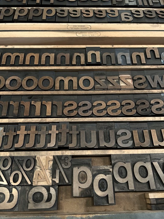
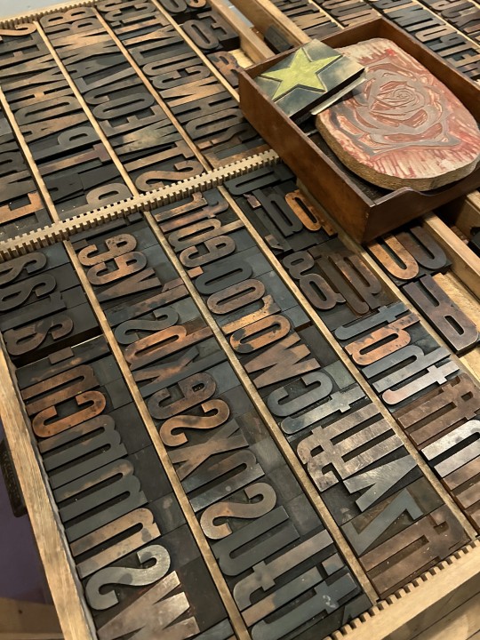
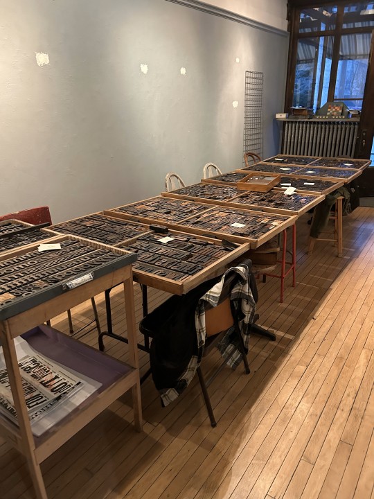
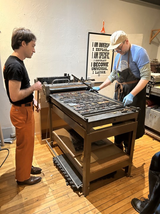
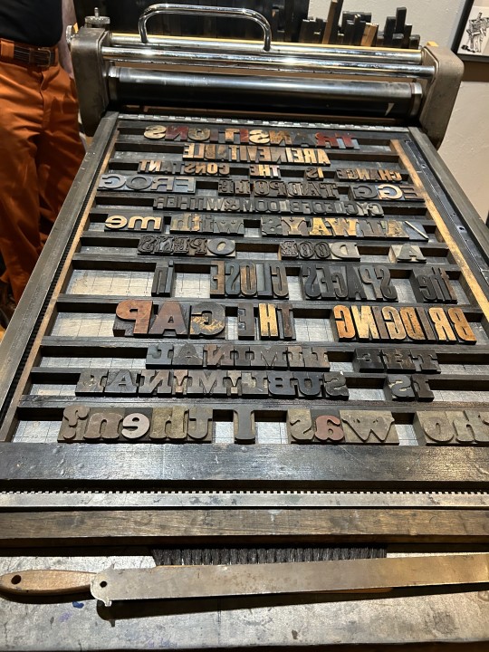
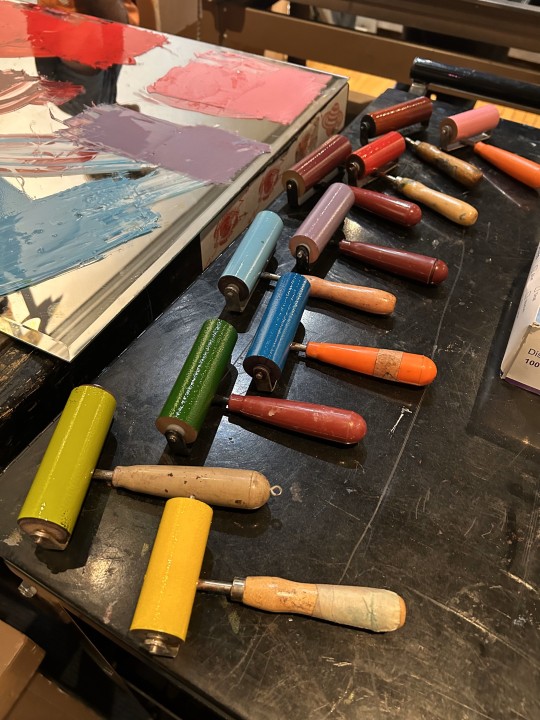
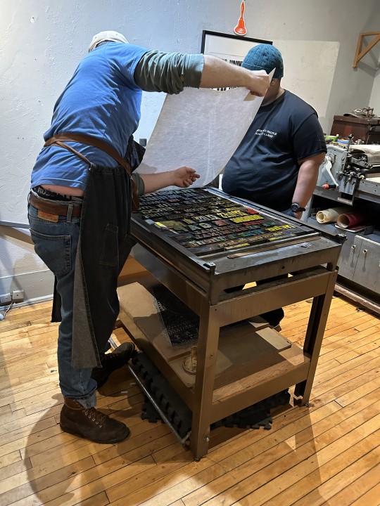
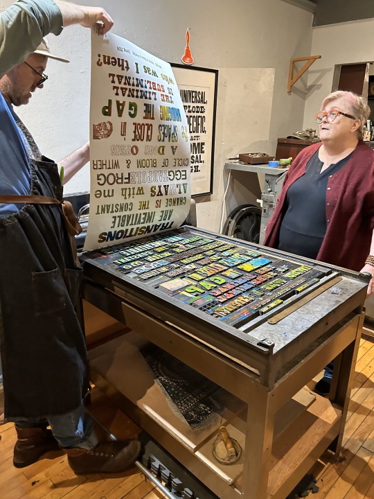
One of my students sent me more images today from our letterpress venture at Team Nerd Letterpress for my History of Books & Printing course a couple of weeks ago. You can read more about the excursion in a post we did last week.
Shown here again are the type cases we worked from; setting and locking up the lines of type on the press bed; inking the type in blue and pulling a proof; then inking the type with a crazy kaleidoscope of colors and pulling multiple prints in rainbow colors.
That image of a sideways face after the line "the spaces close in" is a linocut portrait that Team Nerd proprietor Adam Beadel did of me years ago -- when I still had hair.

View more posts with wood type.
View our other Typography Tuesday posts.
– MAX, Head, Special Collections
#Typography Tuesday#typetuesday#instructions sessions#students#graduate students#Information Studies#INFOST 603#History of Books & Printing#letterpress#letterpress printing#wood type#Adam Beadel#Team Nerd Letterpress#type setting#broadsides#student work#exquisite corpse
46 notes
·
View notes
Text

From: The decorator and furnisher. New York : E. W. Bullinger, 1882-1898
NK1700 .D5 Dec. 1886
#interiordecoration#window#artglass#vases#woodwork#wallpaper#velour#pattern#1880s#late19thcentury#typography#typographytuesday#typetuesday#rarebooks#specialcollections#libraryofva
89 notes
·
View notes
Text
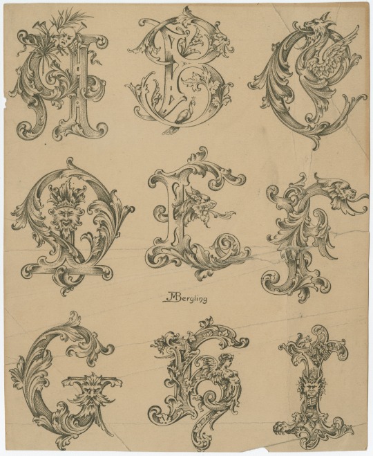

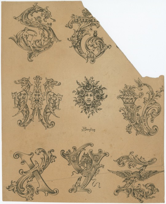
Which letter are you today?
We're kinda feeling like that 'W'...
From a Collection of designs for letters and monograms, by J.M. Bergling.
101 notes
·
View notes
Photo


Argesta by Atipo Foundry / @atipostudio
Argesta is a powerful neoclassical serif font family with high contrast. The ideas for this font has a wide range of reference, from vintage, classic, until the modern era, making it the perfect typeface for an understated, modern, sophisticated look. Stylistically, Argesta is directly inspired by haute couture and it is well-suited to classy branding identity, magazine design, or for luxury product packaging design.
-
Download — http://bit.ly/3749XFZ
-
#literepedegeaba#font#fontforfree#fontfriday#freebie#freedownload#freefont#goodtype#type#typedesign#typeface#typefaceforfree#typegang#typematters#typetuesday#typography#atipofoundry#serif#neoclassical#highcontrast
3 notes
·
View notes
Photo


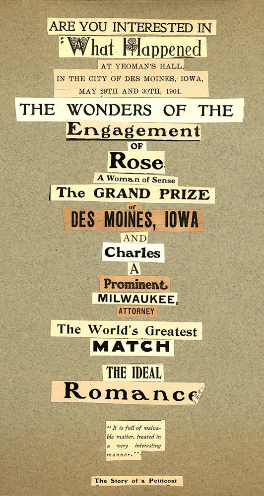


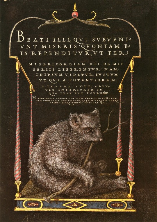
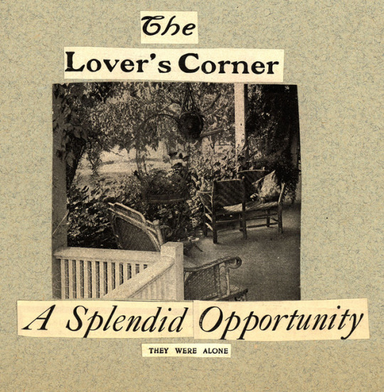
Typography Tuesday: A Love Story
Today begins the first installment of A Love Story. This scrapbook tells of the courtship, engagement, and wedding of Rose Sheuerman of Des Moines, Iowa and Charles Aarons of Milwaukee, Wisconsin. The couple were married in 1905.
We hope you will enjoy this thoughtful scrapbook and the early 20th-century typography and illustrations that help to tell the tale. Keep watching for next week’s installment where we learn about the hardships of sustaining a long distance relationship by post.
#uwm archives#typography tuesday#scrapbook#1900s#love story#keepsake#wedding#marriage#courtship#engagement#archives#artifact#typetuesday#Milwaukee#train#owl#manicule#printer's fist
168 notes
·
View notes
Photo
Happy left handers day to us, fellow lefties! :) © @nomadunicorn
#lefthanded#lefthanders#lefthandersday#lefty#lefty mancini#lefties#type#typetopia#typetoday#typetuesday#typographylove#ilovetypography#graphicdesigner#itsnicethat#eyeondesign#typedirectorsclub#zurdos#adobeillustrator#typedaily
1 note
·
View note
Photo
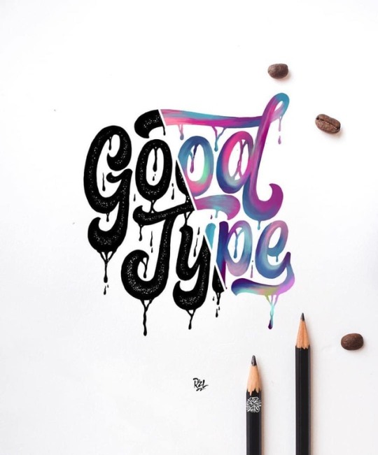
Sharing some fan art on this life belt Sunday! By @rzl.sdk. Rizal is a Lettering Artist based in Bandung, Indonesia 🇮🇩. #Repost @rzl.sdk ・・・ @goodtype , Drawingpen ❌ digital 🔥 . . . Mockup by @dimazfakhr_ . #tyxca #typographyinspired #typography #letteringindo #handlettering #lettering #typegang #typespire #typeyeah #typetuesday #typehand #typematters #art #goodtypetuesday #goodtype #kaligrafina #belmenid #hurufraktur #handmadefont #designinspiration #design #moderncalligraphy #artoftheday #goodtype #strengthinletters https://www.instagram.com/p/BnhBHfalPpX/?utm_source=ig_tumblr_share&igshid=16hkjiylwhjvp
#repost#tyxca#typographyinspired#typography#letteringindo#handlettering#lettering#typegang#typespire#typeyeah#typetuesday#typehand#typematters#art#goodtypetuesday#goodtype#kaligrafina#belmenid#hurufraktur#handmadefont#designinspiration#design#moderncalligraphy#artoftheday#strengthinletters
27 notes
·
View notes
Photo
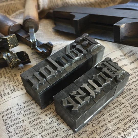
Lead type in black letter font for #typetuesday.👌🏼 #type #letterpress #blackletter #font #antique #handtools #toolsofthetrade #stilllifephotography #nofilter #photography #bookish #inspiration #eidolonhouse
#eidolonhouse#photography#antique#blackletter#type#letterpress#font#inspiration#stilllifephotography#toolsofthetrade#bookish#nofilter#handtools#typetuesday
59 notes
·
View notes
Photo

Playing with gradients tone color🎶🎵 . . . . . . . . . . . . . . . . . #balibillydesign #youaretypography #typosters #typegoodness #typematters #typefacedesign #typographyinspired #ampersand #type #typography #typedesign #typeface #typographyinspired #typetuesday #typographyinspiration #thedailytype #graphicdesign #graphicdesigner #design #designer #font #fonts #fontdesign #fontfoundry #goodtype #creative #typespire #typegang #typematters #letters (at Bali) https://www.instagram.com/p/CLyr_aFHA2k/?igshid=alywn93io3vd
#balibillydesign#youaretypography#typosters#typegoodness#typematters#typefacedesign#typographyinspired#ampersand#type#typography#typedesign#typeface#typetuesday#typographyinspiration#thedailytype#graphicdesign#graphicdesigner#design#designer#font#fonts#fontdesign#fontfoundry#goodtype#creative#typespire#typegang#letters
0 notes
Photo
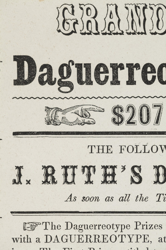
It’s #TypeTuesday again! We’re featuring another image from our current exhibit, Designed, Displayed, & Discarded: Ephemeral Printing in Alton, Illinois, 1835-1855. This advertisement for daguerreotypes includes printed hands, oftentimes called an index or a manicule, which point to and emphasize certain parts of the text. Hand-written manicules gained popularity around the Renaissance, when readers would draw hands pointing to parts of the text they wanted to highlight. Today, the index symbol is considered a standard typographical feature. Come see these manicules, currently on display at the RBML until May 31, 2018.
8 notes
·
View notes
Photo

#TypographyTuesday: Nicolas Jenson's roman types are among the most influential typefaces ever produced. This example shows the blank space left for the addition of an ornamental initial by hand.⠀ ⠀ PA4373 .V6 1478⠀ ⠀ #nicolasjenson #romantype #typography #incunabula #bibliophile #bookstagram #booklover #rarebooks #specialcollections #librariesofinstagram #iglibraries #mizzou #universityofmissouri #ellislibrary #ifttt
#bookhistory#special collections#rare books#mizzou#libraries#books#history#instagram#typography#design#typographytuesday#typetuesday
64 notes
·
View notes
Text


Typography Tuesday
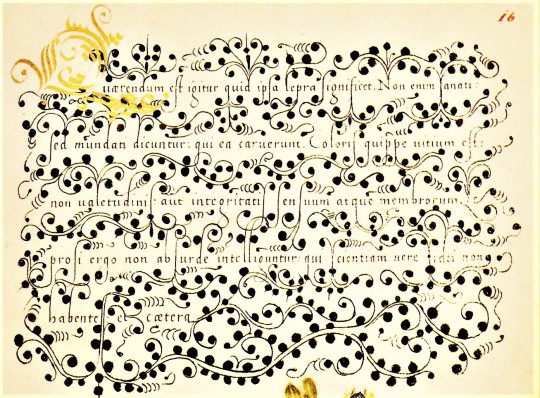
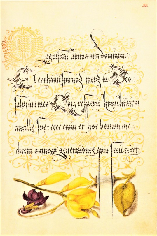
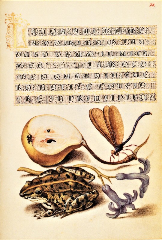
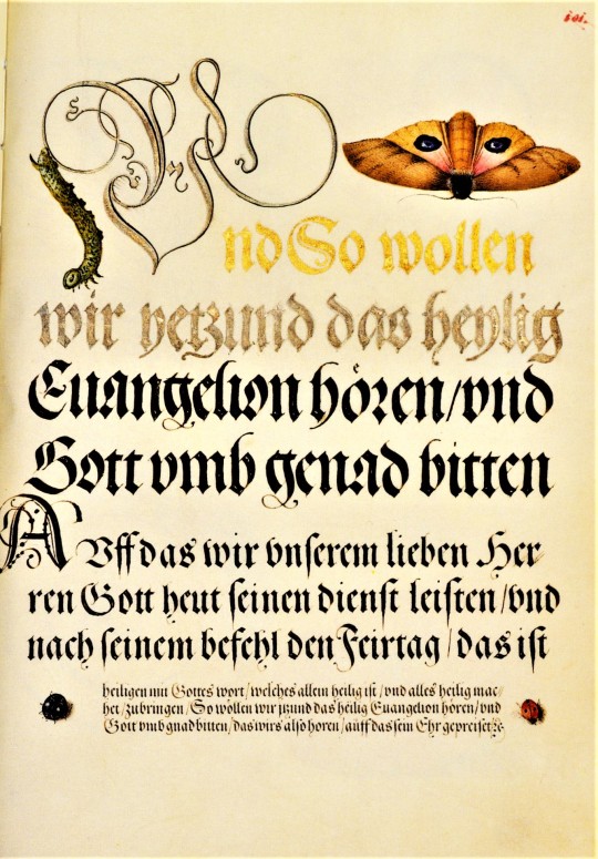
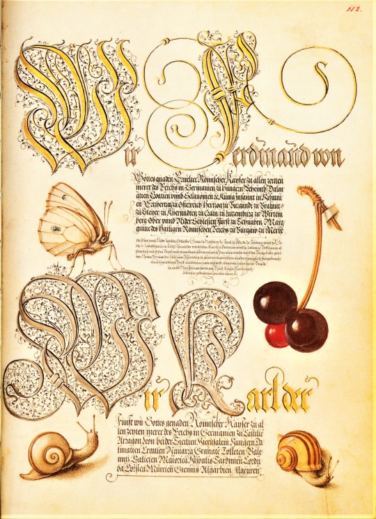
We return to our facsimile of a 16th-cnetury calligraphic manuscript, Mira Calligraphiae Monumenta, or Model Book of Calligraphy, written in 1561/62 by Georg Bocskay, the Croatian-born court secretary to the Holy Roman Emperor Ferdinand I, and illuminated 30 years later by Flemish painter Joris Hoefnagel for the grandson of Ferdinand I, Emperor Rudolph II. The manuscript was produced by Bocskay in Vienna to demonstrate his technical mastery of the immense range of writing styles known to him. To complement and augment Bocskay's calligraphy, Hoefnagel added fruit, flowers, and insects to nearly every page, composing them so as to enhance the unity and balance of the page’s design. Although the two never met, the manuscript has an uncanny quality of collaboration about it.
Our facsimile was the first facsimile produced from the collection at the J. Paul Getty Museum in Los Angeles. It was printed in Lausanne, Switzerland by Imprimeries Reunies and published by Christopher Hudson in 1992.
View another post from Mira Calligraphiae Monumenta,
View more Typography Tuesday posts.
#Typography Tuesday#typetuesday#Mira Calligraphiae Monumenta#or Model Book of Calligraphy#Georg Bocskay#Joris Hoefnagel#illuminated manuscripts#manuscripts#manuscript facsimiles#facsimiles#calligraphy#letter forms#letters#J. Paul Getty Museum#Imprimeries Reunies#Christopher Hudson#Ferdinand I#Rudolph II
828 notes
·
View notes
Text
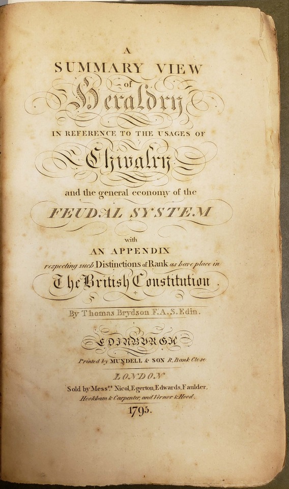
From: Brydson, Thomas. A summary view of heraldry. Edinburgh : Printed by Mundell & Son, 1795
#titlepage#scottish#1790s#late18thcentury#typography#type#typeface#typetuesday#typographytuesday#titlepagetuesday#rarebooks#specialcollections#libraryofva
40 notes
·
View notes
Photo

These embossed letter specimens are examples of Boston Line Type. Boston Line Type was developed in 1835 by Samuel Gridley Howe as a raised letter system of printing for the blind. Reading it tactilely, however, was difficult and the embossed alphabet was eventually abandoned for a simpler dot system.
commontouch.librarycompany.org
[Collection of samples of raised-letter line types for printing for the blind]
13 notes
·
View notes
Photo

#TBT: a Lloyd Reynolds datebook, written almost entirely in calligraphy! #Repost @reedspecialcollections ・・・ Lloyd Reynolds was an English, Creative writing, and Art instructor at Reed from 1929-1969. Reynolds learned calligraphy through personal research, and through his informal calligraphy classes influenced generations of Reed students, faculty and graphic artists. This datebook (all in calligraphy!) is one of many of Reynolds’s we have in the archives. #typetuesday #typography #reedspecialcollections #reedlibrary #lovereed #iglibraries #librariesofinstagram
#reedlibrary#librariesofinstagram#reedspecialcollections#tbt#lovereed#typography#repost#typetuesday#iglibraries
5 notes
·
View notes
Photo


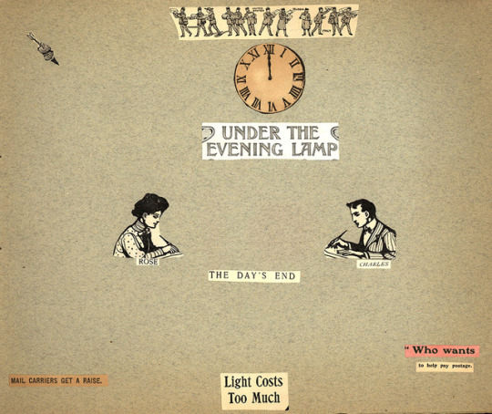
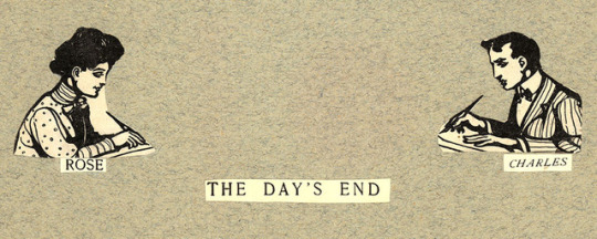
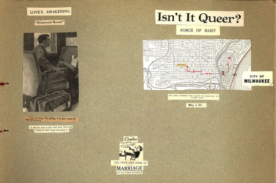
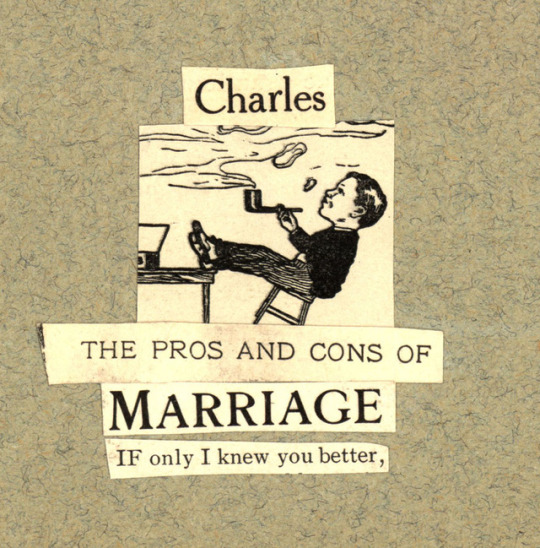
Typography Tuesday: A Love Story, part 2
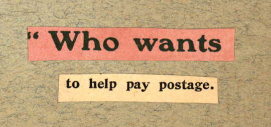
Here is the second installment of A Love Story. This is a keepsake scrapbook that tells the story of the courtship, engagement, and wedding of Rose Sheuerman and Charles Aarons in early 20th century clippings. A trip to Des Moines and a secluded spot on the porch turns in to long distance correspondence.
Watch for part 3 next week!
This scrapbook can be found in the Aarons-Jung-Sheuerman Family papers, 1850-1992 (UWM Mss 44, box 6, folder 1)
#uwm archives#typography tuesday#scrapbook#1900s#love story#keepsake#courting#steam train#aarons-jung-sheuerman family papers#rose sheuerman#charles aarons#courtship#archives#artifact#typetuesday#long distant romance
146 notes
·
View notes
Last Seen Blogs

danieler1313
Cazador de Sueños

javieraart17
Untitled

obesityfantasy
Fatten Them Up

stupid-optimistic
Untitled

sivankarim
Sivan Karim Illustrations