#uncial script
Photo

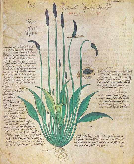
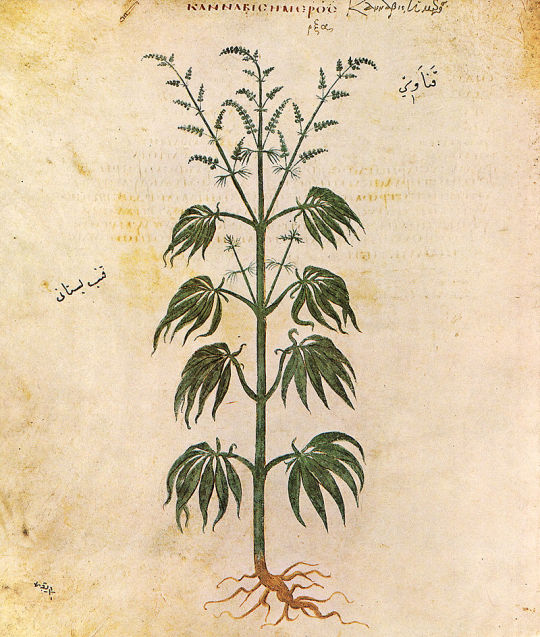
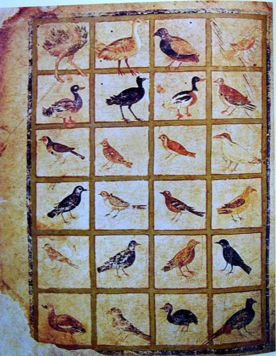

The Vienna Dioscurides or Vienna Dioscorides is an early 6th-century Byzantine Greek illuminated manuscript of an even earlier 1st century CE work, De materia medica (Περὶ ὕλης ἰατρικῆς : Perì hylēs iatrikēs in the original Greek) by Pedanius Dioscorides in uncial script. It is an important and rare example of a late antique scientific text. After residing in Constantinople for just over a thousand years, the text passed to the Holy Roman Emperor in Vienna in the 1500s, a century after the city fell to the Ottomans.
The 491 vellum folios measure 37 by 30 cm and contain more than 400 pictures of animals and plants, most done in a naturalistic style. In addition to the text by Dioscorides, the manuscript has appended to it, the Carmen de herbis attributed to Rufus, a paraphrase of an ornithological treatise by a certain Dionysius, usually identified with Dionysius of Philadelphia, and a paraphrase of Nicander's treatise on the treatment of snake bites.
from Wikipedia
938 notes
·
View notes
Text
Episode 17: Kathryn Maude on politics, the queen as evangelist, and the 11th century Encomium Emmae reginae

British Library Add MS 33241, fol. 1v
In Episode 17 of Inside My Favorite Manuscript, Dot and Lindsey chat with Kathryn Maude about the 11th century Queen Emma, who was married to and had children with both the English king Æthelred the Unready and his successor the Danish king Cnut the Great. The resulting political situation was complicated, and the Encomium Emmae reginae can help us understand the lines that Emma was attempting to walk as her sons grew into adulthood and prepared to take the throne. The text survives in two copies, the earliest one of which is British Library Add MS 33241, believed to be the copy that was presented to Queen Emma herself. Kathryn walks us through the manuscript and we talk about both the politics and the materiality of this fascinating text.
Listen here, or wherever you find your podcasts.
Below the cut are more photos and links relevant to the conversation.
British Library Add MS 33241, aka Encomium Emmae reginae (digitized online)
Folio 1v, the presentation of the book to Queen Emma, with her sons peeking out from the margin.

A close-up of folio 1v focusing on Emma and her sons.

A close-up of folio 1v focusing on the scribe presenting the book. Note that his hands are covered with a cloth. The son's hand has been added.

A close-up of folio 1v focusing on the curtains
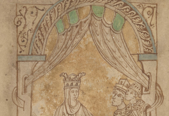
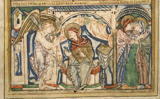
Boulogne-sur-Mer, Bibliothèque municipale, MS 11, miniature of Saint John, folio 107r

Close-up of folio 107r focusing on the curtains. Note Saint John holding the book with a cloth around it.

Copenhagen, Royal Danish Library, Acc. 2011/5, aka Courtenay Compendium, which contains the late 14th century copy of the Encomium Emmae reginae (apparently not digitized)
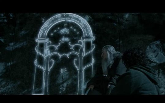
Doors of Durin, drawn by JRR Tolkien.

The Doors of Durin (Gates of Moria) from the Fellowship of the Ring film by Peter Jackson
Middle Aged Women in the Middle Ages, edited by Sue Niebrzydowski. Gender in the Middle Ages, Volume 7. D. S. Brewer, 2011.
Folio 18r, Sven and Cnut's names are capitalized Half Uncials while the rest of the text is a regular Carolingian script.

Folio 48r, another example. Here Emma's name is capitalized at the top.

A king pointing to the text on folio 46r - "a manicule with a king attached" - with a note written beneath in the later middle ages, probably at Saint Augustine's Abbey in Canterbury.
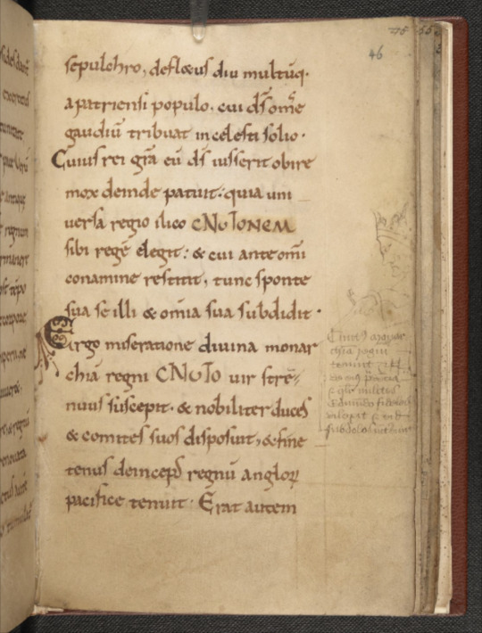
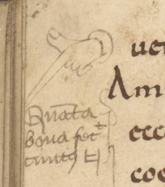
An ugly manicule (hand pointing at the text), folio 46v.

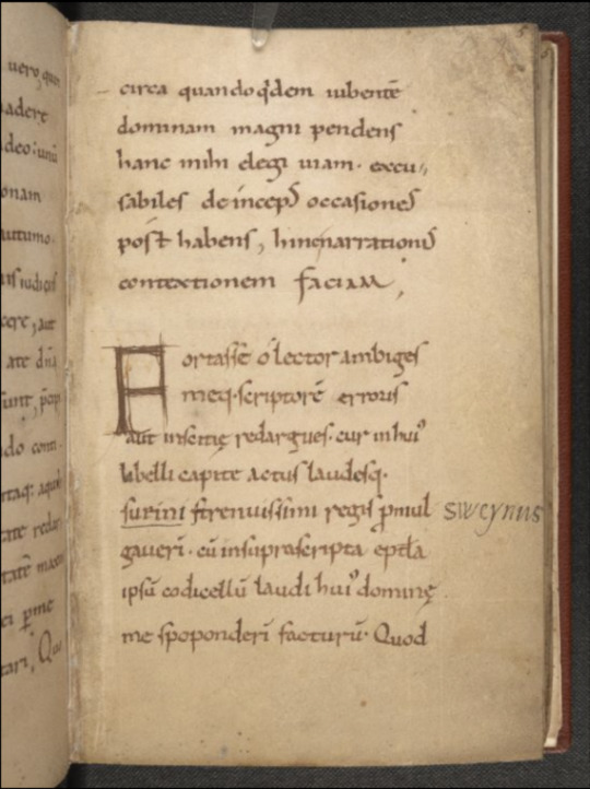
Folio 5r, a gloss in the margin.
Folio 60r, an emoji in the margin of a couple of eyes to annotate the word oculi (Latin for eyes) in the text.

Close-up of the eyes.

Folio 58v, the parchment has been mended during the parchment preparation process, before the text was written.

Folio 54r, space was left for initials that were never added (the penciled M is probably contemporary but was never decorated)

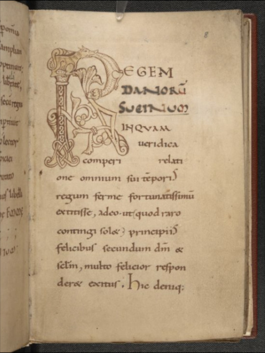
Folio 2r, the first page of text, featuring a zoomorphic initial (i.e., an initial in the shape of an animal, in this case some sort of dragon and a fish eating each other) and colorful capitals.

Folio 8r, a zoomorphic initial R made of more critters eating each other. Good for a tattoo?
Folio 19v. "Explicit Lib[er] I" means the end of book 1, and "Incipit Secundus" means the beginning of [book] two (the second book).

Folio 50v, featuring Lindsey's ugly manicule
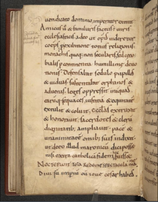
A close-up of the manicule
The Annunciation of Mary in Boulogne-sur-Mer, Bibliothèque municipale, MS 11
We talked to Brandon Hawk about the Vercelli Manuscript in Episode 7.
A hedgehog in the Luttrell Psalter (folio 19v)! (See it online)

"The Social Centrality of Women in Beowulf: A New Context" Dot's very first published article!
#medieval#manuscript#queen emma#medieval art#art history#early england#latin#parchment#book history#rare books#inside my favorite manuscript#podcast#imfmpod
99 notes
·
View notes
Text


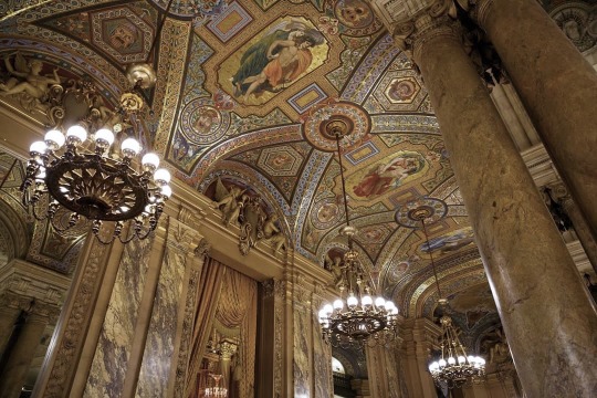
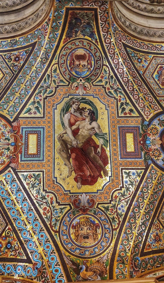
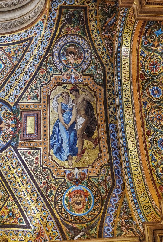

Avant Foyer/“Foyer of Mosaics” of the Opéra Garnier: the four pair mosaic panels + Byzantine Greek inscriptions
(order from left to right, top to bottom)
Artemis (ΑΡΤΕΜΙΣ) and Endymion (ΕΝΔΥΜΙΩΝ)
Orpheus (ΟΡΦΕΥΣ) and Eurydice (ΕΥΡΥΔΙΚΗ, misspelled as “ΕΥΡΙΔΙΚΗ”)
Eos (ΗΩΣ) and Cephalus (ΚΕΦΑΛΟΣ)
Hermes (ΕΡΜΗΣ) and Psyche (ΨΥΧΗ)
The two inscriptions, written in 8th century Byzantine Greek uncial script across the two arches, read:
[1] “Η ΔΙΑ ΜΟΥΣΕΙΩΝ ΤΟΙΞΟΓΡ��ΦΙΑ ΕΠΕΣΚΕΥΑΣΘΗ ΤΟ ΠΡΩΤΟΝ ΕΝ ΓΑΛΛΙΑ ΕΙΣ ΚΟΣΜΗΣΙΝ ΤΗΣΔΕ ΤΗΣ ΑΨΙΔΟΣ ΚΑΙ ΕΙΣ ΠΡΟΞΩΡΗΣΙΝ ΤΗΣΔΕ ΤΗΣ ΤΕΞΝΗΣ”
[2] “ΤΑΣ ΕΙΚΟΝΑΣ ΚΟΥΡΖΩΝ ΕΓΡΑΨΕ ΣΑΛΒΙΑΤΙΣ ΕΠΟΙΗΣΕ ΤΑ ΛΟΙΠΑ ΦΑΚΞΙΝΑΣ ΗΡΞΙΤΕΚΤΟΝΕΙ ΚΑΡΟΛΟΣ ΓΑΡΝΙΕΡ”
The inscriber most likely mixed up the Greek letters Ξ (xee) and X (chi), influenced by the Latin X which corresponds to Ξ phonetically.
The Σ’s have been stylised as the Medieval Greek lunate sigma (C).
The ȣ ligature, commonly found in Byzantine manuscripts and inscriptions, has been used instead of the vowel digraph ΟΥ to represent the /u/ sound.
Text colour alternates from blue to red following word separation and progression in order to divide one word from the next.
Translated text, as interpreted by me:
“Muraling with the use of mosaic tiles was constructed for the first time in France for the ornamentation of this very vault and for the advancement of this particular craft.”
“Curzon designed the images, Salviati made [them], Facchina [made] the rest. The architect was Charles Garnier.”
#palais garnier#opera garnier#paris opera house#greek mythology#architecture#art history#culture#opéra national de paris#classical music#opera#ancient greek#mosaic
154 notes
·
View notes
Text
The Evolution of the Alphabet: A Story of Human Ingenuity and Innovation 🤯
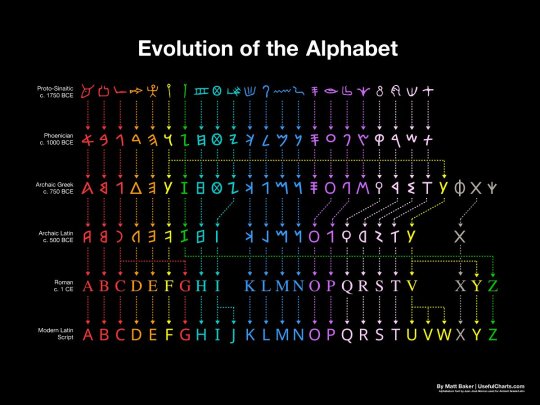
How the Alphabet Changed the World: A 3,800-Year Journey
The evolution of the alphabet over 3,800 years is a long and complex story. It begins with the ancient Egyptian hieroglyphs, which were a complex system of pictograms and ideograms that could be used to represent words, sounds, or concepts. Over time, the hieroglyphs were simplified and adapted to represent only sounds, resulting in the first true alphabets.
The first alphabets were developed in the Middle East, and the Phoenician alphabet is considered to be the direct ancestor of the Latin alphabet. The Phoenician alphabet had 22 letters, each of which represented a single consonant sound. This was a major breakthrough, as it made it much easier to write and read.
The Phoenician alphabet was adopted by the Greeks, who added vowels to the system. The Greek alphabet was then adopted by the Romans, who made some further changes to the letters. The Latin alphabet, as we know it today, is essentially the same as the Roman alphabet, with a few minor modifications.
The English alphabet is derived from the Latin alphabet, but it has undergone some further changes over the centuries. For example, the letters "J" and "U" were added to the English alphabet in the Middle Ages, and the letter "W" was added in the 16th century.
The evolution of the alphabet has had a profound impact on human history. It has made it possible to record and transmit knowledge, ideas, and stories from one generation to the next. It has also helped to facilitate communication and trade between different cultures.
The alphabets are a fascinating invention that have revolutionized the way humans communicate and record information. The history of the alphabets spans over 3,800 years, tracing its origins from the ancient Egyptian hieroglyphs to the modern English letters.
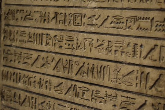
Here is a brief overview of how the alphabets have evolved over time:
Egyptian hieroglyphs (c. 3200 BC): The earliest form of writing was the pictographic system, which used symbols to represent objects or concepts. The ancient Egyptians developed a complex system of hieroglyphs, which combined pictograms, ideograms, and phonograms to write their language. Hieroglyphs were mainly used for religious and monumental purposes, and were carved on stone, wood, or metal.
Proto-Sinaitic script (c. 1750 BC): Around 2000 BCE, a group of Semitic workers in Egypt adapted some of the hieroglyphs to create a simpler and more flexible writing system that could represent the sounds of their language. This was the first consonantal alphabet, or abjad, which used symbols to write only consonants, leaving the vowels to be inferred by the reader. This alphabet is also known as the Proto-Sinaitic script, because it was discovered in the Sinai Peninsula.
Phoenician alphabet (c. 1000 BC): A consonantal alphabet with 22 letters, each of which represented a single consonant sound. The Proto-Sinaitic script spread to other regions through trade and migration, and gave rise to several variants, such as the Phoenician, Aramaic, Hebrew, and South Arabian alphabets. These alphabets were used by various Semitic peoples to write their languages, and were also adopted and modified by other cultures, such as the Greeks, Etruscans, and Romans.
Greek alphabet (c. 750 BC): The Greek alphabet was the first to introduce symbols for vowels, making it a true alphabet that could represent any sound in the language. The Greek alphabet was derived from the Phoenician alphabet around the 8th century BCE, and added new letters for vowel sounds that were not present in Phoenician. The Greek alphabet also introduced different forms of writing, such as uppercase and lowercase letters, and various styles, such as cursive and uncial.
Latin alphabet (c. 500 BC): The Latin alphabet was derived from the Etruscan alphabet, which was itself derived from the Greek alphabet.
Roman alphabet (c. 1 CE): The Roman alphabet is essentially the same as the Latin alphabet, as we know it today. The Latin alphabet was used by the Romans to write their language, Latin, and became the dominant writing system in Europe after the fall of the Roman Empire. The Latin alphabet was also adapted to write many other languages, such as Germanic, Celtic, Slavic, and Romance languages.
English alphabet (c. 500 AD): The English alphabet is derived from the Latin alphabet, but it has undergone some further changes over the centuries. For example, the letters "J" and "U" were added to the English alphabet in the Middle Ages, and the letter "W" was added in the 16th century. The English alphabet consists of 26 letters, but can represent more than 40 sounds with various combinations and diacritics. The English alphabet has also undergone many changes in spelling, pronunciation, and usage throughout its history.
The evolution of the alphabet is a remarkable example of human creativity and innovation that have enabled us to express ourselves in diverse and powerful ways. It is also a testament to our cultural diversity and interconnectedness, as it reflects the influences and interactions of different peoples and languages across time and space.
Thank you for reading! I hope you enjoyed the post about the evolution of the alphabet. If you did, please share it with your friends and family. 😊🙏
#evolution of the alphabet#history of writing#alphabet#hieroglyphs#proto-sinaitic script#phoenician alphabet#greek alphabet#roman alphabet#english alphabet#language#linguistics#consonantal alphabet#syllabic alphabet#ancient egyptian#greek mythology
12 notes
·
View notes
Text
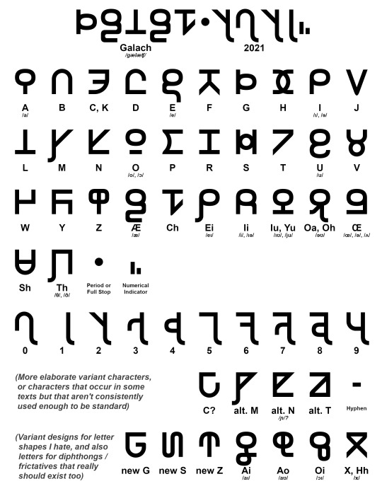
Galach Script interpreted from material shown in Dune (2021).
Over the past year in my free time I've been trying to make a simple fixed-width block letter font for the Galach script that's used in Denis Villeneuve's Dune 2021 adaption (or Dune: Part 1, as it's most likely gonna be called after the second part comes out).
Now, I didn't decode Galach– a lot of other people did independently. All the stuff in the movie is written in quasi-phonetic English (you can tell the accent of the people who wrote given segments because of it), though we have some very sparse bits of untranslated Galach in the books. It's described as descending from a anglo-slavic hybrid language, which is a very... Cold War-era anticipation of a future Lingua Franca twenty thousand years in the future. If Frank Herbert wrote it today, his 'anticipation' of Galach would probably use different root language families.
The basic structure of most letters are the same as in the movie texts. I like their weird dream-writing similarities to the Roman and Cyrilic alphabets as well as Ge'ez script, which is an absolutely beautiful abugida, and there's a vague level of featural-script level similarities between similar letters (particularly all vowels, and to a lesser extent plosives). There are a few letters in the uncial script that also look very similar (particularly the vowels and P, K, and R) and I took the liberty of adapting them from that (let's say formal) movie font into something with more distinguished letters when simplifying them to their shapes here. And I also changed the numerical system: it's not exactly as clean-cut a subdivided base 5 pattern in the movie's system as it is in this one. But hey, who's counting?
This font's called Poritrin Bold and it works, but there's a lot of snags in terms of which version I want to give to the fandom community. The first is that it's a 32-character alphabet for what's normally a 26-letter QWERTY keyboard– which shortcuts do I use? Can I just get away with enabling ligatures, when Office and most other app groups don't really support them? Do I also create a thin-letter and italicize-able version of Poritrin? Why is my brain making a clicking noise?
And that's not even addressing the issue of whether I should add those extra characters I suggested into the font, or add those replacement ones I designed. Lots of questions with arbitrary answers.
I'm all ears for suggestions!
#dune#dune part one#dune 2021#dune fandom#fontdesign#type#typeface#script font#galach#galach script#my art#“baradit nehiidit beed gwarp tau nubukt” sure thing frank that sounds like a universal language
31 notes
·
View notes
Text
i think i was meant to be a monk in like 700s-1200s ireland or uk pre-printing press just copying down books by hand in half uncial or carolingian script
#'brn int ehw rong generation' but its just me wanting to do a lot of calligraphy#can i take the religious part out and just copy books
3 notes
·
View notes
Text
Historical Script Styles: Explore Calligraphy's Roots
Historical Script Styles: Unearth the Fascinating Journey of Calligraphy Through Time!
Historical Script Styles Calligraphy is a beautiful art form that has evolved over centuries, with its roots in ancient civilizations like Egypt, Mesopotamia, and China. The term "calligraphy" comes from the Greek words meaning "beautiful writing," and it encompasses a wide range of styles and types from Western, Chinese, Japanese, Arabic, Indian, Persian, Tibetan, Korean, Hebrew, and Latin calligraphy. Today, calligraphy is still used in formal invitations, branding, packaging, and as a form of artistic expression.
- Calligraphy has a rich history dating back to ancient civilizations.
- The word "calligraphy" means beautiful writing.
- Calligraphy styles have evolved over time and across different cultures.
- Modern calligraphy allows for more freedom and experimentation.
- Calligraphy continues to be practiced and appreciated today.
The Meaning of the Word Calligraphy
Calligraphy, derived from the Greek words for beauty and writing, carries a deeper significance beyond its literal meaning of "beautiful writing." It is a form of art that combines creativity, craftsmanship, and emotional expression. Calligraphy goes beyond mere handwriting, incorporating elements such as proportion, space, depth perception, light, and artistic flair. It is a meticulous practice that requires patience, skill, and a deep understanding of the tools and techniques involved.
Calligraphy has been an integral part of cultures around the world for centuries. It has evolved and adapted to various styles and forms, reflecting the unique characteristics of different societies. From the intricate brushstrokes of Chinese calligraphy to the elegant scripts of Western calligraphy, each style carries with it its own historical and cultural significance.
Through calligraphy, artists can convey beauty, meaning, and emotion in a way that transcends everyday writing. It is a timeless art form that continues to captivate and inspire people today. Whether you're a calligraphy enthusiast or simply appreciate the beauty of the written word, exploring the meaning and history of calligraphy can deepen your understanding and appreciation for this ancient art.
"Calligraphy is not just about writing beautifully; it is about creating an emotional connection through the written word." - Unknown
The Artistry of Calligraphy
Calligraphy is both a skill and an art. It requires precision, attention to detail, and a keen eye for aesthetics. Each stroke, curve, and loop is carefully crafted to create harmonious letterforms that convey both meaning and beauty. Calligraphers often spend years honing their skills and mastering the techniques of their chosen script.
However, calligraphy is not limited to traditional scripts and styles. Modern calligraphy has emerged as a vibrant and dynamic form of expression, allowing artists to experiment with new letterforms, tools, and styles. It blends traditional calligraphy techniques with contemporary influences, resulting in a unique fusion of the old and the new.
Whether you're drawn to the elegance of traditional scripts or the expressive freedom of modern calligraphy, the artistry of calligraphy offers endless opportunities for creativity and personal expression.
Traditional Calligraphy Scripts
Modern Calligraphy Styles
Gothic
Brush Calligraphy
Italic
Watercolor Lettering
Uncial
Typography Calligraphy
Whether you're an aspiring calligrapher or an admirer of the art form, the meaning of calligraphy extends far beyond its literal definition. It represents a fusion of skill, beauty, and creativity, inviting us to explore the possibilities of the written word.
Calligraphy Through the Years
Calligraphy, as an art form, has a fascinating history that spans centuries and continents. It has gone through various stages of evolution, adapting to different cultural influences and technological advancements. From its humble beginnings as pictograms and ideographs in ancient civilizations like Egypt and Mesopotamia, calligraphy has transformed into intricate scripts and writing systems in China, Europe, and beyond. Let's explore the evolution of calligraphy and delve into its rich history.
Evolution of Calligraphy
In ancient Egypt, calligraphy began with hieroglyphs, a system of symbols that represented sounds and concepts. These hieroglyphs gradually developed into more refined scripts, such as hieratic and demotic, which were used for everyday writing. Similarly, in Mesopotamia, cuneiform writing emerged as one of the earliest forms of writing, consisting of wedge-shaped marks pressed into clay tablets. These early scripts laid the foundation for calligraphy as an artistic form of expression.
In China, calligraphy has been considered a highly respected art form for thousands of years. It involves using a brush and ink to create strokes and characters, with an emphasis on the balance, rhythm, and flow of each stroke. Chinese calligraphy encompasses different styles such as seal script, clerical script, regular script, running script, and cursive script. Each style has its own unique characteristics and historical significance, reflecting the cultural and artistic development of China over the centuries.
In Europe, calligraphy took various forms throughout history. The Gothic script, characterized by its intricate and angular letters, dominated during the Middle Ages. The Renaissance period brought a revival of classical styles, with greater emphasis on proportion, symmetry, and beauty. With the invention of the printing press in the 15th century, the popularity of handwritten books declined, but calligraphy continued to be practiced by scribes and monks. In modern times, calligraphy has experienced a resurgence as artists explore new styles, techniques, and mediums.
Region
Example Scripts
Egypt
Hieroglyphs, Hieratic, Demotic
Mesopotamia
Cuneiform
China
Seal script, Clerical script, Regular script, Running script, Cursive script
Europe
Gothic script, Renaissance script
These are just a few examples of the diverse range of calligraphy styles and scripts that have developed over time. Each region and culture has contributed to the evolution of calligraphy, adding new techniques, tools, and artistic expressions to the art form.
As calligraphy continues to evolve, it remains a timeless and cherished form of visual communication. Whether used in formal invitations, branding, packaging, or as a personal artistic expression, calligraphy embodies the beauty and skill of handwriting. It is a testament to the human ability to transform mere words into works of art.
Calligraphy Hand Categories and Scripts
Calligraphy scripts can be classified into different hand categories, each with its own unique characteristics and historical context. These categories represent the various styles used throughout history, showcasing the evolution of calligraphy across different regions and time periods.
1. Roman and Late Roman Scripts
In the Roman and late Roman script category, several styles were prevalent. These include Imperial Capitals, Rustic Capitals, and Square Capitals. These scripts were characterized by their bold letterforms and distinct architectural style, often used for inscriptions and monumental purposes.
2. Insular and National Scripts
In the Insular and National script category, Insular Majuscules and Insular Minuscule were prominent. These scripts emerged in the British Isles and were influenced by Celtic and Irish artistic traditions. Insular scripts were known for their intricate knotwork and highly decorative letterforms.
3. Caroline and Early Gothic Scripts
The Caroline and Early Gothic script category included Caroline Minuscules and Early Gothic scripts. Caroline Minuscules, developed during the Carolingian period, featured more rounded and legible letterforms. Early Gothic scripts, such as Textura Quadrata and Textura Prescisus, emerged in the 12th century and were characterized by their dense, vertical strokes.
4. Gothic Scripts
Gothic scripts encompass a range of styles, including Textura Quadrata, Textura Prescisus, Gothic Capitals, Lombardic Capitals, Bastard Secretary, Bâtarde, and Fraktur. These scripts were widely used in Europe from the 13th to the 15th century and are known for their intricate details, sharp serifs, and vertical emphasis.
5. Italian and Humanist Scripts
Italian and humanist scripts include Rotunda, Rotunda Capitals, Humanist Minuscule, Italic, and Humanist Capitals. These scripts emerged during the Italian Renaissance and were influenced by classical Roman letterforms. Italian scripts are known for their elegant and flowing curves, while humanist scripts emphasized legibility and clarity.
6. Post-Renaissance Scripts
Post-Renaissance scripts feature Copperplate and Copperplate Capitals. Copperplate script, developed in the 17th century, is characterized by its elegant and elaborate cursive style. It became popular for formal documents, invitations, and certificates due to its refined appearance.
These calligraphy hand categories and scripts showcase the diversity and historical significance of calligraphy as an art form. Each style has its own unique characteristics, techniques, and cultural context, contributing to the richness of calligraphic traditions.
Hand Category
Script Styles
Roman and Late Roman
Imperial Capitals, Rustic Capitals, Square Capitals
Insular and National
Insular Majuscules, Insular Minuscule
Caroline and Early Gothic
Caroline Minuscules, Early Gothic
Gothic
Textura Quadrata, Textura Prescisus, Gothic Capitals, Lombardic Capitals, Bastard Secretary, Bâtarde, Fraktur
Italian and Humanist
Rotunda, Rotunda Capitals, Humanist Minuscule, Italic, Humanist Capitals
Post-Renaissance
Copperplate, Copperplate Capitals
These hand categories and scripts provide a glimpse into the historical development of calligraphy and the diverse styles that emerged across different cultures and time periods. Through the mastery of these scripts, calligraphers were able to create stunning works of art that continue to inspire and captivate audiences to this day.
The Evolution of Letterforms
One of the fascinating aspects of calligraphy is the evolution of letterforms over time. As calligraphy developed in different cultures and artistic movements, the shapes and styles of letters underwent significant transformations. These changes were influenced by factors such as the available tools, cultural preferences, and the artistic vision of calligraphers.
During the Celtic and Gothic periods, calligraphers worked with small pens made of feather quills, resulting in intricate and delicate letterforms. The Renaissance period brought a revival of classical inspiration, with calligraphers drawing inspiration from carved capitals and pen capitals. The invention of movable type and the printing press brought a shift in the role of calligraphy, but it continued to be practiced and appreciated.
"The evolution of letterforms in calligraphy showcases the ingenuity and adaptability of the art form. From the small, intricate letters of religious manuscripts to the elegant and flowing copperplate script, calligraphers have constantly pushed the boundaries of letter design."
Table: Evolution of Calligraphy Letterforms
Period
Letterforms
Description
Celtic and Gothic
Intricate and delicate
Small pens made of feather quills
Renaissance
Classical inspiration
Inspired by carved capitals and pen capitals
Movable Type Era
Printing press influence
Shift in the role of calligraphy
One influential figure in the evolution of calligraphy letterforms is Edward Johnston, who developed the Foundational Hand. This script played a significant role in defining the mechanics of calligraphy and set the foundation for modern calligraphy styles. Johnston's work influenced countless calligraphers and continues to inspire new generations.
Modern calligraphy has further expanded the possibilities of letterforms, allowing artists and calligraphers to experiment with new styles, strokes, and tools. The combination of traditional techniques and contemporary artistic expression has resulted in a vibrant and diverse range of letterforms in modern calligraphy.
The evolution of letterforms in calligraphy reflects the ever-changing nature of art and design. It demonstrates the creative innovation of calligraphers throughout history and showcases the timeless beauty of this ancient art form.
The History of Copperplate
Copperplate is a style of calligraphy that emerged in the 17th century, characterized by its extreme cursive script and linked letters. It takes its name from copperplate engraving, a popular technique during that time. The elegance and versatility of Copperplate script quickly made it widely practiced and appreciated.
Although Copperplate calligraphy was prominent during the 17th century, its roots can be traced back to the Italian Renaissance. The script was highly influenced by the stylish handwriting of Italian scribes, who used a pointed metal nib to create the fluid, interconnected letters.
As one of the most ornate and decorative calligraphy styles, Copperplate is often associated with formal and elegant occasions. It is commonly used for formal invitations, certificates, and other high-end applications where a sophisticated aesthetic is desired.
The Characteristics of Copperplate Calligraphy
"Copperplate calligraphy is known for its flowing, delicate lines and highly connected letters. The script is written with a pointed pen, which allows for both thick and thin strokes, creating a visual contrast on the page."
The slanted letterforms of Copperplate calligraphy give it a graceful and dynamic appearance. The script requires a high level of control and precision to achieve the desired effect, making it a favorite among skilled calligraphers.
In recent years, Copperplate calligraphy has experienced a resurgence in popularity, as more people embrace the beauty and craftsmanship of traditional handwriting. It continues to be practiced by calligraphers and artists around the world, who incorporate modern adaptations and personal styles into their Copperplate creations.
Modern Calligraphy

Modern calligraphy is an exciting evolution of traditional calligraphy styles, offering a fresh and contemporary approach to this timeless art form. It combines the fundamentals of calligraphy with personal creativity and expression, allowing artists to explore new letterforms, techniques, and tools.
Unlike traditional calligraphy scripts that follow strict rules and structures, modern calligraphy embraces a more relaxed and experimental approach. Artists have the freedom to play with letter shapes, sizes, and connections, creating unique and dynamic compositions. This versatility has made modern calligraphy a popular choice among designers, artists, and individuals looking to add a touch of elegance to their projects.
One of the defining characteristics of modern calligraphy is the use of a variety of writing instruments. While traditional calligraphy typically relies on dip pens and brushes, modern calligraphers often explore different tools like brush pens, markers, or even unconventional materials to achieve their desired effects.
With modern calligraphy, there are endless possibilities for creativity and self-expression. Whether you're a beginner or an experienced calligrapher, exploring modern calligraphy can be a rewarding journey that allows you to develop your own unique style and leave your mark on the world.
Styles of Modern Calligraphy
Modern calligraphy encompasses a variety of styles, each with its own distinct characteristics and aesthetics. Some popular styles include:
- Brush Calligraphy: Using a brush pen or brush tool to create bold and expressive letterforms.
- Watercolor Calligraphy: Combining calligraphy with watercolor painting to create beautiful and vibrant compositions.
- Digitized Calligraphy: Creating calligraphy digitally using graphic design software and tablets.
- Flourished Calligraphy: Adding decorative flourishes and embellishments to letterforms, creating an elegant and ornate look.
These are just a few examples, and modern calligraphy allows for endless experimentation and innovation. It's an exciting time to explore this art form and discover your own unique voice within the world of calligraphy.
The Different Types of Calligraphy
https://www.youtube.com/watch?v=VU-dHTEkAx0
If you're fascinated by the art of calligraphy, you'll be delighted to discover the wide array of calligraphy styles from around the world. Each type of calligraphy has its own unique characteristics and techniques, making it a rich and diverse art form to explore.
Let's take a closer look at some of the most prominent calligraphy styles:
Western Calligraphy
- Gothic: Known for its intricate and ornate letterforms, Gothic calligraphy originated in Europe during the medieval period.
- Italic: Derived from the Renaissance period, Italic calligraphy features elegant and flowing letterforms.
- Uncial: This ancient form of calligraphy is characterized by its rounded and uniform letterforms.
- Copperplate: With its highly cursive script and intricate letterforms, Copperplate calligraphy became popular in the 17th century.
Chinese Calligraphy
- Regular Script: Also known as Kaishu, this style is characterized by its balanced and symmetrical letterforms.
- Running Script: Known as Xingshu, Running Script combines elements of cursive and regular script, resulting in a more fluid and dynamic style.
- Cursive Script: Referred to as Caoshu, Cursive Script features highly simplified and connected letterforms, creating a sense of energy and spontaneity.
- Seal Script: Used primarily for seals and stamps, Seal Script is a highly stylized form of calligraphy that evolved from ancient Chinese characters.
Arabic Calligraphy
- Naskh: Known for its legibility and rounded letterforms, Naskh is one of the most widely used calligraphy styles in the Islamic world.
- Thuluth: With its elongated and elegant letterforms, Thuluth calligraphy is often used for decorative purposes.
Read the full article
#ancientwriting#ArtisticLettering#CalligraphicTechniques#CalligraphyHistory#CalligraphyRoots#CulturalCalligraphy#HandwritingEvolution#historicalcalligraphy#scriptstyles#TraditionalScripts
0 notes
Text
Notes on books I read:
there's lots of technical terms to describe letter forms
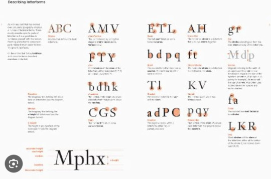
the bulk text of a book is designed as text type usually between 6pt and 12pt (usually has more readability )
Headlines or call-outs are called display type. Display typefaces are used to be seen and not read.
quick history
Words were originally written by scratching into wet clay - hence the used more straight lines rather than curved ones
Greeks changed the writing from right to left to how we read today (left to right) and also changed the orientation of the letters
roman square capitals has serifs on their words as stone carvers followed brush marks that were left (serifs usually used to make font look " authoritative, professional, and suggest the weight of history or experience")
4th century Romans used cursive for their day to day transactions simplified for speed ( cursive used to "add a touch of character and charm, it can also humanize the sentiment you're trying to convey")
unicals (Uncial is a majuscule script commonly used from the 4th to 8th centuries AD by Latin and Greek scribes) incorporated aspects of roman cursive. "Unica" meaning a twelfth of anything, unical referring to the height of the font being 1/12th of a foot (1 inch).
Blackletter (T1450) - strongly vertical letterform used for typecasting/printing. carved ink block of wood used for printing. Later they used an adjustable mold system for "casting" movable. re-usable type from molten lead.
oldstyle (1475) - based on lowercase forms used by Italian scholars for book copying
Italic (1500)- made to be close-set which allowed more words per page
Script (1550)- replicate engraved calligraphic forms. not appropriate for lengthy texts. Forms now range from formal and traditional to casual and contemporary.
Transitional (1750)- refinement of old-style due to refinement of printing methods. Thick-to-thin relationships were exaggerated and brackets were lightened
Modern (1775)- further rationalization of old-style. serifs were unbracketed and contract between thick and thin were extreme.
Square serif (1825)- heavy bracketed serifs little variation between thick and thin strokes. newly developed for advertising heavy type in printing. no brackets. also known as slab serif.
Counter form- spaces between the letters aka negative space. How well you handle the counters determines how easily we can read whats been set.
fonts can be used to reinforce meaning. sizes of words, where the word is on the page (setting) missing letters. playing with the dots in i and j. repetition. combining scale and structure. colour. kerning (spaces between the words). margins
~ a type primer by john kane
After reading a few of the books I looked at many different fonts and many different ways to use type to convey your message and a lot of history behind typefaces.
0 notes
Text
The Green Revolution: Unveiling the Health Benefits of Plant-Based Diets

Welcome to our curated blog post where we dive into the fascinating world of calligraphy. From its ancient origins to the techniques and styles used today, we'll explore the rich history and modern applications of this beautiful art form. So grab your pens and brushes as we embark on this artistic journey!
Calligraphy, derived from the Greek words "kallos" meaning beauty and "grapho" meaning writing, is more than just putting pen to paper. It is an ancient art form that holds great significance in various cultures around the world. The fluidity, precision, and aesthetic appeal of calligraphy make it a timeless practice that has evolved over centuries.
In this curated blog post, we'll take you on a journey through time, exploring the origins of calligraphy, the techniques and styles used in different cultures, and how calligraphy is still relevant in our modern world.
Origins of Calligraphy
The roots of calligraphy can be traced back to ancient civilizations where writing systems first emerged. Let's explore how calligraphy took shape in Mesopotamia, Egypt, and China:
Ancient Mesopotamia: Cuneiform script and the birth of writing
In Mesopotamia, the birthplace of writing, calligraphy manifested through the cuneiform script. This intricate system of wedge-shaped characters impressed onto clay tablets was widely used by ancient Sumerians, Babylonians, and Assyrians. The cuneiform script laid the foundation for future writing systems and set the stage for the development of calligraphy.
Ancient Egypt: Hieroglyphs and their influence on calligraphy
In ancient Egypt, hieroglyphs adorned the walls of temples and tombs, conveying both stories and symbolism. The hieroglyphic script incorporated artistic elements, creating a visual language that influenced the aesthetics of calligraphy in later cultures.
Ancient China: The emergence of Chinese calligraphy
Chinese calligraphy, known as "Shufa" or "Shuji," has a rich history dating back over 3,000 years. This form of calligraphy is deeply rooted in Chinese culture and is often seen as a meditative art form. Chinese calligraphy combines the beauty of brush and ink, as artists use various brushstrokes and writing styles to create characters that convey meaning and aesthetic appeal.
Techniques and Styles of Calligraphy
Calligraphy varies across different cultures, each embracing unique techniques and styles. Let's explore the techniques and styles utilized in Japanese, Arabic, and Western calligraphy:
youtube
Japanese calligraphy: Shodo and the use of brush and ink
Japanese calligraphy, known as "Shodo," emphasizes the use of brushes and ink to create graceful and expressive characters. It requires precise brush handling techniques and understanding of various styles, including Kaisho (block style), Gyosho (semi-cursive style), and Sosho (cursive style).
Arabic calligraphy: The beauty of Islamic calligraphy
Islamic calligraphy is renowned for its elegance and intricate designs. The key script forms in Arabic calligraphy include Thuluth, Naskh, and Diwani, each with its own distinct characteristics. Islamic calligraphy plays a vital role in the adornment of mosques, manuscripts, and other Islamic art forms.
Western calligraphy: From Uncial to Copperplate
Western calligraphy encompasses various styles and scripts, including Uncial, Gothic, Italic, and Copperplate. Each style reflects the historical period it originated from and employs different tools and techniques, such as nibs, ink, and specialized paper.
Modern Applications of Calligraphy
Although calligraphy has deep historical roots, it continues to thrive in our modern society. Let's explore the different applications of calligraphy today:
Calligraphy as a form of artistic expression
Calligraphy has found its way into the world of painting and visual arts, as artists incorporate beautifully crafted letters and characters into their artwork. Moreover, calligraphy is widely used in logo design and branding to evoke elegance, sophistication, and a sense of authenticity.
Calligraphy as a therapeutic practice
Engaging in calligraphy offers a sense of mindfulness and can be a powerful tool for stress relief. The rhythmic movements and focused attention required in calligraphy promote a meditative state, allowing practitioners to find solace and relaxation through this beautiful art form.
Calligraphy in the digital age
In today's digital era, calligraphy has adapted to modern technology. Digital calligraphy tools and applications allow artists to create refined and polished calligraphic designs using digital brushes and styluses. By blending traditional calligraphy with modern technology, calligraphers can explore new creative possibilities.
Conclusion
Calligraphy stands as a testament to the enduring beauty of an ancient art form. From its origins in ancient civilizations to its modern applications, calligraphy continues to captivate and inspire. By understanding the history, techniques, and styles of calligraphy, we can truly appreciate the value it holds in our world today. So, whether you simply admire calligraphy or aspire to become a practitioner yourself, remember that with every brushstroke, you connect with a rich cultural legacy that spans millennia.
#vegan#veganlife#veganism#go vegan#veganfood#vegetarian#healthyveganliving#health and wellness#health care#medicine#wellness#Youtube
0 notes
Photo
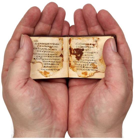

Perhaps the oldest miniature book? Two parchment leaves - with the Song of Songs 4:12-14 and 5:8-9 - from a miniature codex, in a fine Sahidic Coptic uncial script, from Upper Egypt, early 5th century. Each leaf measures approximately 53 by 59mm.
Two further leaves survive from this same codex, once in the collection of P. Ramón Roca-Puig (1906-2001, papyrologist and priest), and bequeathed by him to the library of the abbey of Santa Maria de Monserrat, near Barcelona, where he spent his final years. The monastery leaves were published as S.T. Tovar, Biblica Coptica Montserratensia: P. Monts. Roca II, pp. 55-58, with Song of Songs, 4:8-9 and 8:2-4; and without knowledge of these here.
0 notes
Text
Cyrillize it! A guide on Cyrillic typography for graphic designers by Yana Vekshyna (LO1)
I borrowed a book from the library, and although I'm a native Russian speaker, it proved useful for learning theoretical information about Cyrillic typography. I came across many new facts and important insights that I'd like to document here.
It was surprising to discover that the popularity of Cyrillic typography has been on the rise in the last 15 years, largely due to Eastern European fashion brands like Gosha Rubchinsky, Vetements, and Andrey Artyomov. Some foreign brands have also started using Cyrillic to write English phrases composed of similar letters, making them legible to those who don't speak Russian.
I also learned that many popular Latin typefaces don't accurately represent the Cyrillic alphabet and often fail to adhere to its typographical rules. For instance, Arial distorts some letters by making them too short or too wide/narrow, while Sans Serif elongates tails and tilts strokes excessively, with overly long descenders.

History
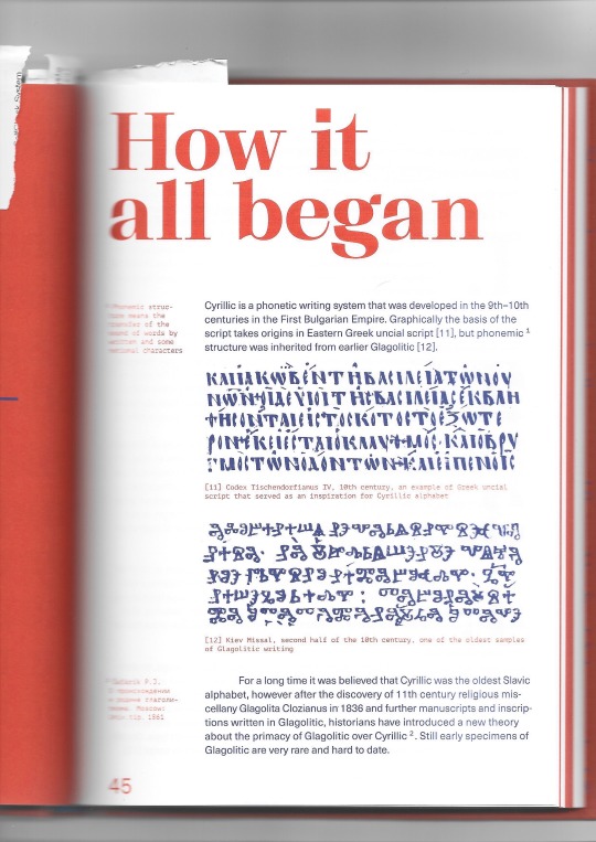
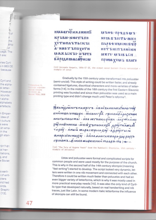
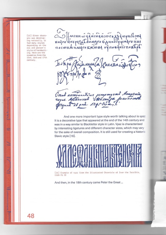
Cyrillic was developed in the 9th-10th centuries in the First Bulgarian Empire. The basis of the alphabet takes origins in Eastern Greek uncial script, while phonemic structure was inherited from Glagolitic. Big reformation to the alphabet and its 'latinisation' were done by the Russian Emperor Peter the Great in 1708-1710. Peter always wanted to bring Russian closer to progressive Europe. Letters were redesigned to look more like Latin, which wasn't done in the most professional manner and Cyrillic only reached its standard forms in the 19th century. The earliest graphical version of Cyrillic was called ustav (Uncial), which was unique due to having vertically straight letters and only one weight and height. Then by the 15th century it transferred to poluustav (semi-uncial). It contained ligatures, diacritical characters and more varieties of letters.
0 notes
Text
Featured Author | Book Buzz Radio Interview | Rev. Dr. Henry B. Malone
Featured Book: The Preaching and Sacred Writings of St. Peter the Apostle Kata St. Mark The Biblical Scholarship series on the New Testament writings Modern Received Eclectic Text compared to the Early Papyri and Uncials VOLUME II
Written for Pastors and serious Bible scholars to give them more time in the Greek text. The first question for the serious Bible scholar should be "What is the text?" Only then are you ready to move on to "What does it mean?" The Sacred Preaching & Writings of St. Peter the Apostle presents the "Received Text" since its inception to present. This is the eclectic text used today for all major translations. The changes over time are color coded Greek script. The textual critic's effort to recover the original autographs is recorded as the top line. Like an interlinear Bible, a level one English translation is provided. Below this in parallel and vertical format are the major Greek Uncials and Papyri published. A few documents take us to within twenty to forty years of the original autographs. The mundane work has been done. Now a study of the text itself can occupy your study. All top line eclectic text verbs have be parsed and the first person indicative form is identified for you.
0 notes
Text
#aFactADay2021
#329: why do we use upper and lower case letters?! well, the upper case letters are straight and simple, which dates back to when Romans carved everything in stone like idiots. but when they wanted to use paper, they used a totally different alphabet, called Roman Cursive, which eventually evolved into our current lower case. but... why??? this could be difficult... basically: uncial was used in the 4th-8th centuries, it looked a bit like a combo of the current two but still majuscule*; semi-uncial is uncial's second cousin, looking quite similar but entirely miniscule*; carolingian was the first script to be bicameral*, using both an uncial-looking script in tandem with a majuscule script for the starts of important words and chapters.
finally, during the dark ages, a bunch of people called the humanists who hated the current Blackletter script (what we incorrectly think of when we say "gothic") found some Carolingian scripts and decided to use their lowercase letters, and replaced the ornate gothic capitals with the classic simple roman block capitals. and thus was born the current system we use today.
well kinda - the actual rules werent laid down until much later, and big documents like the Declaration of Independence has random words capitalised lol
*mini glossary:
majuscule - all letters the same height, commonly associated with capital letters. i mean basically it means all caps.
miniscule - all letters are small but some have ascenders or descenders (like h and g). basically lowercase lol.
bicameral - using upper and lower case.
0 notes
Text
Difference between Hand Lettering and Calligraphy

Writing and illustrating words is a type of art. Creating words on paper with neat and clean designs, stroke is a well-crafted and patient art. There are many such art forms which promote writing into THE ART Here is a list of the most famous:
Hand Lettering
Calligraphy
Typography
They are all beautiful art of writings in their own way. It has been noticed that people are often confused between them, especially between hand lettering and calligraphy - due to a few similarities.
What is Hand Lettering?
Hand lettering is an art of illustrating letters to give them a dramatic effect by shaping and drawing them in various characters and patterns. The best part about this is that there are no particular rules to be followed, except for that they should be readable.
This art of illustrating letters was developed a hundred of years ago, majorly in the early 1800 with the rise of industrialization worldwide. Gradually, it became very popular and was vastly used in signage advertising. and lettering was thought to be a dying art in the late 1900s to early 2000s due to digitalization. But on the contrary, thanks the digital age, hand lettering has now become a famous art, spurring it into various commercial fields of art forms.
To practice hand lettering these the tools would come in handy-
Pencil - You can sketch and erase your ideas easily off the paper unlike with the pen.
Roller scale - Roller scale is a great tool when you've to draw grids. It is otherwise also a very tricky tool to use and if not managed can spoil the art.
Miscellaneous - The other things required are water colours, acrylic colours, brushes, palette, etc.
What is Calligraphy?
Calligraphy is the art of writing beautifully in the tweaking pattern while writing the words. Calligraphy is an ancient and globally popular art form. It has been in continuance since 600. B.C., where it was originally invented in Rome. Since then, with the rise of modern calligraphy, calligraphy has undergone many major changes.
As mentioned before, calligraphy is an art of writing and does not speak just one language. It is adaptable in various languages, which has given birth to doing calligraphy in many languages as below-
Chinese Calligraphy
Indian Calligraphy
Western Calligraphy
Arabic Calligraphy
Calligraphy is immensely popular and requires practice and concentration to master the art. Calligraphy unlike hand lettering, has set of rules to follow for each pattern. It can be freely used in any shape too.
The tools required for Calligraphy are
Dip pens They are the traditional calligraphy tools and are used for scripts such as copperplate, etc.
Brush pens They are also used for calligraphy and they are usually cheaper and a more approachable tool for beginners. Brush lettering can be done with brush pens.
Flat nib pens They are used for calligraphy scripts such as gothic calligraphy, italics, uncials, roman capitals, and many more.
Fountain pens They are more suited for penmanship as (most of them) don't have a flexible nib by default which is necessary for creating thick and thin lines like with the dip pens.
The conclusion is that it is important for artists to understand the work that goes in two different art forms.
Penkraft conducts classes, course, online courses, live courses, workshops, teachers' training & online teachers' training in Handwriting Improvement, Calligraphy, Abacus Maths, Vedic Maths, Phonics and various Craft & Artforms - Madhubani, Mandala, Warli, Gond, Lippan Art, Kalighat, Kalamkari, Pichwai, Cheriyal, Kerala Mural, Pattachitra, Tanjore Painting, One Stroke Painting, Decoupage, Image Transfer, Resin Art, Fluid Art, Alcohol Ink Art, Pop Art, Knife Painting, Scandinavian Art, Water Colors, Coffee Painting, Pencil Shading, Resin Art Advanced etc. at pan-India locations. With our mission to inspire, educate, empower & uplift people through our endeavours, we have trained & operationally supported (and continue to support) 1500+ home-makers to become Penkraft Certified Teachers? in various disciplines.
1 note
·
View note
Text
i am so fucking scared that i won’t be able to tell carolingian minuscule apart from insular minuscule, much less insular majuscule from semi uncial script. and like. college is FUCKED because that is not a fear a normal person should have. not only did they give the monkey anxiety, they gave the monkey anxiety about LETTER FORMS
#my thoughts#and like. insular minuscule vs carolingian should be easy??? but ive been staring at it for so long#that it all looks the same now#and my prof even said that we should be on the look out for the differences between insular majuscule and semi uncial#but like... i can't tell ya the difference dfklgjdflh#every entry to insular majuscule just goes: they have a lot of uncial and semi uncial influences dflkgdfh#like cool. and what are their differences dflkgjdlfh#AAAAAAAAAAH#okay let me think. semi uncial is minuscule and curvy and round and pretty. and has a normal r and a two strike s#insular majuscule has a round s most of the time?? and either the uncial R or the long descender r?? i THINK#but the other website i got here also says like. naahhh the differences between those arent that big dfkjgdflh#so fuck that i guess? dfgkjdflh#i dont even know
0 notes
Text
:~:Minuscule:~:

1. Extremely small; tiny.
“A minuscule fragment of DNA”
Informal
So small as to be negligible or insufficient.
“He believed the risk of infection was minuscule.”
2. Of or in lowercase letters, as distinct from capital or uncials.
Of or in a small cursive script of the Roman alphabet, with ascenders and descenders, developed in the 7th century AD.
Such a multifaceted definition for such a tiny word. I wish I could make my facets known. I wish I didn’t have to write every letter perfectly and lament over past mistakes as if they lay in a casket and were my oldest, dearest friends.
1 note
·
View note