#user interface design
Note
hi i just want to say i stumbled on your blog and i dont know about vintage computers but i feel quite passionately about Internet and tech without knowing all that much honestly so im thankful to your blog being an exciting place of exploration. i love your website too and i look forward to seeing more of your projects. i also wanted to ask because i found your blog from a post about windows ui, do u have more resources on that that u recommend? thank you so much <3
Thank you! I try to expose folks to the cool aspects of the hobby where I can, and show how much more faceted it is than one might see on the surface. The aesthetic is cool and all, but there's so much more to appreciate if you take the time to explore.
Apart from The Windows Interface Guidelines for Software Design, not really. I'm more of an enthusiast with opinions™ about things. I think there's an early one about Mac OS UI development prior to OSX that's worth its salt too, but I'm not an Apple fan.
However, I'm sure a few folks in the mix may have some recommendations. Suggestions are welcome!
20 notes
·
View notes
Text
(deep long sigh)
Reminder that when you implement 2FA setup, you should let people optionally get the same code that the QR image contains as plain text.
This allows, for example, setting up 2FA through a browser on the same phone that contains the authenticator app.
9 notes
·
View notes
Text
interests
6 notes
·
View notes
Text
Smart Finance Mobile App
Follow @ui.designx to get featured.
#copydesignforpractisepurpose
https://www.linkedin.com/in/ui-designx-972741247
#twitter : @outpostmaster
#Instagram : @ui.designx
#mobile ui#uxresearch#user interface design#uxdesigner#ui ux agency#app ui#app design#uiux#uidesigner#visualdesign#web design#uiux_designer#behance#copy_design#usability testing#user experience#uiuxdailydesign#figmadesign#figma#canva#adobe xd
15 notes
·
View notes
Text
The Art And Science Of Web Design: A Comprehensive Guide
In a world where first impressions are everything, web design plays a crucial role in capturing the attention of your audience. From choosing the right color schemes to creating user-friendly layouts, mastering the art and science of web design is essential for building a successful online presence. In this comprehensive guide, we will explore all aspects of web design and provide you with expert tips and tricks to take your website to the next level. Whether you’re a seasoned designer or just starting out, join us on this journey as we unlock the secrets behind creating stunning websites that leave a lasting impression.
Introduction To Web Design: What Is It And Why Is It Important?
In the digital landscape that defines our modern world, web design stands as a cornerstone of online presence, functionality, and user experience. From captivating visuals to seamless navigation, web design plays a pivotal role in shaping the digital experiences that users encounter every day. In this blog post, we’ll delve into the fundamentals of web design, explore why it’s important, and uncover the impact it has on businesses and users alike.
At its core, web design encompasses the process of creating and styling the visual layout, structure, and functionality of websites. It involves a combination of design principles, user interface (UI) considerations, and technical skills to create websites that are not only aesthetically pleasing but also intuitive, accessible, and user-friendly. Web design encompasses various elements, including layout, color scheme, typography, imagery, and interactive features, all of which come together to create a cohesive and engaging digital experience.
Why Is Web Design Important?
First Impressions Matter: Your website is often the first point of contact between your business and potential customers. A well-designed website creates a positive first impression, conveying professionalism, credibility, and trustworthiness. On the other hand, a poorly designed website can turn users away and damage your brand’s reputation.
User Experience (UX): User experience is paramount in today’s digital landscape. A well-designed website considers the needs and preferences of users, offering intuitive navigation, clear calls to action, and seamless interactions. By prioritizing UX design, businesses can enhance user satisfaction, reduce bounce rates, and increase conversions.
Brand Identity and Differentiation: Your website serves as a digital representation of your brand identity and values. Effective web design aligns with your brand’s visual language, tone, and personality, helping to reinforce brand recognition and differentiation. A cohesive and memorable design can set your brand apart from competitors and leave a lasting impression on users.
Search Engine Optimization (SEO): Web design plays a crucial role in search engine optimization (SEO) efforts. Search engines like Google prioritize websites that are well-designed, fast-loading, and mobile-friendly. By implementing SEO best practices into the design process, businesses can improve their website’s visibility, ranking, and organic traffic.
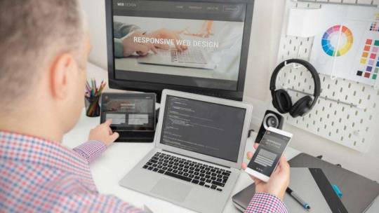
Adaptability and Responsiveness: With the proliferation of mobile devices, responsive web design has become essential. A responsive website automatically adjusts its layout and content to fit different screen sizes and devices, ensuring a consistent and optimized experience across desktops, tablets, and smartphones. By embracing responsive design principles, businesses can reach a broader audience and provide a seamless experience regardless of the device used.
The Role Of Aesthetics In Web Design: Understanding Color Theory, Typography, And Layout
In the realm of web design, aesthetics reign supreme. Beyond just functionality, the visual appeal of a website can captivate users, convey brand identity, and evoke emotional responses. To achieve this, web designers must master the art of aesthetics, understanding the principles of color theory, typography, and layout. In this blog post, we’ll delve into the crucial role of aesthetics in web design, exploring how color, typography, and layout choices can shape the user experience and enhance the overall effectiveness of a website.
Understanding Color Theory: Setting The Mood And Tone
Color is one of the most powerful tools in a web designer’s arsenal, capable of evoking emotions, influencing perceptions, and guiding user behavior. Different colors carry distinct meanings and associations, with warm tones like red and orange conveying energy and passion, while cool tones like blue and green evoke tranquility and trust. By strategically selecting colors that align with the brand identity and intended message, web designers can create visual harmony and establish a cohesive aesthetic that resonates with users.
The Art Of Typography: Communicating With Style
Typography plays a crucial role in web design, serving as a means of communication and expression. The choice of typefaces, font sizes, and styles can greatly impact readability, accessibility, and overall visual appeal. Serif fonts convey tradition and sophistication, while sans-serif fonts exude modernity and simplicity. Additionally, pairing complementary fonts can create hierarchy and visual interest, guiding users’ attention and enhancing the readability of content. By mastering the art of typography, web designers can elevate the visual appeal and effectiveness of a website’s design.
Crafting Engaging Layouts: Balancing Form And Function
Layout is the backbone of web design, providing structure and organization to the content and visual elements of a website. A well-designed layout strikes a balance between aesthetics and usability, guiding users through the site’s navigation and content in a seamless and intuitive manner. Grid systems, whitespace, and visual hierarchy are essential tools for creating engaging layouts that prioritize clarity and ease of use. By understanding user behavior and designing layouts that anticipate their needs, web designers can create immersive and memorable experiences that keep users coming back for more.
Embracing Responsive Design: Adapting Aesthetics Across Devices
In an increasingly mobile-centric world, responsive design has become a fundamental aspect of web design aesthetics. Responsive design ensures that websites adapt seamlessly to various screen sizes and devices, providing users with a consistent and optimal viewing experience across desktops, tablets, and smartphones. By embracing responsive design principles and optimizing aesthetics for mobile devices, web designers can ensure that their websites remain visually compelling and engaging, regardless of the device used to access them.
The Science Behind User Experience: Utilizing Psychology And Data To Create An Engaging Website
In the digital age, where attention spans are fleeting and competition for user engagement is fierce, understanding the science behind user experience (UX) has never been more critical. From the colors we use to the layout of our pages, every aspect of a website can influence how users perceive, interact with, and ultimately engage with a brand. By leveraging principles from psychology and data analysis, web designers can create websites that resonate with users on a deeper level, fostering trust, loyalty, and meaningful connections. In this blog post, we’ll explore how the marriage of psychology and data can be harnessed to create an engaging website experience that captivates users and drives results.
Psychology: Understanding The Human Mind
Color Psychology: Colors evoke emotions and associations, influencing how users perceive a brand or message. For example, blue is often associated with trust and professionalism, while red can evoke feelings of urgency or excitement. By strategically selecting colors that align with the brand’s identity and message, web designers can create a visually compelling and emotionally resonant experience for users.
Cognitive Load: Users have limited cognitive resources, so it’s essential to design websites that minimize cognitive load and make information easily digestible. Techniques like chunking information, using clear navigation cues, and limiting distractions can help reduce cognitive strain and enhance the usability of a website.
Social Proof: Humans are social creatures, and we’re often influenced by the actions and opinions of others. Incorporating social proof elements such as customer testimonials, user reviews, and social media shares can help build trust and credibility, encouraging users to engage with a website and take desired actions.
Data: Leveraging Insights For Optimization
User Behavior Analysis: By analyzing user behavior data, such as click-through rates, scroll depth, and time on page, web designers can gain valuable insights into how users interact with a website. This data can inform design decisions, identify pain points, and uncover opportunities for improvement to enhance the overall user experience.
A/B Testing: A/B testing involves comparing two or more variations of a web page to determine which performs better in terms of user engagement and conversion rates. By testing different design elements, layouts, and calls-to-action, web designers can identify what resonates most with users and optimize the website for maximum effectiveness.
Heatmaps and Eye Tracking: Heatmaps and eye-tracking studies provide visual representations of where users are looking and interacting on a website. By analyzing these heatmaps, web designers can identify areas of high engagement, as well as areas that may be overlooked or ignored. This information can be used to optimize the layout, placement of key elements, and overall user flow to improve the user experience.
Principles Of Responsive Design: Ensuring Your Website Looks Great On Any Device
In today’s multi-device world, where users access websites on smartphones, tablets, laptops, and desktops, ensuring a consistent and engaging experience across all devices is paramount. Responsive design offers a solution, allowing websites to adapt dynamically to various screen sizes and orientations, providing users with an optimal viewing experience on any device. In this blog post, we’ll explore the principles of responsive design and discuss how they can be applied to create websites that look great and perform flawlessly on any device.
Understanding Responsive Design
Responsive design is an approach to web design that aims to create websites that automatically adjust and adapt to the user’s device, screen size, and orientation. Instead of creating separate websites or versions for different devices, responsive design uses flexible grids, fluid layouts, and media queries to ensure that content and design elements scale proportionally and reflow seamlessly across devices. This not only improves usability and accessibility but also enhances user satisfaction and engagement.
Principles Of Responsive Design
Flexible Grids: A flexible grid system is the foundation of responsive design, allowing content to adapt and reflow based on the user’s screen size. By using relative units like percentages instead of fixed pixel values, web designers can create layouts that are fluid and flexible, ensuring that content remains readable and accessible across devices.
Fluid Layouts: In addition to flexible grids, responsive design relies on fluid layouts to accommodate different screen sizes and resolutions. Fluid layouts use relative units for width, height, and margins, allowing design elements to resize and reposition dynamically as the viewport changes. This ensures that websites maintain their proportions and readability across a wide range of devices.
Media Queries: Media queries are CSS rules that allow designers to apply styles based on the characteristics of the user’s device, such as screen size, resolution, and orientation. By using media queries, designers can create responsive designs that adapt to different devices and screen sizes, adjusting typography, layout, and other design elements as needed to optimize the user experience.
Flexible Images and Media: Images and media assets are an integral part of web design, but they can pose challenges for responsive layouts. To ensure that images scale proportionally and maintain their quality across devices, designers can use techniques like fluid images, max-width properties, and responsive media embeds. This ensures that images and media assets adapt seamlessly to different screen sizes and resolutions.
Progressive Enhancement: Progressive enhancement is an approach to web design that starts with a basic, functional layout and adds enhancements and optimizations for more capable devices. By prioritizing core content and functionality and layering on additional features for devices with larger screens or more advanced capabilities, designers can create websites that are accessible to all users, regardless of their device or technology.
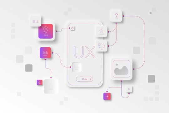
The Importance Of User Interface (UI) Design And How To Create An Intuitive Interface
In the digital realm, where first impressions matter and user attention is fleeting, the importance of user interface (UI) design cannot be overstated. UI design is the bridge between users and digital products, shaping how users interact with and experience websites, applications, and software. A well-designed UI can enhance usability, increase engagement, and foster a positive perception of a brand, while a poorly designed UI can lead to frustration, confusion, and abandonment. In this blog post, we’ll explore the importance of UI design and share tips for creating an intuitive interface that delights users and drives results.
The Importance Of UI Design
Usability: At its core, UI design is about creating interfaces that are easy to use and navigate. A well-designed UI anticipates users’ needs, guides them through tasks and processes, and minimizes cognitive load. By prioritizing clarity, simplicity, and consistency, UI designers can create interfaces that empower users to accomplish their goals efficiently and effectively.
User Engagement: A visually appealing and intuitive UI can captivate users’ attention and encourage them to explore further. Thoughtful use of colors, typography, imagery, and interactive elements can create a memorable and engaging experience that keeps users coming back for more. By creating a positive emotional connection with users, UI design can foster loyalty and advocacy for a brand or product.
Brand Perception: The UI of a digital product is often the first point of contact between users and a brand. A well-designed UI communicates professionalism, trustworthiness, and attention to detail, enhancing the overall perception of a brand. Conversely, a poorly designed UI can convey a lack of care and quality, leading users to question the credibility and reliability of a brand.
Tips For Creating An Intuitive Interface
Know Your Audience: Understanding the needs, preferences, and behaviors of your target audience is essential for creating a UI that resonates with users. Conduct user research, gather feedback, and create user personas to inform design decisions and tailor the interface to the needs of your audience.
Simplify Navigation: Keep navigation menus and interface elements simple and intuitive, allowing users to find what they need quickly and easily. Use clear labels, logical grouping, and familiar patterns to guide users through the interface and minimize confusion.
Prioritize Content Hierarchy: Use visual hierarchy to prioritize important content and guide users’ attention to key elements. Use size, color, contrast, and spacing to create a clear hierarchy of information, making it easy for users to scan and digest content.
Provide Feedback and Affordances: Feedback and affordances are essential for helping users understand how to interact with the interface. Provide visual cues, such as hover effects, animations, and microinteractions, to indicate interactive elements and provide feedback when actions are performed.
Test and Iterate: Regular testing and iteration are essential for refining and improving the UI over time. Conduct usability testing, gather feedback from users, and analyze user behavior data to identify areas for improvement and refine the interface based on user needs and preferences.
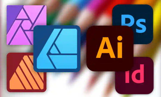
Top Tools And Resources For Web Designers:
In the ever-evolving world of web design, staying ahead of the curve requires access to the right tools and resources. From design software and frameworks to inspiration and education, there is a plethora of tools available to help web designers create stunning and functional websites. In this blog post, we’ll explore some of the top tools and resources that every web designer should know about, helping them streamline their workflow, stay inspired, and create exceptional digital experiences.
Design Software:
Adobe Creative Cloud: Adobe Creative Cloud offers a suite of design tools, including Photoshop for image editing, Illustrator for vector graphics, and XD for prototyping and wireframing. With seamless integration between applications and a wide range of features, Adobe Creative Cloud is a go-to choice for many web designers.
Sketch: Sketch is a popular design tool for creating user interfaces and web layouts. With its intuitive interface, robust vector editing capabilities, and powerful plugins, Sketch is favored by many designers for its efficiency and flexibility in designing responsive websites.
Figma: Figma is a collaborative design tool that enables real-time collaboration between team members. With features like multiplayer editing, version history, and prototyping, Figma streamlines the design process and fosters collaboration among designers, developers, and stakeholders.
Development Frameworks And Libraries:
Bootstrap: Bootstrap is a front-end framework for building responsive and mobile-first websites and web applications. With its extensive library of pre-built components and responsive grid system, Bootstrap makes it easy to create visually appealing and functional interfaces.
React.js: React.js is a JavaScript library for building user interfaces, developed by Facebook. With its component-based architecture and virtual DOM, React.js simplifies the process of building interactive and dynamic web applications, making it a popular choice among web developers.
Vue.js: Vue.js is a progressive JavaScript framework for building user interfaces. With its simplicity and flexibility, Vue.js allows developers to create modular and scalable web applications with ease, making it an increasingly popular choice for web development projects.
Inspiration And Education:
Dribbble: Dribbble is a community of designers sharing screenshots of their work, including web design projects, UI/UX designs, and illustrations. Browsing through Dribbble is a great way to find inspiration, discover new trends, and learn from other designers’ work.
Behance: Behance is a platform for showcasing and discovering creative work across various disciplines, including web design, graphic design, and photography. With its curated galleries and project showcases, Behance is a valuable resource for finding inspiration and exploring the latest design trends.
Smashing Magazine: Smashing Magazine is a popular online publication for web designers and developers, offering articles, tutorials, and resources on topics ranging from web design and front-end development to UX design and accessibility. With its comprehensive and informative content, Smashing Magazine is a valuable resource for staying informed and learning new skills.
Conclusion
In conclusion, web design is a dynamic and multifaceted discipline that requires a blend of creativity, technical expertise, and user-centered thinking. By understanding the principles of visual design, UX design, and development, designers can create websites that not only look great but also provide a seamless and engaging user experience. By following best practices, staying informed about emerging trends, and continuously iterating and refining their designs, web designers can create websites that leave a lasting impression and achieve their goals in the digital landscape.
1 note
·
View note
Text
Okay, so: there's a local restaurant whose online ordering process involves various selecting various sauces to be included with one's order – so many units of teriyaki sauce, so many units of hot sauce, so may units of peanut sauce, and so forth.
The idea is supposed to be that you can select any combination of sauces you want, as long as it adds up to no more than four units. However, what the app actually required is that you select exactly four units of sauces; it wouldn't let you submit the ordering form if the total wasn't exactly four.
Just today I discovered that they seem to have fixed it... not by correcting the errant validation rule, but by adding a "no sauce" option, which counts toward the required total of four.
Thus, it's now possible to place an order with, say, two units of teriyaki sauce rather than four by entering 2x "teriyaki sauce" and 2x "no sauce". Similarly, an order with no sauce at all is 4x "no sauce".
This is quite possibly the least intuitive ordering process I've ever encountered, and I've literally worked in e-commerce.
19K notes
·
View notes
Text
What I've Been Reading: February 18, 2024
It’s been a while since we’ve checked in. Let’s talk about the state of the games industry and the state of the Web.
Continue reading What I’ve Been Reading: February 18, 2024
View On WordPress
#Checkboxes#Google#Pentiment#Radio buttons#Search engine optimization#User interface design#Video game industry layoffs#Video game industry revenue#Xenoblade Chronicles
0 notes
Text
Optimizing User Experiences with Expert Interface Design | intorque
intorque leads in Optimizing User Experiences with Expert Interface Design. Our seasoned experts craft seamless, engaging interfaces, setting your brand apart in the digital landscape. Rooted in usability, accessibility, aesthetics, and functionality, our designs guarantee excellence. Explore transformative outcomes through real-world case studies, demonstrating intorque's impact across diverse industries. Stay ahead with the latest trends, ensuring interfaces that stand the test of time. At intorque, collaboration is key, tailoring designs to your unique brand identity. Trust us to optimize user experiences, propelling your brand to lasting success in the expertly designed digital sphere
0 notes
Text
Touchscreen integration with vi on a phone turns out to be really nice UX actually. (I'm using Termux+Emacs+Evil.)
Unlike a mouse, your fingers are already right there on the touch screen. The travel distance is much lower, barely more than typing.
You can put the cursor on exactly the target line without line counting or picking a search string or whatever motion. Drag to scroll. It's a nice option, faster in some cases, and often mentally lighter.
3 notes
·
View notes
Text
Why I Choose The Affinity Suite Over The Adobe One
A Deep Dive Into My Experience With Affinity and Adobe
Firstly, this is in no way affiliated by Affinity. This is just my genuine opinion and preference.
Lockdown Made Me Do It
I’ve been using Affinity now since 2020 when the world turned to shite, and I was isolated at home with a pregnant girlfriend. I wanted to do some game design. I was, at the time, using Photoshop to create game assets,…
View On WordPress
#Adobe Alternatives#Affinity Designer#Affinity vs Illustrator#Affordable Design Solutions#Cost-Effective Design#Creative Software Deals#Design Software Comparison#Digital Art Bargains#Digital Art Tools#Game Asset Creation#Graphic Design Software#Isometric Illustration Tools#Pay-to-Own Software#Personal Software Experiences#Pixel Art Techniques#Shape Builder Tools#Software Reviews#Switching from Adobe#User Interface Design
0 notes
Text
UI/UX Principles
UI/UX Principles are fundamental guidelines governing both User Interface (UI) and User Experience (UX) design. They dictate how visual elements and interactive features should be designed to optimize user satisfaction!
#https://www.techaheadcorp.com/blog/best-ux-design-practices/#ux design#user experience#design best practices#ui/ux principles#mobile app design#web design guidelines#user-centric design#interaction design#usability tips#human-centered design#responsive design#user interface design#ux research#prototyping#wireframing#accessibility in design#visual hierarchy#information architecture#design thinking#mobile app usability
0 notes
Text
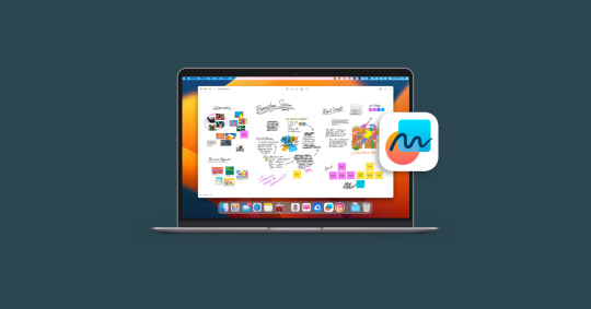
The Ultimate Virtual Whiteboard App
The Ultimate Virtual Whiteboard App for Apple Users. Freeform isn’t just another app - it's a versatile companion for various tasks.
@neosciencehub
#neosciencehub #science #app #Freeform #freeformApp #applefreeform #virtualwhiteboard #designtool #NSH
In the dynamic world of digital creativity and collaboration, Freeform stands out as a revolutionary virtual whiteboard app. Catering to the needs of iOS 16.2 users and beyond, Freeform is more than just an app—it’s a gateway to unfettered creativity and seamless teamwork. Integrated with FaceTime and Messages, it transforms the way we share and develop ideas in the digital space.
Getting…
View On WordPress
#Apple Pencil Compatibility#Cloud Sync#Creative Collaboration#Digital Brainstorming#Digital Creativity#Educational Technology#featured#Freeform#Innovation in Productivity#Interactive Drawing#iOS App#Remote Work Tool#sciencenews#Team Project Management#Tech for Collaboration#User Interface Design#Virtual Whiteboard
0 notes
Text
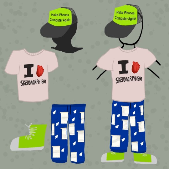
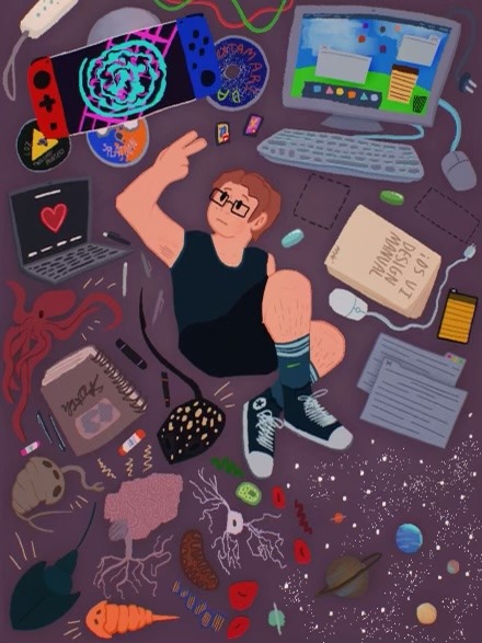
drop ur special interest fit.
also the shirt is a real shirt i own in real life
#adioart#original art#skeuomorphism#frutiger aero#frutiger#frutiger eco#user interface design#uidesign#ui#special interest#fit check#aqua user interface#brushed metal#ios 1#apple#imac#sorry i’m just messing around
1 note
·
View note
Text

I'm Senthil, an experienced freelance UI/UX designer in Melbourne, Australia. I enjoy crafting UX and UI for websites, mobile apps, and SaaS applications. Working with startups and businesses of all sizes, and experience in delivering design solutions for diverse clients such as IT, finance, manufacturing, fashion, real estate, and more... Contact us for more information about our Melbourne-based Top UI/UX Designer!
#UX UI Designer Melbourne#Freelance UI UX Designer Melbourne#Freelance UX UI Designer Melbourne#UI Designer Melbourne#UX Designer Melbourne#UI UX Designer Melbourne#Freelance UX Designer#Freelance UI Designer#Freelance UI Designer Melbourne#Freelance UX Designer Melbourne#User Experience Design#Website Design#Responsive Website Design#UX Designer#UI Designer#iPhone Apps#Digital Design#User Interface Design#SaaS UX Designer#App Designer Melbourne#Mobile App Designer Melbourne#Freelance App Designer Melbourne
1 note
·
View note
Last Seen Blogs

comodakora21
Untitled

asimplersoul
A Simpler Soul

halfpipe
HALFPIPE

fallingin2me
#globalcitizen

adopt-a-stuffie
Adopt-A-Stuffie