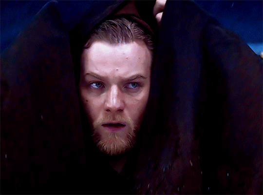
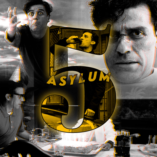
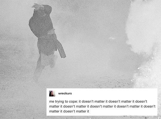
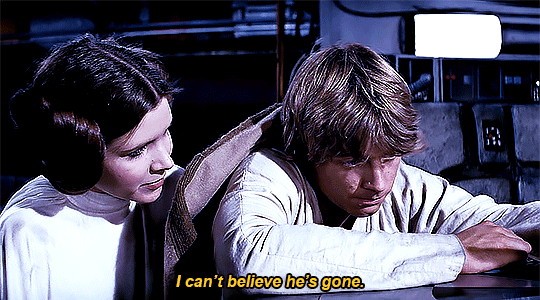
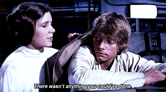
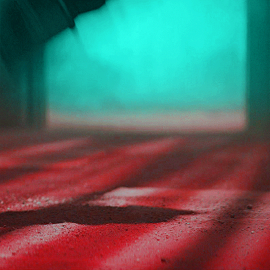
#userdesy
Photo
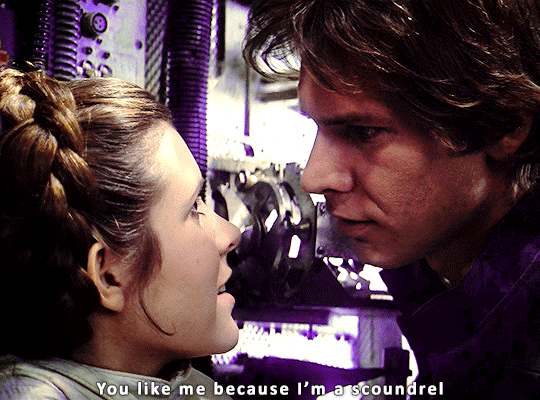
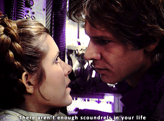
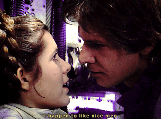

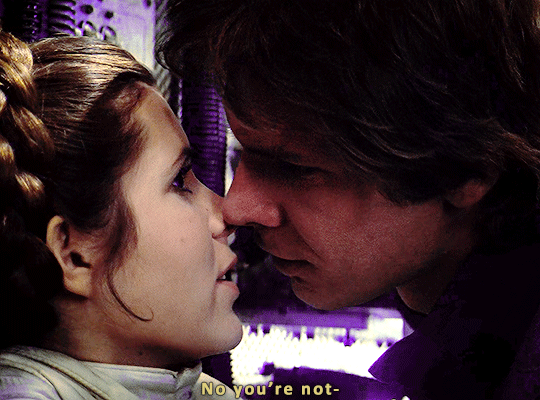
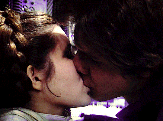
Star Wars: Episode V – The Empire Strikes Back
⤷ dir. Irvin Kershner
#star wars#starwarsedit#swedit#swgifs#starwarsfilms#chewieblog#han solo#leia organa#leiaorganaedit#hansoloedit#userdesy#usercroft#usersavana#userleah#*mine#*gifs#omg i put the wrong director on this initially#i fixed it though
862 notes
·
View notes
Photo

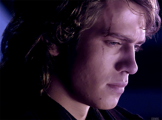
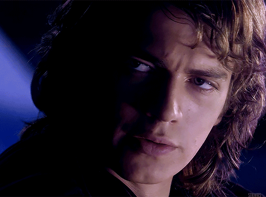
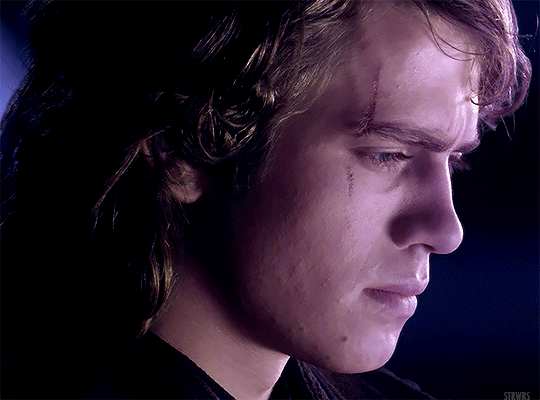
HAYDEN CHRISTENSEN as ANAKIN SKYWALKER
Revenge of the Sith (2005) | dir. George Lucas
#star wars#swedit#starwarsblr#thestarwarsdaily#revenge of the sith#rotsedit#anakin skywalker#*strwrsedits#userlogray#usermullet#xuserann#userparker#xuserash#wynkahthu#userdesy#usershleby#uh oh he's going insane <3
327 notes
·
View notes
Photo
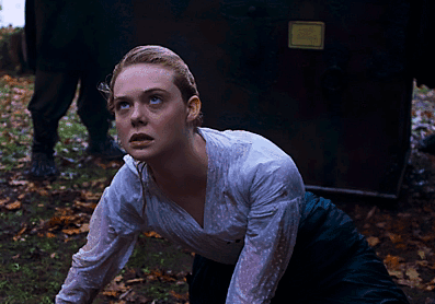

THE GREAT (2020—)
1.01 | The Great
#lanie.edit#the great#elle fanning#thegreatedit#perioddramaedit#efanningedit#efanningdaily#thegreatdaily#perioddramacentral#perioddramasource#userbbelcher#usertelevision#dailytvsource#dailytvfilmgifs#tvandfilm#dailytvandfilm#userpavlova#usermegara#userbarbie#userdesy#usersem#tuserkaitlyn
253 notes
·
View notes
Text
#it’s a hard knock life
MAKE ME CHOOSE -> @matthew-lillard asked DIN DJARIN or LUKE SKYWALKER
#themandalorianedit#dindjarinedit#themandaloriandaily#tbobfedit#swedit#starwarsblr#starwarsedit#tusercora#useralison#userlindir#userdesy#userkosmos#userguinevere#userconstance#usersawah#xuseremily#xuserannie#userobihoe#*#*elios1k#listen i love luke but din is just too relatable#he's just a mood#5k
6K notes
·
View notes
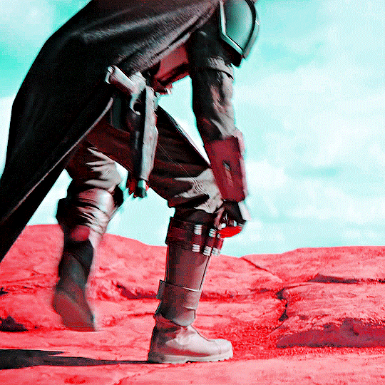
Photo

🤨
#star wars#swedit#starwarsblr#thestarwarsdaily#attack of the clones#aotcedit#obi wan kenobi#usermullet#userlogray#userparker#userdesy#xuserash#wynkahthu#userelio#userobiwans#usermelanie#userobihoe#gif#ours#by em
756 notes
·
View notes
Photo

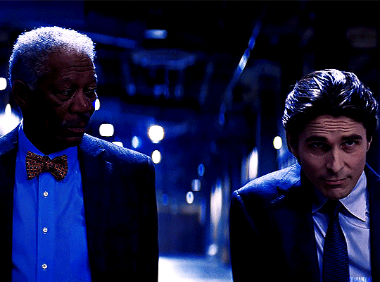

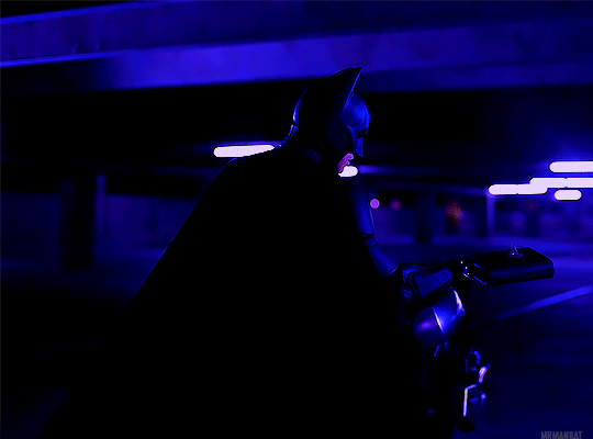


THE DARK KNIGHT RISES
2012 | dir. Christopher Nolan
#dc#dcedit#batman#batmanedit#dcmultiverse#thebatmandaily#the dark knight rises#*em edits#userlogray#lightasthesun#usermimi#lisasnarts#saradika#userdesy#filmedit#hi friends have no fear it is me em#i went ham on the blue for no good reason whoops alskjalsdkj
307 notes
·
View notes
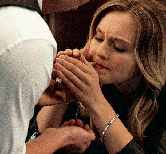
Photo

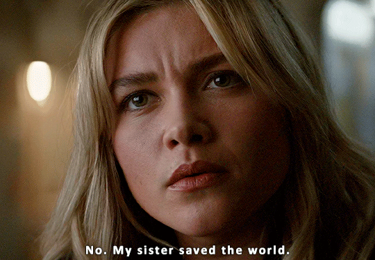

“How has everybody forgiven him for his past?“
#yelena belova#yelenabelovaedit#kate bishop#katebishopedit#hawkeyeedit#marvel#marveledit#mcuedit#marvelgifs#filmgifs#tuserlyn#userashe#tusershay#chewieblog#usercroft#userdesy#*mine#*gifs
531 notes
·
View notes
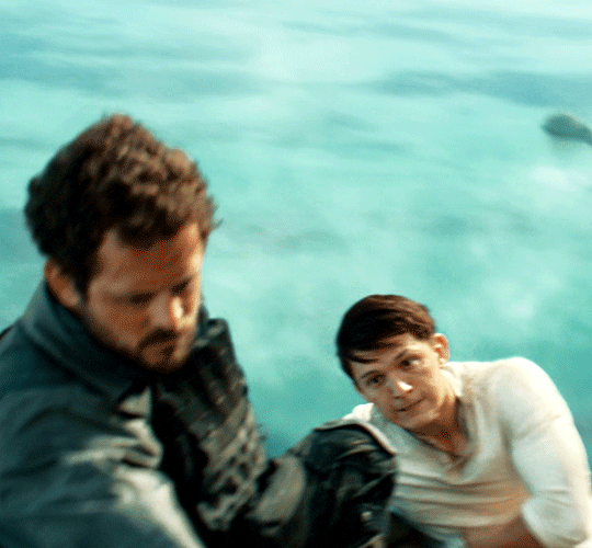
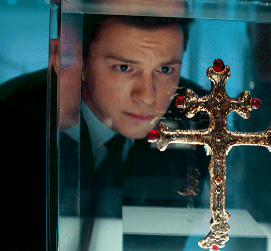
Photo


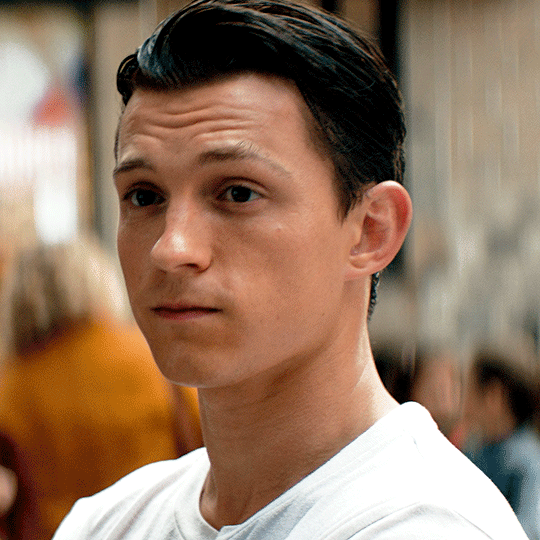
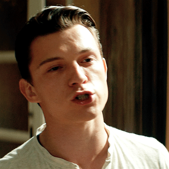
TOM HOLLAND as NATHAN DRAKE
Uncharted (dir. Ruben Fleischer)
#tom holland#uncharted#tomhollandedit#unchartededit#filmgifs#filmtv#tvandfilm#chewieblog#tusershay#userashe#userdesy#usercroft#userdanewhitman#usersavana#*mine#*gifs#he looks so good in this movie
676 notes
·
View notes
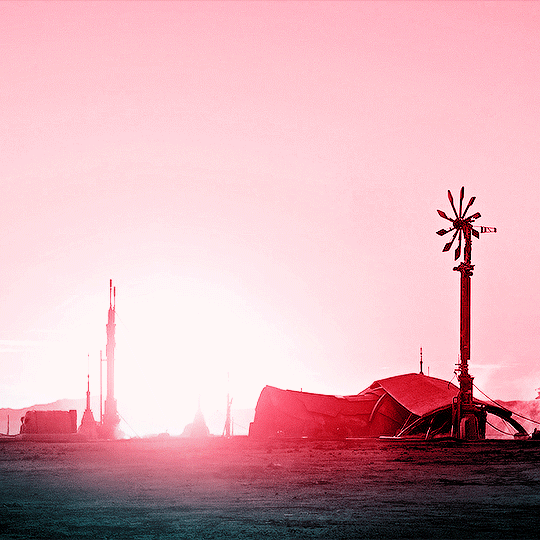
Photo


Watched in 2022:
⤷ MOON KNIGHT (2022) inspo
#moon knight#marvel#moonknightedit#marvelgifs#marveledit#usergif#tusershay#tuserlyn#usercroft#userdesy#userashe#userleah#marveldaily#dailymarvelgifs#dailymarvelheroes#*2022#*mine#*gifs#I saw another set that was similar to this while I was making it and now I can't find the person#but I'm really happy with how this came out since blending and stuff like this isn't my specialty
263 notes
·
View notes
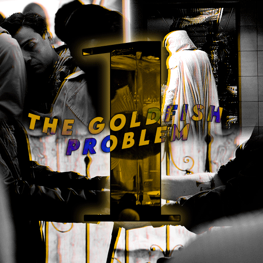
Text

STRWRS’ ICON-MAKING TUTORIAL
Hiiiii welcome to my icon-making tutorial!! I really enjoy making icons, and I thought I’d share how I do it <3
This tutorial is not for beginners!! I don’t explain every step in detail. However, if you have a question about any concept within this tutorial, please don’t hesitate to send me an ask or a dm!! I am happy to help <3 /gen
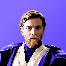
For this tutorial, we’re going to be making the icon you see in the header.
Let’s get to it!! :)
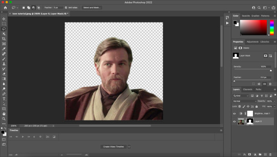
STEP ONE: Open Up the Image in Photoshop

Yay, there he is <3 I got this screencap from this site. They upload screencaps for all live action Star Wars. (They also have screencaps for loads of other movies.)
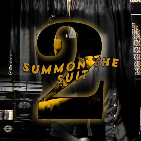
STEP TWO: Crop the Image
You can see in the image below that I added space at the top. This was a personal preference! I recommend playing around with it and finding what you like and what works best for you! It also depends on the image you’re working with.
STEP THREE: Remove the Background
After I crop, I add a brightness/contrast layer and set its blending mode to screen. I do this for all my edits now (tip courtesy of this coloring tutorial by @/spacedjarin), and I adjust the opacity if needed.
The reason I add the brightness layers is to make it so I can view Obi-Wan’s outline better. This will help me to remove the background.
Here’s what it looks like at this point:

Now i select > subject. This is what I get:

I then use the lasso tool to refine the edges. Here’s how to do that:
In the picture below, you can see that the third option is selected. I usually stick to the second and third. The second adds to your selection, and the third subtracts from your selection. It should make sense once you work with it! It won’t be perfect, but we can always fix it up in the next step.

Now I press ‘select and mask’.

This is what comes up:

He looks a little rough around the edges!! Especially on the left side of his face (our right side). I can fix that with the settings to the right. Here are the settings I used and the results:

I cleaned it up a little bit! I’m still eyeing the left side of his face, but I can always fix that later because we’re about to create a layer mask in order to remove the background.
Press OK. Now, press the layer mask icon (the one after fx on the menu underneath your layers).

Voila!! We have removed the background. And we can see our layer mask!!
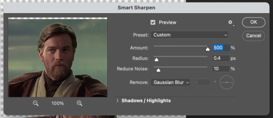
STEP FOUR: Sharpening
Create a group, drag the image and its layer mask inside the group, and then drag the layer mask so it applies to the entire group. It should look like this:

Right click on the image layer and duplicate it. (You don’t have to do this, but i like to just in case something happens. I don’t know what, but laksajsl)
Then I convert the copy of the layer into a smart object. Then I sharpen using filter > sharpen > smart sharpen. Here are my settings:

STEP FIVE: Coloring
I move the brightness/contrast layer into the figure group and then create a group for adjustment layers (i.e., the coloring group) and drag the brightness layer inside. My layers look like this:

I usually do brightness/contrast, curves, (sometimes) channel mixer, selective color, levels and vibrance. And a lot of the time I do multiples of each type of adjustment layer. Depends on what the image calls for!! I just keep going until I’m satisfied with the outcome!!
STEP SIX: Add a Background
After I do some coloring, I want to add a background so I can make sure my coloring matches it and make sure everything looks okay before doing some of the finishing touches.
I have a gradient I previously made all set and ready to go, but I also often use gradients/textures others have made. Check out some of my texture recs here. If you have specific questions about textures or gradients, please feel free to dm me or send me an ask!! I’m happy to help /gen
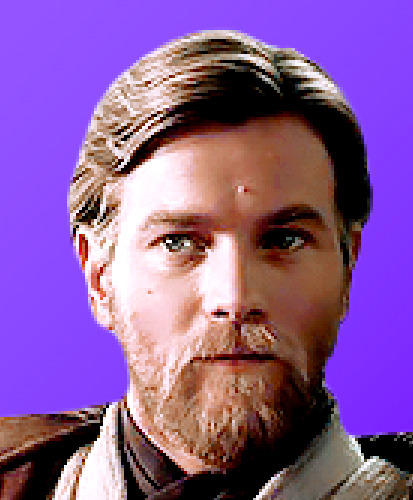
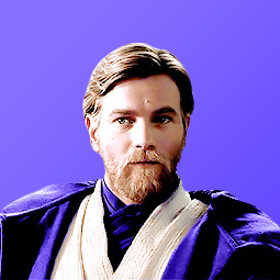
Here he is so far, and look how handsome :) <3

Also!! A good tip for gradients is to position them so the lighter side of the gradient is on the same side as the lighter side of the subject (i.e., Obi-Wan). see how the light hits the right side of his face?? I positioned the gradient so that the lighter side is on his right side. It makes everything look cohesive imo!!
STEP SEVEN: Touch-Up
Now what I’m looking for are crisp lines around the edges of Obi-Wan. i zoom in and look for anything that looks hazy.

See the white haziness around the top of his head?? I’m going to select the layer mask for the figure group and use the brush tool (with a hard brush) to carefully remove the haziness, doing my best to stay around the very outside edges. I think this step makes everything look that much more crispy.
Here’s what it looks like now:
Not a huge change with this image, but with some it makes a world of difference.
STEP EIGHT: “Painting”
Okay moving on!! Now I paint him!!!! (That’s what I call it, at least 👀) I’ll illustrate what I mean and then explain it.
Here’s the icon after i’ve done a little bit of ‘painting’:
And here’s the ‘paint’ layers:

(And my mac’s screenshot function is being weird, so the purple color looks different from what i actually applied [which is #9179ff])
Okay, so I’ll explain how to do it with the example of coloring his robe purple. Here are the steps:
Determine what color you want the robe to be. I used this particular color because I’ve had this purpley color scheme for a while, and I used that hex code to ‘paint’ Obi-Wan’s robe in my mobile header. You can also use the eyedropper tool and select a color from your background. The great thing about using layer masks (instead of coloring on blank layers) for making icons is that you can change up the color if you want and not have to paint the robe all over again!!
Create a solid color fill adjustment layer with that color.
It’s going to turn Obi-Wan that color, so click on the color’s layer mask and remove all of it using the brush tool (using black). Then paint in white where you want the color to go (this shows up as the white spaces on the layer masks).
Once you’ve painted, change the blending mode of that individual color fill layer to whatever looks best to you. You can also change the opacity if you need to. I also used a clipping mask to add vibrance to the purple robe (seen above).
Now I’m going to continue to adjust my coloring and my painting until I’m satisfied!! I will often zoom out quite a bit to see how the icon might look on tumblr’s dashboard. I really try to go for clarity, crispness, and cohesion.
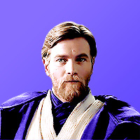
Here he is!! What a guy <3
The only thing left to do now is to image > image size and then change the width and height to 200px x 200px. (Personal preference. I know some people like to do 100 x 100!!) And then to save do file > export > quick export as png.
Here’s the final product:
I hope you enjoyed this little tutorial on how I make icons!! Again, if you have any questions at all please don’t hesitate to reach out. I’m happy to help!! And also please feel free to save and use this icon if you’d like!!
If this tutorial was helpful and/or if you save the icon, reblog this post!! Thank you for reading, and I hope it helped!! <33
#photoshop tutorial#icon tutorial#*strwrstutorials#completeresources#dailyresources#userobihoe#userlogray#usermullet#userdesy#userparker#xuserash#wynkahthu#userelio#to everyone i tagged: pls don't feel obligated to reblog if it's something you're not interested in!!!!#also pls let me know if you'd rather not be tagged in things like this. no hard feelings /gen#10 pm is probably way too late to be posting this but... without further ado#*strwrsedits
262 notes
·
View notes
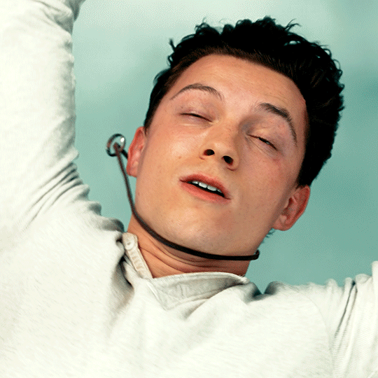
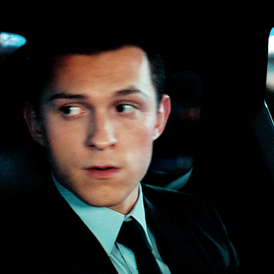
Photo
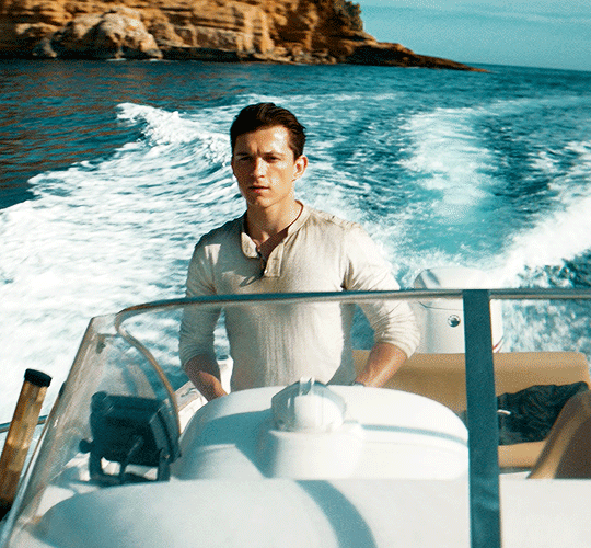


Watched in 2022:
⤷ UNCHARTED (2022) dir. Ruben Fleischer
#uncharted#unchartededit#tom holland#tomhollandedit#filmtv#tvandfilm#filmgifs#chewieblog#tusershay#userashe#userleah#userdesy#usercroft#userdanewhitman#usersavana#*mine#*gifs#*2022
260 notes
·
View notes
Text
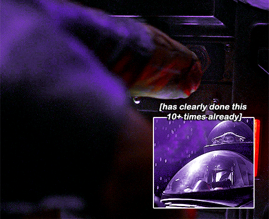
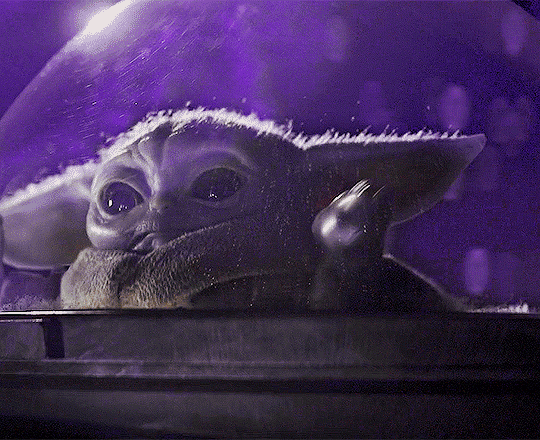
the mandalorian chaotic moments (3/?) / [insp.]
#the book of boba fett#tbobf#dindjarinedit#groguedit#themandalorianedit#tbobfedit#swedit#tusercora#userconstance#userkosmos#userjoanne#usersawah#userobihoe#userdesy#useralison#usernik#tusermaddie#userparker#*chaoticmando#*#help i've been planning to make this scene this episode aired#but then i got lazy and only just finished it#1k#2k#3k
4K notes
·
View notes
Text
#a summary of din djarin [pt. 1]
#dindjarinedit#din djarin#themandalorianedit#swedit#thestarwarsdaily#starwarsedit#starwarsblr#useralison#userdesy#userobihoe#userkosmos#koskareaves#tusermaddie#tuserkaitlyn#userwild#tusercora#xuserannie#userguinevere#tusersoph#*#help this turned out so ugly#let's just ignore how the colouring failed for this one ☠️#tw: flashing#1k
2K notes
·
View notes
Photo


THE SKYWALKERS in 32 BBY & 0 BBY
#star wars#swedit#starwarsblr#thestarwarsdaily#swsource#luke skywalker#leia organa#anakin skywalker#padme amidala#a new hope#the phantom menace#*strwrsedits#usermullet#userlogray#userparker#xuserash#wynkahthu#userdesy#usershleby#userelio#THE SKYWALKER WOMEN COMFORTING THE SKYWALKER BOYS WHILE FEELING TERRIBLE SORROW THEMSELVES#I WILL NEVER SHUT UP ABOUT THIS FAMILY
2K notes
·
View notes
Text


He means more to me than you will ever know.
#the mandalorian#themandaloriandaily#themandalorianedit#dindjarinedit#groguedit#swedit#starwarsblr#tusercora#useralison#userkosmos#userjoanne#tusermaddie#userconstance#usernik#userlindir#userobihoe#userdesy#userparker#usersem#*#flashing gif#NO BECAUSE LISTEN— the way grogu and din Made Each Other Happier <3#1k
2K notes
·
View notes
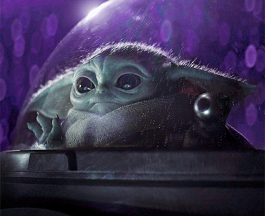
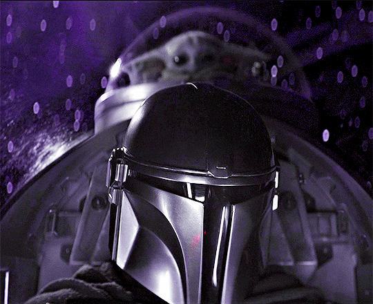
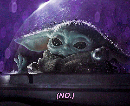
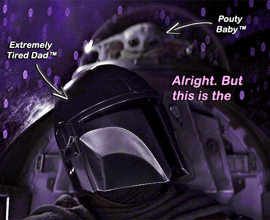
Photo
GIFFING EVERY EPISODE OF THE MANDALORIAN
SEASON 1 EPISODE 1: THE MANDALORIAN
#themandalorianedit#swedit#starwarsblr#dindjarinedit#useralison#userparker#userdesy#userace#usernik#usersem#agentplant#userannalise#userkosmos#userdean#usersalty#userricha#tuserems#userjoanne#*#*everymando#oh look it's me again clowning as i post after midnight
1K notes
·
View notes
Last Seen Blogs

sparkyscs
The Adventures of Sparky

nouseforanamex
What Happened To The Passion?

diaryngtamad-blog
Silver lining dreams.

allconferencealertsnews-blog
Allconferencealerts
bipolarstarchild
Star Hollow