#vanitypress
Text
Beatrix Potter e la Vanity Press
L’anno volge al termine e viene il tempo delle retrospettive. Prima di acquistare una nuova agenda, mi piace sfogliare quella dell’anno appena trascorso e ripercorrere gli avvenimenti, rivedere le note che ho preso, gli scarabocchi che ho fatto.
Oggi sfogliavo quella del 2023 e ci ho trovato una vignetta dedicata a Beatrix Potter. L’aneddoto che la accompagnava diceva più o meno così: “Nell’aprile del 1885, la giovane Beatrix riceve in regalo un coniglietto, che presto diventa il protagonista del suo primo libro illustrato “La storia di Peter Coniglio”. Il testo venne pubblicato dalla stessa Beatrix con i suoi risparmi.”
La didascalia mi ha incuriosita e ho chiesto all’oracolo di Wiki di illuminarmi sull’intera faccenda.
A partire dal 1890, per guadagnare qualche soldo, Beatrix e il fratello iniziarono a creare e stampare biglietti di auguri di Natale e per altre occasioni speciali, usando come soggetti principali topi e conigli e distinguendosi per l'uso di uno stile del tutto personale. (...)
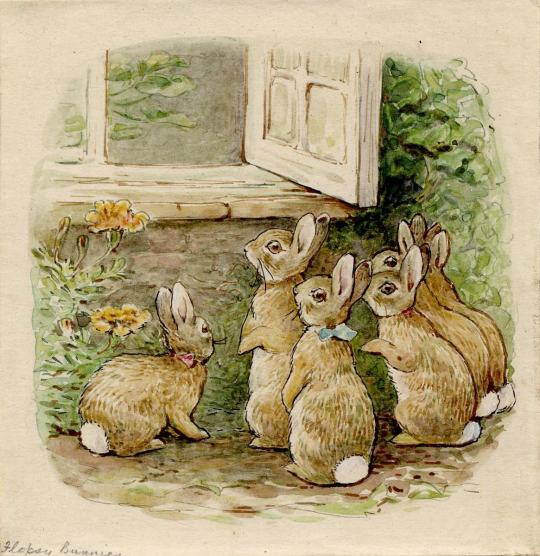
La svolta nella carriera artistica di Beatrix maturò lentamente; può essere contrassegnata da una lettera che scrisse il 4 settembre 1893 e che sette anni dopo ebbe degli sviluppi imprevisti. Inviata a Noel Moore, il figlio maggiore della sua ex governante Annie Carter, spesso malato, raccontava "la storia di quattro piccoli conigli i cui nomi erano Flopsy, Mopsy, Coda di cotone e Peter...". Stimolata dall’incoraggiamento rivoltole da Annie di sfruttare la sua abilità nel raccontare e disegnare storie, Beatrix utilizzò le lettere e il materiale illustrativo contenuto per realizzare il suo primo libro per bambini, dal titolo “The Tale of Peter Rabbit”.
Il libro venne rifiutato da ben sei case editrici, ma Beatrix non si arrese e decise di stampare lei stessa 250 copie che riuscì a vendere in breve tempo.
L'anno dopo, il 2 ottobre del 1902, il libro fu apprezzato e pubblicato dalla Frederick Warne & Company, che pose a Beatrix come condizione di realizzare illustrazioni a colori e non più in bianco e nero.
Ora, erano altri tempi, la concorrenza nel suo settore era abbastanza inesistente ecc, ecc. Però, ciò che mi interessa di questa storia e l’atteggiamento di Beatrix verso il suo progetto editoriale. La signorina Potter era una ragazza di trent’anni che è stata capace di investire nella propria idea, che ha saputo scommetterci per prima, guardando al suo libro come un’imprenditrice.
Nel quotidiano mi capita spesso di sentire casi in cui gli autori chiedono all’editore di investire nel loro manoscritto quasi a scatola chiusa. Si offendono se viene proposto un editing importante, per non parlare di quando ricevono un cortese rifiuto. Troppi si avvicinano al mondo della scrittura con ambizioni unicamente economiche e prive di alcun realismo. Pochi sono disposti a studiare, crescere, migliorare, anche facendosi affiancare a proprie spese da figure professionali come book coach, editor o anche correttori di bozze indipendenti.
Se vuoi imparare a suonare il piano, paghi un insegnante per darti lezioni.
Se vuoi scrivere un romanzo… beh, perché pensi di poter fare tutto da solo?
E qui viene la mia riflessione sulla vanity press e l’editoria a pagamento. La prendo un po’ larga, ma quanto segue è utile per osservare dinamiche reali e soprattutto attuali di questo settore.
La scorsa primavera ho iniziato a lavorare nella redazione di due marchi editoriali di proprietà di Services4Media: S4M Edizioni e Arbor Libri.
Mentre il secondo marchio è dichiaratamente non a pagamento e risponde a una linea editoriale molto specifica, la S4M edizioni si basa su criteri diversi. Si tratta di una piccola casa editrice con sede ad Albano Laziale, che ho avuto modo di visitare di persona in occasione della mia partecipazione a Più Libri Più Liberi, e che ha anche un punto vendita graziosissimo in pieno centro storico.
Vedere quella realtà mi ha fatto riflettere molto sulle opinioni generalizzate degli autori emergenti rispetto alla vanity press, che viene diffusamente descritta come il Male Supremo.
Non fraintendetemi, sono ben consapevole che il fenomeno dell’editoria a pagamento è contraddittorio e vanta, nella maggior parte dei casi, e a ragione, di una pessima reputazione. Chi si affida a un editore a pagamento finisce spesso per scoprire di essere vittima di una truffa commerciale che fa leva su disturbi narcisistici ed ego scalpitanti.
Tuttavia, farsi un’idea radicale su un fenomeno simile non consente di vedere il panorama nel suo insieme, di capire a quali necessità risponde e per quale motivo trova effettivamente una sua ragion d’essere.
Osserviamo quindi questo caso specifico: la S4M edizioni NON è una casa editrice a pagamento, però – e questo lo dico con estrema trasparenza – propone un rapporto ibrido con l’editore, chiedendo ai suoi autori di impegnarsi ad acquistare trenta copie del proprio libro solo e soltanto durante la prima tiratura. Perché? Per più ragioni e ora ve le racconto.
La S4M Edizioni nasce da una costola di Services4Media, un’azienda tipografica che serve più di 300 marchi editoriali su tutto il territorio nazionale. Nel 2016, l’imprenditore e proprietario Luca Falco si trova a intercettare le necessità editoriali di un gran numero di clienti privati con ambizioni letterarie.
Lui risponde dicendo che il suo core business sono le soluzioni tipografiche, che – e lo confermo personalmente – opera con genuina dedizione. Però non dispone di professionisti in grado di dare supporto redazionale.
Così, a un certo punto, incoraggiato anche dal suo staff, decide di rispondere all’appello e apre la S4M Edizioni per supportare, all’inizio, autori di Lazio e Puglia, facendo una cernita delle proposte migliori e offrendo servizi editoriali professionali gratuiti con un’unica condizione: l’impegno da parte dell’autore a investire su se stesso e coprire i costi delle prima tiratura minima.
In questo modo, progetti editoriali validi che non trovavano spazio in altre case editrici per questione di pertinenza alle collane o appeal commerciale, hanno potuto comunque prendere forma; soprattutto autori che desideravano muovere i primi passi nel mondo dell’editoria hanno potuto realizzare il loro sogno e fare esperienze preziose.
A me questa non sembra disonesto. Mi sembra piuttosto una risorsa da usare consapevolmente.
Situazioni come questa – e, attenzione, non voglio generalizzare su tutta l’editoria a pagamento, vanno accostate con coscienza: chiedetevi cosa state cercando, perché volete pubblicare, cosa volete pubblicare e quanto potete apprendere da questo percorso iniziale.
Imparate a valutare queste operazioni senza criteri basati sulla performance economica risultante, piuttosto adottate una griglia di valutazione che misura l’apprendimento, l’esperienza, l’incontro di persone nuove, il miglioramento generale nella scrittura.
Investire nella pubblicazione del vostro primo libro serve a voi per raccogliere dati sui lettori, dati su voi stessi di fronte ai feedback altrui, serve a farvi conoscere da un primo bacino di utenti. In definitiva, serve a farvi le ossa come autori di oggi.
Un’opportunità molto interessante offerta dalla S4M Edizioni, per esempio, è la presenza nelle fiere nazionali. Amazon con l’autopubblicazione non vi consente di sperimentare in questo contesto con il vostro libro; non vi offre il supporto di un moderatore durante le vostre prime presentazioni né il parere di un consulente sui vostri prossimi scritti.
Imparate a sfruttare queste occasioni che, seppure modeste, arricchiscono. Non chiudetevi una porta per un pregiudizio.
L’editoria a pagamento, l’autopubblicazione, e spesso anche la piccola editoriale tradizionale non sono la via per il successo editoriale o per diventare bestselleristi. Servono a capire se pubblicare vi piace ed è davvero la vostra strada.
Senza S4M edizioni, quest’anno testi come “Le scèche de Bare”, un interessante saggio di Marco Lamacchia, o romanzi come “L’impersonatore” di Naila Carlisi o “Stabilità di forma” di Filippo Mola, non avrebbero trovato nuovi lettori a Più Libri Più Liberi. Romanzi come “Insula” di Jessica Salmeri non sarebbero stati presentati a case editrici estere presso il Right Center.
Probabilmente nessuno di questi diventerà un successo editoriale in termini di royalties per l’autore, non sono testi pensati per questo infatti, ma io l’ho vista la gioia degli scrittori che ci credono e che si emozionano di fronte a un nuovo lettore, a una chance di condivisione, e questo, a parer mio, è già qualcosa.
0 notes
Photo

Jim McCann “Maiden Voyage”
#records#lps#albums#vinyl#private press#vanitypress#vanity LPs#mccann#guitar#vinyl addict#mustache#beard#record covers#recordcovers#albumcovers
3 notes
·
View notes
Photo
Our second Blog post is published - http://fourheartspublishing.com/four-hearts-blog/getting-scammed-in-the-publishing-world #avoidscams #publishing #fourheartspublishing #bookstagram #newwriters #aspiringauthors #beginners #writingcommunity #writers #authors #vanitypress #writersbeware https://www.instagram.com/p/CQxyGXfFdoa/?utm_medium=tumblr
#avoidscams#publishing#fourheartspublishing#bookstagram#newwriters#aspiringauthors#beginners#writingcommunity#writers#authors#vanitypress#writersbeware
0 notes
Text


0 notes
Photo

Mechón rebelde #vanitypress #nomakeup #selfie #lazysunday #nofilter
1 note
·
View note
Video
Rainy days are perfect for making a small book #vanitypress #70s #photographs #canonF1 #rolleiflex #schwarzeaufweiß #blancoynegro #blancinegre #SiyahreBeyaz #bnw @ilfordphoto #fp4 #hp4 #film #blancetnoir #黑与白 #Hēiyǔbái #siyahbeyaz #白黒 #shirokuro #blackandwhite #filmisnotdead #istillshootfilm #filmisalive #pdx #portland #nw #northwest #leftcoast #oregon
#rolleiflex#photographs#blancinegre#白黒#blackandwhite#siyahrebeyaz#70s#canonf1#pdx#blancoynegro#filmisalive#hp4#shirokuro#vanitypress#film#oregon#blancetnoir#leftcoast#nw#filmisnotdead#istillshootfilm#schwarzeaufweiß#fp4#黑与白#bnw#northwest#siyahbeyaz#hēiyǔbái#portland
1 note
·
View note
Link
Let’s talk about the disadvantages of vanity presses. Never. Pay. To. Publish.
0 notes
Text
.Second Class...
"let's plan our books"
First Artist:
-----------------------------------------------------------------------------------------------------------------------------
.First Class…
"It will be all about portals and how we find them."
First Artist:
The first artist is called Fiona Banner, we will shortly explore how she used full stops as matter to create Art. She interpreted the full stops as more than just simple round marks, giving them life and meaning by viewing it from different perspectives and dimensions.
Starting Points
Can you open a text document on your computer (could be Word, Pages, TextEdit or InDesign)
Type in a full stop .
.
Using the font selector choose a font for the full stop.
Make a note of the name of the font beside the full stop
. Copyshop
Change the size of the full stop to 100pt or as large as you can!
Try changing the font. Each typeface has a different shape full stop.
. Copy Shop
.
Make a quick sketch of the shape of your full stop.
Now try to sketch it as a 3 dimensional object.
After you have finished drawing find out some more about the font that you have chosen.
Is it a serif or san-serf typeface? Who designed it? When and what for?
Artist Research: Fiona Banner Full Stops
Artist Book http://www.fionabanner.com/vanitypress/periodbook2019/index.htm
Inflatable https://www.youtube.com/watch?v=pgbf8a1XaLU
Scultpure https://www.youtube.com/watch?v=B0mt_0xPeoE
Activism https://www.greenpeace.org.uk/news/artist-fiona-banner-why-i-delivered-a-1-25-
tonne-boulder-sculpture-to-the-government/
Reference https://www.youtube.com/watch?v=q-3yqy-IYnU
My first attempt:
ps: It is interesting to see how full stops can have many shapes depending of its fonts.
SECOND ARTIST:
Daniel Spoerri (born1930) is a Swiss artist and writer born in Romania. Spoerri is best known for his “snare-pictures,” a type of assemblage or object art, in which he captures a group of objects, such as the remains of meals eaten by individuals, including the plates, silverware and glasses, all of which are fixed to the table or board, which is then dis-played on a wall. He also is widely acclaimed for his book, Topographie Anécdotée* du Hasard (An Anecdoted Topography of Chance), a literary analog to his snare-pic- tures, in which he mapped all the objects located on his table at a particular moment, describing each with his personal recollections evoked by the object.
In 1961 artist Daniel Spoerri wrote an artists book called ‘An Anecdoted Topography of Chance.’ He mapped the objets lying at random on the table of his room, adding a rigorously scientific description of each.
He wrote it when he was living at the Hotel Carcassone in Paris, in room number 13 on the fifth floor. To the right of the entrance door was a table which his wife Vera had paint- ed blue. Spoerri drew on a ‘map” the overlapping outlines of all the 80 objects that were lying on the table on 17 October 1961 at exactly 3:47 p.m. Each object was assigned a number and Spoerri wrote a brief description of each object and the memories or associ- ations it evoked. The descriptions cross referenced other objects on the table which were related. The Topographie Anécdotée* du Hasard was printed as a small pamphlet of 53 pages plus a fold out map and index and was distributed as an advertisement for the exhibition.
Spoerri is also closely associated with the Fluxus art movement, a movement formed in the early 1960s, “characterized by a strongly Dadaist attitude, [whose] participants were a divergent group of individualists whose most common theme was their delight in spontaneity and humor.”
We will use Spoerri’s book as a starting point to reimagine the study applied to our studio desks. This is an exercise in object documentation, storytelling and desktop publishing.
PORTAL THE PLAN
Choose 3 items from a portal in your room (a bag, a pocket, a draw, the fridge, a cupboard, etc) and place them on the table in front of you.
Draw a map or birds eye view of the objects on an A4 or A3 piece of paper. Number the objects and make a list with the numbers and names of the objects.
Fold the paper into quarters and turn it over. Start exercise 1 in quarter 1
Exercise 1. Written description
.
Select object 1. Study it closely. Write a detailed description of the object,
You could write about what it looks like, its function, its history or its relationship to you. Ask a question about it. Write small and fill up a quarter of the page.
Exercise 2: Drawing
Select object 2. Draw a still life of the object and title the drawing - but not with the name as the object.
Exercise 3 Instruction
Select object 3. In under 140 characters write an instruction that someone could do do with this object.
Exercise 4. Photograph the portal
Select object 4. Photograph the portal where the objects came from.
Can you use this image as a starting point to design a cover for the publication?
You now have a page plan for your poster/leaflets publication
DESIGN
Create a new version of your sheet of paper using a desk top publishing programme; Indesign, Photoshop, Illustrator or if you prefer to work without a computer redraw or make a collage.Work with the different elements to create a visually interesting poster, folded sheet or small booklet.
Result:
"I Tried to recreate it on my sketchbook, in a way that I could keep it tidy and interesting."
1 note
·
View note
Text
ARTIST BOOK - Fiona Banner artist research
BOOK/ZINE MAKING
Artist research - Fiona Banner
Fiona Banner is an artist and bookmaker whose most noteable work was centred around punctuation, more specifically the fullstop. This work was born through her scrolling through the many different inspiringly names fonts she found on her computer and was fascinated by how the fullstop changed from font to font. So she began her project on the tiny fullstop, not knowing the lengths to which it would evolve. Banner treated the fullstop as her portal to a whole body of meaning, it was almost as if the small dot was a physical portal to an enitre world in her mind.
As shown below, Banner’s work started off small, focusing on the minute details of this tiny piece of punctuation by making books catloguing the variations between fonts. This then blew up into something of extreme proportions such as the giant granite fullstops she placed in London as a piece of activism.


Expanding one piece of punctuation into a complete visual study - Fiona’s fullstop exploration featured many approaches and media types, some that I found particularly interesting include:
- Creating a flip book animation of the various full stop shapes and sizes following on from her book ‘PERIOD’ that featured them in a catalogue.
- ‘PERIOD’http://www.fionabanner.com/vanitypress/periodbook2019/index.htm
Banner created a white covered book covered in the word ‘PERIOD’ in which she collated many of her full stop inspired works (e.g. a large printed variety of different font’s full stops and an illustration of giant full stops floating in the sea etc)
- Animation https://www.youtube.com/watch?v=q-3yqy-IYnU
Stop motion pro trial - between the magnitude of the huge sculptures and the printed media, the clay stop motion acted as a middle ground between 2D and 3D and between the stagnant and the dynamic - she’s bringing the fullstops to life. She’s bringing personality and life to this original dot.
- Inflatables https://www.youtube.com/watch?v=pgbf8a1XaLU
She also endeavoured into creating a collection of large inflatables, all a unique shaped and sized as based off of the varying full stop fonts. Not only was this fun and entertaining but carrying the same message that the fullstop represents through - this also signified the shift from 2D to 3D in Banner’s work.
- Scultpure https://www.youtube.com/watch?v=B0mt_0xPeoE
After making the journey between 2D and 3D practice within this project, Banner moved to a more heavyweight material by implanting granite fullstops in significant locations in London (outside Downing street/in the city centre). The magnitude and weight of these sculptures echoes the permanence of a full stop.
- Links to Activism https://www.greenpeace.org.uk/news/artist-fiona-banner-why-i-delivered-a-1-25-tonne-boulder-sculpture-to-the-government/
“This week Greenpeace activists and I dropped a 1.25 ton Full Stop sculpture onto the doorstep of the Department of Environment, Farming and Rural Affairs (Defra) in support of Greenpeace’s Dogger Bank boulder barrier.”
Since the full stop can be considered quite a firm piece of punctuation, Banner has associated it with her areas of activism to symbolise that ‘enough is enough’.
Response:
As an initial reaction to Banner’s practice, I explored some of the fonts that my computer had and now they impacted the fullstop.


How you can look at something closely and derive multiple works from it:
attach personal meaning/purpose to it (using it for activism or to represent something important to you)
give it life, personality and a backstory
stretch it beyond its original dimensions/mediums
explore the meaning of it across multiple scenarios (to others in public, in private, in a gallery, digitally/physically)
1 note
·
View note
Text
What Writers Need to Know About Using a Vanity Press nce an author finishes a manuscript, they have many publishing options available to them, and one of those options is a vanity press #vanitypress #publishing #writertips https://t.co/w5QerzwgXz
What Writers Need to Know About Using a Vanity Press
nce an author finishes a manuscript, they have many publishing options available to them, and one of those options is a vanity press#vanitypress #publishing #writertipshttps://t.co/w5QerzwgXz
— Stacey Carroll (@shadowconn) July 11, 2020
from Twitter https://twitter.com/shadowconn
1 note
·
View note
Audio
Shigeto
Pusher
(2019)
From the EP:
Shigeto
(Vanity Press)
0 notes
Photo

Mary Hawk “The Many Moods Of...”
#lps#records#recordcovers#albums#vinyl#phonographrecords#gospel records#christian#maryhawk#vanitypress#private press LPs#privatepressrecords#privatepressing#montage
4 notes
·
View notes
Text
QA: D. STRANGE
Photography by: a.r.e.
1. Who are you?
D. Strange….a working class musician obsessed with the concept of sound and rhythm
2. What do you do?
I Inform the masses of what the source of this music (techno) is….show love to the people in my hood and likeminded souls across the globe…dream of a world where we (black people) finally get what we deserve…
3. Where do you often create / produce?
In my…
View On WordPress
0 notes
Audio
TTTT MIX 08 - David Marroquin (Vanity Press)
0 notes
Video
From the Blanket Fort, Episode 2: Let’s Find a Small Press #johnnypress #johnnyartpavlou #johnpavlouartist #alittlesomething #frederickfranck #selfpublish #smallbooks #johnnyart #1995 #slipcase #inspirational #graphicessay #faith #pretentiousdrivel #unpublished #unpublishable #giftbooks #hallmark #hallmarkbook #hayhouse #waynedyer #vanitypress #vanityprojects #bigsubject
#johnnyartpavlou#graphicessay#johnpavlouartist#slipcase#johnnypress#frederickfranck#selfpublish#unpublished#vanitypress#smallbooks#vanityprojects#unpublishable#johnnyart#waynedyer#hallmarkbook#1995#hallmark#bigsubject#inspirational#pretentiousdrivel#hayhouse#alittlesomething#giftbooks#faith
0 notes
Photo
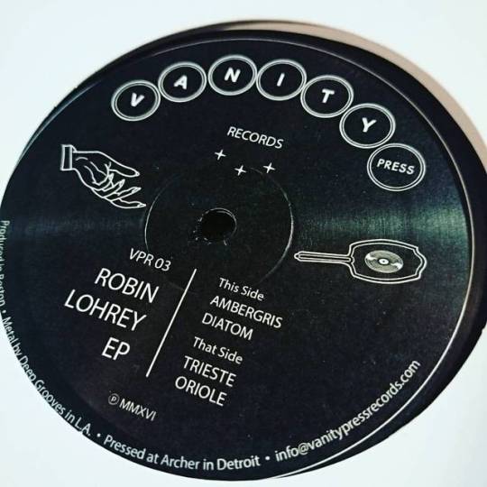
ROBIN LOHREY / ROBIN LOHREY EP : VANITY PRESS (12") アメリカで最も歴史のある音楽教育施設といわれているニューイングランド音楽院にてクラシック・ピアノやジャズを学んだという新鋭アーティストRobin Lohreyが12インチをリリース!淡々とディープだけど味わい深~いナンバーから、繊細で起伏に富んだ展開の楽曲まで、豊かな音楽性&才能を感じずにはいられない洗練されたディープ・ハウス~ディープ・テック・ハウスを4トラック収録! http://www.stradarecords.com/shop/item/18379/index.php #robinlohrey #vanitypress #deephouse #housemusic #techno #techhouse #12inch #dj #record #vinyl #vinyljunkies #stradarecords #recordshops #recordshop #recordstore (Strada Records)
#record#recordstore#techhouse#recordshops#recordshop#vinyl#12inch#vinyljunkies#techno#vanitypress#dj#stradarecords#deephouse#robinlohrey#housemusic
0 notes
Last Seen Blogs

bhaalrespawn
slithering, wet malice

nathanmalonis-blog
Nathan Malonis

ahealthieryou-blog1
Untitled

iselacarley-blog
Mega Keto Diet

blackcrumbs-blog1
Aqui tem de Tudo e Mais um Pouco