#very inspired by Virgil finlay for these
Text
Pulp: Cover Art by Distinguished Artists
Last semester, Professor Jessica FitzPatrick’s class, Narrative & Technology, visited Archives & Special Collections to work with an array of materials including science fiction pulp magazines, science fiction fanzines, comic books, and artists’ books (just to name a few). For extra credit, students had the opportunity to submit a blog post to be featured on our Tumblr. What a perfect fit for #scififriday!
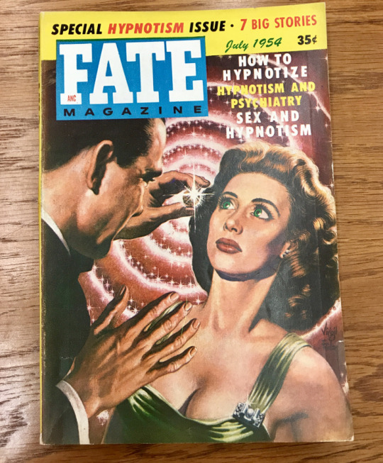
Figure 1: The artwork of Virgil Finlay for Fate Magazine
We often emphasize the importance of first impressions. The very first time that we meet someone or see something makes all the difference. I experienced this phenomenon when encountering science fiction pulp magazines for the first time. My eyes were first drawn in by the vibrant colors on the front page and then my gaze lingered as I glanced over the provocative headlines and the female on the front cover. This visual experience made me eager to learn more about these cover artists and their contributions to the production of pulp magazines.
After doing some research, I found that many cover artists became as popular as the authors of the pieces within. While the editors of these magazines made decisions about the glossy paper to print the covers on, the artists used these choices to their advantage. They utilized sleek, higher quality paper for their artwork that contrasted with the cheap and rugged pulp paper inside. Interestingly, these covers would sometimes be designed before any content of the magazine was written (“Pulp Magazine”). In other words, artists would look to the cover art for inspiration. For this project, I focused specifically on the artwork of Virgil Finlay for Fate Magazine and the artwork of Richard Van Dongen for Astounding Science Fiction. I will be commenting on visual techniques and themes used on these covers that served the purpose of gaining the readership of their intended audiences as well as fueling the content written within.
The first pulp cover that I examined was by a well-known cover artist at the time, Virgil Finlay. An obvious feature of this cover is the portrayal of the typical damsel in distress female. To go along with this are the words, “sex and hypnotism”, which indicate the provocative and exploitative nature of this pulp. This sexualized depiction of women was a common feature of sci-fi pulps that were targeted toward a largely male audience. Finlay’s style for this particular art piece is one of very bright, contrasting colors. This differs from much of his work in which he used black ink with a scratchboard technique. For these black and white illustrations, Finlay used a sharp blade to scratch away white lines from a clay board covered in black ink (Parker). While black and white ink creates an obvious contrast, Finlay chose to use the colors red and green to create a similar effect in this cover art. He cleverly chose to color the woman’s dress green to make her stand out against the swirling red background. Another indicator of her importance to the interest of perspective pulp readers is that we get to see her full face, while we only get to see the side profile of the hypnotist.
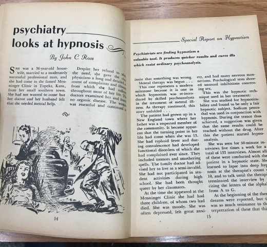
Figure 2: Psychiatry Looks at Hypnosis by John C. Ross
As you can see from Figure 2, the cover serves as a good indication of what is published within. In the piece, “Psychiatry looks at Hypnosis,” there is an illustration depicting a male psychiatrist conducting an evaluation on a troubled female figure. While she is not portrayed as provocatively as the female on the front cover, she is positioned in the foreground of the image. The focus remains on the female, while the psychiatrist remains in the background. While I am uncertain if Finlay’s cover art for this pulp was produced before the written content, that is my speculation based on this connection between the female figures in each.

Figure 3: The artwork of Van Dongen for Astounding Science Fiction
The other pulp artist that I came across offered a contrasting style with the art of Finlay. Van Dongen used a different method than the female physique to appeal to the largely male readership. He relied instead on a realistic style that matched the pulp editor, John W Campbell’s vision of a “more dignified” looking science fiction pulp (Gustafson, Nicholls, Westfahl, & Langford). Rather than illustrating a female in bright colors, he relied on the oddity of an alien creature sharing some brews with the captain of a ship (Figure 3). His colors are more dull and there is not one thing that sticks out more than others. This cover did not catch my eye in the same way, but it still serves a purpose. It is far less provocative than the cover of Fate Magazine which may suggest that the authors of Astounding Science Fiction (and its artists) made the effort appeal to those who are more interested in genre of Science Fiction itself.

Figure 4: An article found withing Astounding Science Fiction
As the front page had led me to guess, one of the pieces inside of this pulp seemed to be targeted toward those interested in the subject of science itself. On one of the first pages of this pulp, there was an article about an electric kit for “brainiacs” (Figure 4). There is an illustration of a male to go along with this, of course.
Virgil Finlay and Van Dongen were two distinguished pulp artists with very different styles. Finlay began his career in 1935 where he began doing interior magazine illustrations. In addition to this, he also illustrated the cover art of upwards of 60 magazine covers. He is well-known for both his mentioned black-and-white style as well as the color illustrations such as the one for Fate Magazine. He was nominated for seven Hugo Awards (science fiction literary awards) and inducted into the Science Fiction Hall of Fame in 2012. (Gustafson, Nicholls, & Westfahl). Van Dongen on the other hand, entered the science fiction field in 1950 after going to school and training in retouching photographs. During his career, he painted over 40 covers for Astounding Science Fiction as well as Worlds Beyond, Space Science Fiction, and Science Fiction Adventures. Van Dongen received the Hugo Best Artist award in 1959 for his work in Astounding Science Fiction (Gustafson, Nicholls, Westfahl, & Langford). Finlay and Van Dongen each made a name for themselves in the field of science fiction pulp. The similarity that they share is the ability of their artwork to draw in readers and to fuel the content of what lies on the pages within.
Works Cited:
Gustafson, Jon, Peter Nicholls and Gary Westfahl. “Finlay, Virgil.” The Encyclopedia of Science Fiction. Eds. John Clute, David Langford, Peter Nicholls and Graham Sleight. Gollancz, 18 Jan. 2017. Web. 19 Mar. 2018.
Gustafson, Jon, Peter Nicholls, Gary Westfahl and David Langford. “van Dongen.” The Encyclopedia of Science Fiction. Eds. John Clute, David Langford, Peter Nicholls and Graham Sleight. Gollancz, 2 Apr. 2015. Web. 19 Mar. 2018.
Parker, Charley. “The Dark and Light of Virgil Finlay.” Tor.com. N.p., 31 July 2013. Web.
“Pulp Magazine.” Wikipedia. Wikimedia Foundation, n.d. Web. 16 Feb. 2018.
-Lydia Belezos, undergraduate, University of Pittsburgh
27 notes
·
View notes
Text
Thurs/03/2020’portraits
Overview of what we did in lesson:
- we did 12 blind collage compilation drawings made from pictures in magazines and cut up pieces to make weird looking faces.
- We had to make sure each was purposeful, pace each peace and do them using continuous line techniques.
- The way we did them looked like our hands were in some kind of trance dancing by re exploring over the image.
- The he process we used was looking at the object, then light, then eye, then information, then arm, then hand, then object and then repeated individually for each piece.
Part two of the session was looking at expressive form drawings and creating our own in the style of Luke Dixon.
- we made one a3 contour black and white self portrait image of ourself
- Photocopied the end outcome in a4 to work back into and colour
- Developed further at home with digital enhancements.
Artists we looked at :
Virgil Finlay- old American pulp scratch artist who was known for scratching intaglio style art prints on black paper to get the white from underneath. He was majorly popular because at the time this was a very lengthy process and he was one of the only artists known to do it. Inspired our part one to our session because we were using ink and markers to black out large parts of our drawings to leave the white highlights like his.
Here are a couple of examples of his work:

Luke Dixon- English artist known for his digital contour style artwork. His art is based on people’s faces and uses contour lines of the skin like on maps to build up the depth and highlights of the face instead of using colour or shading. We did this exact thing in part two of our session, so all our work from today links back to him and was inspired by him. An image of his own work in his own style as an example:
How we made our Luke Dixon inspired work:
- take a photo of our face
- Print out on a3
- Draw out all different colour tones on our face as shapes
- Use a light box and another plain a3 piece on top
- Trace through just the contour lines we’ve just drawn out nothing else
- Fill in the details with the lines contouring and going in the shape of our face
- Thinner together each line the darker the area of skin.
How we made our Francis bacon inspired work.
- ripped up and stuck together loads of images of facial parts and body parts from magazines and celebrity photos to create a distorted face
- Put a pen through the middle of a piece of paper and then your hand under neath to make it impossible to see your pen nib.
- Use continuous line just by looking at your collaged image to make a weird looking continuous blind line drawing
- Take away the blind aspect and work back into it in pen and ink to make monstrous looking pieces of work.
0 notes
Text
Sensor Sweep: Algernon Blackwood, Irish Dogs, Snipers, Battle Angel
RPG (Tenkar’s Tavern): We’re very excited to announce the next release in our Original Adventures Reincarnated line: Expedition to the Barrier Peaks! As with previous releases in the OAR series, this one will include scans of the original 1E editions, a conversion to 5E, and new 5E material filling in some gaps from the original 1E module.
OAR3: Expedition to the Barrier Peaks is slated for a September release. It will be solicited to distributors soon and will be available for pre-order once the book is at the printer.
Anime (Fantasy Literature): “They say if you try making anime for 3 days, you’ll never be able to quit and that in 3 days you’ll also be broke. But even if I were to go broke, I still don’t think I’d be able to quit.” These words from Tezuka, upon receiving an award late in life, express his passion for his work in anime, but he had an equal passion for manga.
Fiction (James Reasoner): I backed the Kickstarter for this anthology, and now that it’s been published and I’ve read it, I’m glad I did. It’s an excellent collection of military fiction, some with contemporary settings, some historical. I’ve always liked war stories, and these are very well done. My favorites are “A Place More Kind Than Home” by Ron Farina, a tale of a Marine coming home from Vietnam that does a perfect job of capturing the mid-Sixties era.
Fiction (DMR Books): So, there I was rereading my Altus Press edition of “The Moon Pool.” As I’ve noted elsewhere, this edition features all of the great Virgil Finlay illos for “The Moon Pool” as reprinted in Famous Fantastic Mysteries. As I gazed once again upon Finlay’s striking illustration of the moment when Dr. Throckmartin’s colleague, Charles Stanton, is taken into/devoured by the Dweller in the Moon Pool, a thought occurred to me. The estates of Merritt and Finlay really missed the boat when they did not take the opportunity to have Finlay’s illo made into a black light poster.
Cinema (Jon Mollison): Up for some pro-Russian propaganda? I got a flick for you. Be warned, though. It’s half cool, half head-slapper. A Sniper’s War presents the story of Deki, a Serbian who enlists in the Russian backed “Ukrainian Separatist” movement that sprung up in the district between Ukraine proper and Russia proper during the big NATO-Russia standoff. He wanted to show his gratitude to Russia by shooting the NATO types that ruined the best country on earth – his beloved Albania. It’s a message film with an odd mix of messages. Part pro-Russia, part pro-Communist, and part pro-Orthodox Church.
Dogs (the Journal.ie): Paul Howard, the creator of Ross O’Carroll Kelly, once remarked that “the social contract between humans and dogs might be the best bit of business we have ever done”. I find it hard to disagree.
While cats briefly ruled social media in the early 2010s with a strong run of viral videos and memes, dogs have reclaimed their prime position since 2016. Some people attribute this to the simple goodness of dogs as being a welcome antidote to the avalanche of bad news which descended during that year.
Cinema (The Dark Herald): First things first.
I am approaching this subject from a place of familiarity. I first saw the Battle Angel OVA when I was stationed at Camp Lejeune better than twenty-five years ago. And there is no getting around it, this film is basically an expanded version of the OVA. Yes, I understand that its supposed to be about the first few books in the manga series but sorry, no. It’s the OVA with some background material thrown in. That was clearly and obviously the inspiration for the whole project. James Cameron is a nerd with a taste for hard science fiction, it’s hardly a surprise that he fell in love with Alita.
Fiction (DMR Books): Algernon Blackwood was born one hundred and fifty years ago today in the English shire of Kent. Blessed with a name seemingly custom-made for an author of weird fiction, he went on to influence generations of horror and fantasy writers.
As detailed in Mike Ashley’s Algernon Blackwood: An Extraordinary Life–a biography I highly recommend–Blackwood spent the first thirty years of his life roaming Europe and North America. After that, he made up for lost time, penning reams of tales–the exact count is still unknown–some of which are considered among the best in the entire weird fiction canon.
History (Men of the West): Hotel is a French term, derived from hostil, a lordly house, a palace. The designation Public House, signifying a house of public resort for refreshment and conviviality, is a modern substitute for Tavern, derived from the Latin taberna, a hut, a wooden booth; frequently also for Inn, or rather, as originally written, Inne, which expressed the Anglo-Saxon for a mansion. And here we may at once observe that by far the majority of our mediæval inns and Hostelries [see Hotel] grew out of the mansions of the nobility during the prolonged absence of their owners.
Fiction (Hi Lo Brow): J.-H. Rosny aîné’s children’s atavistic adventure La Guerre du feu (Quest for Fire).
At some point during the Ice Age, the people of Ulam — a proto-Franco-Belgian Neanderthal tribe — are attacked by a rival tribe, and their precious fire is stolen. (Although they know how to tend a flame, they can’t generate a new one.) The tribe’s leader promises a woman to whichever young warrior succeeds in bringing back life-giving fire to the tribe. This is a slim novella, but it is action-packed: Naoh, our protagonist, and his two comrades encounter monstrous beasts, alien hominid tribes (some of which appear to be proto-Asian, proto-Scottish, etc.), and must use their wits to overcome all sorts of obstacles.
Gaming (Sentinel Hill Press): Perhaps the most impressive memorial to Keith is the H. P. Lovecraft Historical Society’s titanic radio play production of his Fungi from Yuggoth/Day of the Beast campaign for Call of Cthulhu – The Brotherhood of the Beast. They didn’t just bring it to life in audio form (complete with 4 different endings), but they produced a plethora of HPLHS-quality props that would be just as useful for a table-top game.
Comic Books (Barebonesez): When Pa passes, the three Cartwright boys (not Hoss, Little Joe, and Adam… the other Cartwright boys) find themselves with a heapin’ helpin’ of farm land to take care of. Aaron and Horace want to continue in the footsteps of their father, who made the land pay off for him, but third brother Jack wants to dump the dump as quick as possible.
Cinema (James Reasoner): I was surprised to come across a Clint Walker Western I hadn’t seen before, since he’s been a favorite of mine for many years. I was a big fan of his TV show CHEYENNE when I was a kid, and I remember watching YELLOWSTONE KELLY and other movies starring him at the Eagle Drive-In. FORT DOBBS was the first film in which he starred, and you could almost imagine it as being a longer episode of CHEYENNE.
Sensor Sweep: Algernon Blackwood, Irish Dogs, Snipers, Battle Angel published first on https://medium.com/@ReloadedPCGames
0 notes
Text
Philadelphia, Fungus, and Feminism: A Conversation with Fred Grabowsky
It's been years since we last had the chance to talk to Fred Grabosky, the Philadelphia based artist and illustrator. As part of our latest collaboration, we caught up with him in his Pennsylvania studio to discuss album covers, art supplies, and how to stay grounded in the Instagram age.
Are you a native of Philly?
I moved to Philly when I was around 18 and started going to school at University of the Arts, but then I moved back to Jersey. I wanted to change my studies so I jumped out of school for a while, but then I came back for illustration. The first time around I did video, but it didn't speak to me the way it seemed to speak to the other people that were there for it. The first time around, I just didn't know what I was doing yet, you know?
Philadelphia is one of America's oldest cities and it has a somewhat gothic and macabre history. Has that influenced your work at all?
I would say yeah. It has definitely influenced the work around me and that in turn has influenced my artwork. There is a lot of enthusiasm for dark art out here. I'm just a walk down the street from The Convent gallery and I've always loved Jeremy Hush's work, so it's cool to be a part of his gallery shows. As far as the music scene goes, there's been a really good metal scene out here for years now. I'm very influenced by the metal that I listen to when I make the art that I do.
Did music lead you to art, or was it vice versa?
Yeah, music is a big part of me being interested in the kind of art that I make. It took me a while to bridge the gap between the punk music that I listened to and the album covers on that stuff. I just started to study who all these different artists were and where they came from. Like Pushead and even going as far back as Virgil Finlay, who was a scratchboard artist doing a lot of pulp stuff. Music was a huge push in the right direction.
Which album covers do you really love?
When I really started to do illustration work for bands, one album cover that was a huge influence on me - and this sounds like a very kid thing to say now - but when I saw the cover for Baroness' Red Album, it just made me really excited. It made me think about what I could do with ink if I started to take it seriously. I was also listening to Kylesa around then and diving into weird Southern sludge metal. Seeing (Shaun) Beaudry's work on those covers made a connection because I realized he was probably pulling from Pushead, and Art Nouveau, and Alphonse Mucha. That was a good jumping off point for me.
Can you tell us about Decay is a Womb and the inspiration behind it?
Yeah, I started making that piece because of my fascination with the parasitic fungus that takes over an ant's brain (Ophiocordyceps). It's a whole cycle; it takes over the brain, tells it where to go, eats away at it, spores new life, and that new life takes over and destroys more ants. I related it to things that happened to me, not necessarily other people trying to control you, but how depression can become a controlling force in your life. There is a lot of fear and insecurity that can start to eat away at you. So that is the idea for the body of work that I'm creating now, which will have a solo show in July. It also ties into what I'm doing with my band God Root, we're writing an album right now. We're doing a split with some other bands and one of the title tracks is called Decay is a Womb, so I'm really fixated on this theme right now and it ties into my art as a whole.
What are some of your favorite art supplies that you use and recommend?
Definitely Ampersand, they're the scratchboard paper that I use and I'm also going to be using their boards. Always the Pigma Microns from Sakura, I'm always using those. A friend out in South Carolina that goes under Dark Heart Tattoo, she works at Indigo Rose, her name is Chelsea Owen; she showed me Canson Mixed Media paper and I've been swearing by it for 3 or 4 years now. This paper has always been good too because you can ink on it, you can make finished pieces on it. Speedball ink too, their screen printing ink, I love their metallic gold and their metallic silver.
Is your process very regimented or do you just work when the inspiration strikes?
So lately, I just sit the fuck down and say I'm going to make something and it is going to be great. Back when I was doing ink, it was whenever I had the time and I had to force myself to do it, even when I wasn't feeling it, because you have to try to stick to your deadlines. It really becomes a destructive thing because you start to devalue what you are doing and beat yourself up for not working harder. But the process has changed since I started doing scratchboard. Now, I just take the time that I need and don't worry about much else.
It feels good because when it's done, it's done, but with ink, you never know when to stop. Like, if I want a black background but it's white paper, you have to plan out all the weird techniques you could use to make that background black. You could scan it in and make the outline, but that can look cartoonish and cheesy. You could go all around the perimeter making dissipating black dots but that takes an incredible amount of time and it's a huge process for something that might not turn out right. With scratchboard, I'm starting with a black background and I'm making white lines and that is it. That's a much more exciting and freeing thing.
Is scratchboard your preferred medium?
Right now, it really is. Scratchboard has made a huge difference in my turnaround time. When it was ink, it could take months to complete a piece because you have to know for sure where you want to make every line and every dot. It was frustrating and I was just like, fuck it! I can't sit here and look at the same piece for months. Scratchboard is really freeing because you just sketch it out. It's more my style, more of a punk rock style, you just go for it and see how it comes out. You can go with how you're feeling in that moment because it only takes an hour or two to complete.
With a more time-consuming medium like ink, did you ever run out of inspiration before you could finish the piece?
Yes, sometimes I would really just hit a wall. There are a lot of ink artists out there in the dark art scene and I don't want to do the same thing everyone else does. It was a good starting point because a lot of ink artists inspired me, but I'm doing something different because I can embrace scratchboard and translate it in weird ways, like in stained glass.
The last time we talked, you were working in a stained glass studio. Do you still work there?
I probably just started that job when I did the first interview with you guys. I've been there for almost three years now and I really love it! It's very interesting, I get to work with beautiful pieces from the 1800's and 1900's. There are not many places that have on-site painters. I feel very fortunate to be a part of that.
Do you work with a lot of iconography or religious stained glass?
Yeah, I work with a lot of iconography pieces. I don't have any religious ties myself, but I appreciate it for what it is. Some of it has had a bit of influence on my work, but I try not to copy it because I feel like it's been done a million times.
You mean that ironic mix of Judeo-Christian images and Pagan themes?
Yeah, there are a lot of people who just do renditions of religious art and make it grim or evil or Satanic.
There is a lot of non-western spiritual imagery in your work. Do you consider yourself to be a spiritual person?
A lot of that imagery came from research I was doing for the thesis I did in 2013, the Sacred Geometry and Symbolism series. I was just fascinated by the idea that the universe shares a connective tissue with mathematics. At the time I thought, if I'm not going to believe in a god, sacred geometry is the closest thing I can hold to a higher power. It's just really powerful imagery and it makes sense that it's in everything; logos that you see every day to religions that all share these same symbols.
We've talked a bit about the artists that you look up to. How would you define artistic success?
There are a lot of artists that I would look at as a textbook example of success, but if you asked them, they would probably say that they've had successes in the past, but don't consider themselves to be successful. They are their own worst enemy and they beat themselves up. I definitely do that too. You have to make sure that you aren't comparing yourself to other artists because everyone has their own story. Little triumphs are something that should be appreciated more. You have to show some self-love and be happy with what you've accomplished.
Do you think social media has made it easier to share and celebrate those little triumphs? Or are people crippled by constantly comparing themselves to other artists?
It's hard to feel like you can be successful without integrating social media into your process. There's just so much content flooding the internet and you have to fight for space with other artists who are trying to make a name for themselves. It's daunting and we have to really try to not let it become that. But even as I sit here feeling good about what I just said, in the back of my head I hear those fears and insecurities, "You know you don't really think that because everyone wants that big online following." But that's just me comparing myself to other artists. It's very overwhelming if you don't know how to put the phone down and tell yourself to just keep making your artwork and keep going. People are always crushing it out there and you just have to see what they've got and use it as inspiration to push yourself forward, but know that your story might be different.
Speaking of online perils, you've spoken very passionately about the struggle women face and how that inspired Strength and Divinity. Would you consider this to be a feminist piece?
I actually wanted to put the word "FEMINIST" on the bottom of it, but I put it out there to my friends and I had a lot of women say that could be misunderstood. That I could be speaking for women and that takes their voice away. So, I decided not to put any text on it. But I'm pretty fucking pissed off about all the things that women have to go through. It took me a while to understand why I didn't see it before. I think as a society, we adhere to these social norms. There are so many male power-hungry norms that have been out there a long time, so you just don't think about it right away. You just think, ok, that's how life works. The man does this and the woman does that. You don't even realize that you're assigning them these roles. You don't think you are doing it because you aren't consciously thinking anything negative about women, but it's still damaging.
I started to realize that I have a lot of things that I want to work on. I'll fess up that this piece was originally created just as a commission for The Midnight Collective. I didn't plan it out and think, "I'm going to do a piece about the power of women." I just felt it, and made it, and came to the realization afterward that subconsciously that is where my thoughts were.
I think it's important to address just how many things are fucked up about the way that women are treated and people need to recognize those little unfair things that women deal with every day. Like catcalling, or saying those weird aggressive pickup lines, or touching women when they don't want to be touched, or paying them less than men... There's just so many different things that people don't realize, or at least I didn't. I feel like I can speak for a lot of men when I say that we didn't realize it until it was shoved to the forefront and it sucks. It sucks that it took that much for people to realize just how many crazy things happen to women, and they don't even mention it. Why would they mention it when someone is just going to tell you that you're wrong, or misinterpreting it, or that you're just making it all up? It's fucked up. It was a starting point for me to become more involved in feminism, but I can't say that piece was intentionally made for feminism. Sorry, I went on a tangent there. What do you think about that?
I think that's pretty accurate. It's easy to address overt sexism because it's more objective, most people can agree that it's wrong even if it does have to be shoved in their face first. It's the subtle things that aren't so easy to address because, you're right, women are told that they're misinterpreting what happened or exaggerating or just making it up.
That sucks.
The process you're describing is how a lot of artists work. I think most artists work at a subconscious level and it's only in hindsight that you're able to reflect on how it was representative of where you were at that time.
It's hard, I feel like I'm a more scatterbrained individual because I don't think it is all there waiting for me to pull from it. It started because I wanted to create something with the face of a woman because I haven't done many pieces featuring women in them. That was the start but then I wanted to tie in something strong like the skull of a warthog. I always try to represent power and nature in my pieces because I hold nature in high regard. It's what I choose to be spiritual about. I mean, I'm not out in the woods praying to trees, but I can appreciate nature while I'm still struggling to understand what human nature is.
...I'm already thinking of all the ways I could have said all this stuff better.
You'll drive yourself nuts doing that.
I drive myself nuts every day.
You can find limited edition prints of Fred Grabowsky's work in the Dark Art & Craft store.
For more of Fred's work, visit his website and follow him on Instagram.
Events and Exhibits:
07/13 - Grindcore House in Philadelphia, PA. This solo show will run for 2 months.
07/14 - Gristle Art Gallery in Brooklyn, NY. A Phobos & Deimos group exhibition.
09/21 - Shadow Woods Metal Fest in Whitehall, MD. God Root will be performing.
10/04 - Portside Parlor in Philadelphia, PA. Month-long Halloween themed exhibit.
0 notes
Text
THE SYMBOL-FILLED GARDEN
By Christopher McIntosh
Here are a few reflections on gardens as places where the aesthetic and the esoteric can be combined. A garden is an interface between nature and art, and there are many examples of gardens in which nature and art are combined to convey a message – of a moral, philosophical, spiritual or esoteric nature. Thus a journey through the garden becomes a kind of initiatory itinerary from which you come away having learned something or having been transformed or uplifted in some way.
A message can be created in a garden in basically three different ways, or using three different languages: the language of form and shape; the language of the plants and their symbolic meanings; and the language of the man-made features that are placed in the garden.
The meaning that one attaches to these things is partly culture-specific and region-specific, but there are certain motifs that are universal. One example is the motif of the centre, the idea that when one marks the centre of a sacred space one is symbolically marking the centre of the world, the axis mundi. This notion exists in many traditions, and hence one often finds the centre of a garden or piece of land marked by a stone, a mound, a fountain, a tree or some other feature.
Another example of a universal garden motif is that of the entrance or threshold. If we think of a garden as a kind of outdoor temple, the entrance is an important feature. The word temple means literally a place “set apart”. So in many cultures entrances to gardens are treated in a special way. You leave behind the everyday world and you go over a threshold into the rarified world of the garden. So entrances are transitional, hybrid features, and therefore are often guarded by hybrid creatures such as sphinxes, gryphons and satyrs.
In my book Gardens of the Gods (London: I. B. Tauris, 2005) I write about sacred and symbolic gardens in various parts of the world and various different cultures – from the Zen Buddhist gardens of Japan and the Taoist gardens of China to the Mughal gardens of India and the Renaissance gardens of Italy. Here let me just give a few examples, including a couple from modern times.
The Renaissance period was a golden age for sacred and symbolic gardens. The Renaissance garden designers filled their gardens with motifs from classical mythology, taken from Greek and Roman works such as Homer's Odyssey, Virgil's Aeneid and especially Ovid's Metamorphoses, which relates a series of myths concerning the theme of transformation. And these motifs were put there to convey a message. For example, here we see a statue of Hercules in the garden of the Villa Castello in Florence – Hercules being a symbol of courage and virtue. So when you stood in front of this statue you were meant to think about those qualities.
We now move to England and to the wonderful 18th-century landscape garden at Stourhead in Wiltshire. Here again we find the theme of the initiatic journey. Its creator, the banker Henry Hoare, based the garden on Virgil’s Aeneid, which tells the story of the Trojan hero Aeneas, who, after the fall of Troy, made a long voyage around the Mediterranean and finally landed in Italy where he became the founder of Rome. Aeneas’s journey, with its difficulties and its moments of despair, hope and revelation, is reproduced allegorically in the garden through a series of temples, grottoes, tunnels, bridges and other features, all grouped around an artificial lake.
By this time many landowners and garden builders were Freemasons, and there are a number of gardens that contain masonic symbolism. One of the visual sources for them would have been the pictures of symbol-filled landscapes that one often finds on masonic diplomas and aprons as well as in books on Freemasonry. You see here a copy of a design from a French masonic apron, which is fairly typical of these symbolic landscapes. Pictures like this convey the idea of architecture and building as a metaphor for the inner work of moral development undertaken by the Freemason. This goes together with the idea of a search for the lost ancient wisdom that was reflected in the architecture of classical antiquity. Typically, these masonic illustrations show elements of classical architecture and also Egyptian features reflecting the mystique of ancient Egypt and the notion of ancient Egyptian wisdom. Here you see the two symbolic pillars of Freemasonry, flanking the entrance to a temple, and in the background are shown some Egyptian features.
One example of a fascinating garden with a masonic – or, more specifically, Rosicrucian – theme is the New Garden beside a lake at Potsdam, built by the Rosicrucian King Frederick William II of Prussia, nephew of Frederick the Great. He became King of Prussia in 1786 when his uncle died. Already as Crown Prince, he had been initiated into the Golden and Rosy Cross Order. Alchemy played an important part in the order and the members were expected to carry out practical alchemical work. One of the Rosicrucian motifs in the New Garden is an ice house in the form of an Egyptian pyramid. This reflects the mystique of ancient Egypt, which was fashionable in the 18th century. The pyramid has some Egyptian hieroglyphs and a set of seven alchemical symbols in gilded wrought-iron work over the doorway. This reminds us of the key role that alchemy played in the Golden and Rosy Cross.
Another interesting example in Germany is the park at Louisenlund in Schleswig-Holstein, built in the late 18th century by the Landgrave Carl von Hessen-Kassel and now the property of a private school. The Landgrave was a prominent Freemason, Rosicrucian and alchemist, and he’s famous for having harboured the mysterious alchemist, the Comte de Saint-Germain at the end of the latter’s life. The key feature of the park was the Alchemist’s Tower, also called the Freemasons’ Tower, where alchemical work and masonic rituals were conducted. Sadly all that remains of the Tower today are some parts of the foundation and an Egyptian-style doorway, which has been moved to a different position. However, there is a project to rebuild the Tower, and the school is looking for sponsors. If anyone is interested in becoming a sponsor they can contact the Louisenlund Foundation (Stiftung Louisenlund) at [email protected].
Moving to modern times, I would like to make the point that the tradition of creating symbolic and initiatic gardens has not died out. On the contrary, there are many modern gardens in various parts of the world that have been created as places of symbolic meaning. One example is Little Sparta in Lanarkshire, Scotland, created by the poet and artist Ian Hamilton Finlay on what used to be a farm, over a period from the late 1960s to the present. He has taken the classical and Renaissance tradition of garden imagery and adapted it to his own particular style and world view. Finlay was a man with a very strong message, who believed essentially that the values of western civilisation were under threat from what he calls the “secular terror” of modern society, and he saw the garden of Little Sparta as a kind of symbolic fortress or battleship against the forces of the secular terror and in defence of the classical values that he upheld. Consequently there is much warlike imagery in the garden, combined with images from classical mythology and also motifs from the French Revolution, of which Finlay was a great admirer. The presiding deity of the garden is Apollo, who is also identified with the French revolutionary Antoine de Saint Just. One striking feature in the garden is a gilt head of Saint Just, doubling as Apollo. Ian Hamilton Finlay was my close friend for some thirty years, and I have paid a tribute to him in my booklet Ian Hamilton Finlay: a Memoir (Vanadis Texts, 2014).
Another modern example is the Tarot Garden, located near the near the town of Capalbio in southern Tuscany, created by the French sculptress, the late Niki de Saint Phalle. The garden, as the name implies, is filled with figures of the Tarot trumps, created in her inimitable style, some of them as big as houses (one of them she lived in). All of them are in brilliant colours with rich mosaics of tile and reflecting glass. They are clearly influenced by the Spanish architect Antonio Gaudi, whose Park Guell in Barcelona was what originally inspired her to create the garden.
These examples show that the tradition of sacred and symbolic gardens has not only a rich and fascinating history but also a present and a future.
About the author:
Christopher McIntosh is a British-born writer and historian, specializing in the esoteric traditions of the West. In the course of his life he has worked in publishing in London, for the United Nations in New York and for UNESCO in Hamburg, and has travelled throughout the world. He was for several years on the faculty of the Centre for the Study of Esotericism at Exeter University. His books include The Astrologers and their Creed (1969); Eliphas Lévi and the French Occult Revival (1972); The Rosicrucians (latest edition 1997); The Rose Cross and the Age of Reason (1992), based on his D.Phil. dissertation; The Swan King: Ludwig II of Bavaria (latest edition 2003); and Gardens of the Gods (2005). His fictional work includes the occult novel Return of the Tetrad (Oxford: Mandrake, 2013), the Cold War thriller The Lebensborn Spy (Vanadis Texts, 2017) and two collections of short stories, Master of the Starlit Grove (Vanadis Texts, 2014) and The Wyrde Garden (Vanadis Texts, 2015). He also has a long-standing interest in nature-oriented belief systems. His home is in Lower Saxony, North Germany.
Relevant publications by Christopher McIntosh
1 note
·
View note
Last Seen Blogs

inlovewithfictionalbeings
Dionysus' diet coke

spacegaynsfw
Thirst Fairy HQ

glamandrock
Glam Rock

jaguarperry-blog
In NIRV i trust
letsreadmatteroffrance
Let's read Matter of France literature