#visual journa;
Text
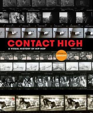
[PDF] Download Contact High: A Visual History of Hip-Hop PDF BY Vikki Tobak
Read PDF Contact High: A Visual History of Hip-Hop Ebook Online PDF Download and Download PDF Contact High: A Visual History of Hip-Hop Ebook Online PDF Download.
Contact High: A Visual History of Hip-Hop
By : Vikki Tobak
DOWNLOAD Read Online
DESCRIPTION : ONE OF AMAZON'S BEST ART & PHOTOGRAPHY BOOKS 0F 2018AN NPR AND PITCHFORK BEST MUSIC BOOK OF 2018 PICKONE OF TIME'S 25 BEST PHOTOBOOKS OF 2018NEW YORK TIMES, ASSOCIATED PRESS, WALLSTREET JOURNA L, ROLLING STONE, AND CHICAGO SUN HOLIDAY GIFT GUIDE PICK The perfect gift for music and photography fans, an inside look at the work of hip-hop photographers told through their most intimate diaries--their contact sheets. Featuring rare outtakes from over 100 photoshoots alongside interviews and essays from industry legends, Contact High: A Visual History of Hip-Hop takes readers on a chronological journey from old-school to alternative hip-hop and from analog to digital photography. The ultimate companion for music and photography enthusiasts, Contact High is the definitive history of hip-hop's early days, celebrating the artists that shaped the iconic album covers, t-shirts and posters beloved by hip-hop fans today. With essays from BILL ADLER, RHEA L. COMBS, FAB 5 FREDDY, MICHAEL
0 notes
Photo

how to save your own life 3/6
society6.com/abiwhales
#art journal#journaling#work#line drawing#my aunts dying plants#portrait#soutine portrait#line#visual journa;
3K notes
·
View notes
Photo

#kiss#prince#song#lyrics#art#notebook#sketchbook#scrapbook#journal#visual journal#art journal#daily journal#artist#journaling#journa#journals of tumblr#blogger#albert sackey#albert sackey art#albert ayebi sackey art#albert ayebi sackey#daily#notes#note#collage#design#text#type#pen#marker
4 notes
·
View notes
Photo
3 notes
·
View notes
Photo

And again for the Get Messy Season of Story. :)
Stencils, black PItt pens, Tombow and Koi markers, waterbrush, sparkly clear Gelly Roll gel pen.
#journal-addicted#thejournalclub#journaling-junkie#art journal#visual journal#rainbow colors#art journaling#visual journaing#stencils#get messy#get messy season of story#my art stuff
16 notes
·
View notes
Photo
#journaling junkie#thejournalclub#art journal#journalbabes#journalsoftheworld#juornalingfrenzy#art journal inspiration#visual diary#mine#art#journaling-junkie#the journa club#journaling inspiration#i had no color scheme for this#or plan whatsoever#but i like how it turned out
749 notes
·
View notes
Photo

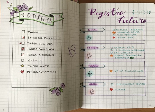
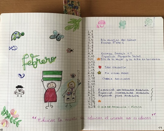
Aquí os presento mi Bullet Journal. Para hacerlo, aproveché un cuaderno que una compañera me regaló hace un tiempo y estaba esperando un uso especial. Me ha resultado muy interesante la actividad y creo que con este tipo de material, será más fácil organizarme. Es muy flexible, y cada uno puede tomar el mejor modelo que se adapte a su forma de trabajar, con columnas, visión semanal, diaria, pero permite destacar algunas tareas principales en registro futuro. El código, personalizado también hace muy visual cada tarea pendiente, realizada, evento...
Al principio me agobié un poco al ver en los materiales tantas opciones y no saber muy bien estructurar, pero creo que el resultado no está mal. Eso sí, espero seguir investigando y utilizar otras opciones, diseños etc...
#VisualMooc #Visual Thinking #AprendeINTEF
1 note
·
View note
Video
youtube
Do some cultures really have 50 words for snow?
Winter is here! Which means we’re looking forward to time with friends or family members, time away from work, and responsibility. And of course…. the visual surreality of a thousand objects under a cover of snow, all turned the same color. All kinds of things, and experiences, difficult to put into words… like, the kind of dim comfort of a warm interior made all the more so by company, and the knowledge of what’s going on outside. That, at least, is a thing the Danes have a word for... hygge. Hygge is like English’s “cozy”, with more specificity. And better branding. It may be tempting to say English speakers “don’t have” hygge, or that we don’t know it when we see it, because we can’t name it. Similarly, there is the old roasting chestnut about how Eskimos have 10, 15, 35 words for snow. And are therefore capable of discerning snow with an acuity beyond, say, your run of the mill English speaker. That their language guides their perception. Which is… not the case, not so straightforwardly, at least. It’s rather that 1) in an environment with endless snowy variations and snow-related situations, it becomes convenient, and wise, to name them and 2) their “words” aren’t like ours. Today on Idea Channel we dig a little deeper into language and culture, so sit back, grab your winter beverage of choice, and let us know what you think in the comments!
--FURTHER READING & SOURCES-- https://www.theguardian.com/world/sho... http://footnotes.pbsideachannel.com/p... http://footnotes.pbsideachannel.com/p... https://benjamins.com/#catalog/journa... https://twitter.com/AndreasKjeldsen/s... but also this whole thread: https://twitter.com/pbsideachannel/st...
--SPECIAL THANKS-- Gretchen McCulloch, @GretchenAMcC (@allthingslinguistic)
33 notes
·
View notes
Text
ZINE - brief and research
The Brief
A Zine is a self-Published, non-commercial print-work that is produced in small batches which usually covers a variety of topics from politics, sexuality and humor to personal ideas and thoughts. The purpose of a zine is to be expressive and to take a creative approach to an idea or topic. These Zines can be digitally designed and printed, or created from scratch at home.
The purpose of this brief is to create a Zine with a theme or narrative with a series of images that corresponds to the chosen theme. This can be created digitally or at home and can include text, illustrations or collages. Look at zine works to inspire your chosen layout, find out where they come from and be creative.
History of Zine
The first Zine (pronounced ‘Zeen’) can be traced back to as early as the 1930s by the Science Correspondence Club based in Chicago who published their Zine titled ‘The Comet’, which kickstarted a long line of sci-fi-based zines. The relationship between Zines and the Sci-fi world deepened over the next 15-20 years until 1967 where the Star Trek fanzine ‘Spockanalia’ was released which increase its popularity. Initially, these zines were printed using mimeographs which push ink through a stencil to create multiple prints at once. However, during the 70s as new technology was developed, creating Zines was easy and more efficient with work being created fast and inexpensively. Soon zines took to the punk scene in London, England throughout the 70s and 80s. Despite Zines becoming popularized through the sci-fi community, in modern day the zines are created by a huge variety of communities. Artists use them to display work and be experimental and expressive, publications such as Home Zine explore the concept of feeling at home, one called Dad Tweets take the approach of humorous dad-jokes and Kanye West even created one for his new line of clothing and shoes.
A Brief History of Zines (mentalfloss.com)
Influential Website
Considered Magazine
CONSIDERED Magazine
This Zine is an independently owned magazine that doesn’t not follow a structured publishing schedule. Their content included sustainable and mindful lifestyle as well as travel articles, collaborating with other creatives such as writers, photographers and artists to display their work and provide them with an additional platform. They focus on being an inclusive company. The visual style of their zines includes the form of a digital blog located on their website where they publish images accompanied by a body of text. Each separate zine within their webpage had a different style of photography and writing, some explore negative space and muted colours whilst others capture bold and eye-catching subjects that quickly capture the viewer’s attention.
BRIGHT
BRIGHT | Ethical Lifestyle (brightzine.co)
Founded in 2016, BRIGHT is an independent zine company with a passion for veganism who aim to offer a creative outlet for those who seek out information about veganism, various movements and the company takes in interest in the cooks behind the vegan meals located in London. In 2019, they opened a coffee shop that included an ethical lifestyle section with food and homeware items. Their values include ‘removing animals and the mistreatment of animals for all consumer companies’ and supporting other small businesses, creating an inclusive community in amongst them and other creatives with similar values. Their zine takes the form of a physical booklet that is released regularly, featuring The Air Vegan who advocates for change in the sneaker community. Plantfaced Beauty that covers a range of plant-based products promoted in these publications and each publication included a range of thought-provoking publications to evoke change. The booklet itself is composed of a range of images. Illustrations and text with a varying colour palette.
Its Freezing in LA
Climate Change Magazine | It's Freezing in LA! | England (itsfreezinginla.co.uk)
This company publishes environmental journalistic content, this is a critically acclaimed independent magazine that is printed every two years with online blog-style content published for frequently. The purpose is to reduce environmental tensions and offer any and all possible perspectives on the climate crisis, offering original and surprising content to spark discussions about these challenging topics. They host climate change-focused events in London, UK where they are based. Their zines in print-form are heavily illustrated, using bold lettering and bright colours combined with striking lines and intriguing textures to bring attention to its contents. Each Issue is slightly different and offers a new insight in the climate crisis. These zines are available for digital download and anyone can be featured in these publishing’s by sending in a pitch with your article idea.
0 notes
Text
SPEEDPAINT REQUESTS UPDATE 7 [Full Rules Included!] -Currently CLOSED-
Also yes, my watermarks are old on these examples! This set of rules was made before I changed my screen names to IntelligentBiscuit
UPDATE 7
Hello!
Just a quick note to say I'll be finishing off requests from the upcoming Thursday and onwards. I'm very sorry it's been so all over the place but switching classes was more of a pain in the ass than I was expecting xD;; I finally have a proper shedule and I'm so pleased! I will be re-opening requests soon so keep coming back to this journa [This Post if you’re on Tumblr] l to see updates
UPDATE!
You can now pick between either having a digital piece or a pixel art piece! When you ask for a request please specify which style you would prefer
-BASICS-
-You can message me via Tumblr as an ask or commenting on this journal to make a suggestion/request, I'll try and get to as many as I can, I do one video per week [unless I randomly decide I want to make two..that's happened before]
-Please note I have assignments as I'm in University so if I'm late or miss a day that's the reason, my education is a priority even if it feels like it wants me dead sometimes <---- this is incredibly important!
- If you want something specific please send a link to a reference along with your request
OCs - preferably a visual reference, a full-body picture would best
Colour Palettes/Poses - visual reference and crediting rules [if applicable]
Fictional Characters - Visual reference from either animes or cartoons or video games
- Also note I have every single right to refuse a request if I am uncomfortable with it, please respect my boundaries everybody has them even yourself, take that into consideration
-Please do not push me about requests I haven't done, it's incredibly irritating and causes unwarranted stress
+WHAT I WILL DO+
+ OCs
+Fictional Characters [Anime/Cartoon/Video Games]
+Youtubers [Preferably someone I'm familiar with I'm sorry ;; ]
+Couples - [OC x OC and OC x CC and CC x CC are all accepted! ]
+Mild gore/blood
-WHAT I WON'T DO-
-NSFW - extreme sexual/violent imagery
-Fetish Art
-Animals - I'm not great at drawing them and I don't wanna disappoint you
-Mechs/ anything heavily machinery based
-Hate Art
-Complex backgrounds
-Complex armour
-Generally anything I'm incredibly uncomfortable drawing
TYPES OF PEICES I'LL DO


2 notes
·
View notes
Photo

Yang perlu kamu tahu, tidak setiap dari kita menyukai sejuknya pagi. Betul pagi membawa sejuk dan segar. Tapi ia pula yang memaksa bergerak terus ke depan, sedang kita masih ada pada kemarin dan tinggal lebih lama di sana. . . . #kisahsebentar #ceritakata #mood #journa #journey #visuals #landscape #lifeisgood #travel
1 note
·
View note
Photo
September 6, 2018
society6.com/abiwhales
#art journal#collage#art collage#seventeen#troye sivan#journaling#visual journa;#line drawing#tracing paper#watercolor#stromanthe#plant drawing#house plant#words#typography#degas
95 notes
·
View notes
Text
4 Key Lessons Content Marketers Can Take From Data Journalists
Posted by matt_gillespie
There’s an oft-cited statistic in the world of technology professionals, from marketers to startup founders to data scientists: 90% of the world’s data has been created in the last two years.
This instantly-Tweetable snippet was referenced in Forbes in 2018, mentioned by MediaPost in 2016, and covered on Science Daily in 2013. A casual observer could be forgiven for asking: How could that be true in three different years?
At Fractl, the data makes perfect sense to us: The global amount of digital information is growing exponentially over time.
From Seagate
This means that the “90 percent of all data…” statistic was true in 2013, 2016, and 2018, and it will continue to be true for the foreseeable future. As our culture continues to become more internet-integrated and mobile, we continue to produce massive amounts of data year over year while also becoming more comfortable with understanding large quantities of information.
This is hugely important to anyone who creates content on the web: Stats about how much data we create are great, but the stories buried in that data are what really matter. In the opening manifesto for FiveThirtyEight, one of the first sites on the web specifically devoted to data journalism, Editor-in-Chief Nate Silver wrote:
“Almost everything from our sporting events to our love lives now leaves behind a data trail.”
This type of data has always been of interest to marketers doing consumer research, but the rise of data journalism shows us that there is both consumer demand and almost infinite potential for great storytelling rooted in numbers.
In this post, I’ll highlight four key insights from data science and journalism and how content marketers can leverage them to create truly newsworthy content that stands out from the pack:
The numbers drive the narrative
Plotted points are more trustworthy than written words (especially by brands!)
Great data content is both beautiful and easy-to-interpret
Every company has a (data) story to tell
By the time you’re done, you’ll have gleaned a better understanding of how data visualization, from simple charts to complex interactive graphics, can help them tell a story and achieve wide visibility for their clients.
The numbers drive the narrative
Try Googling “infographics are dead,” and your top hit will be a 2015 think piece asserting that the medium has been dead for years, followed by many responses that the medium isn’t anywhere close to “dead.” These more optimistic articles tend to focus on the key aspects of infographics that have transformed since their popularity initially grew:
Data visualization (and the public’s appetite for it) is evolving, and
A bad data viz in an oversaturated market won’t cut it with overloaded consumers.
For content marketers, the advent of infographics was a dream come true: Anyone with even basic skills in Excel and a good graphic designer could whip up some charts, beautify them, and use them to share stories. But Infographics 1.0 quickly fizzled because they failed to deliver anything interesting — they were just a different way to share the same boring stories.
Data journalists do something very different. Take the groundbreaking work from Reuters on the Rohingya Muslim refugee camps in southern Bangladesh, which was awarded the Global Editors Network Award for Best Data Visualization in 2018. This piece starts with a story—an enormous refugee crisis taking place far away from the West—and uses interactive maps, stacked bar charts, and simple statistics visualizations to contextualize and amplify a heartbreaking narrative.
The Reuters piece isn’t only effective because of its innovative data viz techniques; rather, the piece begins with an extremely newsworthy human story and uses numbers to make sure it’s told in the most emotionally resonant way possible. Content marketers, who are absolutely inundated with advice on how storytelling is essential to their work, need to see data journalism as a way to drive their narratives forward, rather than thinking of data visualization simply as a way to pique interest or enhance credibility.
Plotted points are more trustworthy than written words
This is especially true when it comes to brands.
In the era of #FakeNews, content marketers are struggling more than ever to make sure their content is seen as precise, newsworthy, and trustworthy. The job of a content marketer is to produce work for a brand that can go out and reasonably compete for visibility against nonprofits, think tanks, universities, and mainstream media outlets simultaneously. While some brands are quite trusted by Americans, content marketers may find themselves working with lesser-known clients seeking to build up both awareness and trust through great content.
One of the best ways to do both is to follow the lead of data journalists by letting visual data content convey your story for you.
“Numbers don’t lie” vs. brand trustworthiness
In the buildup to the 2012 election, Nate Silver’s previous iteration of FiveThirtyEight drew both massive traffic to the New York Times and criticism from traditional political pundits, who argued that no “computer” could possibly predict election outcomes better than traditional journalists who had worked in politics for decades (an argument fairly similar to the one faced by the protagonists in Moneyball). In the end, Silver’s “computer” (actually a sophisticated model that FiveThirtyEight explains in great depth and open-sources) predicted every state correctly in 2012.
Silver and his team made the model broadly accessible to show off just how non-partisan it really was. It ingested a huge amount of historical election data, used probabilities and weights to figure out which knowledge was most important, and spit out a prediction as to what the most likely outcomes were. By showing how it all worked, Silver and FiveThirtyEight went a long way toward improving the public confidence in data—and, by extension, data journalism.
But the use of data to increase trustworthiness is nothing new. A less cynical take is simply that people are more likely to believe and endorse things when they're spelled out visually. We know, famously, that users only read about 20-28 percent of the content on the page, and it’s also known that including images vastly increases likes and retweets on Twitter.
So, in the era of endless hot takes and the “everyone’s-a-journalist-now” mentality, content marketers looking to establish brand authority, credibility, and trust can learn an enormous amount from the proven success of data journalists — just stick to the numbers.
Find the nexus of simple and beautiful
Our team at Fractl has a tricky task on our hands: We root our content in data journalism with the ultimate goal of creating great stories that achieve wide visibility. But different stakeholders on our team (not to mention our clients) often want to achieve those ends by slightly different means.
Our creatives—the ones working with data—may want to build something enormously complex that crams as much data as possible into the smallest space they can. Our media relations team—experts in knowing the nuances of the press and what will or won’t appeal to journalists—may want something that communicates data simply and beautifully and can be summed up in one or two sentences, like the transcendent work of Mona Chalabi for the Guardian. A client, too, will often have specific expectations for how a piece should look and what should be included, and these factors need to be considered as well.
Striking the balance
With so many ways to present any given set of numbers, we at Fractl have found success by making data visualizations as complex as they need to be while always aiming for the nexus of simple and beautiful. In other words: Take raw numbers that will be interesting to people, think of a focused way to clearly visualize them, and then create designs that fit the overall sentiment of the piece.
On a campaign for Porch.com, we asked 1,000 Americans several questions about food, focusing on things that were light and humorous conversation starters. For example, “Is a hot dog a sandwich?” and “What do you put on a hot dog?” As a native Chicagoan who believes there is only one way to make a hot dog, this is exactly the type of debate that would make me take notice and share the content with friends on social media.
In response to those two questions, we got numbers that looked like this:
Using Tableau Public, an open-source data reporting solution that is one of the go-to tools for rapid building at Fractl, the tables above were transformed into rough cuts of a final visualization:
With the building blocks in place, we then gave extensive notes to our design team on how to make something that’s just as simple but much, much more attractive. Given the fun nature of this campaign, a more lighthearted design made sense, and our graphics team delivered. The entire campaign is worth checking out for the project manager’s innovative and expert ability to use simple numbers in a way that is beautiful, easy-to-approach, and instantly compelling.
All three of the visualizations above are reporting the exact same data, but only one of them is instantly shareable and keeps a narrative in mind: by creatively showing the food items themselves, our team turned the simple table of percentages in the first figure into a visualization that could be shared on social media or used by a journalist covering the story.
In other cases, such as if the topic is more serious, simple visualizations can be used to devastating effect. In work for a brand in the addiction and recovery space, we did an extensive analysis of open data hosted by the Centers for Disease Control and Prevention. The dramatic increase in drug overdose deaths in the United States is an emotional story fraught with powerful statistics. In creating a piece on the rise in mortality rate, we wanted to make sure we preserved the gravity of the topic and allowed the numbers to speak for themselves:
A key part of this visualization was adding one additional layer of complexity—age brackets—to tell a more contextualized and human story. Rather than simply presenting a single statistic, our team chose to highlight the fact that the increase in overdose deaths is something affecting Americans across the entire lifespan, and the effect of plotting six different lines on a single chart makes the visual point that addiction is getting worse for all Americans.
Every brand’s data has a story to tell
Spotify has more than 200 million global users, nearly half of whom pay a monthly fee to use the service (the other half generate revenue by listening to intermittent ads). As an organization, Spotify has data on how a sizeable portion of the world listens to its music and the actual characteristics of that music.
Data like this is what makes Spotify such a valuable brand from a dollars and cents standpoint, but a team of data journalists at The New York Times also saw an incredible story about how American music taste has changed in the last 30 years buried in Spotify’s data. The resulting piece, Why Songs of Summer Sound the Same, is a landmark work of data-driven, interactive journalism, and one that should set a content marketer’s head spinning with ideas.
Of course, firms will always be protective of their data, whether it’s Netflix famously not releasing its ratings, Apple deciding to stop its reporting of unit sales, or Stanford University halting its reporting of admissions data. Add to the equation a public that is increasingly wary of data privacy and susceptibility to major data breaches, and clients are often justifiably nervous to share data for the purpose of content production.
Deciding when to share
That said, a firm’s data often is central to its story, and when properly anonymized and cleared of personal identifying information, or PII, the newsworthiness of a brand reporting insights from its own internal numbers can be massive.
For example, GoodRx, a platform that reports pricing data from more than 70,000 U.S. pharmacies, released a white paper and blog post that compared its internal data on prescription fills with US Census data on income and poverty. While census data is free, only GoodRx had the particular dataset on pharmacy fills—it’s their own proprietary data set. Data like this is obviously key to their overall valuation, but the way in which it was reported here told a deeply interesting story about income and access to medication without giving away anything that could potentially cost the firm. The report was picked up by the New York Times, undoubtedly boosting GoodRx’s ratings for organic search.
The Times’ pieces on Spotify and GoodRx both highlight the fourth key insight on the effective use of data as content marketers: Every brand’s data has a story to tell. These pieces could only have come from their exact sources because only they had access to the data, making the particular findings singular and unique to that specific brand and presenting a key competitive advantage in the content landscape. While working with internal data comes with its own potential pitfalls and challenges, seeking to collaborate with a client to select meaningful internal data and directing its subsequent use for content and narrative should be at the forefront of a content marketer’s mind.
Blurring lines and breaking boundaries
A fascinating piece recently on Recode sought to slightly reframe the high-publicity challenges facing journalists, stating:
“The plight of journalists might not be that bad if you’re willing to consider a broader view of ‘journalism.’”
The piece detailed that while job postings for journalists are off more than 10 percent since 2004, jobs broadly related to “content” have nearly quadrupled over the same time period. Creatives will always flock to the options that allow them to make what they love, and with organic search largely viewed as a meritocracy of content, the opportunities for brands and content marketers to utilize the data journalism toolkit have never been greater.
What’s more, much of the best data journalism out there typically only uses a handful of visualizations to get its point across. It was also reported recently that the median amount of data sources for pieces created by the New York Times and The Washington Post was two. It too is worth noting that more than 60 percent of data journalism stories in both the Times and Post during a recent time period (January-June, 2017) relied only on government data.
Ultimately, the ease of running large surveys via a platform like Prolific Research, Qualtrics, or Amazon Mechanical Turk, coupled with the ever-increasing number of free and open data sets provided by both the US Government or sites like Kaggle or data.world means that there is no shortage of numbers out there for content marketers to dig into and use to drive storytelling. The trick is in using the right blend of hard data and more ethereal emotional appeal to create a narrative that is truly compelling.
Wrapping up
As brands increasingly invest in content as a means to propel organic search and educate the public, content marketers should seriously consider putting these key elements of data journalism into practice. In a world of endless spin and the increasing importance of showing your work, it’s best to remember the famous quote written by longtime Guardian editor C.P. Scott in 1921: “Comment is free, but facts are sacred.”
What do you think? How do you and your team leverage data journalism in your content marketing efforts?
Sign up for The Moz Top 10, a semimonthly mailer updating you on the top ten hottest pieces of SEO news, tips, and rad links uncovered by the Moz team. Think of it as your exclusive digest of stuff you don’t have time to hunt down but want to read!
4 Key Lessons Content Marketers Can Take From Data Journalists published first on http://goproski.com/
0 notes
Photo

More playing with India ink and watercolor.
#journal-addicted#journaling-junkie#journalbookies#art jounal#visual journal#art journaling#visual journaing#my art stuff
21 notes
·
View notes
Text
4 Key Lessons Content Marketers Can Take From Data Journalists
Posted by matt_gillespie
There’s an oft-cited statistic in the world of technology professionals, from marketers to startup founders to data scientists: 90% of the world’s data has been created in the last two years.
This instantly-Tweetable snippet was referenced in Forbes in 2018, mentioned by MediaPost in 2016, and covered on Science Daily in 2013. A casual observer could be forgiven for asking: How could that be true in three different years?
At Fractl, the data makes perfect sense to us: The global amount of digital information is growing exponentially over time.
From Seagate
This means that the “90 percent of all data…” statistic was true in 2013, 2016, and 2018, and it will continue to be true for the foreseeable future. As our culture continues to become more internet-integrated and mobile, we continue to produce massive amounts of data year over year while also becoming more comfortable with understanding large quantities of information.
This is hugely important to anyone who creates content on the web: Stats about how much data we create are great, but the stories buried in that data are what really matter. In the opening manifesto for FiveThirtyEight, one of the first sites on the web specifically devoted to data journalism, Editor-in-Chief Nate Silver wrote:
“Almost everything from our sporting events to our love lives now leaves behind a data trail.”
This type of data has always been of interest to marketers doing consumer research, but the rise of data journalism shows us that there is both consumer demand and almost infinite potential for great storytelling rooted in numbers.
In this post, I’ll highlight four key insights from data science and journalism and how content marketers can leverage them to create truly newsworthy content that stands out from the pack:
The numbers drive the narrative
Plotted points are more trustworthy than written words (especially by brands!)
Great data content is both beautiful and easy-to-interpret
Every company has a (data) story to tell
By the time you're done, you'll have gleaned a better understanding of how data visualization, from simple charts to complex interactive graphics, can help them tell a story and achieve wide visibility for their clients.
The numbers drive the narrative
Try Googling “infographics are dead,” and your top hit will be a 2015 think piece asserting that the medium has been dead for years, followed by many responses that the medium isn’t anywhere close to “dead.” These more optimistic articles tend to focus on the key aspects of infographics that have transformed since their popularity initially grew:
Data visualization (and the public’s appetite for it) is evolving, and
A bad data viz in an oversaturated market won’t cut it with overloaded consumers.
For content marketers, the advent of infographics was a dream come true: Anyone with even basic skills in Excel and a good graphic designer could whip up some charts, beautify them, and use them to share stories. But Infographics 1.0 quickly fizzled because they failed to deliver anything interesting — they were just a different way to share the same boring stories.
Data journalists do something very different. Take the groundbreaking work from Reuters on the Rohingya Muslim refugee camps in southern Bangladesh, which was awarded the Global Editors Network Award for Best Data Visualization in 2018. This piece starts with a story—an enormous refugee crisis taking place far away from the West—and uses interactive maps, stacked bar charts, and simple statistics visualizations to contextualize and amplify a heartbreaking narrative.
The Reuters piece isn’t only effective because of its innovative data viz techniques; rather, the piece begins with an extremely newsworthy human story and uses numbers to make sure it’s told in the most emotionally resonant way possible. Content marketers, who are absolutely inundated with advice on how storytelling is essential to their work, need to see data journalism as a way to drive their narratives forward, rather than thinking of data visualization simply as a way to pique interest or enhance credibility.
Plotted points are more trustworthy than written words
This is especially true when it comes to brands.
In the era of #FakeNews, content marketers are struggling more than ever to make sure their content is seen as precise, newsworthy, and trustworthy. The job of a content marketer is to produce work for a brand that can go out and reasonably compete for visibility against nonprofits, think tanks, universities, and mainstream media outlets simultaneously. While some brands are quite trusted by Americans, content marketers may find themselves working with lesser-known clients seeking to build up both awareness and trust through great content.
One of the best ways to do both is to follow the lead of data journalists by letting visual data content convey your story for you.
“Numbers don’t lie” vs. brand trustworthiness
In the buildup to the 2012 election, Nate Silver’s previous iteration of FiveThirtyEight drew both massive traffic to the New York Times and criticism from traditional political pundits, who argued that no “computer” could possibly predict election outcomes better than traditional journalists who had worked in politics for decades (an argument fairly similar to the one faced by the protagonists in Moneyball). In the end, Silver’s “computer” (actually a sophisticated model that FiveThirtyEight explains in great depth and open-sources) predicted every state correctly in 2012.
Silver and his team made the model broadly accessible to show off just how non-partisan it really was. It ingested a huge amount of historical election data, used probabilities and weights to figure out which knowledge was most important, and spit out a prediction as to what the most likely outcomes were. By showing how it all worked, Silver and FiveThirtyEight went a long way toward improving the public confidence in data—and, by extension, data journalism.
But the use of data to increase trustworthiness is nothing new. A less cynical take is simply that people are more likely to believe and endorse things when they're spelled out visually. We know, famously, that users only read about 20-28 percent of the content on the page, and it’s also known that including images vastly increases likes and retweets on Twitter.
So, in the era of endless hot takes and the “everyone’s-a-journalist-now” mentality, content marketers looking to establish brand authority, credibility, and trust can learn an enormous amount from the proven success of data journalists — just stick to the numbers.
Find the nexus of simple and beautiful
Our team at Fractl has a tricky task on our hands: We root our content in data journalism with the ultimate goal of creating great stories that achieve wide visibility. But different stakeholders on our team (not to mention our clients) often want to achieve those ends by slightly different means.
Our creatives—the ones working with data—may want to build something enormously complex that crams as much data as possible into the smallest space they can. Our media relations team—experts in knowing the nuances of the press and what will or won’t appeal to journalists—may want something that communicates data simply and beautifully and can be summed up in one or two sentences, like the transcendent work of Mona Chalabi for the Guardian. A client, too, will often have specific expectations for how a piece should look and what should be included, and these factors need to be considered as well.
Striking the balance
With so many ways to present any given set of numbers, we at Fractl have found success by making data visualizations as complex as they need to be while always aiming for the nexus of simple and beautiful. In other words: Take raw numbers that will be interesting to people, think of a focused way to clearly visualize them, and then create designs that fit the overall sentiment of the piece.
On a campaign for Porch.com, we asked 1,000 Americans several questions about food, focusing on things that were light and humorous conversation starters. For example, “Is a hot dog a sandwich?” and “What do you put on a hot dog?” As a native Chicagoan who believes there is only one way to make a hot dog, this is exactly the type of debate that would make me take notice and share the content with friends on social media.
In response to those two questions, we got numbers that looked like this:
Using Tableau Public, an open-source data reporting solution that is one of the go-to tools for rapid building at Fractl, the tables above were transformed into rough cuts of a final visualization:
With the building blocks in place, we then gave extensive notes to our design team on how to make something that’s just as simple but much, much more attractive. Given the fun nature of this campaign, a more lighthearted design made sense, and our graphics team delivered. The entire campaign is worth checking out for the project manager’s innovative and expert ability to use simple numbers in a way that is beautiful, easy-to-approach, and instantly compelling.
All three of the visualizations above are reporting the exact same data, but only one of them is instantly shareable and keeps a narrative in mind: by creatively showing the food items themselves, our team turned the simple table of percentages in the first figure into a visualization that could be shared on social media or used by a journalist covering the story.
In other cases, such as if the topic is more serious, simple visualizations can be used to devastating effect. In work for a brand in the addiction and recovery space, we did an extensive analysis of open data hosted by the Centers for Disease Control and Prevention. The dramatic increase in drug overdose deaths in the United States is an emotional story fraught with powerful statistics. In creating a piece on the rise in mortality rate, we wanted to make sure we preserved the gravity of the topic and allowed the numbers to speak for themselves:
A key part of this visualization was adding one additional layer of complexity—age brackets—to tell a more contextualized and human story. Rather than simply presenting a single statistic, our team chose to highlight the fact that the increase in overdose deaths is something affecting Americans across the entire lifespan, and the effect of plotting six different lines on a single chart makes the visual point that addiction is getting worse for all Americans.
Every brand’s data has a story to tell
Spotify has more than 200 million global users, nearly half of whom pay a monthly fee to use the service (the other half generate revenue by listening to intermittent ads). As an organization, Spotify has data on how a sizeable portion of the world listens to its music and the actual characteristics of that music.
Data like this is what makes Spotify such a valuable brand from a dollars and cents standpoint, but a team of data journalists at The New York Times also saw an incredible story about how American music taste has changed in the last 30 years buried in Spotify’s data. The resulting piece, Why Songs of Summer Sound the Same, is a landmark work of data-driven, interactive journalism, and one that should set a content marketer’s head spinning with ideas.
Of course, firms will always be protective of their data, whether it’s Netflix famously not releasing its ratings, Apple deciding to stop its reporting of unit sales, or Stanford University halting its reporting of admissions data. Add to the equation a public that is increasingly wary of data privacy and susceptibility to major data breaches, and clients are often justifiably nervous to share data for the purpose of content production.
Deciding when to share
That said, a firm’s data often is central to its story, and when properly anonymized and cleared of personal identifying information, or PII, the newsworthiness of a brand reporting insights from its own internal numbers can be massive.
For example, GoodRx, a platform that reports pricing data from more than 70,000 U.S. pharmacies, released a white paper and blog post that compared its internal data on prescription fills with US Census data on income and poverty. While census data is free, only GoodRx had the particular dataset on pharmacy fills—it’s their own proprietary data set. Data like this is obviously key to their overall valuation, but the way in which it was reported here told a deeply interesting story about income and access to medication without giving away anything that could potentially cost the firm. The report was picked up by the New York Times, undoubtedly boosting GoodRx’s ratings for organic search.
The Times’ pieces on Spotify and GoodRx both highlight the fourth key insight on the effective use of data as content marketers: Every brand’s data has a story to tell. These pieces could only have come from their exact sources because only they had access to the data, making the particular findings singular and unique to that specific brand and presenting a key competitive advantage in the content landscape. While working with internal data comes with its own potential pitfalls and challenges, seeking to collaborate with a client to select meaningful internal data and directing its subsequent use for content and narrative should be at the forefront of a content marketer’s mind.
Blurring lines and breaking boundaries
A fascinating piece recently on Recode sought to slightly reframe the high-publicity challenges facing journalists, stating:
“The plight of journalists might not be that bad if you’re willing to consider a broader view of ‘journalism.’”
The piece detailed that while job postings for journalists are off more than 10 percent since 2004, jobs broadly related to “content” have nearly quadrupled over the same time period. Creatives will always flock to the options that allow them to make what they love, and with organic search largely viewed as a meritocracy of content, the opportunities for brands and content marketers to utilize the data journalism toolkit have never been greater.
What’s more, much of the best data journalism out there typically only uses a handful of visualizations to get its point across. It was also reported recently that the median amount of data sources for pieces created by the New York Times and The Washington Post was two. It too is worth noting that more than 60 percent of data journalism stories in both the Times and Post during a recent time period (January-June, 2017) relied only on government data.
Ultimately, the ease of running large surveys via a platform like Prolific Research, Qualtrics, or Amazon Mechanical Turk, coupled with the ever-increasing number of free and open data sets provided by both the US Government or sites like Kaggle or data.world means that there is no shortage of numbers out there for content marketers to dig into and use to drive storytelling. The trick is in using the right blend of hard data and more ethereal emotional appeal to create a narrative that is truly compelling.
Wrapping up
As brands increasingly invest in content as a means to propel organic search and educate the public, content marketers should seriously consider putting these key elements of data journalism into practice. In a world of endless spin and the increasing importance of showing your work, it’s best to remember the famous quote written by longtime Guardian editor C.P. Scott in 1921: “Comment is free, but facts are sacred.”
What do you think? How do you and your team leverage data journalism in your content marketing efforts?
Sign up for The Moz Top 10, a semimonthly mailer updating you on the top ten hottest pieces of SEO news, tips, and rad links uncovered by the Moz team. Think of it as your exclusive digest of stuff you don't have time to hunt down but want to read!
0 notes
Last Seen Blogs

yes2017-blog
Untitled

sugarlily1
Sugarlily

gnoufs-blog
The Gnoufs

leilighet
I min leilighet

fuckkruspe
RAMMSTEIN