#vogue typeface
Photo

Luca Typeface Letters
These very simple letter shapes are based on an idea by Italian art director Luca Stoppini. The creation was also inspired by the geometric style of Cartier jewelry. Before the turn of the millennium, they occasionally appeared in Vogue Italia.
#typedesign#typeface#typefacedesign#geometric shapes#simplicity#cartier#vogue italia#sans serif#experimental#fashion
0 notes
Note
I don't know if you're still into typewriters or not but if you are Hemingway Jones just put out a video talking about why he loves typewriters focusing on his Royal P with a really cool Vogue typeface. I really enjoyed it and thought that if you were still into typewriters you might, too.
u have cursed me to recall that my typewriters letter O is broken.. it’s actually impossible to get a print wheel for this guy like. i have no idea where or how i would get a replacement. it works in capital O however so idk maybe i just only ever write in all caps ¯\_(ツ)_/¯ this was an interesting channel tho thanks for sending it to me!
12 notes
·
View notes
Text
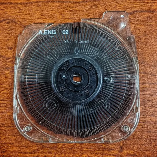
There's something very interesting to me about the technical methods they developed in the last days before the fall of the typewriter gave way to the rise of the word processor. My fascination with the IBM selectrics and their varied and curious little type elements is no secret at this point but it's worth mentioning that they weren't the only innovation when electric typewriters were en vogue.
Enter: The Daisy Wheel. These flat diskettes typically contained 96 characters (much like the later Selectric 3 elements) and boasted the ability to print type up to 3 times faster than that of typical IBM electric typewriters. While I cannot personally attest to this claim I can say that I have found them to provide a much quieter typing experience than the selectrics or comparable Smith Corona machines. In fact, once you get over the nagging expectation of thrashing percussion there's almost a calming, white noise effect to it that really makes you wish they'd been produced in smaller portable sizes that don't claim an entire workspace.
But for those entrepid typists who've got space to spare and an affinity for tactile tactics executed quickly, quietly and qwerty you can start your new addiction with this awesome Daisy wheel diskette specifically for brother typewriters.
The typeface on this daisy wheel diskette is "Prestige 1012" which is clean and professional and might be best suited for business or more formal submissions. This daisy wheel has been inspected, cleaned and tested for for full use and functionality. Before purchasing please be advised that Daisy wheels can be machine specific so do your research prior to purchase.
The wheel of progress kills fascists.
.
..
#thismachinekillsfascists #ironfoxtypewriters #typewriterjunkies #typewriterrevolution #writeintentionally #writenow #vintagetypewriter #typewritersofinstagram #igwriters #igpoets #igauthors #authorsofig #authorsofinstagram #poetsofinstagram #poetsofig #writers #typewriter #newjersey #literacy #wheelwriter #vintagecool #counterculture #typewriterrepair #daisywheel #newjerseyisntboring #typewritercommunity #typosphere #retrolife #retrostyle


#ironfoxtypewriters#typewriterrevolution#writerscommunity#typewriter#writers and poets#writerslife#typing#tomhanks#queer writers#writers#daisy wheels#daisy wheel#electric Typewriter
4 notes
·
View notes
Photo

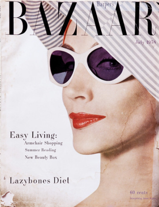
Black & White Vogue Cover (Jean Patchett), New York
1950, printed 1968
Irving Penn (American, 1917–2009)
In 1950 Penn photographed the French couture collections for Vogue in his Paris studio using natural light and black-and-white film. The results exemplified the artist's strong graphic sensibilities and surprised readers of the magazine. Model Jean Patchett fashioned black lipstick out of mascara, and the Russian-born art director Alexander Liberman paired the image with a bold typeface -Vogue's first black-and-white cover since 1932.
#m:photography#n:black and white vogue cover (jean patchett)#a:penn#s:getty museum#l:los angeles#d:1950#d:1968
5 notes
·
View notes
Text
typeface response
what do they remind you of? make you feel? what kind of design work would you use them for?
Futura - it is more simple but with the exception of the pointed apex and vertexs.
Hightower - more classic
Gill Sans - feels like an older style font
Didot - more elegant with the high contrast. feels more modern.
Firmin Didot designed the Didot typeface. He came from a family of French printers. The royal palaces used it. It came from Paris and was developed in the period of 1784 - 1811. Now used in fashion (Vogue).
0 notes
Text

WEEK 4 In-Class: Typeface Research
The typeface I chose to research in class is DIDOT.
Didot was designed by Firmin Didot a renowned French typographer, painter and publisher. Firmin Didot alongside his brother Pierre Didot, played a significant role in the development of printing and typography during the late 18th and early 19th centuries.
Firmin Didot design the Didot typeface in the late 18th century, around the 1780s. The Didot typeface was based in Paris, France, which was a hub of intellectual and artistic activity during the time when Firmin designed the typeface. This environment likely influenced his work.
The design for Didot wad influenced by the neoclassical movement, which sought inspiration from classical Greek and Roman art and architecture. This is evident in the font's elegant, geometric letterforms, high contrast between thick and thin strokes. It is a popular choice for elegant and refined typography. A modern day example is Vogue magazine, Harpers Bazar, which I thought was really cool as I see it all the time just never realised it was Didot typeface.
0 notes
Text
Typeface Notes
Futura
Futura Free Frank Ocean
Red Bull
FedEx
Absolut Vodka
Gill Sans
Penguin books
Tommy Hilfiger
Hightower
Elementary school books
Stencils
Didot
Designed by Firmin Didot
Designed in 1784-1811
Based in Paris
Vogue magazine
Fashion publication
French literature
0 notes
Text
Typeface - Researching Context
Didot
Didot was designed by Firmin Didot between the years 1784 and 1811. Didot was based in France and belonged to a family of printers and publishers known for creating illustrated versions of the classics, reserved for those with access to royal palaces and aristocratic chateaus available to a wider audience. Didot was inspired by the Baskerville typeface and joined the race to perfect the design which created early iterations of the typeface we now know as Didot. The typeface features increased stroke contrast, flat, unbracketed serifs and hairline strokes. The typeface is unsuitable for body text due to the contrast being so extreme, however it is an excellent choice for high end, large format heading text and display purposes. Didot became the embodiment of luxury in a typeface being used in Vogue magazine, Giorgio Armani, Zara and Cahiers d'Art, a French artistic and literary journal.
0 notes
Text
Typeface

Didot- Modern Serif
Firmin Didot, released in between 1794- 1811
elegant, decorative
described as neoclassical
evocative of the Age of Enlightenment
often seen in large format signage/ various display purposes
vertical stress and flat
unbracketed serifs
Vogue
Hightower- Old Style Serif
Tobias Frere-Jones, released in 1994
soft and inky
reminds me of typeface used in classical novels (printed on old yellow paper)
short x-height
wide proportions
deep colour
organic forms and details work well in headlines
complex and subtle
Gill Sans- Humanist Sans
Eric Gill, released in 1928
condensed, bold
very legible, dyslexia friendly
readable in text and display works
but controversial (Eric Gill)
choice to use typeface
Futura- Geometric Sans
Paul Renner, released in 1927
very legible
simple, minimal curves
tall cap height, short x-height
works well in both print and digital work
display typeface, as well as text face
0 notes
Text
Typeface analysis:
FUTURA:
I’m not a fan of this typeface, its too simple for me, reminds me of typefaces used in PowerPoint projects as a kid, not so much poster design. I would use this design for something very simple when just trying to get the message across.
This typeface is based on geometric shapes, it’s a sans-serif. Often used in movies like fantastic Mr fox and other Wes andersaon films - I prefer this font in all capitals as it’s very clear.
GILLS SANS:
I prefer the look of this font to Futura for simple designs, it looks like the letters fit better togther - seems more cohesive. The anatomy of this typeface seems more thought out.
This font was popularised when it was released as it was used for all the Penguin books. That being said i would not use this font, the history behind the man who created it is important to look at when deciding whether to use it.
HIGH TOWER:
I like this text and would use it in some designs, I think it works well for short sentences or paragraphs on posters or in short paragraphs in magazines or newspapers. It looks a lot more elegant than the other two fonts. While reading type in this font its remains legible while looking nice.
This font is a Serif typeface (old style of Serif fonts) designed by Tobias Freire-Jones, it was loosely based on the printing of Nicolas Jensen in Venice in the 1470’s. it is often described as soft and inky.
-wide proportions, bold, interesting, clear, smooth
DIDOT:
This font looks very similar to Hightower to me, Didot is also bold but it’s focused more on the vertical lines. This font has also put more emphasis on the type anatomy, things like the ears and descenders are longer and bolder.
Often used on covers of Vogue and Bazar.
- tall, thick, precise, clear, elegant
0 notes
Text
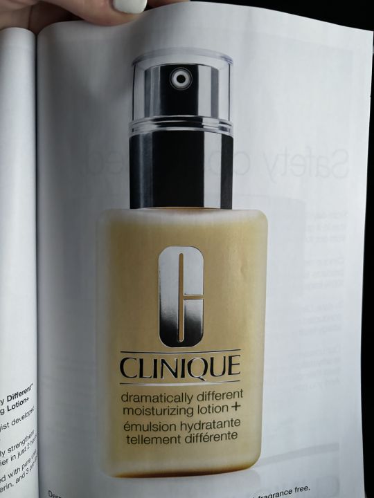


The design of this moisturizer bottle has the denotative meaning of acting as a container for the moisturizer. It exists to promote the brand while containing the product.
This bottle also has a connotative meaning because its design utilizes silver to portray wealth and the font of the brand Clinique is written in a typeface which suggests elegance. This draws on the feelings of consumers by building trust between the brand and wealthy customers.
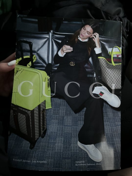
The iconic function is evident in the Gucci brand. In this Vogue magazine, the Gucci logo is strategically placed at the center of the page on Kendall’s belt. Gucci portrays luxury through its iconography by using a gold color and by having a timeless, unique, and recognizable logo and brand. The signifier, being the Gucci icon, signifies luxury.
This mandarin oranges brand utilizes the indexical function of a halo to communicate their product. In one context, a halo is a circle of light placed over one’s head to represent their holiness. In this context, they use the halo to represent health. The subtitle reads, “pure goodness.” This could be considered a tribute to holiness. They are referring to the ‘holiness’ of the oranges.
In this flier for a conference, the design features a tall mountain. The mountain’s symbolic function means it represents reaching high in terms of goals. The smaller text above the word apex reads, “Reach higher. Think deeper.” This further emphasizes that the mountain is a symbol for reaching high.
This flier represents a past style used in the seventies. The bold red color chosen for the background and the black and white figures are communicating an old setting. This is verified by the setting of the musical that the flier is advertising.
0 notes
Text
Typeface notes
_
Futura
It looks simple
It could be used to clearly get across information
Used in body text
Modern typeface
Sans serif font
Gill sans
Bolder so it stands out more
More likely used for titles then futura
Is quite round
Still simple
Modern typeface
Sans serif font
High tower
Old
Classical
Titles and headings
Serif font
Short in height font
Medium contrast
Didot
Longer in height
Serif font
Old
High contrast
Long beaks and barbs
Big
Used for headings and titles
Has a character to it
Used in fashion ie vogue logo
Usually used in a feminine aspect
0 notes
Text
Didot Deep Dive
The Didot typeface features a character set with increased stroke contrast, condensed armature, hairline strokes, vertical stress and flat, unbracketed serifs.
Didot types were developed by printers including Firmin Didot, Giambattista Bodoni and Justus Erich Walbaum, whose eponymous typefaces, Bodoni, Didot, and Walbaum, remain in use today.
The aesthetic of the Didot typeface is distinctly Neoclassical, with minimal embellishment, strong contrast, and mathematical precision. It is evocative of the vertical emphasis and open space characteristic of Ancient Greek architecture, much admired by Neoclassicists.
The Didone font styles, which originated in France, first became popular at the turn of the 18th century. The Didone name comes from combining two popular Didone typefaces, Didot and Bodoni, together. The Vogue cover display type is a Didone.
0 notes
Text
Designer Analysis Writing Exercise - Typeface, First Response
WEEK 4
Futura
This font reminds me of high-class, luxury items. This is due to the thin letters representing elegance and fanciness. It doesn’t need to get your attention because to do so it would need to be loud and that would ruin the elegance of the lettering.
Gill Sans
This lettering reminds me of education, as this font was the most common one I remember being used for educational resources and other education adjacent activities.
Hightower
Hightower seems formal and informative. It reminds me of newspapers; professional, informative, old and opinionated.
Didot
This typeface gives off the feeling of new money, while elegant, it seems more intense and demanding of attention than Futura. It seems less reliable, less sure of itself. It reminds me of fashion publications, like Vogue.
0 notes
Text
Case Study


Transcript:
Slide 2
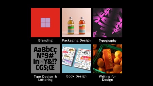
While researching D&AD award winners, I selected a series of categories that particularly sparked my interest as I felt like my work related to them. These categories included branding and packaging design - which is relevant to this units work, typography, type, design & lettering, book design, and writing for design. From each category, I then selected one pencil winner that had designs drawing me in the most.
Slide 3
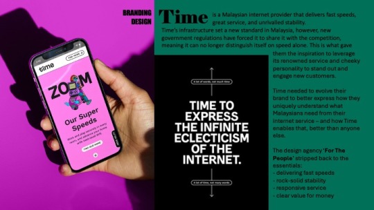
To begin with, the branding design award was Time, a Malaysian Internet provider known for delivering fast speeds. New government regulations meant it could no longer distinguishe itself from speed alone. The design agency ‘For The People’ stripped back to the essentials and redesigned the company with new illustrations and a more distinguishable logo, to accentuate the companies cheeky personality, and engage new customers. ‘For The People’ won a wood pencil for this redesign.
Slide 4
I then looked at packaging design for the Hornicultural Society. ‘Ogilvy UK’ released a series of limited edition condom packets in the style of seed packets to help tackle the rise in STD’s among the over 65s. The packets feature typography and cheeky strap lines that are all creative ways to loosely describe sexual body parts. Both graphite pencils and wood pencils were won for this under numerous categories.
Slide 5
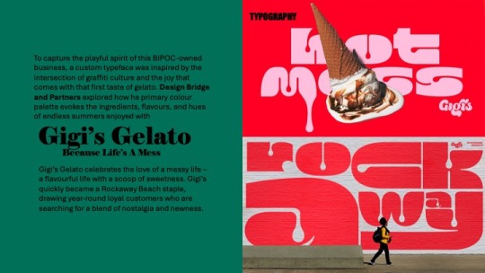
Under the category of typography, I selected Gigi‘s Gelato. The design agency ‘Bridge and Partners’ explored how primary colour palettes evoke the ingredients, flavours and hues of endless summers enjoyed with Gigi’s. ‘Bridge and Partners’ won a graphic pencil award for this type design
Slide 6
The fourth award I looked at was type design, where ‘Studio Drama’ created a dualistic headline type face family for Vogue Brazil. They were presented with the challenge to effectively combine sans serif and serif styles encapsulated by two polarising ideas - vernacular and elegance, creating an authentic outcome that embodied Vogues iconic brand with the rich and cultural typographic heritage of Brazil. ‘Studio Drama’ were awarded a graphite pencil for this typeface
Slide 7
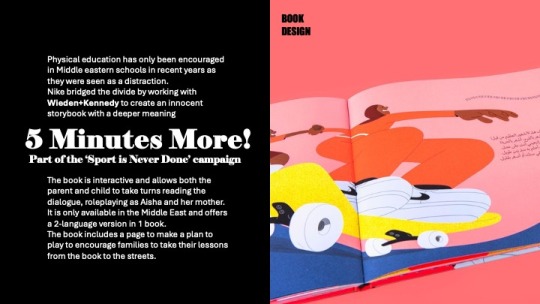
Looking into the category of book design, the one that stood out the most to me was “five minutes more” - which is part of the “sport is never done” campaign with Nike. Physical education has only been encouraged in Middle Eastern schools recently, as it was always seen as a distraction. Nike worked with Wieden and Kennedy to bridge the divide by creating an innocent storybook with a deeper meaning. The book is interactive and allows the parent and child to take turns role-playing as Aisha and her mother, and encourages families to take their lessons from the book to the streets.
Slide 8
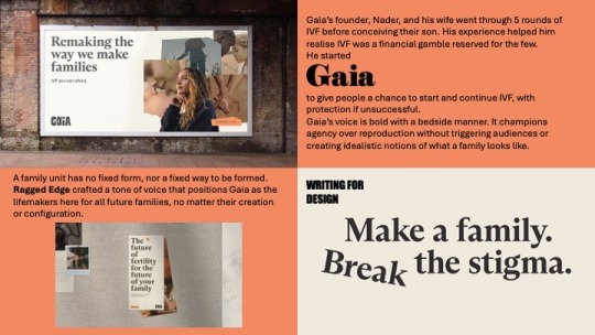
Finally, I looked at writing for design, where the design agency, ‘Ragged Edge’ crafted a tone of voice that positioned Gaia as the life makers here for all the future families. Gaia was founded by a man called Nader to give people the chance to start and continue IVF with protection if unsuccessful, after him and his wife went through five rounds before conceiving their son, and discovering how much of financial gamble IVF is.
Slide 9
This design agency is the one that struck me the most, so I began to research them further.
Slide 10
I discovered that they have won a few D&AD pencil awards and have been featured on their website a few times, for Gaia, Eager which is a juice company they did a simplistic yet impactful packaging redesign for, and Papier - a stationary company they did a logo redesign for. But who are Ragged Edge??
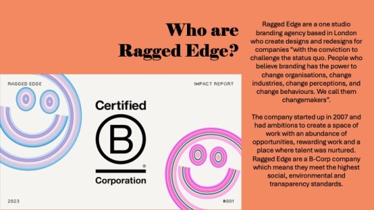
Slide 11
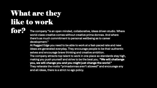
Ragged Edge are a one studio branding agency based in London, who create designs and redesigns for companies with the conviction to challenge the status quo. They state that “People believe branding has the power to change organisations. Change industries change perceptions and change behaviours” this is what they call a changemaker. Clients and that believe they have the ability to become a changemaker reach out to Ragged Edge directly to give themselves the opportunity to become one. The company started up in 2007, and had ambitions to create a space of work with an abundance of opportunities, rewarding work and a place where talent was nurtured. Ragged Edge are a B-Corp company, which means they meet the highest social, environmental and transparency standards.
Slide 12
The company states they are an open minded, collaborative, ideas driven studio where world class creative comes without primadonnas and where theres as much commitment to personal wellbeing as to career development”. After reading a lot of the reviews on Glassdoor for what the company are like to work with, I could see that the only negative things mentioned were the workloads, that is its a very fast paced studio where new ideas are generated everyday. I don’t personally see this as a downside but i guess the workload may pile up and become overwhelming. Many people who have worked for them exaggerate how they are a super kind team of people and the work environment is very friendly. People are pushed to be their authentic selves and brave thinking and creative ambition is highly encouraged. This is what drew me to them even more as i aspire to work for/ have my own company with the same mindset.
Slide 13
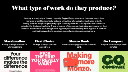
Looking at a majority of the work done by Ragged Edge, a common theme amongst the brand is bold text and solid colours with either photography, illustrations or both. I really like their simplistic quirky style, how they use their colour pallets and how each redesign fits the brand perfectly. I would love to implement these features and style into my own future work as i think they give character to the brand without overwhelming customers.
These are some of the companies that caught my eye on the website. A lot of them have recognisable logos or phrases that really work together in the bold and text heavy adverts alongside pops of animations or photography - Marshmallow, a driving insurance company, First choice, package holidays, monzo banking and go compare.
Slide 14
I delved a bit deeper into some of their projects that interested me the most. Firstly, Marshmallow insurance
Slide 15
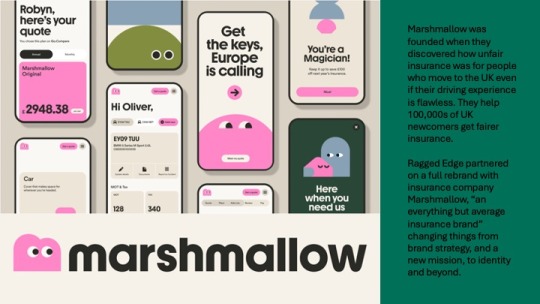
Marshmallow was created when it was discovered how unfair insurance prices were for people who move to the UK - even with flawless driving experience. Marshmallow helped to combat this and help hundreds of thousands of UK newcompers get fairer insurance. Ragged edge partnered on a full rebrand with this insurance company and changed things from brand strategy and a new mission, to identity and beyond.
Slide 16
They generated a library of what they called “marshforms” made up of different shapes, that can be stacked and built together to represent the infinite variation and uniqueness of their customers. A bespoke typeface was also created, with a brand new M logo of a little marshmallow who is always looking forward. With the implementation of photography as well, they were able to bring their customer’s personality to life with bright and vibrant lighting.
I really admire the simplicity and clean feel to the brand with it still having its own character and personality. This is the style of work i hope to be able to produce in coming units and projects.
Slide 17
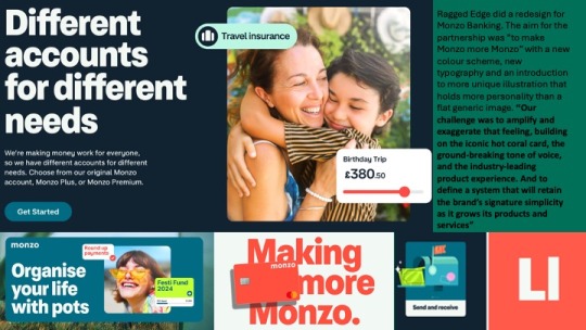
Additionally, I looked into their rebrand of Monzo where they aimed to make Monzo more Monzo with new colours, type and illustration.
Slide 18
With the introduction of these things, the brand feels much more welcoming and friendly in comparison to other banking companies. I think the colour palette used fits really well together. The illustration suits the vibe of the bank and the type with moving image is bold enough that catches your attention yet simple enough to get the message across.
Slide 19
Looking at the interface and how the colours match each other well is very interesting to me. The hot coral represents the warmth from the company, followed by a complementary, navy blue and soft white alongside vibrant secondary colours used when necessary for added eyecatching features. The design is quite simple, but adding these vibrant colours and accents across the UI makes it more unique than what generic banking app/website includes. For example, Lloyds Bank has white black and green as their only featured colours and this can be quite boring. The pops of colour Monzo use along side animated illustrations has makes the banking seem like less of a chore.
Slide 20
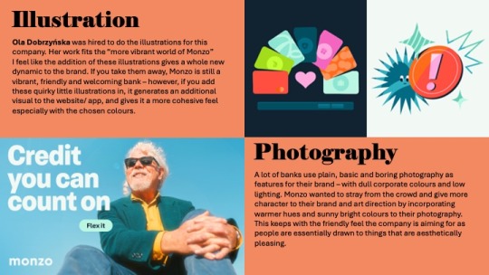
A lot of banks, use plain basic and boring photography as features for their brand with corporate colours and low lighting. Monzo wants to stray from the crowd and give more character to the brand and art direction by incorporating warmer hues and sunny bright colours to the photography, keeping to the friendly feel of the company.
Ola Dobrzyńska was hired to do the illustrations for this company. Her work fits the more vibrant world of Monzo. But I feel like the addition of these illustrations gives a whole new dynamic to the brand. If you take them away, Monzo is still a vibrant friendly and welcoming bank however, if you add these quirky little illustrations in, it gives an additional visual to the website/app and gives it more cohesive feel.
Slide 21
I looked further into the work of Ola Dobrzyńska, a full time freelance illustrator based in Warsaw, Poland.
Slide 22
Ola’s work is bold and colourful with a passion for character design.
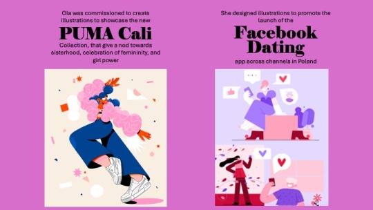
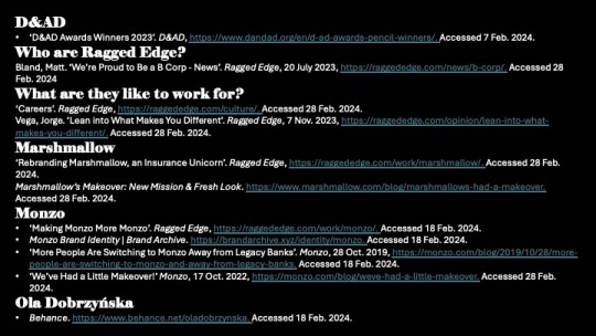
Two pieces of work she has created with recognisable industries outside Monzo include illustrations to showcase the new Puma Cali - a collection that gives a nod towards sisterhood, the celebration of femininity and girl power. And illustrations to promote the launch of the Facebook dating app across channels in Poland.
Her work can be seen mostly on instagram where she showcases her illustrations frequently, and etsy where she sells her prints.
Ola’s work as an illustrator really inspires me as this is a strong interest of mine and the opportunity to work with big name clients like she has done would be incredible.
However, I would need to expand my illustration skills a lot more if i would like to work to this level - I can’t be a procreate girl forever, I need to step into the adobe illustrator world and learn to draw in vector.
Her illustration style is very different to mine but is all cohesive. While it is nice to have versatility in drawings, it is also nice to have a consistent theme amongst them, and this is something that i would like to improve on, so no matter what piece of artwork you see, you know it was by the same person.
Slide 23
As a whole, looking at both Ragged Edge’s and Ola’s work. I know that this is the path of work that is for me, either working in a design agency for branding, or being a freelance illustrator FOR the design agency.
To be able to achieve this I would need to expand my skills in all softwares and be able to use them easily and glide through without problems to ensure i work quickly and efficiently. I would also need to generate a portfolio of work that relates to the industry I want to work in, showcasing all skills i have in a multitude of ways and over a range of projects. Ragged Edge seem like a really great company to work for with opportunities to work on some amazing things that would be really fulfilling and exciting. The only way to work for them would be to check out the open roles on their website or email them, so this is something i can consider in the future when i have a large enough portfolio
In the next 3 years I aim to refine my design work a bit more and create more professional seeming work, with a variety of brand assets that can be incorporated and a solid recognisable logo through the use of thorough experimentation. I will try to increase my knowledge and use of adobe illustrator for typography and the designing of graphics to make things more seamless and clean.
Bibliography:
0 notes
Text

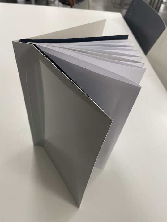
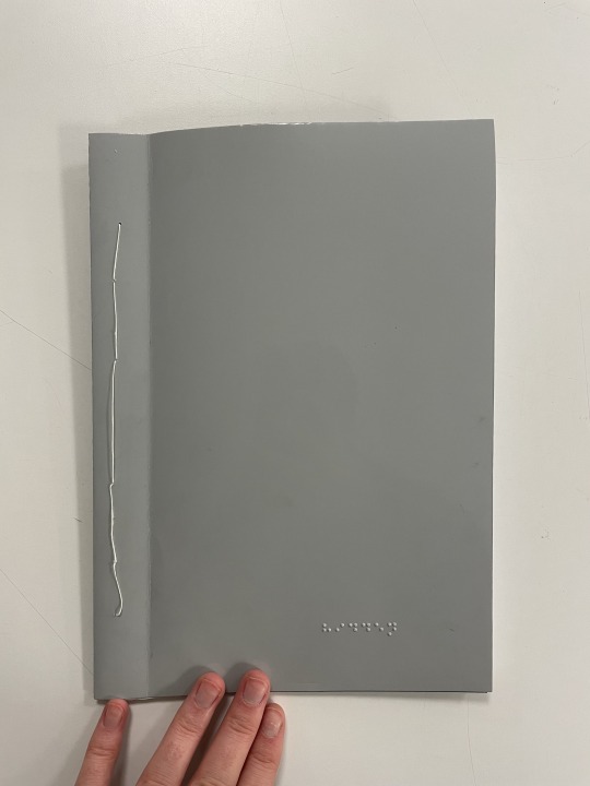
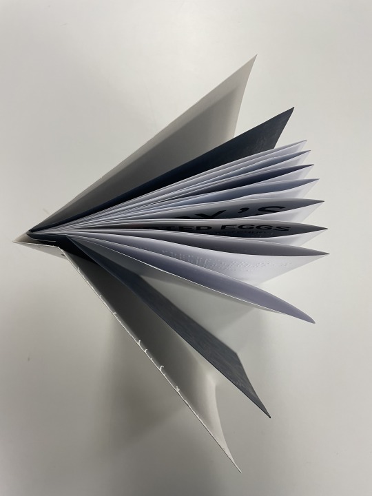

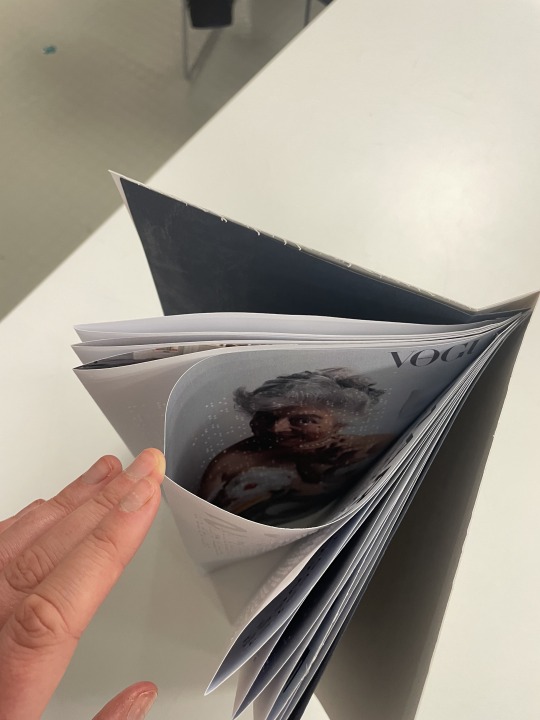

FINAL OUTCOME
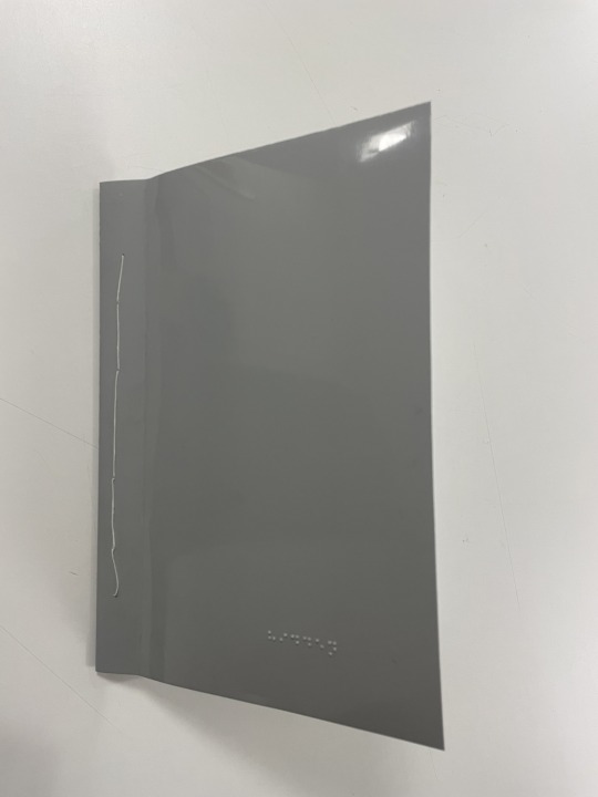
This is the final outcome- 'hidden'
I have thick glossy card as the outer cover which is stitched to the stab stitched interior pages on 120gsm coated paper stock. I chose the glossy grey as the outer over because it has a resemblance to the cover of a vogue magazine but it has not image on it, only the embossed braille with the title 'hidden'. this is layered with the leather look/feel black card to add to the feeling of the book being expensive and a treasurable object, linking to the research i did into the visually impaired wanting access to trends and missing out on the experience of owning and understanding a fashion magazine. the paper for the pages is coated to it feels sleek and there is a high contrast between the silkiness and the braille when it is embossed so it is easy to read. it is also thick enough that you don't immediately see the print on the inside of the fold which keeps it more of a secret, so not as easily noticed by the visually able user.
I used the article on British eccentricity for the contents of this book, because it talks about the visual trends which have been most influential this year, which cis something that visually impaired are missing out on seeing, so I wanted to make a point by using that as the contents of the book. I chose a vogue article because they have started to think about making their work more inclusive by releasing braille and audio descriptive versions of their magazines, but the two worlds of visually impaired and visually able are still being kept very separate and designing for this visually impaired is still an after thought, so i wanted to swap the roles of a visually able and a visually impaired to make a comment on how hard it is for the. visually impaired to get access to the content.
I included an introduction to the book so the users (visually impaired and visually able) have an understanding of the context of the book and that it is a vogue article, but i don't explain how the book works to the visually able, only the visually impaired through embossing in braille.
The images in the book are all full bleed, so the visually able reader can still access what it looks like. I did this because the photography in this article is unexpected and shocking and i want that to be surprising and make them wonder why these images are so surprising and make them want to figure out how to access the meaning behind them. It is also included because this is the side of fashion that the visually impaired are missing out on, because they don't see a book with massive and unexpected images on, they get this knowledge through audio description, touch and braille.
The type has been set in a mono spaces typeface to reflect the braille cells which are 2x3 so all cells are the same size, which is the same and the fundamental design of a mono spaced typeface. the type has been set in a 4x6 grid for the same reason.
Overall I think this is a really strong concept, but i think it could have been executed better. i think the stitching could have been neater and needs fewer pages to actually reach the content of the books.
0 notes
Last Seen Blogs

bug-water
gremlin crime time
kimscakes
Kim's Cakes

ladyofwinterfellx-blog
little bird
votedmostlikelys
the trick to holding on was all that letting go

provident123
Provident