#was originally malboro brand
Text
Assignment #1
Semiotic analysis of four Adbuster spoofs
Spoof ads aim to discourage people from using or buying the advertised product and typically offer some sort of commentary on the issue. They are usually parodies of the original advertisements and often pervert the themes and motifs used within them.
The first advertisement I have chosen to analyze is a spoof ad for Marlboro:
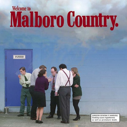
The goal of this advertisement is to show the bleak reality of smoking and it does so by parodying the quintessential cigarette brand, Marlboro. The Marlboro brand relies on its carefully constructed image to sell its product. The brand’s advertisements use rugged cowboys and demanding scenery to showcase what they call “Marlboro country” and suggest that the lifestyle of those who smoke Marlboros is that of freedom, adventure, and independence. This spoof advertisement parodies this concept to suggest what true Marlboro country looks like.
Straight away, the headline “Welcome to Malboro Country” tells you that this ad is playing off of the Marlboro brand. In addition to being in the same font and color red as the original Marlboro advertisements, the phrase “welcome to Marlboro country” was a common feature in older Marlboro advertisements. The cloud of smoke and the blue wall is also reminiscent of the blue skies commonly featured in Marlboro advertisements. Additionally, whether intentional or not, the missing “r” in “Malboro” speaks to its inauthenticity, suggesting that the advertisement is a spoof. The inclusion of the headline and other imagery similar to the original Marlboro advertisements uses metonymic and analogical code to cause the viewer to compare this advertisement to the original Marlboro ads. In doing this, the discrepancies between the two become much more apparent and ultimately enhance the message.
As the viewer makes their way down from the headline, the seemingly white and blue sky begins to fade into a grey (symbolic) that speaks to the dreary reality of the huddled group of people standing outside of the building. The cigarette in each of their hands (iconic) and the smoke trailing from them (indexical), indicate that they are smoking cigarettes and place them in the position of the Marlboro Man. The individuals’ proximity to each other as well as their attire, suggests that they are coworkers who work in an office setting and that they must be out on a smoke break. Additionally, their body language (indexical), in combination with the surgeon general’s warning that reads “smoking causes hypothermia,” indicates that not only is it cold, but that they are succumbing to the elements. All of these components form a condensed code that conveys the reality of smoking as bleak and unappealing. Through metonymic code, it is suggested that this bleak reality is in fact “Marlboro country.”
The next ad I have chosen to analyze is a Calvin Klein spoof:
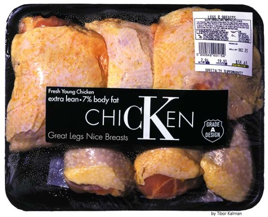
The intention of this spoof ad is to make commentary on the fashion industry and its exploitation of women. The ad features a package of raw chicken that is stylized to resemble the brand Calvin Klein, with emphasis given to the brand’s “CK” lettermark (symbolic). Through displaced code, the pieces of chicken symbolize the women depicted in the brand’s advertisements, speaking to the idea of their body parts being separated from the whole and used as marketing tools. Once one is aware of the comparison being made, it becomes apparent that the descriptive phrases on the packaging are actually being applied to the women and the “grade A design” symbol suggests that those characteristics are the industry’s ideals. The application of common descriptions of premium meat to women highlights the ridiculous physical expectations for Calvin Klein models and calls attention to the dehumanizing nature of the brand’s advertisements. For those who have prior knowledge of Calvin Klein ads, the beauty standards of women, and the inhumanity of mass production, all of the elements present in the spoof ad create a condensed code that sends the message that fashion treats women’s bodies like commodities.
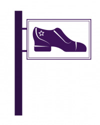
The third ad I have chosen to analyze is a spoof of an ad for Berluti, a men’s luxury shoe and leather goods brand:

The ideology behind this spoof is that buying luxury brands perpetuates consumer capitalism. The leather shoe and the brand’s name serve to symbolize the luxury brands and goods in question. The image of luxury is reinforced by the pristine condition of the leather shoe, indicated by its shine (indexical), which suggests that the shoe is freshly polished. Additionally, the luxury brand name of Berluti, in what appears to be a slightly altered Garamond typeface, typical of luxury brands, speaks to the luxurious image as well. The “place tongue here” (symbolic) alludes to the idea of bootlicking, which symbolizes submission, servitude, and obedience. So, because the “place tongue here” is positioned at the tip of the luxury shoe, it creates a condensed code that suggests that consuming luxury items makes you a servant of capitalism.
The final ad I have chosen to analyze is a spoof of a Tic Tac ad:

The intention of this spoof is to critique the nation’s increasing reliance on prescription drugs to enhance productivity and performance. The replacement of Tic Tacs with Adderall pills uses analogical code to equate our conception of stimulants to mints, suggesting the normalization and trivialization of prescription drug use. The ad’s slogan, “for when you need to freshen your mind,” further suggests that stimulants are used as quick fixes to a tired mind similar to the use of a tic tac for fresh breath. The use of a well-known brand in the spoof highlights the contrast between the expected and the reality, emphasizing the absurdity of the situation. Additionally, the sterile white and various green colors (symbolic), give the ad clinical or medical air. Together, all of these elements create a condensed code that conveys to the viewer a critical message regarding society’s attitude toward prescription stimulants–a message that is particularly salient given the current national Adderall shortage.
0 notes
Photo
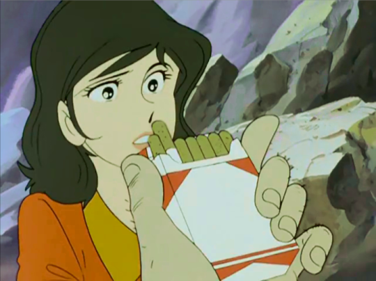

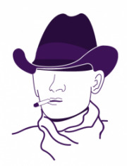
Favorite Lupin III Moments: 3/? (Part II, 3x05)
Jigen tries to comfort and calm down Fujiko by offering her cigarettes while Lupin and Goemon beats the crap out of each other. It was a surprise since Jigen is known for his dislike for Fujiko and irritation toward Lupin for being distracted by her. But they can be genuinely kind to each other and I treasure those scenes dearly. I think it’s the first time when we see Fujiko smoking.
#Lupin III#lupin the third#Daisuke Jigen#Fujiko Mine#lupin III fave#on the blank cigarettes box#was originally malboro brand#but they blank it for the international realise
286 notes
·
View notes
Text
a look into the recent vaping epidemic (10.4.19)

Hi everyone, I hope you all are doing swell. Today we’re going to talk about every millennials’ favorite hot button issue. Vaping! We all know someone who does it! Some of us might do it now! Recently, however, vaping has become a massive issue in the media. With 47 recent deaths linked to vapes laced with THC, and upwards of 1,000 injuries, vape companies, such as Juul, have recently come under fire for the way that they've marketed their products and the lack of research into the dangers of vaping. The products are incredibly appealing to younger users, with flavours like fruit medley and mango, their sleek design, and ease of use.

Juuls and other e-cigarette products were originally said to be a healthier alternative, because the vape juice doesn't contain the carcinogens that exist in 'analog' cigarettes, and can be used to help quit smoking. Although Juul claims this to be their only marketing point, a recent ad study done by a team of researchers working with Stanford Research Into the Impact of Tobacco Advertising found that Juul's ads specifically targeted a younger audience, drawing terrifying parallels to old Malboro ads for the same demographic. The company teamed up with social media influencers to promote their products, launched an ad campaign featuring fun and flirty 20-somethings with their little e-cigs in hand, and promoted themselves on college campuses. Doesn't sound like a company trying to help the older population quit smoking, huh?

Of course, the backlash began. With the rising rates of young people using Juuls socially, the company decided to remove its flavoured pods from retail stores, shut down its social media pages, and adopt a new slogan, "Make the Switch," as a way to market itself for its original purpose, smoking cessation. But it was too late. The damage had been done. Vaping is now a social activity among the younger population, and the rise of off-brand Juul pods have just endangered young people even more. Black market Juul pods containing THC are suspected of causing the vaping deaths, although the cause isn't confirmed, and about 1/3 of those who have the vaping-related illnesses are under 21. Juul has, of course, decided to take a step back from its marketing, pulling all ads. Additionally, the CEO of the company, Kevin Burns, has stepped down. None of this really matters though, because his replacement is KC Crosthwaite, the chief growth officer of big tobacco giant Altria, meaning that Juul will likely keep feeding on the naivety and innocence of young people in order to keep making money. And that, without government intervention, the rates of vaping-related illnesses and deaths will continue to rise. Some states are taking matters into their own hands. Massachusettes placed a 4-month ban on the sale of vapes and vaping products, a highly controversial move. At the height of the Great Vape Controversy, its only a matter of time until big changes are made surrounding vaping, its legality, and the public opinion on them.
0 notes
Text
Emre Yusufi “Solo Exibition” presso Emmanuel Fremin Gallery New York
Emre Yusufi, la poetica tra realtà e rappresentazione.
Alessia Locatelli
In scultura (…) non si può rinnovare se non cercando lo stile del movimento, cioè rendendo sistematico e definitivo come sintesi quello che l’impressionismo ha dato come frammentario(…). (Umberto Boccioni, Manifesto tecnico della scultura futurista, 1912) Ci sono due cose che mi hanno sempre sorpreso: l’intelligenza degli animali e la bestialità degli uomini. (Tristan Bernard) Essere un artista oggi non è solamente poter godere di una professione creativa. Riflette più che altro la capacità di accesso ad un mondo delle idee, ad un universo di connessioni insondabili dalla maggioranza dell’umanità, in assonanza ad una capacità di rielaborazione che infonde forma e vita all’opera finale, ovvero all’elemento concreto di narrazione nato da una primaria intuizione. Ma, a mio parere, non si esauriscono qui le specificità di coloro i quali leggendo il mondo con occhi diversi, sanno ancora stupire ed emozionare. E’ questo il caso dell’artista digitale Emre Yusufi: ironico e curioso di natura, campione di bowling, fotografo e musicista che vanta con la sua Band – gli Zeytin – un cammeo nell’ultimo film di Ferzan Ozpetek (“Istanbul Kirmizisi”). Stimoli trasversali che, se colti, possono condurre lo spirito di un artista oltre la mera esperienza personale, verso composizioni che parlano al contemporaneo. Emre Yusufi è nato a Istanbul negli anni ’80. Diplomato presso l’Accademia Fine Art School di Firenze, ha successivamente conseguito la laurea presso l’università di Marmara di Istanbul nella facoltà di Belle Arti, in particolare nel dipartimento di grafica erede degli insegnamenti della Bauhaus. Il Master di design all’università di Yeditepe in arti grafiche e comunicazione gli ha permesso di completare una formazione che lo vede oggi destreggiarsi abilmente tra le potenzialità tecnologiche dei nuovi programmi di grafica e d’intervento sull’immagine. Da alcuni anni ha aperto un’agenzia di sviluppo del marchio – la Lemonade – che ottiene collaborazioni con brand importanti quali BMW, Malboro o l’Oréal. Uno degli spazi di ricerca prediletti dall’artista è quello del sottile confine tra il mondo reale e l’atto rappresentativo. Nelle sue opere fotografiche l’attenzione a riportare con accuratezza ogni dettaglio rivive non solo nella possanza estetica e cromatica del racconto, bensì nell’attento esercizio filologico atto a non tralasciare alcun elemento che andrà a strutturare la studiata composizione finale. Sfondi, soggetti e accessori diventano tutte componenti essenziali per la resa visiva ed emotiva di ogni storia narrata. Come in una pièce teatrale, nulla è lasciato al caso e tutto concorre alla contemplazione finale della scena ed alla sua comprensione intellettuale. Così accade per “War Animals”. Una serie di fotografie che ritraggono animali che – liberi da ogni sovrastruttura e costrizione – svelano quel fragile equilibrio tra immaginazione (apparenza) e principio di realtà, in cui risiede il vincolo complesso tra l’essere e la sua relazione con il mondo. Un mondo in cui la guerra è entrata nel quotidiano di chiunque, circondandoci e cambiando il nostro modo di pensare, in cui non è più semplice muoversi, tra confini geografici o sillogismi religiosi. In tale prospettiva non c’è assoluzione per l’essere umano; gli animali – presa coscienza della situazione in cui stiamo gettando l’unico pianeta ad oggi abitabile – si armano per proteggersi dall’uomo e dalla sua folle indole distruttiva. L’impostazione dei soggetti è spesso frontale, ad ogni animale per assonanza è associata un’arma da fuoco, frutto di un’analisi delle caratteristiche del protagonista rappresentato, ma anche studio della storia degli oggetti bellici e degli equipaggiamenti per non tradire una “veridicità” atta sottolineare il desiderio di rendere una realtà altra, ma possibile. Nascono così le immagini divertenti e riflessive dei “War Dog” in cui ad ogni razza canina è associato un “fronte di battaglia” relativo alla seconda Guerra Mondiale (Russian, German, American) o la fotografia dello scimpanzé con il fucile, seduto davanti alla tenda dell’organizzazione internazionale per i rifugiati, la UNHCR. Evidente è la scelta di elementi stilistici che riportano alcuni animali alla realtà della cronaca terroristica, come accade per la scimmia con la kefiah sulle rovine di una città bombardata, dietro ad un sole offuscato dal fumo delle bombe, in cui mi piace ritrovare l’assonanza con la ragione umana ormai offuscata. Le molte specie coinvolte in questa ricerca iconografica hanno indotto Emre Yusufi – ove non possibile utilizzare i suoi – a cercare nei siti di immagini o tra gli scatti di altri fotografi le posture che risultassero maggiormente aderenti al concept da rappresentare, come accade per le fotografie dell’elefante/lanciarazzi, dell’orso bianco o per il maestoso leone seduto davanti ai palazzi in fiamme. La stessa accuratezza nello studio e nella resa finale si trova nel progetto “Hercules on ride”. L’idea prende corpo da un’ispirazione, tra il serio ed il faceto, avuta dall’artista in seguito alla visione dell’Ercole Farnese agli Uffizi. “E se Ercole, dopo secoli che dal suo piedistallo osserva l’avvicendarsi l’umanità nelle sue piccole storie ordinarie, si stancasse della sua forzata immobilità e scendesse per sperimentare il vivere quotidiano?” L’inconsueta domanda sfocia in un portfolio raffinato e giocoso – quasi un divertissement – in cui l’eroe mitologico romano si confronta con una serie di attività quotidiane, all’apparenza ordinarie. Ma solo in apparenza, poiché l’atto di soffermarsi a riflettere sull’impossibilità di alcuni di compiere certi gesti e azioni semplici, riporta l’osservatore verso considerazioni dal carattere profondo ed universale. In questo caso lo studio accurato del “medium fotografico” diviene occasione per sottolineare nell’opera finale anche le differenti qualità dei supporti che oggi abbiamo a disposizione per acquisire le immagini. Se Ercole si fa un selfie con i nuovi amici a Parigi, l’effetto estetico ricercato dall’artista sarà evidentemente quello rumoroso e poco professionale della fotocamera del cellulare; mentre le fotografie che lo ritraggono in atti sportivi – boxe, nuoto, surf – risultano maggiormente professionali, dall’inquadratura studiata e dalla resa naturale, compatibile alle cromie ed alle luci dell’ambiente in cui è ritratto, sia esso esterno o al chiuso. Morbide le luci dell’autunno mentre parla al cellulare con la sciarpa al collo ed emozionante il tramonto (o l’alba) il cui chiarore si riverbera dalla canna piegata nell’immagine della pesca. Nulla lasciato al caso, per un coinvolgimento totale del fruitore. La fotografia che ha dato origine alla serie è quella di Ercole che, a cavallo della sua moto, sfreccia sullo sfondo di una riconoscibile Firenze, un hommage alla cattedrale di Santa Maria del Fiore ma anche a quella scultura romana dalla cui intuizione il progetto ebbe inizio. Emre Yusufi stampa in grandi formati da 150x180cm con una resa museale importante, montando sotto plexiglas i suoi lavori, a sottolineare le atmosfere glossy e Pop derivate dal linguaggio della comunicazione e della pubblicità. Una commistione misurata tra l’elemento di analisi del reale – che deve rivestire della forma perfetta il concetto, l’idea primaria – e la componente formale ed estetica ricercata dall’artista. Il risultato è un’opera di arte digitale che riunisce in sé la potenza del messaggio alla ricerca estetica totale, in una combinazione riuscita tra la narrazione sui contrasti del mondo in cui viviamo e il piacere di una visione appagante.
#gallery-0-5 { margin: auto; } #gallery-0-5 .gallery-item { float: left; margin-top: 10px; text-align: center; width: 50%; } #gallery-0-5 img { border: 2px solid #cfcfcf; } #gallery-0-5 .gallery-caption { margin-left: 0; } /* see gallery_shortcode() in wp-includes/media.php */
Emre Yusufi “Solo Exibition” Emmanuel Fremin Gallery New York Emre Yusufi "Solo Exibition" presso Emmanuel Fremin Gallery New York Emre Yusufi, la poetica tra realtà e rappresentazione.
#Alessia Locatelli#artportfolio#Emmanuel Fremin#Emre Yusufi#ercole#Ferdan Yusufi#Forlì#Giorgio Bertozzi#hercules#Mobilis in Mobili#museo crocetti#Neoartgallery#Parma#Roma#Turchia#Tuyap
0 notes
Text
Brand: History Lesson 1
31.03.15 - This post was written during my time working at Inbound Digital Marketing

After writing a couple of posts about brand, I thought it would be interesting to explore where the concept of 'brand' originated. I am going to split this into a few, easy to digest posts, with this first post being 'Brand: History Lesson 1'.
2000BC

So, where does the term 'brand' actually come from? The word 'brand' is derived from 'brandr', an Old Norse term meaning 'to burn'. Belongings such as cattle, timber, crockery and even slaves were 'branded' with a symbol using a hot iron rod to demonstrate ownership. This antagonistic use of branding, which dates back to 2000BC, started to change around the 1800s into a more commercial activity where items were instead branded to differentiate and promote goods and services.
AD 190-1700s
With the fall of the Roman Empire, craftsmanship deteriorated and people were mostly illiterate. This resulted in town criers being used to spread information and later on, when things improved, paid to advertise goods. Hand-lettered adverts and signs were hung to show different types of businesses (such as a shoe for a shoemaker). The first ad in a newspaper was seen in 1625, in England. By the 1700s, the Government introduced patents, trademarks and copyright laws in order to encourage development and innovation. Trademarks acted not only as a way to identify products, but also to show their origin and therefore, quality.
1700s-1800s

The Industrial Revolution (mid 1700s in England), saw the start of mass production. This meant that goods could be produced in a much more cost-effective way. Advertising agencies started in the late 1800s as a means to coming up with original ways of promoting goods and reaching audiences, stimulating demand. This all introduced and highlighted the importance of visual identity and trademarks. Tobacco companies were amongst the first to use unique labels and packaging to attract attention.
It's interesting that the Government is now looking at removing branding from cigarette packaging altogether. This is something which has already been put into effect in Australia in attempts to make cigarettes appear less appealing.
1900s
By the 1940s, there was a lot more competition between companies to get their products noticed and this is when the concept of the USP came in. The 1950s saw the rise of characters being used as the face of a brand. An example of this is the 'Malboro Man'. The Philip Morris Cigarette Company was really struggling to sell their brand of cigarettes aimed at women when they came across an article in a magazine written about an ordinary cowboy, Clarence Hailey Long. They decided to use the cowboy as the face of their brand and to instead, aim the product at men. Their sales increased by 300%. Unfortunately, after the excitement of going from a shy cowboy to a celebrity, Clarence died of cancer.
Brand names started to become more of an importance in the 1960s, where the usual idea of using the founder's name or product's origin was replaced with having more fun and playful names, sometimes deceiving the public. In America, it was thought that the Danes produced the best dairy products. This gave two Polish men from New York the idea to invent the word 'Häagen-Dazs', aiming to mislead people into thinking that their dairy products were actually from Denmark!

In the 1960s the concept of a product being less of a product and more of a status symbol were seen by the likes of Harley Davidson and Mercedes. Things all got a bit out of hand when the idea of false advertising became apparent to society. Brands started to lose their audience's trust and some were forced to rebrand. For example, McDonalds had to look at a redesign using tones of green and yellow in order to portray them as part of a healthy lifestyle and not as an unhealthy fast food restaurant.
As you know, McDonalds is now a very established brand. I will be exploring this and other brands in my next post, which will explore the more recent history of brand.
0 notes
Last Seen Blogs
girlroach
the disco makes me sick

greenstudies
green studies

tiddie-taylor
tiddie-taylor

marjennings
MAR JENNINGS America's Top Lifestyle Expert

hugthot
☆bonjour thot☆