#web layout
Text
Here’s a concept of what a social media site would look like if I was in charge of the web design! Feel free to create a site with this layout if you want.
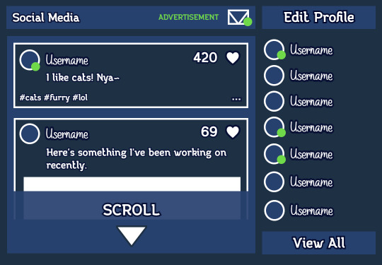
The usernames on the right-hand side are the people you are watching. Basically, people you select to be added to a list so you can see their content more often.
The advertisement is a thing you can click to go to a page where you can watch ads to gain hearts which can be given to users you like to help promote their posts. Don’t worry! You can still log in every day to collect some free hearts. If you’re running low, a message will pop up saying that you only have so many hearts until you have to watch an ad.
You would be able to edit your profile icon and username pretty easily by clicking “edit profile”. Clicking on a username would take you to their page where you can view more of that person’s content as well as their bio.
The green dots represent online users and any unread messages in your inbox. Your inbox would be the place where users you have selected can send you direct messages but you can revoke that ability if they annoy you.
You can click the dots next to any post to do things such as repost that person’s content anonymously or publically.
All-in-all, this feed design is readable and user-friendly. I’m sure it’d be really successful if someone copied this as their own social media!
6 notes
·
View notes
Text


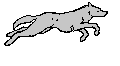


random misc dog wolf werewolf graphics pixels stamps blinkies
#carrd#carrd resources#carrd stuff#neocities#neocities resources#neocities stamps#stamps#webcore#website#aesthetic layouts#werewolf#wolfkin#otherkin#caninekin#wolf therian#nonhuman#alterhuman#dog kin#blinkies#pixels#wolf aesthetic#rentry resources#rentry#rentry graphics#web graphics#early 2000s#2000s#2000s emo#scene emo#dividers
1K notes
·
View notes
Text


Rare Dividers !! Reblog so more people can use ^_^


#icons#layouts#messy moodboard#messy icons#edgy moodboard#dividers#blinkies#y2k#webcore#pink moodboards#cute#old web#colorful moodboard#cute moodboard#resources#cute resources#web resources#carrd#carrd resources#carrd pngs#carrd layouts
3K notes
·
View notes
Text
𝄲 ֵ 𖹭 🥟ְ ᴰᴬᴹᴺ 𝓰𝗂𝗋𝗅 𝂅 𝂴 ﹙𝙲𝚁𝙰𝚉𝚈﹚ ᮥ ֹ 𝖿𝗈᪾𝗋 𝗒𖹭꯭𝅥𝗎 יִיִ
𝄲🍚᳞﹙ יִיִ 𝗌𝗁𝗁𝗁... 𝅼 ֹ 𝖼𝗈𝗅𝗅꯭⍺꯭𝖻 𝚆𝙸ִ𝚃᪾𝙷 @luacrescentte ❟ 𝟢𝟤 ֹ ᴾᴶ𝂅


𝄳 ֹ 므 ᴵᴹ꯭ 𝓈ᴼ ֵ ֹ𝖽𝗂𝖿𝖿𝖾꯭𝗋𝖾꯭𝗇𝗍 𝀕 🪹𝂅 𝄲 믕믹 ֹ 📝̸ h꯭un꯭dr꯭ed
ᥘ⠀ׄ 🦷⠀⠀𝗆͜⍺𝗍𝖾𝗋𝗂⍺𝗅 ⍺͜𝗎𝗍𝗈𝗋⍺𝗅⠀⠀𝄒! ⠀✉️⠀יִי꯭ִ⠀⠀𝗇𖹭 𝖼𝗈𝇁𝗉᪾𝗂𝖾⠀ׄ⠀𝅦⠀͝

#collab w nick-web#ֹ ִᴵ 𝄳 thank u ֵ 𓆤 🥞𝄲 coll⍺b ꯭with﹚יִיִ 𝂴u# #messy moodboard#moodboard amino#wugem moodboard#soft moodboard#random moodboard#edgy moodboard#miyeon moodboard#miyeon messy layouts#miyeon gidle#miyeon icons#minnie moodboard#minnie icons#minnie gidle#gidle icons#gidle miyeon#minnie#cute symbols#messy symbols#symbols#kpop bios#matching bios#twitter bios
1K notes
·
View notes
Text
i found laika's comet on neocities!
made by oaaky on neocities - this was a lovely gem to stumble upon today, and it looks awesome! if you have the time, please go check out oaaky's site and the laika's comet page as well!
#thank you oaaky!!#i didnt know this was a thing until just today#it looks amazing and you included the character quiz as well! you have a real talent for web layouts
653 notes
·
View notes
Text


꒰ა blue and white angel themed blinkies ໒꒱
#🎀#blinkies#dividers#old web graphics#cute pixels#pixels#icons#banners#web graphics#headers#layouts#kaomoji#symbols#favicons#web resources#carrd material#carrd stuff#carrd resources#pixeldump#blue pixels#white pixels#angel#angelcore#pixel aesthetic#pixel graphics#account help#requests open
2K notes
·
View notes
Text

꒰͡ ㅤ 👓ㅤ ✦ ♬ ㅤ 彼女 ㅤ ✧̩͙̾͒✧̩͙̾͒ㅤ ೄ
#笑 哭 现 场 笑 哭 现 场# #winter moodboard#minjeong moodboard#winter#2000s moodboard#2000s web#moodboard#aesthetic#kpop#messy bios#symbols#gg moodboard#pink moodboard#kpop moodboard#mb alt#mb#carrd resources#carrd symbols#alternative moodboard#archive visual#angelcore moodboard#winter icons#messy moodboard#messy layouts#aespa moodboard#fairycore#alternative#grunge moodboard
638 notes
·
View notes
Text
blue dividers for discord decor !!


#discord server#dividers#discord stuff#resources#line dividers#lines#page dividers#web dividers#div#messy layouts#messy dividers#blue dividers#blue aesthetic
2K notes
·
View notes
Text


。ㅤ 𓈒 𓈒 愛 ࣾ ♡ ུ̩̩ ̩ 𖣻 Princess
⊱┈─ 🪼 JellyFish
#⠀ ⠀⠀ ⠀⠀ ⠀⠀ ⠀⠀ ⠀⠀ ⠀⠀ ⠀⠀ ⠀⠀ ⠀⠀ ⠀⠀ ⠀⠀ ⠀⠀ ⠀⠀ ⠀⠀ ⠀⠀ ⠀⠀ ⠀⠀ ⠀⠀ ⠀⠀ ⠀ ⠀⠀ ⠀⠀ ⠀⠀ ⠀⠀ ⠀⠀ ⠀⠀ ⠀⠀ ⠀⠀ ⠀⠀ ⠀⠀ ⠀⠀ ⠀⠀ ⠀⠀ ⠀⠀ ⠀⠀ ⠀#moodboard#mb#colorful moodboard#messy moodboard#soft moodboard#aesthetic moodboard#aes#random moodboard#alternative moodboard#angelcore moodboard#angel moodboard#angelcore#vintage moodboard#messy layouts#blue moodboard#web moodboard#digital angel
459 notes
·
View notes
Text

return.
hi again! i'm still here :)
#artists on tumblr#space art#space#collage art#scifi art#spacecore#space aesthetic#surrealism#scifi#retro futurism#since when is the web app layout like this lmao I've been gone for too long
686 notes
·
View notes
Text


ㅤㅤㅤㅤㅤㅤ𝟏𝟏𝟏ㅤㅤノㅤㅤ童话ㅤ♡̸︎̸ 𓈒

#loc by also-web#chaewon#chaewon icons#chaewon layouts#chaewon moodboard#messy moodboard#indie moodboard#alternative moodboard#lq moodboard#blue moodboard#white moodboard#le serrafim icons#moodboard#moodboard kpop#kpop icons#gg icons#girls icons#kazuha#sakura#eunchae#yunjin
866 notes
·
View notes
Text


misc lucky star graphics stamps pixels
#carrd#carrd resources#carrd stuff#neocities resources#neocities#neocities stamps#stamps#webcore#website#aesthetic layouts#lucky star#konata izumi#miyuki takara#kagami hiiragi#tsukasa hiiragi#scenemo#scenecore#scene#scene emo#web graphics#graphics#rentry resources#rentry#rentry graphics#cute pixels#pixels#anime#weebcore#otakucore#2000s
337 notes
·
View notes
Text


=͟͟͞♡ εїз ᙏ̤̫ cute divider list !! ↺ ↺


#icons#layouts#messy moodboard#messy icons#divider#dividers#webcore#y2k#old web#blinkies#blinkie#cute#cute moodboard#cute layouts
1K notes
·
View notes
Text


#꒰ 📁 edits ♫ ꒱#remniku#2000s web#pastel#pastels#graphics#carrd help#carrd#carrd inspo#carrd icons#carrd stuff#carrd resources#rentry layout#rentry inspo#rentry resources#rentry gif#rentry#pastel pink#light pink#rentry graphics#web graphics#my graphics#rentry edit#carrd edit#edit#my edit#mahou shoujo madoka magica#madoka magica#puella magi madoka magica#madoka
713 notes
·
View notes
Text


#͏͏͏ ͏͏͏ ͏͏͏ ͏͏͏ ͏͏͏ ͏͏͏ ͏͏͏ ͏͏͏ ͏͏͏ ͏͏͏ ͏͏͏ ͏͏͏ ͏͏͏ ͏͏͏ ͏͏͏ ͏͏͏ ͏͏͏ ͏͏͏ ͏͏͏ ͏͏͏ ͏͏͏ ͏͏͏ ͏͏͏ ͏͏͏ ͏͏͏⠀#dividers by pommecita#dividers#coquette dividers#messy dividers#lace dividers#separadores#transparent png#coquette moodboard#messy moodboard#carrd resources#carrd material#carrd help#web graphics#bios coquette#coquette bios#coquette png#kpop moodboard#moodboard#messy bios#coquette#dollette#symbols#locs#twitter bios#resources#kpop packs#messy packs#coquette packs#layouts
344 notes
·
View notes
Text


choco n strawb sweets
#favicons#dividers#pixel art#blinkies#cute pixels#pixels#web graphics#banners#decome#carrd material#web resources#emotes#icons#old web graphics#pixel doll#pixel graphics#stamps#gif#graphics#headers#kaomoji#layouts#carrd#carrd stuff#carrd resources#buttons#backgrounds#dessert pixels#sweet pixels
693 notes
·
View notes
Last Seen Blogs
thekingofeverythingelse17-blog
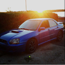
Car Trend
mesillusionssousecstasy
Mes illusions sous ecstasy

drewmwalker
Poly's Doodle cabin
xiaeom
⋆
inmylonelycorner
Lost Somewhere in History