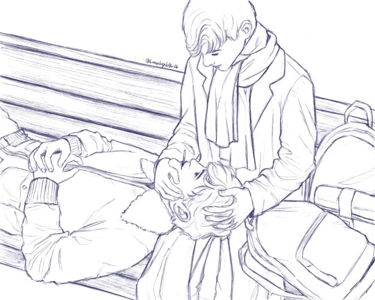
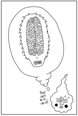
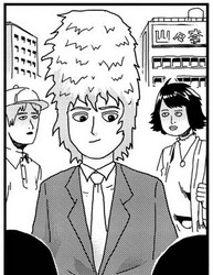
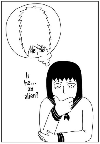
#well he's got a point
Text
What would a note say, "cat dead, details later"
3 notes
·
View notes
Text


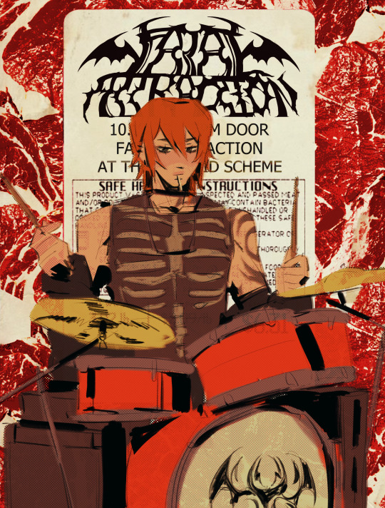

heartbreaking:the worst people you know just started an emo band
#the worst TWO people you know.beel got dragged into tjis#their band iscalled fatal attraction.asmo came up w it#&they give beel lollipops on stage so he can use both his hands but stillhas something 2munch on......#someone said asmo wld be problematic like 2000s jeffree star and i yhinkthey were on to somethinng#i think his interpersonal conduct with fans would be really distasteful in a way that bands cld only get away with during the 2000s#he wld be well liked. but he wouldhave an effect on them that permanently dmgs their taste in partner and psyche#like his ego wld be just kind of annoying until fans start getting his signature tattooed onthem and stuff and it would immediately go to#asmos head so badd to the point where being arnd him is like an impossible task unless ur the worldsbiggest pushover& soo patient#mine#obey me#asmo#beel#belphie
4K notes
·
View notes
Text
House M.D. but it's when House says Wilson's name
#house md#gregory house#prince's talk tag#after almost two weeks of going through the transcripts of every episode I finally finish this and the Wilson version#first off thank you to the clinic-duty team on livejournal for making the transcripts for these episodes#because this video would be near impossible to make without their clear transcripts. I hope y'all are doing well#ive been reading a lot of fics with these two and i see how the authors have the characters refer to each other in their fics#and that got me wondering how much do they say each other's name in the show and how do they refer to each other#since this is the house video ill put his stats here#s1 was 19 times s2 was 31 s3 was 34 s4 was 30 s5 was 35 s6 was 58 s7 was 25 and s8 was 28#in total he says his name 260 times. Mostly refers to him just by Wilson#He's only said Wilson's first name 7 times. Once by Jim 3 by Jimmy and 3 by James#He'll use his full name in professional settings or to be sarcastic or to pretend to be him#You know since House is the main character and in every episode of the show i thought he'd say his name more than him#but Wilson beats him by 42 times bc s7 and s8 he doesn't say his name as much. it took Wilson getting cancer for him to say it more#than he was before that point
720 notes
·
View notes
Text
Fenton Street Food
"You know what's better than being a superhero? A street food vendor! Yes, superheroes can save the day, stop villains and receive hatred or admiration as the case may be, but a street vendor? They are at the heart of the action, fulfilling their dreams! They traveled the world feeding the masses, and even met superheroes, feeding them to keep them doing their duty, food carts are the centerpiece of keeping the heroes alive, they are the heroes..."
Maybe if Danny repeated it enough times he'd start to believe it, though seeing the monstrosity that was the Fenton food cart he highly doubted it. More so because it had fucking guns hidden next to the mutant and very alive Hot dogs (which by the way were not sellable, they were the mascots of the brand).
It all started when Jack Fenton talked about his dream of delivering his favorite food around the world, that fueled Maddie Fenton's idea, and since Jazz was in college and Danny was on vacation no one could stop them.
Soon Danny became a victim of his parents' eccentricities. Although the halfa had to admit that selling in Gotham was a lot of fun, thieves didn't think it was worth mugging him and the Rogues themselves bought his food of dubious origins.
It was almost a shame to have to change cities because Batman was getting too suspicious but Metropolis was waiting for him. And he would be back eventually; some bats who had enjoyed his strange roving food stall had waved him off with handkerchiefs, wiping away fake tears. Danny appreciated it.
Besides, Red Robin affirmed to him that he would recommend him to Superboy, so he wouldn't run out of customers anytime soon. He wondered if he should stop by Central City, the Flash Family ate a lot didn't they?
#dpxdc#The Fentons create another dubious business#Danny is the victim#technically Danny is a good chef#he learned from Jazz to cook as well as possible with the little they had available#which was very useful to survive at the Fenton house#And apparently it's also useful for being the face of the Fenton food cart#His parents tried to help at first but he kicked them out and took over the car#Danny didn't want dead customers#the Fenton food cart travels all over the world#offering food at low prices#dp x dc#dc x dp#Danny wonders what he's doing with his life at this point#his parents got bored of the food cart and left him alone while they went back to the lab#Danny doesn't know whether to be grateful or cry in frustration#maybe he will do both
1K notes
·
View notes
Text
why Aurora's art is genius
It's break for me, and I've been meaning to sit down and read the Aurora webcomic (https://comicaurora.com/, @comicaurora on Tumblr) for quite a bit. So I did that over the last few days.
And… y'know. I can't actually say "I should've read this earlier," because otherwise I would've been up at 2:30-3am when I had responsibilities in the morning and I couldn't have properly enjoyed it, but. Holy shit guys THIS COMIC.
I intended to just do a generalized "hello this is all the things I love about this story," and I wrote a paragraph or two about art style. …and then another. And another. And I realized I needed to actually reference things so I would stop being too vague. I was reading the comic on my tablet or phone, because I wanted to stay curled up in my chair, but I type at a big monitor and so I saw more details… aaaaaand it turned into its own giant-ass post.
SO. Enjoy a few thousand words of me nerding out about this insanely cool art style and how fucking gorgeous this comic is? (There are screenshots, I promise it isn't just a wall of text.) In my defense, I just spent two semesters in graphic design classes focusing on the Adobe Suite, so… I get to be a nerd about pretty things…???
All positive feedback btw! No downers here. <3
---
I cannot emphasize enough how much I love the beautiful, simple stylistic method of drawing characters and figures. It is absolutely stunning and effortless and utterly graceful—it is so hard to capture the sheer beauty and fluidity of the human form in such a fashion. Even a simple outline of a character feels dynamic! It's gorgeous!
Though I do have a love-hate relationship with this, because my artistic side looks at that lovely simplicity, goes "I CAN DO THAT!" and then I sit down and go to the paper and realize that no, in fact, I cannot do that yet, because that simplicity is born of a hell of a lot of practice and understanding of bodies and actually is really hard to do. It's a very developed style that only looks simple because the artist knows what they're doing. The human body is hard to pull off, and this comic does so beautifully and makes it look effortless.
Also: line weight line weight line weight. It's especially important in simplified shapes and figures like this, and hoo boy is it used excellently. It's especially apparent the newer the pages get—I love watching that improvement over time—but with simpler figures and lines, you get nice light lines to emphasize both smaller details, like in the draping of clothing and the curls of hair—which, hello, yes—and thicker lines to emphasize bigger and more important details and silhouettes. It's the sort of thing that's essential to most illustrations, but I wanted to make a note of it because it's so vital to this art style.
THE USE OF LAYER BLENDING MODES OH MY GODS. (...uhhh, apologies to the people who don't know what that means, it's a digital art program thing? This article explains it for beginners.)
Bear with me, I just finished my second Photoshop course, I spent months and months working on projects with this shit so I see the genius use of Screen and/or its siblings (of which there are many—if I say "Screen" here, assume I mean the entire umbrella of Screen blending modes and possibly Overlay) and go nuts, but seriously it's so clever and also fucking gorgeous:
Firstly: the use of screened-on sound effect words over an action? A "CRACK" written over a branch and then put on Screen in glowy green so that it's subtle enough that it doesn't disrupt the visual flow, but still sticks out enough to make itself heard? Little "scritches" that are transparent where they're laid on without outlines to emphasize the sound without disrupting the underlying image? FUCK YES. I haven't seen this done literally anywhere else—granted, I haven't read a massive amount of comics, but I've read enough—and it is so clever and I adore it. Examples:


Secondly: The beautiful lighting effects. The curling leaves, all the magic, the various glowing eyes, the fog, the way it's all so vividly colored but doesn't burn your eyeballs out—a balance that's way harder to achieve than you'd think—and the soft glows around them, eeeee it's so pretty so pretty SO PRETTY. Not sure if some of these are Outer/Inner Glow/Shadow layer effects or if it's entirely hand-drawn, but major kudos either way; I can see the beautiful use of blending modes and I SALUTE YOUR GENIUS.
I keep looking at some of this stuff and go "is that a layer effect or is it done by hand?" Because you can make some similar things with the Satin layer effect in Photoshop (I don't know if other programs have this? I'm gonna have to find out since I won't have access to PS for much longer ;-;) that resembles some of the swirly inner bits on some of the lit effects, but I'm not sure if it is that or not. Or you could mask over textures? There's... many ways to do it.
If done by hand: oh my gods the patience, how. If done with layer effects: really clever work that knows how to stop said effects from looking wonky, because ugh those things get temperamental. If done with a layer of texture that's been masked over: very, very good masking work. No matter the method, pretty shimmers and swirly bits inside the bigger pretty swirls!
Next: The way color contrast is used! I will never be over the glowy green-on-black Primordial Life vibes when Alinua gets dropped into that… unconscious space?? with Life, for example, and the sharp contrast of vines and crack and branches and leaves against pitch black is just visually stunning. The way the roots sink into the ground and the three-dimensional sensation of it is particularly badass here:

Friggin. How does this imply depth like that. HOW. IT'S SO FREAKING COOL.
A huge point here is also color language and use! Everybody has their own particular shade, generally matching their eyes, magic, and personality, and I adore how this is used to make it clear who's talking or who's doing an action. That was especially apparent to me with Dainix and Falst in the caves—their colors are both fairly warm, but quite distinct, and I love how this clarifies who's doing what in panels with a lot of action from both of them. There is a particular bit that stuck out to me, so I dug up the panels (see this page and the following one https://comicaurora.com/aurora/1-20-30/):

(Gods it looks even prettier now that I put it against a plain background. Also, appreciation to Falst for managing a bridal-carry midair, damn.)
The way that their colors MERGE here! And the immense attention to detail in doing so—Dainix is higher up than Falst is in the first panel, so Dainix's orange fades into Falst's orange at the base. The next panel has gold up top and orange on bottom; we can't really tell in that panel where each of them are, but that's carried over to the next panel—

—where we now see that Falst's position is raised above Dainix's due to the way he's carrying him. (Points for continuity!) And, of course, we see the little "huffs" flowing from orange to yellow over their heads (where Dainix's head is higher than Falst's) to merge the sound of their breathing, which is absurdly clever because it emphasizes to the viewer how we hear two sets of huffing overlaying each other, not one. Absolutely brilliant.
(A few other notes of appreciation to that panel: beautiful glows around them, the sparks, the jagged silhouette of the spider legs, the lovely colors that have no right to make the area around a spider corpse that pretty, the excellent texturing on the cave walls plus perspective, the way Falst's movements imply Dainix's hefty weight, the natural posing of the characters, their on-point expressions that convey exactly how fuckin terrifying everything is right now, the slight glows to their eyes, and also they're just handsome boys <3)
Next up: Rain!!!! So well done! It's subtle enough that it never ever disrupts the impact of the focal point, but evident enough you can tell! And more importantly: THE MIST OFF THE CHARACTERS. Rain does this irl, it has that little vapor that comes off you and makes that little misty effect that plays with lighting, it's so cool-looking and here it's used to such pretty effect!
One of the panel captions says something about it blurring out all the injuries on the characters but like THAT AIN'T TOO BIG OF A PROBLEM when it gets across the environmental vibes, and also that'd be how it would look in real life too so like… outside viewer's angle is the same as the characters', mostly? my point is: that's the environment!!! that's the vibes, that's the feel! It gets it across and it does so in the most pretty way possible!
And another thing re: rain, the use of it to establish perspective, particularly in panels like this—

—where we can tell we're looking down at Tynan due to the perspective on the rain and where it's pointing. Excellent. (Also, kudos for looking down and emphasizing how Tynan's losing his advantage—lovely use of visual storytelling.)
Additionally, the misting here:

We see it most heavily in the leftmost panel, where it's quite foggy as you would expect in a rainstorm, especially in an environment with a lot of heat, but it's also lightly powdered on in the following two panels and tends to follow light sources, which makes complete sense given how light bounces off particles in the air.
A major point of strength in these too is a thorough understanding of lighting, like rim lighting, the various hues and shades, and an intricate understanding of how light bounces off surfaces even when they're in shadow (we'll see a faint glow in spots where characters are half in shadow, but that's how it would work in real life, because of how light bounces around).
Bringing some of these points together: the fluidity of the lines in magic, and the way simple glowing lines are used to emphasize motion and the magic itself, is deeply clever. I'm basically pulling at random from panels and there's definitely even better examples, but here's one (see this page https://comicaurora.com/aurora/1-16-33/):

First panel, listed in numbers because these build on each other:
The tension of the lines in Tess's magic here. This works on a couple levels: first, the way she's holding her fists, as if she's pulling a rope taut.
The way there's one primary line, emphasizing the rope feeling, accompanied by smaller ones.
The additional lines starbursting around her hands, to indicate the energy crackling in her hands and how she's doing a good bit more than just holding it. (That combined with the fists suggests some tension to the magic, too.) Also the variations in brightness, a feature you'll find in actual lightning. :D Additional kudos for how the lightning sparks and breaks off the metal of the sword.
A handful of miscellaneous notes on the second panel:
The reflection of the flames in Erin's typically dark blue eyes (which bears a remarkable resemblance to Dainix, incidentally—almost a thematic sort of parallel given Erin's using the same magic Dainix specializes in?)
The flowing of fabric in the wind and associated variation in the lineart
The way Erin's tattoos interact with the fire he's pulling to his hand
The way the rain overlays some of the fainter areas of fire (attention! to! detail! hell yeah!)
I could go on. I won't because this is a lot of writing already.
Third panel gets paragraphs, not bullets:
Erin's giant-ass "FWOOM" of fire there, and the way the outline of the word is puffy-edged and gradated to feel almost three-dimensional, plus once again using Screen or a variation on it so that the stars show up in the background. All this against that stunning plume of fire, which ripples and sparks so gorgeously, and the ending "om" of the onomatopoeia is emphasized incredibly brightly against that, adding to the punch of it and making the plume feel even brighter.
Also, once again, rain helping establish perspective, especially in how it's very angular in the left side of the panel and then slowly becomes more like a point to the right to indicate it's falling directly down on the viewer. Add in the bright, beautiful glow effects, fainter but no less important black lines beneath them to emphasize the sky and smoke and the like, and the stunningly beautiful lighting and gradated glows surrounding Erin plus the lightning jagging up at him from below, and you get one hell of an impactful panel right there. (And there is definitely more in there I could break down, this is just a lot already.)
And in general: The colors in this? Incredible. The blues and purples and oranges and golds compliment so well, and it's all so rich.
Like, seriously, just throughout the whole comic, the use of gradients, blending modes, color balance and hues, all the things, all the things, it makes for the most beautiful effects and glows and such a rich environment. There's a very distinct style to this comic in its simplified backgrounds (which I recognize are done partly because it's way easier and also backgrounds are so time-consuming dear gods but lemme say this) and vivid, smoothly drawn characters; the simplicity lets them come to the front and gives room for those beautiful, richly saturated focal points, letting the stylized designs of the magic and characters shine. The use of distinct silhouettes is insanely good. Honestly, complex backgrounds might run the risk of making everything too visually busy in this case. It's just, augh, so GORGEOUS.
Another bit, take a look at this page (https://comicaurora.com/aurora/1-15-28/):

It's not quite as evident here as it is in the next page, but this one does some other fun things so I'm grabbing it. Points:
Once again, using different colors to represent different character actions. The "WHAM" of Kendal hitting the ground is caused by Dainix's force, so it's orange (and kudos for doubling the word over to add a shake effect). But we see blue layered underneath, which could be an environmental choice, but might also be because it's Kendal, whose color is blue.
And speaking off, take a look at the right-most panel on top, where Kendal grabs the spear: his motion is, again, illustrated in bright blue, versus the atmospheric screened-on orange lines that point toward him around the whole panel (I'm sure these have a name, I think they might be more of a manga thing though and the only experience I have in manga is reading a bit of Fullmetal Alchemist). Those lines emphasize the weight of the spear being shoved at him, and their color tells us Dainix is responsible for it.
One of my all-time favorite effects in this comic is the way cracks manifest across Dainix's body to represent when he starts to lose control; it is utterly gorgeous and wonderfully thematic. These are more evident in the page before and after this one, but you get a decent idea here. I love the way they glow softly, the way the fire juuuust flickers through at the start and then becomes more evident over time, and the cracks feel so realistic, like his skin is made of pottery. Additional points for how fire begins to creep into his hair.
A small detail that's generally consistent across the comic, but which I want to make note of here because you can see it pretty well: Kendal's eyes glow about the same as the jewel in his sword, mirroring his connection to said sword and calling back to how the jewel became Vash's eye temporarily and thus was once Kendal's eye. You can always see this connection (though there might be some spots where this also changes in a symbolic manner; I went through it quickly on the first time around, so I'll pay more attention when I inevitably reread this), where Kendal's always got that little shine of blue in his eyes the same as the jewel. It's a beautiful visual parallel that encourages the reader to subconsciously link them together, especially since the lines used to illustrate character movements typically mirror their eye color. It's an extension of Kendal.
Did I mention how ABSOLUTELY BEAUTIFUL the colors in this are?
Also, the mythological/legend-type scenes are illustrated in familiar style often used for that type of story, a simple and heavily symbolic two-dimensional cave-painting-like look. They are absolutely beautiful on many levels, employing simple, lovely gradients, slightly rougher and thicker lineart that is nonetheless smoothly beautiful, and working with clear silhouettes (a major strength of this art style, but also a strength in the comic overall). But in particular, I wanted to call attention to a particular thing (see this page https://comicaurora.com/aurora/1-12-4/):

The flowing symbolic lineart surrounding each character. This is actually quite consistent across characters—see also Life's typical lines and how they curl:

What's particularly interesting here is how these symbols are often similar, but not the same. Vash's lines are always smooth, clean curls, often playing off each other and echoing one another like ripples in a pond. You'd think they'd look too similar to Life's—but they don't. Life's curl like vines, and they remain connected; where one curve might echo another but exist entirely detached from each other in Vash's, Life's lines still remain wound together, because vines are continuous and don't float around. :P
Tahraim's are less continuous, often breaking up with significantly smaller bits and pieces floating around like—of course—sparks, and come to sharper points. These are also constants: we see the vines repeated over and over in Alinua's dreams of Life, and the echoing ripples of Vash are consistent wherever we encounter him. Kendal's dream of the ghost citizens of the city of Vash in the last few chapters is filled with these rippling, echoing patterns, to beautiful effect (https://comicaurora.com/aurora/1-20-14/):

They ripple and spiral, often in long, sinuous curves, with smooth elegance. It reminds me a great deal of images of space and sine waves and the like. This establishes a definite feel to these different characters and their magic. And the thing is, that's not something that had to be done—the colors are good at emphasizing who's who. But it was done, and it adds a whole other dimension to the story. Whenever you're in a deity's domain, you know whose it is no matter the color.
Regarding that shape language, I wanted to make another note, too—Vash is sometimes described as chaotic and doing what he likes, which is interesting to me, because smooth, elegant curves and the color blue aren't generally associated with chaos. So while Vash might behave like that on the surface, I'm guessing he's got a lot more going on underneath; he's probably much more intentional in his actions than you'd think at a glance, and he is certainly quite caring with his city. The other thing is that this suits Kendal perfectly. He's a paragon character; he is kind, virtuous, and self-sacrificing, and often we see him aiming to calm others and keep them safe. Blue is such a good color for him. There is… probably more to this, but I'm not deep enough in yet to say.
And here's the thing: I'm only scratching the surface. There is so much more here I'm not covering (color palettes! outfits! character design! environment! the deities! so much more!) and a lot more I can't cover, because I don't have the experience; this is me as a hobbyist artist who happened to take a couple design classes because I wanted to. The art style to this comic is so clever and creative and beautiful, though, I just had to go off about it. <3
...brownie points for getting all the way down here? Have a cookie.
#aurora comic#aurora webcomic#comicaurora#art analysis#...I hope those are the right tags???#new fandom new tagging practices to learn ig#much thanks for something to read while I try to rest my wrists. carpal tunnel BAD. (ignore that I wrote this I've got braces ok it's fine)#anyway! I HAVE. MANY MORE THOUGHTS. ON THE STORY ITSELF. THIS LOVELY STORY#also a collection of reactions to a chunk of the comic before I hit the point where I was too busy reading to write anything down#idk how to format those tho#...yeet them into one post...???#eh I usually don't go off this much these days but this seems like a smaller tight-knit fandom so... might as well help build it?#and I have a little more time thanks to break so#oh yes also shoutout to my insanely awesome professor for teaching me all the technical stuff from this he is LOVELY#made an incredibly complex program into something comprehensible <3#synapse talks
742 notes
·
View notes
Text
it's a pet peeve of mine when ppl frame Andrew as hating Aaron and being needlessly cruel to him... bc while yes, their relationship is fractured and strained, Andrew genuinely cares about his brother and wants the best for him, he just doesn't know how to show that in a normal way.
like he might not know how to express it in a healthy manner but Andrew LOVES Aaron, like he truly just wants Aaron to be healthy and safe. It's like, his whole Thing. Aaron is one of the most important people in his life. Andrew wants him around. He'd do anything to protect him.
I guarantee Andrew wants to be emotionally close to Aaron too, he just doesn't have the tools to do that and the thought of letting someone in terrifies him. He also has no concept of what a healthy sibling relationship looks like, so he has no frame of reference to work from.
#i love bickering twinyards as much as the next guy but sometimes ppl write andrew has if he thinks aaron is a waste of space#and that just isn't true#andrew values his brother#he wouldn't insist on keeping aaron close if he didn't#when ppl do this is just so obvious to me that they're using andrew as a mouthpiece for their own dislike of aaron#and like ok yeah you're entitled to not like a character i guess#but it's just so wildly out of character to me for andrew to treat aaron like shit for no reason beyond Being Cruel#like yeah andrew can be mean when he's feeling defensive or trying to make a point#and yeah he can treat people like shit if he's got a reason to justify it like Keeping People Safe#but he's not needlessly cruel to the people closest to him without cause#like neil says#everything andrew does#he does For A Reason#even neil isn't needlessly mean to aaron tbh#like he doesn't like aaron much at certain points but if he picks a fight with aaron it's never without cause#and he's genuinely happy for aaron when things work out with katelyn in the end#and he wants aaron to have a relationship with andrew as well! like it's important to neil that the twins have a healthy bond!!#anyway im getting off my soapbox now this is just something i was thinking about today a Lot#aftg#all for the game#the foxhole court
509 notes
·
View notes
Text

"The she-wolf laid into the squires with a tourney sword, scattering them all. The crannogman was bruised and bloodied, so she took him back to her lair to clean his cuts and bind them up with linen."
#asoiaf#asoiaf fanart#lyanna stark#howland reed#my drawings#i wonder how many times i've reread that chapter with meera's story lol#i like this moment esp it's so sweet#and clearly made an impact on howland as he followed ned into the war later.. all the way to the tower#ohhhh you know what now i want a howland and jon interaction. i want them to meet. oh man#asos#anyway i've been in a bit of a slump lately so this isn't great but eh. i've got a few backlogged as well i might upload..sometime#it was super foggy today to the point of not seeing anything which was very cool so i guess that motivated me to finish this#i like weird weather but it should have snowed damn it. there's almost always snow on my birthday so this feels like an ominous sign#also there are odd places in my neighbourhood where tons of crows and rooks and jackdaws gather for whatever reason and i see them on walks#and i always go hmm looks like a feast for crows over there. heh
460 notes
·
View notes
Text
Something I’ve been thinking about lately is that small moment in “Air Turtle” where immediately after the Daves lose yet another game, Leo says how sorry he is and how he’s doing his best as the mascot. This moment is so short but it’s honestly jam-packed with a whole heap of characterization.
His need to apologize for things clearly not his fault - especially when it feels like he messes up the job he was given despite doing the best he can (the phrase “it’s not about you” takes a new meaning when this is one of the lessons to be learned from that - that he is not always solely responsible for things going wrong), his need to save face and make a connection with an older adult man in his life (something he consistently does throughout the series - he’s got a few daddy issues, always collecting potential father figures, it’s no wonder he jumps at the bit to keep rapport), and the way he sounds and looks and the words he chooses really pushes how he is just a kid (“Mr. the Dunk, I’m so sorry”).
Like I know it’s a one off moment that doesn’t truly mean much, but when put against the rest of the series it works really well with the rest of Leo’s established character and helps in solidifying later concepts as well.
#rottmnt#rise of the teenage mutant ninja turtles#rottmnt leo#rise leo#rottmnt headcanons#am I looking too much into things? almost assuredly yes#I actually appreciate how tim immediately goes ‘it’s not your fault’ as well? like he could’ve just blamed this 15/16 year old but he didn’t#but yeah this moment got to me a little mainly because it made me realize that Leo…DOES take responsibility for things a lot#he messes up a ton yeah but he says sorry at a pretty consistent rate#and y’know thinking about it#THIS IS TINFOIL HAT TERRITORY BE WARNED#he’s mentioned being betrayed by his brothers before - I wonder if it was something as simple as taking the fall for like#breaking something of Splinters or whatever#point is it wouldn’t be out of the ordinary for him to get the full blame for something only partially his fault#or not his fault at all in some cases#like in bug busters where Raph gets mad at Leo for not getting captured with them#(I understand Raph’s mindset here a ton - Raph’s the leader and he’s likely lashing out so I don’t blame the poor kid)#but this plus the moment at the beginning of the movie#where only Leo is reprimanded despite Mikey and Donnie having full autonomy to join the fun pizza stacking#make no mistake this is not at all a diss on everyone else!!! it’s just something I noticed#I think that “it’s not about you” doesn’t just pertain to being arrogant and wanting the spotlight#I think it’s also about how responsibility is meant to be shared#and like#Leo DOES mess up a lot! so he’s honestly probably used to having the blame because it is often at least somewhat warranted#he’s specifically described as being good at apologizing after all#tldr: Leo messes up a lot of the time so he is very used to blame and attention both good and bad#even when the full blame should not be solely on his shoulders
290 notes
·
View notes
Text


Cattonquick boarding school sweethearts/romeo & Juliet AU
In which Oliver also comes from old money and he and Felix fall in love in boarding school(?). The Quicks and the Cattons have been business partners since Queen Victoria was still kicking so Ollie and Felix have known each other their whole lives (summers and holidays always spent together) but when their family ties are suddenly severed after a hostile fight between their fathers, the boys’ last year at Eton is irrevocably ruined. As a reaction they decide (it was Felix’s idea and he succeeded in cajoling Oliver to agree) to elope run away on the first day of the Christmas holidays (imagine their respective chauffeurs endlessly waiting for them at the school gates lmao) and get married on a whim (also Felix’s idea to somehow "fix" things like ta-da! Can’t separate us now dad, we’re fucking married. Oliver is now a Catton. Family peace restored! No, not really Felix lmao.)
#needless to say they get caught the very next day#maybe they didn’t have much cash left and the only -pace they could’ve slept in for free was the hotel in the area that the Cattons owned#the reception prolly snitched but they both knew they would get caught eventually#also it doesn’t help that they’re the heirs of the richest aristocratic families in England#maybe they keep their marriage secret?it would be smarter to considering the repercussions but also maybe Felix it out first thing?#bc its Felix duh#as a consequence to their little escapade Oliver is pulled out of Eton for the rest of the year and the two of them only get to meet#the next year at Oxford where they have to keep things on the down low since Oliver’s father has threatened to transfer him to Cambridge if#if he’s seen frolicking about with Felix. it’s also difficult when Farleigh is acting as a (well-paid) spy for both parties#although both Jeff and James had sprinkled other eyes on the campus#oooh imagine them trying to hide in the back of the club. making out whilst crouching down behind dumpsters lmaooo#or or or! Felix attempting to throw them off by hooking up with indiabel and Oliver is so jealous he ends up doing the same thing#even tho he prolly knows about Felix’s intentions. (Farleigh doesn’t help with his catty comments about ephemeral love)#highlighting Felix’s well known shallowness. and then Felix gets jealous too so it’s a vicious cycle of pointing fingers at each other hehe#anyway they prolly end up like Romeo and Juliet#I was only supposed to do ONE canvas but got carried away and this shit developed a plot! sedate me#also this layout sucks wtf#saltburn#fanart#my art#felix catton#cattonquick#Saltburn fanart#oliver quick#felix x oliver#cattonquick fanart
225 notes
·
View notes
Text

That feeling when he can't stand to see you that way, no matter what you do, no matter what you say😩😭💔
#scott pilgrims precious little life#scott pilgrim vs the world#spvtw#spto#scott pilgrim#wallace wells#lisa miller#scollace#kim pine#natalie adams#envy adams#don't rlly know if I like how this turned out but oh well;;;#hope its obvious that this is based on the song “Scott Pilgrim” which the creation the comics were inspired from#the lyrics always make me think of Wallace and Lisa's feelings for Scott every time I hear it#ofc you could also relate it to Kim especially since the singers voice kind of reminds me of her#but overall the lyrics fit these two much better since Scott never truly “saw them that way” despite how long they've liked him#and they always seem happier to see him compared to Kim#Im surprised tho that I havent yet seen anyone draw these two together now that their dialogue parallels have been acknowledged more lately#also tho I wish more people pointed out that they both got cucked by red heads LOL#and Kim and Envy actually do look really similar when scott first meets them#makes me wonder if Scott subconsciously went for Envy since she reminded him of Kim (which would be fitting given that you could argue that#Envy dated Scott because he reminded her of Todd. Since he and Scott are confirmed to be meant to be seen as similar to one another#so much so that even their first and last names rhyme#last thing I'll add tho is that while Wallace and Lisa are very similar even personality wise#the one big difference is that despite that whole conclusion on vol4 of Scott not cheating on Ramona with Lisa because he loves her#the writers apparently think it would be “organically correct” for him to have an affair with wallace LMAO#but I guess we shouldn't be surprised since Wallace and Ramona are both in the front of the official valentines art which is clearly#a deptiction of Scotts wet dream or smth (oh and you could also argue that Wallace and Lisa parallel on that art since they're both#shirtless with white socks.. which could be a reference to how lisa wears skimpy clothes for Scott and Wallace often only wears boxers#to like sexually frustrate Scott for fun or smth
243 notes
·
View notes
Text
the only show where i am okay with fanon completely overshadowing (lol) canon is danny phantom. like we took this at best pg-13 cartoon about a ghost boy and his adventures and turned it into a horrifying story of tragedy and pain.
the portal accident? let's expand on that: he was electrocuted to death and had a portal to another dimension open on him. the agony he felt as he died is something horrific and unforgettable.
his parents are ghost hunters that hunt his ghost half haha! no. his parents are ghost hunters that are hunting their dead-is-he-dead-is-he-alive? child. they want to capture him for study. danny is constantly living in fear of parents because they want to "tear him apart, molecule by molecule." he is afraid of his parents discovering his secret: would it be better if they didn't know he was their son as they vivisect him? or knowing and doing it anyway?
14 year old superhero! boom pow he punches bad ghosts! so fun! wrong. he is a 14 year old atlas, stuck underneath the weight of protecting his home and the people in it. there are people who hate him, but it's okay because... because. he fends off anyone and anything that tries to harm those under his protection at the cost of himself. it hurts and he hurts but what else can he do? he gives up on his dreams of seeing the stars as phantom takes him away from school, so can continue fighting and keep people (except himself) unharmed.
the giw are so funny because they're so incompetent. but what if they weren't? what if they managed to catch him? what if fenton goes missing and phantom is never seen again? stuck in a tiny cell; he's not human. he is lesser and thus it's okay to tear him apart and put him back together over and over again. he is a shell of himself, truly dead despite being alive.
i could go on and on and on. my point stands: this fandom has developed something so intricate from a cartoon that would've otherwise been lost to time. we saw ideas and concepts that could be fleshed out into a truly engaging and gruesome story and did it! that's crazy!
this show by itself wouldn't be anything great, but fanon just made it so much better (by A Lot). danny phantom fanon is better than canon, and that's the truth
#i got rly into it at some point#whoops#but im being so fr#danny phantom fanon#is so much better than#danny phantom canon#WES ISN'T EVEN A REAL CHARACTER#BUT PPL HAVE FLESHED HIM OUT SO WELL THAT WE FORGET HE ISN'T CANON#i mean cmon#ghost king danny???#corpse au???#death days???#anti-ecto acts??#ghost hunger???#ectobiology???#LIKE HOW MUCH IS THERE THAT WASN'T EVEN CANON IN THE FIRST PLACE#all this to say#ily phandom#y'all are doing god's work fr#danny phantom#danny fenton#fanon vs canon#danny phantom fandom#phandom#(sry if this ends up on d&p tumblr we have the same name)
374 notes
·
View notes
Text
I just want to remind everyone that Wallace is canonically the worse one to sleep in the same bed with.
Scott can be a bad roommate in every other aspect but GUYS Wallace is the one that canonically snores and kicks in his sleep.
Scott sleeps like a princess with his back against the sheet lying perfectly straight (and also taking all the covers) and Wallace sleeps semi-on-his-side and apparently just fucking punting Scott in the leg every so often (not to mention he talked in his sleep too) and I don’t know why this is important to me but it is.
Because when people draw them cuddling in their sleep it’s always Wallace being normal and Scott turning and snoring and shit but you’re missing out on sleepy-cuddly Wallace turning and snoring on Scott. Let that cringe-fail 25 year old be annoying. Istg.
I’m talking to the Mobillace people too btw. Not that I’ve seen anyone draw them cuddling in bed (which is a CRIME btw. Draw that. For me.) but like imagine how funny it would be: Mobile stays the night for the first time and the hot-weirdo is a bed-menace, snoring and kicking and tossing and turning and suction cupping for warmth and Mobile is like “I want him to be my boyfriend” THATS FUNNY! LIKE-
#scott pilgrim#scott pilgrim vs the world#scollace#scott x wallace#scott pilgrim takes off#wallace wells#mobillace#mobile x wallace#mobile scott pilgrim#I’m sick of the cringe-fail erasure of Wallace#he might be more mature than Scott but that fucker ain’t mature#(however yes generally he is the voice of reason for Scott but anyone can be a voice of reason to Scott. Scott has no internal reasoning /h#I made an analysis post at one point about how I believe the primary reason Wallace manages to do half the shit he does#is because it’s easier to get the motivation to do them if he’s telling off Scott for not doing them#we know DAMN WELL that he is scared of their landlord#considering he got plastered the night before they had to go#(he seems to drink when he’s anxious)#and because of how uncharacteristically timid he was in his office#(and can I mention he said the line ‘it’s not our fault we can’t afford rent’ and like. I don’t know it feels important to point out lol)#but he tells Scott that they *have* to go and there landlord is all bark and no bite#despite being visibly nervous around him#so. the reason he dragged Scott to see him with him is because it would make him feel less nervous to see their landlord#if he focused on dragging Scott to see him instead of his own worries#but I never posted that analysis lol#but all this to say#um#i don’t know#but I’m saying something for sure!
193 notes
·
View notes
Text
i'm literally insane about the last agni kai and the lightning scene(s). i swear i've rewatched it 10+ times since my last rewatch of the show (which was my first watch in years) and like. azula sees katara come into view from behind. zuko doesn't. he follows azula's gaze and sees katara and is immediately horrified. he doesn't even think or hesitate because he doesn't have time and for once he doesn't have to look back at azula to figure out what she's doing because he knows what she's doing and he won't let it happen. time dwindling into slow motion as a haunting score plays? and zuko literally yelling out "no!" because that lightning absolutely cannot hit katara. as soon as he sees it there's no chance of that ever happening. and then katara watching in horror as the lightning flashes against features in what is probably one of the most hauntingly beautiful animated moments of the show? zuko hitting the ground still convulsing with lightning and katara crying out "zuko!" and immediately trying to run to him before azula attacks again? and the next scene we cut back to with them, zuko is groaning weakly and trying to lift himself up, and we see katara literally gasp in surprise as she realizes he's still alive (i'm sobbing because i do quite literally think she thought he was dead) and immediately tries to run to him again, nevermind that she knows azula is still there, and the hand katara uses for healing is already doused in water as she reaches for him. but then azula starts attacking again. and zuko, despite literally being in so much pain that he can't stand and can barely even move at all without whimpering, still tries to reach for the spot where he can see azula attacking katara. katara is forced to hide from azula's attacks. and as azula is mocking "zuzu, you don't look so good" down to zuko, the perspective shot is such that you can SEE that katara is also looking at where he lies prone in the distance, surrounded by flame (probably wondering how much time they have before it really is too late) before looking back up at azula and realizing she needs to defeat her as quickly and handily as possible so katara can get to zuko. obviously katara would have done this anyway (the whole reason they were THERE was to halt the continued cycle of the imperialist regime of the fire nation), but the scene is specifically framed as katara trying to figure out how to stop azula so the obstacle to her getting to zuko is no longer in the way. katara's defeat of azula was epic and deserves its own post. but then after making sure azula is securely chained, she runs to zuko, looks at him with such immense sadness and horror and fear as she hears him in so much pain, tenderly turns him over so she can get a good look at the wound. and she cups his head? briefly but so gently? so that he won't hit it as she turns him over? and when she tries to heal him you can tell she is so genuinely unsure if it will even work, and so relieved that she starts crying tears of joy when she sees it has (at least enough to keep him alive and somewhat lessen his pain.) they thank each other (and you can tell it's still really hard for zuko to talk and his eyes are barely open but he thanks her anyways i'm.) and she thanks him back and!!! when he starts to try to sit up she makes a little surprised face and then immediately helps him to do so (and puts a tender hand to his chest while she does!!!) and obviously that last shot of them standing together is also one of emotional support, but katara's hand on his back is also partly because i still think (and certainly katara still thinks) trying to walk/stand on his own would be a bad idea, so it's definitely not happening.
#y'all. let me tell you right now. there was a way to write and animate this scene that didn't play on a dozen romantically coded tropes#and this. uh. wasn't that!#zutara#i know this is basically just reciting what happened ( i almost included the actual way katara defeats azula but that wasn't the point of t#is particular post and also would have made it even longer.)#but#there is nothing about this sequence of events that does not make me feel like i am on drugs.#also you Know zuko immediately after this was like: alright well i guess i've got shit to do! then promptly falls unconscious again. tbh#the joke is on him if he thinks katara is letting him out of sight for a While#atla#zuko#katara#this isn't even particularly analytical i'm just gushing#i'm not joking i will never be over it.#the last agni kai#sozin's comet
166 notes
·
View notes
Text
Something I'm sad didn't make it into the Nimona film was more about Ballister's arm like, the comic had a whole thing about the Institute not having use for a one-armed hero, and that being part of why they began framing him as the villain
#like the film focused on other parts of him which was by no means a bad thing (not just him being gay also the fact the director scapegoated#a lower-class dark-skinned guy) but i Do miss the bit about his arm#it got me thinking of richard iii like how he gets portrayed in the shakesperean play w/ a limp and a withered arm#and the thing is i Cannot be normal about richard iii because like. okay ive seen his skeleton#and if we ignore how he doesnt look like me the curve of his spine is a different degree in a different place#well if we ignore that He Looks Like Me#this is getting off topic my point is about the comic's take on making disabled people into villains#nimona
546 notes
·
View notes
Text
Bruce didn’t mean to slice Jason’s throat and if he did mean it, it was only to disable , it wasn’t lethal and the wound would’ve been treated, and though that didn’t happen it wasn’t Bruce who sealed Jason’s fate but Joker who set off the explosion, and anyways Jason didn’t actually die he comes back in other comics.
Except none of that matters. It matters for the validity of UTRH as a Batman story that Bruce has deniability sure, but does it absolve him? UTRH says No. At the end of the day Bruce would rather attack his son than let his murderer die. Bruce thought he was refusing the choice but the lesson of this tragedy is that refusing to pick one over the other boils down to choosing the other.
#I don’t care if Jason didn’t technically canonically die it doesn’t absolve Bruce one bit#we saw him bleed out onto the floor and then we saw the building debris his body would’ve been trapped under#narratively his arc was over he might as well have died a second time#Bruce doesn’t get point for DC deciding Jason was popular enough to keep alive he doesn’t get points for comic book bullshit miracles#‘Jason got revived a second time’ is as reasonable as ‘he walked it off idk fuck you don’t think about it’#the thing is UTRH is the most sympathetic Bruce has ever been wrt Jason IMO#but the split second decision he makes is so… significant#there’s a reason that the ultimatum scene of the movie version of UTRH gets made fun of#jason todd#batsalt#anti bruce wayne#put a pin on it
166 notes
·
View notes
Text
teru & socialization
i've posted about this before but something ive been thinking about a LOT is mp100's themes of loneliness (and eventual connections). i think this is an aspect of teru's character (in particular) that gets left out because it's not as explicit but i've been wanting to do a deep dive on it for a while and i finally sat down to do it. just a warning, this post is gonna be LONG.
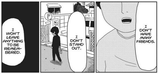
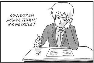
these two panels are from chapter 16 of the manga (which i'm using for my evidence because i. dont want to scrub through the anime LOL). initial sentiment: teru uses his powers to cheat having friends/a good social life and wouldn't have that if he tried earnestly. this is a fair interpretation of the scene. with what we know, at this point of time (as in within the teru-mob fight) teru would not be able to connect with other people earnestly, due to his mindset. which i think is a fair interpretation, HOWEVER:
(from chapter 17 ^^) the first panel shows teru's expression to be strained and the second is visibly unhappy. this puts the first set of panels into a different context, that maybe underneath all of this, teru doesn't WANT any of this life that he's built. keep in mind that i'm analyzing this with teru's possible autistic tendencies in mind & you dont have to believe he's autistic, im not your dad, but i do find this a pretty meaningful indication of masking if he were
(note: yes, the strain can definitely be read as comp-het, and i would agree but that's not relevant so go read this post on that instead)
even if the rest of these panels show teru content with his life, i think these expressions are pretty vital to how we read his life especially because we know so little of it. think about it, if you were a kid desperate for affection because you couldn't get it anywhere else, especially not in a way that would come off as "mature" or "unaffected", wouldn't you also look for validation in your popularity? even if it aligned you with people who you consider fundamentally different to you? my point here is that teru can't not stand out-- it's in his nature-- and we are shown how he tries to blend in & receive attention in the only way possible to him; which is to say that he molds himself into something that is palatable, likeable, and superior to other people. if he's nothing, like mob, he has spent his entire life covering up for it. if he fails socially, like mob, he has to be good at everything (even if he cheats to do so) so that everyone else can look past it.
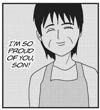
(side note for my teru angst enjoyers: this is a panel of his mom. the mom who he hasn't seen in years. doesn't it make sense that, if he hasn't heard his mom say he's proud of him for literal years, that he would overachieve in response? not related to the autism thing i just have the teru bug. also don't be misogynistic in my notes both his parents suck we just get a singular mention of his mom)
so if teru couldn't meaningfully have friends before mob, that could very easily be because of his past mindset, right?
...except, we don't.. really... see him make other friends afterwards.
but, the awakening lab, right?

(ok i lied to you sorry there is one anime screenshot and thats because it stood out to me while i rewatched it earlier this month. sorry.) id like to bring attention to this screenshot during the cultural festival because the awakening lab can definitely be seen as a direct contradiction of this and i'd like to point out a couple things:
1) in this scene the shiratori brothers are in another room
2) them and the other three are friends with ritsu (or at least close enough acquaintances to want to see him).
considering this is one of the only times they appear together for Fun i am more inclined to believe this is an encounter where they went together because they all would've gone separately anyway. this isn't to discount the possible bond that these characters might have, but thats the thing. we... aren't really shown that they're friends and enjoy spending time together outside of this screenshot, where two out of six of the members are not even present. not to mention that teru is still placing himself in a role separate from his peers. despite stripping the superiority away, teru is still the awakening lab's mentor, not friend. teru still views himself as fundamentally different in a context where his psychic powers don't make him that way.
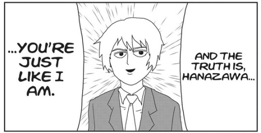
...except with mob. i bring this placement of power up because where he is the awakening lab's mentor, teru declares mob to be his rival, or, in other words, teru is just like him. he is accepting that mob and him are the same. (and if we view mob from an autistic lens... so on and so forth)
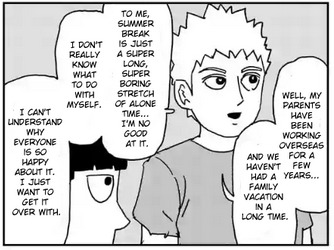
as if to hammer in that point even further-- in the summer vacation omake, teru explicitly states that "summer break is just a super long, super boring stretch of alone time." i'm not sure of the timeline here, but guessing from the hair, we're at least post season 1. which gives us explicit confirmation here that teru is spending the break alone despite his relationship to the awakening lab. his connection to mob is a lifeline here because mob is one of the only people who can intuitively understand teru's isolation without judgment
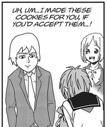
(also, on that point of teru's autistic tendencies: teru does and says a LOT of things that would raise other peoples eyebrows and doesn't seem to notice.
here we get teru actively admitting to his home life, right in front of reigen, WHO COULD CALL CHILD SERVICES ON HIM? this genuinely made me rethink this character entirely. teru's filter is... minimal. he isn't constantly volunteering information and generally minds his own business, but if you ask? Well.
teru is a social person, but to say he is proficient in understanding social situations seems... wrong. teru views his loneliness as boring because, despite being fairly open, does not actually allow himself to think about his own feelings and how they affect him. this loneliness is boring because he doesn't have enough of a reference to realize its not
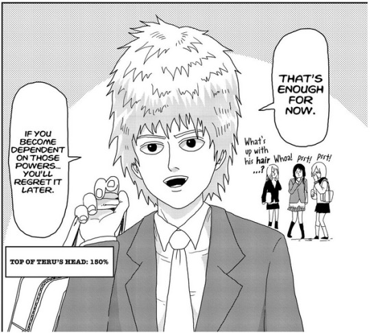
if we are taking pre-mob teru to be a version of himself who is masking, or at the very least someone who is faking a lot of stuff in a less autistic sense, the fight with mob changes teru to the point where he no longer hides himself. in the same way that mob was able to shake teru's fragile superiority complex i think the change in appearance marks the end of the self teru had built up. from this point on we see him become a lot more... Him. his appearance and his fashion choices are, presumably, completely normal to him and we get no indication that he believes otherwise despite the reactions it gets-- which is... well, i wouldn't be writing this post if i thought it was one of his most neurotypical traits.
in fact, he seems... pretty oblivious to what other people think of him. which is an interesting distinction to make considering the intelligence we Know he possesses (which is not to say that you are unintelligent if you don't pick up on social cues, just that its common for media to depict it that way.) these traits are made pointedly, even if unintentionally, separate, ESPECIALLY when you note the amount of characters who Do ruminate on or stare at teru's appearance.
some examples. i don't even think this is all of it-- case in point.)
#mp100#mob psycho 100#mp100 meta#mp100 analysis#teruki hanazawa#fun fact this post was originally going to be about terus autistic traits and then i got scared sorry#mostly bc i was pointing out stuff that made me go Hes just like me Frrrr...#and i dont actually know if thats a good metric bc im only like 90% sure im autistic#tho i think writing 1000+ words on a characters potential autism is. um. its. well.#text#ok ive gone back and forth on posting this a billion times bc ive looked at it too much JUST READ THEPOST
213 notes
·
View notes
Last Seen Blogs

kittygreene-blog
badlands.

charmanthq
charmed life
pinkprincesa1
PinkRainbowprincesa1

jeritmayie
Untitled

fattywattyart
Untitled