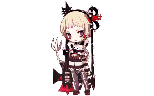
#what bird's feathers that weird accessory thingie has
Text
it started out as a joke but i have officially fallen into the hole called “cinder is a branwen” theory and i don’t know how to get out
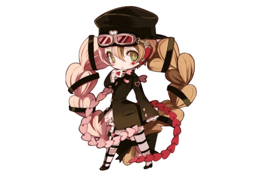
#rwby#cinder fall#asklsdjasdakl pls send help#i really spent days trying to figure out#what bird's feathers that weird accessory thingie has#that's like... one of the only constants in cinder's main outfits#only to find out her concept art describes them as iridescent#and their colors have been black green blue and purple#g u e s s what birds#have feathers like that#guess#the parallels with yang don't help#this hole is too deep i might be lost forever#it's also past midnight and thus officially my birthday so maybe is should just go to sleep#*i#yeah sleep is needed gnight#fcking miss 'fall is not my original last name'#i'm onto you
9 notes
·
View notes
Text
Magical Girl Raising Project Limited - character design ranking
Captain Grace
An alright pirate design with enough little details that keep it from being forgettable (I especially like the anchor buckle on her belt, and the earrings and hooks on her hair). The spikes on the coat are what stands out most to me; makes me think of a Mario enemy or something. However I’m not sure how much of a Magical Girl design it is. Like pirates and frills already go together, so the well tested formula (put a miniskirt and frills on it and it’s a magical girl look!) doesn’t really do much. Maybe it’d be better if she had some cutesy detail in there somewhere? Also is that an tail again or what, or some kind of blunt hook? What is it with these unnecessary tails in Magipro designs. 6/10.
Funny Trick
I’ve always liked Funny Trick’s look, and it’s probably because of the pleasant colour palette, unique eyes and two-tone hair (I’m easy to please with two-tone hair). The nail polish and colourful glitter on her fur are also good little details. But apart from that I guess this is only barely strange enough to be any kind of “magical” look rather than just an anime stage magician, but at least that’s pretty close to magical girls already. Also is that a frigging tail again?? At least it goes well with the hair I guess... 8/10.
Kuru-Kuru Hime
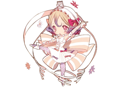
It’s a cute design, but when I think of a ribbon magical girl I somehow expected more ribbons? Like this feels like an the higher end of an average magical girl amount of ribbons? Or maybe it’s totally over the top and my perspective is just skewed since I love ribbons and want them everywhere. Either way I like her outfit from neck down, but I’m not that into the headgear, the combo of the bonnet thingy and the weird crown just sitting on top if it looks strange to me. Nice hair tho even if it could use more ribbons. 6/10.
Weddin
I absolutely love Weddin’s design. The muted and light colour palette is very appealing to me, and the dark chains break up the mostly monochrome design so it doesn’t look dull and faded and also give the otherwise super frilly appearance quite a lot of edge. There’s repeating elements (braids in her hair and veil, the same kind of flowers everywhere, flower yellow also appearing in her eye makeup) so it doesn’t get too complicated, and all of them go well with the wedding theme too. The flame... is a bit of an odd touch and I’d rather associate it with a birthday party or Christmas than a Wedding but I guess you can have candles at weddings too, and I don’t find it too distracting.
I’m not a huge fan of the lingerie like look though, but at least visible garters go with the wedding theme and she’s so covered in veils and frills that it doesn’t look so bad. Also the back train looks kind of lazy. But overall still one of my favourite Magipro designs. 10/10.
Rain Pow
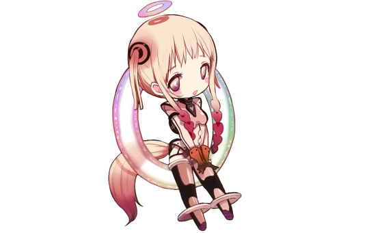
A tail again! However this time I actually like it, since she has that rainbow hoop behind her it looks good to stick something through it, and at least it somewhat resembles her twintails.
As for the rest of the design, it has zero frills and ribbons and looks more like some kind of scifi spacesuit than a typical magical girl design, but somehow I still really like it. I think the weird heart hair is just enough to pull it into magical girl territory for me so my impressions are more on the “an unique take on an mg look” rather than “not mg enough” side. Then all the rings keep the look consistent (I absolutely love the rainbow halo) and the suit itself looks alright enough. I also find it interesting how muted the suit colours are for a rainbow magical girl and even the rainbow is pretty pastel, but I figure this is a better choice than all the expected seven colours in all their eye-strainy glory. 9/10.
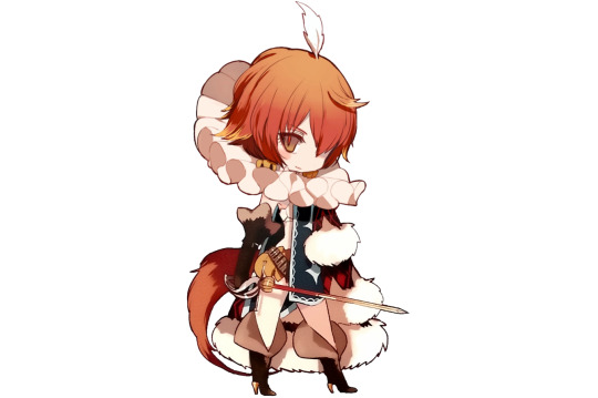
Postarie
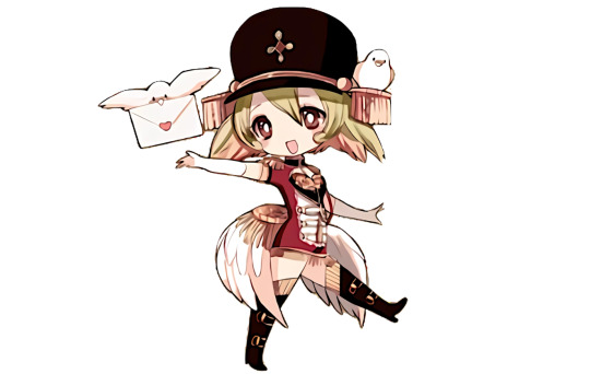
Please put on some pants, that is a shirt and not a dress.
Not too interested in this one, but I find it a commendable effort on making a design on the idea of “postal delivery girl”. Still lots of repeating elements so that’s a plus, especially the back epaulette is such an absurd idea but somehow it works and its wings and the wing hairstyle add the required fantasy touch. Bonus points for the cute birds. 7/10.
Tepsekemei
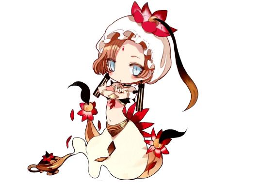
An inoffensive genie design but I struggle to really have emotions towards it. Butt flower is silly and I have no idea what the things hanging from it are, but at least they’re consistent with her head decoration. Don’t care for the shoulder spikes in an otherwise soft looking design. Huge earrings and multicoloured nails are a nice touch. 6/10.
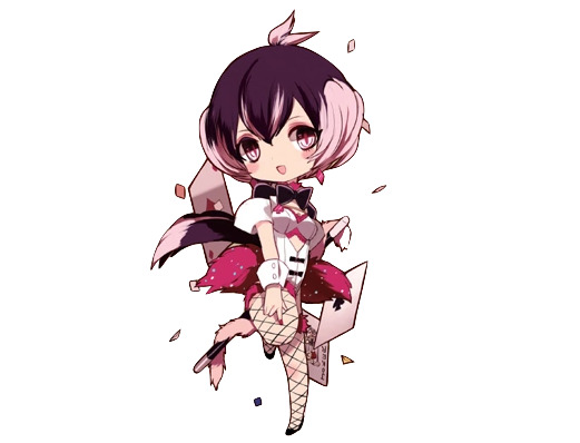
7753
Also one of my favourite Magipro looks. It feels like the design philosophy here was “gakuran jacket and some frills, and then some hearts. And more hearts! More! Even more!” and I think it’s a great way to go with when designing a magical girl. Using just hearts everywhere makes the outfit cohesive, but since they’re all implemented in different ways it doesn’t get boring. I especially like the little hearts on her hands and under the eye, and the one in her pocket.
Two-tone hair in twintails is also one of the best design elements out there and the hairstyle is quite memorable (and also manages to incorporate the heart motif) and I’m always a fan of caps too. The green eyes and the little bit of green nail polish which you unfortunately can’t see here go well with the otherwise reddish look. Maybe the hair looks a bit too clunky (I only just realised it appears to be tied in a hoop behind her) but I won’t let it bother me. 10/10.
Mana
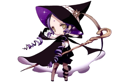
A solid witch design, I especially love the dimensional cape and hat. I also like the huge collar with the lace detail, but I’m not sure if it works with the hat brim. Not a big fan of the hair, I think it clutters the design. The snake leg accessory feels weird and a bit out of place but I do appreciate the asymmetry and also having something dark to break up the otherwise plain bottom part of the design.. 7/10.
Gekokujou Hana
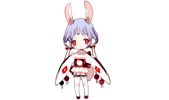
I tend not to be a huge fan of kimono-based clothes, but this one is an exception I guess. The great colours must play a part in it, and the bottom part is fun. Then the dangly decorations add the correct amount of strangeness so it’s not just a bunny girl in a mini kimono Also, another tail, but this time it’s almost a requirement and I love how ridiculously huge it is (and also repeats elsewhere in her outfit). But really I can’t think of anything to dislike about this, must be the colours and the tail. 10/10.
Archfiend Pam
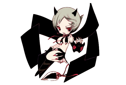
I believe this is the record on how little clothing you can wear in this franchise... At least she has the personality to pull that off. But that is not a top! At least it’s something new...? The wings fit the description in the story, but I don’t think these blank rectangles look very aesthetically pleasing. I like the tail best, the fur edge makes it a lot more interesting than just the usual demon tail. I don’t know, if the theme is a sexy demon girl this design definitely accomplishes it in a unique way, but also I don’t care for this fanservicey designs. Also not a fan of the hair. 4/10.
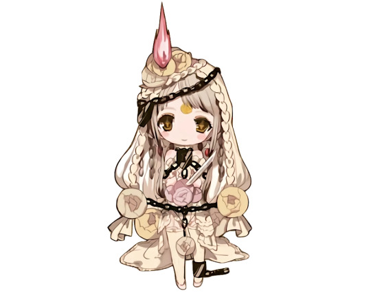
Pythie Frederica
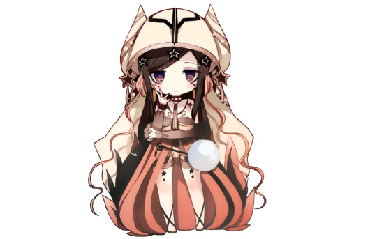
Before drawing her for the chibi series I thought she had some kind of a helmet but upon closer inspection of course it’s a veil. But what are the horns?
Upon closer inspection this one is also very fanservicey, in that her “dress” is actually see-through and the only thing covering the critical areas look like thin belt-thingies. At least she doesn’t look like she’s ten... But a major issue I have is the bottom part of her outfit, like how is it supposed to work? Is it one big piece of cloth, or multiple thin ones? What is the “fire” behind her? Is the dark part her hair, or the clothing, and is it supposed to be black or just shading? I do like the stars; otherwise the design gives a more mature “sexy” air, but the little stars everywhere adds a cute element. The colour palette is pleasing, but as much as I like multicoloured hair it doesn’t grant points this time, because the wiggly stray strands look very out of place here and the colour change makes them even more noticeable. 2/10.
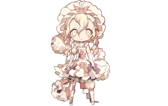
Tot Pop
This one really isn’t my aesthetic, I very much prefer the cutesy style and there isn’t really anything ‘magical girl’ about this design. And it doesn’t really evoke the supposed image of ‘pop star’ to me either, like if you remove the guitar I’d think her theme was a prisoner or halloween. Though I don’t really know what a ‘pop star’ should look like anyway, like can’t they wear anything they want, I know Lady Gaga had a meat dress or something. But as of this design, I don’t think there’s anything specifically wrong with it, the colours are pleasing, the details are consistent and it’s not bland or boring either, but it just doesn’t do much for me because of the theme. I like the blood-stained hair and the spiky hair accessory, the long hanging part makes for a nice silhouette. Meanwhile the skulls on her shoulders feel somewhat tacked on, and in general I don’t care for piercings in anywhere else than ears. 5/10.
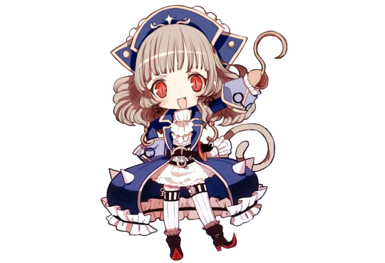
Pukin
And it’s a tail again. What is it with the stupid tacked on tails on every other design in this franchise? Sometimes it’s not so badly out of place, like if you have an youthful cutesy design, a fluffy animal tail can still add to the cute effect even if it’s otherwise out of place. But Pukin is supposed to be this dangerous and majestic authority figure and a cutesy tail very much doesn’t fit that image. And while we’re on the topic of animal features, the story describes that she has a feather decoration in her hair, but the way it’s drawn as a tiny feather jutting directly up in the middle of her head gives me more the impression of a character whose theme is a baby bird rather than a fantasy prince.
Now that we’ve dealt with the tail let’s get the biggest issue out of the way: I’m aware that there was a time in history when people used to wear these kind of giant ruffled collars but I really don’t care if there’s some kind of history based reasoning. It looks like your head is on a plate and it’s something I can’t ignore. I don’t feel even clowns can pull that off. There is no way getting around this.
When I first read Limited I thought Pukin’s appearance was an absolute mess and an instant 1/10, but upon closer inspection there is stuff I like about it too. She has a good colour palette, great shoes and gloves, and as a friend of multicoloured hair I welcome the yellow hair tips. The big heavy cape balances the small top and pants, and I really like the fur. Earrings go well with the pants too. The theme is a bit confused, or at least I don’t know of any fairy tales about pumpkin prince, but it’s not like I would complain about pineapple or cauliflower princess so that’s not really a problem. 3/10.
Sonia Bean
And we end Limited with yet another excellent design. I like how this manages to look kind of tattered and messy without actually being gross and dirty with the patchwork dress, dustball-like thingies, newspaper clippings and asymmetry. Even her hair looks disheveled. The headgear gives the design an old-fashioned vibe which suits her well since she’s so old. The light palette, soft design elements and ribbons give the look a cute feel, but at the same time she feels suspiciously pale, and the manic expression screams danger, like you can’t reason with this girl. She’s like a ghost of a Victorian era child who wants to play with you but you know you definitely should not follow her.
The design only works if I don’t think too much about it though, like dust is gross and newspaper paper is crinkly and not soft at all, but since we’re magical girls here I can ignore that and enjoy the image the clothing evokes. 10/10.
------------------
Limited average: 6,9.
#magical girl raising project#mahou shoujo ikusei keikaku#mahoiku#my stuff#ranking#ranking: magical girl raising project
42 notes
·
View notes
Last Seen Blogs
manicdreams
Mein Zuhause✨

justfrankiejane-blog
justfrankiejane
inoyamanaka99
YouTuberslover

andrewpowellphotostuff
Andrew Powell's Photo Blog