#wogd
Photo
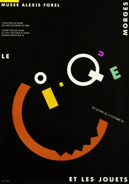
Martine Waltzer, Le Cirque et les jouets, Musée Alexis Forel, Morges, May 26 – October 4, 1992 [Carnegie Mellon University Libraries, Pittsburgh, PA]
#graphic design#typography#art#exhibition#poster#martine waltzer#wogd#musée alexis forel#carnegie mellon university libraries#1990s
61 notes
·
View notes
Text
I am the Hegemon
My robe is whyte
I reconcile
The dark and lyght.
My scepter has
A mitre hed
At Mystic Repast
I lik the bred.
3 notes
·
View notes
Photo

Agustina Cosulich (Mar del Plata, Argentina)
Detail of Voices in Freedom poster, 2009
Women of Graphic Design is delighted to announce that Agustina has joined us as a new contributor!
Agustina has a special interest in featuring female designers from, or working in, Latin America, and you’ve seen some of the designers she’s suggested featured over the past few months.
Are you interested in joining our team of contributors?
Email us if you’d like to join us in our efforts to highlight the contributions women have made to graphic design.
#Agustina Cosulich#women of graphic design#graphic design#typography#poster design#wogd news#female designer#female graphic designer#Argentinian designer
31 notes
·
View notes
Photo
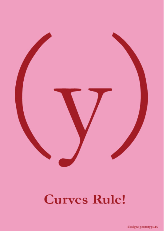
Curves Rule! Is a typographic work selectedfor Typo_Mad 2012 exhibition, curaded by DIMAD, and hold at Central del Diseño, Matadero, Madrid in October 2012. Also this work has been published on the “Feminizine Magazine” in January 2013
The artwork shows a feminine silhouette represented by Garamond font, one of the most rounded fonts, shades of pink, quintessential feminine color, and calls into question the exaggerated presence of straight lines and anorexic shapes in the media. Curves are cool, why not?
******
Curves Rule! Cartel tipográfico seleccionado para la exposición Typo_Mad 2012 comisariada por DIMAD que tuvo lugar en La Central del Diseño del Matadero Madrid en Octubre 2012. El cartel ha sido publicado por la revista “Feminizine” en enero 2013.
La obra representa la figura de una mujer realizada con tipografía Garamon, una de las más redondas, combina dos tonos de rosa , color femenino por excelencia, y viene a poner en cuestión la exagerada presencia de las líneas rectas y figuras anoréxicas en los medios. Las curvas molan, por qué no?
0 notes
Text
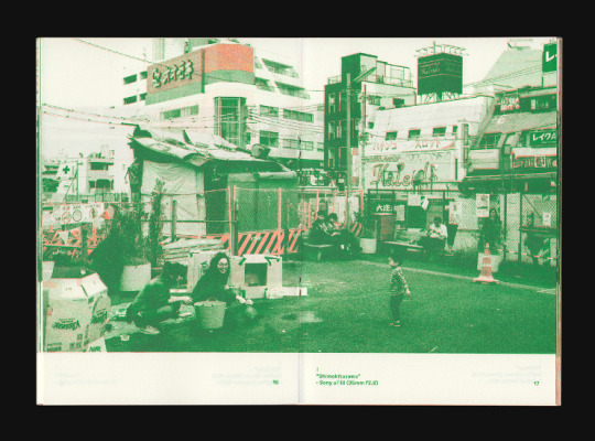
Inspiration with the duotone image treatment
I have found some other works online that have similar duotone treatment, however images are composed within an editorial layout style, nonetheless these inspire me.
https://coryschmitz.com/Travel-Zines
Travel Zines, a set of three 32-page RISO photography zines.
Kyoto available now at Kiosk, Seoul & Tokyo sold out.
136x193mm
https://womenofgraphicdesign.org/post/74194268585/design-caroline-fabes-wogd-submission
Women of Graphic Design
1 note
·
View note
Photo

[WOGD] Resources http://ift.tt/2nS7Ctz
2 notes
·
View notes
Photo
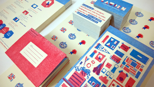
Ephemera — Senior Design Project SAA
Riso 2 color / Various Mailers, cards and resumes / Edition of 250
Design — Lauren Landes
18 notes
·
View notes
Photo
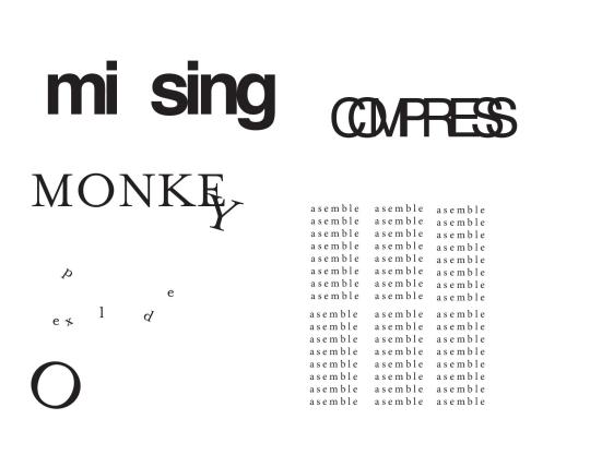
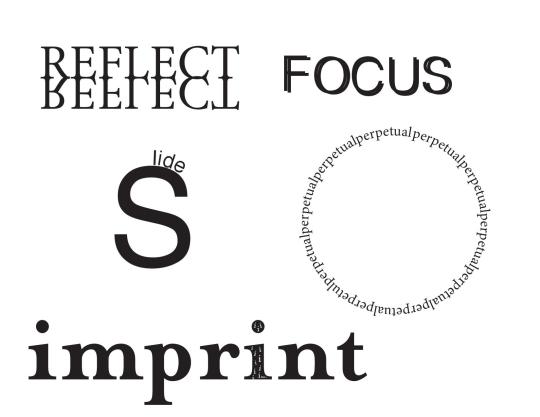
Typographic Metaphors
2 notes
·
View notes
Photo
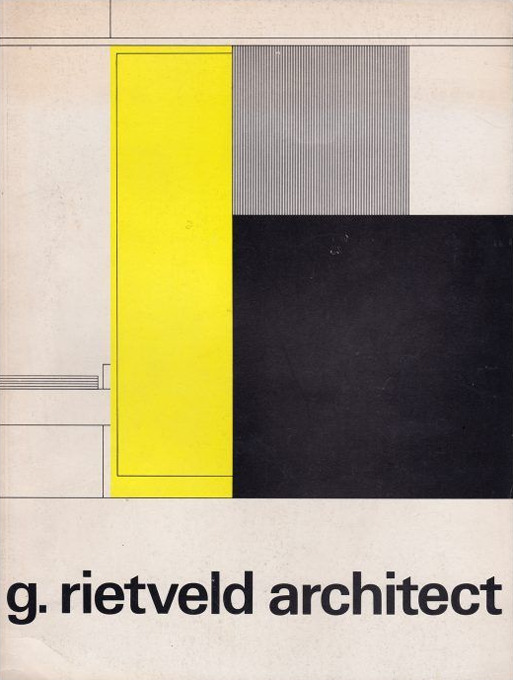
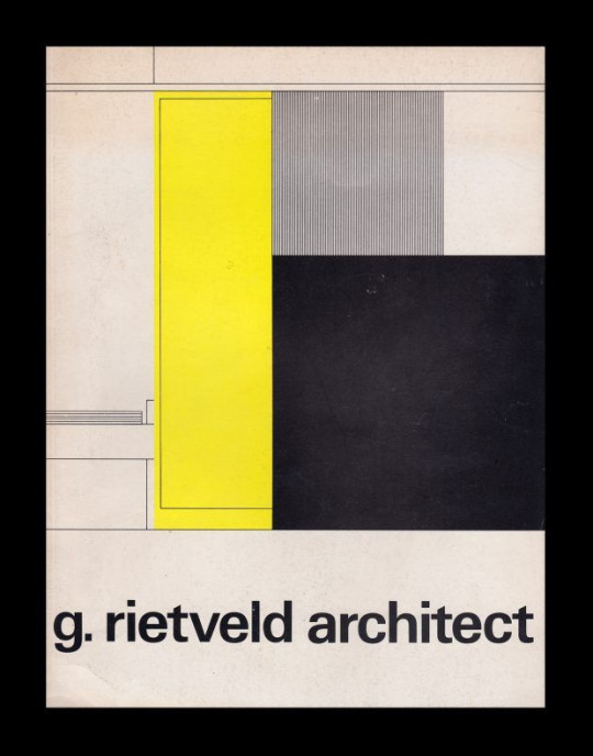
G. Rietveld architect, Stedelijk Museum Amsterdam, 1971-1972 [Exhibition: November 26, 1971 – January 9, 1972] [Design Reviewed, Bradford]. Design: Wim Crouwel, Magda Tsfaty / Total Design
#graphic design#architecture#design#geometry#exhibition#catalogue#catalog#cover#gerrit rietveld#wim crouwel#magda tsfaty#wogd#total design#stedelijk museum amsterdam#design reviewed#1970s
71 notes
·
View notes
Photo


Soo Jin Lee (Los Angeles)
Replica
“The graphic series Replica is a reinterpretation of symbols, store stickers, banners and labels from our mundane life in a subversive and humorous way. It approaches everyday advertisements and signs in an anti-capitalist perspective.” (email with WOGD)
#Soo Jin Lee#women of graphic design#graphic design#typography#female designer#female graphic designer#submission
2K notes
·
View notes
Photo
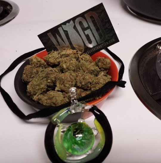
Hashplant haze for days
#weapons of glass destruction#wogd#glass#pendant#weed#dank nugs#dank#hashplant#nugs#nug shot#medicinal#medicinal marijuana#me
0 notes
Last Seen Blogs


thekisforkeats
Aggressively Mediocre Blogger

knitmoregirls
The Knitmore Girls Podcast
thekisforkeats
Aggressively Mediocre Blogger
sublecturas
Lecturas #igerslibrary #igersbooks #instabooks #in