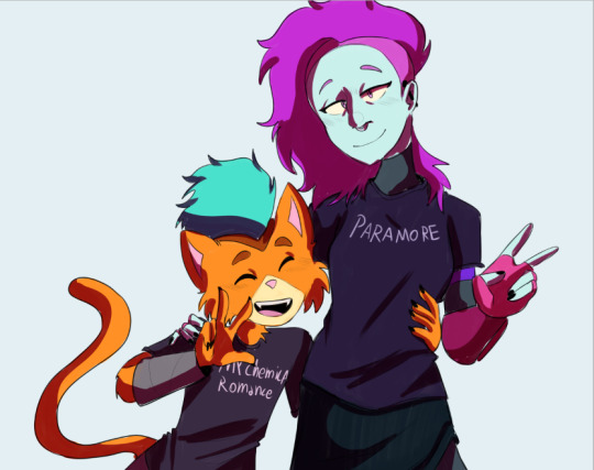
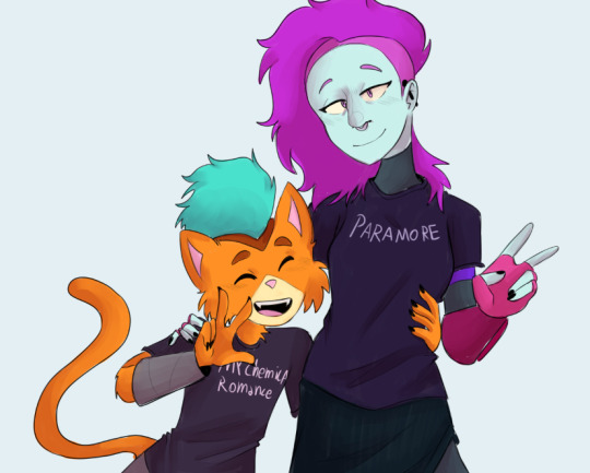
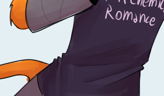
#you get the dark lineart version
Text
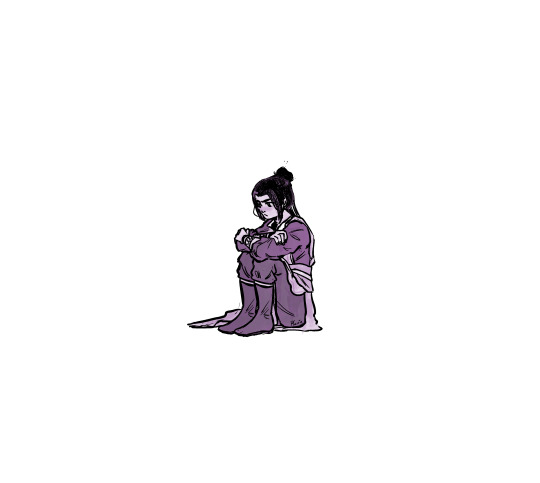
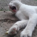
bad day.
#Jiang Cheng#mdzs#mxtx#魔道祖师#pherrie draws#vent art#<3#you get the dark lineart version#even if it makes it obvious that I copy and pasted the shoes lmao
160 notes
·
View notes
Text

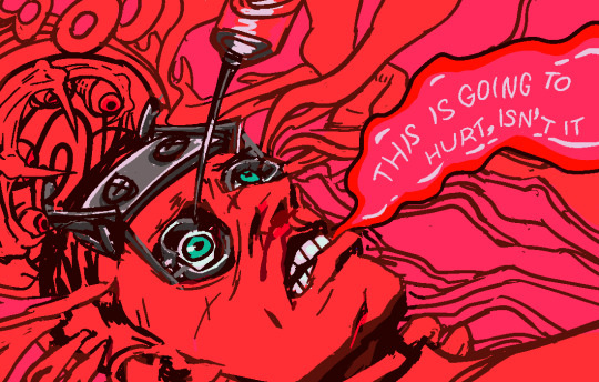
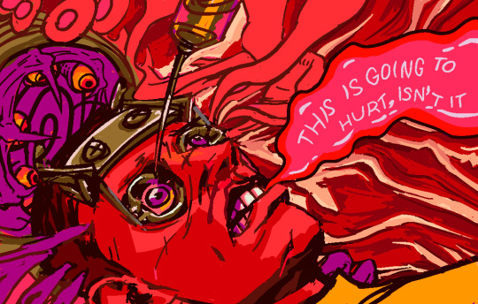
suuuuuper not done yet! but got randomly inspired to draw this scene from dead space 2 cuz it's iconic/sexy and i gotta respect a guy who will crawl into a mystery machine and let it stab his eye if his dead gf tells him it's a good idea
#dead space#cyrsed art#wip#it will hopefully look much better finished altho tbh the lineart version looks kinda ok on its own#but i want to draw MEAT#isaac climb inside the dark machine#you have to go in the dark machine isaac#eye trauma 0---#needles ----#im in the middle of a ds2 playthrough (my first time actually playing it!! and not just watching people play!!)#i'm so excited to get to this part altho holy shit the ishimura section got so fucking hard out of nowhere#and i made some Errors that mean i have like uuh#no ammo lol#9
4 notes
·
View notes
Text
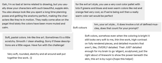
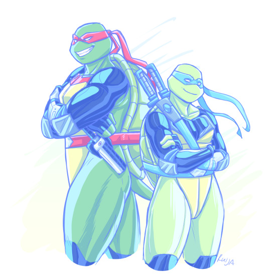
So! The evil art challenge!
Thank you everyone who gave their input, you wrote really nice things💙💙 and you've definitely picked out my habits pretty well, lmao. Below I'll write a breakdown of my style and thoughts behind the "evil" version.
Aesthetically I love pastel and saturated colors and I'm 100% biased toward cooler tones. Regardless of color, whether it's red or blue adjacent, I'll always pick the cooler variable of it. I tend to avoid using black and I particularly have an aversion toward basic red.
I have a short attention span and limited reserves of energy, so I try to work fast and stick to simple techniques; hence the sketchy linearts and mostly flat colors. I also just visually like smooth surfaces and gradients.
I want to convey the shapes and weight of the things I draw but with a minimalistic amount of lines and shading. This ties into putting emphasis on anatomy and muscles. I do tend to spend a lot of time sketching, because I usually have a very specific pose or vibe in my mind, and I want to be able to capture it.
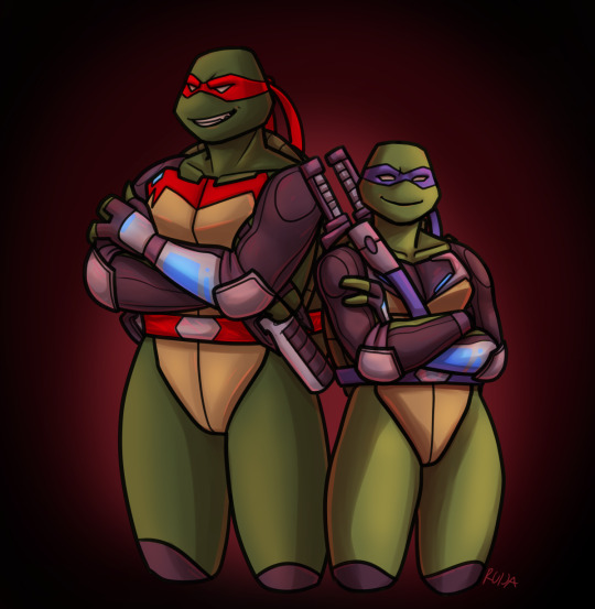
For the "evil" version:
- I sketched Raph and Leo a lot faster and attempted stiffer poses than in the normal one.
- Thick and non-sketchy lineart
- Dark and reddish color scheme
- More rendered, airbrushy and kinda messy shading (I suffered)
- Slightly less defined muscles...?
At some point I thought I should make them sharper, but then I just forgot lol.
Also, here's a flat colored version of the evil art because I like it 100% better. (Works better with the lineart style)

I picked Leo and Raph for this challenge for the opposing red and blue color schemes. As an extra, I put them in Fast Forward gear, as its blueness and the season's more saturated look are very fitting for my style. And then I'd get to make it work in a warmer tone.
Anyway, hope you enjoyed my ramblings and art~
179 notes
·
View notes
Note
I really love what you do with the colors pallets. I was wondering if you had any tips on how todo them? I over complicate things, and I feel like I can’t do the pallets right, like is there a certain rule on color placement? Like the darker colour goes in the background, lighter further front?
… sorry 😭, other artists just make pallets look so easy, would you recommend using 3 or 2 colors to start with?
Sorry for babbling and thanks again 😂, honestly love seeing your art 😙, also, if someone wanted to gives your art/fic would you mind if they tagged you or would sending it in an ask be better?
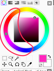
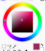
I’m still very new to choosing my own pallets. As for order, often I find the “pop”, or most saturated color works good for the background. Then for the characters, a less saturated version of the compliment color….or one that just looks nice. Then I do a light color for the eyes and any other elements I wanna emphasize. Lineart is done in black and then just alpha lock->fill layer with a color and slide around the adjustments until I’m happy. There’s not really a particular number of colors I think looks best, but I’m starting to like five color pallets. You can do three or even two, but five gives you some breathing room for variety.
A lot of it really is just what looks nice. I hate to say that, but there’s not an exact science behind it. Yes, you have to have knowledge of color theory, but also…It is just training your eye. Studying other people’s palettes, figuring out what rules they’re following, and how to play with and bend those rules.
This is why I will often go into the “color palett” tag for a starting point. But as a way to make them my own…I’ll do each color on its own layer. This way, I can change the hue/saturation/brightness and change, change, change, change, change until I’m satisfied. So much of the process is just playing. Play with one color, hop to another layer, play with that color, hop back to the other and adjust it slightly. And so forth. It sounds like a lot of time, but you get faster the more you practice.
This most recent color pallet actually started off as the THIRD row of colors, and then I just adjusted it until it was different, but still satisfying to me.
Finally I added one solid color (for this one I believe it ended up being a dark blue) above all the layers, and then just cycled through each of the adjustment layer types, until I found the one that looked the best. This last step is the clincher for tying all the colors together, and making them look cohesive.
Then colors are picked and saved. New pallet to use in the future!
134 notes
·
View notes
Note
Hello Tofu!
One thing I admired about your work is your perception to colour, and how you divide things with backgrounds without the need for lineart.
Do you have any tips regarding capturing that kind of style in pixel work?
Do you have any general tips as well for more fluid characters in drawing and animation? :]
hi there, thank you very much!!
i'm not fully sure i understand what you're asking but i will try to answer. feel free to send another ask if i missed something
for me it's about value (brightness when in black&white). and in the beginning i think of my sketch in big areas of value, dark and light respectively, with big big contrast around things i think are important (statue)

the rest of it i keep kind of low contrast, as long as those key areas are standing out i'm happy. it can help to put your art in black and white. i always flip my work constantly too so i can get a fresh view of what's going on
this one is a more soft version but the idea is the same, the trees stand out a lot but the grass fades. you can see 5 separate layers (foreground, main battle area, middle, back, and sky) and i wanted the grass to fade between layers.
what i do is i colour pick some grass, make my brush 50% opacity and draw over the background, then colour pick that again and use that as a middle/blend colour
i do that for almost everything, if i need things to be more smooth then i add more colours.
as for animations hmmm... ‼
i'm really not the most confident animator but for me going faster than the 100ms frame duration (which is default on aseprite) helped me a lot i think. something like 70ms or even 50ms feels so smooth but of course it is faster // more work
i also want to recommend this guys youtube channel, every time i had to animate something i went to a video of his and studied and learned from it
i hope that helps...! im not super good at articulating this stuff cos im not a thinker im a pheromone based organism so lmk
96 notes
·
View notes
Text
well. just noticed something about Steamboat Willie I don't think anyone else has pointed out yet...
let me make it easier to see
Edit:
Uhh, well hard to really make it easier, but here's with a little bit more contrast and brightness.
This is the title card for Steamboat Willie, showing Mickey with an alternative outfit! Striped pants, white gloves, a cane and a hat! Minnie gets the same hat, heels, and a polka dot skirt!
These designs are also public domain because they're in Steamboat Willie!
You can watch it here on the web archive. and on youtube. and probably lots of other places at this point.
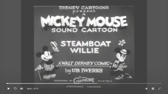
[ID: A screenshot from the Web Archive's video player showing the video paused at 00:04, showing the title card that reads, "Disney Cartoons presents A Mickey Mouse sound cartoon: Steambie Willie, A Walt Disney comic by UB Iwerks".
The rest of the text is blurrier, but seems to say, "recorded by cinephone system, copyright [illegible]". On either side of the text are Mickey and Minnie, smiling at eachother. Mickey is holding up a hat in one hand, and a cane in the other with a wide grin of greeting.
He has a white face, a buck tooth in his open mouth, white gloves, and light grey shoes and shorts, with the shorts having dark buttons and darker vertical stripes.
Minnie has her hands clasped as she smiles at Mickey with lowered eyelids in a flirting pose. She has the same hat as mickey, with a flower stick behind it. She has two circles on her chest like a bra or bow, with a polkadot skirt with a wavy edge. She is wearing light grey heels.
End ID.]
Edit 2:
Here's some slightly more cleaned up versions from MS Paint!
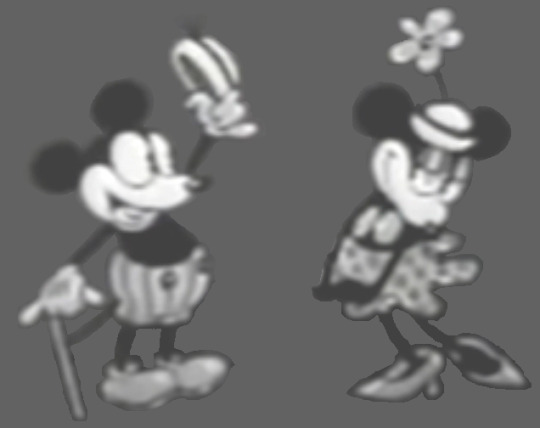
[ID: the same versions of Mickey and Minnie mouse, now with the background solid gray so they are easier to see. End ID.]
Made lineart and colored it for fun. You can download them here from the web archive :)

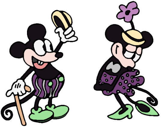
[ID: Two more versions of Mickey and Minnie shown above. One is just black and white lineart, the other has color added. They both have light green shoes, tan and black hats, and purple with grey accented clothes. Mickey's cane is tan, Minnie's flower is light purple. End ID.]
#Public Domain#Mickey Mouse#Minnie Mouse#Public Domain characters#described images#long post#free lineart
127 notes
·
View notes
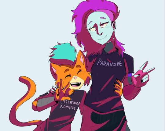
Text
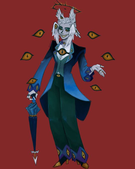
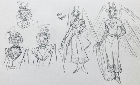
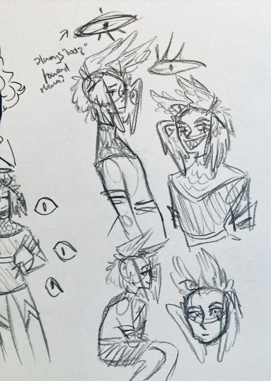
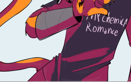
I finally finished the piece for @prince-liest's OC, Tzafael! this really reminded me of how fun character design is (and also that I've completely forgotten how to make digital art, but that's besides the point...) <3
credit to @hogbogglerspirits for the umbrella design! I kind of butchered it so please look at the original and throw lots of love at them
LOTS of notes, draft sketches, brainstorming, etc. below the cut. enjoy!
(note: a lot of what I'm talking about is based on posts prince made under their #tzafael tag, so take a look at those if you haven't yet!)
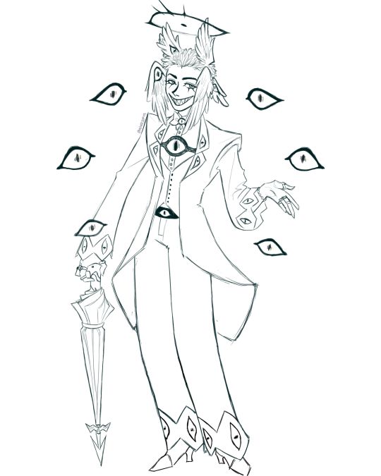
thanks for joining me below the cut! here's the sketch without the colors as a treat (in case you want to color it yourself or something, idk).
notes about making the digital drawing:
holy shit this took me forever -- I was not kidding about forgetting how to make digital art lmao. I forgot how much less forgiving digital lines are and genuinely lost the spoons to even attempt lineart, hence just a sketch below the colors.
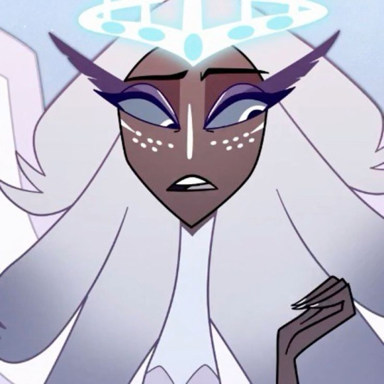
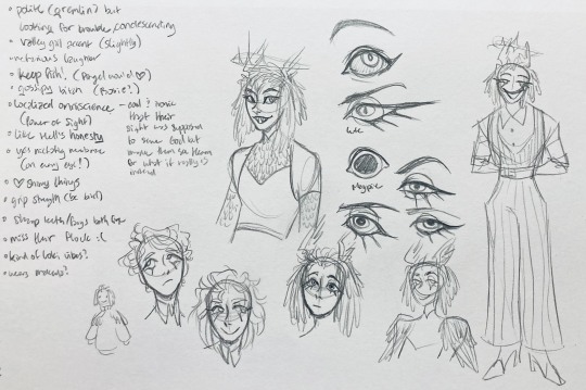
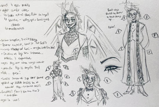
some of you might've seen the original sketch I sent to prince, which the digital version diverges from just a little. it's mostly the halo which I'll explain later, and I finally caved and drew the sixth eye (you can tell I drew and erased it multiple times in the sketch lmao -- still don't know if I prefer it with or without)
here's the original color ref by the lovely @gendermeh! my color scheme ended up looking really different, so some notes about that:
I was looking at references for magpies like this
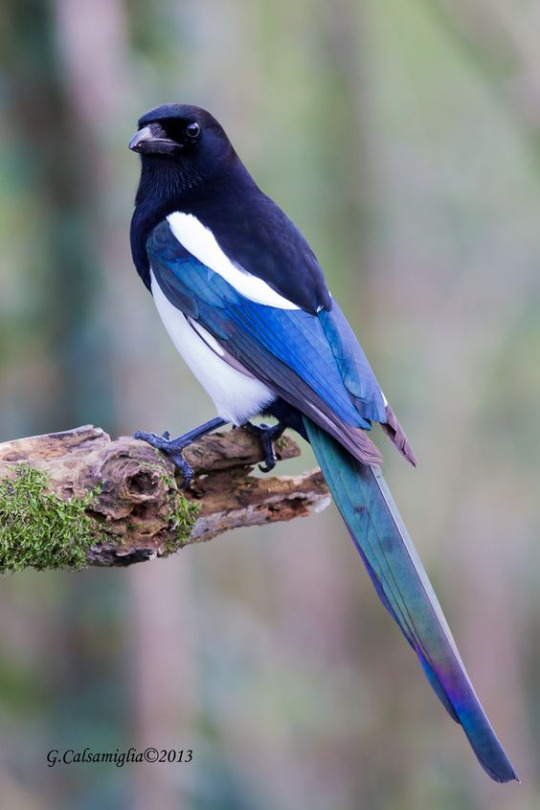
and I wanted to basically follow that color scheme while also being somewhat similar to the original -- dark head/shoulders --> dark top of the jacket, bright blue wings --> bright blue bottom of the jacket, greenish tailfeathers --> green pants, hints of purple --> purplish sleeve and pant ends
I also tried (and mostly failed, let's be real) to capture the iridescence of the feathers -- they look like oil spilled on the pavement or iridescent hematite to me! I think the key ended up being adding bright greens/purples and roughly blending them into the blues or vice versa but I didn't really figure that out until I got to the pants lol.
I'm gonna be honest; I don't remember why I went with this shape for the tailcoat. I just remember being unhappy with the sketch and then trying a bunch of different shapes that mostly looked worse lol -- I think I landed on this because a split tail kind of looks like wings?
KEPT the shoes -- absolutely magnifique. I wish I knew how to color gold better.
added lots of jewelry! they like shiny things :)
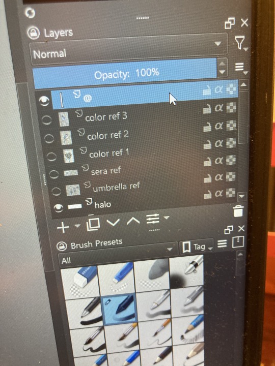
ALSO PLEASE LOOK AND APPLAUD ME. I FINALLY REMEMBERED TO LABEL MY LAYERS!! NO I DON'T REMEMBER WHY THE HALO HAS ITS OWN LAYER.
alright, time for some more design notes/explanations + draft sketches!
but first, a couple disclaimers:
I want to make it very clear that I LOVE everything about the original design. I made a lot of changes based on personal preference/the way I interpreted the character. I was actually planning on making a digital piece that was more faithful to the original design too, but I was just out of spoons for it cause of life stuff.
you probably shouldn't try to read the notes I made in the sketches I'm about to show you unless I say otherwise. most of it is incoherent brain vomit in illegible artist handwriting and I'll transcribe/explain the stuff I think is important :) (the stuff in quotes are direct transcriptions of my notes)
I know my sketches are very messy lol. I only draw for fun, so I usually don't force myself to make stuff any neater than necessary unless it's supposed to be a formal piece. try to bear with me.
1:
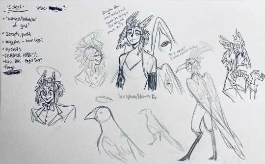
my first few sketches of them! (I think?) this was before I sent prince a laundry list of questions so I was still trying to get a vibe
"magpie -- beak lips?" -- you'll see this in a few sketches; I considered giving them the lipstick design that velvette has since it looks like a beak. I still kind of think it's cute, but 1) I'm pretty sure velvette is the only character that has them, so I didn't want to make it seem like they were related somehow and 2) I thought it might be distracting with how much other crazy stuff I ended up including in their head/face
also, sidenote since it's relevant to what I said about vel: something I realized was important is how one character's design relates to the designs of the rest of the cast. I wasn't sure how much I should've gone for what looked good in a vacuum, how much should be based on what other characters looked like canonically, or what other characters would look like if I also designed them. it ended up being mostly the second option, but it was honestly still a struggle. should I take away some of the tumblr-sexyman-ness (no shade to tumblr sexymen; I love them) because there are other characters that already have it? should I relate their design to sera's and emily's in the show or should I think about how I would've designed sera and emily? should I follow some of the design philosophy of the original show and just throw stuff on there because it looks cool (the answer is yes btw)? decisions, decisions ...
I don't think this showed up really well in most of the drawings, but they actually have a black line down their nose! let's take a look at sera:
since they're siblings, I wanted to include some similar facial markings. the nose line ended up being the only thing I kept though -- I was going to include freckles, but I have a compulsive need to give every character giant bottom lashes so there ended up being no room T.T I like that the magpie's hints of purple kind of match hers tho!
the wingification of the hair begins! I was still unsure of it at this point, but it was an idea I had since I was kind of struggling with how straight the feathers were in the original.
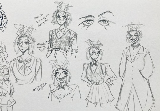
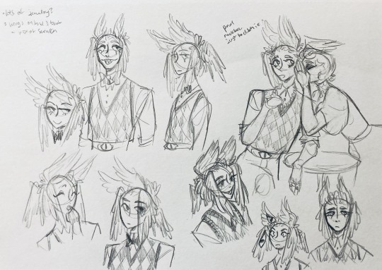
"maybe the ones on their head count as wings (so only one main pair)" -- I originally just had the 2 pairs of wings on their head, so I was thinking of just giving them 1 pair on their back so there would be still be 6 total. also this middle drawing of them is meant to be their exorcist outfit (I wanted it to be a cross between what the other exorcists wear and sera's outfit)
at this stage, I was thinking of giving them more magpie-like characteristics, so I looked at some references and tried to emulate them in a more human design. this ended up being really awkward so I scrapped it, but I still like the idea that their exorcist mask looks like a bird (kind of like a plague doctor's)
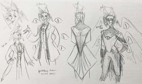
2:
peekaboo! I love the idea of them using the wing hair to cover their eyes lol. (ended up using that idea for my own seraph OC since that's their biblically accurate purpose: to cover their eyes/faces in reverence/humility -- doesn't really fit with tzafael tho lol, so they show their face most of the time)
an eyeball in the bowtie -- pretty self-explanatory. the eyeball motif is important.
the one in the middle is just me practicing drawing the original design, and the one on the right is another exorcist outfit I think. I wanted to include the diamond motif/points that sera has on her dress (the diamonds on the bottom turn into eyeballs, which is why the final design also has eyeballs on tzafael's sleeves/pants)

3:
lots of notes on the side based on what prince said in response to my ask
"localized omniscience (power of sight) -- cool + ironic that their sight was supposed to serve God but made them see Heaven for what it really is instead"
another exorcist outfit, this time including the feathers
I was also experimenting with the halo; I was trying to make it look sort of like sera's crown, but that didn't feel right ...
some practice with eyes -- my style is pretty flexible with eye shapes, so I try to make them suit the character. I drew lute's eye and also an actual magpie's as references -- lute's because of the exorcist background and also because they looked appropriately sharp, magpie's for obvious reasons. once again, my compulsive need for giant bottom lashes strikes
there was honestly a lot to balance with the eyes -- I wanted them to look condescending/bored (lowered top lid) but also amused (raised bottom lid) and like a magpie (round) but also harsh/mischievous (sharp, maybe slit pupils like a snake) and similar to sera's (but not too decorated -- also does it make sense for them to look like sera's if emily's don't even look like sera's?)
considered having wings on the shoulders -- the magpie pattern is super cool, so it would've been nice to have that somewhere more explicitly in the design. I still think that might fit in an outfit they would wear in heaven (maybe for formal occasions)
the introduction of the sweatervest! honestly I kind of love this for the way it captures more of the preppy, spoiled old-money upper-class vibe some heaven residents have, but it was scrapped since I couldn't imagine them wearing that while trying to scare the denizens of hell. maybe something they wear casually though.
"yes nictating membrane (on every eye!)" -- AHH I'm so sad I didn't end up putting this to use. I just feel like the whole effect is based on actually seeing them blink, and I don't animate lol.
4:
ugh, the nefarious laughter one ... don't worry I tried harder on a sketch later on lol.
"like the diamonds on Sera + Em" + "diamonds turn into eyes?" -- I draw the diamonds on the sweatervest turning into eyes later.
tried an actual bow instead of a bowtie -- very cute but didn't fit the vibe.
a skirt! I think they would wear a skirt sometimes.
5:
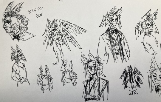
"FUCK ASS BOB" -- asghdk the wingification of the hair continues. unfortunately, I'm realizing at this point that the silhouette of the hair is starting to look a lot like alastor's. I gave a very half-hearted attempt at mitigating this, but it goes back to the thing of how much I am obligated to the original show's designs and what looks cool to me -- I think the wing hair fits them and I didn't want to change it because of alastor, plus my alastor design actually has completely different hair anyway. I did add a third pair to the back to look like a ponytail though.
introduction of the scarf! I was actually going to include this in the final design but uh,,, I forgor. are you starting to see a pattern.
the reason for the scarf is that the "tzafael going to places they know they'll draw attention/can incite chaos" reminded me of that scene in avengers where loki walks into a fancy building looking pretentious af and just casually stabs a guy's eye out. not really the same thing but I felt like the vibe matched. hence, loki's funny little scarf fit.

6:
uaoughdfjh it was SO FUN to draw the wing hair, and it was at this point that I realized they had to stay even though I wasn't sure if it was too different from the original.
gossiping with rosie cause that's the first person I thought of -- tzafael also summoned a pearl necklace to clutch because of the sheer drama of it all (your ex-husband did what??)
also started drawing the rings on their hands. magpie like shiny.
7:
lots of notes cause I was trying to compile the things I still needed to think about/incorporate into the final (I thought this was gonna be the last draft ... haha)
trying to include more bird/eye motifs
"fish ... purse?" -- ha! I forgot I was gonna give them a fish purse. I think I drew that in a later sketch, but not them wearing it.
"picked up Hellish traits bc of extended stay -- existential crisis?" -- I asked prince about the sharp teeth, and their answer implied that they became sharp as they stayed in hell longer, which got me thinking ... I feel like that's actually a great body horror concept. lucifer falling and looking like a normal angel at first, eventually waking up to more and more devilish features and feeling more and more like he's lost his home and his past self ... spooky.
another exorcist outfit -- I actually really like the eyes on the ribs! I never made a final draft for the exorcist uniform, but it would probably look close to what I drew here.
the one on the bottom was meant to be similar to the feathered shoulder pad idea, but this time with the whole magpie (with giant eyes). tried putting the "freckles" (really just dots in this case) over their brows, but that ended up looking kinda weird.
the eye is pretty close to the final design
the one on the right was supposed to be the full final design, but I was totally off lol -- the long trench coat really doesn't give off the right vibe at all
8:
playing around more with the loki vibes of the scarf, also added an eyeball to the chest
I never got happy with the design of the back of the coat -- I think it should probably just be blank at this point. but the sketch here is meant to look like wings/tailfeathers.
yet another exorcist outfit, this time with more magpie motifs. I actually like this one a lot, but I probably should've added the eyes on the ribs from the last sketch. I think I also considered giving them actual tailfeathers at this point.
9:
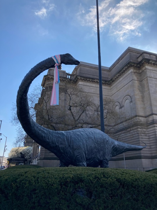
thanks for sticking with me! I promise we're almost done. have a trans dinosaur I saw while I was travelling as a treat <3
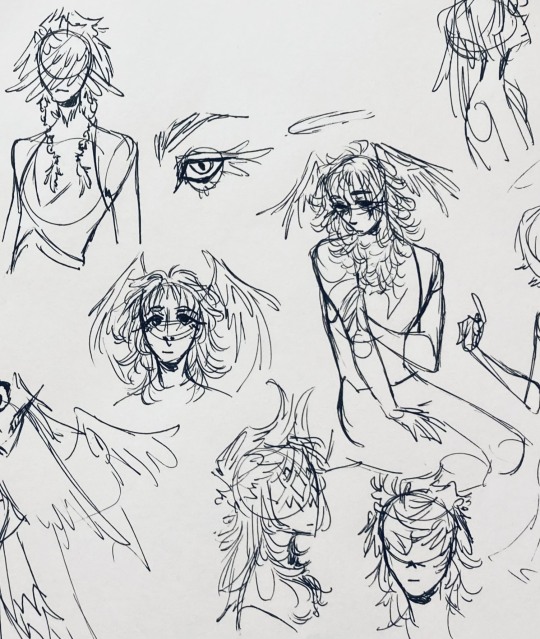
10:
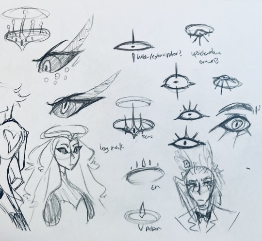
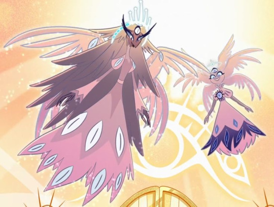
this is after I finished the sketch for the final piece and realized I didn't like the halo design. I drew lute's, sera's, em's, and adam's as refs. (honestly I love the show's idea that each person/people of each rank have a different kind of halo -- I wonder if they can switch them out?)
my main inspiration ended up being the exorcist halo, but I made it look more like an eyeball -- since it always points toward heaven, we can say it's always "looking" at heaven.
(also sera's feather lashes! they're so cute)
11:
EVEN MORE EXORCIST DOODLES
12:
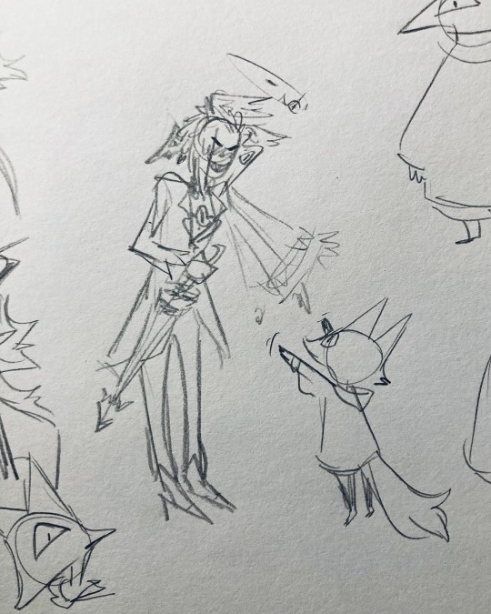
tzafael shooing away my fox demon OC
13:
these are actually sketches for my own seraph OC (raguel), but I wanted to include it since it has even more wing/feather hair variations. I also think the idea of the eyelashes being feather-like could've been cool for tzafael.
14:
some more OG design doodles
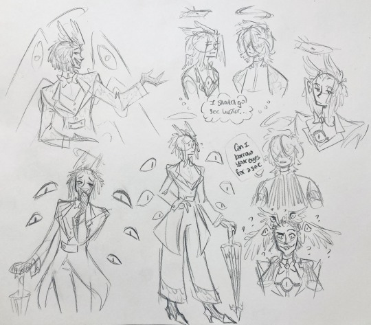
tzafael and raguel together because self-indulgence is the name of the game babey (also wanted to draw tzafael freaked out with their wings flared)
(raguel's blind btw, hence asking for eyes -- tzafael has so many!)
you can probably read the dialogue here so give it a shot. I believe in you.
15:
you know what? the fish purse deserves some doodles
16:
putting them in Situations! I was reading over prince's posts again and I realized there were some funny things I could draw them doing/saying
again you can probably read the words here
angel dust also loves fish (but is apparently bad at taking care of them, hence the suffocating blobfish), so tzafael shows him their aquarium (complete with live fish and flora ofc)
I thought alastor was 8 ft but apparently he's 7.3 ft? so tzafael is enjoying the .2 ft they have on him
trying and failing again to come up with a design for the back of the jacket lol
THE crowley quote
apparently the halo still sends signals from the exorcists -- thought their reaction to the battle at the hotel would be funny
the nefarious laughter (take 2) that I promised -- based on a doodle of alastor viv did that I found
them being sad and curling up in a pile of shiny things like a dragon
OKAY I'M DONE. huge, huge thank you to prince for sharing their OC! this was a lot of fun and clearly inspired me a lot haha. please check out their writing; it's literally so good that I can't read anything else these days. I am chewing on their thoughts constantly.
this was an absolute monster of a post, so if you're still reading, I am both impressed and bewildered at your patience. I hope you enjoyed! (I certainly did!)
#prince (because they are very sweet): I'm excited to see your thoughts!#my thoughts: magpie like shiny hehe#hazbin hotel oc#prince-liest#hazbin hotel#my art#character design#sera hazbin hotel#em hazbin hotel
45 notes
·
View notes
Note
Hello, if you saw the Meow Meow Vampire photos, could you please draw Ayato holding Yui in human form like that? She was cute af as a cat, but I’d love to see her in normal version 😩✨ Thank you so much for your all your arts, it’s always a pleasure to see them on my dashboard! 🫰
ayyyo thank you! I remember this merch line giving me only hope to live when school was on 💕💕💕🥹🥹 thank you for waiting so long xoxo
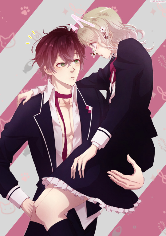
(ok I think I finally cracked the code for dl's lineart colouring!!! i was missing a bit of vibrant natural colour change when the local colour gets lighter... and it was so simple. just gotta turn the lineart layer to hard light blending mode. I had it on normal or multiply and I always felt it was too dark, but yeahhhhhhh just thought i would share my discovery!)
#dl#ask#otome#diabolik lovers#fanart#dialovers#ayato sakamaki#yui komori#ayato x yui#yui x ayato#sakamaki ayato#komori yui#dialovers ayato#dialovers yui#anonymous#anon ask#anon#meow meow vampire
211 notes
·
View notes
Note
curious what you think about bori? they've been my favorite neopet since they first released :D


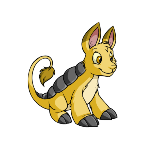
I've always liked Bori a lot. They're kind of armadillo-ish, sporting protective back plates and somewhat 'dillo-like faces, but for the most part they're just nice-looking vague animals, which are always my favorite kind of Neopet. The long lion-like tails are a nice touch, and I like how they have claws suitable for digging in the icy environments in which they live.
The black plated elements and underbelly add contrast, while the ear tips and underbelly add just enough detail without being too complex. It's a very well-balanced design overall.

Thankfully, Bori survived customization just fine—there are no major design changes and they still look just as good. I do prefer them standing as opposed to sitting, as something about the sitting pose feels a bit off (I think it's because it makes their front legs look too long, and it's not that natural of a pose for them to strike to begin with), but it doesn't matter much either way.
Favorite Colours:
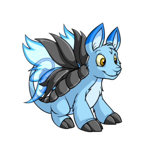
(Side note: I usually cover exclusive colors here, but the Ice Bori a) isn't exclusive to them and b) is honestly pretty bland for how rare it is.)
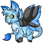
Faerie: What I really like about the faerie Bori is how they handled the wings. It would've been super easy to just tack butterfly wings on them and be done with it, but instead they made the back plates part of the wings, which looks aboslutely gorgeous. The wings themselves are also nice, sporting a sparkly dark-edged design and a unique shape.
Thankfully the color remains mostly unchanged customized, which is good because a UC isn't available—though I will say that the original's wings look a bit better because they're much larger relative to the body, and slightly darker in color as well. Still, it looks good either way.
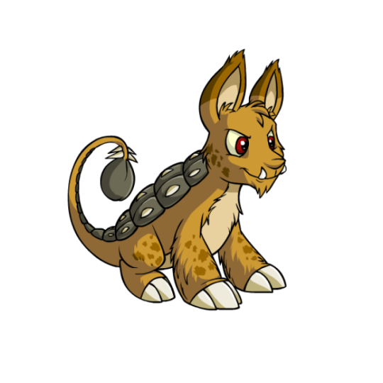

Tyrannian: I have to give this one a shoutout just for being an ankylosaurus, which fits perfectly thematically with the Bori's plating. It's also executed well, giving it a neutral brown palette (always the best color for Tyrannians) and some extra shaggy fur and spots. The plates are just split into smaller sections and run down the length of the tail to get the point across, and even the tail tuft becoming the ankylosaurus' tail club is perfect. While the UC is better due to the unique anatomy, the converted version is loyal to it and still looks pretty good.

Pastel: It's not a particularly fancy color, but I always thought this one was super pretty. The rainbow plates on the back are just perfect, and they did a good job of balancing the rainbow elsewhere (pink ears, blue eyes, green claws, yellow underbelly, etc.). The colored lineart gets the soft look across and it looks appropriately pastel-ish. Definitely one of the best options if you like your Boris straightforward.
60 notes
·
View notes
Text
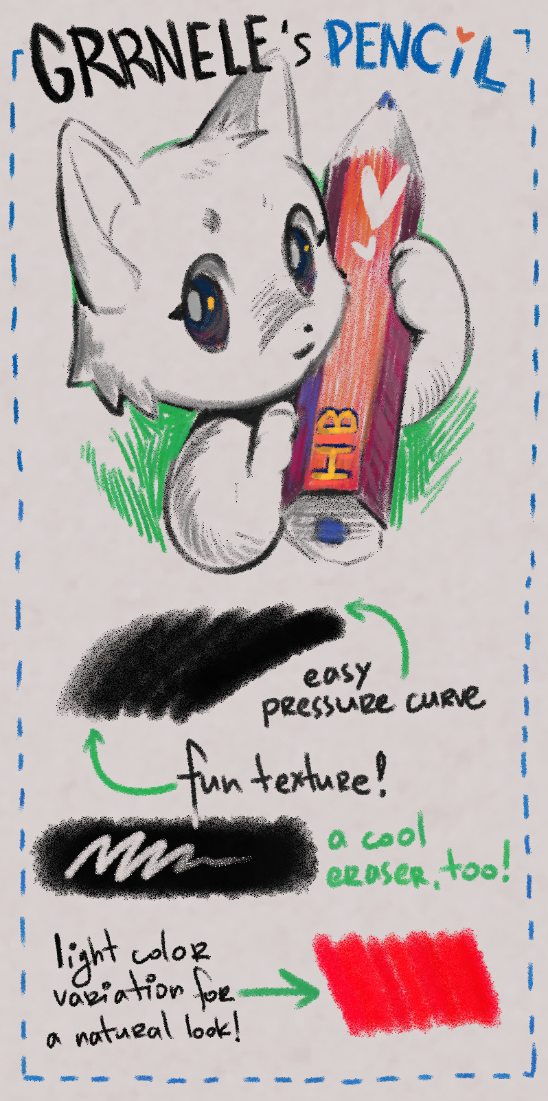
Just wanted to share a fun Clip Studio Paint pencil that I have made some time ago. Light pressure can be used for shading and stronger lines work well as lineart. I recommend picking slightly lighter colours than intended to let the texture do its thing (like, dark grey instead of black).
You can get it here: https://assets.clip-studio.com/en-us/detail?id=2040537
CSP v1 version is here: https://assets.clip-studio.com/en-us/detail?id=2040718
#clip studio paint#clip studio assets#clip studio brush#csp brush#csp pencil#csp asset#csp assets#pencil#brush
55 notes
·
View notes
Text

Decided that instead of silly censor bars for this piece, why not have Hanyou Inuyasha yelling off screen so loudly he's probably woken everyone in the house. Poor Kagome though… 😂 She was only trying to sleep, and she's got to deal with one lump propping up on her thigh, the other lump trying to get between her shoulder blades, and then the third is standing on the foot of the bed screaming.
Pixiv has the one without the word bubbles too.
From last month's patron lineart, which you can find here along with the larger versions of this and the unedited one.
@keichanz @lemonlushff @dawnrider @mamabearcat @inuykago @sailorbabydoll92 @zelink-inukag @itzatakahashi @superpixie42 @sticky-llama-perfection @the-rebel-alchemist @digitl-art-monstr @theinuyashareader @eternalnight8806-3 @cstorm86 @sarah-writes-stories @animelove1313 @nartista @smmahamazing @xfangheartx @cyncyn981 @bluejay785 @witchygirl99 @lady-dark-69 @kazeinori @willowandfog @lavendertwilight89 @gaysonthefloor @senneth-pendra @ruddcatha @pinkpigeonstudio @shinidamachu @cammysansstuff @little-inukag-obsessed @arcprz @liz8080 @trying-not-to-loveu @wulfintheforest @memusicmuse @princessinume @hnn-wnchstr @that-weird-kid-charlie @cannibalsforbreakfast @mr-fairywings @nsr0716 @eringobroke @ladyphoenix0711 @malditamigs @fawn-eyed-girl @littlestuffstohide @smh1821 @karina-inuphantom @dreaming-of-soup @irrationalandimpossible @boostyourmind-blog @anisaanisa @inussunflower @sacred-arrow @nillavanilla21 @yusukesmomjeans @lordofthechips @bluehawaiicat @kawaiichan67 @kagometaishostory @hopidoodle @omgitscharlie @themusicalshoo @heynikkiyousofine @preciouslyours @roseheartwhitefox @brokenangelwings22 @banra-yar @knittingknots @scaponigifs @shardetector @fudalfighter @dchelyst
87 notes
·
View notes
Text
user /canisfamiliars is a zoophilic artist who has rebranded several times in order to hide the fact he draws and consumes zoophilic art
he lied to his former mutuals about not consuming feral nsfw art, much less producing it, including blocking their accounts from his after dark so that they wouldnt find out it was him.
he is not a trustworthy person. he lied to his closest friends about finding zoophilic art disgusting then was found interacting with irl, acting zoophiles on his nsfw account. reiterating he was just fine with people who believe it is ok to fuck dogs in real life consuming his artwork. when confronted he didnt even try to defend himself, just deleted everything and made a new account.
screenshots below. be warned there are nsfw & sensitive topics ahead.
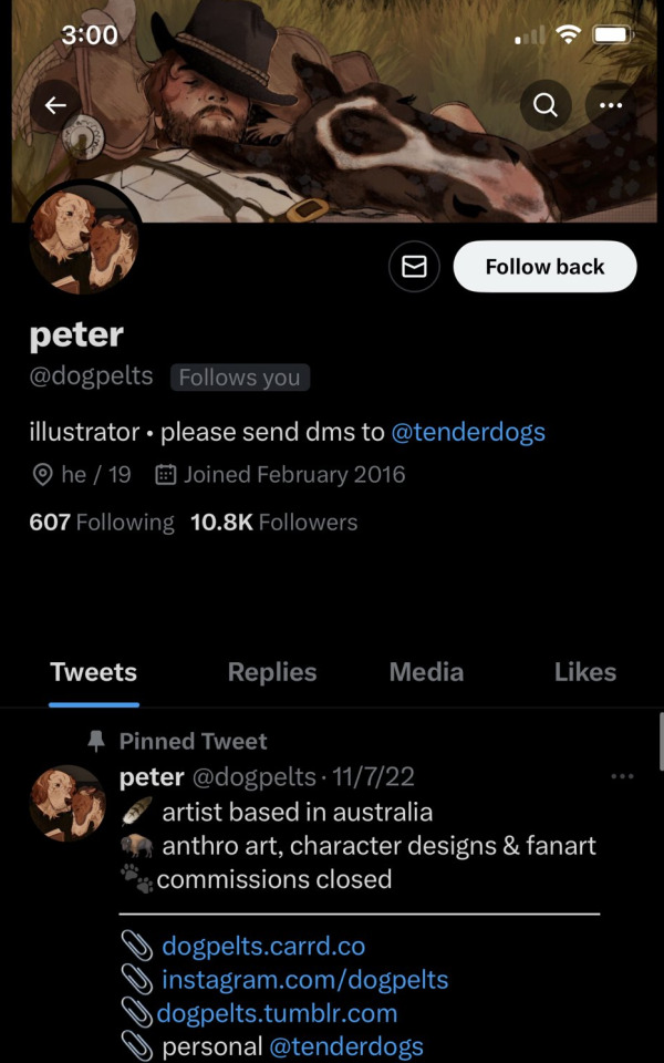
this was his main account. note the similarities in aesthetic, layout, and art style as well as his love for sighthounds.
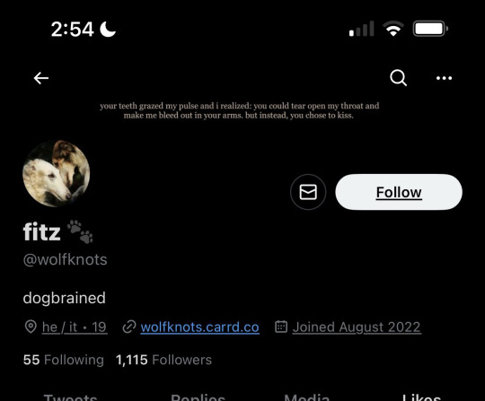
this was his nsfw, which he drew detailed realistic zoophilic art, which i will not and cannot post publicly, but can share heavily censored versions.
on this nsfw account he didnt just have zoophiles following him but INTERACTED AND FOLLOWED PEOPLE WHO BELEIVE IT IS OK TO HAVE SEXUAL CONTACT WITH ANIMALS IN REAL LIFE. the zeta symbol in bio is a way for zoophiles to identify eachother, and the teal/green/brown flag is the flag of zoophilic attraction.

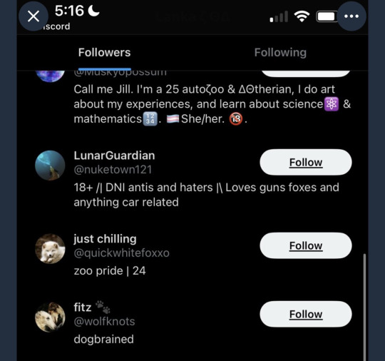

if this isnt bad enough his follower list was chock full of self admitted zoophiles. he definitely saw each and every one of these people interacting with his feral art. you cannot argue its "just fiction" when you are allowing REAL ACTIVE OFFENDERS to interact with your art. is it "just fiction" for an active pedophile to consume nsfw art of children?
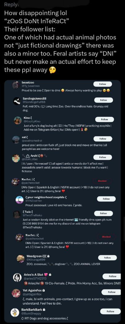
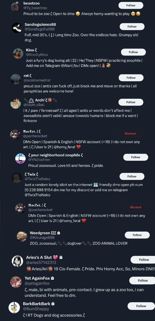
art posted on the account that is far too similar to his current style. note the coloring style, the lineart, and the focus on dogs, especially borzois.


after he got caught the first time, his first reaction was to deactivate all known accounts and run off to a new account, where he tried lying about who he was just like he's doing now. this account was called "earnwolf"; you can see the similarities in style, aesthetic, and how he ever so slightly changed it up to try and not get caught.


this person can try to hide behind "just fiction" but i dont think its "just fiction" when you follow and interact with people who post videos of animal sex and shit. you know what youre doing is wrong. stop trying to quietly rebrand when people call you out for this shit Hawk.
60 notes
·
View notes
Note
How do you usually pick your color palettes? I love how vibrant your drawings are without been intense to the eyes
I went over a couple things in a previous ask. So I’ll include some different ones this time.
A big part is just having an archive of 'things' in your head that develops your intuition when choosing colors. Not necessarily other illustrations/characters, but also logos, buildings, irl stuff? They all give you not just color palette ideas, but also color distribution. You can simplify both trees and bushes as green/brown, but if you picture their colors in abstract, the distribution of each differs. And that helps a lot in recognizing areas where your colors seem lacking, or areas where they *should* be lacking (and thus not attention-grabbing).
In general though I look at a char and decide on a 'main idea'; usually a 2-3 color scheme based off the original design that everything needs to revolve around. Pink/Blues, Green/Orange, Black/Red, etc.
From there my first pass at colors is splitting the piece into different elements (hair, clothes, skin) and giving them a high-max brightness base color with arbitrary saturation, and the lineart a notably higher saturation (and maybe darker) version of the base, usually hue shifted a bit to the left or right (Note this often won't be enough).
Some elements won't fit cleanly in the 2-3 color palette, or would blend in too much with the surroundings (especially with stuff like accessories or clothing patterns). In those cases I mess with the saturation, or use one of the other hues I've limited myself to in order to make it pop out more (outlining the object or giving it a shadow with the opposing color, coloring the lineart surround it, removing the lineart, etc).
Basic shadow colors is usually higher saturated and hue shifted versions of the base color.
The limited pallette creates situations where I'll use pink to act as highlights on Miku's blue hair. Or the pink is used to create extra hair strands for more volume. Limitations force creativity kinda deal.
Trial and Error 🙃. Get used to putting sets of shadings on separate layers so you can lock transparency and change the whole color at once. Same for having a dozen layers clipped to the lineart. Clip has a 'take me to layer this is on' button under Operations that's quite nice for this.
Choose a base level of brightness (usually max for me) and don't deviate too much. Brightness is a powerful part in how your art 'reads' so making something notable darker/brighter than the rest should be a deliberate decision that you make several other choices around. On that note, when I do make something dark, I make sure the lineart around it feels bright and saturated against it.
A buddy told me this trick where you have a layer of pure black on top of everything else. Have the layer setting to "Color" and it gives you an alright idea of how well your brightness reads.
Ok I wrote a lot.
23 notes
·
View notes
Text
Sunny's unnofficial rendering tutorial because idk why but people say they like how I color
Hey kid. So you got your drawing, right? And you have your flat colors, now you gotta render 'em, right? Then you find that BAM, you have no idea how to make it look cool? Neither do I! But here's what I do (I've been told that my coloring is cool)
1. Place your flat colors
Imagine these are your flats. A few things: you want your base colors to be all around the same hue, that way they look better together. See how all the blacks, greys and whites are purple/blue-ish? That's on purpose babey! But how do you acheive this? idfk. jk, you have to stay on one (or two) areas of a hue wheel.
This way, all the colors look like, nicer around each other. You're not FORBIDDEN from going outside an area you picked, but you should still try to make sure everything is in the same hue so you have to do less overlay layers later.
(FYI: I do this because it saves me time on rendering. I don't think it's mandatory, there's no rules to art. Go crazy!)
2. Shading
I think shading makes or breaks a drawing. Personally I don't have a lot of rules about it, but there are still tips I can give.
So here's what you gonna do. You're gonna pick a color that's somewhere on the opposite of your main hue, alright? Here, my hue is mostly cold colors, so I'm going to pick a warm tone. You're gonna make sure it's dark enough so it's like, a shade, but not enough so it becomes black when you set the shading layer to multiply.
(Note: I never get this right on the first try)
(Another note: as you can see, I have the entire drawing, including the lines, inside a group. Don't worry! I'll explain this later)
Personally I like to use a paintbrush-esque brush because I like the look of it being hand-painted that it gives my art. Mine is the default paint tool sai brush, but I'll leave the settings down here just in case.
I don't. Really know how to explain the way I shade, I mostly follow the lines I already placed in the lineart phase, and give them depth. I guess my biggest tip would be to FOLLOW THE CLOTHING FOLDS!!!

Idk how to explain this. But people always tell me that they like how I shade the clothes, it's because I follow the fold lines I place on the lineart phase! Not only does this give the clothes depth, it also makes shading a lot easier. Follow your lineart, idk what else to tell ya.
Now you're gonna set the layer to multiply...
And lower the opacity as much as you want until it looks good. No real rules to this, it's kind of depending on the vibe you want your piece to have.

Now, and stay with me here, grab a blending tool, okay? This is the one I use, I have a textured version for when I'm feeling brave, and a regular, flat version (the one I use the most) Here I'll use the flat version.
And. Stay with me here. I want you to blend the FUCK out of this. Just absolutely destroy those borders. Okay? Trust me. If it looks messy you're doing it right. You're gonna want to follow the shape of the shadows tho, this way you don't lose the shape of the objects you're shading.
Woah! Suddenly everything has depth! Let me go back to the clothing folds, because holy shit, the clothing folds.
See how I'm adding depth to the shadows I placed by kinda. Following the line I drew and blending the outside? Idk how to explain this. You blend whatever isn't touching the line, okay? Trust me.
3. Lighting
Ok. I'm holding your hand gently. You have to do lighting on your art, okay? You have to. It adds depth to the shapes and also is sososoososo easy. Here's how. It's so easy.
Grab your airbrush tool. Yes, that one. Hear me out okay?
Pick a light, warm color between yellow and orange.
Stay with me. Make a new layer, set it to whatever lighting mode you prefer. I use luminosity because I live dangerously.
Now.
Airbrush everything that the shadows aren't touching. Yes. I'm serious.
It's gonna look ugly as shit. DON'T BE ALARMED. This is part of the process. I want you to take the blur tool. And blur the ever loving fuck out of this. Just go fucking ham.
Good. You're doing so well. You're being so brave. Now lower the opacity as much as you want, until you like the way it looks.
Like so. I also like to add a few brush strokes and blend them on an up-and-down motion for the hair and certain details, but this is optional. Same as before, you're gonna take a (slightly warmer, but still bright color) and make a new layer on luminosity mode.
Take the blending tool and make it small, only slightly bigger than the brush strokes, and blend these lines until they look nice. Adjust the opacity, and voila!

Now, I could stop here. But I'm extra so I keep going.
4. The pizzazz
AKA, "Ah fuck the colors don't look the way I wanted them to!"
Do not worry! I have a solution that's almost never failed me.
Overlays. Just a whole fuckton of them. I don't really have a method to this, I just kinda try colors and layer modes until something looks good.
For this one, I felt like I wanted the colors to be warmer, so I picked a warm color and overlayed it on multiply. Then, I noticed that the darker colors came out darker than planned, and you couldn't really tell them apart, so I picked a light warm color and overlayed it on screen.
Voila! We're not done! There's one more thing I like to do, and here's where the layer folder comes in!
Remember how I said I keep everything, including the lines in a folder? This is why!
Make a layer that's on top of everything, like this. Pick whatever color you want, make sure it's bright. (Personally I like using pink). Take the airbrush tool again and airbrush whatever edges you want to give a little more pizzazz to.
Blur it as much as you'd like...
And adjust the opacity and layer mode however you like!
5. And done!
Sometimes I add white highlights. Sometimes I add more shading, or more lighting. It depends! But this is the method I use in a nutshell.
Hope you enjoyed it, or at the very least realized idk what the fuck I'm doing!
21 notes
·
View notes
Note
yo what procreate brush do you use for lineart it looks really cool :o
hi there -- i use a variety of brushes depending on the mood, so i'll make a nice lil compilation of my brushes to cover whichever one you're curious about!! thanks for ur interest 🥰
first off, the very recent BIC pen mimic i got from here:
and it looks like this:

it benefits from a lighter colour (can be used with grey/unsaturated colours), it's worth trying out a few for fun. its grain blend mode (brush -> brush studio -> grain) is set to multiply, so i think that's where it gets its light-to-dark gradient from.
then, there's this one:

which is an edited version of the default Tamar brush. i added jitter settings, which are the reason for its wiggles, and pen sensitivity. i love to use this one to give more simple drawings some extra flare.
and its sibling:
this one is basically the same, but with NO jitter and added stabilisation. :-)
the last one on this list:
i call her 'derwent highpressure 2 2 2', aka this is the culmination of me repeatedly editing & refining the default Derwent brush. the pressure sensitivity is super high because i wanted to get a range of pen thickness without affecting my sore hand too much. it's got a small amount of texture & jitter to it, and i'll be honest, i don't remember what the original one looks like.
to absolutely Anyone: i really encourage playing around with procreate brush settings because, although they're a bit difficult to comprehend at first, they're pretty open in terms of how you can mould them. plus, you can employ personally made textures & shapes (or free ones) to add subtle effects. it's fun! i have a whole dock of speech bubbles, decals, a watermark brush, body hair & feathers, etc. :-)
#procreate#procreate brush#brush settings#artist#sketch#sketching#doodles#original art#art tutorial#AMA
235 notes
·
View notes
Text
So recently I had the pleasure of designing this pin and sticker for @innbetween's season 5 crowdfund! Which (as of posting this) is ALMOST OVER! Go support them!!!


[ID: Two similar circular designs of the quote "If you don't like what you've become, you may change again." The first only has the second half of the quote.
The border is made of branches, with leaves sprouting from the branches on the left and empty branches on the right. One acorn hangs from one of the empty branches. Along the bottom of the border, plants sprout on the left while mushrooms grow on the right.
The background is dark green. In the first design, the text and all the lineart is gold, and the leaves, plants, acorn, and mushrooms are colored in simple flat colors. In the second design, the text is gold, but the branches are brown, and there is more detail and texture in the various parts of the design.]
Since the crowdfund is wrapping up I wanted to share some of the early designs and some of my thoughts on the finished design, because honestly i loved a lot of them.
[ID: Rough sketches of a variety of designs, all featuring the "If you don't like what you've become, you may change again." Some feature only the second half of the quote ("You may change again"). The first is a sketch version of the design above. The second is a rounded rectangle, with the "I" on again being dotted with sprouting mushrooms. The third is a pair of acorns, one with the full quote and one with the half quote. The fourth is a circle with a tree with an acorn falling from it. The fifth is a mushroom. The sixth is an acorn on a branch, with the first half of the quote on a leaf and the second half on an acorn.]
You might've guessed it, but considering Tode, who says the quote in the show, is a druid, the designs are all heavily nature themed.
Fun little note! On all the designs, the leaves are oak leaves to tie into the acorn, and the mushrooms are based on Amanita muscaria, which is among the mushrooms most frequently called Toadstools (see what i did there).
In all honesty, when Hannah came to me with the quote, the first design that came into my head was the one that we ultimately settled on. We actually took another design (the other circular one with the oak tree) to a more refined stage, but the final design just clicked in the end.
And here's a little breakdown of that design! There's a lot of elements going on here, but in general I wanted the details to represent that no matter where you are in life, you still have the potential to change. Thus, the 'cycle', so to speak.

[ID: The final design, this time annotated. There's a circle of labels around the border, with arrows pointing to the next label. The cycle is "Sprouts: New growth" → "Oak leaves: Life, thriving" → "Bare branches: Death/dying" → "Acorn: Seed (potential/rebirth)" → "Mushrooms: Decomposers". At the bottom, there's a horizontal line that's split down the middle. To the left is "Life" and to the right is "Death"]
Here's the thing: I had so much fun with this design. It was fun to think through all the little things I could include, and it was so much fun to work on a design for a show and a sentiment that I love with my whole heart.
So once again, if you want a sticker or pin with this design, or if you just want to support an incredible podcast, go support Inn Between's crowdfund! And if you do get one of my designs, tag me in it when it gets to you, I'd love to see 👀!
#inn between#han doodles#also if people are interested i also have a bunch of alternate colors for the design that i could share#and some more refined sketches#the behind the scenes stuff is interesting to ME but idk how much other people are into it and this post was very long lmao#anyway i'm so happy with this design and if you get the pin or sticker you should tag me in it <3
32 notes
·
View notes
Last Seen Blogs

taramatsu-san
stormoftara
lim10
lim10
cielbyrne
A (probably ace Jughead) Tumblr?
winchesterhobbs
Clever boy, I think I'll eat your heart