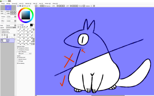
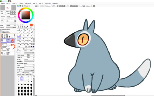
#you know what i hate more than linework
Note
I've just discovered your Rolan x Tav comic.
It's SO neat and accurate, in matter of deign and details!
In case you don't mind, of course, I have some questions you maybe have answered before:
What software do you work with? What kind of pencils do you use? How do you manage to set so neat and clean results? Do you need many references for that or is just a gift you have? How many years have you been drawing to achieve those results?
I don't mind at all! And I don't believe I've answered any of these questions before, at least not since I started doing my comics.
For software I mainly use Clip Studio, though I do also use PaintTool Sai (v2) for certain things that I feel it does better. All of my Mass Effect comics are lined in Sai, for example because things like armour have a lot more inorganic shapes and require long, sweeping, unbroken lines, and I like the pen stabilization in Sai far better than CSP's for that sort of thing.
For how long I've been doing art, I've been at it basically nonstop since I was 9 (so 20 years now, jeez). I was in an art program throughout highschool, went to college for art/animation for 4 years, and I'll have been working professionally as an animator for 8 years in May! So there's a lot of practice there for sure.
And yeah, I use a ton of references. Usually a good chunk of the time I'll spend on something is just collecting or making the reference material I need for it.
I'm putting the rest under a read more because it's pretty long:
(Tumblr keeps eating my formatting so sorry if this is a little scuffed)
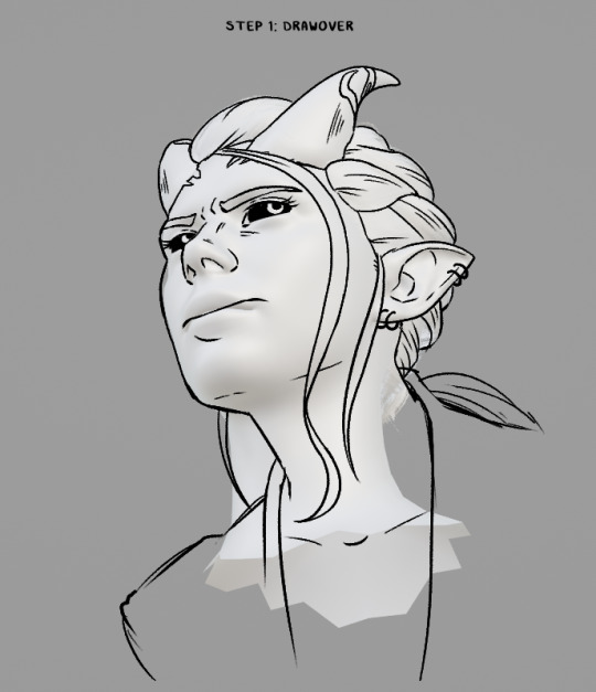
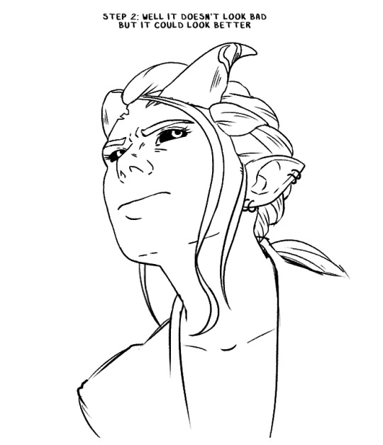
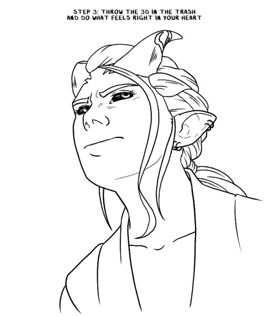
Because I'm normally working full time and doing this stuff in my free time after hours and on weekends, if I know I'm going to be drawing something a *lot*, I'll usually put together some kind of reference for myself in 3D so I can take some of the brainwork out of it and get more out of my evenings even when I'm feeling fried. It also means I put as little extra strain on my wrist as possible because I injured it a number of years back and it gets angry at me if I go for too many hours in a day.
But to give you an example, for Ember I have a Sculpt of her head that I can use to reference any angle I want, or to draw directly over top of for tricky angles. How I draw her isn't quite 1:1 to the model, but it gives me a base structure and landmarks I can build on top of.

My basic workflow is to take the angle I want, draw over it using the model as a guide (while picking and choosing where to stay true to it and where to say fuck it and do what I want), then I get rid of the 3D and do another pass, tweaking and redrawing anything I'm not totally happy until I'm satisfied with how it looks. I draw Ember with a slightly softer, more rounded face than the model has, for instance. Just because something looks right in 3D doesn't always mean it looks right once translated to 2D and I don't care if something is technically "correct" if it doesn't feel right or isn't conveying what I want it to properly.

I'm also always checking reference screenshots to make sure I'm in the right ballpark of how something should look. I actually have a wall of photos next to my desk and while I didn't put them up for that purpose, it has come in surprisingly handy for quickly checking face or hair details when needed. I also just have a big folder of screenshots and other saved reference material.

I don't have a problem noooo~ 😅
Additionally, if my art has a background these days, there is a 100% chance that's a 3D set I built in Blender because I hate drawing backgrounds, but I do like building them in 3D.
Here's two examples: the area around Astarion's bed, which I built out of some of the in-game assets like a lego set (this was a pain in the ass, it probably would have been faster to just build it from scratch based on screenshots 😩) and a closet I modelled for something that's still a WIP.
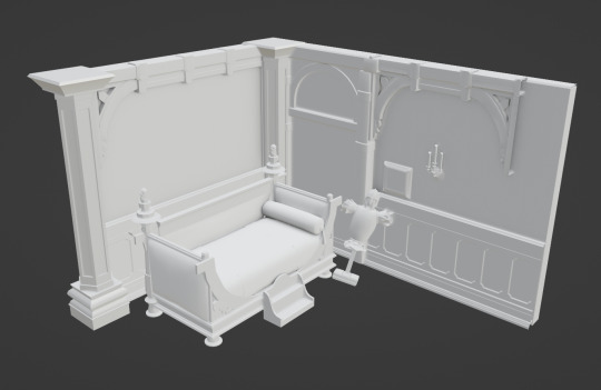
I'll get the angle I want, have Blender generate some linework from it and then grab a basic render of it to slap into CSP so I can draw the characters over top of it.
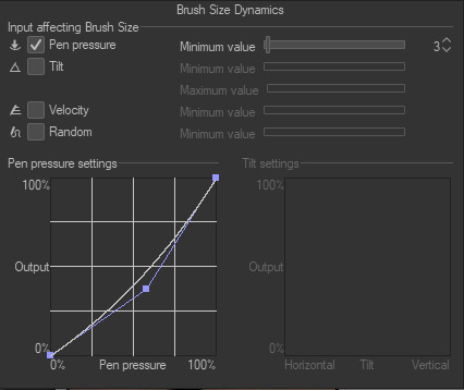
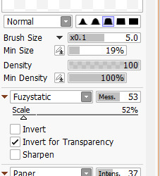
And as for brushes: the main brush I use in CSP is just the default 'Real G-Pen', with opacity effects turned off and these pressure settings: (I like to keep it simple, and I have a bit of a heavy hand so the altered pen pressure just helps me get a smoother taper). I change up the stabilizer settings depending on what I'm doing. Lower for things that need short, quick lines like hair and higher for most other things.
For Sai, I use a 9B pencil I found a number of years ago on Deviantart (I think?) and I wish I could link you to the original post I got the settings from, but Deviantart's search is... bad and I'm unable to find it again.
I hope that answered all your questions! If not, feel free to ask more!
67 notes
·
View notes
Note
Hello Maya! I don't know if you've talked about it, but how do you tackle the task of making a pin design?
I've seen many pin designs and as much the difference between artists' styles is understandable there are some that work better. Im guessing it has something to do with simplicity? Because some details might be lost when translating it into the pin and the limitations it conveys.
So the question is, how do you fit a pin design so it works and looks amazing?, because all your body of work is 👌👌👌👌👌
Do you like making pins?
Is there any insight you could share with us?
i’ve talked about this previously, but it’s been a while i think! there’s also a ton of youtube videos like this one that can help you out with the basics. i also strongly recommend buying copies of “welcome to pin hell” and “the inner circles of pin hell” by hannako lambert. she is a true master of the medium and knows far more than i ever will.
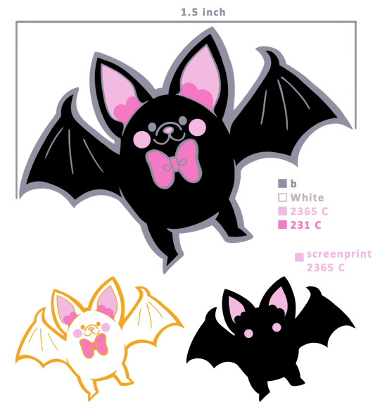
enamel pins are really their own medium and how much you can do with them is really just limited by your own understanding and your budget. you can go as simple and cheap as a simple line drawing with the “fill” areas left empty to be recessed metal, like i did for my bee pin.

working like this, because the metal linework is raised and unfilled, has the highest amount of fidelity between your original artwork and the end product. you have to remember that enamel pins are extremely small and so intricate work can easily be lost if you’re not careful.
you can also have the empty spaces filled with enamel, like i did with the anodized version of my bee pin.
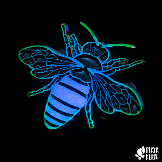
this is called soft enamel. this also has a relatively high amount of fidelity to the original artwork. pins like this can also have special treatments of the metal, like the anodization above (i.e. the rainbow), that are only available for soft enamel pin or pins without any enamel. similarly, glitter enamel and similar speciality enamels are only available for soft enamel. i don’t often use soft enamel as it doesn’t suit most of my work, but it was the right fit for the bee pin because the recessed metal/fill did the best job of accentuating the design.
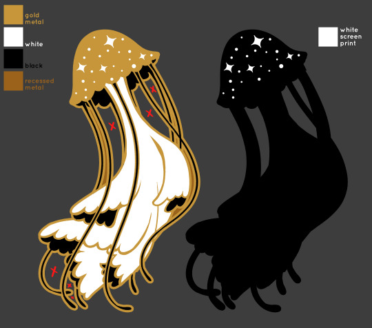
if you fill your pin and then grind down the metal so that it is flush with the enamel, this is called hard enamel. it creates a seamless, cohesive and polished look but because the metal is ground down, it decreases the fidelity of your line work. think of it as a tattoo: soft enamel or no fill is the fresh tattoo, it looks essentially as intended, though if the artist doesn’t know what they’re doing there can already be a loss of detail. hard enamel is like a healed tattoo: the ink will spread and, similarly, when the metal is ground down it may widen slightly. different factories will have different degrees of loss in fidelity depending on the skill of the workers and also how quickly they’re having to work.
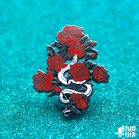
the above pin uses a combination of hard enamel and recessed metal (the lines in the leaves are recessed). this is a pin with a very detailed design that can easily go wrong when not handled carefully. the recessed metal not only looks good and cohesive with the metal, but it also preserves a higher amount of line work fidelity than an enamel fill would, allowing me to be a little more detailed in the design. i also used cut outs give a more delicate feel, despite the sheer size of this thing.
and this is what that same pin looks like when made less skillfully. i would only make pins this detailed if you have history with your manufacturer and know the quality of their work—and if you’re willing to eat the cost of a bad batch. we’d been working with this manu for a few years when they sent us this back and let me tell you, i was crushed. this is maybe my favorite pin i’ve ever designs and apart from hating to waste money and material, it’s disheartening to see my work translated so poorly.

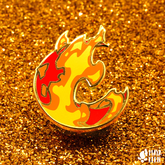
with enamel, each color must be contained by metal. it’s like a little pocket that you inject color into it. but, you can also screenprint on pins! this is a bit hit or miss, as pins are tiny and it’s super easy for the screen to be misaligned and have it totally fuck up your design, but when it works it’s really lovely! (the white spots on the mushroom and the yellow portion of the flames are screenprinted)

one of my personal favorite techniques with pins is to use the metal itself not just as line work, but as its own “fill”
these are the most basic techniques, but there’s tons more, including stained glass enamel and pins that are fully 3D sculpted, but i’ve never done those so i’d recommend checking out hannako’s books for info on those.
with all of this, when you work with a manufacturer, you’ll provide them a jpeg not just with the artwork, but with a “guide” for any processes (cuts, recessed metal, metal treatment, screen printing, etc.) and for the pantones. here’s what that looks like (the “x” denotes a cut)
if you plan to make a lot of enamel pins i highly recommend getting the set of pantone solid coated and uncoated books so you can accurately pick colors. also these books are expensive so store them out of the light so that their color remains accurate for as long as possible, because they will fade. 🤪
i also highly, highly recommend that you create a backing stamp for your pins. this is a name/logo that just gets pressed into the back. this not only helps people know where their pin is from, but also protects you in the case that a major company decides to steal your pin design.
and since i’ve typed up this whole informational post for y’all, here’s a quick reminder that my pins are currently on sale 😘😘😘
#enamel pin#enamel pin design#art tutorial#tutorial#artists on tumblr#art#maya draws things#art tips#faq#ask
685 notes
·
View notes
Note
(Venting because jesus fuck this. Needs to be let out or somethin gonna happen.)
Npd + bpd culture is hating someone bc they keep coercing YOUR fp into public calls and keeping them away from you and saying you hoard them away from everyone else. LIKE. BITCH??? OF FUCKING COURSE I DO. THEY'RE MINE. NOT YOURS. I KNEW THEM FIRST. MINE. I'M THE BEST FOR THEM ONLY I KNOW THEM THAT WELL. STOP FUCKING TALKING TO THEM YOU FUCKING BASTARD. IT'S NOT LIKE THEY LIKE YOU ANYWAYS, WHAT WITH ALL THE DISGUSTING SHIT YOU SAY TO THEM. BESIDES, I'M THEIR FP TOO, NOT YOU, ME. ONLY I'M WORTHY OF THEM AND ONLY THEY'RE WORTHY OF ME. I'M BETTER THAN YOU, FOR THEM AND IN GENERAL. LEAVE.
And hating that same person because their SHITTY 10 MIN UNCOLORED DOODLE GOT MORE ATTENTION THAN YOUR BEAUTIFUL LINELESS PIECE THAT YOU PUT MORE EFFORT INTO AND SPENT MORE TIME ON. FUCK YOU AND YOUR SQUIGGLY ASS LINEWORK I HOPE YOU SEE THIS AND KNOW HOW INFERIOR YOU ARE TO ME. YOU DIDN'T DESERVE THAT ATTENTION. I DID.
-🌌👁
(May i sign off as 🌌👁 if it's not taken?)
.
#npd culture is#npd + bpd culture is#npd#actually narcissistic#actually npd#narcissistic personality disorder#cluster b#bpd#borderline personality disorder#-🌌👁
32 notes
·
View notes
Text
i just ranted about this to some friends so i'm gonna rant about it here because everyone needs to hear this. EVERYONE.
DO NOT SELF-DEPRECATE!! CRITIQUE YOURSELF!!
as an artist and a writer i hear this ALL THE FUCKING TIME. someone will show me their work and go "this is so bad, i'm sorry, this looks awful."
i cannot begin to express in words how much that shit pisses me off. self-deprecation does not gain my sympathy. it gains my absolute unfathomable rage. it makes me red in the fucking face.
do you not like something that you did? okay. GIVE ME A REASON WHY!
don't like how you drew something? why? were the proportions off? don't like the linework? is the coloring too messy? the shading? the lighting? the background? what don't you like? why don't you like it?
don't like how you wrote something? why? is the tone strange? is the pacing off? bad grammar, spelling, punctuation? bad spacing? what don't you like? why don't you like it?
this self-critiquing literally applies to everything, even outside of artistic works. it applies to school essays, conversations, human character. if you don't like something, especially if that something is something that you have made or done, give me a fucking reason why. NOTHING IS BAD SIMPLY ON THE BASIS THAT IT IS YOURS. THAT IS NOT A VALID REASON. IT NEVER HAS BEEN, AND NEVER WILL BE.
you are allowed to hate your work. every creator has done something that they don't like, some more frequently than others. that's natural. that is allowed. what i hate is when people hate their work simply because it is their work. they completely lose their motivation to make because they hate everything that they make and cannot come up with a single genuine reason why.
give me a reason. "it just looks bad" is not good enough. end of story. i won't hear anything otherwise. self-deprecation does not gain my sympathy. it gains my fucking ire, is what it gains.
be confident in your work. self-analyzation is one of the best ways to improve your work. always self-analyze. you learn to do it unconsciously. if you can come up with at least one reason why you don't like something you've done, you can come up with a solution on how to avoid that problem the next time. you know better, you do better.
so do not self-deprecate. self-critique. have confidence. be assured; everything you do is good, even if it has elements to it that you do not like. creation in and of itself is a good thing, no matter how much you might hate it. simply doing is better than not doing anything at all. adopting this mindset will improve your confidence and ensure that you make more things and do better in the future.
hope this helps. go make some good shit.
21 notes
·
View notes
Note
Hey :) I've been looking at your blog and first off, wow. Second, you're really good at digital drawing and I'm trying to get better at digital drawing but I can never seem to get the lines straight or the colours even and in the lines. So if it's not too much trouble, could you maybe tell me what app you use or what brushes you prefer? I'm currently using ibisPaint X and I'm drawing with a sketchpad :) it would really help if you gave me some tips too! Thank you!! Also, you're really talented hehe
Hi there, I'm glad you like my art thank you so much! ; u ; <3
And sorry for the late reply, I wanted to write up a full response with some examples!
So for my artwork, I use almost exclusively Paint Tool SAI. I specifically use the original SAI atm, though I want to try using SAI 2 more (the brushes just feel... different. I've been using SAI for a decade now, so it's where I'm most comfortable.)
SAI does cost money, but there are also free alternatives online as always. I'm not familiar with IbisPaint X, but I know that FireAlpaca and Krita are two good free options. I don't use a smart tablet or apps to draw, though, so I'm not sure what are the best options outside of PC.
As for brushes, I use three brushes for my lineart-- though 2 of them much more than the third.
The first brush I use is my Marker brush. I've been using this brush to line my work for a very long time. It's thin and somewhat transparent (sometimes I copy-paste my lineart a couple of times to bulk out the transparency).

The second brush I named TEST when I made it and I just never changed it, so it's my very permanent TEST brush. It's sort of similar to my marker brush (it even uses the SAI marker brush base), but it's thicker and a little more ragged. I tend to change up my style when I use this brush.

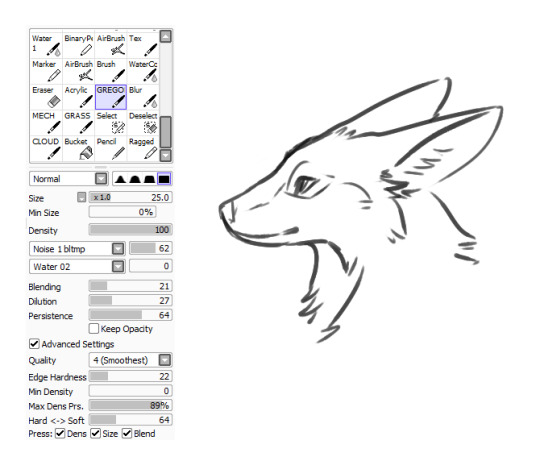
The third brush I use for lines is not one of my "lining" brushes. It's a painting brush named GREGORY and I Mostly use it to paint backgrounds and details in fur. I change up the "blending" setting on it as needed. I usually only use this brush to line if I'm having artblock or am sketching around.
As for keeping lines straight, I honestly just gotta say-- there's tricks to cheat the system! The first, easiest thing is you can find the "stabilizer" setting on your art program, slide that bad boy up, and have some assistance with keeping your strokes smoother.
The second thing you can do is... not really "line" your artwork.
I tend to fight with lineart a lot. Sometimes it's not so bad (especially with my TEST brush), but a lot of the time I just line something and hate the end result, if I can even push myself to finish it.
So, instead of "lining" over my sketch layer, I just... make the sketch my lines.
My sketches are usually pretty detailed so I think that helps, but I basically just erase and go over the lines meticulously in small increments until I'm left with linework. And if I'm having trouble with a spot, I'll just make a new layer, "properly" line that spot, erase the section of the sketch under it, and then merge the layers and move onto the next section. (I also keep my fingers over my undo and redo hotkeys, since a lot of lining can be just undoing a mistake and redoing it until you like it.)
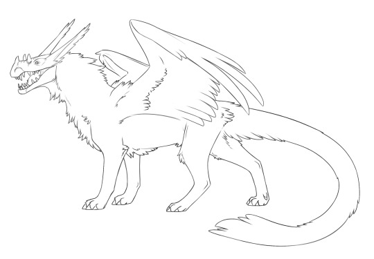
For example, here's this dragon I've been working on, in its original sketch:

And here it is halfway through the cleanup process, where you can see an amalgamation of clean lines amid the remaining sketch:

And here's how it looks now:
Lines won't cooperate? Make friends with the sketch! I often feel like it's easier to keep the personality of the original sketch when I do this also, though that's just personal preference.
Now as for keeping colour inside your lines, Layers and layer settings are your friends-- that and the magic wand tool (which is a selection tool).
When I use the magic wand tool, I tend to select the area Outside of my drawing first
If there's a hole in my lines and I'm having trouble finding it, I cut a line across the drawing and use the magic wand tool again so I can see which section of the drawing the linebreak is in and fix it.
Once the lines are sealed, I invert my selection so it's inside the lines rather than outside! I prefer to start outside since I find it easier than individually selecting the inner parts of the drawing. It's worth mentioning that the magic wand tool is not perfect (especially if you have sketchy, ragged lines like I often do), so you might have to clean up the edges.

You can make layers under your linework that you can freely draw on without disturbing your lines, and they will conform to your magic wand selection as well. What more, though, you can also make clipping layers/groups which are layers that affect only the pixels below them.
So like in this example here there are four layers. There's the lineart layer, the layer for the base fur colour, a layer for the details (beak, eyes, white spots), and then there's a clipping layer that is on top of the details layer.
Anything I draw on that clipping layer can only appear on pixels directly below it. This is useful for a lot of things like detailing and shading. It also means you can safely exit out of your magic wand selection and still remain in your perimeters.
You can also lock layers which is like using a clipping layer, only you're affecting that actual layer instead of going over it. Whichever one you want to use is pretty much just personal preference or situational.
You can also use these layer settings to colour in your lines, if that's something you want to do!
I hope some of this helps! I also hope that you're having fun with doing digital art! :D <3
#also I love your username#so-once-i-was-a-chicken#digital art#replies#art tips#art programs#art brushes#brushes#paint tool sai#maybe I should put some of this under a readmore but naw#long post#not art
223 notes
·
View notes
Note
hello!!! if you dont mind me asking what kind of white pen do you use for adding little highlights in your art? your art inspired me to start inking and coloring my traditional art and ive been having a lot of fun with it for a year or so now but i can never seem to find a good white gel pen to use 😭
you and me both friend 😭 I have a lot of issues with the ones i've tried and im thinking i might switch to just using white dip-pen inks (shirahama has given the brand she uses it's something like icy-white but i'll have to dig that out again).
the best luck i've had has been the following:
General notes of paint/acrylic markers - be extremely careful of smudging and drying times, both of the pen and whatever you have underneath. For any solvent-based mediums (paints, alcohol markers and ESPECIALLY linework inking) acrylic markers can pick up some of the colour or damage the paper and create smudges and tears. This is relatively easy to avoid so long as you wait for stuff to dry and work in small areas. The paint itself will take a while to dry so I usually let it sit for 30mins-1hr before putting it anywhere near my scanner bed. If you need to work on a larger area and the paper you're working on isn't pretty robust you should probably switch to a paintbrush and just use regular acrylic paint (which has a longer drying time).
I've also found that with smaller pen nibs getting a reliable opacity is an absolute crapshoot lol.
Artistro paint market pen - really good when fresh, but god help you if you go without using it for too long after you start using it. it'll gunk up and I don't know how to fix them. They are relatively cheap and come in packs at least. Doesn't seem to have larger sizes though.
Posca paint pens (various sizes) - far more robust than artistro if you store them right but regrettably more pricey. I've also found the finest nibbed white pen to be... deeply underwhelming. It never seems to have adequate pigment no matter how long I shake and prime it. By contrast the artistro gave the same sized line much more consistently, but at the cost of the pen nib itself being pretty unreliable.
Decobrush pigment - I've not got these in white so can't speak for them directly, but the colours I do have are pretty spiffy and it's a BRUSH pen, which gives you so much more control and a range of sizes per pen. There is some difficulty with low opacity on these though (since they're meant to be used with other decobrush markers), so I don't know how a white "corrector" would fair. The colour range is generally pretty gorgeous though, in the long term i'd like to have more of them.
General note on gel pens - I've got a love-hate relationship with gel pens honestly. I find I can get more consistent results out of them because the ink doesn't settle and you don't have to prime the nibs, but that's only if you can find a good brand... and then a good specific pen lol. I've also found an issue when you don't let the medium below dry properly re: smudging, but it also seems like if your work isn't boneeee dry (like overnight or multiple days of alcohol markers drying) the gel can very easily take on the colour of the pigment underneath, especially darker ones. Oddly this doesn't always show up when scanning, but it will look odd in person. Not always a draw back though - it looks great for white detailing in shadow.
Sakura Gelly Roll 08 - Not sure if there's other sizes (or their efficacy) so I thought I'd be specific because if there's one thing about gel pens the specificity MATTERS. I've got a couple of these and they don't disappoint (insofar as my expectations for gel pens go)
Uniball signo broad - this was my favourite until it ran out of ink. I cannot say for the uniball signo (without the broad part) which seemingly just gave up delivering ink and enjoys carving lines on the page and maybe delivering just enough ink that you can see where the ball is on the track it leaves behind. But the broad? I really liked. It honestly probably performs the same as the gelly roll but the pen just feels nicer to use lol, and the fact that it ran out of ink rather than dried out speaks for how much I liked it lol
as a general warning though - basically any gel pen or acrylic pen should be the last thing you do on your piece, because the second it goes down you will not be doing any more colouring in that area (unless you paint with acrylics). You can maybe use lineart pens on top of them once fully dried for at least an hour (ideally more) but it's very likely to smudge.
honestly... if you scan your work, there's no shame in cloning a white area of your work to use as a highlight post-scan. i always feel like im cheating until i remind myself that every digital-artist peer i have gets do to this at their leisure lol. i'd recommend getting a good scan/photo of the work before adding any highlights anyway because it's sooo easy to bugger them up and be unable to fix it (i say this as someone who never remembers and always regrets it lol)
examples:
you can see where the opacity doesn't quite hide what it's covering - an extra layer or digital correction would have been great. pretty sure this was artistro acrylic pen. but the unseen thing is i had to correct around the iris to the point where i said "well fuck i can't do what i want now" and just fixed it digitally.
dot highlights on the left and in/around the eye - definitely gelly roll. gel pens are really good for little pin pricks because you avoid the ball-point smearing things too thin and you can get pretty high opacity from that. also some more digital "help" with a bit of airbrush glow.
Definitely gel pen but i forget which kind, but I wanted to show what I meant by "picking up some pigments" and how can can be a boon, but also how sometimes the scanner just picks it up as white anyway (left is scanned, right is a photo - you can see it's purplish in the shadows)
#asks#Anonymous#sorry this turned into an info dump basically i also Struggle with this step#and i feel like i should just go full digital with it until i find a better solution#other things i'd like to try are gouache and just using acrylic with a fine brush#mostly cos high opacity white ink is just... hard to find and dip pens are Difficult
10 notes
·
View notes
Text
i’ve heard people make the argument that using “ai generated art” for backgrounds or coloring or whatever is a “valid” use-case.
The examples that I’ve seen definitely look worse than hand-drawn work.
It’s the same argument that people make when they talk about using pre-rendered stock 3d backgrounds for webcomics.
But those 3d backgrounds lack so much artistically! I hate seeing the arbitrary, unintentional jagged raster lines compared to the smooth linework of the characters.
I’d much rather see “poorly” hand-drawn backgrounds! It has so much more character! Or if you want to use photographs for the backgrounds, take the photos yourself or have a friend/collaborator take them! They’d be images unique to your work, bearing the unique context of your artistic intent.
Yes, some things save time. You know what else saves time? Not having backgrounds. Not coloring. Not mixing your own colors, using only Pantone.
Some shortcuts make things look worse. But I also say this as someone who has read a pretty high number of webcomics with stock 3D render backgrounds. Some of them I consider quite good. But the things that made them good in my eyes were the writing and character art and other aspects, and the backgrounds felt like they detracted from the quality.
12 notes
·
View notes
Note
for the character thing u know i gotta ask zero

obsessed with how you specified with a sprite. it's gonna look so awkward, I love it.
send me a character and i’ll list:
favorite thing about them
The weirder answer: the specific tone of voice I have developed for him in my head that I can never explain to people, but it just Is. Lately it's been getting more muddy and vague (Gotta go replay!!! Yearning...), but in general, holy shit, it's so good.
The normaler answer: the way his whole character is on the undefinable fringe between right and wrong, life or death, being perfect and just being, etc etc. You get it, it's on the ceiling.
least favorite thing about them
THE WAY HE JUST WON'T LEAVE MY HEAD.
Seriously, though, I don't know... there are plenty of parts to him you're supposed to dislike and question, but at this point I have stewed and pondered on them enough to actually adore how well they fit together.
There's at least some sort of inferable reason to just about everything he does or can do, so it's genuinely hard to find a reason to hate him, despite it all. When the character is complex... bottom text...
favorite line
Off the top of my head, probably "You honestly thought you were in my league." I feel like I talked about that moment plenty (with some people, or maybe with myself), and also not enough, but it really feels like the first (or one of the first) times his core character really shines on its own.
And due to how it's all constructed, in the moment all you can really think about is how much you agree. You just sit there, somewhere between utterly fascinated and deeply... immersed, for lack of a better word, and it's the exact way they want you to feel. They want this to stick, so it does. It's just a good scene.
Shout-out to "You are wise and virtuous." in HERO as well, because that is probably my single favorite bit in the whole thing. Help.
brOTP
The little girl, obviously :3
+ Fifteen, but it's too complicated to just call it that. I'm not in the mood\shape to try explain it exactly, especially since you already know
OTP
The receptionist. <3 <3 <3
It's the kinda shit that realistically shouldn't work out, which is why I'd love to see it actually get pulled off in canon, LMFAO. But I'm not too hung up on it, obviously.
nOTP
Literally everything and everyone else (aside from the two crossover crack ships I now have, but that's entirely out of this ask's scope and I don't want to elaborate), including 150 seen through any other lens than mine, to be honest.
Lea him alone.
random headcanon
He really wants to have a cat, but doesn't act on it for multiple reasons, from stray cats just generally being nasty on top of how The Everything in the district is horrible, to the crushing knowledge of never being able to take care of it perfectly.
unpopular opinion
Probably every single opinion I have. I don't like answering questions like these because I hate knowing what is popular no matter what fandom. The very concept of such a question consistently stumps me, because I am permanently off in the corner, just doing my own thing.
song i associate with them
You've seen my playlist, and I don't like going off about it unless prompted, so I'll simplify and say Overdose. :3
favorite picture of them
[scrolls through 💿 tag and my silly art stash rapidly] uh... I'm gonna pick three... if there's anything KZ fandom always does right, it's the art, ugh.
The second one in this tweet. There's something about the framing and the texture that just gets me so bad...
This post. I keep saying it, but Scary is one of my fav artists in general, and I continue projecting stuff onto this piece specifically, so it just means so much to me, oh my god. That and the song it's coupled with. Help me.
This post. The expression and pose, the colors, literally everything about the linework, and to top it all off, the gem that is the fucking caption. I think about it weekly.
#🍵#zero.txt#long post#i should add a note about skipping the unpopular opinion entry for next time oh my god. i hate that question
5 notes
·
View notes
Text
03/9/24
technically an update from yesterday but it’s 1 am right now lmao
Worked on some pages
Fixed some older design sheets
i have made a decision that sets me back quite a bit but it will save me a significant amount of time in the long run so i feel less bad about it
i restarted. again. i was going back to look at some old pages and there were quite a few weird continuity errors (ex. line sizing, line colours, character placement etc) that i just couldn’t fix because i get rid of the file as i finish them to save space. there’s also a bigger reason i wanted to, which is a problem ive run into several times while working on this project:
colour. i am so incredibly bad at picking colours for non-painted artworks that it’s embarrassing 🥲 i just can’t do it!! and it takes me so long and procreates fill bucket just doesn’t work properly so i’m doing 2 things:
- switching the comic to black and white
- going back to my drawing tablet and using krita as the art program
the reason why i used my ipad for so long was because i wanted to be able to work on it wherever i went, but procreate has so many setbacks that has wasted so much time that the portability isn’t enough to justify using the program. i cannot go as loosely as id like to be with my linework in procreate as i can on pc and the fill bucket never working is such a big reason why i’ve struggled to work consistently on this project. these changes will eliminate a large majority of my problems when i’m making this comic so there’s very little chance i end up restarting again. my only problems would just be hating my old art but what can you do 🤷♀️
not really update related, just kinda yapping utc
i used to care a lot about getting this comic out and making hype earlier into the project. thats what all creators usually go through. trying to push things out while they’re relevant so it gets more reach. after working on this comic for almost 3 years, im doing this more for me than for anything else. it’s so incredibly self indulgent that it already caters to a rather small demographic, and im fine with that. that’s how i’ve always worked. i did whatever i wanted and if people didn’t like it, i didn’t care. they can go find other media they like.
i used to be worried about not getting this comic out when this ship was super popular. not to say that it isn’t still, but there was a prime time and i was trying to get there within that time period. obviously that didn’t happen but whatever 🤷♀️ i’m taking the time to make sure i like what im doing with this project. who knows when i’ll finish it. but i want to make sure i do. just to say that i did it. this story has evolved and grown alongside me and i can’t wait for a day where i can put it out into the world. i’m okay with the possibility of my friends being the only readers. as long as it exists someday and im happy with what ive accomplished, i’m okay with the time ill need to get there.
2 notes
·
View notes
Text
Painting Outside (and over) The Lines:
For a while now, I've been in the practice disregarding lineart completely since I have some contempt for the practice of redoing sketches but cleaner and nicer. I've seen the explanation for people hating their lines for sketches they like that it's because you lose some of the nuance of the sketch when you redo it more slowly and focus on making it neater than better. That I can't help but agree with whole heartedly since it can take me twice as long to line with half the quality on my even my better days. I've found that I can only get better end products by putting way less detail and time into sketches (so I'd have to put more detail and time into cleaner linework) and I can just "add on" a layer of detail that overlaps the linework. Here's an example of what that looks like:
A beautiful little love child baby concept of an oc and an anime boy. Here's some quick lines with rough colors (and poor penmanship.) Once I have a palette I can live with, I follow it up with details...
And after sanding off some of the details like bleeding color or mistakes here and there in the lines, I drop a layer or two on top to just very loosely edit in some extra detail or whip out anything I miss in clean up...

I'm not sure if you can spot all the differences individually but hopefully we can see the final product as at least a little more pleasant to look at than the previous posts. It's a bit sloppy/lazy in terms of art process but I guess I look at final product and the ease getting to that point over the process itself. If you'd like to try this, I suggest using a pencil tool with a textured edge for the lines and coloring and hard brushes for filling with limited soft brushes for blending the edges of colors and shadows only.
Thoughts? Do let me know if this does anything for you!
3 notes
·
View notes
Photo


SCANNER VS PHOTO (phone) OBSERVATIONS AND GRIEVANCES
COLOR
the scanner is way better about preserving the right hue except when it comes to reds. sometimes it preserves it really cool red but it pulls too much from oranges. The scanned colors on casarin are almost exact, the photographed colors on alex are almost an exact match; the photo doesnt capture the red in the shadows of casarin’s hair (idk why i picked that the shade nevermind that) and alex’s yellow orange and skin are too dark leaning too red. the orange i use for oasis and alex is warmer than the one i use for latikam and susarikas (salmon), irl they look almost the same, the scanner will turn the salmon straight up pink. Worth mentioning this example is after contrast editing but its still very apparent before any adjustments.
TOP - what they look like irl BOTTOM - what the scan says they are (various samples to account for slight variations ect)
TEXTURE
scanner preserves crisp lines better. everybody knows this. But it always has a grain to it. When taking into a program and doing more linework there I think its the better option since is vibes with the digital textures better imo. But after editing and everything else i dont think its noticeable. In colors it KILLS. Scanner looks like the vision of a man dying of radiation, photo clearly has paper texture. Its most notable in alex’s hat. There’s also this strange haloing on the lines with the photo. No idea why. I think its something exclusive to my phone. To be expected the more the contrast has to be edited the worse it all gets.
Scanner reduces the watercolor edge look, photo seems to amplify it. My phone does this to all photos i hate it. Normally I like watercolor edge but Im shit at evenly applying color so its working against me i think. These are alcohol markers btw not watercolors. Its a side effect of the fact I dont know how to color. The scanner drags my uneven coloring further though. Especially in faces. I hope we all die.
Not a fan of the speckling but thats a paper issue more than anything as far as i know. I used this paper since it was like the second best about that. Overall I dont think I can win. They’ll just always look better in person. You had to be there.
EDITING
when im doing just lines it never matters lol. Scanner is better in preserving crisp, matching the digital noise texture vibe unintentionally, and keeping the paper level and flat. But I have 13 years experience I can salvage linework from the shittiest of photos without much more effort lol so I’m kind of a spoiled brat about this one.
Scanner will keep the white FFFFFF, and washes out everything else. Photos are a mixed bag. Overall I think I ended up using about the same settings in the end loll? But photos I have to account for the ambient color (even on an overcast I got a slight yellow, idk man) and the fact I cant take a straight non blurry photo. Though overall I think photos take being edited better. I feel like im not riding such a fine line between overedited grainy ass nam flashback lookin bullshit. I know that’s perfect for sf vibes but I want to be in control of it at least.
MATERIALS FOR REFERENCE
Strathmore marker paper I think
sakura micron 01 black; sakura gelly roll white 10 (you can color over the white with the copics btw i didnt know that)
copics e33 e11 e25 r39 bg93 y23 (shading rv99); e30 y23 yr15 yg67 (shading bg96 bg99)
photo taken in overcast afternoon by window but also a single warm lightbulb in the background which is probably where I was getting that slight yellow from now that I think about it. there were 45mph gusts today so. :/
idk what my scanner is i doubt it matters its cheap you think i have money after getting copics lmao lol lol ha
5 notes
·
View notes
Text
I hate that people are pushing AI art with the Common reasoning behind it being "art is so expensive and inaccessible to get into :("
While this CAN be true (see: marble sculpting, machine sewing, etc) this isn't the entire case.
You can find yarn at Thrift shops. You can find knitting/crochet needles and hooks at Thrift shops. You can get a $5 hand sewing kit that will last a very long time. All you really need is a couple different needle options, a thimble if you want to save ur fingers, and a ripped piece of clothing.
All you need to paint is cheap paints. Will they last long? Depends how you treat it. Keep ur eyes open for sales coupons and discounts. If you're dedicated to learning the craft, you can do as I did saving quarters and dollars that I didn't use for food and basic necessities to save up for mediocre art supplies and paper to practice my skills between shifts.
Like..... I don't want to take away how hard art can be when you are disabled. I know from experience that if you don't have energy, you don't have energy. If you're in pain, that comes first.
But even then. We have tools to make things easier. There's wrist supports of all sorts, there's tutorials on making things like yarn work more accessible. There's predictive correction for drawing software now! Sometimes it's AI, but not the kind that's stealing your artwork. Its the kind that reads your movements and cleans up the jitters in the linework for you.
There's so much out there!!!! Art is more accessible than ever!!!!! Hell if you have a half decent laptop blender still offers older versions of their software!!!! You don't need a top of the line computer to do that!!!!! Don't have a computer??? Obviously you must have a phone or other device to log into apps on!!! Download a free sculpting app. Download a flip-book animator. Use an online web browser based art tool. Put thought and care and love into your piece. Throw that shit together hastily. Idc but it will be better than trying to type out prompts till the machine gives you something close to what you want.
#maybe its the rabid artist in me thats made me work harder and jump thru more hoops but. why is it so hard for people to google#“how to (art piece) with (disability)” or “how to (do art) for cheap”#like. idk. art is more acessable now than ever before#please please please do some art. for yourself. for your brain.#make bad art. make brilliant art. spend five seconds doodling or hours on detail#throw yourself into it#its worth it#the act of creation is worth it
1 note
·
View note
Note
I'll take Sherlock and Glee for the asks game if you please.
Sherlock (2010s starring Benedict Cumberbatch)--100% of brain lights up in complete delight... until it all starts to go downhill
Firstly, as you all know, I am on the autism spectrum, and so is one of my biological parents. That is NOT an excuse for improper social behavior, but giving you the background information about possibly how and why happens (or happens to such an extent) could lend some context.
I love to create. Any kind of content. Writing, drawing, painting, photo editing, sewing, setting margins for business letters... the list could go on. It makes me so happy to take on a project that feels fun and feasible. Something I learned when I was young was, basically, if you don't have it, you don't necessarily have to buy it. Look at your materials, or at cheaper materials, and create what you want exactly the way you want it (like, if the beaded princess crown at the Busch Gardens gift shop is, in fact, too big for your head, we can hit up Walmart and get wire and beads and make a crown that fits you, in any color you want).
I've carried that attitude through most of my life. Like, nice-fitting jeans from Goodwill-- I can hem them, the length doesn't matter.
That's actually given me a lot of confidence in my abilities, and it brings out ingenuity with problem solving, especially when it's crunch time (like, signed paper needs to be delivered to the customer--whose office is in Montana--before a certain deadline in not-my-timezone? No prob. Run to my boss's office, hand him a pen, run to the fax machine, run to the phone, let the Montana contact know the doc has been sent, and bam. (Sure, the expectation may be for an engineering review, and the expected delivery method may be SharePoint link, but a signature from the maximum authority and the convenience of instant delivery? No one can complain about that.)
Things start to go south, though, when my efforts (which I consider to be "good energy," if that makes sense) don't wind up doing what I want them to do, or things turn out to be much more difficult than expected. For example, when using black paper and a white marker for a drawing, it will become clear, when one tests the quality of several white markers on a scrap paper, that some are better quality, or better suited to the tasks, than others.
But say I started with the Crayola iridescent paint marker (nice tool for outline/contrast, but not a great choice for linework or edges), and my drawing is not showing up. I must choose, then, to
1) scrap my drawing (and maybe do it again with something like a matte brush tip)
2) go over my drawing again (and again) with the Crayola in hopes of improving what I already have (though with equal probability of ruining it), or
3) become a frustrated mess of hopelessly selfish human and hide under my desk with all the dinosaurs and paper clay and other odds and ends I use for art with my kids.
More often than not, it's choice #3. I don't exactly know how to, like, have frustration for a thing, and, while still acknowledging it as important and real and meaningful (enough so that I still have desire to make the thing and make it in my own correct way), put it away in my brain's side pocket and move to perform different tasks. I tend to try and try and try to bulldoze my way through, risking breaking my supplies (because I so hate leaving projects unfinished, or with the current step/chapter unfinished), or I become sad and feel negatively about myself and my skills and the fact that I will have to put everything away in order to take a break (kids and cats, lol), then get it all out again for my next try.
Glee--cute and quirky, and then it was cutting edge, and then it was the BEST, and then it started tilting the other direction, and it ultimately fell on its own sword and became the absolute WORST
A lot of things, mostly books and classic television programs, that have been considered from, broadly, 1950 to 2020, as "things we will pass down to our grandchildren," including, but not limited to, the following:
Harry Potter-- and that's sad. That's a travesty. Some aged wine grows more precious over time. Some just goes off.
Dr. Seuss--Because he had an actual career, and writing nonsense books was only part of it. I respect that particular treasury. But he was a guy. With a life. And, in comparison, like, even if Bohemian Rhapsody is a glory film, it doesn't erase the bad choices that still stand, unchangeable, in their influence on modern history.
Mr. Rogers (ok, he helps kids learn to tie their shoes... but, I kid you not, one skit in the world of make believe had a puppet who identifies as a woman, performing in a (very fictional) talent show, during which she was dressed up as, and pretending to be, a kitten, who was singing (horrendously) an original song, in which the lyrics begged the Moon (cognizant, apparently, and generous) to give her a star as a birthday present. What the everloving fuck, here? Not to yuk anyone's yum, but... a grown man, who has created an OC 'verse for children (his main consumers) and those who watch with them. I'm seeing... possible ageplay x furry x accompanist? what accompanist? x personification of balls of rock x obvious greed and pestering as a method to be rewarded x light references to Wicca and Paganism (I don't care, but some people might. Could bring on some leading questions from the littles, too.
Magical family recipes that are actually on the back of a can of condensed soup
BMI (used as an indicator of health--Have you ever seen a male ballet dancer? Yeah, like, in jeans on the bus he just looks like a dude. In tights and a tank, he looks like Secretariat. Depending on his height, he probably weighs something like, 1.5x the expected--visually based--BMI. Put him in high-healthy, verging on overweight. He probably eats 3,000+ calories of healthy food on the daily, and regular deadlifts, eh, 100 to 130ish pound partners? See? V healthy. Chart means nothing.)
Binarily- segregated restrooms (Ok, have you seen a toilet stall in Iceland? They're mostly non-gendered, at least in big public places, like the airport. The regular stalls--usually, like, 20 of them in a row, with a couple of handicapped/accessible/baby-changing stalls on the end-- contain one regular toilet. The door and walls go from 1cm above the floor to 1cm below the ceiling. All have sliding locks that operate only from the inside, and outside hardware is barely visible; it's just the flat (no screwdriver marks) heads of the screws that brace the locks to the doors. Then there are sinks. That pour out water. And pumps. For soap. And paper towels. The entire population has a grip on what purpose bathrooms serve, as well as what people do in bathrooms, and the differentiation of both private and public spaces in order to meet most efficiently serve the population.)
Frosted Flakes is (are) the sugary sweet part(s) of a complete breakfast. (!) Conjugate that, Tony Tiger. and WTF is a "complete breakfast?"
Math problems about trains. Nobody cares about crossing paths anymore. It's all arrival time, landing time, time zone, jet lag, how late to your meeting you can be before it's considered rude (and how disheveled are you allowed to look before high fashion hits slobbiness)?
Filler foods, which is a ridiculous American ploy to short farmers and natural food producers by making those goods more expensive and then creating a "store generic brand" version of the same product that's cheaper. Yay, save 20 cents! But that packet of breakfast sausages you just put in your cart is made of mostly soy and meat... leftovers. The brand that's beside it, that has the "naturally raised" sticker on it, that one's made of humanely farmed meat and probably a few salts, spices, and safe preservatives."Far East" instant couscous? Made in America, it's heavily mixed with condensed powdered dairy and soy filler. Kosher couscous pearls, you know, from that tiny aisle with grape jelly and yummy crackers? One ingredient. One! Whole wheat. You do not need a chemistry lab to make couscous.
Why am I so passionately angry about this? I'm allergic to dairy, soy, cashews, and oats. The ONLY milk I can drink is almond. When I eat bites of oral food (usually for social fun), I have to ask for every last ingredient to make sure I will not cause myself to have an allergic reaction, which is different from a gastroparesis flare up, which need to be medically treated differently, lest further damage be caused by overtreatment or symptoms left to stew and spread. My big kid and I are also touch-sensitive to oats, so, in addition to not tolerating whole-grain bread, we cannot use many lotions and shampoos (marketed for sensitive skin, lol) because they contain colloidal oats. There are even exam gloves on the market, meant to help nurses with dry skin, which I do understand is a problem, that contain colloidal oat powder (inside) and have a regular silicone outside. There is too high a risk for touch-transfer, though, and we frequently have to ask and remind practitioners to NOT use the oat-poisoned gloves.
ADDITIONALLY, there are something like 3 or 4 types of formula in existence for sustaining us tubies that don't contain at least one of the major allergens (usually dairy or soy). Of those few, at least one has CORN SYRUP as its primary ingredient. Ok, yeah, fortify the tubies and give them easily accessible carbs to keep them running. But, um, nutrition? Like, the absolute and awful, yet hilarious, truth that pirates (yes, of the caribbean) were healthier than individuals of European military forces traveling by sea, because the pirates ate a more balanced diet--fruit, bread, alcohol (aka sanitary hydration), and the redcoats died of things like scurvy because nobody thought to bring a lemon wedge to go with their hardtack and tea... People don't subsist on corn syrup. They can't exercise. They can't gain lung capacity, the ability to walk long distances, the critical thinking to problem solve and maintain self-care and do work. There is ONE type of tubie formula our family depends on (well, 2, because there's grown-up and pediatric) on the market that is allergen-free, pea protein based, contains natural minerals, and mixes with water and other dissolvable powdered supplements. We're immensely blessed to have it. We have to bring our own if anyone's in the hospital, since it's "rare." But OMG, the stuff has saved my life.
Forgive the ranting. I like to explain myself.A lot.
0 notes
Text
It is late and I am bingeing Whang on yt and I am in a mood.
I am obsessed, absolutely fixated on the preservation of art, whatever form it may take. I wish I could recover all the art I loved as a kid (mostly obscure web games) but I'm not particularly torn up about those losses, with one exception.
When I was 17 I volunteered working part time at an art supply shop, the owner's wife was my art teacher at the time/
We had more than a few clients asking for advice on preserving their art, a lot of which we laminated for them. My favorite still, is the drawing brought in by a man, he said his dad (or grand-dad, can't remember.) Most of them were sci-fi drawings, incredibly elaborate scenes of robots, warring spaceships, etc. There were two illustrations of the four horsemen of the apocalypse. All of these were drawn with cheap colored pencils and crayons, with extremely limited palettes. The most elaborate illustration was only drawn with yellow, orange and green, with black for linework. They were all quite old too, pre-Star Trek. The man claimed they were drawn in the 40s and 50s. If that's true, his father was an incredible visionary and I would sell my soul to pick his brain.
They were beautiful pieces, perfect examples of outsider art. To this day, I still hate myself for not at least taking photos, or getting the man's name. I would give anything to get scans of those drawings, or pay for prints.
Because of that event in my boring-ass life, I became very passionate for the preservation of art, I'm fascinated with internet mysteries (particularly the Land of Ta and the Most Mysterious Song On the Internet) and the internet is vital in the process of immortalizing art, even shitty low quality art, because you never know what will inspire someone. Foddy was inspired by a monumentally shitty game (Sexy Hiking) to make Getting Over It, a beloved rage-inducing game.
1 note
·
View note
Note
You get a cookie if you can tell wtf this is without zooming in: grabukimasterlist(/)art(/)209-No-More-Strawberry-Milk-917628717. Help, a random furry got into the Grabuki ML! grabukimasterlist(/)art(/)127-A-Deadly-Swipe-from-the-Northern-Lights-876729383. grabukimasterlist(/)art(/)52-Nobody-s-Fool-832775602 It looks like there's blood coming from their armpits. And what the fuck happened to their thigh? Omg.
https://www.deviantart.com/grabukimasterlist/art/209-No-More-Strawberry-Milk-917628717
this is more recent how did the linework get even lazier you can barely tell what’s going on with the arms or shit what the absolute fuck is going on what’s with its mouth why is its tail so fucking round it has to sit on that but i guess grabuki always operated more on looking cool than being functional in any sense of the word. the fucking back arm isn’t even fully drawn it’s just a gradient because they know it causes so much fucking noise in the design. this shit looks squeezed out last minute so much

https://www.deviantart.com/grabukimasterlist/art/127-A-Deadly-Swipe-from-the-Northern-Lights-876729383
what the fuck even is this i thought these things were distinct enough and yet someone has managed to entirely make them unrecognizable this looks like ass
https://www.deviantart.com/grabukimasterlist/art/52-Nobody-s-Fool-832775602
yeah this doesn’t look like one either jesus hulking christ i hate this species so much
0 notes
Photo
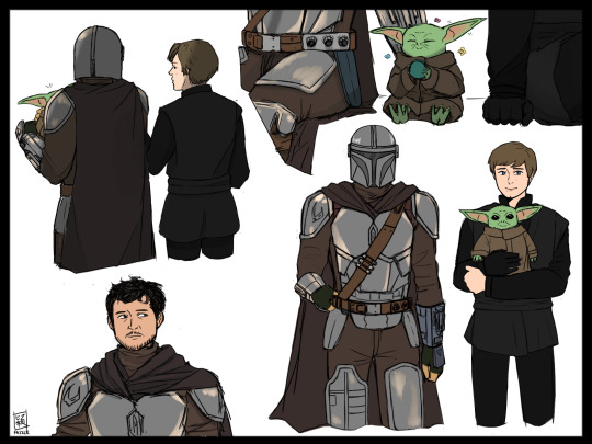
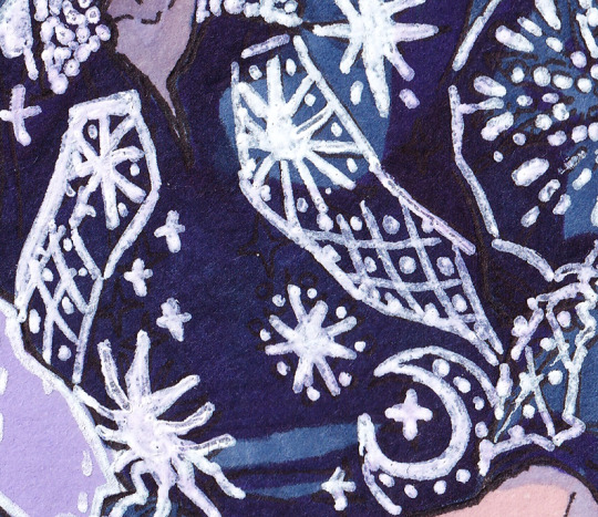
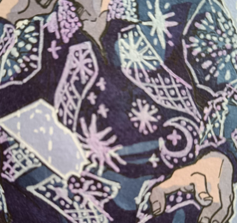
brain: make more dinluke art
me: okay
#dinluke#skydalorian#the mandalorian spoilers#you know what i hate more than linework#colouring#try to spot where I completely gave up#din djarin#luke skywalker#grogu#fazzleart
2K notes
·
View notes
Last Seen Blogs

imogenegomi
Author Uses Writing In Place Of Therapy

xcrybebi
xcrybebi

33win7
33win 🎖️ Thương hiệu nhà cái đẳng cấp

luciasabina-blog
Apa Kabar ... click --> ( * )
loodacomix
Comics Culture Rat Nest