tjwilliamson21
Thomas Williamson - Graphics Blog
80 posts
Don't wanna be here? Send us removal request.
Last Seen Blogs

lifeofsheribrooke
Sheri Brooke

tetsuotools
TOOL

the-fuck-24
Desmond

maxxx212
Just like all the rest
neonrama
SILVERCHAIR
Text
Final Evaluation
With this project I identified architecture as theme and specialism that I wanted to base my work around. I wanted to work within this industry for this assessment as this is the progression route I have decided to follow, after completing this course. Within this specialism I have established that I want to work outside of the studio to get away from the digital workspace and work in the 3D workshop. The purpose for this project was to redevelop a location that would bring economic growth and popularity to the area, however from my mid-term review I re-established the context of this assessment as I found through my site location another way of redeveloping the area by creating a museum that will generate revenue and increase the population of the area; this museum will be a celebration of architecture in the local area but also the ambition of where structural design is heading.
Something I asked myself early on was ‘why is the image of utopia always changing?’, it was something that I was intrigued about after my trip to the Sainsbury’s centre. Why I was interested by this statement was because people have previously stated that Utopia would be shaped in the style of specific appearances, however we have moved on from this perception being the ideal place to live. My understanding is that Utopia will always change to try and accomplish the ideal world to live in because we are always developing and creating new technology that allows the human race to discover new ways to push the boundary of design within structure.
Some problems that occurred when working autonomously in this brief was finding an opening where I could explore my specialism from another approach. I found it difficult to keep to my time plan as I was always finding myself engrossed in the practical aspects, from this I wasn’t always creating enough development pieces. I wanted to overcome this by throwing myself out of my comfort zone and experience new ways of working throughout this project.
By not having a clear prearranged pathway from the original brief did worry me at the beginning, but how I overcame this was by outlining what my ambitions and aims where going to be at the beginning of each week though the time planner.
My most relevant research came from trips to museums and locations of interest, I was able to see the structures in person which gave me a better representation of how I could produce some observational drawings but also experience the scale and shape of the buildings. This added depth to my visual research because its sometimes difficult to appreciate the size of the building or its features from pictures.
For this project I had a variety of research that I feel this has helped me observe different styles that people have introduced to the design industry. I would have never of found this through one source, I used some architecture magazines that I had previously brought, and they outlined the advantages and disadvantages of self-building your home, if I didn’t have these magazines I found have never of considered researching into property and house development. By having a breadth of books also helped early on, as I was able to vision my intensions from my proposal which had heavily been influenced by architecture in obscure environments.
By having an early range sources allowed me to develop and focus my research, for example from reading ‘Architecture Competitions’ I came across an architect called Zaha Hadid who later I researched further into and found her work to significantly influential to this project, due to her designs having irregular forms that could be distinguished as a Bespoke Building’.
I found that my research connected throughout the project as from my analysis of Zaha Hadid’s work it reminded me of another architect and designer called Frank Gehry whose work was also followed the irregular and chaotic pattern that I am interested, this was starting to establish a common theme throughout. My research did take a tangent in looking into more abstract and natural aspects of architecture, this allowed me to establish the context of my project in more detail as looking into the works of Theo Van Doesburg and understanding how he can make something with such detail be broken down into simple geometric form has helped me comprehend how this could be applied to almost anything not just natural forms
For this project my experimentations have been varied as I wanted to explore a range of methods of working in different workshops. The successes of this project were my wide range of drawing techniques that I have learnt overtime on this course such as continuous line drawing, quick observational drawing and having new abilities in digital that have allow me to alter imagery. With these drawing techniques it has given me the opportunity to develop them in an area that I am most confident in which is in the 3D workshop where I have been able to make model responses to classroom workshop and my drawings.
This allowed me to recap on my comfort zones and identify what they were but also how I could use the too effect my project. I was able to engage with areas that I’m not too familiar with for example the ceramics workshop. I outlined that there was a lot of potential in this area that I hadn’t consider before, which lead to me gaining a wider breadth of resources to experiment with to reach my final outcome.
I investigated my theme through an array of different resources that I consider. One task I created was a response to the work of Frank Gehry, by using wire structure that I could mould and manipulate to different positions that created a new drawing point. I felt this would allow me to draw freely and capture the looseness of Gehry’s sketching techniques.
My research was what helped me develop my experimentations the most because I was always able to respond to something that then could lead me on to further developments of the original Idea. For example, my location research was originally just quick rough sketches of interesting buildings in the area. However, from this I took this drawings into the workshop and made them come alive in a basic 3D form that gave them more detail and a purpose. I was always looking for how I could further my work, with this I used my wooden maquette I decided to cast them using plaster in the ceramics workshop where I was completely out of the comfort zone, but without this workshop I would never learned a skill that would influence my final piece.
With this project I have refined skills in the workshop that will help in my progression route at university. How I have done this is by speaking with the industry professionals at college and explaining my visions of what I intended my work to appear like. To get their experiences on the most effective way I could approach my task; this could have been though discussions I had about the best way I could shape and join my maquettes.
With this project I intended to produce a structure that would have the potentials to increase the economy in the local area and the popularity as well, the outcome as a whole has been a success in opinion as I have produced a body of work that supports my decisions through out the project.
Even though there have been developments with what I proposed to produce, I found that these differences have allowed me to lead this project in a more exciting way as I have been able to explore the development of architecture in how I see the perception of utopia is always changing.
The processes and materials I used for this project were the correct ones for me, because early on I identified my strengths and weaknesses to allow the time to explore into processes that aren’t first nature for me but also leave me enough time to develop my strengths in 3D to create a combination of a variety tests and approaches that I have taken to complete my targets.
The Duration for this brief was a factor that I wasn’t overly concerned about at the start because with the time planner it allowed me to see what was set out for that week ahead and where I had space to do research or develop work in. Further into the project I found myself getting to engrossed in the workshops which lead to me over running my own deadlines I set for myself, even though I was being productive and efficient there were times that I realised that I should have been trying to approach this project from anther angle.
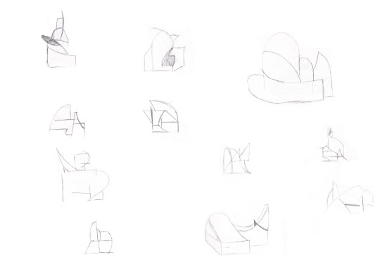
The most successful outcomes I produced leading up to my final outcome were my loose drawing exercises based on research, why I believe that these little tasks were so successful were because at the start of the project I was overthinking my role, being the architect. I was always trying to complicate everything by already attempting to create a finished outcome without having any test pieces. Using these loose drawing exercises gave me more freedom to create a range of large scale imagery that was built up using linework, this then lead to me identifying ‘structures within structures’. I was able to later refine these drawings into more detailed representations of modern buildings.
By not only having tutor reviews but having peer assessment and discussions has allowed me to interact with people that are in a similar situation. Having the opportunity to compare my work with other peers is closest to industry standard where I can see the work of others and discuss the successes of their work or mine to identify what’s missing or what could be done better to improve the quality of the work. This opportunity has lead me to bounce ideas off a larger audience rather than just my tutor meaning their opinions have been more diverse slightly than just one dimensional. I believe by having this feedback has allowed me to improve and develop my project more than I intended as I had the ability to get my peers input in drawing tasks to see how they would possibly approach this from their perspective.
If I were to do this project again I believe I would consider taking a similar approach but possibly not restrict myself early on in the workshop. Something I would have been keen was experimenting with more materials to create test pieces and observe whether the visual language would change dependant on the materials or whether the different properties of the material could have made it easier or harder to work with. I did explore new processes for this project in the ceramics workshop, I feel this was only a start and I could have continued this further.
Another area for improvement that could have directed this project further would have been to use a broader range of research, since I may have been too conservative from mostly researching architects. If I had a breadth of artist and designer outside of the industry I believe it would have given me the opportunity to explore structural design from and outsider’s perspective this therefore could have meant my visions wouldn’t have been as one dimensional.
Something I would have liked to push further was my questioning of utopia because I believe that these statements could have as given some more clarity to my project on how my designs could fit into the ideal world. Is humanity too greedy in picturing Utopia? Or are we under valuing the image of Utopia?
0 notes
Text
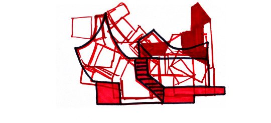
Bespoke buildings The design & Outcome
After reestablishing the context of my project I was able to start to consider work that could be applied to my final outcome. I will be discussing the influence of others in designing and creating my final piece.
Following my location selection of London I decided to produce a piece that would be distinguished as an architectural museum that will hold and celebrate a range of existing buildings in the local area but also my models that can influence the shaping of the future of architecture going forward.
The first question asked myself how was I going to present these models? I decided that I would make all of the structures that I had outlined and designed to identify how big the museum would be.
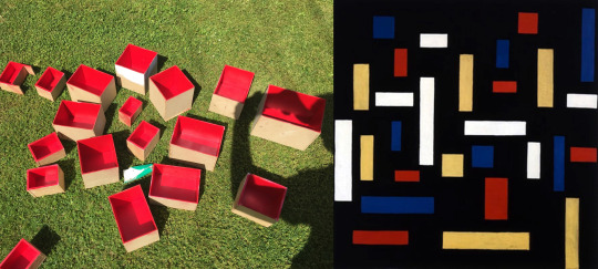
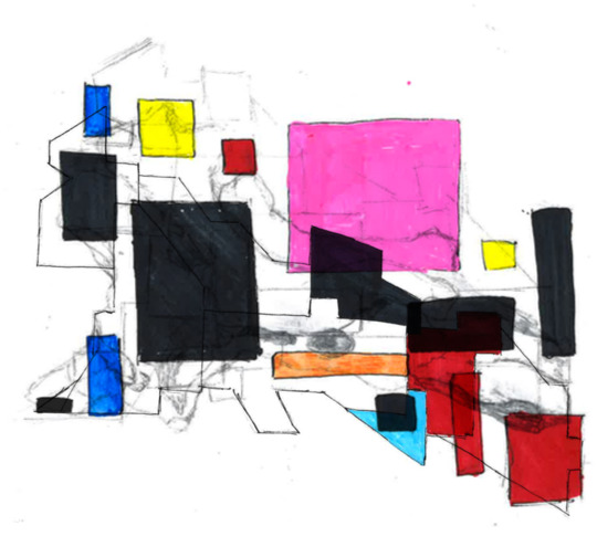
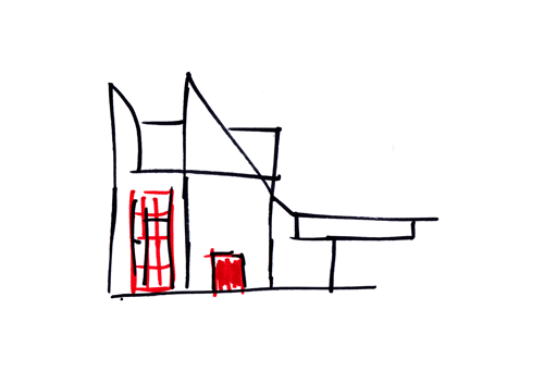
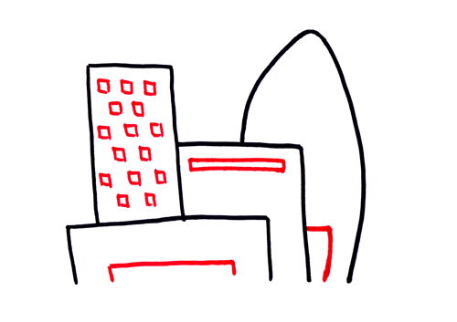
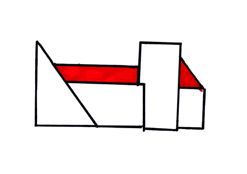
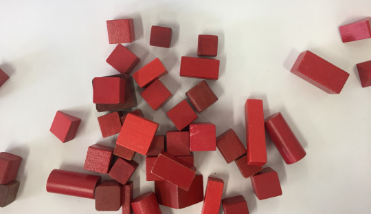
I produce a range of small boxes that will hold the models. I decided to colour them red using spray paint as I felt this would be the quickest way to achieve this; the reason behind red was because of my subtracting sketches workshop I only used two colours to create a theme throughout this series. In this workshop I used the red to add detail to the drawings and I felt I could replicant this with my outcome in highlighting each box to show that each model is the detail of the overall piece being a point of interest.
Following this I had some rough dimensions that would now allow to start designing the museum to store all of the building, I wanted to use my previous work to influence me on what it will appear like for example in my Gehry response I identified this triangle box that I felt would be able to be connected on to the structure and store some of my models. Form this it had a similar appearance to a feature of one of my subtracting sketches.

I went back through my imagery to locate the building that the similarities, so that I could redraw it in a 3D style that I could extend and add parts to.

I used these sketches to create a paper model that I could work from to create my outcome, this also helped me in deciding the layout of all of the locational models as this gave me an idea of the distances between where the boxes will still.

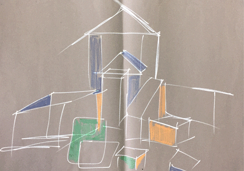
I developed my architekton piece is a digital way so I can show a representation of how some of the models could possibly sat in their environment. I tried to use subtle colours that didn't cause to much of a contrast, this was something I wanted to incorporate into my final design by making a structure thats going to fit into the surrounding are and not cause to much of a contrast but still follow my modernism theme.
These were the early stages of construction. When outlying the overall shape I felt the best way to produce this structure was to make it in three pieces, the base and two sides. My reasoning behind this was so when it came to cutting in the holes for the boxes it would be easier to manage, this was a similar reason for when it can to wiring the lights in as it would allow me to manouvre around with ease.
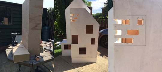
I did have some problems in the early stages as I was unsure on what materials to use for the roof and the window side because I didn’t want the colour to differ to far away from the dark grey paint that I was going to use. After so time gathering resources that I had available to myself found some slate to give the structure an actual pitched roof.

Another problem that I encountered was when it cam to wiring up the led lights, because a couple of the lights cables were wired up the wrong way so when it came to compelling the circuit they didn't turn on, this therefore then to some draw backs in my time plan so I could disconnect the circuit and rewire it.
These images show the later stages of the construction of this project, this was to give a rough indication of how every feature will appear and function before the completed project.
If I was going to do this again I would try and gather more materials earlier on to give me a clearer image of how each area will look, because I didn't have enough acrylic to complete the window feature as I wanted to have the window affect run the whole way around. To possible develop it again I would want to cut the building in halve and add a piece of acrylic to either side so it will create a transparent section all the way through, this would give the piece a more modernism appearance by having larger glass sections.
Bespoke Buildings the outcome:

Working over the past 12 weeks this is my final outcome that I have produce using a range of processes and research to complete this piece.
This overall piece has been a success as I have produced a structure that has been designed to emulate a museum that will be a celebration of architecture in London’s surrounding area.
The colour scheme that I used was based of my subtracting sketches workshop where I used two colours to produce a range of quick drawings, I used the red pen to highlight the detail of he structures. So for this outcome I wanted to follow this in a similar way by enhancing the rooms for the models, which will make the models stand out on the red background.

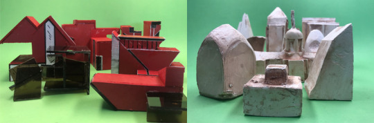
In the construction phase I have used a range of different processes that have a diversity of meanings that cause a contrast whether its because of the texture of the materials used for example the models that are behind the acrylic section have a sense of importance as they have been concealed away potentially they are the more valuable pieces, or another reason could be that they are the worst outcomes or the most unattractive buildings that are being hidden away. The real reason behind this was I wanted a group of three that worked together and were all different sizes; I decided to choose three of the plaster casted models as I wanted this side to emphasise the dystopian appearance.
For this outcome I would have liked to given each section its own window with a slight reduction on the transparency as this would allow the light to reveal the structure within. Something else I would have liked to achieve was experiment with the lights and wiring to produce a delay on the lights so each room would flash on to at a different time.
0 notes
Text
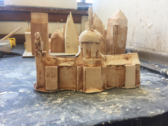
Model making: London site location
In this post I will be discussing my reasoning behind making these maquettes but also what I will intended to do with these.
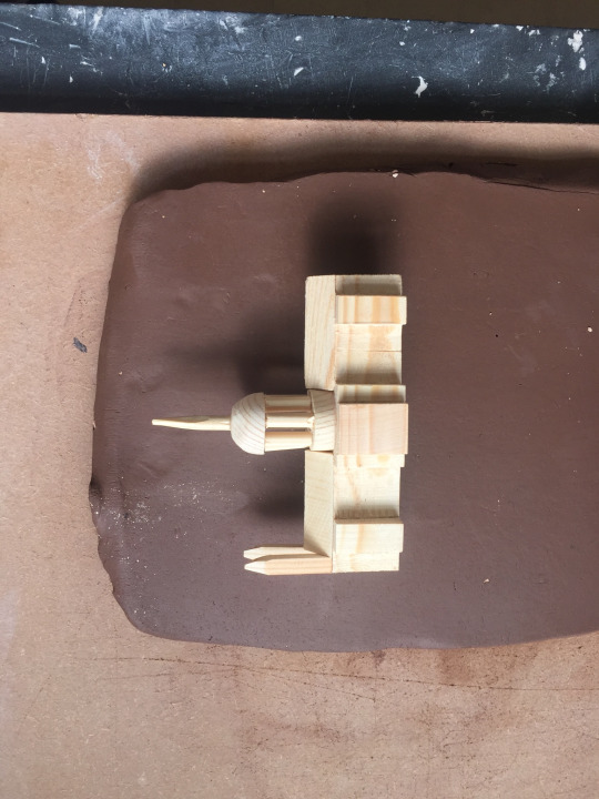
Using my location research and sketches I was able to develop them in a 3D method this was a so I could start to visualise the surrounding buildings and scale of what my outcomes could be produce as.

These wooden models have been produced using minimal detail my reasoning behind this is because I wanted these existing buildings to appear rather minimal in comparison to my own modern structures that I intend to produce; this is so your attention is drawn to what the possibility of London’s skyline and housing estate could appear like, this was to push aside the older buildings sort implying that this is the new vision of Utopia next to the later, almost giving off a dystopia appearance.
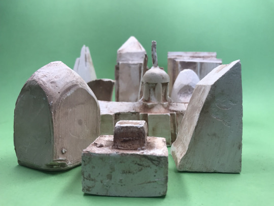
Using these wooden maquettes I want to develop this further as I don’t believe these structures look to dated and dystopian. After discussions with my tutor I was able to use a process that I have never experienced before in the ceramics workshop which was plaster casting.
I was excited to use this process because I felt that I could really manipulate the mould to slightly distort the outcome by pushing and pulling sides of the clay, this was to attempt to give a dystopian look.
The process:
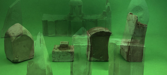
The first part of this process was to roll out a piece of clay that would be thick enough to push the wooden model into, so it could create an imprint of the model. Following this it was needed to be repeated so there was two sides of the mould that could be joint so plaster could be poured into.
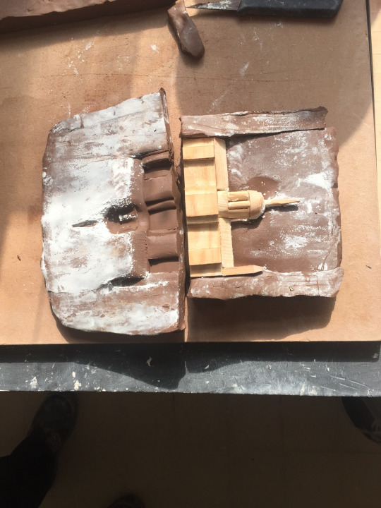
This image shows the two sides before they were joined. Talcum powder was applied to stop the clay from sliding away from each other. What was interesting about this step was that when the talcum powder was applied it produce a backdrop for the imprint; I what I saw in the clay was a cloudy sky scene above St. Paul’s cathedral.
After this to join the two sides together I had to apply a little bit of water to each side and slightly move each side, rubbing them together to create friction which then dried out the area was applied to creating a join.
From this the mould was completed, all that was needed to be done to make some of the points and detail of the model, to stand out more this was done by using the point of boxwood tool to apply a small amount of pressure and mark the features that you desire to be sharper.
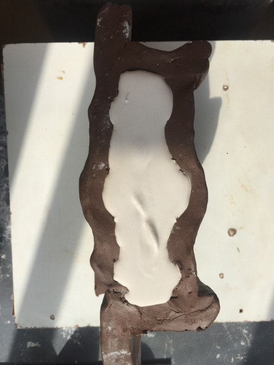
The next step was to pour the plaster in the mould and let it dry...
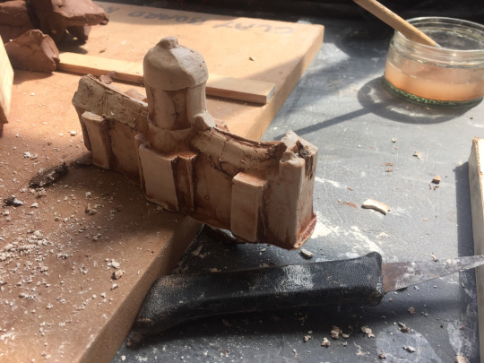
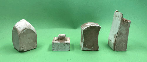
After 15 minutes had past the clay could be removed to reveal the desired model. Unfortunately when the cast was removed from the mould, the towers and points of my model were weak at the join and were pulled away in the clay, however they were easily repairable by gluing them back on.
Following this there was still some tidying up to be done, using a range of files and a pottery knife I was able to carve away some imperfections that I didn’t what to appear but also smooth down some areas that would then have a sharper appearance.
This was my first finished cast, the technician that walked me through this process explained to me that the darker brown patches could be washed of as they were just excess clay and this would reveal a brilliant white, however I felt that it gave the cast a rough and dirty appearance which I believe communicated an element of dystopia as the beautiful visuals of this traditional structure are slowly deteriorating over time.
Following this I repeated this for all my wooden models, this lead to me bringing my site location to life. Creating a miserable London skyline.
0 notes
Text
Structures in structures
In this post I will be discussing whether we can identify structures within in structures, this will do demonstrated in finding a new building within an excising one and whether I can communicate this theory with everyday objects as well.
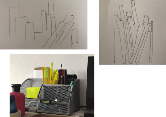
This quick test piece shows my intentions using a stationary holder I was able to highlight a point of interest and create a city skyline using simple geometric shapes and continuous line drawing.
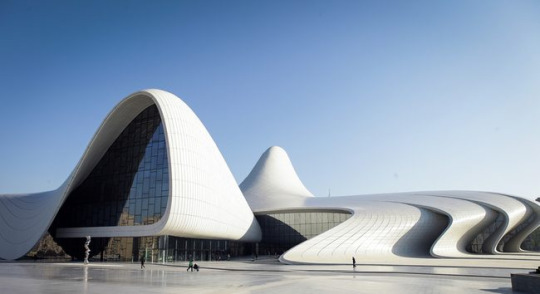
This theory first came to mind when I was researching the work of Zaha Hadid, because when I was looking at some of the buildings she designed it was easy to get lost, when observing the images as there’s a tendency to follow the obscure line work qualities the work has, for example the Heydar Aliyev Center in Azerbaijan, the free flowing lines are something that you wouldn’t expect to find in a building due to the complication that would occur in the construction of the building. When observing this building I started to notice little structures that could be form within this structure.

In the glass work there seemed to be a staggered stair case that could look similar to a skyline when standing upright, whereas if it was flipped on it side I could see a layering effect happening and with symmetry to would produce a pyramid type shape.
My research on Theo Van Doesburg has also supported this theory, as a large out of his drawings and paintings are of natural forms that are part of a series which can be broken down into simple geometric forms. From this case studying I started to gather some primary research of natural objects and location to see whether I can produce a response that could represent hi style but then also furthered into structural design.
This was a success as the outcomes had a similar appearance to the block work exercise called build & destroy which was based on the work of Elliot Noyes; this was good as it was showing there is a common theme that follows throughout my work.
Using these blocks that were used in my Doesburg response to draw the simple form of a piece of driftwood...
Using my outcomes I produce this block work piece using a digital process to create a structure. The outcomes that produced with these geometric shapes from my Doesburg response created rather abstract buildings, overall I see this as a success because I can identify a structural form within each piece whereas when somebody else views these images they may not identify the same structure as I do.

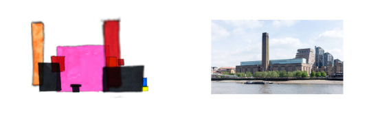
In these images I see characteristics from some existing buildings for example the fourth drawing I can see show similar shapes and attributes that the Tate museum London. This can be seen with the large towered section at the front and back with a large space in between.
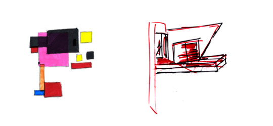
In the last image I also noticed some similar features and overall shape of work I had previously done. I believe it similar qualities to my architekton development piece I created for the abstract aesthetic workshop as they both have a thin hanging platform section that has larger multiple layered sections that are directed outwards.

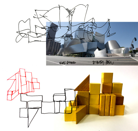
Using this wire frame I was able to manipulate the shape it give range of obscure and geometric lines this brought a new outlook on identify possibly structures. How I came across this process was by trying to produce a response for the sketch work of architect Frank Gehry, as without this aid to draw I didn’t have the ability to draw in a similar loose and free style.
What I found after drawing from this piece was that I could push it around to create another abstract set of structures, I believe this will help me develop my ideas for my final outcome as its another drawing process that will allow me to generate a series of Bespoke buildings.

This image that I have taken from my Gehry post shows how I have identified a structure within a structure I believe this shows that this theory of identify structure can almost be applied to anything from an existing building, a stationary pot, a woodland or possibly within a living being, this could be something to develop this idea further to see whether a structure really could be produce from a living form.
Possible further investigation:
Another aspect I want to investigate for this idea is using a view finder to photograph parts of existing buildings to see if there is any potential here to locate a new building within. This could be done using a primary source by actually visiting the buildings or through secondary and layering the view finder over the top; I believe taking live images with a viewfinder would work better as you would get a sense of texture that each building possesses.

0 notes
Text
Frank Gehry

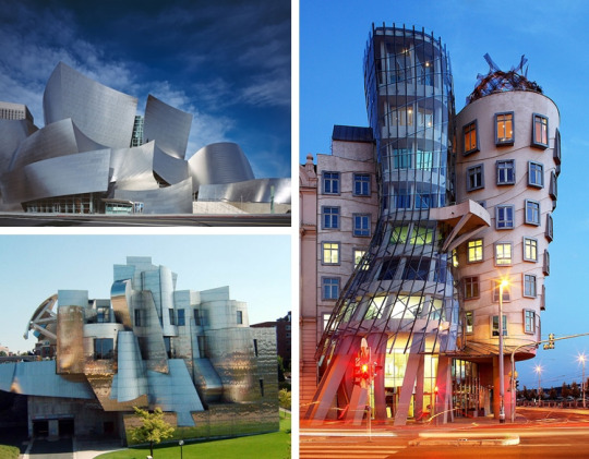
Frank Gehry was an American architect, his work has become world renowned and he is consider as one of the most important architects of the 20th and 21st century.
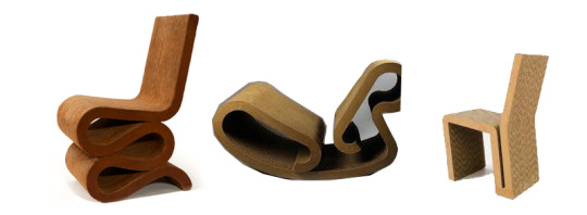
Before he became a renowned architect Gehry was a furniture designer and produced a collection called Easy Edges, this work followed in a similar style to his buildings having unconventional designs. Even though his furniture design was rather obscure. When creating his work he used an unordinary material that would be associated with this industry; the use of cardboard is quite bizarre because the material in sheet form is rather flimsy and weak, however Gehry noticed that when layered and joined the properties changed to give the piece increased strength and durability.
Gehry’s drawing style is rather unique in the architecture world because a lot of his early staged sketches are really loose, rather childlike which is strange as most people who practice architecture produce high detailed technical drawings that envision what the structural will appear as.

Seeing how Gehry’s loose drawings are developed over time getting more considered and detailed each time in the lead up to the final outcome. I personally prefer the loose sketches that he produce over the technical imagery because it gives Gehry his own identity, making it autonomously able to identify that work as his rather than being the same as every other architects drawings.
What I find interesting about his work is the absurdity to it, because of the irregular shapes and sharp angles it gives the appearance of the structure a playful meaning as they appear they have been made without too much consideration but in a more autonomous way like the continuous line drawings, this shows the connection and communication that's gone into his work from design to outcome.
I like that there doesn't appear to be any symmetry within the buildings, to mine this is quite strange as the structures in buildings don't see as they would be able to support themselves whereas when you see the outcome you almost are able to see the work balancing on each over and relying on each piece being there to support the obscure shapes.
Following some visual research of Gehry’s working I wanted to replicate his drawing style as I felt this would be able to help me develop my own drawing style in a way that wouldn’t be as structured and boring. To achieve this I wanted to make an aid that would help in creating irregular and disproportioned shapes, I done this through a wire model that wasn't to strong so it could allow me to manipulate the frame each time to fresh design each time.
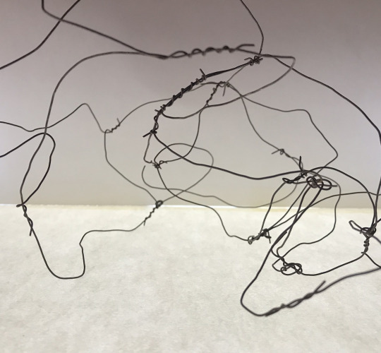
This simple wire sculpture has allowed me to create a range of simple line drawings and continuous line imagery as well.
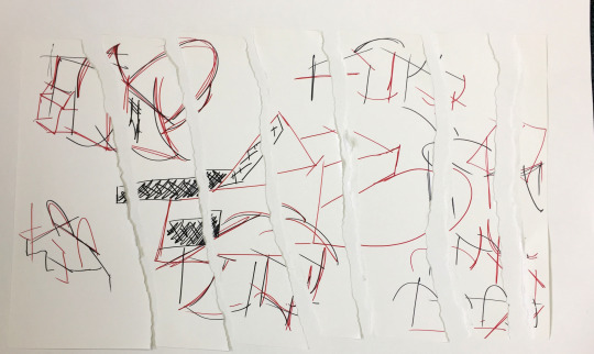
For this response I decided to keep drawing loose on a large scale media until the page was full leaving me with a range of obscure shapes that emulated Gehry’s style. From this I was able to identify structures within this imagery however I wanted to take this further by ripping the pages up and layer the line work in different positions to see if there was any potential structures that could be identified.

These images were a few portions that I had layered the pieces into, I found this easier to identify new buildings and shapes as I wasn’t just drawing the wire frame but this time a structure that had been identified in a section of this rather than the image as a whole.

These drawings are my outcomes that I produced following my ripped up source. Overall I found this task to be a success as I achieve what I intended to by emulating Gehry’s drawing techniques and produce a range of organic structures, although my piece weren't an exact replica of his work this was because Gehry’s line work was more frequent which built up texture whereas my drawings are much more cleaner being single strokes.
If I was to do this again I would like to create a more detail response by using more frequent line work to give a better comparison to the drawings of the Walt Disney Concert Hall or the Guggenheim Museum, then I could have a side by side comparison of my single line stroke work next to the more frequent and textured piece and see the differences.
Actions:
Following my drawings the step would be to incorporate them into a 3D way and possibly produce models based of my imagery.
I feel I could develop this line drawings in a similar way that Gehry did, from simple line work, technical drawings, layout plan and potentially a model or outcome.
0 notes
Text
Marcel Breuer
Why I feel Marcel Breuer will be of an interest in this project is not just for his brutalist architectural works but also the furniture designs that he worked on, because in his chair designs they show his appeal to the geometric form within structure rather than the economics that make the design of the chair comfortable.
Although comfort of the chair must have been a factor when designing the piece its clear to see that the form had more influence over the function, why I believe this is because of looking at the range of chairs he designed there’s a theme of balance and unorthodox which is communicated through the shape as I feel from observations of the imagery it shows his trying to move away from the traditional style that is hinge on the way that a chair has four legs to create balance whereas with Breuer’s designs I can visualise them as an ordinary four legged chair that then has been stripped down to find a harmony of balance with only two legs that are connected.

In this example I have replicated Breuer’s chair design and changed it to a more traditional style that that doesn't rely on balance but symmetry whereas the original has pushed this boundary to show that the form is the purpose of this piece rather than the function, because Breuer could have easily designed this chair in a similar way that I have but concentrate more on the function by making it more comfortable for example adding cushioned areas rather than wooven design, or what could have been done is to look at the ergonomics of the human anatomy and see what create the most comfort, this could be done by shaping the chair to the natural form of a person.
Now looking into Marcel Breuer’s architectural work I can instantly see his structures are part of the brutalist movement. At the time of working Breuer was always interested in pushing the boundaries with the newest technology available also in his designs he wanted to break the conventional forms. He was also a pioneer in the international style which was where he used a connection of steel and glass before being engrossed with the brutalist movement that he is most known for in the architectural world.
One of his architectural pieces that has caught my eye is the Met Breuer formally called the Whitney Museum of American Art, , which is a museum for the modern and contemporary. Why I have taken an interest in this piece is because of its own contemporary style that was created post war; what I appreciate about this building is the timeless quality it has, since it was opened in 1966; even though it was originally opened over 50 years ago it still hasn’t lost any quality, the reason behind this in my opinion is that although it has a similar shape to buildings from the brutalist period it doesn't have the concrete appearance that has now become dated even with its own beauty, instead it has a slate tile shell which gives it a more sleek and upper class appearance, that I believe gives it this timeless quality. The windows and frames give this rather flat building movement and direction as they are stuck out; this gives this structure a subtle 3D character that draws you into the windows almost giving it a focal point that draws you away from the overall shape.

How I intend to use the timeless quality that The Breuer Met processes it by considering the colour and materials used in my designs and models, because if I can determine what can make my structures timeless this could be used to shape the perception of Utopia as then if modern buildings have this quality then we would be a step closer in achieving this vision of creating the ideal world.
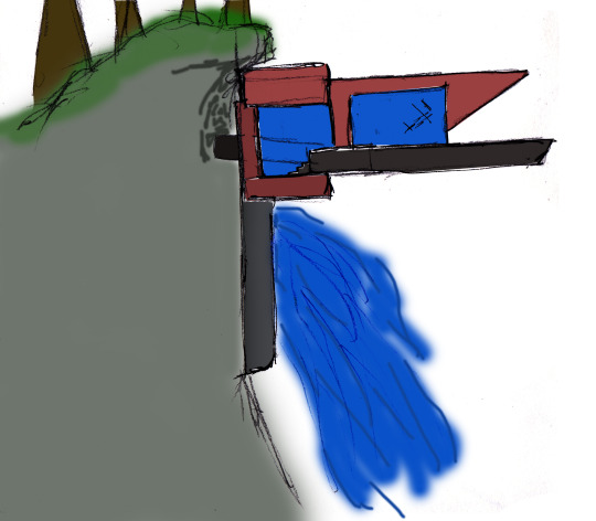
What I could also use with the influence of Beuer’s work is how he was pushing the boundaries of within design and how he wasn’t contempt on normality this was identified in his furniture design, I want to use his efforts in furniture design and apply them architecture in the way that I could look at balance and unorthodox approach he had to see where these buildings could fit in surrounding environments. By looking into balance within structure I think this would a rather abstract approach that will relate to previous research and work that I have produce for example the architeckton I produce has the same characteristics that follow the pattern of an unorthodox appearance but has also been designed around balance as the most successful landscape for this model was hanging upside, which therefore lead to the piece having to be suspended from land for example off a cliff or above a waterfall.
I now will explore visuals like this example to identify the element of balance within structure.
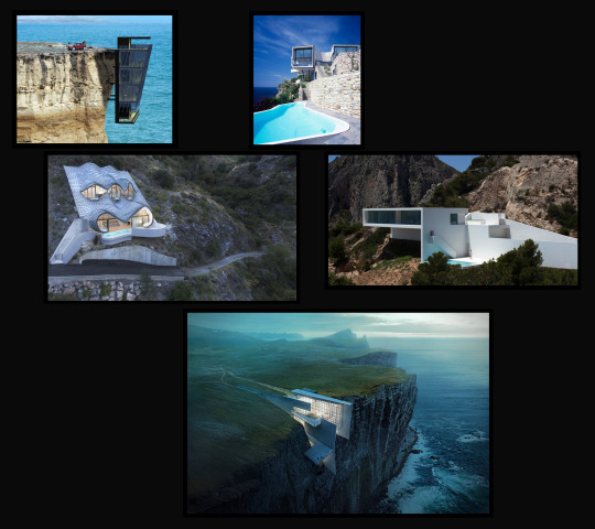
From this quick visual research I personally believe that the white painted is a revamped type of brutilist architecture, which has a more cleaner appearance that is quite simple but rather attractive.
With these images I noticed there’s an characteristic of modernism and brutilism together, is this the future of architecture? Is this the revolution of Brutilism?
0 notes
Text
Mid term review
My intentions for this brief were to produce a structure or building that will increase the population or popularity of the location but also to possibly increase the economic growth as well. My first impressions on how I wanted to achieve this was by researching areas that were in need of these requirements that I outlined in my project proposal, this was though creating futuristic residential area, a modern shopping centre or an office space, this would be meet a different requirement by creating a large amount of jobs. However after some consideration and research I felt this idea would have became tedious, so my project has taken a turn based on my location research as I always wanted to produce a structure that would be celebrate location that is London but also produce a range of buildings from developing my subtracting sketches; this would overall create a museum as such to commemorate the existing buildings alongside with the newer modern architecture, to show progression for the future, that will celebrate the different architecture styles around the area.
How my project has changed from my proposal?
How my outcome has changed from what I originally intended to produce by creating a museum for architecture. I stated in my proposal that i would ‘create a scaled model of the area with minimal detail then having the ‘Bespoke Building’ with mass of in the site location’. Instead, when I had identified London as my location, I made some observational sketches of buildings in the area that I felt could be categorized as Bespoke buildings. From this I decided to create the area using plaster casting this would then give then models a simple and dystopian appearance, which will give my own Bespoke building a more modern and detail aspects that cause a difference between the two showing progression for the future of London’s architecture.
‘What I want to achieve for this idea is to replicate how a project would be handled in this real world’. I still want to try and emulate how the real world scenario would be controlled, one way that I’m following this is using the range of drawings and developments that would affect how the outcome, making decisions that influence how a project pans out.
One way I that I worried about in how the real world project would be handled was the time constants, as knowing how long away the deadline was gave a realization of how industry practitioners work; although at first it worried me it also excited me as with my time plan it gave me the closest opportunity to real world experiences, even though at times some parts of the project already have over ran it has shown me at how I can effectively manage my time to make it up in other areas. For example some of responses to workshop have taken longer than expected as I wanted to explore them from another angle such as the ‘Abstract aesthetic’ workshop as I wanted to see if the visual language changed when producing the basic image in 3D, form this I found that it didn’t but gave that meaning more depth and understanding.
What is the role of the architect?
Something that I needed to establish for this project was what my role of the architect was going to be and how this could possibly change over the course of rest of the project.
In this Fmp I intend to show my ability of my journey on how to become an architect. How I feel that I have showcased this is by completing a range of observation drawings that have given me the bases to identify which area would serve the best qualities for this project. I feel my range of research has allowed me to visualize my ideas as not just using the internet has given me the opportunity to explore into architecture magazines where it showcases the work of peoples clients showing their dream properties appearance and how they reached that goal, for me this project has that similar quality as my goal is create a piece that is going to celebrate the different styles of architecture.
With the remainder of this project I intend to take myself out of comfort zone by producing work in a different manner that I never considered before to lead to my final outcome. This manner of working would be in ceramics; why I haven’t considered this before is because I never really thought about architecture being connected with this workshop as I felt it was best suited for pottery and chinaware, but after some visual research and refection of some of the materials in the ceramics workshop I came to the conclusion this would be an interesting tangent and development to take my project.
Why because it will allow me to use a new material that has different properties and process that I have never used before, which could possibly lead mistakes in the construction phase giving me the opportunity to create something that wasn’t intended but actually has qualities that could develop my project further.
I feel this could work alongside my drawings well as by exploring something new in the construction phase has similar connections to the pathway I want to take my projects location. Not only understanding a new materials property I will also be able to push a combination of materials to show the developments I want their to be in designing and building structures.
What I have produced so far in a 3D aspect is my Arcitektons, I feel these models have given me the step in making a connection from a physical piece and a draw piece because I have been able to draw back from this model in the attempt that I can produced a range of different buildings based of one model to accommodate the design to different audiences this would make the design multi functional dependent on the positioning and layout of the model, this would allow it to adapt to surrounding environment, which has followed my research on Frank Lloyd wright especially his Falling water house, as this is the perfect example of a modern object being accepted into an unfamiliar natural surrounding.
Trying something new...
Creating my own workshop outside of the classroom tasks. ‘Subtracting Sketches’ this workshop has been a big success and help in this project in the way that it has allowed me to develop a new drawing style when in designing phase.
This task has taught me to not overthink the drawing, develop each image in their own way but also look at the style of my peers and see how I can alter their drawing style to develop new exciting ideas. By creating a series of image that change slightly each time has made me understand that even a subtle change can make a big differences on the appearance of the outcome; I feel this could be applied to more than just building design, because it will give the designer an opportunity to interact with what the audience wants but, then also the opportunity to develop it and it give the piece their identify to it.
My Research has followed my intentions but also changed, by looking at structures within natural environments and making connections between different aspects of design.
From the work of Theo Van Doesburg I have been able to work backwards from a detailed image of the subject to a simple basic form in a geometric style. This research has given me the opportunity to continue exploring ‘structures in structures’ but from another approach as this gave me a comparison between the natural and industrial aspects that can occur within architecture.
Another Architect that has had large amount of influence on my approach to the drawing and design period of this project so far has been heavily influenced by the work of Zaha Hadid as her buildings are very angular and bespoke which instantly corresponds with my project, another architect who I have previously observed the work of Frank Gehry. I intend to research into his work further as he follows a similar style, having irregular shapes but also his drawing and sketch phase is extremely attractive even though the lines are rough; his drawings could even be described as messy.
I was also asked to do a self assessment of my work so far which would then be further discussed with my tutor, to see if my assessment of my self was fair.

From the discussions I found that I was close to where I was working at and had actually under evaluated myself. This had pushed the grade of where I am working at solidly into my predicted grade but also closer to achieving higher. Upon discussions with my tutor I have been told that I have work that is pushing the boundaries into the distinction criteria, however to achieve this I need reestablish the context of my project and give it more direction with the work I am producing.
0 notes
Text
Theo Van Doesburg

Theo Van Doesburg born in the Netherlands 1883, he was known for painting, architecture and poetry and was evolved in the movements such as De Stijl, Elementarism, Concrete art and Dadaism.
Following my work in the ‘Build and Destroy’ workshop where I touch on Doesburg I have extend my knowledge on his work, to give me an opportunity to produce some work in his style.
Doesburg’s work on breaking down natural objects down and beings into the natural form this was something that I felt that could be incorporated into my project, in trying to identify structure within the natural from, how I feel this will help me develop my project is that I will be able to produce a range of work using simple basic geometric shapes.
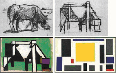
These cow pieces are a series that are broken down each time going from the realistic observational sketch down to simple squares. Its easily to see the reversibility that has taken place as you can see how Van Doesburg got to each process and how he has used darker blocks to identify the shaded and tone on the cow.
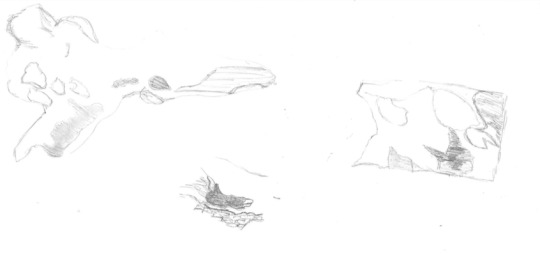
This first sketch was of a piece of drift wood; I draw these images quickly to try and identify which area of the object would be the best to draw from using the view finder to see which area will have the better outcomes to turn into a simple form.
I found that my first response was a success as you can see the similarities to how Van Doesburg work changes after each image, being broken down at each stage. With the use of colour on the geometric form it has allowed me to emulate the shading of the original image by using block colour.

I wanted to overlay all the images over the top of each other to show where each piece has come from the original image to show the likeness that they both have even in the simplest of forms.
Something I could progress on with this piece is to go back into this overplayed image with the viewfinder to observer and record to see if there is any other attractive features that have been combined together; that the image could possibly lead to a structure that has been identified within natural abstract piece.
I wanted to repeat this task again with the same object but drawing from a different angle to see if there was differences between the two, but wanted to do with this drawing was highlight the raised section of the driftwood that creates an arching bridge, seeing whether the shapes section used would differ from the first drawing.

This was also another success as I was able to use longer and larger shapes that still communicate the same response, which is the simplest form possible but also again I was able to use block colour to shade the image; the section that had the best representation was under the arched area of the driftwood.
I also created another response to Theo Van Doesburg’s work using a teasel. However this image wasn’t as successful because when breaking the image down from its original form, the outline of the shape still has the similar shape although I don’t feel that the appearance communicates the same interpretation as the driftwood as I believe I used to many geometric shapes that over complicated the image taking away from the perception of the task.

From this research on the cow series by Van Doesburg I made my own responses by using natural objects such as a teasel, bone, oyster and starfish. My responses have similar characteristics and visuals to Doesburg’s which is want I intended, however this was still to similar to the original image the next step that I wanted to do was to identify a structure in a structure in the block work; by redrawing around the blocks to produce a building either in a digital process or by using an analogue, despite having two options I feel that the best option would be to use a digital process because it will mix up my response and potentially altering the meaning by having a clear and sharper image. By using a digital process I believe it could be interesting to explore as I will be able layer the blocks over existing buildings and structures to possibly identify something new within this image.

One aspect that I was potentially thinking of doing with this block piece layered over some structures that I used from my artist and location research, was to draw through the blocks and around some of them to attempt to identify a ‘structure in a structure’. I feel that the outcomes will produce a range of abstract structures that would have the potential to be categorized as a bespoke building.
0 notes
Photo


Subtracting Sketches is a workshop that I produced to help produce a range of series that are changing with each drawing. For this task I wanted to use the help of my peers to get a different style of drawing implicated into this task, as I felt If all the design were based of off my initial drawing the workshop could become very limited.
For this workshop I outlined a couple of restrictions: the drawings must be 2D and you could only use the medium provided which was two different coloured sharpies. My reasoning behind only using two colours was so that the outline and shell of the structures would be in the black which would leave a rather plain and simple design, this would then allow the red to be used to add detail and enhance interesting areas by colouring in or highlighting.
The first drawing was designed by myself as I wanted to test how the process would work and whether it was successful. For my first image I used a pencil sketch that I previously produce following my abstract aesthetics in a response to Malevich's architektons.

I wanted to use this drawing so I could develop it further as the line work I had previously was rather soft and dull; this task will be a perfect opportunity for me change this as the sharpies leave a boulder and brighter outcome which therefore means the image will be much more striking.

The next steps were to alter the first drawing slightly and keep repeating this until there was 4/6 images on each page. The process was to stick to using similar shapes and characteristics that show a narrative in the progress. For each step the purpose wasn't to make a that much of a difference as this would be done over time, therefore this created a series of different structures, that were easily identifiable as part of the same collection due to colour, shape, and tone.
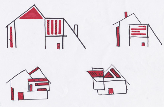
After I had tested the process worked successfully I got my peers to draw any type structure that came to mind, still only using the stipulations I had set out. These are the first images of my peers...

Using these drawings I followed the same process as before to reach an end product. By only altering the images a little bit at a time meant that it was easier to work backwards and decide at what stage the best outcomes were produced. For example the responses that I produced following the drawing from Jack I found that the second image in the series was the best because the overall shape wasn't to complex and the details added didn't take away from the piece as a whole. Whereas when I look at the piece that was drawn by Ollie I found that the last drawing was the best because out of the six images I had alter this one the most being the last therefore meaning that the image had completely changed at this point and now had been split into different levels. I feel that the reason like this drawing much more was because I could visualise myself developing this piece further, potentially by creating a 3D model in the workshop.

When observing this drawing I can see different indentations that I could create in a model. For example the window section I considered to cut them back slightly to create a ledge that would cover the windows from natural environments. Having a range of angular shapes that makes this building more visually intriguing due to the structure not having any symmetry.
0 notes
Text
Choosing a location
In this post I will be discussing possible locations that I could base my project around but also to see what the positives and negatives are of selecting this area. I will be looking at existing structures in the area to try and identify what the style is but also made could be built to change the visuals of the city, possibly giving it a more futuristic aesthetic.
Early locations I thought of:
Norwich
From recently visiting the area, there was a range of different styles in the town with most of the focus and attention drawn to the beautiful Cathedral. With my first ideas of creating either a shopping centre, an unusual office space or a modern housing development I feel this area would have been ideal because of the traditional detail cathedral and local architecture could have a modern influence in the city.

Detroit
When observing Detroit, it was one of the areas that I felt I could have the most freedom to produce one of these ideas as the region is very rundown and poverty-stricken. I believed by using these factors it could give the opportunity to try and give the city an economical growth, jobs and increase the popularity leaving the potential to get the city out of poverty. I feel that best option would be to design a shopping centre and an office space, that could be built over two phases one after the other starting out with an unusual office space as this would boast the economy to the area. Then followed by the shopping centre as this would have the potential to revitalise the city centre and put money back into the community.

More considered locations that have been identified by my peers who were asked the question ‘Name the first city you can think of?’
With these responses I wanted to move away from my initial ideas and focus more on what the cities existing area looks like and whether there is any potential to revitalize and change the perception the area.
The responses:
The first person I asked was Zak, his city was ‘Shanghai’
My initial reaction was quite unclear as I couldn’t picture any of the area or the architecture. After this response I started to do some visual research on the city to try and identify the rough shape of the area that I could build a new structure in. After looking at the city of Shanghai I found that this area was already overcrowded both with the population and the buildings layout being rather close; looking at the type of buildings in the area has show a large amount of skyscrapers, this therefore would be a good location to create new and exciting structures that can create a contrast but possibly create a pathway for a new of what Shanghai looks like. From using visual research I was able to conclude that this any isn’t in need of being modernized as the buildings that are located here are already following the attributes that categorize modernism in my opinion as the structures use the same materials and bespoke shapes that aren’t like many others. Leading on from this a negative that would hinder my decision of choosing this city would be that all the research for this possible site would have to be secondary as there wouldn’t be any possibly way of visiting Shanghai.

The next location was decided by Georgia, ‘San Francisco’

Moving around the world for the next destination to America. This location is similar to the last in the fact that the area is heavily populated already and has a large range of towering skyscrapers overseeing the surrounding city. What I found from San Francisco was that there is already some stunning traditional architecture such as the ‘Palace of Fine arts Theatre’ but also some new modern style buildings that are now moving away from conventional American way that many large cities have, some of these characteristics that classify this are the detailed fascia boards on the houses around the windows and valleys of the roofs but also the typical metal stairwell on the outside of tower blocks. I feel that this area would be a good place to take this project and explore the existing and changing architecture that is has to other; I did some initial drawing of the most famous, interesting and absurd buildings that San Francisco had to offer, what I found out through these drawings and research is that the buildings here are all very geometric as well as rigid keeping to the same style by not pushing the boat out, I maintain the idea that San Francisco is in need of some fluidity and organicness inspiration to be put into the structure design to give the area something different, a new diverse talking point that gets everyone excited when they see it; I came to the conclusion that this city would be great to base my project around as I could introduce some work inspired by Zaha Hadid to create a new range of more unorganized structure to the area and give it a fresh vocal point or a different epicentre.

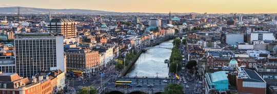
Personally this location was one that I was hoping would get suggested as I believe London has a immense amount incredible buildings but also growth. This was a response from Jack.

London is one of the homes of innervation in architecture in my opinion, as the city is the pinnacle of growth due to the perception of Utopia always changing. My reasoning for say this is because you can travel around all the different areas of London and discover the Brutilist architecture on Alexander road, the high story houses in Chelsea, the Gothic architecture of Westminster abbey or the Houses of Parliament and the Modernism era in the city centre of the Shard or the Scalpel. The interest I have in London is because of the changing environment but also how the use of space has been utilized; this is why one of the reasons I wanted to use this location but also as I can use a range of primary and secondary research from my recent trip to the area.
I feel that this location would probably be the best for my project as the city is has already been developed, but I believe that this is only really in the city centre where the majority of progression is happening in architecture, I would intend to do is broaden that by moving out to the outskirts and the boroughs. What could possibly be produced is a series of housing projects that are pushing the modernism movement making the homes more technologically advanced in the materials used but also the efficiency of services and the way of living easily. I think something that would be really interesting is to use the brutilist architecture of Alexander road and develop it to the modernism period by incorporating the newer technology and materials that can revamp the houses up to date.
This suggestion of Dublin was from my peer James...
Using secondary evidence I found that this city has some beautiful and picturesque landscapes. What I also found from this research was that Dublin didn’t have the large skyscrapers that the other cities I have been looking at, although this gave me a range of different building types; its not what I’m trying to identify as the location that I feel will be best for my project will be a city that’s pushing the boundaries with design but also with height, because I follow a similar interest that Le Corbusier had by looking at exploring space in an efficient way, to exploit the biggest amount of space the world others, in building upwards.

My peer Ollie, recommended to research Monaco, a island located near France with charming views of the sea.
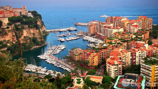
Monaco was the at the opposite end of the scale in comparison to some of the previous suggesting as this county/state has a large amount of traditional buildings that have a specific style that makes it easily identifiable of that location. Although Monaco is majority still a conventional location there are signs of progression away from the traditional appearance with newer and exciting buildings that are using materials that suggest modernism and some of the shapes are moving from the normal geometric shape, for example this hotel...

Even though you can still outline the basic rectangular shape following the geometric style it has been developed in different stages but adding and altering different shapes. These irregular waves on the balcony create an interesting spaces for each room as it will affect the amount of light allowed to enter the space at each given time. When looking at these balconies, what I see is the sketch work of Frank Gehry on the Walt Disney Concert hall, as if you strip back all the interior lines and just follow the outline of the drawing I can clearly see similar shapes; this would be something to consider when designing through my drawings whether there can be a similar outline or shapes to different designers that have had a influence on me.

0 notes
Text
London Trip
In this post I will be discussing and reflecting on a recent trip to Shoreditch London, where I was able to gain some primary research on a possible site location for where to base my project on.
On this trip I was able to record unique structures that I was unaware that existed from older industrial buildings to more modern offices. This trip was able to give me a visualization of what standout structures that could define a location and possibly build up a portfolio of what this area could look like if I built it up in sketches or in 3D.
By being able to get out in the real world rather than viewing it from behind a computer screen it as it allowed me to appreciate the little details that you can’t see or value. An example of this was the Commercial Tavern, as in person the shape is the best asset and feature this building processes. My reasoning for this belief is that I feel defines the cross-sectioning of the roads and apposing buildings that surround the Tavern which is hard to comprehend from behind a screen. Why it does this is because of the circular front the building has, as it opens the space more so than a geometric design would, providing the same amount of area but giving more fluidity on it’s appearance giving the area some diversity.
When walking around Shoreditch I was able to locate a range of different apartments that are arranged in different parts of the area, which had a mix of modern and traditional styles of architecture. Some of the more modern buildings give this area a breath of fresh air bringing two styles together creating a new and vibrant location.

This range of apartments are from different locations in the Shoreditch and it shows what the areas intentions are moving forward in construction by following other areas in London that are progressing, by using materials that showcase modernism in existing buildings such as The Shard, The Scalpel, or The Gherkin which these buildings are made of a mass amount of glass and metal, in my opinion this is what epitomizes modernism in architecture by having exposed metal with large cross sections of glass next to traditional brickwork buildings brings out the best in both styles as the brickwork brings colour to city in comparison to the darker steel work.
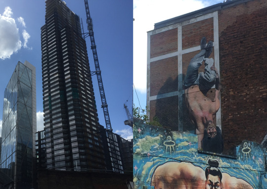
This area of the city is growing rapidly in construction but also in popularity, as Shoreditch’s Street art is one of the most attractive aspects this area has. Having this appeal to the area but also the different styles of architecture has a real beauty making the town more desirable.

When coming to the end of the trip we started walking further out from the street arts epicenter I started to notice some more traditional religious buildings, that are clean pale structures which suggests a caring and peaceful appearance that implies acceptance when observing or approaching the building.
One similarity that a religious structures usually follow, is symmetry and in this building above it follows the same pattern which makes its easier to follow continuous lines to create an infinity whole shape as if you walked around the structure in a 360 degrees you would still be observing the same line where you started to create these types of places.
Although there isn’t to much fine details with this religious structure like most other churches or chapels it makes up for it with the more unusual shapes such as the full circle and semi circle windows where often in these circumstances the churches would have large stained paneled windows that glimmer with the different colours when the sun shines through them.

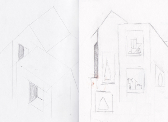
After exploring the local area for a while I wanted to use my photographs and produce some technical sketches of the buildings that stand out and are relevant to my project. These drawings show the building from the angle I was viewing them at, but I also draw them from above based on the view I had of them; why I did this was to explore if there was a difference in the appearance, by looking at if there was symmetry in them or irregular shapes that don't follow throughout.
0 notes
Text
Build & Destroy
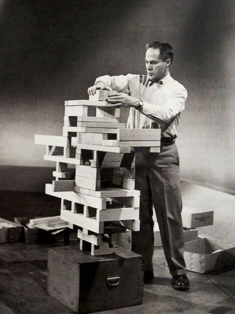
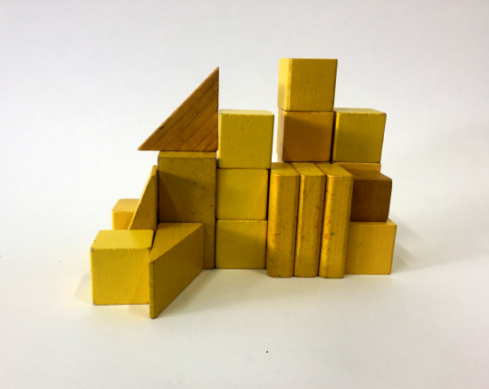
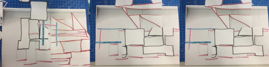
This workshop was to develop an understanding of balance in structure within modernism architecture. This task will get me to strip back to the basics and remember the autonomous mind within design, by not over thinking each task and worrying about what the outcome is but start to understand the shape and from, to then make connections to structures and how they could help in the designing process. The workshop has been based in the work by Eliot Noyes with his project Neutralises balance this task was to use building blocks to make 3d abstract sculptures that have similar characteristics to structures, I was asked to use the same colour to limit my design however this also gave the potentiality to explore the tonal value with one colour, possibly identifying another design within the tone.
Using my sketchbook I was given different observational drawing techniques by using a range of medias and different viewpoints of the sculpture to record. The first task was to use either crayon or charcoal to observe the vertical lines within the piece; for myself I decided to use crayon to follow in the theory of Noyes’s the autonomous mind linking to how children just build to play around, so by using crayon I found that I was drawing without thinking, also it made me to start to not see my sculpture as a structure I found this to be important as it allowed me to over complicate the drawings.
From these drawings there is that child like appearance just through the texture and the consistency given off by the crayon. Although it is very rough there is similar characteristics and qualities to the sculpture, however from speaking with my tutor the purpose of this task was to be loose and free with the drawings by looking for a second then drawing either extending the lines bigger than they are or thicker, and smaller this would then change the subject with different inter crossing lines; following these drawing exercises it would allow there to be the element of development as these new lines could allow me to produce a different project through a 3D method or in a detailed technical drawing.
The next task was to do the same as the first but instead of drawing in the vertical lines I had to draw the horizontal lines using a different colour. There was two options for this next stage we could have draw the horizontal lines over the top using a different colour or on a separate sheet of that could be layered over the top. I went with drawing over the top on the same page as at the time I thought this would be the best option however now upon reflection I can see there being more potential in having them on separate pages as I found myself drawing to the vertical lines trying to have more consider lines connecting to each other, trying to have order in the observations and not having freedom. By also having the drawings on a separate page it would allow me to combine the different lined drawings of this sculpture with another to see if I could then identify something new within that mix and match.
With the continuous drawing task I decided to change my viewpoint and draw from above to see if there was another outcome in a different position, from doing this I found that there is the possibility of finding another structure in a structure, this got me thinking in how this could relate to actual existing buildings can we identify another building in the Empire state building, Buckingham palace, The Effie tower etc, they could be found in the smallest areas within a window for example it doesn't have to be another building as a whole it could be separate individual pieces that need to be put together.
The effect this task had was more bold and prominent as for the choice of media I went with by using a permanent marker I wanted to have the opposites in consistency by having a solid unified line to the broken rough crayon line. I feel this showed more diversity in my drawings and enabled me to pick out different aspects within both that could possibly be collaged together, to see if they could form one united image with the juxtaposed features. One designer/ architect that I found this task could be linked to was Frank Gehry as his sketches for building designs were loose, for example the continuous line drawings he produced when designing the Walt Disney concert hall are really basic but have a vast amount of detail when observing the sketches to the actual building showing these organic curved shapes that don’t follow the usual order a building has when being designed and produced.
This image shows a comparison of continuous line drawings done by Frank Gehry and myself.
The final drawing task was to use ink to record a smaller section within the sculpture to capture the tonal value, also by taking smaller sections of this sculpture it allowed me to identify imagery in the structure that could be made by a combination of the shadows and blocks to form something new. I started by doing this task in my sketch book but I found there to be to much control which wasn't the purpose of the task, so I decided to work on a larger scale as this would mean there would be times I would have to reach over and stretch to complete my observations this was what I was intending for as it meant there was more possibilities for mistakes which could then lead onto creating something new and different with the similar features to the block work.
In this follow up task we were asked to knock down our structure we produced to try and identify if there was anything formed in the rubble; possibly another building or simple forms.
With the scattered blocks I was able to use my recent research on Zaha Hadid and used a rather geometric task by turning it into a curved/angular design; this was successful as I was able to this gradually starting with one drawing layered over top and sketching out around the design I could see within. The next step was to repeat this again until I found something that was obscure and completely different from the original image, this was to show the progression that occurs in the design process.

Looking at mine and Freya’s work there will instantly be connections as the processes are the same, however there are some differences in how we approached the drawing tasks. With the first task I opted to draw the vertical line and horizontal together whereas Freya decided against this, the reason behind why I did it together was because I felt there was more potential in finding a structure within this lines, but I also see the positives of doing it the other way as you can still layer the lines on top of each other but with this way it gives the designer more freedom in how these lines could be allied together or in different positions.
Whats interesting about having these two outcomes lined up against each other shows the similarities in shapes within the both drawings even though the models built are different. Where I see this connection the most is in the continuous line drawings this is because they have the most detail but also they are the easiest to understand what the subject is that is being drawn, when comparing the contentious line with the inks there is more tonal value in them possibly giving the opportunity to identify a ‘structure with in a structure’ however in the inks they both give the subject back the childish element that there was in the building phase.
Whats the potential of repetition of this task? What would different or the same every time this workshop was repeated. I feel if I was to repeat this task there would be a cutoff point because I believe the designing process would become very limited as my model making will end up being to similar almost identical outcomes each time.
Following this workshop I developed this further by using the work of Theo Van Doesburg on his life drawings of a ‘Cow’. When observing my scattered building blocks they had similar characteristics to the break down work of living objects into simple geometric forms.

When observing both of these images I can see the shape and form are very similar having a range of different sized square and rectangles; something that I notice about Doesburg’s work that is similar to the work of Vladimir Malevich’s is that they both looked at the simple forms of art and graphic design by breaking each idea to the bare minimum. For example this drawing Doesburg done of a cow can be identified throughout all four images as the positioning of each shape and colour also relate to the original form it started at.
what is modernism and what drawing techniques/styles epitomise’s this
After completing this workshop I wanted to develop this further by printing out all of my different drawing techniques to cut them out and layer all together. I wanted to see if there was any other imagery that was being produce when having all the drawings together.
I was starting to see different structures in this task; this made me to think about this idea again of identifying ‘structures in structures’, this allowed me to rotate each piece and record the different positions, In the first image the two triangles together looked similar to a roof of a building that I spotted on a trip up to London. So I believe this task was a success as I am able now identify these small features in my work that can be identified in existing buildings or designs.
After using this mash up of all the line work I created a series of imagery from the blocks stage by stage, which then formed a building in the end. In the picture below it shows the series layered on top of each other having a chaotic appearance but you can still following the shapes that outline the from first block work to the finished image.

0 notes
Text
Zaha Hadid

Zaha Hadid was born in Iraq 1950 and graduated as a fully qualified architect in England, and she was described by The Guardian as the ‘Queen of the curve’ Why? this is because her buildings have unique qualities that most buildings don’t posse which is these extravagant designs do. Having the confidence that Zaha had when designing and producing these buildings shows the direction and identity that her works has. What I see when viewing her work is the vision of the future Utopia, why I have this feeling is because we don’t often see many structures that look like this or have these unique shapes and meanings; what I mean by this is that Zaha’s work doesn’t just show the future of architecture but it communicates this through the emotions and description of each building as when I view all of her work each design is different in their own way but still imply one word in my opinion... BALANCE
This is because each section relies on the other and I feel this is what each building must mean that they rely on each other pushing the future of architecture all over the world in different countries possibly to create an enterprise to start forming her portfolio and identity.
Arguably Zaha Hadid’s most notable pieces is located in Azerbaijan which is used for conference hall, a gallery hall and a museum, this modern building is one of the most distinguished buildings of the twentieth century. Why I feel this is because of the looseness this piece of art has; when observing this structure its easy to get lost in the shape and lines this building owns.
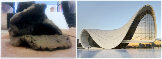
The best feature the Heydar Ailev Center has is the drooping front as it looks like the climate has melted it slightly causing this beautiful disfigurement; I feel if this section of the building was raised it would have been identical on either side creating a perfect line of symmetry; this distinguished characteristic looks as if it has similar properties of clay in how the foundations can stay firm but without the correct support it can become hanging or falling.
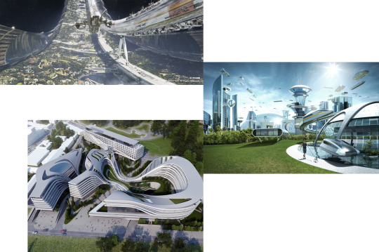
The similarities of people’s perception of the future Utopia, the film Elysium and Zaha Hadid’s work all acquire related attributes, the easiest one to identify is the colouring. By having a very light silver/grey or whites which then suggests a similar material is going to be used in creating Utopia this could be because this material is going to be the most efficient and sustainable in time to come. Another feature that is noticeable is the shaping of the buildings by having more organic shapes that aren’t using associated with when designing a building, even when the more common geometric shapes have been used in these images there has been something added or removed to change the impression, that this new shape/design is possible better than the original or more visually appealing as its fresh and new, nothing like we have seen before.
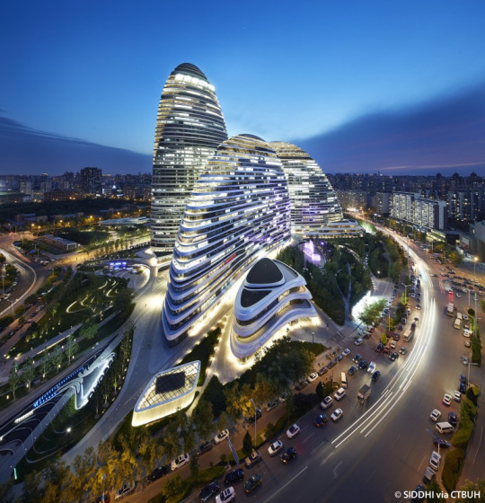
What I see and feel when observing the Wangjing Soho building that opened in 2014 following her designs.
Following this research I wanted to create a comparison on other structures that I find have similar characteristics and styles but are all different, having different meanings and purposes.
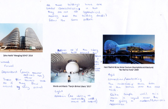
All these buildings following have similar qualities in that how they can all be categorised as modern architecture but also in the shapes used to create a flowing design that carves into the background which attempts to subtlety sit into the surroundings.
What’s the potentials of this research?
With this research I believe that it will help on producing more organic and contemporary designs, that can help me emulate my own futuristic building designs that can possibly redesign the Utopian perception.
With visual influences of Zaha Hadid’s work I believe that it can allow me to consider shape and line work more, by not focusing on symmetry to much, to create buildings that have a range of twisting and curling attributes.
0 notes
Text
Abstract Aesthetics

his workshop has been based on the minimal design work of Kazmir Malevich, Sol Lewitt and French street artist Eltono, in this workshop this will challenge experimental compositions that occur in the most basic graphical way. This workshop will allow me to understand positive and negative space through subtlety, precision, accident and chance seeing whether there’s any connections or major differences that are associated with any of these methods.
Task 1: Defining a system
In this task we have been asked to begin will the raw materials in the form of a black square of paper and a white one as well. To start this task we had to cut one of the squares into exactly four equal rectangles and then repeat this four times.
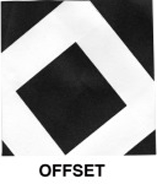
After completion of this step the objective was to produce four different outcomes by sticking the rectangles onto the other piece of paper either in a precise structured way or in loose accidental approach. This will allow you to produce four quick outcomes that didn’t require to much thought or time; from doing this it gave the simplistic style that Malevich had thought out a lot of his work some examples of this are his ‘White on white’ or ‘Architekton’ what’s interesting about this pieces are that something so simple but are striking an effective as the colour gives in plain and basic but gives a sense of whole and unity.
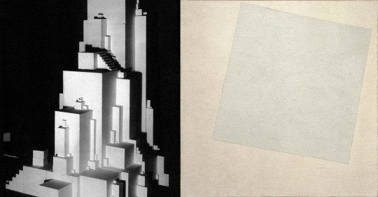
When I had created my four compositions I was asked to give the piece a one worded name and this had to be the first thing that came to mind when observing the composition. This first task was for me to understand what type of approach I would have when completing work in this workshop, I was able to identify that I had more of a careful and ordered approach when considering where to position the pieces, I believe this could be applied to a lot of my work as I often work with structure to what I want to produce.
Task 2: Fracturing the system
After establishing a system, the next step was to brake the intuitive order that I had developed from the previous task. For this task instead of having four equal rectangles I was asked to cut, tear and fold the medium into alternative shapes giving a different appearance and meaning to the first set; I was also able to change the dimension of this workshop, by giving outcomes that only really had a 2D component and adjust it to have 3D qualities, what this did was give the outcomes movement and life as upon observation it allows you to connect and follow different paths that weren't originally possible; this shows a progression from the most basic form of design by giving it a different purpose and meaning.
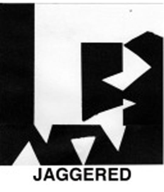
The task differs from the first way as the cutting process is much more organic being teared and folded into small pieces, this made each piece more chaotic as there was the opportunity to use more than one piece of paper to cut up.
Task 3: Final cut
In this last section we have been asked to repeat the same steps as the first by cutting the square into four vertical pieces, then cut them into as many smaller horizontal pieces as you like.
The objective is to create abstracted pieces that have moved away from the simplicity of the first task showing how easily and quickly the simplest form of graphics can be slightly changed to create something with more complexity to it. In this task it also gave me the opportunity to explore with a 3D element again but with more pieces this time; this started to form a tunnel or bridge that seemed to be covering lots of intersecting roads.
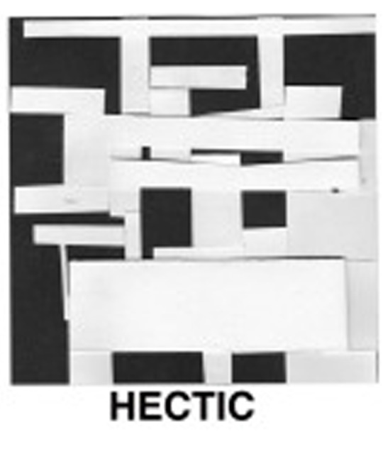

Task 4: Review and reflect:
When looking at everybody's in the group it forms a collection, which then stated making me seeing groups within the image as a whole. There was almost a new alphabet being created especially with the first task as although they were all different, you could see the similarities in how they were made using the exact same sized pieces.
I feel that the individual meanings are still there when looking at them as a collection but it also starts to create a new meaning, in the form of a different languages alphabet.
Going back to the start of the brief looking at what designer I based my work on was Malevich’s Architektons as I wanted to try and incorporate the architecture aspect of this workshop, to make easier connections to my project but also leaving the door open to pursue and explore this task further.
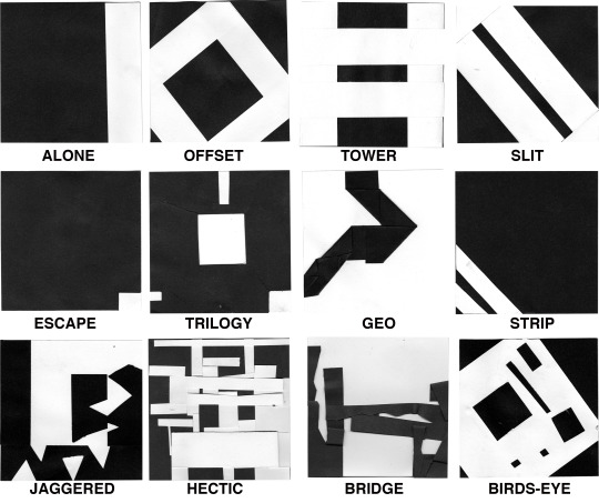
Development:

After I had completed this workshop there was an opportunity for progression by recreating my ‘Abstract Aesthetics’ in a 3D way by making the piece in another material. For this task I decided that I wanted to create the ‘Tower’ piece as I thought of how this could be manufactured in a different way but still appear the say as it originally appears.
When viewing this model I made it so that from every angle it looks the same through out, giving symmetry to the model. How I was able to make the model appear the same but be different was by making it in two pieces; but why? the reason behind this was to keep the original meaning but also give it the ability to changed or improved. How this can be achieved was by positioning the two halves in different ways to see if the outcome changed its meaning and whether there’s any possibility of viewing a structure within this piece but also if there’s still a structure in another position.
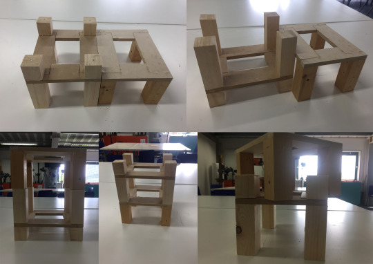
But I also able to create something that wasn’t intended using my scrap pieces to produce my own version of Malevich’s Architektons, by playing and joining random scrap materials to see if there was any connections to Malevich’s work or if there’s any buildings being formed/can be formed.


After producing this small Architekton I wanted to draw it from different angles and positions to see if any structures could be identified within this maquette. From this I found a success, as I was able to draw a series of houses that could be placed into separate locations with different environments; I was able to draw some of these ideas in their bespoke locations, as when I flipped the maquette it had unique qualities that gave it the ability to be a building that could overhang a cliff side or hidden within a waterfall, which then gave it this absurd isolated building, having similar appearance to a super villains base or a hidden fortress.

0 notes
Text
Stranger in a strange land
The Brief:
In this workshop the objective was to create a basic pop-up and gain an understanding go how these are produced but also whether they have thew same effect as each other.
In this workshop it will get me to consider compositions in a 3d way looking at how different depths and positions of each piece. I have been asked to create a small narrative of a protagonist in absurd land; this will be done in a monochromatic colour pallet.
Task-1 Sketching ideas
For this workshop I was asked to create a hand rendered landscape piece for owe character to be lost in. In the designing process to objective in creating a landscape was to be creative and detailed but also to be considerate as this was the first time creating a pop up, therefore meaning not to over compliant the design as when it came to cutting the scene out if it was to complex you may not be able to get to pop up because its a new process which needs to be worked on and refined before jumping ahead of yourself.
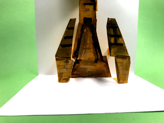
For this designing process when were shown a few examples of previous works completed by my tutor, in his example he had inked the background on the card that will be used for the fold rather than creating a piece which had a background on already, this is how I was imagining this process would be done. Also in the scene there was a protagonist in the foreground and a larger character that was perceived as the antagonist in the background and they were both divided with a range of rock formations. What I liked about this piece was how the composition has been considered to create tension before these two characters are about to fight, although I feel this has been achieved largely due to the positioning I also believe the monochromatic colours and tones give a sense of animosity since the characters almost blend into their surroundings as if they were using them for cover before or during their battle.
After seeing the examples I started to imagine what I could create in my scene for the pop up and how I could relate it to my project. I then went onto the internet looked at visuals of forbidden cities and ancient ruins, some examples I looked at were places such as Atlantis, The Forbidden city, The Pyramids and Aztec cities, after the research I decided to sketch and ink out a tower from the city as I felt this would be a natural fit for a ’Stranger in a strange land’ as I felt I could add an explorer to scene or follow the example by having a protagonist and an antagonist.
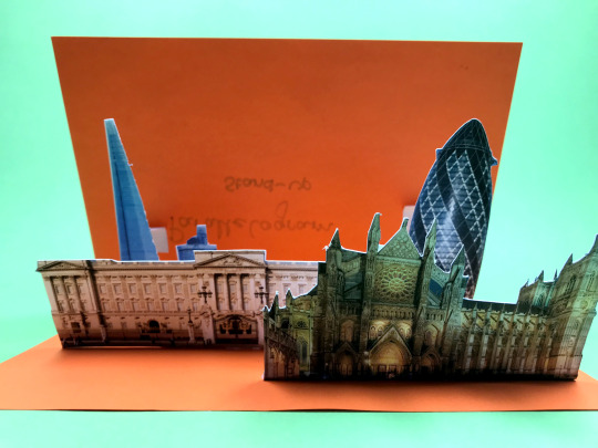
Task-2 A basic V-fold
After selecting imagery or creating a scene the next step was to produce one of the most basic pop ups mechanisms. How this piece was constructed was by using my image I chose which I edited on Photoshop this was a city skyline of New York.
Why New York? New York city has one of the most beautiful towering skylines in the world and I felt that I could portray the smaller buildings in the front followed by taller skyscrapers presenting the stunning architectural characteristics; the reason behind editing the image to black and white was because it brought the out tonal qualities that wouldn’t be appreciated in colour.
add photo
When looking down the middle of the pop up it brings the piece to life giving it a 3D element, but it also gives a sense of perceptive as if you were there in person or walking down the street.
Task-3 the parallelogram stand-up
This pop up differs from the previous v-fold, it works on a lever and bridge system. This means that when the pop up is opened each piece pulls creating a lever system where each piece is dependent on each other.
The difference with this process is that it allows you to use the negative space surrounding the pop up because it gives me the ability to create more of a narrative in the scene by exploiting the space.
Something to consider and be careful of was the lengths and distances between each piece and image, as this has an effect on the lever system because if one lever is to short or to long then it effects the mobility of how the function of each piece moves. This was a problem that I have encounter on my piece as the last lever is slightly to long and doesn’t completely pull the last building up all the way.

Although both approaches are similar they both their differences which are that the V-fold works on one way and that’s were the position of where the fold is, making it very difficult to use the negative space to the best of my ability, something the V-fold was better than the parallelogram stand up was that all the pieces we’re individual and didn’t depend on one another but just on the angle they were folded at and folded on.
What I have learn’t from this workshop is how to use a scalpel on a much more refined way by being more careful and cautious as this has now allowed me to be more skillful of a process that I have previously enjoyed but not always been the most confident.
For this workshop the materials used were card and ink this is a very easy and basic process that doesn’t require to much time but the precision and positioning of the pop up otherwise they wouldn’t stand successfully or function properly. Another material that could be used for this could possibly be with a fabric to experiment with or whether it would be too flimsy and not pop up when opened.
Whats next?
I would like to explore what would happen if I did this task on a larger scale? and if it would be successful or not but also does it become more interactive?
If I did this on a larger scale it could almost become a moving interactive mood board of my favorite buildings or area of interest of where my site location could possibly be.
0 notes
Text
Peer review
In this post I be discussing the recent catch up presentation that has been designed to be a quick recap on reviewing at what stage of owe project we were at and how we intend on developing this project further.
We had to review owe peers work using only 3 words.
The first example piece I decided to reflect on was the work of Jake and the 3 words that I used to describe: Scary, Horrific and Monochromatic.
How Jake produced this work was using hand rendered processes that have been used to create a cut out pop up narrative. After discussions with Jake we both came to the conclusion that his work was a success as it communicated the horror element that he was trying to rely onto the audience. One way that Jake believed this task could be improved by having a longer time frame to develop his own unique style.
I believe that the work was successful in the way it communicated his theme because his work was meant to strike fear into the audience but keeping them intrigue with what will happen in the narrative.

My second example piece was to reflect on was the work of Jack, and discuss the 3 words that I used to describe his work: Loose, Bold and Rough.
Jack also used an analogue hand rendered process that used scrap materials that have been cut off of random textured pieces of mediums. The process he used to produce his work was a technique called flapping animation. Through discussions we agreed that his work was a success in the theme he was communicating as these a clear connection of character design and lip sync that have been used together to create a conversation which is the premise of Jack’s project.

0 notes
Text
Le Corbusier

Charles-Edouard Jeanneret known as Le Corbusier was an architect, designer, painter, urban planner and writer. His architectural presence is one of the most prolific of all time and he has influence on the industry is second to none. Corbusier’s architecture work is part of the modern period, he dedicated all of his work in providing better living conditions in over populated areas.
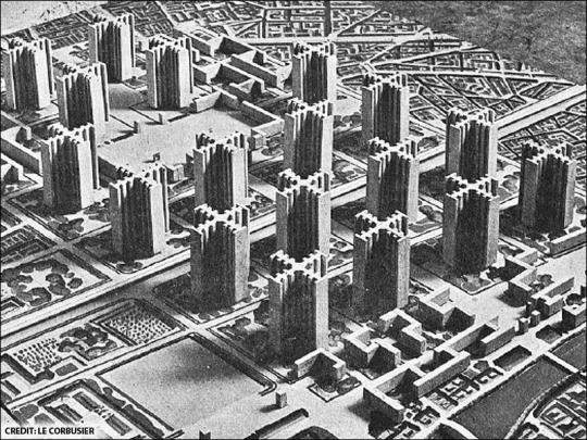
My favorite piece of Le Corbuiser’s work is a design that was never constructed but it was the idea and purpose that really interested me. Ville Radieuse was a project that he exhibited in the 1920s creating his representation of a utopia city; he believed that the future of architecture and living was upwards because as populations were rapidly increasing Corbusier was becoming concerned on space as to house the demand this was the prompt he used to explore the biggest open space we have by building upwards; this also showed a belief in that by building up we would be closer to the gods.
What I enjoy about this project was the effort he put into creating this concept and model for something that wasn’t ever made, but when observing the model and sketches the detail that Corbusier put into this design filtering every possible route into the city center. For me looking at how filtration has an effect of how/where something can be constructed but also looking at how more routes can be added into certain places to increase the flow around the city or increase the viewings of the area by having different options.

Palace of the assembly
This building was one of Corbusier’s most prominent buildings which is located in India and the project year was in 1963.
When observing this structure its very difficult to be drawn away from the curved section as for me its as if this section is breaking away from an ordered and symmetrical appearance even though there still is symmetry from a different angle when viewing the building. Why I feel that this section of the building is difficult to stop observing is because if it is viewed head on you cannot see the unique design causing a shock when you see it from another angle you are able to see the half cylinder shape. What this does to the rigidity of the building is that it loosens the stability of the rectangular structure as each side depends on each other but by incorporating this curved element it looses the dependency of each side but still keeping a unity in having four sides.

Notre Dame du Haut is a Roman Catholic chapel built in France 1955 and is described as one of the most important religious architectural pieces of the twentieth century.
Without research I wouldn’t have known this building was a chapel as on appearance I still can’t picture it; I feel this is because of the British cultural and how religious architecture is very different as they are more darker buildings with large stained glass windows whereas this chapel is the complete opposite its bright and rather unorthodox in comparison especially as this building has lots of smaller randomly assorted rectangular windows that give a slightly modern appearance on the placement of windows.
As a whole this building has a rather unique shape, in the first photo the angle shows the chapel with a darker roof which I feel has similar shape to a pirate hat or a hair style which could implicate the first impression of the building as a whole; this is what could possibly deter the religious appearance.
Why I feel Le Corbusier could have produced this chapel in a unusual religious style is because of trying to show that different doesn’t mean bad and could quite possibly mean the same about the individuals who would travel to the chapel, implying that this chapel doesn’t judge on first impressions and that it will accept you into the community. Upon research I found that the roof had been designed this way, to allow rain water to slop down the back of the roof to create a natural fountain; I also found out that the roof had been designed to look as if it was floating however I didn’t notice this on my first glance and beyond another look I was able to see this, because of the shadowing that you can see where the roof and walls meet it gives of this floating element but this is due to supporting columns that are set slightly further back. This isn’t the first time Le Corbusier has done this, he had also used this same technique on another church Sainte Marie de La Tourette. Why I feel he has done this is possibly to give the illusion of the unknowing powers that people believe God has and to signify this is a Holy building.
As a whole this building has some unusual shaped features that chapels don’t often possess. As a comparison of this chapel to my local church they both give a different emotion...

As when viewing St. Andrews church instantly without any hesitation I identified it as a place of worship due to the iconography of what we perceive a church or chapel to look like with the geometric shape, towers and arched windows whereas Nortre Dame du Haut is the complete opposite it doesn't appear to have any order of symmetry which gives off a chaotic feeling, however when observing the building you can see the freedom of the form and shapes used by effortlessly follow the lines around the building. In my opinion it doesn’t have any usual features that I can disguise each building having other than the tower but even still they are completely different in shape and detail.
Whats Next?
Possible explore more what space offers? whether there’s more or less of it.
Also look into filtration more and how it directs us to certain landmarks and points of interest in largely populated areas.
Something I would like to implicate into my designs or final outcome is how Le Corbusier changed the appearance of something with huge iconography and identification behind it but still have a successful outcome.
0 notes