
unluckyhex
by jasmin
online reflective journal, communication design studies s3793388 — jasmin s.
40 posts
Don't wanna be here? Send us removal request.
Last Seen Blogs

andrfet
Без названия
15hegira
Untitle

ouranioto3o
✨✨✨✨✨✨

magicaloperaeclipsetoad-blog
Untitled

jesshavok
JessHavok
Text
le fin !
this course was a toughy.
so glad i had karen as my teacher, but she was what made me terrified from the start, HAHA! i guess she’s what made me nervous, but it benefitted me in a way, as i pushed myself to do more and more, improving what i could week to week. i had great difficulties balancing my jobs with this subject in particular too, which was outright horrible... but hey! i managed :^) (i think.) couldnt thank karen enough for her toughness and her endless support and feedback each week.
i really appreciate the world karen and andy have opened to use through their lectures (and classes) the capabilities and strengths of design, introducing and teaching us the past, present and future of design and designers, with their impact to the world and their audience. our lecturers enthusiasm and spirit were beaming through our screens, and looked forward to every week for them! they were full of engaging content, small banter and their knowledge/experiences. i really appreciated these lectures and the effort that went into going through them.
my final assignment for cds allowed me to reimagine and reexplore my design interests and styles, engaging with the topic: coco chanel and understanding her interests and aesthetics with mine. as for the tumblr assignment... it was a difficult mess.. but i got there. i was so focused on perfecting my posts and controlling the order of it... it affected my workflow, which didnt really benefit me. this lead me to lack in content and lag behind, unfortunately. posts remained in drafts and/or google drive.. but nevertheless, i found my way and still got to experience exploring ideas and inspiration and documenting my process throughout communication design.
adios! thank you for everything, everyone and our lecturers/teachers: andy and karen ヾ(´・ω・`)
3 notes
·
View notes
Photo


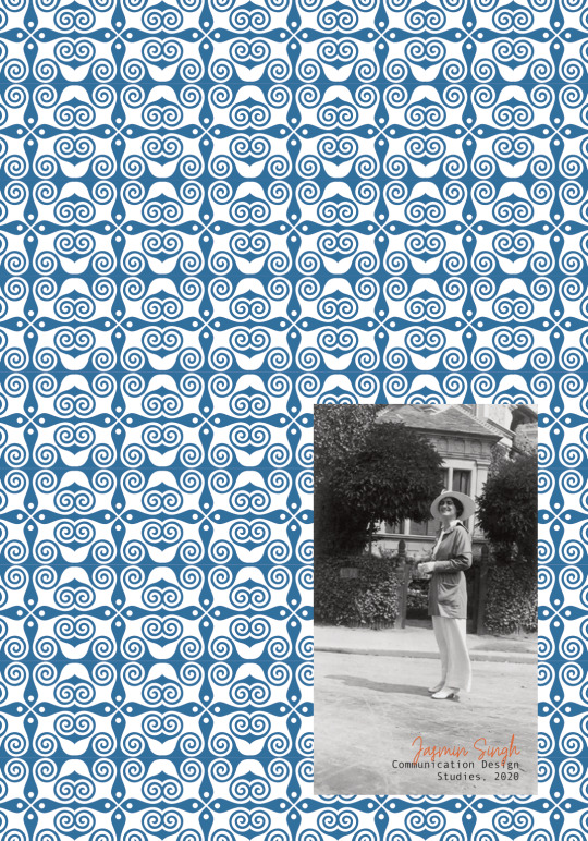
wk 13, 5th jun ‘20 - i
finalised zine! (whoop whoop)
the final changes made to complete the zine:
changed to portrait, thought it would work better for a zine, the readability, structure and the content included.
redesigned and reworded the introduction page, imitating a letter to coco chanel
adjusted and played around more with the layout of the first question: grammar errors/readability and layout of texts with images
took advantage of the spread of two pages (flat lay) and experimented a bit more for more variety in spread
added another font for the coco’s quote
(the 6th page is coming out a bit differently than my actual submission, but you can see the idea behind it?) added hues to the images to pop out from the b&w pattern
restructured the reference page
“bedazzled” the back cover
i was overall really pleased with my assignment! just suppeeerrr anxious of the outcome and how well it weighs with the criteria (eek D:) i feel maybe i could have done more to experiment? especially reflect the influence of my inspiration (still image from inside chanel’s video) and do a bit more playing around with the capabilities of a zine. overall, i enjoyed the process of actually making something i felt close to what i was interested in designing. learning about coco chanel was a great adventure too, as i had only very little knowledge of her background and her influence in fashion. with this, i was also able to dable in art deco! i can definitely see my overall design working as an online publication, but as far as a printed zine? im not too sure...
2 notes
·
View notes
Text
Lecture 11: What’s next for communication design?
Throughout this lecture we looked at how we have now moved into a hybrid state between a material world and a digitalised world. Towards the end of the lecture the question was asked when using adobe software how much of the design is authored by you the designer? and how much is authored by something else? e.i. the program. I don’t think I could answer this question properly as I haven’t spent enough time on the adobe programs. However, it is an interesting idea when you think programs such as adobe supply you with all the tools and equipment you need and most of the time can do all the hard work. I feel the idea comes from the person and then is executed by the program.
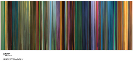
Early on we looked at this movie barcode from Kung Fu Panda 3. Before seeing this I didn’t know movie barcodes existed. I found this segment really interesting, especially how you can predict the storyline just from the barcode and how you can often tell what the character is going through by the use of colours, e.g. purple means turbulent. After the lecture I looked up other movie barcodes and found them all rather beautiful and kind of mesmerising to look at.
Reference: Moviebarcode.tumblr.com. 2020. Moviebarcode. [online] Available at: <https://moviebarcode.tumblr.com> [Accessed 20 May 2020].

We also looked at Parametric and Generative design and how they have been used. We looked at how you can generate different patterns by using the same grid, similar to the way Pepsi has. There is an overlap with grid work from the early 20th century that parallels to what is happening in the 21st century. Can also relate to the Bauhaus and how some artists were heavily influenced by using a grid system in their work.
Reference: Davis, D., 2020. Parametric Typography. [online] Daniel Davis. Available at: <https://www.danieldavis.com/parametric-typography/> [Accessed 20 May 2020].
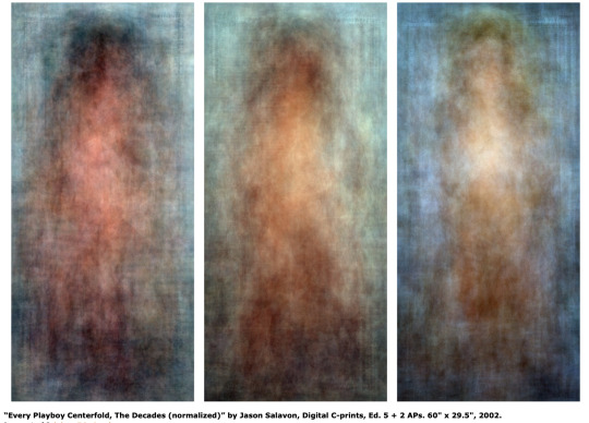
Work by Jason Salavon.
He has manipulated preexisting media to create works of art ‘by overlaying images (such as multiple photographs) and averaging the result to create visual amalgamations and, second, by distributing processed media (such as individual frames of a movie) side by side or in other configurations.’ - https://en.wikipedia.org/wiki/Jason_Salavon
I wasn’t fully sure on what Parametric and Generative design meant, so I looked into them a bit more and used these definitions as a reference.
Parametric design is a process based on algorithmic thinking that enables the expression of parameters and rules that, together, define, encode and clarify the relationship between design intent and design response.
Generative design is a design exploration process. Designers or engineers input design goals into the generative design software, along with parameters such as performance or spatial requirements, materials, manufacturing methods, and cost constraints. The software explores all the possible permutations of a solution, quickly generating design alternatives. It tests and learns from each iteration what works and what doesn’t.
Reference: Theophanidis, P., 2020. On Uniqueness And Averageness: Jason Salavon’S “Every Playboy Centerfold, The Decades” (2002). [online] APHELIS. Available at: <https://aphelis.net/uniqueness-averageness-jason-salavons-every-playboy-centerfold-decades-2002/> [Accessed 20 May 2020].
2 notes
·
View notes
Photo

WEEK 11 LECTURE: WHATS NEXT FOR DESIGN?
Week 11′s lecture was about the future of design. We learnt about the new mediums designers can now work with because of the emerging technologies of the 21st century onwards.
‘we’ve moved into a hybrid state between a digital and material world’
Karen and Andy touched on something I’ve been thinking a lot about lately which is how over stimulated the internet is. I’ve actually stopped going on social media as much recently because of this, sometimes i feel so overwhelmed with the amount of information/images/data I’m consuming at once when I’m on my phone. I kind of think it’s unnatural, but it’s unavoidable these days.
I think Karen said it’s ‘humanly impossible to observe everything uploaded on the internet’, so a lot of todays design is about trying to visualise this data in a more consumable way. We got shown some examples of this, one being Jason Salavon’s work with layering magazine spreads/school photos etc. which I thought represented different time periods really creatively.
Another confronting thing that was talked about was https://thispersondoesnotexist.com, which is a website that shows you a photo of a person that is completely made up from generated pixels. I knew about this website previously but i thought the photos were made up of multiple images blended together. I learnt in this lecture that the photos are completely computer generated, and that it’s artificial intelligence that constructs the human faces with its own knowledge… WHAT?! That freaks me out?! I definitely think I’m scared of which direction technology is going in.
4 notes
·
View notes
Text
wk 11, 22nd may ‘20 - ii
assignment progress

fig 1: front cover

fig 2: contents

fig 3: one page of (two) questions
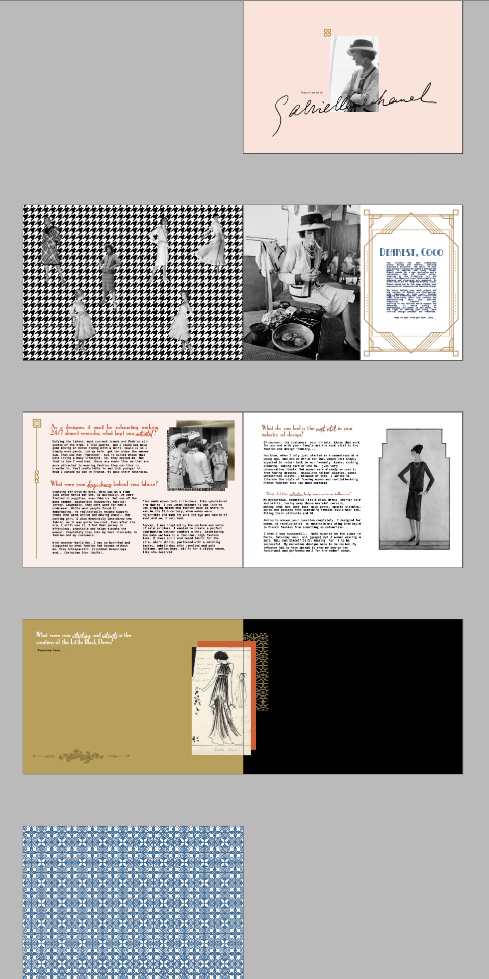
fig 4: overall layout, in progress
i decided to change the questions!
what do you feel is the most vital in your industry of design? and what did this motivation help you create or influence?
as a designer, it must be exhausting working 24/7 almost everyday, what kept you motivated?
what were your design choices behind you fabrics?
what were your intentions in the creation of the little black dress?
do you have any advice for new designers in regards to dealing with criticism?
i felt as though my questions were much more appropriate and
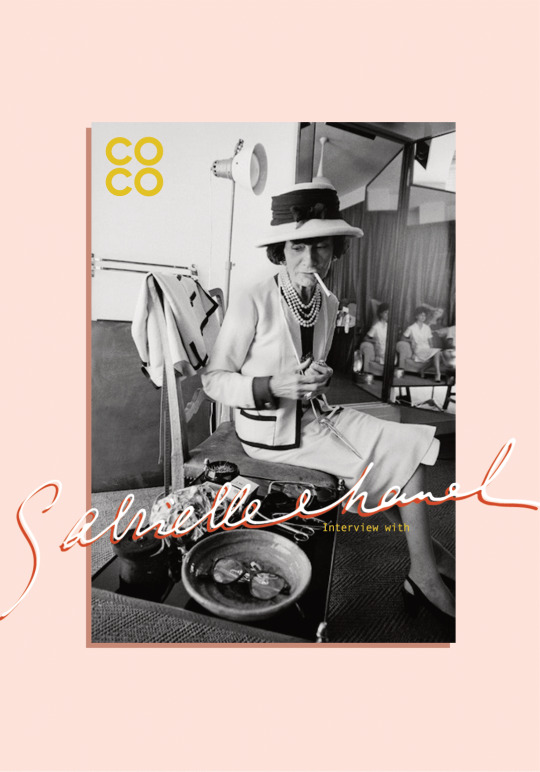
this time around, karen was happy with the progress i had made! and it was a relief! i took great inspiration from this: https://unluckyhex.tumblr.com/post/620358515931906048/wk-11-22nd-may-20-i; the colour palette and the style. i had also briefly learnt that coco chanel was deeply interested in art deco, and took inspiration of the gold embellishments and patterns/shapes of the era, incorporating it into the zine.
i also added more of coco chanel’s work, placing it upon a signature pattern from chanel, used in her suits: houndstooth. these images were cut out of photographs of her models in chanel clothing (referenced in zine) and placed randomly, considering balance and its overall presentation.
some criticism i received today:
remove the page numbers with the contents page
removing the contents page will allow for a better use of the page
revise the introduction of chanel
needs a bit more implementation of chanel’s style and her work
touch ups here and there
grammatical and spelling errors
0 notes
Text
wk 11, 22nd may ‘20 - i
another piece of inspiration for my zine!
a still image from 'inside chanel’s' video: https://www.youtube.com/watch?v=Mp7eFGge9Sg
0 notes
Text
wk 10, 15th may ‘20 - ii
lecture #10, art activism and design activism?
this week explored art and design activism, by first understanding the rise of conceptualism and how it could arguably be the start of design activism. this was a period of time where conceptual art and artists collided with traditional art, experimenting and “thought out of the box” to get a message across. such artwork was heavily impacted/relied on its form, presentation and its function.
i was super engaged towards viewing the iconic and compelling works of colors magazine. their works are controversial and intriguing. rather than getting upset looking at the work, i am fascinated and interested of the art direction and intention.
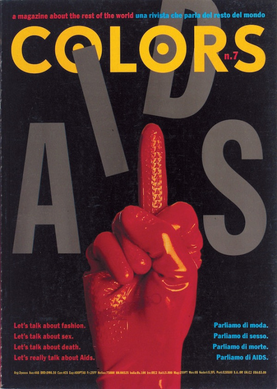
fig 1: colors n.7 magazine cover
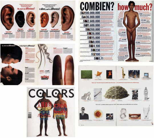
fig 2: outline and cover of another colors magazine issue
colors was surely unafraid and bold about their opinions, and i can appreciate that. they speak their mind and hold strong opinion, straying away from typical magazines and present a strong layer of intention.
in figure 2 for example, even though a majority of it is not in english, the images clearly show the audience the “differences” and similarities of being a human, considering physical differences and the variations in appearance/s. at first glance, you could interpret this an analysis of race + the human body, and global human issues like racism and the black market/human trafficking.
such close analysis and presentation of the body parts and the models are uncomfortable and a bit unnerving-- but i reckon it’s meant to be! it’s confrontational; we dont talk about these issues/topics on the daily... plus, these are humans, the same thing that their audience is! emphasising the disturbing issue.
0 notes

Text
wk 10, 15th may ‘20 - i
assignment progress
fig 1: page with the description of coco chanel
at this point, i have already compiled a better set of questions:
Considering you were not so well off... What had helped start up your interest in fashion, let alone starting up your brand, Chanel?
What are some things you would change with your previous work?
What project are you most proud of and why? ... What inspirations were drawn for this project to be made possible?
What are some difficult challenges you faced throughout your career? Did your time as a Nazi spy during WWII create any adversity or did it bring any fortune to Chanel?
Is there some message or value you would like to pass on for inspired, future designers and craftsmen?
talking to Andy (for a change of pace, specifically for this situation,) asked about my lingering concern about whether or not i should change my topic from chanel to a wacom tablet. i had this at the back of my head, as i felt that my zine could be much more artistic and experimental compared to coco chanel’s aesthetic of femininity, high-end fashion, over the top pearl jewellery, and upper-class france. i have just been apprehensive and indecisive about whether it’s too late or too ambitious.
Andy ended up encouraging it if i seriously felt like it would be the right choice to make. he also made the point that my (current) questions and the way i have presented coco chanel does not serve justice or the best potential to the assignment. this is in the light of the relevancy to the topic of design. so far, it is evident it has been more garnered towards the direction of a biography.
i lightly reflected, and had to reevaluate my direction and next move. i was still strongly considering the wacom instead... but redoing my research would be exhausting and consume a ton of my time.

fig 2: example of one “completed” interview page
but taking the questions and my current concern to karen for feedback, i was told the overall appeal of the document was extremely lacking, and appeared very “hotel brochure”-like. i could definitely agree, i wasnt very focused on the appearance of my document. the description page was also deemed a bit unnecessary and/or lacking, as there could be more implemented, otherwise use it as another page for more questions, that would actual serve more purpose.
on the topic of changing my subject from chanel to wacom, karen was against it, unless i felt extremely sure and definite towards changing it. karen encouraged the idea of changing the questions up, in order to provide a stronger focus on design.
oh well, who knows? i’ll work it out :)))))) (sigh)
1 note
·
View note
Text
SOMETHING I WISH I HAD SAID
"Put out ideas like you're going to die tomorrow, but, organise your files like you're going to live forever."
-Andy Simionato
10 notes
·
View notes
Text
wk 9, 8th may ‘20 - i
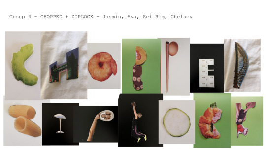
fig 1: “chopped” “ziplock”
placed into a small group of 4, cutting out images out of newspapers and magazines that we could manipulate and replicate into a certain letter, we were to share our images on to a google presentation for the next step.
the only magazine i had at home was a tourist guide booklet, that i didn't think we’d care for anymore. with this, i was limited again with my choices and imagery. there were too many images of nature, not even ones that were legible and focused. it was mostly compiled with fields of flowers, large bushes of leaves and empty bodies of water. luckily, it still featured some man-made landmarks: like the sydney harbour bridge.
i could see my group wasnt struggling too bad, but they too were restricted by small range of images and a concentrated range of food products.
this was genuinely pretty fun to do! got to speak more to my classmates and actually socialise. this task served as a visual option for our current assignment: incorporating collage. not sure if it would be interesting and reasonable to associate the two with each other..?
0 notes
Text
my god i thought this was super cute!! i had to reblog it and appreciate it on my blog.
WEEK EIGHT: ARTIST INSPIRATION (Bruno Munari)
When I delved into the research I conducted for Bruno Munari, an artist mentioned in the lecture, I was specifically inspired by his children’s books and how they still appeal to me, an adult! I attached some of this into a previous post and they display his illustration style and with minimal layout design. I love the idea of creating designs that appeal to all ages, so I was inspired to create a little poster design with an illustration that is colourful and childlike and pairing it with more minimal type and background colour. Maybe I’ll create a series. :)
7 notes
·
View notes
Text
wk 8, 1st may ‘20 - ii
assignment progress

fig 1: screenshot of general, brief descriptions on a word doc, on the topic of coco chanel - who she was, and my reasons for my interest in the designer.
at this point in time, my questions are underdeveloped, and i’m quite all over the place with what i want to ask, how she will answer, all while trying to abstain from asking anything generic to chanel.
What had started up your interest in fashion, let alone starting up your brand, ‘Chanel’?
Did your time as a Nazi spy during WWII inspire you or have any influence in your design or practice in fashion?
1 note
·
View note
Text
wk 8, 1st may ‘20 - i
lecture #7, the futurist cookbook
i was entertained by the concept and wanted to learn just a bit more about the eccentric idea...
futurism was during the era of modernism, begun by Filippo Marinetti as an artist movement. Marinetti proposed a strong rejection against the traditional forms and intended to embrace the use of energy and the dynamism of the imagined “modern world” and its technology. futurist work featured visual depictions of light, movement and speed.
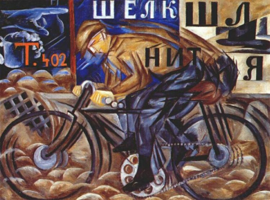
fig 1: Cyclist - Natalia Goncharova (1913)
Marientti had also created The Futurist Cookbook.
“The Futurist culinary revolution … has the lofty, noble and universally expedient aim of changing radically the eating habits of our race, strengthening it, dynamizing it and spiritualizing it with brand-new food combinations in which experiment, intelligence and imagination will economically take the place of quantity, banality, repetition and expense.” - Benito Mussolini
the cookbook proclaimed to be one of the “greatest artistic prank[s] of the twentieth century” and a “serious joke". recipes featured bologna served onto a table shaped as an airplane, “spicy airport” which was essentially olivier salad, and “rising thunder” as orange risotto. ‘Lambrusco’ wine was served in gas cans. the idea was to bring elements separated apart together with, in order to create combinations unimaginable and flexible.
the futurist cuisine and rules for a perfect lunch serve as a great example of its absurdity: https://www.finedininglovers.com/article/dining-marinetti-manifesto-futurist-cuisine
0 notes
Text
wk 7, 24th april ‘20 - ii
workshop #7, architexture
i wasnt able to take proper photos outside my house due to illness and having to be constantly busy with two jobs... so i had to look within my house.
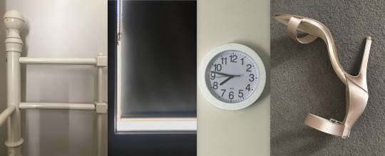
i’ve an extremely small place so my choices were limited... regardless, i felt the first three options were quite “meh” but i was really glad about my heel as a ‘y’!
from this task, and looking at the examples of other people’s work (in the drive) it was good to know a majority of us recognise that perspective plays an extreme role in looking into the form and shape of these objects that potentially imitate another shape or in this case, a letter from the english alphabet.
0 notes
Text
wk 7, 24th april ‘20 - i
lecture #7, what is this bauhaus, anyway?

fig 1: Poster for the Bauhausaustellung (1923)
the “house of construction” originated from the bauhaus art school in germany (1919) by Walter Gropius. the function, intellectual and theoretical approaches of its subject were their primary concerns.
the school was intended for the practical arts: being architecture, interior design, textiles and woodwork. the diversity of the work coming from the school indulged in spanning building theory, carpentry, ceramics, fine art, graphic printing, glass and mural painting, weaving, geometry, mathematics, business administration, metal, photography, printing and advertising, and plastic arts. this was due to Gropius believing in the collaboration of diverse artistic fields.
the art school taught numerous timeless lessons:
not limit your knowledge and capabilities: roam and get messy with ideas
collaborate and create iterations: gain feedback of different contexts, mindsets, fields, etc rather than secluding yourself to one respective industry.
embrace change and new concepts
understanding the designer has the capability to control the affect and appearance of the design
to go back to the basics: refine technical skills and knowledge, revisit the fundamentals of colour, form and the meaning of design, connecting back to the basic elements.
i can seriously associate myself with the last point, as the start of the year, re-understanding colour theory, drawing, balance, re-introducing myself to adobe applications after months away, it was a refreshing start and allowed me to reconnect with my passion and interests.
0 notes
Photo
zeline, judith, anya, devon, and laras
2K notes
·
View notes