
uxmorsels
UX Morsels
Bite-sized bits of user-experience love.
142 posts
Don't wanna be here? Send us removal request.
Last Seen Blogs

everzoo366
Untitled

crrahsa-yamah
C'rrahsa Yamah

ready-to-blow
𝔰𝔞𝔠𝔠𝔥𝔞𝔯𝔦𝔫𝔢

tanglangviaggi
Tang Lang Viaggi

ticcytx
Ticcy's Randomness
Video
youtube
(via It’s not you. Bad doors are everywhere. - YouTube)
2 notes
·
View notes
Quote
Products are stories. That we need to tell through design. That people need to be able to tell each other.
Luke Wroblewski (via andylueck)
1 note
·
View note
Photo
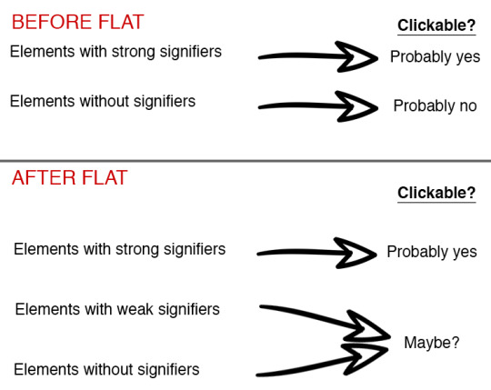
Long-Term Exposure to Flat Design: How the Trend Slowly Decreases User Efficiency
Kate Meyer for Nielsen Norman Group:
Clickable UI elements with absent or weak visual signifiers condition users over time to click and hover uncertainly across pages—reducing efficiency and increasing reliance on contextual cues and immediate click feedback. Young adult users may be better at perceiving subtle clickability clues, but they don’t enjoy click uncertainty any more than other age groups.
32 notes
·
View notes
Link
The term “journey mapping” emerged around 2009 when organizations began placing extra emphasis on making customer experience a key part of their… December 16, 2015 at 03:01PM
23 notes
·
View notes
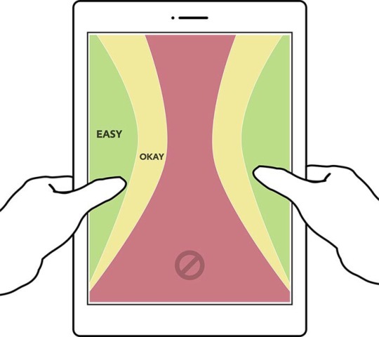
Photo
How We Hold Our Gadgets
By Josh Clark:
Where do hands and fingers fall on the device? This question is the linchpin for every form factor this book examines, and the answer tells you how to design your layout for comfort and efficiency. Since we hold phones, phablets, tablets, and laptops very differently, it’s no surprise that each of these touchscreen variations has its own UI needs.
47 notes
·
View notes
Photo
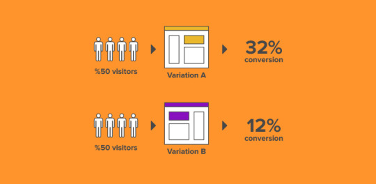
Have you been reluctant to use A/B Testing as a part of your design strategy because you don’t know how to get started? – WhatPixel offers a simple guide to help determine the variables <bit.ly/1o2MbkL>
35 notes
·
View notes
Photo

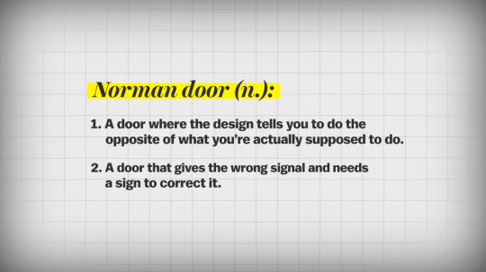
How to design doors to be less confusing
You’ve encountered a door like this. One that looks like you should pull on it, but really you’re supposed to push. Those doors you hate have a name: “Norman doors.”
They’re named after Don Norman, a UC San Diego cognitive scientist, who identified this phenomena in his book “The Design of Everyday Things.”
According to Norman, pushing on a door that says “pull” isn’t necessarily your fault. It is just poorly designed.

So what’s the solution to this mess?
Norman explains two principles of design that make objects, including doors, more intuitive to use.
One is discoverability — that is, just by looking at the door, you should be able to detect what you could do with it. So a door with only a flap would be more intuitively interpreted as something you push on rather than pull.
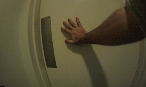
A well-designed object should also provide you feedback while using it.
Feedback involves any visible, tactile, auditory or sensible reactions that help signal whether your attempted use of the object was successful. In the case of doors, the twistable knobs would signal to you whether the door is locked or not.

And perhaps the true test of a well-designed door may be whether your family cat can open it with ease.
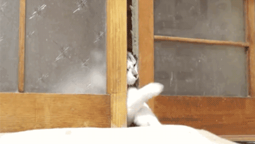
Watch the full @vox video on Norman doors (and human-centered design)
1K notes
·
View notes
Photo
How We Hold Our Gadgets
By Josh Clark:
Where do hands and fingers fall on the device? This question is the linchpin for every form factor this book examines, and the answer tells you how to design your layout for comfort and efficiency. Since we hold phones, phablets, tablets, and laptops very differently, it’s no surprise that each of these touchscreen variations has its own UI needs.
47 notes
·
View notes
Photo
Long-Term Exposure to Flat Design: How the Trend Slowly Decreases User Efficiency
Kate Meyer for Nielsen Norman Group:
Clickable UI elements with absent or weak visual signifiers condition users over time to click and hover uncertainly across pages—reducing efficiency and increasing reliance on contextual cues and immediate click feedback. Young adult users may be better at perceiving subtle clickability clues, but they don’t enjoy click uncertainty any more than other age groups.
32 notes
·
View notes
Photo
How We Hold Our Gadgets
By Josh Clark:
Where do hands and fingers fall on the device? This question is the linchpin for every form factor this book examines, and the answer tells you how to design your layout for comfort and efficiency. Since we hold phones, phablets, tablets, and laptops very differently, it’s no surprise that each of these touchscreen variations has its own UI needs.
47 notes
·
View notes
Link
Lessons In Designing Great Enterprise Software http://flip.it/tqsnf
0 notes
Link
Apple’s plan to kill the hamburger menu http://flip.it/NLXjS
0 notes
Photo

Mac OS X 10.11 El Capitan - Moving your mouse or trackpad around quickly to locate your cursor enlarges it.
/via Carbon Costume
124 notes
·
View notes
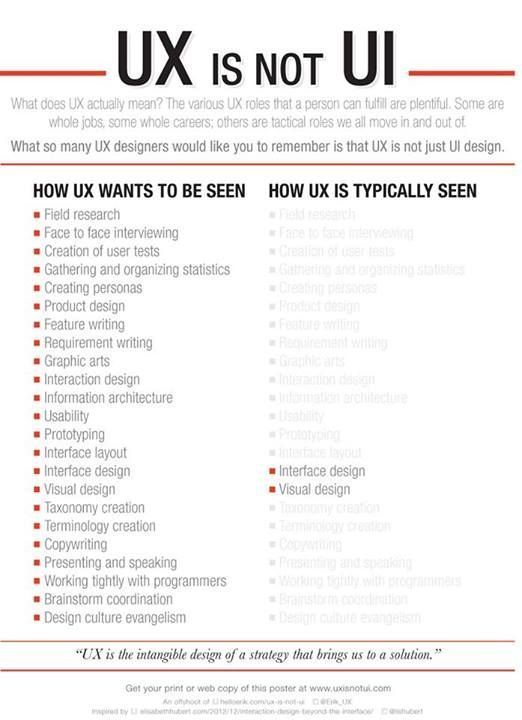
Photo
The 7 Deadly Sins of User Research
(Nothing to add - the above image says it all)
1 note
·
View note
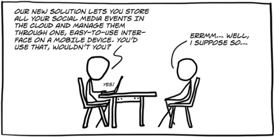
Quote
If you want to understand how a lion hunts, don’t go to the zoo. Go to the jungle.
Think: user research. (via thehipperelement)
15 notes
·
View notes
Photo

Trello - If you sign in with a Google account you’ve not used before, it asks you if you want to add it to an existing account.
51 notes
·
View notes