
versus-studio
VERSUS
Design. Motion Graphics. Animation.
50 posts
Don't wanna be here? Send us removal request.
Last Seen Blogs

naughtyssexyscheerleader
Naughtys & Sexys Cheerleaders

qwcccccccccccccccc
제목 없음

fredsquirt8503
Untitled

mosspotato-blog
ossis pomarii

pepepetos
vinny in hell
Text
NEW WEBSITE
We have moved to www.versus.studio - this tumblr will be kept as an archive.
0 notes
Video
vimeo
BT SPORT / FA Cup 19-20 Quarter Finals promos
We worked with BT Sport to put together a series of promos for the 2019-20 FA Cup. A homage to the classic Creature Comforts series, the audio used unscripted interviews with fans.
After being interrupted by COVID, the FA Cup resumed and we made the a special lockdown version for the Quarter Finals (above).
vimeo
vimeo
vimeo
vimeo
vimeo
0 notes
Video
vimeo
BT SPORT / Champions League 19-20 promo toolkit
We worked with BT Sport to put together a promo toolkit for the 2019-20 UEFA Champions League season. The idea was to make a pinball table filled with illustrations of players and personalities from the teams in the competition, with frenetic animation to capture the excitement and unpredictablility of the Champions League. We explored a few looks but the 80s style was the chosen route.
The toolkit enabled the internal team at BT Sport to easily swap out illustrations to customise promos for different teams/matches, and the client was extremely happy with the results.
This montage shows a selection of the 3d shots that we created.
CREDITS:
3d: Matt Knott, Louis du Mont, Ben Austin, Steve Bjorck, Simon Smalley
Art Direction: Matt Knott
Director: Laurie Smith
September 2019
0 notes
Video
vimeo
BT / CRYSTAL MAZE SPONSORSHIP BUMPERS
BT asked us to create a set of sponsorship bumpers for a special charity episode of The Crystal Maze, in aid of Stand Up To Cancer. We devised four bumpers, each an epic version of the BT logo in the style of the zones from The Crystal Maze; futuristic, aztec, medieval and industrial.
October 2016
0 notes
Video
vimeo
BT SPORT / Action Woman Awards 2016
The BT Sport Action Woman Awards are annual awards presented by BT Sport to the sportswoman or female sportsteam who has been adjudged to have been the best of the year. For 2016 they asked us to create a series of promos to raise awareness and get the public voting, with an overall 30sec piece and then individual 15sec just focusing on each nominee.
The idea was based around a mock magazine; making the nominees cover stars and having the camera move dynamically around, highlighting some of their achievements (particularly in the individual promos).
October 2016
0 notes
Photo


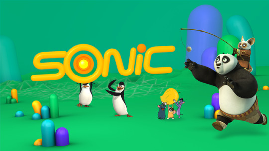

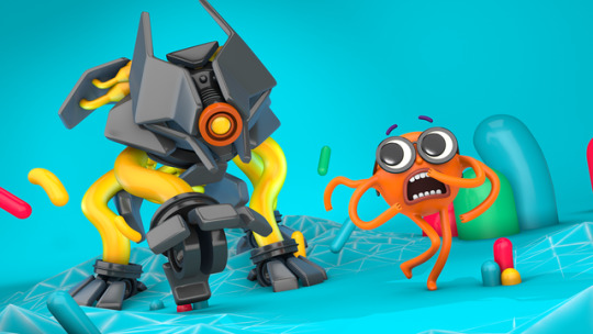

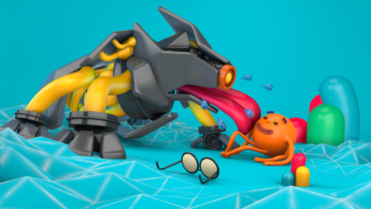


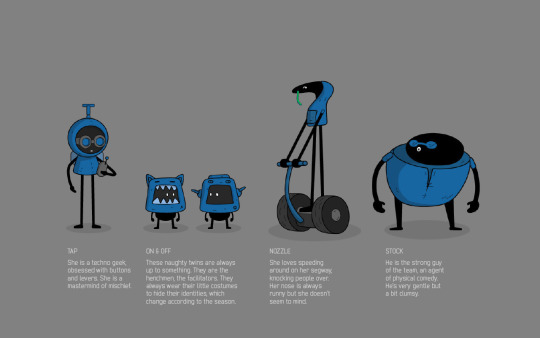
NICKELODEON SONIC REBRAND (PITCH)
Nickelodeon Sonic is a TV channel in India and part of the Nickelodeon brand. We were invited to pitch for a rebrand of the channel. The brief was to reposition Sonic from an action-oriented channel aimed at 10-14 year old boys, to a comedy-focused channel with an expanded audience of 4-14 year old boys and girls.
We collaborated with our excellent friends at Formation, and our approach was to create a madcap world centred around a button. Kids of all ages love the mystery of a button, it appeals to their innate curiousity. What will happen if I push it? The button was devised as part of the logo, and as a flexible device that could be used in a myriad of ways but giving a central point of reference for the viewer. A funny character - Ian - was then introduced as the protagonist to build a series of humorous idents around.
We didn't win but we were quite happy with the work.
December 2015
2 notes
·
View notes
Photo
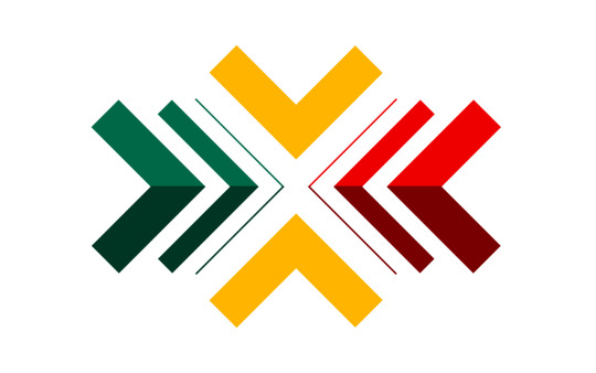
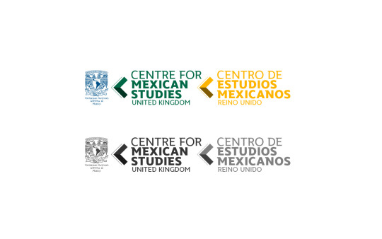
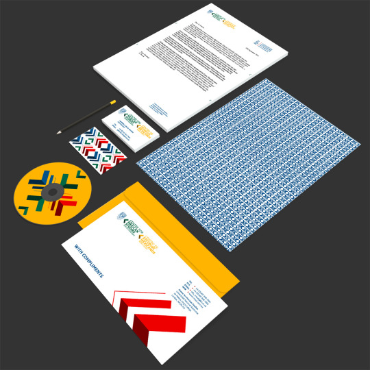

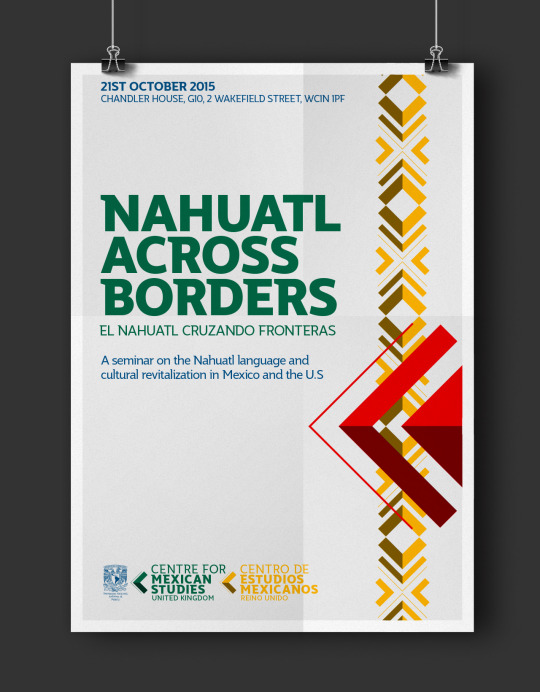
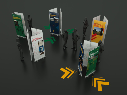
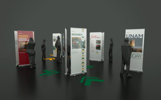
CENTRE FOR MEXICAN STUDIES / IDENTITY
We were asked to create the identity for the Centre for Mexican Studies UK, an initiative from UNAM (the National Autonomous University of Mexico) that aims to facilitate cultural, professional and academic exchange between UNAM and higher education institutes in the UK.
Our solution had two aims. Firstly, to visually embody the purpose of the Centre; fostering and promoting collaboration, networking and the exchange of knowledge and ideas. Secondly, to visually reflect part of Mexican culture, tying the Centre to Mexico in the eyes of the viewer.
The identity system utilises a system of arrows that can be combined in a myriad of ways (both functional and decorative), and reflects traditional Mexican patternmaking. The colours represent the different elements involved in the initiative - yellow/gold and blue from UNAM, red from Kings College (the UK host) and green from the Mexican flag.
August 2015
2 notes
·
View notes
Video
vimeo
BT / INFOGRAPHICS
BT asked us to create some infographic explainers for a series of recruitment and new joiners videos. These were sections that sat within longer films and were used to illustrate the functions of the different companies that make up BT Group.
The challenge was to strike a balance between keeping a 'corporate' style, maintaining consistency between the seven different businesses (each having their own brand and stakeholders) and yet creating something that was engaging for the viewer. We can't show the full versions but this is a montage of some of the project.
April 2015
0 notes
Video
vimeo
ANHHA / SS15 VIDEO
AndWhat approached us to create a video to showcase AnhHa’s SS15 Womenswear collection. Intricate detailing and contemporary monochromatic shapes where the foundation for the general look. We combined stop frame photography with motion graphics to generate a stylish and at the same time playful animation.
CREDITS:
Client: AnhHa
Agency: AndWhat
Art Direction: Jonny Cazzola
Photography: Daniel Benson
Stylist - Adele Johnson
Hair - Fumi Maehara
Makeup - Nancy Sumner
Model - Alexandra Zolotavina
November 2014
0 notes
Video
TINY POP / BIG QUESTIONS
This is another set of interstitials for Tiny POP, aimed at preschoolers. This series asks some simple (and not so simple) questions that children might ask and explains them in an engaging way.
We had to create a series of 12 in six weeks (two per week), so from a production standpoint we had to keep them fairly simple, with a mix of 2d and 3d animation.
vimeo
vimeo
vimeo
vimeo
CREDITS:
Client: CSC Media
Producer: Stephanie Wahlstrom
Additional illustration/animation: Sofia Serrano, Fernando Vera
August 2014
0 notes
Photo
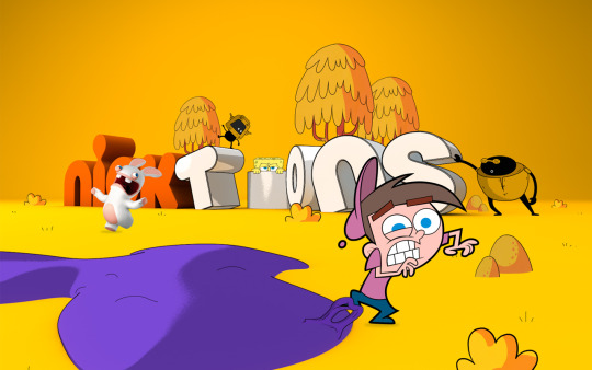
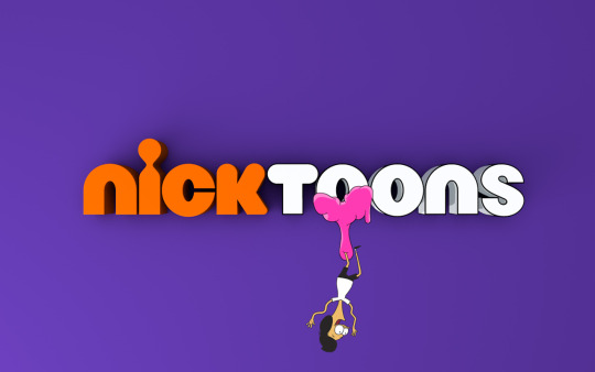

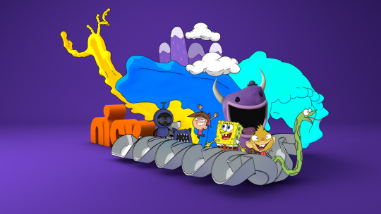

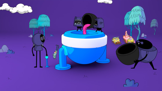
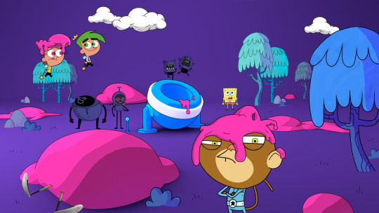

NICK TOONS UK REBRAND (PITCH)
Nickelodeon invited us to pitch on a refresh for Nick Toons. The brief asked to create an on-air look that was 'focussed on funny' and that utilised key show characters within the package, creating a strong connection between the logo and the characters.
Our approach was to develop a new set of 5 characters - the Toons team - to play tricks on and otherwise sabotage the main show characters. This would keep the show characters front-and-centre but would give lots of possibilities for comedy that would otherwise be difficult to achieve with limited assets. It would also give lots of flexibility for evolving over time, rather than the same joke endlessly repeated. This was married with a visual look that tried to get back to the roots of animation - the environment of Toonsville is surreal, random and funny.
Sadly we didn't win the pitch, though they did pay to use our typography. So a little bit of Toonsville made it on-air.
August 2014
2 notes
·
View notes
Video
NICK JR SEASONAL IDENTS
A selection of seasonal idents and packaging for Nick Jr (some UK, some international). We created themed versions of the Nick Jr world to illustrate spring/Easter, summer and winter/Christmas.
CREDITS:
Client: Nickelodeon International / Nickelodeon UK
Producers: Jon Preston / Tee Gray / Heidi Gadd
2014
0 notes
Photo
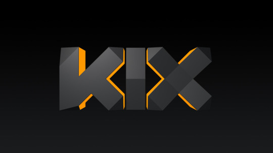

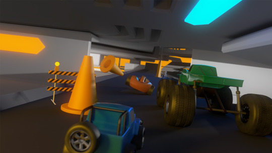
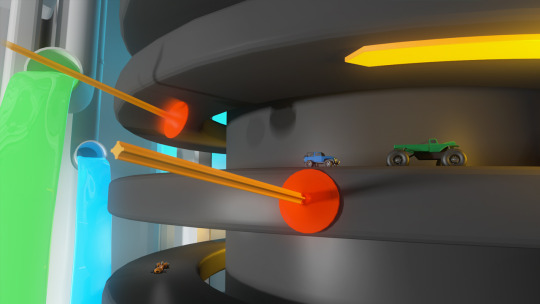
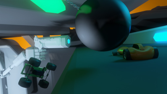
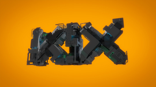

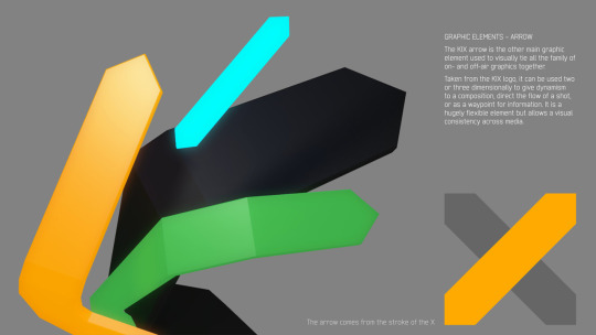

KIX REBRAND
We don't pitch very often but this was for a rebrand of KIX, a UK children's tv channel aimed at boys aged 7-12 years old. The brief called for a look that was epic, action, explosive and fun, with one foot in a surreal world and the other in a boy's imagination.
Our response was a to create a futuristic-looking graphic style with a logo that could transform and evolve over time. The logo would also function as a container for the idents - imaginary worlds would exist within the logo structure and scenes of action and adventure would unfold as the viewer travels through them. We visualized one of these idents with The Kix Rally, where a set of cars race each other in a surreal enclosed space, avoiding giant sucker bullets and wrecking balls. As the cars get picked off one by one the camera pulls out to reveal all the action has been happening inside the KIX logo.
We got down to the final two agencies but sadly got pipped to the post.
April 2014
0 notes
Photo
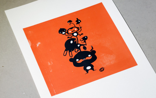

PRINT CLUB LONDON
Matt recently spent a weekend at Print Club London, rediscovering the joys of screenprinting. We spend a lot of time creating moving image/animation so it's refreshing to get away from a computer from time to time. We'll be doing more with these character designs in the future.
April 2014
0 notes
Photo


3D PRINTING
We've been experimenting with 3d printing with one of our characters (onerobotband from our POP idents). In this case we modelled it hollow to both reduce printed material and enable us to plug the instruments into his back.
This technology is incredible and we look forward to experimenting with further as it evolves!
April 2014
1 note
·
View note
Text
We have moved! We're now in an old pharmaceutical factory in Bethnal Green, a good place to produce some graphic remedies!
0 notes
Photo

Merry Christmas!
Our contribution to the Christmas Gifs website/project by Ryan Todd.
3 notes
·
View notes