Photo

MINI
5 notes
·
View notes
Photo

‘95 Toyota Land Cruiser
22 notes
·
View notes
Photo
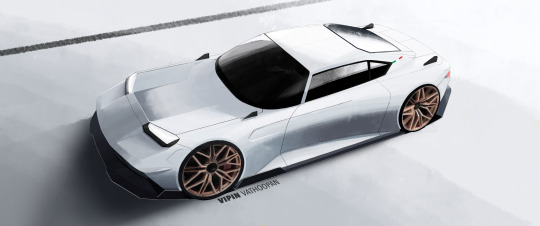

Lamborghini 350 GT Concept
13 notes
·
View notes
Text
Colour Journal 2
Notes
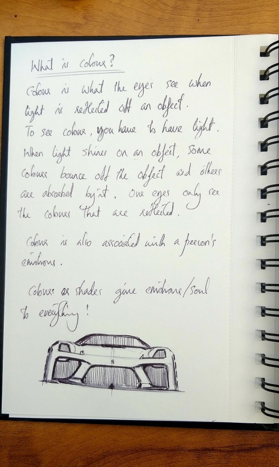
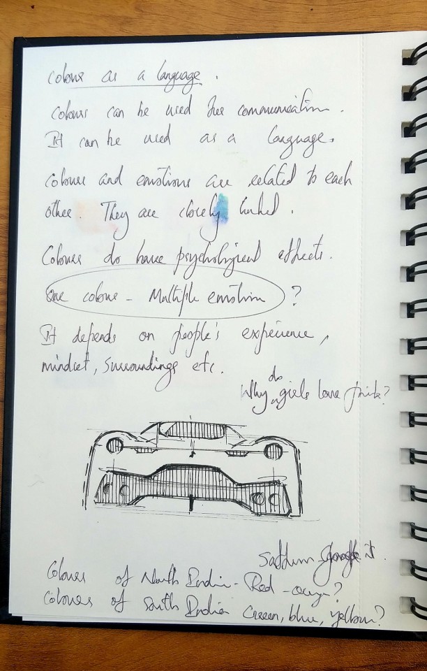
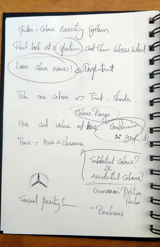
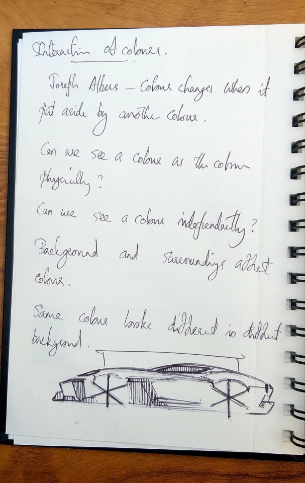
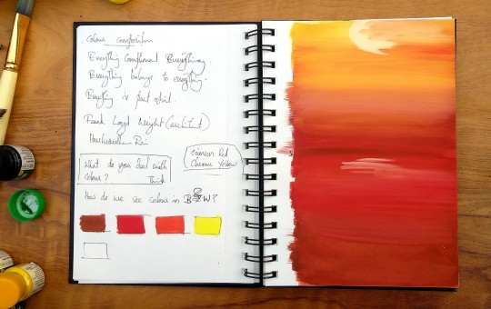
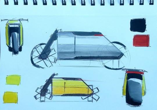
5 notes
·
View notes
Text
Reclamation
This video is a result of our humble exploration made during the Fundamentals of Visual Design at NID. This video aims to bring our understanding of space as a compositional element and with music binding it together. Following the Coivd 19 pandemic, during the global lockdown period, while humans were safely stored away in their homes, hidden from the great outdoors, the global eco system changed.
https://youtu.be/KFsLZz9x-uA
youtube
It was an unique experience for all of us. We had to work day and night to meet the deadline. Person to person physical communication wasn't happening and the poor internet connection made it hard for me to catch up with these guys. Despite all the issues, we have managed to come up with a decent music video that was made completely from scratch. The three day time period and tight schedules put our skills and productivity to the test.
In the video, my contribution was the post lockdown, social distancing part. I used stop motion technique to capture my idea. The boxes depicts humans. The white background represents the earth. The white shows the purity of earth. During the covid pandemic, human interference, exploitation and pollution reduced by a huge margin. This made the earth pure. And the globall eco system somewhat changed back to it's normal form. But the humans haven't changed much. The mental stress, fear, agitation, tension etc were depicted through the black colour.
Draft 1

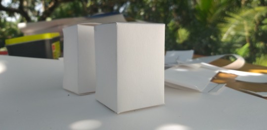


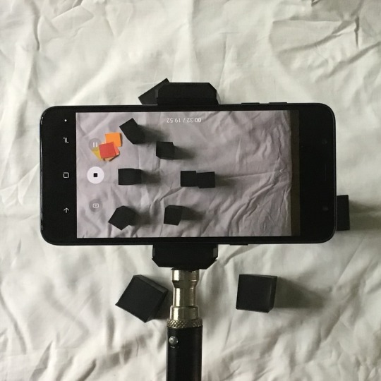
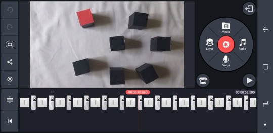
We had to change our first idea on the day before the final submission.

Team
Abhishek
Anjana Dev
Ashin
Athulya Prabha
Gajalakshmi
Kuldeep
Rashi
Rishikesh
Vipin Vathoopan
2 notes
·
View notes
Text
Music Colour Video
LIFE IN COLOUR
A music video that depicts our understanding of colour in the forms of abstract visuals combined with audios and music made by us. This video relates to the journey of a person from birth to death and shows the different emotions the person goes through. Each emotion has been related to a specific colour.
https://youtu.be/qy9JT349jMI
youtube
The team assigned me to do the 'Growth' part of the video which is represented by the colour green. We have discussed and considered many media including paper, paint etc. and ended up with the digital one. I used Procreate app to make this stop motion animation. It was a painstaking process and we were happy with the end product.
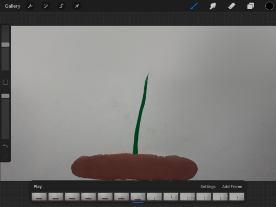
Final Draft 2
Team
Adwait Bhale
Divyanshu Singh
Rishikesh M Nandakumar
Vipin Vathoopan
Yash Choudhary
2 notes
·
View notes
Text
Colour Journal

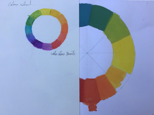
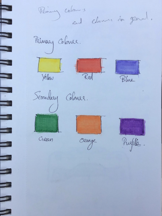
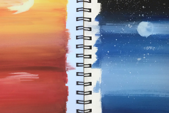


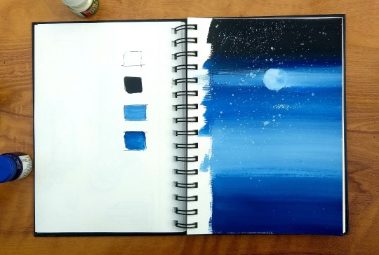
I found this idea of a colour journal really interesting. It is really helpful to understand and study colours in a simple way, especially for a guy like me who have a very basic understanding of colours.
I know there isn't much of a study in my journal yet. But I believe that this will be a beginning for keeping my understanding and observations in a book that is always accessible for me.


4 notes
·
View notes
Text
Composition 2
Infinite
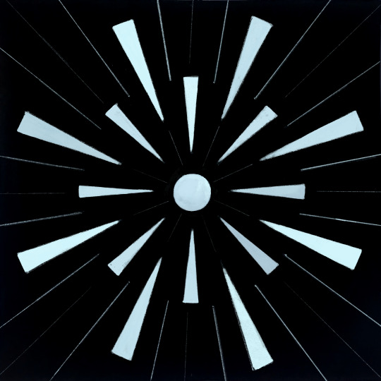
For me, infinity or infinite means a never ending tunnel... you can see the light on the other side. But, you are not going to reach there...!
I used the circle to represent the light at the end. Triangles and lines create a perspective view and a sense of speed.
Point of Interest
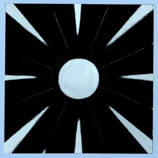

Rhythm
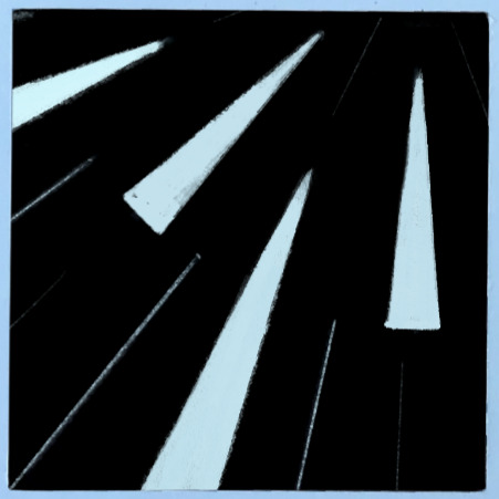
Scale and Proportion

1 note
·
View note
Text
Composition
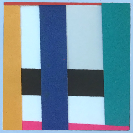
Based on the understanding and experience on principles of visual design, I made two compositions that are representing the words 'Friendship' and 'Infinite', using only basic geometrical shapes. And then created a window of 8cm x 8cm to identify the predominating principles of design in the compilation.
Friendship
Friendship for me is always colourful. Here, the cross weaving threads or pattern represemt the strength of the relationship. The white background is trust and faithfulness, which is the base of every friendship. The different coloured lines or threads are different elements of friendship such as celebration, forgiveness, truthfulness, loyalty, responsibility, gratitude etc.
The black rectangle and line represent jealousy and unhealthy competition between friends.
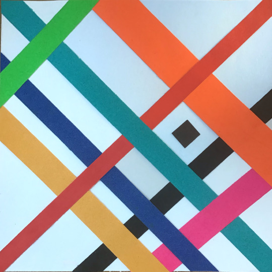
Point of Interest

Balance


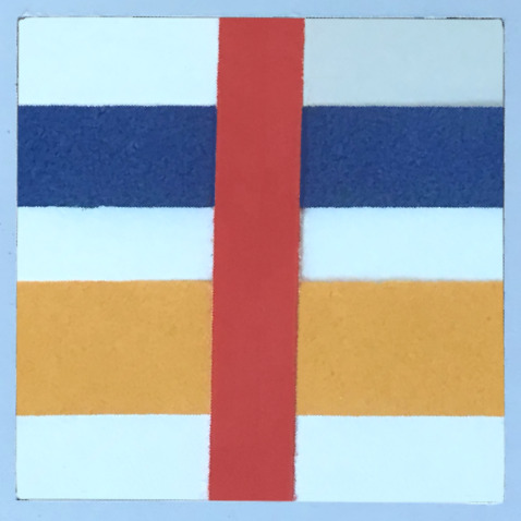
Scale and Proportion

1 note
·
View note
Text
Principles of Visual Design
The principles of design arrange the elements of art/design(dot, line, space&shape, colour, value, texture, volume etc) into composition. These principles determines the beauty of a composition. How one applies these principles determines how successful a design may be.
Pattern
Rhythm
Balance
Scale and Proportion
Point of Interest
Unity and Diversity
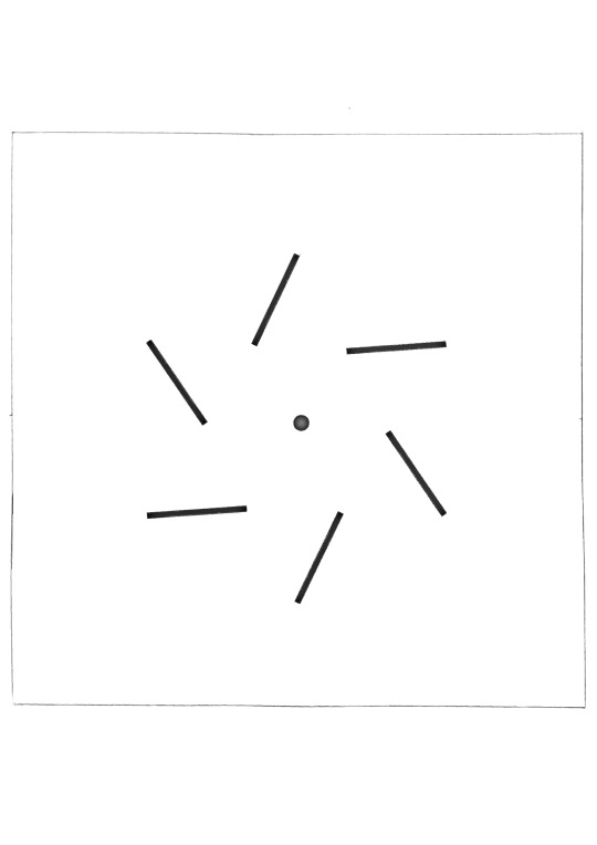
Here, I explored these principles using lines and dots of specific sizes.
Balance
Balance is the distribution of the visual weight of objects, colors, texture, and space. If the design was a scale, these elements should be balanced to make a design feel stable.

Rhythm
Rhythm is a principle of design that suggests movement or action. Rhythm is usually achieved through repetition of lines, shapes, colors etc. It creates a visual tempo in artworks and provides a path for the viewer's eye to follow.

Point of Interest
This is the area or point within a composition that captures and hold the viewer's attention. The point of interest in a design should stand out but should be noticed after the element with the most dominance.
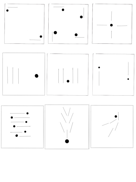
Thumbnails
There is no particular order because I wasn't deliberately trying to create a composition that follows a certain principle. I was arranging elements randomly and trying to figure out what is the predominating principle in that composition. I also tried to use an optimum number of elements in my compositions. But it doesn't always work. I found it difficult to keep the minimum of the elements.

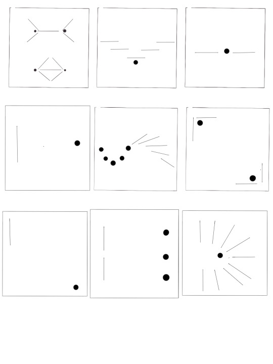
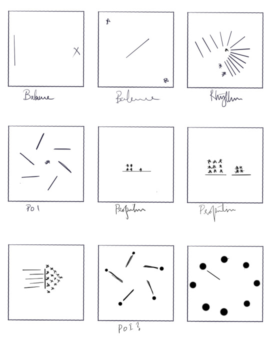

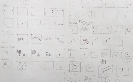
I have done many of this thumbnail on paper. But ruined them by sketching cars over them. I really enjoyed sketching these compositions.
1 note
·
View note
Text
Bug EB110 ❤
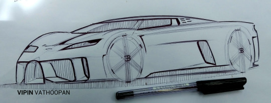
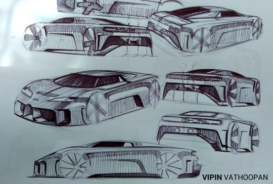

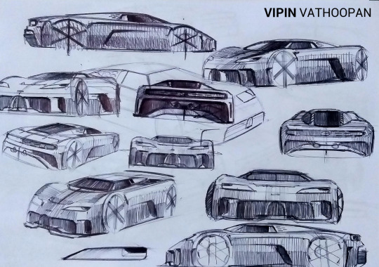
8 notes
·
View notes
Text
Taste, Colour and Music 2
Fried Egg
Converting the taste of fried egg into painting and music!
A fried egg, is a cooked dish made from one or more eggs which are removed from their shells and placed into a frying pan, and fried with minimal accompaniment. Fried eggs are traditionally eaten for breakfast in many countries but may also be served at other times of the day. It is one of the simplest of foods.
A fried egg has two distinct tastes to it. The white and the yolk. The white of the egg is bland, not much flavor. The yolk however taste kind of buttery and has a creamy texture. As you can see the white colour in the painting represents the bland taste of egg white. And the yellow represents the creaminess of the yolk. The blue stroke is there to create the salty taste.

2 notes
·
View notes
Text
Taste, Colour and Music
Converting the taste of a food into music and painting!
പുട്ടും കടല കറിയും | Puttu and Kadala Curry
'Puttu' is a breakfast dish eaten in the south Indian state of Kerala. It is made of steamed cylinders of ground rice layered with coconut shavings. Puttu and kadala curry(chickpeas curry) is the most loved breakfast combination here in Kerala. When served along with a hot cup of tea, this simple dish is sure to make every Keralite nostalgic.
Here, I converted the taste of the food into music and then the music into painting.
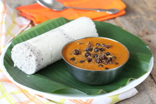
1 note
·
View note
Text
Gestalt Principles
Human brain is always looking for order, symmetry, and uniformity around us. It is programmed to see structure, logic and patterns. This, in art and design field, is known as Gestalt principles of visual perception. It is basically the psychological ability of our brain to recognize complex patterns, shapes and colours.
Principles
Similarity
Proximity
Continuation
Closure
Figure and ground
Symmetry
Symmetry
It is a visual property in which elements are made up of equivalent parts to resemble proportion and balance.

Continuation
This explains how our brain experiences visual line of elements that are grouped together. There is a tendency to perceive a line continuing its established direction.

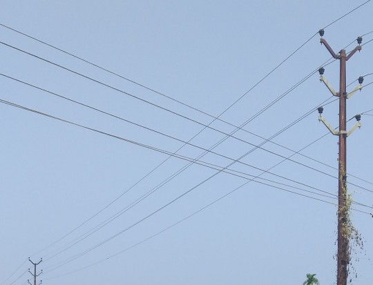
Similarity
It says that elements that are similar are perceived to be more related than elements that are dissimilar.
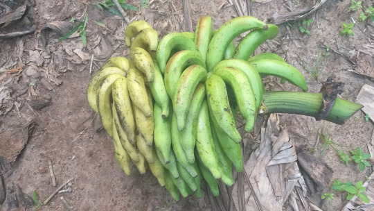
Symmetry-Proximity
The principle of proximity states that objects or elements that are placed together are perceived to be more related than the ones far apart
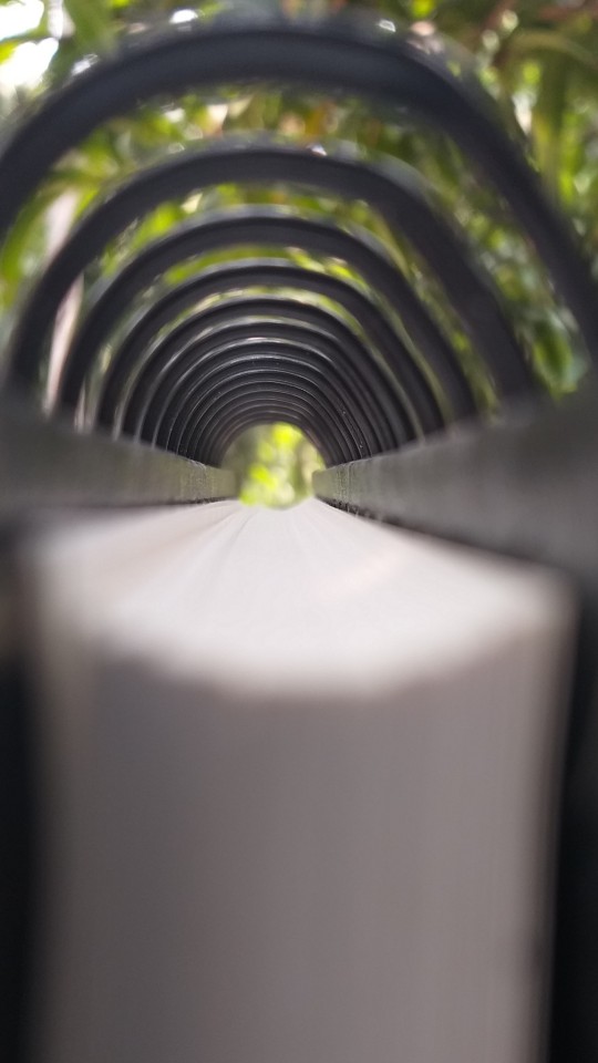
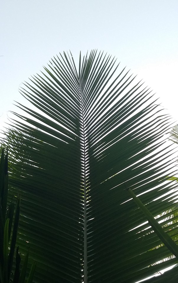
Closure
The closure is one of my favourite Gestalt principles. It’s the idea that your brain will fill in the missing parts of a design or image to create a whole.

Similarity-Symmetry

2 notes
·
View notes
Text
Colour interaction
Fun experiment to study how different background colours affect the colour of an object


Took two of my niece's favourite toys and placed them on coloured papers. Observed the changes. Snapped some pics. I wouldn't say these pictures are accurate. The camera and software altered some colours. But I could see the changes at the time of taking these pics.
1 note
·
View note
Text
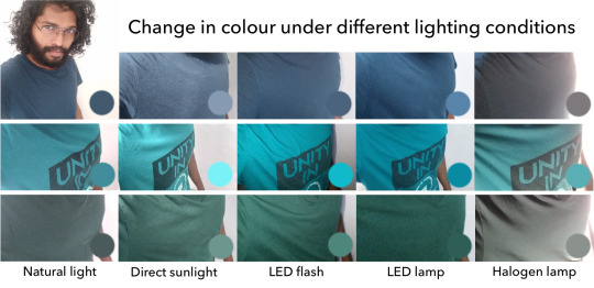
Is there any easier way, to understand colour interaction, than taking selfies?
Same t-shirts under different lighting conditions. Surprised by the results!
3 notes
·
View notes
Text
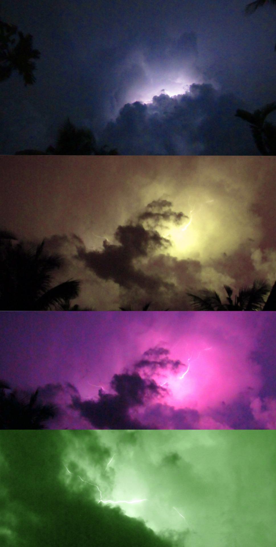
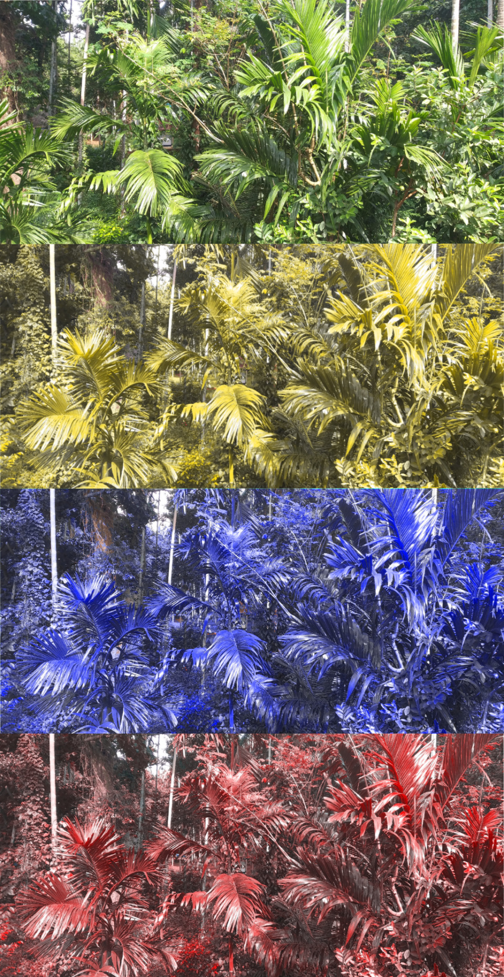
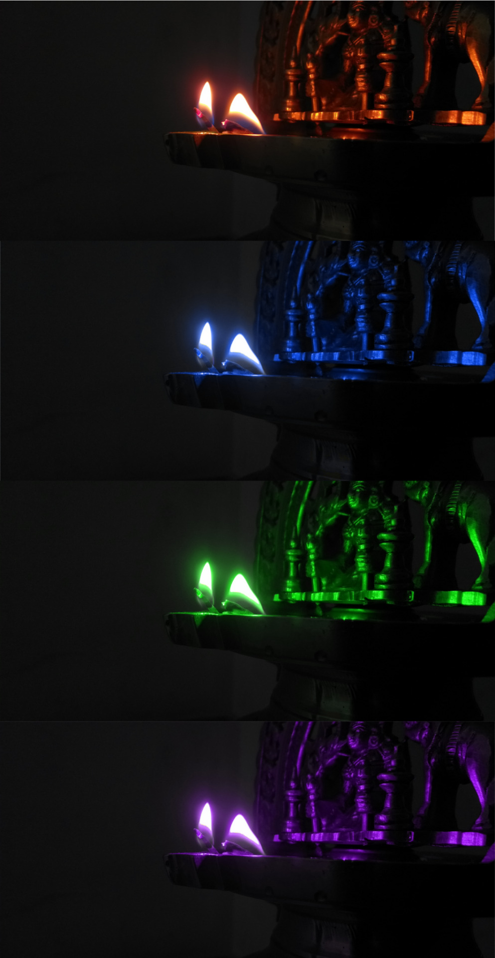
Colour Perception!
Changing colours of objects and images to understand the change in our perception
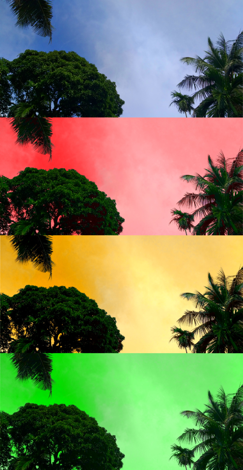




Sky looks scary when we change the blue colour. Creates a post apocalyptic feel.
Moon loses its soothing effect when change the colour. Red and yellow colour makes it look like a planet that is far far away from our solar system!
The fire and light of the lamp looks like a result of some kind of chemical experiment!
Changing the colour of lightning makes it even more beautiful and scary!
Lite colours go well with dark backgrounds. The yellow colour suits the car much better than the red when it is in the dark. I felt the same with my nephew's sandals. The lite colours look more pleasing to the eye.
Changed the colour of my niece's school bag. She loved the red one a lot. Children do love bright colours! :)
Changing the colours of plants from green to others, creates an unknown feeling inside! Can't explain what it is... Something disturbing....not pleasant...
Naseberry looks entirely different in other colours. It looks venomous! And the sweet taste I feel in my tongue when I see one, has changed completely.
3 notes
·
View notes