
Design, with results. Widgets & Stone creates strong brands for leading corporations and nonprofits,
and tools for bringing them to market in meaningful ways.
[email protected]
+1 423-266-2221
1601 Gulf Street 600
Chattanooga, Tennessee 37402
270 posts
Don't wanna be here? Send us removal request.
Last Seen Blogs

louwu
free hugs for louis

annacarissa-blog
one of a kind,

pattypnelson
Ew…(Old Patty Nelson Rp Blog)

amelink66world
Batman and batman

inherentlyindecent
Inherently Indecent
Photo
We’ve Moved!
Find us now over at our blog: here.
We have added a blog feature to our website and are no longer updating this Tumblr feed. Although you will find more/older archives here, so you can pick what you want to see!
Visit us at https://www.widgetsandstone.com/blog
0 notes
Photo
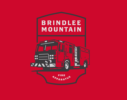
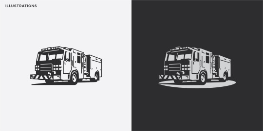


To the Rescue
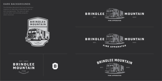
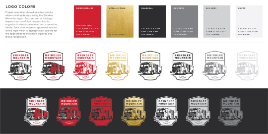
Logo for Brindlee Mountain Fire Apparatus
In 2000 volunteer firefighter James Wessel helped his local fire department purchase a used firetruck. When the truck broke down on its very first call to a house fire and the house was lost completely, they went back to the salesman who brokered the deal looking for compensation. As it turned into a lengthy legal battle, James decided that he could do better. He founded Brindlee Mountain Fire Apparatus in 2001, buying, fixing and selling one fire truck that first year.
In the twenty plus years since then, the company has grown by leaps and bounds — buying, fixing and selling hundreds and hundreds of vehicles every year. But as the company’s reputation and brand equity has grown, the original logo began to lag behind, not adequately expressing their integrity and expertise.
After a failed attempt at logo redesign a few years ago, we were asked to come the rescue. We created a new logo that embraced their rich heritage but also would take them into the next era of growth. We developed a flexible logo system that could accommodate all the many applications: digital, print, apparel and more.
Click on images for a larger view.
Creative Direction: Paul Rustand; Design: Mark Walter; Illustration: David Webb.
#firetruck#logo#logo design#Brindlee Mountain Fire Apparatus#buy fix sell#Chattanooga TN#Widgets & Stone
0 notes
Photo

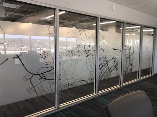


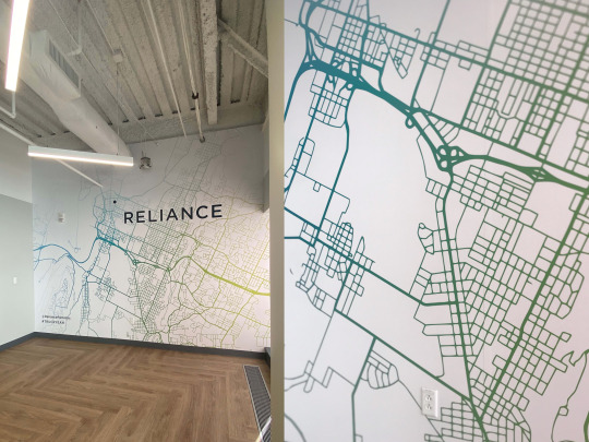
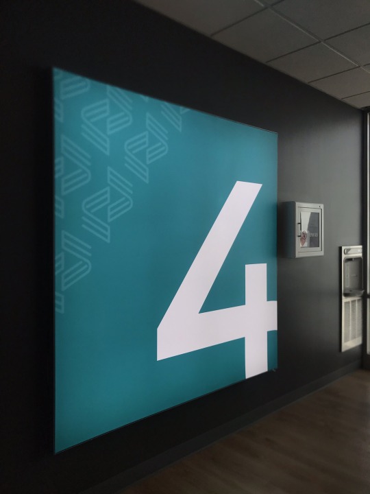
Going the Extra Mile
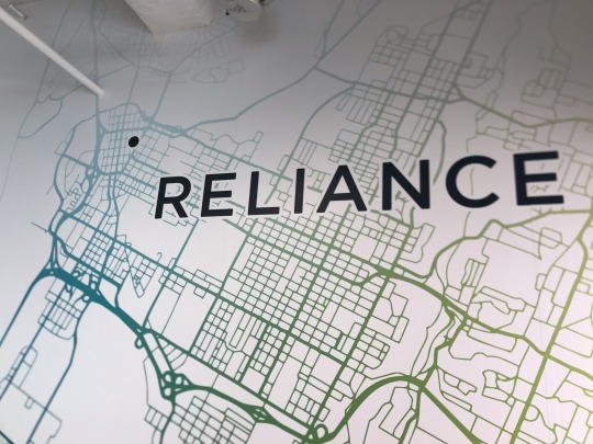
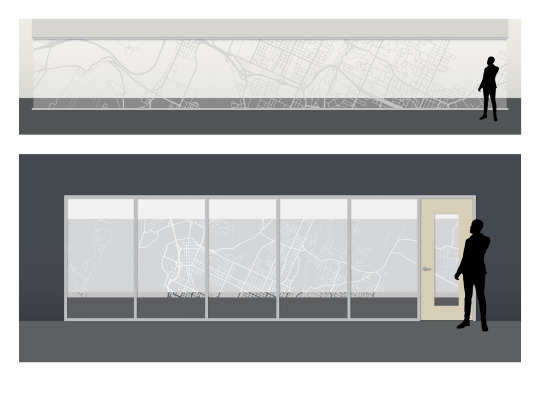
Reliance Partners Environmental Graphics
Reliance Partners helps provide trucking insurance for freight companies – whether they have just one truck or as many as a thousand. The company’s philosophy of going the extra mile for their customers is paying off in dividends and Reliance is growing. So much so that the company has moved into a much larger facility, building out a couple floors to make room for all their employees.
The architects and interior designers at Franklin Architects tapped us to create interior and environmental graphics to bring the Reliance brand to life in the new space. Working closely with COO Laura Ann Howell, our team created signs, window treatments, break room graphics, and “instagram-able scenes” throughout the office.
The end result goes the extra mile to reinforce the Reliance brand in the contemporary professional setting, while adding dynamic visuals to the decor.
Click on images for a larger view.
Creative Direction: Paul Rustand; Design Direction: Liz Tapp; Design: Mark Walter.
#Reliance Partners#Widgets & Stone#environmental graphics#signage#instagram-able#wall graphics#mural#illustration
0 notes
Photo
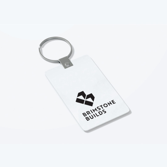
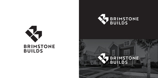

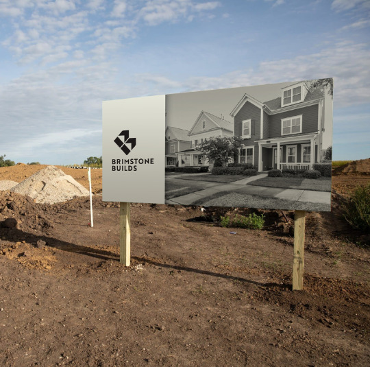
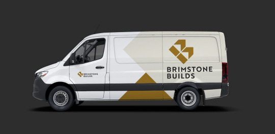
Spec-tacular Building
Brimstone Builds Logo
As Nashville and the surrounding region have continued to grow in population, a new spec home building company saw an opportunity to grow as well. Brimstone Builds sought out Widgets & Stone to create a new logo to help them compete in the market.
Our solution is far from cookie-cutter and is built to last for many, many years.
Click on images for a larger view.
Creative Direction: Paul Rustand; Design: Mark Walter.
0 notes
Photo
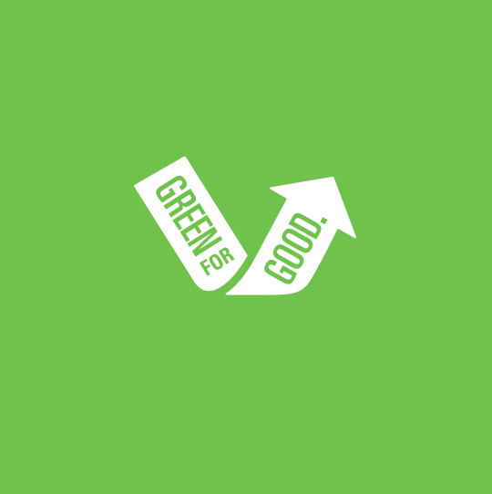


Be Green, Be Good
Green for Good Logo
The Green for Good idea was spawned from Startup Week CHA, in which entrepreneurs were invited to pitch ideas to the city for ways to inspire better recycling practices. Brian Wright’s Green for Good was one of four ideas chosen by the city and awarded grant money to pilot the program and assess the results.
The Green for Good concept is a threefold plan: identify fun, inventive ways to recycle in the home, school, and at work. Businesses and organizations on the Southside that will be participating in the pilot program for the month of January. The Green for Good team will be collecting the recycling on a weekly basis.
Proceeds from the collections will benefit Habit for Humanity. Each participating business will compete to win a Green for Good prize pack.
Widgets & Stone donated a logo to help the cause get off to a good green start.
Click on images for a larger view.
Creative Direction & Design: Paul Rustand.
0 notes
Photo

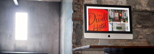


Tinkering with Space, Online
Web site for Tinker Ma
Tinker Ma offers clients their more than 60 years of combined expertise in architecture and design. The name is a play on words, as architects tinker with space (‘ma’ is japanese for “space”). Widgets & Stone created the adaptive logo and identity system for the firm in 2019, and returned to help build a functional and dependable web site in 2021.
Tinker Ma is prolific, with many team members producing many projects around the southeast. With their old web site, they could not update it themselves and had to rely on developers to do it for them, and as a result, the site did not showcase newer work. We set them up on a new platform and gave them a tutorial on how to add and change information themselves, allowing Tinker Ma to stay up to date.
Visit the web site.
Click on images for a larger view.
Design Direction: Liz Tapp; Design: Liz Tapp, Noah Marlowe; Photography: provided by Tinker Ma.
0 notes
Photo

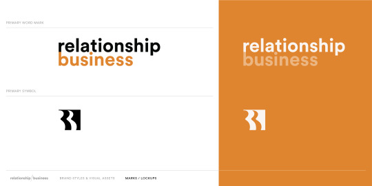
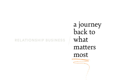
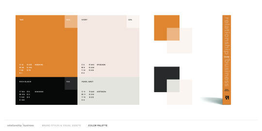

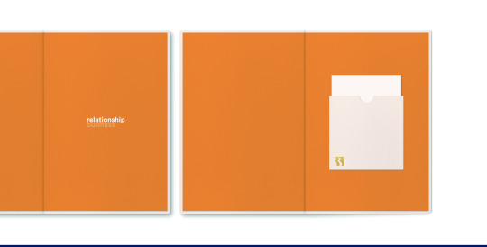

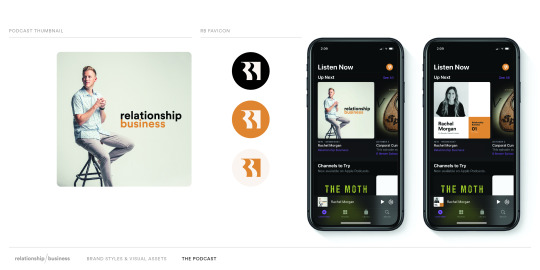

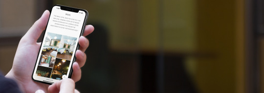
A Good Business
Relationship Business design identity
Relationship Business is the latest endeavor of Goodstory (and Counsel Creative) founder, Kenny Morgan. As a writer, podcaster, and coach, Morgan champions a message of people-over-profit—relationships before business. Keen for a fresh perspective, Kenny asked Widgets & Stone to build a flexible visual identity to unite his many projects. The resulting system hinges on a versatile typographic strategy softened by a nature-made color palette and hand-drawn flourishes.
Be sure to keep an out eye for the book and the podcast as they roll out in the coming months!
Click on images for a larger view.
Design Direction & Design: Mark Walter; Photography: Goodstory.
#Relationship Business#Kenny Morgan#Brand identity#brand design#identity design#publishing#book design#social media design#Widgets & Stone
6 notes
·
View notes
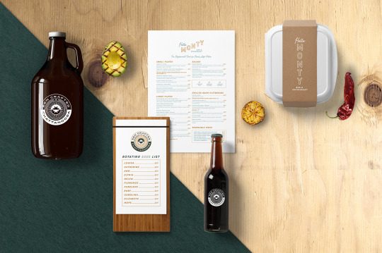
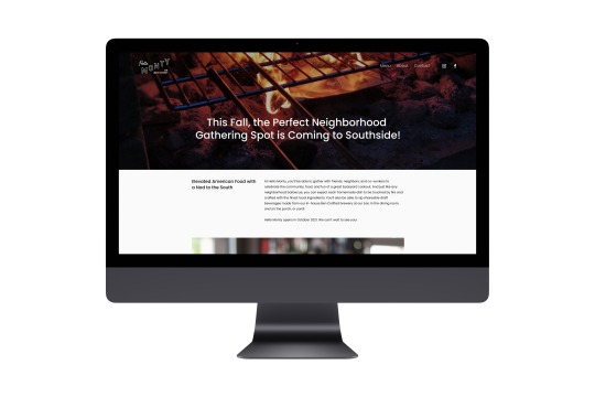
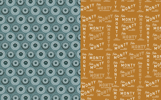
Photo
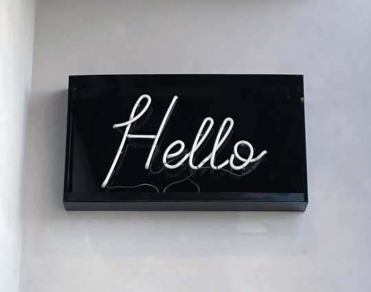
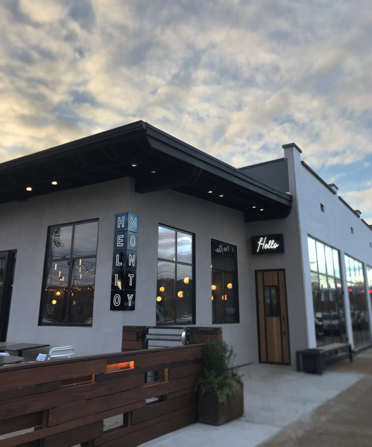
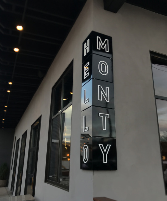
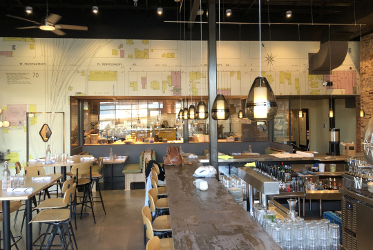
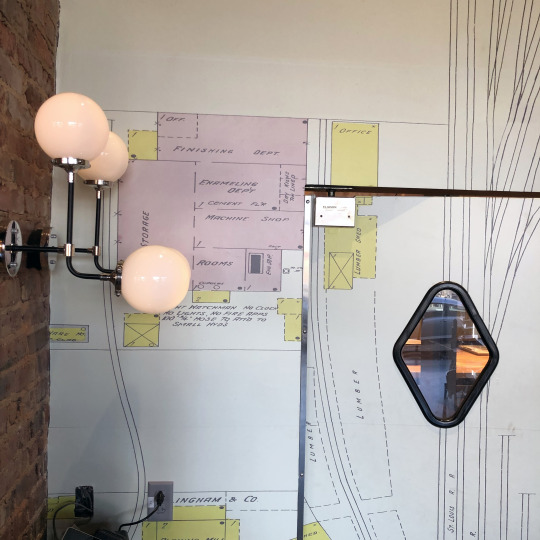
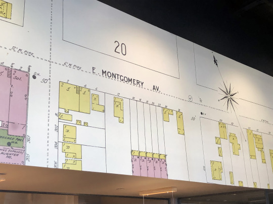
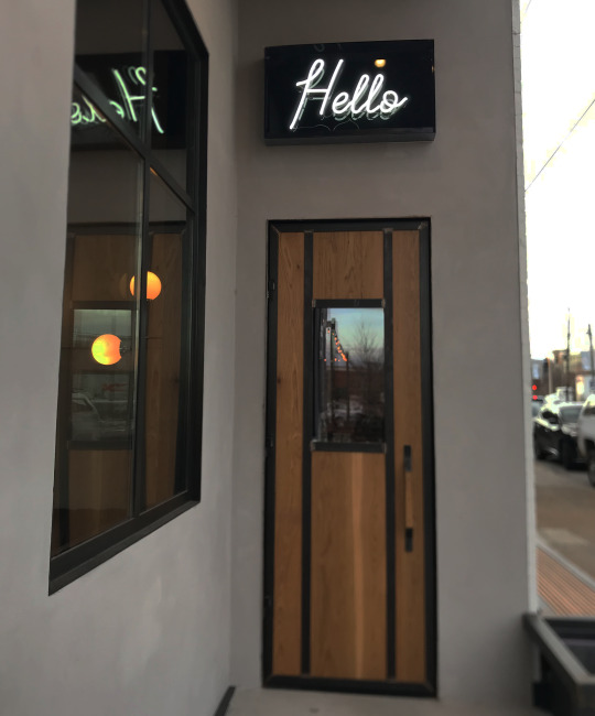

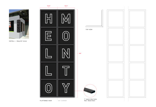

Hello Monty on the Corner
Signage & Graphics
We told you about helping our long time collaborator Rob Gentry as he and his brother Clay worked to start the new restaurant and bar, Hello Monty. The construction was completed and Hello Monty opened to the public in October of 2020. We also were able to help put some finishing touches on the beautiful building remodel Rob and Clay did with Tucker Build: the signs.
Designed to be a classic neighborhood joint, Rob and Clay wanted the signage to be minimal and to complement the building. Art Director Mark Walter expanded on Designer Travis Hitchcock’s stacked type logo and identity to make an elegant sign that took advantage of being on the corner. A bright “Hello” neon sign in the script from the logo lights the way to the slightly hidden location of the front door.
Inside the bar, Mark added a wall mural of a vintage map. While now known as Main Street, it used to be called Montgomery Avenue, and that was the inspiration for the name.
Click on images for a larger view.
Creative Director: Paul Rustand; Art Director: Mark Walter; Designers: Mark Walter, Travis Hitchcock; Exterior Sign Production/Installation: Victory Signs; Wall Mural Production/Installation: Adams Litho.
#Widgets & Stone#Signage#Sign Design#Environment Design#Wall Mural#Neon#Hello Monty#restaurant design#logo#identity
2 notes
·
View notes
Photo
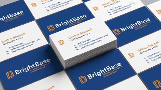

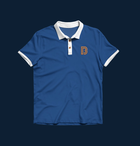
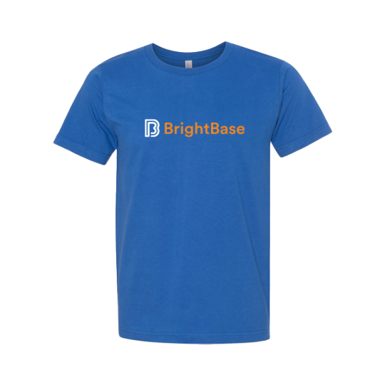
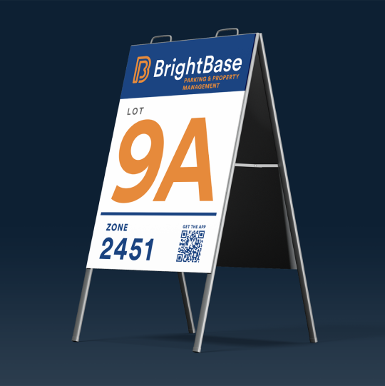


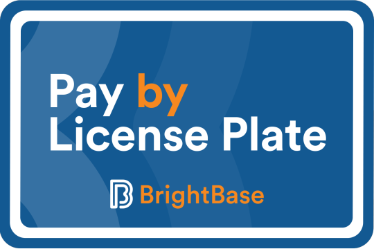

A Bright Start
BrightBase Identity Design
BrightBase Management was founded by the grandson of what is now known as Republic Parking Services. With over 50 years of combined experience, the BrightBase team serves the Chattanooga area with a southern charm that is wise and welcoming.
As an new entity, BrightBase needed branding that reflected the expertise and insight that accompanies decades of management experience, while capturing the loyal, neighborly essence to be expected of a Chattanooga local's entrepreneurial venture. Widgets & Stone helped guide the new company through naming and identity design. The typographic logomark, the brand's jumping off point, subtly connotes driving lanes or parking lines, while grounding itself with a highly legible sans serif font.
The website guides customers and potential employees with bold buttons and simple drop-down menus. BrightBases' web presence is so instinctive, a user could navigate it while driving—though we don't recommend it!
Click on images for a larger view.
Creative Direction: Paul Rustand; Design: Brad Dicharry, Emily Ricks; Photography: Unsplash.
#branding#identity design#logo design#BrightBase#Widgets & Stone#Chattanooga#Parking management#web design
0 notes
Photo

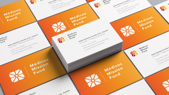


Growing the Mission
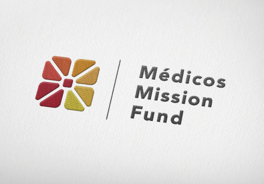
Médicos Mission Fund Logo and Identity
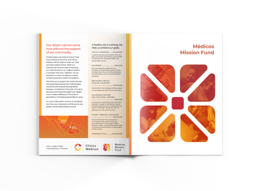
Clínica Médicos was founded in 2015 by Dr. Kelly Rodney Arnold to make quality, comprehensive healthcare accessible to Chattanooga’s underserved Latino community regardless of insurance status, language, pregnancy, age, or gender. In six short years, from their clinic at 1300 East 23rd Street, it has realized that mission by providing outstanding care and empowering the next generation of medical professionals through education and hands-on training.
Now, Clínica Médicos is growing. Dr. Arnold and her colleagues have acquired a new facility at 1148 East 23rd Street — a former automotive garage across from the Sculpture Fields at Montague Park — and will soon offer a fuller range of medical services, including mental health and counseling, dentistry, and more.
To bring this vision to life, they have created the Médicos Mission Fund, a new non-profit, 501c3 organization that will fund the growth of a new campus, outstanding educational experiences for our physicians and high-quality medical services and equipment for the families who rely on Clinica medicos.
Widgets & Stone helped to create a logo that pairs perfectly with the Clínica Médicos identity and dovetails into print materials as well.
Click on images for a larger view.
Creative Direction: Paul Rustand; Design Direction: Liz Tapp; Design: Liz Tapp, Noah Marlowe; Photography: provided by the client.
#Widgets & Stone#Chattanooga TN#Clinica Medios#Medicos Mission Fund#branding#identity design#print design#logo
0 notes
Photo

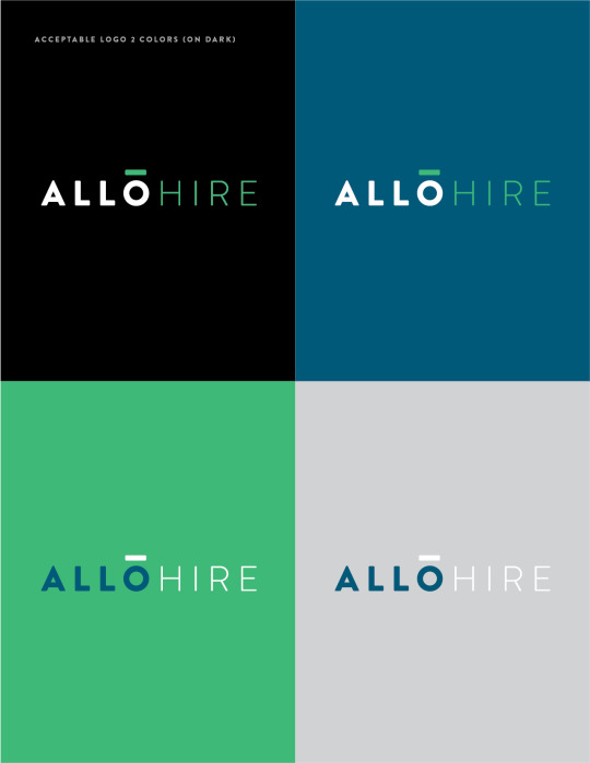
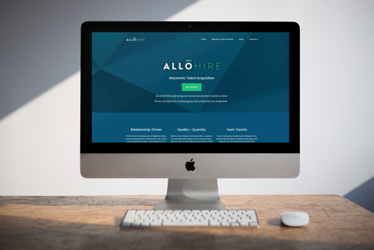
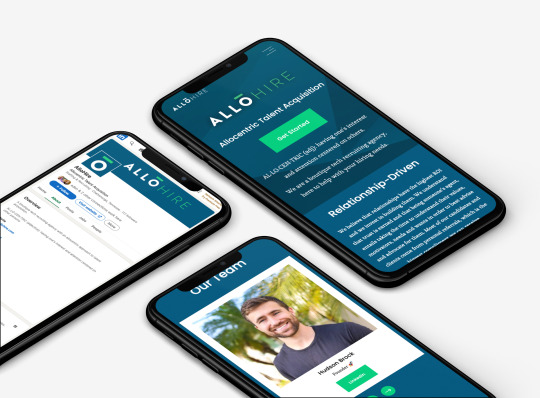
The Opposite of Egocentric
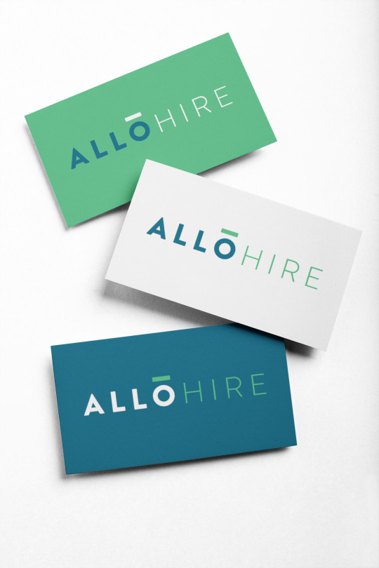
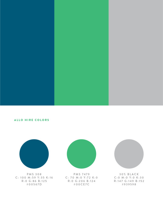
The AlloHire identity design
Founded by Hudson Brock, AlloHire is a boutique tech recruiting agency. They are relationship-driven, they believe in quality over quantity, and they are distinctly tech-centric. For these reasons they drew their name from the little known word “allocentric” which means “having one's interest and attention centered on others.” It is the exact opposite of egocentric and totally fits the young company’s personality.
We created a plainspoken, type-only logo for AlloHire. The macron (the line over the vowel that makes you say “its name”) puts the focus on a single character, centered in the name, hinting at how AlloHire focuses on each individual client. The macron also has connotations of “raising the bar” and moving upward, just like what the recruiters do for their customers.
To go with the logo, we built an extremely minimal web site and helped AlloHire put what they do into just the right words.
Click on the images for a larger view.
Creative Direction: Paul Rustand; Design: Brad Dicharry, Liz Tapp; Writing: Paul Rustand, Liz Tapp, Hudson Brock.
0 notes
Photo


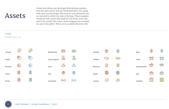

Refreshing the Body
Design update for Lookout Mountain Presbyterian Church
In 2015 designer Benjamin Dicks (formerly a designer with Widgets & Stone from 2012-2014) created an elegant identity design for Lookout Mountain Presbyterian Church (LMPC). The design served the church well for over six years.
In 2021 LMPC Communications Director Anna Moyle asked us to “refresh” the identity and provide design tools for the church’s communication needs. We kept the rose window symbol Ben created, but updated the type and colors and provided an alternate approach – reversing the symbol out of a solid circle.
The design team then updated the look and feel of stationery, documents, brochures, TV displays, and podcast graphics along with customizing an icon set. We also worked with web developer John Reeder to provide a wide array of web module design and styles to be applied to the new web site (which is currently in development). Lastly, we provided the working templates with design guidelines to help the communications team implement the new look.
Click on images for a larger view.
Creative Direction: Paul Rustand; Art Direction: Mark Walter; Design: Brad Dicharry, Emily Ricks, Mark Walter, Noah Marlowe; Photography: LMPC.
0 notes
Photo
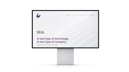
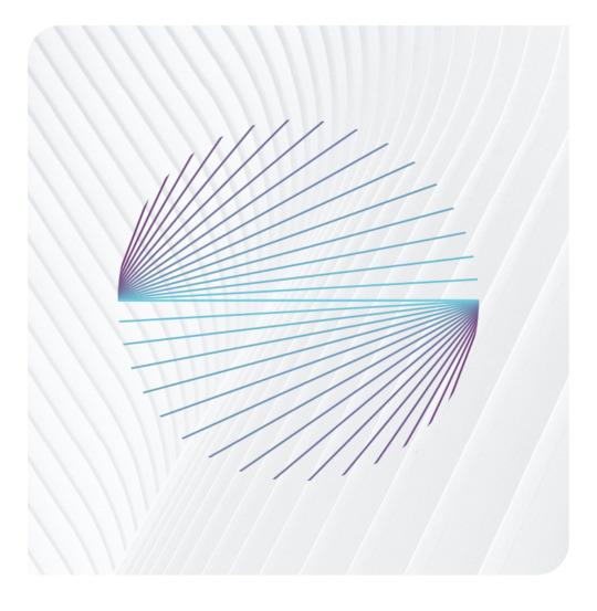


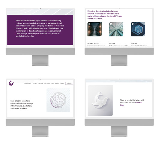
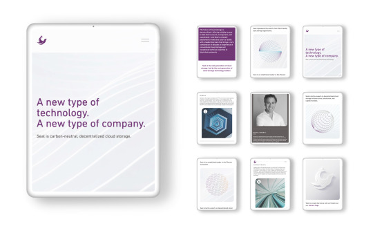
Signed, Sealed, Delivered
A web page for SealStorage.io
Our friends over at Stitzlein Studio helped to create a marvelous rebrand for Seal. They also designed an elegant and to-the-point web page for the company, but they needed help building it.
Design Director Liz Tapp worked closely with Joe and Leslie Stitzlein to build the site to their exacting specifications, and to build it onto a platform simple enough for anyone to use. The result is refreshingly clear and striking.
Visit the site here.
Click on images for a larger view.
Creative Direction & Design: Joe & Leslie Stitzlein; Web development: Liz Tapp.
0 notes
Photo

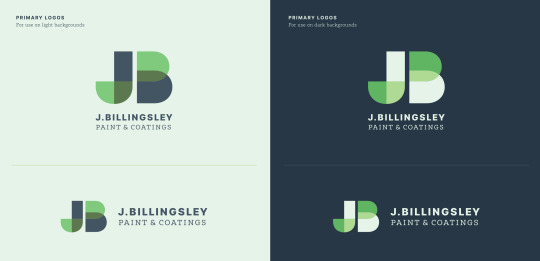
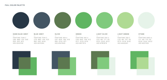
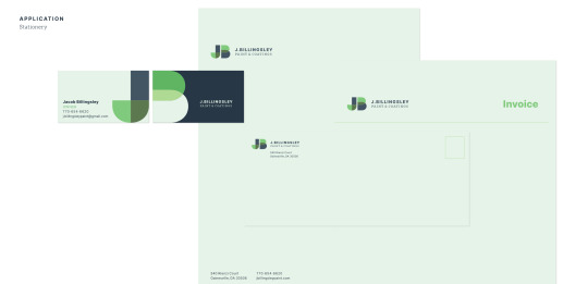

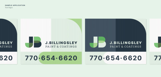
A Perfect Overlap
J. Billingsley Paint & Coatings Logo
Jacob and Sara Billingsley are striking out on their own after many years of experience in commercial paint and coating services. The new company will focus on residential projects.
They wanted to stay away from tired or trite references to painting—paint brush imagery, rollers, cans etc. Our Senior Designer, Mark Walter, decided that a more subtle or abstract reference to paints and coatings – coupled with the use of a monogram – focuses on the professionals at the core of the business. The result helps to differentiate them from your run-of-the mill local house painting business.
Mark wanted the type choices and implementation to lend a sort of blue-collar, hardworking tradesman, no-nonsense tone. On a design-related note: color transparency experiments that play into the final color palette were inspired by Josef Albers. It's an interesting connection that a lot of his color theory work was essentially cutting and arranging paint swatches!
Click on images for a larger and better view.
Creative Direction: Paul Rustand; Design: Mark Walter.
0 notes
Photo
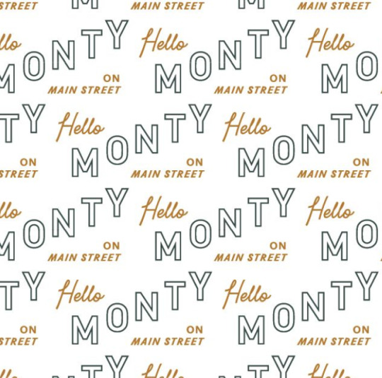


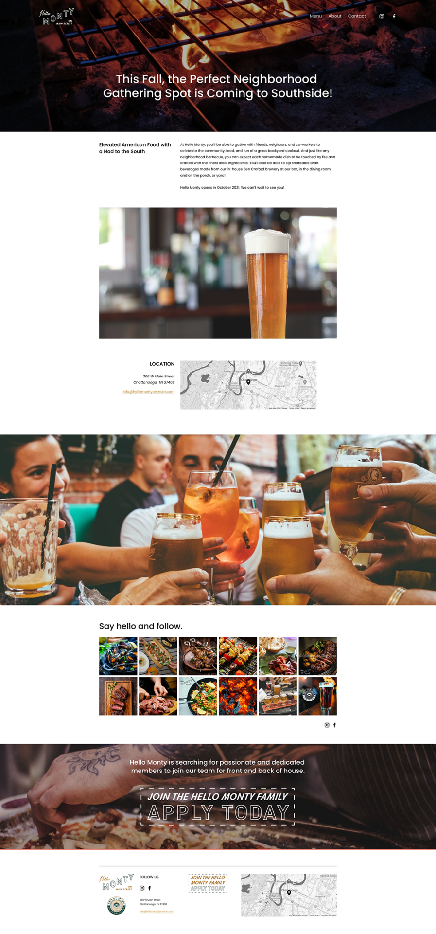


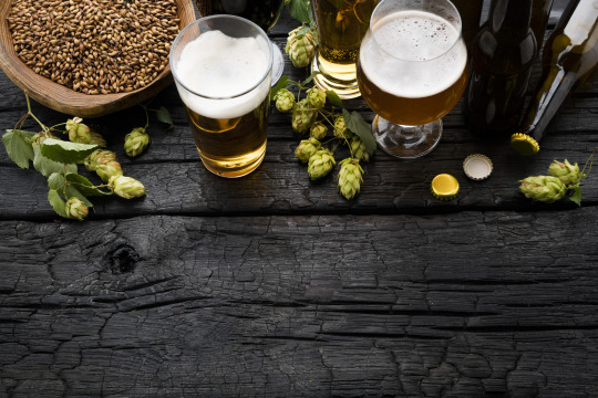
Well Hello Monty
New Neighborhood Joint Opening Later 2021
A new restaurant and bar is opening on the Southside. Brothers Rob and Clay Gentry are Southside residents, Chattanooga natives, and have decades of experience in local brewing and restaurant operations. Rob owned The Blue Plate and ROBAR and is a co-founder of Big River Grille & Brewing Works, which was the first commercial brewery in Chattanooga post-Prohibition. Clay Gentry has been managing brewing operations and designing breweries for Big River restaurants across the country since the 1990s and has brewed professionally longer than anyone else in the city.
Rob has been one of our longest standing customers, letting us collaborate with him on a variety projects, including identities for The Blue Plate, Local 191, Localito 191 and ROBAR. With Hello Monty, we are excited to be part of creating a place that wants to become a gathering spot for the neighborhood – one that serves exceptional food and really, really good beer. The restaurant and beer logos are inspired by good old neighborhood restaurants and bars.
The names Hello Monty and Ben Crafted are nods to one of the city’s earliest proponents, B. “Rush” Montgomery. In the late 1800′s he declared that Chattanooga would one day be the “funnel of the universe!” The new restaurant is located on Main Street, which was originally named Montgomery Avenue after him.
As the restaurant design and build out continue to take shape, we are excited to grow and develop the identity design to reflect it’s personality. With a very talented brew master, a James Beard nominated chef, a menu featuring live fired food and a great space, Hello Monty won’t disappoint. Visit HelloMontyOnMain.com to keep up with this great neighborhood joint.
Click on images for a larger/better view.
Creative Direction: Paul Rustand; Design: John Le, Travis Hitchcock, Mark Slawson, Noah Marlowe; Photography: various stock sources.
#Hello Monty#Ben Crafted#logo design#identity design#restaurant#bar#grill#Chattanooga TN#Widgets & Stone
1 note
·
View note
Photo


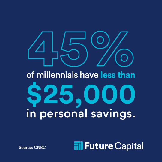
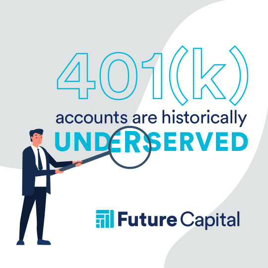

The Future is Now
Social media designs for Future Capital
Future Capital (by ProNvest) offers a suite of financial tools that takes the heavy lifting out of planning and investing for retirement by automating the day-to-day work of managing your retirement accounts. Their technology gives you access to institutional investment advice and management at a low cost.
While Widgets & Stone was helping develop designs and illustrations for an explainer video for ProNvest, we were also creating a graphic style that could easily move to their new brand: Future Capital.
The sharp and fresh illustrations we created paired perfectly with the expanded ProNvest / Future Capital color palette to create an inviting set of social graphics for the experienced members of the ProvNvest team to spread the word about their state-of-the-art account analysis tools.
Click on images for a larger view.
Design Direction: Liz Tapp; Design: Liz Tapp and Travis Hitchcock; Illustration & Animation: Travis Hitchcock.
0 notes
Photo


Chattanooga Design/Creative Companies
A relatively up-to-date list
A basic overview of the city’s creative companies: anyone related to design, web, advertising, branding, marketing, strategy, film, video, writing and the like.
Atomic Films
Brightside
Carbon Five
Crash Creative
Derryberry PR
Fancy Rhino
Full Media
Goodstory
Hagan Copy (Good Words)
HEED PR
Humanaut
Johnson Group
Level2D
MaceCarmichael
Maycreate
Myna
ND&P
Papercut Interactive
Pathfinder Films
Q Strategies
Roundtree
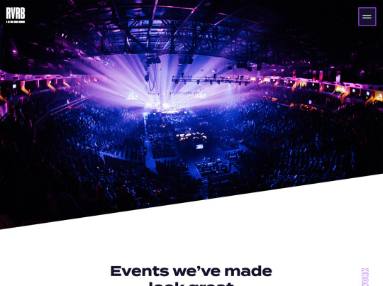
RVRB
The Sasha Group
Simple Focus
spectruss
Strafire
Super Chief
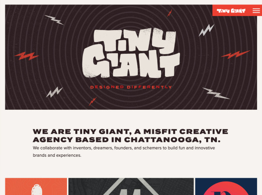
Tiny Giant
Tubatomic
Whiteboard
0 notes