#aaa i'm reading and i have lots of missplesings sorry about that aaaa
Note
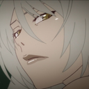
I'm sorry this isn't a commission, but I just have a question about your art. Feel free to ignore this, of course. I was really amazed by your Miku drawing from December 16th. Seeing such a high-level piece, I wanted to achieve something similar, but no matter how much I try, I can't replicate your shading and highlights. I was so genuinely curious that I couldn't sleep. Could you possibly give me any hints or advice?
Hey, sorry for making you wait so much for this answer, i've been finishing some projects and i barely had free time. Anyways i'll try to do my best on explaing my coloring and lighting methos and you also asked me to explain how i create the folings of the clothes. Please take in consideration that 1 i am not native in english so it's a bit difficult for me to explain myself sometimes in this language and i may have some misspelings, sorry about that, and also 2 i am not great at explaing my drawing process bc i kind of turn off my brain when i draw lol, but i can explain the fundamentals that i know and help me create! Last thing i want to let you know is that i've started glazing my art, this is a metho to protect the images for AI images generators and it leaves a kind of pattern /effect on the image that i did not put there during the drawing process.
with all of this said let me start explaining things!
Learn the basics:
This may come as a cliche i guess, but yes my first ever advise to anyone is learn the basic theory on lighting and colors (on anything related to art tbh). You don't really need to spend a lot of money on books and such as there are lots of resources online like videos and documents you can read for free. It's not necesary to be an expert and even the smallest mount of knoledge is enought to inpruve your art a lot! , i find it very interesting to learn the way things work too so don't think you'll get bored of it!
To be frank, i am actually not very good at lighting lol. My lights and shadows are not very correct, but since i do have a lot o control over my colors and i know very well how to used them it kind of compensates and creates a very recognisable (i think) style.
just u know basic shitty advise that everyone is going to give you but it works! if you have free time try watching some videos or reading some documents about color theory shadow and lighting!
Your working space:
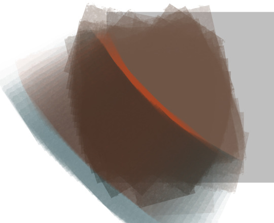
So this is something that works FOR ME not everyone likes it, you can try it see if you like it and if you do, cool! if you don't … that's cool too! When drawing on digital i prefer it when my base layer is grey instead of white. It helps with my headaches too but it's more about the fact that starting in a middle tone when coloring (in my opinion) makes the process of briging out both shadows and lights easier, let me give you an example:
Drawing from complete light (white) to compplete darkness (black) may condicion you to actually lose control in the contrast betwen these areas, i prefer staring in a middle place (grey) and that way is i want to show darkness i'll use a darkr color and if i want to show light i'll use a lighter color, but if i start on white i can't use anything lighter. I think i did a HORRIBLE job explaing myself there, but yeah it just helps me control my color valius a bit more lol.
this is the color that i used:

Another inportant thing about your woking space is you brushes, in my case i prefer using textured brushes that mix well, and i prefer using very thick strokes, if it's too think i'll just color pick the transparent color and ease it! I work in CSP i don't know what you use, but just in case i'll give you the setiings of the brushes i use the most with their codes so you can find them


Sculpting with lights and shadows
As i said before, i am not very good with light yet, so this is something that i do to help me with the process. When you think about it, lighting is used in art to give volume to the piece, not in every case bc rules in art are not there to be followed but to asist us when we need to take a creative decision. The way that we can start with our Sculpting is by creating a very easy first guide othe the shadows and lights and to do it with very big block, so that we get the general shape first,we don't neet to get lost in the detailds yet
The actual coloring
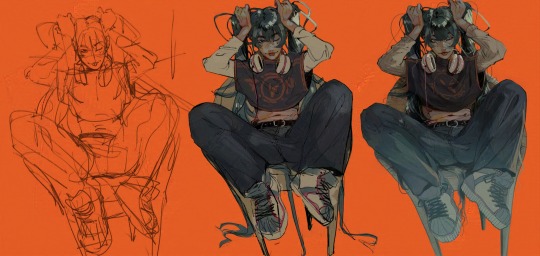
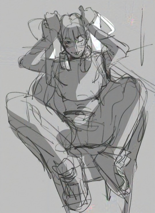
When drawing my process is divided in three stages. I first create the doodle/lineart, that doesn't neet to be super neat as i will fix it during the rendering. The basic colors, and the rendering.
During the preparation for the rendering when doing the base colors i recomend that you give special atention to the focal points of your illustration, in this case for example that's her face and the top of the hair, that's why i gave so much more atention for this part in comparation to the shirt, that it's literally not shadowed yet. Then another step that i use normally before rendering and that i can NOT RECOMEND ENOUGHT!!!! GO WILD WITH THE COLOR CURVES!!!! OMG!!!! THAT STUPID LITTLE TOOL IS SO FUCKING COOL!!!!!!!!! like for real, it gives effects that i have not been able to achive in any other way and omggggggg use the fucking color curves pleaaaaaaseeeeee
ok i'm notmal again , lets continue.
For the rendering i usually convine all the layers of the drawing on one layer, then use a textured brush that has low opacity of mixes very well fot the actual work. Tbh here is very i can't really help you a lot, bc i have no idea what i'm doing when i render i just don't know, the only thing i recognise is that i try to esare or clean the lines from the doodle/lineart, and i focus a lot on creating volume in the places that are more important.
Skins
An specific thing that i do a lot when it comes to coloring skin is using an undertone in red (literally) I will put the basi color, use the brush to mark where i want shadows to be in a very vibrant red and then use a blue / green / pruple (depends on the skin) to finish the shadowing. Thios metho is nice for lots of occasions, but take in consideration that it doesnt work for example for very dark scenarios where the character is suppoused to be in the shadows, as that red tone works as a outline for the light. It just depends on the situation.
Clothes foldings:
Ok so here the only thing i can give you an advise with is to remember that the way that clothes fold dependes on gravity and that gravity works in curves most of the time that have two (or more) attachment points that are going to determinate theit trajectory. Example:
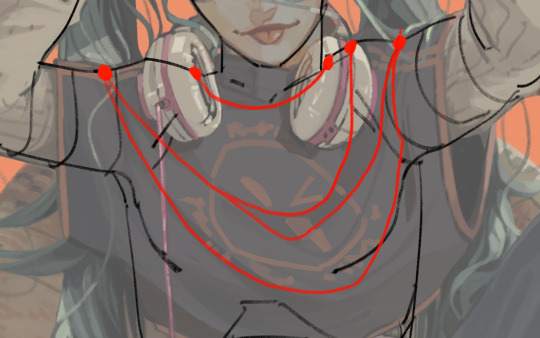
And remeber that this creates (again) a volume, that there is an inside part, that it's probably going to be draker, and an outside part, that it's going to be lightter. With this info you can start practicing with images of clothes.

this is as much information as i am able to recolect on my coloring process bc i am horrible explaining , spacially on text and in english, and i am also not very much aware when i draw, i kind of disconect. I still hope this is enough to help you a bit on your learning journy.
I may try doing a video at some point if i ever have the time so i can explain my coloring while i actually do it bc if not in that situation i'm not sure i'll be able to remeber what it is that i did.
My last piece of advise is to watch speedpaints and livestreams of artists you like during their drawing process and maybe even tray to imitate them while they are drawing to see what it is that they do exccly.
hope you have a good day and lot of lucks ! be proud of being able to create and be proud of being an artist!
#my art#art advice#color and light#aaa i'm reading and i have lots of missplesings sorry about that aaaa
218 notes
·
View notes
Last Seen Blogs

hockeyplayerfan
Manly Man Fan

bigbenaward
BIG BEN AWARD

clairvonta
CLAIRVOYANCE

jbeer-ja
日本のビール情報
mizunoyukino
Young men are all tsunderes, you know.