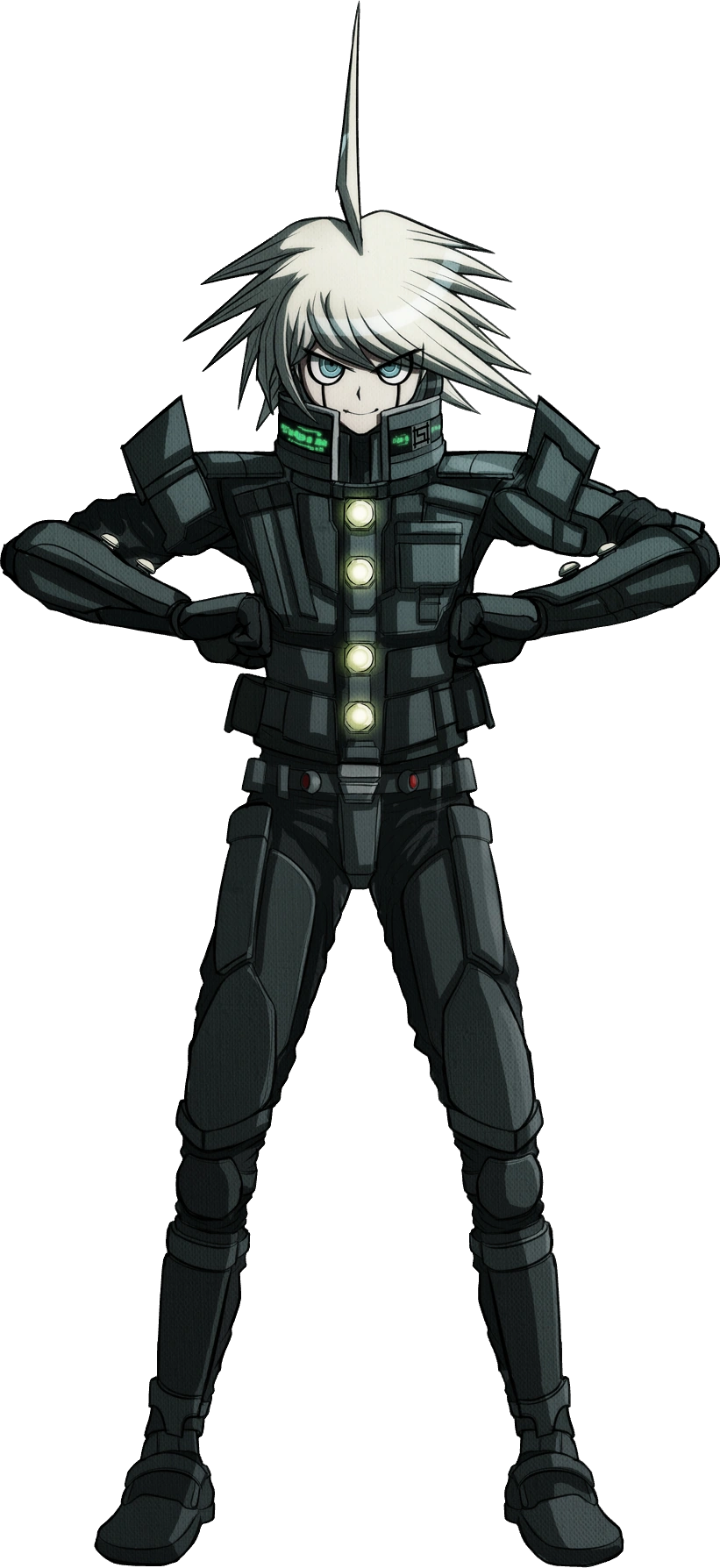
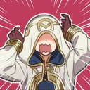
#and it's really good the contrast compared to her default outfit
Text
It feels it's been so long since the last gacha skin i've loved so much...
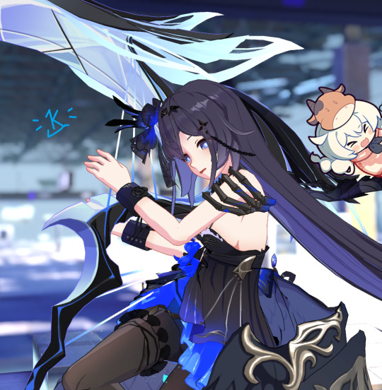
And weapon skin!! Soo pretty...
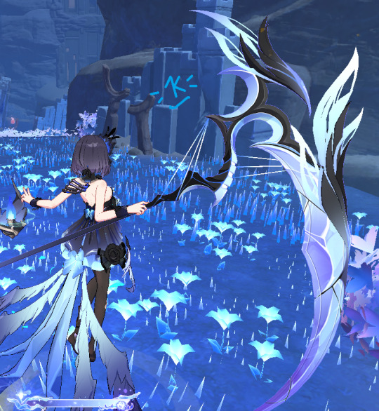
#honkai impact#seele vollerei#herrscher of rebirth#horb#man the effect of her combo in Life Binder form it's sooo good!#and it's really good the contrast compared to her default outfit
13 notes
·
View notes
Note
i luv ur dr art recently @_@ if you don't mind me askin who are ur fav dr characters design wise (not personality/story?)
LOVE when people ask me stuff like this yes - i'd gladly <3
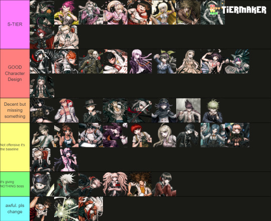
Only included DR, SDR2, NDRV3 - we'd be here forever if it was the entire franchise. Also only accounting for their ingame default outfits
The placements on each tier is deliberate, the closer the character is to the top of that tier, the higher they are. I judge them by:
>Prominence of the Talent, its practicality
>Relevance to the character's identity/personality
>Colour and aesthetics :]
[ramblings undercut]
[S-TIERS]
Like Gundham for example is an S-Tier design as it ticks all above boxes whilst still in a school uniform. The Four Dark Devas are important to the design, they go with him everywhere and the 5 of them are a UNIT which shows his strong connection with animals. I love the bandages and the eye-scar as it has a double meaning that indicates yes he works with animals (they can be rowdy), but as a character Gundham builds onto this detail using these scars to create this dark angsty facade. Aesthetic-wise by his hair he has a unique character silhouette, and I like how his purple is made the focal point by the blacks and whites of his uniform... both reinforcing the villain-facade and highlighting the importance of the Four Dark Devas.
Similar reasonings for the other Top 2 of Souda and Miu this time toppled with the strong yellows and pinks in their design. It's eye-catching and easily conveys what their talent is. (I really wish they kept Miu's promo-art backpack into her regular sprites, imagine her emoting with 4 arms isn't that awesome >:] )
Honorable mention to Impostor (Twogami) as well. While the regular Togami design is... mid. I really appreciate how contrasting Impostor's colours and accessories are down to the necktie and poses! Like yes they are impersonating Togami, but their values and personality as a person are not the same. The deception of Togami's dark clothing vs honest white suit of the Impostor's. Impostor fucking CLEARS regular togami any day on all accounts I will die on that hill.
[GOOD CHARACTER DESIGN]
A lot of the talent indications on this tier are more subtle in compare to S-tier but they get the job done and they do it in a pleasing way (I like the colour palettes on Chiaki, Mikan and Ibuki for example). Like I loveeee Sonia's uniform especially for it's simplicity. And yet the design still alludes to the Princess talent by elegance in the bow, the brooch, her crowned braid and how the shape of her skirt resembles that of a puffy princess gown. I also think the reds in the design like Snow White are a cute touch!
To me, Sonia should be the standard in what a Danganronpa design SHOULD be in accordance to detail.
[BAD CHARACTER DESIGN]
[ie the Green and Blue tiers]
Reasoning why I put them here mainly because of wasted potential, either too basic (in a sense it doesn't tell much about that character) or not practical in any way for their talent... I HATE Ryoma's stripe leggings ik he went to prison but the execution of the concept looks awful.
And I hate Akane's and Sakura's outfits particularly cuz you KNOW why they made those skirts so short and I hate that. We could have gotten awesome gymnast of martial artist outfits but no......
I added Kiibo in that bottom tier because structurally even as a robot he is a visual nightmare if you're an artist trying to draw him. Especially when most of his suit is different shades of black and complicated chest cavity. And I despise the way that it looks like these robo-plates are attached on top of what looks like fabric long sleeves and pants as if the designer was too scared to fully commit to him being a robot. He is NOT 3D-optimised and he is NOT animator-friendly I'd throw up if I ever had to deal with him.
#ask stufff#stufff rambles#danganronpa#dr#sdr2#ndrv3#this is so unnecessarily long idc i love talking about design details i will have this#i was gonna start COLOURPICKING... and ANNOTATING dude shits serioussss
39 notes
·
View notes
Note
Hello! Since you seem to be getting a lot of character comparison asks, I figured I’d ask if you have any thoughts on the similarities and differences between Ken and Koichi, and also their relationship with darkness? At first glance they seem very similar but I feel the way they view darkness- and perhaps the darker parts of themselves- differs quite a bit.
The two of them definitely have similar base profiles at first, but start to really veer off in different directions after that!
I think the one thing that's most different between the two is that, quite simply, their "base personalities" -- that is, how they act in normal situations separated from all the stuff going on with Digimon fighting -- are actually fairly different to begin with. One thing that might surprise people is that Kouichi actually uses the more assertive/aggressive pronoun ore, contrary to what his supposedly “shy” personality might suggest (of the Frontier boys, only Tomoki uses the more polite boku, and I think it’s in line with Frontier generally portraying its kids as less naturally well-behaved and a bit more misfit). Kouichi’s “shyness” in Frontier is really implied to just be out of the circumstances of him being a bit awkward around the kids he’d been fighting for a period, and especially not sure how to approach Kouji, but Things I Want to Tell You implies that he’d actually had a full-on social friend circle (mentioning friends at school and playing soccer). The only part that made him “out of place” like the other Frontier kids was really the part right before the series, when he learned he’d had a brother, had to question what that implied, started fostering feelings of jealousy towards him, and ended up “passed over” for being chosen instead of how Kouji was, but for the most part his personality doesn’t seem to be that fundamentally different from Kouji’s (there's a point made in a scene in Frontier episode 40 where the twins are looking at Takuya with nearly the exact same expression).
Ken, on the other hand, does use the polite pronoun boku, and although he’s still a fairly casual person (his speech pattern is slightly more casual than Takeru’s), he is kind of...a polite nerd, for lack of a better way to put it. That penchant for intellectuality wasn’t entirely the Dark Seed’s doing -- he’s gone on infamous “trivial fact” spiels like about the origin of Christmas or Japanese hot springs. In contrast to the more easygoing Daisuke, he takes things really seriously, and one could describe him as “so overly serious about things he sometimes rolls into stupid”. He’s also rather tidy (he puts his chopsticks neatly on the bowl when eating, his Digital World outfit is his school uniform, he’s constantly tucking in both his summer and winter blouses, and even his Kizuna outfits are slightly formal), and because he does seem to carry himself softly, he has a stronger image of being a “nice and polite person” who doesn’t act roughly by default. Less so because he can’t be rough or aggressive, but more because he doesn’t want to be -- you can think of him as basically holding back his cards until the time is right or stronger force is called for (meaning he can seem mild-mannered, until he suddenly drops some sassy zingers right when you least expect it).
There are some similarities that go beyond their base profiles; it’s interesting how “jealousy” seems to be part of both of their initial motivations (and, in an interesting meta twist, one of the original ideas for Ken and Osamu was for them to be twins). However, as you said, they have a somewhat differing attitude in terms of what “darkness” is, and a lot of it has to do with a combination of what that even means in Adventure/02′s narrative versus Frontier’s, and what that meant to each of them personally. Ken had an outright self-inflicted identity crisis and an awareness that his fall came from his own personal vices, and the issue is casted in Adventure/02 as a problem of “balance”; Ken himself understands in 02 episode 23 that he has to accept everything in himself, and Takeru reminds him in 02 episode 37 that you can’t eradicate it entirely, but Ken of course retains an aversion to contexts where they’re obviously too much in excess. Kouichi, on the other hand, was probably not going to have a complete emotional meltdown to that degree had it not been for Cherubimon’s interference (although he still wasn’t necessarily having a great time), so being free from that influence means that, with his head cleared, he’s able to confidently deny going back there again and have faith in his ability to use it for good, especially because the part keeping it balanced -- his brother Kouji, as the light -- is able to be there and fight alongside him. His problem was addressed by learning to work alongside and get to know said brother, instead of living in jealousy of him.
It’s also interesting to see how their future plans end up going, since we now have “distant future” canon material for both 02 and Frontier; Ken had “expectations” put on him to the point it practically ripped him apart and gave him an outright identity crisis, so his future involves him allowing himself to not have to live to expectations nearly as much; by the time of Kizuna, he’s still dabbling in soccer and various hobbies and being chaotic with his friends, his “psychology” degree is not even mentioned anywhere except in his official profiles because of how much it’s a comparative non-issue in his life at the moment, and while he’s certainly still selfless, he’s still at the point where being able to just enjoy life as it is at all is a big deal. Even if he hasn’t found a goal in life to completely commit to yet, at the very least, he has the other members of the 02 group to support him, and it’s still important that he’s dedicating his efforts to supporting them in turn. Kouichi, on the other hand, didn’t have to worry about that kind of identity crisis, but he did have to worry about seeing his mother’s selfless streak meaning she was constantly ruining her health for others -- so, having taken on some of that selflessness, he’s decided to single-mindedly pursue a dream of going to medical school to help his mother. Keep in mind that he arguably has an even higher hurdle than our other single-minded prospective doctor, Kido Jou, because unlike the Kido family’s existing esteemed line, Kouichi’s not-exactly-well-to-do background means he’d had to scrounge up funds by being a paper boy while he was at it -- so that’s a pretty big uphill battle he’s taking, but he’s doing it because he knows that’s what he wants, and he also has his brother properly keeping up with him, and in touch with both him and his family situation.
#digimon#digimon adventure 02#digimon frontier#ichijouji ken#kimura kouichi#ken ichijouji#kouichi kimura#shiha's ask box#justmakeleftturns
79 notes
·
View notes
Text
Cranberry
The ideal Holmes is tall and dark with sharp edges and an intelligent look to him, but also posh and with a sense that you could fold him into origami if you really tried. Dresses well, but wouldn’t look out of place sprawled dramatically over a couch in a dressing gown with a pipe and surrounded by drug paraphernalia. Once made a pillow fort and sat in it to think. Caught somewhere between handsome, pretty, and weird looking. Emphasis can be on any of the three. CANNOT have facial hair.
Holmes Adaptations
S-Tier

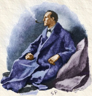
Miss Sherlock (Yuko Takeuchi) - 95%
You’ll notice, of course, that nowhere in the earlier description did I say Holmes needed to be white, a man, or even human. None of those qualifiers or the lack-thereof prevent someone from looking the part -- it simply becomes necessary to compare them to the characters around them. And when I picture a female Sherlock Holmes, Yuko Takeuchi embodies the exact image in my mind. Her sharp edges, piercing eyes, and impeccable fashion, along with the powerful weird energy she brings to the role, fit Sherlock perfectly. She does look more than a bit like she could kick my ass, but more in the manner she dominates the room, which is perfect for the character.
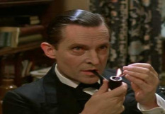
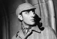
Sherlock Holmes (Jeremy Brett) - 85%
I haven’t watched this adaptation, though I’ve been meaning to get around to it. So this ranking is based solely on screenshots and promotional images. And honestly, as ugly as i find this guy, he totally nails it. He even kind of looks like the illustrations in the stories. I won’t give him a perfect score because his hair could be darker and his face is a little small, and there’s just barely something missing. But as far as “canon” Holmes adaptations go, he’s the cream of the crop.
A-Tier
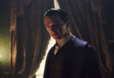
Sherlock: The Abominable Bride (Benedict Cumberbatch) - 80%
Definitely the more accurate of the two Cumberbatch Holmes designs, the sleek fashion and slicked back hair complement Cumberbatch’s angular build and “somewhere between pretty and just weird” face. He’s tall, dark, and posh. If there’s anything holding him back it’s simply that even dressed up properly, there’s something still a bit modern looking about him.
Fate/Grand Order - 78%
Given that his design and presentation are a direct reference to both Brett and Cumberbatch’s portrayals, it’s a given he’d place so highly. It’s really hard to nail down a 2D Holmes, especially in the anime style this game employs, since it has a tendency to prettify characters by default. True to form, FGO Holmes is far neater and more precise than I’d like. But he’s by no means a bad design, and depending on the image he can really hit the spot for me; he’s definitely a chart topper in the realm of 2D Holmes.
Sherlock Holmes: The Furtive Festivity (Gregory Johnstone) - 75%
There aren’t many Holmes that we only get to see as an old man, in no small part due to the ACD estate’s notoriously malicious copyright practices. Johnstone ranks so highly not due necessarily to the details of his look, but the overall feel he embodies. This Holmes is soft, affectionate, more than a little floppy. His hair and costume portray a man well grown into his eccentric life, and his face is sharp and mature enough to suggest the brains underneath; even if that’s more wisdom than intelligence in this particular story. This is a Holmes designed by someone who really loves Sherlock Holmes, and it definitely shows.
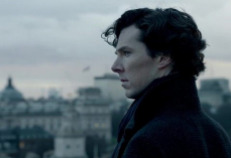
BBC Sherlock (Benedict Cumberbatch) - 75%
Cumberbatch’s features still naturally suit Holmes well, and he’s tall and striking enough to cover the rest. But this isn’t a rating of his acting performance aside from the visuals it supplies; it’s hard to modernize Holmes, especially since it makes perfect sense for Holmes to gel well with the changing times; he was always a man ahead of his era. BBC Holmes’s trademark trenchcoat and curly locks aren’t traditional Holmes, but they suit him well enough.
Yuukoku no Moriarty - 73%
The long hair is an unorthodox take, but I'm certainly not complaining. YnM's Holmes definitely nails the youthful scientific exuberance of an early Holmes. It's clear they were going for a sort of BBC/ACD mix, but with their own spin. Pretty -- he is an anime boy, after all -- but all sharp edges and full of energy. Decent, way better than most anime Holmes designs manage.
B-Tier
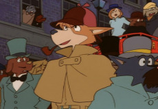
Basil of Baker Street [The Great Mouse Detective] - 70%
Comparing the character to those around them is especially important when it comes to non-human characters, who naturally don’t have the same features. Putting Basil next to Dawson makes this abundantly clear, as they make a perfect portrait of Holmes and Watson. For a mouse, he’s thin, angular, even a little ratlike; all decisions that suit Holmes well. I have some complaints about his ensemble, though; while the dressing gown suits him well, his normal brown coat and hat don’t work so well with his fur; the monochrome look makes him come off a bit scruffy and unrefined.
A Study in Black - 68%
Rules are made to be broken, they say; here’s a Holmes with well maintained facial hair and who’s shorter than Watson, and yet I can without question say they were the right decisions. This Holmes takes a very different design approach than any other on this list, even the other modern takes, but he embodies the spirit of Holmes much more than if he’d tried to match every detail. Holmes is still gaunt and striking, eccentric and fashionable. He looks absolutely great.
The Private Life of Sherlock Holmes (Robert Stephens) - 62%
Stephens in this role is, I have to say, far too soft. But he’s playing a different sort of Holmes, and I can’t resist keeping him here. There are some parts of the look he has down; he certainly looks high class, and the softer elements of Holmes’ character look good on him. Holmes’ traditional costume, the hat and coat, look out of place on him. But that suits the message of the film, and may very well have been intentional.
C-Tier
Dai Gyakuten Saiban - 58%
Not the only blond Holmes on this list, but it doesn’t suit him as poorly. From a character design standpoint, it looks very good. As a Holmes, it’s unorthodox. He’s not gonna be a chart topper with it, but I wouldn’t rule it out. This Holmes’ real problem isn’t his coloration, merely that he’s much too conventionally attractive. His jaw is a bit too wide, curls a bit too lovely, the peek of lavender under his coat a bit too rich, and I can’t look at him for too long without blushing. Do some cocaine and get back to me.
Sherlock Holmes (Basil Rathbone) - 55%
Now, this one might be controversial. I don’t think Rathbone Holmes looks very good. I can’t put my finger on why; his head is the right shape, his nose very sharp, though his face looks very smooth and he seems overall vaguely packed in. Like he was plucked out of the sky just before walking on set. The shapes are all right, it just seems off to me. I guess what I’m getting is that his look is too obviously produced. He looks too much like an actor portraying Holmes, rather than Holmes. But I know he’s gonna be the guy a lot of people swear by, so I won’t defend this placement too hard.
Sherlock Hound - 45%
Really, what is up with the monochrome design on some of these cartoons. Sherlock Hound has the darker hat to make up for it, though, so it’s a little better. Applying the same rubric as Basil to him... doesn’t get the same results. As far as I can tell, this just looks like a normal dog. And a scruffy light-furred one, at that. There’s a contrast between him and Watson, sure, but it could’ve been pushed further. At the end of the day this is an average guy dressed as Sherlock.
D-Tier
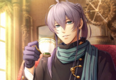
Herlock Sholmes [Code: Realize] - 40%
This is a very pretty anime boy. I’d pick him first in whatever dating sim this is. ...Wait, this is supposed to be Holmes? How can you tell? Look, I know it’s hard to make an anime boy Holmes. Holmes’ key design elements aren’t his costume or his hair, they’re the things that make him unpolished. And anime dating sim boys don’t like to be unpolished. But really, this is just a steampunk boy who likes tea. Nothing here reads as Holmes to me.
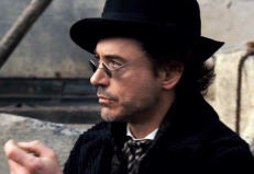
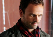
Sherlock Holmes (Robert Downey Jr.) - 35%
Now, I love this movie. RDJ got me back into Sherlock Holmes when I was younger. And as this character, he has a very specific and well designed look. ...Does that look gel with canon Holmes? I don’t think so. He’s rough, he’s scruffy, he’s short and wide and strong-jawed, and he refuses to go for a clean shave. I like him a lot, but he’s not very Holmesian. He does, however, nail the eccentricity and his costume design works for him well. I do like a messy Holmes. So I won’t go any lower than this.
F-Tier

Basil [Blush Blush] - 28%
So, he’s got the outfit. There’s that. But otherwise... This is just some soft ugly anime boy cosplaying Sherlock Holmes. He doesn’t have a single trait that works in his favor. On top of that, he’s got the same problem the other Basil on this list had -- the all monochrome light brown just looks weird, and not Holmesian at all. And this boy doesn’t have the excuse of literally being a mouse. This is just an ugly design.
Elementary (Jonny Lee Miller) - 25%
Now, I've only watched a few scattered episodes of Elementary. Partially because I'm morally opposed to shows that only gender-flip half of the duo, partially because I’m absolutely outraged by the travesty they made Moriarty. But this isn’t a bad character, per-se.
But, like, this is just some dude. This isn't Holmes.
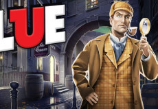
Sherlock Holmes [Clue] - 23%
I love Clue so much. That probably doesn’t surprise anyone. I have the season pass in this game, which automatically gives me every DLC character they add for free. So I was super excited to hear there was gonna be a Sherlock crossover. ...But this is just ugly. Another light haired square-jawed monochrome asshole pretending to be my favorite character. There’s nothing Holmes about this. (The rest of the designs in the pack are no better, but this isn’t about them.)
Skylar Holmes [Blossom Detective Holmes] - 20%
Now, Blossom Detective is a show that I famously disliked so much I immediately sat down and screenwrote my own Holmes cartoon on the spot. And Skylar certainly feels like she should be in the “part 2″ of this list, but a Holmes she is.
She's cute and she accessorizes well, but she's just not Sherlock Holmes by any stretch.
Sherlock Shellingford [Milky Holmes] - 10%
Now, look how cute she is! Sherlock Shellingford, present and accounted for. She’s got TWO Sherlock names so you know she’s the real deal. Now, this is just an objectively good design. She's exactly what she needs to be to serve the role she plays!
And that isn't Sherlock Holmes. Sorry.
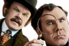
Holmes & Watson (Will Ferrell) - 0%
Get out of my house.
Holmes Archetypes
Not all Holmes’ are meant to be the Canonical Sherlock Holmes, of course; some are just neat references, or characters who naturally fit into his role whether the author intended it or not. Let’s address them here, and remember that not looking the part doesn’t really reflect negatively on these ones as they’re stand-alone.
S-Tier

Dylan Reinhart [Instinct] (Alan Cumming) - 90%
Dylan is so point for point Sherlock Holmes that it’s hard to call him an archetype and not a straight adaptation, or possibly a rip-off if I’m being harsh. But I’m not supposed to be rating him by portrayal, just looks - and he’s really good. He’s the exact right blend of weird looking, though not as angular as he should be. His sharp eyebrows and nose and high hairline work fantastic, and he wears a suit very well. He’s a perfect little bundle of posh and nerves, and though he’s not perfect the fact that this isn’t actually supposed to be canon Sherlock Holmes makes this placement very unsurprising. He wouldn’t look out of place on the other list.
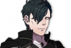
Hubert von Vestra [Fire Emblem: Three Houses] - 85%
Oh? What’s that? You don’t think Hubert von Vestra is a Sherlock Holmes archetype? Okay, then explain to me why he uses the word “sentiment” exactly twice in his supports. Atheists 1, Church of Seiros 0. Anyway. Let’s start with the obvious. Hubert looks like Benedict Cumberbatch. But, he looks like a vampire Benedict Cumberbatch who did a lot more cocaine. And if you don’t think Sherlock Holmes should look like a vampire, youre lying.
A-Tier
None yet. Please submit your Holmes and I will add them.
B-Tier
Heinwald [Dragalia Lost] - 67%
I would never look at this design and think "well, that's Sherlock Holmes". Heinwald looks more like a zombie or the bride of Frankenstein, very Halloween. His look being so specific does come at the expense of his Holmesness, but he's still got more than a few traits down and he’s an absolute treat.
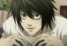
L Lawliet [Death Note] - 65%
This is a very, very weird looking man. Key points: dark hair and eyes. gaunt, sharp, and mostly angular (though with a softer face). Extremely foldable. This man could 100% pass for Holmes, if someone else was dressing him. Put him in a suit, comb his hair? Yeah. It’d really work. But until then, he’s just most of the way there.
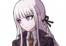
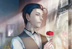
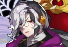
Kyoko Kirigiri [Danganronpa] - 63%
Kirigiri really gets jilted here, because she could be much higher. Unfortunately, she has to be part of a series that with only a few exceptions just reuses the same face and body for most of its female characters. Kirigiri definitely has the sharp and focused feel she needs to pass for Holmes, and she dresses well. The white hair is the opposite of the dark he usually touts, but it’s striking. Unfortunately, put her next to any other character in her series, and she blends back in.
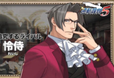
Miles Edgeworth [Ace Attorney] - 60%
Feels a little weird to put Edgeworth on here when the actual Sherlock Holmes is in his game, but he fits the character much better if not the narrative role. So let’s go over the looks. His jaw is a bit wide, but he’s very pointy, and I certainly have never gotten the impression he’s a physically strong man. He’s very fashionable, and with his big cravat and sharp hair he makes a cutting silhouette. I’d say he needs a bit more to really nail the look, though.
C-Tier
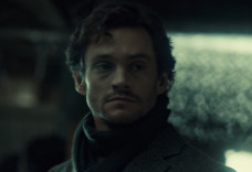
Will Graham [Hannibal] (Hugh Dancy) - 45%
Despite being a noted Hannibal Lecter fan and possible homosexual, I still haven’t watched Hannibal. I’m taking people at their word that Will is a Sherlock; I definitely would have assumed otherwise looking at him. He reminds me deeply of BBC’s John Watson, and it’s hard to see anything else. But I don’t hate his look; he reads as clever, he looks good in darks, and I wouldn’t complain to see him cast as Holmes. He’s better than some of the lower-tiered canon Holmes actors, anyway.
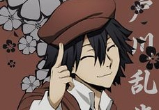
Ranpo Edogawa [Bungo Stray Dogs] - 40%
This is another submission, and I don’t know who this boy is. I really doubt he’s actually a Holmes, given that he’s named after a real non-Doyle writer, but I was begged to include him. Let’s go. I really like his outfit. He’s got an aesthetic I like. Is it Holmes’? No. This kid looks like he’d fit way better as a Baker Street Irregular; maybe he should audition.
D-Tier
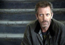
Gregory House (Hugh Laurie) - 35%
Take everything I said for Robert Downey Jr, and just mess up his hair a bit more. House is scruffy, poorly put together, and not wearing anything that costs over $100. As a Holmes, he’d work as one of his disguises; I wouldn’t be super surprised if this guy suddenly cleaned up and looked the part -- but it would take a lot of cleaning. I love his look, though -- again, he isn’t trying to be canon. House is an explicit Holmes parallel, but he’s still his own character.
F-Tier

Walnut Cookie [Cookie Run] - 20%
Given how much “Holmes costume” and “Detective costume” are conflated, it’s possible this gingerbread baby isn’t even supposed to be a Holmes reference, but I’ll take her. She’s an excellent design - but a standalone one. Shes too soft, warm, and curly looking to pull off canon Holmes.
5 notes
·
View notes
Text
Sonic OC Bio
Name: Cameron Segana
Nicknames: Cam
Age: 15
Alignment: Good
Species: Human
Continuity: Mostly games but with several changes
Physical Appearance
- Medium to dark brown skin
- Light brown eyes
- Super curly black hair worn in a short afro
- thin green headband
- Tends to wear green, teal, and coral pink outfits
- SA outfit: green and white sweatpants and short sleeved shirt with sandals
- Single eyelash and almond shaped eyes
- No gloves (they make her hands sweat)
- Bead bracelets
- Seashell necklace
- Beige and green sandals with ankle straps and a slight wedge heel
- Is one of the shortest human characters (by Sonic standards) at just 4'3
Family
- Erin (cousin)
- Nathan (father, whereabouts unknown)
- Karyn (mother, whereabouts unknown)
- John (uncle and Erin's father, whereabouts unknown)
Friends
- Team Sonic
- Amy
- Cream
- Silver
- Blaze
- Big
- Team Chaotix (sometimes)
- Team Dark are more like acquaintances
- Luna and Darcelle (two OCs associated with Team Dark)
Enemies
- Dr. Eggman
- Mephiles and Iblis
- Deadly Six
- Infinite
- Metal Sonic
- Black Doom doesn't exist because I hate them more than Mephiles
Backstory
Originally from an idea I had for a Sonic X reboot, Cameron is a 15-year-old human girl who lives in a secluded cottage with her older cousin Erin. In SA1, she discovers Tails after his crash and nursed him back to health before returning him to Sonic. Because of the badniks invading her home she decides to join up with them to stop Eggman from taking over the city. Along the way she discovers a knack for archery and some clues pointing to the whereabouts of her parents and uncle, who went missing during an expedition to Soleanna a few years back.
Personality
- Shy at first
- Introverted
- Learns to let loose
- Blunt when it comes to her opinions
- Sometimes expresses low confidence at times
- Mellow and soft-spoken
- Plucky
- Claustrophobic
- Bit of a neat freak because she doesn't like to attract bugs
- Expresses a thirst for adventure
- Can be pretty steely when angered
Hobbies and Interests
- Photography
- Swimming
- Surfing
- Collecting seashells
- Pizza
- Root beer
- Onion rings
- Scrapbooking
- Skating
- Works part time at a diner
- Playing her flute and drums
- Archery (she feels like a badass and likes to collect arrows)
- Traveling
- Skinny dipping on a hot Summer's evening or for privacy (her most shameful secret!)
- The colors green and blue
- Lemonade
Pet Peeves and Least Favorite Things
- Pickles
- Badniks invading her island
- Humidity
- Cold temps and snow
- Being underestimated because she doesn't have powers
- Gross things like bugs and slime
- Overly bright colors like neon orange and green (they hurt her eyes)
- Stubbing her toe
- People telling her that her parents and uncle won't come back
- Losing hope
- Closed up spaces
- Her camera malfunctioning
- Spoiled entitled behavior
Powers and Abilities
- Bow and arrow are her main weapons
- Hand to hand combat
- Athleticism
- Power Ups
- Hold her breath for extended periods of time (helping when in water levels; still need air bubbles)
- She can even weaponize her camera by turning the flash up bright to blind enemies
- Not the fastest nor strongest but has a healthy balance to keep up
- Learns to use Extreme Gear
Misc
- Cameron's surname is a reference to SEGA
- Her official ethnicity is African American but for the sake of my sanity her race will not be brought up constantly because I'm not here to earn social justice brownie points
- Cameron wears blue, green and oranges because I noticed how Sonic females tend to wear pink, purple and red and wanted her style to fit the games since there's not a female character yet who's associated with other colors besides those three
- A lot of people think that Cam and Erin aren't related because they look very different (Erin is a light-skinned redhead), which sometimes annoys her
- Out of the characters Cam has the most costume changes as she wears bathing suits, coats and winter gear, and other outfits depending on zone; she even begins carrying a bag to hold her outfits in
- She has a more mellow, humble personality to make her stand out from the other hammy, prideful and vibrant characters
- Cam documents her adventures through scrapbooking
- Her ultimate goal in the series is to find out what really happened to her family. This will eventually be resolved in Sonic 06 (spoilers: there's a happy ending)
- Also, Cameron and Sonic will be a couple but as always for my canon/OC ships, it's going to be a slow burn. Also I might tag as trigger warning for interspecies since some people still haven't got over SonElise.
- In SA1, Cameron received arrows with powers based on the stage. So for example, in Ice Cap she gets ice arrows, in Red Mountain fire arrows, Windy Valley has wind and leaves arrows, and Emerald Coast has her default arrows
- She doesn't have an ability type because I think it's outdated by now and limits potential
- I based her color scheme on the concept of Chromatic Arrangement. Sonic = blue, Tails = yellow, Knuckles = red, so it would make sense for another major character to be green (I don't count Jet and Vector). In SA Amy and Big round it out as "pink" and "purple."
- I guess Cam could technically count as a superhero even though she doesn't have the credentials of one (i.e costume, secret identity, edgy 90s redesign and bad Rob Liefield art)
- I based her SA/default costume from the styles that were popular in the late 90s and early 2000s since that's the era when the games came out
- Cam and Erin splits the bills, which is why they both have jobs since their parents aren't around. They end up getting rewarded money (SA2 by the president) which they then save up to go to Soleanna
- Cameron doesn't really consider Team Dark to be her friends, but she doesn't see them as enemies either
- She doesn't hate Amy either; she's more amused by Amy's worship for Sonic but does try to help her temper the obsession when it gets too much
- Cam eventually starts to see Tails and Knuckles as the brothers she never had, so she's protective of them; although her first impression of Knuckles was "Does he and Sonic fight every time they see each other?"
- I was inspired by Saphira24667's OC Saphira to make Cam and Sonic a couple because while I don't hate pairings like Sonally and Shadamy, I just want to do my own thing. Besides people will still find fault with it because it's canon/OC, so it's not like I have much to lose. No, I do not support beastiality but Sonic is at least sapient enough and people get away with Shadow/Maria.
- Originally my OC was going to be a Caucasian girl with long, wavy orange hair and a more "yoga instructor" design. Her names were also going to be Verna, Jade, Kelly, Celadon or Esmeralda, and her last name was going to be Greene. However I felt that having her be named after a shade of green and have a last name that literally is GREEN would be too much overkill so I changed her name and design. I also added more colors like blue and coral to give her a tropical aesthetic.
- Her theme in the SA games is Lauryn Hill's song "That Thing" which thankfully came out before SA was released in Japan (I tend to go extremely meta with my characters)
- One very old idea I had for her was for her to be a poodle with water powers to contrast her with Blaze; she's still associated with water though she doesn't have any powers
- Another old idea was for her to be a porcupine named Penny who had the power to control metal. The metal powers got carried over to my Shinkenger OC Ayane.
- I intended for Cam to be the total opposite of Chris Thorndyke as she actually has relatable problems, a character arc, and a likable and sympathetic personality.
- Cam weighs 121 pounds, so she has a canon weight compared to female Sonic characters
- In Sonic 06 Cam and Sonic becomes an official item (Amy will still be treated with dignity and respect as I hate ship wars)
- I have yet decided on what kind of power ups to give her
#sonic oc#sonic original character#actually good sonic oc#poc heroine#black female superhero#sonic human#sonic human fancharacter#badass normal#sonic games#good sonic oc
8 notes
·
View notes
Photo


TUT 06: Vibrancy
Photoshop
Timeline or Frame Animation
Lots and lots of selective color
In this tutorial, I'm going to show you how I make my vibrant gifs. Now I know these aren't the most vibrant (color porn-ish) gifs ever, but compared to the originals, there's a huge difference.
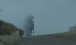
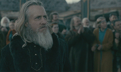
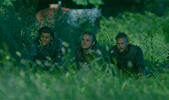
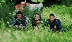
The majority of these gifs will be from the show, Vikings, but this technique will work with any gifs. I'm mostly using Vikings because the scenes are always dull grays, greens and blues, so this will show you the 180* change!
To start off I use a .psd I made, the download and tutorial on how to use it is here. Like I mention on that post, I use that on 99% if not all of my gifs. So Here are a few before gifs, with no other editing besides sharpening:

And here's the afters with the mentioned .psd and edits made with the .psd tutorial:
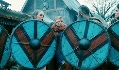

So, if you use that to start off, you can hop into the tutorial after the basic editing. I'm going to basically re-create the .psd so all you lazies don't have to download anything (I'm a fellow lazy so I gotcha). So to start off, I'll use this gif. It has one main color (green) plus their clothing and skin colors so that's the easiest:
I'll start with a curves layer, a brightness/contrast layer:

And a levels layer set to 50% opacity:

Here's my gif now:

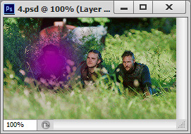
It's pretty washed out, so I want to add a selective color layer, adjusting only the blacks:

And the gif:

Now is the funner part. So, I mean, you could just add a vibrance layer set to 100, but that will add a lot of tiny pixels of colors you don't really need (ie random magenta 1x1 pixels in the trees), which would be this:
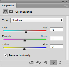
And you don't really get individual colors, you just get a mess of one overall hue, so in my opinion, it's better to add color gradually. So to do that, you'll want to start by balancing the overall color. Since my gif is mostly green, changes are there's too much green, almost to the point where it bleeds into all the other colors. So for this specific gif, here are my color balance settings:

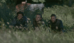
And my gif now:

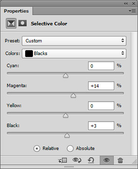
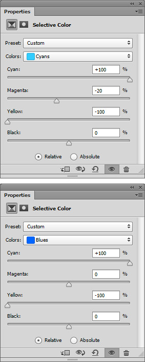
Now that there's more of a separation of the colors, I can add a selective color layer to tweak individual colors. Here are my settings for this gif, but every gif will be different:

Now I know some of my settings are extreme, but since there's barely any of those specific colors (cyan, blue, magenta) showing, I wanted to really bring them out. My gif:
Now to brighten the gif up so we can really edit the colors and make a vibrant gif. I use a same vibrance, levels and brightness/contrast layer with varying opacity's based on the gif. Here are my settings for this gif:

The vibrance was set to 100%, the levels was 50% and the brightness/contrast layer was set to 55%. Here's my gif now:

Now to make the colors more saturated. Basically I just use a selective color layer and make the specific color setting 100 to get the purest color, then duplicate that layer until I'm happy (still remembering gradually add onto colors). Here's my settings for the greens, since that's my main color:

Now, add more brightness if you're gif needs it. I'll add another brightness/contrast layer, so here's my gif now:

Now to fine tweak. I want to start with the blacks since they're washed out and starting to turn a noticeable color. Which the blacks here are more towards the green side, I want to add magenta with a selective color layer. I also want to darken them. I want to do it before I start messing with the colors because the black can get muddied and be harder to isolate layer on. Here's my settings:
And here's my gif, the before is on the left, and the after is on the right. You can see a pretty big difference with such a small edit:

Now to fine tweak my colors. This will vary gif to gif, but here are my settings for this gif, really focusing on skin colors. I'm going to get pretty dramatic, cos I can play with the opacity, but here are my settings:

And my gif:
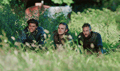
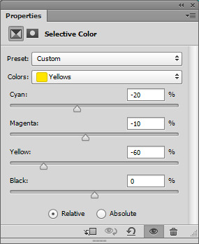
Pretty good, eh? There's a few little issues I want to fix, and you might have the same issues if your gif has more than one person or a lot of colors. So the guy on the far left has a bit of a darker skintone then the two on the right, so he came out more orange that I would like. To fix that, I just add a selective coloring layer and remove some red and yellow. It will mess up the entire gif, but I'll utilize the layer masks next to fix that. Settings:
And the “messed up” gif:

Now, when you add an edit layer, it automatically adds a layer mask like this:
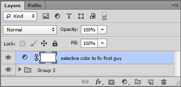
If it's white, that means the opacity is 100% over the whole canvas. Black means it's at a 0% transparency. By default, they're all always white. I only want this selective color layer to be over the first guy's face, so I use the fill tool (paint bucket) to fill the layer in black with the alpha slider by clicking on the mask on the layers:

Now the layer is basically hidden, but still enabled. So now, using one of the default soft brushes (hardness set to 0), I want to use the white to paint over just his face.
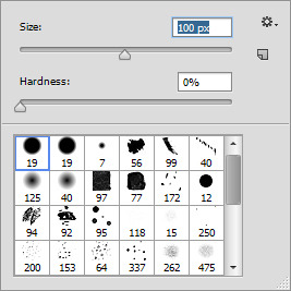
Here's where I colored for example, but I did this while the alpha mask was clicked:
Now the rest of my gif is back to the original, but his skin is more balanced out! You can do this for all the bits you want to adjust. For example, in this gif, I can make the outfits more blue, the cart in the background more red, and even the greens more green by "coloring in" the trees.
Now the final steps would be more brightening if you need it, and another low opacity vibrance layer. I follow the same rule every time, for every +10 vibrance I make the saturation -1. So if the vibrance is 60%, the saturation is -6. That just keeps a balance while still saturating the gif. Here's my before gif:

And the after:
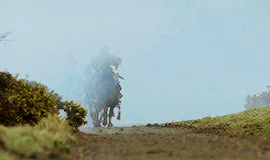
And keeping in tradition of my other tutorials, I will show you again, but a quick tutorial. So here is the before of the next gif:

Now here's the gif with the same editing as above, levels, brightness/contrast and a color balance with these settings:

Here's my gif now:

This gif is super dull, but the colors are pretty separate already unlike the last gif, so I really want to edit the foggy mist and the plants. I'm going to go right in with a selective color layer with the cyan and blue settings as these:
Then I'm going to duplicate that layer a few times until the blues are super saturated. Here's my gif now:
Now I want to fix the blacks. Adding so much blue made the darker colors have a blue tint, so to fix that, I want to remove the blues from the black like this:
Here's my gif now:

Now to fix the overall colors of the red and yellows (plants and skin tones mostly). Here are my settings of a selective color layer:
Now here's my gif:
The blacks washed out again, so I fix that with a selective color layer removing reds from the black. Here's my gif after that:
So, like before, I want to use the layer masks on the edit layers to isolate edits to where I want. Here's how I painted them (with the colors I edited) for tutorial purposes. All these were painted on the layer mask using a selective color layer:

And here's my gif:

Now the colors are pretty isolated, but it's still pretty dark, so I added another brightness/contrast layer. Here's my gif after that:

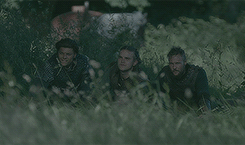
Now the last steps would be a vibrance layer (if you need it) and one final selective color layer to fine tweak the colors. Here's the before gif:

And the after:

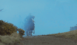
And for one more quick tut using a non-Vikings gif. The show is "Black Sails" and most of the time they're on a sunny beach, on the bright blue ocean or in a tropical vibrant landscape, so this is for gifs that are already 1000 steps ahead of the Vikings or Game of Thrones scenes!
Here's the before:

And after the brightness/contrast, levels and curves layer. I didn't mention this before cos there's no POC on this tutorial, but if after you do this step on a gif featuring a POC (even lighter POC shades), you might wash them out. The easiest way to avoid the "white wash", is to add a selective color layer and on the white color settings, turn the white slider all the way to -100. It will look crazy! Just play with the opacity until you balance the color out. Anyways, here's my gif now:

Now, add a color balance layer if you need it. I don't really need it here, so I'll go into the main selective color layer. I want to boost all the colors like I did in the very first gif on this tutorial. Since the color is pretty balance already, I also added more blacks to the black color option right away. Here's my gif after that:

Now to make the gif super vibrant, add a vibrance layer (remembering the -1 saturation for every +10 vibrancy rule I mention in all my tuts). You might also need to add another brightness/contrast layer. Here's my gif now:

Now you can use the layer masks with selective coloring layers to really isolate certain colors. For all of my Vikings gifs with characters with brighter blue eyes (Bjorn, Ubbe, Ragnar, Floki, Harald for you fellow fans) I literally add like 10 duplicates of +100 cyan/blue selective color layers over the eyes so they really pop. In this gif, Eleanor (Hannah) has greenish blue eyes, so I'll do the same. I'll also go over her lips and skin with a masked selective color layer as well. Here's my gif:
Now the final vibrance and brightness/contrast layers IF you need them. Some gifs will, some won't. Here's the before gif:
And after:

Sorry for such a long tutorial, but I really wanted to get thorough with three common gifs (mostly one color you want to bring out from dull scenes, an overall colorful gif from dull scenes, and a brighter scene you want to color). Hope this helps!
391 notes
·
View notes
Last Seen Blogs

akianessrosa
Aki Aness Rosa
deolx3
DEOL×

beautycounterwipes
China Wholesalers Convenient Wipes Factory
a-aeriis
HEY GIRLIE HOLD STI
alfonse-field
Welcome FEH nerds