#it's such a good design choice to make her pigtails look like rabbit ears in her new iteration it drives me INSANE
Text
truly, will there ever be a more inspired character design decision than spinel from steven universe going from a cheery, toony entertainer with a silhouette like mickey mouse to being unceremoniously abandoned and forgotten by everyone for countless years and, in her grief and anger, gaining a silhouette like oswald the lucky rabbit
6 notes
·
View notes
Text
silhouette design in magical girl raising project
i love some of the character designs in this show, but not all of them, and for various reasons. some characters have great color schemes, and some don’t; some have creative clothing choices, and some don’t; some have design choices that just bother me personally.
this post won’t be addressing any of those - although i may in another post.
this post is specifically targeting the silhouette design.
silhouette is incredibly important in character design - if you can’t recognize a character in silhouette, you’re less likely to recognize them later or from a distance. in anime this doesn’t get addressed often, as many character designs stay relatively close to normal clothing, which tends to not have interesting silhouettes as normal clothing (and hair) usually can’t believably defy gravity and follows what is possible to make via standard clothing manufacturing.
however, in magical girl anime, these boundaries are lifted, as the clothing and hairstyles are created and maintained through magic. magical girls can be held to a higher average, as it is expected that one lets loose in the character design. magical girl raising project is unique in that ‘magical girl’ simply means a girl with magical powers - a girl’s aesthetic doesn’t have to follow the standard magical girl fare of a fluffy skirt, boots, pigtails, etc. the artists went wild with this, more so than a lot of series i’ve seen.
so, without further ado, my opinion on the silhouette design in tandem with the character desig. there will be spoilers, so watch out! my deepest apologies for the image quality; it is frustratingly difficult to find clean versions of the artwork! this is specifically for the anime versions of the designs.
snow white: 3/10
snow white is... rather boring. it’s not terrible - keeping the standard fare makes sense for her character - but the interesting parts of her design aren’t pushed enough. the bud on her head and the flower straps in the back would be interesting if they were larger and more visible from more angles, especially when she stands still. the bows on the back of her boots are the most interesting part when she isn’t moving, and that draws attention away from the more important parts of her design.

ripple: 8/10
ripple’s ponytail and scarf create an interesting silhouette, even when she’s still, but they look extremely similar - they can get lost in each other in certain poses. the pompoms on her skirt create some interesting movement in her dynamic poses, but look kind of weird in others. the ha on her shoes create a very interesting look from the side; it looks completely different from the high heel image the mg genre is used to.
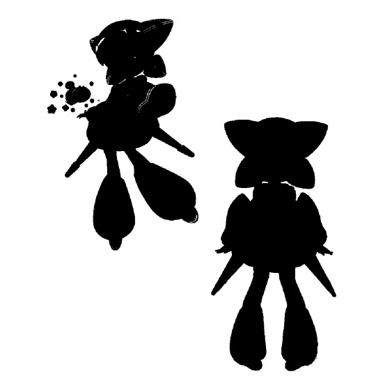
swim swim: 9/10
the ‘devil tails’ and bat wings not only create a recognizable silhouette - they even use it in the opening! - but they also immediately indicate that swim swim will be trouble. the ‘tails’ also create a skeleton bell dress shape; it makes her look a bit like an evil queen, which is exactly the role she takes on. the rest of her is very smooth - fitting, as she’s a swimmer. her curly hair creates interesting negative space, too. my only gripe is that i wish the wings were a little bigger, but any bigger and she could fly with them, so i understand.
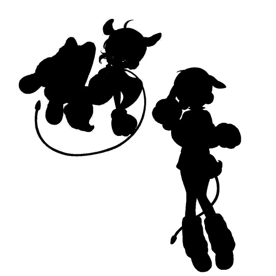
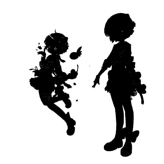
tama: 6/10
not a fan of the leash; it looks like a tail, but not only does the long, thin tail not work with the fluffy rest of her design, it takes attention away from the fact that she already has a tail. aside from that, the batwing cape creates interesting negative space in her dynamic pose, and the large paws stand out amongst the cast of characters with tiny hands. the floppy ears are very visible, and from multiple angles.
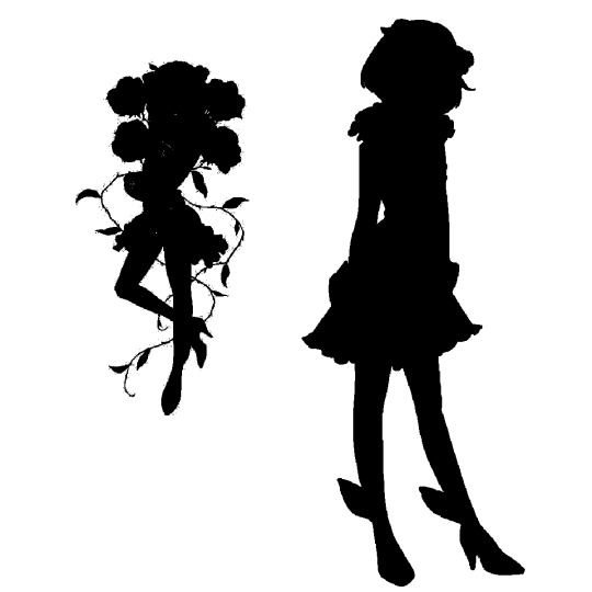
cranberry: 1/10
the only interesting thing about cranberry’s silhouette, unfortunately, is the leaves on her shoes - the rest is streamlined and nothing sticks out. the mullet skirt isn’t apparent unless she’s moving - it otherwise looks like a normal skirt. her upturned jacket collar doesn’t create any negative space like it does in her chibi art, her flower crown isn’t very visible... overall rather weak.

the peaky angels: 5/10
the twins are interesting in that they essentially have two silhouettes - when they’re together, and when they’re separate.
separately, the one-sided wing is an unexpected shape, and the speech balloon halo becomes a very distinguishable shape, too. the rest of their form is unfortunately indistinguishable - the bell-shaped dress makes them look like an egg. their hairstyles aren’t that different, either, and one of them just looks like she’s got a perfectly round head.
together, their silhouette forms a whole angel, which indicates that they’re only whole when together - fitting, because after yunael dies, minael goes ‘one winged-angel’ in personality. definitely an interesting take on the ‘tiny angel’ look.

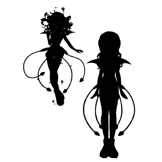
hardgore alice: 3/10
while i love hardcore alice’s character and color palette, her silhouette is rather uninteresting. her wide, wavy hair takes up the entirety of her upper body, the ends are indistinguishable from her dress’s hem, and her hairpiece is flush with her head, so it’s invisible in silhouette. the rabbit plush she carries around can add something nice, but it’s rarely visible because of the dress’s length. the bloomers’ ruffles look good, though, and the apron adds some appeal in more dynamic poses. the long, wavy hair makes her, at first glance, look like a little girl, which suits the character, but i wish it wasn’t her only feature.
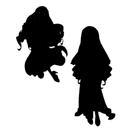
sister nana: 2/10
nana’s overlapping elements don’t really work. the nun’s habit's scalloped edge or her hair’s drill ends would have looked fine on their own, but together they look like one big, uninteresting mass. her hair also blocks out the interesting appeal on her torso - the (pillows?) on her hips would have an interesting shape if they were visible. the ends of her hair, however, sync up nicely with the way the end of her dress is drawn with the bunching. you really can’t tell she’s a nun at all -particularly with the slit dress - unless you see her in color.
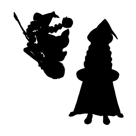
top speed: 9/10
immediately you can tell top speed is a witch. the hat gives it away, and the cape sells it. the crooked tip is visually interesting, but doesn’t point in a direction that looks out of place. the braids are always visible, and look fantastic when in motion. the cape unfortunately blocks out most of her body, especially her skirt and collar, which have interesting shapes, but it follows the same line as the braids, which looks good, and fits the whole ‘halloween witch’ theme.
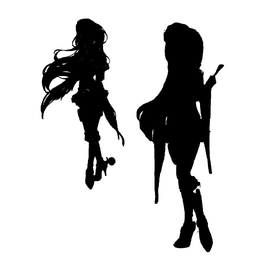
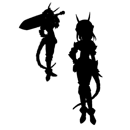
calamity mary: 7/10
holy howdy, those spurs have a great shape, as do her long fringe sleeves. the fringes create good negative space, especially when moving and the individual strings fan out. her boots and gun holster make her legs together look more interesting than one or neither. her hair kind of detracts from her shape -long hair often does - and i wish her hat had a wider brim so you could tell what it is, but it does have a different tangent than her head, so it’s visible even in sihouette.
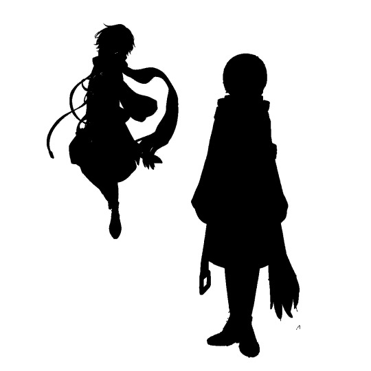
weiss winterprison: 4/10
she... mostly looks like a block when standing still. the asymmetry of the belt and the scarf looks good, and the crossbody belt creates a small shape on the right, but everything else lies flat - the scarf on her neck, the belts in the front, even her hair is smooth and flat. in motion, though - the loose straps and the scarf fan out to create excellent negative space. while this isn’t always good practice, it works to a degree with winterprison, better than it does with sister nana, because winterprison tends to melt into the background unless she’s in a fight.
magicaloid44: 10/10
definitely one of the greatest silhouettes in the show. her very short height immediately stands out in the cast of similarly-statured characters. the four ‘ponytails’ create a very distinguishable shape, especially in a 3/4 view. the triangular jetpack wings work with this, skinnier and longer but pointing i the same direction. while the gauntlets and her skirt merge together, the gauntlets’ top is still easily distinguishable from her arms and the rest of her body. the sharp, perfect angles lend themselves well to making magicaloid44 have a different feel from the rest of the characters - fitting, since she’s a robot.
la pucelle: 8/10
with one glance, you can tell she’s wearing a ton of armor. the jagged shapes around her arms and legs couldn’t really be anything else. the jagged tail and horns, too, make you think of little else than a dragon. the dragon knight aesthetic is instantly visible, especially when paired with the huge sword. her hair creates negative space, more so than most of the other characters. some of the armor shapes could be bigger and more imposing, though.
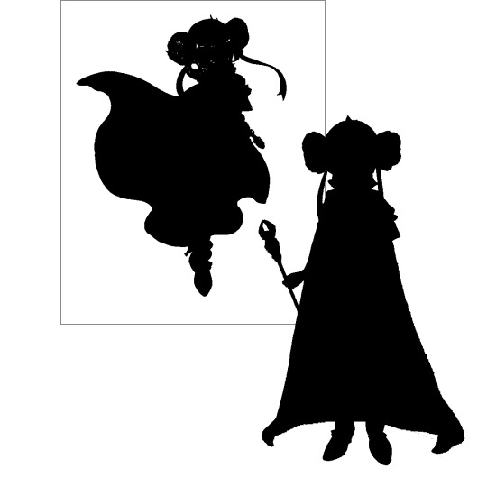
ruler: 8/10
whatever those things on her head are, they’re the strongest part of her silhouette. they stick off her head very visibly, and the ribbons create good negative space. her upturned collar is visible in most angles, and looks very regal. the cape blocks out more detail than top speed’s does, but it works here as well. it just skims the ground; it’s clearly been tapered and exactly measured, and she looks like a ruling authority. she gets a lower score than top speed, though, as the rest of her outfit has a better silhouette than the cape, and you can never see it.
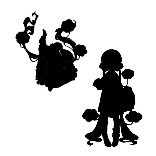
nemurin: 11/10
the best silhouette in the show. there’s so much appeal in this design - the pigtails that drag and gather lazily on the ground, the clouds dripping off her hair, the gathering of the nightgown, especially in the sleeves, the bunched up socks... everything about the silhouette creates fantastic visual space. the pillow’s ruffles connect it visually to the socks and the clouds, which all have the scalloped shape. even without the pastel colors, the shapes and her posing always give off a sweet, lazy girl vibe. i’m pissed that they killed off such a well-designed character so soon.
#magical girl raising project#mahou shoujo ikusei keikaku#magipro#mahoiku#silhouette analysis#character design#design analysis
166 notes
·
View notes
Last Seen Blogs

mardehoras
Mar de Horas
antthonystark
who knows anymore

ezscrappers2
Untitled
jabbajacks
My chill space