
abelloprocess
Type in Motion
Process website for YSDN 4002
40 posts
Don't wanna be here? Send us removal request.
Last Seen Blogs

motiv-ation
Positivity Line

dokidobe
yellow.dr.monv

zorria
My Obsession With The Seven deadly sins
dianahastings
The Odd Butterfly
terresdebrume
They're all trans!
Text
Kill Bill Monologue
“300 word written statement describing your concept and addressing how your visual decisions work to support the concept“
Kill Bill Monologue is an excerpt from the classic Quentin Tarantino film Kill Bill Vol. 2. The 60 second monologue performed by the character of The Bride (Uma Thurman), was an exciting choice for Project 2: Long Story Short. The objective of the video is to depict the monologue focusing primarily on typographic movement. The monologue uses impactful words such as “bloody”, “rampaged”, and “revenge”. Consequently, it was a challenge to match the typography with the literary imagery.
The video begins with suspenseful music. The video uses four colours – black, white, red, and yellow. Yellow being an iconic colour worn by the character The Bride, was an obvious choice to include. Texture was also experimented with in the video. Different textures are layered overtop a solid colour background to add visual interest and to create a “vintage film” look. In addition, Anton a sans serif typeface is used for the entire video. Anton is not only easy to read, but also accurately mimics the original font used on the Kill Bill movie posters. Anton is a bold typeface that is appropriate for a bold monologue. Moreover, a jittery text effect is applied to Anton to create slight movement to the words on screen. This effect adds personality and a slight feeling of tension. Paint splatters are also used and appear in sequence with major sound changes in the monologue. Additional audio such as the gunshot heard when The Bride talks about “Bill’s last bullet” was added to create excitement and shock.
Reoccurring effects such as the typewriter effect is used in several parts of the video. In addition, background transitions and masks are also used repeatedly to keep the video consistent. Overall, Kill Bill Monologue puts a new typographic twist on the film.
0 notes
Photo
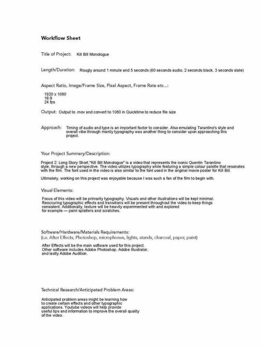
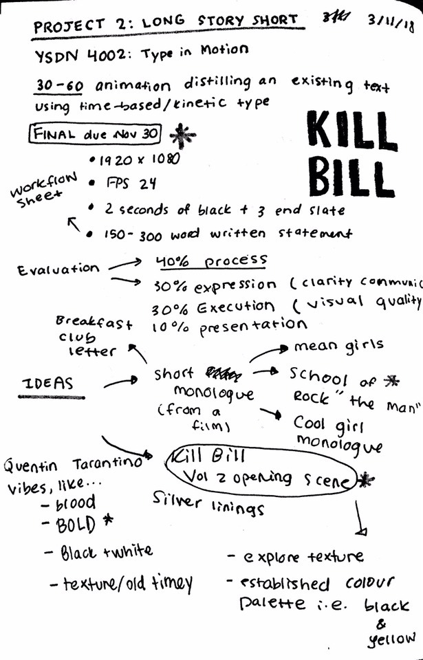
Workflow sheet excerpt from Long Story Short.pdf for Project 2
0 notes
Text
Update:
Due to a swollen left eye which I thought was from my eczema but turns out it’s blepharitis, I was unable to attend Week 11′s class. Thank you Julia for being so understanding and emailing me the tutorial video.
Also when I went to the pharmacy to pick up my prescription ointment for my eye, I couldn’t help but have war flashbacks to:

0 notes
Photo
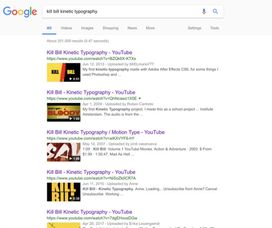
Aside from creating a mood board and researching different Tarantino shooting styles, I also looked at existing Kill Bill kinetic typography projects to see how other people’s approaches.
0 notes
Video
vimeo
Process Video for Project 2
This project has given me the opportunity to experiment with textures and different effects. Because I am such a fan of Kill Bill, creating this has been really fun. The main focus of the video right now is type. Later I will go back and probably add some visuals.
0 notes
Text
Kill Bill Monologue
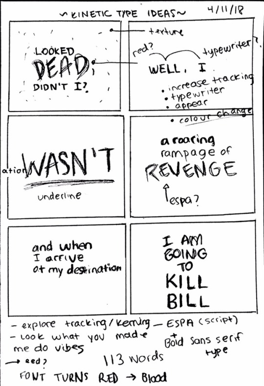
Looked dead, didn’t I? Well, I wasn’t.
But it wasn’t from lack of trying, I can tell you that.
Actually, Bill’s last bullet put me in a coma.
- a coma i was to lie in for four years.
When I woke up, I went on what the movie advertisements refer to as “a roaring rampage of revenge.”
I roared. And I rampaged. And I got bloody satisfaction...
I’ve killed a hell of a lot of people to get to this point, but I have only one more.
The last one. The one I’m driving to right now. The only one left.
And when I arrive at my destination, I am gonna kill Bill.
0 notes
Photo
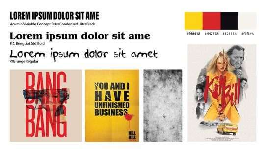
Bang bang, he shot me down
Here is a moodboard of what I want to achieve with this project. The fonts are subject to change however the idea of a bold sans serif font similar to the one in the original Kill Bill posters was my initial idea. The serif font is also a font I am considering because it is used in Tarantino’s films too. I am also open to experimenting with a “grunge-y” distressed or handwritten font.
The objective is to use a simple colour scheme consisting of 4 colours. Also the illustrations and visuals will be kept simple. As previously mentioned, texture is another element that I want to explore for this project.
0 notes
Video
youtube
I found this really interesting video that explains Tarantino’s style of shooting. Despite this project being primarily type based, I may try to incorporate some of these methods within my final video. For example, the extreme close up shots and the crash zooms!
0 notes
Photo
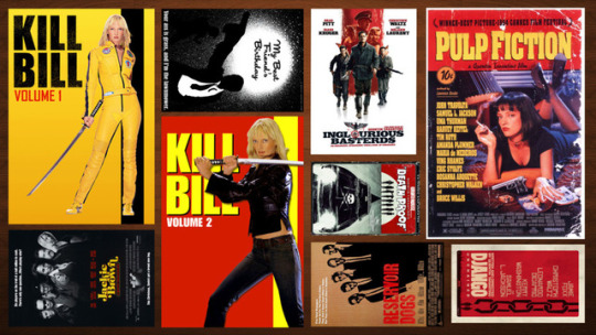
From Pulp Fiction to Kill Bill
Here is a collage of Quentin Tarantino movie posters. As depicted, Tarantino uses bold and heavy typefaces. Additionally, the posters shown above all share a similar colour scheme. There are undoubtedly reoccurring colours within Tarantino’s movie posters. This includes red, black, yellow, and white.
0 notes
Photo
Project 2: Long Story Short
I began Project 2 by brainstorming ideas for different 30 to 60 second audio clips. I attempted to find audio clips in music, TV Shows, and podcasts. Being a movie junkie, I decided to research famous movie scenes and monologues. I had a few clips in mind for this project. This included “The Man” monologue by Jack Black in the movie School of Rock, as well as the dialogue between Janice and Cady in Mean Girls.
I ultimately decided to go with the monologue from one of my favourite movies, Quentin Tarantino’s Kill Bill Vol. 2. This monologue is performed by Uma Thurman’s character, the Bride.
Tarantino’s style of filmmaking is iconic. There are reoccurring themes and even reoccurring actors that are present within Tarantino’s movies. After taking this into consideration, I became really excited to emulate this through kinetic type. I immediately took note of ideas that I wanted to explore with this project for example experimenting with texture.
0 notes
Photo

Here is the redesign of the HealthMart Pharmacy logo. In the end, there were 2 variations. I ultimately chose the one on the right.
0 notes
Photo
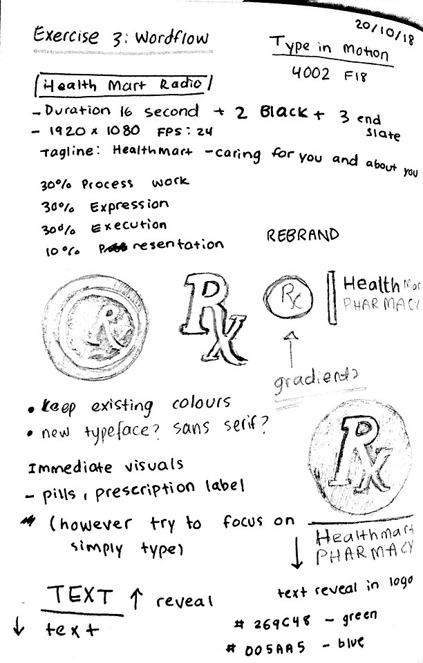
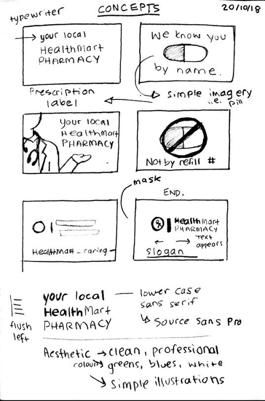
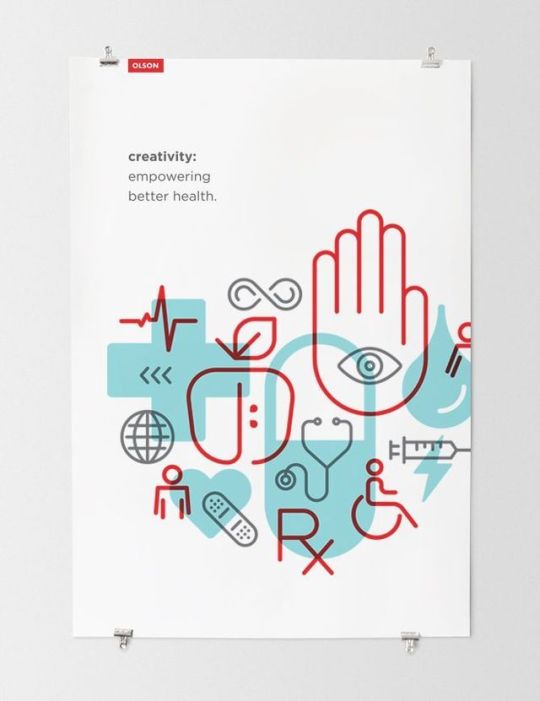
Exercise 3: Wordflow
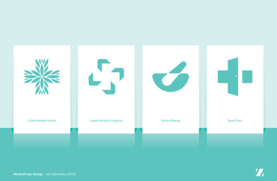
I began Exercise 3 by redesigning the current logo for HealthMart Pharmacy. Using the existing colour scheme, the redesign is a new and modern look that is still reminiscent of the old brand identity. The new logo uses “Source Sans Pro”. This sans serif font comes in a variety of weights and is easily readable. The objective of the brand and the new logo is to convey a professional and friendly pharmacy.
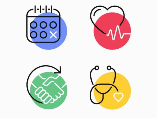
After redesigning the logo, I began to brainstorm concepts I wanted to execute. Focusing primarily on type, I didn’t want to use too many illustrations. Instead simple iconography (i.e. a stethoscope and a pill) will be utilized in the video. Additionally, text transitions in scale and position will be explored. Finally, the use of masks is also a technique I wish to use in the video.
0 notes