
Last Seen Blogs

mistermcdestiny
Fern McDestiny

sica-jjang
제시카 ♡
mobbtown-blog1
Untitled

djmusicbest
NEW RELEASE MUSIC

tamil12314
Untitled
Text
Week 15 - Final Thoughts
I see the future of design truly being endless. I think design will just keep progressing and finding ways to make everyday life more convenient but more stylish and sleek as well. In regards to graphic design, I think it will be an industry that continues to grow. With social media being almost a necessity now for companies to have and be successful, graphic design is at the forefront. Graphic designing is a huge part of social media presence and how a company portrays itself, so I think it will grow a lot more. Architecture is another thing that I am interested to see the future of. Today we see a lot more modern and innovative designed buildings which I personally really like. I think we will see architecture focus a lot more on being more environmentally friendly and finding ways to provide electricity to buildings via solar polar and other ways that are more environmentally friendly. I also see the future of fast food chains changing completely with industrial design and design in general. Today we are seeing a lot of fast food chains have kiosks to order food, and I think eventually some fast food chains might be completely without human involvement and all done with sophisticated machines. Obviously the possibilities are endless and there is no telling whether these new innovations to come will be successful or not, but I do think the way design is moving towards is to be more convenient, fast, and with less human interaction/involvement.
0 notes
Text
Week 14 - Your Choice
Something that I would like to talk about is font anatomy. I never knew how complex it was, and really didn’t even know that it was a thing! Although it is interesting, I do think it is a little obsessive. There is just so much to remember and so easy to get one part of the anatomy confused with another. Typography in general was a hard topic for me. There is just so many fonts and the history is so complex, it was hard for me to remember everything and really understand at times. Even for our most recent project where we had to identify certain types from the other, that was hard for me. I feel like there are just so many fonts out in the world today and some look so similar, it was hard for me to remember the characteristics and be able to depict which font categories they belonged to. Another thing I’d like to touch on is industrial design. Before this course, I heard of the term “industrial design” but I really didn’t know what it meant. I thought it was just like designing art with beams from industrial buildings and such. Although sometimes I still get confused by the definition of industrial design, I have a lot better understanding than I did before and I am constantly seeing things in my own life and relating it to industrial design. When I see designs or objects laying around my house now, I often think about the various types of designs we learned and the reasons why it was made the way it was.
0 notes
Text
Week 13 - New Media
Digital aesthetic is a graphic design movement started in the 1990s that focused and emphasized on futuristic design. This movement embraced the idea of sleek technology and almost seemed futuristic or ahead of its time. This idea is sleek technology is a textureless look that is visually simplistic. Technology companies were a huge part of this movement like Apple and even car companies like Tesla. Apple constantly used the idea of digital aesthetic to innovate technology that almost seemed futuristic, like the iPhone, Apple Watch, iPad, etc. These devices were not only sleek in appearance, but provided technology and innovation that had never really been seen before in comparative designs. Tesla is another great example of digital aesthetics. Tesla’s are known for being sleek in design and smooth looking cars, but also futuristic in the fact that they can drive themselves, don’t require fuel, and have a wide range of features in the car like even being able to play games on the screen. Digital aesthetic continues to push the boundaries of innovation and technology. Once we think that something couldn’t become any more futuristic, a new model comes out with even more features, or a sleeker design with less buttons, or even bigger screens.
0 notes
Text
Week 12 - New Media
In our world today, there are so many interactive designs. Interactive design I think is something that companies often strive for. A lot of times I hear about or see how companies are trying to get consumers to engage with their products or design more, which I think relates to just how much we are seeing interactive designs today.
A huge piece of interactive design is our smartphones that we almost all use everyday. On our phones, we are provided with an app that is convenient for almost anything we need. With the swipe or a tap of the screen, we are able to open an app or the internet to a whole interactive world. Not only are these apps designed to be easy to interact with and use, they are also designed to be pleasant to look at through graphic design and color schemes. Besides apps that provide function and convenience, there are also games that we can get on our smartphones. These games are another example of interactive design and designed very intricately to keep our attention and keep us playing longer than we probably should. Another huge example of interactive design that we can find on our smartphones, tablets, or even computers is social media. Social media is designed to allow users to not only interact with the apps they’ve created, but also interact with others and even companies too. Social media is now developed into carefully curated content for each specific user to keep them interacting and using the platform. As I said before, I think that interactive design has grown so much in recent years is because it is all a tool for companies to obtain data on their target market and consumers and figure out what they like so they know what to design or produce next.
0 notes
Text
Week 11 - Graphic Design
According to Stephen Eskilson, Citizen Designer is, “a professional who attempts to address societal issues either through or in addition to his or her commercial work”. This is a movement that really encourages designers or really anyone to design things that contribute to society through meaningful design and encourages social activism. This movement is meant to really push designers to create things that can impact issues that society faces, such as climate change, societal issues, and even health issues as well.
I think this is a really important and relevant movement right now. There is a lot going on right now in our world that requires activism and change, so having a movement in the design world where some of the most creative minds could possibly create something to combat any of these issues is a great start. With my generation, we see a lot of people wanting to be activists and demand change in society, so I think this movement in design is something a lot of young people could really get on board with and want to be a part of. As someone who wants to go into graphic design, I have struggled at times with the idea that my profession or career choice might not have enough activism or may not help people in the way I want to. So knowing that there is a movement, the Citizen Designer, it is really encouraging to know that I can still be apart of change but use my creativity to fuel it.
0 notes
Text
Week 10 - Graphic Design
Blackletter I found to be really interesting from the typographic readings. From first glance at the examples in the book, I would have never been able to probably determine what the letters were and what the word said. Before reading about Blackletter, I would have thought that this would have been found highly criticized for being illegible, but this actually is not the case. Blackletter is a traditional German script and in the 1890s, a lot of German printing used Blackletter. Blackletter can be described as “narrowly proportioned letters, stylized ligatures to connect letters, and small spaces between words and between lines of text” on page 95 of our textbook, Graphic Design - A New History. And although to myself and probably a lot of other people today it may seem like it is unable to read, but in this time period there was no findings that this font to those who were familiar with it read any slower than those who read from roman typefaces. I found this really interesting because it does not seem like it would be easy to comprehend at all.
Another reading that I found interesting was reading about postmodern typography. This kind of typography was much different than the traditional fonts and tended to break what was considered the rules of traditional typography. It’s odd to me that typographic designers wouldn’t have been more creative in the ways that postmodern typography earlier on. Postmodern typography can be characterized as letters that overlap, inconsistent sizes of letters/words, and capitalization at random. The designers of postmodern typography wanted to think outside the box and push the set boundaries of modern typography. The criticized it’s lack of creativity and were advocates for typography having unlimited possibilities.
Another thing that was interesting to me was the reading of type anatomy. I didn’t know that there were so many components to typography. There are titles for almost every part of a letter for example; ligature is when two letters connect and ascender is the top part of the letter ‘h”. There are also uppercase letters, small capital letters, and lowercase letters. There is also a term called cap height, which is the distance from the baseline to the top of all capital letters which determines that letter’s point size. Until then, I never knew or even thought about how point size in letters were determined. There is also a term called x-height, which is the height of the main body of a lowercase letter (excluding ascenders and descenders). There are a lot more terms and their definitions that I learned from this as well. I just found this extremely interesting how complex the anatomy of fonts are and that I didn’t even know these terms existed until then.
0 notes
Text
Week 9 - Industrial Design
Brook Stevens was an industrial designer from Milwaukee. In fact, he was one of the first industrial designers in the United States. Originally, he went to Cornell University for architecture, but decided that architecture wasn’t for him and left. He then moved back to Milwaukee and began his career in industrial design. He chose to stay in Milwaukee during his career because he had said that was where the business was. There were many other cities during this time that were already heavy in industrial design, and Milwaukee was not. This led to many opportunities for Stevens and ultimately helped Milwaukee as well. During his successful career, Brook Stevens worked alongside many manufacturers including; Miller Brewing, Harley Davidson, Allen-Bradley, and more. He was very outspoken and critical to outdated designs. He was not fond of the idea of timeless designs and was very successful in this way in being able to adapt to changing times and styles of consumers and clients. He strongly believed that consumers always wanted the newest and best thing, so he was able to make a very successful career from this mind set. Not only did this kind of mind set become one of his greatest assets, it pushed other designers to follow in this same kind of thinking of always trying to think ahead and create things that were new and unique. His work was very diverse from automotive creation to creating company logos to kitchenware. Milwaukee has a huge history of manufacturing, which made it a perfect place for Industrial Designers, so Stevens intuition served him very well.
0 notes
Text
Week 8 - Industrial Design
Industrial Design continues to evolve and change our everyday lives. It provides us with many useful designs or tools that make our life more convenient. Not only are these designs useful, but they are becoming more sleek and more visually appealing to the consumer as well. Here are some industrial design examples that I use almost everyday.
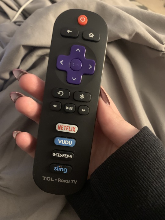
TV remotes have been around for a while now, but they continue to evolve and become even more convenient for users. This is my remote for my smart tv. Not only does it function as a normal remote, but it also has buttons that can take me straight to various streaming apps like Netflix. Some remotes now a day even have voice command and allow users to direct it via their own voice without having to lift a finger. Another thing to notice about remotes is the size of them continues to be smaller and more sleek as well.
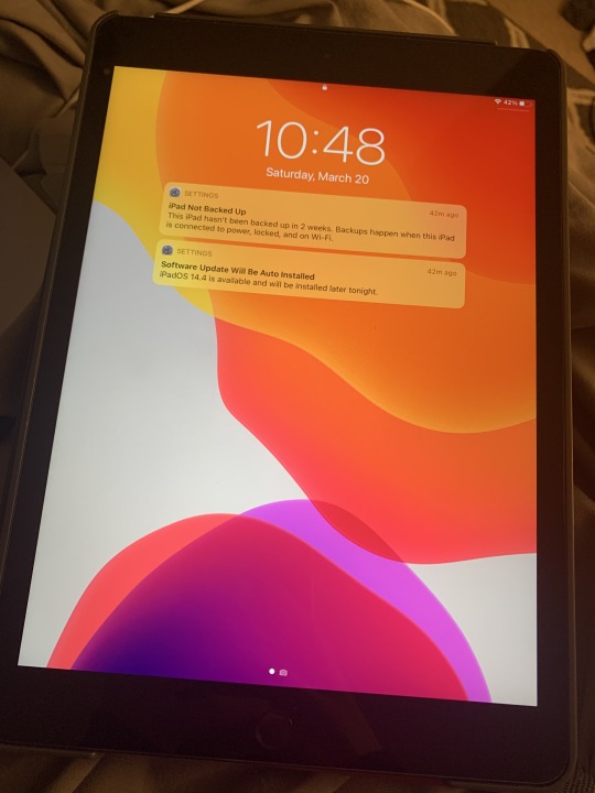
This is my iPad that I use nearly everyday for graphic designing. iPad or tablets haven’t been around for very long as some other inventions in the tech world, but they are constantly changing and becoming more useful. When I got my first iPad in third grade, it was a lot thicker and more bulky and it didn’t even have a camera. Today, iPads and tablets can do so much and are even starting to replace laptops due to their smaller size.
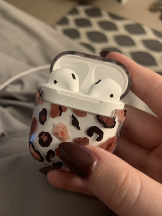
Airpods have been a great edition to my life. Although headphones have been around for a long time, Apple changed the game completely with these wireless bluetooth headphones. Not only are they visually more appealing, but it’s very useful to not have cords hanging down like traditional ear buds. Today wireless ear buds have nearly taken out the traditional ear bud completely. Not only does Apple have this product, but so many other companies have created their own versions for much less in price.
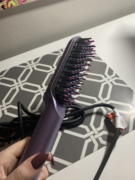
I recently came across this amazing brush that has made my morning routine much more convenient. This is an electric brush that not only combs your hair like a traditional hair brush, but it also straightens it at the same time. It’s comes in many different colors and there are a lot of variations of this design on the market as well.
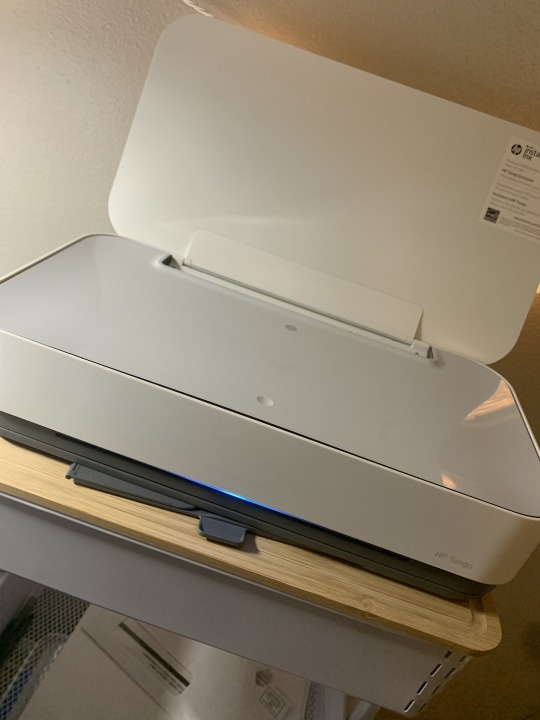
Another thing that I have seen really evolve in recent years are printers. Printers continue to become more simplistic, appealing, and smaller. I love the design of my printer because not only does it provide the function of printer good quality images, but it’s also super simple and not an eye shore in my bedroom. The back part is where the paper sits and it can also lay down as well, which I really like for visual purposes when I am not using it. Printers continue to change to become more convenient and simplistic for users, which I really appreciate because I am not that tech savvy when it comes to printers. There are even portable printers on the market that can fit into a purse or a bag, which is great for people on the go.
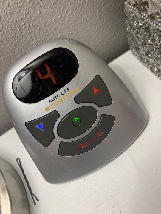
This is a great innovation for people who are always cold at night. There is nothing worse than getting into bed after a long day and your bed is ice cold. This is a heated mattress pad, and it is amazing. I also really like how small and simple it is so it doesn’t take up a lot of space on my night stand. It has multiple settings and even a preheat button that you can turn on before getting into bed at night. This design has also been really great in terms of saving money on electricity in the winter as a college student. There are tons of different kinds of mattress pads on the market and have a lot of different functions and uses for them, but this is the coolest innovation of the mattress pad I have seen yet.
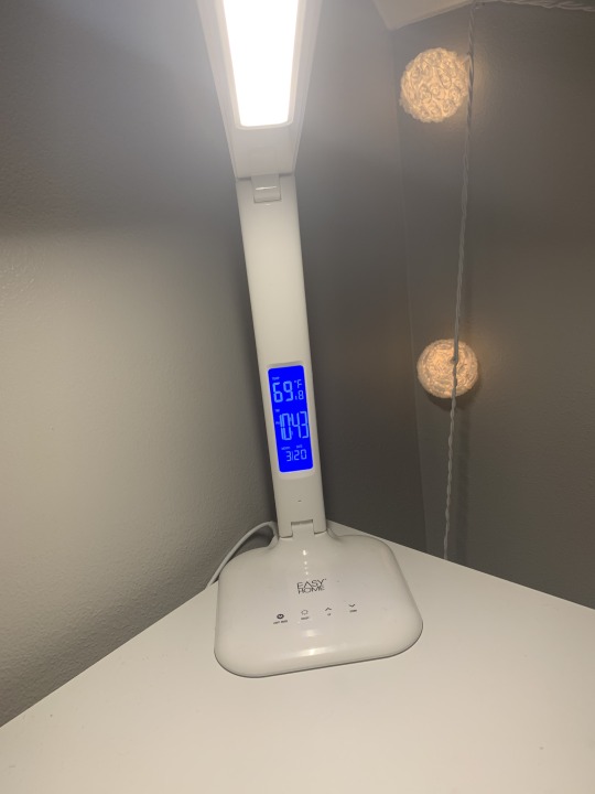
When thinking about industrial design, we think of innovative designs and sleekness. This desk lap I think is a great example. This lamp has so many different functions such as; different light modes and brightness levels, its touch screen, a clock, a room temperature, an alarm, and even a USB port to charge your phone. All that function into this small, simplistic looking desk lamp! It’s pretty great and is helpful in so many ways. Obviously lamps have been around forever, but more and more am I seeing lamps that serve as multipurpose tools instead of just being a source of light.
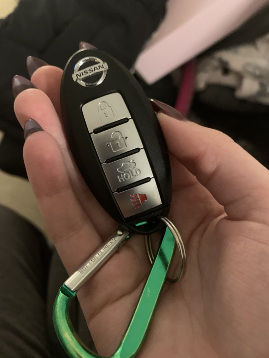
This is my key fob for my car. In industrial design as cars are becoming more innovative and visually appealing, so are their keys. My car doesn’t need a key to be put in it to start, I just simply have to bring this key into my coat pocket when trying to start my car. I think it’s really convenient to not have to think about your keys. I just put it in my purse or coat pocket when i am leaving the house and don’t have to think about it again. There are many cars on the market today that have similar keys, some even have buttons that can start you car before you even get in it. Sometimes it’s the simplest things that are innovated and become so convenient that consumers wouldn’t have even thought twice about before it came along. I would have never thought this innovation would have become so admired, but it really is!
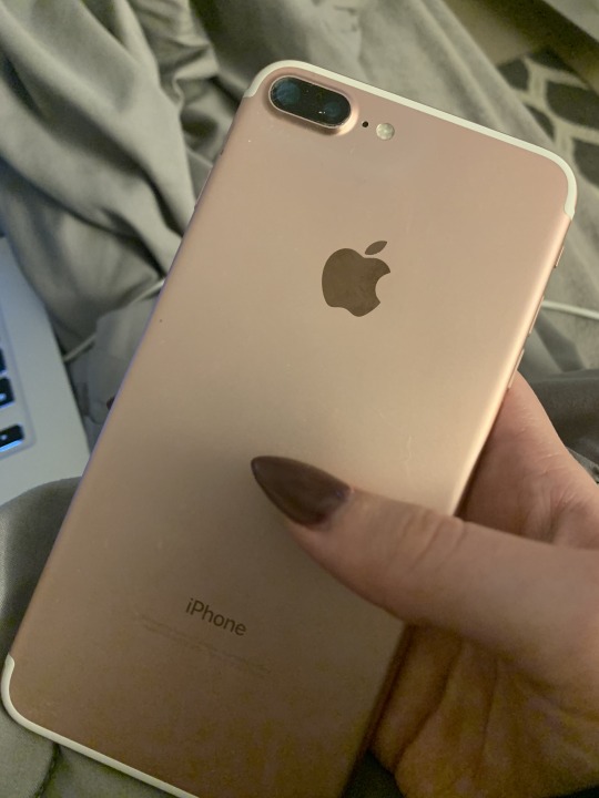
I don’t think anyone could talk about innovation without bringing up the iPhone. iPhones are constantly becoming more innovative and convenient for users. They serve as so much more than a smart phone. The design of iPhones are also have a very minimalist aesthetic. iPhones are also very user friendly which is great for those who are tech savvy and those who aren’t, which is a huge reason why I believe iPhones are so popular. They have so many different tools that make everyday life for its user more convenient.
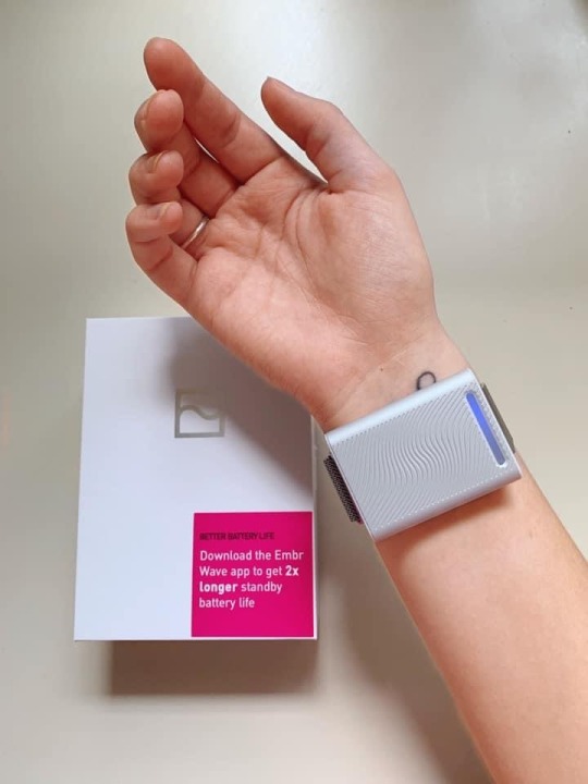
The last piece of industrial design that I use heavily is my Embr Wave. Although it might not be a very well known device right now, it serves a great function. It was created to help people regulate their temperature better by allowing users to either chose to cool down or be heated up. You place this little device on your wrist because it is said to be one of the best spots in your body to help change your temperature. If you have ever seen someone pass out, sometimes medical personnel will put an ice pack on their wrists to cool them down, and this device does exactly that. I have a medical condition that doesn’t allow me to regulate my own body temperature well and if I get hot, I pass out really easily. This device has replaced the need for ice packs and other cooling cloths and has truly saved my life in some cases. It’s a really great innovation especially for people with certain medical conditions.
0 notes
Text
Week 7 - Architecture
Two key principles of Universal Design are Equitable Use and Flexibility in Use.
Equitable Use in design is a design that is useful and marketable to people with diverse abilities. In other words, Equitable Use designs are made to be accessible for everyone, including those with disabilities. These kinds of designs provide privacy, security, and safety for its users. Equitable Use is made to provide the same means of use for everyone, and if that isn’t possible, it provides an equivalent that makes it useful to all. There are a lot of examples that I can think of around me, such as; automatic doors, ramps, and elevators. These designs make it possible for everyone to use. Automatic doors are useful for those who can walk on their own and even those who may need assistance with a walker or even a wheelchair. Automatic doors have sensors that are able to detect people coming through so that they are easy to come through. Ramps are also a form of Equitable Use in design as well. If someone cannot walk freely and needs a walker or wheelchair, they are still able to use the ramp because there are no stairs. A personal example of this in my own life comes from my high school I attended. It was a very old high school and only had stairs originally to get to a higher landing of the floor, but it was out of code and wasn’t safe for those who needed to use wheelchairs or crutches, so they had to renovate and create a ramp as well. This is an example when the design could not provide equality for all users, so they had to make an equivalent, which was the ramp.
Flexibility in Use in Universal Design is a design that accommodates a wide range of individual preferences and abilities. Flexibility in Use provides a choice in methods of use, accommodates right or left handed people, and provides adaptability to the user’s learning speed. An example of this would be non-smudging pens. For those who are left handed like myself, it can be really frustrating to write things (especially for professional purposes) when everything you write gets smudged. I recently came across these pens that are designed to not smudge, which is great for right handed users and even better for left handed users. Another example of Flexibility in Use is closed captioning found on TVs. This allows for people who cannot hear well to read what is being said on TV instead of just watching it in silence. This provides flexibility to users with a preference to read and watch or for those who don’t have the ability to hear what is being said.
0 notes
Text
Week 6 - Architecture

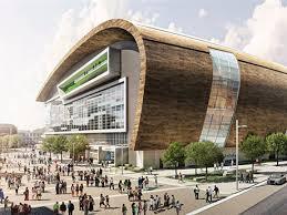
The Milwaukee Bucks’ arena, Fiserv Forum, is a really interesting piece of architecture found in Milwaukee! The top photo is a real photo of the forum, and the second photo is actually a digital sketch/mock up from when they were in the design process.
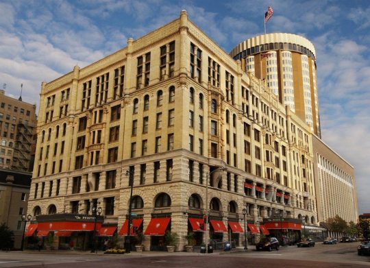
The Pfister Hotel located in downtown Milwaukee is a beautiful piece of Victorian architecture found in the city.

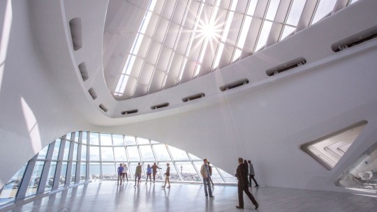
The Milwaukee Art Museum is a really unique piece of architecture. It has a lot of really cool arches and window designs that make it feel very open and bright.
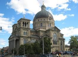
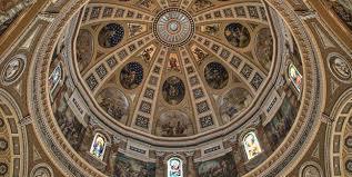
The Basilica of St. Josaphat is a Polish cathedral is a piece of architecture that looks even cooler on the inside than the outside. It’s filled with amazing art like murals and glass stained windows.
0 notes
Text
Week 5 - History of Design
From this week, there are a few examples of design found in the reading that I can correlate to things I see either on a daily basis or just in the modern day today.
(image from www.washingtonpost.com)
On page 193 of our textbook, Graphic Design: A New History, it talks about Gustav Klutsis who was a Constructivist artist. He worked to create new graphics and design dynamic display signs. He created displays that collaged together different types of photographs with letter cut outs. It created chaotic energy and design. He made postered for Russian athletes and even political leaders. The work of Klutsis reminded me a lot of movie posters that we see in theaters and on social media today. A lot of them have the same effect of collaging several photos and lettering together to create an intriguing picture.
(image from www.logodix.com)
The textbook also talks about the 1920s movement of The New Typography. This movement liked the use of asymmetry and San Serif fonts. Rather than the purpose of the design to be made to share a certain message, this movement focused more on appearance. Sans Serif fonts are heavily used today and can be credited to this era. Helvetica font was created during this time period and if found in many brands that we see on a daily basis.
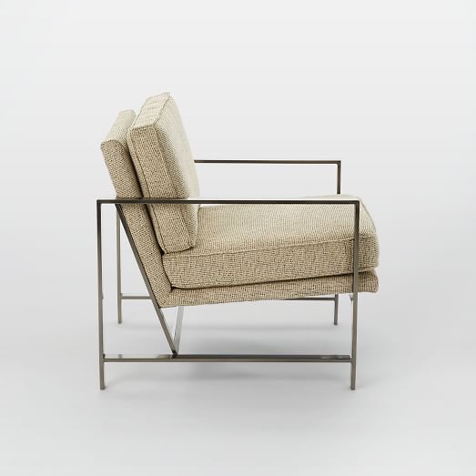
(image from www.westelm.com)
Another thing I found interesting from this week’s reading was the impact of the Bauhaus in buildings and furniture. On page 217 of our textbook, it talks about how furniture and such was “designed to complement the reductive geometric abstraction and modern industrial materials of the buildings themselves… Designed chairs for the buildings that for the first time employed unadorned tubular steel for the frame.” During this time period design started to become more modernized and used steel and canvas for fabric instead of conventional furniture that was made of wood and springs. I see a lot of this kind of furniture in our everyday lives. The modern furniture that looks more industrial is quite popular. Although I don’t personally think it is as comfortable, this kind of furniture does make a statement and provides a clean aesthetic.
0 notes
Text
Week 4 - Found Object
As I left my warm home this week to take a walk in the snow and cold for this week’s journal entry, I came across a lot of people in my neighborhood using a snow-blower to remove the snow from their walk ways and drive ways. Despite being able to find a lot of other elements of design, I saw so many snow-blowers that I decided this is the object I would focus on.
Although snow-blowers might seem to the average person that they are all designed pretty much the same, I observed quite a few differences in each. Almost all the ones I saw on my walk were a different color, some red, some yellow, and some green and yellow. The one at my house is red, which is probably due to it being a Craftsman snow-blower and red is their brand’s main color. I also saw different sizes of snow-blowers. Some where smaller that the user holds onto the handle bar and maneuvers themselves, and others were tractor like where the user could sit and steer with a wheel. And lastly, I saw the giant snow plow trucks from the city that are bright orange with a large shovel like object in the front removing snow from the roads. If it isn’t pretty obvious, snow-blowers possesses an element of design. Snow-blowers are designed to solve the problem of removing snow from side walks, drive ways, and in my dad’s case, part of our backyard to create a path for my dog to roam around.
The most obvious comparison that I can draw to a snow-blower is a shovel. They are utilized for the same purpose, which is to remove snow from the sidewalks. Visually, the are a lot different from snow-blowers. They are a lot smaller in size and pretty basic in design compared to the innovation of a snow-blower. Although they still do the same job and are utilized the same way, they require a lot more labor from the user than a snow-blower. Since shovels require mostly the user to do all of the heavy lifting, it also takes a lot longer as well and isn’t as convenient. Shovels do possess an element of design and solve a problem, but they are definitely not as nice to use as a snow-blower.
0 notes
Text
Week 3 - History of Design
Post a combination of 10 drawings, photos and/or notes on design observations you see in the world around you since the beginning of this semester. Please refer to your reading for historical elements from design that are showcased in your observed modern design examples. (Scan or photograph notes for post. The 10 observations must utilize all three observation methods. i.e. You can’t post 10 photos only.)
I learned a tremendous amount from this week’s reading about design and it’s history. I truly had no idea how in depth the history of design goes and how influential design has been even to our modern culture today. From this reading I learned that there are a lot of things that are still around centuries later in our everyday life today or were just stepping stones to the everyday items that we use/see on the daily.
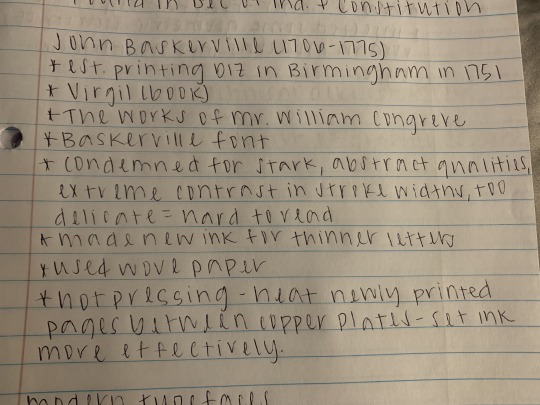
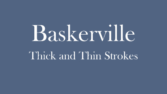
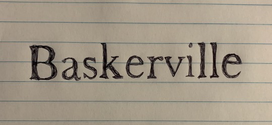
One thing that I found quite interesting is the Baskerville font, created by John Baskerville in the 1700s. Baskerville is a very common font that I see a lot and can be found in Microsoft Word and Google Docs. The first photo is from my notes from this week’s reading found on page 27 of our textbook, “Graphic Design - A New History”. It’s crazy to think that back then Baskerville font faced a lot of criticism for being hard to read, whereas today, it probably would not be considered difficult to read. The bottom photo is just an example of what Baskerville font looks like for reference. I also included a drawing by myself of the Baskerville font.
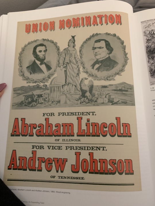

The nineteenth century saw the use of colored political posters become quite popular. On page 44 of the textbook, “Graphic Design - A New History”, shows one for the presidential election of 1864 for presidential candidate Abraham Lincoln and his vice president Andrew Johnson. The photo above shows what colored political posters look like today. Although these posters are still around today, there is a large contrast between the two. The colored political poster for Abraham Lincoln utilizes multiple different kinds of typefaces and also shows several images. It is very chaotic compared to what we see today in colored political posters. Today, these posters usually only use one bold typeface with no imagery. They are much more simplistic but their message is still clear.
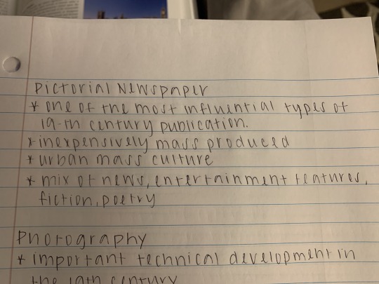
Another historical element of design that is still seen today is a version of the Pictorial Newspaper created in the nineteenth century. This was one of the most influential types of publication of its time. It was used to show a mix of news, entertainment features, fiction, and poetry. The first photo is from my notes that I took from the reading found on page 31 and 32 of our textbook. Although our newspapers may look much different today and can even be found online like seen in the second photo, there are still a lot of similarities. Today we still see newspapers having the same mix the pictorial newspaper had.
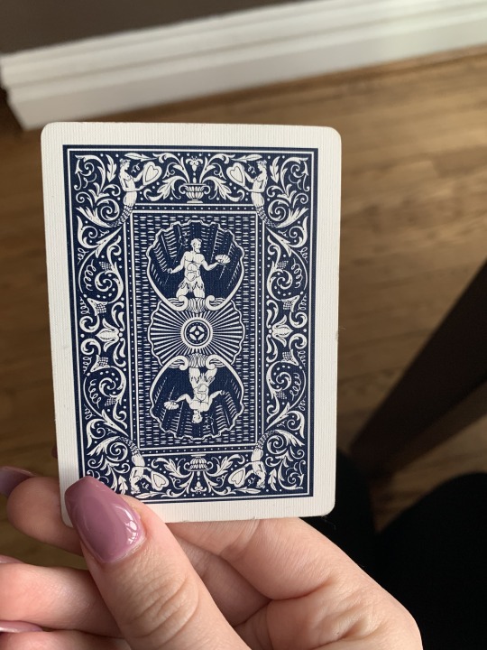
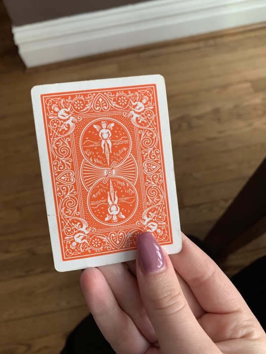
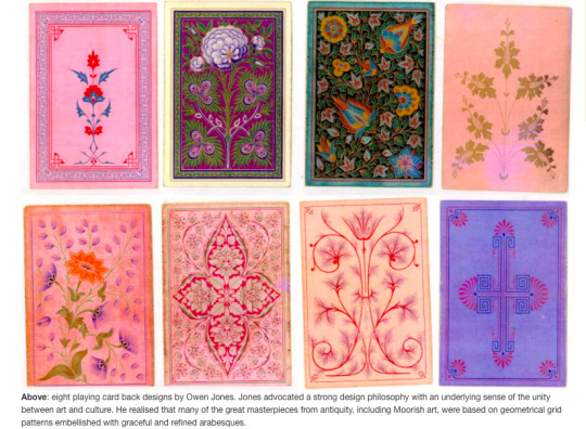
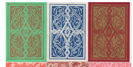
An additional form of design that is still seen heavily today is found in a deck of cards that most likely nearly every household has. The designs found on a deck of cards was created by Owen Jones, an influential British architect and designer. It is very clear that these designs have stood the test of times and are very well known. The photos above are taken from a few different decks that I have in my own home. The screenshots shown are some examples of Jones’ designs. Although the modern day cards are not identical to his designs, it is clear to see the similarities and his influence on the designs we see today.

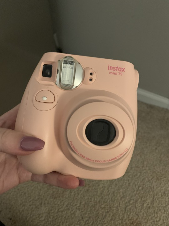
Another really interesting thing I learned from the text is the history of photography and how influential it was to the evolution of graphic design. It was said in the text to be one of the most important technical developments of the nineteenth century. The first photo is a picture of my Canon camera, this is obviously a lot more advanced than the first cameras created and produces much higher quality photographs. The designs we see today in these high tech cameras would not have been possible without their earlier versions from the nineteenth century. The second photo is of my polaroid camera that in the last few years has made a huge comeback. Although these polaroids are still more technologically advanced compared to vintage polaroid cameras, it’s still very interesting to see how they have come back into “style”.
0 notes
Text
Week 2 - Design Thinking
After reading “Design Thinking'', I would define design as at its core being an innovation to a certain consumer problem or need. Though I think there is a lot more to design then that. A designer needs to have a good understanding of what people want and need, their likes and dislikes as well. A design also doesn’t have to be a completely new innovation, it can be an updated or more practical version of something that already exists today. Another thing I found interesting from this reading is that it goes on to talk about how anyone can be a designer, it doesn’t have to come from someone who has a degree in design. To be a designer you just have to embody these characteristics; empathy, integrative thinking, optimism, experimentalism, and collaboration. I think this was a great point to add because there are many inventions that come from individuals that weren’t necessarily taught to be designers, they can simply just be people in a certain field of work that are knowledgeable and see a need and want to be the solution. So although there are specific definitions out there of what design is, I think of design as a huge puzzle with many different intricate pieces that together make it a whole, which makes it difficult to give it one standard, concrete definition.
Design thinking is recognizing a need and then creating an innovation that meets that need. Not only does design thinking meet a need, but it is a lot of times made to be visually appealing or have features to it that go beyond the consumer is looking for. For example, an iPhone (made by Apple and invented by Steve Jobs), was designed to be a mobile form of communication for the consumer. And although that’s its most basic purpose, it goes much beyond that to make life more convenient. An iPhone has features such as a GPS, a calculator, an alarm clock, and accessibility to email. All these features (and more) make life so much more convenient for the user and can even take the place of a lot of previous innovations that we would have needed without it. An iPhone can replace the need for a built in GPS in a car or an alarm clock on our night stand. All these different features and uses of the iPhone just go to show how much thought and detail truly go into the design thinking process making life more convenient for the user and replacing many older needs.
0 notes
Text
Week One - About Me
Hi, my name is Abigail Clements, but everyone calls me Abby. I am a junior this year studying marketing with a minor in design. I have always been artistic and had a love for fashion and design but never thought much about turning it into a career. Originally, I thought I was going to get my degree in accounting but I realized graphic design or something in design is what I am meant to do. I have quite a few chronic illnesses that I have been struggling with for four years now, and actually had to take a semester off last spring to focus on my health. During this time I explored my interest in design more and fell in love with it all over again and changed my major. This summer I even started up my own small graphic design business which keeps me pretty busy.
I’m taking this class to fulfill the requirements for my design minor, but I am so excited to take this course and finally start doing things I am passionate about. Although I do have a small business for graphic designing, my preferred drawing program is Procreate. I don’t have much experience with photoshop, but I am known for being the girl that can edit anything out of pictures. I am taking another ART course this semester to learn more about Adobe Illustrator and Photoshop, which I am really looking forward to as well.
I am mostly inspired by Pinterest, fashion and big cities. Growing up 25 miles outside of Milwaukee and having all my family in the Chicagoland area, I have been around cities all my life. I get most of my inspiration when I am in the city. I love looking at the unique architecture and seeing other people’s fashion sense. My ultimate goal one day is to live in a big city, so I am really hoping my degree will lead me in that direction as well. My dream career would be something either in the fashion industry in marketing or to do social media marketing for a professional sports team.
1 note
·
View note