Text
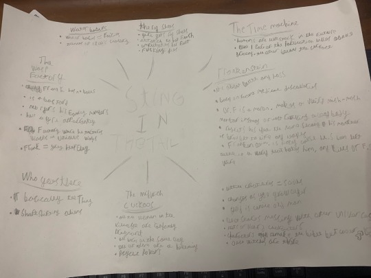
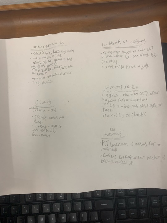
To start off with for this project we have some starting spider diagrams that show off the contents of all the stories we can use for inspirations for this project, I’m more leaning towards Frankenstein for a few reasons
.I love the idea of designs a more grittily designed Mad scientist and monster design to give some more fitting material for a style change for this project,
.the somewhat more grounded theme and story give a solid contrast to the final results of my other works and the research I’ll get done will allow me to research some ideas I never would have before.
.it’s one of the simpler and more understandable stories of the bunch meaning more focus can be put in changing up my art methods and creating new takes for their designs.
0 notes
Text
continuing with our covering of the Nazi we now have the purpose of concentration camps to discuss.
the first Nazi made concentration camp was made only a few months after there rise to power in march of 1933, the camps originally were made with the intention of housing political opponents to the nazis like communists and trade unionists, though after the night or broken glass the camps saw a massive increase in Jewish people and just about everyone else the nazi’s didn’t like, alcoholics, gay people anyone who went against there vision was unfortunately condemned to these places if found out.
while not made with the sole intention of killing people the awful conditions of the place and cruel apathy of the guards employed there meant there was a solid chance of death upon entering.
things during World war 2 with soviets and prisoners of war now also being condemned to these hell holes, and the amount of them increasing to 40,000 during the events of the war, the already awful living conditions became beyond inhumane during the 6 years these events went on, with the living conditions and gassing of prisoners resulting in the deaths of 6 million Jews and likely hundreds of thousands more.
To this day the events of the holocaust remain one of the most inhumane and cruel parts of human history, hopefully something of this brutality and cruelty will never happen on the same magnitude again.
this specific site helped me a lot with the research of this event and to refresh me on the subjecthttps://www.hmd.org.uk/learn-about-the-holocaust-and-genocides/the-holocaust/the-camps/concentration-camps/:
0 notes
Text
ok so it appears I may have accidentally skimmed over the aspect of studying more social history for this project that I’m going over as of now starting with one of the more well known ones that being the Nazis treatment of the Jews during there reign of Germany
one of the best examples of this is Kristallnacht or more commonly know as “night of broken Glass”
the event was started after the shooting of a German embassy official in Paris named Ernst vom Rath, he was Shot by 17 year old Herschel Grynszpan as a few days earlier thousands of polish Jews were expelled from German including Herschel’s parents, enraged by this and seeking revenge for his family’s circumstances, Herschel would go on to shoot and kill Vom Rath, the actions of this would create a snowball event of which that caused the events of the night of broken glass.
The Nazi Party becoming aware of these events decided to use the situation to their advantage to initiate a event of antisemitic excess, encouraging the masses to outrage about the event as they please as well as arrest as many Jews as jails cells could hold, the event resulted in many Jewish houses and institutions were damaged or destroyed, even jewish buildings that caught fire were let burn as the higher ups told the fire departments to only stop the fire from spreading to other areas, over 7000 jewish establishments had there windows destroyed in the event and many were looted as well, to make matters worse the Nazi Party said the blame of the event lied on the Jewish community themselves leaving them to have to pay for all repairs to their damaged homes and businesses.
while a simplification of the events the recounting shows how the Germans used the actions of just one jew to lead an antisemitic crusade which would result in the events of tens of thousands having to pay for an action they didn’t commit, the Nazi’s fear mongered the public against them
links that helped with the creation of this project:
https://encyclopedia.ushmm.org/content/en/article/pogroms
https://encyclopedia.ushmm.org/content/en/article/kristallnacht
0 notes
Text
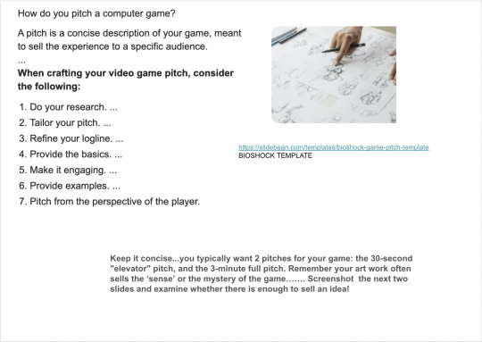
ok so here’s some images shown of how to make a pitch sheet on the google classroom page to give us an example to help work on and give and example for our own Pitch sheets that were going to make,
as well as that they also gave an actual pitch made by someone and how they did it and talked about it
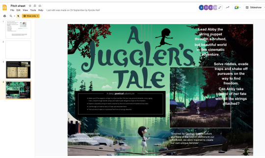
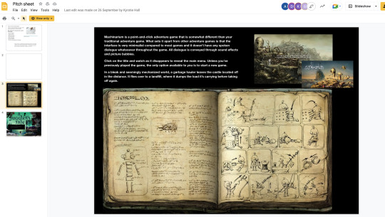
these images will be very helpful in the inevitable production of my pitch sheet.
0 notes
Text
Possible theming related to my projects story
ok so, with description given of my plot synopsis of Fractured roads is that there is an overall theme of the story that’s sort of slipped my mind until now, that being of incompetent world leaders, most of the Overlords have either been mentioned or Implied in the story summary or previous posts have been described to be incredibly irresponsible or flat out bad at their jobs, the story itself when you think about it in this light becomes more of a story talking about how incompetent leaders can not only screw over other countries as well as themselves by ruining relations by due to their own inadequacy or ignoring responsibility, only after having the sense quite literally Knocked into them do they start to take their Jobs seriously again, possibly being an encouragement for people to be more vocal about their leaders incompetency less nothing changes.
this though was somewhat of an an unintentional theme I never had this theme in forefront of my mind while imagining the characters or story and more just fell together as I defined things more, it’s very much a very basic and lighter theme however, it doesn’t really go into depth about the idea as the focus is more on the worlds characters and gameplay, instead of being a one to one interpretation of world leaders being Incompetent in running their countries properly, also I think it would be hard to pull such a thing off when one of my Overlords is a Halloween themed Jack-O-Lantern dressed like Dracula.
again It’s not an incredibly in depth theme seen in every aspect of the games identity, but it is relevant enough to the overall plot that it’s worth a Blog post going over it.
0 notes
Text
Project Title: Fractured worlds and story summary
Ok so I have a final name for my game concept that being of course seen in the title
Fractured Worlds.
the title being a play on not only how messy the relationships between the worlds and there overlords has become but also a reference to how fangs skull mask has a fracture in the left eye
as well as that here’s the basic story summary
while the idea of a world being home to many more worlds within them seems somewhat confusing that was the case for the many worlds overseen by their overlords, and while they all had vastly differing opinions on how to run things for a time they all managed to work together and help each other, unfortunately overtime many of the overlords began to shirk responsibility or return ends of their deal due to incompetency or pride, after an extended period of this unprofessional buffoonery going on the Overlord of the land of shadowy road “The Skull Lord” has grown sick of these games and is ready to get his fellow leaders back in line even if it means by force, as such He sends his right hand man and Best Knight fang Out to set his former comrades even if it involves some more “Aggressive” Persuasion.
0 notes
Text
an update report of the new sketch I made for my angular crab boss design I later dubbed “King Crabular” a name inspired by the fact that the Boss was based off a King crab but also combining the words “Crab” and “Angular”
the next few pictures of the character are small showings of process on the enhanced sketch I made of Him
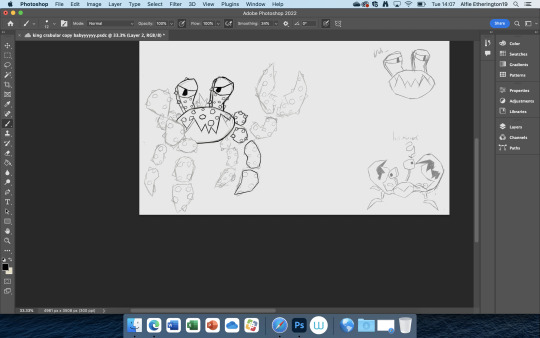
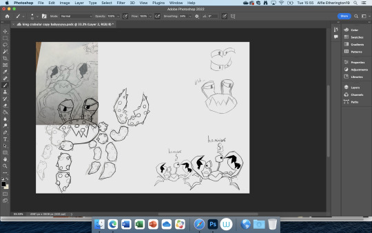
the next few images also show the line art and next colour for King C and his minions, Kysrtie recommended the idea of having the smaller minions being lighter in colour and more orange and I liked that enough to implement it in the duplicate of the minions as well as moving some of there Eyes around to make them stand out a bit from each other instead of just being full on copy pastes with different sizes and colours
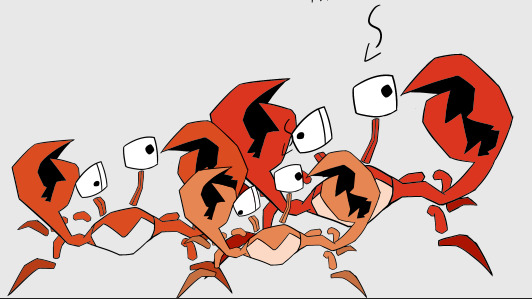
I didn’t have the time to get a bit fancier with the shading and such for King C and his minions which is unfortunate but it probably makes the process of talking about the colouring a bit easier as it was mostly just me using the good ol paint bucket tool to help me out but using a different brush for some parts of his limbs to give some extra colour variety to this dude
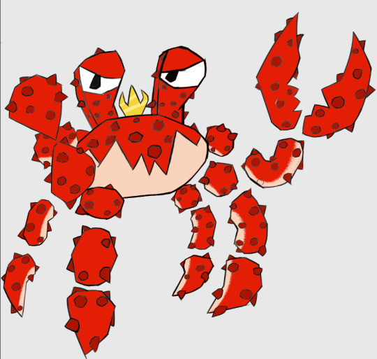
overall happy with this guy but wish I had more time to do more poses and expressions for him.
0 notes
Text
The Devils Knot story is a true story with multiple different adaptions whether it be novel or film it’s a story about, 3 children being murdered and 3 Teenagers being accused of it due to people believing they were in cahoots with some type of Satanic cult.
the story states that Three 8 year old kids Christopher Byers, Michael Moore, and Steven Branch had all gone missing only for their bodies to be found in the woods near their houses a day later, their bodies being brutally beaten and mutilated in specific ways that made people believe that the murders were possibly traceable back to a satanic cult of some kind.
the three accused of the crime were know as the “The Memphis Three” Jason Baldwin, Damien Echols, and Jessie Misskelley, three teenagers who had a recorded troubled history in the past with Jason and Damien having past history of shoplifting and vandalism and Damien as well even had times where he had to spend time In a mental institution Damien and Jason were said to be close friends, both bonding over there distaste for the culture in west Memphis, and while Acquainted with Jessie from school apparently they weren’t super close to him.
Echols was repeatedly was suspected due to having an interest in occultism and a police officer thinking he was shading, despite being interviewed more than any other suspect the police but made very little progress with him seeing him as more as source for information rather than a direct suspect
Jessie was later interviewed despite multiple issues with the interview, for one jessies IQ was around 72 meaning he qualified for barely intellectual functioning, next was his status as a minor, while Jessies farther gave him permission to go with the police he did not agree to his son being interrogated.
the end result of that was Jessie being forced into making a confession of which he didn’t understand the laws of, which then resulted in Damien being arrested as well as Jason for no real reason other than being close to Damien
there still remained more inconsistencies' in even the eye witnesses stories came out inconsistent and more absurd each time they recounted it
despite all this and more clear as day mistakes the Memphis Three were charged as guilty with Jason and Jessie receiving a life sentence and Damien receiving a death sentence, upon retrospect of how shoddy some of the evidence were, the case was revaluated and the three were given an offer to be released and in late 2011 that was exactly what happened.
the story of what happened to the Memphis 3 is a story of wild superstition and accusations taking president rational though and deduction, despite breaking multiple rules during the investigation and the actual evidence being inconsistent at best and flat out wrong at worst, however because they LOOKED to fit the bill everyone looked past, what happened to these 3 is pretty messed up in hindsight and makes you wonder if the people in the court ever heard “innocent until proven guilty”
however perhaps this story could be used in some way in the plot of my game, perhaps the reason the over overlords ignore the skull lord is that they assume him and his kind are all part of some deranged murder cult due to all wearing horned skull masks that would give them almost a demo look from afar, either either way food for thought.
links for where I gathered most of the information
https://en.wikipedia.org/wiki/West_Memphis_Three
https://en.wikipedia.org/wiki/Devil%27s_Knot:_The_True_Story_of_the_West_Memphis_Three
0 notes
Text
platformers have a variety of styles of level design whether more linear or more open or blend of both, there’s a ton of different ways you can spice up the gameplay of these type of titles, no better can some of this design be seen than in some of the early titles of the sonic series
The early genesis titles took advancer of sonics momentum system to create these larger speed based jungle Gyms with slopes and loops and multiple different layers which allowed for a variety of different ways to play them, you could either use your map knowledge and skill to take the fastest possible root and keep a consistent and speedy flow encouraging replay value and learning the levels, or you take your time to explore all the level has to offer and find it’s many secrets including ring cases, extra lives or in sonic 3 and knuckles, warp rings which gives you a chance to nab the chaos emeralds, you Can really tell in zoom out of these old genesis levels that the devs designed for players who wanted to test themselves to beat the zones as fast as they can, and the players who want to see and explore everything the game has to offer
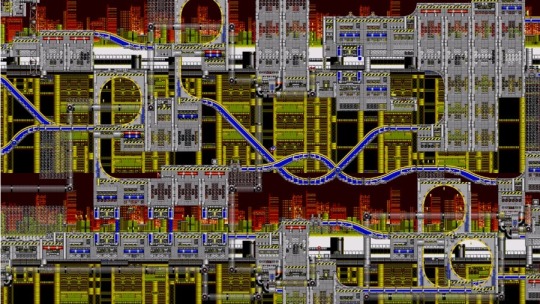
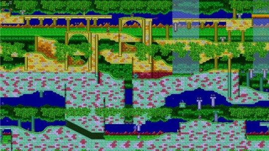
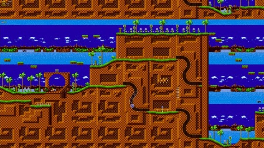
However as the series progressed into 3D and onward they’d take more focus onto the action and speedrunning side of sonic gameplay rather than the exploration aspect, while this isn’t entirely a bad things as in some cases it allowed for more fast based and fun linear level design however it’s impossible to deny that the free roam and exploration aspect of sonic was somewhat downplayed.
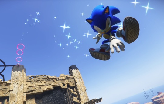
That is until possibly very recently as sonic frontiers has recently shaped up to bring that exploration and free form style back to the series with its “open zone gameplay” and multiple ways and options to progress through the story, so it appears that that focus on exploration might make a comeback for this title.
0 notes
Text
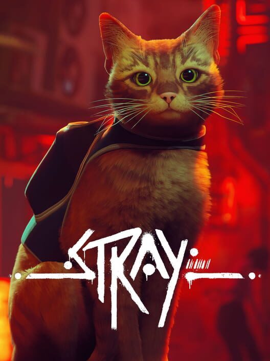
ok last cover let’s wrap up with a nice simple one, Strays cover is very straight forward but get’s its across very concisely, the cover shows our main character, the Stray Cat we play as front and centre, strays whole thing is that you play the story from the perspective of some random little cat who just kinda fell into this situation by accident, so of course it makes sense to have the literally selling point of the game be front and centre
The font for the cover is also really nice looking probably the best one We’ve had so far it’s look of being done with graffiti with small stain marks and dripping paint gives it a very run down and grunge feel, but at the same time the very angular and alien way the letters are drawn also gives very futuristic and robotic vibes which fits since a lot of the side characters in this game are robots in a run down post apocalypse city area type area you can even see it in the background a bit
a bit of the futuristic aesthetic can also be seen in again the background, and the weird little vest thing the Cat is wearing.
as mentioned Strays cover is simple but conveys everything it needs to in a very subtle and straightforward way, overall very good.
0 notes
Text
Alright I’ve probably had too much fun with the last let’s take a look at some bad game covers
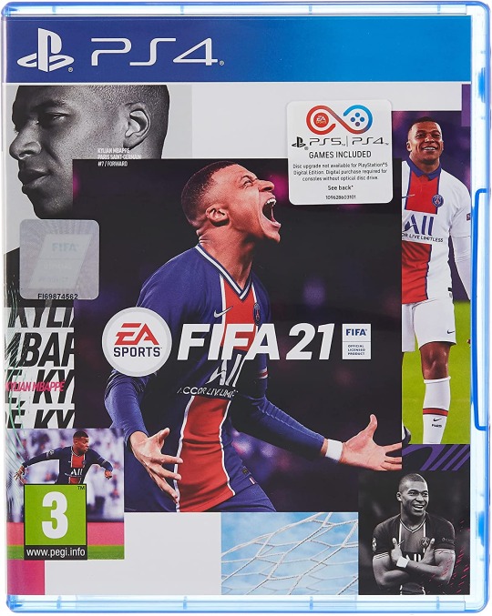
Your eyes do not deceive this is an actual game cover, they released this.
now before I completely tear this to shreds I feel I might as well reluctantly play the game of devils advocate to at least give this somewhat of a fair chance, cause if you squint a bit, maybe also look side ways, maybe also imagine it not looking like it was in photoshop in about 5 minutes, you can somewhat see what their going for here with it being a collection of a footballers career with multiple screenshots throughout their career I’m guessing.
However what I said their intention might be is more than likely giving way too much credit to a company like EA, and the more than likely Intention of this cover is they were cutting too close to the deadline and made this at the very last minute, cause let’s just get this out of the way, this cover is comically bad looking, the blog basically writes itself with how comically cheap it looks, if you had removed the cover itself from the game case and showed it to me on a whiteboard of some you could very easily convince me that this was the work of a 14 year old making a PowerPoint on a thing they like, it’s quite literally just images of a footballer over a white background, it looks so comically bad that it doesn’t even feel real.
I think the worst thing about it is just how soulless it is, it has no personality or even gives any hints to what the game may be about though to be fair all the FIFA titles are basically just generic football games, so I suppose there would be nothing to really show off in a game cover anyway
tho in a way I suppose it fits, A bland and soulless cover for a bland and soulless franchise.
0 notes
Text
wow a whole 2 posts in without talking about sonic, let’s fix that
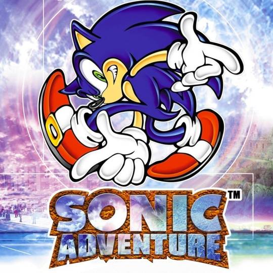
sonic adventures cover is probably one of the most memorable covers out there and many factors of it’s design leave it sticking in peoples mind
the first point is likely the most obvious, sonic himself, for some context for the dreamcast era of the series and going forward sonic and co received some minor to major design changes depending from character to character, meaning the cover was likely at the time the first time the average consume would see sonics new look, giving all the more credit to just how stylish and in your face sonics pose is his here, the pose and sonic himself in his earlier artwork after first being redesigned definitely harkened back to old rubber hose cartoons with just how stretch and stylised sonics limbs are here, the pose itself also imbues a sense of 90′s to early 2000′s coolness which can be seen over the top is also somewhat timeless and charming in how fascinating it looks even to this day, I’ll move on before this just becomes a post about sonic art sorry.
the background of the piece remains very vivid and dreamlike with multiple locals of the game looking as if they were trapped underneath the water which is also supported by the water drop vibrations surrounding sonic, this is also a subtle reference to how the games main antagonist Chaos, is an entity composed of entirely water which gives the ocean like background a whole new meaning
the font of sonic adventure is probably the only weaker aspect of it as the 3D look of the logo as well as the image of the clouds seen in the letters while impressive at the time hasn’t truly aged the best, though not to the point of dampening the strong suits of the rest of the image
sonic adventures logo just has so much unique and interesting imagery and symbolism wrapped within the confides of it’s simple exterior that it’s hard not to love it or at least find it charming, as they never really made covers like these from sonic adventure 2 going forward and nothing in the industry has recaptured that type of look] this games cover has again.
0 notes
Text
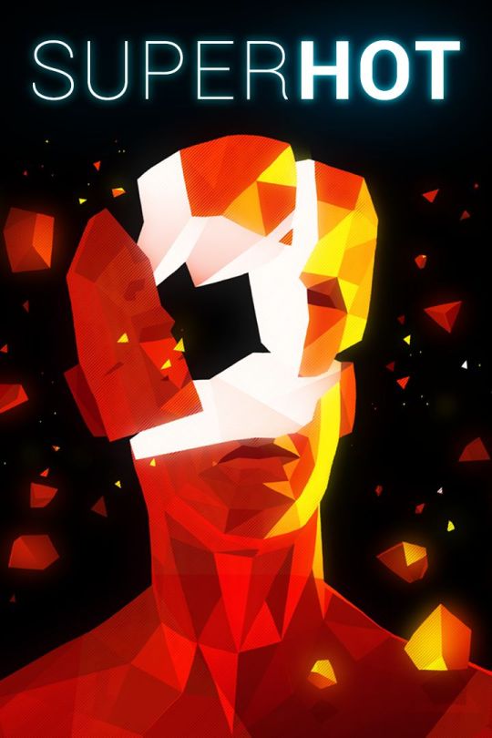
you know it’s funny considering how much I like super hot as a sort of De-stress type game for me that I’ve never talked about it so I guess that changes now let’s roll!
super hots title is simple and straight to the point as it shows a high quality close up of an enemies head getting blown in red shards exploding all over the place, like superhots general graphics it’s simple straight forward and gets to point but stands out in it’s affective use of colours with the glowing fragments of red contrasting with the darkness of the background
the font up is identical to the end level fonts seen at the end of every stage, with the hot being far more thick and assertive than the smaller and quainter “super”
this almost gives the sense that the hot in the cover is being said with more emphasis and value as well as referencing a valued game mechanic

superhot game cover while really simple manages to take the basic game concept and make a genuinely very pretty and thematically fitting cover to the game itself
0 notes
Text
I got requested to look at a few game covers for different game so yeah that’s what I’m gonna be doing for the next few blogs
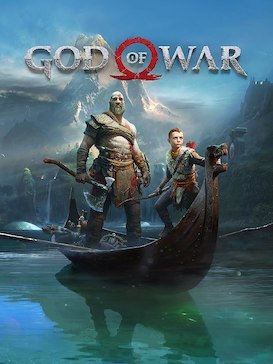
god of war is a bit of a random one considering I’ve never played it but hey I think it would be a bit unfair and repetitive if I went to revisit the same old Ips I usually go to talk about for this so I’m picking something new to keep things somewhat surprising
the cover itself has a very cinematic quality you see with a lot of modern PlayStation games, don’t believe me check out some other PS4 exclusives mad around the time and you’ll get it, uncharted, the last of us, horizon zero dawn, almost all of them have this sort of movie poster type vibe to them where it feels like the cover is made in mind of a move instead of a game though I suppose a lot of the games previously mentioned have way more of a lean towards their narratives than the average game
as for fonts god of wars seems to tie back into it’s basis in Kratos and the ever cleverly named BOY going around and exploring norse mythology as such the font has this aged stone look to compliment this as if the title itself was as old as the myths shown off in the game
God of wars cover is generic, but overall pretty solid it’s movie poster style makes it somewhat blend in with the other PlayStation exclusives but it’s undoubtedly well made.
0 notes
Text
yeah no joke were still treading with patching as this is probably still one of the biggest things made for the project thus far as it uses a lot of creative stuff and excess that definitely makes it come off as very ambitious compared to my other work, like imma be honest I really did pour my hear out for this piece in particular and am just really proud of it in general even if it probably sucked out even more of my soul than the work on the character sheet but I guess that’s lesser considering how I got the majority of the character sheet work done in one day compared to this piece which was a week long project I believe or maybe a little less either way here it is
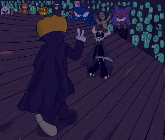
yep it’s our newly introduced pal sur patching ready to square done with fang in front of a spooky and live audience (fun fact that’ll probably haunt you whenever you look at this drawing but the posing and positioning of patchington and fang here were initially inspired by this meme template featuring the youtuber filthy frank
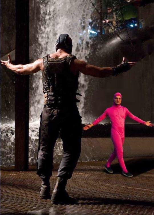
it’s not one to one and I did change a lot for it to just be an inspiration and not just a redraw of a meme but I figured this pieces humorous inspirations were at least worth a mention you known.
this one specifically was made a few days before the start of the new college yeah for the over the term project and I was really proud of once I was done
ok so quick notes on the process, as mentioned I started out with the sketch using said meme as the inspiration point there were some little inspiration points like the little doodles made for the background characters, you can also tell I was going for a stage even back then which continued into the next sketch
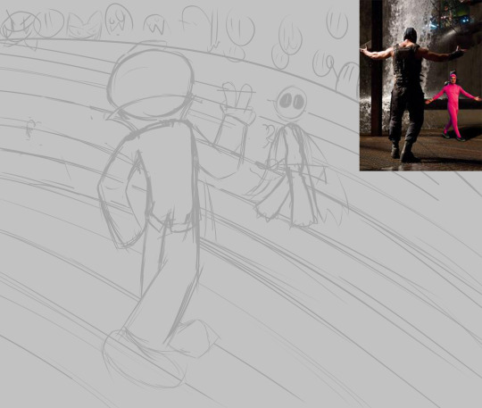
and here we get a bit closer to that final result you see a lot more characters in the background as well as fang and Patchington looking a little closer to how they normally look you also notice a lot more characters and references in the background like Gengar and the boo and a coupe other ones if you’ve got a good eye
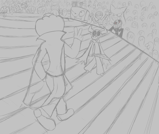
the line art and colouring was long but overall uneventful as the sketch was pretty much done it was me just redrawing a cleaner more detailed version of that with some minor improvements for the rest of the process different colouring and lighting techniques were separated into different layers and all collected worked together to create the final result of this image.
still to this day really proud of this one.
0 notes
Text
Age Ratings have been a thing in media for a long time now even before the advent and use of it in video games. The concept of age ratings themselves was invented back in 1968 to better help parents make more informed choices to what they should let their child watch. The system is used nearly identically for video games, only real split off is that the uk age rating system used numbers while the US version of video game age rating utilises letters still to embody a greater word essentially
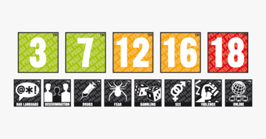
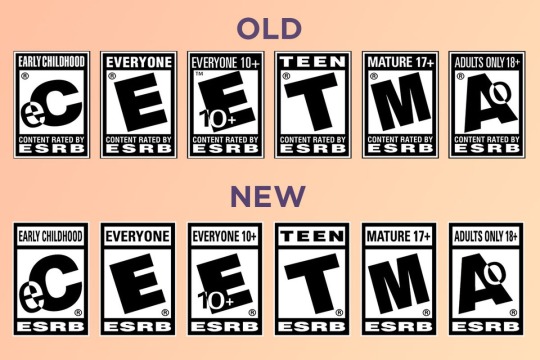
E= for everyone
T=Teen
Ect ect you probably understand
The reason I’m mentioning this now is that my fictional game has yet to receive a verdict in its age rating, as for what I believe that should be I’d probably say..
An E10+
I was initially going to say just an E as my art is normally very abstract and cartoony which gives it a slightly wider appeal than say something more realistic or gritty, however I decided to bump it up to an E10+ as while cartoony, some specific designs (specially fangs species) can likely give off some darker implications considering they all wear the skull of some creature, which may give off some accidental vibes that fangs species is just in some religious cult, I mean hell the the skull lord (that name in this context is probably asking for trouble in hindsight) is this powerful leader in a big cloak who has what looks like a human skull on the top of his staff and one of his necklaces is literally a demonic red eye in gem of sorts, when I think of it like that i can now better understand why Kyrstie assumed some of my characters looked like they belonged in. Cult.
But yeah as I said the rating I choose is E10+
for the exact type of person who may be interested in what My game is about, I’d probably say someone who’s very into the indie game scene, specifically indie Platformers, stuff like Hollow knight Cuphead, and A Hat In Time, games that usually have more cartoony styles or 2D artwork, but will sometimes have some darker elements and themes than the visuals would have you believe.
0 notes
Text
Yep we still continue down the path of the blog and here we have another Tuesday warm up drawing this time either making an alien or a tribal warrior or a bit of both I just went with alien
Really I just didn’t know what the hell to draw for this and just kinda drew the first thing that came to mind and somehow the idea with the least thought behind it ironically has become the very concept I’ve show for these sheets
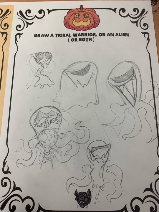
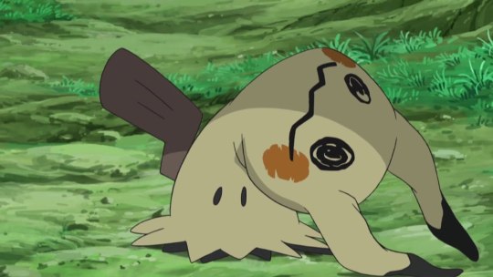
This smug looking among us reject is some gross space parasite thing from the depths of wherever the hell my mind was when drawing this thing, as shown it’s not only real slimy but can basically just morph it’s body to form different shapes like tentacles or floating appendages or trying to poorly imitate it’s prey mimikyu style.
This thing by all means shouldn’t have looked as decent as it does but hey life finds a way I guess.
Really not much to say here just surprised me basically admitting I have zero ideas was it’s own idea that formed into this thing
0 notes