
alternativephotographycom
AlternativePhotography.com
Historical photographic methods in use today – the art, processes and techniques of alternative photography. Photography as it should be: hands on, fun and inspiring.
532 posts
Don't wanna be here? Send us removal request.
Last Seen Blogs

saracatariina
Glowin ✨
lovereggaeton
Love Reggaetón
unknownsecret123
The Untold Fairytale

epicmurdock
2006 Preteen Goth

dancewithfeel
Share your dance life with the most positive dance community!
Text
Follow us... in other channels
Since we don’t have many followers (28) we will focus our efforts in other channels, please follow us here:
https://www.alternativephotography.com/follow/
0 notes
Text
Making large format negatives with X-ray film
Scott Wittenburg shares his experience of working with large format x-ray film photography and how he uses them as an inexpensive and fun way to create large-format negatives.
Writer and photography / Scott Wittenburg

First print!
I began my X-ray film experience after building a homemade 11x14 view camera from scratch several years ago. Having finished construction, I started looking for traditional 11x14 black and white sheet film online so I could try the thing out but soon realized that film this size was not only extremely rare but also extremely expensive.
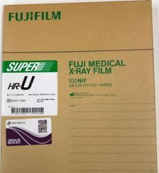
Fuji medical x-ray film
I soon discovered that some folks had used X-ray sheet film with encouraging results, so I decided to give that a try. Not only was the film easy to find, but it was also incredibly cheap—only around sixty dollars for 100 sheets! Since I was new to all of this, I decided to give Fuji HR-U X-ray film (green) a go simply because I was familiar with that brand name.
I ordered a box of X-ray sheet film from an online medical supply company and couldn’t wait to get started!
My first attempts were discouraging, to say the least. I had shot two sheets of film in my backyard and estimated the exposure settings. I then processed the film in my darkroom and examined the negatives. Not only were there light leaks from my homemade film holder, (through no fault of the film), there were scratches in the fragile emulsion. Also, the film was underexposed with very little contrast.
I had tray-developed the film and theorized that the raised ribs on the bottom of the tray were the reason for the scratches. To resolve this issue, I decided to use sheet film hangers instead. I bought a pair of 11x14 stainless steel film hangers from a different medical supply company and a three-gallon developing tank from a plastics company. The scratches disappeared, but the film still lacked decent contrast. So I tried a different developer with a longer developing time, which yielded better results.
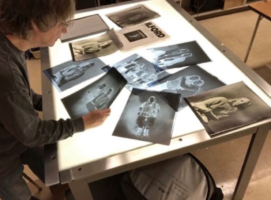
Scott Wittenburg proofing negatives.
After many trials and errors with exposure settings, developing times, and contrast filtration, I have finally worked out a system that works for my personal needs. I suggest to anybody wanting to give X-ray film a try to use whatever you have on hand before sinking a lot of money into it and to experiment with film types, exposure settings, light sources and processing times. As with any new process, experimentation is often the key to success and half the fun!
Since most of my work is done in the studio, I prefer studio flash as my light source. If you are going to shoot indoors and are photographing people, I suggest that you use flash to avoid long exposure times. I learned very quickly that it takes a LOT of light to achieve acceptable results indoors with this film since the effective ISO is only around ISO 50. My vintage Balcar 1500 watt second monolight has just enough power to give me sufficient light for synced exposures. If you are going to shoot still life, continuous light sources are fine since long exposures aren’t an issue.
Film tank and holders
As for processing, I use Rodinal diluted 1:100 for 5 minutes at 70°F, while agitating the film every thirty seconds for five seconds. I don’t use a stop bath at all and simply place the developed film in the fixer for a couple of minutes with continuous agitation, followed by a five-minute wash time. I always develop my film in total darkness, one sheet of film at a time, while listening to music —a necessity, especially whenever I’m developing six sheets or more in a single session!
With regard to contact printing my negatives, I use a number 2.5 contrast filter in most cases and Ilford Multigrade paper for conventional prints. This relatively low contrast filter number is pretty remarkable, really, since it yields decent contrast with good mid-tones that rival conventional film prints. I have used my X-ray negatives to create cyanotypes and salt prints with great success as well, and love the fact that I don’t have to rely on digital negatives to get the job done. Using a real negative is so much better!

Alisa Anika by Scott Wittenburg. Large format negative (or positive) with x-ray film.

Alisa Anika by Scott Wittenburg. Cyanotype made from X-ray negative on watercolour paper.

Lauren, by Scott Wittenburg. Using x-ray film.

Lauren, by Scott Wittenburg. Salt print made from large negative.
In closing, I’m thrilled with this film! Not only has it exceeded my expectations, it is inexpensive and easily obtainable. I encourage anybody who is into large format photography to give X-ray film a try. It’s a wonderful way to yield large, inexpensive negatives for conventional printing and alternative processes!

Addy Silhouette, by Scott Wittenburg made with x-ray film
Example print

Print made with large format x-ray film.
Read more in Built from Scratch. See more work in Scott Wittenburg's gallery.
Learn more in Scott Wittenburg's book
Built From Scratch: Adventures in X-ray film photography with a homemade 11×14 view camera
by Scott Wittenburg
Rated 9 - based on 3 votes
- Buy eBook directly from the author ($7.99 download direct)
- Buy paperback directly from the author ($55-65 including shipping)
- Buy from Amazon.com
- Buy from Amazon.co.uk
-
Learn to build a large format camera.
Read the full article
0 notes
Text
Chrysotype
Christina Z. Anderson gives us all we need to get started with the chrysotype process as well as tips for experienced printers.
Writer / Christina Z. Anderson
Photography / Christina Z. Anderson, Pradip Malde, Mark Goddard, Kirk Cochran, Alyssa McKenna, Nick Sramek, Charlie Parrott, Joren Nelson, Max McDonough, Caden McCullough, Alex Glenn, Jake Culbertson, Thomas Callahan, Fran Browne.
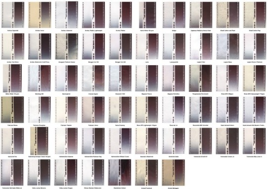
Illustration 1a. Papers that performed well with the chrysotype process. Click here or on the image to get a large picture and read the names of suitable papers.

Illustration 1b. What an unsuitable paper looks like.
The chrysotype2 (from Greek chryso/gold and typos/strike or print) is a photograph made of actual gold. The process was discovered by Sir John Herschel in 1842. Herschel’s research was greatly informed by scientist Elizabeth Fulhame who noted the necessity of moisture to facilitate the reduction of gold to form an image.
Unfortunately, Herschel’s way of practicing the chrysotype process was unstable, difficult, and expensive, and it never became part of the photographic canon in the 1800s.
Platinum/ palladium, arriving on the scene around 1873, got a 100-year leg up on the chrysotype process to become the most common noble metal photographic process. Even today, there are still few chrysotype practitioners. Some don’t prefer the color to the blacks and browns of silver gelatin and alt processes, but that comment is often said about cyanotype’s dominant blue and yet cyanotype is assuredly the most widely practiced alt process.

Illustration 2. Mike Ware’s platinotype portrait © Pradip Malde 2014.
142 years after Herschel, in 1984 Dr. Mike Ware from England began his photochemical research aimed at devising a stable and easier way to practice chrysotype. He shared the resulting processes with the world in 1992, but even after three decades, chrysotype continues to be a rarity in the alternative process field.
Illustration 3. Leanne McPhee’s portrait © Mark Goddard 2018.
Ten students, one alumnus, and I began researching and practicing chrysotype together for the first time Fall semester 2021. I had been wanting to learn the process since 2015 when I saw my first chrysotype print in person (which I bought) that was made by Leanne McPhee and is now the cover of her book. The impetus to teach a full-semester class came from Montana State University’s College of Arts and Architecture Dean Royce Smith. When he found out that a chrysotype could be blue as well as other colors, his thoughts immediately turned to the MSU colors “blue and gold” and how fitting it would be to make a blue and gold print—out of actual gold! Dean Smith agreed to fund the gold part of the equation for the class for our group learning experience.
I have since found the process to be addictively engaging, due to its wide range of color possibilities and surprises, and no more daunting to learn than platinum/palladium. If you are thinking of giving the process a try, here are some tips to make your chrysotype journey easier.
Books
Illustration 4. McPhee’s book with five tiny vials of gold chloride, 5 grams needed for 36 ml of gold solution.
Before you begin, read these two books thoroughly: Chrysotype, A Contemporary Guide to Photographic Printing in Gold (Leanne McPhee) and The Chrysotype Manual (Mike Ware, now available free here: https://www.mikeware.co.uk/mikeware/downloads.html).
Chemistry for making chrysotypes
Chemistry is a bit of an outlay at first (~$340) but considering this amount will make 45 8" x 10" prints minimum, it’s not so costly. There are other chemicals you can add to the following, but this will do at first.
- 5 g gold chloride (buy the cheaper hydrogen tetrachloroaurate(III) trihydrate) ($250)
- 12.5 g thiodipropionic acid ($12 for 25g)
- ~8 g sodium carbonate ($7 lb)
- 30 g FAO (ferric ammonium oxalate) ($10 100g)
- Tween ($7 oz)
- 50 ml/2 oz brown dropper bottles, 4 (~$2 ea)
- Distilled water ($2)
- Oxalic acid ($9 lb)
- Tetra-EDTA ($18 lb)
- Sodium Sulfite ($18 5 lb)
Paper for printing chrysotype
To be on the safe side, use the best/aka unbuffered papers: Hahnemühle Platinum Rag, Bergger Cot 160 and 320, Arches Platine and Platine Lightweight, Legion Revere Platinum, and Herschel Platinotype.
Appropriate papers for chrysotype do not equate to cyanotype exactly. Some papers that work well with cyanotype do not for chrysotype and vice versa. Below is an example of a not so good paper (left) and a good paper (right). Don’t frustrate yourself at the outset by starting off using some inferior paper you may have on hand. Gold is worth a good paper!
Illustration 5. Rising Barrier vs Platine.
If you choose a buffered paper, which is most often the case today unless choosing the top five unbuffered papers listed above, within hours to a day or two you will see a slight change in coating color leaning towards orange.
According to Mike Ware from a Facebook post:
"Calcium carbonate (chalk) which is alkaline (pH ~9) will destroy the pale green ferric ammonium oxalate sensitizer by hydrolysing the iron(III) to form Fe(OH)3 and FeO(OH), which are orange, and not light sensitive. The rate of this destruction will depend on the prevailing RH%, which provides water in the paper fibres to promote the hydrolysis. Evidently, at the RH% of these tests, over four days before exposure the slow hydrolytic destruction is extensive with much loss of image, whereas over an hour or so the loss is not significant."
Facebook post from Mike Ware

Illustration 6. Strathmore 500 2-Ply paper.
If you have chosen an alkaline paper and it has turned quite orange after coating, it will not print well or at all. Papers that are slightly orange will still print, but grainier and slower. I found that all papers that had some buffering printed predictably slow (10–12.5 minutes under UVBL versus 5–8 minutes for an unbuffered paper), pinker, less Dmax, and grainier, enough so that I can spot a buffered paper in a lineup. To the right is an example of a horribly oranged paper, Strathmore 500, that never printed an image.
Below is an example of Kirk Cochran’s experience with an oranged paper which illustrates clearly Dr. Ware’s point about the decreased sensitivity being time-related.

Illustration 7. Decreased Sensitivity © Kirk Cochran.
According to McPhee in an email,
"The archival nature of a chrysotype print always depends on the substrate used to print it on. The formula itself is stable, but only archival when combined with appropriate papers. The reaction is strong when the paper has both an optical brightener and calcium carbonate."
Leanne McPhee
She has seen a darkening of chrysotypes on buffered paper 5–8 years later.
On thin papers, dispense with the use of Tween (with thicker papers 1–2 drops 5% Tween per ml solution works great) or else the solution can shoot straight through the paper (Platine or Bergger Lightweight, Twinrocker Text Weight, etc.). Tween is a surfactant that helps papers absorb the solution better with less runoff, washoff, or bleeding (along with other problems) that may occur when a solution sits on the paper surface and dries before absorption. Below is an example of the unsuccessful use of Tween on Platine Lightweight; also an illustration of how a thicker coating is bluer than a thinner coating which is pinker.
Illustration 8. Unsuccessful use of Tween on Platine Lightweight; also an illustration of how a thicker coating is bluer than a thinner coating which is pinker.
Observations about the chrysotype process
-

Illustration 9. A document of squares filled with Pantone colors.
A chrysotype print can be many different colors depending on the final size of the gold particles—from pink to mauve, to green to blue to inky purple-black. The available color range in the chrysotype process is greater than any other monochrome process. Below is a comparison I made of a multitude of student chrysotype prints to Pantone color swatches. I created a document of squares filled with those Pantone colors.
- For those living in dry states, chrysotype is a blessing because the process performs beautifully with absolute dryness.
- Chrysotype has amazing latitude in sit time; not printing a coated paper within the day has always been a bad choice but for chrysotype it has not been a problem on good papers in Montana 30-40% RH. In fact, it has eliminated the issue of uneven humidity with the chrysotype process that results in uneven blue patches (wetter) within a mauve print (drier). In fact, chrysotype has a longer window of opportunity between coating and exposure, days even, without fogging, though grain may increase if paper is not humidified pre- or post-exposure.

Illustration 10. An example of a chrysotype print made after five days of coated paper sit time, © Kirk Cochran (BTW it was Kirk who discovered the potential for a long sit time, not me).
- Chrysotype benefits from a very thin coat, unlike other processes that benefit from more. 1 drop per 2 square inches with a brush is as much as you will need, and chrysotype is not better with more solution.
-

Illustration 11. Example of a thinner coating, left, and a thicker coating, right—double the drop count on the right (20 vs 40 drops).
A thinner coating leans pink and a thicker coating leans blue. See example of a thinner coating, left, and a thicker coating, right—double the drop count on the right (20 vs 40 drops).
- A drier coating leans pink and a more humid coating leans blue. Below are examples of pinks and blues because of humidity pre- exposure (blue) and post-exposure (pink).

Illustration 12. Hooker Oak © Christina Z. Anderson 2021.
- Bone dry paper (RH around 35–40%) will come out of the exposure unit with little printout and a scratchy brown look, but with a post-exposure humidity chamber up to 30 minutes the whole image magically appears when you think it just isn’t going to make it. The print-out remains pink/mauve and very little blue highlights will come in during development (student Nick Sramek noticed exceptions to this "rule" in his prints, where his highest highlights printed blue). This printout within the humidity chamber is a wonder to behold. Tip: “Humidity chamber” is just a fancy word for a tray of water with a screen on top and another tray inverted on top of that to keep the moisture “local.”
- Paper that is coated and thoroughly pre-humidified before exposure for 30 minutes in a ~100% water humidity chamber is very inky blue with exposure and stays inky blue upon development. Tip: put a piece of Dura-lar between the negative and the paper to prevent the negative from sticking to the humid sensitizer.
- Image development in 1% oxalic acid comes out blue, so a dry print exposed dry with no pre-exposure or post-exposure humidification will result in split tones, deep mauve shadows and blue midtones and highlights.
- The association between color and humidity is a blessing with so many color choices but if wanting absolute color consistency from one print to the next, pay close attention to match each processing step exactly, especially humidity during coating, pre- and post-exposure.
-
Illustration 13. Green Hollow © Christina Z. Anderson 2021.
Humidity helps to prevent bleeding, either paper humidified pre-coating, post-coating and pre-exposure, or post-exposure. See an example of bleeding, below, at the top of the print.
- Uneven humidity as well as uneven coating leads to odd unevenness in color in a print e.g. blue patches and streaks.
Illustration 14. Uneven color due to not drying evenly before exposure © Jake Culbertson.
Comparisons to classic "Develop out" or NA2 Platinum/Palladium
I’ve practiced the NA2 method of platinum/palladium for about 23 years. Next on my list of “things to do” is to learn the ropes of the one-solution POP or printing out platinum/palladium process (see Pradip Malde and Mike Ware’s 2021 book Platinotype: Making Photographs in Platinum and Palladium with the Contemporary Printing-out Process) which is like chrysotype in its use of ferric ammonium oxalate and humidity, but until then here are some observations of chrysotype compared to the NA2 method.
- Both platinum/palladium and chrysotype are noble metal processes and 100% archival, but I can attest to the fact that chrysotype seems even more archival anecdotally: don’t get it on your nails because it will remain until your nail grows out. Even silver nitrate doesn’t last that long!
- There are four solutions to mix: ligand, gold, ferric ammonium oxalate, Tween; only the one (gold) is pricey. With platinum/palladium there are four solutions to mix: ferric oxalate, platinum/ palladium, Na2, Tween; three are pricey (platinum, palladium, Na2).
- Gold is $6.81 ml; palladium $6.32 at the time of this writing. A drop of gold is 34¢; a drop of palladium is 31.6¢; a drop of platinum is 53¢; a drop of Na2 is 14.4¢.
- Since an 8˝x 10˝ requires 40 drops of solution (20 ligand/16 gold/4 ferric ammonium oxalate or 18 ferric oxalate/18 palladium/3 Na2) an 8˝x 10 cost is $5.44 chrysotype and $6.12 palladium/na2 (metals only, not rest of chemicals). I have actually used only 30 drops of solution for an 8˝ x 10˝ (1.5 ml) and it was fine,too; however, I use non-absorbent Kobayashi brushes. At the time of this writing a 2˝ Kobayashi brush costs ~$50USD and is worth its weight (literally) in gold savings. The company is a pleasure to work with, too.
- Processing steps for chrysotype are a bit more exacting e.g. pay attention to developer time so shadow blockup, black specks, or bleeding does not occur; platinum/palladium is develop to completion and not much seems to change once developed. Illustration 15. Processing steps for chrysotype.
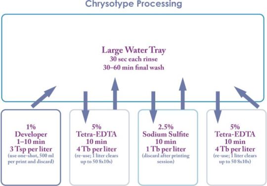
Illustration 15. Processing steps for chrysotype.
- Processing steps are longer and stronger e.g. development up to 10 minutes, 5% tetra-EDTA for 10 minutes, two baths, and 2.5% sodium sulfite for 10 minutes with a water wash in between each step (with less clearing time, there can be a loss of color in a chrysotype, e.g. bright pink fades to purple or purple-blue). Personally I think I will use this longer and stronger clearing protocol for platinum/palladium, too.
- Chrysotype can bronze like platinum/palladium. However, pt/pd does so terribly in cases of overexposure, low humidity and too thin a coating and the bronzing, unless slight, doesn’t disappear. With chrysotype, often the bronzing reverts to mauve/brown, and barely a whisper of a chrysotype coating works fine where it doesn’t with platinum/palladium. However, if I do say so myself, this bronzing, below, is sort of awesome.

Illustration 16. Bronzing © Alyssa McKenna.
- No worries about shelf life of the chrysotype chemicals like platinum/palladium’s ferric oxalate.
- Both platinum/palladium and chrysotype are prone to black specks but in platinum/palladium it is usually due to a contaminant in the paper or solution e.g.
Read the full article
#AlexGlenn#AlyssaMcKenna#CadenMcCullough#CharlieParrott#ChristinaZ.Anderson#chrysotype#chrysotypepapers#FranBrowne#JakeCulbertson#JorenNelson#KirkCochran#LeanneMcPhee#MarkGoddard#MaxMcDonough#MikeWare#NickSramek#PradipMalde#ThomasCallahan
0 notes
Text
William Dunniway (1946-2021)


Will Dunniway has sadly passed away. We share his work in honor of his memory. Will was a practitioner of photography both historical and digital. He honored history, and spent nearly 50 years in the practice of art design in various formats of pencil sketches, oil painting, album cover design, film and digital printing to his most favorite Wet-Plate Collodion. He will be missed.
From: California, USA.
Shows: Wet-Plate collodions.
WILLIAM HERBERT DUNNIWAY SEPTEMBER 26, 1946 – APRIL 8, 2021
Will/Bill Dunniway was born in San Bernardino, California the son of Marjorie (Sharp) and Donald Dunniway and grew up in Colton, California. Serving in the US Marine Corp during Vietnam and after an honorable discharge, he returned home and pursued art and graphic design. He spent 30 years as a Graphic Artist and Art Director for Mount Herman Christian Conference Center in the coastal mountain area of California while married to Crystal (Ruth) Dunniway. They raised two children Troy Dunniway and Michelle Dunniway and have two grandsons Eric and Todd Dunniway. During these years, Will discovered a passion for Civil War Reenacting and later the 19th-century wet-plate collodion photographic process. His marriage to Dr. Frances (Ouellette) Dunniway in 2005 moved him to Southern California and his final home in Yosemite Lakes Park, Coarsegold, California. Will helped to raise his stepchildren Donovan Brown and Collette (Brown) Strosnider and they shared three step-grandchildren Connor Brown, Levi and Ellie Strosnider. He is also survived by his two brothers Michael and Steve Dunniway as well as nieces and nephews, in-laws and cousins.
Will was a practitioner of photography both historical and digital. He honored history, and spent nearly 50 years in the practice of art design in various formats of pencil sketches, oil painting, album cover design, film and digital printing to his most favorite Wet-Plate Collodion. Will stated this was his favorite as the process was authentic, hand-made, finicky, difficult, but yet captured his passion for history and photography. “You have to really want to do this...it is not easy. The tools involve a very heavy civil war era camera with bulky lenses and dangerous chemicals. The ‘film’ comes in the form of a 20-pound box of 8 x 10 glass. The many ripples, waves, pours, and movements captured by the antique lens appear as slow puddles and drips, and are superimposed against the glass, which simultaneously creates sharpness and softness. The image when developed is a record of what was in front of the camera...a tissue-thin seascape of emulsion as it freezes time, showing time stopped in two different worlds...two stories brought together.”
Not an easy process to master, Will’s collection of images, spans three decades, capturing events from the lives of Civil War soldiers, gold miners, and Native American tribes of the Plains, as well as landscapes from the National Parks-Yosemite, Crater Lake, Monument Valley and Grand Canyon, west and east coast lighthouses, and the red rocks of the Southwest.
His statement:
"I am not a revisionist. My goal is not to reinterpret the past. I have been faithful to history, becoming adept not only with understanding historical processes, but in understanding the way people thought about themselves and their environment in some of our nation’s most turbulent times."
After a heart attack in 2013, Will was afflicted with heart failure, which altered his physical ability to shoot landscapes on location. Never to be idle, he began teaching the wet-plate collodion process to others, hosting many workshops in his home darkroom. His collodion students included Hollywood celebrities, National Geographic photographers, Pulitzer Prize winners, and leading international cinematographers. Spanning six decades, Will photographed notable personalities ranging from Billy Graham to Johnny Cash as well as being an internationally recognized master of the wet-plate collodion process. Will’s ambrotype (collodion image on red glass) of Winona Ryder appeared in Francis Ford Coppola’s 1992 film Dracula. In the last decade of his life Will studied, field use tested, and was acknowledged as an authority in rare optics by 19th century lens makers. His work has appeared internationally and is held in many private collections, including the George Eastman House in Rochester, New York.
After his prolonged illness in his Coarsegold home, Will died peacefully under VA hospice services in Fresno, California. He was laid to rest on May 11, 2021 in Hermosa Cemetery-Inland Memorial Colton, California amidst family members.
More about William Dunniway:
- His work lives on his website.
- Article by William Dunniway: Will Dunniway’s ‘Dirty Hand’ collodion tour of Yosemite Valley
- Portrait of William Dunniway: Will Dunniway: A man with a mission
Read the full article
0 notes
Text
Jane Wiley


Jane Wiley, a professional photo archivist, shows her combinations of old and new in the shape of gum bichromates and cyanotype.
From: Charlotte, North Carolina, USA.
Shows: Cyanotypes, Gum bichromates, and a mix of the two.
Jane Wiley was raised in North Carolina by a long line of passionate photographers and adventurous women. She experienced loss at an early age when her father was killed in Vietnam. Her mother’s Polaroid snapshots immortalized him as a dashing 31-year-old pilot. These small, treasured pictures inspired Jane Wiley to pick up a camera to make her own presence known in the world.
Jane Wiley's passion for saving old photographs led her from casual family historian to professional photo archivist. She uses that experience to combine old and new photo processes, printing her contemporary photographs in various historic techniques.
Jane Wiley prints in the mediums of gum bichromate, platinum/palladium and cyanotype.
Her work has been published in The Hand and exhibited across the United States. Jane Wiley's photographs are held in private collections in the US and Europe. In 2020, she received an Honorable Mention in the 15th Annual Julia Margaret Cameron Awards. In 2021, her piece She Is Crowned Victory was chosen to be published on YourDailyPhotograph.com.
"When discussing alt processes I always say, “You don’t have to fear the chemistry, but you do have to respect it. Just don’t lick your prints."
More about Jane Wiley:
- Contact email: jane.vignettes (at) gmail.com
- Website
Read the full article
0 notes
Text
Nina Adler

Nina Adler, a self-taught photographer, born in Denmark, but lives in France takes photographs from her travels and prints them in the cyanotype or vandyke process or makes xerox liths of them.
From: Montcuq, South West France
Born: Denmark
Shows: Cyanotypes, Vandykes and Xerox lithography.
Nina Adler is a Danish-born self-taught photographer who chose to live in a village in S.W. France 20 years ago. She is using digital cameras for her travelling and street photos taken around the world, and since 2007 she has been exhibiting regularly in France and participated in several photo festivals.
A few years ago Nina Adler started experimenting with alternative printing procedures – to get away from the too « smooth », too perfect images she had produced until then. In Venice she discovered the Xerox lithography (using a B/W laser photocopy as a simple print plate). Later on she got hooked on Cyanotypes and during the recent Covid confinement in France, having found a perfect 10 years old recipe by Wynn White on this site, she started experimenting with Vandyke prints. She likes the fact that all these alternative procedures will never produce any two similar prints. Every print comes out different and even errors might sometimes turn out just wonderful.
"I love the «slow cooking » feeling of working with alternative printing and the excitement of discovering every new handmade print."
More about Nina Adler:
- Contact email: nina.adler (at) orange.fr
- Website
Read the full article
0 notes
Text
Which type are you? New t-shirt!

We had some fun and designed a new t-shirt. We think you may get some questions wearing it... and a good conversation starter...
The items can be bought at Cafe Press:
- All designs at Cafe Press
- "Which type are you?" Design
Show your love for alt. proc.!
Anthotype...
Daguerrotype...
Cyanotype...
Which type are you?
Read the full article
0 notes
Text
Blythtypes - positive-working cyanotype prints

The ‘Blythtype’, is a variation on Cyanotypes by Jeff Blyth where a positive print is made from a positive image. It also has increased light sensitivity through the introduction of a photosensitive dye. Cyanotype experimenters are encouraged to have a go, though NOT for beginners.
Writer and photographer / Blyth, Jeff. Richardson
Abstract
This paper describes a new Cyanotype system, the ‘Blythtype’, which offers a new technique resulting in a positive image made from a positive image. Another advantage of this new technique is the increase in light sensitivity through the introduction of a photosensitive dye. Crucially, it also offers photosensitivity to the red end of the spectrum enabling a greater balance of grey scales to be recorded from coloured images which until now has not been directly possible with Cyanotypes.
The authors hope this will excite many home-based Cyanotype experimenters to have a go.
Some chemical mechanics of how this new system is thought to work is given at the end.
The Blythtype is more photosensitive than the traditional system and has sensitivity even to red light, as you can see from the red outfit in this picture of the children.
This new ‘positive-working- Cyanotype system’ has three great advantages.
- It does not need a negative image sheet.
- It allows a modern digital projector to be used, as one might a photographic enlarger.
- It allows old transparencies like ‘Kodachromes’ to be turned directly into cyanotype images using old analogue projectors.
(All chemicals and equipment are readily available at low cost from Internet suppliers. Without exception the chemicals advocated are not acutely toxic, nevertheless safety precautions should always be taken to keep chemicals away from children).
Key Words: Cyanotype, Blythtype, Positive-working, Photographic Blueprint, Prussian Blue.
Our Procedure
- Coat a specific brand of semi-gloss photo-paper with a solution of the dye thionin acetate.
- To then readily convert that thionin acetate coating into the less soluble salt thionin ferricyanide.
- To then coat the sheet with a special photosensitizing liquid we have developed.
- To then expose the covered sheet to the image from a projector.
- To then develop the exposed sheet in acidic ferrous sulphate solution where it creates the famous Prussian Blue pigment and removes thionin dye.
Chemicals Required
- De-ionized or distilled water (DI) . (One can just use the water collected from say a domestic tumble drier).
- Potassium ferricyanide (available from www.magnacol.co.uk or in USA and Canada from http://www.artcraftchemicals.com)
- Thionin dye, the chloride salt is the most preferable and was until recent years the standard form of it. But the acetate salt is now the only form commonly available (eg. from www.magnacol.co.uk or in the USA and Canada from http://www.artcraftchemicals.com)
- Ferrous sulphate (sulfate). Available in USA and Canada from http://www.artcraftchemicals.com
- Sodium bisulphate (sodium hydrogen sulphate). N.B. Not “bisulphite”.
- EDTA (ethylenediaminetetraacetic acid, the free acid powder) . . (Available from www.magnacol.co.uk ). For USA, or Canada, https://apcpure.com
- Sodium sulphite (sulfite) anhydrous. Na2SO3. Available in USA and Canada from http://www.artcraftchemicals.com
- DEA, Diethanolamine. (Available from www.magnacol.co.uk ). Alternatively, TRIS Base can be used. This is a convenient solid crystalline alternative which gives the same result as DEA but needs about double the exposure time. Available from : https://www.ebay.com/b/Other-Medical-Lab-Dental-Supplies/257874/bn_16562557
Materials for making the photosensitive sheets
Through extensive testing we have found so far only two inkjet photo printing papers that are suitable for this process., We think it is essential to start with one of these two brands. The problem with many inkjet photopaper brands tested, both full-gloss and matt, or indeed any ordinary printing paper, seems to be that the dye penetrates too deeply into the fibres and backing and this inhibits the dye’s vital photobleaching reaction. The backside of both these products are waterproof, and essentially the dye will not penetrate into them.
Check list of required items:
- Epson PREMIUM SEMIGLOSS photo paper A4. Epson also offer a size 14% larger than A3. Alternatively, Jessops A4“SATIN” photo paper . A3 size is also available.
- One weighing machine capable of weighing to 0.10g
- A good quality soft squeegee. e.g. GB Pro 14”. (This will work also on A3 size.)
- A calibrated beaker, or jug, that will hold more than a litre.
- Two small soft sponges of different colours.
- Surgical gloves
- To prepare A4 sized sheets we use a 3mm thick piece of PMMA sheet also known as “Perspex”, “Plexiglass” or just “acrylic”. We call this the “carrier sheet”. we use about a 5 cm border all around when an A4 photosheet is placed in the centre. (A3 sized sheets will of course require an A3 sized sheet plus an extra border). This sheet does not have to be transparent, but it should not be white as that will cause back-scatter when it is supporting a sheet of film in the projector beam. A glass sheet is also good but less user-friendly and as it has to be handled a lot, the sharp edges and corners should be smoothed off.
- A4 trays for processing baths.
We use very low-cost plastic “Kitty Litter” trays . The coating procedure should be kept quite separate from the later photosensitizing procedure which is done just before the exposure and development procedure. So one can use the same trays after carefully washing them free of the chemicals used in the initial coating procedure. We use 2 trays to hold 2 solutions for initially coating sheets, and then we dry the sheets well. Later we need 1 tray to make the sheet photosensitive and one tray to hold developer after the exposure and 1 tray to hold a final treatment after development. This last tray ideally needs an extra tray to act as a floating lid on about 1 litre of liquid to minimise oxygen absorption. A minimum of about 250ml of liquid is needed for a bath so that it completely covers the smooth floor of an A4 tray. For A3 sized sheets we use polypropylene storage trays.
Thionine dye bath
For the Epson “Semigloss” photopaper, we add 1.0g thionine acetate (or chloride) to a clean 1 litre beaker , then we add 260 ml of hot (~70 oC) de-ionized or distilled water (DI) This is then stirred for about 15 minutes.. For the Jessops Satin photopaper we start with 1.3g of thionine dye and then we add 260 ml of hot (~70 oC) de-ionized or distilled water (DI) This is then stirred for about 15 minutes. The thionin solution is then left to cool for several hours before use. During this time, thionin forms peculiar aggregations of molecules such as dimers and trimers so that one can later get richer dye coatings from cold solutions than hot ones. Once in a tray the cold solution can be used indefinitely but needs to be stored in a bottle to stop water evaporation. We have recently been surprised to find that coating works best without the addition of alcohol, or a surfactant. (In contrast to our previous recipe).
Potassium ferricyanide bath
About 150g of potassium ferricyanide is stirred into 1 litre of DI in a jug or beaker until dissolved. In a tray, it can be used indefinitely but should be stored in a bottle to prevent too much water from evaporating.
The Photosensitizing bath. Either using DEA or the TRIS BASE alternative
100.0g (not ml.) diethanolamine (DEA), is stirred into 200 ml. of DI and stirred to form a clear solution (soln.) in a glass or plastic beaker or jug. Then 91g of EDTA powder (N.B. NOT the sodium salt form of EDTA) is poured in and stirred continuously until a completely clear solution results. The clear solution may warm up to about 35o C during this neutralization step. This quantity of liquid is sufficient to cover the floor of one of our A4 trays. (The pH finishes up at around 7 when it has cooled down to about 20 oC.). This concentrated solution keeps well and can be used many times, it just needs protection from evaporation in the long term.
If TRIS Base is being used instead of DEA, The same method is used as for DEA but the ratios differ to get to a neutral pH.
120g TRIS Base is stirred into 200ml of warm DI (~50 oC.) and then 100g EDTA (Not the sodium salt) is stirred in for as long as it takes to get a clear solution. (The pH finishes up at around 7 when it has cooled down to about 20 oC.).
Ferrous sulphate developer bath
We stir in 20g. sodium bisulphate to a litre of water in a beaker or jug (tap-water is quite OK here, cold or warm from the hot tap is better than using cold water from the cold tap as it will contain less oxygen). Then about 15g. of ferrous sulphate is stirred in. This is then poured into a tray. This acidic solution slowly absorbs oxygen. It works well to use another tray as a floating lid when the soln. is not in use, it can then last for days..
Sulphite bath. (The final bath)
About 30g. anhydrous sodium sulphite (Na2SO3) is stirred into 1 litre tap water in a beaker or jug. This somewhat alkaline solution will absorb oxygen more rapidly than the previous soln. when it is in an open tray. It works well to use another tray as a floating lid when the solution is not in use .
Method
1Under ordinary room lighting, the thionin solution is put in a tray. The photopaper sheet is now going to be placed upside down on the surface of the thionin dye soln. A good technique here is to place the sheet on the surface with both hands so that the front of the sheet is somewhat convex so that the middle of the sheet first touches the liquid in the centre of the tray and the sheet is then allowed to flatten out and push any surface bubbles away. It is then left to float flat on the surface for about 2 minutes (we have not found that it matters if it is 10 minutes). It does not matter much if the dye also gets on the back of the sheet, but it makes the squeegeeing procedure easier and wastes less dye if the amount on the back is minimal. The sheet is then lifted off the surface by holding just a corner and liquid is allowed to drip off the opposite corner for about 30 seconds before being placed face up on a clean flat very smooth surface such as the acrylic “carrier sheet”.
2A “handling edge” is chosen which will not be in the final image area. The handling edge is held firmly down using the gloved thumb and index finger spread as widely as possible so that the sheet will not slip, the squeegee is then pulled down the coated sheet fairly carefully and evenly with a firm downward pressure so that the excess dye is swept off the other end of the sheet. This excess dye can be squeegeed into a folded strip of water-proof film when one edge is tucked under the carrier sheet. The excess dye can then be poured back into the bath. (The back of a discarded wide strip of the type of photopaper being used here works fine for this).
3The coated sheet should now look homogenous (except for the handling edge). Each coated sheet must be completely dry before the next step to photosensitize it. We find it best to use warm air from a hairdryer clamped about 1 metre above the sheet which is resting below on paper towelling.
4Under ordinary room lighting, the dried thionin coated sheet is then totally immersed face up in the bath of potassium ferricyanide solution, where it is gently rocked for about a minute, and then left for another minute. (No difference has been detected if it is left in this bath for 20 minutes). This step is transforming the thionine acetate coating into a much less soluble thionin ferricyanide coating. The sheet must then be washed entirely free of the very soluble potassium ferricyanide soln. We do this by using a good flow of cold tap water, first rinsing the yellow solution off the back of the sheet and then using a soft sponge to help fully remove all traces of solution off the front. The tap water is now squeegeed off the sheet before it is dried again under a warm but not hot air flow.
5The photosensitization step must now be carried out under dim lighting. The dried coated sheet is placed upside down in the photosensitizing solution. As before, a good technique here is to place the sheet on the surface with both hands so that the front of the sheet is somewhat convex so that the middle of the sheet first touches the liquid in the middle of the tray and is then allowed to flatten out and push any surface bubbles away. It is then left to float flat on the surface for about a minute. It is then lifted out and held by a corner so that excess liquid streams and drips off into the bath before being placed face up on the carrier sheet. A few drips of this concentrated liquid on the back of the coated sheet serves to effectively hold the photosheet in place by capillary action after the squeegee is used. The sheet is held down firmly along the handling edge using a widely spaced thumb and index finger and the excess liquid is removed with a firm swipe of the squeegee. This excess concentrated sensitizer is not wasted . It can be squeegeed onto a wide folded strip of water-proof film when one edge is tucked under the carrier sheet. The excess liquid can then be poured back into the bath. (The back of a discarded wide strip of the type of photopaper being used here works fine for this).
6The carrier sheet and coated photosheet are now ready to be positioned in front of the projector set-up. This needs to have been pre-arranged so that it will all be in perfect focus when the carrier sheet is put in a marked out vertical position. It is now important to keep in mind that using a projector as a photographic enlarger creates a strict requirement that you never have to consider normally when using a screen. This is that during the exposure period, there must be not the slightest movement or displacement between the photosheet and the projector, or the image will finish up blurred. The projected light is blocked off with something that can act as a shutter that can be lifted off or slid sideways. If you initially need to adjust the exact position of the photosheet then it should be done in less than 5 seconds from the start of the exposure. ( We have found it particularly useful to use a piece of high optical density sheet as a shutter so that we could adjust the position of the very dimmed down image exactly where we want it on the photosheet).
7To judge if there has been enough exposure after a period, we completely block the projector light briefly and examine the sheet under non-bright torch-light. If just the brightest highlights in the image can be faintly seen, then the exposure is probably enough. If on the other hand the whole picture can be seen, then it is probable that it is overexposed. With regard to the image size being projected, our latest findings are for example that if DEA/EDTA was used as the sensitizer then an A5 sized bright image might need less than a 1 minute exposure, an A4 about 2 minutes, and an A3 about 4 minutes, but if the photosensitizer used was the TRIS/EDTA then these exposure times needed to be doubled. But all this can of course vary greatly depending on picture and projector.
8Under dim lighting, the exposed sheet now needs to be briskly washed entirely free of the sensitizing solution or it will not form that vital Prussian Blue (PB) pigment in the acidic ferrous sulphate developer bath. This sink washing process is carried out using a good flow of cold tap-water while gently rubbing all over the sheet with a soft sponge, (preferably a different sponge from the one that was used to prepare the sheet earlier), this procedure should preferably take less than a minute, and should include a brief rinse of the back of the sheet.
9The developing bath: The washed sheet is then quickly placed in the acidic ferrous sulphate bath (so that the whole sheet gets simultaneously covered). Bright lighting is OK now. The bath then needs to be rocked for at least a minute., Although the image usually shows up strongly in about 10 seconds, it is necessary to continue agitating the sheet for at least a minute so that the thionin dye can be solubilised and removed (unless you would like a violet print). It is then briefly rinsed , front and back, under running tap water and then immersed in the final bath of sodium sulphite solution and well agitated for about half a minute. It is then rinsed under running tap water, front and back to remove the sulphite soln. The water on the surface is then squeegeed off with a clean squeegee and the sheet is dried in a warm air flow.
Manipulation of contrast
There is much discussion of ways to increase or decrease contrast in traditionally made Cyanotypes in refs Some of these ways may also work on the Blythtype.
Discussion of possible chemical mechanisms
- The coated thionin dye in the form of its acetate or chloride salt is readily converted to a less soluble salt by immersing it in concentrated potassium ferricyanide solution. The resulting thionin ferricyanide coating is then made light sensitive by coating it with the concentrated solution of diethanolamine EDTA salt.
The relatively viscous and concentrated photosensitizing layer on the photosheet needs to be squeeged off after a minute for two reasons:
- A thick layer causes dye to dissolve into it and this can act as an uneven light filter.
- A thick layer has a lensing effect which slightly defocusses the image.
However, if the sensitizing solution is made more dilute and less viscous in the first place, it reduces its photosensitizing ability very substantially. The pH is neutral and the solution is not harmful if it accidentally gets on unbroken skin. It is very water soluble.
It is thought that in the imaging process, light causes the dyed photosheet to bleach and momentarily to produce a colourless compound known as leuco-thionin. This reduced form of the dye then seeks to return to its non-reduced coloured form by reducing its ionically attached ferricyanide anion to form thionin ferrocyanide. The proportion of ferricyanide ion converted to ferrocyanide ion is dependent on the light intensity on that area and also of course, the exposure time.
Read the full article
#blueprint#Blythtype#Blythtypes#cyanotype#cyanotypes#PhotographicBlueprint#Positive-working#prussianblue
0 notes
Text
Annette Golaz
Swiss photographer Annette Golaz experiments with a variety of 19th century photographic processes like gum, platinum/palladium, salted paper and cyanotype printing. She researched the toning of cyanotypes with botanicals and developed a tricolor cyanotype process.
From: Maennedorf, Switzerland.
Shows: Tricolour cyanotypes.
Swiss photographer Annette Golaz experiments with a variety of 19th century photographic processes like gum, platinum/palladium, salted paper and cyanotype printing. She researched the toning of cyanotypes with botanicals and developed a tricolor cyanotype process.
Annette Golaz has contributed to Christina Z. Anderson’s Cyanotype book and is the author of the book “Cyanotype Toning: Using Botanicals to Tone Blueprints Naturally” in the same Routledge series on Contemporary Practices in Alternative Process Photography. She is also pushing boundaries when using more modern outdated cameras, for example a 20-year old Apple digital device with 0.3 megapixels. In 2020 she did win third price in the Krappy Kamera® Competition by the Soho Photo Gallery, New York.
Annette Golaz has painted for years but today photography is her preferred medium. Alt Processes are the perfect blend of the two art forms. She has exhibited her work in Switzerland and the USA. She teaches tricolor cyanotype workshops. Golaz is a teacher and journalist by training, she is head of photography of a Swiss publishing house for cookery books and is the editor of a food magazine.
"It's always about light. It changes permanently and so do the objects that are immersed in it. My heart skips a beat when things start to look soft, nostalgic or dreamlike."
More about Annette Golaz:
- Contact email: info (at) agolaz.ch/li>
- Website
Read the full article
0 notes
Text
Diana Caragan

Diana Caragan is a cyanotype artist, photographer, and graphic designer based in Converse, Texas, USA.
From: Converse, Texas, USA.
Shows: Cyanotypes.
Originally from the Philippines, Diana Caragan worked and traveled the world while serving in the United States Navy. Following her military career, she earned her associate's degree in Studio art from Del Mar College. She received her bachelor's degree in Graphic design from Texas A&M University-Corpus Christi.
Diana Caragan's work is directly inspired by the beauty of nature, travels, her social background, and different cultures. When she's not working on her projects, she spends her time traveling and hiking outdoors with her family. She also likes visiting antique shops, art markets and hanging out in local coffee shops. She is deeply passionate about making art, learning new things, and sharing them with the world.
"Pursuing a full-time career in art is both nerve-wracking and exciting at the same time. Progress is slow but beautiful, and I am enjoying every part of the process."
More about Diana Caragan:
- Contact email: tinyowlsa23 (at) gmail.com
- Website
Read the full article
0 notes
Text
Xerolithography - transfers using paper
Xerolithography is a lithography process but simpler than using plates. It's an easy process to experiment with and has the option to add colours with different inks.
Writer and photography / Palle Lindgaard-Jørgensen
Xerolithography is a fairly simple process, where it is paper (originally a xerox copy and not stone like in normal lithography) which is used to print from. The principle of the process is that “fat shuns water”, so black areas in your paper copy will receive ink and white will not. I have worked with the process for the last five years and gradually increased the complexity adding colors and adding more layers of paper on top of each print.
"What I like about the process is, that you are free to change the look of your original photo in numerous ways, still maintaining however the content of your original photo and that the print has a “soft” look as a result of the way you ink your paper."
The method I am working with is presented in the following.

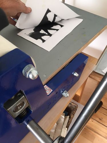
The original laser print used for xerolith.
1Start the process A laser print of a photo (black and white) is quickly put in water, pulled out and placed on a sheet of glass with the printed side up. Gum Arabic is applied to the whole surface of the picture with a foam washcloth.

Gum arabic.
2Add ink Etching ink (Cranfield or other brands) is added a few drops of linseed oil to make it more fluid and then applied to the picture with a foam washcloth. Fold the foam washcloth tightly so it’s only a small area that is put into the diluted etching ink. Dab the ink onto the picture.

Ink used in the xerolith print process.
3Remove surplus Surplus ink is removed from the white areas of the picture with a new foam washcloth. Roll the washcloth over the picture and take care not to remove too much ink.

Remove too much ink.
4Print in press Dampened printing paper is put into a printing press (see picture).
Use a printing press to print the Xerolith print.
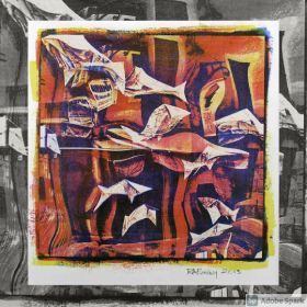
5Or use spoon If you do not have access to a printing press, you may also use a spoon to put pressure on the picture. The final print can be seen below - remember it is mirrored - so if it’s important like if the picture contains text, mirror the picture digitally prior to the xerolithography process.

Use a spoon instead of a printing press.
6Add colour You can add any color you like and you may also print the xerolithography on top of other pictures.
Hope you will enjoy working with the process. The process needs some practicing before you have a perfect result- so start with a simple picture with much contrast- like the elephants shown in my example.
Palle Lindgaard-Jørgensen has worked with alternative photographic processes for more than ten years. He works with photo transfers, photogravure, xerolithography, cyanotypes and albumen prints. See Palle Lindgaard-Jørgensen's gallery.
Read the full article
0 notes
Video
youtube
Please consider supporting AlternativePhotography.com
https://www.alternativephotography.com/become-a-member/
0 notes
Text
New book on toning cyanotypes!

The cyanotype toning book from Annette Golaz - another Routledge publication - is here, containing step-by-step instructions and contemporary artists working with toning.
As we all know by now, cyanotypes are blue by default. As much as blue is a wonderful color, it is not always suitable for the final print. Luckily, cyanotypes can be toned, and now there is a whole book devoted to this topic.
From the publisher:
"Throughout history, cyanotype prints have been toned not only with various—and at times hazardous—chemicals but also with more natural ingredients like tea and coffee. Since the cyanotype itself is non-toxic, Cyanotype Toning will champion an innovative process, developed by the author, of toning cyanotypes with natural material."
This is a two-part book including a step-by-step how-to section needed to achieve a successfully toned print. Part two is devoted to artists who have explored toning. The first part gives easy-to-understand instructions, accessible to all skill levels and also describes factors that can influence the outcome such as the quality of paper and water, temperature, and more. Part two goes into more detail about how artists have explored toning in their creative process.
"Using botanicals to tone cyanotypes broadens the color spectrum, enlarges creative possibilities, and makes the cyanotype process even more versatile."
Annette Golaz, the author is a Swiss photographer, experiments with a variety of alternative processes and cameras. Below are links to get the book (this will give us a tiny tiny percent of the prize without making it more expensive for you).
Cyanotype toning: Using Botanicals to Tone Blueprints Naturally
by Annette Golaz
- Buy from Amazon.com
- Buy from Amazon.co.uk
- Buy from Book Depository
- Buy directly from Routledge publishers - link coming soon
Read the full article
0 notes
Text
Richard Bailey

Richard Bailey from the UK is now retired from teaching and lecturing in art and design and pursuing alternative photography.
From: Sheffield, Yorkshire, United Kingdom
Shows: Casein bichromates, cyanotypes and gum bichromates.
Richard Bailey retired after over 30 years as a teacher and lecturer in art and design education. His teaching experience was across a number of areas within art and design including fine art, photography, graphic design and digital design. He holds a Hons Degree from the University of Sheffield with specialisms in painting and ceramics and a Cert Ed teaching qualification.
It was after his post secondary school education at Rotherham School of Art & Design that Richard Bailey first developed his passion for photography. Following this, his education included vocational qualifications from Coventry College of Art & Design in graphic design and photography.
On retirement, Richard Bailey decided to pursue his interest in 19-century alternative photographic processes after dabbling a little whilst still teaching full time. Gum printing was an alt photo process he had wanted to explore for some time so he set to work reading about the process. After reading Christina Anderson’s books which included a wealth of information on the gum bichromate process amongst others, he felt ready to begin his journey into the magical world of alternative photographic processes. He continues to experiment with other processes including casein dichromate and more recently Dan Burkholder’s Photo Gilding process and the Gumoil process.
Richard Bailey's current goal is to build a sufficient body of work from which to exhibit his prints.
His introduction to alternative photographic processes was the discovery of a chapter titled "Rediscovering Old Processes" in Michael Langford's wonderfully informative book "The Darkroom Handbook".
Inspired by the book he made his first print - a cyanotype photogram on watercolour paper exposed using the sun. He was hooked!
It was a frustrating journey at first with many failures but he learnt a lot and loved experimenting with the process. He particularly enjoyed the uniqueness of each print even after using the same negatives, colours and exposure times. He also learnt to accept the flaws in some of the prints which added to their uniqueness.
"From simple beginnings with cyanotype I went on to experiment further with the gum bichromate process which drew me due to its printmaking and watercolour like qualities."
More about Richard Bailey:
- Contact email: info (at) altography.co.uk
- Website
Read the full article
0 notes
Text
World Cyanotype Day 2021 - all the links you need
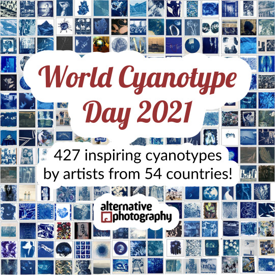
World Cyanotype Day 2021 is now over. You and 427 cyanotypes were entered in our online gallery - and really made the day. There is just so much inspiring work!
We would love to get your feedback on the event, please comment below!
Make a cup of coffee, sit back and enjoy the show. These are the links where you can find inspiration.
See this year's Gallery here:
👉 https://www.alternativephotography.com/gallery/gallery-by-process/world-cyanotype-day-2021-gallery-rejuvenation/
See artists on our Pinterest board:
👉 https://www.pinterest.se/alternativephot/learning-alternative-photographic-processes/world-cyanotype-day-2021-rejuvenation/
Facebook album:
👉 https://www.facebook.com/media/set/?vanity=alternativephotography&set=a.10158497531613683
Instagram:
👉 https://www.instagram.com/alternativephotography_com/
👉 YouTube:
The Day in a Nutshell:
https://www.youtube.com/watch?v=0rWvUw3k_qE
All 427 cyanotypes:
https://www.youtube.com/watch?v=PW_e7_RXB1g
We hope you appreciated our effort and would consider becoming a supporting member of AlternativePhotography.com
👉 Supporting membership:
https://www.alternativephotography.com/become-a-member/
See you again next year for World Cyanotype Day 2022!
Learn more in the Cyanotype book
Blueprint to cyanotypes - Exploring a historical alternative photographic process
by Malin Fabbri and Gary Fabbri
Rated 9,7 – based on 234 votes
- Buy eBook directly from us ($12.99 download direct)
- Buy paperback from Lulu ($38 + shipping)
- See more buying options.
All you need to get started with cyanotypes, full of information, tips and samples from artists.
An excellent beginners' guide to cyanotypes!
Read the full article
0 notes
Video
youtube
World Cyanotype Day 2021 - all 427 cyanotypes
0 notes