
amberduan-ual
Amber Duan
@UAL LCC, Illustration and Visual Media
35 posts
Don't wanna be here? Send us removal request.
Last Seen Blogs

bestgrrls
goddesses
lovesung127
after midnight enthusiast

krikkrikkr
xaxax

chargow-blog
lotties blog

mrdeath06
Mr. Death
Text
Independent Projects Feedback (20/5/23)
I received a lot of great feedback from my classmates on Thursday and gave some things to think about for the future! I was really glad that other people could also see how my PleinAirpril paintings evolved throughout the project, since that was my biggest takeaway from the entire endeavor. I ran out of time to print the project as a book since the paintings took longer than I expected and there were no printing slots available by the time I finished, but I really do want to collect them in print form some day. I would love to see what they look like riso printed, since I know the colors would differ a lot from my digital paintings.
I posted all my PleinAirpril paintings on Instagram and Twitter as I completed them every day, so I also received feedback in the form of comments from friends and other artists. It was fun to see which paintings resonated more with people and I felt really encouraged when others liked the more experimental work I was trying!
I'm really glad I was able to do the Independent Projects as part of this course, especially since at Pratt most of our projects are given to us as briefs from our professors. This level of freedom and creativity was super exciting, and I grew a lot as an artist from the work I did.
0 notes
Text
Making It Workshop #5 (19/5/23)
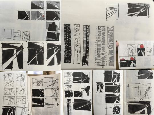
Geoff Granfield's guest lecture was really fantastic and personally interesting to me since I'm interested in both editorial and book illustration work.
I liked that Geoff showed a lot of his process work and talked about how he works traditionally. I think most editorial illustrators now work digitally, so it's cool to see that traditional chalk pastel still works for him. His illustration style is so clean and sharp that it's hard to imagine that he uses chalk pastel, so I think it's really impressive that he chooses to work with the medium.
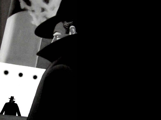
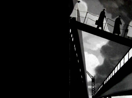
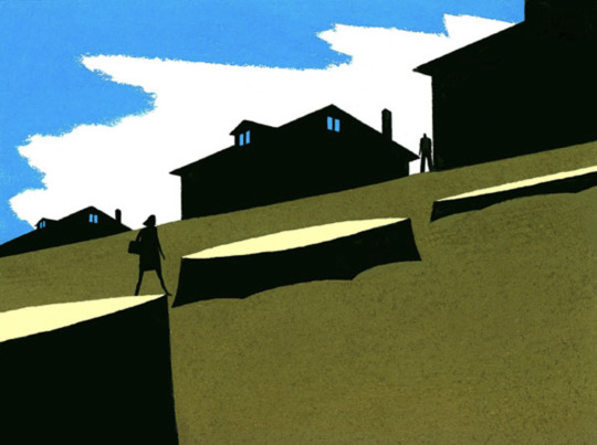
I think Geoff's style is really cool because it's quite stylized and atmospheric. He cited film noir as a major influence on his work, and I can definitely see the same quality of muted emotion and dramatic framing. His illustrations are really intelligently composed, with certain elements taking up the majority of the frame or others becoming trapped/constrained to convey a certain message.
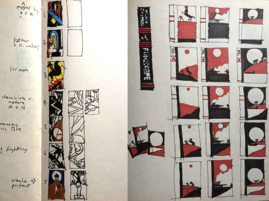
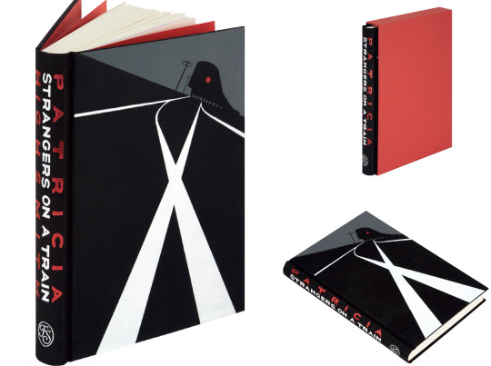
It was interesting to see Geoff's book illustration in addition to his editorial work. I don't see many novels these days being published with interior illustrations, so it's really cool to see how Geoff approaches this type of work. I found it amazing that he gets to propose where the illustrations will go in the book, and that he has to plan out the spacing of them as well.
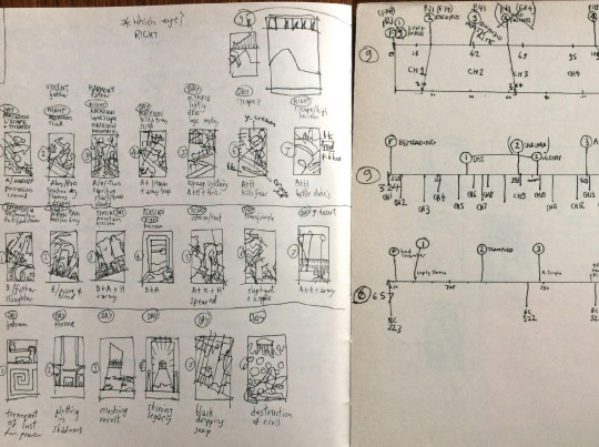
I noticed that Geoff tends to sketch out thumbnails of his work over and over again, with minor changes to composition and proportions of elements on the page. He's clearly experimenting with the visual impact of different choices, and I found this kind of process really appealing. He's very logically coming to the best conclusion through trial and error, thinking through making.
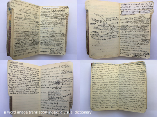
Geoff talked about his visual dictionary, which is a sort of reference tool that collects visual language interpretations of different words. His example was the word "divide" which can be visualized as two pieces being split in half, but also can be conveyed with a fence or border. One of my professors at Pratt, Richard Borge, is also an editorial illustrator and mentioned a similar working process and how helpful it can be, so I'm definitely interested in starting a similar reference tool of my own now.
Geoff brought up two themes in his lecture that I found deeply important. He mentioned that as illustrators, we have the ability to create narrative and meaning in art, which is might be one of the only ways we can resist AI. I found myself thinking about this a lot as he spoke, and came to the conviction that there is no way AI will ever completely replace human art. Geoff's art is a really great example of why.
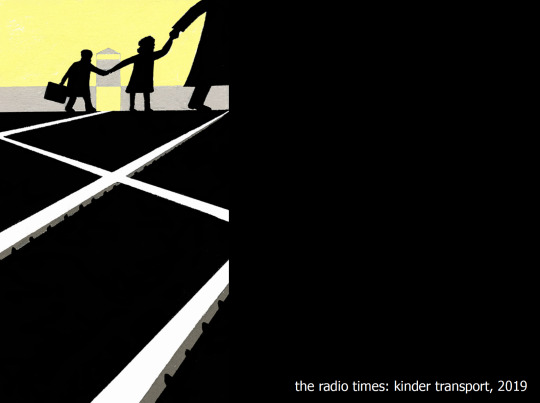
His illustration style itself may not be especially unique, but his unique way of visual thinking can't be replicated. In this editorial on the Kinder transport, the railroad tracks very subtly form the swastika symbol. Geoff talked about how this was necessary because powerful hate symbols need to be treated with sensitivity, especially when being portrayed in media. An AI would never be able to come to this same illustrative result, no matter how many pieces of art it scrapes. This is because a human mind had to consider the context of the subject and symbol, and think about how the composition could communicate both in a respectful way.
Artists have always been challenged by advancing technology to bring something to the table that machines cannot. The invention of cameras sparked the Impressionist movement, directly countering realism and embracing human emotion in art. I think the rise in AI image generation will force us as illustrators to make more intelligent choices in our art, because AI will only become better at replicating aesthetic styles with time.
0 notes
Text
Independent Projects Final Crit (18/5/23)
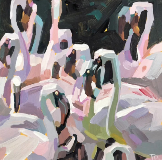
Day 27 and Day 28 were two of my favorites amongst the whole batch of paintings! I really enjoyed Day 27 especially because it felt like I'd improved upon the style of abstract painting I started exploring in Day 15. I felt like the process of the painting was a balanced mixture of intuitive and thoughtful, and I'm pleased with how the end result turned out as well.
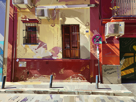
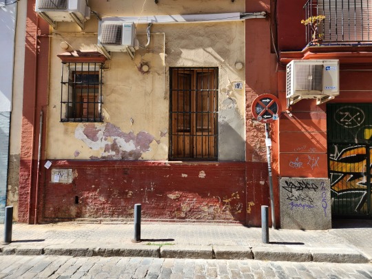
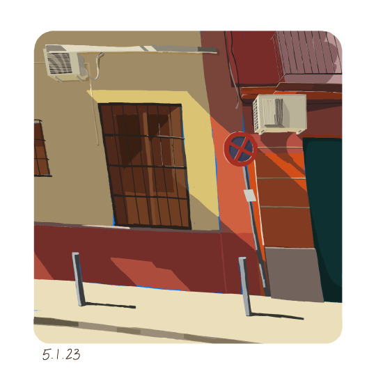
For Day 29, I followed along with Younhyung Ku's Warrior Painters demo. I was inspired to try and incorporate some texture in my work again, since Younhyung was really skilled with using a texture brush. He was one of the only artists who used a texture brush in the beginning stages of painting, rather than leaving the texture detailing for the end. I like that the demos challenge me to experiment with new techniques and methods of working. I learn so much every time and love seeing the paintings of the demo artists' as well.
For my last painting, I tried to use a combination of hard and soft edges, which I had kind of abandoned by Day 11. I knew I wanted to do an abstracted piece for my last day because it's a style I've discovered through this challenge and grown to love.
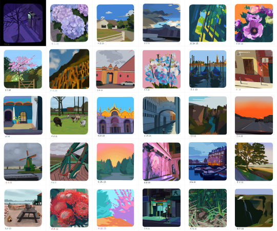
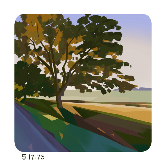
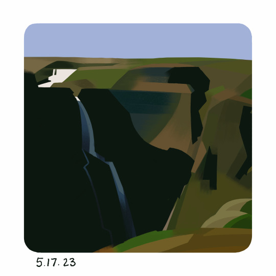
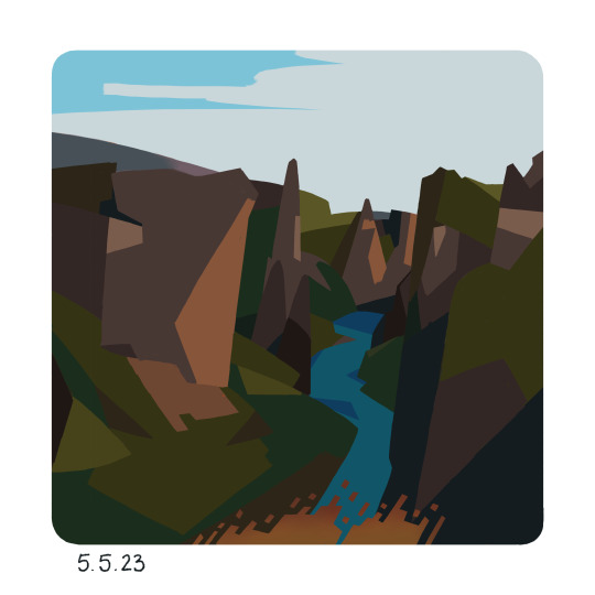
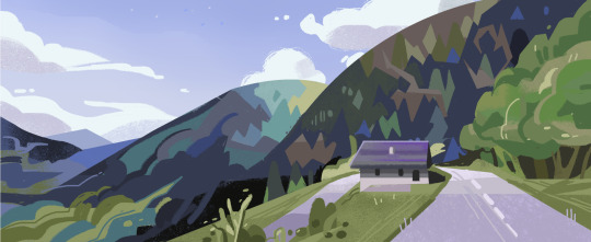
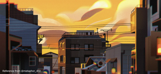
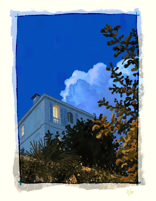
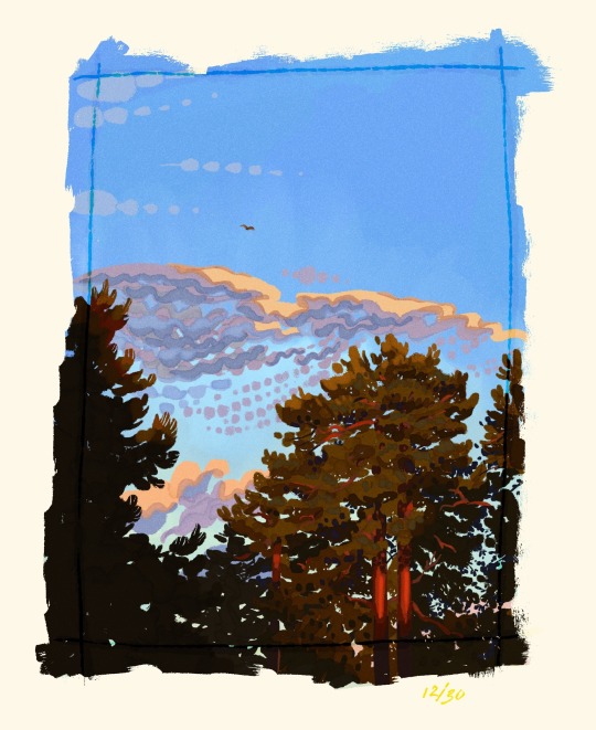
Here are all my PleinAirpril paintings collected in one place! I'm super happy that I was able to complete the challenge, even if it took me until May to finish.
-
For my character design I knew I needed to collect some more references for what armor looked like, so I created another Pinterest board with historical images and artistic renditions of armor.
Originally I wasn't quite sure how the leg armor parts connected to each other, but after studying some references I was more confident about incorporating the eagle aesthetics into the costume. I also looked at the how armor for an archer would differ in terms of pieces and mobility, which I didn't end up using for this project but definitely would for a different character design in the world since I would like to flesh out the different classes of knights at some point.
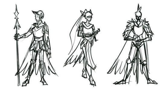
The character design I ended up going with is meant to be a cavalry soldier type of knight, mobile but still well protected for battle. I explored three different iterations of the design, and ended up combining aspects of the three for my final. I took the curved helmet, and winged pauldrons (shoulder) from the first, layered tassets (upper thigh) reminiscent to almain rivets from the second, and the winged fan plates (guards for side of knee) from the third. The feathered cape remained consistent throughout, and I brought in the spurred boots from my leg armor studies as well.
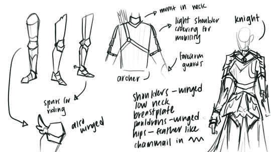
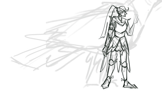
I pictured the final design beside an eagle mount for context and scale.
0 notes
Text
London Docklands Location Visit (12/5/23)
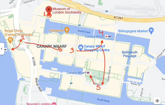
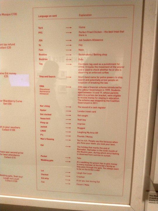
This was my first time heading out this far east in London, and it was an interesting experience! The Museum of London Docklands was much more comprehensive than I expected, touching on a wide range of topics from the two World Wars to British Cockney slang.
It was raining a little bit by the time we finished with the museum, but I really wanted to see at least one of the other locations marked on the map for us, so went to location #2, the Royal China.
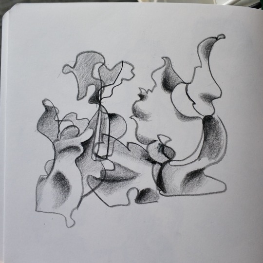
There were several different modern sculptures there, all very abstract in form. I wanted to try and capture the loose, almost figurative quality of them so I decided to use a blind contour line to get the shapes in first. I wasn't very concerned about creating a realistic drawing, instead I focused on the feeling of the sculptures. I overlapped two different sculptures with each other since I thought their shapes were quite complimentary.
After I finished with the lines, I started rendering the form and shape of the sculptures. All the contours were quite soft and natural, so I kept my hand light and shaded with gradual value transitions.
0 notes
Text
Progress Tutorials (11/5/23)
Both of these two paintings are from the neighborhood I grew up in! Collecting reference photos made me realize that I wish I had taken more photos of Seattle when I was still there. I think there's a special kind of love that goes into drawing your home and where you've grown up, and I wish I'd gotten more pictures to draw from before coming to London! It's definitely something that I want to invest time in when I go back home for the summer, scouting out places that hold a lot of memories for me and trying to commit that to visual form.
Day 19 was a kind of ambitious painting for me because I was trying to capture all the architectural details that I could see. I think I'm still a bit unsure when it comes to architecture and trying to balance structure versus personality/feeling, but it was definitely good practice all the same.
For Day 20, I followed along with Lea Pinto's Warrior Painters demo. Lea's demo was really interesting because I could tell she wasn't used to speaking about her process that much or talking while drawing, but she had such a wealth of information and tips to share! I learned so much about difference tricks in Photoshop, and more importantly some of Lea's though process and logic behind the choices she makes.
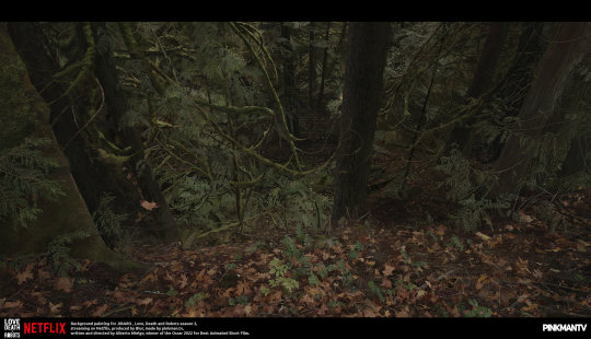
Lea was one of the background artists for JIBARO, one of the episodes of Love, Death, and Robots, an animated adult tv series streaming on Netflix. I'd actually watched this episode before so it was amazing to hear her talk about how she designed and painted some of the scenes from the episode.
I was super shocked to hear that Lea generally uses a mouse with the lasso tool for 90% of her painting process, and she explained that she feels more comfortable using it as opposed to a tablet. I don't think I could ever work like her but it really goes to show that it doesn't matter what your art tools are, as long as it works for you and you're able to use them how you want to.
I'm pretty pleased with how my own painting came out, because I was able to accomplish several things that'd I'd been aiming for in the same piece! I increased the saturation and vibrancy from the original reference, added my own slanted perspective for more character, and was able to integrate the overall color palette with the primaries red, blue, and yellow.
My color sense has definitely gotten stronger since the start of this challenge, and I can also see how my paintings have gained a more confident feeling to them. I really believe that getting a lot of mileage in drawing is one of the best things you can do to improve quickly, and I'm glad that I can already see gains within just a little over two weeks.
For Day 23, I followed along with Yeonji Rhee for her Warrior Painters demo. I thought Yeonji's demo was really informative, and I could really tell that she had confidence in teaching and explaining art concepts to other people. Her demo was a bit like a lesson almost, focused on how to use grays effectively within an image.
I'm super thankful for the Warrior Painters and Artbrew for their demo collab series. Every time I've followed along with one of them, I end up feeling reinvigorated from the new knowledge I've gained and inspired by the amazing artists leading the demos. I think this pattern of creating and learning, creating and learning is a really effective one for me because sometimes I get too caught up in learning and fail to actually apply any of those lessons to my work.
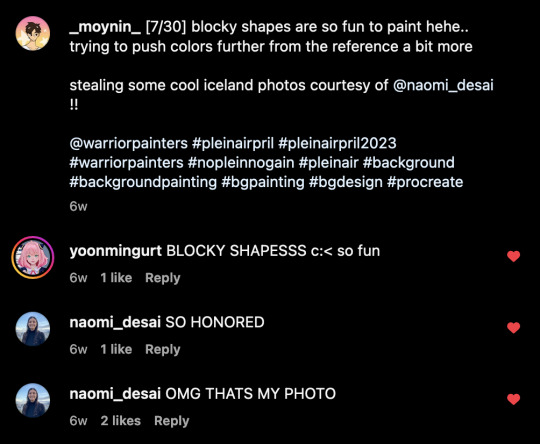
Almost all the paintings that I've done for PleinAirpril are reference photos I've taken personally (besides the demo sessions), but a few images are also from my friend Naomi! Naomi recently traveled to Iceland and took some amazing photos on film.
When they finally got developed, I was really blown away by the atmospheric quality of her photos, and was inspired to try and create that feeling in my own artwork.
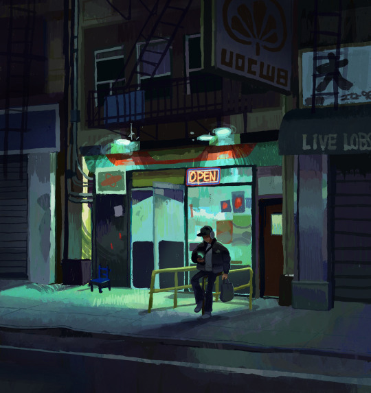
For Day 25, I followed along with Kaye Kang's Warrior Painters demo. Kaye had some helpful color editing tips which I found pretty interesting. She said that she never works directly with an unaltered reference image, and will always adjust the colors in Photoshop first to enhance a certain type of lighting or atmosphere.
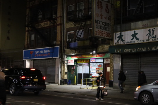
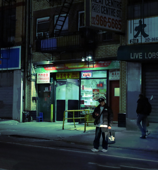
Usually, when I paint colors that don't follow the reference exactly, I just use my own color sense to adjust them as I paint but Kaye's method seems really helpful for more unnatural colors or combinations that I'm not as comfortable with.
I liked the photo that Kaye picked for the demo because I got to think about how to simplify the signs and details of the storefront while still having them be convincing.
In this next painting, I applied the Photoshop techniques I learned from Kaye's demo to create a really pink lighting with greenish shadows, inspired by one of my favorite illustrations ever by @quruiqing on Twitter.
I did try experimenting with an inverse of that coloring, with green lighting and pink shadows but it didn't exactly fit the atmosphere I was going for so I decided to ditch it.
I had a lot of fun with the pinks and purples of this painting, and definitely want to play around with strong/unnatural lighting more in future works!
0 notes
Text
Making It Workshop #4 (5/5/23)
I really liked Nghiem Ta's presentation and found her job super interesting! I've never learned about what goes into a book designer's job but I've always been interested in it so this was a really great opportunity.

It was really cool to see how Nghiem blocks out sections in the picture book for art and sections for text. Just from a glance, I can see that the compositions of each spread are varied nicely and flow into each other.

Seeing the illustrator's sketches added into the spread is also really cool, and gives me a much better sense of how a picture book actually comes together. It's super cool to see how the artist actually works within the blocked out dimensions without it seeming stiff or awkward.


The difference from sketch layout to the final printed spread is also really valuable. It's interesting to note the small changes like the movement of a card from horizontal to vertical, the corner flourishes becoming gears, and the pose of the magician changing slightly. Overall though, the composition has remained very close to the original sketch, showing that it's important to lock down the layout but okay for smaller details to end up changing a bit.


I also loved getting to see the more technical and organizational parts of Nghiem's job like the scheduling and file building. I'm pretty familiar with these two aspects because of my Prattler job and as a mod for several fanzines, so it gives me some confidence that I would be able to handle this kind of job.
I feel like the publishing industry is much harder to gain information about than animation because most professionals in the industry are not as vocal about their careers (online at least). I think there's also an age difference between the two industries. There's a lot more demand for work in animation as opposed to publishing which can operate with a much smaller design team. I personally think this leads to less young people (who are more transparent and active online) getting hired, and contributes to a feeling where publishing can lag behind current day sentiments/trends by more years. I really appreciate having Nghiem's expertise and her willingness to share information her career with us, and it definitely helps me to understand what I'm interested in doing in the future.
0 notes
Text
Interim Crit Project B (4/5/23)
My concept art project idea pretty much started from one character design which I then developed a world around.
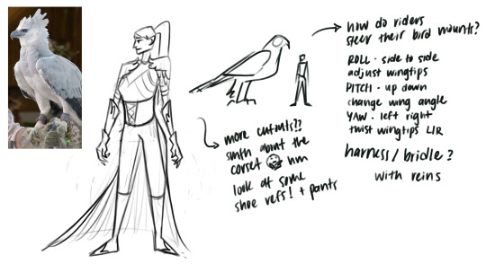
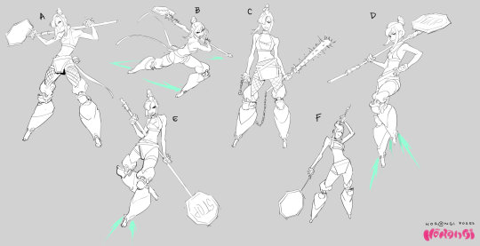
I've always loved birds, especially birds of prey like eagles, hawks, falcons, owls, etc so I wanted to design a character that was based on one. I took an image of a harpy eagle and incorporated characteristics of the bird with medieval fantasy armor. I wanted the armor to have pieces and flourishes resembling feathers, and the knight to have a cape like a feathered tail. The gauntlets are sharp to imitate the talons of an eagle and the overall silhouette is pointed. I kept shape language in mind and wanted the character to have a triangle shape to emphasize her dangerous nature as a warrior.
I think I ended up choosing a fantasy inspired genre because I've been reading a lot of fantasy books in the past few months. I used to be a really avid reader through elementary and middle school, and my favorite genre back then was anything to do with dragons and talking animals. One of my favorite franchises ever is How to Train Your Dragon, both the book series and movie trilogy. I fell off reading books when I started high school because the internet was much more accessible by then, but for 2023 I decided to get back into it!
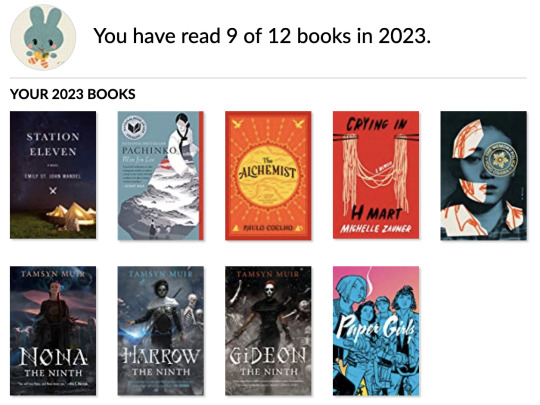
So far my 2023 Goodreads challenge has had a pretty considerable ratio of fantasy books, specifically the Locked Tomb series starting from Gideon the Ninth. The Locked Tomb is a bit of a mix of fantasy and sci-fi, but knight cavaliers and necromancer sorcerers are pretty central to the story, which definitely led to the knight decision.
From the character design, I started thinking about what kind of world this knight could inhabit and why would her armor be so heavily inspired by birds. The two main influences that I combined to create the world this character design by Airi Pan and the Great Eagles from Lord of the Rings.
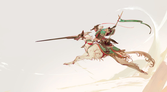
I love the idea of taking any animal and having it become a knight's trusty mount, and the Great Eagles already set precedent for large birds that can be ridden, so I decided to create a world based on the concept of eagle knights.
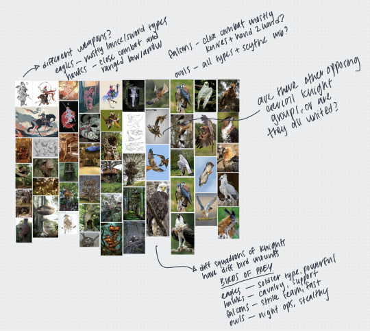
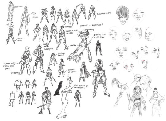
I started gathering references for the influences that I want to go into the world, from fantasy medieval knights to birds of prey, to treehouses and bird nests. I took notes on areas that could be fleshed out for worldbuilding purposes, thinking about different classes of knights and their different bird mounts.
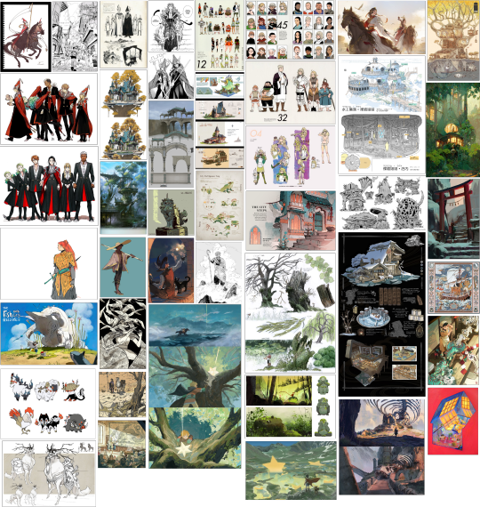
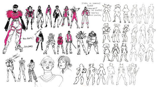
Next, I also created a reference board of visual development art. I wanted to have a lot of different types of concept art to reference and prompt me to think of different aspects of worldbuilding. Two manga titles that really inspire me are Witch Hat Atelier by Kamome Shirahama and Dungeon Meshi by Ryoko Kui. Both are manga series written and illustrated by women, and are set in incredibly lush fantasy worlds.
I was inspired to start reading Witch Hat Atelier after hearing that it has great representation of disability and darker skinned characters, which is really rare for both the fantasy genre and Japanese manga. The character designs in Witch Hat Atelier are gorgeous and fantastically diverse, yet cohesive in a way that I really appreciate.
youtube
I picked up Dungeon Meshi after watching this amazing breakdown video on character design in the series. Ryoko includes extras in some of the volumes which demonstrate her great attention to detail in character design. Her character portrait lineups show diversity in their facial features and physical makeup, and she also makes sure that even when her characters have swapped costumes, they're still distinguishable from each other. There's a large range in body shape and size in the cast, even for women, whom Ryoko isn't afraid to design outside of the typical beauty ideals.
Besides character art though, I also have environment designs and creature designs in my reference board. I think it's important to have sheets that describe the detail of specific environmental details in a technical way, but also more rendered paintings that establish the mood and atmosphere of a world.
0 notes
Text
Making It Workshop #3 (28/4/23)
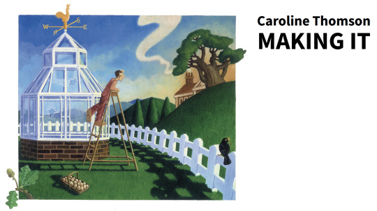
The guest speakers this week were pretty interesting! I was more interested in Caroline Thomson's career, since she made the transition from illustrator to illustration agent.
I think I'm a little similar to Caroline in that I'm interested in being an artist, but also in jobs that don't require actual art-making but are related to it. She talked about how she's done a lot of editorial illustration work in the past and been commissioned for advertising work as well, but mostly works as an agent for Arena Illustration now.

Caroline mentioned that having experience as an illustrator really helps her in her job as an agent now, because she's familiar with what it's like being on the other side and what it can be like to work with clients. She confessed because of that she's almost always on the side of the illustrator when it comes to negotiations or conflicts, and I really admire that! I think using your own experiences and advocating for others is great, and I'm glad that Caroline can now serve as a gatekeeper who opens the doors for others.
My long-term goal as an artist is to be able to contribute as a concept artist to a animated TV series or feature film. I'm also interested in editorial illustration and would be open to freelancing part-time, but I'm not sure if I would ever want to live a life as a full-time freelancer. I like having a fixed schedule/routine to my days, and the feeling of working in a larger team. It's something that's carried over ever since middle school, and part of the reason I loved being a part of my school band. I love the community and collectiveness of being a part of something bigger than yourself, so I don't think I'd want to become a full-time independent artist.
In terms of other art careers I'd like to explore one day, I've always been interested in comics and loved collecting them so I'd like to try creating indie comics or even publishing a graphic novel in the future. The combination of the visual art form and the narrative really appeals to me, and I look up to a lot of comic artists for inspiration. I've heard from speaking to professional comic artists though that it can be a very lonely career, since most artists are in charge of all aspects of their work, from writing to artwork. That's partly why comics isn't my number one choice for a long-term career, but I'd still like to explore it as part of my art journey.
On the other side of my creative interests, I also really enjoy being a in a position where I can advocate for other artists and give them opportunities as an art director. As the Prattler creative director, I've often reached out to other illustrators I know to ask if they're interested in taking an editorial illustration spot. I love working with an artist and seeing their piece come to life, and ultimately seeing it in print, knowing that I helped make that happen.
I'm generally a very organized person and embrace the chaos of working on a large production, which is why I'm also interested in becoming a production assistant in animation. I've always liked that as a creative director, I get to work on the magazine from beginning to end, and I know PA's serve a very similar role.
I don't know what kind of path the future has in store for me but I'm definitely open to many different paths, and I have faith that wherever I go I'll be able to find my way with time. :)
0 notes
Text
Interim Crit Project A (27/4/23)
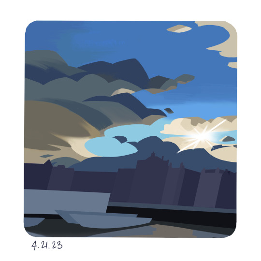
I feel that I really had a breakthrough starting from Day 11 of my PleinAirpril paintings. I really made an effort to push and simplify the shapes I saw within the reference image, and I purposefully slanted the angles of the buildings to create more visual interest and personality. I feel really happy with the shapes of the clouds in the painting, and that sort of chunky, geometric shape carried itself through the rest of my paintings. I was also conscious of the composition of the drawing and eliminated some clouds that I felt weren't as necessary or detracted from the flow of the piece, which was a step further than just copying the reference image like I'd done before.
For Day 12, I followed along with Min Yum's Warrior Painters demo. This painting was also definitely a breakthrough painting for me, specifically in terms of color. Min really emphasized that it doesn't really matter what color you use, as long as you assign that color a role and it fulfills that specific role.
At first I was confused by this statement, but eventually I realized that this really holds true, especially for art that uses non-representational colors. I think one of my favorite examples of art that uses "wrong" colors very successfully is the art of Jojo's Bizarre Adventure.


The colors of the left cover are what the actual character is meant to look like. Even though the colors on the right cover are technically incorrect, Hirohiko Araki, the creator of Jojo's Bizarre Adventure, uses them to great stylistic effect. The green color fulfills the role of the dark blue in his coat and hair, while the cyan blue becomes the color of the shirt.
Min Yum talked about how he introduces color variation into his artwork generally by jumping around the color wheel but sticking to a similar saturation level, which I found to be a really helpful tip. I experimented with that technique in painting the trees and grass, and found it to be really fun and natural feeling.
In Min's demo, he also introduced me to the idea of having a really crazy color for the underpainting/base, which I love! It's not as applicable to digital painting since the underpainting doesn't exactly show through the layers of paint, but I still found that having a bold base color to start with definitely influenced my color choices and the resulting feeling of the piece since it got me into that more bold and expressive mindset.
Another artist I look up to is Teddi Parker, who is a traditional acrylic painter and works in a very impressionist, expressive style.
She often uses a yellow or pink underpainting layer, which adds warmth to the overall piece and creates some fun peeks of colors. I love the look when bitspieces of the underpainting come through, since I think it adds a lot of contrast and visual flair to the final piece.
For the next two days, I definitely tried to apply that underpainting technique to my work and had a lot of fun pushing the colors to a higher saturation point. I was also trying to learn how to find a good balance between depicting detail and withholding it, creating areas of contrast and attention.
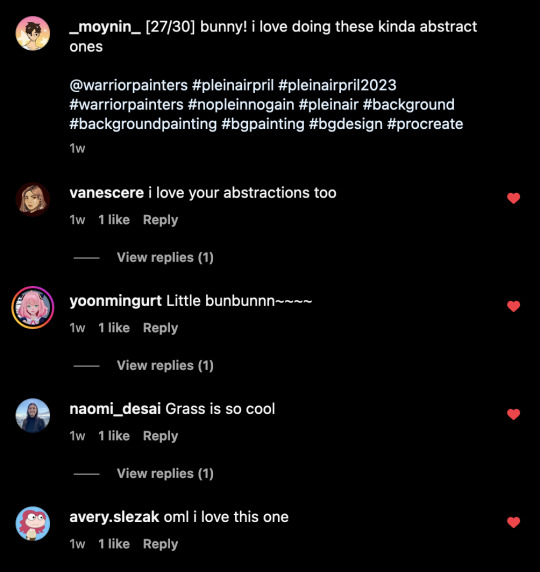
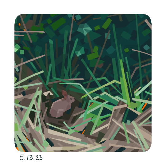
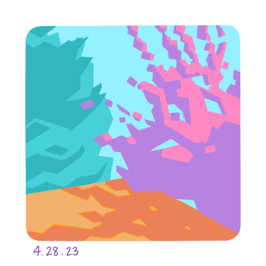
Day 15 was a pretty unique piece because I really abstracted the image I was referencing. The original photo was a very complicated, detail heavy forest environment and I knew there was no way I was going to be able to effectively capture all the elements without spending hours upon hours on the piece. So I decided that I would try to capture the feeling of light and shadow in the piece instead, distilling it to basically two values.
Beyond that, I approached the painting quite naturally, letting myself establish a shape language and pattern to use throughout the whole piece, and making sure that was present throughout the whole composition.
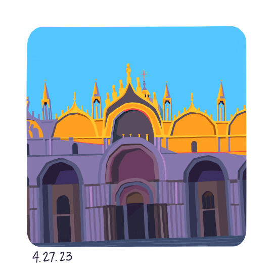
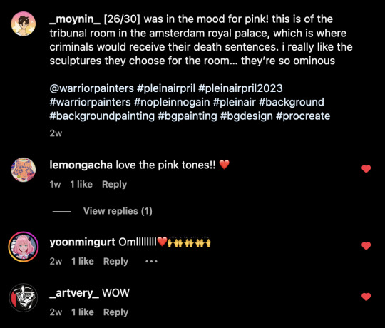
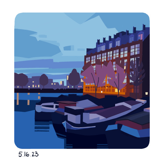
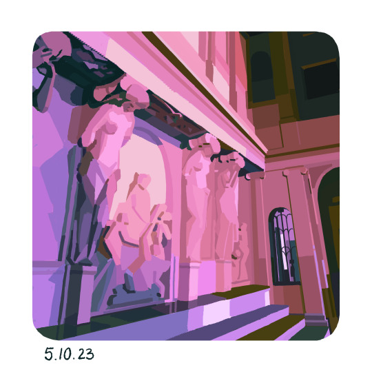
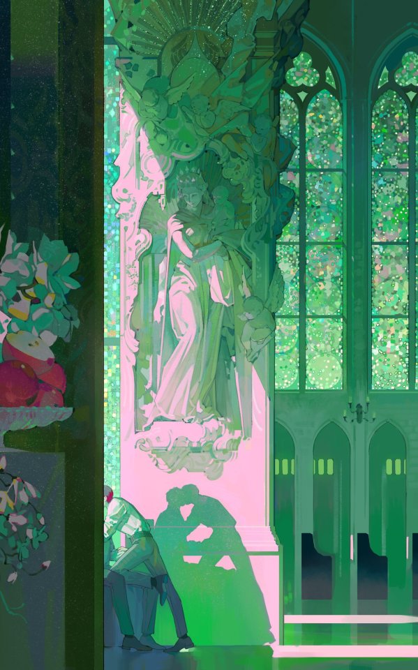
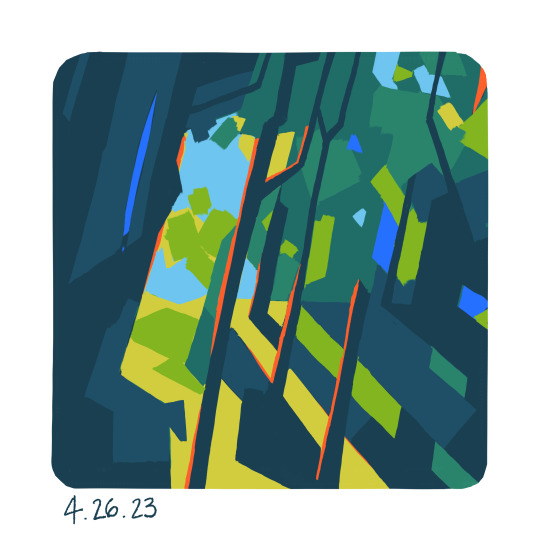
I have mixed feelings about Day 16's painting, since I wasn't very pleased with how I treated the shadow area of the cathedral, but I do like the contrast of purple and yellow that serve as the dark and light respectively. This piece was really challenging since there were so many details and elements of the cathedral, and I definitely struggled with what to keep and what to simplify.
One thing that I attempted to create in this piece was the effect of chromatic fringe. I'm not entirely sure if it's actually a formal technique, but I've seen a lot of artists use it in their art. Oftentimes, on the edge of a shadow, there will be a more saturated edge, which adds more life and color into the piece.

I think I ended up using the effect a bit haphazardly, but I do really like the look of it and want to try incorporating it into my art more in the future.
0 notes
Text
Making It Workshop #2 (21/4/23)
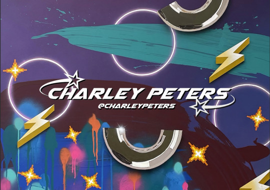
I really enjoyed the guest lecturers today, especially Charley Peters's talk. Her art isn't usually the type of work I'd be drawn to, but her mannerisms and way of speaking were super charming. I also appreciated her candidness about how she was able to find success as an artist and the different sources of income she depends on to survive.
Charley talked about how she's not the type of person who can sit out and plan a piece of art before she starts it generally, which was interesting to hear. It seems like her art-making process comes very naturally to her and she likes to let her intuition lead her through a piece, rather than trying to think about it beforehand. She also mentioned how that can be really difficult when she has to work with a client, and the different ways she's found of making those experiences work with her style of creation.
I think listening to Charley's lecture made me more aware of the differences between types of artists and how some advice might be more suited for certain people but not others. We all have to figure out what works for us, and it seems like Charley's been able to do that through a series of trials and errors which is pretty inspiring.
Charley was super forthcoming about how long it took her to find her place as the artist she is now, and how many different types of work she's taken on just to support herself through the years. I love that she said she cat sits for money because it's so real. Her advice on figuring out what you like to do (even if it's not art related) and how to monetize that is super helpful, because a lot of the time professional artists never talk about that. She also talked about how she doesn't particularly like writing but she's taken writing gigs for the money and to boost her own reputation. Generally, I just appreciated that Charley was willing to talk about the hard stuff and the things you don't necessarily love but need to do, that it's not easy being an artist but still worth it.
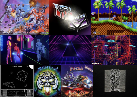
I also found the part where she talked about finding her style really interesting, since that's something I've always struggled with. Charley said that in art school, her tutors all told her that the type of art she was interested in was garbage and she should find "proper art influences". In the end, her art style clearly reflects both her more "academic" influences and the video game, retro aesthetic of her youth. I found her advice to expand your influences but still be true to yourself to be really impactful. I think I struggle a lot with being overly conscious of my own artistic style, but reminding myself to be true to what inspires me helps with quieting those insecurities.
0 notes
Text
Project Agreement Tutorials (20/4/23)
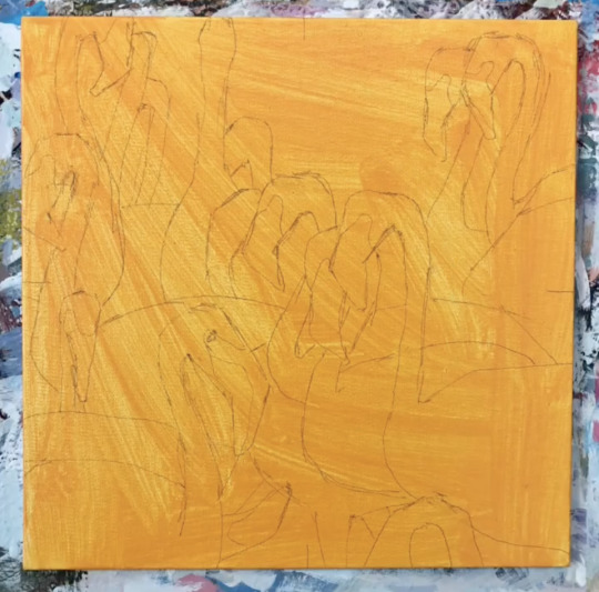
By the time of this class, I'd completed a third of the paintings in my Project A PleinAirpril challenge which is what I brought in to show. I decided at the beginning that all 30 paintings would be the same size and shape, to emulate the experience of drawing in a real sketchbook and so if I ever wanted to print the paintings as part of a book, I'd be able to format them relatively easily.
I chose to bevel the corners of the paintings because I liked the softer effect it gave, rather than the sharp 90 degree turns. I set the paintings slightly inside the square of the canvas rather than directly on the edges because I wanted there to be a bit of a frame to each painting, and also because I wanted room to date each piece underneath. It also had an added benefit of creating more continuity to my Instagram feed, where I was posting the pieces.
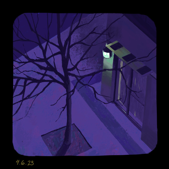
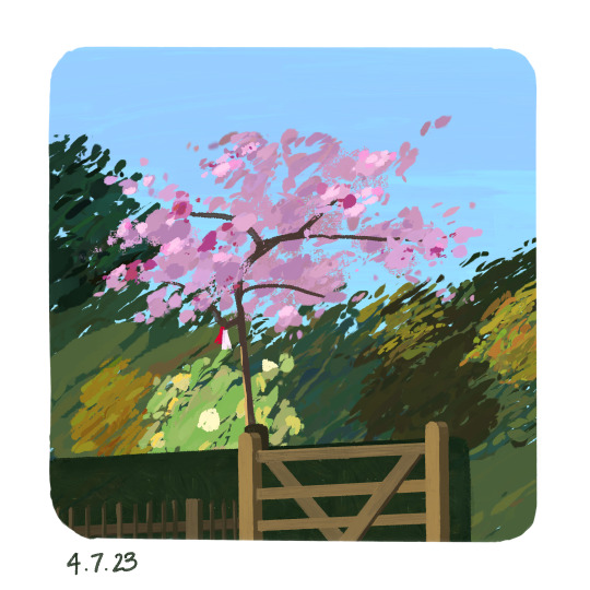
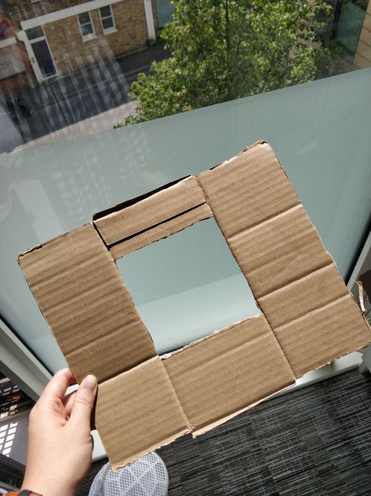
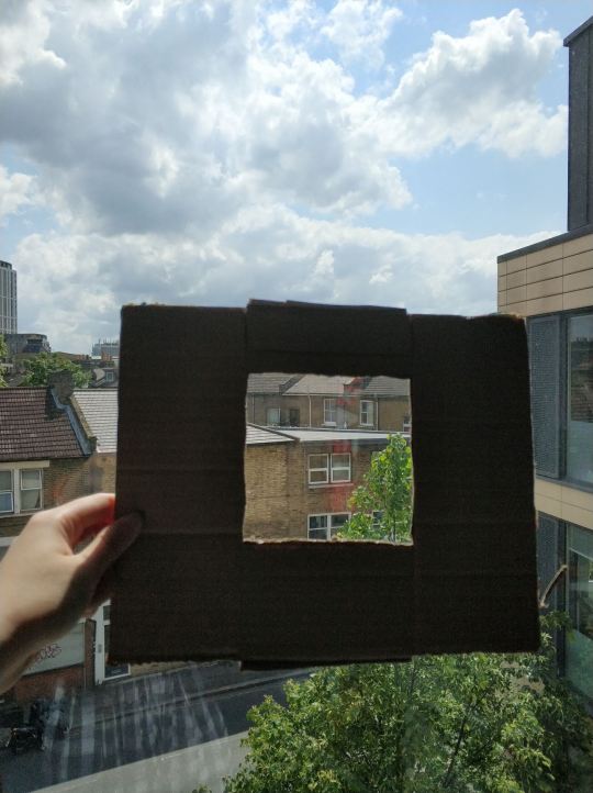
The first two paintings I did for PleinAirpril were plein airs done from real life observation. I constructed a little window out of cardboard for my first painting, which I did at night time from my room.
I used a lot of brushes with color mixing for these two because I'd seen other digital artists create really gorgeous effects with the color variation. I focused a lot on trying to capture the colors and lighting I saw relatively accurately at this stage.
For the third painting, I followed along to the first Warrior Painter's demo with Angela Sung, one of the hosts of the Warrior Painter community! For this demo, I was trying to follow the same painting techniques as Angela. She uses the lasso tool a lot to select certain parts of the painting, and then fills that area with a solid color. I think it was a valuable experience to try and work that way, but I found that it definitely doesn't work for me very well. I didn't really feel like I had a lot of control over what I wanted to do, and it really slowed my process down a lot as well.
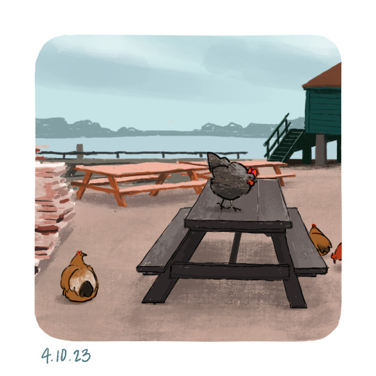
For the next two paintings, I tried to push my colors a bit beyond just what I saw, but in hindsight they were pretty close to the original. I experimented a bit with linework in the chicken painting, which I liked but ultimately gave up on in favor of lineless painting instead.
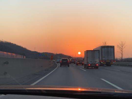
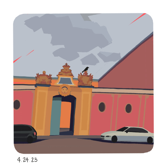
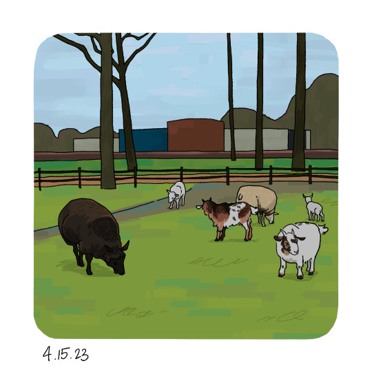
Also at this point, I started using reference photos instead of drawing from real life, since it cost a lot of time to scout out and visit specific locations, which I discovered for Day #2 since I did that at Holland Park near Kennington Palace. Almost all the rest of the paintings I did were of photos I took from spring break, which I wanted to do since it was like a way of documenting the places I traveled to :)
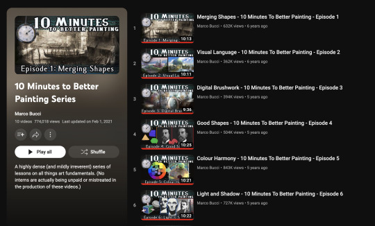
For Day 6, I painted while watching Marco Bucci's YouTube video series on tips for better painting. It was really helpful to take in his tips and I found myself actively incorporating his tips into my painting as I worked on it.
I merged my shapes into defined sections and was conscious of making sure colors from certain dominant areas were also present in less prominent areas, to a lesser degree.
For the next four paintings, I tried to keep those lessons in mind and experiment with my painting techniques to see what worked the best for me.

0 notes
Text
Making It Workshop #1 (14/4/23)
During this workshop, I finalized my two independent projects. Project A will be the PleinAirpril challenge and Project B will be a visual development project.


I chose Identities and Place for Project A since I'm primarily focusing on documenting environments and places. I want to express a sense of character and personality in the spaces I paint. The resource I put in the Miro board was a link to Monica Nguyen-Vo's portfolio tab of background art.
I follow Monica on Twitter and I know that for a period of time, she would do daily background paintings for a 30 minute duration. I really like the quality of her environment art, specifically her shape language and color palettes.
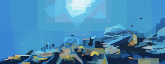
I adore the stylized geometric look of her shapes, and the way they still clearly communicate the details of the environments in spite of the liberties she's taken. The way some forms are broken up remind me of low-poly 3d models, where the surfaces are composed of a very limited number of faces and vertices. I've always found low-poly art to be charming, so I really appreciate the influence in 2d illustration as well.
The light sources in these paintings are well portrayed, showing where the light is coming from and what kind of light it is. The sun depicted in the underwater piece is especially cool since it shows how the light would be refracted through the water.
I look up to Monica's art a lot since she's a relatively recent graduate, and has already worked for multiple animation studios such as Netflix, Cartoon Network, and Nickelodeon.
I chose to place my Project B under Sequences and Time since it's a visual development project geared towards animation. I think it would also work as a comic project though, which is also a sequence based visual media.
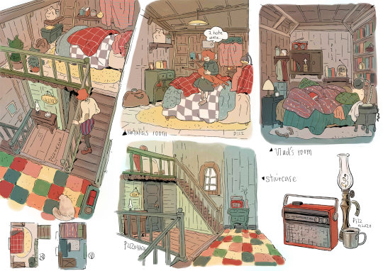
I shared Knight Zhang's portfolio website for the Miro board because she's a very experienced visual development artist.
I like referencing Knight's portfolio because her website showcases a mix of more polished work and more exploratory sketches. She has very tight character turnarounds and pose references, but also initial character designs and even brainstorming notes.

Knight's work is more video game oriented but I still think it's a good reference for visual development work in general, and I'll definitely be looking back at it while creating my own visdev project.
0 notes
Text
IP Launch Briefing Part 2 (13/4/23)
By the time of this tutorial session, I’d already decided on having PleinAirpril be my Project A but I still wasn’t exactly sure about what I was going to do for Project B since I’d waffled between a couple ideas over spring break. Doing this association exercise actually really helped me figure out what I wasn’t interested in doing, narrowing my options down. Throwing myself into the PleinAirpril challenge means creating a lot of art every day, so I think I’m less in a frame of mind to engage with writing than I was before spring break. I really just want to create art, so my idea for Project B will be to work on developing a visual development idea and concept art.
I think it’ll be a good complement to the PleinAirpril project since for visual development, I need to synthesize the visual information I’m researching and taking in to create something new, and for PleinAirpril, I’m largely observing and translating, trying to capture the feeling of something rather than creating something original.
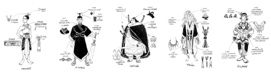
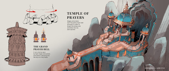
I’ve been looking a lot at Airi Pan’s visual development project Ambrosia, which strikes a great balance between storytelling and information giving. The images she’s illustrated provide an insight into how the world she’s created works, as well as the personality and motivations of the characters that inhabit it. I also really appreciate that a glimpse of the narrative has also been woven throughout, rather than just giving us information as is.
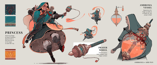
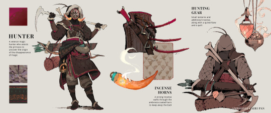
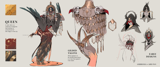
I’d like to do something in the same spirit as this, which is a really helpful reference to look back on for level of detail and what kind of information to include.
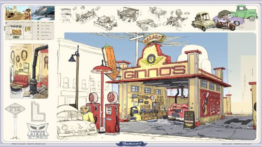
Another artist I really look up to in visual development work is Scott Watanabe, especially his concept art and explorations for Raya and the Last Dragon. There’s an enormous quantity of work up on his website, but I especially appreciate the sheets with research notes about more technical details and explanations for certain things.

0 notes
Text
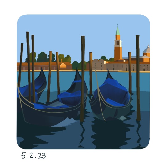
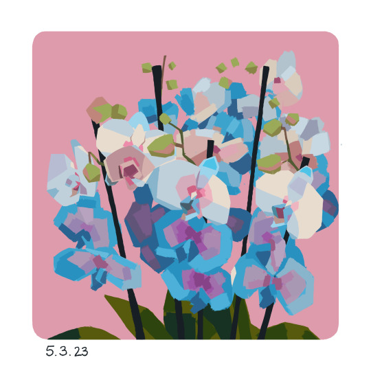
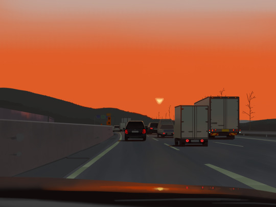
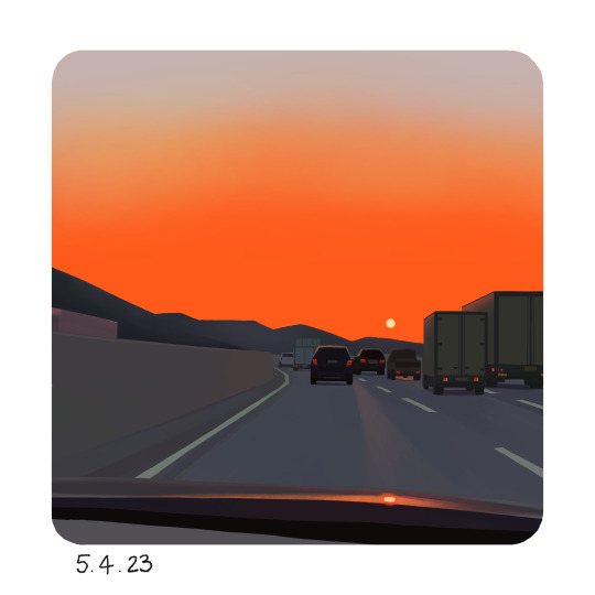
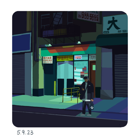
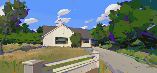
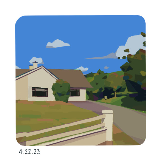
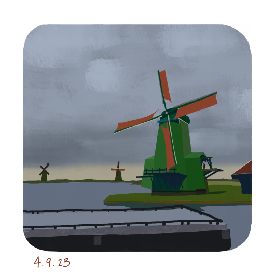
PleinAirpril- Project A (5/4/23)
For the last couple weeks I’ve been traveling around Europe, so I’ve been pretty removed from thinking about the Independent Projects but scrolling Instagram today I realized that PleinAirpril has just rolled around the corner!
PleinAirpril is an art challenge hosted by an online community of artists called Warrior Painters, which focuses primarily on environment painting. Since 2017, the challenge has taken place during the month of April, where artists are tasked to draw and post one plein air painting every day. Plein air is a type of painting done primarily outside and from observation, usually surrounding environment but for PleinAirpril artists are allowed to draw from reference photos as well.
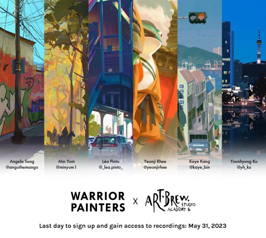
In past years, Warrior Painters has organized events like a prize competition and other incentives for people to stay motivated but this year they’ve organized a collaboration with Artbrew, a Korean art community. Together, they’re offering 6 weekly demos with professional background artists for artists to follow along and learn from, which I think is a really awesome opportunity.
I’ve followed the PleinAirpril challenge on social media for several years now, but I’ve never gotten around to participating myself; partially due to a lack of confidence and also a lack of time, since usually April is right in the middle of finals season at Pratt. But since I’m studying at UAL this semester and we’re allowed to choose literally anything for our SSP Independent Projects, it’s the perfect time and reason to try this challenge! I’m excited to do it for the first time, especially because I’ve been more motivated to turn to visual development and aim for breaking into the animation industry.
I’ve already seen some really inspiring pieces from others participating in the challenge, and found some new favorite artists to follow such as Fanny HS and Kaye Bin.
I really like the way Fanny uses color and light. The rich saturated colors paired with the darker and less saturated ones play off each other so well, and create a really lovely contrast. I also like the way they draw foliage, which feels a bit gloopy. I love that it strikes a balance between the details that are shown and the details that are omitted, helping to not overwhelm the eye.
I like Kaye Bin’s environment art because they’re able to create such a tangible mood and atmosphere in their pieces. I’m really impressed that they’re able to balance a lined and painted style in the same piece, because that’s always been a big struggle for me in deciding which style to draw in, so it’s really cool that they can combine both. I also like the people that are drawn in, giving the whole scene some life and energy. It feels almost like a film still, where we’re walking right behind the character in the foreground and captured them mid-sigh.
I’d love to be able to create some of the same feelings in my own work, and learn from artists who have had a lot more drawing experience than me.
1 note
·
View note
Text
Independent Projects Launch Briefing & Brainstorming (17/3/23)
I’m really excited about the Independent Projects coming up because at Pratt, there has rarely been an opportunity to have so much freedom over the direction of our creative projects. I’ve recently been thinking a lot about the direction I’d like to take my art in and what kind of work I’d like to pursue after graduation, so I think this is a really great opportunity for me to develop that in the way I’d like.
I’m currently unsatisfied with my portfolio, because I think it’s much more design oriented than illustration oriented. I enjoy design work, but I’m ultimately much more interested in illustration, and specifically the animation industry. I want to create a large body of work that will push me more towards the direction of illustration that I’m trying to head in, instead of just settling for design. I know it’ll be a lot of work, but I believe that getting mileage in and just producing a lot of pieces will really help with that.
For my Project A, I definitely want to tackle something that would help me develop my skills in concept art/visual development. I’ve been really inspired looking at environment concept art recently and I’ve always been less confident drawing/painting environments since I usually focus on character related art, so I think this project would be a good opportunity to explore and become more proficient in that area.
I’ve been really enamored with how even the most mundane things can be designed to incorporate personality and character, becoming visually interesting. Even the simplest rock or bush can tell you a story or give you details about the surrounding environment, which I think is really really cool. A lot of visual development is considering how to design these mundane, everyday things, ranging from telephone poles to parking meters, and I’m pretty fascinated by that.
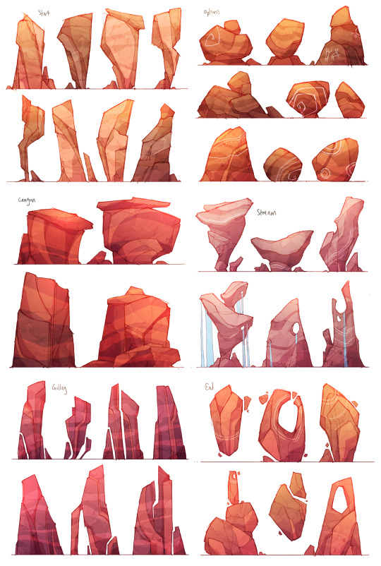
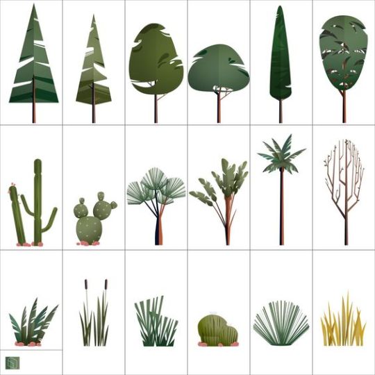
I keep a large collection of images on Pinterest on environment design and art, which I think will be really inspiring for whatever I decide for Project A.
At the same time, I would like to combine my skills in design and illustration somehow, so I’m considering creating an editorial zine for my Project B since at Pratt I work as creative director for our school’s campus magazine.
I love the experience of working with editorial and turning words into images, but usually as director I’m more on the supervising side and not illustrating myself. I’d like to take the opportunity to maybe create something for myself and have it be entirely my design and illustration work.
Something I’m really passionate about is racial justice and discussing Asian identity, which I have some already existing writing on. I think it would be a really rewarding exercise to take some of that writing and visually interpret my own intention that I had when writing it, rather than interpret someone else’s words. Not that interpreting someone else’s writing is less rewarding, but there obviously isn’t that kind of personal connection that exists when the writing has come from myself.
Another option I’m considering as well is asking some of my close friends to give me some of their writing on Asian identity, then compiling and designing that in a zine. I like the idea of having multiple voices reflected in the zine, and sourcing writing from those close to me still gives me a sort of personal connection to the work. I’ve already asked some people and they’d definitely be interested, so I’ll think about it over spring break!
0 notes
Text
Final Crit (16/3/23)
For the Art in Site final crit, everyone brought in their posters and hung them on the walls. It was really interesting to see the variety of approaches to poster designs, as some people approached it in a purely informational way, while others approached it in an almost advertisement kind of style. I enjoyed the more seminar style way that Peter and Martin approached the critique, asking us as students to offer words of commentary and responding in kind. I found that many of the themes that I’d noticed in the interim crit were even more strongly reflected in the final crit- elements of play, distraction, calm, approachability, personalization, and patient-oriented design were all present.
Martin asked me to show my prototype curtains and explain my concept a little, which I was happy to do, since there wasn’t a way for me to pin my curtains to the wall. I feel like they received my idea quite well, though I personally think perhaps I could’ve taken the execution a bit further. Overall, I appreciated this project as an opportunity to think about how to utilize art to benefit others, since I care a lot about different areas of inequity and sometimes struggle to figue out how my interests in art can contribute to combating these issues.
0 notes
Text
Poster Design (14/3/23)
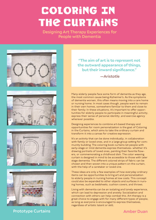
Designing my A2 poster for the final critique was a challenging task, since I had to consider how to thoughtfully present all the different types of information I had to our Art in Site professionals in a clear and concise manner. I had a large amount of research that I knew would be impossible to present in its entirety, the ideation and actual creation process, and my final prototypes; all very different kinds of information.
My priority was to communicate the intention and concept behind my idea, even if the curtains themselves didn’t reflect the scope and entirety of that. I knew that my project was a little bit different from the majority of the Art in Site projects other people would be presenting, since in essence my concept was the designing of an experience, not necessarily a single piece of art.
I used colors from my weave curtain in the design of the poster, and to reflect the multifaceted approach that one could take the concept, since I feel that my project was more of a jumping off point and less of a final guide for how to execute the idea.
0 notes