bookcoversalt
because you *can* judge a book by its cover
in which a very grumpy graphic designer complains about the cover of YA books, mostly.
255 posts
Don't wanna be here? Send us removal request.
Last Seen Blogs
drawsoleum
🍂🍁Oh how the gentle wind~🎵

arcflre
Let's share FE!!
craigpetersennz
Art of Craig Petersen

allhailyuri25
Shoujo Ai~
nebulaskiesworld
Adri
Note
I love your blog but I'm concerned to see you were named as participating in Emily A. Duncan's bullying of other authors along with Christine Lynn Herman and Rory Power. Please address this.
Thank you for being respectful. I addressed this on my personal twitter here.
11 notes
·
View notes
Note
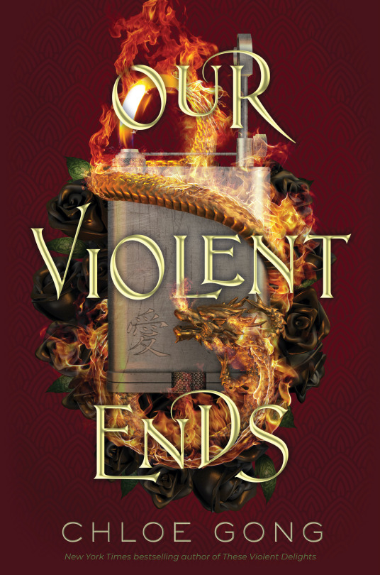
why is the cover for our violent ends so much... worse... than the cover for the previous book (these violent delights)
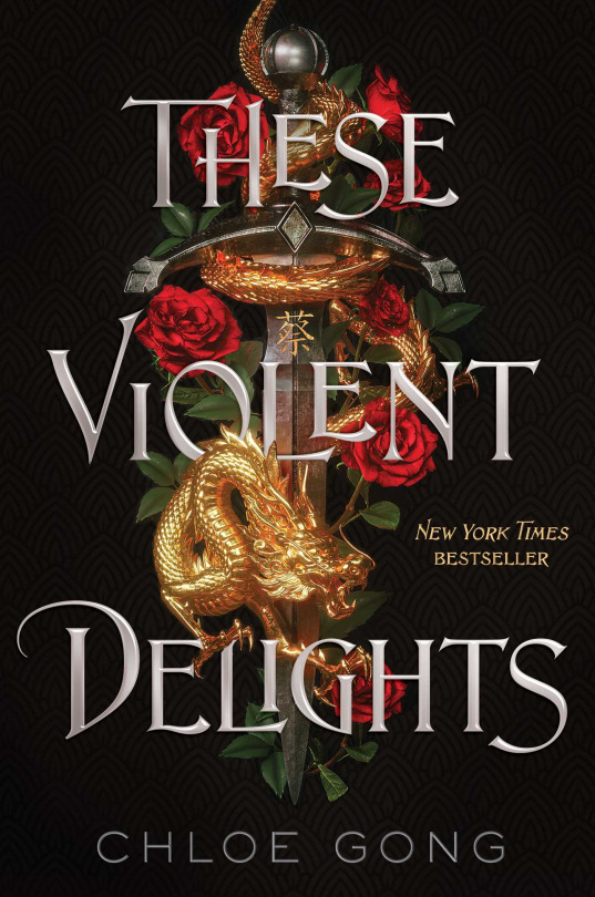
Well, to start with, an upright, flat rectangle isn’t the most visually dynamic or interesting shape in the world to anchor your design to, lol. It also commits the sins of:
A substantially more garish bevel on the text (bevel = metallic-ey dimensional effect). Also a drop shadow now? Why????? Why drop shadow????
The sort of pale, colder gold tone of the text also matches nothing in the illustration in terms of color, whereas the silver text on TVD was echoed in the silver of the sword metal. It provides a nice subtle little bit of cohesion on TVD that we’re missing on OVE.
.
A much weaker silhouette + overall visual language to the main illustrated lockup. The sword shape is clear on TVD, but the other elements are also thoughtfully placed to gave the impression of organic randomness, which nicely contrasts the rigidity of the sword without impeding readability. The colors and values of each item (dragon, sword, flowers) work together but are also individually appropriate and appealing. The edges create a clear and compelling shape that contrasts cleanly against the black background-- and that clean contrast is itself a contrast to the more dense and layered parts of the illustration. Inception but for contrast!
If you squint at OVE, on the other hand, it’s not immediately clear what you’re seeing, other than fire-- the flowers look like they’re made of mud, the lighter (?) at that suggested scale is kind of a visually ambiguous and blocky-looking item to put front and center, and the whole thing forms a distinct oval shape that undermines any sense of the organic we probably should be getting from the foliage and fire that might provide interest. The dragon’s body is also wrapped weirdly-- it looks very tight to the lighter, but its body curvature is more rounded than the lighter would be. It’s a small thing, but our brains do clock it as “off”. The flame coming from the upper left becoming the dragon’s body is a nice idea, but it isn’t reading nearly well enough to carry the awkwardness of everything around it.
.
A misguided background color change. Nearly identical, in fact, to the one executed by BLOOD & HONEY, with its red background compared to its predecessor SERPENT AND DOVE’S black one, which I talked about at length. But we actually have kind of the inverse problem: going from black to red for B&H introduced a new contrast that threw rendering flaws into relief and made the cover far more bright and “busy”, while here the red is far less contrasted with its illustration than the black was, putting murky midtones against murky midtones and washing out our aforementioned good contrast of TVD’s illustration/ text lockup against its black background.
And like, the thought process behind changing the background color is obvious and sensible-- how do you replicate a design as closely as possible for marketing/ visibility reasons but make it distinct enough not to be confused with the original? You leave the layout the same but change the color in a big bold way! And red is a very logical place to go from gold/silver/white/black. But changing a major component of your design, in theory, requires recalibration of other aspects in turn to make the whole cover as functional as the original. I would actually have liked to see this with a white background (and a whole different lockup, but--). It would have restored our ~ contrast and the duality/ stark opposites of black/white seems appropriate for the Romeo and Juliet thing.
To its credit, I appreciate the presence of the pattern on the background, and it has a Subtle Gradient which we usually love, but goddam, it just looks really bad against that art. There is so much cowardice in the dark murky colors on this thing.
.
Fire effects.......... not good
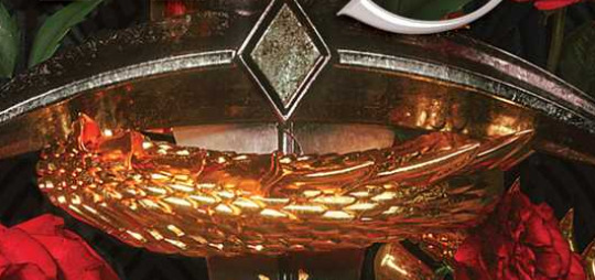
Our man Billelis did the TVD cover, and without googling I am........ pretty sure he did not do OVE. Look at the beautiful, crisp, glowing gold reflection of the dragon on the sword from TVD, the kind of realer-than-real-life metallic rendering that I think of as Bill’s signature:
Vs..... whatever’s happening here:
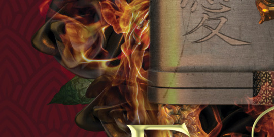
The execution is simply Not As Good on a technical level, duller and more ambiguous re: the illusion of objects interacting in physical space. Idk, maybe we couldn’t afford Bil for the sequel. Good, honestly. Bleed em dry, Bil.
And YES, that is the cruel prince font. 🥴
84 notes
·
View notes
Note
why is the cover for our violent ends so much... worse... than the cover for the previous book (these violent delights)
Well, to start with, an upright, flat rectangle isn’t the most visually dynamic or interesting shape in the world to anchor your design to, lol. It also commits the sins of:
A substantially more garish bevel on the text (bevel = metallic-ey dimensional effect). Also a drop shadow now? Why????? Why drop shadow????
The sort of pale, colder gold tone of the text also matches nothing in the illustration in terms of color, whereas the silver text on TVD was echoed in the silver of the sword metal. It provides a nice subtle little bit of cohesion on TVD that we’re missing on OVE.
.
A much weaker silhouette + overall visual language to the main illustrated lockup. The sword shape is clear on TVD, but the other elements are also thoughtfully placed to gave the impression of organic randomness, which nicely contrasts the rigidity of the sword without impeding readability. The colors and values of each item (dragon, sword, flowers) work together but are also individually appropriate and appealing. The edges create a clear and compelling shape that contrasts cleanly against the black background-- and that clean contrast is itself a contrast to the more dense and layered parts of the illustration. Inception but for contrast!
If you squint at OVE, on the other hand, it’s not immediately clear what you’re seeing, other than fire-- the flowers look like they’re made of mud, the lighter (?) at that suggested scale is kind of a visually ambiguous and blocky-looking item to put front and center, and the whole thing forms a distinct oval shape that undermines any sense of the organic we probably should be getting from the foliage and fire that might provide interest. The dragon’s body is also wrapped weirdly-- it looks very tight to the lighter, but its body curvature is more rounded than the lighter would be. It’s a small thing, but our brains do clock it as “off”. The flame coming from the upper left becoming the dragon’s body is a nice idea, but it isn’t reading nearly well enough to carry the awkwardness of everything around it.
.
A misguided background color change. Nearly identical, in fact, to the one executed by BLOOD & HONEY, with its red background compared to its predecessor SERPENT AND DOVE’S black one, which I talked about at length. But we actually have kind of the inverse problem: going from black to red for B&H introduced a new contrast that threw rendering flaws into relief and made the cover far more bright and “busy”, while here the red is far less contrasted with its illustration than the black was, putting murky midtones against murky midtones and washing out our aforementioned good contrast of TVD’s illustration/ text lockup against its black background.
And like, the thought process behind changing the background color is obvious and sensible-- how do you replicate a design as closely as possible for marketing/ visibility reasons but make it distinct enough not to be confused with the original? You leave the layout the same but change the color in a big bold way! And red is a very logical place to go from gold/silver/white/black. But changing a major component of your design, in theory, requires recalibration of other aspects in turn to make the whole cover as functional as the original. I would actually have liked to see this with a white background (and a whole different lockup, but--). It would have restored our ~ contrast and the duality/ stark opposites of black/white seems appropriate for the Romeo and Juliet thing.
To its credit, I appreciate the presence of the pattern on the background, and it has a Subtle Gradient which we usually love, but goddam, it just looks really bad against that art. There is so much cowardice in the dark murky colors on this thing.
.
Fire effects.......... not good
Our man Billelis did the TVD cover, and without googling I am........ pretty sure he did not do OVE. Look at the beautiful, crisp, glowing gold reflection of the dragon on the sword from TVD, the kind of realer-than-real-life metallic rendering that I think of as Bill’s signature:
Vs..... whatever’s happening here:
The execution is simply Not As Good on a technical level, duller and more ambiguous re: the illusion of objects interacting in physical space. Idk, maybe we couldn’t afford Bil for the sequel. Good, honestly. Bleed em dry, Bil.
And YES, that is the cruel prince font. 🥴
84 notes
·
View notes
Note
I loved your video about House of Salt and Sorrows ! It was super interesting. I'm impressed by how you detailed every genre, it was such a thourough analysis and explained very well. I will definitely watch if you ever do more !
Thank you so much! The reception has been so lovely and I really appreciate how many of you were willing to give my new format a shot. I definitely intend to do more, but they are labor-intensive and I am moving this month (why did i decide to move during the combination pandemic surge + holiday season 🥴) so likely not before the new year. Cover talk will continue as normal, however!
13 notes
·
View notes
Note
you're like the mcmansion hell of the YA blogosphere
This is, with complete sincerity, the only compliment/ comparison I have ever specifically hoped this blog would garner, so thank you 😭❤️
And if anyone isn't familiar with mcmansionhell, please treat yourself to smart architectural roastings. Enjoy the lawyer foyers.
27 notes
·
View notes
Note
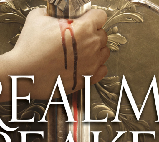
Just saw Aveyard's cover for Realm Breaker was released. It's reading Adult to me instead of YA (title font + drop shadows, Aveyard's name is Big and Bolded) thought that was interesting. Thoughts?

Oh, yeah, this is directly aping not just adult fantasy but Game of Thrones specifically. Down to the multiple lines in that A crossbar.


Which..... Okay! I guess!
Important context here is that we’re working with the most generic capital-F-Fantasy synopsis/ pitch (read: list of jobs) possible:
A strange darkness grows in Allward.
Even Corayne an-Amarat can feel it, tucked away in her small town at the edge of the sea.
She soon discovers the truth: She is the last of an ancient lineage — and the last hope to save the world from destruction. But she won’t be alone. Even as darkness falls, she is joined by a band of unlikely companions:
A squire, forced to choose between home and honor.
An immortal, avenging a broken promise.
An assassin, exiled and bloodthirsty.
An ancient sorceress, whose riddles hide an eerie foresight.
A forger with a secret past.
A bounty hunter with a score to settle.
Together they stand against a vicious opponent, invincible and determined to burn all kingdoms to ash, and an army unlike anything the realm has ever witnessed.
“Teenager has big magical destiny + large group of edgy outcasts with very specific and fun fantasy professions unite to stop the big evil what threatens the kingdom” is the most quintessential fantasy plot out there, and for that reason it is very hard to sell without a more specific hook. But here we are trying to do it...... again. Macmillan YA inexplicably bet big on this formula last year with debut series THERE WILL COME A DARKNESS and bombed hard: after spending a fairly insane million dollars on the advance (for three books, so ~$333,333 per book), more than a year after its release, the first book has less than 5k ratings on goodreads. (Compare to “successful” ‘19 debuts SERPENT & DOVE with 67k or WICKED SAINTS with 18k)
Worth noting that the DARKNESS covers went distinctly Schwabian:

When I complained at one point about the emphasis on the five protagonists in that synopsis and their little portraits on the covers, someone said to me, ‘but they have these nuanced little details that are so cool if you’ve read the book!’ And y’all, that’s lovely, but we are talking marketing, and “having five+ protagonists who are very cool, we swear” is not a selling point. It’s closer to the opposite of a selling point. Even as someone who likes epic fantasy, getting Into It with five whole characters is potentially a lot of effort, and I want to know what my reward for that will be, not just how much work I’m going to have to do. ANYWAY.
While I don’t think it’s necessarily a bad move for REALM BREAKER to hit that big red “IT’S LIKE GAME OF THRONES, GUYS!!” button I do think it’s, um, kind of silly. On the one hand, sure, you’re limited in immediately identifiable epic fantasy points of comparison, and, uh, go hard or go home? On the other hand... adult crossover exists, but are these books going to successfully pull any honest to goodness George RR Martin fans looking to fill a Winds of Winter shaped hole in their heart? I mean...... I guess it’s possible, but they are in for a YA culture shock that I can’t wait to read about in goodreads reviews.
At the end of the day, I presume that Aveyard has the clout and established readership to avoid the fate of THERE WILL COME A DARKNESS and generally sell lots of books regardless of the marketing angle or cover comps, but the GOT-ness of it all strikes me as somehow both indulgent and disappointingly generic. That said, the cover itself is fine (hard to fuck up SWORD IN MIDDLE with some plain ass fonts). The flourish textures are elegant unto themselves, and the lighting end editing is classy enough that nothing looks disastrously cheap or fake.
Except for this hilarious, budget TV show, watery ass “blood”, lmaooooooooooooo. Come on, guys, we could have photoshopped that.
75 notes
·
View notes
Note
Can you do the new cover of Silvia Moreno Garcia's The Beautiful Ones? It's so ugly

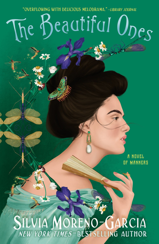
There’s basically two things going on here: the portrait, and everything else. And both are, ummmmmmmmm, not working out i the way I’d like them to.
The portrait is an example of a growing phenomenon I’ve noticed among amateur digital painters where [facial] rendering takes clear precedence over other skills like color theory, anatomy, proportion, composition, lighting, etc. And I’m sympathetic to that: different artistic abilities do naturally develop at different paces, and it’s understandable to prioritize people’s faces looking good, particularly if you’re a character or portraiture artist. But work that’s this uneven in that regard arguably does not belong on a cover. This woman’s face is delicately rendered, and the proportions of the facial features in profile are flawless, but it’s also kind of flat in regards to both color and shading in a bland, unappealing way, and looking at the rest of the painting shows us why.

What is happening here? Why is the hand rendered but the arm turns into cardboard? What in the dodge/ burn tool hell is happening with the shading on the dress? Where tf is the light source in this picture? Why is this shoulder and back just kind of a blob? Where are her bones? (And why..... that upwards drop shadow on the author name.......)
Giving hair a defined shape and focal point with a highlight/ shine is such a phenomenally easy digital painting process and it hurts me so much that this hair is a blob of brown given only vaguest, most noncommittal form. The pose she’s in also isn’t very natural, which might work fine in a more stylized illustration, but not one that appears to be going for realism.
Flat shading or low-contrast sections in a painting can be intentional and effective, of course, but here, the hair, dress and body are so weakly executed that it’s clear this isn’t merely a poor choice, we’re actually bumping up against the illustrator’s technical limitations. And that’s a huge bummer for a cover that’s trying to be swoony and elegant and beautiful on art noveau levels.
It’s worth noting that actual art nouveau illustration relied far more on thick, expressive linework, and was selective and delicate about where and how it used rendering as visual information:
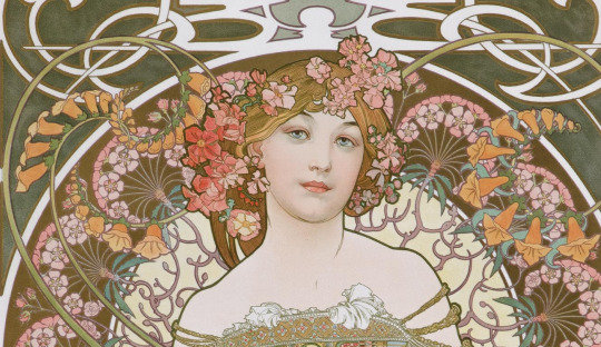
Note that her shoulders are more flat than her face here too-- but it’s all part of a more graphical style, a visual language that works because it’s strong lines and contrast and shapes giving the forms their meaning, not just the delicate shading. With the incredible number of internet artists who’ve experimented with directly replicating a Mucha style, I’m sort of surprised this cover didn’t go for a more 1-1 attempt at it vs naturalistic illustration.
No, our direct art nouveau inspiration comes in this extremely funny title treatment.

Somewhere between the pale blue gradient, how weirdly tracked out the letters are, and the arbitrary-feeling arc the type is on, this looks like the title for a novelty book about faeries, or the Word Art header for a garden party invitation.
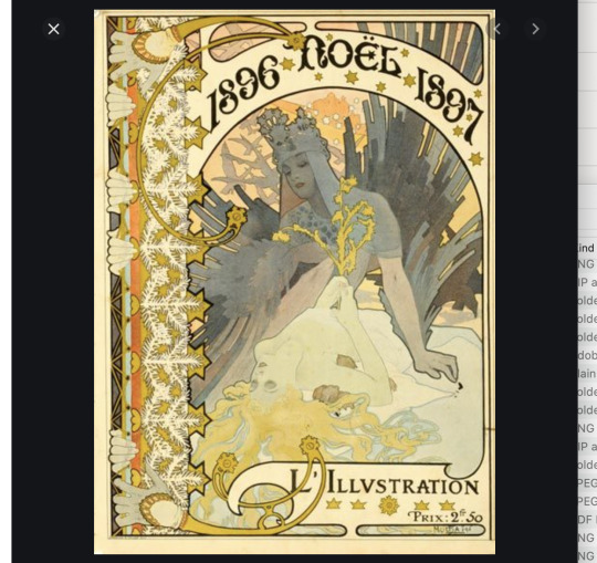
(I wrote that and then googled ‘faerie book’ on a whim and HA i was RIGHT:)

(Also omg love this cover, look at that EMBELLISHMENT, the VICTORIAN CLOTH COVER INSPIRATION >>>>>>>>)
This isn’t a bad font, but the way it’s being used on TBO is underwhelming. It’s high and small on the page and doesn’t have enough contrast or interest to stand out or pull the appropriate visual weight. The arc its forming feels weird and noncommittal-- it’s mimicking how text was often arched in real art nouveau posters, but those worked because of the strong, clear geometry of the arches and how they related to the other visual elements.

We have none of that here; the text is floating on its own, visually weak and untethered amongst the other elements. And the other elements are also....... themselves untethered.

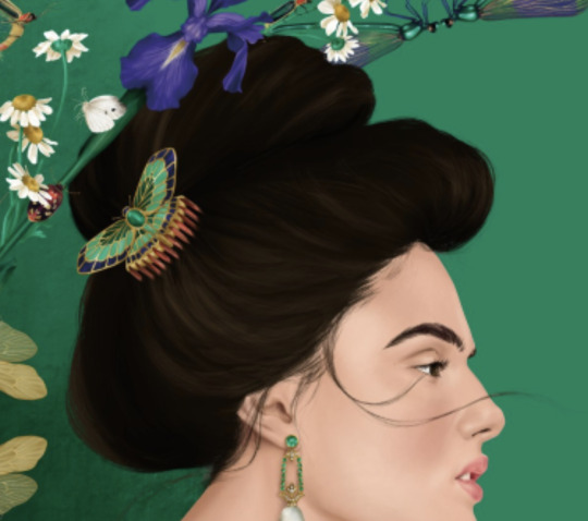
In this cover’s defense: i think it’s an INTERESTING choice to create this decorative wreath of illustrated elements and have it distinctly mirrored in this off-center way. I like the idea of it as a not-too-direct way to play on organic art nouveau embellishment and patterns and I like that it’s an illustrative element abstractly giving a more unique form and depth to an otherwise simple and centered layout. If it had worked, i’d be a big fan.
But the placement and overall structure is, um, weird. Rather than it immediately reading it as a stylized border element, Your eyes are drawn to the dragonflies’ distinct symmetry and vertical orientation and take a second to puzzle out what’s going on. It hits on her hair as kind of a tangent that suggests it’s part of the portrait, as does the fact that it’s rendered at the same style and scale, but it isn’t. I’d normally be into the way it interacts with her hand to give some depth but it’s kind of too subtle to do much? It’s providing some much needed detail and visual interest but in general, it looks like it should be scaled or placed differently somehow.
One of the things that makes the art nouveau style appealing its its contrasts-- organic, flowing shapes and patterns contained by strong geometric ones. Thick lines and delicate details. Flat graphic elements and soft, realistic rendering. All applied in harmonious, coherent ways. There’s not a lot of that going on here, just a middling attempt at something caught between historical/ art nouveau interest and flat, mediocre realism.
Not sure why, since the author’s other books mostly have great covers, particularly MEXICAN GOTHIC. That LUSH TEXTURE, the RICH DARK SHADES, the CLEAN WHITE TYPE,, the VIBES. More of this and less of whatever’s happening up there.

Like what I do? Want early access? Support bookcoversalt on Patreon
56 notes
·
View notes
Note
what do you think of the cemetery boys by aiden thomas cover?

First I want to say that it's really sweet and affirming how the community rallied around CEMETERY BOYS to propel a latinx trans author and story from an indie publisher to become an instant NYT bestseller, and I don't want to seem like I don't have enormous respect and love for that. This cover clearly "works" for what it is, particularly in its Día de Muertos coding, so credit where it's due.
That said, I have some problems with the art direction here, so let's break it down.
What's working?
-> The illustration style. I really like that the style evokes more of a flat-shaded graphic novel or even animation feeling than the typical softly rendered Character ArtTM we've been seeing (and which I am so tired of talking about, oh my god). This is becoming its own trend; among others, the new covers for the Lunar Chronicles books and the cover for the forthcoming BLAZEWRATH GAMES also do this.

I think it's probably more appropriate for a lot of fantasy books than highly polished, painterly portraits: there's a modern-feeling energy and an edginess to it.
-> The color scheme. I love the maroonish red and gold alongside earthy tones for the characters, they're appealing and ~ magical and give it a cohesive feeling.
-> The texture and embellishments. That rough texture on the edge of the moon is my SHIT. The gradients are pulling their WEIGHT. The details really add a lot not just atmospherically/ coding-wise but hierarchically, with the sweep of petals really guiding the eye and giving it a sense of dynamism. The use of light lineart on dark colors is giving us some visual complexity that prevents the flat style from feeling too cartoony.
What's not working?
-> The, um, facial anatomy.

"Looking up" is a tough angle to draw a face at and the stylization here doesn't quite hide that we have not nailed it. We're missing the emergence of the underside of the chin, the rounding of the alignment of the facial features (most notably the hairline and eyeline) that happens at an angle because the head is semispherical, and the nose and mouth do not quite look like they're in agreement about how far or what direction the head is tilted.
And love interest in the background has just...... an absurdly large and pointy chin that I don't think was intentional.
-> The composition.
The face thing was kind of a nitpick, I'll admit, but this is the big issue here: the illustration has a LOT of negative space that isn't being utilized well, and it makes the overall layout of these elements that I think are individually nice feel kind of empty and lopsided.

Super roughly blocked but you can see how the lockup of the two central characters is off-center based on the space around them. It's a problem/ Feels Weird because the hierarchy is sort of predicated on them being aligned with the skeletal figure + moon, which are perfectly, symmetrically center.
Even if we nudged them left to fix that, the overall shape of the figures + graves form something of a thin, bottom-heavy triangle:

It's a bit clunky and antithetical to the sense of motion that the illustration is otherwise giving us, a shape that implies stability and strength rather than excitement. I think I'd have liked to see the main character scaled larger and placed more to the left, with more of the second character revealed and centered in the right side, to break up the shape and fill the space more effectively. There's still a lot to like about this, though, and I think it's a nice example of a character art cover with a specific and appealing vibe to it.
Like what I do? Want early access? Support bookcoversalt on Patreon
31 notes
·
View notes
Note
Hi! Out of curiosity, may I ask who gives the final approval on things like a book cover? Issues like the colour of the skin could sometimes be handled with a single slider in photoshop, the artist wouldn't even have to do that much to fix their errors. Of course, they should keep the descriptions and races in mind - but if an error occurs, someone should be there to let them know and make them fix it, no? Thanks for an answer!
The answer, as with most things in publishing, seems to be “it depends”.
Disclaimer that I don’t work in publishing, so this is educated extrapolation.
Typically, the designer and/or illustrator creates the cover [or cover art] under the supervision of a CD or AD (creative director or art director) depending on the hierarchy of the art team. The list of people who have input or give direction on this, not just at the final stage but through the whole process, include:
- The marketing team/ sales
- The book’s publicist (is this considered distinct from marketing? I don’t know)
- The author
- The editor
- Print production team or liaison (for the physical output + finishes)
- The author’s agent
Factor in potential assistants or mentors or bosses getting involved or the author’s blogger friend in their group chat dispensing advice (✌🏻), and we start to understand How Bad Trad Pub Covers Happen, other than designers making poor choices: that’s potentially a lot of cooks in the kitchen. Other than the author, agent, and editor, whether or not these people have read the book or just received blurbs/ descriptions seems to vary by company and imprint and book and whether or not Venus is in retrograde. Anecdotally, the editor may override marketing in terms of definitive decision-making if they have the clout/ seniority within their imprint to do so and feel strongly about it, but I don’t think that’s usually the case. Some authors have “veto power” or required consultation on the cover written into their contracts, but that can mean lots of different things in practice, and typically they don’t get much say over the final direction. (Being a published author is an exercise in Choosing Which Hills To Die On, and [insert literally any element of your cover] is one of many.) So I really don’t imagine that finalizing a cover involves a definitive final check by a designated person so much as a process of gradual soft approvals until the files get packaged for the printer and the intern pulls the latest jpeg off the server to upload.
So at least the way I understand it, there’s not one person to point at for why the whitewashing got through. If the AD/CD didn’t know any better, the editor should have flagged it, but maybe the editor is hands-off the process or forgot that detail or was out that week, and marketing didn’t read the book or get specific physical character descriptions, and so on. The author, if they noticed it, may have decided not to say anything for any number of social and professional reasons. Or maybe someone did notice and brought it up and the art team decided that it wasn’t that big of a deal and the timeline was just too tight to do anything about it. (to be clear: I disagree, it IS a big deal; I am not making excuses or endorsing these scenarios, just giving examples.)
You’re right, darkening or lightening skin up marginally is an easy fix, and that it didn’t happen given that, presumably, a whole team of people had eyes on it (it’s a PRH imprint, so it’s not like this was a tiny indie publisher), is embarrassing. But most industries, publishing included, are actually just a bunch of messy group projects in a trench coat, and when things go wrong or slip through the cracks..... that’s part of why.
12 notes
·
View notes
Note
the kirkus review for cast in firelight dragging ch*rlie b*water's art for lightwashing one of the protagonists on the cover…love to see it


HAHA YIKES
27 notes
·
View notes
Note
A+ youtube video! I feel like this is a dumb question, but what other sources, exercises, etc would you suggest for a writer wanting to get better at, like, everything you do in that video? I feel like I'm just not intelligent when it comes to writing and reading. I slap down whatever seems fun and I'm sure it makes for a bland story full of stupid plot holes and everything you talked about, so how does one get better at dissecting this stuff and...writing/reading intelligently?
Thank you so much!! There’s a tendency to consider analytical people just “smart”, as if the observations they make come naturally to them. But that super isn’t true: being thoughtful and critical about media, like drawing or writing or playing a sport or learning an instrument, is a skill that you pick up by absorbing reference, learning the language of the art form, and then practicing replicating it through your own perspective.
ABSORBING REFERENCE
My two biggest critical inspirations are Lindsay Ellis, a video essayist who covers film and culture, and Film Crit Hulk, a screenwriter and movie critic, and I’ve been consuming their work since I was 15. (I’m 25 now! that’s a wholeass decade.) I've picked up many, may other sources along the way: other video essayists, pop culture commentators, TV critics, spirited roasts of 50 shades of gray, actual “writing craft” books and blog articles, long goodreads reviews of books I thought I had a pretty good grasp of the flaws on, funny booktube reviews, even “anti” posts. I read “how the last season of game of thrones went the fuck off the rails” articles til my eyes bled, not because I cared about game of thrones, but because there was so much good, insightful reporting being done on How And Why A Story Fell Apart.
LEARNING THE LANGUAGE
Not all of this is good or useful. There’s a lot of bad faith or shallow criticism out there. The cinemasins clickbaity style of nitpicking “plot holes” or penalizing a work for the mere presence of tropes without regard for broader artistic intent and cultural context is particularly insidious and should die. The people who think twilight is stupid because it has sparkly vampires are missing the point. A LOT of people critique YA in particular from a place of bitterness or bias or misplaced expectations (and so did I, to some degree, for a long time. I’ve worked really hard to grow out of that, I hope). But the point is to seek out content in this vein-- not what I consumed necessarily (I would not wish that many GOT thinkpieces on anyone), but stuff that interests you. The more of this you mindfully consume and the more perspectives you collect and compare, the more context you’ll have for what’s being discussed and the more you'll naturally start to form your own opinions on it. You will learn, slowly, by osmosis, to pull what strikes a chord with you from the noise.
REPLICATING IT THROUGH YOUR OWN PERSPECTIVE
The cool and fun part is that to some extent, your brain will start doing this on its own. You’ll read a book and you'll just notice more. You’ll call plot twists faster, or be more cognizant of the pacing, or connect dots you might not have otherwise connected. You’ll see the logistic scaffolding in your own work more clearly and you’ll be more aware of choices you’re making subconsciously. You’ll recognize thematic hypocrisy or worldbuilding inconsistencies and have the language to name them.
And you’ll also have the tools to explore your less clear-cut, more emotional reactions to art. And this is the most important but “hardest” part of this: sitting with vague feelings and unformed thoughts trying to suss out what’s at the heart of them and why, using your hard-won critical “training” and your contextual knowledge.
I like to frame them as questions:
Why did the end of [book] feel disjointed? Why didn’t I connect with the main character in [book]? What really resonated with me about the plot of [book]? Why does [character] appeal to me more than [other character]? Why does [book]’s use of [theme] make me uncomfortable?
Sometimes it comes down to just preference or subjective taste, and that’s fine and good to know. But more often than not, you’re reacting to something concrete that can be identified:
The ending of HOUSE OF SALT AND SORROWS feels disjointed because it comes out of nowhere and has nothing to do with our heroine’s efforts in the larger story. I didn’t connect with the main character in HEARTLESS because within the context of the worldbuilding, her choices didn’t make sense. What really resonated with me about the plot of UPROOTED is its thematic coherency. The Darkling appeals to me more than Mal because the villain romance power fantasy aspect of the series is better fleshed out and ultimately more rewarding to read than the love story of two flawed teenagers. ACOWAR’s use of trauma and recovery makes me uncomfortable because it ceases to be a sincere element of anyone’s arc or characterization and becomes yet another tool to make Rhys look like the best and coolest and wokest fae boyfriend.
Pulled from an old Captain Awkward article, this is something I have in a sticky note on my desktop as sort of a criticism guide:
One of the things we try to do is to push past “I liked it”/”I didn’t like it” as reactions to work. What is it? What is it trying to be? Is it good at being that thing? Was that a good thing to try to be in the first place? Did the artist have a specific agenda? How did it play with audiences at the time? Does it play the same way now? What stereotypes does it reinforce/undermine?
Even if it’s only for your own personal growth rather than intended for an audience, I recommend putting burgeoning critical thoughts or questions you’re trying to “work through” down in writing somewhere: goodreads reviews! tweets! blog posts! spamming your group chat! Even just a private word document. The synthesis of thoughts into written content forces you to identify and choose a specific articulation of your idea(s). If it’s in a pubic or semipublic forum, you’ll also be able to see which of your ideas resonate with other people, and that can (isn’t always, but CAN) be useful information as far as having an external barometer for when you’re onto something.
And then..... you do that a bunch of times in different ways for many years, with a lot of different books and movies and games and whatever else. Like any other skill, you will get better the more you do it. (Again: I have been doing this for ten years now, and it still took me three months to write that video script. Forming nuanced, informed opinions and then articulating them coherently is hard.)
As kind of a footnote tip, seek out peers who have the same goals and feelings, and try to connect with them! Lots of my current internet friends found me back when I was posting on my personal blog about problems i had with THE SELECTION or RED QUEEN and we bonded over having similar opinions and being in similar places in our writing/ reading/ careers. These people now beta read my scripts and posts and help me brainstorm or refine ideas. I strongly believe that creatives (and critics) do their best work and grow the most within a network of support and feedback.
But also, in regards to creative writing in particular, i want to be clear that having fun is the most important thing. I absolutely think creators need analytical skills to improve their craft, but without the enjoyment of doing the thing at the core of it, there is no craft at all. If you have to choose between the "smart” thing and the fun thing, choose the fun thing. Tbh, if you’re worried your work is bland, analysis probably isn’t the solution-- figuring out how to have more fun is the solution. And letting yourself lean into the stuff that’s wild and awesome and so incredibly you that it sets you on fire to write is a skill of its own :)
18 notes
·
View notes
Link
New patron early access post has been up for about a day! This will go public + I will crosspost here on friday, but in the mean time ^^^
5 notes
·
View notes
Link
New patron early access post has been up for about a day! This will go public + I will crosspost here on friday, but in the mean time ^^^
5 notes
·
View notes
Note
Wait is your whole YT just going to be like. Negative stuff/why X sucks (besides covers)? Also w/ HoSS, I don’t like it either (and you make good points in your vid) but isn’t it kinda rude to put “why this is terrible” videos in the general tumblr tag for the book where people who do like it will probably see it?
Like I know hate-reading/reviewing etc can be fun but is that. Is that the whole deal. Because I know on here at least you actually give both positive and negative reviews of stuff so I’m a bit confused
Short answer: no, the YT will not be wholly negative; in theory it will shake out to be about the same negative/ positive/ “commentary on neutral thing that exists” as this blog.
Long answer is that in the video, I do my best to be even-handed about what works and doesn’t (and what I think COULD work given tweaking), and more importantly, why I feel that way, using the most objective language possible. Like bookcoversalt, there will be some "lol this is dumb” (because it’s entertaining, and because there’s some ridiculous stuff in this content that there isn’t room or the justification to engage with seriously) but I really do hope my body of work speaks for itself as good faith criticism that isn’t just snark or negativity or dunking on things for fun. (My marketing/ thumbnails may trend that way, however, for reasons of “youtube clicks”.)
I realize this is a reaction to what I just said about doing exactly that to THRONE OF GLASS. I was semi-joking; talking about the original TOG really means talking about how YA fantasy and its Standards have (and haven’t) evolved in the eight years since TOG was published, common amateur writerly mistakes, and the basis for the conversation about Sarah Maas, “empowerment,” and the self-insert character, and I don’t consider any of that hate-reviewing or “book rant” material, as booktube calls it. But i also do hate that book The Most, and it is the seed of SJM’s deeply problematic and monumentally popular fantasy romance empire, so yeah, I would be lax on my “minimal dunking” principle for that one, because It Would Be Fun For Me, and because I would not consider it ‘punching down’ or being unreasonably mean as I perhaps would for books that are not the basis of one of the most profitable series in YA.
Also, I disagree that it’s rude to put sincere criticism of works in the tags. It IS rude to tag or send the content to professionals involved in creating it (NEVER EVER TAG AN AUTHOR IN YOUR MIXED OR NEGATIVE REVIEW OF THEIR BOOK), and I personally think that yes, “hate” or outright anti takes probably shouldn’t go in tags, but I don’t consider what I do to be in that category, I consider it relevant content and fair game on a website where tags are not curated collections so much as a general indicator of subject matter. (But also my tagging on this blog when it happens at all is minimal and uneven, so it’s not an issue that comes up often.)
At the risk of being SINCERE ON MAIN, I have been running this blog for four years, and I ran a critical blog about an unnamed specific book series for two years, and every once in a while I get feedback or a comment that says something to the effect of “I really enjoy your criticism, it helped me identify my own feelings and put them into words.”
And hearing that I accomplished that is the best fucking feeling in the world. That empowerment is what reading/watching thoughtful media criticism did and does for ME, and passing that forward is always my main goal: not to impose my own opinions, but to provide them as a context for YOURS. Having a basis of knowledge and vocabulary to suss out my own reactions and then identify what in art or media triggers them and why on a specific and informed level makes me a better writer and artist and a more thoughtful consumer. And you’d think that’s instinctive, but it really isn’t; it’s a skill that requires practice and thoughtful consumption and feedback from peers and research just like learning any other skill does. So if or when people disagree with me: great! I was reading old posts the other day and I myself sometimes do not agree with me. But I hope you take something from it anyway <3
16 notes
·
View notes
Note
If you don't mind telling, I was wondering what other book you'll do/you'd like to do videos on?
Tentatively, my next video will EITHER be the Grisha universe’s problems with religious worldbuilding that I alluded to in the HOSS video, OR just...... ruthlessly making fun of the original THRONE OF GLASS book, because pointing out all the ways in which it’s terrible is some very juicy low-hanging fruit. (I also, eventually, intend to do a deep dive on the various issues with SJM’s series holistically, but that is a topic near & dear to me that I don’t intend to tackle until I’m really confident with the medium.)
I have a list beyond that (and not all are centered around a specific book, some are more trends or phenomenons) but I don’t want to over-promise, so it’s secret for now ;)
10 notes
·
View notes
Note
I LOVED your analysis of House of Salt and Sorrows. Are you going to do a similar one for Gideon the Ninth (which is also partially inspired by Annabel Lee, and a mishmash of different genres)? It'd be great if you did!
Thank you!! I actually did not know that GT9 was also annabel lee inspired, that’s so interesting. I have a couple of video topics tentatively in the queue already, but that’s a great idea for a companion video on “how to do these things but good, actually.” I bit off a lot with this first video; in the future i’m hoping to do more and shorter ones, so something like this is totally a possibility!
Here’s the video for anyone who missed it:
youtube
13 notes
·
View notes
Note
I’m curious about your opinion about the cover of These Hollow Vows by Lexi Ryan. I know fuck all about art, but I thought that the shadowing was....a choice

For being an extremely straightforward entry into the “emotionless delicately-rendered Pretty character art” trend, and also the KNIFE!!!!! SO EDGY WOW LOOK KNIFE trend, I don’t hate it. As on the FOREST OF SOULS cover (although it isn’t as elegantly executed here), I like the shadow across the face as a source of moody interest that’s keeping this from being merely a lineup of barbie dolls, and we’ve got SOME motion, at least, from the cape and hair. The only outright “bad” thing i’d call out is that there’s something.... if not actually technically incorrect, then visually wonky, about the way both of her arms are posed, and I’m not sure how i feel about the background figures being perfectly symmetrical.
BUT i am OBSESSED with the title treatment. It’s so good. The metallic effect is natural-looking and attractive and the thin slight serif with a touch of art noveau in the high bar of the E and curling ends of the S hits that sweet spot of unique-but-familiar in a way that’s ~ fantasy ~ but not noxiously so. The little details in the Os are just enough to give it interest and a “spiky” quality that seems appropriate. And everything is spaced/ kerned/ tracked well! A unicorn of cover typesetting!
24 notes
·
View notes