
Last Seen Blogs

araborbit
Untitled

hellishana
active in september

hihihihioo
Untitled

heejinsoulyves
heejinsoulyves

collectifartistesauteurs
[BẬT MÍ] 7 cách trị mụn và vết thâm bằng cà chua
Text
Jerry Saltz Offers New Rules for How to Be an Artist

Portrait of Jerry Saltz by Celeste Sloman.
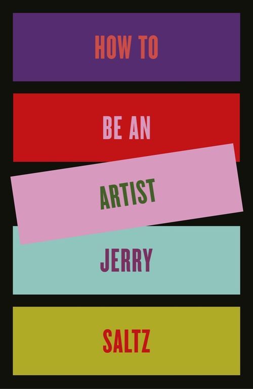
Cover design for Jerry Saltz’s upcoming book, “How to Be an Artist.”
After Pulitzer Prize–winning art critic Jerry Saltz published his cover story “How to Be An Artist,” for the November 2018 issue of New York Magazine, he received an outpouring of feedback from unexpected readers. Musicians, chefs, doctors, and even tennis champion Rennae Stubbs reached out to Saltz, telling him how applicable his 33 rules were to their fields. Any job done well, after all, requires creativity, a carefully titrated blend of vulnerability and self-confidence, and introspection—all topics Saltz covered.
Where there’s a popular article, there’s often a publishing deal. In March 2020, Riverhead will release a book by Saltz with the same title, How to Be an Artist. The self-described “folk critic” has expanded his rules from 33 to 70. Today, Riverhead reveals the cover design, which looks radically different from the three flamboyant New York Magazine covers that depicted Saltz dressed as Frida Kahlo, Salvador Dalí, and Andy Warhol. Instead, the new cover will feature a colorful, hard-edged, geometric design: bold, monochromatic rectangles across a black background.
“Everything I write is written in heat and published at once. And [the book] is a completely different beast. The heat stayed up weeks and then months,” Saltz explained. He’s almost certain the writing process gave him tendonitis. Everything Saltz writes, he said, “is written in terror.”
The new material for the book, according to Saltz, ranges from the broadly applicable to the technical. New “lessons” include “Make Art for Now, Not the Future;” “There Are No Wasted Days;” and “There’s No Such Thing As Fear of Success.” He delves into art historical narratives, such as the divergent ways that modernist giants Pablo Picasso and Henri Matisse manipulated two-dimensional space. Picasso contained his figures within his canvases’ borders. “Legs don’t shoot out, nothing goes out off the side. Everything is in conversation with the four sides of the painting,” Saltz said. Matisse, on the other hand, preferred an “almost cosmic” sense of space, where body parts extend beyond the frame.
Regarding the cover design, Saltz said that upon first seeing it, he thought his impersonation of Dalí may have been a better option. “That was fun. That seemed to work for people,” he mused. At the same time, he acknowledged that while readers quickly discard magazines, a book becomes “part of the furniture, part of your life.” There’s a certain “mindfulness” to the pared down design.
One of the original magazine covers also incited angst online. New York Magazine received backlash for dressing and making up Saltz, a white man, as Kahlo, a Hispanic woman. Though Saltz says he understands the criticism, he also would like to think that “if you become famous enough to be a refrigerator magnet, like Vincent van Gogh, then that belongs to a wider culture. As opposed to appropriation.”
Saltz’s initial idea for “How to Be an Artist” stemmed from his much-lauded piece for a 2017 issue of New York Magazine about his own failed career as an artist. He doesn’t see himself as an expert on artistic success, and he says that’s not what the book is about at all. Instead, “it only has to do with having a life lived in art,” Saltz offered, “to experience the flow of creativity in your own life. And to banish the demons enough to be in touch with that.”
from Artsy News
5 notes
·
View notes
Text
The only remaining curator at San Francisco’s 500 Capp Street Foundation quit.

The former home of artist David Ireland, now the 500 Capp Street Foundation. Photo by Fabrice Florin, via Flickr.
San Francisco’s 500 Capp Street Foundation, a small museum in the Mission District dedicated to Bay Area conceptual artist David Ireland, who passed away in 2009, has had a tumultuous few weeks that included protests over the firing of one of its two curators, the resignation of the other, and the cancelation of exhibitions.
According to the San Francisco Chronicle, a crowd gathered outside the museum on July 6th to stand in solidarity with Bob Linder, the foundation’s head curator who was laid off late last month. While 500 Capp Street implied that Linder was laid off because of funding in the wake of national and local grants the museum had expected to receive but didn’t, the Chronicle suggested that Linder was fired so that the museum could “drastically scale back the programming of national and international artists that Linder curated” and in order to “make [500 Capp Street] more of a museum dedicated solely to the installation work of [David] Ireland.”
A show of works by the artists Liz Magor and Nina Canell that had opened on June 22nd was scheduled to run until October 12th, but was abruptly closed by the artists on July 8th, as Magor and Canell elected to end the show in solidarity with Linder and the protestors. Following suit, other artists who had been commissioned for future shows at the museum also opted to cancel them.
This left the museum with only one staffed curator, Diego Villalobos, who tendered his resignation last week. The foundation board chairman Jock Reynolds told the Chronicle that Villalobos was leaving because “he has an opportunity outside of the Bay Area and he has chosen to pursue this.” But in an email to the Chronicle, Villalobos denied the factuality of Reynolds’s statement, saying simply: “I resigned for other reasons.” Villalobos declined to comment further, citing a nondisclosure agreement he signed when he was hired.
The 500 Capp Street Foundation has temporarily closed as it installs an exhibition of David Ireland’s work in lieu of the previously programmed exhibitions.
from Artsy News
2 notes
·
View notes
Text
The co-presidents of vetting at the Biennale Paris quit over allegations of looted artifacts and furniture forgeries.

The 2018 edition of La Biennale Paris. Photo by Philippe Lopez/AFP/Getty Images.
Two chairmen of the vetting committee of La Biennale Paris resigned unexpectedly just two months before the art fair is set to open in the French capital, taking over the gilded exhibition space inside the Grand Palais. Frédéric Castaing, who is in charge of the National Company of Experts—which provides 40 of the roughly 100 vetters who authenticate works in the biennale—is stepping down from his position. Joining him is Michel Maket, who heads up the Syndicat Fançais of Professional Experts in Works of Art and Collectibles; he will resign his co-president position while remaining part of the vetting team.
The Art Newspaper revealed that the resignations come as criminal investigation continued to plague the annual show, prolonging an unfortunate trend that began in 2016, when a number of exhibitors left after forged royal furniture evaded the vetters and was offered at the biennale as authentic. Now, exhibitors and vetters are up in arms about the inclusion of Geneva- and New York-based Phoenix Ancient Art, which has been accused of trafficking antiquities from Syria; a librarian who was accused of participating in an alleged €850-million ($957.8 million) Ponzi scheme when providing manuscripts to the company Aristophil; and a tribal art dealer whose father was accused of selling fake Jean Prouvé furniture from the 1950s.
All the dealers caught up in criminal investigations declined to comment for TAN’s story. The Syndicat National des Antiquaires, which runs the Biennale, said in a statement quoted by the trade publication that the resignations will have little impact and that “all the other experts will assume the vetting as planned.”
Further Reading: How Forgers and Grifters Have Conned the Art World for Generations
from Artsy News
4 notes
·
View notes
Text
6 Films Inspired by Famous Photographs, from “Moonlight” to “Her”

Dolphin, 2018.
Viviane Sassen
Stevenson
Photography and film have always had a sibling-like relationship. No one understood that better than 19th-century photographer Eadweard Muybridge, who invented the zoopraxiscope, an early movie projector, while creating his famous photographic series, “The Horse in Motion” (1878). To discern whether horses always keeps one hoof on the ground when galloping, Muybridge fired the shutter in quick succession, attempting to capture every muscle movement the horse made. He used the zoopraxiscope to project the images in rapid succession, effectively creating a very short film.
Since then, the influence of photography on film has been undeniable, with directors frequently looking to still images as they conceive the look and feel of their work. Director Stanley Kubrick actually got his start as a teenage press photographer, taking photographs that owed an aesthetic debt to the famous crime photographer Weegee. Kubrick was so captivated by Weegee’s gritty, lurid style that he even hired him to take still photographs on the set of of Dr. Strangelove (1964) years later, and also sought his advice when filming the movie’s crime scenes.
Similarly, the look of the titular hotel in Wes Anderson’s The Grand Budapest Hotel (2014) was partially inspired by photographs, specifically a series of hand-tinted travel postcards that Anderson stumbled upon in the Library of Congress. Other directors have taken visual cues from a single image—or have drawn inspiration from the person behind the lens. Below, we round up six films inspired by famous photographs.
Her (2013), directed by Spike Jonze
Her was a paradox of a film—a futuristic cautionary tale doused generously with nostalgia, a love story with only one truly sentient lover. It’s perhaps no wonder, then, that director Spike Jonze drew from photographer Todd Hido’s intriguing, enigmatic image Untitled #2653 (2000) when conceiving of his 2014 Academy Award–winning masterpiece. In the film, Joaquin Phoenix plays a disillusioned writer, Theodore Twombly, who spends his days composing intimate letters for other people and becomes infatuated with his scary-smart virtual assistant, Samantha, voiced by Scarlett Johansson. In an interview with New York Magazine, Jonze described the photo that inspired him: “It feels like a memory. The mood of a day without the specifics. A memory of this girl, in this beautiful, funny forest.” Indeed, the image’s muted palette is reflected in Jonze’s similarly subdued color scheme.

Untitled #2653, 2000.
Todd Hido
Wirtz Art
On a deeper level, Hido’s photograph captures the contradictions implicit in Theodore’s love for Samantha. The image depicts a literal blank slate of a woman, her face explicitly unavailable to us. Because of that, the viewer can project whatever they want onto her, just as Theodore romanticized Samantha into his lover.
The Virgin Suicides (1999), directed by Sofia Coppola
An intoxicating, dreamy gloom fills every frame in screenwriter and director Sofia Coppola’s beloved film, The Virgin Suicides, which chronicles the tragic lives and deaths of the five adolescent Lisbon daughters through the eyes of their young, adoring neighbors. The film has a distinctly feminine melancholia, aided by the ethereal look of cinematographer Ed Lachman’s work. Coppola drew inspiration from photographer Bill Owens, and she has pointed to one photograph in particular, Our eighth-grade graduation dance was really far out (1973), saying it was “definitely in my mind when I worked on the film.”
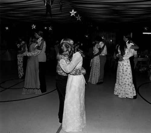
Our eighth-grade graduation dance was really far out, 1973.
Bill Owens
Etherton Gallery
The photograph shares literal similarities to The Virgin Suicides, particularly the film’s homecoming dance scene, right down to the twinkling cut-out stars dangling from the ceiling. The girl in the center of the frame, with her conservative white prairie dress and blonde curls, could easily be a Lisbon daughter. What’s more, there’s an awkward tenderness to the image that similarly permeates the film. As Lachman has said: “We want[ed] to really create the world of adolescence.” Indeed, the film evokes a feeling of wistful teenage longing—both the narrators’ youthful desire to know and save the sisters, and the girls’ equally fervent desire to escape their claustrophobic family life and experience something more.
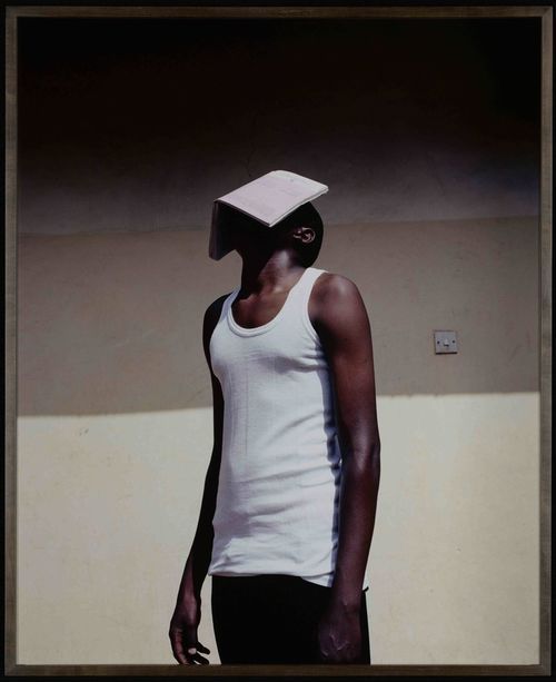
Moonlight (2016), directed by Barry Jenkins
Moonlight, which won the Academy Award for the Best Picture of 2016, captures the life of Chiron, a black queer person coming of age in Miami. Through three extended vignettes, in which three different actors portray Chiron, the intoxicating film immerses us in a lush, dreamlike world. In order to achieve this effect, the film’sdirector Barry Jenkins and cinematographer James Laxton relied heavily on photographs for inspiration.
Codex, 2010.
Viviane Sassen
Atelier Néerlandais
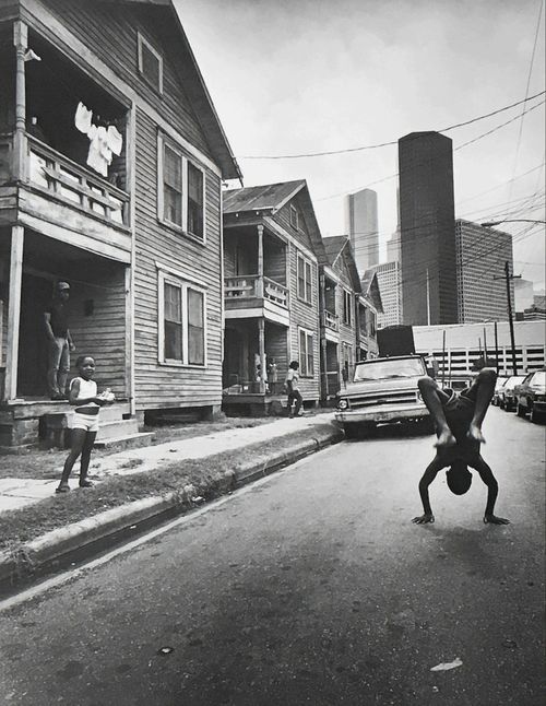
Flipping Boy, 1983.
Earlie Hudnall, Jr.
Elizabeth Houston Gallery
The pair looked specifically to the work of American photographer Earlie Hudnall Jr. and Dutch photographer Viviane Sassen. They were captivated by Hudnall’s loving, realistic depictions of African-American communities in the south from the 1970s and on, with images showing close moments among families, friends and neighbors. Similarly, Moonlight tells Chiron’s story with a remarkable sense of intimacy and empathy. From Sassen, Jenkins and Laxton drew a decadent, deeply saturated color palette and an abstract appreciation for the human form.
In 2016, Laxton explained his fascination with photography, saying, “When I look at still images, my brain becomes actively engaged and I am able to picture a whole experience, a different world…photography enhances my sense of what happened just before or after the frame was captured.” Laxton’s photographic approach is evident in moments like the iconic beach kissing scene, in which the camera cuts suddenly to a close-up of Chiron’s hand digging into the sand. It’s a subjective, honest moment in a film brimming with them.
Carol (2015), directed by Todd Haynes
Photographer Saul Leiter is beloved in his own right for the way he simultaneously captured the grit and beauty of 1950s New York City. It’s no wonder, then, that director Todd Haynes looked to Leiter’s workwhen conceiving of his 2015 film Carol, which took place in Manhattan during that decade. In the film, a young female shop-clerk and a jaded housewife start a romance in a society hardset against their love.In order to evoke the look of 1950s street photography, cinematographer Ed Lachman chose to shoot the film on 16mm film, giving it the grainy, electric feel of an old-school photograph.
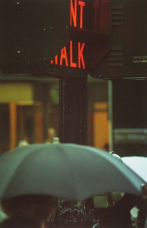
Don't Walk, 1952.
Saul Leiter
Howard Greenberg Gallery
San Genaro, 1958.
Saul Leiter
Howard Greenberg Gallery
Haynes praised Leiter’s ability to merge street photography and abstract art, all while accurately portraying the chaotic forces of city life. “While at times you think you're looking at an abstract painting,” he said, “it actually gives such a specific sense of time and place because of the kind of light and how it plays on glass and how it interferes with dust and dirt and grime.” Haynes’s directorial choices were also informed by the way Leiter often framed his images through plexiglass or windows, obscuring the object of his gaze, and distancing the viewer from the scene.
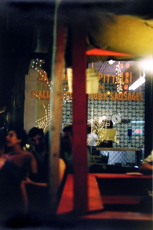
Nightcrawler (2014), directed by Dan Gilroy
The photographer known as Weegee (a pseudonym for artist Arthur Fellig), became known in the 1930s as the master photographer of brutal crime scenes on the dirty, dark streets of New York. His life sounds pretty cinematic to begin with—he reportedly slept clothed next to a police radar waiting to wake up and bolt to the latest crime scene—but it was reimagined in Dan Gilroy’s debut film, Nightcrawler, about a similarly determined cameraman, Lou Boom. Played by Jake Gyllenhaal, Lou prowled the streets of Los Angeles, on the hunt for photogenic bloodshed.
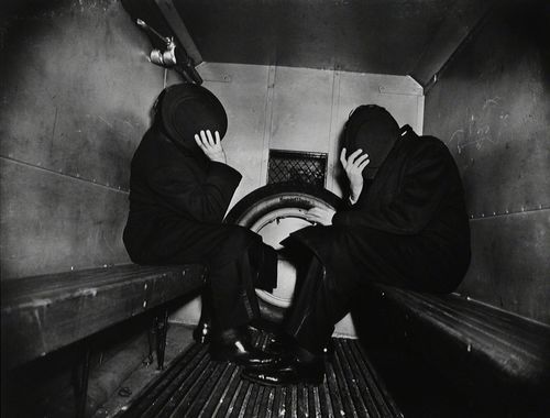
In the Paddy Wagon, 1944/1993.
Weegee
BAM
Gilroy was first inspired by Weegee when he stumbled upon his book Naked City in 1988. The director said he “wanted to tell that story but make it contemporary.” While he found the opportunity with Nightcrawler to update Weegee’s life and his film equipment, giving Lou a digital camcorder rather than a 4 x 5 camera,he maintained the gritty desperation that made Weegee so captivating. Indeed, much of the film is conveyed through Lou’s viewfinder, capturing the immediacy and luridness of his and Weegee’s work.
Saving Private Ryan (1998), directed by Steven Spielberg
For his wartime epic, Saving Private Ryan, director Steven Spielberg sought to realistically capture the events of World War II’s D-Day through the eyes of a soldier. In building fidelity to this moment in history, Spielberg consulted the photographs captured by the famous Life magazine photojournalist Robert Capa during the D-Day attacks in 1944. Capa was a master war journalist, capturing images up-close, with unflinching realism while embedded with Allied soldiers during the landing in Normandy. While discussing Capa as a reference for the film, cinematographer Janusz Kamiński said: “In Private Ryan, I wanted to take a major Hollywood production and make it look like it was shot on 16mm by a bunch of combat cameramen.”

US troops assault Omaha Beach during the D-Day landings. Normandy, France. , 1944.
Robert Capa
Magnum Photos
Importantly, Capa followed the maxim that, “If your photographs aren’t good enough, you’re not close enough.” Similarly, Spielberg did everything he could to bring the violence and paralyzing fear of war straight to the viewer, even insisting that the camera shake as a bomb went off, as if the camera itself is also experiencing the impact of the explosions.
from Artsy News
0 notes
Text
Egypt reopened two ancient pyramids to the public.

The Bent Pyramid. Photo by lienyuan lee, via Wikimedia Commons.
Two ancient Egyptian pyramids that have been closed to the public since 1965 have been reopened following excavations and renovations.
One of the pyramids, the Bent Pyramid of King Sneferu (named for the pharaoh who founded the 4th dynasty of Egypt) dates back some 4,600 years. In many ways it’s a unique specimen—the structure starts out at a 54-degree angle before tapering to 43 degrees in its top section. According to Mostafa Waziri, the secretary general of Egypt’s Supreme Council of Antiquitie, change in angle occurred at the time of its construction, when architects noticed cracks appearing in the structure. Archaeologists excavating the Bent Pyramid discovered “hidden tombs” that contained mummies, tools, and masks, according to an announcement by Egypt’s Ministry of Antiquities.
The Bent Pyramid and the adjacent “satellite” pyramid that is also being opened to the public are located in the ancient royal necropolis of Dahshur, which sits about 25 miles south of Cairo on the west bank of the Nile. Archaeologists working at the complex also found sarcophagi and part of an ancient wall believed to be about 4,000 years old. According to DW, the Egyptian government has been working to boost tourism to the region.
from Artsy News
1 note
·
View note
Text
Collecting 101
From auction house lingo to the ins and outs of art insurance, this guide offers collectors the resources they need to navigate the art market confidently.
from Artsy News
0 notes
Text
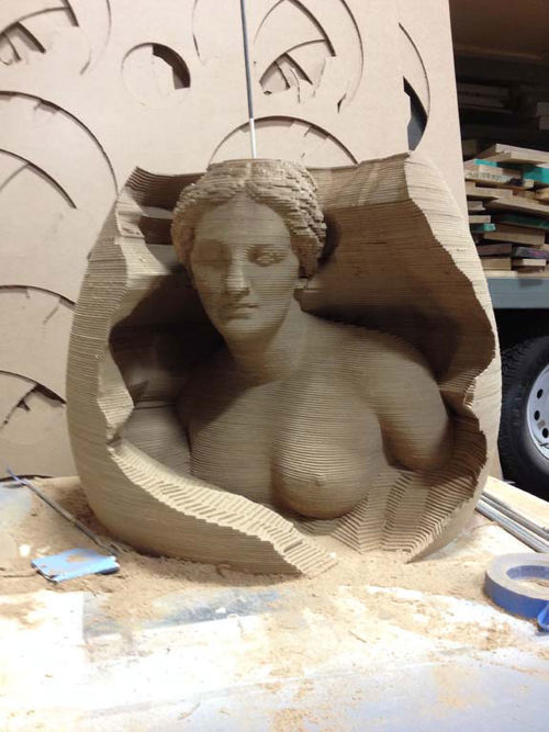
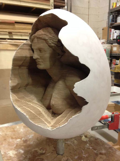
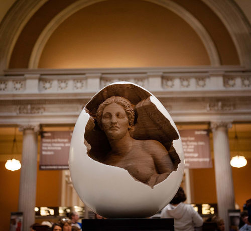
See How a Massive Burning Man Sculpture Comes to Life
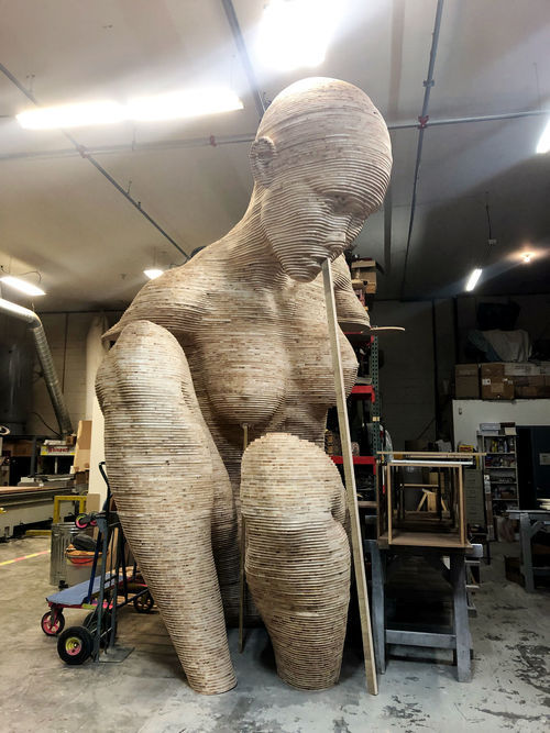
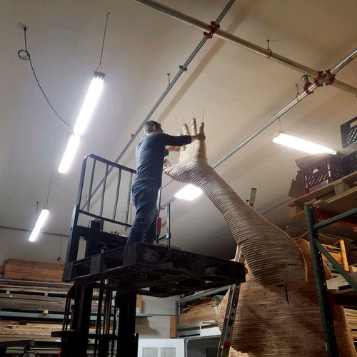
In-progress view of Chris Carnbuci’s new sculpture Mariposita , 2019, at a woodworking shop in Suffern, New York. Courtesy of the artist.

A view of Carnbuci’s Mariposita, 2019, on a truck on the journey to Albany, New York, where the sculpture will be completed. Courtesy of the artist.
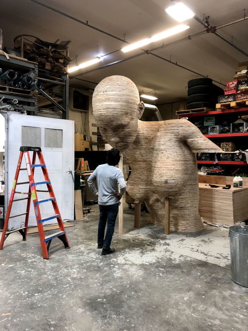
Looming at 21 feet tall, Chris Carnabuci’s new sculpture Mariposita (2019) portrays an alluring woman emerging from an eggshell. The piece is far from your average artwork, comprised of thousands of pieces of plywood, each designed and cut with 3D-modeling software and a CNC machine, then assembled by hand. In a few weeks, the artist will hit the road on a cross-country journey with his massive creation in tow to a haven of otherworldly art: Burning Man.
Mariposita is one of hundreds of innovative, large-scale artworks that will pop up across Burning Man’s 7-square-mile footprint in Nevada’s Black Rock desert. Art at the annual event promotes self-expression and creativity, while serving as interactive sites for community, celebration, and inspiration. But how does such an artwork come to life?
The idea

A rendering of Chris Carnabuci, Mariposita, 2019. Courtesy of the artist.
The idea for Mariposita came from a much smaller piece Carnabuci made in 2014, titled Fertility. That sculpture—a bust of a woman emerging from an egg—was part of The Big Egg Hunt, a New York City–wide exhibition of artist-designed eggs in spring 2014. Afterwards, Carnabuci dreamt of making a piece in a similar vein—on a much larger scale—for Burning Man. (Full disclosure: Chris Carnabuci is part of the same Burning Man camp as Artsy founder and executive chairman Carter Cleveland.)

Courtesy of Chris Carnabuci.

Courtesy of Chris Carnabuci.

Courtesy of Chris Carnabuci.
Courtesy of Chris Carnabuci.

Courtesy of Chris Carnabuci.

Courtesy of Chris Carnabuci.
Courtesy of Chris Carnabuci.
Courtesy of Chris Carnabuci.
Courtesy of Chris Carnabuci.
Carnabuci, who is an architectural designer by day, has been helping fabricate artworks for Burning Man for over seven years, but he’s never presented his own work at such a great scale. “I was very impressed with the work that’s out there,” he said. “And if you’re out there in the desert, you need to build big, because it’s so expansive, everything is miniaturized. It’s not for the sake of building a large sculpture, it’s just for the sake of making it fit within its own environment.” For him, that major task required over 18 months of planning.
Chris Carnabuci at work on Mariposita, 2019. Courtesy of the artist.
Mariposita features a full female figure, who is modeled after Carnabuci’s wife, Paula. A tango dancer, Paula created a performance that will accompany the piece at Burning Man. And the name Mariposita came from her, too: She’d visited a tango studio of the same name in Buenos Aires; it means “little butterfly.”
“It seems to me like a perfect name,” Carnabuci said. “It’s this woman breaking out of a shell.” He added that it resonates with the present moment, and presciently, this year’s theme for the art at Burning Man: metamorphosis. The final piece will have sound and lighting elements, and will sit directly on the ground, allowing people to interact with it easily.

An in-progress view of Chris Carnabuci, Mariposita, 2019. Courtesy of the artist.
The funding
Unsurprisingly, such an endeavor is expensive. Like many artists showing at Burning Man, Carnabuci applied for funding from its grant-giving committee. To apply, he shared details about his experience going to Burning Man and his past work, as well as a rendering of what Mariposita would look like. In the second round of the process, he outlined how much grant money he needed, a plan for supplementing that with additional funding, and the logistics of transportation and installation.
In March of this year, Carnabuci found out he’d been approved for the funding he requested. In May, he set up a month-long Kickstarter campaign to secure the supplemental funding he needed: $25,000. He surpassed that goal, raising $25,625 by the end of the month. Carnabuci estimates that Burning Man covered almost a third of the cost, while the Kickstarter campaign covered two-thirds, and he covered the rest.
The design process
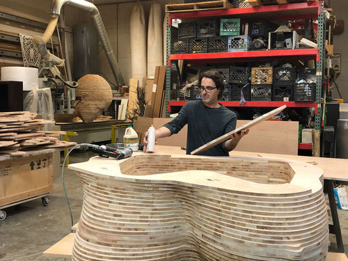
Chris Carnabuci at work on Mariposita, 2019. Courtesy of the artist.
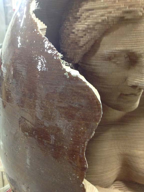
With Fertility, Carnabuci began using his now-signature technique, which involves the use of a CNC machine—a computer-controlled apparatus that can be programmed to create specific marks or cuts in a variety of materials. He uses it to cut precise slices of plywood that stack up to resemble figures. For Mariposita, he needed to create a digital 3D model of the piece, which he would use to program the CNC.
To create that 3D model, he needed to determine the pose of the woman in the shell. He went to the studio of photographer Peter Freed—who is also Mariposita’s documentarian—where Paula sat for a shoot, trying out different gestures. Carnabuci then used those images to inform a 3D model he created with the software DAZ 3D. He manipulated a rendering of a female figure into the desired pose and adjusted her features to resemble his wife, making it look as realistic as possible. With that model, Carnabuci mapped out the dimensions and a plan for building the piece. Limiting factors included the size of plywood sheets; the height of the shop in Suffern, New York, where he was building it; and the volume of the 26-foot-long truck he’ll use to drive the sculpture cross-country.
The fabrication

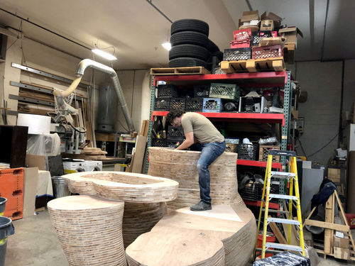
An in-progress view of Mariposita, 2019. Courtesy of Chris Carnabuci.
Carnabuci began building in motion, knowing that he would be under a time crunch. “Even at that point, six months away from the Burn, you never have enough time,” he said. He did a lot of the programming work to prep for the CNC process, and put up his own money to purchase the plywood needed to begin the most time-consuming part of the process: building the woman.
First, he uploaded the 3D-model file to a software called Slicer for Fusion 360, which converted the female form into 300 different huge lateral slices that, when stacked up, resemble the figure. Those slices are far larger than any piece of plywood, however, so before putting that information into the CNC, he had to divide each slice down further—each one became 4 to 12 pieces. In the end, by Carnabuci’s estimate, there were over 3,000 individual parts. “Then, I had to take all of those pieces, sand them down, and painstakingly put them together with screws and staples,” he said.

Pieces of plywood for Mariposita, 2019. Courtesy of Chris Carnabuci.
The sculpture couldn’t be made as one giant whole, as it would be impossible to move and transport. Instead, Carnabuci created a series of blocks that can be fitted together like Legos to construct the woman. “With transportation and installation on my mind, I made sure that I’d be able to actually move this and install it without needing an army of men and women and heavy equipment,” he said. “I can actually put this whole thing together with, like, two guys and two ladders.”
Chris Carnabuci at work on Mariposita, 2019. Courtesy of the artist.
While Carnabuci is the main artist behind the work, his team of collaborators is crucial to realizing Mariposita. In addition to Paula’s dance and Freed’s documentation, Carnabuci has called on the support of executive producer Owen Grover, project manager Morgan Wynne, lighting designer Alexandra Wynne, and 3D-modeling artist Kat Kinkead. Additionally, he’s hired two collaborators to install the piece, and one of his daughters will join him on the drive.
The transportation and installation

In-progress view of Mariposita, 2019. Courtesy of Chris Carnabuci.
Carnabuci has already transported the woman sculpture to a warehouse in Albany; she was too large to stay in the shop in Suffern. After he finishes the egg, he’ll move that to the same warehouse, and spend a weekend on a test-run installation. “Theoretically, everything should work, but nothing ever works in real life the way it does on your computer,” he said.

In-progress view of Mariposita, 2019. Courtesy of Chris Carnabuci.

Mariposita, 2019. Courtesy of Chris Carnabuci.
Then, he’ll rent a truck and hit the road by August 16th, to arrive at Black Rock by the night of the 19th or the early morning of the 20th. Artists are assigned a space on the Playa where they can mount their works. Carnabuci estimates that it will take three days to build the piece; he plans to spend the extra time tweaking it and working on sound and lighting elements with his collaborators.
The finished piece
Chris Carnabuci with Mariposita, 2019. Courtesy of the artist.
Though Carnabuci’s thinking is grounded in the present and in ensuring the work comes together smoothly, he expects that once it’s finished, he’ll feel exhausted—but excited, too. “It’s going to be the biggest, best thing that I’ve ever done,” he said. “That’s the plan, anyway. So I just hope that I’ll be very proud of it, that it has some lasting significance to me and for others.” Ultimately, he noted that sharing it with others and seeing them engage with it will be incredibly rewarding.
And while some artists burn their works at the end of Burning Man, Carnabuci will not. He’s currently exploring options for it to find a new home on the West Coast, potentially in a public space or a sculpture park, or he may drive it back to New York.
Carnabuci noted that the people and the experience of Burning Man keep him going back each year, but the art is crucial, too. “All our friends go there, and it’s a good place to sort of lose yourself and just get away from the real world for a bit and recharge,” he offered. “But it’s better, for me anyway, to go with purpose. Each year, that purpose has been somehow related to art.”
from Artsy News
0 notes
Text
Why AI Can’t Yet Predict Mark Rothko Paintings’ Auction Prices

Courtesy of Sotheby’s.
A popular art-world parlor game is predicting sale prices for masterworks in upcoming evening auctions. Just how much will someone pay for a dazzling painting by Claude Monet, an iconic sculpture by Jeff Koons, or a classic work by Mark Rothko? Earlier this year, the consignment of three Rothko paintings to Sotheby’s prompted us to build a model for predicting sale prices using artificial intelligence (AI) tools applied to historical Rothko sales data. While the analytic techniques we used were complicated, our approach to modeling was straightforward: combine information on the nature of the paintings sold (“supply”) with gauges for how many people may have the means and desire to acquire something so expensive (“demand”).
We explained in an earlier article that the best way to measure supply is by using digital images of paintings, their dimensions, and whether it is a work on paper or canvas. We also found that the best measures of demand are the number of billionaires in the world and the amount of wealth they control. When we put these supply-and-demand metrics together in May, they explained close to 95% of movements in prices paid at auction for Rothko paintings. While that was a tantalizingly high percentage, how did the model perform when predicting the future? And what do these results tell us about the market for Rothko’s paintings?
The SFMOMA Rothko

Mark Rothko, Untitled, 1960. Courtesy of Sotheby’s.
At the evening auction at Sotheby’s on May 16th, the San Francisco Museum of Modern Art (SFMOMA) was selling a Rothko painting from 1960, one of seven Rothko works in its collection. Like many museums today, SFMOMA wants to buy works by women, people of color, and other overlooked or marginalized communities, but it lacks the funds to do so. Selling the Rothko would hopefully provide the museum with the fuel it needs to achieve its ambitions.
Lot 12 was hanging where it could not be missed: at the front of the room near the auctioneer, a suitable spot for what could have been the most expensive artwork sold that night. Sotheby’s estimated that it would sell for a hammer price between $35 million and $50 million. But the successful bidder would also have to pay the auction house’s buyer’s premium on top of that, which equals 25% of the hammer price up to and including $400,000; 20% of the amount between $400,000 and $4 million; and then 13.9% on the amount in excess of $4 million. With the buyer’s premium, Sotheby’s was forecasting that the painting would go for a figure between $40.1 million and $57.2 million. After running the painting through our AI algorithm, the model predicted it would sell for $42.3 million (hammer price plus buyer’s premium), toward the lower end of what Sotheby’s estimated.
In the months leading up to the sale, Sotheby’s specialists no doubt spent countless hours trying to develop interest in the painting—perhaps from Silicon Valley tech investors soon to be flush with cash from the Uber IPO, or SFMOMA trustees with emotional connections to the work, or Chinese billionaires looking to put offshore cash to work in something that would look splendid in new apartments overlooking Central Park. But as the sale began, these specialists knew their hopes and dreams could easily be dashed if bidders elected to sit on their hands or refused to engage in a bidding war. To hedge against this, SFMOMA chose to sell the work with a guarantee, meaning the museum would receive at least the (confidential) minimum guarantee amount it negotiated with Sotheby’s when consigning the work to the auction house.
Bidding for the painting was slow, with what appeared to be fewer than five bidders. Contrary to popular belief, there are just not that many people in the world with the means and desire to buy an artwork at this price point. Bidding soon stalled around $37 million (or $42.7 million with buyer’s premium), teasingly close to our AI model’s prediction. But the auctioneer did not take the lull as a sign that the sale was over. His patience was ultimately rewarded when bidders pushed the final hammer price to $43.8 million (or $50.1 million with the buyer’s premium). Respectful applause filled the auction room with the tap of the auctioneer’s gavel.
How did the model do? The AI forecast was off by 15.6%, a much larger margin than the deviations we found when training the model on historical data. A possible explanation for the higher price may be the painting’s special provenance: Many auction specialists believe collectors are willing to pay a premium for museum property relative to what they would otherwise pay for a similar object. In any event, the bidding gods that night were certainly smiling on the SFMOMA painting, but they capriciously withheld their affections when the other two Rothkos went up for sale.
The Steinberg Rothkos

Mark Rothko, Untitled (Red and Burgundy Over Blue), 1969. Courtesy of Sotheby’s.

Mark Rothko, Untitled (Red on Red), 1969. Courtesy of Sotheby’s.
Canadian businessman Arnold Steinberg and his wife, Blema, a professor at McGill University, were passionate collectors of post-war and contemporary art. Their heirs elected to sell over 100 valuable works from their collection—assembled from the mid-1960s through 2014—at Sotheby’s. Two Rothko paintings on paper from 1969 were up just three lots after the SFMOMA painting; perhaps an underbidder would elect to buy one as a consolation prize.
The larger of the two works, Untitled (Red and Burgundy Over Blue), had a pre-sale estimate between $9 million and $12 million, or $10.5 million and $13.9 million with buyer’s premium. Our artificial intelligence model predicted that lot 15 would sell for $16.6 million, above the top end of the auction estimates, which would make it the second–most expensive Rothko work on paper to sell at auction. The second work, Untitled (Red on Red), was smaller, but notable for its bright-red palette. Sotheby’s estimated it would go for a hammer price between $7 million and $10 million, or $8.2 million and $11.6 million with the buyer’s premium. Given its appealing color scheme, our model predicted that lot 16 would sell for $13.7 million. Unlike the SFMOMA painting, neither of these works were being sold with a guarantee. But given the strong showing on lot 12, the auctioneer and the heirs were probably anticipating great interest in the works, perhaps even a bidding war.
Auctioneers try to hide their machinations, but it soon became clear that most of the bidders interested in lot 15 were of the imaginary type. The auctioneer took chandelier bids up to one bidding increment below the reserve price, which is where he must stop so that legitimate bidders can buy the work at the reserve. After a very pregnant pause, a lone phone bidder emerged with a $9 million bid (or $10.5 million including buyer’s premium). The auctioneer’s job was now clear: Don’t panic, but wait for it to sink into the minds of other potential bidders that the painting could sell very shortly for that amount unless they jumped in.
The auctioneer soon turned his attention to someone sitting in the very front of the room: Marc Glimcher, president and CEO of Pace, the gallery that represents the Rothko estate. The auctioneer tried repeatedly to cajole him to bid, but Glimcher declined. Perhaps he had other works on paper by the artist back at his gallery that he preferred to sell instead of investing capital in another. When it became clear the auctioneer’s gambit was not working, and that no one else was interested in bidding, he brought the sale to a close.
Lot 16 followed the same dance with chandelier bids into a quiet auction room. The awkward space was finally pierced when a phone bidder came in at $7 million ($8.2 million with buyer’s premium), the low end of the auction estimate. Knowing it was the end of the game, the auctioneer quickly pronounced the lot “sold.”
How did the model do? Very poorly. The AI estimates were about 60% higher than what the works sold for. The model was expecting much stronger demand, which did not materialize that night. Having the works appear after the SFMOMA painting as a consolation prize was smart positioning by Sotheby’s. But with the sale occurring at the end of a packed week of auctions, plus after the successful Frieze and TEFAF art fairs earlier in the month, maybe collectors considering the Steinberg Rothkos had already bought other things. Being late in the sales calendar can disadvantage consignors.
Rothko deal-making
Did the buyer(s) of the works on paper get a deal? Two measures of value say yes. First, Sotheby’s sold a similar Rothko work on paper last year in its May evening auction. It was from 1969, the same year as the Steinberg Rothkos. Smaller than Untitled (Red and Burgundy Over Blue) but about the same size as Untitled (Red on Red), you might expect some sort of pricing parity between works sold within such a short period, but the painting offered in May 2018 went for $18.9 million—completely out of whack with the much lower May 2019 results.
A second measure of value is found by comparing the all-in sale price to the low end of the auction estimates. Both Steinberg Rothkos sold for almost 1.2 times their low estimates, well below the 1.8 average for the other 23 Rothko works on paper from what are considered his classic years (1951–70) that sold at auction since 2010.
While these measures suggest the buyer(s) got “a deal,” what’s causing such fragility in the demand for Rothko works on paper? Statistical models—no matter how sophisticated—are generally poor predictors of turning points because they are trained using historical data. But when models fail, it can sometimes be a signal that changes are afoot. While Rothko’s position in the history of Abstract Expressionism is secure, pricing for his work is subject to the whims of today’s collectors.
Over the past few years, there’s been a noticeable shift among institutional and private collectors to focus more of their time and resources on buying artworks by women, people of color, and other overlooked or marginalized communities. This trend is likely to continue for some time, impacting people’s willingness to pay big prices for works by important male artists in the historical canon. For the price of a single Rothko work on paper, collectors could buy iconic works by Sam Gilliam, Ruth Asawa, and Alice Neel—and still have some money left over in their pockets. The lower prices paid this season for the Steinberg Rothkos may be the new normal.
from Artsy News
1 note
·
View note
Text
Police evicted artists from two Beijing art districts now slated to be demolished.

A directory of artists’ studios in the Huantie art district. Photo by Galleri Beck-Fischer, via Flickr.
In the past week, artists in two of Beijing’s art districts have been evicted by police, ostensibly as part of a campaign against organized crime that will see both districts—Luomahu and Huantie—demolished. On Sunday, notices were posted throughout Hauntie informing artists they would have a week to move out, and some 30 police officers in riot gear moved through the area to begin evicting artists from their studios; these noticest likened artists to “unstable factors” and “security problems.” On Wednesday, riot police began evictions in Luomahu as well.
Canon Duan, an artist who has had a studio in Huantie for four years, told The Art Newspaper:
They are driving us all away on the excuse of cleaning up the underworld. [. . .] We're not prepared at all. And no one has explained it to us. [. . .] We invested a lot of money in the renovation, we paid the rent, we were here for many years. But there is no option for compensation, nor any acceptable explanation. [. . .] We have no human rights here.
The sudden eviction and demolition of artists’ studios en masse is not exactly a new phenomenon in Beijing. Last summer, without warning, a demolition crew started smashing Ai Weiwei’s studio in the city. A few weeks before that, spaces in the city’s Caochangdi art district were informed that their buildings had been marked for demolition and they would need to move out by the end of the month—echoing studio evictions that had taken place in the area a year earlier.
from Artsy News
0 notes
Text
A Texan collector donated 106 artworks to Paris’s Musée d’Orsay.
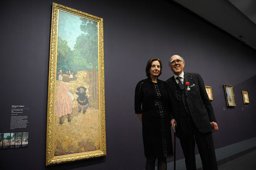
Marlene and Spencer Hays at the Musée d’Orsay in 2013. Photo by Antoine Antoniol/Getty Images.
Marlene and Spencer Hays were a Texas-based collecting couple who, in 2016, pledged that their entire collection of roughly 600 works would be bequeathed to Paris’s Musée d’Orsay after their deaths, making it the largest foreign collection donated to France since World War II. Spencer Hays passed away in 2017 and Marlene, who is now 82, has announced that she is making an immediate donation of 106 works to the Parisian museum. This suite of works being donated includes 40 paintings, 47 works on paper, and 19 sculptures. It is primarily made up of works by post-impressionist artists such as Pierre Bonnard, Camille Claudel, Henri Matisse, and Amedeo Modigliani.
The Hayses first traveled to Paris in 1971, and returned every year until Spencer’s death. In a 2016 interview with Franceinfo radio, Spencer said:
We both grew up in a small town. We didn’t have any money. Back then, the only thing I knew about Paris and France was the city called Paris, in Texas, 70 kilometers from where I lived.
In 2016, they were made commanders of the Legion d'Honneur by then-French president François Hollande for their donation. Presently, much of their collection is housed in a replica of the Hôtel de Noirmoutier, the former residence of the prefect of the Île-de-France region, that the couple built in Nashville, Tennessee.
from Artsy News
0 notes
Text
Christie’s will offer a $20-million Nicolas de Staël painting in Paris.

Nicolas de Staël, Parc des Princes (Les grands footballeurs), 1952. Est. €18 million–€25 million. © Christie’s Images Ltd, 2019.
A day after David Zwirner dropped the news that he will open a Paris gallery to establish a continental beachhead in post-Brexit Europe, Christie’s announced that a high-profile work will be sold at its Paris salesroom during October’s FIAC fair, and not two weeks earlier during the London sales that typically coincide with the Frieze art fair—usually the most prominent fall sales week in Europe.
The work in question is Nicolas de Staël’s painting Parc des Princes (1952), which is estimated to sell for between €18 million and €25 million ($20.2 million–$28.1 million). Kept in the estate of the artist’s heirs since 1955, it is expected to smash the abstract painter’s auction record, which currently stands at $12.1 million, set in May 2018 at Christie’s New York.
In a statement, Pierre Martin-Vivier, who is the 20th century international director at Christie’s, said:
It is such a joy to present this historical and monumental painting in Paris during FIAC. Parc des Princes is a masterpiece by de Staël, a work that challenged the pictorial idiom of the post-war period. We believe that the art market will respond with the same enthusiasm which drives us.
On one level, it makes complete sense that this painting would be offered in Paris. The Russian-born de Staël spent most of his life in France and the painting depicts a soccer match between the French and Swedish national teams taking place in Paris’s beloved Parc des Princes stadium.
But a work offered at this price point would have been one of the most expensive lots of the Frieze London sales, and for it to be offered at Christie’s Paris—which has not in past years sold such high-profile works during FIAC—represents another sign that Paris is gaining prominence as England prepares to exit from the European Union. (The current plan has a no-deal Brexit scheduled for October 31.)
The sale will happen at Christie’s Paris salesroom in the 8th arrondissement on October 17th, the day after FIAC opens to VIPs at the Grand Palais.
from Artsy News
1 note
·
View note
Text
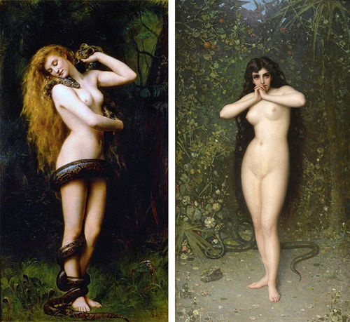
Long Demonized in Art, Eve Has Become a Pop Culture Icon
Divinely inspired or otherwise, the Old Testament story of Adam and Eve in the Garden of Eden is deeply rooted in the Western psyche. Eve occupies mere pages of the Genesis epic, but women have spent millennia atoning for her original sin. For the last 2,000 years, Eve has been invoked in the monotheistic world to suppress women’s rights and defame their characters. How many misogynistic stereotypes and prejudices stem from the reputation of the much-maligned, archetypal first woman?
The apostle Paul cited Eve’s narrative to justify women’s subservience to men, writing in the apocryphal book of Timothy that women should “keep silent” because “Adam was formed first, then Eve. And Adam was not deceived, but the woman was deceived and became a transgressor.” In the Middle Ages, St. Bernard of Clairvaux sermonized to rapt audiences of men and women that Eve was “the original cause of all evil, whose disgrace has come down to all other women.” More recently, at a legislative dinner in 2015, South Carolina Senator Tom Corbin was confronted for his combative remarks about women’s right to participate in the state’s General Assembly. “Well, you know God created man first,” he quipped. “Then he took the rib out of man to make woman. And you know, a rib is a lesser cut of meat.”

Adam and Eve, 2015.
David LaChapelle
MARUANI MERCIER GALLERY
From these rigid perspectives, Eve is one-dimensional: inherently wicked and an afterthought to Adam. Yet across popular culture and the history of art, Eve appears as a paradox. She is guileful and naive, earth mother and fatal seductress; she is the problem of man, his downfall, his eternal scapegoat.
Such depictions have structured our ideas of beauty, gender, and morality. The oldest conceptions of Eve play out again and again in all reaches of contemporary culture. A judiciously placed apple in a woman’s hand in art, advertising, or film can immediately invoke Eve’s devious sexuality, and still other references abound. The Handmaid’s Tale (2017–ongoing), adapted by Hulu from Margaret Atwood’s dystopian novel, features a young, religious character named Eden, who is expected to help repopulate the country. By the same token, in Pixar’s animated children’s movie WALL-E (2008), the title robot meets a fellow android who has come to bring new human life to Earth. Her name? EVE.
Forbidden fruit
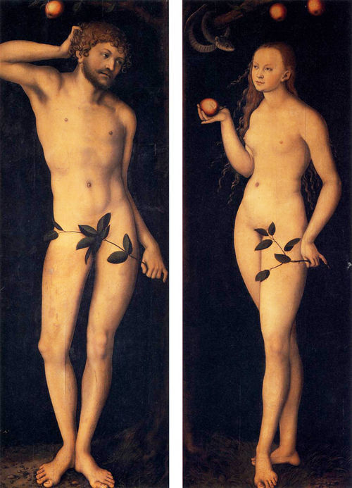
Lucas Cranach the Elder, Adam and Eve, 1528. Courtesy of the Uffizi Gallery.
Though never explicitly named in the Bible, the apple has become the de facto “forbidden fruit”—powerful nomenclature for that which is fatally desirable, and therefore all the more tempting and worthy of moral rule-breaking. The apple’s shiny red skin and juicy interior make it an apt stand-in for sex, and the seductive way in which Eve is often depicted eating it only reinforces its libidinal connotations. Genesis records that after Eve takes a bite of the fruit, she simply “gave some to her husband and he ate.” St. Jerome, however, used the Latin word seducta to describe Eve’s transgression.
During the Northern Renaissance, German artist Lucas Cranach the Elder perfected the bewitching female nude. In his Adam and Eve diptych from 1528, the couple faces one another beneath the Tree of Knowledge, little red apples bobbing tantalizingly above their heads. A self-possessed Eve holds one perfect fruit out to her husband, who scratches behind his ear in apparent befuddlement. In Cranach’s depiction, it’s not the serpent whispering in Eve’s ear or even the apple that is dangerous, but the perfectly beautiful and alluring woman who will be his pleasure—and his downfall.

Domenichino, The Rebuke of Adam and Eve, 1626. Courtesy of the National Gallery of Art.
Men are often shown as helpless in the face of this female threat. In Domenichino’s 1626 painting, The Rebuke of Adam and Eve, God and his coterie of cherubim float down from heaven to reproach Adam. The first man throws up his hands in what looks like confusion or exasperation, diverting the entirety of the blame to his wife.
The image of Eve as sexual temptress has remained frighteningly constant, even in products and programs that purport to challenge ingrained sexist tropes. In the early aughts, for example, the soapy comedy-drama Desperate Housewives was lauded for casting five middle-aged women in the lead roles. The intended audience for the salacious TV show was presumably women, yet the impossibly fit, botoxed, and high-heeled characters seemed designed to appeal to men.
The apple’s shiny red skin and juicy interior make it an apt stand-in for sex, and the seductive way in which Eve is often depicted eating it only reinforces its libidinal connotations.
Red apples played prominently in promotional materials for the show. In the title sequence, an animated version of Cranach’s Adam is crushed by a giant falling apple as a blasé Eve looks on. In posters ahead of season five, the topless cast smiles coyly from behind a row of apples and the tagline “Even Juicier.”
So should one eat the apple or abstain? Designer Donna Karan exploited this ambiguity for her long-running DKNY scent Red Delicious. In the ads, a pouty model has just bitten into a green apple (how subversive), and the perfume packaging itself is shaped like the fruit. Sin is no longer the province of Eve alone: The “new temptation in fragrance” was marketed to both women and men.
Once in a while, the story of a woman with an apple doesn’t explicitly end with damnation or sex. In Disney’s Aladdin, the apples Princess Jasmine steals for a young, hungry boy lead to her meeting the titular male hero. They go on to have fabulous adventures together, but it’s Aladdin who reveals the world to Jasmine, and not the other way around. Sometimes apples—potent transmitters of dangerous information—are exchanged between women. In the 19th-century fairy tale that would later become a Disney classic, a witch proffers the poison apple that puts Snow White to sleep.
Snake charmer
In the book of Genesis, the tempting creature is explicitly referred to as “he” and is described only as a serpent. Yet Eve’s casting as an evil temptress gave rise to the belief that the duplicitous snake was female, too. In art, it was often depicted with a womanly upper body and a reptilian lower half. If wickedness is associated with femininity even before Eve gives Adam the Forbidden Fruit, which came first, woman or sin?
Michelangelo’s Sistine Chapel version of the Fall sees his muscular Adam and Eve joined by an equally hulking snake-woman wrapped around the tree. Her right arm grasps the trunk for support as she stretches out to meet Eve’s upraised hand. Both Eve and the serpent use their left, or “sinister,” hands, further signaling their deviousness.

Michelangelo, The Fall of Man, 1512. Image via Wikimedia Commons.
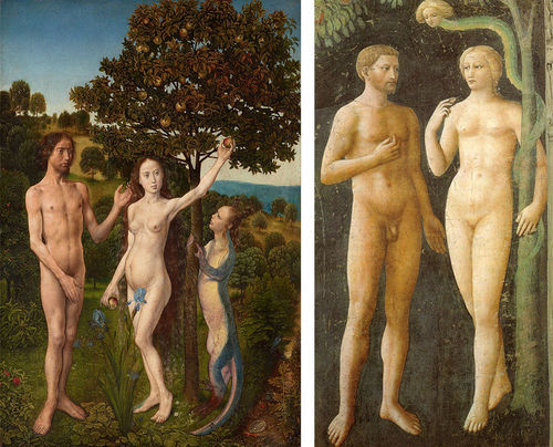
Michelangelo was merely following a popular convention of his time. During the Renaissance, snake-women appear in Hugo van der Goes’s The Fall of Man and The Lamentation (ca. 1470–75); a terracotta sculpture of Adam and Eve by the workshop of Giovanni della Robbia (ca. 1515), which took inspiration from a famous Albrecht Dürer engraving; and the stone facade of Notre Dame. A blonde-headed serpent woman in Masolino’s Temptation of Adam and Eve (ca. 1425), a fresco in Florence’s Santa Maria del Carmine, is frighteningly funny: She snakes along the Tree of Knowledge with her comically tiny head popping out of the end of her skinny green body.
Left: Hugo van der Goes, The Fall of Man and The Lamentation, 1470–75. Courtesy of the Kunsthistorisches Museum. Right: Masolino da Panicale, Temptation of Adam and Eve, ca. 1425. Courtesy of Cappella Brancacci.
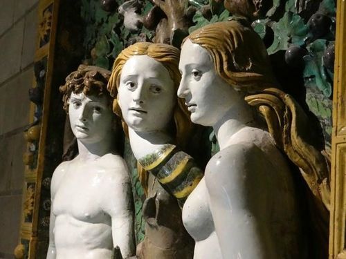
Giovanni della Robbia, Adam and Eve, ca. 1515.
Even before the Bible story, snakes were associated with women in cultures around the globe. The hostility that is created between them in the Bible may have been a way to separate the nascent Jewish community from pagan traditions that had a snake as a powerful female goddess. The Canaanite cult of Baal-Asherah heavily influenced the newly formed Israelite nation. In the predominantly female cult, Baal appeared in the form of a serpent with his wife, Asherah, at his side. When the Israelites entered Canaan, pagan religions were demonized in lieu of monotheism.
In this light, the story of Adam and Eve has political undertones. The biblical narrator may have already witnessed an established association between the serpent and the woman in neighboring tribes. When God punishes them, a wedge is driven between the serpent and the woman, cursing everlasting “enmity” between them and their offspring. The story successfully alienates the woman from her longtime ally.
Left: John Collier, Lilith, 1887. Image via Wikimedia Commons. Right: Pantaleon Szyndler, Eve (Temptation), 1889. Courtesy of the National Museum in Warsaw.
They are indeed powerful together. Who can forget the 2001 MTV Video Music Awards, when Britney Spears walked onstage with an albino python draped across her neck? Dressed as an exotic snake charmer and scantily clad in artfully tattered rags and glitter, Spears fully assumed her onstage persona as an outlet to embrace her newfound sexual freedom. The conflation of the pop star with a sexual goddess transpired before millions of girls and women in the public forum of television. With that scene from Genesis, snakes and women received their eternal reputation of immorality. The snake became an erotic symbol as “the bad girl” gained sex appeal.
The fall of (wo)man

Britney Spears performs at the 2001 MTV Video Music Awards. Photo by Kevin Mazur/WireImage.
Spears’s performance resonates with an artwork made over a century earlier by Pre-Raphaelite painter John Collier. With her perfect, naked body and long blonde hair, the woman in the 1887 painting who nuzzles the head of the giant snake sensually coiled around her looks like Eve. But in fact, it’s her alter ego, the legendary femme fatale, Lilith.
Fed-up women looking for a new matriarchal origin story have taken in Eve beneath their own gaze. They have embraced the qualities—independence, curiosity, sexuality—that once demonized her.
In Jewish literature, the enchantress Lilith is described as Adam’s first wife, before Eve. Lilith was man’s equal but was devilish in her sexuality. According to legend, she felt repressed by Adam’s side, and she eventually leaves him to cohabit with demons in deep waters. In folklore and pop culture, she has come to be known as the mother of demons and vampires, eater of babies, husband of Satan—in short, a dangerous, sexually liberated woman.

Lilith Fair, 1998, Mountain View California. Image by Tim Mosenfelder / ImageDirect via Getty Images.
Finally, in our modern era, fed-up women looking for a new matriarchal origin story have taken in Eve, and her alter ego Lilith, beneath their own gaze. They have embraced the qualities—independence, curiosity, sexuality—that once demonized her.
Kiki Smith’s take on Lilith (1994) is a powerful and disturbing sculpture—a black-bronze horror movie demon, nude and crouched in a spider-like position high up on the wall. The glass grey eyes startle any viewer. An unlikeable woman, who is not sexually available, nor coy, is a forcefully unusual statement.
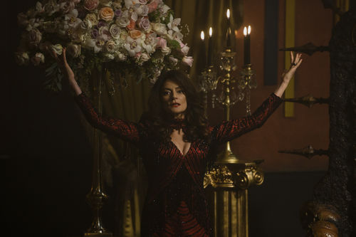
Madam Satan from The Chilling Adventures of Sabrina. Photo by Diyah Pera. Courtesy of Netflix.
Lilith appears in many guises in TV and movies: the progenitor of the vampire race in True Blood (2008–14); Madam Satan on The Chilling Adventures of Sabrina (2018–ongoing); the frigid, hated ex-wife of sitcom icon Frasier. The sci-fi movie The Fifth Element (1997) turns the concept of Lilith on its head by having the main character Leeloo—a variation on Lilith—save humanity instead of devouring it. Her name has also been invoked as a statement of feminist independence: The Lilith Fair of the late 1990s adopted the legendary woman’s name for a music festival that showcased only female artists or woman-led bands.
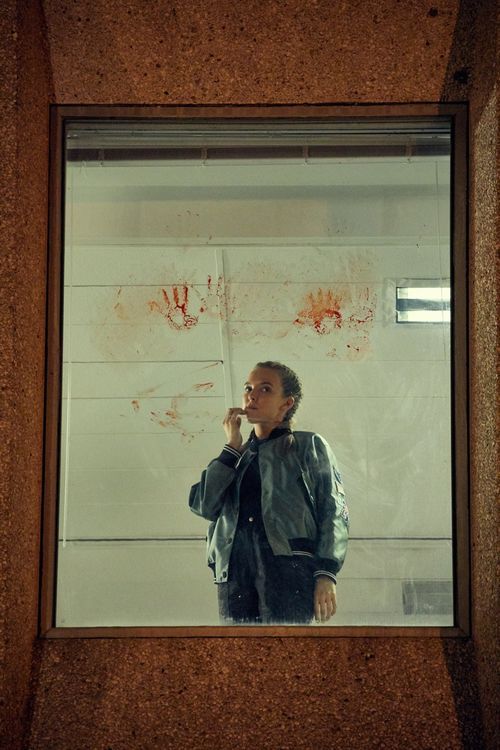
Villanelle from Killing Eve. Courtesy of the BBC.
One recent TV show has gone above and beyond in complicating our understanding of Eve, and women. The BBC series Killing Eve (2018–ongoing), which follows an M15 agent, played by Sandra Oh, as she tracks down a psychopathic female assassin portrayed by Jodie Comer. Guess who is Eve? It’s not the assassin. The delight of the show is seeing the intense connection unfold between the so-called good and bad guys. Who is on which side becomes impossible to understand—both women contain multitudes. The sexual drama lies between the killer, Villanelle, and Eve—not a man. Though the title of the show probably refers literally to Villanelle’s overarching plans, it’s also a fitting metaphor for the destruction of the story of Eve itself—and all the misery, unfair expectations, and misrepresentation that have come along with it.
from Artsy News
4 notes
·
View notes
Text
Why Artists Who Dabble in Other Professions Find Success
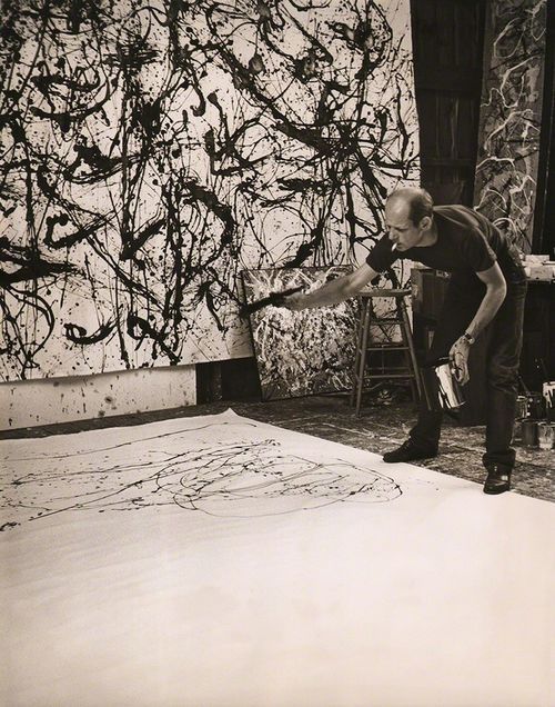
Jackson Pollock, 1950.
Hans Namuth
Keith de Lellis Gallery
We love stories about people who triumph despite the odds. The underdog genre—as old as David and Goliath—is a Hollywood favorite. Films from Miracle (2004) to Ali (2001) focus on sporting events where teams or individuals pull off upsets and become national heroes. The theme extends to creative endeavors as well. A famous literary anecdote recounts that Stephen King faced 30 rejections from publishers for his first novel, Carrie (1974), before Doubleday bought it.
The principle holds true in the visual arts, too. Take for example beloved outsider artist Lonnie Holley, who was born into poverty in the Jim Crow era and got his start carving tombstones for his sister’s deceased children. And Jackson Pollock, who was one of the worst draftsmen at the Art Students League before becoming one of the 20th century’s most important painters.
Pollock’s story is included in David Epstein’s new book Range (2019), which is filled with miniature biographies of artists and public figures, from tennis champion Roger Federer to former Girl Scouts CEO Frances Hesselbein. Despite their disparate endeavors, the subjects’ tales all feature meandering—or rather, ranging—paths. Epstein argues that these trajectories are integral to success in any field. He suggests that artists should be generalists, unafraid of trying different disciplines, before focusing on their craft.
Self-portrait, 1887.
Vincent van Gogh
Kröller-Müller Museum
Epstein’s book responds to the idea that it takes 10,000 hours of practice to become an expert at anything, a principle Malcolm Gladwell popularized in his 2008 book Outliers. Epstein notes that evidence for the theory extrapolates from data related to golf—a game which rewards repetitive practice. “That’s not how artistic creation works,” Epstein explained recently. “You’re trying to do something new to you, and in some cases new to anyone. One of the sources of power for doing things like that is having really broad experiences.” That often requires trying, and failing, at a number of different activities.
Paul Gauguin was a stockbroker who was forced to find a new career path after the market crashed in 1882. Vincent van Goghfailed as an art dealer before he painted some of art history’s best-loved canvases. Jean-Michel Basquiat never formally learned to draw, then became one of the United States’ most famous—and expensive—artists. Jeff Koons famously worked in finance before becoming today’s most prominent living American artist. Carrie Mae Weems had already studied modern dance and worked as a labor organizer before she embarked on her own formidable art career.
I Looked and Looked but Failed to See What so Terrified You (Louisiana Project series), 2003.
Carrie Mae Weems
Jack Shainman Gallery
All of these artists, in their own way, demonstrated one key attribute of success: “match quality.” The economics term, Epstein writes, is used to “describe the degree of fit between the work someone does and who they are—their abilities and proclivities.” What artists such as Pollock and Basquiat lacked in traditional drawing skills, they made up for in commitment to their work and engagement in art. They also tried out other art forms before devoting themselves to their signature painting styles: Pollock made murals, drew, and worked in a figurative vein, while Basquiat began in graffiti. Sampling alternate modes proved crucial to their careers and to their eventual, groundbreaking canvases. Weems has tied her dance background to the role of the body throughout her photography.
Epstein doesn’t limit his discussion of artists to such giants of 19th and 20th culture. In a chapter about lateral thinking, he writes aboutcomic book artists. He cites a 2006 study by Alva Taylor and Henrich Greve which examined comic books’ commercial values. The pair hypothesized that artists who produced more comic books and had more years of field experience would create the highest-valued products. Instead, what mattered was how many genres (crime, fantasy, sci-fi, etc.) an artist had worked in. “Where length of experience did not differentiate creators, breadth of experience did,” Epstein writes. “Broad genre experience made creators better on average and more likely to innovate.”

Head, 1982 -2001.
Jean-Michel Basquiat
New River Fine Art
While surgeons and airline crews benefit from repetitive practice—the smoothest operations and flights are often the result of specialized expertise and training—screenwriters, authors, and artists require a range of material to create innovative new work. Jordan Peele, Epstein suggests, drew on his expertise in comedic timing in order to create the hit horror film Get Out (2017). Neil Gaiman’s writings on art, and his forays into children’s literature, have perhaps enhanced the psychological complexity of his adult novels. Instead of dismissing their diverse paths, said Epstein, artists should learn to tell better stories about their lives, “explaining their zigzags as part of one holistic narrative.”
Epstein himself became enthralled with such tales during the research for his book. In fact, he started collecting art after learning about his subjects’ intriguing life stories. A Yayoi Kusama print now hangs above his child’s crib. Outsider artists, and Lonnie Holley in particular, became favorites. Range, for them, was a product of necessity. They often had no access to the traditional paths, such as MFA programs, towards an art career.
Not Just A Hairdo, 2016.
Lonnie Holley
James Fuentes
During his research, Epstein began thinking more critically about such artists’ backgrounds. Like jazz musicians, he said, these artists “had to create their own forms, and some of those turned out to be paradigm shifting.” There’s nothing wrong with formal training, he continued, but “we stand to miss a wealth of talent and creativity if our pipeline is so narrow that it erects tremendous barriers for people with nontraditional backgrounds or whose styles evolve slowly.” That would be an awful waste—their intriguing stories, as much as their artwork itself, enriches contemporary culture.
from Artsy News
1 note
·
View note
Text
An appeals court ruled that the heirs of a Holocaust victim are the rightful owners of two Egon Schieles.

Photo by TJ Bickerton, via Wikimedia Commons.
In a major restitution case involving two Nazi-looted Egon Schiele watercolor paintings, a New York appellate court upheld a ruling that returned the pieces to the heirs of their pre-war owner. Fritz Grünbaum, an Austrian cabaret singer, amassed a major collection of 449 artworks—including 81 works by Schiele—before being killed in a concentration camp in 1941. The works were originally returned to the heirs in 2018, and this ruling being upheld puts an end to a complex, years-long dispute. The Schieles at stake in this legal battle are Woman in a Black Pinafore (1911) and Woman Hiding her Face (1912).
Last year, New York state judge Charles J. Ramos cited the Holocaust Expropriated Art Recovery Act (HEAR act), a law enacted in 2016 that gives descendants to victims of Nazi persecution a greater chance of regaining artworks misapropriated by the Nazis by easing the statue of limitations on such cases. Earlier this week, a unanimous ruling by a five-judge panel once again cited the HEAR act when stating its verdict; the judges also found that the evidence indicated Grünbaum had owned the works before the war and had never voluntarily rescinded ownership.
The judges wrote in their ruling:
The tragic consequences of the Nazi occupation of Europe on the lives, liberty and property of the Jews continue to confront us today. [. . .] We reject the notion that a person who signs a power of attorney in a death camp can be said to have executed the document voluntarily.
Prior to this trial, the works had been owned by London art dealer Richard Nagy, who purchased them six years ago. While the court has not accused Nagy of any wrongdoing, the holes in the works’ provenance history tipped the scales of justice in the direction of Grünbaum’s heirs. Nagy believed that the works wound up in possession of Grünbaum’s sister-in-law Mathilde Lukacs, who then sold them after the war to Swiss art dealer Eberhard Kornfeld.
Eventually, the Schiele works from Grünbaum’s collection were sold to American dealer Otto Kallir, who sold them to a variety of patrons. Kornfeld published a catalogue of Schiele artworks in 1956 that contained no mention of Lukacs, however, Kornfeld himself testified in 2007, claiming he did purchase the works from Lukacs. While Kornfeld presented documents corroborating this account, Grünbaum’s heirs dismissed the documents as either forgeries or fakes; neither the lower court nor the appellate court considered them to be substantial evidence.
The heirs’ attorney told the New York Times the works are at Christie’s and will be auctioned in November. He said their estimated worth is around $7 million.
from Artsy News
0 notes
Text
How Jony Ive Remade Visual Culture in Apple’s Image

Photo by Budrul Chukrut/SOPA Images/LightRocket via Getty Images.
Jony Ive is not the greatest living artist. He is very far from the most famous. He may not even be an artist, depending on who you talk to. But if, as Georgia O’Keeffe said, an artist is someone who fills space in a beautiful way, then the soon-to-be-former head of Apple Inc.’s design team is one of the most influential artists of the last quarter-century.
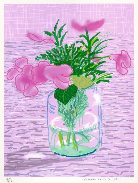
iPad drawing Untitled, 329, 2010.
David Hockney
The Drang Gallery
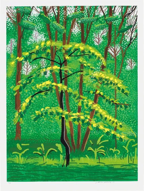
19 May, from The Arrival of Spring in Woldgate, East Yorkshire in 2011 (twenty eleven), 2011.
David Hockney
Phillips
To say that you can see Ive’s influence everywhere would be an understatement—it’s present even where you don’t see it. A massive chunk of contemporary design, from the glowing overhead lights in a JetBlue cabin to the idiot-proof control system of a Camry seems like facsimile Ive. Even the current Marie Kondo–led vogue for tidying up, with its worship of simplicity, finds a kindred spirit in Ive’s work. It’s likely that Ive’s greatest legacy, greater than any single product, was to expand consumers’ and businesses’ expectations of what should be beautiful—to treat the curve of an earpiece or the girth of a plug as matters of fine art.
Ive’s influence on fine art itself is almost as vast. Some of the most striking works the English artist David Hockney has made in recent years were scrawled on the screen of an iPad. In this new medium, Hockney’s colors seem riper than ever, his lines are bolder and more playful—Ive’s form, in short, fits Hockney’s content like a glove. And the 2018 show at the ICA Boston, “Art in the Age of the Internet, 1989 to Today,” was full of nods to the Apple look Ive created, even if many of those nods were satires and scathing critiques. Sondra Perry’s Graft and Ash for a Three Monitor Workstation (2016) is a big middle finger aimed at Ive’s company: the crisp frames of the computer screen have become suffocating, and the “bicycle for the mind” is now an actual bicycle.
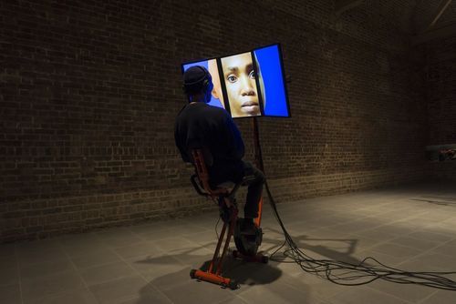
Graft and Ash for a Three Monitor Workstation, 2016.
Sondra R. Perry
Serpentine Galleries
It is strange to speak of the man who led Apple’s design for two decades, whose creations have sold well over a billion copies, and who has won nearly every major award his field offers as a neglected genius. But when you consider the starring role he played in crafting the world’s most recognizable brand aesthetic, his contributions to visual culture start to seem weirdly unacknowledged. Last month, after Ive announced that he was retiring from Apple to start his own design firm, a journalist for The Verge wrote: “Stop anyone in the street and ask them to name a famous industrial designer and I would hazard a guess that, if they have an answer at all, it would be Jony Ive.” Quite the “if”: Sir Jonathan Ive (everybody uses his nickname) is the most famous living person in a field that has produced surprisingly few famous people.

Braun T 1000 radio, 1963.
Dieter Rams
San Francisco Museum of Modern Art (SFMOMA)

010 nesting tables, set of two, c. 2010.
Dieter Rams
Wright
This has something to do with the field itself. Good design—per Ive’s idol, the German designer Dieter Rams—is unobtrusive. Its purpose is to help consumers pursue their own ends without confusion. The same, it would seem, goes for good designers. By his own admission, Ive has never relished public speaking, and he spent most of his time at Apple overshadowed by his famous boss, someone who wasn’t exactly renowned for sharing the spotlight.
When discussing Apple’s product line from the late 1990s and the early 2010s, it’s tempting to credit Steve Jobs and Steve Jobs alone. Yet the iPod, the iPhone, MacBook, et al., were fruits of a close collaboration between Jobs and Ive, with Ive originating a sizeable number of the ideas and fine-tuning many of the others. According to Walter Isaacson, the author of a 2011 biography of Jobs, the two men had a “mind-meld” (an appropriate reference for two hardcore sci-fi fans). Jobs himself put it more seriously: “If I had a spiritual partner at Apple, it’s Jony.”

Farnsworth House, 1946-1950.
Ludwig Mies van der Rohe
Plano, Illinois
Ive had almost finished his design for the iMac when Jobs rejoined Apple in 1997. We also know, from Isaacson’s biography, that Ive created the elegant “neck” model for later versions of the iMac, and that he based the clickwheel and chunky curves of the original iPod on Rams’s products from the ’50s. The MacBook’s casing, a quintessential Ive-ian invention, was made from aluminum with a texture like timeworn stone—rough yet smooth, complex yet simple.
A lot has been written about the influence of the Bauhaus on Apple products, partly because Jobs never missed an opportunity to connect the two. Ive, like his spiritual partner, was an outspoken believer in Bauhaus architect Mies van der Rohe’s mantra, “Less is more,” but he drew from a much wider range of styles. His original, translucent iMac case did for the PC what Richard Rogers’s Centre Pompidou did for the museum: took an obscure, intimidating object; cut it open; and made it seem jaunty and friendly. If the iMac was almost childlike, the iPhone conveyed otherworldly mystery, evoking the monolith from 2001: A Space Odyssey (1968) brought to life by another shy perfectionist, Stanley Kubrick.

Side view of a G3 equipped Apple iMac, made in 2000. Photo by Thomas Kaiser, via Wikimedia Commons.
Ive’s own footprint in sci-fi is unmistakable and, peculiarly, more than a little sinister. From Black Mirror (2011–present) to Blade Runner 2049 (2017) to The Circle (2017), the future these days is always full of off-white metal and luminous screens that seem malevolent, even when they’re trying to soothe you.
If these movies are any sign, there’s something people find a little unsettling about Ive’s designs. Maybe it’s simply that, as with any really popular style, the “Apple look” has become a victim of its own success, cheapened by countless knockoffs. Or maybe Apple’s mission—and the Ive designs to accompany it—no longer seems as daringly utopian as Jobs managed to make it appear. Good design, Rams argued, isn’t only unobtrusive; it’s long-lasting and environmentally friendly. It’s hard to stay faithful to those dictums when your company’s business model seems to depend on products that stop working a few years after customers buy them.

Still from Black Mirror, Season 4. Courtesy of Netflix.
It may have been inevitable that Ive would break away from Apple, then. Some are surprised he stuck around as long as he did. Already, he’s facing a problem very few artists have the luxury of facing: How do you keep making art when you’ve already remade the way the world looks? And how do you stay unobtrusive when the design world is waiting to see what you do next?
from Artsy News
0 notes
Text
What Happens When an Artwork Is Damaged Beyond Repair
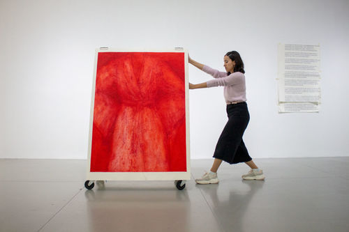
Promotional image for “No Longer Art: Salvage Art Institute” at Museo de Arte de Zapopan, Mexico, 2019. Courtesy of MAZ.
On December 24, 2008, one of Jeff Koons’s famed balloon animals—an edition featuring a 10-inch-long red dog—fell and broke into several pieces. Five months later, after examining the sculpture and assessing the damage, insurance company AXA Art determined that it would cost more to repair than the sculpture was worth. AXA paid the owner the insurance premium, declaring the work a “total loss.” The pieces of the broken balloon dog were transported to a large AXA warehouse, where the dog joined hundreds of other “totalled” artworks.
In May 2009, the same month Koons’s sculpture officially exited the art market, New York–based artist Elka Krajewska was talking with her neighbor Rosalind Joseph, who works at AXA in public relations, about these warehouses for so-called “salvage art.” Krajewska was intrigued by the concept of what was once considered a work of art being demoted to an object with no value beyond its materials. In response, she came up with the idea for a museum of salvaged art, a place where these totalled former artworks could find new life in the conversations and philosophical questions they spark: What defines an artwork? How do we determine its inherent value? Is there such a thing as objective value?

Installation view of “No Longer Art: Salvage Art Institute”at Museo de Arte de Zapopan, Mexico, 2018. Courtesy of SAI.
Over the next three years, Krajewska registered her Salvage Art Institute (SAI), met with people at AXA, visited their warehouse, and—in concert with Columbia University’s Graduate School of Architecture, Planning, and Preservation—was able to secure a gift of about 40 damaged pieces for the institute’s collection. In late 2012, SAI opened its first exhibition, “No Longer Art,” at Columbia’s Arthur Ross Gallery, featuring its recently acquired collection of totaled art. Among the works were a water-damaged Giacometti drawing, a torn painting by Alexandre Dubuisson, and Koons’s broken balloon dog.
Although Krajewska is an artist, she thinks of SAI more as an educational tool or a means to spark discussion, as opposed to an art project. She said the value of displaying salvage art is the conversation. “It opens up your head and your understanding of what art can be and how we feel about it.”
Matthew Wagstaffe, Krajewska’s long-time assistant, concurred. “These things lie at the intersection of so many areas of expertise,” he said. The liminal status of these damaged works draws interest not only from the art and insurance worlds, but also the wider realms of law, economics, sociology, philosophy, and even literature. (In Ben Lerner’s 2014 novel, 10:04, there’s an “Institute for Totaled Art,” inspired by SAI.) Wagstaffe added that there’s a “strangeness in the objects,” as well as a “degree of accessibility to them,” despite the verbose insurance claims governing their status.
Non-art on tour

Visitors at “No Longer Art: Salvage Art Institute” at Museo de Arte de Zapopan, Mexico, 2018. Courtesy of SAI.
Ever since SAI’s first exhibition, the collection has been touring the world. Each exhibition is different, but they all have a few things in common: Visitors are encouraged to interact with and touch the objects; each object is displayed on a moving cart, so people can rearrange the exhibition space as they please; and if they want to find out more about the individual objects, visitors can flip through binders of redacted insurance claim documents tracing damage, declarations of total loss, and transfers of ownership.
At SAI’s most recent exhibition, at Mexico’s Museo de Arte de Zapopan, Wagstaffe said museum security “had trouble with the fact that viewers had to touch and engage with the art. It goes against the basic rule of a museum.”
“I picked up the Koons, and suddenly I was surrounded by security telling me to put it down,” Krajewska remembered. The guards called the museum’s director, which sparked a discussion of the meaning of the exhibition. Krajewska loved it. “There’s a playfulness around the concept of what we value,” she said. Ultimately, Krajewska and the security officers compromised: Visitors could touch the art, but they had to ask a guard for permission first.

Visitors at “No Longer Art: Salvage Art Institute” at Museo de Arte de Zapopan, Mexico, 2019. Courtesy of MAZ.
It’s not just museum guards who are uneasy about SAI’s collection, watching as visitors smudge a drawing with their fingers or put their hands through a hole in a painting. The shippers also worry. “Shipping is a tricky endeavor,” Wagstaffe said. “There’s a fear that when you re-engage, you bring back that value, so there’s never insurance on the shipment. You remove something from having monetary value and, at every turn, people are trying to bring it back into that.”
At every step, Krajewska and Wagstaffe are diligent to not let any object in SAI’s collection gain value. It’s one of SAI’s nine policies, which collectively read as a kind of manifesto. The first policy is akin to a mission statement: “SAI is a haven for all art officially declared as total loss, removed from art market circulation and liberated from the obligation of perpetual valuation and exchangeability.” An important part of this liberation is the removal of the artist’s name from the object. (An artist’s signature creates value, after all.)
The seventh policy mandates: “The signature of the adjuster meets and cancels the signature of the artist.” In a further effort to liberate its damaged works, when SAI displays its collection, the pieces’ titles list their object number, materials, history of damage, and former artist and title—for example, SAI 0015: materials: aluminum, porcelain; size: 10” x10” x 3”; damage: 12/24/2008, shattered in fall; claim: 05/11/2009; total loss: 05/20/2009; production: 1995; artist: Jeff Koons; title: Red Balloon Dog, Ed. 51/66.
Embracing change and chance

Installation view of “No Longer Art: Salvage Art Institute” at Museo de Arte de Zapopan, Mexico, 2019. Courtesy of MAZ.
Inevitably, pieces in the SAI collection undergo further damage, and Krajewska loves how they change over time. The collection includes a diptych drawing made with gunpowder that people tend to smudge with their fingers while handling; when they touch another object afterward, they leave gunpowder fingerprints behind. These kinds of acts connect viewers to the objects, but also tie the objects to one another in a very unique way. Krajewska documents these further degradations in extensive reports on individual objects she keeps in her studio. She sees them as living objects, and her documentation is a history of their lives.
Amid all the meticulous documentation of SAI’s activities and collection, there’s an equally strong element of chance to the project. Krajewska is the first to admit that SAI was formed under extremely serendipitous circumstances: the neighbor who happened to work at AXA; AXA CEO Christiane Fischer’s improbable enthusiasm for the project; Columbia University’s initial willingness to support it. The chance encounters didn’t stop there. Ben Lerner wrote about a fictionalized SAI because Krajewska liked how he described art in his first novel, Leaving the Atocha Station (2011), and called him out of the blue to talk about her new project. Wagstaffe met Krajewska because a friend of his had a studio next to hers. Most of SAI’s travelling shows are the result of curators asking to borrow certain objects or the whole collection. And, at the root of the institute, there’s the randomness of how objects get damaged in the first place.
There’s more chance in SAI’s immediate future: In May, Columbia told Krajewska that the SAI collection would have to move out of their storage space before the end of the year, so Krajewska and Wagstaffe are looking into other options—including a dream of transferring everything to permanent display on a houseboat. Krajewska is an avid sailor, so the problems of both storage and shipping would be solved in one fell swoop. Plus, as Wagstaffe pointed out, “marine insurance marked the early days of insurance, and sailing through international waters means even more liberation for the collection.”
Over time, Wagstaffe has become fascinated with the very idea of insurance, which seeks to anticipate that which can’t be foreseen. “We’re up against things that exceed our ability to change them,” he said. “There’s a strangeness in humans trying to deal with disaster in this very dry language.”
New values
Last fall, Krajewska was preparing SAI’s collection for shipment to Mexico when she came across an unopened box from the original 2012 shipment of works from the AXA warehouse. Inside she found a large, gold pendant with an etching of a bearded face and a large dent suffered in apparent fall. The signature was still legible: “Picasso.”
Around the same time, Therese Patricia Okoumou—the woman who climbed the Statue of Liberty on July 4, 2018, in protest of the separation of migrant families at the U.S.–Mexico border—was found guilty of committing federal crimes. As Okoumou was preparing for her sentencing, Krajewska was working on a special SAI project she said would “allow young students preparing for college in the humanities to interact with our inventory on their own terms,” she said. “Patricia seemed a perfect community liaison for that program.” When Krajewska learned the judge might be more lenient in sentencing Okoumou if she had an employment opportunity lined up, she swiftly wrote up a job offer letter to present to her prior to sentencing.
Krajewska showed up to federal court last March for Okoumou’s sentencing wearing the Picasso pendant around her neck as a kind of good-luck charm. Okoumou avoided jail time and was let off with probation. For Krajewska, the episode showed the pendant had taken on new “cultural value.” After all, it hasn’t been a “real” Picasso in years.
from Artsy News
0 notes
Text
David Zwirner will open a Paris gallery to counteract the effects of Brexit.

Rue Vieille du Temple in Paris. Photo by Klaus Graf, via Wikimedia Commons.
David Zwirner announced today that it will open its sixth gallery globally in the Marais district of Paris, long a hub of the French gallery scene. Zwirner will take over a space on Rue Vieille du Temple once occupied by the legendary dealer Yvon Lambert, and most recently inhabited by VNH Gallery, which will close. Zwirner’s first show in Paris will be of work by Raymond Pettibon, who has not shown in the city since 1995, and it will open in October, timed to the FIAC fair that’s held annually in the Grand Palais.
The reason for the new space, David Zwirner told the Financial Times, was to establish a presence in continental Europe ahead of England’s planned exit from the European Union—as of now, Zwirner, who was born in Cologne, has only one space in the region, in London. He told the FT:
Brexit changes the game. After October, my London gallery will be a British gallery, not a European one. I am European and I would like a European gallery, too.
The transition will be smooth, with Victoire de Pourtalès, a partner in VNH gallery, staying on as co-manager of Zwirner Paris, with much of the staff remaining as well. VNH co-founder Hélène Nguyen-Ban called it a “happy ending” to her gallery, adding that “it’s much better than if an Abercrombie & Fitch moved in.”
Paris has risen in status as an art market hub since the Brexit fiasco escalated, despite the fact that London still accounted for 66 percent of all of the continent’s market activity. The arrival of Zwirner, one of the world’s most important mega-galleries, only adds momentum to the shift toward Paris.
from Artsy News
0 notes