
Last Seen Blogs

nutriendosonrisasnsargentin-blog
CREANDO SONRISAS, CONSTRUYENDO UN MEJOR FUTURO.

freebieglobal-com
Untitled
kakashismain
Mae - kakashismain

hayallerde-yasam
Hayallerde Yaşam

rayawaifu
#1 jackfruit jerky fan

Text
Alchemy Logo

You can see on my final designs the alchemy logo isn't included. Initially I wanted to add this at the top. Ideally this would have been transparent but I didn’t have the time to source transparent stickers. I think this would have really put together the design and in hindsight I should have included this.
0 notes
Text
Self Reflection
Overall I really enjoyed this project. I like how the brief was broad and we could choose a product that we wanted to design.
I’m happy I went with the tumeric elixir because I make and drink for myself and for my friends and family so creating packaging for this product was heaps of fun.
I enjoyed exploring illustrator more and learning new tools I haven’t tried before.
I’m happy with my end product although I wish I had made another product to go with my turmeric elixir.
0 notes
Text
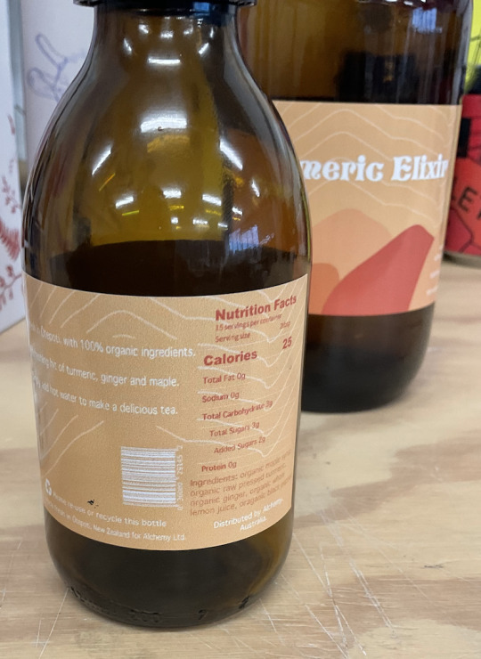
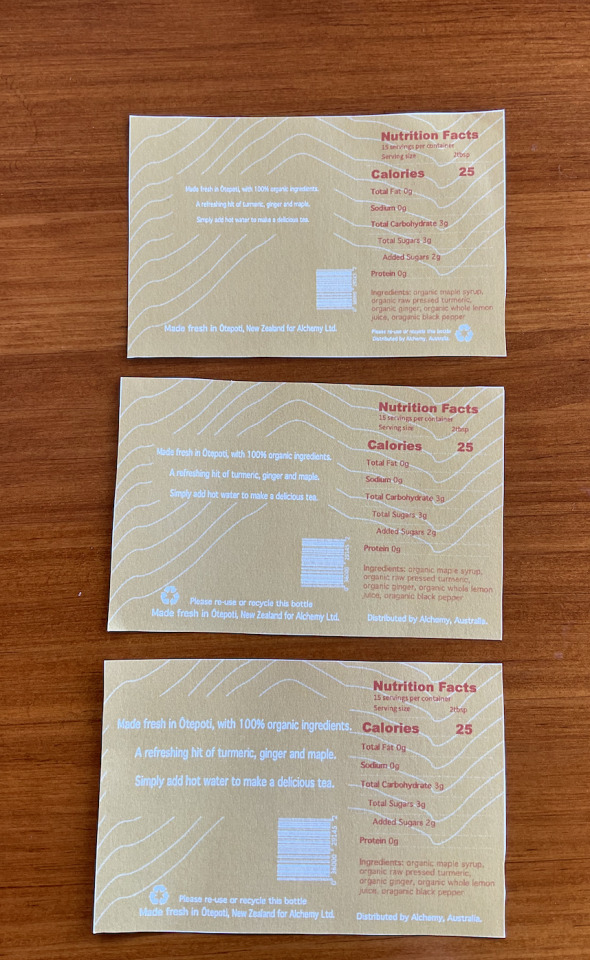
Final prints
After my second round of printing, I was more cautious putting the stickers on because the last trial was uneven.
Overall I’m really happy with how they turned out, the packaging is still grainy but I actually think it compliments the design. When I first started to research my logo I added a grain effect on illustrator, luckily I didn’t go ahead with this as it would have looked messy.
0 notes
Text
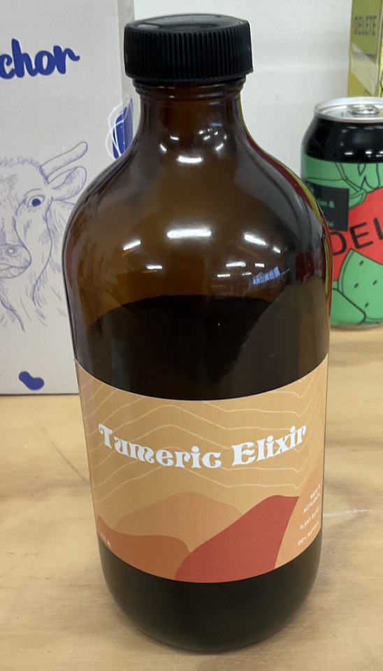
Labels first print
My first print went pretty well. The only issue I had but the grain that the sticker created. It made my typography hard to read on the back, especially on the small bottle. I edited the type on the back and adjusted the sizing of my recycling logo & barcode and re printed.

0 notes
Text
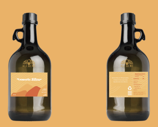
Adding a second bottle
Because I didn’t have time to add a second design, I decided to add a smaller 300ml range to my drink.

0 notes
Text
Print Trial
After I had made changes on my label, I decided to print it out to see what it would look like. The first label is my first print out. All the text and icons were too small and you couldn't read it. I altered it slightly and printed out, the second print out was also small.
For the third print out, I Changed the positioning of the recycling icon and text. By putting this in align of the text about the drink, I’m hoping users will read the recycle information. I changed the size of the barcode and text. Now it is far easier to read.
0 notes
Text
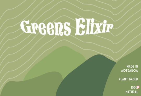
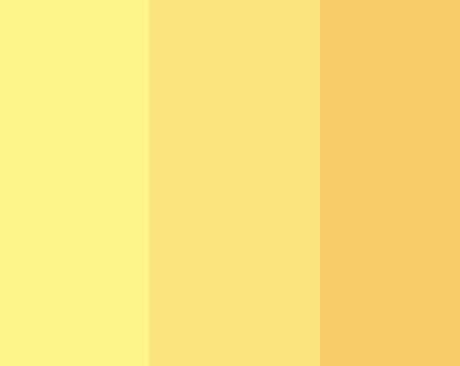
Green exploration
I really wanted to incorporate another colour palette for my final designs, I tried green colour. If I had more time for this project I would have made a different illustration to go with the green colour.
0 notes
Text
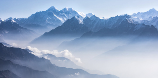
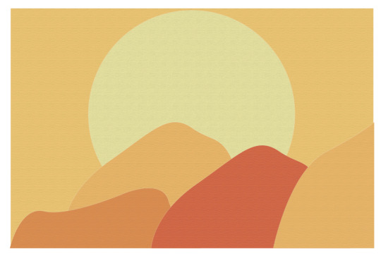
Mountain research
From the start of this project, I was pretty set on incorporating mountains into my design. I had a look at a different mountain designs. I roughly incorporated these designs in my final logo.

0 notes


Text
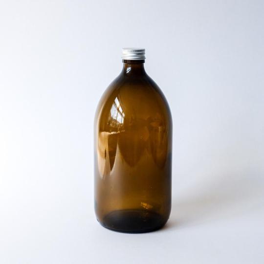
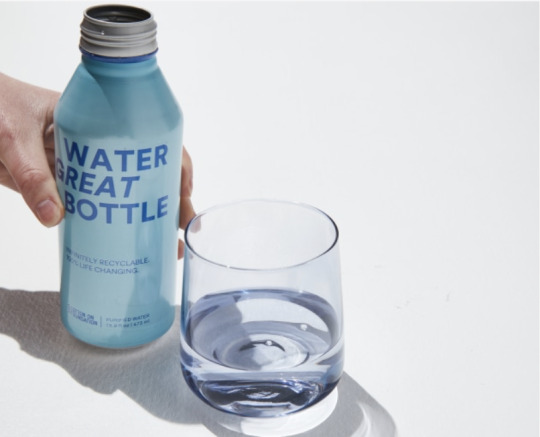
Exploring Glass Packaging
I really like the look of Amber glass and I think it would complement my packaging colours well. Because the particular aluminium bottle is hard to source I’m looking into glass packaging.
Amber glass is easy to find as a one off purchase, I went to Taste Nature and had a look an a bunch of different packaging options. They did sell aliminum bottles but were to small for my drink. I found a 700ml amber glass bottle similar to the bottle below. The only problem is it has a plastic cap. As you can see on the third glass image it has a metal cap which I would have preferred.


0 notes
Text
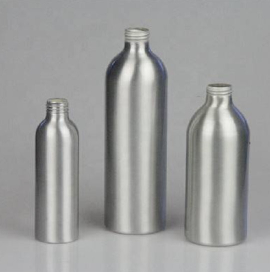
Exploring Aluminium Packaging
A few weeks ago I bought one of these drinks bottles, completely made of aluminium with no plastic.
Aluminium is light and can be recycled indefinitely.
I struggled to find other drink products that aren’t a typical coke can.
I found a few different online options that would work with my packaging, but the ordering time was about 4 weeks.
If we had more time for the project, I would have ordered however I’ve started looking into glass bottles.

0 notes
Text
Incorporating Textures
I wasn’t too familiar with the textures tool on Illustrator. I had played around with a few of my packaging mock ups.
I chose not to use these and am glad I didn’t because the printed bottle sticker came out with a similar grain. I would have loved to add real texture on to the logo. Something for next time.


0 notes
Text
Exploring Typography


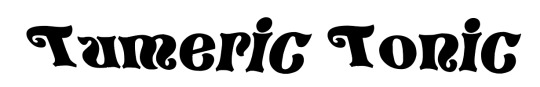
I really wanted to add fun and bold typography for my design. I explored a couple of different fonts and played around with the warping tool. For my final I ended up going ahead with the second Tumeric Tonic. But changing it to elixir
0 notes
Text
Playing on Illustrator
This is one of the first prototypes I worked on. I really like the simplicity but I wanted to add some textures and hopefully have textures on my final packaging.
0 notes
Text
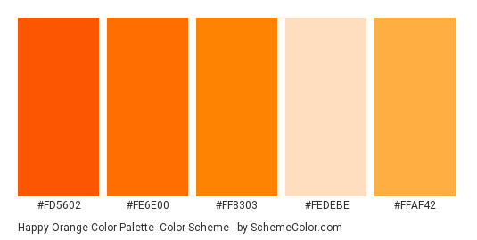
Why Orange
I choice the colour orange because the main ingredient in my drink is Tumeric. I explored multiple colour pallets and used these three for my design.

0 notes