
dashawfrostart
Dasha W. Frost's Little Art Blog
Hello, and welcome to my blog dedicated to drawings, art styles and everything related (and maybe sometimes beyond)! I acquired all my skills through hours of dedicated practice and observation. And I also have my signature art style with cute ears, ugly dragons and crazy faces that I treasure very much 🤓. Here you will find my thoughts, WIPs, important updates on projects, and of course, loads of artworks! 😁🎨🦆 I post whenever I'm in the mood.Also, in my spare time I like to make nuthatch and fox noises.
35 posts
Don't wanna be here? Send us removal request.
Last Seen Blogs
meriimayhem
Merii’sMeyhem

berteena
Berteena

rockford-rp
an oc rp

moodluksarkilar
Şarkılar en güzel hatıralardır'

elect2care
Elect2Care
Text
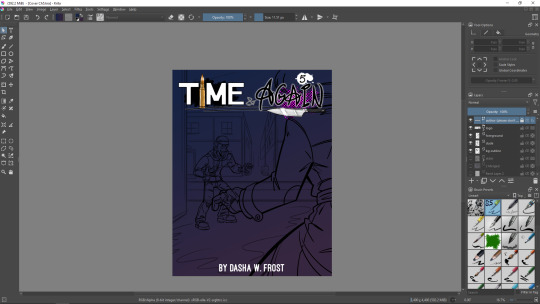
"Time & Again" Chapter 5 Has Been Finally Released!!! 🥳

Yes, yes, yeeeeees!!!! It’s finally here! Chapter 5 of my graphic narrative “Time & Again” is released today!!! Only after a few months of development, through ups and downs, through problems and solutions, and with various personal things happening on the background – I’m ready to announce it’s here! Time to celebrate! :D
Read it on GlobalComix: https://globalcomix.com/c/time-again/chapters/en/6/1
Get a high-quality PDF copy from my Itch page: https://dashawfrost.itch.io/time-and-again-chapter-5
That was quite a journey for me! This chapter is significantly darker than the previous ones released so far! Let me make a fair note: a totally different, quite grim arc of the story begins from now on.
Only 3 more chapters left.
Thank you everybody who read, liked, supported, and reviewed “Time & Again”! This means truly a lot to me! I really want to know what you guys think!
Your opinions matter! Remember to use tags #TimeAndAgainbyDWF and #LotharAndJeanny when posting stuff about “Time & Again” anywhere in social.
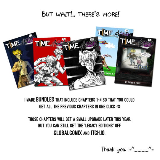
I made the discounted bundles that contain “legacy editions” of Chapters 1-4 of “Time & Again” on both GlobalComix and Itch.
Why? Now, that is indeed a good question!
I've already explained my intentions on the release of the upgraded "Clean Cut Edition" in this post, therefore I'd like to encourage people to get the legacy editions in case if they want comparisons or if they are archivists. 😁👍
TL;DR (because Frosty cannot for the love of it write short posts): Because the upgraded edition of the previous chapters is underway. The upgraded version is called “Clean Cut Edition” (and freshly released Chapter 5 is already a part of that quality upgrade), and the major difference between the two editions will be the newly added “Notes, Commentary & Hints” section. Also, the shameful typos that slipped my attention will be all cleaned up, and some visual improvements will be made, as well. Therefore the currently available Chapters 1-4 will be soon outdated and therefore will be replaced by the “Clean Cut” versions everywhere.
So if you’re curious to see the “less clean and typo-ridden” legacy editions – the bundles are for you! They also allow you to easily show some appreciation and support to the artist, and that is very valuable, too! That will keep me motivated to work on the future chapters AND it will support the development of “Clean Cut Editions”.
Get ‘em here: https://itch.io/s/122573/time-again-chapters-1-4-legacy-editions-bundle
And here: https://globalcomix.com/a/dasha-w-frost/bundles/d1688c7c-b48a-4edf-957d-98fa658b3b81
The bundles are available until the end of May 2024.
Yup... Time (and again) to celebrate!!! 🥳🍺🥂
0 notes
Text

Time for the fourth and the last teaser for the upcoming Chapter 5 of “Time & Again”!
The fans of good old memes will surely recognize this one without further commentary 😉 And for the rest of you, I will provide a quick explanation - and also a bit of a backstory for the curious minds.
This meme-like teaser is based off "Ancient Aliens" meme (NOT to be confused with the Doom mod of the same name). However, I have learnt about that particular meme thanks to the Dark Souls variation made by UsagiLovex from DeviantArt; gladly, that artwork is still available here. Needless to say... That Lautrec of Carim version of the meme made a great impact on my crazy imagination. I believe, those of you who are familiar with Lautrec and Dark Souls will have more fun and perhaps a clearer understanding of the meaning of the teaser I made.
That said though, I believe you will understand it best once Chapter 5 is finally released 😉... Just wait up a bit. It's almost here, I promise 😁 See you very soon!
~~~
The previous teasers can be found here: TEASER 1, TEASER 2, and TEASER 3.
0 notes
Text
This *Past* Week In "Time & Again" #16: Preps For Something Big (And Unknown)
In regard to "Time & Again", the last week was... rather odd.
One might possibly say it was somewhat uneventful, but that's not really true. In fact, it was SO EVENTFUL that I'm a little agitated right now. Or maybe "agitated" is not the right word. The writer/editor in me, sadly and to my shame, is failing to put it properly into words now to make it descriptive enough.
The most important thing is that little stuff here and there in Chapter 5 has been improved, altered (where needed) and fixed. So now it looks even better.
For example, I recoloured a whole set of speech bubbles in Inkscape to make certain that the readers understand it easier to whom the certain lines belong to.
As I worked on that particular improvement, I learnt a new trick yet again. I really like it how the newer interface in the latest versions of Inkscape works comparing to, say, that from the version 0.92 that I used when I only started to learn vector software. It makes everything much easier and allows to swap certain things in a matter of a few clicks (but also including a few minutes of swearing because I didn't realize that I was hitting the wrong buttons to begin with - that's how it sometimes goes for me 😅… but dis ok, everybody is learning, right?!). That goes for swapping gradients on the go, as well. I learnt that one can just import another SVG file that had extra gradients into another one to make extra pre-made gradients available in the list for an easy colour swap - and I needed that because I had to use the exact same colours for certain speech bubbles. I could've used a colour picker, of course, to take the colours from an already complete page... but I'd say swapping the gradient colours from a dropdown list is easier and hassle-free. I like that.

(those two pictures above are the examples of what I did, taken from one page: those are the straight exports of the speech bubbles from Inkscape. To the left, that's an old version, and to the right that's an updated new version as it is going to appear in the final release)
I also checked all the text again to make sure that I never missed anything that needed to be italicized (further reading on how I improved my font and created an italic version of it is in my previous post). Fonts are important in my story. Whenever something is highlighted in the text, be it through the formatting or via additional decorative effects - that MEANS certain something. The change of the font itself is also significant. Little details like that make me happy, and I love to see how meticulous the other artists can be when it comes to the little details like that. In my opinion, in art every little detail has a certain meaning, has an impact on the story and/or how it's perceived by the readers. So, in short, everything is important. It might be a hint of sorts, after all.
I even mused ahead, and not only I took extra notes on important monologues/dialogues for Chapter 6 that I'll start working on later this year (approximately in summer), but I also brainstormed the whole idea of "Time & Again" all over and came up with the certain concepts for the very distant story elements, even in regard to Chapter 8. I got ways to go, but it's never wrong to fantasize and refine what you've already had in your mind for the future 😉.
I am patiently waiting, enjoying my nice cup of Earl Grey tea in my apartment on this snowstormy day (yep, we are suddenly snow buried), as my editor gives the chapter a second read for further refinement. I'm very content about how it's going.
And I'm slowly setting up a page for Chapter 5 on my Itch.io - I'm gradually, resolutely getting there.
That's practically all I've done for the story itself within the last 7 days or so.
Majority of my incredible effort lately has been put into something else though.
And here's some important news: I've been trying to prepare for the two grand adventures that potentially await me in May. But - funny how it often happens this way in life, innit? - realistically speaking, only one of these adventures is going to take place in my life, for they are mutually exclusive. There is simply no way to combine them. It's either/or - no options in between. Therefore, knowing in advance that I put double the effort, only half of which will potentially pay off, it makes my life right now pretty fun, no doubt about it.
But this is something that absolutely has to be done.
One of those endeavours is artistic - and another one has a great life importance to me.
The artistic one though requires A LOT of preparation and a certain financial investment, too. Unfortunately, where it all stands right now, due to the time limitations, I am terribly restricted in my options. This is why I'm virtually trying to do a tribal dance with a tambourine in my right hand, twirling around the dining table, singing incomprehensible impromptu songs in all the languages I remotely speak in (hopefully not futile) attempts to draw a certain positive outcome closer to me. And trust me on that: this is not an easy task. I foresee myself looking like a sun-dried prune once the hassle is over.
You know, in videogames, I view RNG as some kind of a nuisance. It might be nice at times, but, being a fan of games where I have full control over everything I do, I cannot appreciate RNG very much. I like to be responsible about my own actions, and I want to know when I screw up or succeed, so that I could make adjustments to my actions accordingly. All this "RNG a.k.a. gambling, bro!" makes me cringe. In cases like that, I always feel like AI just hates me, LOL. Never have I been very lucky in small life events either... well, except for that one time, or maybe two at best. Well, if interpreting having blue jays at my balcony feeder as "a lucky event", then I'd say three. Yup.
Closer to May, aside from Chapter 5 release, hopefully! - I will make an announcement about if I rolled 20 for realsies and what The Real Life RNG is gonna present me - because the choice between the two possible routes does not depend on me. So we'll have to go from that.
It's also fair to mention one of these routes potentially leads to me going radio silent (blog silent?.. internet silent?..) for a month. Which means no updates on the state of "Time & Again" for a while.
But enough of babbling for now, otherwise I turn into Edgar - who babbles all the time (according to Lothar anyway).
That was another one not-really-to-the-point post. I had plenty of those many years ago 😁
See you soon! 👋
0 notes
Text
These Two Weeks In “Time & Again” #15: IT'S FINALLY DONE 😱 And The Logo, And The Font
I almost kinda can't believe this, but just a couple days ago, it finally happened:
I FINISHED CHAPTER 5 and shipped it to my editor-in-chef.
Wooooo-Whoooooooooo!!!!!! 🥳🥳🥳 I am so happy! It's really hard to emotionally understand that the work is finally done. That was quite an undertaking.
... Overdue by approximately 3 months. But that was just a silly time limit I set to myself before I even started working on it. Different life situations got in the way of me finishing it up faster, but, all in all, since I am fairly satisfied with the result, I don't think any complaints are justified. I am indeed happy.
Now I am in the state of mental emptiness.
Joking. Not really. I suppose, until my editor gets back to me with a handful of suggestions, I will simply keep drawing and I will try to finish up all the last preparations before I could justify the public release. Gotta make everything look nice and sparkly clean after all 😁
I also slowly, little by little, write materials for a bonus book that currently has a vague title "Time & Again: Collector's Edition". I believe I never revealed that plan just yet, but that's been something I've been working on on and off since the last year, I think. Or maybe even since 2022. Hopefully it's gonna be interesting to all the "Time & Again" obsessed fans in the future someday, because it will contain more WIPs and sketches. As for myself, it's just fun to use it as a sophisticated diary for how the work went.
Speaking of different editions...
Earlier in this post I've mentioned my plan to release the updated versions of the previously released Chapters 1 to 4. So, the prospects of that updated release are also getting brighter and brighter; from ghostly, ephemeral concept it is actually gradually fleshing into something real, almost day by day now. And this is very good.
And here's the grand reveal for you: this is what the refreshed logo for of the updated edition gonna look like:
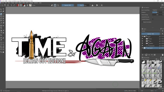
In fact, Chapter 5 will already have this very logo, for it's gonna be the first Chapter to be ever released that came with "Notes & Commentary" section right away. And the presence/necessity of that very section is the main reason why I am updating everything in the first place.
So, when will "Time & Again: Clean Cut Edition" of the previous chapters be released?
- unfortunately, that I have yet to decide on. Cannot tell right now, but one thing that stands for certain is that it will be released only after Chapter 5 goes public. My current priority right now is the release of Chapter 5, proper and nice.
Since today's blog post already contains a fairly big and happy announcement, this might be enough of the news for now. What could possibly be as important as the fact that I finally finished up the supermassive amount of work, literally a new chapter in Lothar's story?! Probably not much!..
Well, almost.
For the last topic to cover today, I wanted to tell something else important and interesting that most people will probably not understand due to excess amount of specific terms 😅 But it matters a lot to me, so here goes.
Not long before all the work on Chapter 5 was 100% done, I finally got to look at the main font that I use in my graphic novel (Frosty's Comic Font), for it needed some perfection: I remembered that it was not displaying correctly in some cases, or rather, selected set of the symbols didn't look right, depending.
... I must admit, I am a huge fan of typefaces. I used to collect fonts for personal use back in the day, for I loved to experiment with different designs, and usually I needed them for my custom "one of a kind" greeting cards I used to make for my friends' birthdays. Good memories.
A few years back I started to learn how to make my own True Type fonts - and I bet you have already seen at least a couple of those fonts on my artworks, logos, signatures and, of course, in "Time & Again". Some of those fonts are still partially incomplete and/or unpolished and, thus, currently unused by me - until the moment in the future when I will finally have more time to fiddle with 'em, for working on fonts is not too difficult, but not particularly easy either. In this case, I mean "it's time consuming", for the process of actually drawing a font, designing letters and symbols to me is easy-peasy-lemon-squeezy. But vectorizing, perfecting the kerning in between certain pairs of letters, making sure that nothing is sticking out too much comparing to the rest... That is a bit tedious. In the end of the day however, it pays off tenfold, for you have a pretty, absolutely nice font that can be used virtually anywhere, in any software, for any purpose.
I've never designed any monospace font yet... But aye, I'm being a little too nerdy again. Back on track, Frosty.
I never post my fonts anywhere to download, paid of free; I use my font solely by myself for now. And "Time & Again" was the reason why I urgently needed a new nice font with a fair touch of "me" in it... I wanted to make "Time & Again" my own as much as possible. So it was only obvious that I needed to design my own typeface for this crazy project.
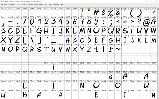
In 2021, I made the first relatively complete version of Frosty's Comic Font to use in "Time & Again" as the main font for the characters' speech. It contained all the basic English language glyphs and extra symbols for German language.
Alas, not everything was smooth, and in Inkscape, when I used to copy-paste the lines of text on the speech bubbles, the formatting of little symbols such as apostrophe and quotation marks went down the drain, and was exchanged with the default system font (or whatever Inkscape uses when a glyph is missing).
Unfortunately, that error stretched out in time (and space) up until a few days ago. I only was able to figure it out last week.
By the time I managed to figure it out, the version of the font reached 1.3, and the last update also contained glyphs for Spanish language.
It turned out, I did not include glyphs for all the possible variations of apostrophes and quotation marks. So I got that fixed. And now everything works like a charm. I am very proud 🙃
But the actual reason why I needed to return to designing fonts was different: I was tired of not being able to force italicize my font in Inkscape. While Krita allows for a default italic offset for a font that does not come with a premade italic version of itself, Inkscape does not do that. My manner of work is such, that I work with fonts on the pages of my graphic novel in Inkscape, for it's easier to me. But I like to sometimes accentuate certain words in the speech of the characters with italics, usually to make the readers pay extra attention to those particular words. I did not want to fiddle with workarounds (and in fact I know of no such things for my particular issue) in Inkscape, trying to combine multiple text boxes with different manual skew on the same line or whatnot, so I finally decided to make Frosty's Comic Font Italic.
I generate all my fonts in FontForge. Here's what the window looks like:
I couldn't even imagine that generating an italic version out of a regular font could be done in just a couple of clicks in FontForge! 😱 So simple!
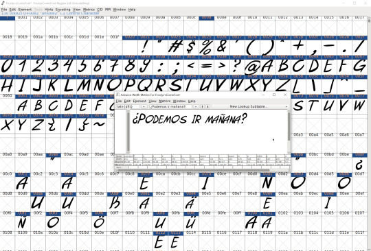
Once it was skewed, I tried to input an example text just to test it out and see what it looks like. When I'm test driving my fonts, I like to write something that uses extra symbols, such as something in German or in Spanish, because all those extra fancy letters make me happy. And once I was satisfied with it, I saved the final version (v1.4) and started using it!
Here's the clear side by side comparison of what the regular version looked like versus the new italicized one:
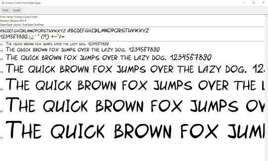
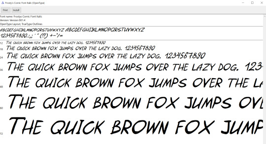
I think it turned out rather nicely.
And now in Inkscape I can finally use different formatting of my own very font within one text box, as illustrated through a quotation from a song by U2 (these guys are my current obsession - just as in ol' good times when I was 11 🤣) on the screenshot below:
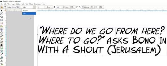
Magic!!!!!)))))
That's probably all for now.
... Okay, okay! You probably want more teasers/spoilers from the finished product, right? Here's a little funny snippet for you:
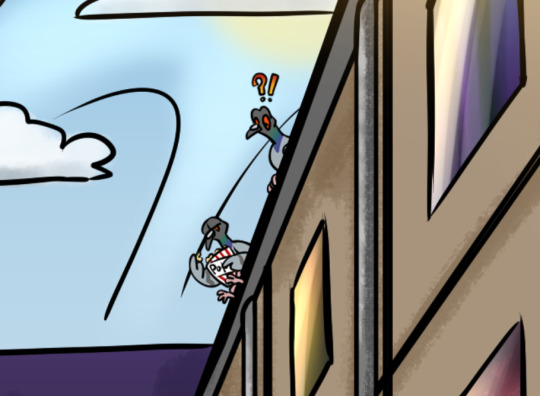
Because any urban landscape always requires fat rock pigeons staring at stuff. Some of them might even watch something while munching on popmeat popcorn.
That's all for today's great news! See you soon! 👋😎 There's more to come.
0 notes
Text
Time for Teaser #3 for the upcoming Chapter 5 of "Time & Again"!
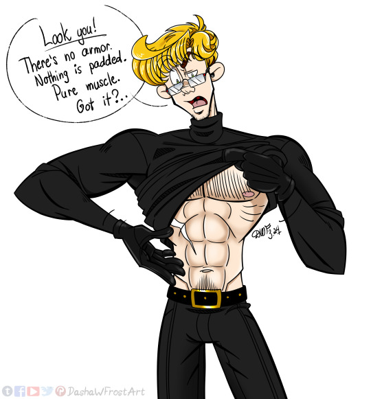
This one was born from a conversation I held with my artist friend earlier last year, when I showed her some sketches for Chapter 5. She was so impressed by Lothar's quite masculinely shapely abs visible through his tight turtleneck shirt, she couldn't hold back from commenting on that. We started to wonder if that was actually armour of sorts and if the shirt is padded or has any kind of protective upgrades... which would've been suitable for Lothar, knowing he has a particularly dangerous job.
But really - there's nothing but chiseled muscles.
And this picture proves that ;)
~~~
The previous teasers can be found here: TEASER 1 and TEASER 2.
0 notes
Text
These Two Weeks In "Time & Again" #14: My Feelings For Facebook Are Still Surprisingly Mutual... And I'm Getting There!
A big announcement! The artist contracted a wee bit cold 🤧
This is sad, for it broke my impressive "I never get sick!" streak that lasted for, like, 7 years or so. I guess I'm not gonna get that notorious achievement anymore.
And fine, see if I care! I don't like achievements anyway (which is, perhaps, pretty clearly stated in Chapter 3 😁)
But don't get me wrong: under any circumstances pathetic excuses such as "having a cold or something alike" most certainly do not set me free from working on "Time & Again" 😤 They might hinder my progress, which is truly unfortunate, since the work is almost done - but that will not stop me, by any means. *for some reason, I really wanna put that weird "shake fish" smiley from DeviantArt in here*
Trying to prettify and overhaul, completely or partially, the social pages for the upcoming release of Chapter 5 is not easy at all... A long time ago - and that means well over a month ago - I submitted a name change request for my art page on Facebook, to better reflect the current obsession priority and certain ethics of the author in this great adventure. I was told that it might take up to 3 days for the changes to take effect, if approved.
But it's been already that long, and there's still no change, nor can I submit a new name change request. I mean, I absolutely don't mind "Art by Dasha W. Frost" as a page title, but, honestly, "Official Time & Again Graphic Narrative Page" would simply be better right now, while I'm still working on this "genre abomination experiment of a graphic novel". That's a little bit sad to me.
So this is where that post title comes from. Facebook seems to really dislike me - but you know what?! My feeling towards it is truly mutual 🤣
Somehow, I believe, constant dissatisfaction with the social netwroks has always been one of the most prominent topics I wrote on back in the day, when I used to have a secret blog on Wordpress. However, it's getting a tad too old for me (not the blog, but the topic; the blog is long gone), so I don't want to keep up with the "tradition" and I'll just move on without it.
... also, how I accidentally misspelled "networks" in the second last sentence really makes me think of yet another one Ultravox song. So, once I realized I typo'd, I just decided to leave it as is, for the sake of fun association. (I sure somehow became a big fan of this band over the course of, like, 5 months 😅)
But on a more positive note!!! I finished up all the teasers for Chapter 5 that I had in mind (and one of them you've already seen in the previous post 😁), and that's one of the biggest and the most important things I've done for "Time & Again" within the last two weeks. W00t and doot!!!
You know what else happened?.. I finished up all the new inner covers (also known as Vorsatz und Nachsatz in book printing ☝) and the main cover for Chapter 5! And I really like the results 😁
(some snippets of the progress go below)

I guess you will see the finished product soon enough 😁
And yet again, I want to praise Krita's Assistant Tool: I used Vanishing Point assistant to draw a better urban perspective for the cover art. I think it turned out pretty good and significantly less crooked. Haha)))
I also finished up the author's letter that will be included into the chapter as a bonus material. I started writing it long ago, gradually adding more and more to it as the time went by. This is not what I usually do, for, at times, writing in segments might quickly become a disaster for me. Even writing future snippets/drafts of the blog posts in here often represents a sort of challenge to me - although I clearly seem to magically succeed somehow. (yay? 🥳 I guess?..)
But nevertheless, this is what happened to the author's letter/afterword for Chapter 5. And it turned out good... but big 😅 However, after an attempt to figure out how to make it shorter... I simply decided to keep it as is. Because WHATEVER! You can read the whole thing if you want. It's moderately entertaining after all 😁 Or you can skips some parts in it. Or you can skip the whole thing (because you probably came here for the artworks anyway, right?..). I don't care. I just did what I thought would be good and what makes sense to me, as an author. That's all, deal with it! 😎 The readers are not obligated to like everything 😁
Also, the author's letter/afterword turned out very sincere.
... Heh, as if I can ever be insincere? That's ridiculous.
"Then, what's left now?", you ask me.
Good question. Indubitably.
The right answer is: not much. Not much at all. Just one more session of proofreading (damn, I hate hate hate discovering typos already after I posted stuff! 😫), and tiny touch-ups here and there, and assembling the last bonus pages from the materials I have on hand.
And I also need to write a short dialogue for a certain background. An ugly dialogue, I must admit. But I'll rickroll my sleeves up (for realsies), and I'll do it. Preferably in one sitting. Perhaps even today. 💪
And shortly after that I'll finally initiate the last stage of work: I'll recut it into a webcomic. And I'll finish up drawing all the extra designs that I need for the itch.io release.
I ask myself this question more and more frequently lately: how did Lothar even end up as a protagonist after all?.. That's quite a turn of events. Originally created in late 2014 - mid-2015 as a side character/antagonist for a story about catpeople that I never happened to finish writing (and not only that, but apparently, I never even posted any substantial artwork of the catpeople Freia and Fjolvarr together, so I cannot show almost any proof... sadness), Lothar has sure come a long way. He's been through a lot - thanks to me. I never really asked his permission; I mostly just did whatever pleased me as a writer/artist. And now... we can see him as a main character in an effing blooooody graphic novel - a format that I haven't even been familiar with up until a few years ago! That is quite a change!!! And what the peck even happened to me as a content creator? I think I possibly lost my mind.
But again... Lothar has sure been through a lot in the last few earthly years.
And my first comedic one-shot is probably gonna be about that.
But I think that's enough talking for today. The important piece of a dialogue won't be finished today if I keep talking. See you next time!
0 notes
Text
It's time, IT'S TIME, everybody! Here's Teaser #2 for the upcoming Chapter 5 of “Time & Again”! A little bit of craze is very fitting for what's about to come soon 😁
~~~
The first teaser can be found HERE.
0 notes
Text
So I Completed The GOG Survey, And It Made Me Thoughtful... (a.k.a. Artist's Rant)
... And everybody knows that I become scary when I'm thoughtful, because hello yet another one wall of text 😎 But if you're here, it means you love 'em. Otherwise you would've never come over.
Perhaps, I've already mentioned that before somewhere around here, or maybe not (Frosty does not remember absolutely every single post she writes), that the primary purpose of playing videogames for me is to draw inspirations for my own creative stuffs. I really wish I could signify that in the survey, but alas, I did not have an opportunity to do so, for there was no extra "other" field to fill out. This way, the absolutely biggest factor that drives me to play videogames had to be left out from the survey. And this is very sad, because I would really love to share that.
This is not a secret to anyone that I'm very much into the development of my graphic novel right now, to the point that I sacrifice some other activities or aspects of other creative works I really enjoyed earlier (for example, as the pinned message says, I virtually stopped working on greeting cards designs, and I hardly ever do totally random artworks anymore - all for the sake of fetching out a bit more time for myself to further invest into "Time & Again", for that is my priority... and... I stopped assembling papercraft models in my leisure time as well). I have my ups and downs working on "Time & Again", too, so it does not always go smooth as I expected. Sometimes my creative spark needs a push - a thoughtful or an emotional one, or a little of both. That's especially when the videogames come into play for me. Depending on my choice of a game to play, what kind of inspiration I'm seeking, it might be incredibly impactful - sometimes even empowering! I most certainly see videogames as a form of art, there's no denial. An interactive form of art that is - and I treasure that way more than movies that usually require zero involvement from the viewer when it comes down to the story itself. (but overall, my superhuman-proportioned cringe towards movies is a whole another topic, so we'll keep that outside this post for now)
I've been playing videogames since childhood - back in the day I used to have a NES/Famicom console, but soon I became a PC gamer. I truly believe that was one of the factors that contributed to my creativity and endless curiosity in visual arts, and perhaps also something that turned me into a thinking person. And by the way, I learnt a lot of interesting stuff about the world through playing videogames, heheheh!
While, perhaps, being purely a form of entertainment to some people (and I don't deny that by any means), I think over the years, with the development in the industry, video games have evolved into something more nowadays, something that can be taken more serious. Art always contains a certain message. Videogames do contain artistic messages, too.
Since my priorities have been shifting ever since I started working on "Time & Again", I often think about all of that. My paradigm has cracked and now rearranges itself in a most peculiar way. In fact, I perceive videogames as a form of art more than anything else now. Because this is what it is to me. And I draw inspirations for my own projects from the other people's art. It's really that simple.
Art is an experience. I want to experience art - including videogames, for this is one of my favourite forms of art - to feed myself emotion to process and thought to ponder on, that could potentially lead me to the expansion of my own artistic horizons.
I think this is truly magical. People's creations inspiring other people's creations is quite possibly worth living for. This way we share our experiences and pass them on to the others.
I'd say this is very precious.
I could talk about this stuff for hours and hours, but I will stop here, for there's something else.
There is another one interesting point that I wanted to reflect on after completing the survey, and during the last couple years - and the last year especially - it has become fairly important to me.
I am incredibly disappointed with the fact that buying a PDF artbook for a game without owning the game itself is not even an option on any of the videogame stores. That is frustrating, and honestly - it doesn't make any sense.
The reason is that the artbooks are usually distributed as DLCs for the games. Logically, DLCs DO indeed require the base game, for the additional content usually is something that you can use within the game, such as an extra level, or a skin, or a weapon, etc. But artbooks are neither of those. Most of the artbooks are just separate PDF documents you can read on your desktop computer or a mobile device... and they most certainly do NOT require a base game to be owned. (the only exception to that I've seen so far was the artbook for Atomic Heart that was actually incorporated onto the game and was accessible through the in-game menu. That is, I must admit, an excellent way to prevent people from just "redistributing" (e.g. just a sophisticated word for STEALING, cough cough) the PDFs illegally in the internet - and oh boy, let me tell you, people really love doing that!😅)
So why not make them purchasable separately, in case if the user wants to support the artist, but does not necessarily want to play the game (for whatever reason they have - it doesn't matter)? 😁 I was fairly disappointed when I discovered on GOG that I could not buy a Yooka-Laylee comic (that was discounted at the time, and I've been specifically waiting for it be get discounted for a long time) because I didn't have the game on my account on GOG... sadly, I actually do own the game - but on Epic only. I usually prefer to support GOG with the idea of DRM-free content, but that time it just didn't work out for me. So I ended up buying it from Epic anyway.
But that's for the game I actually owned.
There are plenty of other games that I don't think I will be able to play for different reasons, so I don't wanna buy them - but I sure DO wanna buy the artbooks, to support the artists (and developers, too). But I can't. Because I have to own the game first. The game that I might never play anyway. 🤷♀️
Working on my graphic novel sure changed my understanding of the value of art a lot, and also my views on what's important and how my works impact the others, including the fellow artists.
Starting last year, I found out that the presence - or absence - of an artbook as a bonus content was one of the main deciding factors for me if I really wanted to buy a game or not. Majority of my last videogame purchases had artbooks included, usually with deluxe editions. It means a lot to me as an artist - aside from simply appreciating the art in those artbooks itself - because I relate quite well and I understand the amount of time and work put into the game development AND development of all the visual materials for the games, breathing life into something that your mind have created and materializing it through the means of pen and paper and/or digitally. And let me tell you: it's not easy at all.
One might say that I'm going a bit too hardcore on this whole topic, turning it into some great issue of sorts, etc. But it is what it is. This is what's important to me, and I want to uphold the values.
A shellfish request of mine: I would've really appreciated the videogame services to allow me to search specifically for the games with artbooks as DLCs 😁 And THEN allow me to buy the PDF artboooks separately, pls 😤 That would make me very happy.
I suppose, that would be enough for today's random post on the topics that are very important to me. So I bid you farewell for now and go back to working on my story about crazy Lothar. 🙌
0 notes
Text
This Week In "Time & Again" #13: Lucky Thirteenth Post! And... whatever, i'm lazy 😅
62 layers
is the number of layers that the most complex page currently has in Chapter 5. And mind you, that actually might not be the final number, for some "layer work" might require slight reorganization. All for the sake of ease of turning all this into a webcomic, which is, as you already know it from this incredibly old post, an objective for the near future.
Hitting an important and a peculiar stage of work right now, my mind keeps going back to questions of automation I mentioned earlier and... less earlier in regard of a somewhat different problem. Now I dream of a mass layer import algorithm for Inkscape - and PLEASE don't take me for a fool after doing your minute-long google research session on the matter! Yes, I know that mass layer import plugins for Inkscape do exist.
But alas, during my last year's exploration of the problem, after spending a whole day trying to find a good plugin like that, I came to a disappointing conclusion that absolutely none of them currently work.
But that would probably be a story for another day. In fact, I already have a post draft prepared, for this particular occasion 😁
Anyways,
at this point of time, Chapter 5 is at the stage of "post-production and finalization".
This is truly amazing, and I must admit, overall, I am very happy with the end result.
Even though the road was not paved with nice and smooth stones, but it appeared to be sorta bumpy and crooked (or maybe it's just my perception).
Even though it took me significantly more time to make it this far with it than I originally estimated - but often that never goes smooth either.
Now, my main objective is to complete the cover arts and all the bonus materials that must be included. That would be my goal for the next few weeks ahead. Thus, very little is left to do - but this little stuff is pretty important for a conceptual, through-and-through synergistic endeavour such as "Time & Again".
I also intend to make a few teasers for Chapter 5. At least 3, I think. I intend to... but we'll see if it actually happens, because the release is nigh(ish), but I still didn't invest my time into those small teasers. They are supposed to be pretty entertaining though. So, alongside with everything else that needs to be done, I'll try to manage.
As already has been indicated in the previous post, working on Chapter 5 sure improved my drawing skill in Krita - or rather, I found ways to do everything faster, more efficient time-wise. Which is very precious.
Aside from the incredibly useful Filter Layer function that I discovered recently, one of my favourite "tricks with layers" in Krita is Erase blending mode that I was finally able to make a good use of 😅. I like to correct certain parts of the backgrounds with it, at times isolated from the other layers in a group, to avoid permanent destruction of the background in case if I want to revert back to its original version without regret or having to redo everything from scratch again. In other words, instead of using Eraser tool to destroy something forever and ever, I use a "fake erase" layer that can be turned off any time, need be. Sweet!
Another one nifty layer trick I found long ago - but never used it previously in my graphic novel - is the usage of Destination In blending mode (that, for some reason, isn't even mentioned in the documentation, so I cannot provide a link 🧐). Technically, it's absolutely not necessary to use that trick, and some might even say it's counterproductive. But! - I personally like to use it in special cases when creating a background that consists of a smooth gradient that might be a challenge to fix once done. Because how many times have you tried to correct a shape that has been filled with a nice gradient to make it look like a certain spot on it was not just artificially attached?.. I remember myself from back in the day, in my photoshoppin' years, going through the pains of using Clone Stamp to try and recreate the smooth change of colour on the spots that have been added later, just to make it look like it all was made in one sitting, right off the bat. Oh boy, that brings... painful memories.
So, Destination In blending mode resolves the aforementioned issue for me completely.
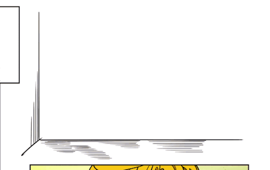
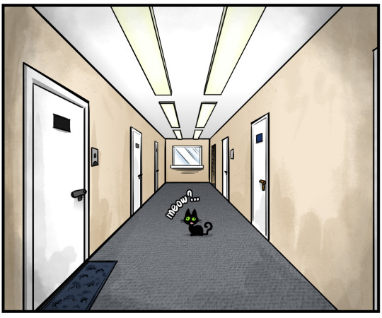
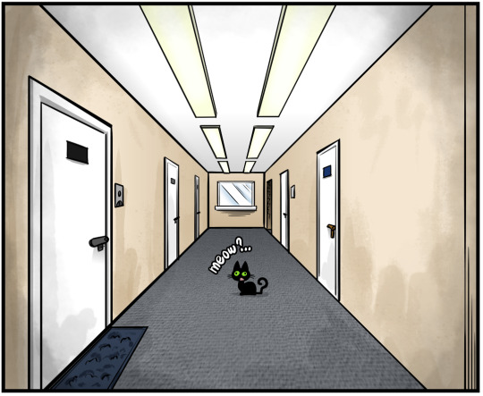
But alas, if it turns out I did screw up something that requires a smooth colour change - in certain other cases, primarily when correcting shapes of the foreground objects/people - I resort to the magic effects of blurring/smudging tools. Like recently I had to remove the door on the picture of a corridor and turn it into a wall corner. And can you tell it originally existed there, but has been removed afterwards? - not to sound like a stuck-up snob, but I really doubt it.
And that might sound weird, for Krita actually has a wonderful Smart Patch tool that functions pretty much identical to Photoshop's Clone Stamp I'm so used to. And you would think that that would be an ideal resolution to the problem I described just above.
But no: for some reason I simply like to repaint the section that requires a correction and then to blend the colours for a smooth transition instead. Why do I do that? That I cannot tell you.
Those are the mysterious ways of Frosty's artistic cognition.
Also, I finally returned to using character colour palettes.
When I worked on my other, much older random pieces featuring Jade, Alan and Stu under the codename "Trio", sometime between 2010 and 2016, I used to have a special file called "Trio colour palette" that looked like a colour swatch for each character. Kind of like an eyeshadow palette, but for a significantly more important purpose. 🎨😁
I had a file like that for "Time & Again", too, but at some point of time I simply stopped using it, for the reason completely unbeknownst to me (and The Past Me probably cannot explain that either). So I found it, opened it, and decided to use from now on it while working on the current chapter and the future ones.
Here's what it looks like right now (obviously, with potential spoiler notes artistically blackened with a marker brush 😁):
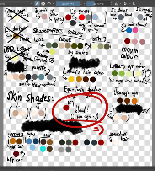
Yup, it's terribly messy, but I don't complain. I can navigate it with ease - and that's all that matters.
... And of course, lil old me cannot avoid a nice (and horrible) use of another videogame reference that is circled with red on the screenshot... Well, you know the drill. That's typical for me. And of course, I most certainly did not have to link back to the original, for it's very famous 😁 (dear goodness, that game definitely affected my sanity long ago... good times!).
You know what? That would probably be enough for today. I'm lazy and don't want to invest too much time and effort into writing about something that most people don't even understand anyway 🤣😅 Well at least not right now. So I wrap it up right this once and will ruminate more on some certain other topics in my next post. Cheerios!.. I mean, sorry. Cheers!
(wait, what? no! instead of Cheerios, shouldn't it be Chex then, for a Doom nerd such as myself?..)
0 notes
Text
This Week In "Time & Again" #12: It's Alive... Alive! Honest! And A Little Sour, And A Bit Sweet!
Guten Fhtagn! It's been... a while again.

(this is just a colourful teaser for you now, because it feels silly to make a post that starts with a wall of text - even though I personally love walls of text. Keep reading and you'll find out why those weird empty rectangles are here! And as I often do: there's an animated GIF in the end of the post!)
Lately, life has sucked me into a giant cycle of great and lush eventfulness. Kinda as if I hopped into a funnel and then swirled around a bit. I might even say it was fun (haha, fun funnel 😁 What, not funny?.. Lame?.. Aah, well then).
So, below goes a straightforward chronological report on what happened to "Time & Again" during this long looooong period of my blogging hiatus.
2 weeks ago I've actually spent only a few days working on "Time & Again" - much less than anticipated.
As I always say, life usually takes away so much time from art!.. 🤣 However, it's always a choice. Because I'm not drawing 24/7; never did, and perhaps never will - because otherwise I'll never go birding, among other things. And birding is love. Birding makes Frosty happy. I wanna see more nuthatches and northern flickers around me, preferably every day, when possible. Too much to ask? Yes! But life is always about setting priorities straight and meticulously balancing the things you love and want to do. Because something always goes first, and something other goes second (third, fourth, etc.). So that is what I'm trying my best to do here.
But that was only half of the problem. The other half of the problem was about my futile endeavour to relight the creative spark that was seemingly extinguished over the course of the previous 2 weeks - perhaps due to the reasons mentioned above in this post.
I'm always very hesitant to take breaks as I work on my projects, because it breaks immersion - and getting back into the mood again might pose a serious challenge.
That is exactly how some of my novels/stories failed to see the light of day in the past.
Now, since the work on Chapter 5 is nearing to its end - yes, it's almost done!!! - it's just very disappointing to slow down and having to look for the spilt marbles on the floor (however, Lothar, personally, will definitely benefit from at least TRYING to find his own marbles 🤦♀️ dear goodness, that man is indomitable). The work still went well, but without excitement I previously had. And I perpetually have serious problems trying to figure out a personal cure for the "lack of spark" issue: not even once in my entire life have I found a resolution that works wonders like a panacea for me in situations like that.
That said, with all of the distractions and not-exactly-creative events with myself in the epicentre, I managed to keep my word and created a Krita forum thread featuring majority of WIP screenshots from Chapter 5, which you can view following that link. Now, my only objective in this regard is to keep updating it 😁 (what I'm kinda failing at recently)
While not being exactly productive with "Time & Again" - that is only up until this week (read ahead) - in the meantime I have reconsidered a couple things that are related to the artistic part of my existence.
One of the decisions was to take down the links to my DeviantArt account sometime after this post goes life. The reasoning behind that decision is as simple as an egg: because I don't post anything on DeviantArt anymore. And I keep forgetting to do it anyway. And I keep forgetting simply because it doesn't really matter.
In the recent years I perceived DeviantArt to be nothing but a sort of a personal sketch/art dump simply for the sake of gaining more exposure [not really - read an UPD note ahead]. Let's be honest here: DeviantArt is not a good place anymore. It used to be awesome in 2008-2010 or around - for me anyway. But nowadays... Not so much. I don't think I want to delete it yet, for I still want to pop up, perhaps, once or twice a year and dump all the new artworks in there for the future archival purposes - and in case if somebody might be still interested. But for now, I view my DA account as an almost completely dormant collection of trash masterpieces of yore. So I will stop promoting it for the reason of it being obsolete like the morning dew beneath your feet in its current state. (holy effing smokies, that song was very difficult to find to provide a link to! 😱)
[UPD 2024/03/12]: my aim with this was originally a bit off - which I realized only now. Aside from it being a random artworks dump, my decision to keep my DeviantArt account alive was precisely for linking back to it: meaning, I was thinking about uploading artworks on there in order to specifically use them in my posts and on the websites. So, yes, it is a relatively dormant collection, but also a convenient stash of art things to utilize elsewhere (thank you, id Software, for teaching me this word! 🤣). I'll see if that really works out in the future tho.
There's also something else that I don't to reveal just yet, and I'll keep it a secret for now 😉 I must try something before I jump to conclusions.
HOWEVER!.. This last week has changed the tides considerably, in my favour. Again, having only a very hypothetical and a rather unclear clue on why that happened - what, I must admit, mesmerizes and puzzles me to a great extent - that long-longed-for spark I thought I had lost along the way somehow magically returned back to me after I spent a few hours (and 2 days in total) of writing an arch-important "Notes & Commentary" section for the reissue of all the previous "Time & Again" chapters that is nigh (here, I teased ya. Now live with it 😎🤣). I really like "Time & Again". Even while it's still incomplete. Even if Lothar is just a stubborn a**. Even if a certain other character has quite funky fetishes. Even if Jeanny is perhaps dealing with her own little pinky demons. I really like "Time & Again", and I really enjoy its style, so revisiting the whole thing for the sake of writing additional materials for it quite possibly worked in a positive way on my spark.
I love you, my spark. Let's keep it this way for as long as we can from now on.
So now the work goes quite well, and I feel very good about it. There's still something troublesome that needs to be dealt with... but that'd be a painful tale for yet another post.
And, of course, I experimented with some Krita stuff again - for it seems, Chapter 5 really marks a period of great technical discoveries for me.
For example, finally, after all these years 😅🤣, I learnt and made a very good use of the toggle "All Layers" and "Current Layer" settings of Contiguous Selection Tool (that'd be your Magic Wand tool, ya Photoshoppers around - including my past self). That helped me to speed up flood fill of the certain areas.
Speaking of flood fill and all, I experimented more with the "smart fill" as well. In the previous post, I was dreaming about an advanced AI algorithm to automatically recognize and colour the characters according to a user-prepared colour pallete. I might be exaggerating a bit, but flood-filling flat colours on every page felt almost stupefying - and, in short, not fun. I've read a little about the potentials to automate the process in Krita and have discovered a few neat tricks that I might use to speed up the process of colouring of the next Chapter. But right now - that's a story for another day in the future.
And at last, let's talk about the backgrounds.
I find it that the backgrounds that are just, let's say, "placeholders" and don't contain the surroundings of the characters are sometimes challenging. And in Chapter 5, there's gonna be plenty of those - because oh boy do I love long conversations! (strong self-awareness and self-mockery go here) And most of these conversations don't even require detailed environments for the backgrounds! Because people are just friggin' talking! And their surroundings don't matter on those particular panels.
I've looked through quite a few graphic novels and comics at the local book store to get extra inspirations - but very often I see that the artists simply fill the panel with a solid colour. Completely flat.
I must admit, I'm deeply hesitant to do the same, because I like at least a little texture on storywise-insignificant solid colours. It gives... depth.
So this is what I've been doing so far (and yes, you guessed it now! the picture in the very beginning of this post is very relevant here!):
While the "flat solid colour" on the background just seems... too flat, I decided to utilize a gentle gradient as a base, and then to apply additional brush strokes on a separate layer with special blending mode in order to create the effect of imperfection and ever so slightly visible texture to it. After a few sessions of trial and error, and thinking about how it feels and if it matches the mood of the chapter, I ended up using a couple of watercolour and splatter brushes together, in black, and the layer blending mode that I figured worked best for me was Soft Light (SVG). As illustrated by the following GIF:
And LAST (but as usual: not the least, but I won't cover "the least" in this current post for now, for the post is already a fatso - typical, innit?!), I've learnt how to use Filter Layers for the quick colour correction on the go. And this might be extremely useful in a long run for the future chapters of "Time & Again".
I might cover this in one of my next posts.
That should be enough for now.
So let's summarize: I most certainly did NOT disappear because "Time & Again" ceased to exist, or because I've been abducted by aliens, or because I got carried away giving belly rubs to pinky demons, or anything alike. I disappeared BECAUSE I was working hard on my story, even though at times it didn't go as smooth as I wanted to 😉.
Well, folks, let's wrap it up for today, and see you next time in another blog post! Take care! You will see Lothar in action again soon enuff! 👋
0 notes
Text
This Week In "Time & Again" #11: Still Colouring, And Some Distractions
So...
I have a few internet-posting goals for the close future. I know that I keep saying that all the time, but - since I'm an interwebs hermit, and I've been this way for, like, at least 10 years of my life now (and I have zero regrets 😁) - going online to post something takes an enormous mental effort from me. This is probably what happens when ageing, too. Every time I think about that, I just feel like those dogs from the funny videos who are being scolded for doing something their two-legged companions do not appreciate.
So, basically and in a nutshell, this is my face when I think about going online to post stuff:

(source: https://makeagif.com/i/UyVZCW)
And after all... why would I distract myself from work anyway? 😁
However, I really want more people to get acquainted with Lothar and Jeanny, and Edgar, and Winston, and Beatnik (oops, giant spoilers), and Daniel (oops, even more spoilers), and all of those other weirdos that our violent lovers meet on their strange path towards happiness (hopefully, because, truly, sometimes it's very difficult to say).
So this is something that must be done eventually, so I will persevere😁💪 Rolling up my sleeves already!
Anyways, we know that Valentine's Day is coming! And I already have an artwork prepared to be uploaded very soon. Since in December last year I skipped a Christmas and New Years artwork, breaking my own good tradition and ever so slightly ruining a nice progression in the completion of my "2023 Pre-Christmas To-Do List", I figured I really should not delay with this one.
And after all, everybody likes a little bit of spicy to set the mood for the upcoming Valentine's Day 😉 (and most of my Valentine's Day artworks are usually nothing short of "spicy" 😁 well, because they have to be that way).
I also made a totally random artwork, because I wanted to practice drawing certain something, a design element I would love to incorporate into my art style - so I came up with an idea to draw a parody of sorts. And it makes me really happy.
It felt... rather refreshing. It gave me extra energy and happiness that I could use to continue working on the colouring for the actual chapter.
Working so hard on the chapters of "Time & Again", I almost forgot how it feels to draw something random. Or something out of canon. Something simply for the fun of it. Many years ago most of my artworks used to be random and they were dedicated to random, various things and sometimes people. It was good. Now, since "Time & Again" to me is no less that a self-invented job (yeah, pretty much, for better or worse), I almost never do random funny and cute arts anymore, nevermind my greeting cards store had no updates from last year whatsoever... "Time & Again" might sound like a sort of obsession - but that is merely because I really, really, REALLY want to finish it up as soon as I can, because everyone should know what happened to Lothar and Jeanny and how they manage. Even if the confusion about the timelines still persists - but it's twice as fun this way! 😁
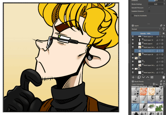
A fun observation: there's something in Lothar that I absolutely hate colouring! And the thing is absolutely essential to that particular dirtymouth individual! And the thing is...
His glasses.
Don't get me wrong! I love his glasses, the way they match his appearance, and that tiny bit of extra sexiness he magically acquires when wearing them.
But dear goodness gracious, boy do I ever hate colouring them! 😤
It usually takes me at least 3 layers (lineart inclusive) to colour them, and then I have to arrange all the layers in the proper order. If the rest of the colours - including the skin and the clothing, but excluding special shiny/textured surfaces, if present - take me only one - ONE! - puny layer to make everything as it should be, then the glasses alone - that effing pathetic piece of... accessory! - take at least 2 layers of colouring. 3 with extra shine. Duuuuh.
And they appear on every each panel with Lothar, because he wears them all the time.
Geez, man! I hope sometime in the future that hot yet disgusting guy gets himself a pair of smart contacts with the built-in voice activated UI overlays. I'm sure he's rich enough to afford such a gimmicky thing. That will free me from a lot of extra work!..
(imagining things? entertaining my designer's hunger? foreshadowing? who knows?!?!;)))
... Which lead me to another one thought about the simplification of the colouring process. You see, with the colouring the way I do it, there's a lot of "automatic" work that is not really creative, one might say. I just need to fill the certain areas of the lineart with a certain colour and remove all the unfilled pixels afterwards... which is just a process of clicking, selecting areas and colours, and filling those areas with the right colours. And it's... kinda tedious. And monotonous. To be 100% fair, it's getting old fairly quickly. Now, shading and adding lighting effects is totally different. But filling the areas with the plain, flat colour prior to applying the shading... is incredibly "mechanical" to me.
And my idea was... an AI program to do that.
YES, YES, I KNOOOOW YOU'RE EITHER TURNING YOUR BACK ON ME NOW OR DOING THE ROBERT DOWNEY JR. MEME FACE after hearing (reading?) what I just said. I know the whole world just split into 2 groups of people who say either "AI yay!" or "AI nay!". Because, well, you see, human beings really enjoy disagreeing with each other, so there always has to be a reason (says I, cynically).
My experience with AI is fairly limited as of now, but as a computer nerd - and a wife of yet another one computer nerd, for the full picture - the new technology mesmerizes me. I was shocked when ChatGPT named me the game I had trouble remembering the title of simply by my extremely vague (and partially wrong!) description - and it did it right off the bat, from the first try. I was utterly mind-blown.
We've already heard a lot about AIs ruining the artists' works and yada yada, and we're not gonna touch this topic right now. But since AIs are capable of manipulation with the visual material, then why not teach it to automate the rather tedious processes in creating art while still keeping the essential "human" involvement intact? I would definitely use some nice program to automate the "select and fill, rinse and repeat" part of my work on Chapter 5 and potentially all the future chapters. An algorithm that would recognize the characters by their facial/bodily features and automatically colour them according to the colour scheme I created earlier (so, no random green hair if the character is blond, and no brown eyes if the eye colour must be blue, for example). Or something along the lines of that.
Dammit, that would really make the work of the human artists so much faster whenever needed! I vote for this! I will hope from now on that somebody makes me a Krita extension with such a functionality now 😁
Deary me! I can't believe this actually happened! Sorta!.. I think this might be potentially the shortest blog post that I've written IN YEARS!.. Wowza! Apparently I can do that when I'm not trying, haha (but isn't it always this way?..😑 come to think of it, shopping works this way, too: when you're looking for something specific, you can never find it anywhere around!)
Sorry, no gifs today (aside from the funny dog one above).
Moreover, when I looked into my screenshots folder, I have discovered that I did not take any this time while I've been working on the colouring like mad. This is sad, perhaps...
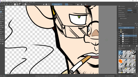
So let me fix this! Here's a random screenshot that is very difficult to unsee, and it makes me super, super happy - especially considering what's actually happening in the story while Lothar is so... high? (would that be the right word in this situation? 🤔 man, sharing screenshots of random panels from the comic out of context is fairly odd)

... And now, I disappear into my little and comfy tree hollow, ruffling my feathers, so that I could work more on Chapter 5. Gotta make it stellar, after all! So I need more time in my tree hollow! Silky smooth! (ok, I start to get carried away associatively, so I better stop. Bye! See you soon in the next update!.. ah daaaaw, the next blog post! 👋)
0 notes
Text
This Week In "Time & Again" #10: Colours Are Getting Colourful, Indeed!
So, just as promised and exactly as planned, I'm working on the colouring for Chapter 5.
And boy, it goes very well now, let me tell you!
In fact, it goes so fantastically well, I honestly don't even wanna be here right now writing this post that most people will not even bother reading (we live in the age of Likes and Emojis, after all, so longreads are usually not welcome... but see if I care!), and I just want to keep working on the colouring. Just like I do almost every day, almost non-stop. Quite possibly over 40 hours a week. And I'm not even getting paid for it.
That's dedication, innit?..
But making another post on how it is going, even if there's not much to tell aside from an incredibly simple and modest yet surprisingly descriptive "'Iz gude!" (pardon my Scottish, ahem), is kind of a moral obligation for me. I decided that I'm gonna make posts about the progress - so that decision should be carried on with.
So... yes, iz goin' gude! 🤣
This time I did not bother trying to decide what approach to use in colouring the characters. I decided to aim for the same simplistic way of colouring from Chapter 4, with a lack of shading. "Atlantis" is still one of my greatest artistic inspirations, and the masterly executed balance of visual simplicity and skillful complexity in the art style of that movie is something that drives me to keep working on my own style, to strive to achieve a similar effect, because this is what I want my work to be like, too.
Of course, a little experiment will also take place in Chapter 5, since I don't like my visual works to feel static and inanimate. But I'm not going to tell what exactly it will be yet. You will see. It's going to be something very obvious and easy to notice, for I've never done anything like that in any of my previous works. 😉
The question of backgrounds tho, contrary to the character colouring method, is a much, much trickier question. With every new chapter in development, I ask myself how to draw and colour the backgrounds in such a way that it's in harmony with the characters, but allows them to also stand out - but not too much (otherwise there's no harmony). And this question has not been answered fully by me. I keep experimenting. I'm still searching.
For now and for this particular chapter, however, it all seems pretty straightforward to me. I opted for a simple background with a little bit of a painted, splattered "texture" to it. And I achieve this effect through layering colours and the texture with specific settings, usually using Soft Light (SVG) blending mode for the dark parts. And if I need an even darker shade - I put an additional black rectangle on top of it and play with its opacity until I get the desired effect. ("A very LARGE gif below" warning!)

For the obvious reason of spoiler avoidance, I will refrain from further explanation and I'll limit my demonstration primarily with the textual description, for now. But, just as proposed long ago, I am indeed still planning on creating a WIP thread on Krita forum.
Your horribly introverted and seriously muse possessed dear artist simply should take a break from colouring everything like an obsessed maniac and finally get the Sch***e done.
Eventually 😁
There's something else interesting I wanted to note before wrapping it up for today. Something somewhat technical.
Because I have increased the page size for the last 4 chapters of my crazy endeavour, suddenly I remembered that I also need to rescale the rest of the pages that serve as - as I call them - "framing materials" for the chapters. And that includes (and, as you may guess - but not limited to): the cover art, the background for all kinds of bonus materials, the back design (for potential printing on paper), the chapter title page, Vorsatz und Nachsatz, the credits page, and, of course, the Characters' IDs page... Yup, all of that stuff required to get the higher resolution variations, exactly 1/3 larger size of the original.
And I forgot about it at first. I guess, my idea to turn it into a webcomic prevailed and befogged my consciousness ever so slightly. Or a lot. Not sure. But the fact is, that just slipped my mind.
Of course, a poor designer in my could've just enlarged the already existing pages by 33% to get the expected result in a few clicks hassle-free.
But that's only the poor designer. Because everybody who tried to draw at least something digitally in their lives would know that that would only destroy the quality of the artworks. And that is totally unacceptable for me. And I'm no poor designer. "Time & Again" is awesome. No sloppiness allowed, I says.
This is why I needed to redo everything layer by layer, file by file in higher resolution. It was that clear.
Am I being too techy? Well, deal with it 😎.
But good thing I'm so practical: I already had all of the elements drawn in higher resolutions than needed. And those I didn't have - they were all vector-based, so they didn't even need any extra work.
Good job, me! 😁
The moral of the story is simple: dear artists, whenever you work on something like that, just make higher resolution drawings - just in case, even if you don't need them that large for your particular current tasks. Because you might need the larger art in the future. Because who knows? What if you go crazy and haphazardly decide to up the resolution for everything, like it happened to me?
This is something that I also learnt from the videogame development tutorials, and that was quite an obvious idea, now that I'm thinking about it. Drawing everything in twice the resolution you need is a truly good advice. Surely, it might save you from a lot of frustration.
But back to my circus and my monkeys. Since I always make all the geometric elements for the page designs in Inkscape, it was simply a matter of a couple clicks to re-save my older page outlines and templates in higher resolution. The same goes with text.
I love vector stuffz 🤩
The only page I needed to tinker with a bit longer than everything else was the Characters' IDs page. This is my vector template:
From today's perspective, I do not understand why it was made this way - can't be responsible for my past self, right? right???... - but the colouring of the Characters' IDs was done in Krita instead of Inkscape. Which is a bit absurd, because I used simple gradients to fill in each of the "character cards" individually. And I could've easily done it in Inkscape, too. But to save myself some time, I decided not to unravel that twisted ball of yarn and did the same: coloured them all in Krita. Again. Because why not? - it's extremely easy.
However, I have discovered imperfections that I was able to remove in this "new, hi-res edition".

Each "character card" has an inner circle of solid colour around the character's portrait. And apparently, in all 4 of the previous chapters, those were not aligned properly. The screenshot above demonstrates that: once I copy-pasted the new template on top of the old one for comparison, the placements of the inner circles did not match (the black one is the perfectly aligned new circle; the pink parts sticking out from behind it are the parts of the old and misaligned circle from the previous chapters). Of course, I seriously doubt it anybody would stare and measure how precise I am down to the pixel... But this time to me this misalignment was pretty obvious. And the puny perfectionist in me raged. A lot.
So that has been fixed. Hurrah for Align and Distribute options in Inkscape 😁
Remember this, pals: Align and Distribute are women's best friends - not dogs, not diamonds, and... definitely not what the rest of the internet suggests. Yikes.
(and to be fair, Align and Distribute should be the best friend of everybody, not only women! Honest!!!)
Again, because I drew all the character portraits in significantly higher resolution than needed long ago, I just copy-pasted and rescaled them to the right size. And then... after a few sessions of copy-pasting and rescaling, everything was done and ready to go!
And for now that is probably enough.
Once I stop colouring for a while next time, I'll drop by again to write another one typical - and perhaps, somewhat techy as usual - longread that some of you might be interested in.
But for now - bah-byes, and cheer up! Valentine's Day is soon, and spring is just around the corner. Be happy just like Jeanny!
See you soon! 👋
0 notes
Text
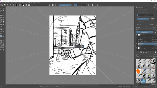
This Week In "Time & Again" #9: LINEART IS DONE!!! And My Adventures With Krita Assistants! [Longread warning]
First things first! It took me a while (again) to make yet another one post, but taking a small social hiatus was totally and utterly worth it, let me tell you!!! Because here's the news:
THE LINEART FOR CHAPTER 5 IS COMPLETELY DONE!!! Yaaaaaay!!! 🥳
(happy cheering, happy music playing (my personal favourite is Skinny Puppy - very happy indeed), sounds of jolly hand clapping, and a cake, somebody please bring in the cake!.. wait... the cake is a lie... 😱 hmmm, every time I refer to this joke, I want to alter it and say, "A pie is a lie, but the cake is fake!" Personally, makes me happy, but also makes me sound a bit like Mad Hatter to everyone around😅 which is fine, I love "Alice's Adventures in Wonderland")
Not gonna lie, it feels like I spend a little bit more time on lineart alone comparing to what I've been expecting from myself: different factors have contributed to the delay, and among of them was a short-term loss of a creative spark as well (which is always incredibly unpleasant, yaaarrrr!), but nonetheless! It is done!!! And let me tell you - it is done in style 😎 Ich bin sehr froh 🥳
However, contrary to what I've just written above simply for fun, it's not time to celebrate just yet. I'll probably take a small 24 hour break from my project - to take a breather and recalibrate my brain to successfully switch to colouring mode, ya know - and I'll just keep working on it to keep up the pace! The Colouring Stage is waiting for me, wheeeeeee!!!
... Wait, but so happened I already had my 24 hours off drawing yesterday. 🤔
WELL, NO TIME TO SPARE NOW: BACK TO WORK!!!...
But only after I'm done writing this post, for I have a moral obligation to finish it up 😁
So, earlier I promised to share my experience with Krita Assistant Tool with you. This is going to be very technical, so prepare yourselves, happy folks. Here goes.
I've used Krita's Assistant Tool before. I started to use it quite extensively as the work on Chapter 2 began, for I had to represent strictly geometric shapes of rooms, and corridors, and even the whole floors, for almost the entire set of events was happening indoors. In a peculiar place.
The entirety of Chapter 1 with the exception of, say, 2 or 3 panels at most, took place within Lothar's mansion in Sweden. That one also required quite a few geometric shapes, but for some reason I did well without any help of Assistant Tool - I don't remember for sure by now, but I only used it briefly for some panels/frames. And it did not require anything particularly complex then. Mind you, during the development of Chapter 1 I've been still learning my newly obtained graphic tablet - that was the first time I ever used one (and now I don't want to go back to neither mouse and keyboard drawing or a "blind" tablet - eff that! 🤣).
In this respect, Chapter 2 was a game changer. I wanted to raise the plank further up and challenge myself to do even better with the perspectives of urban buildings and interiors.
And since approximately that time, I believe, Assistant Tool has become a precious little helper for me. Thank you so much, Krita devs!
As you can see in the documentation, Assistant Tool has many features and different modes. I primarily use those tools to draw perfect - or almost perfect - urban perspectives, for those might be a bit tricky to do right off the bat. However, some of those tools might be used in a non-conventional or less expected ways. Let me show you some of my experiments with them.
Starting off with the basics, of course.
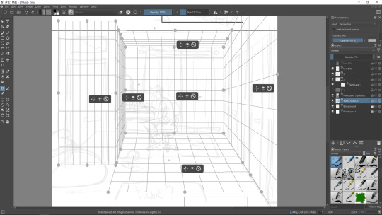
Above you can see the screenshot that illustrates how I used to normally set up the perspective assistant grid for the more correct view of a room - I've been doing that very thing beginning from Chapter 2. Basically I create a bunch of perspective grids and join them to create an imitated 3D view of a room. That really helps a lot.
I mentioned a certain video tutorial that really helped me out on my journey of meowstering - sorry, mastering the Assistant Tool in a way that's helpful to me. It was this incredibly helpful little video I watched trying to figure out how to build a one point perspective view for one of the panels I challenged myself to draw. However... I discovered something else instead: Parallel Rulers and an obvious "Snap To Assistants" function. Both of which are super helpful to use. I never paid attention to "snap to assistants" before. Now I wonder why 😅
Parallel Rulers help to draw totally straight lines when working on a perspective view - like the one that I was having a hard time dealing with when trying to portray an extremely skewed backstreet perspective. All of that is done without the use of the Line Tool.
While parallel rulers are something that I'm still learning and practising, the self-explanatory "snap to assistants" is an excellent function that just makes your life significantly easier.
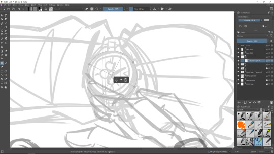
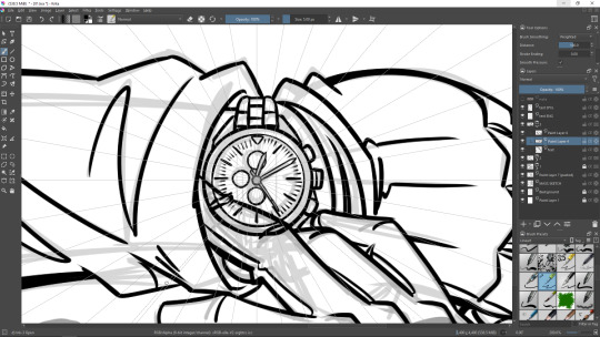
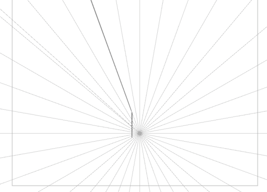
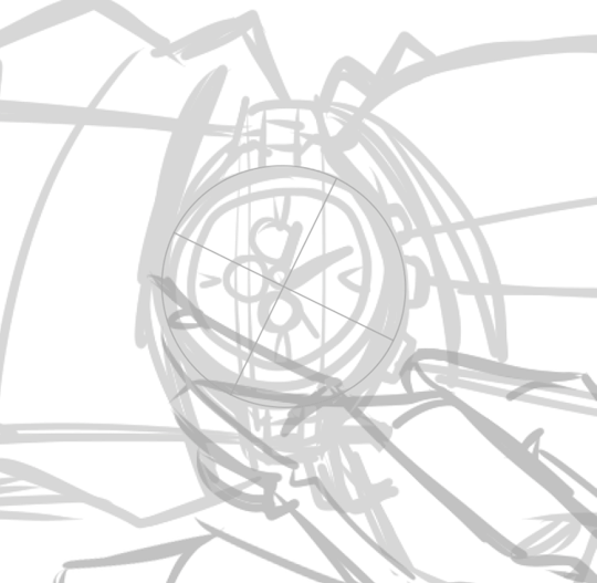
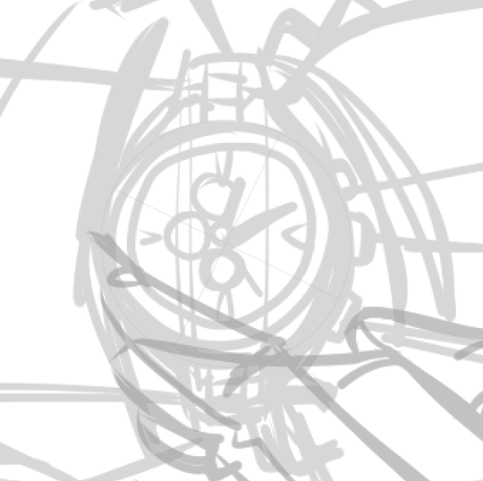
I used a combination of Ellipse and Vanishing Point with "snap to assistants" function on to create spectacularly precise and nice looking sports wristwatch for Lothar. This is just how I love it: extremely geometric and correct, but with slight imperfections that make it lively and natural, with a visible hand-drawn "fluctation" to the outlines:
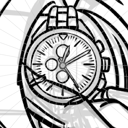
For example, here's a good comparison for you to see what I'm talking about: to the left it's a gif illustrating how I drew the wristwatch outlines with an Assistant with Ellipse setting that snaps to the assistants, and to the right there's a gif showing how to do the same (but way worse) simply using the separate Ellipse Tool using the same brush as an outline. Behold the difference:
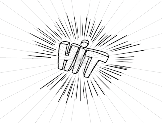
For the record, I used the same neat trick to draw the nice lines around that "Hit!" special effect on another one page, to make it look cleaner and more professional:
Spline is yet another one type of assistant that might come in handy in certain situations, for some artists. In my case this time, I used it so add extra thickness to a certain line that has already been drawn to make it look more appealing and lively:
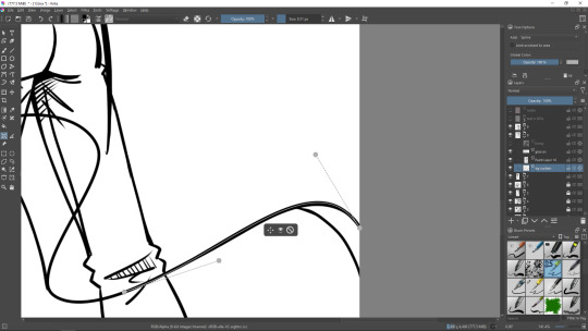
Thus, instead of trying numerous times to reproduce the same brush stroke (and inevitably failing at it repeatedly) to add just a little thickness to already existing stroke, one can simply draw a Spline "vector path" on top of it, turn "snap to assistants" on and draw a perfect, non-shaky line that doesn't stray somewhere you don't want to. Neat-o! If you're somewhat familiar with vector software (like I am), using Spline and making it exactly the shape you need is easy-peasy: it has two handles so that you could adjust the position and the curve of the assistant line. Works exactly as a basic Bezier Curve. Super simple!
That's gonna be enough for now.
Since this post has grown fairly large in size (I never change, eh?), I'm thinking about taking a longer break in posting again. So I might return in about 2 weeks with more news on how the colouring of Chapter 5 is going!
Stay tuned, and have fun! Lothar is on his way back to you, and Jeanny will follow up, too 😉 Take care!
0 notes
Text
This Week In "Time & Again" #8: Achievement (Almost) Unlocked! And A Pre-New Year's Mess
Does it ever happen to you that you're so energetic, and hyper, and full of determination and all - and then you take a deep breath, sit down happily on your comfy couch, and you're ready to start writing a new and lovely blog post!..
... but then you realize you have absolutely nothing to write about. Or - perhaps, to be more precise - you feel like there's nothing worth mentioning that would make an interesting, succulent, and informative post.
That happens to me once in a while - which is odd, considering how much of a babbler I tend to be when it comes down to self-expression in written form (it must be, Lothar affects me in a certain way and alters my usual behaviour, because normally in my life outside any artistic activities I am fairly quiet).
The aforementioned little hiccup on my way of the "ultra-completionist of the Pre-2024 To-Do List", unfortunately, hindered my progress, and the final number of the blog posts ended up a tad smaller. I don't think there are any complaints from the readers though 😎 I'll try to keep up next year.
On a side note, one of the goals on the list has been removed and deliberately postponed until January. I have reasons, trust me 😁
But most importantly, Christmas season of "Time & Again" turned out to be pretty good! Just as planned, at this point of time, just a couple days short of 2024 (because I started writing this post yesterday), The Lineart is 98% done - it only needs a sparkle of perfection and and a short session of filling up the gaps and missing spots here and there on different pages.
AND DONE. Moving on to The Colouring Stage right after all of that has been properly handled. (oops, unintentionally, I lied: I already started to partially colour some peculiar things... too excited; can't hold back, LOL!)
I would say, this is truly a great achievement. Well... almost got an achievement anyway. Working on your grand project every day, little by little, and watching it growing, evolving, and getting fleshed out a little more day by day is hard to describe in a verbal form. I wonder about this sometimes... Perhaps, those who have never been in a similar situation will not understand this emotion very easily. But I'm telling you with 100% honesty, as usual - this emotion is priceless and really makes you feel that you're doing something important in life.
So, in short, everything goes steadily and as planned. Plans change sometimes - but that is totally fine. Currently, everything is indeed as planned - and I can't help but rejoice 🥳
As a treat for reading yet another one of my excessively talky talky longreads, I'll tease you with some rather unpredictable snippets now ;)

Just who are those guys???.. And what's the situation??? They sure look feral!
You will definitely find answers to all of these questions after Chapter 5 is released sometime in 2024 ;)
... In the meantime, as I've been working on a peculiar troublesome background, I have discovered a handy option in Krita's Assistant Tool that I believe has a possibility to make my life easier in the future. I used Assistant Tool before, and quite profusely. But thanks to a certain video I came across, I happened to find out that there's more to that incredible tool. I'm excited to cover this topic in the next blog post, so stay tuned!
I also made a horrible mess on one of the pages that currently looks this way:

How do you like the funny lettering???!!! 😁
Those are not stickers, by the way (although that's certainly a good idea to turn those into stickers!.. That'd be a story for another day tho). Why those are needed - that I'll keep a secret for now. But I wanted to show you what they look like - especially when cluttered altogether, hehe.
Also, obviously, this is not the final version of each one of those sound effects bubbles. There's more work to do eventually 😉
For now... let there be silence. In a bit over 24 hours, the calendar will show 2024 on this side of the globe. So I'll stop typing right now and I'll save more stories for later.
... I'm also wrapping it up for today with my ridiculous habit to scatter vaguely related song references across the text, so, yup - time for a small break 😅
(And I should also take a break from listening to Ultravox on repeat, otherwise my non-existent vinyls are gonna get non-existent holes in them... wait... how does that work exactly, again?..)
So, for a bye-bye, I'll say show this:

Bah-bye, my friends! And see you next year! 👋🥳😁
0 notes
Text
This Week In "Time & Again" #7: And The Wheels Keep Turning
Hallöchen! 👋
Took me a little more time to come back with a new blog post - but here I am, delivering you a new tiny wall of text to read, just as originally intended 😁
Christmas is steadily on its way, and the life is exploding with events, big and small, good and not quite - but mostly good ones; and the jolly festive music is playing all around, and as a certain somebody plays one truly mesmerizing and entertaining Christmas Doom mod in the evenings - of course, with Christmas music in it, too - the work on "Time & Again" goes on and quite well (can't complain; Lothar can't complain either). All's good. In fact, I have only about 3 pages left to finish up The Lineart Stage, although some little parts here and there were skipped previously. But I doubt it it's gonna take me considerable amount of time to make everything 100% complete and to wrap it up (no, not the presents - tis the season, I know, but I meant a different kind of wrapping... y-yeah 😅).
Since time is a valuable resource - which is exactly what one of my absolutely favourite characters in the entire "Time & Again" series once said (hey dear readers, can you guess who I'm talking about?) - I think, for the first time in my life, this once, I'll make a new post very short. Gotta go back to nannying me kids, after all (ah, life of an artistic parent is hard 😫). Don't wanna waste a lot of time distracting myself, especially during this hectic end of the season.
Also, I still got my eggnog to drink. It's on my list of important things to eat/drink. So yup, time is sure valuable!
I was gonna make a special post about the procedures and peculiarities of how I create page templates for "Time & Again" using Inkscape and Krita to create a functional and convenient workspace for myself. But I'll save that for another day, because writing a logically structured and sophisticated post about such a technical topic will require some mental effort. And since currently my mind is preoccupied mainly with blue jays, eggnog, laundry, und Spätzle, this topic might be a tad too exhausting for me to take on right now. So I'll just spam with a few cute panels portraying Lothar - to keep y'all happy 😁
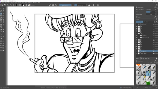
We already talked about Lothar's disgusting habits earlier, we did.
However, cigarette smoke dreamily twirling upwards in the air is something that I really enjoy drawing often outside the outlined boundaries of the comic panels. As you can see on the screenshot above, Lothario is super excited about something in front of him and he absolutely does not notice that the cigarette is sticking out from the panel. And you know? I like that. What you will often see in my graphic novel for sure - and especially in Chapter 5 I'm working on right now, because holy effing ****, is Lothar a heavy smoker! 😱 - I use the smoke outside and sometimes across a few panels, sometimes intertwining the lines and arranging them in such a way that they create a neat effect of interconnection.
It's not only about smoke/aromatics though; I really enjoy drawing hair sticking out from the frames, too. I must admit - your dear creator hasn't read a lot of comics in her life, but you'll have to put up with me 😎 - I do not see this happening in a lot of comics or mangas. Or perhaps I'm just attempting to read the wrong ones all the time 🤪
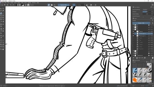
Here's another one peculiarity I really grew really fond of within the last few years. Whenever I draw limbs on the background that are directly behind the limbs on the foreground, I just fill the background one with diagonal strokes. Of course, I do it by hand every time. I did have an idea to automate this and just fill the areas I need with the predefined strokes/crosshatch - luckily, Krita has an amazing function to add a fill layer with a wide variety of parameters of choice. But for such a simple task as illustrated above, I just do it manually all the time. Also, it looks natural and with a slight degree of imperfection - that's just what I need!
And pistols... ugh. Pistols take a certain talent to draw well, too 😁
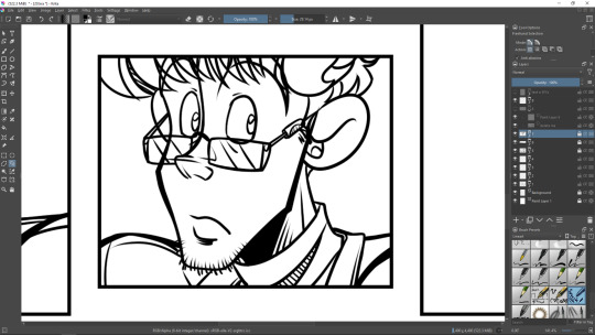
And this... Honestly, why am I even showing this one to you?.. 🤔 Probably because I really like Lothar's face on this picture. Once coloured, it won't disappoint you.
Welp, that's probably enough for a very short post in between sessions of creation and life undertakings.
Aaah, no! Just one more thing - a little but extremely funny animated gif before I go offline to create more stuff! Here you are! 🤣
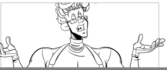
See you next time! Take care! Don't forget to drink some eggnog. 👋
0 notes
Text
This Week In "Time & Again" #6: Unfortunately, Lothar.exe Has Stopped... 😅 And An Important Announcement
Whoa, it's been a while! Here goes my initial intention to post consistently, lol. 😅 But let me tell you more about what has been going on lately.
Time sure flies - especially during the pre-Christmas time. Having a lot of fun and getting extra inspirations at work is definitely wonderful! You've already seen my To-Do list for the rest of December, and I'm glad to report that majority of those goals is complete! 🥳 And very soon I will present you a certain new art piece - the very one I've been working on in the last few days. I must admit I am very excited!..
Unfortunately though, it's not related to "Time & Again" in any way possible, so I'll stop bragging about it right this once - instantly, perhaps faster that the instant noodles are cooked.
With all of those life and other art activities, I must admit, the work on "Time & Again" itself has not moved very far ahead... as of now. I still have only a few pages left in Chapter 5 to draw the black and white lineart. Yep, I've been temporarily distracted by the other things that were needed to be done, in both life and art.
Currently I'm hoping to finish up the lineart by the end of December. Unfortunately, the development of Chapter 5 has stretched out across time (and possibly space, too); originally I was planning on releasing the latest chapter this year, and that would've been an excellent Christmas gift for all of you (says I, with enormous cynicism - for those very few of you who know what I'm talking about are sure frightened rather than jollied). My art schedule included a somewhat steady release of approximately 2 chapters per year - I would definitely strive to uphold that within the next upcoming years. But life's unpredictable sometimes, so one can never know how it's really gonna unfold, especially given you're a married and working adult 🤓
However, there's not room for disappointment at all! Sleeping on it and ruminating more on the matter, I think I've come to conclusion that, in the end, it might be better the way it is: it's probably nicer and more polite if I release this... bloody chapter after the jolly and happy Christmas time. Because... Well... You'll see soon enough by yourselves.
There's one more important thing to note.
I highly encourage you to go to GlobalComix - which is the home of "Time & Again" online release - and read the whole thing or selected chapters from it before something else mysterious happens to it... "How come?! What happens?!", I hear ye saying. And let me tell you: it's gonna be something BIG. So here goes:
I'm planning to release slightly updated versions of Chapters 1 to 4 packed with additional notes, commentary, and easter egg deciphering for the clearer reading experience. It also means that the older editions that are available right now are gonna be turned into "legacy editions" (for archival purposes, let's say), and therefore they will be PERMANENTLY REMOVED from both GlobalComix and Itch pages, to be exchanged with the updated versions.
For this reason, I made "Time & Again" COMPLETELY FREE TO READ on GlobalComix right now until further notice AND the release of the updated editions. So suit yourselves 😁 See the links in the post pinned to the very top of my blog and 👉here👈.
(The PDFs on Itch, however, will stay at their regular, full price, for they come in extra high quality. As already mentioned, they will also be later removed from their pages, so if you would like to get acquainted with the "legacy editions" - NOW is the time. Get them from here; they are $4 CAD each... for now, but I might make a discounted bundle to honour the upcoming updated edition, so stay tuned)
Meanwhile, I must mention the newer, updated editions are not going to be completely overhauled and turn into something totally different, no. Most extra additions and corrections are going to be made in the bonus materials section, and it will also undergo an extra session of proofreading in order to remove typos and wording that is far too convoluted. However, there indeed will be tiny little additions to the main dialogues, too - only in a handful of selected spots that awkwardly slipped my attention and needed to be perfected.
That, of course, will be another little "Verbesserung" sub-project of mine for the next year. And I already started working on refining certain points in already existing chapters.
That's for certain: you won't be disappointed 😉
But now, in order to keep up with the usual format of blog posts on the progress with my precious "Time & Again", I'll share some more technicalities with you. There's something curious I wished to share with you for a while now.
Back in the day, we used to have that little Sticky Notes app in Windows - if I'm not mistaken, it was included into the standard installation package alongside with the other convenient apps well-known for the most Windows users. I used it for a while, for, at times, I really enjoyed to just "pin" my lil artistic to-do list down to the desktop so that I could always see what I needed to do. Perhaps, strange to hear that from an old-school person who is a great fan of pen/pencil and paper - but having notes attached to my desktop really worked well for me, for your humble artist practically never opened her notebooks to even check the hand-written to-do lists 😅.
So yes, Sticky Notes worked well!..
... in theory.
And unfortunately, it worked only in theory, because it ended up doing things I was very discontent about - usually it enjoyed failing to load my notes on startup despite having it on in the settings. That was getting on my nerves, so I finally decided to let Sticky Notes go and to find the open source alternatives to suit my tiny wee requests and caprices.
At first PNotes caught my eye - but alas, I had to get rid of it, for I had trouble with the quirkiness of the interface and extremely weird issues with the notes autosaving (?!) - which practically defeated the purpose for me.
But shortly after I found Simple Sticky Notes and I enjoy it immensely every single day now 😁 It has enough customization, super easy to use, simple and neat functionality to it, and most importantly - it works. It loads on startup just as requested - and it even saves all the changes to the notes in an instance. Wunderbar!
Here's an example of what my desktop memos look like right now, using Simple Sticky Notes:

As you can clearly see, the formatting of the notes is simple, appealing, and useful. It makes me truly happy that my notes are organized well. Something that needs to be especially kept in mind is highlighted. A memo on the content of Lothar's gun holsters is there, too, because it would be funny to mess it up and draw the wrong pistols in the wrong holsters (unless he secretly juggles them when nobody's watching... but I doubt that this German sir wants to bother himself with a nonsensical show-off such as this - even though my imagination is quite entertained with the picture).
"Notes & Commentary" is, indeed, intended for the updated edition mentioned above. For now, I've only had time to complete that section for Chapter 1. And to my surprise, it had way more references and easter eggs than I remembered! And every single one of them was noteworthy.
So this is how my artistic workplace is organized.
Ok, time to wrap it up for today, I've already wrote a lot, just like I always do 😁 There will be more Lothar and Jeanny in the next "This Week In 'Time & Again'" posts. And after all, it's Christmas time. You're probably puzzling yourself trying to guess what kind of crazy and ridiculous outfits I come up with for them this holiday season 😉
Cheers! See you soon! 👋
0 notes
Text
This Week In "Time & Again" #5: Busy Busy! and How I Adhere To Content Guidelines Through Creating Extra Layers! 🤪
Hello there!
Let's start off with an important announcement right away: your dedicated artist a.k.a. The Proud Mother of Jeanny and Lothar now has a day job! What?! You though the artists never have day jobs because most of them post 24/7?! Well YOU'RE WRONG! Artists need money for living, too, and since art pretty much never pays anyway 🤣... This is why I'm doing it! Aside from a certain personal challenge that I don't have any intention to disclose.
So the things are gonna get pretty busy for me until the end of December! Which means it will most certainly slow down the work on "Time & Again" for me - plus the other little extra goals I've outlined earlier in the previous post. But I'm not in a hurry, so we'll see how it's gonna go for me 😁 Ta-daaaaaa! Moreover, my new job already gave me some extra inspiration for something that I most likely will utilize in promo materials, extra arts, and perhaps even in the pages of the chapters themselves. So it's all going quite well right now.
I know, I know, some of you might really NOT want to hear that yet again 🤣, but anyway! Christmas is on its way. While I was trying to figure out what yummy dishes to prepare for our snowy and magical holiday feast, I suddenly found myself musing about what Lothar really used to enjoy as a Christmas treat when he was little and cute (and not yet broken). The succulent German dishes I prepared last Christmas and New Year's, carefully following the recipes mainly taken from chefkoch.de only avoiding limited ingredients that we don't like, turned out simply delish! I'd like to do something equally spectacular this year as well.
So, what would Lothar - as a child and as an adult - absolutely love to have for Christmas dinner in his homeland in Germany?.. Hmmm. Would he rather have Bratwürstchen mit Kartoffelsalat, or something along the lines of Entebraten/Gänsebraten, or even a baked festive fish?!.. Or maybe he'll just go casual and get himself a burger (with colourful sugary icing sprinkles, because well, you know, Xmas and all???)?! Oh maaan, so many things to consider! 🤣 I think this is a very difficult question for me to find the right answer to. That is perhaps because I've never even decided which town he's from. But I do certainly have a feeling he comes from Norddeutschland somewhere... He strikes me as a person who was born in a big and pretty town on the north of Germany. This is probably important to know in order to figure out the answer to my question outlined above. And it's also important to figure out what his favourite soccer team is. For, you know, it's important to German folks. I believe he still likes soccer - he probably simply doesn't have a lot of time to invest into watching it, for he has... much more important matters to attend to. Indubitably.
However, strictly speaking, before trying to push my brain to do creative yoga and bending it in all of the imaginary - and non-imaginary - ways possible, the largest question is as follows: Ist das überhaupt wichtig?..
Because in art, certain things have significance only within specifically defined contexts. There's no need to work on something if it does not serve any purpose within the story whatsoever. I am a big fan of the idea that every little element in an art piece should bear significance within its concept. This is how it has always been for me, and this is definitely how I always work on my written and visual stories - and that's also how I will work on my videogame if I ever get a chance in the future - and I want to keep on going ahead with that idea.
But I digress again! Back to "Time & Again"!

(here's a cute little gif of a very bored Lothar... or is it what's REALLY going on on that particular frame?.. 😉)
As I've been dedicatedly and steadily going forward with the lineart for every each page of Chapter 5, I made an interesting discovery - or rather, I came to an interesting conclusion.
Unlike the previous chapters, this one is going to be, well, let's say, more graphic. Don't get me wrong: going overboard with excessive violence and "shock content" that is incredibly popular nowadays (cynicism and sarcasm intended) is a total and strict no-no for me, because I really think the world could really go without it - or at least, as an artist, I would not like to contribute to this ridiculousness. So in my story, depictions of violence are going to be very limited and sparing for the reader.
However, in Chapter 5, certain so-called "graphic" parts are essential and irreplaceable. It's pretty clear that any endeavour to define terms such as "little violence" or "too much violence" is purely subjective, and everyone of us has absolutely different degree of tolerance towards this kind of stuff (which, by the way, is incredibly important to be mindful about, I think! and a lot of people, sadly, aren't like that), therefore every website that allows you to host and post such kind of content must have those guidelines outlined in the terms of use - and the tricky thing is, it's similar yet still varies from place to place. So I check on the content guidelines every time right away when I'm trying to decide if I want to share my works on particular platforms or not. In case with "Time & Again" that I PERSONALLY define as a strictly "18+" story (prove me wrong 🤪), you can easily understand how important it all is to make sure that Jeanny and Lothar - and anybody else they contact - don't get burnt on a stake. That would be very unfortunate for them... And for me, too.
To avoid another one overwhelmingly giant post (or a series of such), I'm not gonna go into detail and start a whole new thread of discussion about ratings, content guidelines, and so on - although even up to this very day, as a content creator, I'm still not certain about some stuff and cannot fully agree with those concepts. But let's leave the theories out of this post for now (or completely out of my blog - because why should I even bother?..).
Anyway, finally wrapping up this giant prelude and avoiding digressions (which I do extremely badly on my part, but at least I honestly admit it 😁), my point is, I decided to make a few separate layers for "injury makeup" on my characters that can be easily turned off in case they're considered "too much". Thus, all the bruises, scabs (if any), cuts and scratches (if any), and, finally, streaks of blood are gonna be kept on a separate layer (or 2 separate layers - not sure, we'll see about that) to be easily removed for good prior to posting on certain platforms (if the content guidelines call for that).
Here, an easy fix! Just like awesome patches for some very old games that don't work on modern PCs anymore (a very good comparison for me, actually).
Later on, once The Colouring stage of my work is finally on, perhaps, I will show you what it's gonna look like - that is, only if there are not going to be any major spoilers, of course.
Since I'm trying to avoid spoilers, I don't think I can show you a lot of screenshots today 🤷♀️. Although the work on the lineart for the chapter is virtually half complete as of today, I think I'm gonna postpone showing off the progress and I'll just stick another one animated gif in here, again. Because everybody loves animated gifs, right?! Here goes! 😁 Demonstrates how simple it is to draw Lothar's hair.
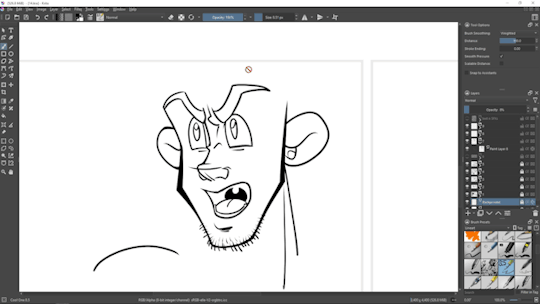
Since my materials are growing, I'm planning to open a thread with all the WIP stuffs from Chapter 5 on Krita forum sometime soon. I've done something like that before, for Chapter 4, but already after the official release, if I remember correctly - you can view that thread here - don't forget to scroll down to see more.
So stay tuned, for one of the next posts I'm gonna make will contain a link to the forum thread with all my Chapter 5 sketches/WIPs.
And for now... Tha-tha-that's all folks! See you very soon! And don't forget to sip on your lovely hot chocolate with cute lil' marshmallows casually floating on its surface - this is the season after all! 👋🤗
0 notes