
daviddesigningforprint
YEAR2 Sem 1 Designing for Print (M&M)
24 posts
Don't wanna be here? Send us removal request.
Last Seen Blogs
cinderellaboyincorectquotes
I have an obvious favorite character
valery749
Silentium.
rosamilonguita
Mango Tango

pantynhutz
Untitled

mezz4sigaretta-blog
mi lascio ingoiare dalla calca
Photo
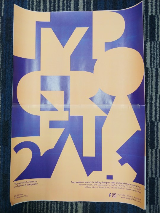
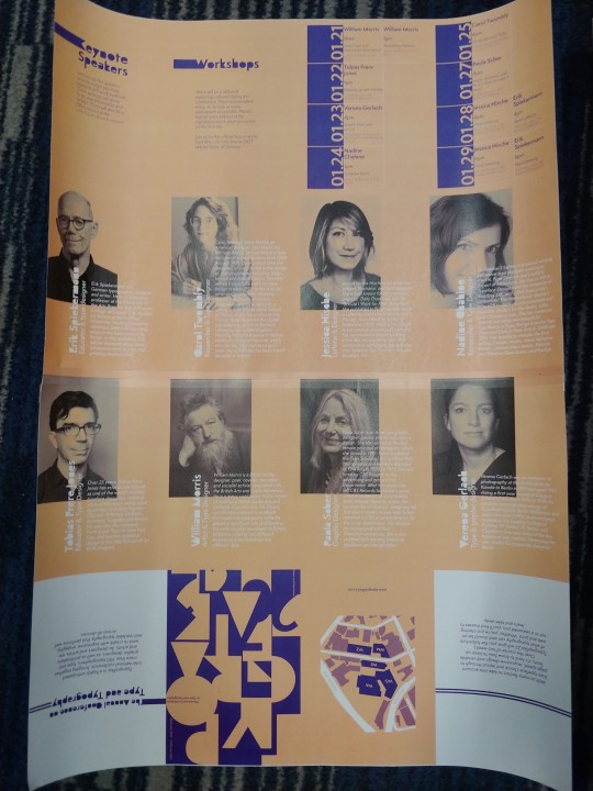
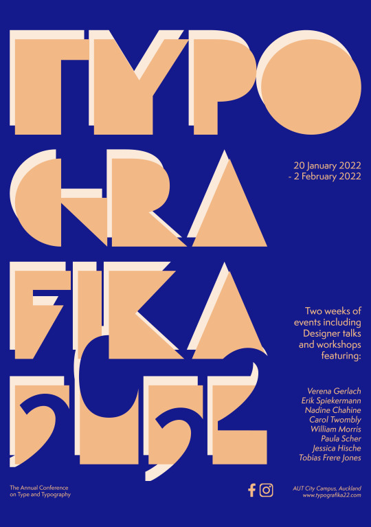
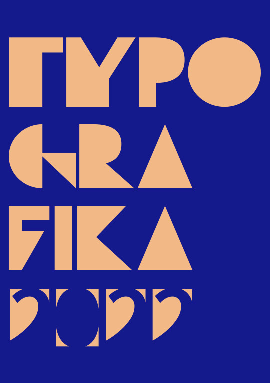
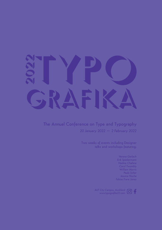
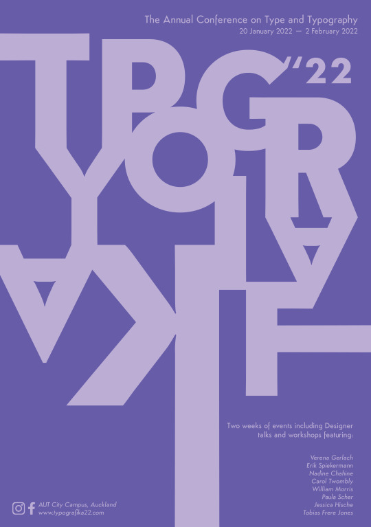
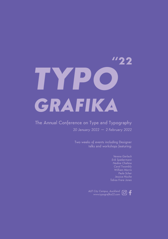
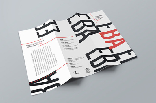
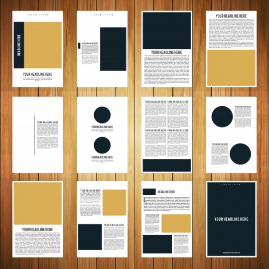
This is my final printed poster and brochure. I used 2 A3 size paper to create a A2 size.
0 notes
Photo
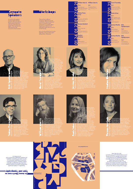
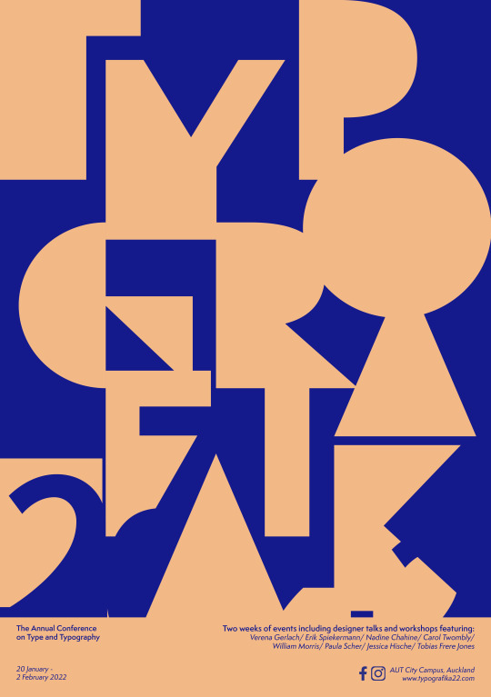
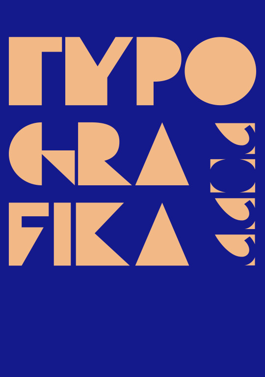
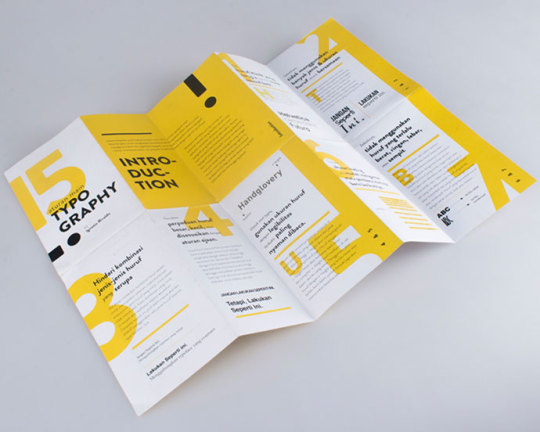
This is my final a2 size poster and brochure for this project.
0 notes
Photo
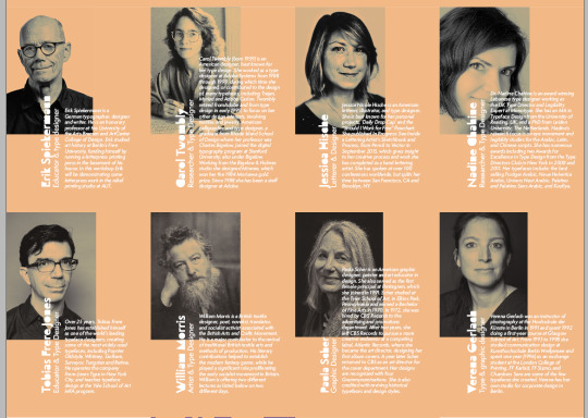
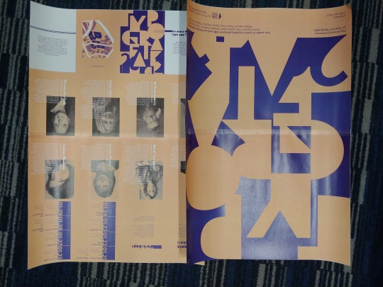
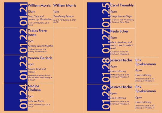
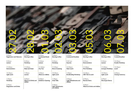
This is the typographers' information in my brochure. I tried to use a similar colour tone for the image of typographers with the background. Also, I used the white colour of typefaces to make the paragraph readable. I create a timetable for the conference.
0 notes
Photo
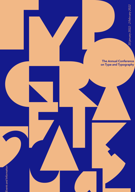
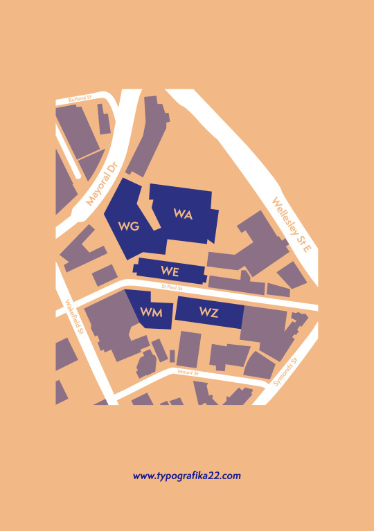
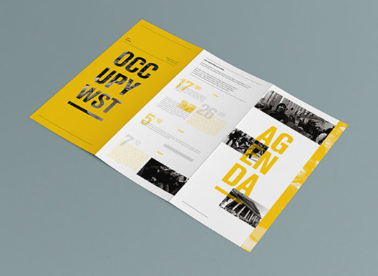
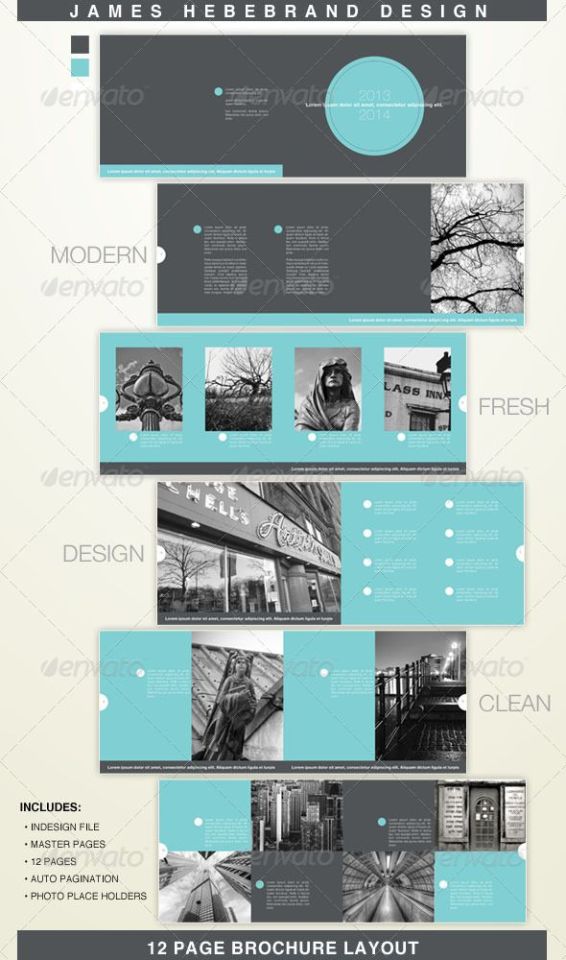
These are my final front cover and back cover of a brochure. I add a map on the back cover to use more space in other brochure pages.
0 notes
Photo
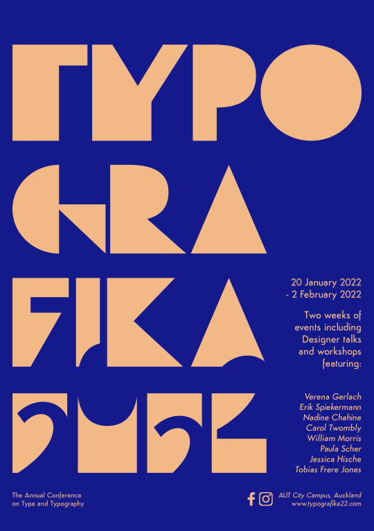
These are the colour that I used for my poster and brochure.
I don’t want to use multiple colour, so I focus on using Apricot colour and cool tone of blue colour.
0 notes
Photo
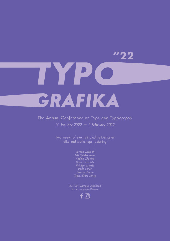
Final Feedback:
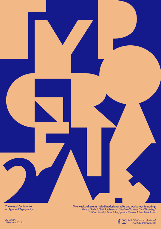
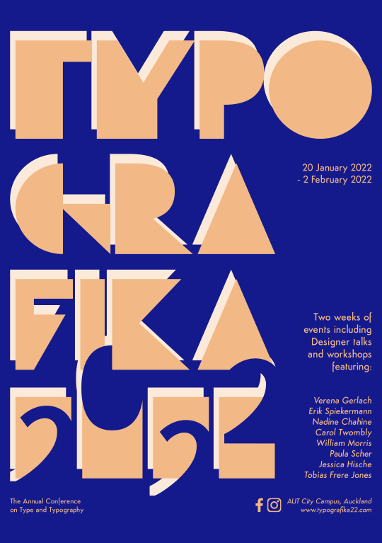
I got the final feedback about my poster. Logan said my poster is too busy. He suggested me to removed the white repeat typefaces, so I did. He has asked me to use the front cover of the brochure. He said my front cover is better than my poster. That is why I changed it.
0 notes
Photo
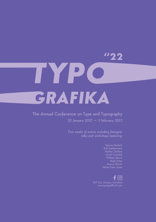
I got some feedback about my poster and brochure. Hazel said my poster doesn’t fit with the theme of the concept. So I decided to play more with the typeface. My friend suggests me to change the colour tone of the poster. He said the colour tones are too bright, and he also said the colour of the typeface design and the poster background are similar, which makes people less interested in the poster. So I used a different colour as a background to catch people’s eye.
0 notes
Photo
In week 10, I did practice using the pencil tool in Adobe Illustration.
0 notes
Photo

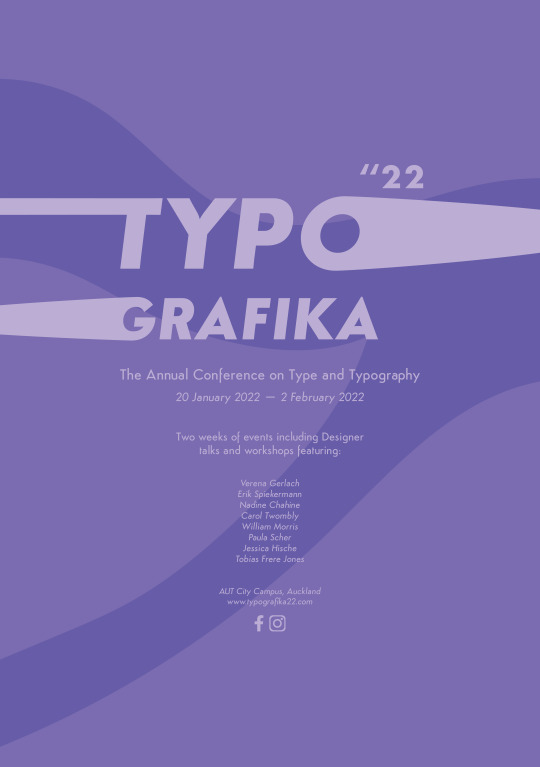
These are the design concepts of my poster and brochure.
0 notes
Photo
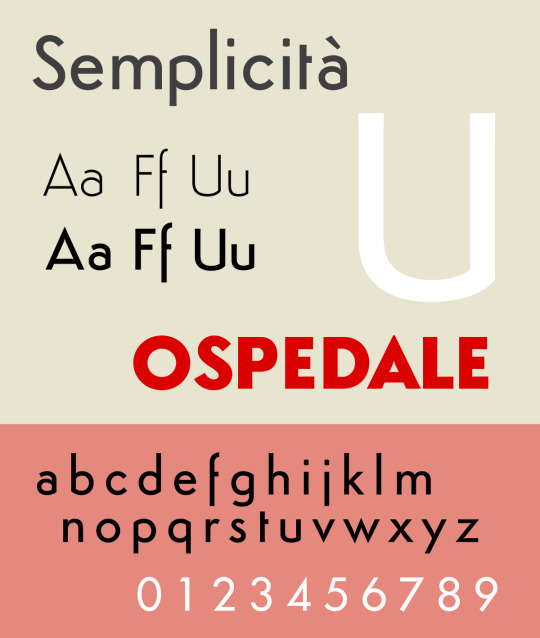
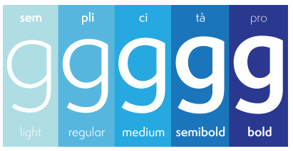
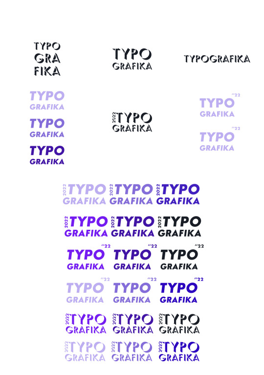
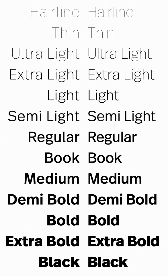
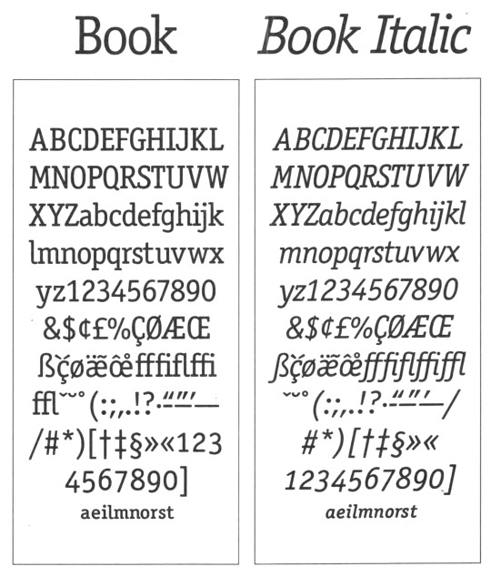
Typefaces research for the poster and brochure.
I decided to use Semplicità as my poster and brochure font because it has 11 different thickness options. So I can use multiple thicknesses through this font and,l also like how it has a unique personality (Semplicità Ombra).
Semplicità is a sans-serif typeface of the geometric style. It was published by the Nebiolo type foundry of Turin, Italy from around 1928. Semplicità, named for the Italian for "simplicity", is an example of the new wave of "geometric" sans-serifs such as Erbar and Futura appearing in the late 1920s and early 1930s. These designs were based on the proportions of the circle and the square and the influence of Roman square capitals, breaking from traditional "grotesque" designs of the nineteenth century. Semplicità, however, has a number of unusual features, including a 'U' with an angle, following the classical model, and an 'f' which descends below the baseline. It is also a "spurless" design, similar to the contemporary Bernhard Gothic and more recently FF Dax, in which most strokes end without terminals. These features give Semplicità an appearance similar to some of the flamboyant, modernist Art Deco lettering of the period.
https://en.wikipedia.org/wiki/Semplicit%C3%A0
https://fonts.adobe.com/fonts/semplicita#fonts-section
0 notes
Photo
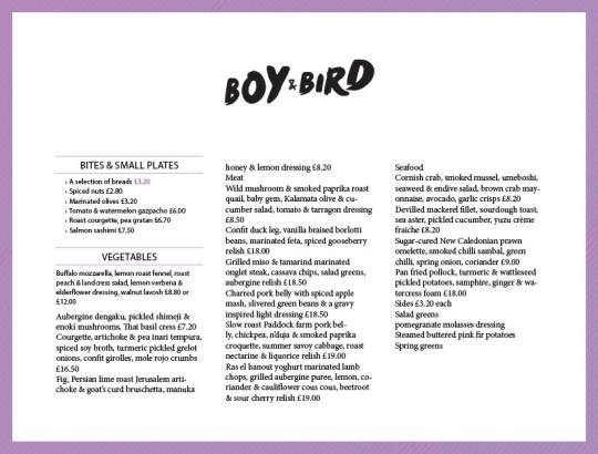
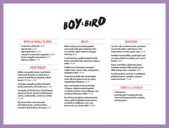
I did re-arrange the restaurant menu for the exercise table task, and I tried to create the table in Adobe Indesign and playing around with it.
0 notes
Text
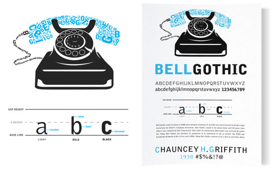
Appropriate typefaces researches
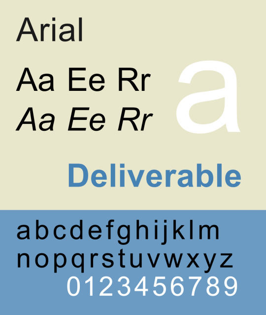
Arial font
A contemporary sans serif design, Arial contains more humanist characteristics than many of its predecessors and as such is more in tune with the mood of the last decades of the twentieth century. The overall treatment of curves is softer and fuller than in most industrial style sans serif faces. Terminal strokes are cut on the diagonal which helps to give the face a less mechanical appearance. Arial is an extremely versatile family of typefaces which can be used with equal success for text setting in reports, presentations, magazines etc, and for display use in newspapers, advertising and promotions.
https://docs.microsoft.com/en-us/typography/font-list/arial
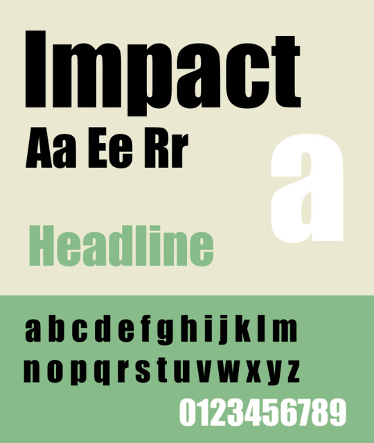
Impact font
Geoffrey Lee designed this face, first issued in 1965 by the famous Sheffield foundry, Stephenson Blake. The mid-1960s marked the height of a fashion for bold condensed faces that probably originated when Paris Match cut up prints of the Schmalfette Grotesk font, which had been drawn by Walter Haettenschweiler. Because Impact was less condensed than Schmalfette, designers often used the two fonts together as companion faces. Even without Schmalfette, you can use Impact for, well, impact.
https://docs.microsoft.com/en-us/typography/font-list/impact
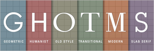
Geometric Sans-Serif
Geometric Sans is a combination of three different groups (Geometric, Realist, and Grotesk), but there is enough commonality between them to group these as one group for this example. This type family of sans serif typefaces are based on strict geometric forms. The letters are often uniform in width and focus on a “less is more” aesthetic in their design. Geometric typefaces are often classified as clear, objective, modern, and universal. On the flipside, they can be said to be cold, impersonal, and boring. Examples of Geometric/Realist/Grotesk Sans: Helvetica, Univers, Futura, Avant Garde, Akzidenz Grotesk, Franklin Gothic, Gotham.
Humanist Sans-Serif
Humanist Sans typefaces are more clean and modern and derived from handwriting. These typefaces are designed to be as simple as possible, involving thinner and thinner stroke weights similar to our handwriting. They are often classified as modern yet human, clear yet empathetic. Examples of Humanist Sans: Gill Sans, Frutiger, Myriad, Optima, Verdana.
Old Style Serif
Known as the “oldest typefaces”, Old Style is marked by little contrast between thick and thin, and curved letter forms tend to tilt to the left. These typefaces are often classified as classic, traditional, and readable. Examples of Old Style: Jenson, Bembo, Palatino, and Garamond.
Transitional and Modern Serifs
Created in the mid 18th century and late 18th century, Traditional and Modern typefaces emerged as an experiment in making letterforms more geometric, sharp, and virtuosic. Transitional and modern faces are often classified as strong, stylish, and dynamic. They are also said to be too conspicuous and baroque to be classic, and too stodgy to be truly modern. Examples of transitional typefaces: Times New Roman, Baskerville. Examples of Modern serifs: Bodoni, Didot.
Slab Serifs
Slab Serif have become more popular in recent years. They have a stroke similar to those of sans faces but with solid rectangular shoes stuck on the end. Slab Serifs are unusual in the world of typography; designer Dan Mayer says: “Slab Serifs are an outlier in the sense that they convey very specific — and yet often quite contradictory — associations: sometimes the thinker, sometimes the tough guy; sometimes the bully, sometimes the nerd; sometimes the urban sophisticate, sometimes the cowboy.” Slab Serif can be known as urban or rural, generally standing out in the wrong surroundings but fitting right in in the right places. Examples of Slab Serifs: Clarendon, Rockwell, Courier, Lubalin Graph, Archer.
https://trydesignlab.com/blog/how-to-choose-the-right-font-for-your-design/#:~:text=Here%20are%20some%20safe%20sans,Palatino%2C%20and%20Times%20New%20Roman.
0 notes
Photo

This is the clear cut practice that I did for my brochure.
0 notes
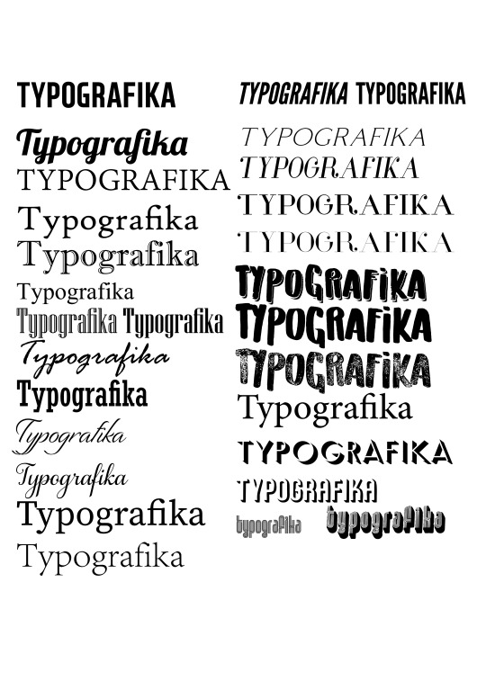
Photo
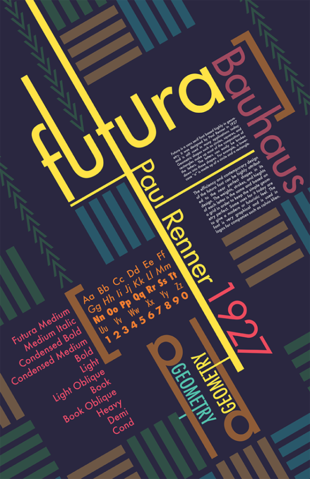
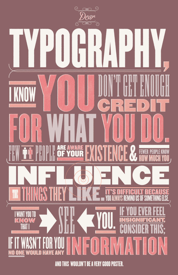
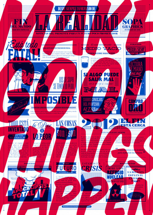
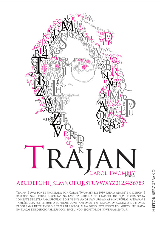
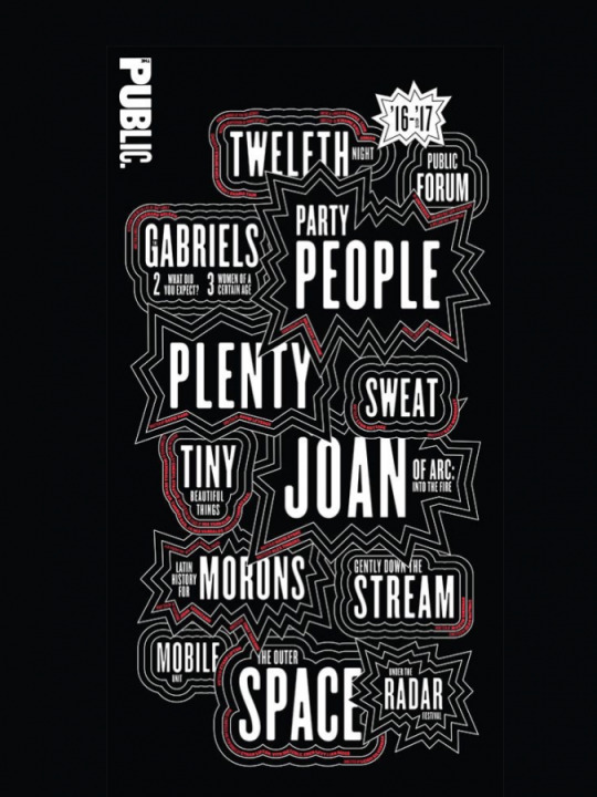
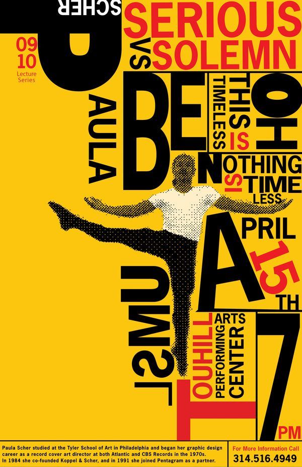
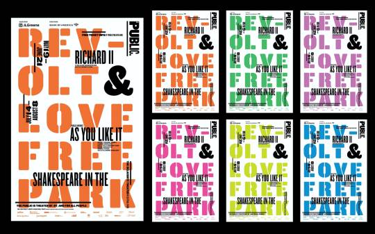
These are some of the researches that I did for my poster.
References:
http://portfolios.aiga.org/gallery/23216255/Typeface-Poster-Design
https://edbakeriv.com/2019/04/27/futura-specimen-poster/
https://venngage.com/gallery/bold-typography-poster-examples/
https://thebbcreative.wordpress.com/2011/08/15/favourite-free-fonts/
https://masaka.luxiarweddingphoto.com/font-posters/
https://www.pinterest.nz/eroicadesouza/paula-scher/
https://www.semipermanent.com/stories/interview-paula-scher
https://www.creativereview.co.uk/pentagram-public-theater-identity-paula-scher/
http://luc.devroye.org/fonts-26216.html
0 notes
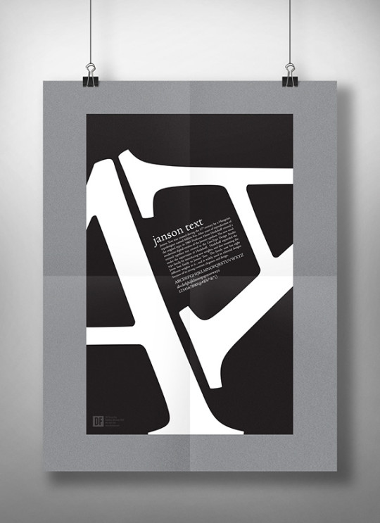
Photo
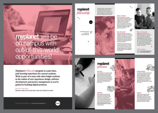
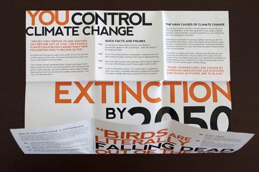
These are some of the researches that I did for my brochure.
0 notes
Photo
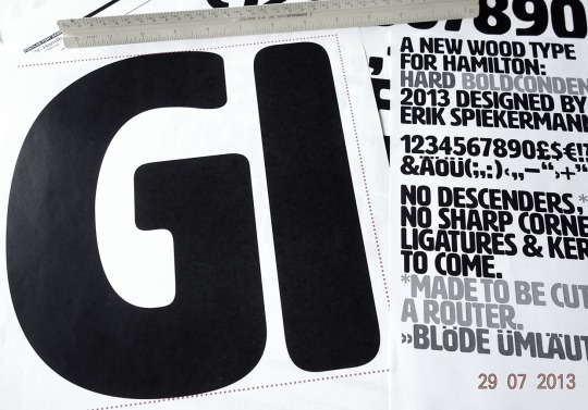
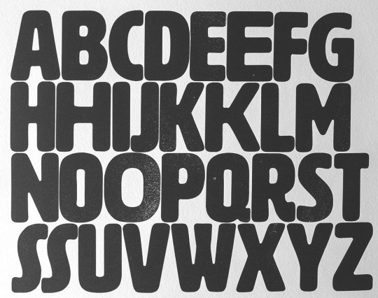
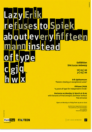
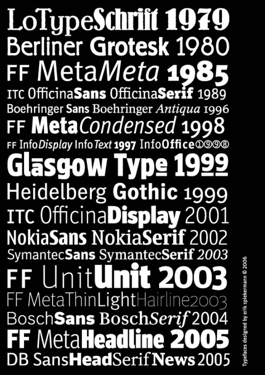
Erik Spiekermann
Erik Spiekermann, born 1947, studied History of Art and English in Berlin. He is author, information architect, type designer (FF Meta, ITC Officina, FF Info, FF Unit, LoType, Berliner Grotesk and many corporate typefaces) and author of books and articles on type and typography.
Between 1972 and 1979, he worked as a freelance graphic designer in London before returning to Berlin and founding Meta Design with two partners. In 1989, he and his then-wife Joan Spiekermann started FontShop, the first mail-order distributor for digital fonts. FontShop International followed and now publishes the FontFont range of typefaces. MetaDesign combined clean, teutonic-looking information design and complex corporate design systems for clients like BVG (Berlin Transit), Düsseldorf Airport, Audi, Volkswagen and Heidelberg Printing, amongst others. In 2001, Spiekermann left MetaDesign over policy disagreements and started United Designers Network, with offices in Berlin, London, and San Francisco. Spiekermann an Honorary Doctorship for his contribution to design. His family of typefaces for Deutsche Bahn (German Railways), designed with Christian Schwartz, received a Gold Medal at the German Federal Design Prize in 2006, the highest such award in Germany. In May 2007 he was the first designer to be elected into the European Design Awards Hall of Fame. In January 2007, UDN was renamed SpiekermannPartners. In January 2009 SpiekermannPartners merged with Dutch design agency Eden Design & Communication and continued its operations under the name Edenspiekermann . Spiekermann is considered a very influential personality in the field of typeface design and information design. He often attends international meetings, and has been giving a substantial contribution in several fields, such as app development and public way finding.
References:
https://www.fontshop.com/designers/erik-spiekermann
https://en.wikipedia.org/wiki/Erik_Spiekermann
Image References:
https://ankitbariadesign.wordpress.com/typography-2/the-pioneers-of-graphic-design/research-erik-spiekermann/
http://luc.devroye.org/fonts-26227.html
0 notes