
Last Seen Blogs
endominator
Endo
arcadian-vampire
Check Reflections So I Won't Forget My Face

racheljhaydentx
Digital Marketing By Rachel

dawebimuso
Untitled
Text
Method
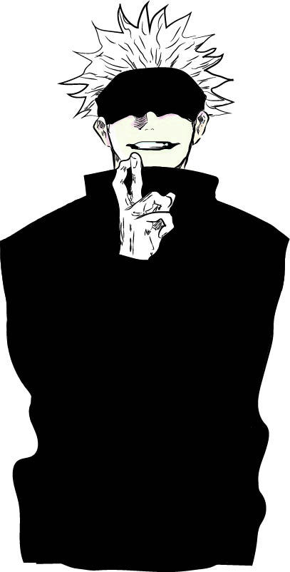
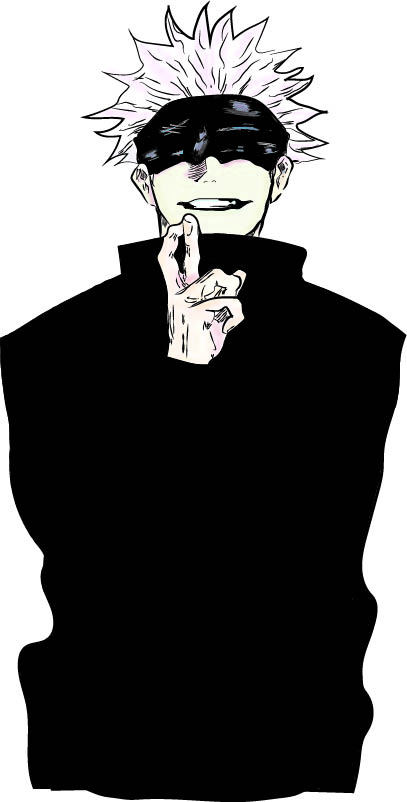
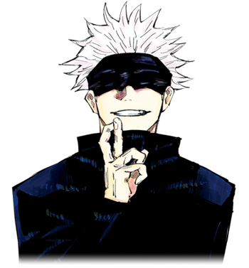
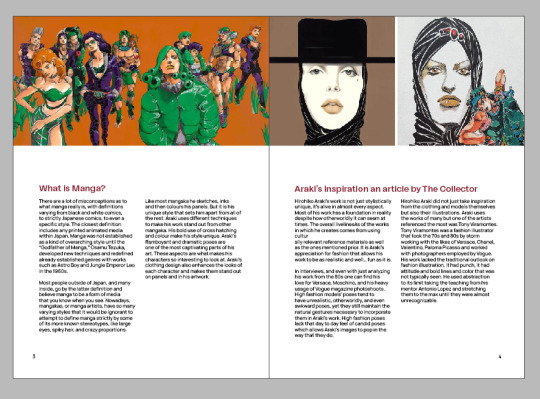
Illustration is an important in story telling medias like manga, comics and art. The visual style of manga has influenced my design creations and creation style. Manga uses cross hatching, shading and colour to create the illusion of 3 dimensional shapes. Mangaka’s often use illustration to create their stories with characters and to feed the narratives they create. One influential mangaka is Kentaro Muira who’s style embodies that of a medival artist and uses techniques such as cross hatching to perfectly create works of art. Kentaro uses a very dark aestethic to illustrate the dark surroundings of the world of Berserk and the characters around it.
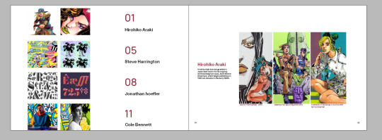
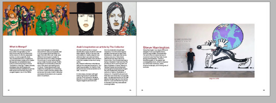
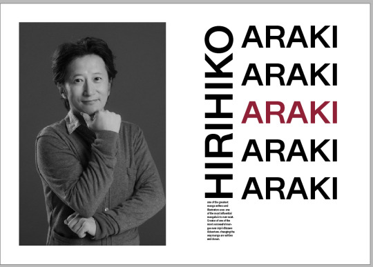
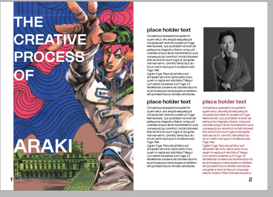
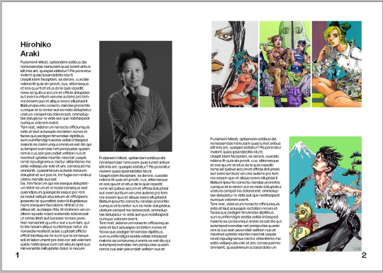
Analyzing how Kentaro uses these colours taught me how I could use different tones in my own work and make better use of darker colours to create things that stand out to others. Darker tones create connotations to darker themes but if manipulated correctly can create works of beauty. I use cross hatching in some of my character creations by hand before I render them into a digital illustration. Manga isn’t only in black and white there is another stage to their techniques called colouring, colouring can make the already amazing illustrations and add another layer. One impressive mangaka that uses these techniques well is Hirohiko Araki. Araki is known for his flamboyant and dramatic character poses and colouring and uses this to create his bright and strong aesthetic. The techniques of manga cross over to design and help me create illustrations for packaging and products to appeal to target markets such as young millennials, who are more likely to be captivated by vibrant illustrations. “Manga just needs to be interesting. If it is than it will get serialized” Tsugumi Ohba.
The imaginative nature of illustration and its many techniques strengthen my designs by the mediums ability to be anything I need it to. I can create the ideas and worlds I think of in my head and get visual representation of my ideas. Manga also blends into design well because of the use of hierarchy, a manga artist can choose to make certain parts of the panel more important than another to bring attention to specific parts of the page. Generally, mangaka’s tend to position panels so that the top right takes more importance of other parts since in eastern media read from right to left. The way that mangakas think about how their panels will be read and the attention to detail they have when using hierarchy has helped me focus on these aspects of design. Something as simple as simple as the placement of panels can impact to the visual flow of a manga page. By understanding how a person will interpret a page and read a page I learnt to put myself in the viewers perspective and see it as they would. This helps me understand how a viewer will see my designs and why it works as a design, guiding them through the information they need to see in a creative way.
0 notes
Photo
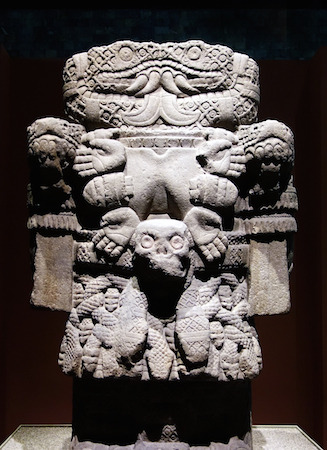
https://www.khanacademy.org/humanities/art-americas/early-cultures/aztec-mexica/a/coatlicue
0 notes
Text
context
“Depression – it's not easy to deal with, but when you try, you can stop thinking about it as a weakness and turn it into something brilliant.” While I design I notice things in life seem to change my approach on deisgn itself. The artist Dawid Planeta gives me great inspiration not only for his artistic prowess but the way he articulates his struggles with mental health through his art. While designing I have gone through many changes and struggles just like Dawid so I understand how creating things can help the struggle. My own designs have been a way to articulate themes and words that every human can feel but don’t really discuss. I noticed as a designer I should think about the psychology of others to better understand what others would want and why it appeals. The ideas of loss and sadness is something every human can feel but not everyone can go through the same struggles as someone else. Everyone has their own burdens in life but it is that understanding that everyone can associate with. I noticed that understanding these ideas and concepts can make it easier to create for others with the same struggles. In Dawid Planeta’s Wisp of smoke it shows a figure in front of a giant Aztec statue. The Coatlicue statue is an aztec statue that is identified as the diety Coatlicue (Snakes-her-skirt). Humanity has always looked to gods and deities for guidance in times of struggle. Humanity hopes a higher power will comfort them in their times of need and offer an escape and reason for the hardships in their life. Deities give them hope and help them carry on through the hard times. The ominous nature of the figure and the deity translated to design can work in harmony with design. The vulnerability that comes with understanding your emotions and being content with the feelings you have can create enigmatic compositions just like Dawid planeta’s Wisp of smoke.
0 notes
Text
abstract
“One day, in retrospect, the years of struggle will strike you as the most beautiful.” The struggle humanity faces everyday is something that gives lifes darkest moments but getting through them helps each person prevail. We face hardships everyday but it is the driving factor of struggling that makes success even better. Just as Freud says the struggle will strike you as beautiful. We equate struggle with unhappiness or suffering. These two things are perceived as unhealthy thus we learn to live for the future at the expense of the present. We strive for success so that our past can never repeat itself, so the struggles of our past become a distant memory. We associate the hard times with fondness because we were able to overcome the obstacle that was ahead of us and turn it into something better. This is the internal struggle of humanity and taking these approaches into design can help mold a style and ethic for perfection. Designers always strive for perfection but it is that pursuit that is the struggle and only by investigating the problem do we realize perfection is unknowable, it’s right in front of us all the time.
0 notes
Photo
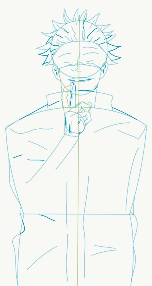
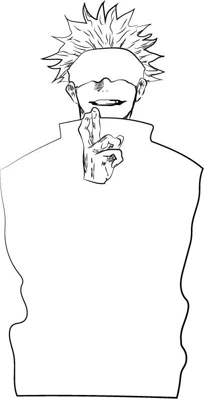
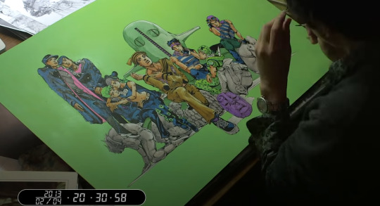
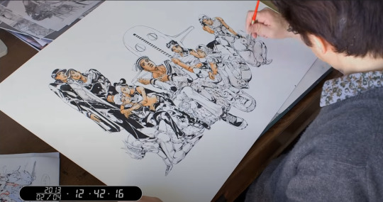
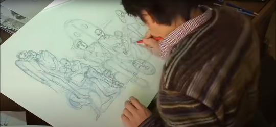
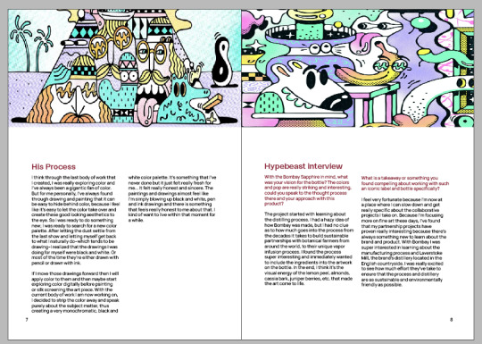
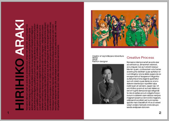
At the start of this process I just like Araki I sketch out the anatomy and positioning of the character. I follow the sketch and clean it up making outlines of the outside pieces to get an of the overall shape and anatomy of the character. I then add a basic colour for the base of the character and the clothing. I then add in some colours for skin tone and then add the highlights for the characters clothing. I use different brush types to and stroke to create that hand drawn style. This process is the basic art principles I learnt while sudying japanese artists and western comic book artists (Hirohiko Araki, Kentaro Miura, Jim lee, Todd McFarlane). this is a illustrating style that I learnt and now use in illustrator. it’s the structure I follow when drawing characters in the manga/ anime style.
0 notes
Photo
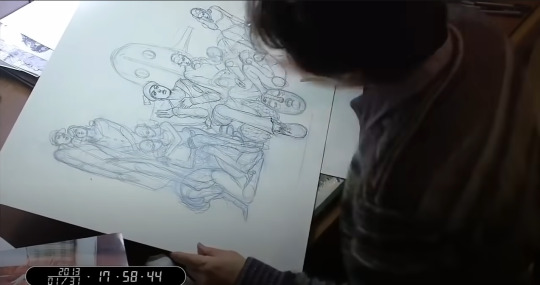
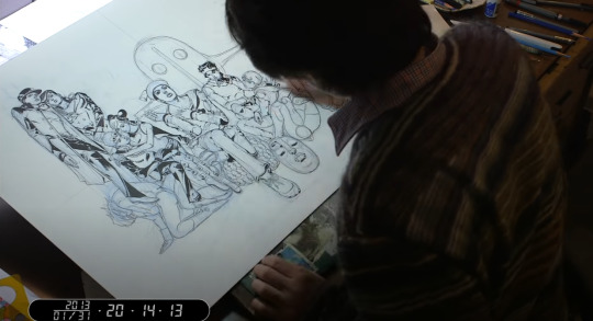
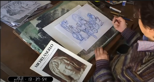
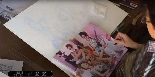
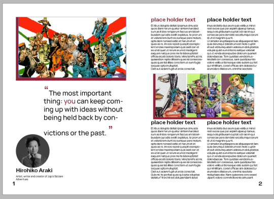
while getting research for the book I watched some footage of how the artist araki breaks down his work and the process he goes through when creating his art. He first start off by creating a small plan and he looks through magazines and sculpture books for inspiration and anatomy references. He then makes the sketch of what he wants to create on an a4 piece of paper and figures out the poses and characters he wants to place on the bigger sheet. He uses this as a way of placing what’s in his mind to the paper to get an idea of what his art is going to look like. he then follows the shapes on the bigger piece and then starts adding the finer details in his sketching process. after that he transitions to inking and then adds the colours with a paint brush and mixed inks. the lines and shadows are all done with a g pen and a micron pen.
Analyzing this process helped me with some of my own process in design. sometimes I will sketch things and then ink them and transition these inked drawing to illustrator and image trace it to make it a digital vector illustration. I do this in consideration that I don’t have a stylus or drawing tablet so making physical drawings and porting them over lets me add to the drawing and clean things up in illustrator. I use the similar processes when in illustrator to finish my pieces and designs.
0 notes
Photo

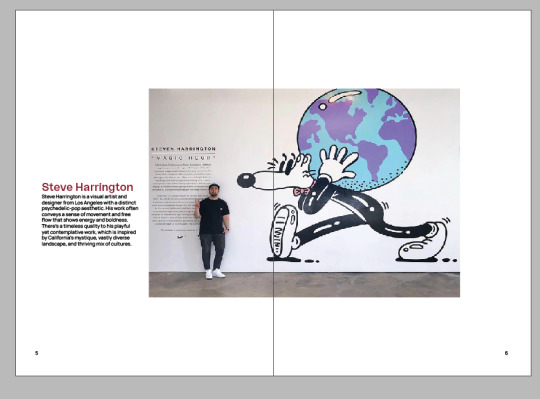
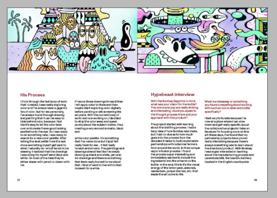
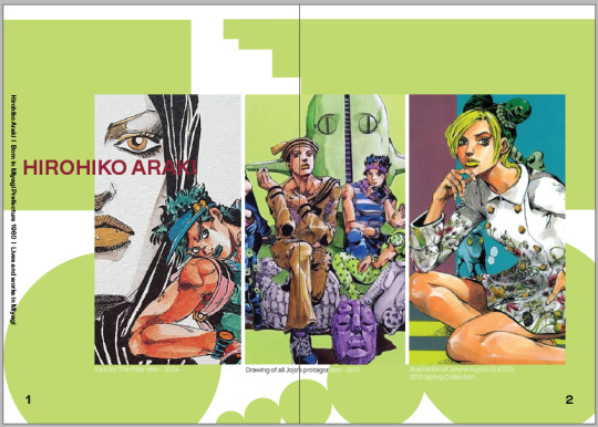
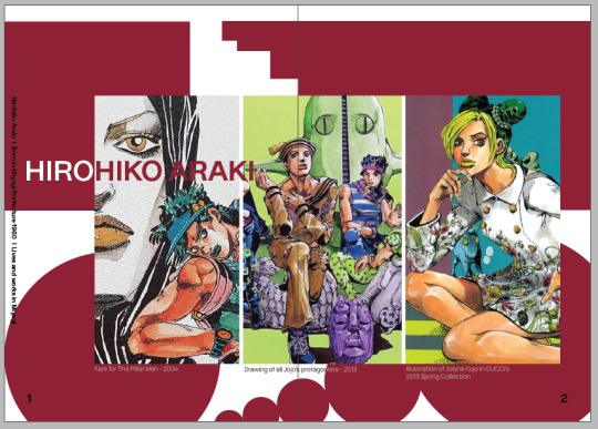
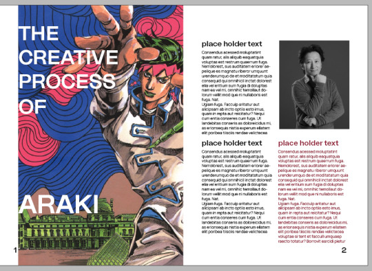
This is the final version of the book. after trying out different styles I realized that I should look into trying to simplify the layout and let the images take more part in the introduction pages. While going the process of trial and error I noticed that some of the shapes take away from the system and stand out on their own. I took into consideration that the shapes may add to the design of the book but aren’t consistent enough for me to want to keep it in the system. For the final layout I chose to have an introduction page with one pieces of art made by each person covered in the book and then I decided to create a system where the images would be on top and the text would be below with a gap to clearly show each the pieces. I added 01,02,03 to the page numbers to keep consistency with the table of contents. I added a small summary of each artist in the introduction page and gave more information on the next about their art and inspirations so the next page would flesh out who the artist is and let readers know how and why they have the art styles they have. I kept the same red for artist names and the text above the body text and also quotes to fit the three colour system I created (black, white, red). I used the same margins and columns that me and my group had created, but I changed that placement of some of the body text and images.
0 notes
Photo
I create all these design templates for each page looking at what one system could look like besides using the general template. I move things to one side of the page to see how it reads and if the text sizes work together to try get a sense of how a reader might see the work. I play around with colours to see if that makes a difference with the work. I also play around with hierarchy. I also play with shapes made in illustrator to see if that would compliment the work and make things interesting.
0 notes
Photo
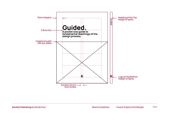
This is the process I went through when designing the book for studio. these are the guidelines we made as a group. and this is the overall process of how I would design a book. I use the coloumns to create a system that reflects what I could be useful to the users of the book. the system is made to show there is a cohesive system throughout the pages. These guidelines help the book look constant throughout the design.
0 notes
Text
Isolation
All of the pieces I have selected all are under the theme of isolation in some way or another. The pieces have characters featured on their own or indifference with other characters. Mainly the visual theme is black and white but the overall all theme I picked was isolation.
0 notes
Photo
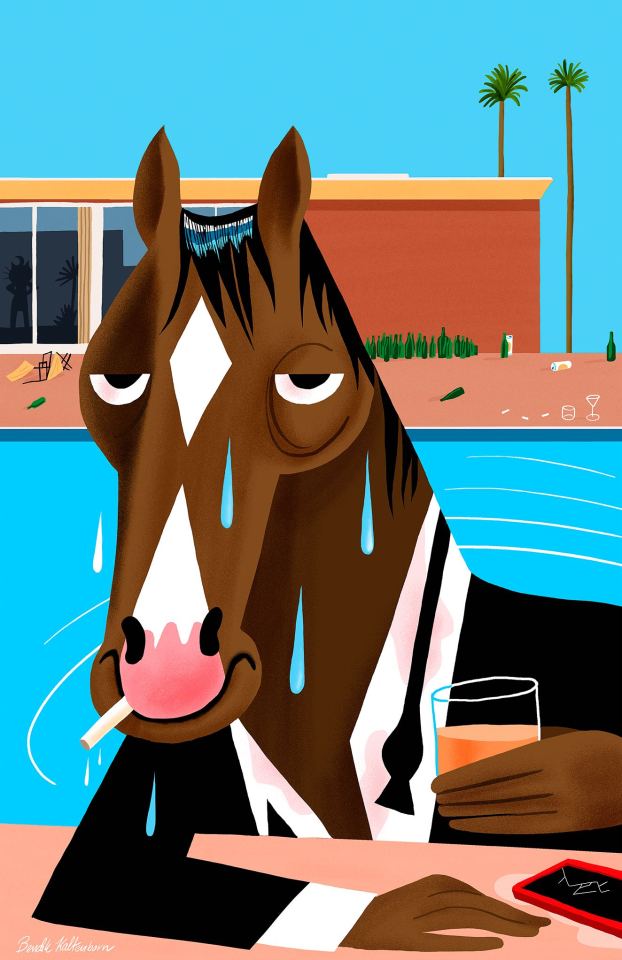
Horseman by Bendik Kaltenborn
date: unknown
Method: digital illustration
This piece looks to be inspired by the David Hockney piece called a bigger splash. The environment behind Bojack the character is replicated from the Hockney painting. The digital illustration uses vector images and shading to create the aesthetic of Hockney’s style infused with new technology and Kaltenborn’s own artistic preference. The piece is a homage and a wonderful one at that.
The context to why this piece is so important not only as a piece but with it’s references to Bojack the show as a fan is huge. In Bojack we see the famous Hockney painting ‘Two With Two Figures’ numerous times during the show in Bojack’s office. The painting is referenced in some nightmares of Bojack’s.
In the show the Hockney painting is modified with Bojack looking at Bojack instead of what the original has. But not only is the references to Hockney the best part of this illustration, but it is the subtle references to Bojack as a character.
Throughout the show and even in the opening of the show Bojack is seen falling off his balcony in the ‘Hollywoo’ hills into his pool. The imagery of bojack jumping into water and drowning in his pool are very strong throughout the show. His own idol secratierate who died by jumping off a bridge strengthens the deeper meaning of water that the show creates. This feeling of drowning in fame, sadness, regret and all of Bojack’s worst traits. Are all shown through this one image.
Bojack is holding an alcoholic beverage in his hand representing his alcohol addiction and he is also holding a cigarettes' showing his smoking problem too. The suit represents the intro, during the intro he is wearing a tux and drowns in his pool after falling. This photo makes references to that small detail too. The bottles on the roof and all over the house also hint to his drinking problems.
In the back of the image you can see silhouettes of princess Carolyn one of Bojack’s only friends and his agent. The shape of her silhouette shows her with her hands on her hips representing yet again Bojack has done something stupid.
The expressions on Bojack’s face perfectly represent the type of mental state Bojack has a character. He is nihilistic and doesn’t care about much, he clings to his pasts days as a sitcom actor in ‘Horsin around’ a show that is modeled after the Cosby’s. But it’s not just that the references stop their, like Hockney Bojack is in paradise and like some of the meanings in Hockney’s work he isn’t happy all though he has everything he could have asked for. Bojack just like in the show still deals with all of these issues while living paradise. He is as some would say suffering from success.
This all comes together to give what viewers understand as what Bojack is, a person with mental problems suffering in silence seeking attention for all the wrong reasons. Bojack is simply Bojack.
https://www.newyorker.com/magazine/2016/08/08/bojack-horseman-bleakness-and-joy
3 notes
·
View notes
Photo
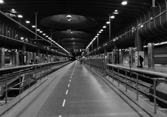
This is a pieces of photography from my year 1 minor class.
I had taken this image with my booklets overall theme of isolation inspired by covid-19 and the photographer Thomas struth and his empty city images. Covid-19 inspired me to take photos like this because I would take photos where there should be people everywhere but there is hardly anyone there making an almost ghost town like aesthetic. These were all places in the city that would have people in them but they were almost empty.
I used my phone camera for this photo and took it while I was training home. The image was edited in photoshop and was done by changing the levels and adjusting the image to black and white.
0 notes
Photo
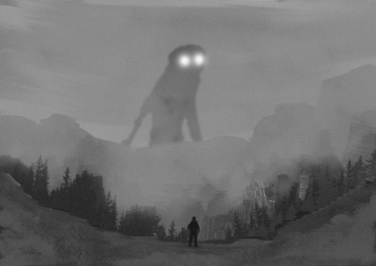
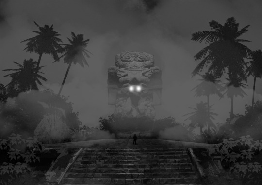
‘Broken city’
during 1 in year 2 somewhere in 2021
Artist: Leroy Tito (me)
Method: photoshop/digital art
When I first created this piece I was inspired by speed art tutorials I had seen online. I made it for an assignment but I had also created this channeling the feelings I felt while my grandmother was sick with cancer. I made a broken city because it felt like my world was breaking and I wanted to make a piece that displayed how I felt. I made a giant monster due to my inspiration from Dawid Planeta. But the giant monster represented the future and how scary it was to me knowing that I would lose my rock at such a young age and that wasn’t ready.
To me I am the figure standing in front of the ominous future. Gazing at the abyss and dreading what is to come. Like the figure I couldn’t do anything to change the future I just had to stare.
The image was created using brushes in photoshop and images from the internet handed in with a filter and painted over to make them fit the rest of my work.
0 notes
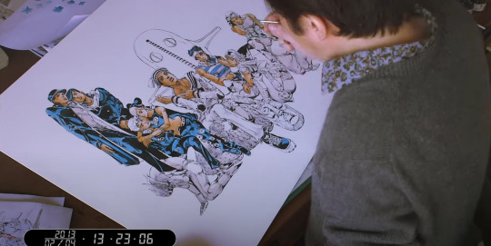
Photo
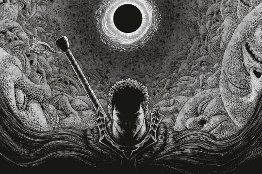
Berserk chapter 355 page 17 released on march 23 2018.
Artist: Kentaro Miura and his assistants
Method: digital artwork
This piece was created for the long running manga Berserk. this chapter was very dark and the character in the middle is guts. The main protagonist of Berserk.
Miura stated that the work that had the biggest impact on his own was Buronson and Tetsuo Hara's manga Fist of the North Star. Hieronymus Bosch paintings and has also cited fantasy novel series Guin Saga and violence jack as inspirations.
The overall theme of berserk has an almost medieval presence. The story of berserk is dark and gritty and the protagonist and the art style displays that to perfection. The art is perfectly drawn and created with so much care it is considered art even though it is in a comic.
The piece strikes out to me because of how dark and detailed it is. The piece has layers of faces in the background and is masterfully crafted with perspective. This piece to me shows who guts is, even with all of these horrific faces in the background he is still going through never phased. Pushing past all of the horror and coming out strong. I believe what Miura was trying to do with his story was to show optimism and fighting against your demons.
https://en.wikipedia.org/wiki/Kentaro_Miura
https://neotextcorp.com/culture/remembering-kentaro-miura/
1 note
·
View note