
emilyanimation
Enterprise Module
Development blog for Emily Chambers - Film and Animation student at BCU
76 posts
Last active 60 minutes ago
Don't wanna be here? Send us removal request.
Last Seen Blogs

the-music-maniac
THE MUSIC MANIAC

starshapedbee
Bee!
thepiedsniper
-The Pied Sniper-

fuckyeahpipesofpan
Pipes of Pan

vampirechatroom
أوي شكد حلوة الحرية
Text
Overall Evaluation
While I believe I have been evaluating my work as I created it, I wanted to write an overall, general evaluation/expression of any final thoughts and feelings on the project that I wanted to express.
I feel as if I could’ve emulated the character style a bit more, I just drew my first designs and ran with them, only doing around three sketches per character, not even doing any design work for the church boys, jesus or the mean man. Understanding and researching 1950s aesthetics and design wouldve been beneficial, instead of just lightly touching on some styles of commercial animation from the time. Having matchstick appendages also turned out to be a bit of a technical problem. The thin arms made the joints visible if they bent in certain ways, meaning some movements looked wrong. It’s not that it wasn’t possible - just difficult with my level of skill in creating puppet models. I have learned this for the future, and will keep it in mind. I will also probably use Illustrator instead of photoshop in the future, depending on the future project of course. Illustrators vector files and simple shape tools make for some much sharper and easier to create models than drawing each one.
There were a couple of other technicalities that I noticed which should have been fixed if i had more time - little things like pixels being on the wrong layer or movements looking somewhat unnatural. Learning tools such as ease in and ease out to give a greater sense of movement anticipation should be my next step if I plan to use the program again.
I was happy with most of the little movements i did - it felt strange if characters weren’t moving at all when on screen so i added little details that helped you know the characters a little better instead of them all doing the same kind of thing. Initially I planned for the parents to hold hands in the first scene and nod in sync, but having them react in different ways was a lot more fun to animate, and surprisingly easier, as i struggled to get two separate character models to interact with one-another.
My mother model was my personal favourite due to it being the most visually connected to the era I was basing it on and the model I spent the most amount of time on considering it was my test, I wish I could've used the model more if I had time to alter scenes. This means I should have spent more time on key models instead of one that would only be in one scene so the entire film looked polished insetad of just the first shot.
Time scheduling worked and spared me a lot of stress and extra work - it is something that will take time to perfect though as I still had the odd few days that didn’t work out due to procrastination or other life scenarios. I was in production all the way into the final week when i wanted to be done by then, but luckily everything was still completed in good time thanks to scheduling.
0 notes
Text
Sound Production
For the audio I needed the right kind of accent and for it to sound authetically old-timey. Initially I was planning on having it be an American voice to play into the 1950s stereotypes, however at the time I needed the files there was no one available who could do such an accent. However I feel as if the British accent still works and my cousin did a good job pulling off the chipper radio voice I was going for. In order to sync up my animations with the dialogue I had to get the audio files quite early in the project, during the Easter holidays, which is why I was especially limited for voice actors. I didn’t get around to editing the voice files until much later in the project, once all the animation was completed.
youtube
As I have never even touched Adobe Audition before, I required tutorials in order to help my navigate the program. Luckily I found a tutorial with exactly the kind of effect I was looking for, which helped me out a lot. Unfortunately it was one of those tutorials that didn’t exactly teach me. It told me how to do certain steps but it didn’t tell me why I was doing them, or what it meant. I got the jist after experiementing more with the program, but it would have been nice to have been given a broader understanding.
In the tutorial, he gives you two different options for making the audio sound muffled and old, and I ended up going with the second one, the FFT filter with the on hold EQ preset, as it felt just a bit more like what I was imagining in my head.
This edit along with a vinyl noise over the top of the footage was very simple audio editing, but I didn’t feel that it really required anything more than that. I played with the idea of including rag-time piano music in the background, but thinking about old PIFs from the 1950s, I couldn’t recall coming across any which included music as well as narration. Either way I’m satisfied with the final result and don’t believe it needs anything more to it.
0 notes
Photo

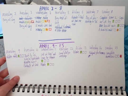

Timetabling
Proof that I’ve kept up with my timetable since the beginning of the project - give or take a few days and detail lessening as the deadline gets closer. Time management is a skill that I will have to hone quite a bit to get the most out of it as I still struggled a with the very small amount of project time but i’ve been doing leaps and bounds better than previous modules just by writing simple bullet point lists of tasks to complete in the day.
0 notes
Video
1950s Public Information Film - Final Piece
0 notes
Video
youtube
Scene 5 Production Evaluation
In this scene I am coming to a conclusion to the PIF, and reminding the audience of the inital message of the film, summing it up in one quick scene. I am also summing up the joke as well, skipping past the clearly homosexual behaviour in order to focus on something that is really just trivial stereotypes. I including a binoculars filter around the edges of this scene to really hone in on the fact that the audience are taking the words of the PIF to heart and are going out there to search for this supposed gay behaviour they’ve been told about - instead of what is actually considered gay.
I struggled quite a bit with the framing of this scene as kissing is quite a complex motion and I wasn’t entirely sure how to go about it.

I thought about having the two separate character models just hold hands and lean in for a kiss but I knew the framing would lead me down the body so the viewer would miss anything happening on the head as the camera moves on quickly. I also considering making new models with both of the boys in profile facing each other, but quickly realised that would look odd with the very 2D look the rest of the film has, and wouldn’t really show anything interesting on their bodies.
By making a new model that combined their bodies I could have one of the boys backs facing the camera, so no awkward kissing motions would have to be made with facial features. This worked out a lot better than my other concepts and I included a bunch of other tells to make sure it was clearly kissing, such as love hearts and hand movements down each others bodies. I’m not sure how clear it is that one of the boys the main child is kissing is one of the kids he was talking to earlier in church, but even if its not abundantly clear from his back I at least believe the implication is there. Perhaps it would have been funnier if he was kissing Jesus? I feel that would have made more narrative sense too considering he was the one he winked at just moments before this scene. But alas, an idea which came too late in the creative process.
I am happy with this scene and believe it wraps up everything neatly to give a succinct and comedic ending to the satirical PIF.
0 notes
Video
youtube
Scene 4 Production Evaluation
This scene was of the final tableau, which was the one I struggled the most on finding a concept for. I finally went for a scene with Christian connotations to really dial in on the kind of conservative person I am poking fun at and to include the Adam and Steve line that I really wanted to keep in somewhere. I’m really happy with the comedic timing of this scene as I got the expressions just how I imagined, and the word “Steve” perfectly syncing with the cheeky wink helps with getting the idea across in the short time I have.
Instead of keeping the block “SCENARIO THREE” text up throughout the whole time the woman was talking, I added a quick extra scene in to establish some of the church boy characters, who would show up in the final scene. I struggled a little with the timing on this one, as I wasn’t sure if they were on the screen long enough to really take in and remember for the final scene, but according to peer review, it was fine.
As this section of the PIF had more cuts than the rest of them, it ended up including a lot more compositions and character models. It got to the point where it was difficult to organise and I was clicking on multiple ones in order to find the one I wanted.

Highlights the importance of composition naming!
This scene also includes different angles for the characters which was particularly challenging for me who is still very much a beginner at drawing - so the quality of the appearance of the film drops significantly. I did have some technical issues during this period - Windows released a new software update that made the majority of tablet pens not work when zoomed in on most art programs, so dealing with that cost me precious time that I would have spent making it look less bad.

Potentially the worst thing I have ever drawn. The zoom in on the scene that includes this comp is strategic as I try to hide it as much as possible.
0 notes
Video
youtube
Scene 3 Production Evaluation
This scene is showing my second tableau, which is more of a commentary on how women are supposed to always love men even if they are being cruel and abusive. According to a lot of the more conservative population, if you are a feminist or critical about mens behvaiour in any way, then you must be a lesbian. Of course this notion is ridiculous, and I tried to portray that by having the man be clearly brutish and insane, which contradicts the narrator claiming that he is simply a good man asking her to do something. Additionally the fact that the mother thinks the fact her daughter doesn’t want to marry anyone despite not even being 20 yet is a surprising notion despite it being very understandable in this day and age is another nod towards its ridiculousness.
I know I wanted the man to be very gross and mean, so I designed him to be very bulbous and much larger than the girl, to get the idea of what kind of person he is easily with simple visuals. I used the puppet tool for all his motion, using this tutorial to learn how to do quick movements by just clicking and moving a point with my mouse.
youtube
This allowed the movements to be much smoother than manually opening and closing his mouth with every separate keyframe, which would have taken a much longer time.
Initially I was thinking about having the word “LESBIAN” slap over the girl in big letters, but in the end I don’t think it was particularly necessary, and would have been difficult for it to really pop out with everything being greyscale. I also feel as if that would have made it feel a bit less authentically 1950s as big bold things like that wasn’t really their style.
0 notes
Video
youtube
Scene 2 Production Evaluation
In the second scene I am starting the tableau scenes which make up the bulk of the PIF - a bunch of scenarios that the narrator tells the audience is gay behaviour when its really not.
This differs from my storyboard as I came up with the idea of having the mother explain the scenario after I analysed the coughs and sneezes PIF. Having the mum talk helps personalise the film and brings the target audience in. I contemplated having the mother character model visibly talking alongside the voice, but this felt too much as if it was an issue for that specific character instead of mothers everywhere, and using block words for that section felt much more general to an entire group of people. Additionally, lip syncing was an ability that was probably a bit too intermediate for my current level of skill with the program.
I knew I wanted the camera to pan down the childs body to show off all of his “normalness” so the shoes are more of a surprise when the camera reaches the bottom of his body. Due to this I had to time his body movements so there would always be a part of him moving on the screen in order for him to not look just like a picture of a boy instead of a real one. This is why the head moves first, then his arm, then a wiggle of the toes.
I am happy that my movements of the character model gives him some level of personality - I wanted him to appear very innocent despite clearly going behind his parents backs. However the movements in his face and arm are very stiff and I struggled to get it to appear more natural. Learning how to create smoother movements with tools such as ease in and ease out should be my next task if I wish to use AfterEffects in the future.
The only change from pre-production was that I was going to have the boy licking his lollypop, but the way I constructed his arm meant there was no real natural way for him to get the lollypop up to his face. In the future when creating the models, I should have all the required movements in mind so I’ll know exactly what parts of the body will need to move and how they will do it.
1 note
·
View note
Video
youtube
Scene One Production
The first scene was trying to establish what the PIF was about, and the characters that will be recurring throughout the film. Considering 1950s PIFs were very straightforward with what they were trying to say, I included a narrator literally explaining what the PIF was about instead of their being a twist like more modern PIFs. Having the characters look directly into the camera helps it appear like they are interacting with the bodyless voice, as they are often associated with being behind the scenes. My target audience for the film is the stereotypical nuclear family, so having them represented on the screen and staring right at the audience would help bring in that specific kind of person.
Due to attempting to be authentic as possible, I had to keep it in black and white and include a vignette on every scene. I decided to make everything some shade of grey instead of pure black/white to give it an aged feeling.
When the narrator is specifically addressing the parents, I planned for the movement to zoom in on their faces, but I had some technical difficulties as I couldn’t figure out how to do that camera movement. While experimenting I ended up doing the effect shown in the video where the children zoom out of the shot as everything gets larger using the scale/position tools. I found that was a lot more dynamic and interesting to look at than a simple zoom in so I ended up keeping my experimentation.
In pre-production, I planned to have the characters interact, with the parents holding hands or touching their children in some way. I found this to be rather difficult as when animating separate characters it is hard to tell where other characters will be in the space. I’m sure there is a way to figure this out but for someone who has never used the program before and on a time limit, I decided to just have them look at each other, and have separate reactions to the narrator. While it was different from my pre-pro script, I don’t think this change took anything away from the film and could even add something to it - having the characters react in different ways helps give personality to the different characters and makes them feel a bit more real.
0 notes
Video
Flatpack Film Festival Performance
Our puppet performance for Flatpack Festival is complete! Was honoured to be chosen as part of the opening performances and I believe it went very successfully.
Our performance was based off the year 1968 and the Kray Twins arrest in that year, shown from the perspective of normal Londoners as they hear the stories and rumors of the men.
We have performed the show once before at the end of the previous module but that was a while ago - unfortunately due to the fast pace of Flatpack and the available time to set up, we didn’t have any time to rehearse before the performance began. Due to us using the three-act structure and a heavily narrated format, there wasn’t any issues with people forgetting their parts aside from me occasionally forgetting which character was supposed to be talking at which part. The lighting also had to be changed quite a bit from the original production and there was the occasional timing issue with that, but nothing that would have been distracting.
During the chase scene at the final part of the performance, a puppet leg did fall off but thanks to the puppeteers just powering through and not drawing attention to it, it didn’t take anything away from the perfomance and added a layer of comedy to it.
0 notes
Text
Problem Solving
While editing the models for the church scene, I realised half way through that I had given the young boy long sleeves when no other character in the animation has sleeves, including the ones in suits. This was also an issue as I made the sleeves connected to the body layer, so it would not move with the rest of the arm.
To fix this I removed the sleeves entirely so it would fit with the style of the rest of the characters in the animation, and allow the arms more movement if its required. This does make the model appear rather bare though, maybe I could add some smaller sleeves that aren’t as noticably against the rest of the style, or give him some kind of jacket? I will have to see what time allows me to do.
0 notes
Video
Scene Development
In order to really construct that sense of authenticity in my work I followed a couple of tutorials in order to get the old-school film effect across.
I love the effect it produces as it makes it feel very authentic and has a real old-school feeling to it, however I feel as if I made the flickering just a bit too fast. The scratch lines move about so quickly that I feel it could be distracting to someone who hasn’t worked on this for a long time. I turned the opacity down on the lines to make them more grey so they were less stark and distracting, but I still feel as if they could be a little slower. I shall ask peers on their opinions of it in order to be sure.
I also added a small jiggle on everything in the scene as everything was always moving in old-school films. However I feel as if the movement is too slight to be noticable and was therefore a bit of a waste of time. I could make the jiggle a bit more prominent but I already feel as if the film looks and feels very authentic for the 1950s and figuring out how to do any additional effects at this stage in the project could be not a great use of my time. I shall get all the scenes done and then if there is any additional time I shall make edits to the jiggle effect I created.
By importing a project into other projects and using animation presets I can apply the affects to my other scenes so I don’t have to go through the tutorials multiple times and waste time.
youtube
I tried to find a tutorial using Lynda.com but there wasn’t anything for the specific technique that I wanted, which is why I had to resort to youtube. Often I find tutorials to be rather dreary and slow, but this one had quite an engaging step-by-step structure that was easy to follow and exactly the sort of thing I was looking for. My only issue is that I wish it taught me why I was doing certain things more often - there were points where I was typing in the numbers that it was telling me but I had no clue what those numbers meant or what they were supposed to do, so I wouldn’t be able to apply what I was doing to other effects in the future. Often in tutorials there is an assumption that the person watching is already well-versed in the program which can be fustrating for someone with a thin grasp on it.
0 notes
Photo


Flatpack Festival Preparations
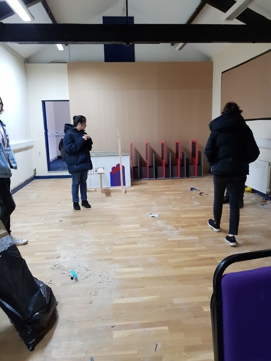
My previous project was a live brief that was offered to the Flatpack Festival. My group were honoured to receive a place in the festival, and have been planning the performance for the last week.
We had to make a new base for the set as the previous one was fragile and difficult to transport, we also had to think about speakers and the logistics of the space to use a projector. We went on an excursion to check out the space in Digbeth today and started getting an understanding of how it would look and work together.
Looking forward to the final performance tomorrow!
0 notes
Photo


Script
In order to sort out the issues with the stilted strangeness of my dialogue, I sorted it out by focusing on it through the script. Most of the changes I made were extending some sentences so they didn’t end too quickly, and adding a secondary character, the mother asking questions to prompt the different scenarios. Before I felt as if the different tableaus were too separate and had nothing to connect them together, so by adding a second voice that triggers the different scenes makes it feel a lot more natural.
I also changed the final scene, as the banana concept didn’t feel as fleshed out or as relevant as the other ones. I loved ending it on “Its Adam and Eve not Adam and Steve!” but it didn’t feel connected, so I made the 3rd scenario based around church and Christianity. This furthurs the comedy of poking fun at this type of conservative culture, considering Christians wide and unpleasant history with the LGBT community.

0 notes
Video
youtube
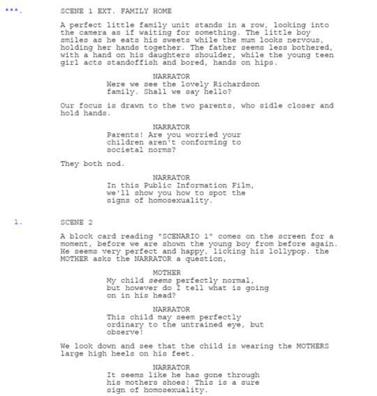
Applying Analytical Skills to PIFs
Describe - List information on what you can see without interpretation.
The PIF starts with shots of a man sneezing loudly and obnoxiously in various places, while people look at him in distaste. A woman speaks over the top of the footage, explaining that this is her husband who never uses a handkerchief, and what she is supposed to do about it. The voice changes to a man, explaining how she must reason and be kind to him, while showing shots of a womans hands caressing his head and massaging him. The voice then explains that if that doesn’t work, water must be thrown on him, followed by footage of just that. The second scenario involves him being shown a handkerchief and completely misunderstanding what to do with it, shining his shoes and polishing things. The male voice then explains the woman must take pepper and make him sneeze, holding up the hankie in front of him in order to condition the behaviour. The third scenario involves him using a hankerchief but putting it in with the normal washing before the woman can boil off the bacteria. The male narrator informs her that hes dangerous and should just be locked up, as a shot of a police car drives away, people cheering and waving as it leaves.
Identify - What contextual questions need answering before interpretation?
This was from a series of four other short films from the late 1940s informing the British public not to spread germs. The creator of these PIFs is Richard Massingham, who was the Senior Medical Officer at the London Fever Hospital before going into film. The first film in the series, Coughs and Sneezes (1945), was given five months to be made, in order for it to be release mid-november, which was a key time of the year for colds and influenza.
The late 1940s was considered the “Golden age” for public health, due to it being the post-war era and the creation of the NHS in the UK. Films like this along with posters and slogans, raised the publicity of public hygiene tenfold. While we are all aware of things like this nowadays, back then it was information which needed to be spread to everyone to raise awareness.
Interpret - What message is it trying to express? What is it communicating?
This film is trying to raise awareness of public health and how sneezing can spread colds and other diseases. It does this by hiding its message behind a layer of humour, the film is entertaining and not too blatant with its message, making it more likely that people will pay attention. Lots of modern day PIFs use fear and shock factors as its driving force to get people to watch and listen which does work, but humour can be just as effective, as the audience can laugh at the ridiculousness of the mans actions. The sneezing man character in the film is played as a bumbling fool, who everyone is irritated and bemused by. If an audience member sees their own behaviours in him, then they are likely to stop those behaviours for a fear of being ridiculed and disliked by their peers.
By spilting the film into a 3 act structure they can inform an audience on multiple subjects while still acting like they’re not teaching anything at all. The stuff they teach is treated like common sense, with the woman explaining that her husband isn’t following these simple common sense tasks. By framing it like this, people learn without being told that they are learning.
Evaluate - How successful/unsuccessful did the media communicate the message?
I believe it was successful in communicating its message - it informs an audience on how to use hankercheifs in a quick and easy format, squeezing lots of information in just 60 seconds. The three scenario tableaus are very effective in getting lots of ideas across quickly, and adds to the comedy of the film, as each answer to the questions becomes more and more ridiculous. Having the film shown around winter must have also had an impact on its audiences and successfully informed people on the uses of hankerchiefs.
Reflect - what have you learned about constructing meaning that could apply to own work?
I want to use a similar structure to this PIF for my own work - I feel like the 3 tableaus work well when trying to make people aware of a subject, especially for comedy. I quite like the concept of question and answer as well, it makes the flow and format really easy to follow, and doesn’t require much of an introduction taking up time.
0 notes
Video
youtube
Visual Component Analysis in 1950s TV Animation
Tone
In terms of the contrast/affinity of of the tone levels, everything was kept a relatively similar tone of grey, aside from black hair styles and the bright white teeth. Making the teeth white contrasts against the rest of the grey scene and makes them pop, drawing attention to them which is the exact aim of the film, considering it is a toothpaste commercial. Audiences tend to be drawn to the brightest part of a frame and are therefore drawn to the teeth. The rest of the girls character design (her hair, eyes, lips and dress) is kept quite dark, helping to add contrast to her bright white teeth and draw attention to them.
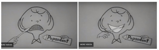
The teeth are dark (a tone associated with more negative connotations, especially with teeth) until the toothpaste is used and they become a bright glowing white (a colour associated with positive things such as purity and cleanliness.) The fact that the character is the same colour as the background helps draw even more attention to the teeth, which is the only thing with a different tone in the scene, aside from the paste tube and brush which is just a touch lighter than the background, to highlight the brand name.
Colour
Colour TV wasn’t widely available in the 50s until some time later, so everything was kept in greyscale due to technical limitations of the time. a fun way they combat this in this commerical is to physically write the word yellow on her teeth in order to get that visual idea across to an audience.

0 notes
Video
After Effects Test
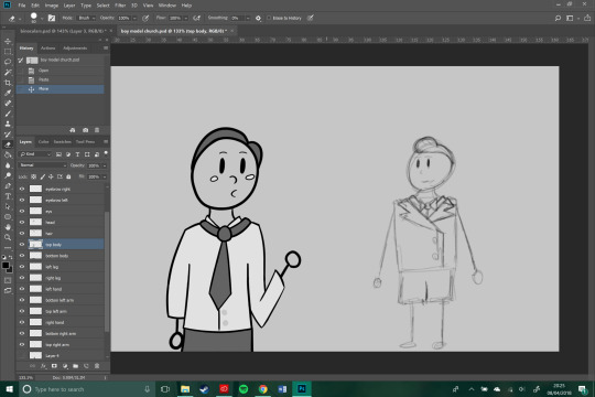
Before I got into production, I wanted to make sure I was able to make a working AfterEffects model myself with the skills I currently have.

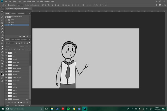
To test my skills, I made a quick model out of the character design i’m most comfortable with so far so I could potentially reuse it for the production itself. I made each part of the model on a separate layer so that they could move individually from one another when placed into AfterEffects. I was sure to remember to use thick lines and black and white in order to emulate the 1950s style.
This was mostly a test to see if I could create a model that would work in after effects, as I was unsure if I needed to use illustrator or photoshop to make the characters. While my animation will have to be kept simple as I am still very new to AfterEffects and still learning the basics, I am confident I will be able to create something effective that still works as visual storytelling. I have previously struggled to wrap my head around AfterEffects so finally starting to understand it is a very satisfying feeling, even if I still have a long way to go in mastering the skill.
0 notes