Last Seen Blogs

wine-gay
cal.

primetimemedianc
Prime Time Media

photostev24-blog
Photostev

witchywithwhiskey
☽✧ witchywithwhiskey's fics ✧☾
Text
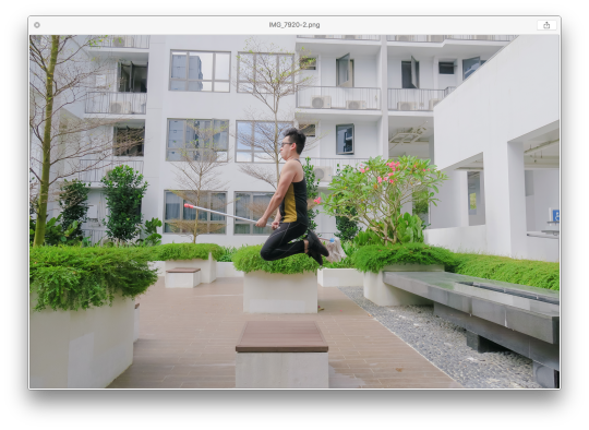
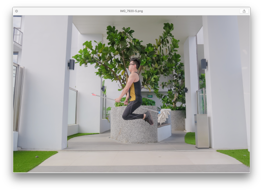
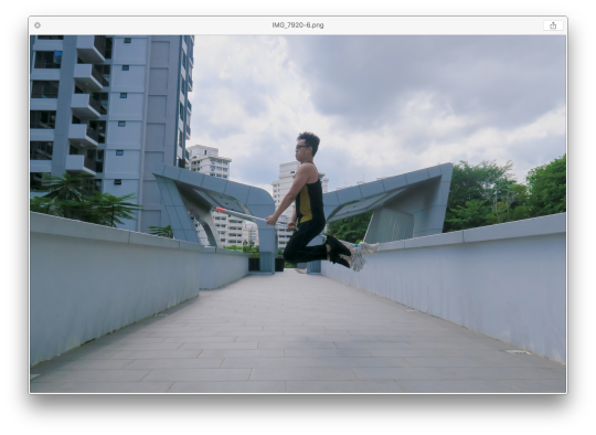
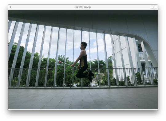
Week 14 - Photography ( Minor )
Week 14 - Photography ( Minor )
We were give two weeks to shoot our last project.
Here are my results!
All thanks to my amazing model, Melanie who really did an amazing job!


I think i don't have to mention which image is for which features - you can tell ;)
0 notes
Text
Week 12 - Photography ( Minor )
Week 12 - Photography ( Minor )
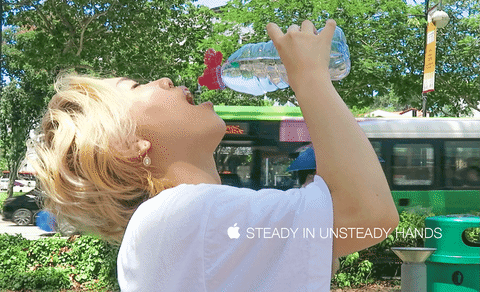
We were given a new brief - Apple
Apple has approached you to breathe life into a new campaign for their launch of the new APPLE IPHONE MINI.
"I love your style / voice, and want you to shoot this campaign" - Kevin Ou (Marketing Director, APPLE)
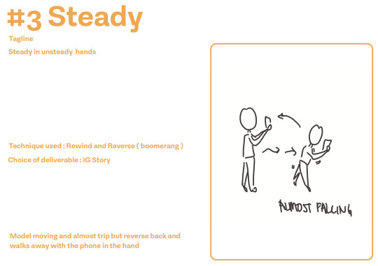
1 x IG STORY
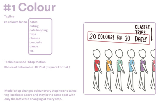
2 x IG POST
1 x Bus Stop Screen (Vertical)
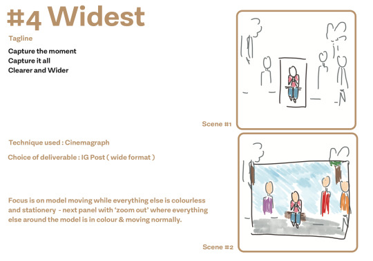
GOAL: CONVEY NEW FEATURES (USP)
Pro-Grade Camera (Main Features)
Wide Angle Camera: Widest lens on a Smartphone Camera
Super Steady Mode: Clear video with Minimal Shaking
Size: Smallest Smartphone available in the market
Color: Available in 20 colors. More colors than our competitors.
So i did some research and came up with a few concepts -

0 notes
Text
Week 14 > 16 - C.D
The last two weeks before submission ( AKA Project Week )
We have to put our app onto invision + roleplay + paperprototype + slides to show our app and how it works.
We had to create our app onto a prototype so my classmate was kind enough to teach me how to use invision since I was not taught in school anyway :)

So basically Invision is this website that allows you to prototype your app for a better user experience ui/ux. The website is really REALLY easy to use and navigate around it so I guess Invision really did ‘perfect’ their user experience. So Invision helps you to envision how your app would look if it’s ‘real’. You can choose so many options of how the function and gestures would work for the user depending on what you’re going for. Each screen would require you to make the click box so that when the user click -
This is the overlay of the entire app
we also did the roleplay + paperprotottype
youtube
also the slides for the explanation of the app ( along with our other touchpoints )

- and I think we are done?
Link to invision app -> https://invis.io/6HRM089GRU7
Overall I feel like this branding project was tougher on the fact that is teamwork. To work with someone with a different view of designs and time management can be the biggest challenge rather than tackling the brief itself. I’ve seen some classmates of mine struggle get their work done because of time management issues from the other partner eg. I was quite lucky that I could communicate well with my partner even though I have to admit there were some moments I felt so suffocated and felt like this was not going to work out ( like a toxic relationship HAHAH jk ) but I’m glad we made it through till the end.
I guess the struggle was to have the same concept and agree with someone - to making the entire brand story then going on to the app and customer journey. I feel like there were a lot more things we could have done better but I can only blame myself for the lack of capability to strive better. We had so much to do from brand story - logo - secondary graphic - touchpoints - customer journey - role play video - paper prototype - hifi app.
I’m just glad this is over !
0 notes
Text
Week 13 - C.D
Week Thirteen - 01/04/2019
/end of CPJ/
JK APRIL FOOLS HAHAHAH ...........
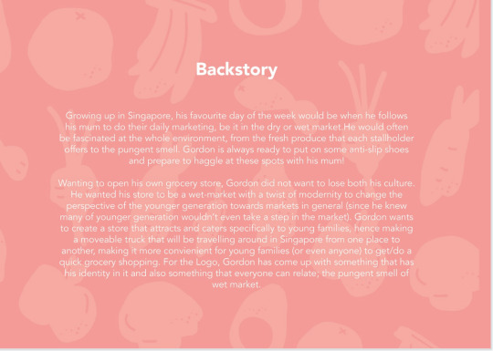
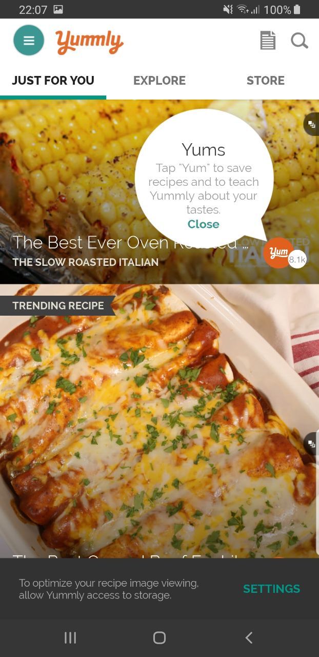
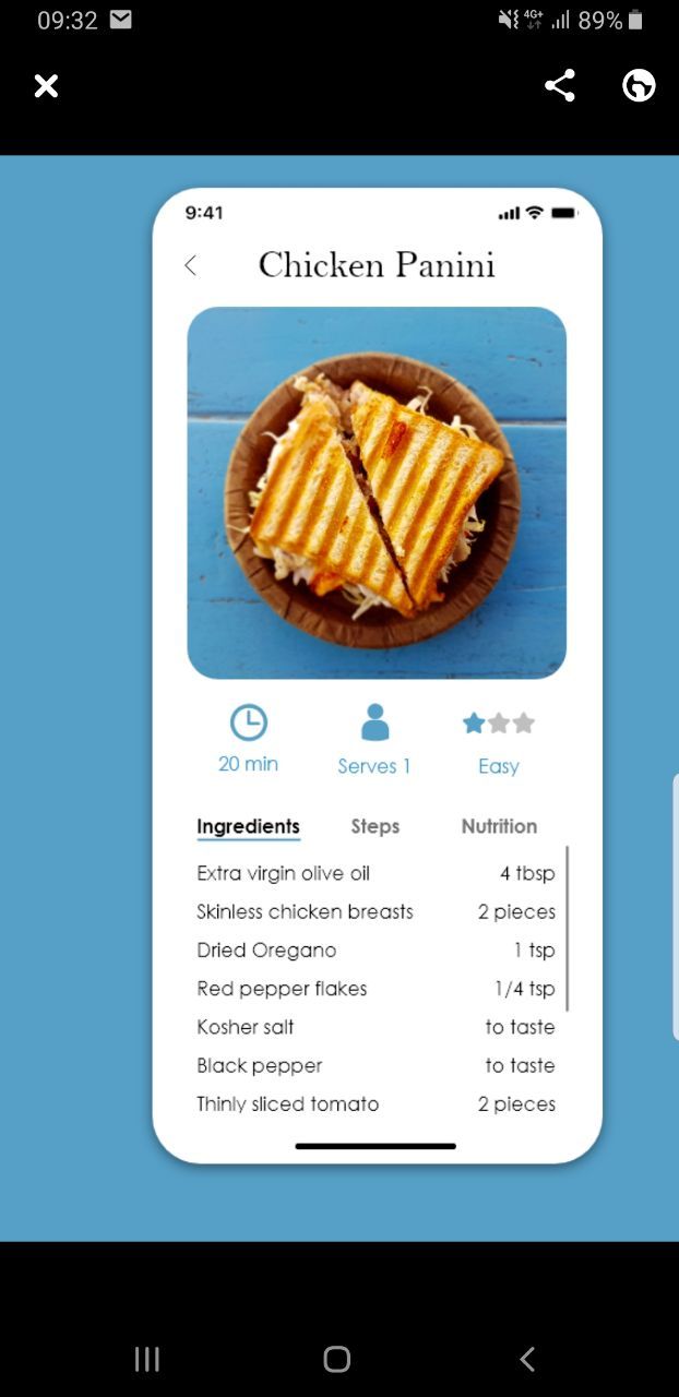
This entry would focus on how the app is created for Gordon app. I did some research on existing recipe apps such as Tasty, Recipe-book and Yummly.


some overview of how some of the apps i downloaded look. Most of it seems rather complicated and involve the user knowing what they like to cook before even using the app. Afterwards I went onto Dribble to see some inspirations.
getting a quick view and feel of how some layout display works - I opened my illustrator and did the artboards
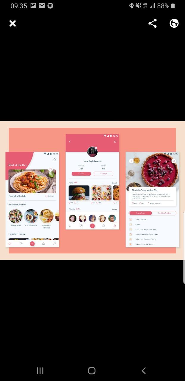
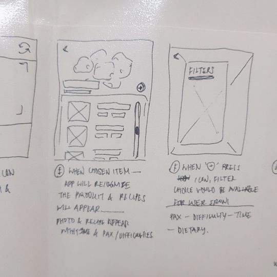
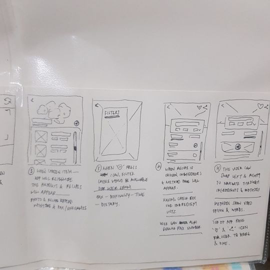
since our customer journey focus on helping the user find recipes when they snap a photo- here is the overall layout
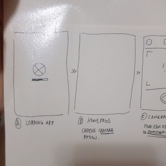
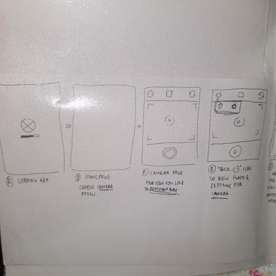
Loading Page
Home Page
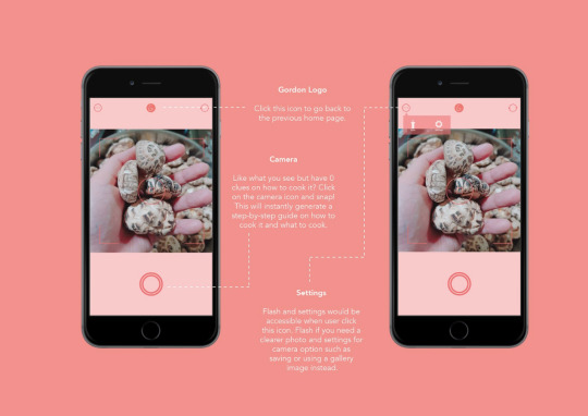
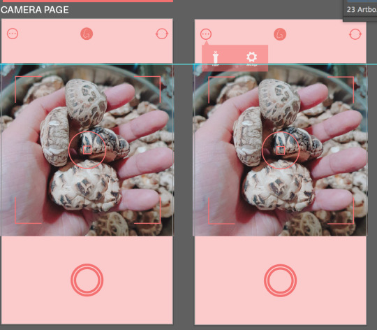
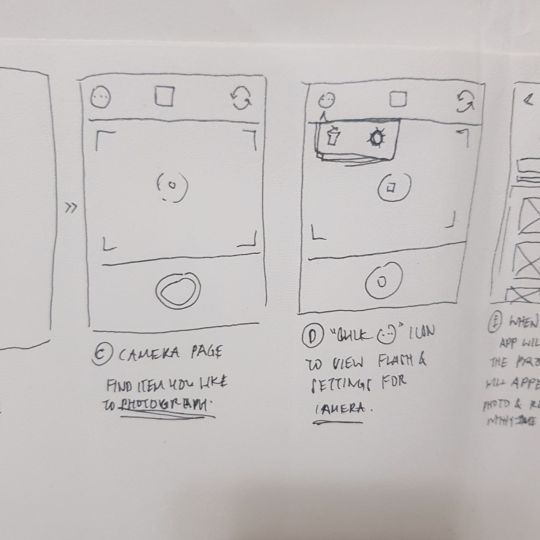
Camera page
Camera page -> filter
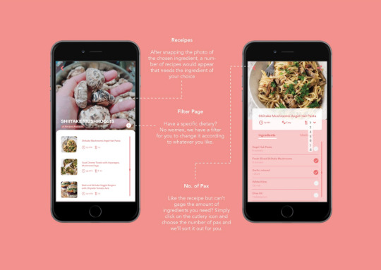
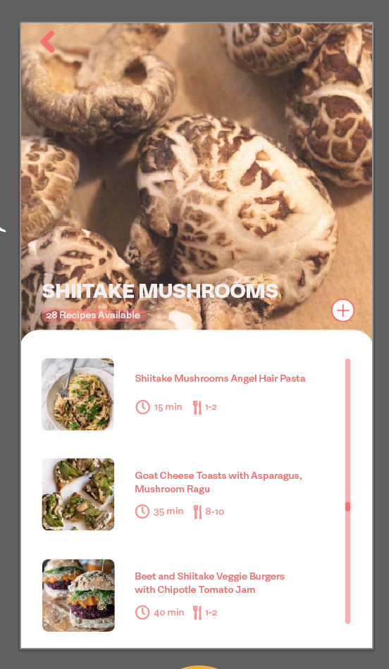
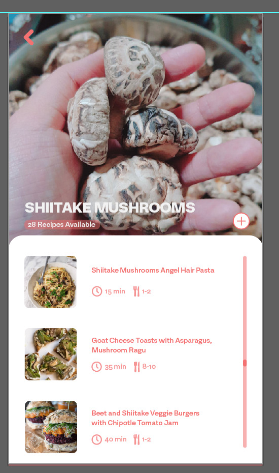
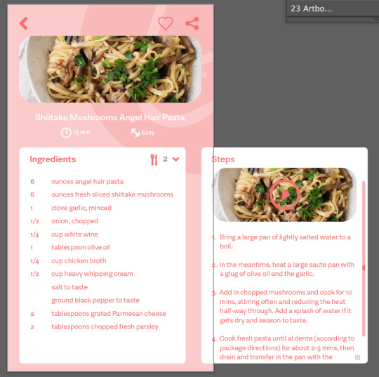
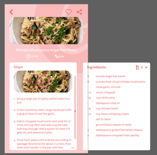
Recipe page
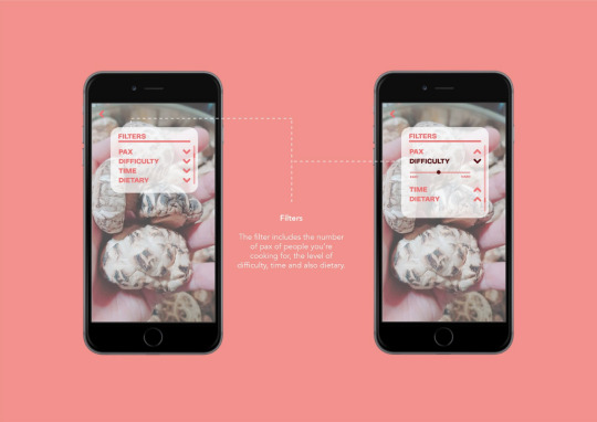
Recipe page -> filter
Recipe page -> filter -> Difficulty
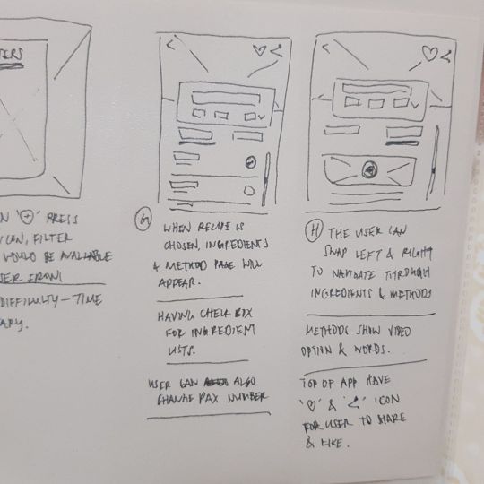
Chosen Recipe
Chosen Recipe -> how many pax
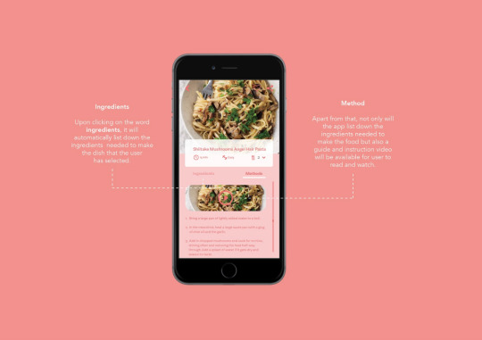
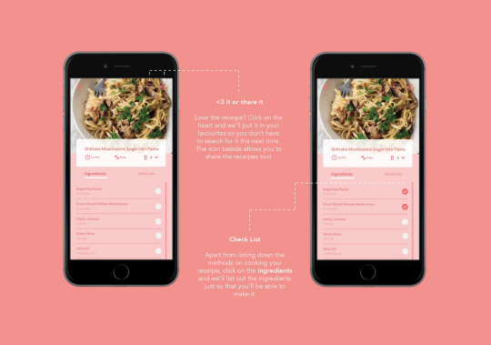
Chosen recipe -> ingredients
Chosen Recipe -> methods
Very simple and clear cut!
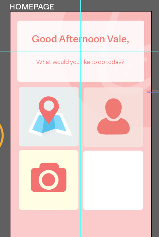
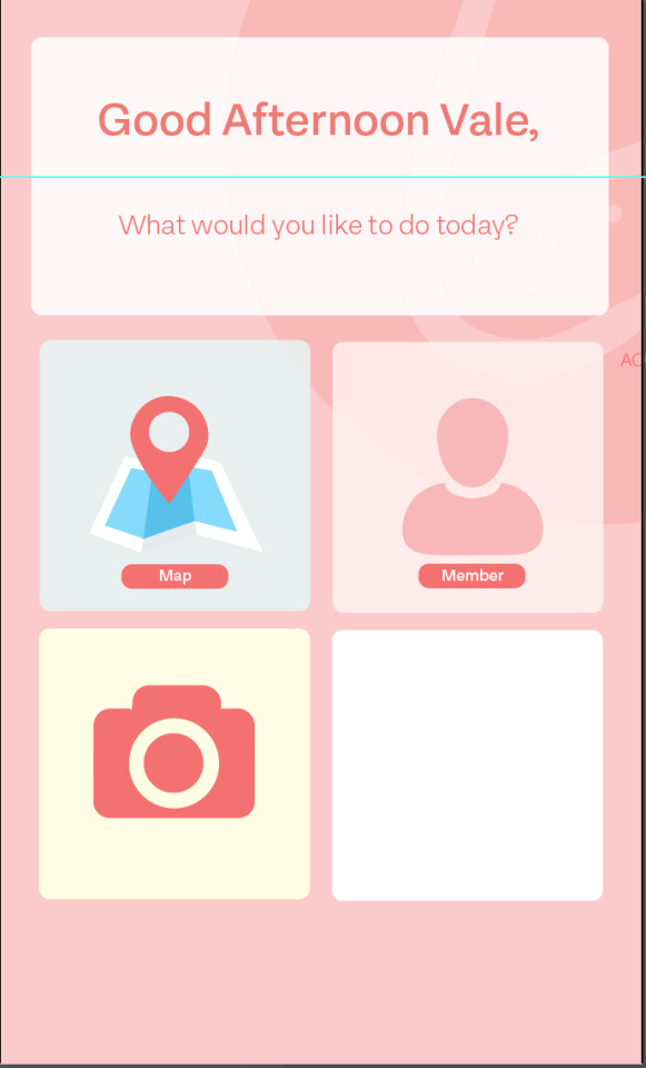
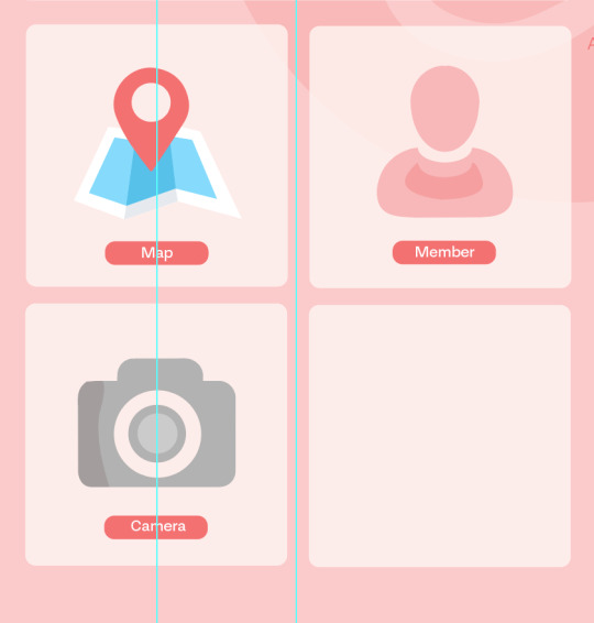
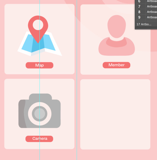
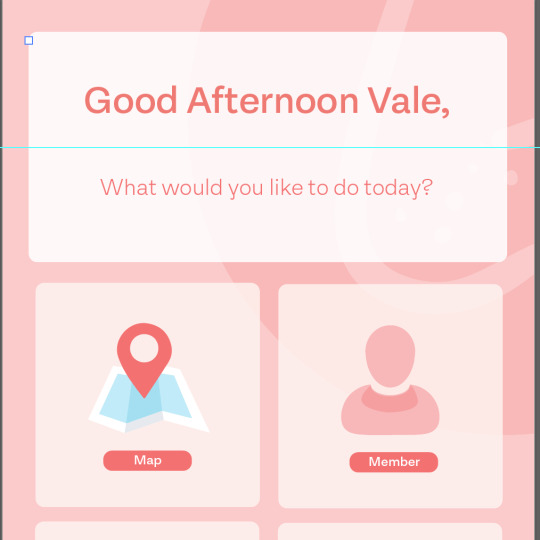
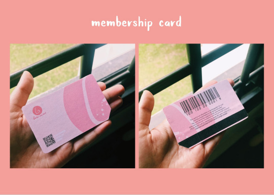
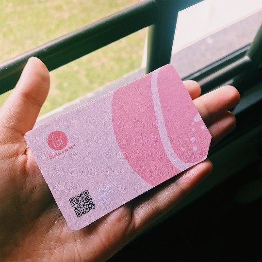
So for the homepage - I wanted to keep things simple and only showing the necessary icons for the user with just - map ( to show where our truck is ), member, camera and delivery! I vector the icons and type in the labels. The entire app background would be the same with the gordon logo blown up and running throughout the entire app. ( just like our membership card )
For the camera section - I was inspired by this camera app call Foodie!
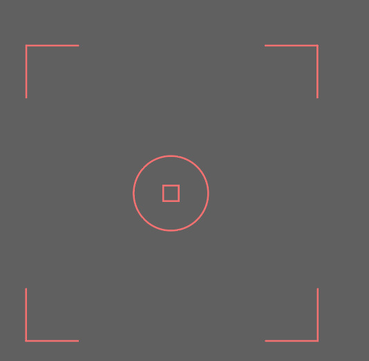
Simple and cute
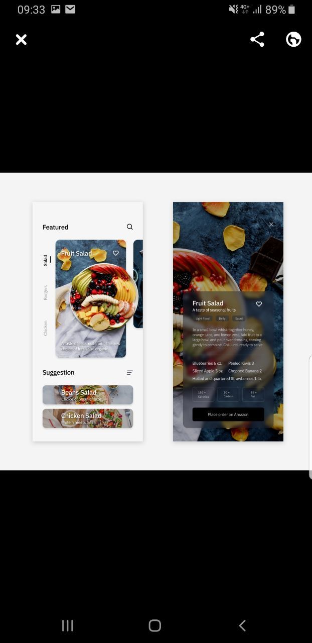
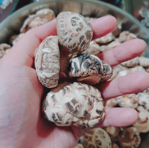
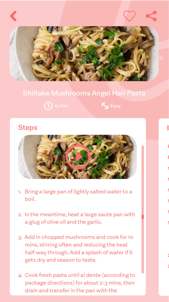
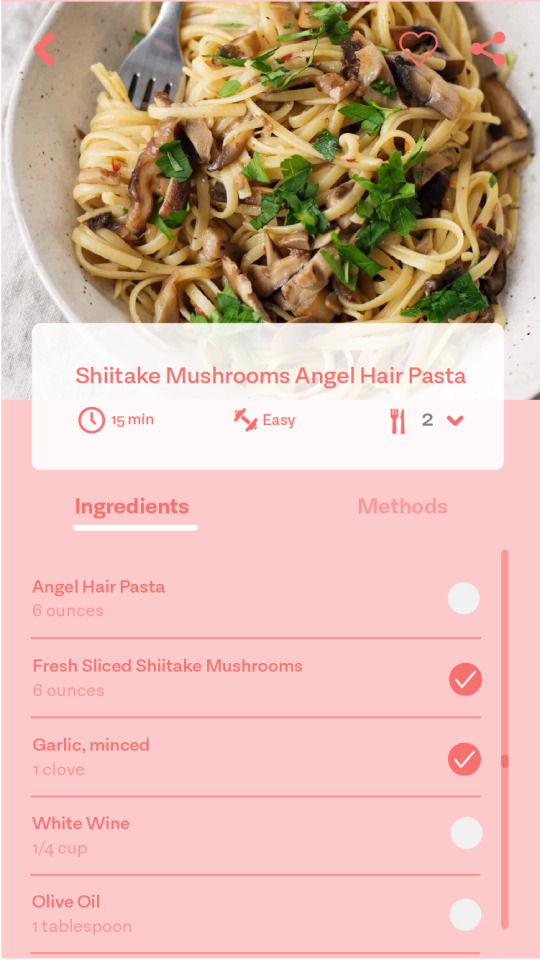
Next was the recipe section after the user has taken a photo of the chosen ingredients---
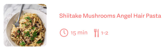
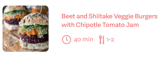
I made it simple and clean for users to be able to read - I got recipes of Shittake Mushrooms from https://www.chowhound.com/food-news/171855/reasons-why-shiitakes-are-the-king-of-all-mushrooms/ !

all this layout may seem simple and easy but trust me, it isn’t!
I took a full day non-stop to create all these artboards with the icons, alignments, pictures, designs and font choices! I had to go back and forth whenever I’m ‘done’ with the artboard, send it to my phone to see how it looks like on an actual phone then going back to illustrator to fix it or improve anything else. Aside recipe - I was only more concern if the background should be the user’s own photo or a google photo.
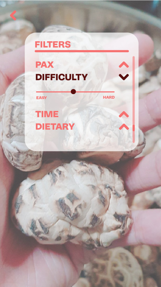

under the recipe page - there is a ‘+’ icon for users to click through filter mode! Especially if you have a strict dietary or a tight schedule!
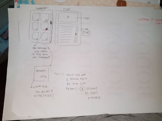
here comes the ingredients/method sections once our user have decide on which recipe they like to cook!
this was my initial design! where the user can swap left right to see through ingredients and methods. There is almost an option for user to change the number of pax so that the amount of ingredients would change to -
after some feedback from my partner, I decide to create another layout which also became the final layout
-End of week 13-
0 notes
Text
Week 12 - C.D
Week Twelve - 25/03/2019
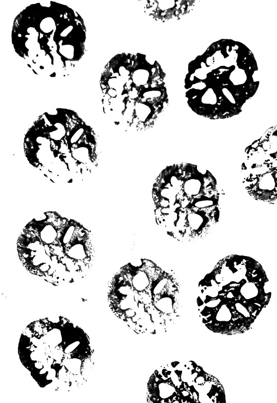
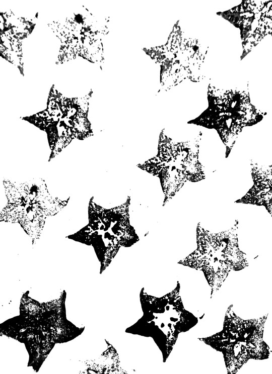
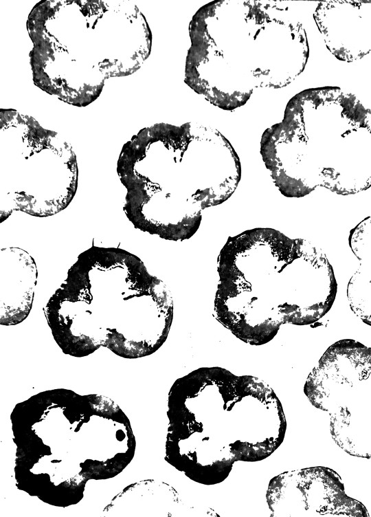
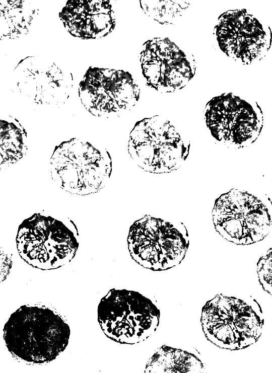
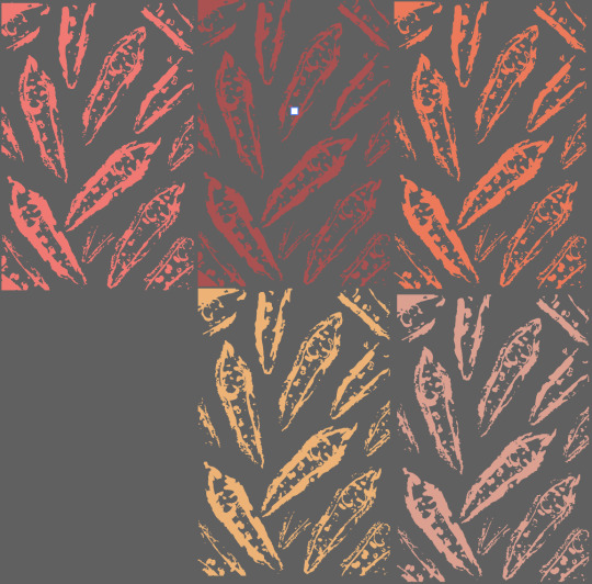
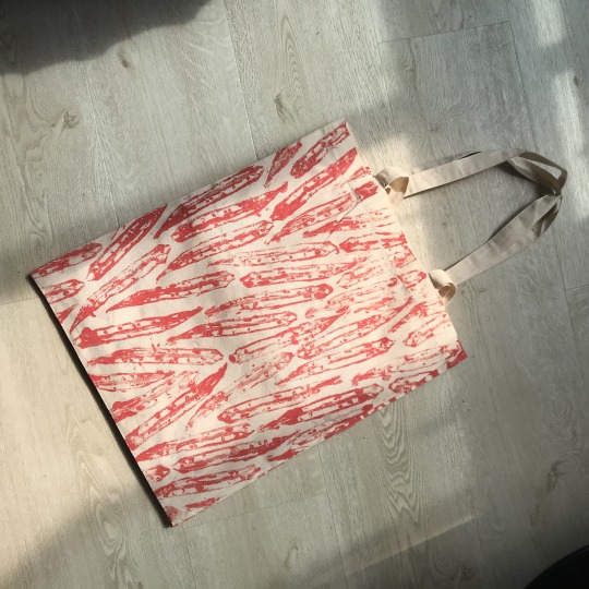
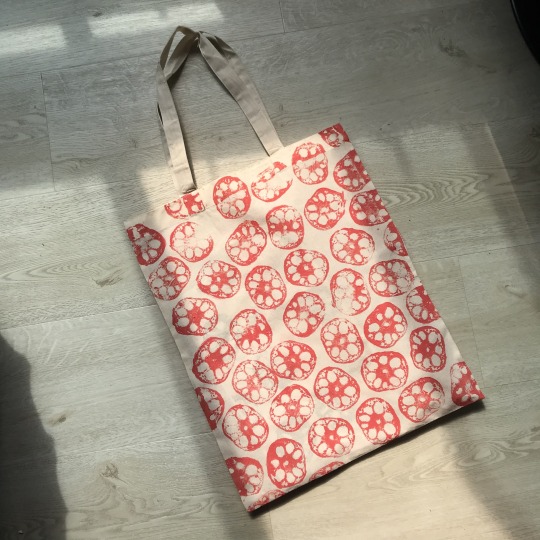
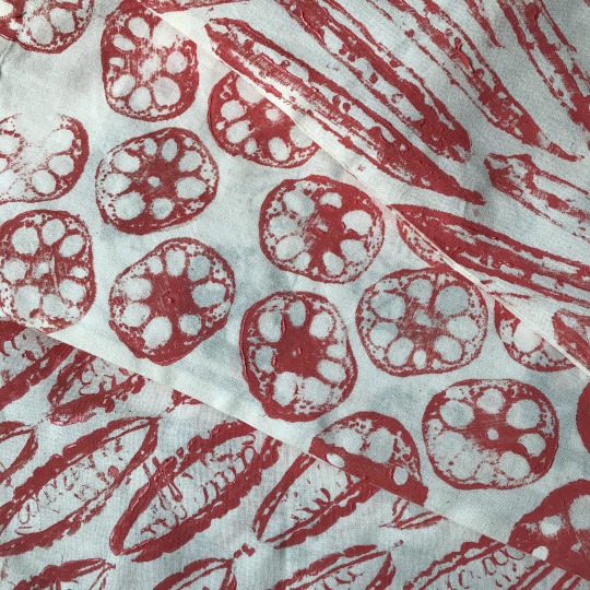
My partner scanned the prints she tried with different sort of fruits. Can you identify any of them? :D
/avocado, strawberries, bitter gourd, chilli, green pepper, lotus eg.


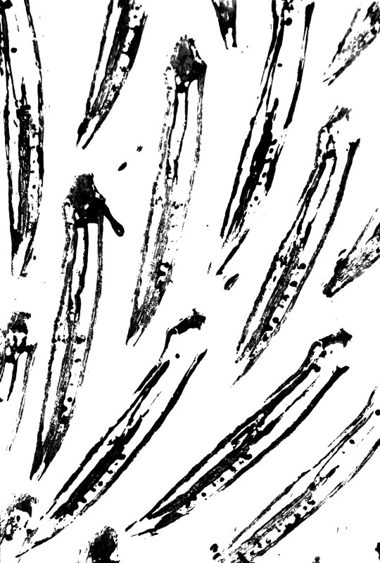

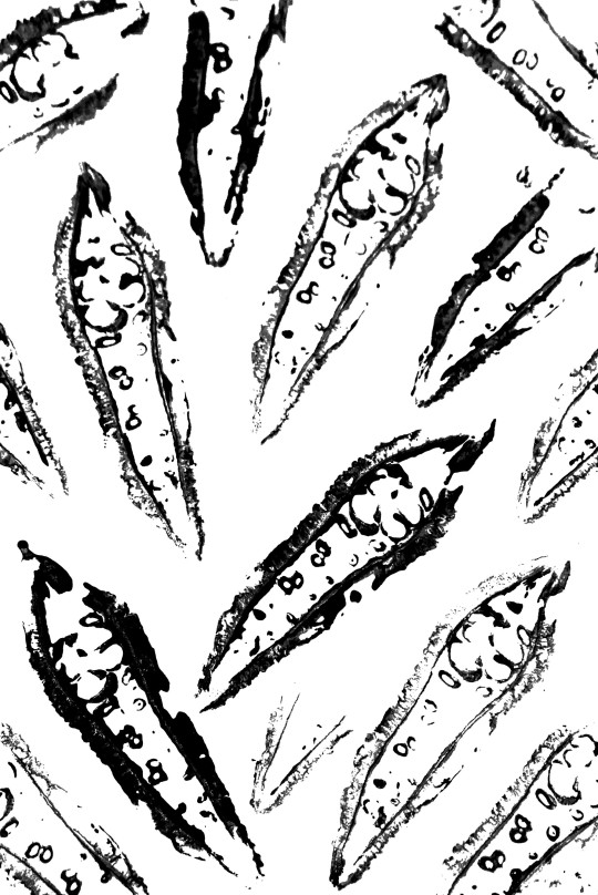

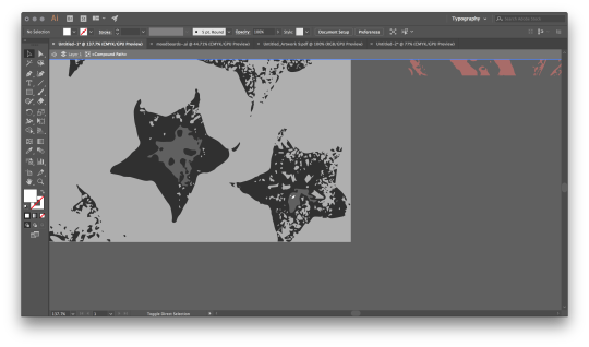
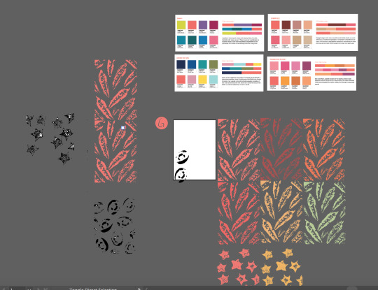
/some trial and error I did with the totebag printing because we weren’t sure if we should really try to DIY or send it for printing for better presentation.


-
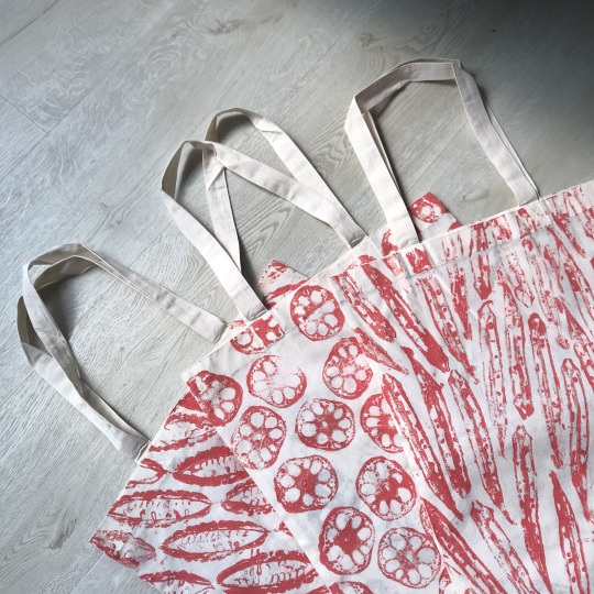
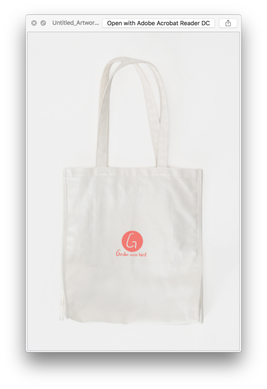
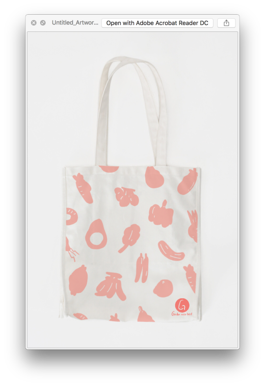
End up with using the usual idea of the tote bag
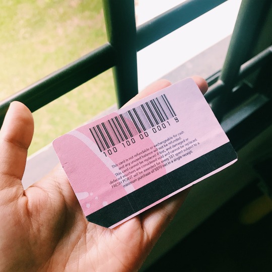
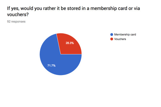
Along with the tote bag, my partner designed the membership card :D
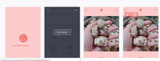
The app *plays drumming rolling* here it is \o/

so ...our initial idea of the app failed including the roleplay video we did earlier. The feedback our lecturer gave us was that try to create part of the app that other apps do not have so that you can really have the ‘x’ factor.
so after doing some survey on google survey -
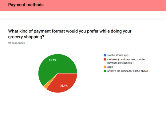
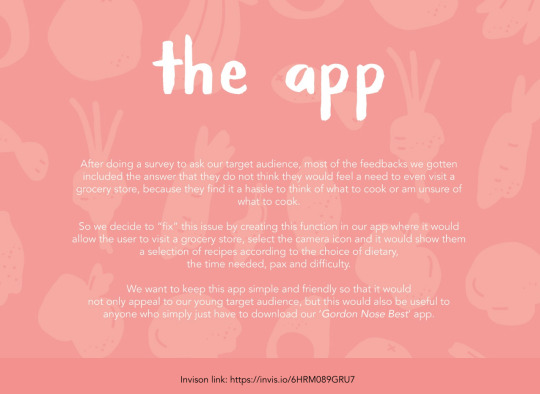
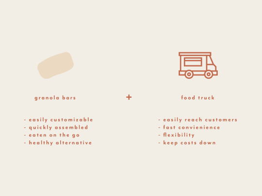
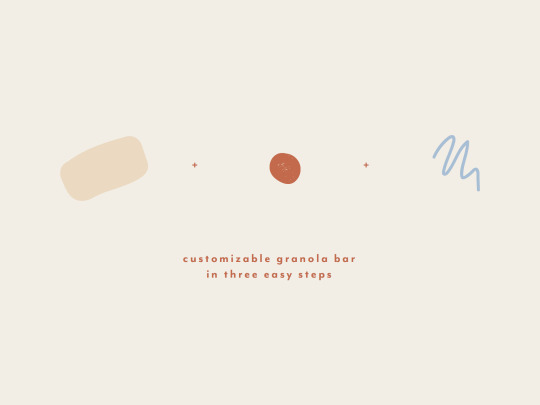
After doing a survey to ask our target audience, most of the feedbacks we got included the answer that they do not think they would feel a need to even visit a grocery store, because they find it a hassle to think of what to cook or am unsure of what to cook.
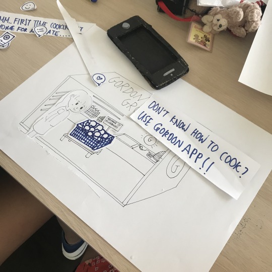
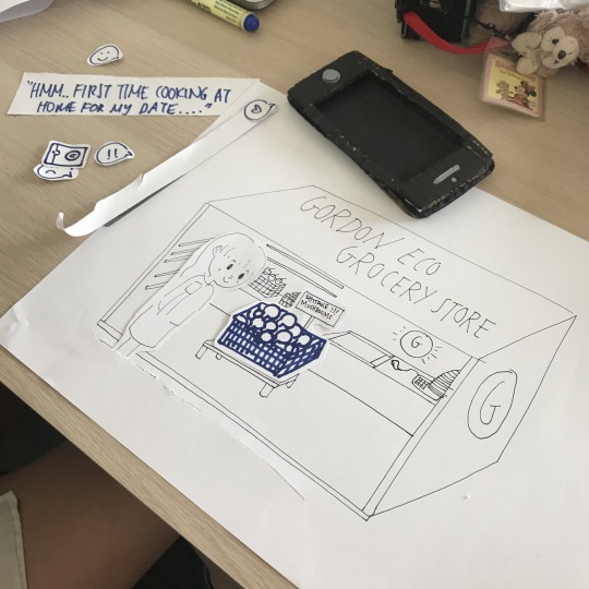
So we decide to “fix” this issue by creating this function in our app where it would allow the user to visit a grocery store, select the camera icon and it would show them a selection of recipes according to the choice of dietary,the time needed pax and difficulty.
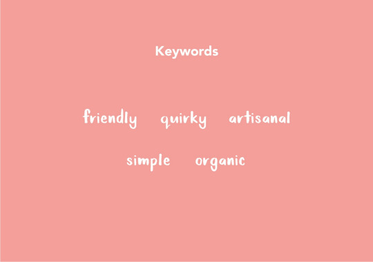
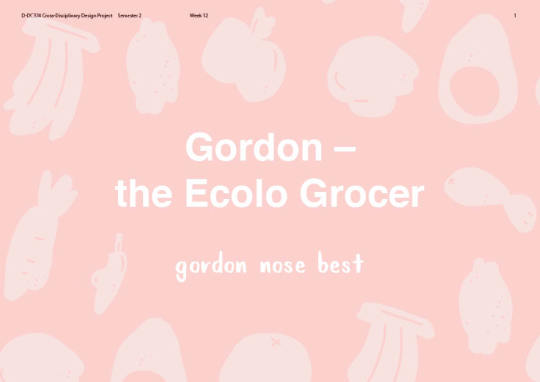
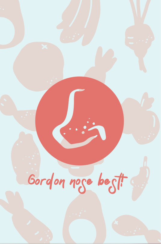
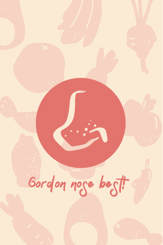
We want to keep this app simple and friendly so that it wouldnot only appeal to our young target audience, but this would also be useful to anyone who simply just have to download our ‘Gordon Nose Best’ app.
so we completely changed our idea 360.
^ this was just an idea of the special part of our app.
^Here is a simple roleplay video of how this app would help!
vimeo
Once we got all these stuff down - it’s left with creating the app on illustrator!
-End of week twelve-
0 notes
Text
Week 11 - C.D
Week Eleven - 18/03/2019
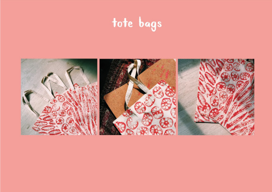
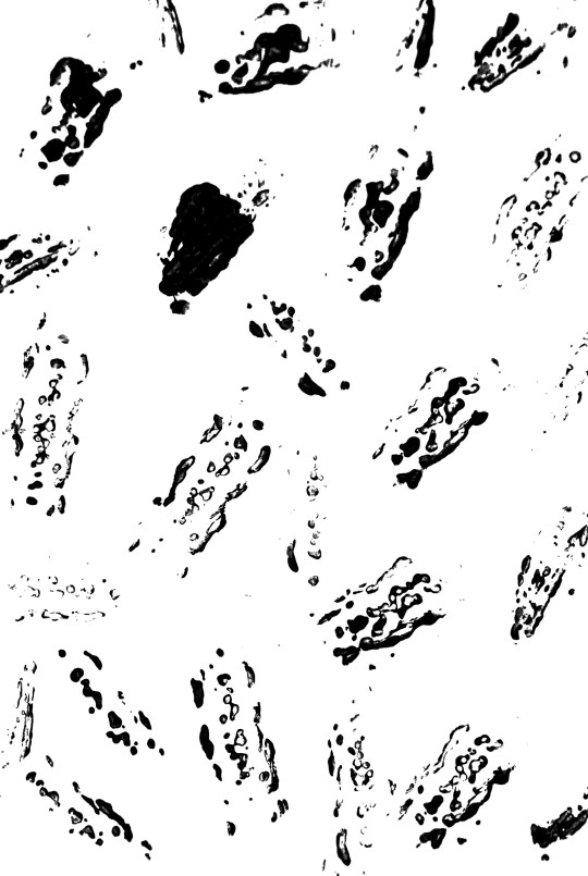
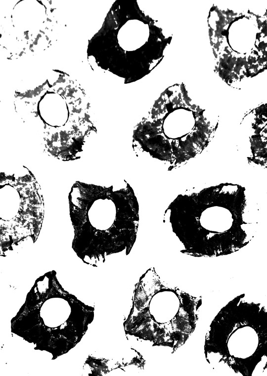
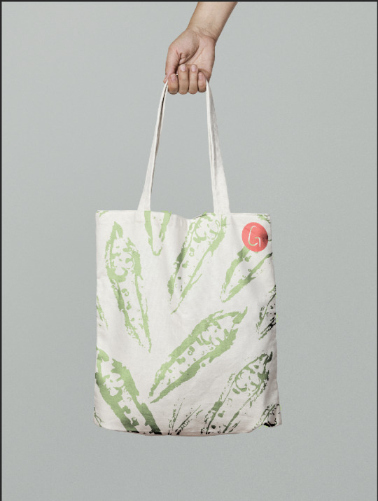
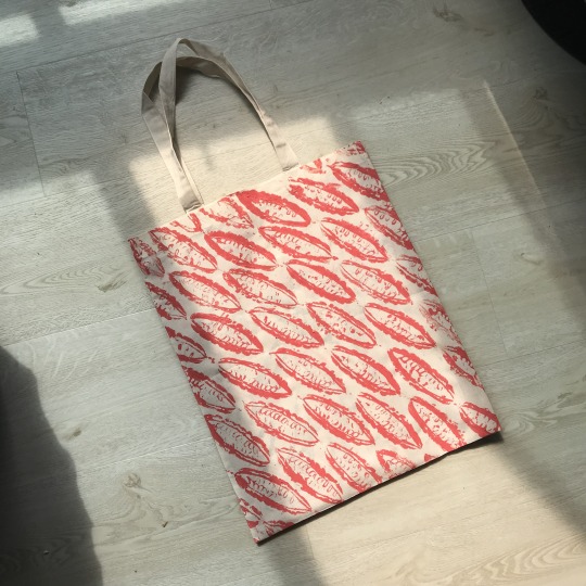
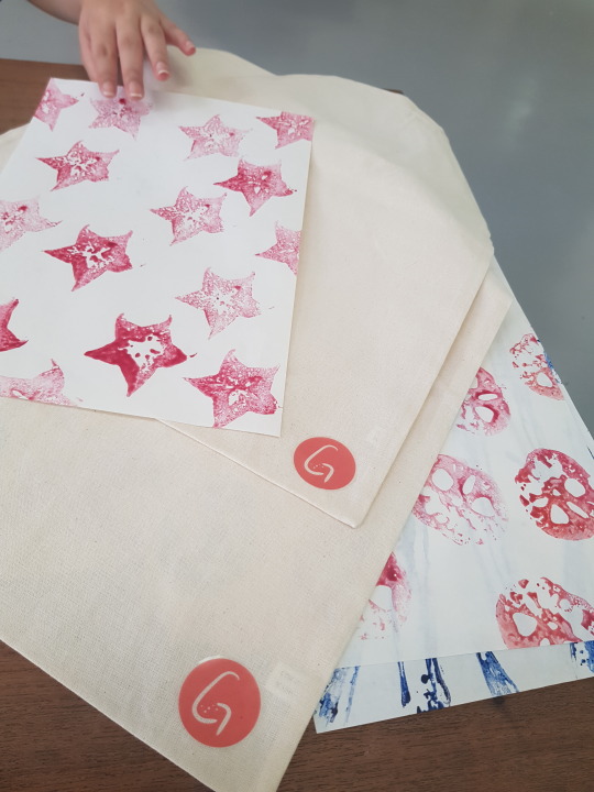
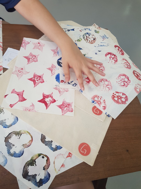
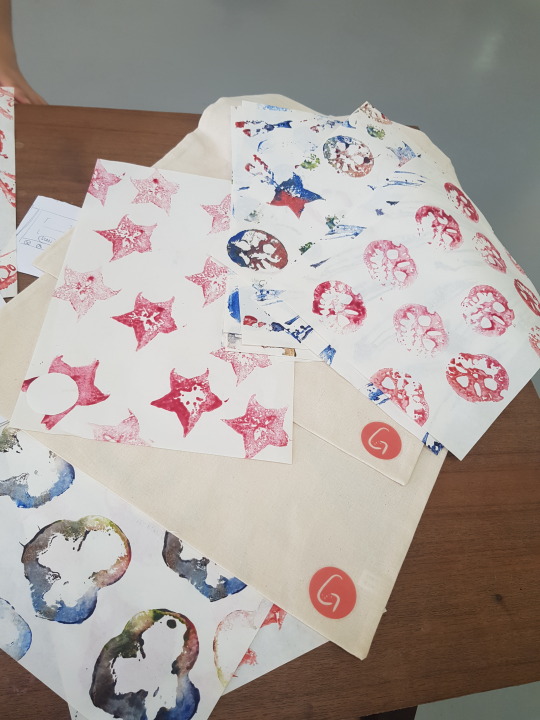
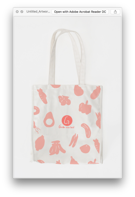
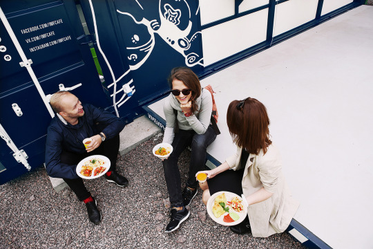
We have decided on the materials and styling of our tote bags. Since we wanted to avoid any wastage of printing outside because it is another sense of wasting materials - and also since Gordon’s store is supposed to be eco-friendly so for our tote bag instead of sending it to a print shop, we decide to DIY it. For this, my partner had to do the stamping - I had the idea inspired from when I was young, during kindergarten we were given cut fruits and paint - using it as a stamp to play around and create patterns. This also goes well with our brand story because we are targetting young parents with children.
Here are some samples she did with the choice of fruits she chose and our primary colour.
Pin up session -
this was also for our Lasalle open show :D
Max being extra ^ hahahahaah
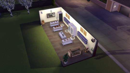
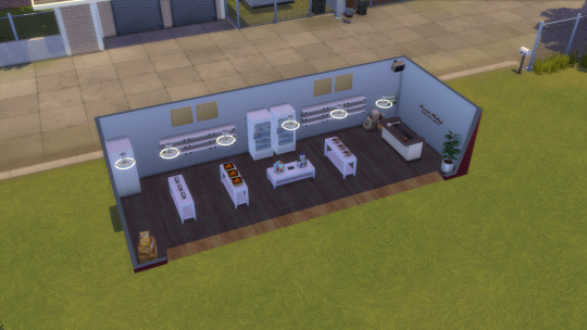
Credit to my partner who decides to do Gordon’s ‘shop’ in Sims to show a better visual for our branding :’D


-End of Week Eleven-
0 notes
Text
Week 10 - C.D
Week Ten - 11/03/2019
Roleplay video idea -
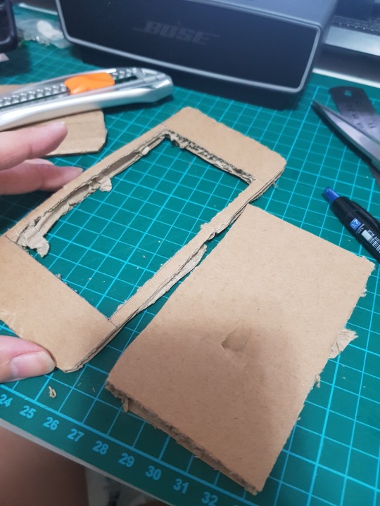
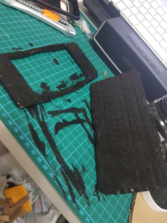
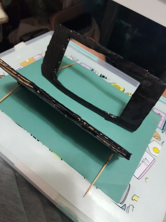
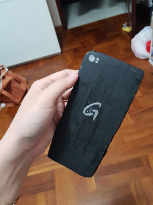
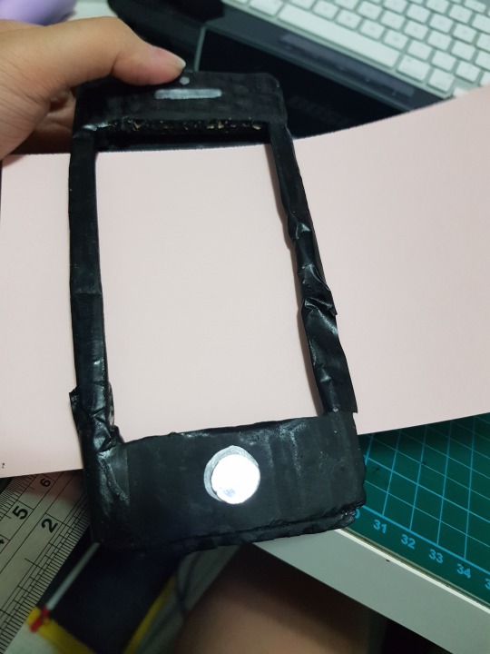
my attempt of making the /iphone/ for roleplay + paper prototype purpose
/yay im in the iphone gang now...../slowcries/
(using just cardboard + blank paint + silver marker )

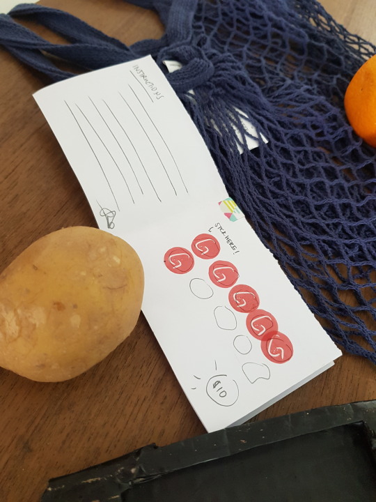
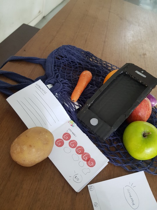
Our idea at first was to have stickers on our products. Because our concept is to be completely zero waste -
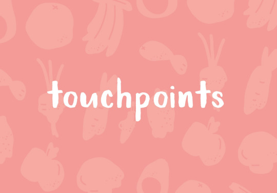
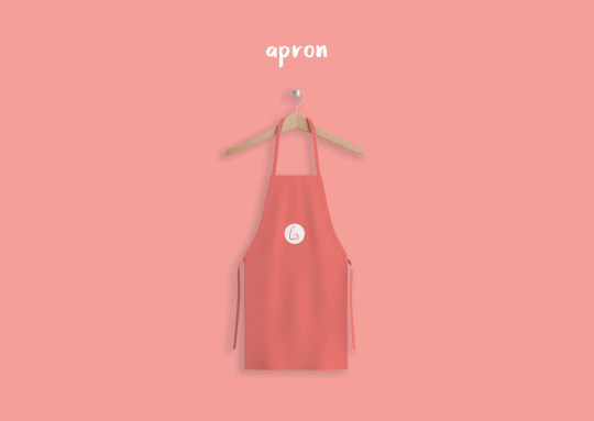
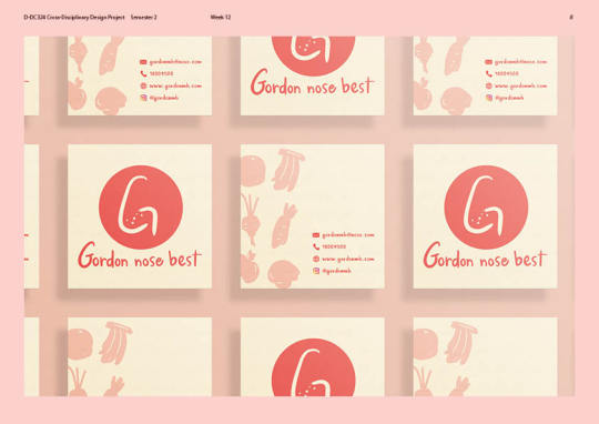
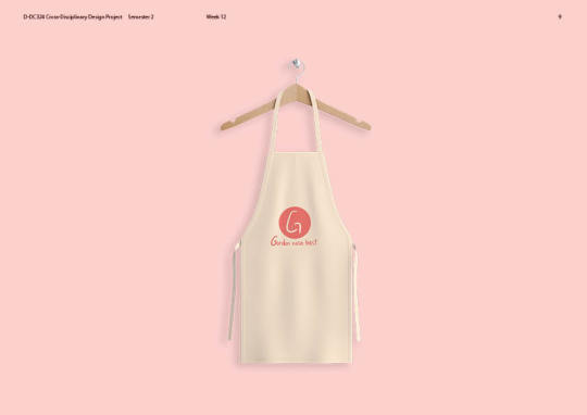
our three touchpoints would be
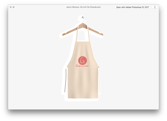
- totebag(s)
- aprons ( for the work staff )
- coupon booklet.
(coupon booklet was still in progress at this point but everything else was just a rough mock up)
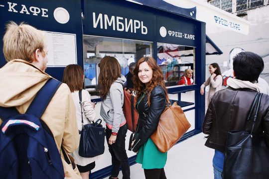
The reason why we wanted to include a tote bag in our touchpoint was that people are so reliant on using plastic bags for their grocery shopping so by providing the user with a tote bag, it would decrease the usage of plastic and also another step forward to the environmentally friendly world. Users are also encouraged to bring their own tote bags but we would be there to provide them one if in any case, they do not have one on hand.
Also, the reason why we have completely no packaging design at all, this is because we are encouraging people to not have any waste ( somewhat maybe like living simple, being a minimalist ). I’ve seen most of my classmates who chose Gordon’s brief have made packaging which I feel would defeat the purpose of being a ‘eco-friendly zero-waste’ concept because for example, if you make a packaging for the container so that users will use these containers to store the ingredients that they purchased at the store, but the packaging would have no purpose aside from the ‘branding’ purpose and into the trash bin it goes = more waste, you save on plastic but yet waste on paper. Therefore my partner and I decided against creating any packaging for our branding.
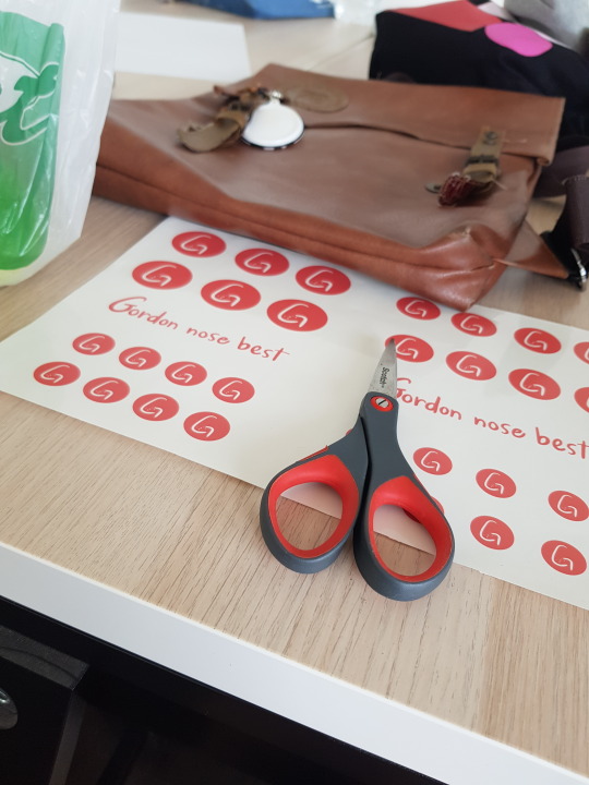
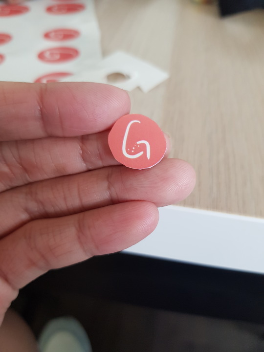
With our roleplay video - we wanted to show the idea of how coupon booklet would work. Since we have zero packagings, we would still need to have our products differentiated from another grocery store. So every product would have a tiny sticker of our logo that would be made with this brand https://www.purelabels.com/

where all their labels are compostable and recyclable!. Every product would have a sticker and our customers can peel them off, paste them onto the booklet and collect their credits!
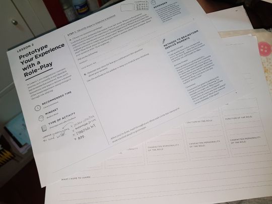
worksheets ^ we were given to help in our roleplay concept idea this week
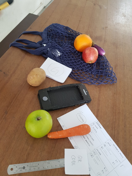
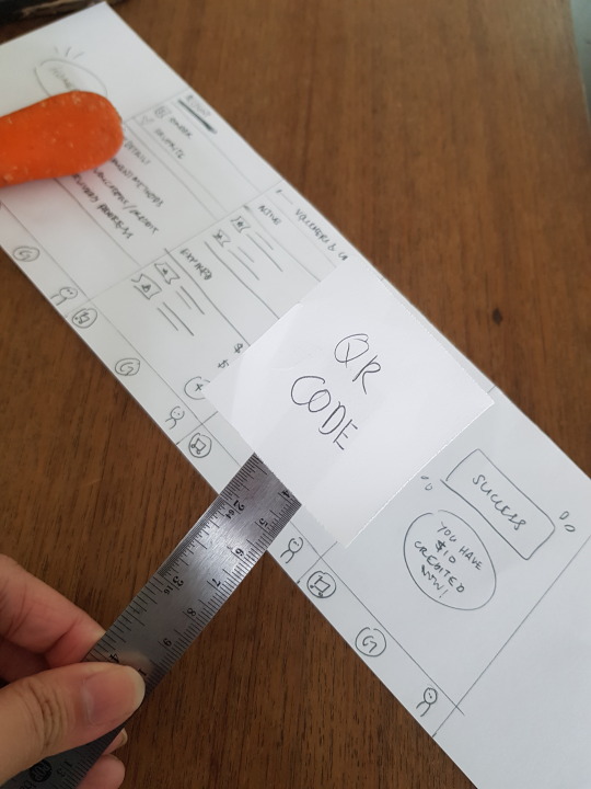
So for the app roleplay - we wanted to show how the app would also allow our users to take a photo of the QR code and use it for their online delivery too.
Super simple and quick to use - since our goal was to keep it simple, user-friendly that anyone of any age and background would be able to learn to use it within seconds!
- end of week ten -
0 notes
Text
Week 9 - C.D
Week Nine - 04/03/2019
After formative + Project week
So after getting feedback from formative submission, our lecturer told us to update more strongly with the backstory plus our touchpoints but overall looks good for the time being.
Part two of this major cross-disciplinary project was to do an app of one set of customer journey path. We have to come up which part of the customer journey we feel that would be important and vital for our branding and the ‘x’ factor.
We were given a set of worksheets to work on which would aid us for this part of the project.
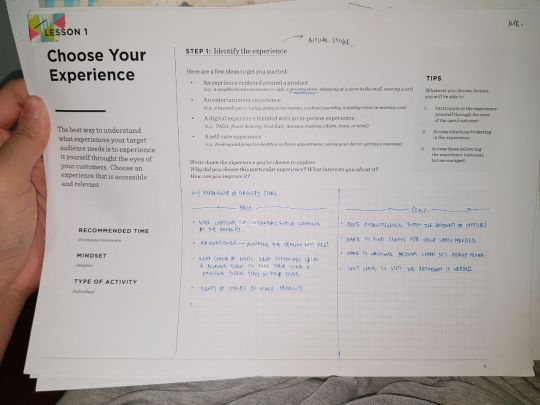


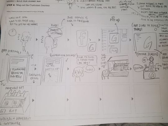
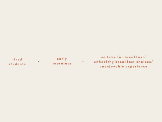
so with this set of the worksheet, we are supposed to decide which focal point we like to create for our app. Both my partner and I felt like our special ‘x’ factor was delivering fresh food to your doorstep for busy parents since our targets, after all, are young families with both working parents ( instead of how the dynamics were in the past where there would be at least one stay home parent, while the other parent is a bread-winner ).
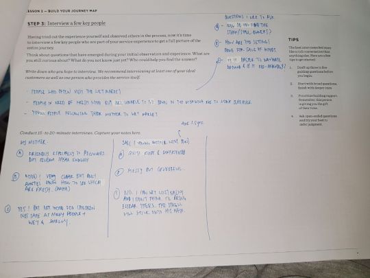
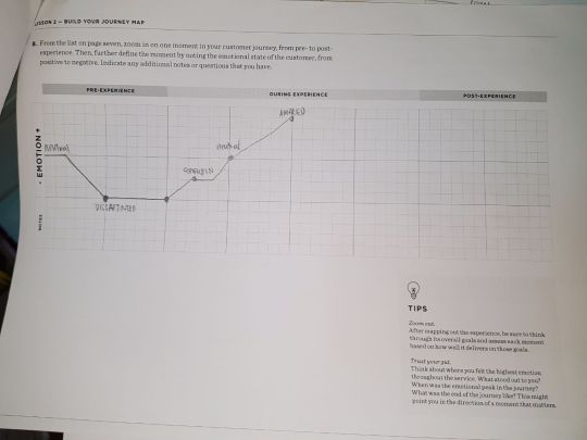
The worksheet, we have to tackle our ‘ideal’ customer + customer journey map + interviews + pros&cons of the choice of the grocery store since after all, as designers, we are supposed to constantly help improve on user experience in any way.
I did some simple research to see how this worksheet works since our lecturers got this online. I watched some youtube videos to learn how helpful it is to map out the customer journey before attempting to make the app because it would be easier to make the changes now rather than after when you have created the app. I also wanted to avoid making some common mistakes designers do when they are creating app.
youtube
youtube
youtube
This way, we are also supposed to create a roleplay video for our choice of the customer journey. My partner and I decided to create the idea of delivery but also collecting credits and coupons. We created a simple script where it shows how the sticker on our product would be also useful after purchase for the customers when they get home. This would be done in week 10!
0 notes
Text
Week 11 (B)- Photography ( Minor )
Week 11 (B)- Photography ( Minor )
Here are my new attempts for the brief.
cinemagraph ---------------------

https://gph.is/g/ZPY8Xr4
https://gph.is/g/Z8xdJkZ
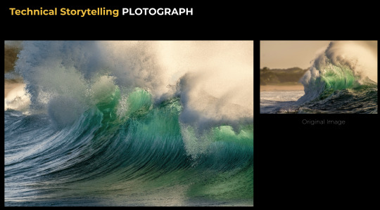
Plotograph ---------------------
These two images were edited with plotograph app on the phone.

vimeo
vimeo
HyperLapse ---------------------
vimeo
vimeo
Some of the challenges I had to go through while doing this ( aside from the heat and haze ) was the control of the weather and to be honest this is one of the biggest factors to why I tend to avoid doing an outdoor shoot. Thankfully I was blessed with the blue skies and fluffy clouds. I tried my hand editing cinemagraph on photoshop with the help of this youtube tutorial
youtube

It’s actually quite easy to get the hang of editing this technique! I just wish my shots were much clearer but this isn’t too bad for a first attempt :)
END
0 notes
Text
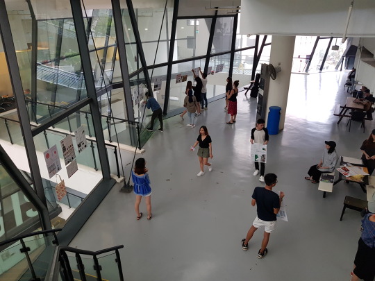
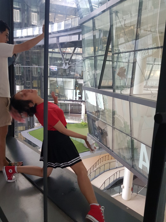
Week 11 (A)- Photography ( Minor )
Week 11 (A) Photography Minor
After we were given the brief -
I wanted to choose LOVE as my initial idea for this project.
Since we have to use 3 different method to showcase our visual storytelling, I wanted to split it into 3 different way to show ‘LOVE’.
Love for water
Love for food
Love for ----- ( which at this point, I was unsure of what ).
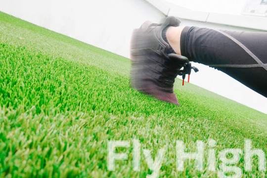
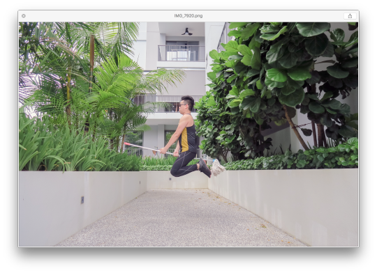
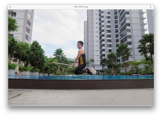
Using my free time - I went to try out this idea I had with the help of my boyfriend as the model / main subject. ( He was also kind enough to help me in the previous ‘Nike’ ).
So basically LOVE FOR WATER : I wanted to play around the idea with the swimming pool down my house.
For the LOVE for FOOD - I wanted to go around the idea of love for pizza, having to photography a belly getting bigger and bigger and when you zoom out, it’s actually the subject belly getting bigger not from pregnancy but from the consumption of pizza. I was planning to use STOP MOTION idea for this.
Here are some try out (that failed badly)
vimeo
vimeo
vimeo
vimeo
vimeo
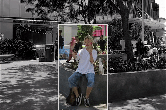
After all these sad attempt - I decide to change my entire idea and go against something that is out of the comfort zone for me.
Personally when it comes to photography, I love to focus on a main subject to tell my audience the story therefore things like buildings / sky / still life tend to be something I avoid doing so as I’m not good at it.
However since this is for school - it’s the only chance to venture and try something new ; it’s okay to make mistakes but at least you tried and see what you can improve on rather than not ever knowing if you’re able to achieve it.
I changed my choice of theme to : Still life / Architecture
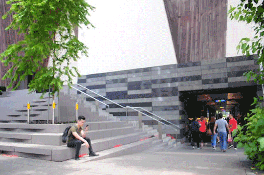
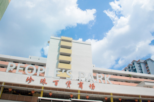
I head out and venture to a few places to capture buildings along with some people and the weather as my secondary elements.
Instead of using the typical : Boomerang + Slow Motion - I choose to do
0 notes
Text
Week 09 & 10 - Photography ( Minor )
Week 09 to 10 Photography Minor
So after project week ;;
There were two classes which I did not manage to attend on my part due to emergency family and falling sick. Even though I did not turn up, I did ask a few classmates and email my lecturer to see what I’ve missed.
I have to admit that I did not like missing out on classes but //life can be like that // so I have to catch up with my classmates.
I was told that I missed out the review for our submission during project week and the feedback we have gotten by our lecturer.
We were brief on the new assignment where we have to make use and learn how to use and create our work with certain techniques.
Here are some of the techniques that our lecturer have gone through -
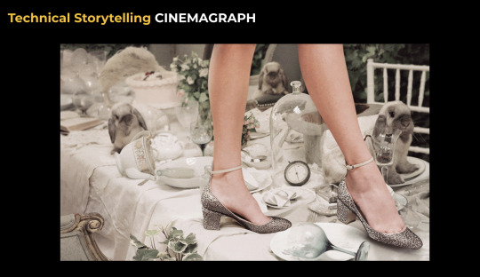
Cinemagraphs are still photographs in which a minor and repeated movement occurs, forming a video clip. They are published as an animated GIF or in other video formats, and can give the illusion that the viewer is watching an animation. A variation is a video snapshot (clip composed like a still photo, but instead of a shutter release it is captured using the video recording function with its audio track and perhaps showing minor movement such as the subject's eye blinks). Another variation is an audio snapshot (still photo linked to an audio file created at the moment of photo capture by certain cameras that offer this proprietary function).
Cinemagraphs are made by taking a series of photographs or a video recording, and, using image editing software, compositing the photographs or the video frames into a seamless loop of sequential frames. This is done in such a way that motion in part of the subject between exposures (for example, a person's dangling leg) is perceived as a repeating or continued motion, in contrast with the stillness of the rest of the image.
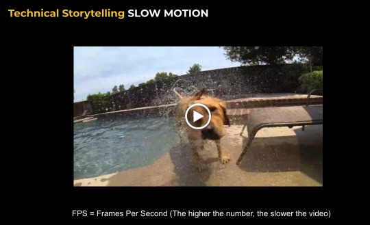
Slow motion (commonly abbreviated as slo-mo or slow-mo) is an effect in film-making whereby time appears to be slowed down. It was invented by the Austrian priest August Musger in the early 20th century.
Typically this style is achieved when each film frame is captured at a rate much faster than it will be played back. When replayed at normal speed, time appears to be moving more slowly. A term for creating slow-motion film is overcranking which refers to hand cranking an early camera at a faster rate than normal (i.e. faster than 24 frames per second). Slow motion can also be achieved by playing normally recorded footage at a slower speed. This technique is more often applied to video subjected to instant replay than to film. A third technique that is becoming common using current computer software post-processing (with programs like Twixtor) is to fabricate digitally interpolated frames to smoothly transition between the frames that were actually shot. Motion can be slowed further by combining techniques, interpolating between overcranked frames. The traditional method for achieving super-slow motion is through high-speed photography, a more sophisticated technique that uses specialized equipment to record fast phenomena, usually for scientific applications.
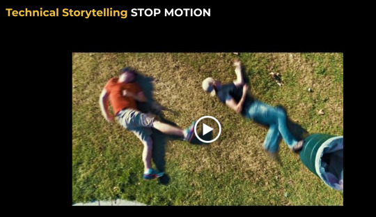
Stop motion is an animated-film making technique in which objects are physically manipulated in small increments between individually photographed frames so that they will appear to exhibit independent motion when the series of frames is played back as a fast sequence. Dolls with movable joints or clay figures are often used in stop motion for their ease of repositioning. Stop-motion animation using plasticine figures is called clay animation or "clay-mation". Not all stop motion, however, requires figures or models: stop-motion films can also be made using humans, household appliances, and other objects, usually for comedic effect. Stop motion using humans is sometimes referred to as pixilation or pixilate animation.
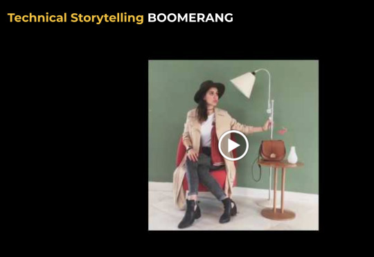
Introducing Boomerang from Instagram, a new video app that lets you turn everyday moments into something fun and unexpected. Press a button and the app does the rest. Boomerang takes a burst of photos and stitches them together into a high-quality mini video that plays forward and backwards.
“It’s a moving photograph, kinda. I suppose that’s the best way to say it! Even better, it’s incredibly easy and fun! You can simply upload any photo you like and then use some really fun options to animate it. This is a great way to breathe new life into any photo you’ve ever taken. It works great in so many conditions… clouds, moving water, grasses, hair, flowers, water, fire, etc. When you look at the rest of the portfolio, you’ll see how fun it is. Note that because these are all multi-framed, it may take a moment or two for the whole thing to load before you see it flow smoothly.”
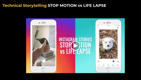
Life Lapse simplifies the creation of personal time lapse videos. Document life'sjourney in either short video clips or photos and the app assembles those memories into a compelling and creative video bringing those memories to life.
The brief for the new project
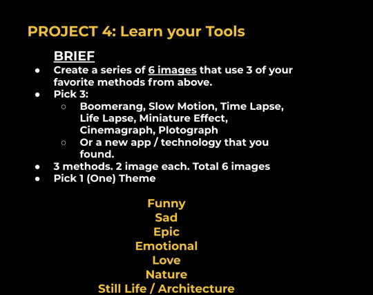
This above is the samples of what our lecturer wanted us to attempt but the twist is to use 3 methods above to create our visual stories with our choice of theme.
I will end my entry here and in the next entry, I will talk about my ideas and experiment tryouts.
0 notes
Text
Week 05 - Photography (Minor)
Week 05 - 06 photography Minor
“I believe in redefining my impossible.”
Nike has approached you to breathe life into a new campaign. "I love your style / voice, and want you to shoot this campaign" - Kevin Ou (Marketing Director, Nike)
4 Images will be launched on Instagram over the course of 4 weeks. (1 per week).
New Tagline: “I believe in redefining my impossible.”
Create a series of 4 images that best showcases the energy and emotion of Nike and their new Tag Line. You can use any digital storytelling tools that you've learnt.
Remember: This project is 50% technology and 50% about ideas. The best results will be a combination of both.
Demographics (Target Audience):
18 - 25 year olds
50% Male / 50% Female
Singapore Market only
“I believe in redefining my impossible.”
^ to me this tag line immediately calls out SPEED & FLIGHT.
Though I’m not really good with the technology side as I’m still learning and hope to get better in it someday - I tried my best to play with quirky angles and drawings. Since our target audiences are teens - I wanted to keep it light hearted, simple and funny.
Since the impossible to be is ‘flying’ ( because we humans do not have the ability to fly haha ) - I decide to play with some flying ideas.


Final image - life lapse
photo used for life lapse gif above


0 notes
Text
Week 06 - C.D
Week Six- 11/02/2019
One week before formative submission -
My partner tried to write the tagline in as many styles as possible to see what would work with the logo - I also redid the logo in a few different manners
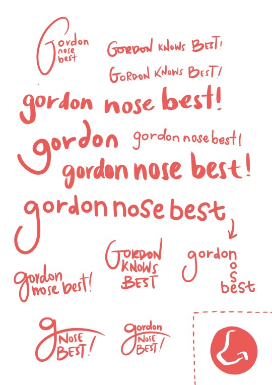

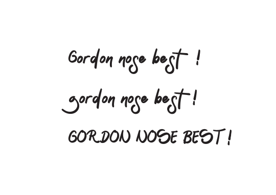

just trying some mix and match with the tagline and logo we redid.
for formative submission - we have to complete the visual brand identity poster and the slides to explain our branding. Here they are completed below


- End of Week Six -
0 notes
Text
WEEK 05- C.D
Week Five- 04/02/2019
HAPPY CHINESE NEW YEAR ! I HOPE YOU GUYS PIGGED OUT
Anyway this week was Chinese New Year so there was no class, therefore, no lecture. we had to do work on our own.
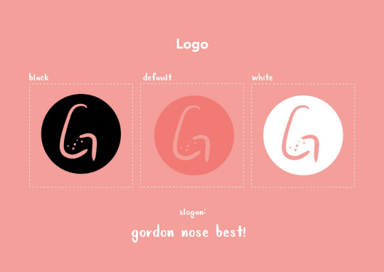
We decide not to use fruits silhouette as the logo since there is already a branding with such concept and idea similar to Gordon -
I decide to do some sketches to get some idea of it .
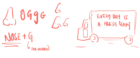
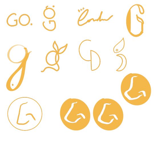
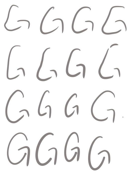
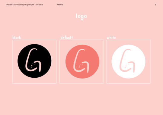
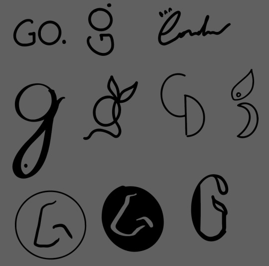
Here are some designs I tried to make with the idea of combining a nose and the letter G.
a bunch of artboards I did on illustrator to get the idea flowing -

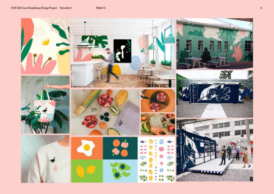
Some illustration styles Erynn and I decide to go with which was quite cute yet not too detailed that even a child is able to depict what it is.
We found a good sample of how using blobs could be just enough details to express to the customers keeping it quirky and cute.


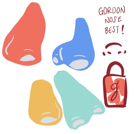
I made some of the logos from my sketches in the week earlier into illustrator to see how to get it going. (below)
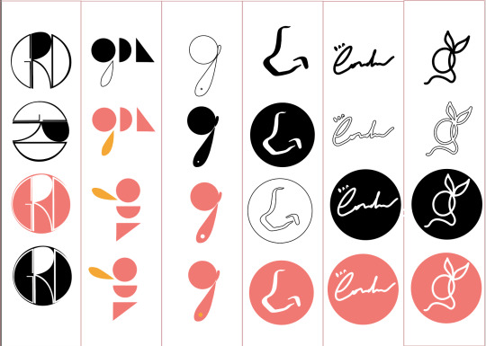
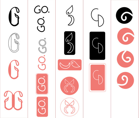
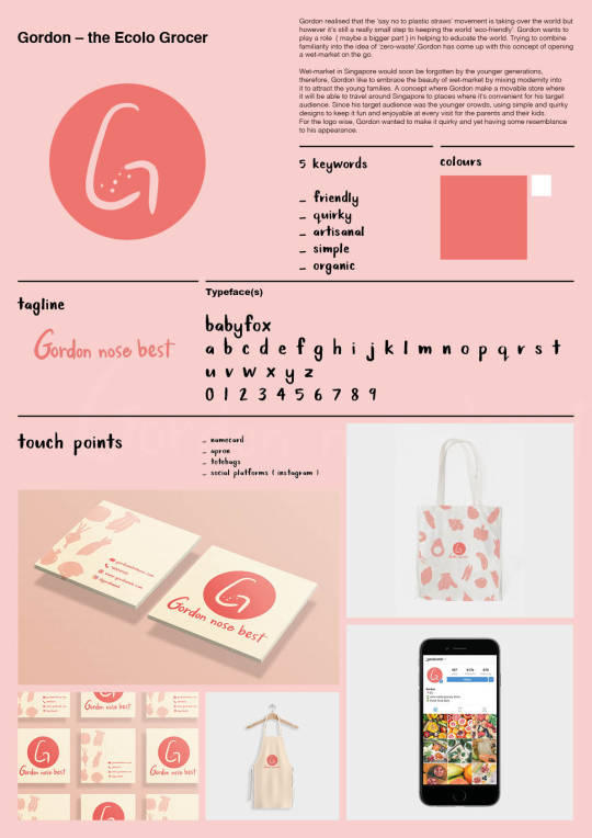
The colours we decide to use were just living coral ( Pantone colour 2019 ) -
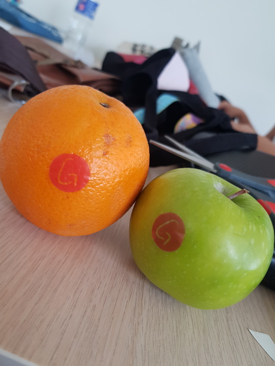
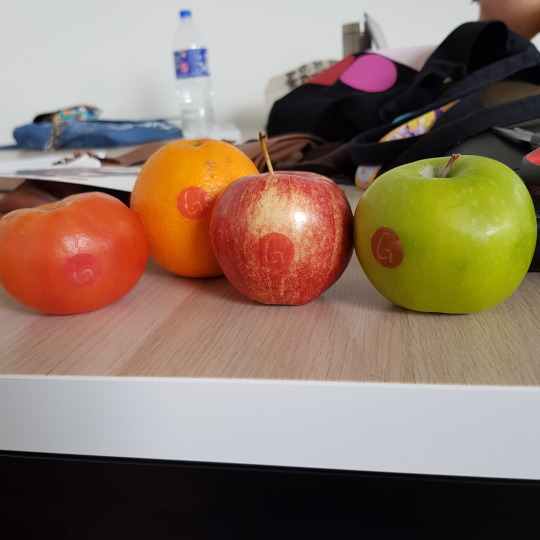
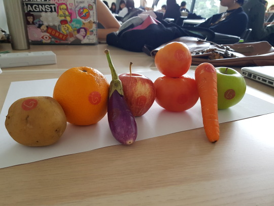
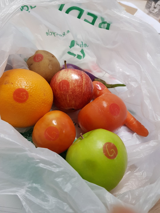
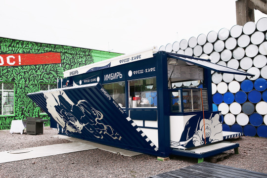
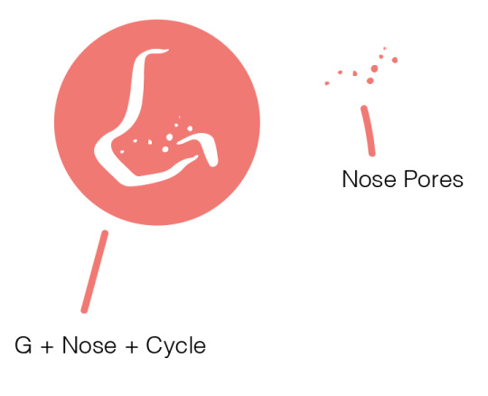
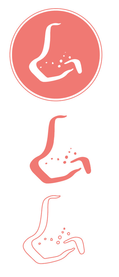
Since we decide to go with the nose - after talking to some lecturers, some suggestion were made by them - since fruits and vegetables some of them have pore-liked textures like our noses, Felix suggested to use it into our logo branding or maybe into some texture idea with the namecard/letters whatever so that our users would come in contact to.
Keywords for Logo
- Simple
- handwritten
- friendly
- Organic
Avoid using basic typography fonts( especially Serif as Serif fonts tend to come off formal/polish).
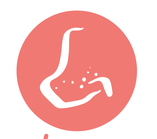
this was the first logo I decided to come up -
added some pores in to represent it with the fruits elements that would become the secondary graphic elements for this branding

some elements I drew - trying to keep it as child-like doodled as possible.
(could be better but yea I guess)
I transported into illustrator - added colours and the exact pores on the logo onto each and every element.

These are just some rough ideas for the logo for the branding - I tried to combine the tag line & elements together ( below )

Keeping the main elements in the same colour code while changing the background colours - trying to mix it up.
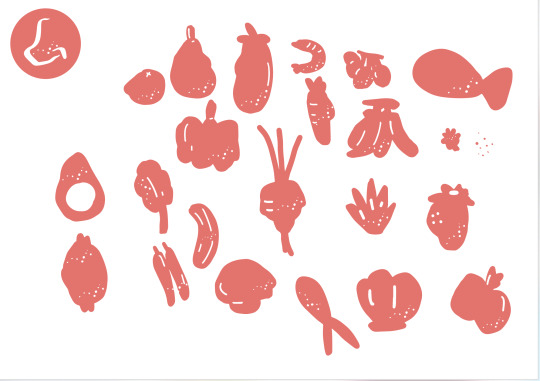
Drew more elements and decide to add in the signature pores into every element I drew to keep it constant.
----------
during class, we consulted our lecturer and he gave some feedbacks on touchpoints and also trying to fix the tag line typography and logo to make it look like a G since he said it looks nothing like a nose or G ( even though we both thought it was like a cartoon nose ) -
so after the discussion, we tried to work with more handwritten tag lines and redrawing the logos -
- End of Week five -
0 notes
Text
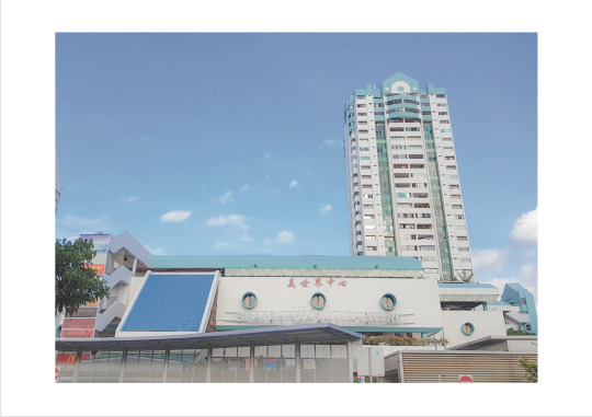
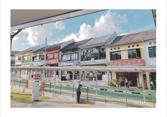
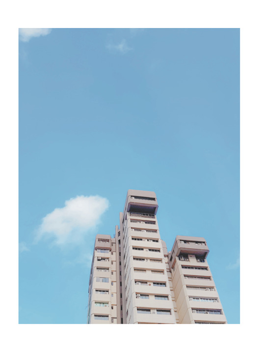
Week 04 - Photography (Minor)
Week four - photography : 31/01/2019
The submission for the first assignment is to show our neighbourhood using the style of voice we chose -
also out of our six images, we have to use one of the technique that kevin showed us.
https://drive.google.com/open?id=1FtzBM6GOwFY12lfd58vL_zCpz0oIrc1n

0 notes
Text
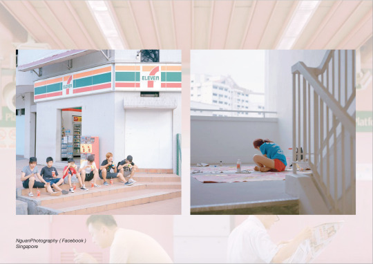
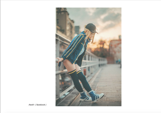
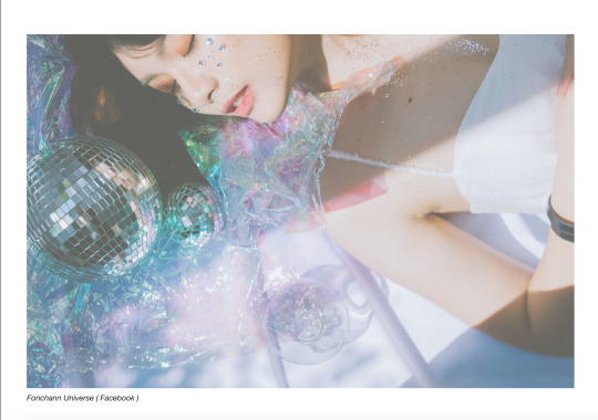
Week 03 - Photography (Minor)
Week three - photography : 24/01/2019
We show case our voices and style.
here’s my slides that I showed


0 notes
Text
Week 02 - Photography (Minor)
Week two - Photography : 17/01/2019
Introduction to photography -
This marks the first lesson of photography where we got to meet our lecturer, Kevin. This minor will be all about experimental photography -
Kevin explained to us how he want us to be able to find our style or ‘voices’ and to be able to stand out among many other photographers out there in this world.
0 notes