
Last Seen Blogs
ia1n
Iain Robinson Photography

911tshirt
911TSHIRT 🔞
gkingoffez
not evil anymore i want to be loved.

trashcanloser
Trashcanloser

ur-moms-girlfriends-art
Password child
Text
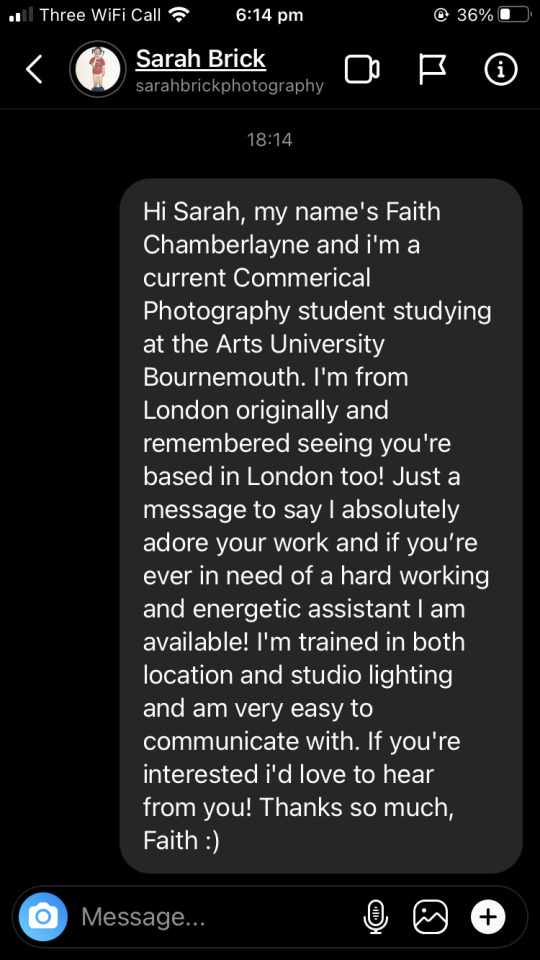
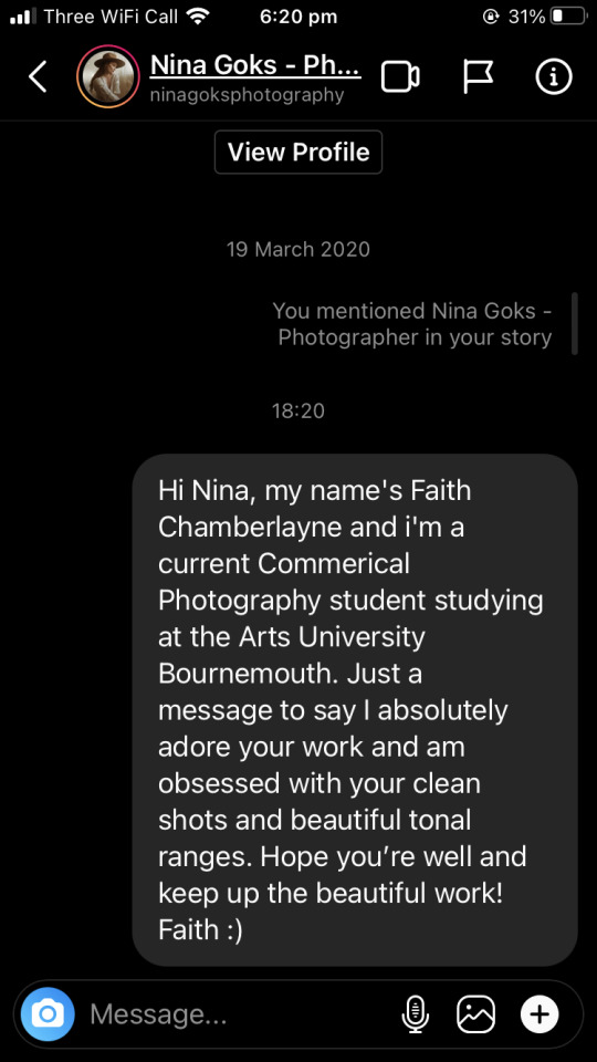
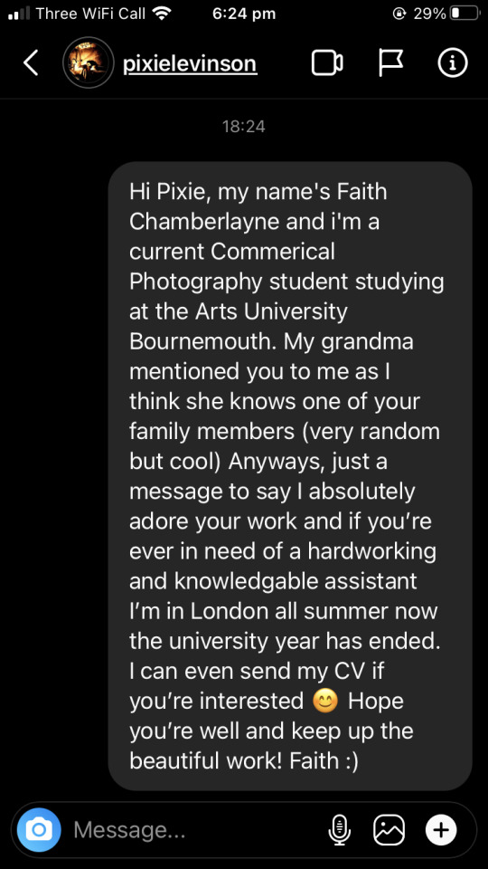
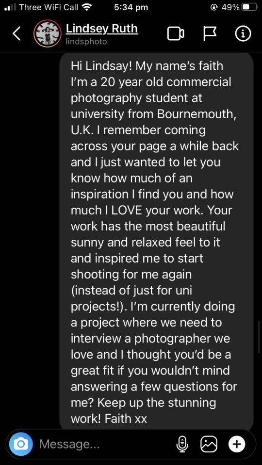
Reaching out to Photographers
These are the various messages i’ve sent to photographers about assisting, interviewing and just messaging in general:

0 notes
Text
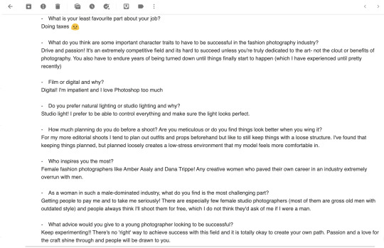
Interview
For my interview I decided to question Lindsay Ruth, a fashion photographer based in L.A, California. Her work is compPLETELy different from mine but i’m obsessed with her use of photoshop, colour, natural and studio lighting, angles etc. She is very experimental and her style is like nothing i’ve ever seen before. I initially messaged her on instagram and then emailed her the questions. Here’s her reply to me on instagram and her email reply along with the questions i asked:


0 notes
Text
What i’ve learnt
I felt it was a good idea to reflect on the learning process in this unit as it’s really been a fresh and exciting challenge that I probably would have botched without the help of my amazing tutors and Justin. Some things i’ve learnt
-Always experiment with different styles and colours.
-When it comes to branding, REALLYY look deep at your work and find patterns. Tying yourself and your art’s vibe to what you present to other people is very important.
-Keep researching and changing your ideas to fit the times.
- Making a website is much harder than it seems but give yourself credit for trying.
This unit was completely out of my comfort zone and was hard work doing all the research to find out what makes a brand good but i really loved the challenge. I feel so confident now that i look much more put together and that people will take me more seriously as a professional. I feel really proud of the work i have done for this unit and am excited to be able to have this new confidence that i’ve created for myself.
0 notes
Text
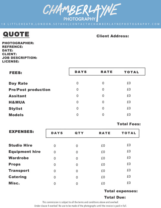
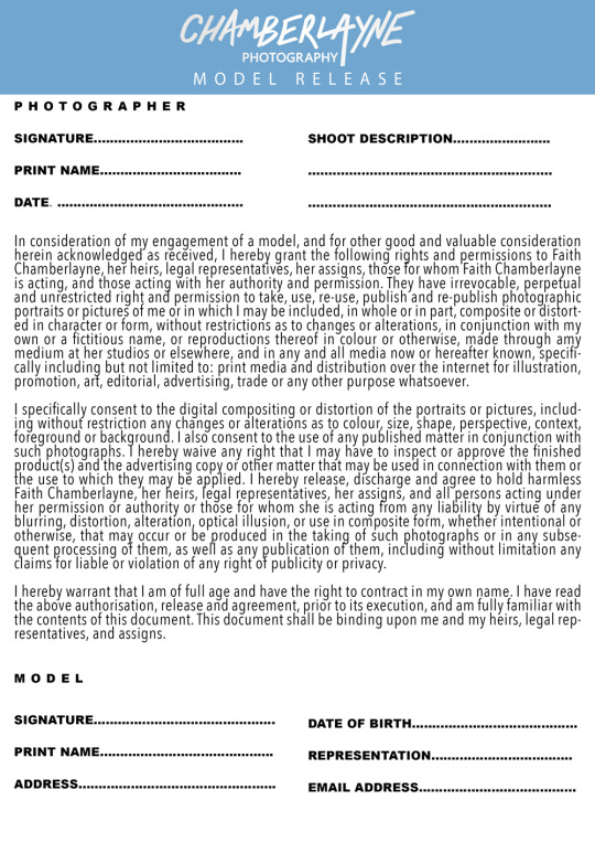
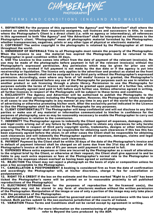
Professional Paperwork
Now that i’ve spent so much time on my website I think i have a really solid idea of my brand and how i want it to look. At the beginning of this unit i ended up buying a template off etsy for a photographer’s invoice but changed the entire thing a lot. The one part I kept was the banner along the top as I think that looks really nice however, it had no personal branding on it which I had to add myself. I want to add some accents of the pretty sky blue from my website to tie everything together and use a similar font but as i made these documents on photoshop I couldn’t get the exact same one. I screenshot my website and colour picked the exact same blue in photoshop so they all looked seamless. I want to keep it simple but also recognisable as my brand. Here are my final paperwork pieces! I’m really happy with them and think they look great all together. They represent me, my brand and look really good together with my website and other promotional materials :)
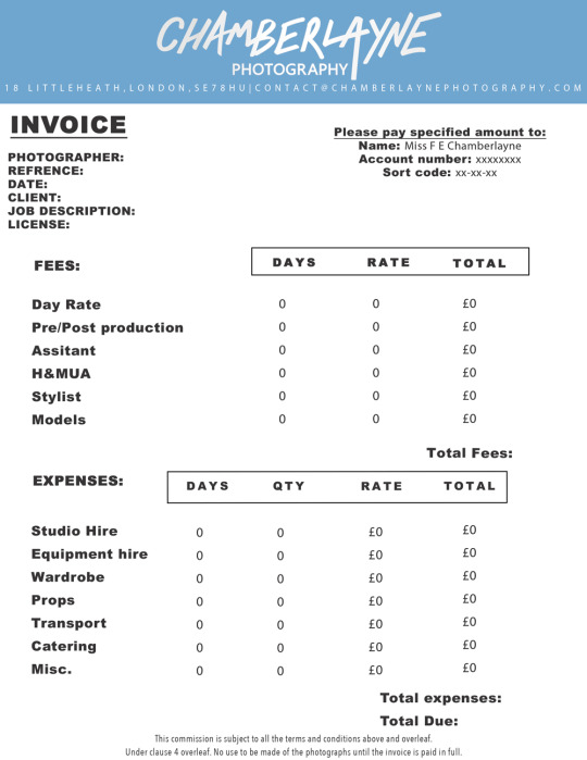
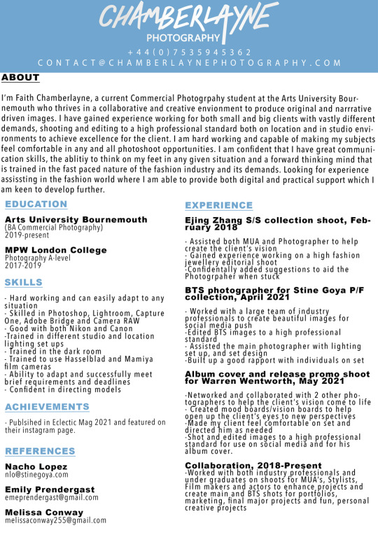
I’m also really proud of my CV as I hadn’t actually realised how much experience and knowledge I had until i was writing it! My covering letter sums everything in there up nicely i think and is the perfect balance of formal and informal. Very pleased with myself!
0 notes
Text
Mobile view trouble
So lucky I checked mobile view before I decided my website was done! where i had changed the colours of the colour theme for my link page it had made the page completely white! as the text was white it had made the background white and you couldn’t see anything. I made a few edits and managed to change the background colour to be the same blue as my background on my contact form page and all was well!

I think the white on the blue background looks so pretty and ties together all the blue hues from my images and represents me well as an artist and as a person (this sky blue is one of my favourite colours!)
0 notes
Text
Final website design part 2
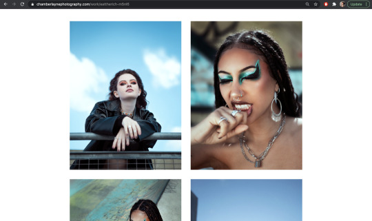
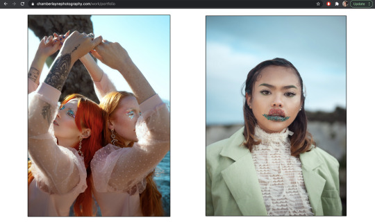
This is how i’ve decided to lay my gallery images out. Nice and clean on a white background so as not to distract from the colours in the images and let them shine. For the LONGEST time I was looking at my website thinking something doesn’t look right and it was because I had used a white logo, black text in some places, blue text in other places and it looked a huge mess. I fixed it by changing my colour theme to ensure all the text was white and then my footer was blue text on a white background. Originally i’d had the footer black with blue writing when the background for my gallery pages was white and it looked far too messy. These are some of the before and afters:
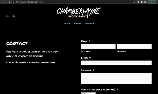
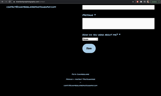
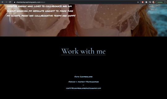
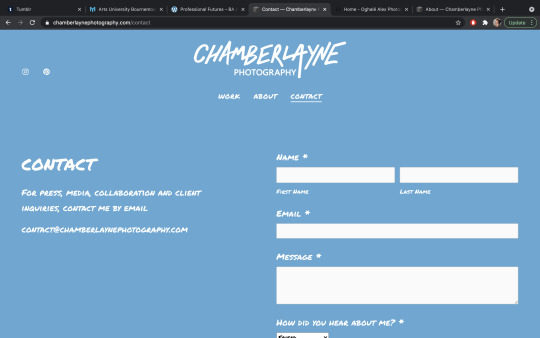
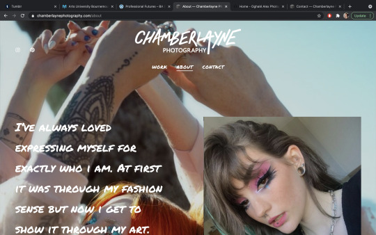
I think keeping my whole website white and blue allows for the contrast in my images to shine and be the main focus of the website. I think after looking at other photographer’s websites and seeing them have all white everything on theirs made me realise how much cleaner white makes everything look so i’m really happy with this now. I kept my about page very simple with just a photo of me and a bit of text and then added a ‘work with me’ button at the bottom which takes you to the contact page. I kept this very understated too with a little email form which is connected to my business email ([email protected]) and also added the email on the side too just incase. For animations i’ve fixed everything to fade in slightly when the page loads to keep it soft and representative of my work. I’ve also added my social media links in the top left hand corner which are linked to my instagram and Pinterest as I don’t have a facebook for my photography. Personally I think my website looks great and flows well. The SEO is optimised, i’ve got my metadata appended to all my images too which includes copyright and all the images i’ve chosen are ones that i’m very proud of.
0 notes
Text
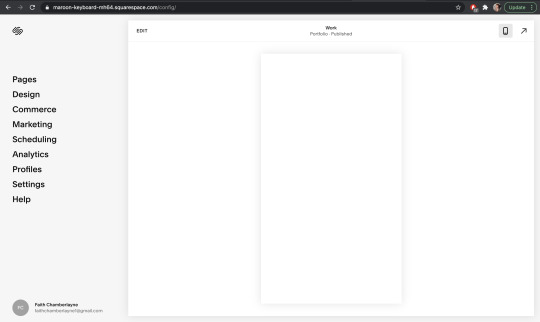
Final Website design
After playing around with it for a while and trying out different layouts and images i’ve finally finished my website and am really happy with it. I’ve chosen black, white and teal as the main colours in my website to compliment my images and keep it as simplistic as possible. I’ve kept the homepage layout simple, inspired by Harris Nukem i’ve chosen to use a full bleed image of mine for the background along with my logo at the top, my page headers and my social media links in the corner. I added a small little line of text at the bottom which i’ve automated through settings to be the description that comes up under the URL when you search my website on google. I think this sums up me nice and easy and gets straight to the point. After a tutorial with Justin he taught me that you should have key words in that section such as ‘fashion’ ‘photographer’ and ‘U.K/London’. This will help my SEO when people search for fashion photographers in the U.K. Here’s my homepage:
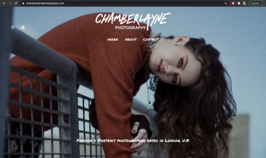
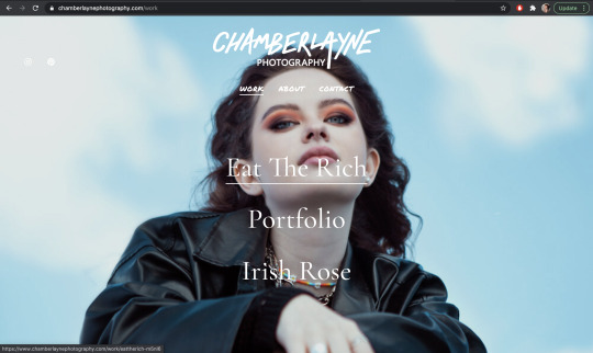
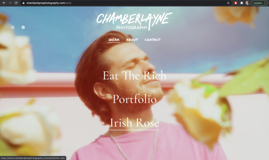
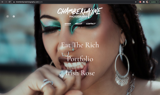
Below are the images that show up when you hover over each category in my ‘Work’ page. I’ve chosen images that have the subject in central framing as I want this to look good when being viewed from a mobile too as i’m assuming most people will be viewing my website from their phones. The only issue i’m having with this website so far is that there is a Chamberlayne college for the arts that does photography which is going to make my website hard to find on google. Realistically i should have chosen a name which wasn’t so similar to something else but I wanted my brand to be about me and my family name so I can’t fix this unfortunately.
So far i think this all looks great. The white logo with the white writing lays over the images really nicely and keeps the website looking professional and clean.
0 notes
Text
More website inspo
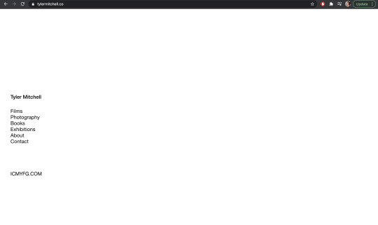
It’sOther websites i have looked at are Tyler Mitchell’s and Oghalé Alex’s - a Nigerian-American photographer based in London. Both take simplicity to a whole new level with nothing much more than page headers on a white screen which I really like. Tyler mitchell’s home page is literally just that and as much as i love it and think it looks incredibly sleek, I think Mitchell can get away with it as he’s such a famous photographer he doesn’t need and introduction:
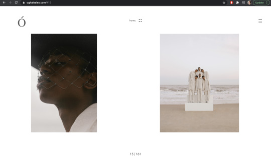
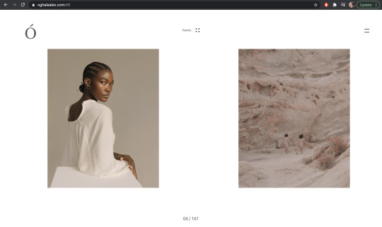
Oghalé Alex’s on the other hand is just the same but with his images on a side scroll on the main page. The bright white cleanliness of his page perfectly represents him as an artist and compliments his work beautifully:
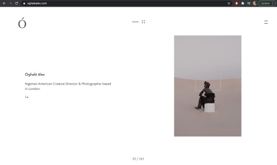
Both are incredibly easy to navigate also and work beautifully with the soft tones of their work. I definitely want to include an image on the home page to introduce myself as and artist and grab the viewers attention like Oghalé Alex does.
0 notes
Text
Branded material - postcards and business card finals.
The past 4 months of this unit i’ve really put some thought into how I want to be perceived an an artist. Having tried and failed to make websites int he past i really wanted to nail my branding for this unit. These are my final designs for my business and post cards. I wanted them to be fairly similar but not completely the same. As my personal style with colour palettes focuses on teal and blue highlights, I felt it was only appropriate to have some of that colour on the back but the blue hues on my postcard are completely different to the hues on my business card because, to add some differentiation, I chose the colours that best suited the images I used on the front. I also swapped the side of the writing to also make sure they weren’t too similar. I used Canva to create a free mock up and chose my 2 favourite images of mine. These were the results:
Business cards:

Post Cards:

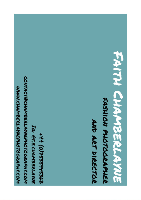
I’m really proud of them as they’re inviting, straight to the point and are clean and simple just how I have made the rest of my branding look.
0 notes
Text
Final font decision

After looking at fonts again i decided that the other font I chose was far too boring. After playing around with it next to my images when designing my postcards and looking at it next to the colours I have chosen for my branding, I didn’t think it worked too well at all. I have instead chosen this font called ‘permanent marker’ which I think looks great. I’ve used this throughout my business cards, postcards and website for a clean and seamless brand identity. It looks the perfect amount of messy and clean at the same time and I think since there isn’t much writing on any of my branded things it works nicely and doesn't look too cluttered like it did before.
0 notes
Text
Colour research
I have been looking at colour palettes for the backs of by business/post cards and since I often edit my images with cinematic colour palettes (cyan highlights and warm orange shadows) so I thought either a teal/cyan or warm orange would look best of the back side of my cards. Since i’m going to have the logo in white on top of a full bleed image of mine on the front, the colour on the back needs to consequently be dark enough that white text will look good on top of it also.
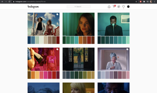
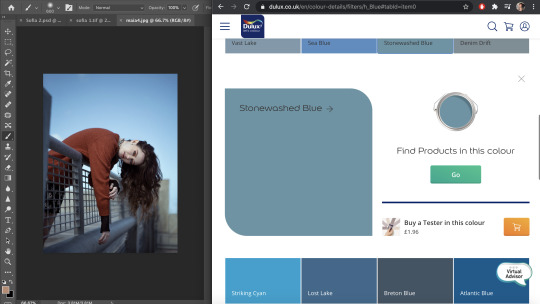
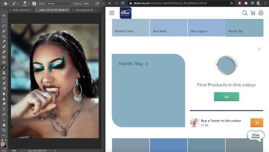
After looking at some of the colour palettes on my FAVOURITE instagram account (@colorpalette.cinema) I decided on a cool toned blue/teal colour as this is also the prominent colour in a lot of my work. I looked on the Dulux website for paint colours and tested a few next to two different images of mine. I think the ‘teal facade’ colour is perfect for the message I want to send as it gives off a calm yet interesting vibe and isn’t just black or white like a lot of other people’s business cards so it’s memorable at the same time.
The only concern I have is that I don’t want my chosen colour to become outdated or decide later down the line (if and when my style changes) that I don’t like it anymore. This is something I have seriously considered and taken into account but after giving it some thought, by the time that happens i’ll most likely be a much better photographer and want to rebrand myself anyway. I think for now i have chosen a colour that best represents me and my work and at least I then have the option to change it later should I want.
0 notes
Text
Font Research
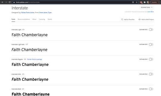
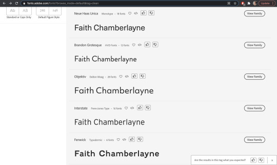
I have begun font research for my branding by looking on both adobe fonts and DaFont as well. At first I started looking at graffiti/marker style fonts which, after some trial and error with my logo (shown above) looked cool but also looked too much. It was busy, unclear and distracted from the logo itself which is what I want to be the main thing everyone remembers when they look at my business cards/postcards etc.
I then decided I wanted a more understated font, one more similar to the ‘photography’ part of my logo which is much. One that’s clean and doesn’t take away form the ‘Chamberlayne’ part. Above are some of the fonts I thought would work best and I think (after some more trial and error) i’ve settled on ‘Interstate Light’.
0 notes
Text
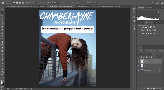
My Logo
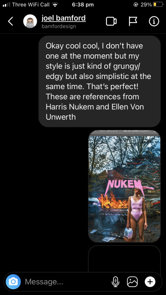
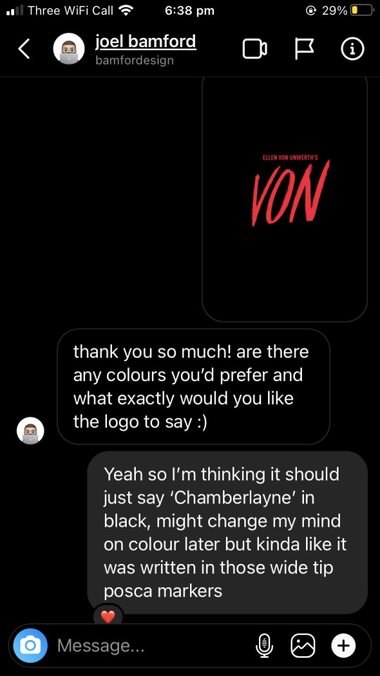
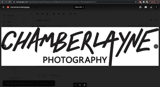
For the logo for my branding I have collaborated with graphic design student Joel Bamford. After analysing my work I would describe it as edgy/grungy but in a clean way? This is exactly what I said to Joel and some references I sent him. Since my style is very edgy I wanted my logo to look as though i’d spray painted or written in chisel-nibbed posca markers as they have an edgy feel to them and I like to use spray paint/graffiti in the backgrounds of my images quite often. The logo he came back with was perfect in every way and i think it reflects my art style and me as both an artist AND a person very well. I did do some editing in photoshop to make it white on a black background rather than black on white as i think it stands out better but this will be my logo for all my branding now :)
0 notes
Photo
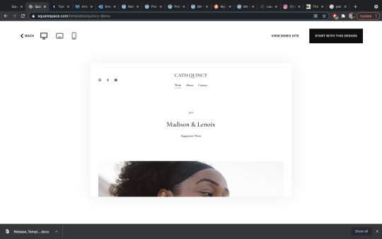

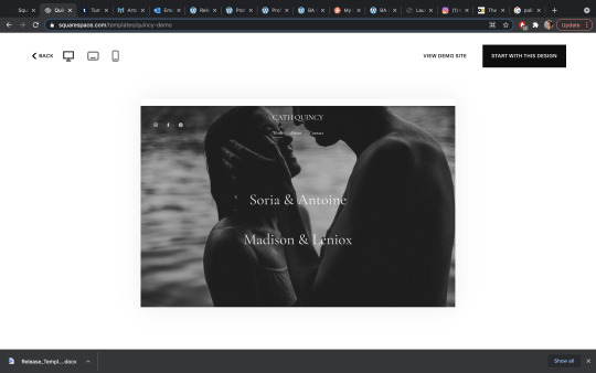
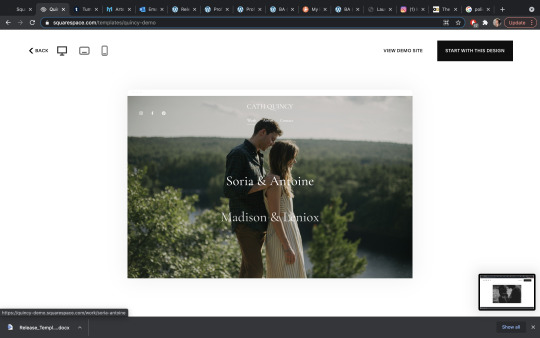
I’m really glad I swapped over to Squarespace as it has so many themes that are perfect for what I want. All are very sleek and professional and I don’t have to faff around with trying to install and use themes on Wordpress. I found one called ‘Quincy’ which was perfect, very minimalistic and had that thing where you hover over a header and it changes the image to show what’s in the folder/page. I liked that as it let’s the work shine and is very minimalistic in all other areas. It was actually designed for wedding photography but it has very smooth and gentle transitions between pages and when you scroll which I thought reflected my work nicely.
0 notes
Text
Website research specifics
Having done lots of looking at different websites to decide what I liked best, the four websites I found most appealing I had listed in a post before and here’s what I liked about each in more detail.
Haris Nukem:
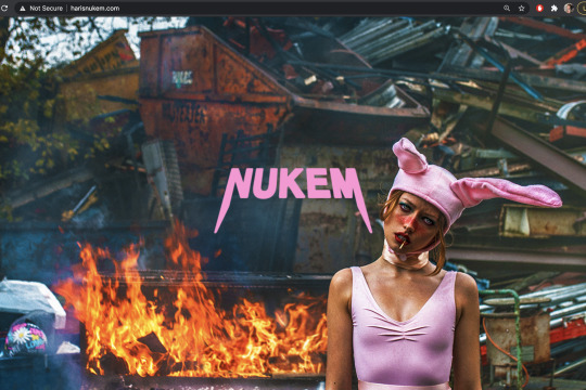
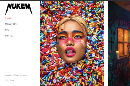
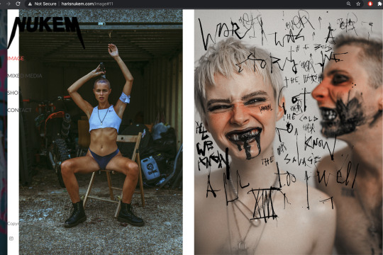
What I loved about Nukem’s website was that initial full screen image of his that once clicked then takes you to his images. The images (apart from his logo and the sub-headers) stand completely alone on the page which really allows the work to shine and doesn’t distract from it. What I also liked was that, as he is an artistic photographer, he doesn’t have all of his images in neat categories. They swipe sideways as though you’re reading through a book and are all completely random in sequence. I also liked the fact he only has his instagram link on there and doesn’t promote on several different platforms as it keeps it simplistic and also almost everyone has an instagram.
Lindsey Ruth:
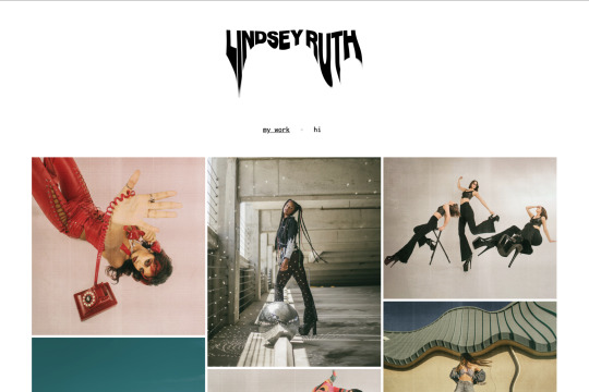
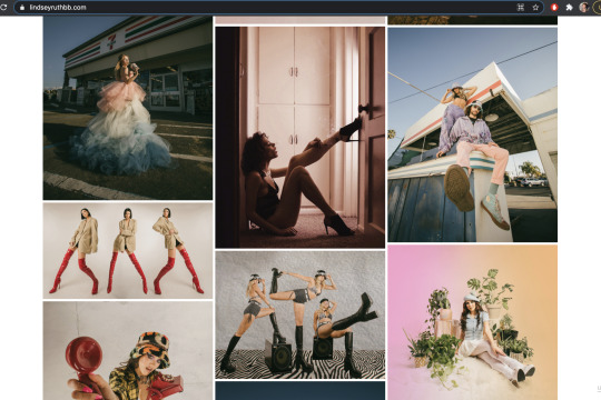
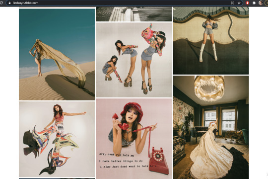
Lindsey’s website was similarly bare besides her logo and her sub-headers which again allows the viewer to focus on the work and get a real sense of the artist’s style. I got a good understanding of who she was and her very relaxed and quirky personality (also given away as the only other sub-header than her images was labelled ‘hi’). She comes across as very approachable and easy to talk to which is definitely something I want to put across on my website. You are able to click on each individual image to view a larger version but there are no titles or explanation of the images (same as Nukem) which just allows the work to speak for itself and not feel so pressured to fit into one category. it’s very relaxed, not flashy and made me feel very comfortable when looking at her website.
0 notes
Photo
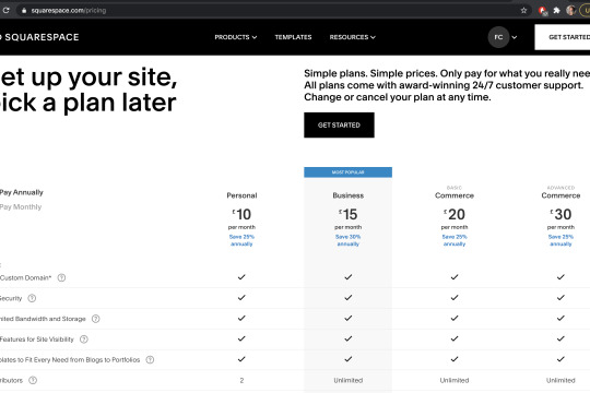
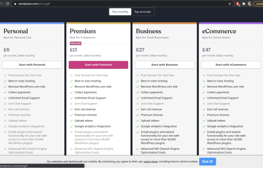
After our tutorials with Justin I decided Wordpress would be the best option because of its excellent SEO and its endless customisation options. However, after speaking to some of the current third years and watching some youtube videos comparing sites, i’ve decided Wordpress looks extremely difficult to use. As it’s my first website I think I am going to use Squarespace to build my website and later on down the line when i’m better equipped with website building skills I can try it again.
Price wise, Squarespace is quite a bit more pricey than Wordpress. Wordpress is £7 a month for their Premium plan and Squarespace is £15 a month for a business site. Squarespace seems much more user friendly and still has very good SEO, customer service and site customisation options. They also have a free 14 day trial so if I decide I hate it i can always restart on Wordpress.
0 notes
Text
Website Inspiration
Having now done some research into some other photographer’s websites and looking at different styles and layouts, i’ve been able to see exactly what I like and don’t like in a website; the main things being simplicity and cleanliness. Whilst a lot of my work isn’t necessarily light and soft like the work you’d expect to see on a clean and simple website, I think it’s clean in a different kind of way. It’s dark and edgy but is photoshopped to a very high-end, professional standard with no distractions and all shot digitally. I will go into more specifics in the next post but these are the websites I really enjoyed:
https://www.lindseyruthbb.com/
https://www.amaurynessaibia.com/
https://brodiesiantaberner.com/portfolio/
http://www.harisnukem.com/
0 notes