
georgesmithunit1
Unit 1 Illustration & Animation
26 posts
Don't wanna be here? Send us removal request.
Last Seen Blogs

opticsponge-blog
pretty wow
royalsimoneriksson
Young Royals

wackapedia
When will you realize Paris waits for you

cmonbartender
alice!
zeezu-ix
ONE MIND, TOO WILD, STUCK IN DIVINITY!!!
Text
Final Evaluation
25/06/18
In this evaluation I will be sharing my thoughts and opinions on my final animation as well as the process I went through to create my concepts and illustrations.
Concepts & Illustration Process
The assignment brief required me to create an animation that simulates a point and click game. I had complete creative control over the concept. I needed to create a minimum of one animated character, a digitally hand drawn background, elements of the background that are animated, and the whole sequence was to be a minimum of 10 seconds in length.
I adhered to all of those points except for one, which I completely forgot about - which was to have an element of the background moving, to be fair, I had planned on it only being minor in the first place (the rotating ventilation thing in the first scene). I came up with the idea of making a fighting-orientated scene for my animation, because I really just wanted to test out some animation techniques that I’d learned before, and also because I thought that it would be fun to animate, as well as entertain the audience. I wasn’t particularly inspired by anything to create a fighting scene, I’d wanted to do an animation like that for a while, so I thought it a perfect time to demonstrate what I could do. I had a lot of planning to do before I even created my background scenes. First of all, I needed to conduct some thorough research on point and click games, as well as anything else that seemed appropriate. I researched a number of intriguing titles which caught my eye when I first saw them, as well ones that I’d already heard of, and even played in one case. Researching those titles was really insightful and helped me with coming up with a solid visual style for my animation. After the research, I was required to come up with an entire 300 word plot for my animation - of course, this didn’t impact the animation itself, but it did help throughout the project as a whole, as it gave me a better understanding of my own story.
After finishing the plot, I needed to establish a clear visual style for my animation. I had already established one before getting to this point to be honest - and that was thanks to a game by the name of ‘Night in the Woods’. Luckily, I stumbled upon this game while I was researching point and click titles, and was immediately captivated, and even more so after I researched it further. I will share my thoughts on this game a little later on in this evaluation. Anyway, After I’d finished establishing my visual style, which would take inspiration from Night in the Woods, I needed to write about my main character complete with his very own backstory. This was similar to the plot in which it didn’t impact the animation at all, but did help me to get a better understanding of him and add some character depth. After all of this written stuff followed a series of pages in my sketchbook devoted to sketching out ideas of a character design, which adhered to my character description, as well as some sketches of the main enemy of the fight scene. Among these sketches was a character turnaround sheet, which would essentially showcase my main character’s appearance, whose name is Ace by the way, so I’ll refer to him as that from now on. The character turnaround sheet was pretty useful I think, as it helped serve as a reference for whenever I needed to draw Ace. Finally, I sketched out some initial ideas for a background scene for my animation, which mainly included cyberpunk cities etc. There was a lot of planning, which I believe was very necessary.
Now back to my main character, Ace. He is a very important character to the overall plot of the story, and so I wanted him to look intimidating, powerful, I wanted him to have a strong presence, so that’s why his colour palette ranges simply from white to black - I thought it best to have him wear a trench coat type of thing, because I wanted him to look professional and serious, so I thought this attire conveyed that perfectly. In that sense, I think Ace successfully communicates my intentions of having a strong-willed, physically strong and intimidating character. As for the style, I went with the anime/manga style while I was drawing him, since that’s pretty much all I can do somewhat decently, though I’m completely fine with that. It kind of translated over to the animation, though his design had to be dramatically compromised, since it would’ve taken so long if I’d have animated him exactly according to his illustrations, and maybe I wouldn’t even be done with the animation by now if I had been doing that, since I only finished it on 23/06/18, so a few days ago, at the time of writing.
Back to the backgrounds again. First of all, I mentioned earlier that my main inspiration for my background came from ‘Night in the Woods’. I really liked the visual aesthetics of that game, the graphics were really pleasing to look at in my opinion. They look as though they were all created in either Illustrator or Photoshop and given effects and textures according to the scene. I think that aspects of Night in the Woods are visible in my first scene, but definitely not in the final scene of my animation, since there’s a lot of details and effects that I used. For my scenes/backgrounds, I chose to use Photoshop alone, no Illustrator or scanning in drawings, since I believed that Photoshop was the best option for creating these scenes, and I still stand by that, as it offers many effects and is much more versatile in my opinion, I do end up using Illustrator later on however, since I needed to create two assets for my scene, which was the green arrow which appears at the end of the animation to tell the player that the character can move on, and the mouse cursor which was very important and a good detail in my opinion, as it makes it look like an actual point and click game. Of course, Illustrator is far superior to Photoshop when you need to create complex shapes which can’t be made in Photoshop in a short amount of time however. I also used Adobe After Effects to animate my ‘Start Game’ scene, as the background was created entirely in Photoshop and could only be animated in After Effects, given what I had planned to do. Back to my scenes, I chose to create them in a somewhat simple visual style as I knew that my animated characters would be excessively simple, and turns out I was right. I do think that all three scenes that I created all adhere to the same general theme of being futuristic and cyberpunk, and certainly communicate my intentions and the atmosphere of my animation.
Personal Analysis of my Final Animation
So my initial intention for my animation was to do a fighting scene, which I actually ended up with. While I was animating, I was essentially improvising what would come next, as for some reason, I never actually planned out the whole thing using a storyboard. I intended for my animation to be entertaining, whilst still trying to adhere to the project name, a point and click game. Actually, now that I think about it, I had a second idea kept in my head during the very early stages of this project, which would take more of an adventurous route, which I thought somewhere down the line afterwards wouldn’t be as fun to animate. I don’t think that counts as my final animation changing in the end, since I didn’t choose it to begin with, so if anything, it changed during the early phase, before planning. I think that my idea of creating a fight scene was kind of ambitious, but I didn’t want to go over the top in terms of concepts, so I had to limit my imagination a little there, but as I go on, and learn more and more, I’ll hopefully become more versatile in my skill set, and be able to create very ambitious animations, with camera movement etc. In terms of software knowledge, I had a lot of experience in using Photoshop, since I’d been using it a while ago, and I’d had the opportunity to learn it even more this past year, so I wasn’t limited in my background creation. In Adobe Animate, I was less knowledgeable, however, I’ve actually been animating for the past 7 or so years, on and off of course, on a software called Flipnote Hatena, which was on my Nintendo DSi, so I had learned some basic animation techniques which I developed from experimenting over on that, like smearing, it’s a technique that can be seen in my animation quite a lot - maybe I used it a bit too much, but anyway, it’s when you draw a kind of lazy-looking frame between other frames, to simulate the character or object moving quickly. I may find a way to share some of those animations at some point, I have some good ones on there. Anyway, my point is that moving from that software to Adobe Animate wasn’t too difficult a transition, especially since I’d used it in secondary school before, so I was able to adapt to it with relative ease.
Throughout this project, I haven’t particularly learned any groundbreaking new techniques or anything, though I have absolutely had the chance to develop my already existing techniques and skills. It also helped give me experience with combining different scenes together, and then animating them when they were all together, for example, it was tricky at first when I wanted to combine all of these different scenes, but, after a bit of trial and error, I manged to get them together and start animating the mouse cursor, since it was much easier to do this in After Effects. Along with this, I also used the trial and error method when it came to exporting my final finished animation from After Effects, since that was the last software that I used, which held all of my scenes together, as well as the mouse cursor movement and the green arrow at the end. I remember vividly that I ended up having to export it at least 15 times, since I had to keep messing with the quality to try and get the best that I could. I ended up getting a sub par quality when I rendered and exported at home, and then somehow, when I tried it at school, I ended up with a better quality version, which I have uploaded to YouTube. The quality isn’t the greatest and there are black bars on the left and right sides, but it will have to do at this point. I did look up a few tutorials online, but none yielded any success.
When it comes to my animation, while I’m pleased with the result, I actually believe that it doesn’t look a whole lot like a game, which is a shame, considering the amount of time that I poured into it. I think that the main problem or reason for this is that it looks too fluid perhaps, and also it just looks more like an actual animation, since the movement is so fast - I think that the mouse cursor which I implemented during the After Effects phase as well the start game screen sort of saved the whole thing from looking completely like just a cell animation. I do have an idea of what could be improved to make my animation look more like a game actually, and I’m a little annoyed that I didn’t think of this throughout the entirety of the animation process. What I’m thinking is that when the characters stop, they could kind of bounce up an down, I think that’s called an idle animation or something - it wouldn’t have been such a difficult task to do as well, so it’s a shame I didn’t think to do it. It could’ve also drawn out the animation a little longer maybe. I think that the smear frames that I mentioned earlier definitely don’t help the animation in terms of it looking like a game, though I saw no better alternative for fast movement, since it would look choppy and weird when a character moves from one side to the other if those were the only frames. If I had all the time in the world, I would’ve increased the FPS to something high, but I didn’t so I stuck with the option that I believed was best.
I think that I did a somewhat decent job at getting it to look like a game in the end. Though when it comes to time management, I started off terribly. When I started animating in Adobe Animate, the FPS count was set at 24. So me doing a completely frame by frame animation, I was drawing out these entire characters every single frame and it was taking me so long - I was getting incredibly frustrated at times, and considered completely scrapping the idea of doing a frame by frame animation. This lasted almost two weeks, with me barely getting anything done, and I was beginning to panic, since the deadline was fast approaching, and I had only done just under two seconds total. I had the idea to create a ‘Start Game’ scene, which could be considered a cop out, though I needed it if I wanted to get even close to the 10 second minimum, or so I thought. I made sure to make this screen look good visually, and so I began animating it after I’d finished creating it in Photoshop. I even added a mouse cursor that would click on a button to start the game - I managed to draw this one out to three whole seconds. I was pleased with it but I realised that I needed to go back to the dreaded 24 FPS animation.
One afternoon when I was working on it at home however, I randomly decided to look at the right hand side of the Adobe Animate document, and saw the FPS button, I decided to mess around with it and move it up and down, and when I played it at 18 FPS, I noticed that the number of keyframes in each second decreased, and the length of my animation so far was now at 4 seconds. So I played the animation that I had so far, and it actually looked better than when it was at 24 FPS, since that was way too fast for what I was doing. I decided to move the FPS down even further, and stopped at 15 FPS after playing it a few times, and realising that this speed looked so much better, the animation was longer, at about five and a half seconds. I was very happy with this turn of events, and became motivated to finish it again. I understand this was kind of unrelated from the start of this paragraph, but I just wanted to explain that as I felt it was rather important to the whole project.
Personal Opinions on my Performance & Final Work
Overall, I am very satisfied with my animation. I believe that the time and effort that I put into it payed off, though it still has its strengths and glaring weaknesses throughout.
First of all, I think that unfortunately, the negative aspects outweigh the strengths, though I think the animation kind of carries the positive aspects. Anyway, speaking of the animation, I tried to get the entirety of it as fluid and smooth as I possibly could, which may actually be considered a weakness, since that is probably one of the main reasons for it not looking like a game. But set that aside, and I think that it is one of the main good things about the animation, alongside the added effects that I added post Adobe Animate (the green arrow and the mouse cursor), since these two aspects help drastically make the animation look more game-like in my opinion. Back to the animation, I’m very pleased with how I animated the electricity emanating from the enemy, and especially when he is charging an electricity beam, and I think that it is instantly recognisable as electricity, which is definitely a good thing (then again, what else would it possibly be). The backgrounds are also a major plus of the whole thing, I think that they’re all well-made, except maybe the scene where they’re in the sky, it looks a bit strange. Though the first two scenes definitely correspond with each other, and actually look like they’re from the same thing.
As for the negative aspects of the final animation, the weaknesses, are quite prominent in their numbers, though I think as I mentioned before, the animation definitely cancels them out a bit. Anyway, one of the first negatives to take away would be the the characters in comparison to the background. They don’t really correspond to each other and look out of place, although then again, there are a lot of types of animation out there that utilise real backgrounds and then have 2-dimensional characters moving around on them. An example of this that I remember watching at one point would be Aug(De)Mented Reality, which uses real life scenarios with 2-dimensional traditional animation cels. Another example would be anime (or sometimes western animations) - they draw these often very detailed backgrounds because nothing will be interacting with them, so they can just keep them static, but go all out with the detail. A specific example would be the animated movie Your Name, which does has some animated aspects, though my point is that the background is incredibly detailed compared to the main characters (and all characters for that matter). Back to things looking out of place, the green arrow at the end definitely looks strange, no matter how you look at it, since this time it doesn’t just look weird with the background, it looks weird with the animated characters too, I don’t really see a way around it to be honest, except maybe change the colour or even hand draw the arrow in adobe animate. Something I want to point out is Ace and his attire, namely, his trench coat, which I seemed to have subconsciously changed into a cape somewhere along the lines. Finally, the last thing I want to mention is the movement and speed of actions. Essentially, while animating the mouse cursor over in After Effects, I realised I didn’t have a whole lot of time for the mouse to stop at some parts, namely, near the end of the first scene. I just think that there needed to be more pause between actions to allow for more mouse movement to be a little slower, and those idle animations I mentioned would help with this greatly.
There are a handful of things that I would do differently if I were to redo the entire project, including a couple that would have been really beneficial to me. For starters, I’ll go back to the character movement again, I really think that it’s too fast paced, which isn’t necessarily a bad thing if you can do a fight scene well, which I did, but I think it lacked different camera angles and movement etc. So I believe that when a character is finished performing an action, they should just pause for a bit, so that 1: I can have slower mouse movement, and 2: it won’t look solely like an animation, as opposed to a game, which is what the objective was. The other very important thing that I didn’t do for some reason, would be to create a story board, because I was improvising throughout the entire thing, and if I just drew out a few pages worth of boxes, it could’ve been a lot more structured, and I may have finished the animation a lot sooner, because I knew what I was doing. Also, this probably goes without saying, but I would have started at a much lower FPS than 24 when I started out the animation, since 24 is just way too many for a simple point and click game.
But overall though, I am pleased with my final animation and I do think that I was successful in creating an animation which adhered to the project name, and I think I managed my time fairly well, more so in the second half of the project, where I was on a roll with creating the final scene and animating once I’d figured out that I didn’t need to animate at 24 FPS. There were things that I did to speed up the process though, like with Ace’s character - he’s literally transparent, which is a decision that I decided on during the early stages of animating the first scene. He was too detailed a character, since he has different segments (clothes) unlike the enemy, which I just coloured one solid colour, along with the eye. Also, I just didn’t want to deal with the fill tool, which I had to deal with enough when I was colouring in the enemy - I kept trying to fill him in, only to find out that there were still like two or three gaps in the lines, so it wouldn’t fill. Another thing I did was near the end of the animation, I started copy and pasting frames and moving them a little bit instead of hand drawing all of the frames, which is something I should’ve done since the start, but still hand drawn the necessary frames. It saved a lot of time.
I really didn’t plan on writing 3703 words for this, I think it’s the most I’ve ever written. I guess I just had a lot to talk about.
1 note
·
View note
Text
Sky Scene Process
19/06/18
After I had finished animating the first part of the scene, I wanted to create another scene so that I could have a longer animation. I went with a scene somewhere in the sky, since at the end of the first animation, the characters are shown to be jumping off-screen.
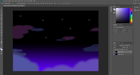
So, I started by going over to Adobe Illustrator to start working on the scene, but like with the previous scene, I just didn’t have enough effects at my disposal, so I decided to just do it in Photoshop again. This time however, I did create some clouds in Illustrator that I imported Photoshop, and I duplicated them and manipulated them so that you couldn’t tell that they’re the same, unless you analyse them or something. I made the background a dark blue-purple colour to start with and then coloured the clouds a pink-purple colour. I think that the contrast is a bit too high between them here.
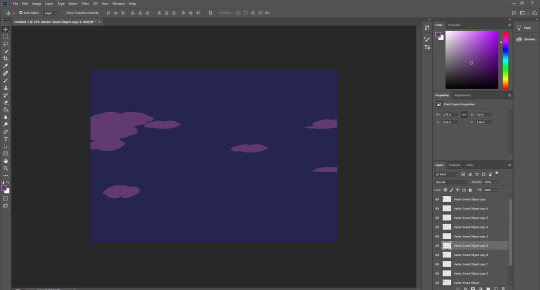
So I thought that the background looked too boring, so I gave it a gradient going from the top right value of blue, to black, which makes it look like it’s really high up, which I guess kind of makes the clouds make no sense in a way. Anyway, speaking of clouds, I thought I should change the colours of some of them, just to add some variation I suppose. I also added some more clouds to the foreground, to give some more depth. I think that it looks good so far. maybe a bit strange, because of the colours of the clouds perhaps, but still decent.
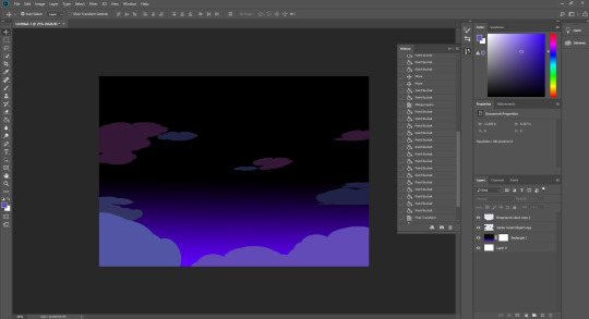
Next I decided to add some effects as well as add one more new aspect, the stars. Now this was on Photoshop and I’d already closed down Illustrator, so I just used the polygon shape tool, which was already set to a hexagon, that was good enough, so I used that and made it really small, which I would’ve done even if I had the option of having actual stars. I duplicated one star five more times and spread them out to some degree. I also blurred four of the stars to make them seem farther away, and of course, I gave them all a glow which makes them look a lot better I think. As for the effects, it was really only one effect, one of my signature effects I suppose, the 3D stereoscopic effect. I just duplicated the layer and changed unticked the red box from the colour channel options. Then I moved this new layer to the right a bit, to give the effect.
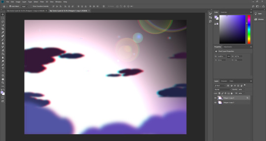
Finally, I was messing around with lens flares, and added subtle ones near the bottom of the scene, behind the clouds. They looked okay, but then I randomly decided to change the size of the lens flare and it gave the below image. Suddenly I had a really good idea which if I could pull off, would look very good I think. So basically, I had the idea to have the enemy character shoot something, maybe a bolt of electricity or something, and then for one or two of the frames, it would look like this, to make it look like it hit Earth or something.
Overall, I’m excited to start animating on these newly created scenes.
0 notes
Text
Animating the Start Game Scene in After Effects
10/06/18
So I had just finished creating the scene in Photoshop - the reason I chose Photoshop over Illustrator by the way, was because I felt that everything that could be done in Illustrator could be done in Photoshop, but better, because of the effects that it offers. If I were making a more complex-looking scene that had lots of different shapes and such, I would definitely go to Illustrator.
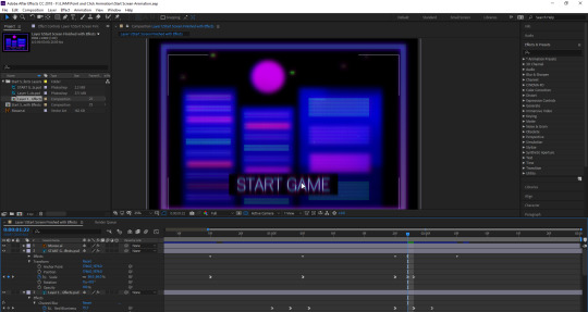
Anyway, I wanted to start animating as soon as I finished the scene, so I didn’t lose any of the ideas that I had prepared. So firstly, I opened up Adobe After Effects, and then I created a new project, and imported the Photoshop files. I was a little skeptical beforehand, as I had a feeling that you wouldn’t be able to import multiple Photoshop layers, as I had never once tried to, and that something would mess up. Thankfully though, it worked and preserved all of the layers (all two of them that is). So I had a couple of ideas that I wanted to implement in this animation, the first one was to very subtly zoom in and out on the background which wasn’t too difficult, all I had to do was go to the transform drop down and click on scale. I set scale to 100% so it didn’t move at all and then created another keyframe and change it to 102%, so it moved very slightly, and then I created a final one set to 100% again, so it zoomed in very slightly. I repeated this throughout the animation.
I thought that I was only going to apply this effect to the background, but then I decided to give it to the ‘Start Game’ button too. Slightly less subtle this time around, but I think that it looked good. I wanted to have the button be zoomed in on too, as if it were being clicked onto, so I made it so that the button zoomed in much farther than near the end. I only just thought about it, but I had the idea to have an actual mouse on the screen, so that when something is clicked, e.g in this scene, the button. I may implement that soon.
The next thing I added to this start screen animation is the effects. I thought I would give it some to make it look less stationary again. I decided to go with the colour channel blur preset which I just dragged from the presets tab on the right over to the layer that I wanted it to be on. I placed these in two different spots in the animation - one near the start which was fast and another one near the end which was slightly slower. I tried to make it look kind of glitchy. I also decided to add a blur to the background. It started after the first colour channel blur, and got increasingly more blurred, and then went back to normal. That was about it for the background, so I thought I would add some effects to the ‘Start Game’ button, to give it some more flare. I planned on having the button clicked at this point, so when the button does get clicked on, I also gave it the colour channel blur effect, which I think looked pretty good. Those were all the effects I added to the scene as a whole.
Finally, I wanted to implement the mouse which would be clicking on the button. So I went to Adobe Illustrator, and started to create the mouse, which took a lot longer than I’d expected. Firstly, I created a triangle, which I would then warp to make it look longer, like an isosceles triangle. It took me a long time to get the shape right for some reason, and then after that, I had to create the thin part under the triangle. This was also more difficult than I’d expected, as I had to get it centered, then I had to get the right width, and then I had to try and merge the two shapes together afterwards. When I’d finished creating it, I imported the layer into my After Effects project, but it looked terrible, and not like a mouse at all. So I had to redo it again, and also make sure to make the outline a lot bolder, since it was so small it was almost not visible. So I finally got it right after another attempt after that and started animating it. First of all, I kept it off the screen to start, and made sure that the anchor point was in the middle of the mouse. I set its destination at a little right of the center, and made it relatively fast, but not too fast. I also gave it a blur effect when it was moving, just as an added detail. Finally, after I’d moved the mouse first, I moved it again over to the ‘Start Game’ button, this time a bit faster - and once again, I gave it a blurring effect.
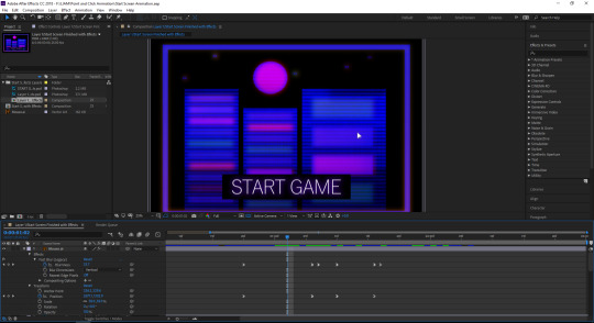
That was it for my start screen scene. It is three seconds long, which I think is appropriate, considering how exactly I’m animating my actual point and click scene (frame by frame, which is taking a lot of time).
1 note
·
View note
Text
Start Screen for Point and Click Animation
10/06/18
So whilst I was animating in Adobe Animate, I realized just how long it was going to take me to get to 10 seconds, and if I were to hand draw each frame for 10 seconds, then I may not even finish it before the deadline, considering how I animate.
I thought about possible things that I could add to draw the animation out without drawing each frame, and a screen that goes before the game came to mind, in particular, a start screen. I think that if I were to make a start screen, it wouldn’t just be a way of drawing out the animation, it would make it look more like an actual game and not just a fighting scene, because you might not think that it was a point and click game if you just saw the animated scene. Also, an idea that I literally just thought of, would be to maybe animate a mouse on the screen every time the main character Ace makes a move - that could make it look even more like a point and click game, because then I’m showing that the mouse is controlling Ace’s actions. I could click on the enemy and then he would rush over to fight it.
Anyway, I’ll go through the process of how I created the start screen. I started by creating a black background, I don’t know why, it was just a random decision. Then I thought of placing a box over the top of it and giving it a gradient, which would go from purple to blue at the top. I wanted to use colours that went with the cyberpunk theme, so I think that these pretty much represent it perfectly.
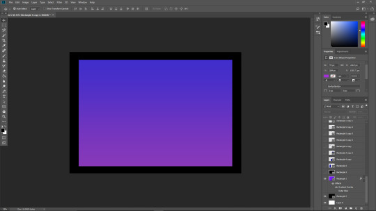
Afterwards, I decided that the box gradient was weird and nothing that would go on the top of it wouldn’t look very good, as they would most likely blend with the colours, with it being a gradient. So I put another black box over it - black looks good with everything after all, especially this, I think it looks really nice. I needed to fill this box with something, so immediately, skyscrapers came to mind, so I placed some rectangles down on the box starting from the immediate left side, so there was no black on the left side. I think this looked horrible, because the colours just blended, as I mentioned earlier, so I decided to give it some breathing room, and moved it to the right. I thought that simple shapes would work and look best, so I did that, and also only made 3, as I thought that was enough. Perhaps I could have added 4 but then it would’ve been even, and then 5 would’ve been too much as they would have been squished up against each other and they wouldn’t reach the top.
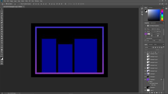
Next I added some simple details to the buildings, windows. I made sure to vary the colours, though maybe they should’ve been a bit more neon-looking. The base colour was a desaturated blue kind of colour, which you might be able to tell since it’s the most common colour on the windows. I experimented with using a glow on the windows, but I decided against it as it just looked a bit too messy I think, and so I kept with the simplistic kind of design. The last thing that I added for this stage of the process was the moon. I coloured it purple, as I didn’t want it the same colour as the buildings, and pink didn’t look good, so since I was sticking to a specific colour palette, I think purple was the most appropriate choice. I noticed the moon has a slight 3D effect, which I’m not sure how I did unintentionally, but it looked cool so I didn’t investigate it further.
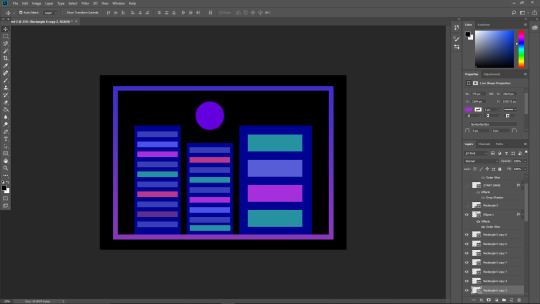
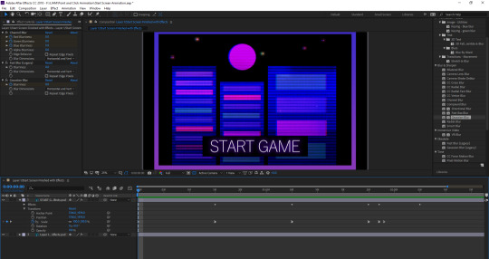
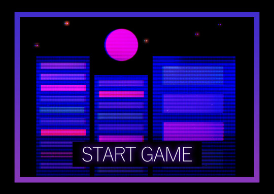
The next things that did was the ‘Start Game’ button. Without these words, you wouldn’t know what the scene was for, so it was very important that I made it look good. I decided to keep it simple however, and go with black and white. I think it’s still pretty noticeable, and when I animate this screen, I might have it moving slightly, maybe a slight zoom in and out - I also might do this with the background, to keep the whole thing from looking too stationary. I decided to give the text a blue glow, so it stood out a little more, and also adhered to the colour palette. After this, I thought about adding some stars in the sky, to make it look like a night sky, as opposed to just a black background. The stars are just simple white ellipses I created, and gave them a slight white glowing effect.
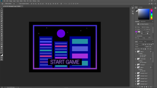
I was almost finished with the creation of the start scene, but I think that it needed some effects or something added to it. I chose to give it the 3D effect that I often use. I think it looks good though - all I did was duplicate the background and unticked the red colour channel and moved the duplication slightly to the right using the arrow keys. I also thought to give it some kind of filter effect, so I pulled up 2 different ones that I really liked, placed them over the top of the background, and changed the layer modes, I believe I changed both to soft light, but it may have been overlay, either way, they do similar things. It made the scene look like an old 80s game, or at least something imitating it, taking inspiration from the cyberpunk style. I think overall the scene turned out very well in my opinion. Perhaps the ‘Start Game’ button looks a bit too simple looking back, but I think it serves its purpose well enough.
1 note
·
View note
Text
Main Animation Scene Process
04/06/18 (I created the scene a couple of weeks before this date)
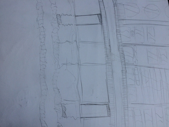
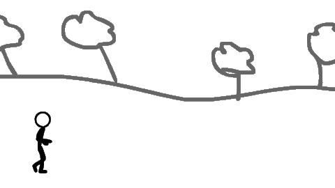
Below is the sketch of the scene which I drew a while ago, and I go over it in the post below, but I will talk briefly about it here. The scene was inspired by the cyberpunk aesthetic as I really like this theme, so I thought I would try and incorporate it into my work somehow, and thus I decided to create a whole scene which encompasses this. It has some aspects which I planned on animating in the final animation, but perhaps I won’t do some/one of them, namely the flickering lights. But the person walking by the window on the top right will most likely be animated, as well as the rotating fan-thing on the left. Aside from this, nothing else will be animated in the background most likely. The scene includes a row of stores which won’t be interactive, as well as some details above the stores like ventilation pipes.
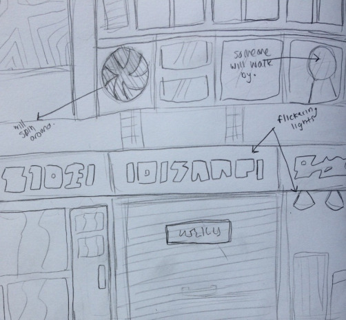
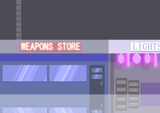
So I went to Photoshop, and started creating the scene. I brought it to Photoshop as I thought that I would be drawing it with a wacom pad and a pen, though as it turned out, I created it with shapes and lines. But I still think it is better than creating it in Illustrator, as the effects are very limited compared to Photoshop. As I started creating the stores, I struggled to think of what I could write on the signs. In the sketch, I intentionally made it so that it was eligible, but I thought that I just didn’t want to create some random letters with shapes, as it would be time consuming and tedious, so I decided on using English. I considered using Japanese, to make it look like Neo Tokyo or something, but I settled on English, and thought of some random words which I thought would work, which ended up being a weapons store (this is the future remember) and a lights store, which was inspired by the sketch which includes some lights hanging from the ceiling. The door and windows were, I think, the only instance where I used the wacom pad and pen which I had set up specifically for this task. I just did some fast lines down the middles of them to imitate the effect of a shine. By this point, I already decided to experiment by duplicating everything I had made and reflecting it below the scene to make it look like, well, a reflection. This was pretty much it for this part of the process, other than the shade beneath the signs and the pole thing holding up the store.
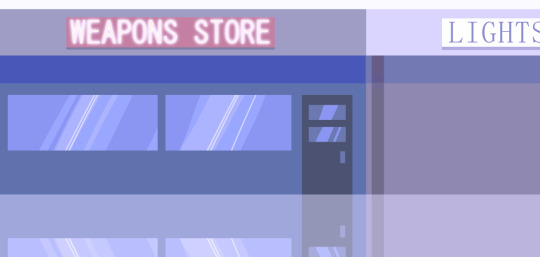
Next, I added some other details, such as most noticeably, the area above the stores, with the ventilation pipe. This would eventually have some windows with a person walking by, and the fan. I added some things in the lights store, as well as some actual hanging lights. I also changed the colours of the weapons store, as well as added a glow to the text to make it look more neon city-esque. Looking back, it seems I actually added the glow during the earlier process. The lights were interesting to make, as they are just rounded shapes hanging from the ceiling, with a glow. I tried to make the glow on the farthest back layer of lights look darker, but it just kind of looks like the I used a different blending mode, like ‘darker’ or something, which I didn’t. I redid the reflection, with updated assets, and I think it looks quite nice personally. There isn’t much I can add to the rest of this stage of development.
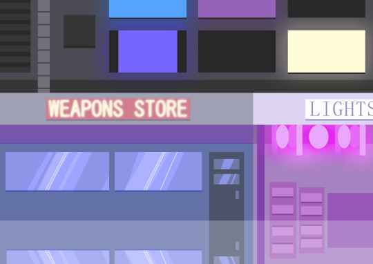
This is where the scene starts to look good I think, with the top half of the scene complete, alongside other details. First off, I added the things at the top which I said I would, like the windows and vent. Sure, the whole thing doesn’t look exactly like the sketch, but I’m glad as it looks much better in my opinion. Anyway, back to the top - I added the windows and gave them each a different colour, as well as having some curtain-like things covering two of the windows. I also gave each of the visible windows a glow with their respective colours. The fan next to the windows will, as I mentioned in the previous post, be most likely added in After Effects, post-Adobe Animate, as I would find it difficult to keep drawing the same thing spinning around for 10 whole seconds, which who knows how many frames that would equate to. I’m glad I decided to develop the lights store because I just felt like something was missing, so I thought I would make the whole room look like the pink lights were influencing the colours of each object. Speaking of the lights, I decided they looked to drab and boring, so I gave them a more fluorescent glow. You could compare the below image of the lights store to the above image of the lights store, which could show how the store looks when the lights are turned off perhaps. Other than what I mentioned, that is pretty much the completed scene, though I ended up adding some various effects afterwards.
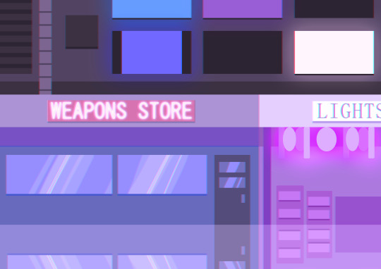
Here’s the version of the scene which I added some effects to. Only 2 though, I didn’t want to go overboard with effects to make it look tacky. But I added a coloured filter - I don’t actually remember what colour it is, although, looking at it I would assume that it was either purple or blue. Alongside this, I duplicated the layer and altered the colour channels on the new layer, to give it a stereoscopic anaglyph kind of effect. I just hope that the reflection doesn’t look too prominent and not like a reflection at all. After all, all it is is a duplicated and flipped upside down version of the scene with a lowered opacity, somewhere around 60 I think.
Overall, I am really happy with how the scene turned out, it isn’t too detailed, as the animation will just be a 2-dimensional one created in Adobe Animate, and it isn’t too complex, because it doesn’t need to be. I think that the colours adhere to the cyberpunk aesthetic quite nicely, and the effects compliment it very well. I did experiment with adding a lens flare in the scene, and it came from the top right window, though this didn’t make a whole lot of sense, as the light probably isn’t glaringly bright. Perhaps my least favourite part of the scene comes from the top half, with the windows and the vents - I’m not sure why, there’s just something about it which doesn’t look as appealing as the bottom half to me, maybe it’s the windows, they look a little bit plain, and the curtain things that aren’t fully closed look kind of strange, which is because I couldn’t really recreate actual curtains very well, because of the limited shapes on Photoshop, and if I were to draw them using the wacom pad and pen, they would look terribly out of place I think. My favourite part of the scene however, has to be the lights store, as I think the colours look really nice when they’re just confined to one room, as it gives the impression that only that room has these bright lights.
0 notes
Text
Creating Animated Characters in Hand Drawn Environments Animation Research
17/04/18
I researched point and click games online to get some inspiration behind my own ideas. Upon researching, I came across a number of intriguing titles which caught my eye, one in particular. Some of the games which took my interest are “Deponia”, which has quite a charming Western art style with some futuristic aspects to accompany it. I like the character designs and also the backgrounds. There were quite a lot of games which utilised pixel art, which whilst I would be doing a hand drawn animation, these could still be good references for my own animation, when it comes to background(s) and character design. These games include “To the Moon”, “The Binding of Isaac”, and one that I have actually played, and thoroughly enjoyed, “Owlboy”. The art in this game is absolutely phenomenal, and the backgrounds in particular, which I may end up taking inspiration from when it comes to developing my own ideas. However, the game that caught my eye the most when researching point and click games was “Night in the Woods”, which after researching the premise and plot of this game after being drawn in by the beautifully Illustrator-type graphics, really interested me, as I really like the dark themes that it seems to tackle accompanied by happy-looking visuals throughout the game. It has actually made me want to play it myself as this seems like something that I would enjoy, and I really like the simplicity of this game. It may end up being one the main inspirations behind my animation.
PLOT
The story will take place in the not-so-distant future during 2088, where the world is in a state of chaos and ruin. There are barely any natural aspects left, and neon cyberpunk-esque cities occupy most of the world. A highly confidential organisation had been working behind the scenes on developing a machine which would mass-manufacture creatures to be placed in the public. Designed only to induce fear in people, this would reform the public so that the organisation could essentially take full control over everyone - the organisation was dubbed “Puppet”, since their aim was to control people, like puppets.
The world was becoming a place more and more empty, everyone was straight-faced and had no personality left. There were few people who were able to hide from this reality, including our main character, who goes by ‘Ace’. Too many creatures were being manufactured by Puppet and eventually, Ace, and a resistance group led by him fought back, but to Puppet's distaste, they started sending hostile creatures which will induce fear by violence this time, thus inevitably leading into a third world war, with many countries taking part in the rebellion. Ace eventually became the ‘leader’ of the human race, and it became his duty to take down Puppet, and hopefully salvage what was left of the world.
Ace manages to breach Puppet and get to the machine down below the surface, but at the cost of countless lives. Ace manages to shut down the machine and take down Puppet - but, was it worth it in the end? With the loss of his humanity, for the sake of humanity, Ace becomes an empty human. Struggling to come to terms with his actions, and contemplating over and over whether he made the right decision, Ace lives on and the remaining population tries to rebuild the world. Perhaps some day, Ace will discover his true self.
The story ends there - I decided to give the story a somewhat open-minded ending, so I’ll leave it up to the reader whether it ended happily ever after, or in a tragedy.
VISUAL STYLE
The visual style that I’m most likely going to be going with will be something like what I mentioned earlier; Night in the Woods, as I was captivated by the art and style of the game, without even playing it myself. I really like the simplicity of the art style, whilst also retaining quite a distinct look. My animation will most likely be 2-dimensional, as I think there’s a lot more opportunity and space for 2D backgrounds and foregrounds, as well as characters and movement. Whilst I will be taking inspiration from this game, I will be also trying to develop my own style when drawing out my background(s) and character(s), and I probably won’t be staying very close to this game’s style anyway, as it seems like the vast majority of it was created in Adobe Illustrator (not a bad thing if so).
2D games also have quite a special place in my own heart, growing up with Nintendo games and such, so I think that this animation will be quite personal to me whilst I create it, and when it’s finished, it may end up having aspects inspired by Nintendo games, most notably the Mario & Pokémon series.
CHARACTER & BACKSTORY
My character’s name is ‘Ace’. He has no recollection of who named him this, or even if this is his real name, being an orphan for as long as he could remember. Ace has a strong sense of justice, and believes that the world is a terrible place and despises those who perform crimes for their own sake. Whilst in hiding, Ace started training, using a long blade and a regular handgun which he found laying around - perhaps it was once used by a soldier who fought against Puppet. Eventually, Ace came across other like minded people, and soon after, he founded the largest resistance group whose goal was to take down Puppet.
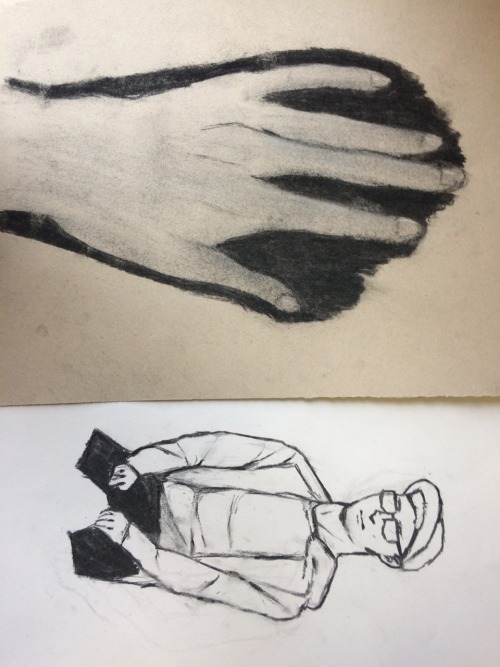
Ace is a male whose age is unknown, although he looks as though he is in his mid to late twenties. He seems to have a somewhat southeastern accent, so he might have been born somewhere in Asia, although he speaks fluent English. he has a very serious nature but this changes somewhat by the end of the story. He usually wears a long white coat with black trousers and black shoes. He has medium-length black hair and his eye colour is grey. Ace’s weapon is a long blade and a regular handgun which he uses when he can’t fight with a blade.
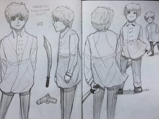
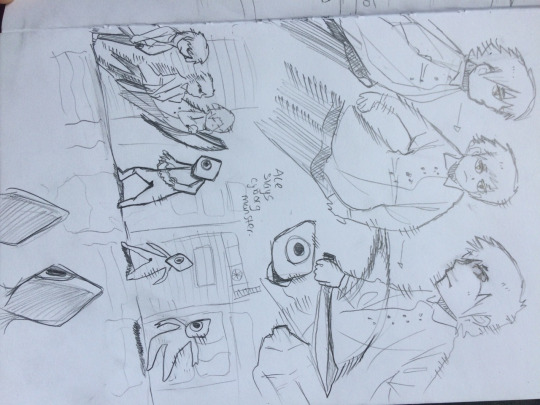
Above is a character turnaround sheet that I drew of Ace, along with some other sketches. I think the first view that I drew (far left) is the best and I was quite pleased with how it turned out, and then I drew the next one which I was significantly less happy with, as I’m bad at drawing side views of people as well as hands, as you can tell, it doesn’t look very proportionate. I think that the next one is a slight step up from the previous one, but it still doesn’t look great, although, I am a little happy with how the hand turned out, holding the blade. The last two are just simple sketches which turned out a little bit too detailed than I had planned. Initially, these sketches were supposed to show off how Ace could look in-game, but as I said, they’re a little too detailed, and I plan on making a fairly simple 2D animation. I’ll work on these at some point. The two other drawings on the left page are just to showcase his two weapons. His long blade, and the regular handgun. The handgun looks a bit disproportionate, but it doesn’t matter since I probably won’t be animating the it, maybe though.
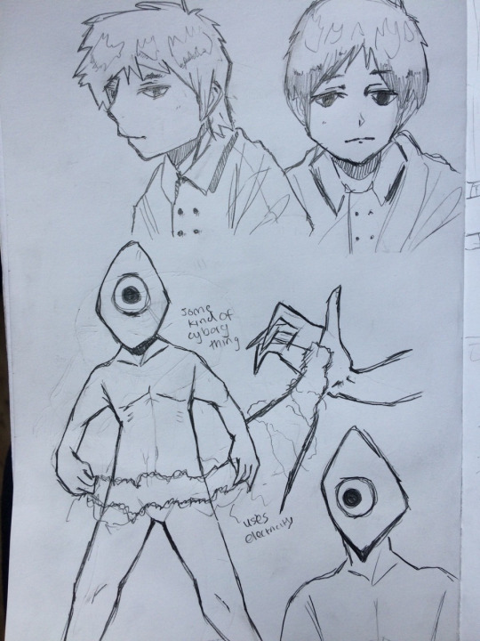
Below are some sketches that I did of Ace and also some of the monster which he will fight. I decided to draw it with one eye, which made it look like a cyclops thing. I decided to keep its design simple, I’ll probably colour it a shade of red or something, since they are just mass-manufactured monsters. When Puppet added offensive capabilities to the monsters, electricity was probably the most easy to produce, so that’s what they gave them. They can materialise electrical energy from their palms, and join them together to amplify its power. Above the monsters are some sketches of Ace. For the monsters, I had to draw a whole body, bar the feet, so this was a little challenge for myself, but I think it turned out decent to some degree - I like the legs especially. I drew the hand with the electricity coming out just to showcase it. They can fire it out of their palms with relatively strong force.
Above is a sketch of a potential background for the animation, however, I draw another one which I think will be bit more suitable. Anyway, my background is set in the future, where neon cyberpunk-esque cities occupy most of the world.
Below is a sketch of a potential background for my animation, I think this will most likely be developed in Photoshop. It’s essentially a row of neon-esque stores with some rooms above where a person will walk by. There’s also a fan or something on the left which will spin - I thought about it and realised that this would be best suited for After Effects, so I’ll try and do that when I’ve finished the main animation. There’s also some hanging lights on the right which I may or may not end up animating in the end. The font on the stores is intentionally eligible. I think this is a solid design in my opinion, so I would like to bring it to life digitally. Below the scene is just a sketch of Ace being showcased with his weapon.
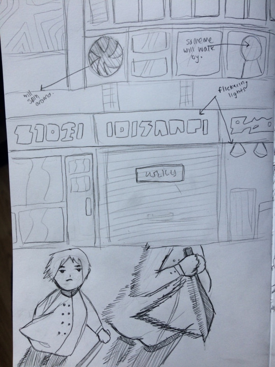
This final page of sketches that I did is just some rough sketches of Ace’s movement at the top, and how he could potentially move about, whilst he slays the monster. I don’t know yet if the animation will contain blood when a monster is slain, but I will most likely decide when I get there. The sketch below it shows the aforementioned scene which I drew, with Ace confronting a bunch of monsters, with a pattern of how his movement could go, like in the sketch above it. I added a reflection of the row of stores to imply that the floor is wet or something. Maybe I’ll add rain somehow, although this seems like a difficult job.
0 notes
Text
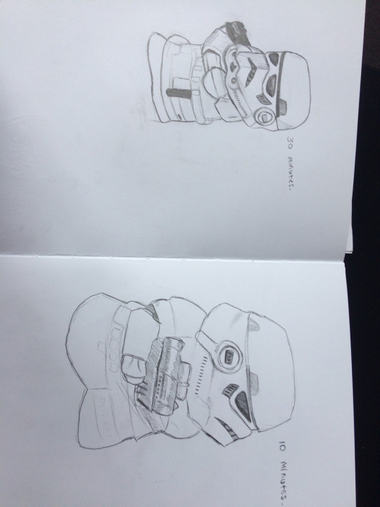
30 Minute - 10 Second Observational Drawing
13/03/18
Today, an object was placed in front of us which we couldn’t move, and we were tasked to draw it in a designated time span. Personally, my first object to draw was a Storm Trooper figurine thing, which I got a pretty good angle for, getting most of the front side of it. For this drawing, we had thirty minutes for it, and I started with trying to get the main outline of the figure, as I thought that it wasn’t a very complex shape, and then I could add the details and such afterward. However, as I started doing the outline for the head, I just gave in and started drawing in the details already, and moved down to the torso, etc. I think it turned out pretty well for a thirty minute drawing, however, I had been told that it was too small, so for the next drawing I made sure that it fit the A5 page I was using. I think I have a habit of drawing things too small, which probably originated somewhere during primary/secondary school, where I always doodled in the corners of my text books, etc. For the next drawing of the figurine though, it was moved, so I had a new angle to work with, again, it wasn’t a bad angle, though it did now contain more of the gun, which was difficult as it was quite reflective, so there were different shines and such, which I don’t think I emulated very well, but it still looked all right. I should mention that this drawing took 10 minutes, so it wasn’t as detailed as the first one, but I definitely did manage to resize it to fit the page as oppose to the previous one. I think that it turned out fairly well, as I think that the shape of the figure looks more accurate, now that I had more to work with.
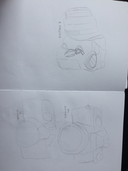
For the last set of drawings, I was given a camera to draw, which was most likely going to prove more difficult than the Storm Trooper figurine, as the shape was a lot less humanoid, and more completely inanimate object, so something I’m not particularly familiar with drawing. However, I think that that was the aim of this task, to get us to draw something we weren’t particularly familiar with, to develop our skills with drawing things that weren’t human, which generally, is what this group focuses on, myself included. Anyway, the first camera drawing took 5 minutes, so we had to get the basic aspects down and develop what we could with the time we had. I think I more or less succeeded in getting the basic shape of the camera down from this angle. The last 2 where really cutting it short, with thirty seconds, and 10 seconds respectively. Of course, they didn’t turn out as masterpieces, but I think that you could definitely tell that they were both cameras, even with the minuscule amount of detail. I think I did well with the time I had personally.
Overall, I think that this was a pretty good exercise for me, as it gave me a chance to work with limited time, as well as multiple different angles and objects that weren’t human, which I will definitely need for future endeavors.
0 notes
Text
Rendering Task
20/03/18
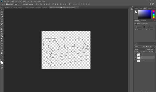
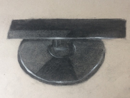
Today we looked at rendering images in Photoshop, because we will soon be creating our own objects to be put into an environment for a computer game. We need to get to know an object’s form, so like how a light source will affect it, and by doing this, we can create a 3-dimensional feel for a 2-dimensional drawing.
Firstly, we opened Photoshop, and opened an image of some line art of a sofa, which will be the perfect thing to do this with. Next, we pressed ctrl+alt+shift+3 which would allow us to select the white areas. Then, we would delete this and be just left with the line art. We renamed the layer to “line”. Next, we duplicated the layer and locked it, just in case we had to start over. We then created a new layer and named it colour, and moved this below the line layer. We selected the magic wand and at the top, selected ‘sample all layers’. Now we just had to go to the “colour” layer and select all of the areas of the sofa and fill them in using the bucket fill tool.
Now time for the fun part. We could use the dodge and burn tools to shade, but I decided I wanted the sofa to be of a material similar to velvet, so it wouldn’t look shiny, and so I relied on using textures and shading only the parts where the light source didn’t reach, e.g. the left side of the sofa, because I thought it would give it a more clean look. For the colour of the sofa, I decided on a desaturated purple, as I think it fits with the material which I chose.
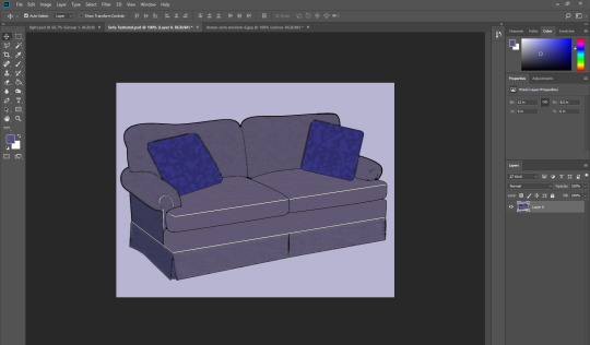
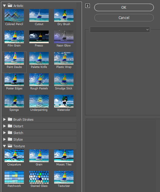
And like I said, I thought I could put some of the textures to good use in this task. From the texture library available in Photoshop, the ones below are the main ones that I used throughout the process. I couldn’t tell you which ones exactly because I’ve forgotten but I think it may have been “Sponge”, “Texturizer” and one more which I used which could be “Coloured Pencil” or “Dry Brush”. Either way, I messed around with the values and whatnot to see what I believed fit. I also coloured the pillows a blue colour which looking back may have been a little too neon in comparison to the sofa itself.
Final Render
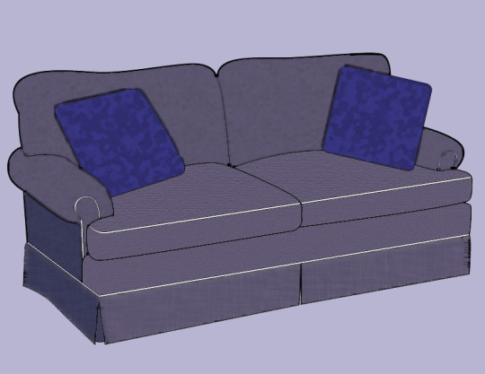
I think that it turned our very well in my opinion, and this technique of colouring and shading things/adding textures and whatnot to line art will prove to be very useful in future tasks, since we ourselves will be designing our own things, probably on paper, so we can photocopy/photograph them onto Illustrator or Photoshop, or maybe just create them fresh in these programs. It has given me an excuse to play around with form and light sources and develop my skills further, as form is an extremely important aspect to consider when creating digital pieces as well as real life illustrations/drawings. I think that I did do a pretty good job in my opinion, as I said, because I think it has some quite realistic elements in it, which was the goal, developing a 2-dimensional drawing to give it a 3-dimensional feel. Off the top of my head, I can’t think of any other ways one could go about doing this type of thing, except using some different program or something, or maybe even physically doing it in real life, like creating a collage of some kind, sticking various different materials to the drawing, as well as shading using pencils/watercolour etc.
0 notes
Text
Drawing a Character from Descriptions
13/03/19
Today, we were tasked with drawing a character from a description. Firstly, we were given a sheet of paper with questions like favourite animal, colour, height, fashion sense, occupation etc. We had to fill these in, but it wasn’t about us, we had to make our own character up with this information. Once we had finished, our sheets were collected by our lecturer, and then re-handed randomly to others in the class. That person would have to read through the information, and on the back, draw a character which looks like how the information describes. Personally, the sheet that I had was fairly ambiguous, so I could add a bit of personal touch to my drawings. After we’d finished, we were asked to lay out our drawings on the table, and wander around the room and observe the drawings to try and pick out which one ours was. I think there were about 4 people who correctly guessed which one was theirs, myself included, and the person who drew my character did a great job.
Below is the drawing that I did with the information that I was given.
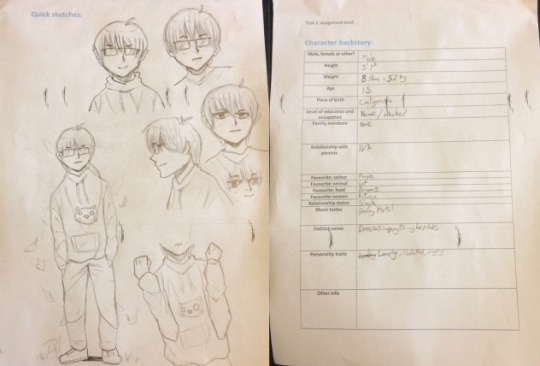
I think that this was a pretty enjoyable exercise, and it was a good chance to draw for somebody else, and to improve my drawing skills a little more.
1 note
·
View note
Text
Charcoal + Chalk Continued
06/03/18
Today we continued using charcoal and chalk to draw from reality. We started by drawing our opposite hand. Much like last week, I started off disliking it, as it just didn’t really look like a hand at all, but as I went on, it started looking somewhat decent. Because I sit next to a window, there was a light source, which would make for some highlights using the chalk, and the surface which my hand was atop was a black table, which meant that I could just shade it black around the hand, to make it really pop. I think that the anatomy is fairly good with the final product, but the shading and highlights definitely aren’t all that, so I should probably take my time, really observing how it looks in future.
Next, we had to draw a people from real life, the people being our classmates. I have to admit, this was a difficult task, as I just couldn’t get the anatomy correct even when they were right in front of me, and it didn’t help that we had to use charcoal, as opposed to a pencil, which I probably would’ve done better with, as the tip of charcoal was just too wide, so there was no room for precise details. The above drawing took around 30 minutes like the drawing below, but I think that the below one is very bad personally - I think it’s mainly the shoulders, the head, and the neck which do it for me.
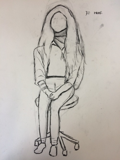
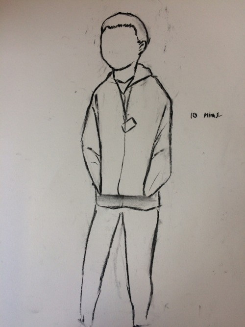
The drawing below was the final one and this time, we only had 10 minutes for it. This time, it was of a classmate standing up, which I should’ve been more familiar with as opposed to the ones where they were sitting down, but it still didn’t turn out particularly well. It didn’t help that we had to sketch it out roughly in 10 seconds, and then add everything else. I think that if I were to improve, I definitely need to start actually measuring with the head technique, which I didn’t really do, as I underestimated it and didn’t really feel that I needed it.
0 notes
Text
Charcoal + Chalk Drawings
27/02/18
Today our task for the class was to use charcoal and chalk to draw something from life. However, for the first drawing, we only had charcoal. We had to go out and find something to draw, but not like a scene - something zoomed into.
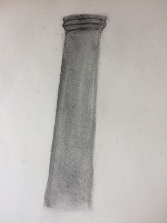
For my first drawing, I chose a pillar that I found in the college. It had a light reflecting onto it so I thought that would make for some interesting shading. Personally, aside from using them a little in GCSE Art in secondary school, I was pretty inexperienced with using charcoal and chalk, but alas, I gave it my best shot. Below is my final result, it didn’t turn out quite how I envisioned but it still has some aspects which look decent, such as the texture for the most part. I think that I held back when drawing with the charcoal as it was very messy and I was really out of my comfort zone in terms of the drawing techniques/tools. To improve on this, I would probably need to observe it more closely so that I could get all the details down when drawing.
Anyway, after drawing with charcoal, we were reintroduced to chalk, which would allow us to create slick looking highlights and such. We were told to look for something, preferably something that reflected light, such as a black mug or something, so that we could put the chalk to good use. I chose to draw part of a monitor stand, as once I saw it, I realized that there were lots of highlights and even a reflection from the stand onto the plate. Initially, I was discouraged from using the chalk, after drawing the pillar, which didn’t particularly end in success - and as soon as I started drawing out the basics with the charcoal, I was disliking it more and more, however, once I had coloured everything in black with the charcoal, I thought that there was a lot of room for some techniques. Firstly, I thought that the whole thing was too dark and you couldn’t see the stand which held up the monitor, so I used the chalk and smudged it in so that it was visible. In fact, I did this with a lot of the plate, as I needed to make sure that I could add the reflection. I made sure to make the reflection as dark as possible and I think that it turned out very nice. After this was the fun part, I needed to add the highlights. I did this with the chalk and tried to make the lines as slim as I could, which was surprisingly tricky, and they’re not perfect. I drew the lines in the chalk somewhat lightly so that I could add harder strokes in the middle of the lines to make them really pop. After finishing the stand, I thought that I was pretty much done, however, my lecturer told me that I could also draw part of the monitor, which I decided to try my hand at with the remaining time that I had left, and it actually ended up looking pretty decent, and really added to what I had drawn - the stand. I added the highlights at the bottom of the monitor and also added a reflection on the left side, the reflection being the paper which I drew it on, which I find quite interesting. Paper-ception? Overall, I think that my drawing turned out really well especially with it being essentially my first charcoal + chalk drawing ever. Of course, there is still much room for improvement, as I would need to work on the shape, especially the plate, and also the highlights.
After finishing these drawings, I will admit that I am not a huge fan of using charcoal, as personally, it is way too messy for me, and also quite difficult to use and control, as the tool itself is quite large, so there isn’t much room for detail, or at least with the bigger sticks of charcoal. However, I will say that after using the chalk, I felt as though my drawing became a lot better, and actually rather enjoyed drawing the second one as I feel that the two tools complement each other really well.
1 note
·
View note
Video
After finishing my rotoscope animation, I took it to After Effects and with help, added some effects to it to give it some more flare. We added some brick walls and changed the colours to black and white.
1 note
·
View note
Text
Rotoscope Animation
30/01/18
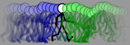
Last week we had to go out in small groups and film ourselves performing basic acts. These involved running, walking and jumping. If we had enough time, we could perform different acts such as punching or kicking. For my rotoscope animation, I chose our group’s walking sequence.
Here is a link to the original source footage that I used. I would upload it here but it would have to be drastically altered to the point where it is cut into a 3rd of its original length, as well as the size.
Now on to the animation itself. Whilst reviewing the footage, I decided to just draw over the figure with one solid colour - I chose a slightly desaturated red. I found that whilst animating, for me - it wasn't hard at all, but definitely time consuming, and personally, I did not find it boring. However, I did take some breaks in between, as if I were to animate the whole thing in one take, the latter frames would most likely drop in quality. However, I did also find that as I animated, I got into the swing of it and each frame started looking more similar to each other. You probably won’t be able to tell, and I can’t either, but around the middle of the animation - it was done using a mouse as oppose to the latter and former frames, which were done using a graphics tablet. As I was animating using the mouse, it definitely didn’t look as good as when I was using the tablet, because when I used that, I could have thicker parts at times - for example the ends of the shoes.
The main problem I ran into was getting the head to look the same in each frame. In the final animation below, you can see that the head is by no means perfect - and it looks like it is shaking every frame but I think as long as you do not concentrate on the head, you won’t notice it that much. However, I kind of like how it looks, as well as all of the other shaky parts of the body - as it gives it a sort of uniqueness to it. Another somewhat problem would be that I couldn’t exactly get the animation perfectly over the original figure, which meant that the anatomy wasn’t always 100% correct.
Overall, I am very happy with my final animation and it looks very fluid to me. Especially the hands and legs. Personally, I am not sure how I could improve my animation itself as I produced the best result I could, and all I can think of would be to add a background perhaps or go over the figure with clothes and skin colour, to give it more detail. I could also try and get the lines as close to the original footage as I can. Also, I am pleased with how this animation looks on here, as it looks like the figure is walking off screen and looping back around.

1 note
·
View note
Text
Walk Cycle Animation
23/01/18
In Adobe Animate CC, we had to use a pre-made animation of a basic walk cycle, and finish it with help from a walk cycle reference image. To do this, we had to move the image behind the animation so that we could draw the different poses each frame.
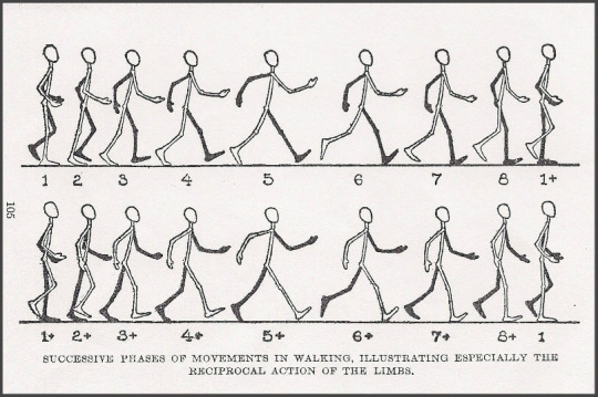
The head was just a circle so we could easily just duplicate it each frame so that it would always be the same size. It was fairly easy to copy the poses each frame, and what helped even more was the onion skinning button - when clicked, it meant that we could see frames that we animated in the past. As you add frames, the past frames vanish as you get further along, but more will appear too. You can move the onion skin on the timeline indicator (below), you can change the amount of frames that you can see, and if you bring it forward, you can see future frames that you have created too. The second image shows what my animation looked like as a whole.

As I continued the animation, I thought that I would add a small twist near the end of the animation after I had finished the second walk cycle. I chose to make the character jump - to do this, I had no reference, so I had to imagine what that would look like when performed in my head. I thought that after finishing the walk cycle, the character would start to bend their knees slightly and the character would squish down as well. After squatting down slightly - to show that they’re ready to launch. Next I animated the time where the character was in the air. This wasn’t too challenging, but it still probably isn’t accurate to what an actual jump would look like. After the character hit the ground, I decided to continue the cycle for a few more frames.
1 note
·
View note
Text
Animation Research
16/01/18
Rotoscope Animation
Rotoscope animation is a form of animation which requires you to trace over live footage, frame by frame, when a realistic action is required that you wouldn’t be able to pull off by doing cell animation. The rotoscoping technique was invented by Polish-born animator Max Fleischer in 1915, and was used in his groundbreaking “Out of the Inkwell” animated series (1915-1927). Rotoscoping can look extremely good if done right, however, the process can be very time-consuming and often requires not just a graphics tablet but expensive and complex software.
Along with Out of the Inkwell comes one of the most notable rotoscopic animations - Cinderella (1950). Other examples include Alice in Wonderland (1951), and Fantasia (1940).
Cel Animation
A cel or celluloid is a transparent sheet in which objects are painted or drawn for traditional, hand-drawn animation. Actual celluloid was used during the first half of the 20th century, but was later replaced with Computer Animation Production System (CAPS) and the vast majority of major animation studios completely phased cels out. Like all forms of animation, it is time consuming, however, it is relatively inexpensive, and also doesn’t require any special props or lighting set-ups, and can be done by one person on their own. As I stated, this process is very time-consuming and anyone trying it would need to be both gifted and fast at drawing if they to manage heavy workload and maintain a consistent look throughout the piece.
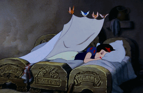
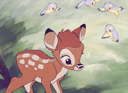
Notable examples of cel animation are Snow White and the Seven Dwarfs (1937), and Bambi (1942).
0 notes
Text
2 Point Perspective
09/01/18
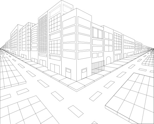
Our task a few weeks ago was to draw a corner scene using 2 point perspective. This meant we had to essentially draw 1 point on each side of the page which would basically be our guidelines. After this we had to draw a line down the middle of the paper which would be the corner of the building. Then we had to draw the guidelines, which were just horizontal lines which came from the two dots - these would make it a lot easier to get the heights and proportions etc. of the buildings correct, and then we could simply erase them when we were finished with them. I started drawing in the buildings and looked for inspiration online, and found the image below. I really like the building designs, and the dark shadows look really good.
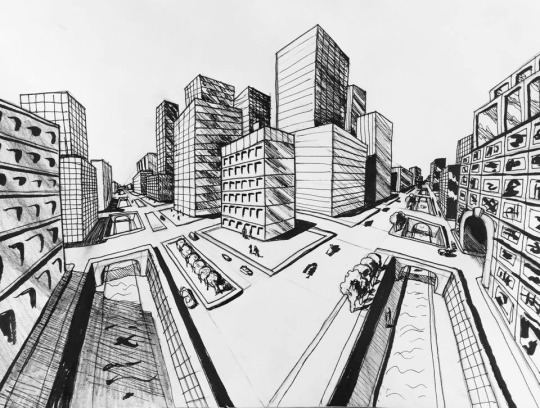
Drawing the buildings proved quite tricky and tedious at times as the closer I got to the points, the more convoluted and crowded it got, so sometimes I messed up the perspective and it looked unrealistic, and it was especially annoying when I had to start drawing in the details such as windows and doors, as they were very small when getting closer to the points. For the windows, I tried my best to vary them from each other, trying to create a unique design for each building, (the second building on the left which has indents in the building, as well as the fourth building which has windows with rounded parts) and sometimes this worked and sometimes not so well. I was still keeping up with the 2 points, using a large ruler which stretched from one point all the way to the other side. Here’s how the windows looked when finished - as neat as I could’ve drawn them whilst having a somewhat unique design.
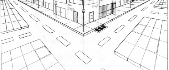
Along with the buildings, I needed to draw more aspects which would make the whole drawing more realistic, and these were the pavement and the road. I thought that the pavement would be easy as I could simply draw a line from each point until they met up in the middle, but it took quite a few attempts for me as I kept either drawing them too wide or too thin - then I had to draw the individual slabs which was again, quite tedious and tricky, as I needed to make them look equal in width and as they got closer to the points, they’d get more squished, and I did use a ruler to measure the distance between them so I could shorten them every 2 or 3 slabs, but eventually, I lost track and started estimating the distance instead. After I finally finished this, I needed to then draw the pavement which was separated by the road. This was quite difficult as well however, as I had to keep switching the perspective from the right to the left as there outline of the pavement was coming from one side, and then the slabs were coming from the left side. Here’s what they looked like - not perfect by any means but I tried my best.
After this I just drew details which I thought would add to the scene and make it look more realistic. I drew some streetlights and the drain on the road for example. Overall, I think it looks decent, and not overly exaggerated as I was just going for a simple city scene.
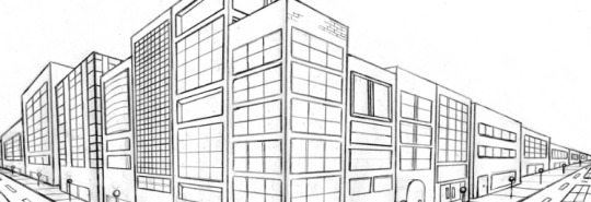
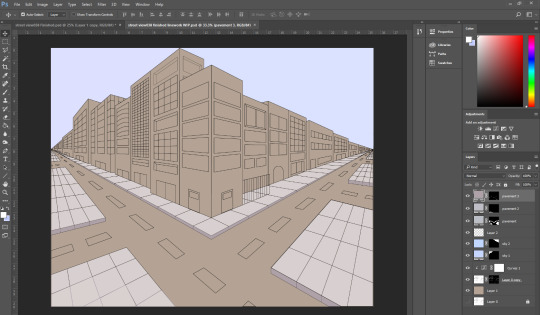
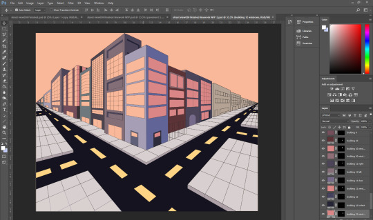
When I finally completed the line art, I needed to start colouring it, which I thought would be a semi-easy task - I’d just have it photocopied, and imported onto Photoshop, but when I did that, I found that it didn’t look very good at all on Photoshop - there were problems which I found such as there being marks everywhere from the original drawing, that I must’ve forgotten to erase properly, as well as some lines looking more faded than others - not everything had properly rendered. Disappointed with how it looked on Photoshop, I suddenly had a preposterous idea - to redo it all in Illustrator! I knew that I was in for another long and difficult time, but I decided to do it anyway.
I set the photocopied layer to around 15% opacity and started recreating everything with the pen tool. Luckily, Illustrator comes with an aligning feature, which helped me tremendously, as it helped snap my lines into the right places. However, this aligning feature was also becoming the bane of my existence, because, as I drew a new line with the pen tool, the aligning feature would align that line with another line, making it difficult at times to get the lines in the right places. drawing the windows was very tricky and some of them ended up not looking as good as the original ones I drew. The pavement was just as infuriatingly difficult to get right, even more so in fact, as all the lines kept connecting with each other, and then I also had to get the width of the pavement as accurate as I could, but when tracing over it, I found that they were not matching up with the rest of the drawing, and this proved quite troublesome, as it meant that I needed to either start over, which I was absolutely not doing, or going along with it, and it doesn’t look too bad, but it’s not as accurate as the original unfortunately. As well as this part of the pavement, the parts which involved both perspective points were equally as difficult to get right, and they still look a little strange, but I did the best I could. I won’t even mention how annoying the road lines were to get right. Here’s the final line art.
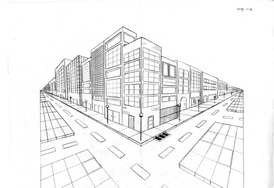
After this grueling task, it was finally time to start colouring. I took to Photoshop and selected and deleted all the white so that I could colour each different part of the image. To colour each different section of the image, I needed to select the magic wand tool so that I could select the parts which I wanted to colour, and then go to layer>new fill layer>solid colour so that it would create a new layer everytime, just in case I wanted to edit a particular layer’s colour. Here’s some progress.
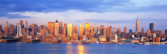
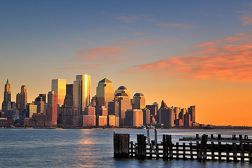
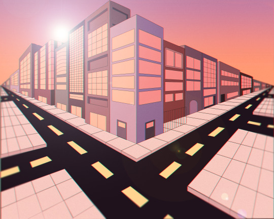
So I initially had the idea to do a normal sky with normal colours, however, I thought that’d be too boring so I decided to create a scene using colours that you’d find in an afternoon setting, e.g. orange. I really like the concept that simply using colours lets us portray a specific time of day or atmosphere as oppose to just drawing. Even in a monochromatic drawing, we can add colours to change the feel of the image, or the time of day, from midday, to the afternoon or midnight. That’s what I was trying to accomplish when I decided to mainly use orange when colouring - I didn’t particularly pull it off as well as I’d liked to, but I think one would understand what I was trying to do when looking at it. Here’re some of the images which inspired me.
So below is what it looked like for a while. I coloured the sky a shade of orange to mimic the effect of a sunset. I also decided to make the right side of the set of buildings darker than the left side as I wanted to show that the sun was shining on the right side and then a shadow was being cast onto the right side - to add a sense of realism to it, like with the above images. I made sure that the windows and glass doors were a darker shade of orange as well as the buildings. I would’ve liked to have created a gradient in the sky going from orange to blue, like in the images, but I messed up the layers somehow so the sky ended up being a part of another layer. I tried to make each building a different colour, but, after all, buildings aren’t supposed to be multicoloured, especially if I was going for realism, so maybe I’ll try and change the colours overall so that they’ll look more realistic, so maybe I could use a gradient map or something.
After messing with various different filters/adjustment levels, I produced two pieces which I somewhat like. This first one has a gradient in the sky where I tried to imitate an afternoon sky, but I don’t think it really looks like that. I also altered the colour levels and curves adjustments, to make it look redder slightly. I added a slight texture to the pavement but it isn’t too noticeable on here. I also added a lens flare which looks a bit too prominent, as oppose to the bottom one, which I personally prefer. Finally, I added some blur - one of my favourite things to do - as the buildings get farther away from the middle, and then on the pavement right at the front. This one turned out alright, but not exactly how I would’ve liked it to end up.
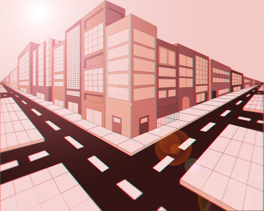
I did similar things with this one, except I added a gradient map to try to create the afternoon effect instead of level adjustments. Like I mentioned above, the lens flare is a lot better on this one in my opinion. I also added a layer of noise to try and create some kind of texture throughout the image.
1 note
·
View note