
hmse-research-blog
HMSE Blog
- Overwhelming - each post is tagged with it’s associated week. Search “reflection” to find my journal entry and “assignment” for my assignment submission
14 posts
Don't wanna be here? Send us removal request.
Last Seen Blogs


Text
Final Reflection
The past 12 weeks have been a roller coaster for me. Not only did I have to work on the first half of the video, but I also had to design the lights to support the videos. The biggest challenge of this course is reflected in its name, eliciting a heightened sensory experience is not easy. We learned to destroy the audience's expectations. But we also need to leave enough room for the expectation to be set. We had to imagine ourselves in the audience's position while working on the project. Admittedly putting us in their seat is not easy as the creator is often desensitised from the work. Most people would have trouble in killing their darlings but not me, I have buried many of my darlings. I knew better not to get attached to my artwork since they will always go through numerous times of reworking to achieve their greatest version.
I can't imagine myself working solo on this project. I have to say this project would be a failure if not for Minod and Thirech being great teammates. I can't imagine myself working with others either since only they have the same interest as mine. Looking at the final presentation, I would say our work was the weirdest one and we have lived up to our name "The Weird Kids".
There are 2 works that pique my interest. Rob Curulli's lighting work and Aidan's serene garage.
Seeing Rob's work the first time is quite an interesting experience, the beats in the soundtrack create a tingly sensation almost like goosebumps or someone tapping on your neck. The lights, however, get boring for me after 3 minutes in. Some people find the 9 minutes duration feels just right for them but I feel like it's a little too long. focusing on the music, gave me a futuristic feel accompanied by the white lights.
Aidan's work would be so much more interesting to experience in real life. The addition of the garage backdrop gave it an indie band aesthetic. If I have to mention one band, Aidan's aesthetic reminds me of Chase Atlantic. Chase Atlantic has a very moody dimly lit rustic aesthetic that is often defined as "indie". I find it impressive that he could make the projection interact with our movement using Xbox Kinect.
I have to admit some works is a miss for me and they did not give me the heightened feel. but the majority of this class did impressively well but most importantly, our group did an amazing job.
0 notes
Text
Week 12
Final video update and final reflection
https://drive.google.com/file/d/1xEq3iFEjaFt0e4AWSvPmVS1Jmkt799dj/view?usp=sharing
Keynotes for overwhelming video:
Cultural Influence
I included some references to the traditional Indonesian song "Lingsir Wengi" written in ancient Javanese script (Starting at 1:38) This song was originally created by Sunan Kalijaga (a holy figure in Java). This song was made to ward off evil and protect the believers. I decided to use this song because it is a perfect irony to the second half part which could be described as pure evil.
In Indonesian media, the "defiled" version was very well known to do the opposite effect. This blasphemous rendition was created by Sukap Jiman for a 2006 horror film "Kuntilanak" (English title is named The Chanting). This version is now heavily associated with an Indonesian ghost "Kuntilanak".
the lyrics written in the video for clarity: (Sunan Kalijaga Version)
ꦭꦶꦁꦱꦶꦂꦮꦺꦔꦶ
ꦱꦺꦥꦶꦢꦸꦫꦸꦁꦧꦶꦱꦤꦺꦤ꧀ꦢꦿ
ꦏꦒꦺꦴꦝꦩꦿꦶꦁꦮꦺꦮꦪꦁ
ꦔꦺꦫꦶꦤ꧀ꦝꦸꦲꦠꦶ
ꦫꦶꦤꦮꦺꦔꦶ
ꦱꦶꦁꦠꦏ꧀ꦥꦸꦗꦶꦲꦺꦴꦗꦺꦴꦭꦭꦶ
ꦗꦚ꧀ꦗꦶꦤꦺꦩꦸꦒꦧꦶꦱꦠꦏ꧀ꦲꦸꦒꦺꦩꦶ
Original Kuntilanak written by Sunan Kalijaga
youtube
Defiled Lingsir Wengi used in DreadOut, 2014
youtube
Technical Inspiration
The main inspiration for the video is "TAC" by Richard Grant and Midsommar, the non-linear editing in TAC makes the whole video unpredictable and confuses the audience without any context. playing the video loud makes the entire experience discomforting and creating a great HME. Midsommar managed to create an incredibly disturbing horror experience using happy and pastel colours. The juxtaposition of grotesque corpses decorated with a bouquet of flowers created quite frightening imagery. the bright lighting also proves to be a great choice since brighter lighting means we can see more of the gory details that dark ambient lighting normally wouldn't. The atmosphere and the emotion are what I am trying to replicate minus the gore (due to ethical reasons). I and Minod used the glitch editing that Richard Grant similarly did in TAC and we build upon it. The strobe with contrast was used to create a discomforting effect on the audience.
Stendhal Syndrome
Keeping the Stendhal Syndrome theme, I added a random rotation movement to create the nauseating effect. I am aware that this effect might not affect some audiences but during testing, some viewers did experience motion sickness which means that this effect did its job.
Challenges:
- Working on lighting without being able to see in real life demo.
- Equipment limitations due to restrictions.
- Having to continuously develop the video and sound while not relying on a storyboard.
- Learning new software from scratch.
- The constant fear and a reminder of the possibility of us failing the class even with our best effort.
Testing the video
I tested both videos to 4 viewers. I asked them to react to the video blindly. I didn't tell them what the premise of the video is and the only context I give them is that the video is supposed to make them feel something. 3 out of 4 gave a negative reaction (which is what we wanted) and the other gave a positive reaction. After they reacted to the video I showed them the light demo which gained a more positive reaction. Notable feedback from 2 audiences is that the flower kaleidoscope reminds them of batik art which becomes my inspiration to subtly add more Indonesian culture.
The success of the video:
- the first 20 seconds are pretty-looking
- all 4 viewers experienced motion-sickness after watching the video
- they feel uncomfortable watching the video but are also mesmerised when watching the pharos demo
-main keywords they feel are mesmerising, sickening, creepy
The fail of the video:
The original ad break did not gain positive feedback from both lecturers. As a result, we had to rework the ad break. The intention of the ad break was to remove the audience from the brutality creating confusion before putting them back to brutality. But this part ended up destroying the energy of the previous sequence.
Besides this, the original concept had to go through a major rework from theological themed to a more abstract one. But fortunately, the team pulled through and manages to be ahead of schedule without needing a strict deadline and lengthy production timeline. Each of the members has a high sense of responsibility and each of them gives constructive feedback to each other. Shaun and Darrin did a great job in giving us constructive feedbacks (and brutally honest ones).
Ultimately we have created professional and immersive work that is certainly worth framing on a portfolio website. Everyone has been a pleasure to work with and we all had a great sense of design.
0 notes
Text
week 11
youtube
video update:
- Transition fix for scenes 1-2
- motion blur adjustment
-minor timing adjustments for aquarium scene
- Javanese script addition to match brutal
My work for the next week would be the last iteration for pharos before finalisation for project presentation on week 12.
There was a delay with the current test that might be a human error during the playback instead of the project file timing issue. The video and the lighting were played manually so there is a chance of it not synchronising properly as visible in the current test result. The syncing issue is quite significant and it ruined the immersion of the experience. Other than that issue, some minor adjustments for the colours will be needed as it looks that intense colours work better to cover up the light bleeds from the video. I will be simplifying the light animation for overwhelming since white lighting lights up the whole room while not giving any special effect to the environment.
0 notes
Text
Week 10
Overwhelming & Brutal combined
There were some minor iterations from week 9. Some of the iterations are adjustments of the motion blur, and chromatic aberration. Thirech combined both videos and it turns out very smooth contrary to Darrin’s concern. We decided that the simple hue shift works the best in introducing a different theme. The small change makes the contrasting idea blends smoothly. It doesn’t look janky and jarring.
youtube
Pharos Simulation for Brutal
After looking at the capitol test, I decided to add more bursts lights. The lights matched the simulation pretty well and there are no delays. I wanted to experiment with the placement of the strobes in this WIP. The white strobes would be my main concern since all white lighting might illuminate the whole room and break the immersion completely. We will have to see the next test to determine if it’s working or not.
0 notes
Text
Week 9
milestone presentation
youtube
feedback for the prototype:
- timing for transition in scene 1 to scene 2 needs fixing
- more invert colours
- add more motion sickness
- delete the black bars for the fishes and flower kaleidoscope
- more fish for the second half
Two subjects who watched the demo video claimed they feel dizzy and had some motion sickness after watching. This is really good news since my original aim was to portray nausea triggered by Stendhal syndrome. My next aim is to induce nausea even more to those watching. But before that, I will have to put a disclaimer since this video may cause terrible motion sickness.
New iteration
youtube
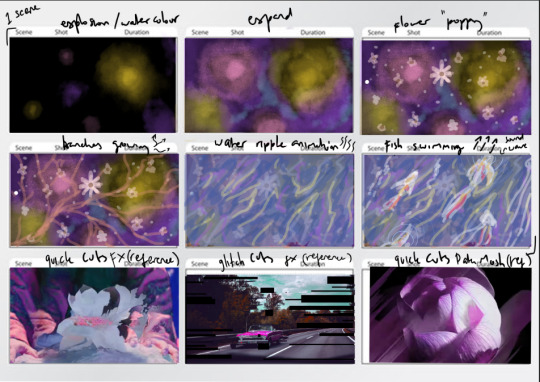
I made the new iteration based on effects that are known to cause motion sickness while interacting. the first effect is motion blur, this effect is notorious for causing sickness for game players. the effect turns out to be a nice support to keep the viewer's attention to the center of the video. the second one is chromatic aberration, the effect combined with lens blur has a very hypnotizing and sickening effect, this example can be found in "the chilling adventures of Sabrina" where some viewers found it annoying and nauseating due to the overused effect. However, I found the effect to be distracting and if the majority agrees I will discard the effect. Besides the motion blur, I added more inverted colours and the result is an overwhelming (painful) visual. I refrained from doing it too often to avoid desensitisation but I figured we could push more inverted colours for the final iteration next week.
there are some feedbacks that I did not pursue mainly the transition and the 2nd fish scene. I found the fish to be distracting and out of the place and I found that it does nothing to add the overwhelming effect. The second one is the transition, the transition was not meant to be timed according to the audio since the audio didn't show any clear change in the chord progression until the fish sequence.
Pharos WIP for brutal
youtube
The lighting design for brutal is fairly simple and has less variation. This version is not the final as some sequences are made for testing purposes. the structure is essentially set and the next couple of weeks will be developing lighting design for overwhelming and small iterations for brutal.
0 notes
Text
Week 8
Progress report
As my video develops further, I found that it feels graceful rather than overwhelming. It has to do with the editing and as a result, I chose to do a non linear editing style. The current WIP is not aggressive enough to be overwhelming, further development needed for both audio and visual. I will have a slight detour from my original schedule but the development is still on time. For the next couple of weeks i will be developing both pharos and the video. The video should have less workload now that the base is done and there’s not a lot of workload for the lights since brutal’s light will be very simple and is atmospherical. The audience should only focus on the video while for overwhelming we would want the audience to look around hence the slow pace video of the first half.
youtube
The audio has not been updated since Minod is still working on it, but I wanted the sound to match the visual and very loud on the second half. The first half should be calmer and as it goes the energy is much stronger and more aggressive signalling that we are transitioning to something more menacing and introduce the “danger” feeling. Unfortunately, we can’t see that currently since the visual is not yet supported by the audio…. Hopefully we can see more audio development for next week.
Inspiration:
I was inspired by Midsommar for the second half part of the video. I found the movie incredibly overwhelming due to the elegance but also brutal visual and the choir like audio paired with unsettling high pitched cello noise in the background. The screaming and crying people also adds a plus point to the unsettling feeling.
youtube
For further development of my video, i decided to take inspiration from Richard Grant, specifically on his experimental video titled “TAC”
youtube
The use of non-linear editing paired with loud sound makes the potential for it to be overwhelming.
0 notes
Text
Week 7
Feedback notes:
-music is not overwhelming
-video lean towards serene and lovely instead of overwhelming
- suggested changing the adjective from overwhelming to serene
-transition phase might be jarring
Video:
https://drive.google.com/file/d/1TDoOFIBJwa2TORp59AQJe7FdaECcL9Eq/view?usp=drivesdk
Progress:
Based on the feedbacks for the video above. We decided to change our adjective. However I still wanted to try achieving the overwhelming visual. As a result I have to change my strategy by not using any music for the second half. Minod will have to revise the sound to suit my video.
For the second last scene i decided to create a kaleidoscope look that in my opinion feels overwhelming (in huge scale). The amount of details and texture with the combination of striking colours.
Thirech suggested to make a Mandelbrot zoom effect, basically is an endless zoom of the same video asset. Minod dislikes the colour which I think could be an advantage if a number of audience thinks the same.
Based on experience, the more we hate something the more overwhelming it feels to us. I decided to do some hue shift as well to further overwhelm our eyes making it possibly painful to see, though the painful ness is what I’m trying to achieve. Further feedbacks from lecturers will be needed.


(The desired texture is the one on the left in 4k resolution)
Darrin suggests that the transition phase might be jarring in not a good way. But I disagree since the audio is meticulously phased to not disrupt the audience’s immersion and the visual must be carefully considered too which is why I decided to gradually shift the colour palette and the shape of the video to mimic the brutal side.
In case this video still doesn't produce the desired effect, we will continue on by changing our adjective into serene and brutal.
For the lighting, I decided to just sync the lights with the video for the first half and shift to something more disorderly with the second half to amplify the overwhelmingness. There is not much progress for now but more pharos development will be done in weeks 9-10.
0 notes
Text
Week 6
Feedback notes (overwhelming):
psychological comes from theological
Use less cliche (avoid occultism)
music needs more energy
less in your face portrayal
flashing colours for contrast
use signs and semiotics
simple is better
focus on inducing heightened multi-sensory experience instead of meaning
test animation after feedback (overwhelming, uncoloured)
My intention is to portray the feeling of dizziness or light-headedness. some tweaking needs to be done and the colours will greatly affect the experience.
We contemplated if we should change our direction from bright colour to a darker theological portrayal. But since our feedback was to use less cliche and more colour contrast we decided to stay with the brighter colour and avoid any orthodox iconography.
Research into Chapman brothers and more aesthetics emotion
Jake and Dinos Chapman are visual artists whose artworks are often described as shocking. Their works often portray offensive subjects and gore paintings. Their sculpture stands the test of time as the works still feel shocking as it was a few years ago.
what makes their artwork so jarring and shocking is their use of controversial subjects such as nazi and children nudity. the subjects they used are human matters that are timelessly offensive and is morally evil. In our case, religious concepts are dated and Christianity doesn't hold the same power as it was before therefore making the angelic and rock music portrayal cheesy. Chapman uses horrible human history instead of orthodox iconography which makes the impact. The installations reminded us of the pain and anger creating hostile emotions.

Relating back to aesthetic emotions, Silvia and Cooper's (2009) study reveals that hostile emotions are the most predictable and "easiest" to induce. the emotions trigger aggression, self-assertion, and violence. A work that is against someone's moral values combined with deliberate offensive imagery creates anger. negative moral value combined with unpleasantness will create disgust. To ensure safety we might want to limit the anger level we are trying to achieve, but we wouldn't want a 100% disgusted reaction. Our goal is to find a good balance to create a shocking unpleasant experience but at a controlled rate. Our plan would be to add some violent and gore imagery (computer-generated not actual photographs) to go against moral value as well as fitting our death narrative and then add some jump cuts and reversal sequence to add the unpleasantness, the music will also contribute to the unpleasantness. Our hypothesis is the sequence will create disgust emotion combined with horrified and maybe a little anger depending on the viewer's psyche. Another interesting emotion is surprise. Suprise is induced when there are 2 conflicting sensory such as how a product looks vs how it feels. But it also could be induced by an unexpected change. This supports the reason to stay in the pleasant and colourful palette of the first concept for overwhelming. The sudden change of style in the transition will create an element of surprise and keep the audience amused for the later 2 and a half minute part.
Sources
Silvia, & Paul J. (2009). Looking Past Pleasure: Anger, Confusion, Disgust, Pride, Surprise, and Other Unusual Aesthetic Emotions. Psychology of aesthetics, creativity, and the arts 3.1: 48–51. Web.
Cooper, J. M., & Silvia, P. J. (2009). Opposing art: Rejection as an action tendency of hostile aesthetic emotions. Empirical Studies of the Arts, 27, 111–128.
Simons, R. (1996). Boo! Culture, experience, and the startle reflex. New York: Oxford University Press.
https://www.theartstory.org/artist/chapman-jake-and-dinos/
1 note
·
View note
Text
week 5
Synesthesia has been known to give advantages in a multisensory experience.
Synesthesia is a condition where a synesthete's stimuli reaction causes an additional experience. These experience often occurs between sensory perceptions such as taste to sight, or sound to sight. The perception of the stimuli is consistent which becomes the main indicator if a person has synesthesia. (Hubard, 2005).
Spector and Maurer (2008) find that the association of words and colours comes from a biased perspective depending on their living circumstances. Adults and children who are literate have the same consistency in associating A to red, B to Blue, G to green, etc. This phenomenon happens to English speaking subjects where the alphabets are associated with the first alphabet of the colours.
A prime example would be artist Billie Eilish who claimed to have synesthesia. In process of creating music, she tends to compare sounds to texture. As a result, her "ocean eyes" track has a unique sensory experience that she described as "velvet". The debut track gained an overwhelmingly positive reaction and peaked at number 11 on "bubbling under 100" in 2018.
My interpretation of synesthesia includes that we often associate a sensory stimulus with a certain emotion based on individual memory. For example, we associate red with blood, and blood gives us a danger flag resulting in fear and panic. Loud and aggressive sounds (for example screaming sounds) also give us a danger flag resulting in panic and alert. The outcome becomes :
blood->red->danger + scream->danger = scream->red/blood => metaphorical expression "blood curdling scream"
Interpretation of sound to colour is different to every person depending on their cultural and educational background. The use of synesthesia helps to express abstract emotions through metaphorical means to both synesthetes and non-synesthetes. (van Campen, 2007)
Synesthesia as methodology
Merter (2017) argues since design appeals to our senses and provides a multi-sensory experience. In theory, synesthesia could be used as a methodology or framework for a multi-sensory design.
Merter proposes a design methodology that utilises synesthesia.
The process involves:
Deconstruction
Identification
Placement
Ideation and Representation
Reconstruction
Finalization
(Merter,2017)
The journal suggests that this method will help to enhance imagination and the overall experience of the audience. My hypothesis concerns that this methodology will help us to manipulate the emotion of the subject. At the moment there has been no research or result backing up this proposed method, further tests will need to be conducted to discover its efficacy.
I am using this methodology to create a colour scheme from this method. Small sections of the track are identified as sensory adjectives. Colours are then cross-associated with the designated samples through brainstorming and colour theory. Then, a video prototype is created to test the association. Adjustments will be made after several feedbacks from test audiences. A successful final outcome should evoke an emotion that is "overwhelmed".
My methodology would be a derivative of Merter's which includes:
Analysis, analysing the soundtracks
Identification, beats of the soundtracks are identified and deconstructed for the next step
Placement, the beats are placed with colours that might have potential matches
Ideation, choosing the final colours with the movement for animation
Prototype, creating the initial animation.
Repeat 1 & 5, we ask for feedback from test subjects preferably both synesthetes and non-synesthetes to see if the video produces the overwhelming feeling and the satisfying feeling.
Finalisation, modifying the video according to feedbacks and then implementing the video and lighting to the final installation.
The process of placement and ideation is entirely subjective since synesthetes have their own interpretation of association. My concern would be whether the colour resonates with the beats in the audience's mind. However, consistency is the key in synesthesia and our brain could subconsciously interpret patterns which makes this process not impossible to do. I believe the psychology of colour will also help the placement process since humans have subconsciously assigned colours to certain meanings.
Analysis, Identification
Below is a track that we are using as samples for the overwhelming audio draft
the audio draft has a bright note that many describe as happy and calm. I interpret the music as having a yellow, purple, pink tone. Pink tones are often used to have a calming effect, Plutchik interprets it as contempt. Yellow is interpreted as optimism and joy. Purple is interpreted as disgust and loathing but my interpretation is nostalgia and freshness. Blue may have different meanings ranging from distraction to amazement, I interpret this shade of blue as freedom.
Placement & Ideation
These are the 4 main colours that I have chosen for the 'overwhelming' prototype. There will be a variation of shades depending on the energy fluctuation of the track. Higher energy (faster and louder) sound will have a brighter shade while the slower moments are the opposite. Instead of ideating a storyboard, I decided to ideate a colour movement since the video would be most likely abstract


I had looked at Plutchik's wheel of emotions for references. However, I did not agree with the reference image. The main issue I had is the image does not have enough range of tonal values. The reference images only include mid-to-high tonal values. Sanford (2014) argues that darker value is often used to describe something negative in the English language. The image references did not use dark tones and greyish tones for the negative emotions which creates the disconnection.

Prototype Plan
Instead of using blender3d, I will use touchdesigner instead to ease my workload in generating the shades. The hues will be manually assigned since computer can only generate shades depending on the frequency. Then the outcome will be adjusted in after effects by adding additional animation similar to Lume's Van Gogh exhibition.
Colour Storyboard
Testing and adjustments will be done in later weeks
Sources:
https://www.verywellmind.com/the-color-psychology-of-black-2795814
https://rmit.primo.exlibrisgroup.com/discovery/fulldisplay?docid=cdi_crossref_primary_10_1177_0305735618798024&context=PC&vid=61RMIT_INST:RMITU&lang=en&search_scope=EverythingNOTresearch&adaptor=Primo%20Central&tab=AllNOTresearch&query=any,contains,psychology%20of%20music&offset=10
https://plato.stanford.edu/entries/music/#3
https://www.researchgate.net/publication/319562687_Synesthetic_Approach_in_the_Design_Process_for_Enhanced_Creativity_and_Multisensory_Experiences
https://www.cell.com/neuron/fulltext/S0896-6273(05)00835-4?_returnURL=https%3A%2F%2Flinkinghub.elsevier.com%2Fretrieve%2Fpii%2FS0896627305008354%3Fshowall%3Dtrue
https://www-annualreviews-org.ezproxy.lib.rmit.edu.au/doi/pdf/10.1146%2Fannurev-psych-010213-115035
https://www-proquest-com.ezproxy.lib.rmit.edu.au/docview/614495032?accountid=13552
0 notes
Text
Week 4
(Researches for projects proposal)
The theme of this whole project is death.
Overwhelmed
Hiroaki Ota, a Japanese psychiatrist described several people who visited Paris, experienced dizziness, rapid heartbeat and palpitations, shortness of breath and other psychiatric symptoms ranging from hallucinations, both visual and auditory, to paranoid persecutory delusion and depersonalization disorders. (Palacios-Sanchez, 2018)
Since my role is mainly to work on "overwhelmed", I decided to build my idea from this syndrome. The animation would be abstract and light coloured in contrast to the brutal theme. We decided to have a soundtrack with a vintage tone(inspired by Caretaker) to tie it with the later part to create a vague narrative. The narrative is not the main experience so it's not detailed nor it is an in-your-face exposition.
I am aware Stendhal syndrome is a rare phenomenon and not everyone feels nauseous looking at a beautiful video animation. And this is the reason why I suggested Capital Theatre due to its size and the lighting system. Based on my personal experience and previous blog research about cathedrals design, the size of the theatre and the surround sound system will immerse the audience and helps to achieve the overwhelmed feeling (essentially forcing the audience to experience this syndrome). One of my main concerns is the nauseating effect, it is the most logical way to force the audience to feel the Stendhal effect but it will not be pleasant.
"Sensory conflict theory must incorporate these ancillary signals from viscera and other internal organs when modelling the implications of exposure to conflict situations. For example, when on a moving vehicle such as a ship, getting one’s “sea legs” involves being able to coordinate whole-body movements to achieve desired goals in the moving environment while also maintaining appropriate predictable stabilization of the viscera. Visceral afferents, as discussed above, affect the control of respiration and heart rate and vestibular sensitivity to motion. Cerebellar mechanisms related to the formation of internal models of motor and sensory control thus have to incorporate models of the environment to which the organism is exposed and must adapt to, e.g., predictable vehicle motion" (Lackner, 2014)
"What remains perplexing, however, is why some conflicts are provocative and others are not." (Lackner, 2014)
The quotes above suggest that the main source of motion sickness is an uncoordinated body movement with its visual information. By theory, we could avoid motion sickness by avoiding certain camera movements and resorting to more predictable object movements
youtube
The Lume exhibition will be my main inspiration in terms of animating. The exhibition mostly uses motion graphic animation of an existing painting which has less workload than traditional frame-by-frame animation. the assets will be taken from open sources and self-produced. We will develop storyboards for both parts and animatics to ease our communication with each other.
Brutal
The aesthetic of this project is inspired by the Japanese art movement visual kei and ero-guro.
Anxiety is a state of diffuse arousal following the perception of a real or imagined threat. This fundamentally experiential, future-oriented, self-focusing emotion at times can be adaptive, as anticipatory problem-solving thoughts are triggered (Barlow, 1991)
A research journal by Giustiano (2015) suggests that fear can be conditioned. Such a process is what creates post-traumatic stress disorder.
youtube
A video journal created by Michael Stevens (channel name Vsauce) shows the demonstration of fear conditioning using electric shock. In this video, the subject is shown pictures of certain shapes with certain colours and each time the projector shows a picture of a purple square, the subject is electrocuted with a small charge. Although this experiment is not as severe as experiencing an accident or having a near-death experience, it shows that fear can be learned and as a result, the subject gets a slightly faster heartbeat and cold sweats every time the purple square is shown.
Based on the references above, the video can be designed to “teach” the audience to fear whatever is in the video with the help of lighting and audio. By incorporating a sound that almost everyone hates (for example high pitched scratching, or any sound between 2000-5000 Hz). This part will rely mostly on audio and the video serves as the indicator of what to fear.
Plan B:
Due to unpredictable lockdowns that may happen in the future, we made a backup plan in case an in real life exhibition is not permitted. We obtained 360 footage of the Capitol Theatre and we would mask the video assets into the base. the rest of the effects such as lighting and spatial sound will be fabricated digitally using after effects and other software necessary.
Bibliography:
Stevens, M. (2019) "What Is The Scariest Thing?", Mindfield, [youtube video], available at: <https://youtu.be/9Vmwsg8Eabo>
Ine RP Braat, (2019)"Vincent van Gogh art ALIVE - Atelier des Lumières (Paris, France) STARRY NIGHT", [Youtube video], available at:<https://www.youtube.com/watch?v=BbgrHnbgoDU>
Palacios-Sanchez, Leonardo et al. “Stendhal Syndrome: A Clinical and Historical Overview.” Arquivos de neuro-psiquiatria 76.2 (2018): 120–123. Web.
Amstadter, Ananda. “Emotion Regulation and Anxiety Disorders.” Journal of anxiety disorders 22.2 (2007): 211–221. Web.
Lackner, James R. “Motion Sickness: More Than Nausea and Vomiting.” Experimental brain research 232.8 (2014): 2493–2510. Web.
Doran, Bruce J, and Melissa B Burgess. Putting Fear of Crime on the Map: Investigating Perceptions of Crime Using Geographic Information Systems. 1. Aufl. Vol. 2. New York, NY: Springer Science + Business Media, 2011. Web.
Giustino, Thomas F, and Stephen Maren. “The Role of the Medial Prefrontal Cortex in the Conditioning and Extinction of Fear.” Frontiers in behavioural neuroscience 9 (2015): 298–298. Web.
Wildschut, Tim et al. “Nostalgia: Content, Triggers, Functions.” Journal of personality and social psychology 91.5 (2006): 975–993. Web.
0 notes
Text
Week 3
(Project + further reading)
For assignments 2 and 3, I collaborated with Thirech and Minod. Based on our assignment 1 blog, we all have similar interests in ero-guro (Shoujo Tsubaki and Dir en Grey).
Unfortunately, Minod is offshore which makes him unable to see our possible exhibit option. We took photos and records of the demos and then share them in our group chat. We haven't decided on a fixed place yet.
We decided our aesthetic would be grunge and fast-paced, taking inspiration from Dir en Grey. Our main colour palette is red.
Further readings:
How do we learn fear?
(Javanbakht A. and Saab L. , 2017) an education article in The Conversation mentions the brain parts that are responsible for creating a fear stimulus. The response starts in the amygdala, it activates every time our eyes recognises a threat such as predators. Then hippocampus and prefrontal cortex interpret the threat. They are the parts of the brain that processes whether the threat is real or not.
A way to simplify things is Amygdala is our emotional brain, hippocampus and the prefrontal cortex is our cognitive brain. An imbalance between the reaction of these two will create a reaction that could be polar opposites. if the emotional brain overreacts then we will experience anxiety, phobias, and may lead to PTSD. If the cognitive brain suppresses the amygdala while it did not react then we will feel bored.
Stendhal syndrome, overwhelmed by art
This syndrome is a clinical phenomenon where someone feels emotional anxiety or in other words, overwhelmed by arts they find beautiful. It is a very rare condition and there is not much research conducted as it is not a life-threatening condition. The syndrome behaves similarly to over-stimulation, it does not only apply to man-made art but also to nature they find magnificent.
This syndrome is one of my inspirations or "moodboard". The emotion of overwhelming I want to create is similar to this but with brutal theme added. The ideal target audience would be people who enjoy horror and mystery.
more creative examples:
Alternate Reality Game
ARG is a networked narrative "game" that uses real-world as the platform, most of the activities the player must do is solving clues and surf social media to find more clues. This genre of game is oftentimes controversial due to its immersiveness. It is too immersive that bystanders might mistake it as real. One of the most famous examples is Cicada 3301.

this is the internet's first ARG and many still don't know this is a fabricated story. People had created some conspiracy theories that this message is a recruitment tool for the CIA and other intelligence services. The clues involve cryptography and stenography making this game one of the most difficult puzzles. The concept of this genre was unheard of, creating a storm in the 2012's internet. It is very clear this artwork is very overwhelming to many curious minds.
Sources:
https://www.scielo.br/j/anp/a/3yRYFFQsTRBfhjCzGPjnsNm/?lang=en&format=pdf#:~:text=A%20very%20rare%20condition%2C%20known,pains%20and%20loss%20of%20consciousness.
https://b.online.csp.edu/resources/article/pyschology-of-fear/
https://theconversation.com/the-science-of-fright-why-we-love-to-be-scared-85885?xid=PS_smithsonian
(The sources below are articles that hold no scholarly research, they only function as summaries and report articles)
https://www.youtube.com/watch?v=I2O7blSSzpI
https://www.independent.co.uk/life-style/gadgets-and-tech/masonic-conspiracy-or-mi6-recruitment-tool-internet-mystery-cicada-3301-starts-again-9044049.html
0 notes
Text
Overwhelming & Brutal
Overwhelming (verb)
Have a strong emotional effect on
Overcome with emotion
Affected by something very strongly
Synonym to: strike, move, affect
Brutal (adjective)
Unpleasant or harsh
Direct without any attempt to disguise unpleasantness
Synonym but not limited to: violent, savage, direct
Brutal & Overwhelming
A combination of both words have a negative-leaning connotation. The experience of course, is subjective to each audience. People who loves seeing horror or action film might find these emotion exhilarating while people who hates loud noises and jump-scare might hate the emotion and feel scared. Study by Lynch and Martins (2015) shows that low empathisers have more tendency to enjoy violent and gore media and vice versa.
Horror enthusiast seeks sensation from suspense and resolve. Suspense for example, is when a character is in threat of a masked killer and resolve is when the killer is finally caught or killed in retaliation. We often feel a sense of euphoria and relieve when a threat is resolved and such logic happens behind a horror enthusiast’s mind.
Zuckerman’s model of sensation-seeking mentions four related but different factors that includes:
thrill and adventure seeking
experience seeking
disinhibition
boredom susceptibility.
Bibliography:
Lissek S., Powers A. S. (2003). Sensation seeking and startle modulation by physically threatening images. Biol. Psychol. 63, 179–197.
Lynch T., Martins N. (2015). Nothing to fear? An analysis of college students’ fear experiences with video games. J. Broadcast. Electron. Media 59, 298–317.
Zuckerman M. (1988). Sensation seeking and behavior disorders. Arch. Gen. Psychiatry 45, 502–503.
Here are the examples of 11 artworks that feels brutal or overwhelming or both:
Requiem for A Dream
(viewer discretion is advised)
youtube
Requiem for a Dream (2000) is a film depicting addicts who are connected to each other. This movie often uses parallel cuts to indicate things are happening at the same time. The use of meditative music over heart-wrenching scenes creates a haunting effect. The editing choice in the final scenes successfully created tension and the continuously looping parallel shots of the characters proves to be overwhelming.
Before Your Eyes
youtube
Before Your Eyes tells a story of a boy who died very young due to an illness. This game utilises motion sensors and the game progresses every time the player blinks. Each scene is crafted with great details making the players holding their blink to elongate the scene. The first person perspective makes the audience sits in the young boy's place watching life flashing before their eyes. This game is overwhelmingly beautiful and heart-wrenching in its aspect to cherish whatever amount time we have left on earth.
Devotion
youtube
youtube
In Devotion (2019), the user plays as a father solving clues and puzzles as to what happens in his life. This game criticises the influence of cults in Taiwan. It also heavily criticises overbearing parents and the stigma of mental illness in Asia.
The use of red colour during revelation and flashback scenes and the silent jumpscare during most of the gameplays is very effective to keep the players anxious. This technique also does not over expose the players resulting in a more unpredictable jumpscares. Besides it’s graphic imagery and colour scheme, this game is brutal due to its harsh and raw depictions of cults and superstitions that affects vulnerable families in Taiwan.
Source:
https://www.jstor.org/stable/20059000
https://factsanddetails.com/southeast-asia/Taiwan/sub5_1b/entry-3814.html
Everywhere At The End of Time
youtube
This album created by The Caretaker depicts the mind of a patient with alzheimer. The 6 hour long piece involves a continuously degrading set of music. Each stage shows a deteriorated version of it’s previous stage. The album ends at static noises and ultimately long silence.
What makes this album eerie, overwhelming and brutal is the idea behind it. Exposing the audience to what dementia sounds like forces them to emphatise with the memories. The duration of the album also emphasises the slow and painful degeneration and by stage 5 the sudden void creates a horrible overwhelmingly somber aura knowing the memories are forever gone.
Ouroborindra (album)
youtube
Ouroborindra (2005) was produced by Jim Jupp under the pseudonym “Eric Zann”. Jupp stated this album was inspired by H.P. Lovecraft. Similar to Lovecraft, this album has a haunting and hair-raising aesthetic. A minute listening session gives the audience a taste of Lovecraftian cosmic horror.
The static noise and continuously evolving sounds creates an overwhelming eeriness while not being painful to hear. Some parts are accompanied by pianos giving the listener’s ear some time to rest. This arrangement choice proves to be excellent as it creates a pleasant bridge and outro.
Source:
https://ghostbox.greedbag.com/buy/ouroborindra-0/
Brutalist Architecture
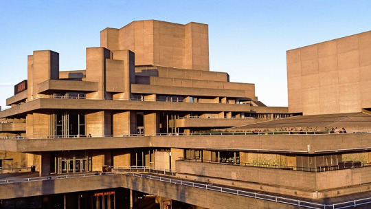

At a glance, this architecture looks boring and unappealing. What makes a brutalist characteristic is the blocky and chunky design.
Some argue that brutalism is an egalitarian movement, this movement strays away from white painted walls with decorated windows typical of the time. At the time, the geometric and blocky design was considered modern. This evidence appears in futuristic movies and in spy/war movies symbolising rebellion, modernism, and revolution.
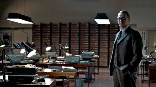
Tinker Tailor Soldier Spy (2011)

Black Mirror (2011)
Source:
https://www.tandfonline.com/doi/abs/10.1080/10331867.2015.1032481
Shoujo Tsubaki (Camellia Girl)
(viewer discretion is advised)
youtube
Shoujo Tsubaki (1992) is a film adapted from the comic of the same title. The uncensored animation completed with voice acting added many layers of disturbance and the feeling of dread. Many people found this film very upsetting resulting to banning in several countries.
This artwork is one of the greater known titles within the ero-guro (short for erotic-grotesque) genre. The Ero-guro genre symbolises resistance and rebellion during world war 1. Some also enjoy it as escapism and sexual liberation. This film is brutal due to its depiction of grooming, abuse, and nonsensical grotesque scenes.
Source:
https://www.diva-portal.org/smash/record.jsf?pid=diva2%3A1570686&dswid=8039
Sistine Chapel Church

The wall and ceiling of the Sistine Chapel were painted by Michelangelo (1508-1512). It is not surprising that this work took an incredibly arduous time that Michelangelo dreads working on it. The details and paint stand the test of time and the colossus artwork will make every visitor gasps in awe. Each painting has incredible details and the colours are carefully coordinated. It only takes a single glance to feel overwhelmed by the presence of this artwork.
Source:
https://www.jstor.org/stable/1464068
Japan Sinks
youtube
Japan Sinks is a Japanese animation series created by Masaaki Yuasa. The animation was an adaptation of a novel with the same title. Each depiction of death are raw and uncensored oftentimes includes close-ups. This series was a contribution to Paralympics 2020 and was set to release as a promotional campaign.
It doesn’t take the brightest bulb to notice the brutality of this series. The main characters experienced sudden deaths of their loved ones and the grief was left unprocessed until much late. Naturally, this end of the world scenario includes a multitude of body counts. Many great characters did not survive and their final scenes include close-ups and slow motion of their remnants making their sudden demise even more brutal, leaving a gaping hole in the viewer’s heart.
Judith Slaying Holofernes (Artemisia Gentileschi version)

The painting showed an “uncensored” gory scene of Judith beheading her abuser helped by another woman. It is said that Gentileschi was inspired by her master, Caravaggio. Caravaggio’s version had a different composition and the painting shows Holofernes holding his blood, resembling strings.

Judith beheading Holofernes (Caravaggio)
Unlike her master, Gentileschi did not hold back nor consider making the painting palatable for the viewer. The more brutal interpretation made the intention behind the painting even clearer. It is one of the strongest depiction of complex independent women and a strong message of feminism in baroque era.
Source:
https://digitalcommons.butler.edu/urc/2018/arthistory/2/
Notre Dame Basilica (Montreal)
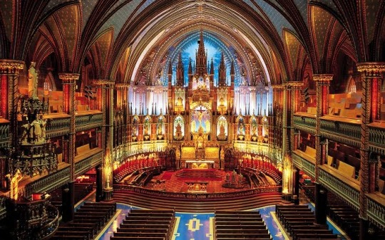
youtube
This gothic style cathedral is located in Quebec City, Montreal. The three-story-tall hall symbolises the church’s power and the huge size of a cathedral has been known to give psychological effects to the devoters. The blue colours represent the sky and heaven, the red colours complemented by gold accents gives a royalty and majestic look. The pillars will reverberate the sound of organs creating an effect of “heavenly sounds”, many believers are attracted to this sound resulting in higher attendance. The design of the cathedral makes the attendees feel small and overwhelmed as if the church attendees are “meeting” God.
Source:
https://www.mdpi.com/2077-1444/11/9/478/htm
https://askinglot.com/why-are-gothic-cathedrals-so-tall
Final short reflection:
Each of the artworks above shows a great amount of research and thoughts poured into the small details. They each have their own unique approach creating unique and impactful results.
3 notes
·
View notes
Text
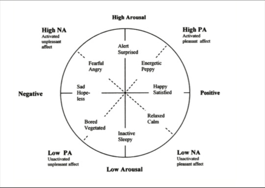
Thursday Class
I’ve learned that a human’s emotion is subjective to their conceptual knowledge. Referencing the circumplex model of affect, high energy arousal may affect someone in a negative or positive way. For example, a person who fear height would have a negative reaction to roller coasters, and vice versa.
Before ideating my video, I have to consider possible audience’s reaction especially negative reactions. I have to be mindful in using strobe lights since it may trigger a seizure reaction. This consideration would be tricky for the emotion I chose (brutal & overwhelming) since both emotion might need a shock factor or jumpscares to support the demand for high energy. The jumpscares have to be placed strategically as well to create an impressions while using it very sparingly.
Further reading:
The subjective experience of fear arises out of cognitive interpretations of these patterns of physiological activity that occur in the context of eliciting stimuli. As emotions are experienced and communicated, cognitive interpretations are employed to identify the neurophysiological changes in the valence and arousal systems and conceptually organize these physiological changes in relation to the eliciting stimuli, memories of prior experiences, behavioral responses, and semantic knowledge. (Russell, 2003)
In relation to the chosen theme, a negative reaction such as fear, anger, and sadness would be considered a success. However, some positive reaction such as energetic and satisfied would also be considered a success if the subject enjoys the dark/horror genre. In order to elicit a fear reaction, we have to consider what’s commonly known as terrifying to many. It could be a car crash, death, or maybe the feeling of being trapped in a room with a stranger.
The exhibition type is also important in maximising the experience. My ideal place for exhibition would be an empty gallery or hall equipped with surround sound system. But unfortunately since we live in the worst era for real life exhibition and I am but a student, I have to stay open minded to other possible digital options although it will always be underwhelming compared to real life. I have considered VR as the last option in case the worst happened during the final weeks. But if there’s another way of still doing a real life exhibition of a closed space while still adhering to rules I will certainly consider it.
To know whether my future team has succeeded in creating negative arousal, some beta viewers will be needed. We are not reliable to determine whether it’s a success due to bias and numbness since we are the creators and the creation process would have killed our excitement by the time the prototype is finished.
Credit to:
Russell JA. Core affect and the psychological construction of emotion. Psychological Review. 2003;110:145–172. (Google Scholar)
0 notes
Text
Tuesday + Group Discussion
Brutal & Overwhelming
We had some discussions regarding to the emotion above. We started off by researching what each words mean.
brutal (adjective)
Unpleasant or harsh
Direct without any attempts to disguise unpleasantness
Synonym to: violent, savage, direct, etc
Overwhelm (verb)
Have a strong emotional effect on
Overcome with emotion
Affected by something very strongly
Synonym to: strike, move, affect, etc
By combining these 2 words we get a sense of negative emotion that is harsh and affects someone witnessing. This emotion is also tied to anxiety and shock.
After defining the words we searched for some artworks that makes us feel those emotions. What feels brutal and overwhelming is very subjective to each of us, as a result we had some variations of unique inspirations. All of the inspirations suggested a very strong and loud approach. For example Thirech’s suggestion of Doom ost has the heavy metal genre. Other student inspiration was a film writer who’s main theme is brutal and violent. One of the video depicted mass suicides and a very bloody train station. All of these inspirations are very aggressive and high-energy.
My inspiration was The Caretaker’s album Everywhere at the End of Time.
https://youtu.be/wJWksPWDKOc
youtube
This album attempts to convey the experience of dementia. The artwork has 6 parts or stages each showing a degeneration of the previous track. The first stage is the “memory” tracks. It has a very nostalgic and vintage remark as if you’re listening from a phonograph. The last stage is a horrifying and “brutal” husk and empty noises of what’s left from the first stage. Without knowing the context behind it some would feel very confused as to why the album is incredibly long and the longer it plays the creepier and more inaudible it becomes. What makes this album terrifying is the idea that the first tracks are the memories and as it plays through the memories are fogged and confused and ultimately, they were forgotten.
The album feels very overwhelming due to the 6-hours-and-more duration and brutal due to the depiction of dementia. It is very raw and eerie but it’s not aggressive and high energy like other students’ examples. I chose this artwork as my inspiration because it leaves a deep impression in my head. Aggressive and high energy are often only leaves a temporary shock. If we kept getting exposed to the high-energy we will become numb or used to the feeling so it doesn’t affect you anymore. A subtle low-energy and durational approach leaves a longer impression and with the help of context or conceptual knowledge behind it.
Note: the overwhelming feeling and the brutal idea of Everywhere at the End of Time is my subjective point-of-view as someone who has been numbed to jumpscares and violent imagery.
1 note
·
View note