jadeconnolly3point3
cache
'Design a Treasure Map' - Ian Anderson
69 posts
Don't wanna be here? Send us removal request.
Last Seen Blogs

dirtybigasdwhore
Sans titre

art4lm
Art4LM
bitterbanter
a knick knack between the lucids and the cosmos
meltovv
Gott hat Erbarmen, ich nicht
Photo
An example of how the illustrations compliment the photographs... I think that they add the perfect amount of personality to the page, to remind us that the girls, however model like for the magazine’s aesthetics, are real people, with real stories.
0 notes
Photo
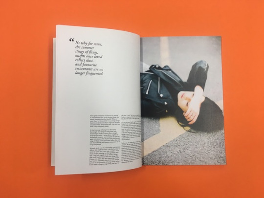
The quote. I wanted the writing to be given just as much attention as the images, and so, I pulled out the most intriguing part of the text.
0 notes
Photo
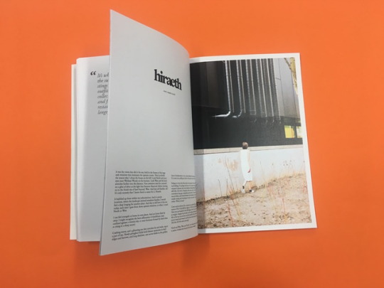
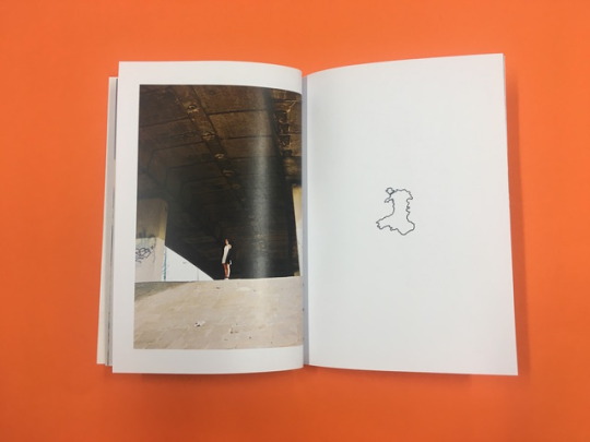
A title page for a chapter - you can see how the minimal layout adds to the effectiveness and drama of the photographs. Also, how the typestyle has been repeated for the titles of the chapters.
0 notes
Photo
the logo.... I wanted to use a serif font, usually against what I would go for, simply because, it has connotations of literature and reading. The tight kerning leaves no room and creates a close relationship between the letters - hopefully, how the reader will feel: a close relationship with the letters.
0 notes
Photo
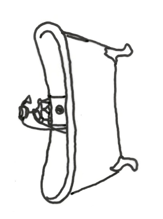
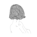
A bunch of tiny little hand drawn illustrations will accompany the stories, it is presumed that the illustrations were drawn by the girl telling the story. A personal touch for personal content.
1 note
·
View note
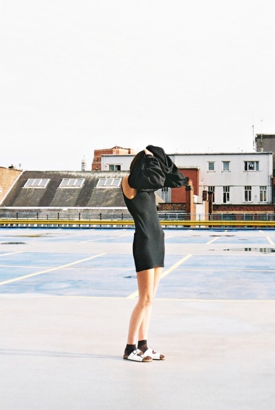
Photo
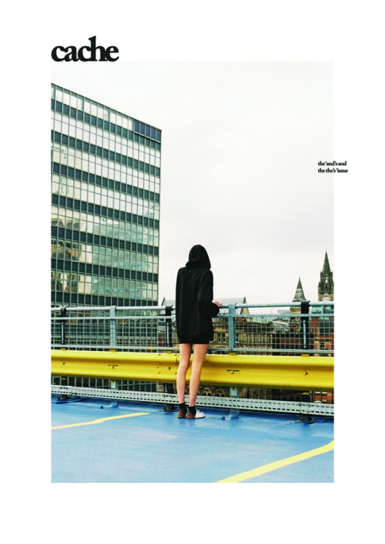
HERE SHE IS... The final cover. Who knew the one outtake that made it through to the final images, would be the cover.. I like to imagine that the model is looking for something, searching in her jumper.. There is also an air of secrets about this - playing on natural curiosity, we want to know what is behind the jumper, and so, WE WANT TO LOOK INSIDE THE MAGAZINE!
0 notes
Text
“THE AND’S AND THE THE’S”
Inspired by Rupi Kaur’s Ted Talk.
I'm looking at the connection between poetry and illustration.. story telling and art. I found something that Wallace Stevens said in a lecture about the arts in general are a “compensation for what has been lost. Men feel that the imagination is the next greatest power to faith: the reigning prince.” He's basically arguing that, because poetry and painting operate on the same level, between imagination and reality, these arts assume a prophetic stature and become a “vital assertion of self in a world where nothing but the self remains, if that remains.” This can be applied to, and could be a nice connection to our 'past selves'. This relates nicely to the inanimate objects, of no real worth, holding sentimental value.
2 notes
·
View notes
Photo
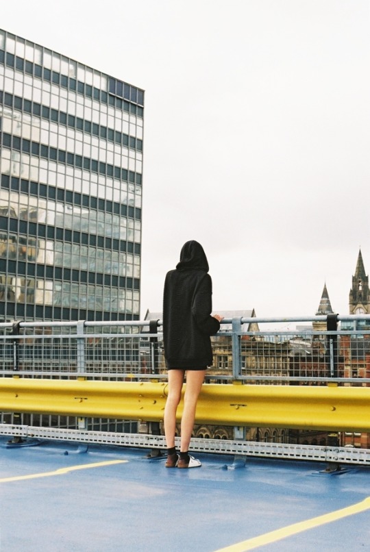
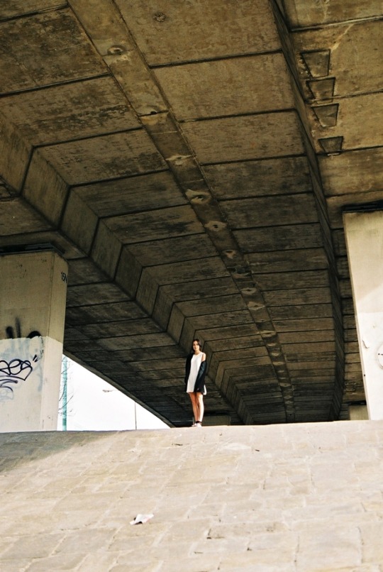
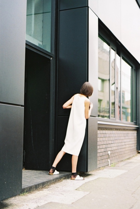
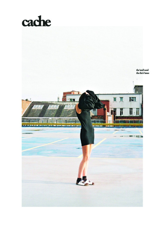
Creating a format that could be repeated makes the publication appear more professional and realistic. As if, for the next issue, a photograph relevant to the content could replace this one. I love the colours in this image, however, I do not feel like it screams out about searching for something.
0 notes
Text
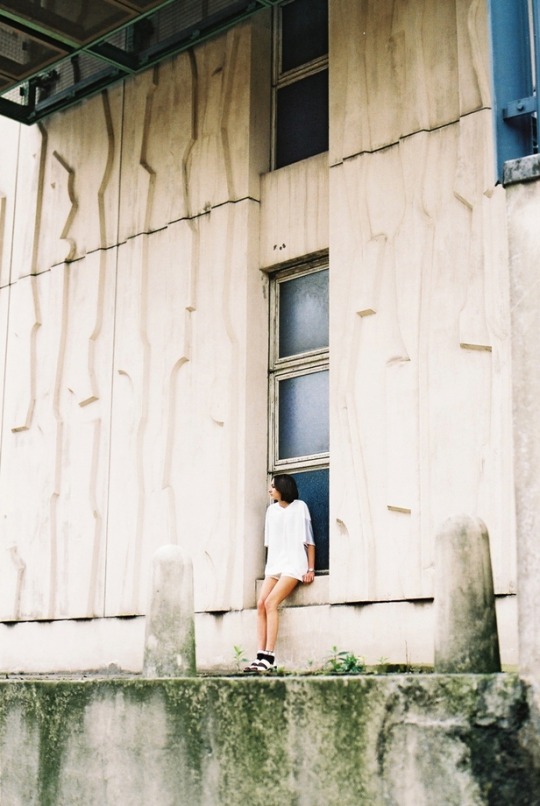
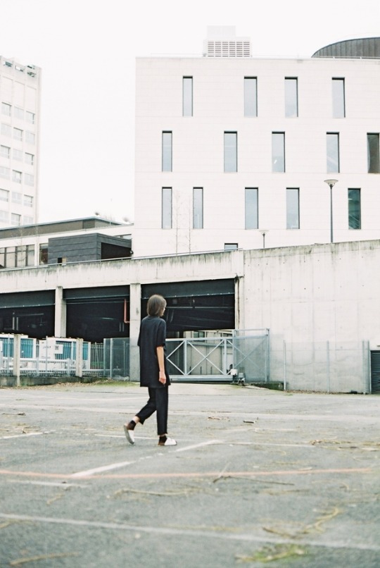
After all of the wonderful photos that Elle helped me take, I need to reevaluate the cover...
0 notes