
Last Seen Blogs

lytzu
Areli

misskaorii
🩵Kaori🩵
katekatebear
sunshine & the bear

femteruki
esp. esu

kfmupdate
Komunitas Fotografer & Model
Audio
For my sound collage, I recorded various sounds of water in my apartment, and edited them to create a rhythmic pattern.
0 notes
Photo

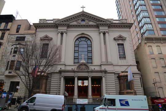

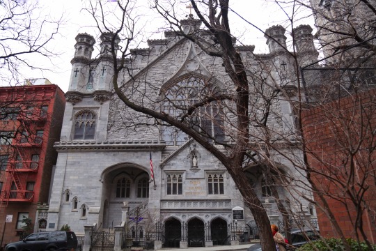


For my photo essay, I decided to photograph religious buildings of different cults around my neighborhood (Yorkville/Upper East Side in Manhattan).
Because of the stronger political and social role that religion had in previous centuries, religious buildings in Europe are always given great highlight within a city’s urban architecture. Churches, cathedrals, and synagogues are often surrounded by large squares or are located in significant locations of a city. I find it fascinating how in New York these buildings are instead tightly interwoven in the urban architecture, and sometimes even camouflaged within it. I chose to photograph the buildings in their architectural contexts.
New York is a city often identified with materialism and consumption, and at the same time it is home to a great richness of diverse human cultures and religious cults.
1. Islamic Cultural Center of New York, 96th St. / 3rd Ave.
2. St. Francis de Sale Roman Catholic Church, 96th St. / Lexington Ave.
3. Congregation Orach Chaim, 94th St. / Lexington Ave.
4. Our Lady of Good Counsel Roman Catholic Church, 90th St. / 2nd Ave.
5. Zion-St. Mark Evangelical Lutheran Church, 84th St. / 1st Ave.
6. Temple Shaaray Tefila, 79th St. / 3rd Ave.
7. Unitarian Church of All Souls, 80th St. / Lexington Ave.
8. Church of Scientology - Celebrity Centre, 82nd St. / Park Ave.
9. Ramakrishna-Vivekananda Center of New York, 94th St. / madison Ave.
10. St. Nicholas Russian Orthodox Cathedral, 97th St. / Madison Ave.
1 note
·
View note
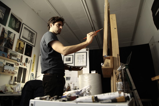
Photo


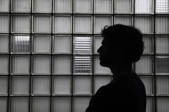
Silhouette
[At the studio of painter Charlie Masson http://charlie-masson.com]
4 notes
·
View notes
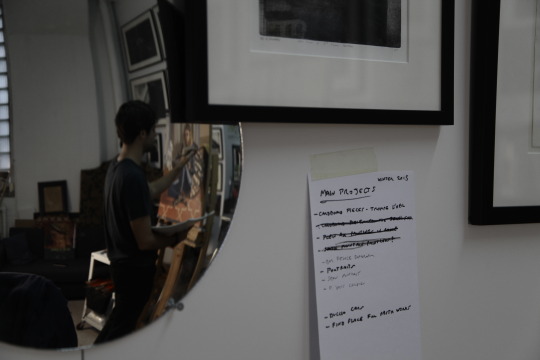
Photo

Framing and composition - rule of thirds
[At the studio of painter Charlie Masson http://charlie-masson.com]
1 note
·
View note
Photo


Blur
[At the studio of painter Charlie Masson http://charlie-masson.com]
0 notes
Photo

Occult point of view
[At the studio of painter Charlie Masson http://charlie-masson.com]
1 note
·
View note
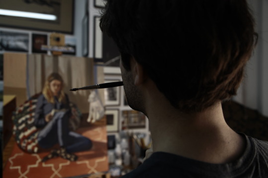
Photo


Deep depth of field
[At the studio of painter Charlie Masson http://charlie-masson.com]
2 notes
·
View notes
Photo


Shallow depth of field.
[At the studio of painter Charlie Masson http://charlie-masson.com]
0 notes
Photo

Online [nytimes.com]
In this online ad for the upcoming Coen brothers movie Hail, Caesar! , the portraits of the characters follow a graduation structure. The underlying text follows the same direction, bringing the viewer’s eye to the main object, positioned on the right edge. The whole composition utilizes white space to give prominence to the text and the main object. The overall aesthetics of the ad follow the style of Hollywood’s golden age, in which the movie is set.
2 notes
·
View notes
Photo

Billboard
The objects in this Whole Foods Market billboard follow a rather informal structure, but at the same time are placed along axes that build a frame for the text. The different font sizes of the text also build up a frame for the central word - LOVE - in bigger size. The oysters - traditionally a “fancy” food - are served on some minimalistic plates with a home-style napkin, and some empty shells are shown too in the bottom left corner. This projects the image of the company, selling high quality but natural and homey food.
1 note
·
View note
Photo
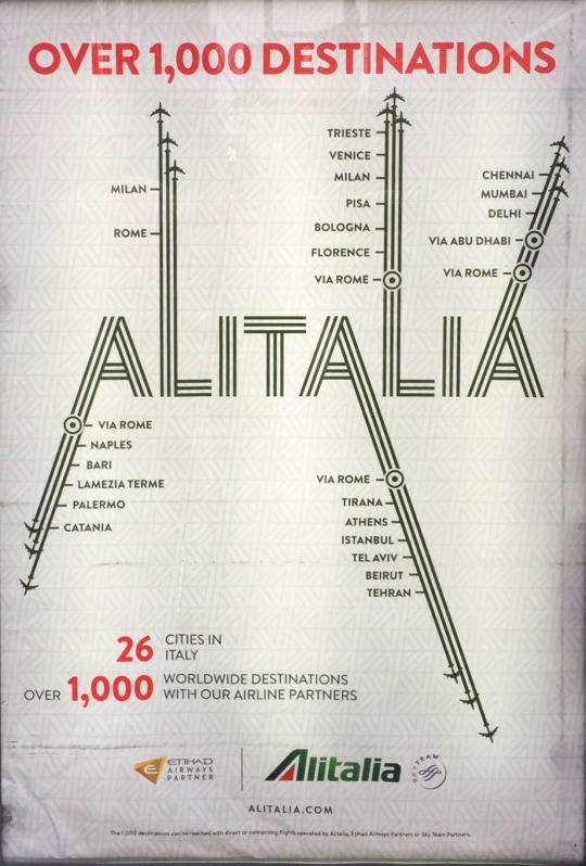
Billboard
This is a billboard for Italian airline Alitalia that caught my attention. I like how it utilizes groupings and vectors to create a literal and metaphorical sense of direction, while keeping the design very clean and focused on the main object - the company’s logo and the main destinations of the airline. The extensions of the letters remind of an airport map. Also, the colors of the ad - green, red and white - are the ones of the Italian flag.
2 notes
·
View notes
Photo

Print [The New Yorker, Feb. 8 2016 issue]
This poster for Laura Poitras’s exhibition at the Whitney museum plays with many compositional features. On the vertical plane, the museum’s logo and the title of the exhibition are placed symmetrically, creating a frame for the main image. This is in turn asymmetric on the horizontal plane. The asymmetry, and the girl’s look, create a dynamic movement towards the light box, that acts as a window on the composition’s focal point, placed outside of the poster’s boundaries. The image also uses contrast between the black background and the white rectangle. The lines in the museum’s logo also seem to point towards the same focal point, and the image of the woman looking out of this sort of window interacts with the museum’s slogan, “You can see America from here.”
2 notes
·
View notes
Photo

Print [The New Yorker, Feb. 8 2016 issue]
This ad for fashion brand Céline gives prominence to the model through the central placement and the contrast achieved with the use of white space. Together with the composition however, the eye of the viewer is caught by means of the graphic design technique, willingly looking like a clumsy digital collage. The bright color and this provocative use of aesthetics make it an interesting and powerful ad.
2 notes
·
View notes