Text
Winter lights project
This project centres around the winter lights in Canary Wharf. I actually worked next to them so I would pass them everyday for work and they were absolutely beautiful. We were told that we had to create a brief to pitch a installation for the canary winter lights. Starting off myself and my partners wanted to create something that was interactive and fun. So are original planning began with brainstorming ideas that we thought would be a enjoyable experience. We came up with the idea of a clapping light feature which centred around the game musical chairs. We thought this not only would be interactive but also would be incredibly fun for the public to use when visiting the show. We thought about how the lights would interact with the chairs and we looked at examples online which we could emulate or draw on for examples. I decided to spearhead the research alone, as was the initiator of the project, I found a example with a designer called Bobby Petersen. He put on a show at the Victoria and Albert museum in which he incorporated musical chairs to play music, when people sat down on the chairs each individual chair would play a harmony to create a linear interactive musical experience for the public.

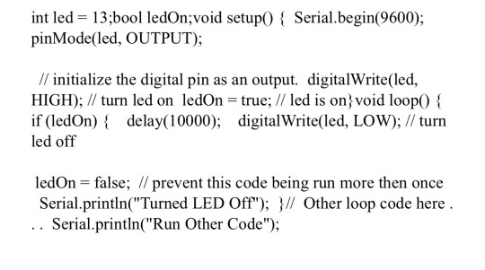
I thought this concept was incredible and thought it would be a perfect example to build are idea and and visual narrative from. After I came up with our idea I brought it to Preticha and Pricilla and we started to think about the coding and the Arduino in regards to the actual creation and interaction with the lights.. Going on YouTube I saw the different inputs and out put that are needed to create a interactive design and I found it very confusing but at the same time very fascinating! After getting are visuals together and the general output of how we wanted our Arduino to be we focused on the final product. The actual interaction with the chairs. I originally wanted the concept to be that the public clap which then makes the lights start moving and then when they stop one of the chairs automatically disappears be either sinking into the ground or folding up somehow. After talking with my partners they felt like this would be too confusing and trying to find out how that would actually work from a technological perspective was deemed almost impossible, so after much back and fourth we decided that we wrte defintely over complicating the process so we thought why don’t we just have plastic chairs and the Arduino focus more on the lights themselves. Below you can find some of the coding I used and looked at when thinking about the creation of the lights.
This the code I found that we came up with together to use for timing

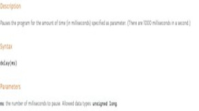
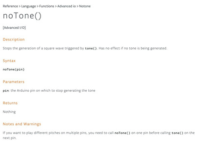
The following code is what we would use to make the music pause
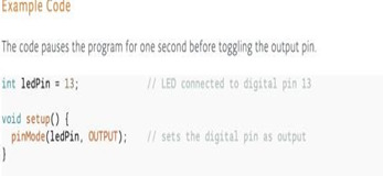
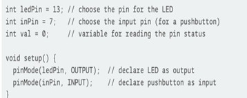

After doing some research I realised that I wanted the show to run seamlessly without any delays. So I seperatley went and researched coding that would allow are show to run without delays. This code basically allows the original code to run WITHOUT having the ‘run other code’ printed out for approximately 10 seconds after start up.
The idea was that the chairs would be plastic and the only thing that would be interactive would be the actual lights themselves. When someone claps the lights start flashing and then when the lights stop everyone has to sit down. It would then be up to players directly to take a chair away after each round. After our final meetings we were about to get the Arduino but unfortunately the coronvirus situation. In context it really showed to us that in creative situations unexpected things can happen and you really have to find a way to adapt. The main thing I enjoyed about this project was the brainstorming on how we could bring a fresh new look to the winter lights show. I really enjoyed coming up with ideas and then linking them back to the Arduino and what would be possible and what wouldn’t be possible. Coding was something that I never ever had any experience with so I definitely was taken out of my comfort zone. But indirectly I believe learning stuff like coding and Arduino can only help you and improve your creative ability’s. Learning the ins and outs of things that make you fell uncomfortable can only provide growth which indirectly will make you grow as a creative and a human being which I definitely appreciate and value! One thing I was also greatful for was having a group! Having people you can brainstorm with and bounce ideas of off is always such a beautiful and fulfilling experience because you learn so much from each other.


0 notes
Text
CCI CAMPAIGN
kashifcci CCI CAMPAIGN
With our new project we were given the brief of making and helping introduce a fresh new look to the Kingston CCI brand. We were told that this had to include making a Instagram campaign which represented the Kingston art courses in a eclectic and fashionable manner, whilst retaining the uniqueness that is so symbiotic with art courses at the university. We had to create animations in different ways which helped showcase the CCI brand. Pricilla ended up joining the group towards the end of the project so at first it was just myself and Preticha.

in order to gain a good understanding of the brief and what was required of us I came up with a PowerPoint presentation to contextualise and bullet point the things we needed to focus on.
The next thing we did is focus on the logo. Branding is one of the most important things for anyone that is trying to promote anything and a logo is normally the frontrunner of the branding. Your logo helps attract your target audience, helps attract potential clients and contributes to your unique selling point. We realised this was one of the most important things we could focus on.We wanted something fresh, something aesthetically pleasing and minimal but with a splash to it that still made it stand out. I went on the internet and began brainstorming. I found several logos that I found inspiring and then brought them into Preticha to find out her opinion.


.After looking at the images I brought in me and Pretchia began brainstorming and sketching out designs. We wanted to create something that was appealing to the eye but not tacky. we understood that our target audience would be in between the ages of 18-30 and we wanted to create something that resonates with them. so we put are self in their shoes ad began to brainstorm and sketch logos and images we think we personally would be captured by.

After this process we were happy with what we came up with. We went home and decided to focus on trying to build are logo using adobe photoshop.
This is the original image I came up with

I then sent it to Preticha to get her opinion and she stated she thinks its a good start but we definitely need colour and more of eye popping lay out to it.
We decided to go to the library and Pretchia added on to my original image.

Over a period of time me and Preticha went back and fourth with the image and finally settled on one.

After showing are logo to Xavier he explained to us that we needed to include ‘creative and cultural industries’ on it which we hadn't done. So we then went back, re edited the image, made sure that the name of our brand was showing and visible and below is the final outcome after the necessary changes.
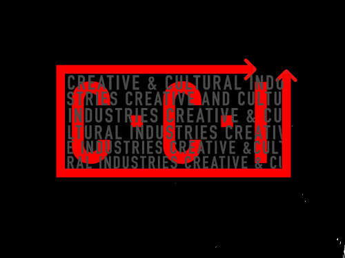
I came up with the idea of adding arrows to our final image, I felt like the arrows would be great signifiers on the logo, I felt like it gave the image the impression of direction and security, the idea that cci was leading you to a secure path through the education and career prospects of the course.
Are next step was storyboarding, based on what we wanted for the video we had to come up with 5 four second videos which were required to have four stories and a ending. We sketched several storyboards showing how we wanted each story to be displayed visually from the beginning to the ending. We started off with our concept of the ‘big bang’ that’s what we wanted to represent cci as a course. We believe that CCI has such a explosion of ideas, people and different art forms, almost like a explosion of creativity. We decided to start off by looking at descriptions and keys visuals of the Big Bang and how we can relate that to the course, we mood boarded how and why we felt like cci was a course with a explosion of ideas. In my particular case I felt like there was such a multifaceted nature to the cci course and when you are around the students and teachers, specifically when you’re being taught you feel like you’re being provided with almost a explosion of ideas. After much discussion we decided that’s what we wanted our common theme to be for the Instagram campaign animations. We wanted each video to be a explosion of sorts which either transforms the scene or creates new ideas and life.
Our story's included a Big Bang which then creates planets with each planet representing a new idea from the course, a scene in which there’s trash on floor and a cci bang falls out of the sky, when the bang hits the trash the trash then turns into gold. A scene in which there are bored children sitting in a classroom being taught by teacher, the teacher sees they’re visibly bored, goes into his pocket, and brings out a cci bang, he then throws the bang at them in which the children then transform and suddenly are dancing in the classroom enjoying the music. My fourth one was a dirty old coin, then a cci bang happens and then coin is turned into a silver coin which glistens and shines. In context the overall theme is one of transformation, we wanted it to be shown that cci is a course that transforms and changes it students for the better, that cci can bring the best and most creative streak out of the most dullest and non creative situations, and to summarise a course which is filled with new ideas, a creative juices which are ready to explode and change the world around its students. We ended up sketching out are storyboard and then forgetting to take pictures, the lesson we learnt from that is take pictures of EVERYTHING you do straight after you've finished, then email them to yourself! it provides you with a level of security and give you opportunity to display the process you used to get to the final outcome of your work.

After our storyboarding We wanted our video to focus on the idea of the big bang and space, so we created the below image on paint, it was a rough sketch but a outlier of where we wanted to go, I actually brought up using the show Ricky and Morty as colour scheme inspiration, I felt like the wacky colour of the Ricky and Morty show was interesting and perfect for our video.

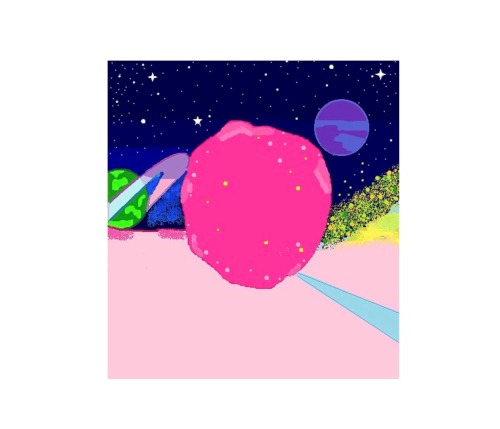
The most difficult thing we found with doing this project was the actual creation of the ideas, actually coming up with the ideas was such a beautiful and enjoyable process, Xavier made it incredibly enjoyable for us and me and my partners enjoyed mood boarding and coming up with ideas. We would spend hours just talking about the ideas, discussing what we think could be the best outcome and what we could do to make it better. The starting and preliminary process was so creatively satisfiying. Unfortunately when it came to the actual process of creating those ideas that’s when we hit a break wall. In my experience learning how to use photoshop is such a weird experience and difficult to say the least but after going on YouTube and watching a few tutorials me and Preticha started to get the hang of it.

Below is the image taken during the creation of the explosion me and preticha wanted for our animation, me and prethcia worked tirelessly in the library trying to use photoshop, we ended up taking turns because the process was so pedantic, me and Preticha added about 10 layers to create the animation, however I also phased the background into the explosion and the background image was completely separate to the overlaying explosion, at the first the explosion wouldn't combined but after using the magic wand and the help of youtube I ended yo figuring it out. Preticha then added the final layers and we managed to get it moving.
When it came to the day of the deadline the school computer wiped off our remaining animations meaning we didn't have the time to create a whole twenty second video for our deadline. Preticha and Pricilla wanted to changed our idea and then came up with a idea of character watching tv on a screen and then a pop of colours appear. Priclla created some still images on adobe illustrator then we worked together to create the final video using adobe and illustrator me and Pricilla sent drafts back and fourth to each other.
Below is the link to our finial cci video campaign
https://vimeo.com/405899840?activityReferer=1
I found the process to be tentative, I enjoyed and I found I was really strong and coming up with ideas and initiating them, but when I used Photoshop I found it quite hard at first, after learning layering and the magic wand I found the process to be easier and I'm happy I pushed myself when it came to using the software as I had no clue how to use it before the course, during the end of the process the coronavirus struck! it was very annoying because I'm a care leaver and had no resources at home so it definitely slowed down the process for me.
0 notes
Text
Mug Shoot Project
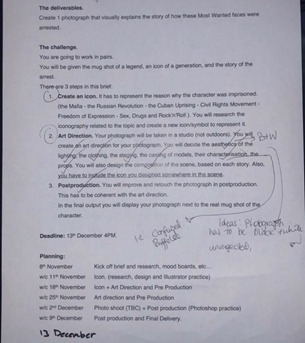
Visual narratives brief - We had to create 1 photo that explained the story of how our specific most wanted face was arrested. It had to explain this through the visuals and art direction of the photo. It also had to include an icon which represented why the figure was imprisoned
I was placed in a group with Fabiana and Leri. We decided to chose Jimi Hendrix as our chosen character. Jimi Hendrix was a famous guitarist and artist who was widely popular during the sex drugs and rock and roll era. He often had a problem with alcohol and drugs and one day ended up being arrested in a airport for the possession of drugs. “ Jimi Hendrix is now experienced, in the worst way. He was busted May 3rd at Toronto International Airport for allegedly “illegally possessing narcotics.”
References
https://www.google.co.uk/amp/s/www.rollingstone.com/music/music-news/jimi-hendrix-busted-in-toronto-197468/amp/
https://mobile.abc.net.au/news/2017-07-12/four-songs-that-prove-jimi-hendrix-was-the-ultimate-guitar-hero/8697146?pfmredir=sm
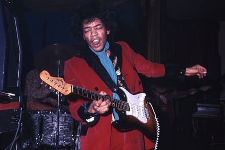
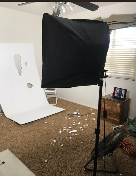
It all started with a concept. We wanted to really conceptualize the idea of Jimmi and the general aesthetic of the time. i.e. the rock and roll era, the tie dyed shirts, the headbands. It was important that we captured the feeling of the Sex, Drugs and Rock & Roll era. In preliminary decisions I brought the below images to the table, I wanted to use the below background as a backdrop and then somehow fit the model into the holes of the background and then edit it to make it seem like the background was interactive with the model, after several discussions we felt like as a whole my idea was too confusing so we decided to scrap it, we decided it would take too much time to edit it and create the whole background, we’d prefer to redirect that energy elsewhere.
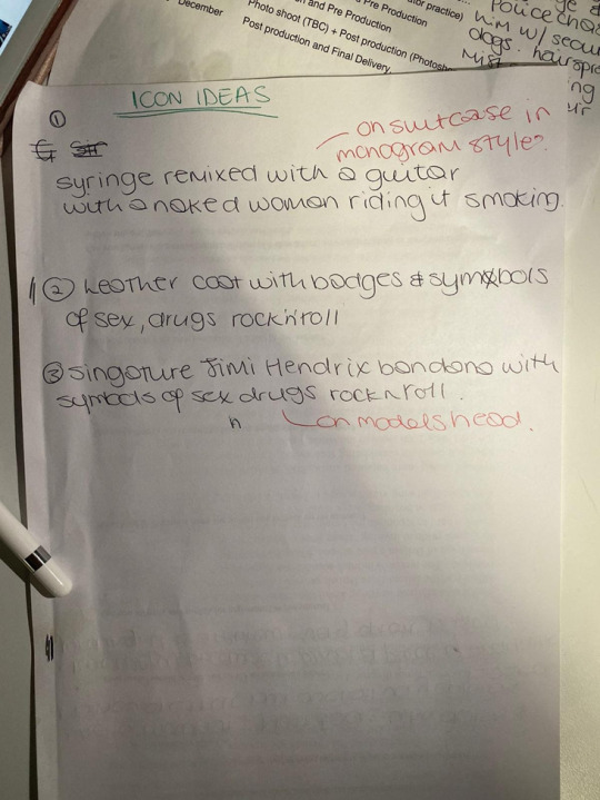
We had a meeting to plan out our general ideas for the icon and shoot. We wanted to aim for a icon which really showcased the reason and the story behind our photo. In our case it was Jimi being arrested in a airport for drug possession so we wanted to that to be shown in the layering of our icon.
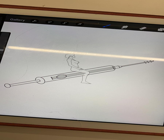
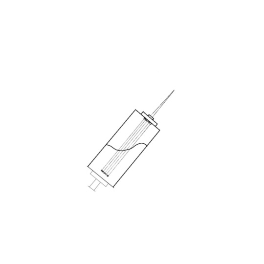
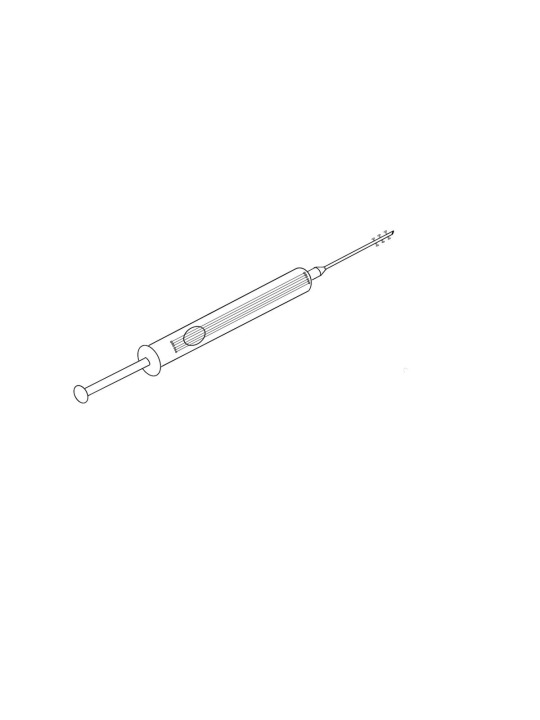
One of the images we made which we were going to propose as our icon, we thought it would be interesting because it involves the reason why Jimmu was arrested. (Heroin) but also had some style and design to it. We wanted to make sure the icon was inclusive of the reason without it looking weird or rude. I felt like we had to be quite sensitive with how we handled the topic specifically because it was to do with drugs.
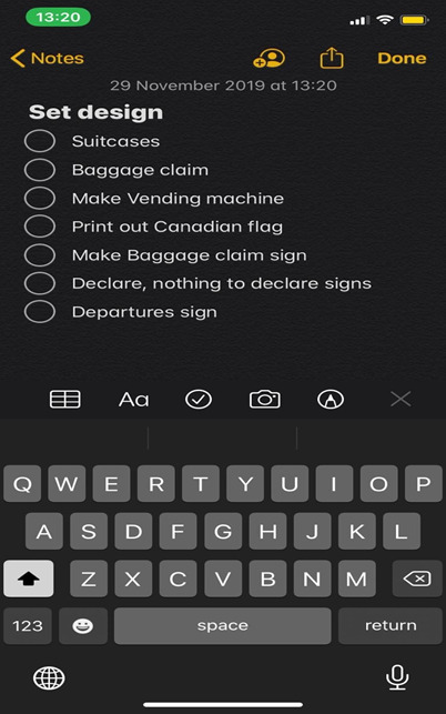
We decided to do some art direction for our scene. Below is a list of the stuff we wanted to create for the scene.
*What went well - we were very artistically inspired with the ideas we had for the general art direction, originally we had a very tentative idea of what we wanted to do but as we went on it became clearer to us.
*What could of been improved - even though we had lots of ideas, as we were going a long we found that we lacked the resources to bring a lot of those ideas to fruition, which was incredibly frustrating! For example our original idea was to make a airport from scratch but in doing so we needed to find materials that allowed us to do so which would be quick and easy and without making a lot of mess, after searching we found that there weren’t really any materials which could do so, my idea was to bring some plastic chairs into the scene and create some stands using cardboard we found but after doing so we found it look incredibly unrealistic.
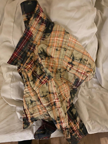
My job was to go and find the clothes for the shoo! I wanted to make sure I found clothes that really emulated the vibe and feel of the era which sex drugs and rock and roll, after a lot of searching I managed to find this really kool shirt, I decided to bleach the shirt cause I felt like it made it more authentic and gave it a more genuine feel, Jimi was always in his shirts so I think this look gave the model a more believable look.
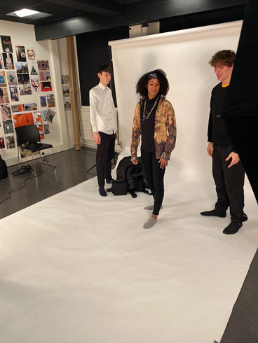
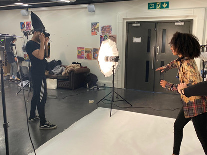
Shoot day.* We organised some of our class mates to be our models and one of Leri’s friends. We decided to keep the concept simple and decided to have the image be Jimi getting arrested in a airport with 2 security guards holding him back. We also aimed to show in the image Jimis drugs falling out of his bag or pocket. We were taught how to use the cameras and we practiced long shots and close up shots on the models. I found using the camera quite difficult because of my eyes, I also found to quite hard understanding the instructions on how to use the camera. Below are images of our shoot. My focus that day was to creatively direct the shoot, I decided on the lighting and the overall stance of the models, which I found very enjoyable! I kept on running up to the models and at one point had to do some acting exercises with them to make them loosen up and look more realistic which I never thought I would end up doing! It made me realise that being a creative director is not just about making the overall aesthetics look nice but also you will find yourself having to do things that you would never think you would need to do to get the best results for the shoot. I also kept on having to drop a bag on to the floor in between the flashes to get the look that drugs fell out of Jimis pocket. I ended up finding a plastic bag and pouring sugar into it to give it that realistic look of drugs!
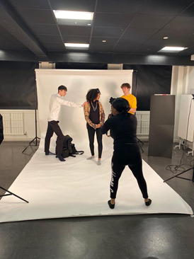
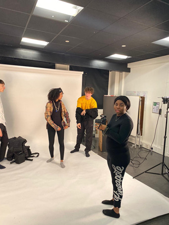
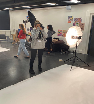
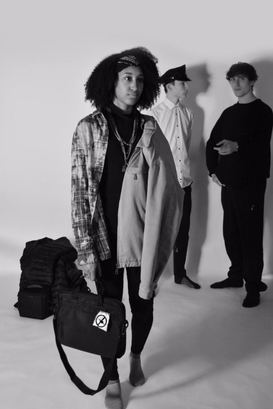
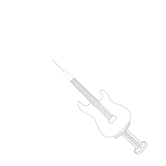
After are shoot we had to chose a final icon out of 3 we sketched to have in our final image. We decided to go with the guitar shaped one. I originally wanted to go with the long syringe but after much consideration we decided that the guitar shaped one was a good representation of the era Jimi had come from. Below is also the final image. We tried to put the icon on to different parts in the photo and a lot of places it looked really unrealistic. So we settled with it being on the bag, almost like a token of sorts. I found editing quite easy, I originally wanted the image to be sideways to give it a distorted look but my peers felt like it didnt look realistic so we settled with putting it in black and white, I think the most difficult thing about photoshop is learning how to add layers to a pictures whilst retaining the image quality and making sure everything as whole looks realistic. Overall the assignment was enjoyable, I felt like me practicing creative directing the shoot was fun and is something I definitely would like to explore in the future, it feels more multifaceted and I feel like I’m properly exploring what creativity means to me. I believe this assignment gave me a good insight on what and how to work on briefs as a group and how to listen and adapt to each other’s opinions
0 notes
Text
Typographic Collage
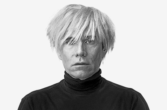
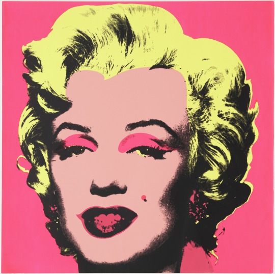
The artist that I chose from the Tate modern timeline was Andy Warhol. Due to me doing it in one day I was asked to only chose one. Andy Warhol was a artist who revolutionised the art world and changed the perception of what was considered ‘art’. Predominantly before Warhols influence art was often considered to be just anything that traditionally involved paintings. Warhol was one of the main leading figures in introducing a art form called ‘pop art’ into the mainstream. My critical opinion of Andy Warhol is that he was revolutionary, I believe he was daring and fearless however I also believe his love of celebrity clouded his judgment. I believe his work was fascinating however within it signalled a depth to him that not many people had an opportunity or privilege to see.
References
https://www.tate.org.uk/kids/explore/who-is/who-andy-warhol
https://www.christies.com/lotfinder/Lot/andy-warhol-1928-1987-liz-early-colored-liz-6205132-details.aspx
https://www.moma.org/collection/works/61240
https://www.invaluable.com/blog/andy-warhol-biography/

0 notes
Text
Disclaimer - I started the course quite late and then went through a period where I wasn’t in due to problems with student fees for the course so I didn’t properly start the course until late November. The first section will be quite rough due to only being in for a weeks before I was informed by the university that I had problems with fees **
1 note
·
View note