Last Seen Blogs

deans-bacon
Jeffrey dean morgan and supernatural🥵

woodwatchtimes
SVENN WOOD WATCHES

theodette
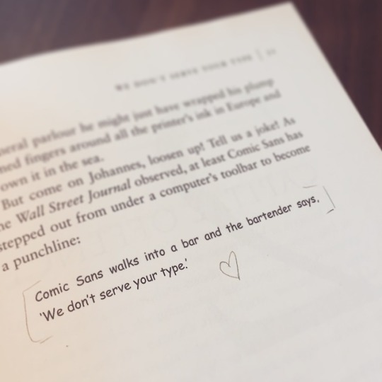
Behind the Glasses

rowaelinwhitethorn
aelin ashryver galathynius

soothful
Untitled
Photo
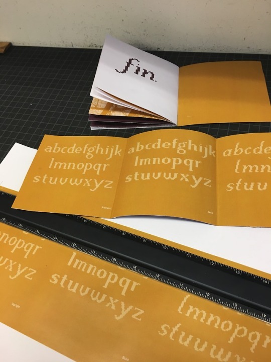
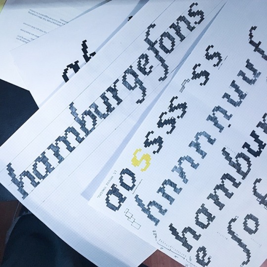
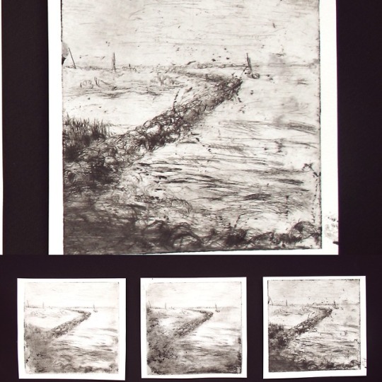
Specimen WIP
Measure, Breathe, Cut, Breathe.
In that order.
0 notes
Photo
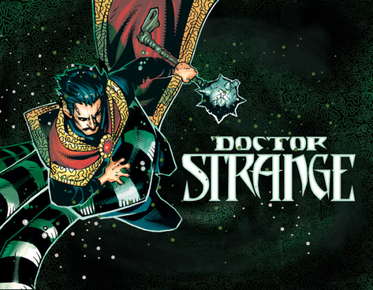
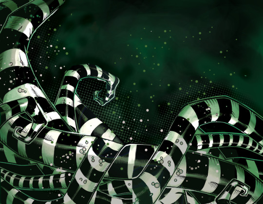
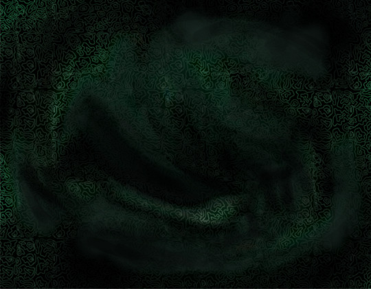
Dr. Strange Style Guide Template
I was really upset that I didn’t get to make my style guide during Marvel. I contributed to another one, which was ok but this was a lot of fun. I made that swiggly pattern, used brush tools to create smoke, and photoshopped that b+w tentacle thing(?). This was a great internship, however sooooo slow-paced. I wish there was more direction, but it’s okay. :)
0 notes
Photo
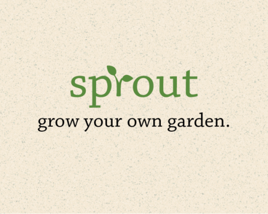
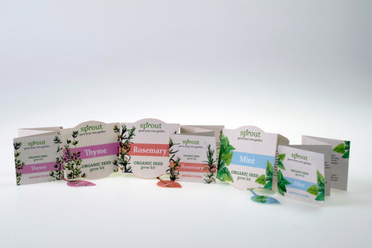
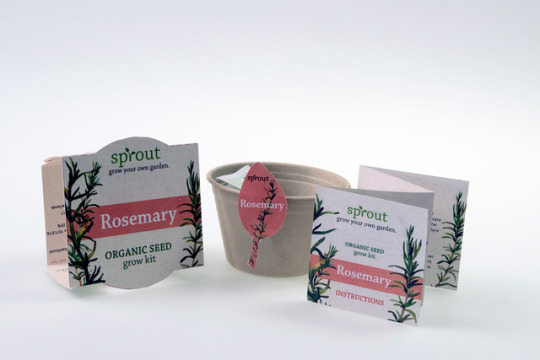
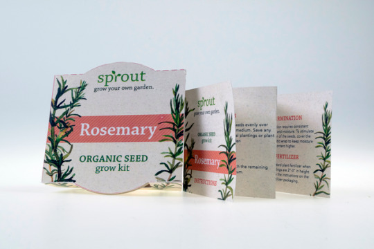
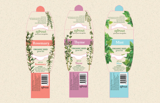
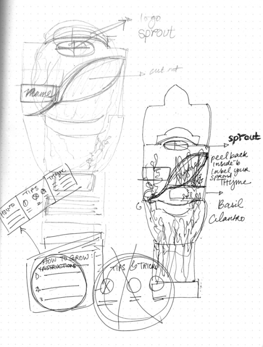
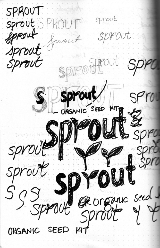
Sprout—Branding + Packaging
This is a concept brand for an organic seed packaging kit for people who are not familiar with gardening. The seed packaging includes a kit of all the things you would need to plant the specific kind of seed—pot, seeds, growing medium, instructions, and pot label. The brand’s objective is to introduce people to gardening in a very affordable, easy, and “all-in-one” way. The instructions card includes an explanation on how to grow the sprout and how to take care of it. It also comes with an included sticker, so people are not confused if they have multiple sprouts.
The concept of this brand is built by an all-natural, soft, and pastel aesthetic that does not appear condescending to the buyer. The watercolor images are an emphasis to the natural quality of the seeds, and the idea of “gardening for the average person.”
---
Weak. But, I like the typesetting here. I’ll revisit the imagery soon
0 notes
Photo
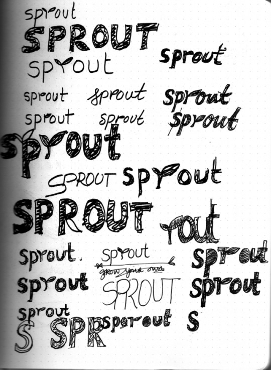
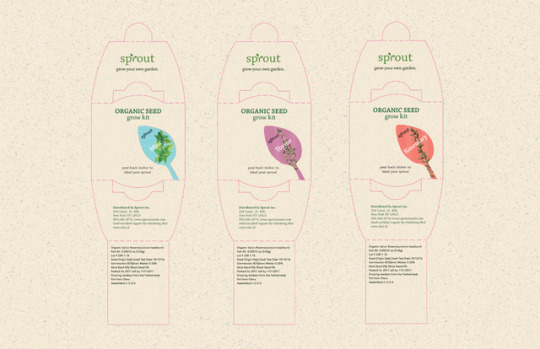
Sprout—Branding + Packaging
This is a concept brand for an organic seed packaging kit for people who are not familiar with gardening. The seed packaging includes a kit of all the things you would need to plant the specific kind of seed—pot, seeds, growing medium, instructions, and pot label. The brand’s objective is to introduce people to gardening in a very affordable, easy, and “all-in-one” way. The instructions card includes an explanation on how to grow the sprout and how to take care of it. It also comes with an included sticker, so people are not confused if they have multiple sprouts.
The concept of this brand is built by an all-natural, soft, and pastel aesthetic that does not appear condescending to the buyer. The watercolor images are an emphasis to the natural quality of the seeds, and the idea of “gardening for the average person.”
---
Weak. I shall revisit you, one day.
0 notes
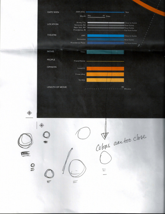
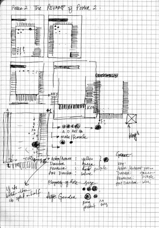
Photo
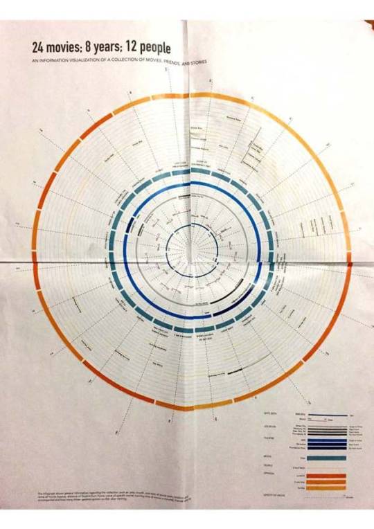
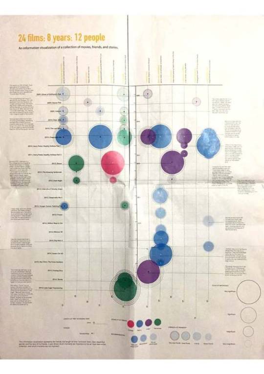
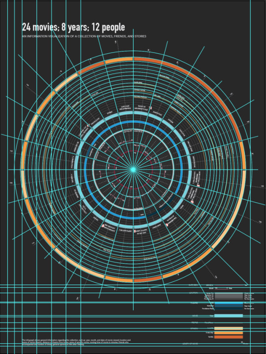
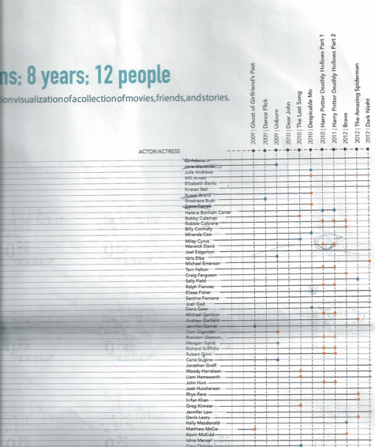
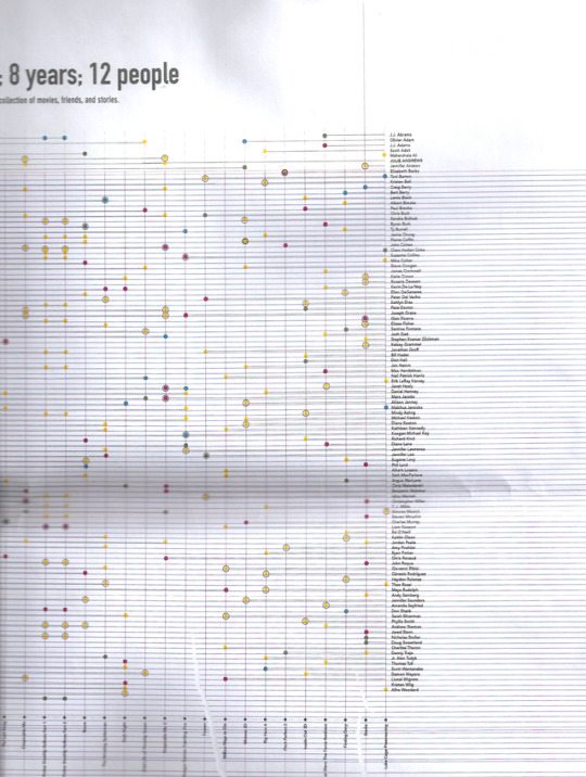
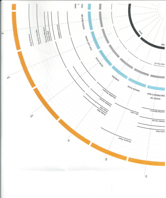
Information Design—The Finish Line
This stage I had finalized one poster, and I was making final edits to make sure the second wouldn’t fall short when placed next to the first one. And another major decision was to eliminate poster 3 because of a weak concept. BUT the visual was working, so I brought some of that into the second poster (making the circles a little larger) and using color selectively. Also, check out that screenshot of my document grid. Yes, those circle lines are custom made then turned into gridlines. Thank you, Ai.
---
I swear I am totally one of those detail obsessed designers.
1 note
·
View note
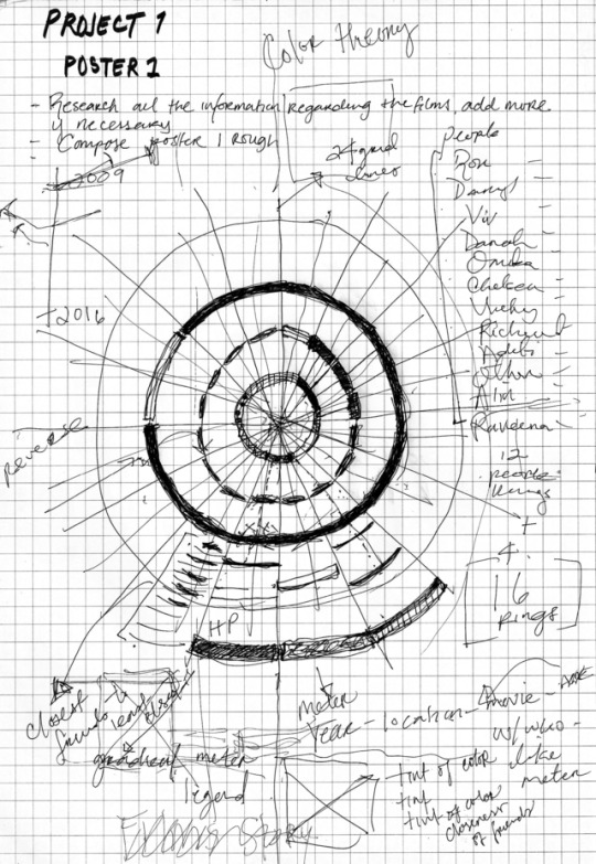
Photo
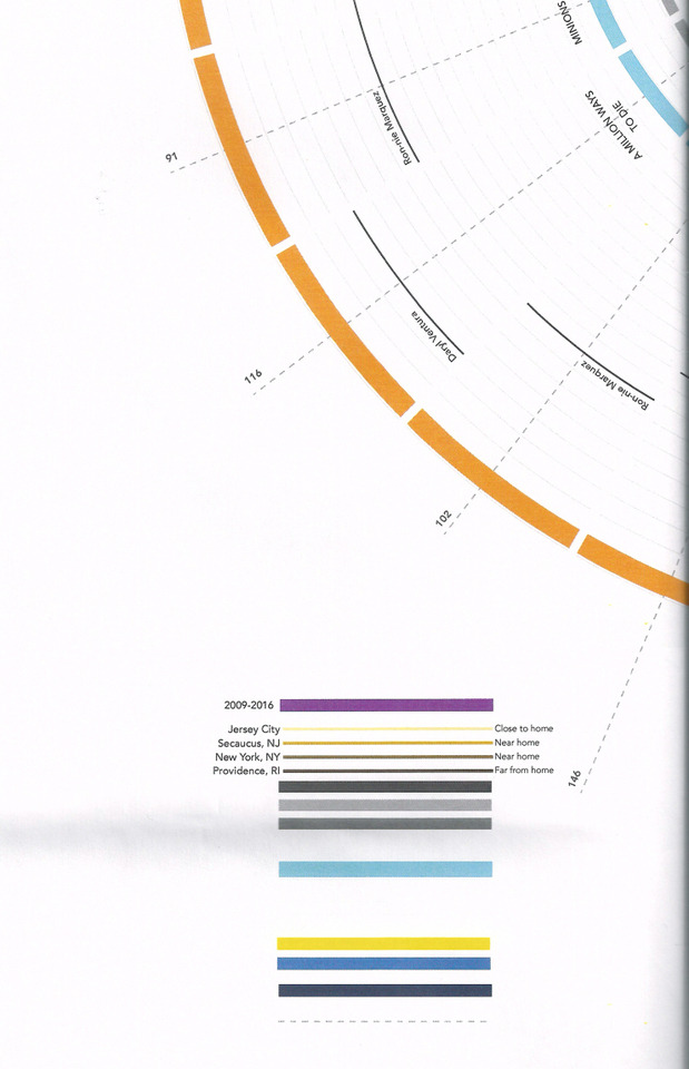
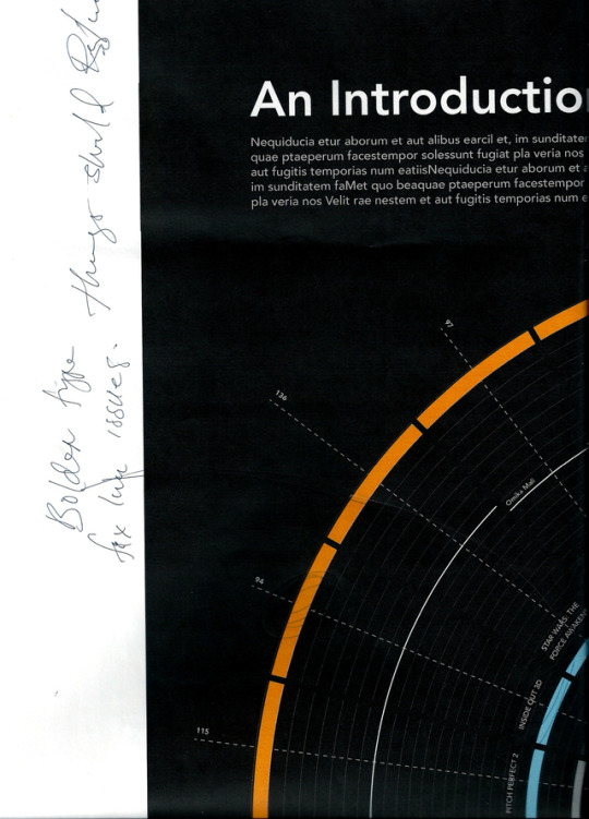
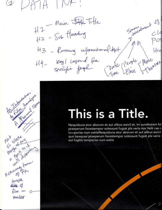
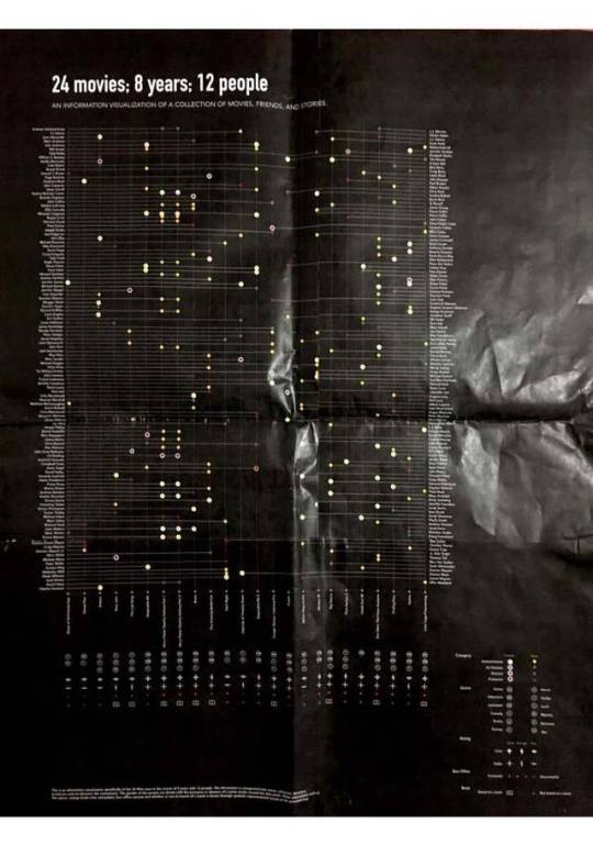
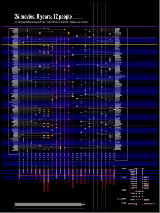
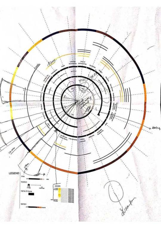
Information Design—A Million Edits Later...
Edits. Edits. Edits. And more edits. Most important thing I learned from this phase was the concept of “Data Ink” as you’ll see in giant text as a note to myself. Also I established a title from “This is a Title”, “1/3: Introduction” to finally “24 movies; 8 years; 12 people”. What a long way this project has come. Insane, really. I considered using images of my the movie tickets, which I dropped because my professor brought up the point of, “What does the scale mean? And, what does the lines mean?” I didn’t have a concrete answer and I realized it doesn’t make any sense. I also made the drastic decision to put both posters on black. The colors are more vibrant and sit better on the page, therefore the contrast is higher when seen from a distance.
----
“Kirti. You’re absolutely nuts.” Yes, Jun. You’re right.
0 notes
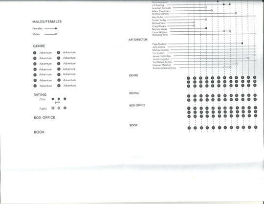
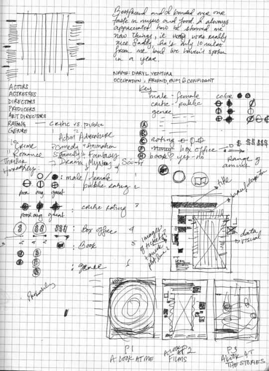
Photo
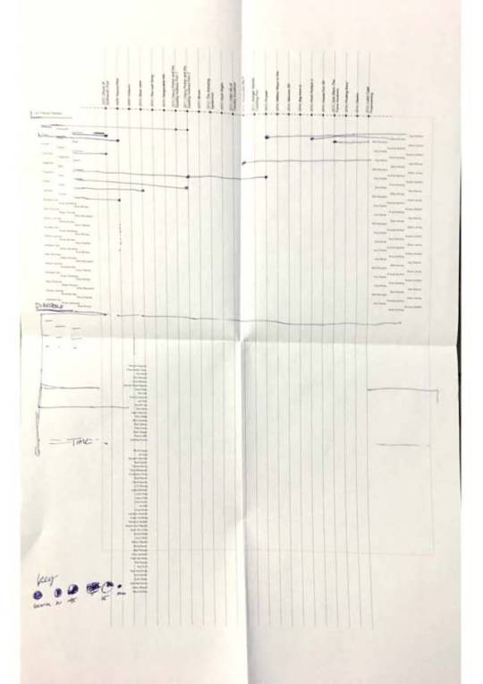
Information Design—First Round of Roughs
These are initial rough concepts. I was originally doing a set of 3 posters, so for much of this process I’ve shown 3 different design concepts. Here displays an overall look I was using for the posters, and doing one poster at a time but thinking of the next one.
-----
I can’t believe I sold my teacher on this vague concept with just lines and placeholders. I was incredibly nervous but I guess she saw something in it?
0 notes
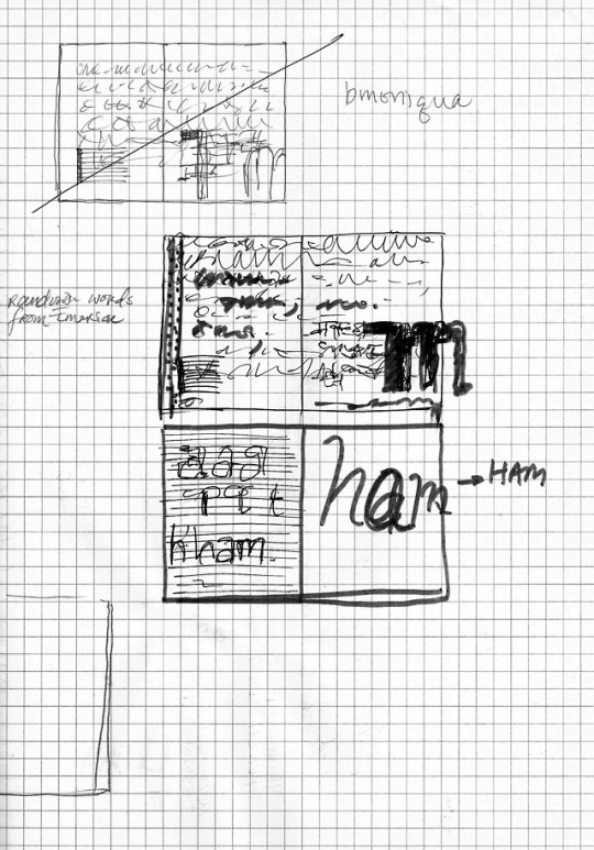
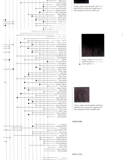
Photo
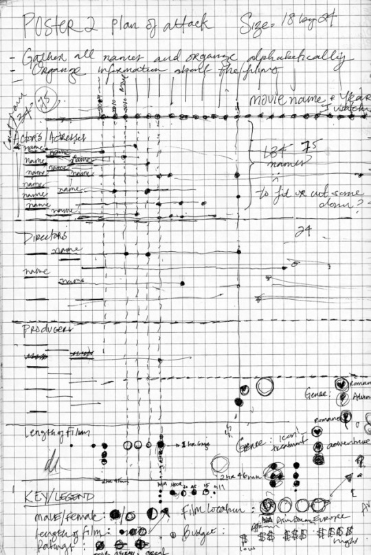
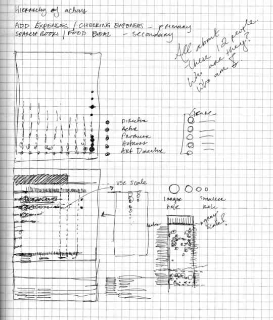
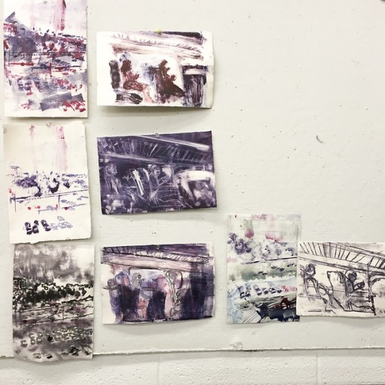
Information Design—Notes, Sketches, and Concepts
These are images of my sketches and notes from the three posters over the course of this project.
0 notes