
Last Seen Blogs

baylardo
The attack on Pearl Harbor was a surprise military strike conduc

sp1derg1rlz
LOL

daphnensunshine
Me,Myself, and Stuff?

minotehren-blog
M!no'

cpn86457
ナイネス の ブログ✩
Text
LIS 4317 Final Project
Dataset:
https://www.kaggle.com/datasets/kumarajarshi/life-expectancy-who?resource=download
Dataset is a compendium of data collected from WHO and UN publications.
Problem description:
Life expectancy primarily depends on the quality of life that those under the age of 18 experience and as such countries with high life expectancy should have limited issues with the longevity of children.
Related word:
In Module #9 for LIS 4370 a form of regression was used which is what I plan to use to visualize this data. As the goal is to simply find the relationship between major factors, I believe this is an easy method to present the outcome.
Module #7 for LIS 4317 will also be applied as some level of exploratory analysis will be required to properly represent the data.
Some old work from Data Mining when it came to stepwise regression and variable selection.
Solution:
To start with the dataset that I chose consisted of 22 variables and 2938 objects, of these variables Country and Year are relatively useless as the data I want has nothing to do with these values. However, before I removed them, I did some regression tests to see if the variables have any impact on the data for the y variable that I have chosen. Ultimately it was shown that Country and Year have little impact on Life expectancy with all the provided data.
After removing those two variables I set to correct any na values, as in this case na values are a result of the data not being collected at the time I didn’t want to just remove the rows. Since I can’t remove the rows, nor can I generate new ones due to limited data I decided to group the data by country and just take the mean of the variable to replace the na. This approach is not perfect and is undeniably biased, however, the loss of data would have prevented any form of proper analysis and thus this was my only choice.
Following cleaning the data I decided to do some simple model creation to get an understanding of the data. I started with a full model of all the variables, and then followed with a step model with a reduction in both directions. Following the analysis of the model summary it became apparent that only a few variables have a strong impact on life expectancy based on the provided data. Following that I did another regressive model with a larger scope which showed the exact same conclusion.
After the initial test analysis, a proper model was created through the caret train function. The method used was cross validation with the model method being leap Backward. Since I wanted to represent the data in a clear manner, I decided to limit the variables to 3 as any more would be difficult to visualize without being overwhelming.
An analysis of the final model showed that the most important variables for life expectancy were adult mortality, child HIV/AIDS deaths within the first 4 years of life, and years of schooling.
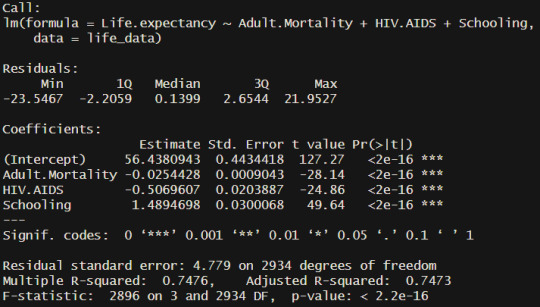
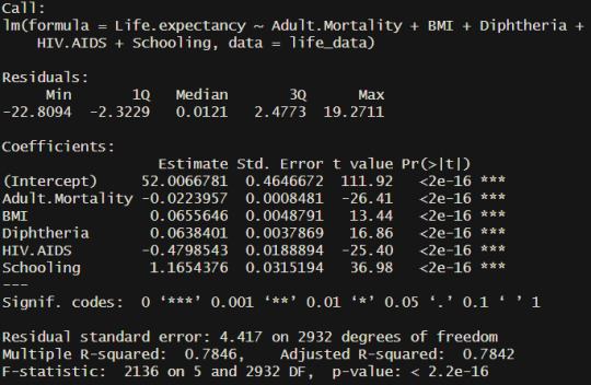
If the variables are allowed to be expanded to 5 then the extra two are country average BMI and tetanus vaccine percentage in 1-year olds. Ultimately these two additional variables do not add much to the model as the difference between results is quite negligible.
Results and discussion:
The two following graphics both represent the same information in slightly different ways in an attempt clarify any confusion.

The above graphic bring attention to the impact adult mortality and infant HIV/AIDS has on total life expectancy.
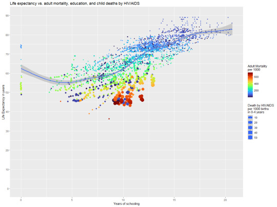
While this graph brings more attention to how the effect of education is more subtle in its impact.
Based on these two graphs and the analysis process I believe that my original hypothesis that “Life expectancy primarily depends on the quality of life that those under the age of 18 experience and as such countries with high life expectancy should have limited issues with the longevity of children.” was partially correct in that life expectancy is strongly tied to education and a Childs access to medical care. The strong impact of adult mortality does make sense on the surface, however, I do wonder if there is something more complicated with these numbers as adult mortality is rather general and the source of mortality could have major implications on life expectancy. Ultimately this analysis has made it apparent that more information is required before a more complete analysis can be done.
0 notes
Text
LIS 4370 Final project outline
So, the package that I have created is a Viterbi algorithm package which is intended to pre-process text for NLP work. The general premise of how the function works is that you provide a dictionary of and language and the text that you want to train it on. The dictionary is then trained so that any modifications to the text are done in context. After the dictionary is trained the Viterbi algorithm can be applied to separate fussed words or correct spelling mistakes. The algorithm is not perfect; however, it is one of the best methods that I have found for correcting these kinds of errors. In the following section I will demonstrate how to use the package and potential pitfalls of implementation.
The two following sections are simply demonstrating how the dictionary and text can look, for use with the viterbi algorithm.
> dictionary <- AlphaWords
> head(dictionary)
words
1 aa
2 aaa
3 aah
4 aahad
5 aahing
6 aahs
> sample_text <- SampleText
> sample_text
[1] "This is just an example of a kind of sentence that the viterbi algorithm can solve. Since it's trained on the used data it is important that the combined word showes up in its individual form atleast one in the data. For example, in this dataset the combined word will be wordshowes as that does show up in the dataset I will also add a typo for the word solv which may be corrected depending on the dictionary that is provided. Though since solve shows up a few times I think it'll correct to solve on as desired."
The first step to working with the viterbi algorithm is to process the dictionaries as certain characters can cause issues with the algorithm in its base form.
> dictionary <- populate_dictionary(dictionary)
> head(dictionary)
words
[1,] “aa”
[2,] “aaa”
[3,] “aah”
[4,] “aahed”
[5,] “aahing”
[6,] “aahs”
Following the dictionary processing the dictionary needs to be trained for use with the viterbi algorithm which is done as follows. This will create a hashed dictionary which is a simple data structure that has a key value pair similar in a sense to a list however much faster and more data efficient.
> viterbi_list <- train_viterbi(sample_text, dictionary)
vitberi_list[[1]] will be a hashed dictionary
vitberi_list[[2]] will be the total number of words
vitberi_list[[3]] will be the longest word in the dictionary
> hashed_dictionary <- viterbi_list[[1]]
> total <- viterbi_list[[2]]
> max_word_length <- viterbi_list[[3]]
This can be mapped to a dictionary and run on every word if desired, however, the text is small, so I’ll just use the words function to separate the text. Following the trained dictionary each word of the sample text can be run through the join_words() function and corrected.
> for(word in words(sample_text)){
processed_text <- join_words(word, hashed_dictionary, total, max_word_length)
}
> processed_text
[1] " this is just an example of a kind of sentence that the viterbi algorithm can solve since it's trained on the used data it is important that the combined word showes up in its individual form atleast one in the data for example in this dataset the combined word will be wordshowes as that does show up in the dataset i will also add a typo for the word solv which may be corrected depending on the dictionary that is provided though since solve shows up a few times i think it'll correct to solve on as desired"
Now it’s important to note that not much has changed in this sample dataset and this makes complete sense. While it is true that the viterbi algorithm will correct texts that are fussed or misspelt it generally requires quite a large training dataset to be used properly. In this case the dataset is only a few sentences and thus it’ll have little to no coercion over how words should be spelt. Ultimately the algorithm is just a probability comparison and if the typo shows up just as much as the correct spelling or if the typo is actually just an uncommon spelling of a word, then the algorithm will simply choose which shows up first.
0 notes
Text
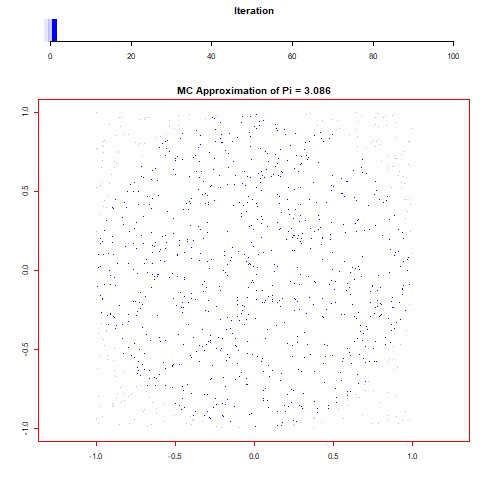
LIS 4317 Module # 13 assignment
For this assignment I wanted to create an animation from randomly generated data and the first thing that came to mind was some form of Monti Carlo simulation. With that in mind I thought of a few different simulations and came to the decision to find pi through the calculation of randomly distributed dots by taking the sum of all x^2+y^2<=1^2 over the number of runs and multiplying it by 4. Through repeating this process 100 times over 100.000 values I was able to find that pi is 3,13616 which is incredibly close to the 3,14159.
I found the process of creating the animation quite simple after reviewing the examples that were provided. I quite like how much more information can be conveyed when showing data this way, however, it was incredibly time consuming to create all of the plots required to show large data (even with shortcuts taken in how much is changed per frame) and it was difficult to validate results given the time required. Despite all of this though, I believe this is an interesting and fun method of presenting information.
0 notes
Text
LIS 4370 Module # 12 Markdown
I didn’t really end up learning anything new in this assignment as I have had previous experience in R Markdown and LaTeX. When it comes to R Markdown I was required to use it for a year to submit weekly R assignments and for LaTeX I was required to use it for assignments when I was a physics major. Outside of this I don’t believe there was anything too interesting outside of a basic review of how markdown works and with how data is presented. It honestly reminds me of how wonderful tools such as Jupyter notebook are when it comes to the ability to have interactive data.
0 notes
Text
LIS 4317 Module # 12 assignment
or this assignment we were required to create a social network visualization through either excel or R. I decided to go with R as I prefer programming over tool manipulation.
For this assignment the first step was to find data that could be used as I didn’t find randomly generated data to be all that interesting. After searching for a little I found this site (http://upg-dh.newtfire.org/NetworkExercise2.html) which provided some example data for a Network exercise similar to this assignment but in a specialized software.
The data that was provided focused on the relationships between characters in a novel with separation for where in the story the characters relationships were referenced. With this data I created the following visualization.
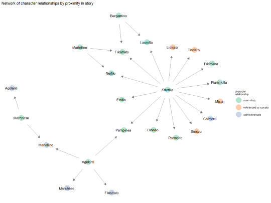
The above visualization shows the directional relationship between all of the characters while thee colouring shows where in the story their relationships were specified/clarified.
For this assignment I didn’t really run into any major issues as the data I found was quite straight forward to use. Honestly, the hardest part was just learning the syntax and finding a good palette that wouldn’t obscure any information.
0 notes
Text
LIS 4317 Module # 11 assignment
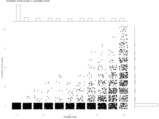
From the provided link the two graphs that stood out to me the most was Marginal histogram scatterplot and Marginal boxplot scatterplot. I found that these two graphs provided a significant amount of information while still being easily readable.
For the first graph I produced I wanted to do the simple Marginal histogram scatterplot with jitter to show the probability of hail vs the probability of hail severity. The histograms show that the data is incredibly right skewed on the x-axis and left skewed on the y-axis showing that on most readings there is a low probability of hail and that even if the probability of hail is high the probability of severity is generally low.
Following the Marginal histogram scatterplot I was curious about what information a boxplot could provide. From the below graph it is apparent that sever hail is an incredible outlier compared to all hail events and that the mean probability of hail is close to 25% with nearly 75% of all hail probability being under 75%. This graph helped provide additional insight that the original was unable to do.

I believe that the combination of these two graphs along with jitter provide a clear and concise image of the data. I also believe that this graph combination is incredibly powerful for exploratory analysis as they are easy to setup and provide a reasonable amount of information at a glance.
0 notes
Text
LIS 4370 Module # 11 Debugging and defensive programming in R
For the following code I found two bugs which are as follows:
tukey_multiple <- function(x) {
outliers <- array(TRUE,dim=dim(x))
for (j in 1:ncol(x))
{
outliers[,j] <- outliers[,j] && tukey.outlier(x[,j])
}
outlier.vec <- vector(length=nrow(x))
for (i in 1:nrow(x))
{ outlier.vec[i] <- all(outliers[i,]) } return(outlier.vec) }
For the first bug I found that the return function was sharing a line with the for loop and thus was unable to run due to an unexpected symbol error.
tukey_multiple <- function(x) {
outliers <- array(TRUE,dim=dim(x))
for (j in 1:ncol(x))
{
outliers[,j] <- outliers[,j] && tukey.outlier(x[,j])
}
outlier.vec <- vector(length=nrow(x))
for (i in 1:nrow(x))
{ outlier.vec[i] <- all(outliers[i,]) }
return(outlier.vec) }
For the second bug I found that the function tukey.outlier was undefined and was throwing a could not find function error.
tukey_multiple <- function(x) {
outliers <- array(TRUE,dim=dim(x))
for (j in 1:ncol(x))
{
outliers[,j] <- outliers[,j] #&& tukey.outlier(x[,j])
}
outlier.vec <- vector(length=nrow(x))
for (i in 1:nrow(x))
{ outlier.vec[i] <- all(outliers[i,]) }
return(outlier.vec) }
After reviewing the code I couldn’t find any more errors that stood out and as such I believe the code is working as intended within reason.
0 notes
Text
LIS 4317 Module # 10 assignment
For this assignment I found a dataset of hail data from the year 2015. With this data I was interested in creating some form of time series given that the data type aligned so well with the idea. As this is the case I created the following bar graph from the time series data.
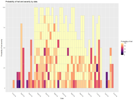
The above graph shows the probability off hail and the probability of hail severity over the year 2015. I believe that this graph is an alright representation of the data, however, there is a lot of overlap and confusion caused by how messy the data is. I couldn’t really find a good way to organize everything so that it would convey what I wanted and still be presentable. As this is the case I figured I would find a middle ground of preventability and readability which is what I’ve shown above.
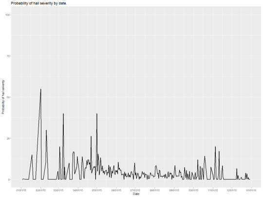
Following the bar graph I wanted to try a simple time series line graph and created what I’ve shown above. To clear the data up a little I too the average of all the data for a day and presented it as above. I do not believe the above graph is a good representation of a time series, the data is a little too chaotic and messy resulting in no real information being gained from it. I believe if instead of taking a sample of the data I tried to focus onto a single area maybe a county I would have a much better graphic.
0 notes
Text
LIS 4370 Module # 10 Building your own R package assignment
For this assignment I created the following DESCRIPTION file for my R package.
Package: LIS4317.Module10
Title: Bitwise grouping
Version: 0.0.0.9000
Authors@R:
person("Lilith", "Holland", , "[email protected]", role = "cre",
comment = c(ORCID = ""))
Description: Compairs two composite elements in a sorted bitwise list to test if they share composite elements.
Depends: R (>= 3.1.2)
License: MIT + file LICENSE
Encoding: UTF-8
Roxygen: list(markdown = TRUE)
RoxygenNote: 7.1.2
LazyData: true
Generally when being required to make an arbitrary package name for a project I struggle, however, in this case I was already working on a personal project in python and figured I could use that as a basis for this assignment.
For my personal project I want to find every possible combination of ratios from a set list and then find the combination with the smoothest transition between sub elements such that the rate of change is never too extreme.
As this is my goal I figured a fast way to test combinations would be to simply use a bitwise and operation on a list of ratios that have been converted to simple binary values. If the ratio is used it’s a 1 if not a 0, by doing this comparison I am able to go through millions of combinations in a reasonable time.
Now to describe the DESCRIPTION file for the assignment.
Title:
For the Title I figured I would just focus on a package that specializes in translating and grouping the binary values.
Version:
As the inner workings of the package are being sorted and there is currently no code the version is just left as in development.
Authors@R:
For this I put myself as creator and left an empty ORCID as I had nothing to put there.
Description:
Outside of the typo the description is a super short version of the wall of text above.
Depends:
As this is a blank template still the only dependency is the R version.
License:
I’m not too sure on what license to use and figured the MIT license could never really hurt me given it’s fair use purpose.
Encoding:
Base encoding of UTF-8.
Roxygen:
This is auto generated by Roxygen.
RoxygenNote:
This is also auto generated by Roxygen.
LazyData:
Suggested by assignment for better memory behavior.
0 notes
Text
LIS 4370 Module # 9 Visualization in R
this assignment I wanted to create three common visualization types that can be done with base R. For that I started with a basic scatter plot matrix.
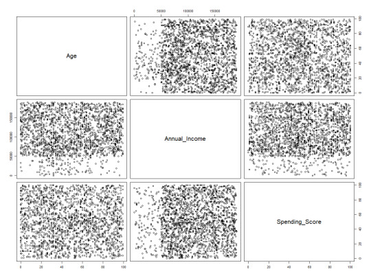
his plot shows the relationship between non categorical data and is a great tool to quickly review the relationships between sets of variables. With the data above there isn’t anything especially interesting however, it isn’t uncommon for trends to appear at this level.
For the next common graph type I decided to plot a standard scatter with a fitted regression line.

This plot type is a great tool for presenting the relationship between two variables in a clear concise way. The fitted line also allows for the data trend to be interpreted assuming in this case the data is linearly related. A better example of this graph would be one with confidence intervals however, that would require more effort than is worth in base R. This graph specifically shows that there is little to no direct relationship between income and age.
For the final graph I wanted to present something beyond just a scatter plot and decided to do a histogram as it is another powerful tool for visualizing trends and grouping data.
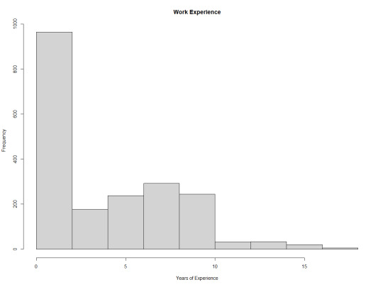
The graph shows that there is a strong right skew in the data and that most individuals in this data set have no work experience.
0 notes
Text
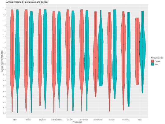
LIS 4317 Module # 9
For this assignment I wanted to take the dataset I used before and represent it from a different perspective. Previously I made a multivariate heatmap so this time I decided to do a multivariate violin graph with a focus on the different income by profession and gender. To give context I also decided to add the bar plot so that the distribution can be understood along with the distribution.
0 notes
Text
LIS 4317 Module # 8 Correlation Analysis and ggplot2
For this assignment I decided to use the customer data set provided by https://www.kaggle.com/datasets/datascientistanna/customers-dataset
This dataset contains 2000 entries with 8 columns CustomerID, Gender, Age, Annual Income, Spending Score, Profession, Work Experience, and Family Size. From this information I removed CustomerID as it has no value and I also removed Gender and Profession as the cor() function dislikes factors.
With the data as is I decided to find the cor() of the data and replace the diagonal 1s with 0s as to make the data more readable resulting in the following graph:
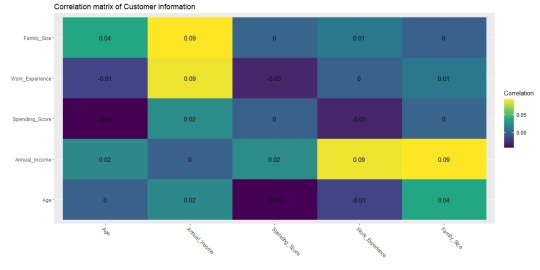
With this graph it is apparent that there are no strong correlations with the data and that a different approach should be used. Despite this though, as a proof of concept I decided to find the contour of the correlated values Annual Income ~ Family Size + Work Experience. With these variables I created the following graph:
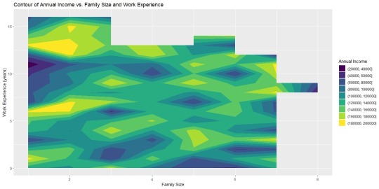
While this graph looks rough and incomplete this is the best I can do without generating synthetic data to smooth out the variables. Despite these rough edges however, it is apparent that there are highs and lows within the relationship of salary, family, and experience. It is apparent that those with the most work experience and lowest family size will make more money than those who have a large family and no experience. However, again it is important to remember that these variables do not actually have a strong correlation and a different approach would be able to more accurately represent the data.
0 notes
Text
LIS 4370 Module # 8 Input/Output, string manipulation and plyr package
While I do understand the importance of knowing why and how things are done on a more fundamental level, I found this week’s work rather confusing. I think my biggest issue was that I already have quite a bit of programming experience with python and R and that because of this I have a biased view of how things are done. Generally, with class work I’ve found it incredibly difficult and uncomfortable to go against the practices and techniques that’ve become standard in my every day coding. Moving on from that I will say that my biggest takeaway for this week’s work is the ddply function as it’s not something I’ve ever used before. Generally, when working with data I tend to work with dplyr not plyr so I have little experience with the ins and outs of the package. I am curious however, about the reasoning behind the use of read.table rather than something like read.csv. I and the use of write.table rather than write.csv, I do understand that the approaches produce an identical result. But I’m more curious of the reasoning to choose one option over the other.
0 notes
Text
LIS 4370 Module # 7 R Object: S3 vs. S4 assignment
a quick test to determine if an object is an s3 or s4 type can be done as follows:
> is.object(mtcars) & !isS4(mtcars)
[1] TRUE
Based off of this it is apparent that mtcars is an s3 object this could also be determined simply by acknowledging that any data frame uses $ to address variables
> mtcars$mpg
[1] 21.0 21.0 ...
The ability to use $ instead of @ also shows that mtcars and for that matter all data frames in R are s3. As mtcars is an s3 type object a generic method could easily be created and applied.
The easiest way to determine if an object is s3 or not would be to do is.object(object) & !isS4(object) as if something is an object but not s4 it must be s3 You can also determine what object system an object is associated with through the use of $ and @ as an object can only use one. It's a crude test but rather simple. You could also use pryr::otype(object), or str(object) = formal class
To determine the type an object is you can simply use the function typeof(object) which will return list, int, double, bool, etc...
For s3 a generic function is a function that does not belong to any specific objects or classes and can be tested by typing the function name and seeing if UseMethod is called in the function. For s3 any method belong to the classless function rather than any specific class or object.
For s4 a generic function belongs to the class or object and cannot be called directly outside of the class unless through a method.
The largest difference between s3 and s4 would have to be safety as s4 has more checks and also a more rigorous system for creating methods and functions that are able to be class dependent.
0 notes
Text
LIS 4317 Module # 7 assignment
Starting with the mtcars dataset I decided to do some basic exploratory analysis to see if there are any standout variables.
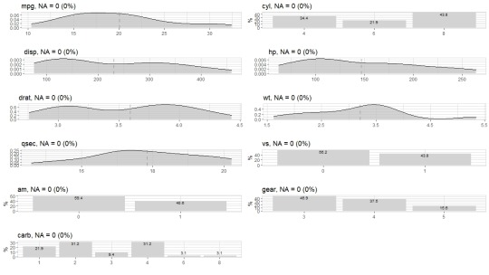
Based off the variables in the dataset I found that mpg was the most interesting to focus on as I can conceptually understand how variables are connected. Another option would have been hp as again I can see how that variable could be derived from say cylinders, displacement, and carb.
Moving on from the broad exploration I decided to do a more focused view on mpg to see if there are any standout graphs.
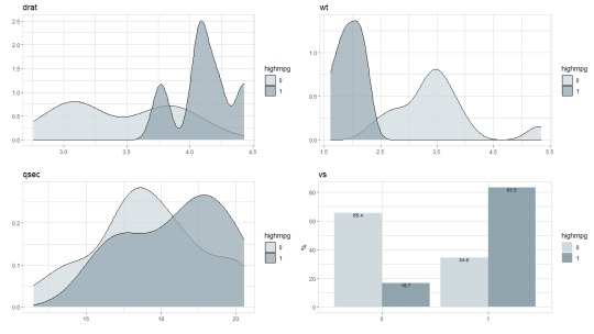
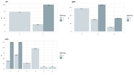
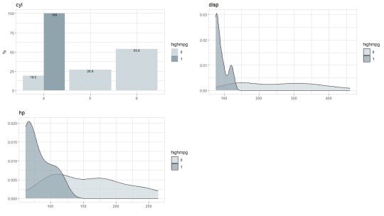
From these graphs it is blatantly apparent that high mpg vehicles are skewed one way or the other. As this is the case, I decided to do a stepwise regression in an attempt to narrow down the independent variables. Through the creation and optimization of the linear model I found that the weight and quarter mile times had the largest impact on the vehicle’s mpg.
From this information I decided to plot mpg vs. weight and quarter mile time with the main point being weight and the colour being quarter mile time. From that I had created the following graph:
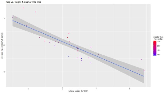
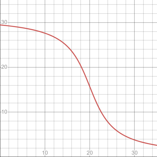
This graph shows that there is a rather linear relationship between weight and mpg and that the lower the quarter mile time generally the better the mpg. I believe that this is an okay graph for showing the data that has been provided, however, I do have some issues with the linear model as you would expect the data to follow a curve like below given that there is a min weight and a max speed. Despite this though I do believe the graph I have present to be okay at displaying a narrow band of mpg information.
0 notes
Text
LIS 4317 Module # 6 assignment
I chose the AER SmokeBan Do Workplace Smoking Bans Reduce Smoking? dataset from https://vincentarelbundock.github.io/Rdatasets/datasets.html as the basis for my analysis. This dataset consists of 7 columns smoker, ban, age, education, afam (african american), hispanic, and gender. With these columns I decided to explore around gender and age specifically using some basic exploratory analysis as shown below:
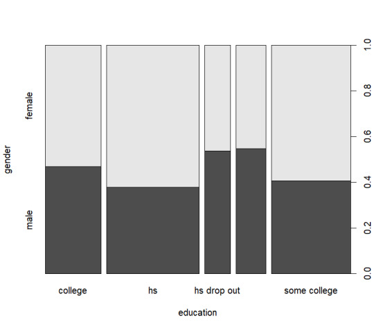
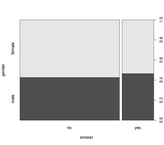
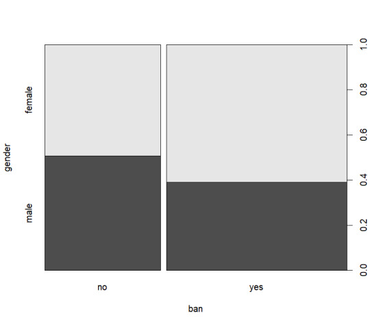
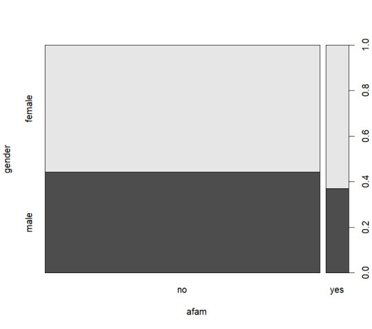
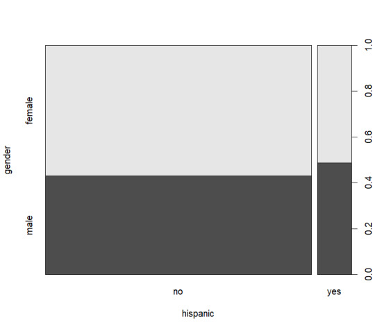
From these graphs I decided that a view on age, smokers, and smoking ban would be the most logical as nothing quite stands out as significant.
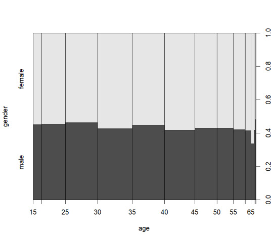
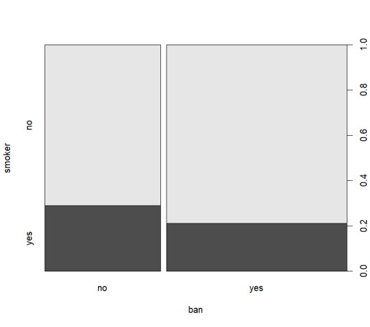
With this in mind I wanted to create a graph that would compare the total number of people who are under a smoking ban vs the number of smokers. Or rather to say I wanted to know how many people smoked when there was a smoking ban vs when there was not a smoking ban. With that in mind I created this graph:
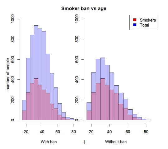
This graph shows that there are more people who are under a smoking ban however, the percentage of smokers under the ban is only around 1/2 while the percentage of smokers without the ban is closer to 2/3. This clearly shows that the ban has some impact on the percentage of smokers. The graph also shows that the largest discrepancy in smokers to non-smokers is in the 25-50 age range.
I believe this data fits Yau’s view as the graph clearly shows the important part of the data the smokers vs. total with a ban and without a ban allowing a clear image to be made in a concise manner. The dual graphs also allow a direct comparison to be made between the ban and no-ban results, however, I do believe normalizing the data would make the graph even more readable as the current layout does require some extra interpretation.
I’m not 100% certain that this graph gits Few’s view as the data could be normalized and cleaned a little further, however, despite this I do believe the graph I have created is a decent tool in allowing one to understand the general idea that is trying to be conveyed. I also believe that the labels could have been cleaned up more for the final result however, without using an additional package I was not sure how to get any further than what I have achieved. With all of this in mind I believe that the graph I have presented with the addition of normalization would fit Few’s views.
0 notes
Text
LIS 4370 Module # 5 Doing Math Part 2
Starting with matrix A:
[,1] [,2]
[1,] 2 1
[2,] 0 3
and matrix B:
[,1] [,2]
[1,] 5 4
[2,] 2 -1
adding the two matrixes together results in the following matrix:
[,1] [,2]
[1,] 7 5
[2,] 2 2
because matrix addition is simply the addition of each relative matrix element, that is to say element 1,1 of matrix A is added to element 1,1 of matrix B and this applies to every following element.
The same is true when subtracting the two matrixes:
[,1] [,2]
[1,] -3 -3
[2,] -2 4
In this case instead of adding each element the two elements are subtracted from each other with the first matrix being the leading number.
After doing basic matrix addition and subtraction the creation of a zero matrix with only diagonal eliminants is done through the following script:
diag(4)
[,1] [,2] [,3] [,4]
[1,] 1 0 0 0
[2,] 0 1 0 0
[3,] 0 0 1 0
[4,] 0 0 0 1
diag(4)*c(4,1,2,3)
[,1] [,2] [,3] [,4]
[1,] 4 0 0 0
[2,] 0 1 0 0
[3,] 0 0 2 0
[4,] 0 0 0 3
By using diag(4) an identity matrix is created, afterwards multiplying the identity matrix by the vector results in each of the values being multiplied by its relative value resulting in the desired 4, 1, 2, 3 diagonal matrix.
For the final matrix I wasn’t too sure how to approach the problem as there are a few different ways so I decided to create a 5x5 zero matrix:
C <- matrix(0, 5, 5)
[,1] [,2] [,3] [,4] [,5]
[1,] 0 0 0 0 0
[2,] 0 0 0 0 0
[3,] 0 0 0 0 0
[4,] 0 0 0 0 0
[5,] 0 0 0 0 0
Then I replaced the first row with the vector c(0, 1, 1, 1, 1):
C[1, ] <- c(0, 1, 1, 1, 1)
[,1] [,2] [,3] [,4] [,5]
[1,] 0 1 1 1 1
[2,] 0 0 0 0 0
[3,] 0 0 0 0 0
[4,] 0 0 0 0 0
[5,] 0 0 0 0 0
Following this I replaced the first column with the vector c(0, 2, 2, 2, 2):
C[, 1] <- c(0, 2, 2, 2, 2)
[,1] [,2] [,3] [,4] [,5]
[1,] 0 1 1 1 1
[2,] 2 0 0 0 0
[3,] 2 0 0 0 0
[4,] 2 0 0 0 0
[5,] 2 0 0 0 0
Finally I added a diagonal of 3s to fill out the matrix:
C <- C + diag(3, 5)
[,1] [,2] [,3] [,4] [,5]
[1,] 3 1 1 1 1
[2,] 2 3 0 0 0
[3,] 2 0 3 0 0
[4,] 2 0 0 3 0
[5,] 2 0 0 0 3
After creating this final matrix I am inclined to say that there is a better method to doing this, however, I am not sure what it is. I believe this to be the case as the amount of effort required to build this matrix was excessive and required a lot of manual input. I bet sweeping across a zero matrix and then applying the diag() might be a faster method to creating this matrix.
0 notes