
molly-h-art-blog
Molly Hooper
UAL Diploma Student.
45 posts
Don't wanna be here? Send us removal request.
Last Seen Blogs
the-inquisitor-spaceship
𝑇ℎ𝑒 𝐼𝑛𝑞𝑢𝑖𝑠𝑖𝑡𝑜𝑟

thecrew357
Sr.Dhaa And Mr.Skull's

bingxxx
BingX

ps-dipper
DIPPER
Text
What I learnt
Learning about animation has been a process involving learning various techniques such as sculpting plasticine models, designing a character and working with colour. I created drawings and hand-rendered them digitally using Illustrator. I learnt to work with acetate in the style of Marty Cooper to draw my animation frames onto them. This taught me about perspective, character design and using the environment. When working with claymation, I learnt about sculpting, using sculpting tools and working with a camera. I learnt about using various materials and working within the timing when I was in the making of something inspired by James Gulliver Hancock.
I found what I learnt useful when working on my final animation from my past projects in terms of knowing what to do.
1 note
·
View note
Photo
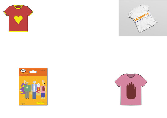
This is a concept board of possible merchandise ideas for my animation.
It includes T-shirt designs in the style of those worn by the characters, a T-shirt mock up featuring the logo and packaging for a mystery bag toy series.
2 notes
·
View notes
Link
This is my completed animation. It is about a group of anthropomorphic animals visiting Japan.
I could’ve made it better by removing some of the unwanted lines on the characters, showing more of the characters’ personalities and making the transitions smoother.
The music that I used is ‘Firecracker’ by Yellow Magic Orchestra, as my Tutor suggested that I use it because it has a catchy melody, fast pace and a Japanese sound.
I think it works well because the timing with the music is good, especially as the plane flies off.
3 notes
·
View notes
Photo
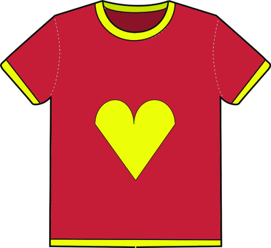

This is an example of the type of merchandise that would be created for my animation to promote the Travimals brand.
I have researched other merchandise aimed at my target audience, and have tried to make the colours bright and keep the design simple to appeal to young children.
I have other ideas for products, such as wrapping paper, lunchboxes and stationery.
3 notes
·
View notes
Text
Working in Premiere
I struggled to organise my project in Premiere because some of my frames were too large and in the wrong order.
I fixed this by resizing them in Photoshop and re-pasting them.
1 note
·
View note
Photo

I have changed my logo so the colours do not clash and the subtitle is not too distracting.
The colour of the subtitles from a dark brown to a lighter blue colour so it is not too harsh. I have also changed the size of it to balance the logo a little more.
In the opening sequence, the letters move in different ways. For example, the ‘Travimals’ logo bouncing in, the ‘explore’ letters rushing into the frame before suddenly stopping and reacting in a rubbery motion, and the ‘explore Japan’ words bumping into each other like a Newton’s Cradle, all with their fitting sound effects.
2 notes
·
View notes
Photo
This is the final scene of my animation. I have created a GIF of it to see if it runs smoothly and I need to fix any mistakes.
I like the way everything moves smoothly and how it transitions from day to night.
I could improve it by making the characters move up the stairs at different times and speeds, as seeing them all move similarly at the same time looks unnatural and mechanical. I could also improve on the movement of the plane at the last part, as the arc of motion is jerky and impossible to do for a plane. I could do this by planning out where the plane will move within the scene beforehand so it runs more smoothly and looks more natural and believable.
1 note
·
View note
Photo

This is a logo experiment for my Animation.
The name “Travimals” is a combination of the word travel and animals.
I chose this name combo because I thought it was short and catchy.
I used the colour scheme because the colours contrast well, and it looked better and less harsh than orange with black.
I created the logo in Illustrator using the shape, typing and anchor point tools.
I think it went well because the colours, font and composition go well together and it fits in with the style of Al Murphy.
I could develop this logo by fixing the position of the patterns to make them more neat or natural.
I could experiment further by using the same logo with different colour schemes.
1 note
·
View note
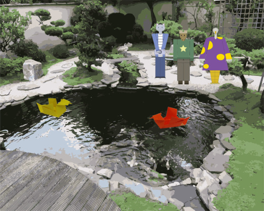
Photo
I have extended Scene Four and am happy with how it looks.
3 notes
·
View notes
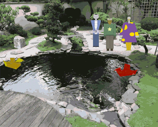
Photo
Reflection of Scene Four
The scene shows the characters observing ducks in a pond while the cat takes a photograph. The camera then zooms into the ducks where they paddle past each other.
I used the origami GIF that I created earlier in the scene, and when working with the GIF I noticed that the background colour contrasted too greatly, so I adjusted the levels and saturation of the images.
After playing back the scene, I realised that there wasn’t enough movement in the characters, so I am going to fix it by having the characters interact more by using props or doing more actions.
1 note
·
View note
Text
Reflection (16/05/19)
I created a GIF of scene one to check if it runs smoothly, and it wasn’t successful because some frames had a size that was too large.
It didn’t upload because the frames were different sizes, so creating this tester allowed me to check for any problems prior to uploading the frames to Premiere.
I will make sure to check for any size differences and keep them all 1000 x 800 PX to prevent any further problems.
I spent time resizing the oversized images.
I am going to continue working on the third scene and make sure that I have plenty of movement in the scene, such as flying kicks, jumping from walls and parrying, along with other karate moves.
1 note
·
View note
Photo
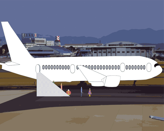
The final section of scene one depicts the characters getting out of the landed plane at the airport.
2 notes
·
View notes
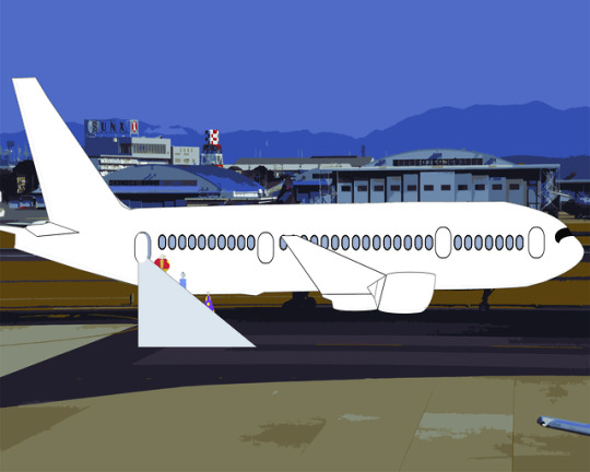
Photo
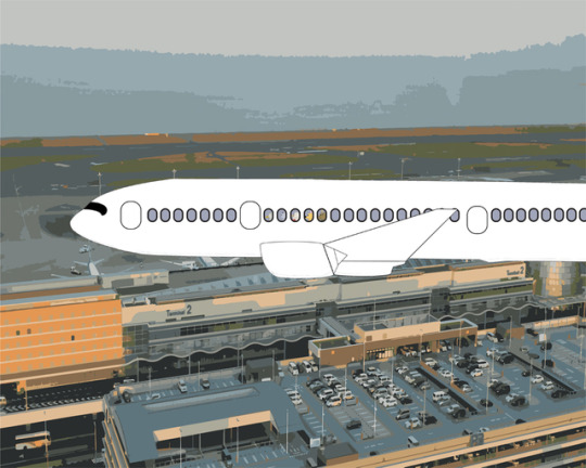
The second section of scene one depicts the plane landing at the airport.
2 notes
·
View notes
Photo
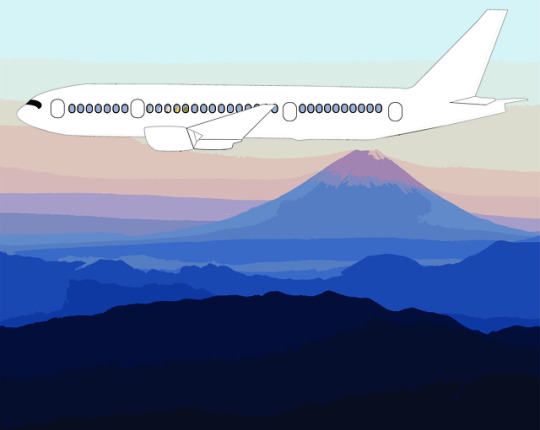
The first section of scene one depicts a plane flying over a landscape.
1 note
·
View note
Text
Reflection (14/05/19)
I have been creating frames for the first scene of my animation on Photoshop.
The scene shows a plane landing and the characters leaving the plane.
Everything is seen from the side.
My backgrounds are images of airports and landscapes that I stylised in Illustrator by using the 16 colour image trace tool.
The first background is a landscape featuring a mountain, the second background is an above shot of an airport, and the last one shows the airport at ground level.
I edited them by using the image trace tool to give them a stylised look.
The first section of the scene has the camera zooming in on a plane to where you can see the characters in the windows with the first background featuring Mt. Fuji.
The next section shows the plane landing at the airport from above.
The last section has the characters leaving the plane at the airport via a stair ladder.
I traced over a picture of a plane to give it a cartoony feel.
WWW: The look and effect of the backgrounds, smooth movements
EBI: Giving more movement to the characters
1 note
·
View note
Photo

This is an experiment with 16-colour image tracing on Illustrator to give stylised painting effect.
This is for my opening scene in my animation where a plane is flying over the Japanese landscape.
I like the look this effect creates, and I will be using these backgrounds in my project.
2 notes
·
View notes
Photo
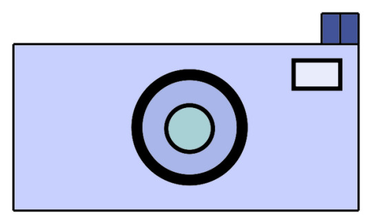
I have started creating props and accessories for my animation characters.
The one pictured here is a camera for the cat character.
My next target is to develop the story more by writing or storyboarding it in more detail.
1 note
·
View note