Last Seen Blogs

savisavichan
"I live to let you shine"

janet-grandchamp
Follow the day and reach for the ☼

howmanyresets
how many resets now?
psychologicaltraveler-blog
Welcome dear

evilmario666
EVIL MARIO.
Text
Evaluation
I carried out lots of secondary research, which helped me establish lots of things throughout my project. Such as my magazine sections, the elements of my trend forecast and my target audience.
Most of my primary research was made up of my own photoshoots, which were built upon my secondary research. I also carried out a primary research survey, which allowed me to identity current popular influences within my target group.
Throughout the year what I’ve found most difficult is distinguishing the most prominent uses between indesign, illustrator and photoshop, up until this module, they all blurred into one and I didnt know which application to use for what. Because this module was 3 months long and I was using all three of those applications throughout, I feel as though I am very familiar with all of them now, which makes me feel more confident moving onto my degree in September.
I think my main strong points are my photoshoots. I feel as though I planned them very thoroughly, which I think made some of my pages look very professional, the slip dress page for example.
One of my main weakenesses throughout the project was learning how to embrace negative space. I think I got the hang of it towards the end which resulted in some very good page layouts. Another thing I also found difficult was switching between writing for my blog and writing magazine content, and didnt quite realise how different the 2 styles are. I felt as though once I’d got used to writing for a magazine, I started to write in a more colloquial style towards the end of my blog, some of which I think sounds quite unprofessional.
Although this isn’t an improvement I myself could directly make, one of the ways I could improve this magazine is to get it printed elsewhere. The way the book was bound meant the last 3 pages began to fall out, which I attempted to fix using eyelash glue. As well as this, the ink on the outside of the bind has already started to scratch off, making it look old and scuffed, so I will have to potentially consider getting another one printed for the exhibition. An improvement I could make regarding the content itself is consider the midway point in each spread more carefully, thinking about the printing process the whole way through. For example, the magazine page that talks about pearls has a set of lips right in the middle of the page, which does not look good printed at all. I also regret not going with the silk paper option, I think it would’ve made the magazine look much more high end and luxurious.
This module definitely required lots of planning, particuarly for the several photoshoots I carried out. It was after the first one I realised how many things need to be predetermined, such as outfits, location and timings. As well as this, this is the first module in which I had to plan for the final outcome to be complete before the actual deadline, because it’s a magazine I had to leave time for it to get printed, which meant working out how long I would need. That was actually the biggest issue I encountered, although I had a consistent time plan it fell through slightly when I needed to send the magazine to print. This meant I was slightly strapped for time regarding my sketchbook, but thankfully I finished everything just in time.
On the most part my final outcome is successful, the majority of the pages look how I intended, and after having looked through the magazine after it was printed, I’m fairly sure there are no grammatical mistakes or errors which is something I was worried about; but something that frustrates me is the quality of the print. In term of layouts I think there are a few that are particularly weak, such as the lips page, which I would improve by simply swapping it out for an image that didn’t have a face exactly on the centre line of the magazine.
6 notes
·
View notes
Text
Back Cover
So that my magazine has a cyclical structure, I used a similar layout to the front cover, which doesn’t appear in any part of the magazine.

0 notes
Text
Cemetery Page Break Spread
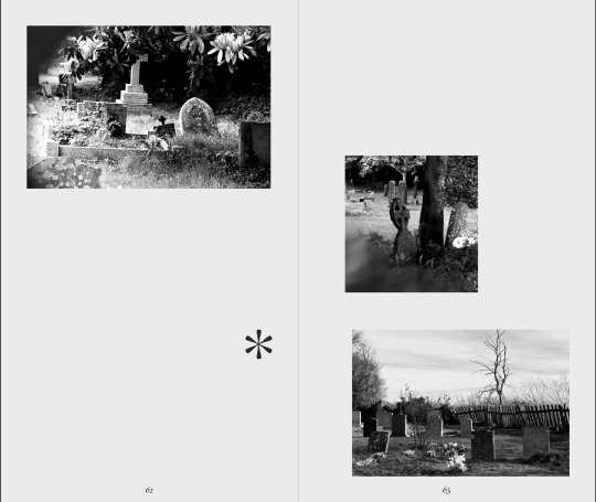
It took me a while to get to a point where I was happy with this page, again I began by laying them out symmetrically. Although its not something I would’ve kept anyway as it contradicted my entire magazine, I think the reason it looked so bad was the contrast between all the images combined with the very neat layout. Some of the images were edited more darkly than others, and they were all completely different levels of zoom.

0 notes
Text
Literature Spreads
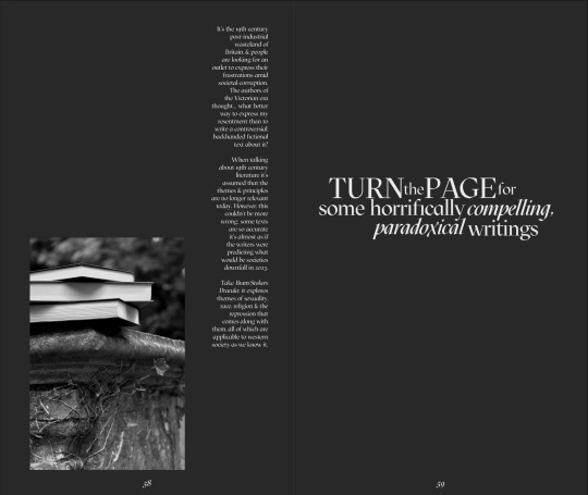
- I used this as an opportunity to make sure my music page wasnt the only one of its kinds, with the play on words with the “turn up the volume”. I remixed it and changed it to “turn the page for” and subbed gothic rock for horrifically compelling writings. I’m not sure writings was the best word I could’ve used, but I thought books was even worse, and the word fiction which would’ve been ideal in this context, doesn’t make sense in that sentence.
- I think even though my article writing research pointed me towards rhetorical questions as a good way to engage a reader, after writing one in the context of my magazine, it felt slightly gimmicky and unmatched to the style of writing I’ve tried to maintain throughout. I think its almost muted by the rest of the text so I left it in, because the introduction of the text which I thought was really effective wouldn’t make sense without it. I thought a good way to make something such as gothic literature interesting and to appeal to my audience, would be to make a comparison to present day, a time period in which my audience are familiar with, so I tried to emphasise how similar the time periods were in terms of the themes they used to write about.
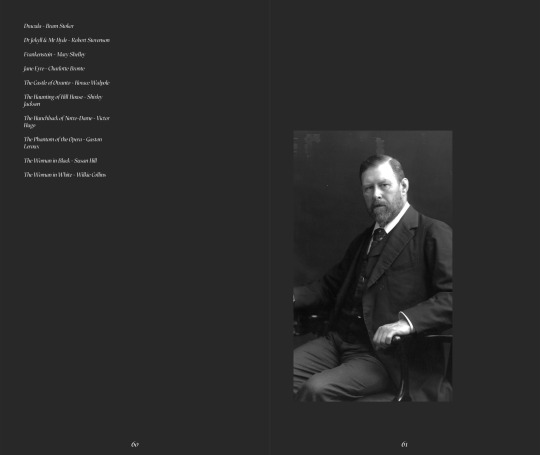
- All throughout my magazine I’ve made sure that no element is stand alone, any type of layout or whatever is repeated at least once to avoid anything looking out of place, which I wanted to make sure was the same for the artwork of Mary Shelley. To balance it out I included an actual photograph of Bram Stoker in a much smaller size, to have something that links but isn’t exactly the same, making even my content a tad asymmetrical and building on that theme. I also put the names of the books in a similar format to how I laid out the songs, in the top left corner but on opposing pages.

0 notes
Text
Colour Spreads

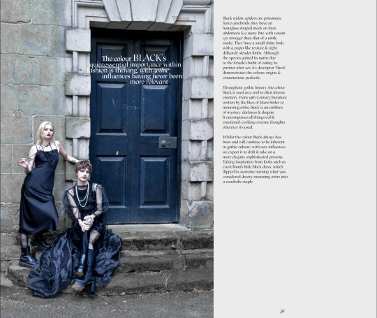
The first colour page I did was based on black, with it being one of the most engrained elements in gothic culture I wanted the page to be good. I thought the image I used was very relevant, firstly because both outfits in the image are built upon the colour black, aswell as the huge black door in the background. I think the black door particularly is very effective, its sheer size makes it look very grand and emphasises its importance. Paired with my use of the word quintessential, I think the accentuated importance is clear.
Although it’s similar to how I attempted to add context behind the pearls by explaining where they came from, I think using the same technique but with a black widow spider was actually quite successful. Because the origin of the pearl has absolutely no connection to the goth subculture whatsoever it was completely pointless. However spiders are a common motif amongst gothic elements such as fiction and decor. Not only that but because black widow spiders have a red mark on them, its even more relevant because black and red and two of the three colours in my predicted trend
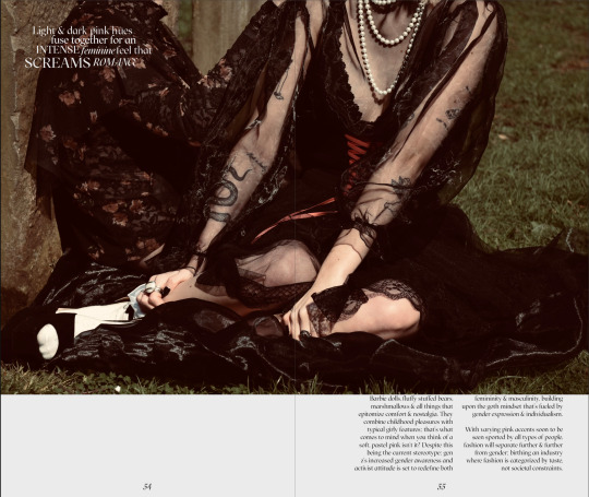
I had quite the conflict with myself over the pink page. Because I wanted to demonstrate the pinks as being accents, I chose an image where both outfits had pink detailing on them, the ribbon on the right and the floral pattern on the left, but I feared it wasn’t obvious enough even with the warm editing. So I edited the image further accentuating the red and pink tones, which as you can see makes the pink shades much more noticeable and even put a pink undertone on the image. However, I think that almost over did it, and kind of contradicted the mostly muted theme throughout the rest of the magazine. So I went with the original edit.
I also struggled with deciding how to lay out the phrase on this page, I thought of having the word “screams” much larger than all the other words similarly to the “volume” on the music page, but after testing it I felt it looked too obvious and slightly gimicky, contradicting the general serious nature of everything else.
I experimented heavily with column sizes and amounts on this page; i knew i wanted the image to cut off at the top of the page because otherwise their heads would look like they’ve disappeared.
To write the colour descriptions and phrases I started by sussing out their connotations, and writing them out to see if any ways of playing the words around sprung to mind. I really like the way they both sound
I initially wanted a red colour page, but I felt as though my description would be similar to that of the pink page, and didnt want to add anything in unnecessarily. However I added in a full bleed image in which my models red lip and jewellery was very obvious, so I still included it within the colour section.

0 notes
Text
Gothic Rock Spread

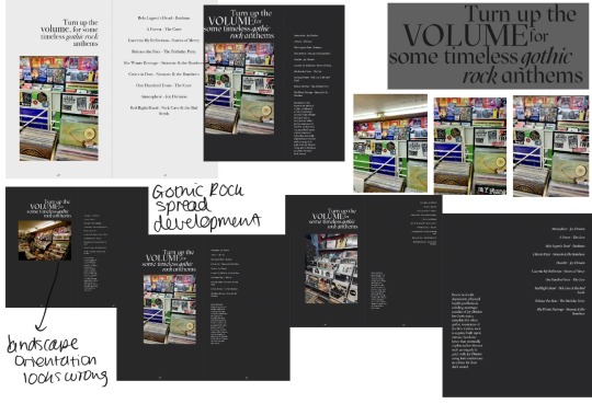
- I chose this photo bearing in mind the problem I encountered with the music culture catalyst spread; making sure the first thing you’re eyes are drawn to isn’t something completely irrelevant. The most prominent words within the photograph are stickers in the foreground of bands such as Green Day, as well as indie / metal /hardcore in the middle ground in bold black capitals which is much more appropriate. As the photo was originally very rich in colour similarly to the others I took in the Oasis market, I decreased the saturation which gave it a much more neutral look.
- In order to compile the list of what I have deemed “timeless gothic rock anthems” I took the top songs the most influencial artists in the 80s gothic rock period according to my research, including Bela Lugosi’s dead, which is believed to be one of the songs that kickstarted the movement.
- Similarly to my piece on architecture, I wanted to describe what contributed to and the features of gothic rock without sounding like a robot. So knowing the key themes and facts around the music and having them in my prior research, i used them combined with an example to create a more anecdote style piece.
- Similarly to my inside the wardrobe page this page initially had huge text on it, because I felt the need to fill the space. Part of me thought that having the text box the same width as the photo would look intentional, but this was before I set font and text box size limitations.
0 notes
Text
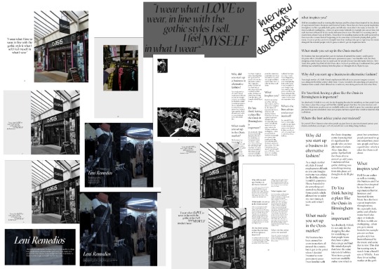
Interview Spreads

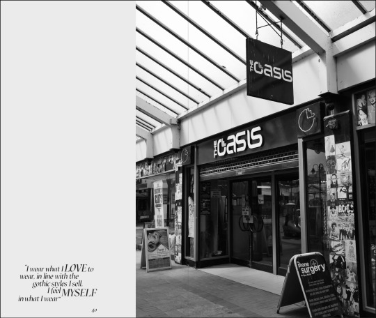

I think these 3 spreads are probably the weakest amongst all the pages. Because most of the spreads in the magazine are very image heavy, having so many words with lower quality images I found difficult to layout, especially in the layout style I had established at this point. Firstly, the lighting in the shop was really quite bad, so before I made the photo much cooler and eradicated the yellow it was completely unusable. Aswell as this I think the general style of images across the magazine is very editorial, I undertook lots of planning for my shoots and I think that’s clear in the images. However it was difficult to plan the Oasis market because I couldn’t control the conditions; for example the photo of the front of the market. There are so many distracting irrelevant signs in the foreground and background; and it completely takes away the professional aesthetic I was aiming for across the board. Similarly, the walls of leniateliers were made from a cork like material, which I thought made it look under contrsuction and overly contrasting of what was being sold but again, it was out of my control.
In terms of layouts for the first 2 spreads I kept the same full page images that bleed slightly onto the opposite page, which I think the more I build upon it is a really effective feature right through the magazine. I tried something a little more unique for the spread with the interview answers on it. I thought it was interesting to have a photo of the masks which are a small object in a large size, and the photo of the dress which is large in real life as a smaller image. I dont want to go as far as saying it’s like an optical illusion but I do think it’s engaging.
0 notes
Text
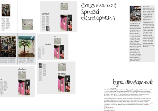
Oasis Spread

- Found tricky because even though I wanted to showcase the Oasis for what it is, lots of the interior is very bright, and as you can see the first images I used were so bright it really contradicted the rest of the magazines palette, so I tried muting some of the images.
- Titling on the edge of factual and uninteresting, but I think the first sentence tones it down.
- Lots of the photos I tried to used just clashed because of the intense colours.
0 notes
Text
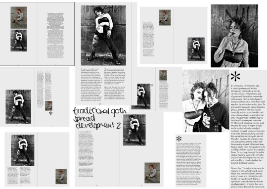
Third Traditional Goth Spread

Again referring back to my research on how to write for a magazine, I built the text on this page around an anecdote. However, instead of just having it as the introductory statement, I had it take up the entire first paragraph. I wanted to give my readers a sense of understanding of what being a goth in the 80s was like, without sounding like a fact machine that just lists the things they did and what they were in to. So I tried to write an anecdote that emmerses my reader in the situation, as if they were a goth in the 80’s. I attempted to achieve this firstly by activating their senses, detailing the things they can see, here feel and smell, aswell as this, the outfit I described is loosely based on the outfit from my photo shoot, and having that as refernce alongside the text would help my reader to build a picture in their head. I also made comparisons that are easy for most people to imagine, for example I used the Joker as a reference, which I think most people are familiar with.
Despite the variety of layouts I trialled for the two images I used a similar technique as I did in the previous page, creating quite a contrast in size between the two images. I was also undecided on where I should place the star, but I really like it lined up with the text above it because it almost looks like a bullet point thats notifying the reader to look at the text.
0 notes
Text
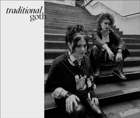
Traditional Goth Spreads
This page is one of my least favourites, and was one of the hardest to make look decent.
Even though I didnt label it as a culture catalyst, I wanted a section on the traditional goth, referring to the original 80s goth subculture because its what all this history and culture I’ve research resulted in. For the white shirt shoot I did a while ago, I tried to communicate every element of goth i had researched which I talk about on the post so I think it was only fitting to use that shoot for this section.
To begin with I had the title sideways against a photo of my two models against a white tile background, which I later realised didnt comply with my magazine rules. I was originally happy with this image, and it wasn’t until I viewed the page in presentation mode that I realised it looked slightly fuzzy, despite the fact the photo uploaded in a very large size to Indesign. Strangely I had the same issue with other photos from this shoot, but I eventually found one which is on the final spread that was completely clear. However that then presented me with the issue of the title colour being quite similar to the colour of the stairs in the image, so the overlapping of the title and the image which was consistent throughout the magazine might not of worked, so I printed the page out to check and it was visible but slightly faded into the background. So i moved the title to the left so only part of the h was overlapping the image, and even though that part was slightly not visible I asked some people in class and they all said they read it as a h easily so thats how I left it.
- Something I struggle with is embracing negative space, so finding a layout I deemed effective for just 2 images was difficult. In the early days of the spread I had the two images the same size centralised on each page, but as the magazine developed I realised that there shouldn’t be any centralise elements. After fiddling around for a while I realised the way to go was having them completely different sizes, to create an interesting contrast. I then placed them in opposite corners of the spread building on the asymmetrical pattern, but still keeping within and pushed against the purple margin for uniformity.

0 notes
Text
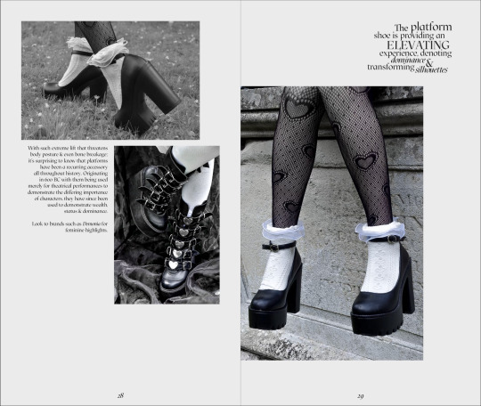
Platforms Spread
- A problem I had when putting the final parts of this spread together was the quote in the corner. After pasting the edited version of it from illustrator to indesign some of the words became highlighted in blue, and after clicking off them they were evidently thicker than the other words and I couldn’t work out why. To solve the problem I just wrote some of the words directly onto indesign, deleted the bold words and put the idesign ones in their place.
- For this page I did quite a thorough experimentation with the phrase, as I couldn’t decide which words should be larger than others and also in capitals. I think the one I went with looks the nicest on the page and compliments the image layout well.
- I found the text on this page difficult to write, with the first sentence going through many iterations. I wanted to write something almost abstract that plays on the height increase that platform shoes give, exaggerating it to make the piece more interesting. I think even though what I went with works i know it doesn’t sound quite right, so I think its something I could improve on if I made the magazine again.
- Even though 2 of the images on the page are black and white, I think the 3 work well together, because using Lightroom I took out any visible warm tones in the third image, which gave it a slightly more colourless look. Its unfortunate because I really like the image of the shoe where the grass can be seen underneath the organza, but the green tones were quite hard to eradicate because of the amount of sunlight that shone on the material and through it and i didnt want it to overpower everything else on the page.

0 notes
Text
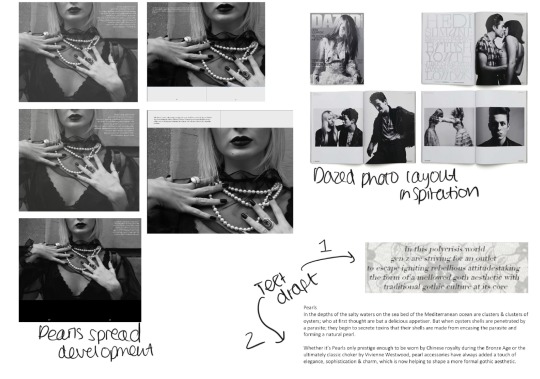
Pearls Spread
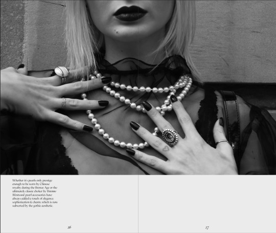
This is probably one of the earliest pages I made, with its first iteration being completely different to the final. To begin with I reduced the opacity of the image to 80% and overlayed it with a phrase from my trend forecast, as I was originally going to set my magazine with all the fashion in the back half. I was worried about having the image central due to the lips potentially getting lost in the bind, but when I moved it to the side I didnt like it so kept it central. I also tried having the image at the bottom. But something key I have realised is that having an image cut off with page left above it when there’s something that looks like it should continue (a face for example) it looks really unthoughtful and out of place.
I was also very set on having one text box with a width of 120mm for this page as I used to have that as a column size. I realised that not only was having that column size unnecessary, but 120mm just fits inside the purple margin, and as all of my text must stay inside the purple margin but also touch it, any text on a single page in a box that size would be central, which doesn’t fit with my asymmetrical layouts. Obviously the page could be in a 120mm textbook and be placed across a spread but I think thats too risky, as having my magazine perfect bound means some of the words may be entirely invisible.
I was also going to write a little section about where pearls come from on this page, but as I began to wrote it I realised how boring it sounded and also how irrelevant it is, because the pearls background has absolutely nothing to do with gothic culture.
0 notes
Text
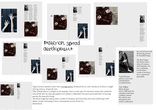
Patterns Spread
This page also endured many iterations, although I was set on using the images that are on the page.
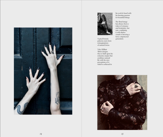
- I realised that my initial type draft for this page included many unnecessary words such as “as an example” that follows “take William Morris designs” , so the amount of type I had became smaller meaning I had to reduce from 3 28mm sized columns to 2. I inserted a small image into the text with the same 28mm width.
- To make sure this page wasnt too similar to one of the architecture pages, I made the bottom right hand photo square shaped as oppose to the standard size, which worked quite well as it removed most of the background wall and draws attention to the floral pattern on the garment, which is what the text on the page is about so its very fitting.
- I also trialled having the symbol on this page, but I didnt want to over do it and have it on too many pages, I want to keep it as an accent feature and it not reoccur to often.
As the text does on every page, it is against the purple margin.
0 notes
Text
Architecture Spreads
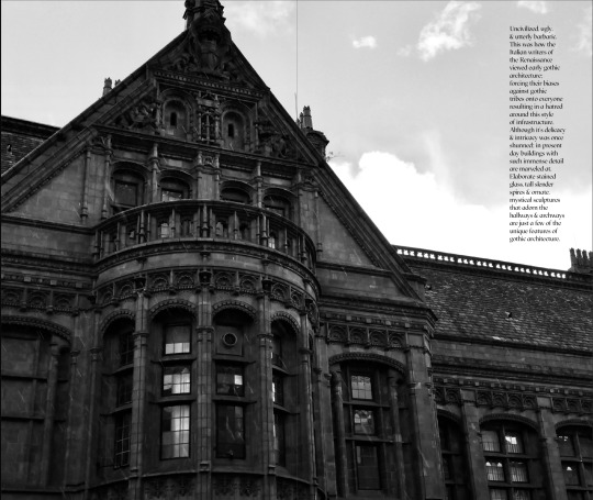

- After carrying out research on how to write for a magazine, I found that a technique that can be used to grab your readers attention is to begin with a sharp, shocking statement. For this small piece on gothic architecture, I took facts from my earlier research and tried to present them in a more interesting way. I knew that gothic architecture was hated in its early days, so rather than saying this outright as I would in a more factual essay type of situation I began with “uncivilised, ugly and utterly barbaric” not only does the lack of context in the opening statement draw my reader in, but the combination of the use of alliteration and the rule of three also makes it a nice phrase to read / say, further encouraging my reader to read on. To also try and make it an interesting piece to read I summarised down the most crucial elements of gothic architecture. I could talk for hours about its features but I nailed it down to “elaborate stained glass, tall slender spires and ornate mystical sculptures” which I think is an accurate yet interesting description to read.
- After photographing the grand gothic building by the childrens hospital, I knew I wanted to have it as a double page spread, because the details on the windows etc are a perfect example of gothic architecture which is what this section is about. I tried different zooms and placements of the images considering the text also, but I eventually positioned it so that the building almost framed the text, with the paragraph being positioned just about the lower heighted part of the building.
- One unfortunate thing about this spread is whilst I was taking the photos, it began to rain, which is why there are faint dashes going diagonally across the image; if it weren’t for this the image would be even clearer demonstrating its features even more. I decided to have the photo in black and white firstly because the natural brick colour the building is is not reminiscent of classic gothic architecture and I thought it would be nice to have consistency throughout the architecture section with everything being black and white. Having said that, keeping in line with the slightly off coloured pages, I did put this image in a more greyscale filter, to avoid harsh highlights and shadows that would’ve contradicted my page and text colours.
- For the third page of the architecture section I included 3 different images of 3 different gothic churches, to add some variety to the section. As you can see, originally I had 2 images of the same church but of different parts of it, which didnt look quite right, as well as this the three images were all quite similar, they were all fairly zoomed out and focused on the spires. So I swapped one of the zoomed out images for a close up of a church window, really exaggerating the variety which makes for a nice page I think.
- Originally I had the church names and location exactly above each photo, but to continue the asymmetrical theme I made them all exceed the edge of the image slightly, the same amount but in different directions. Again, building on asymmetry that is still uniform.
- This page is the second to use the star like symbol, which appears intermittently throughout the magazine. After leaning that similar symbols are an inherent part of gothic type, I thought it would be a fitting extra to spice up my pages a bit.

0 notes
Text
Culture Catalyst Spreads
As I mentioned when planning the page orders, throughout the magazine there are 3 defined culture sections named literature, architecture and music, because I found those to be the 3 most crucial things in the development of the goth subculture and its culture in general.
I decided that all these pages would be an 8% black, to make them distinguished from the other pages and to also match the slightly of white colour of all the other pages.
I wanted these 3 title pages to be similar in some ways but also have their own features. For example, all 3 pages have an image that touches the top and bottom bleed, as well as one vertical edge; and all the ‘culture catalyst” subtitles are the same size. However the actual page titles vary slightly, with some of them bleeding across onto the image in different amounts and some of them not touching the image at all.
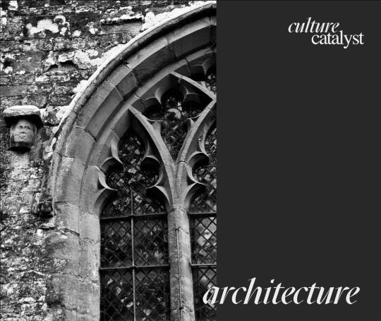
The 3 images I used were my own and descriptive of the pages. For the architecture page I initially trialled in on the right hand side, because I thought it would look the most natural having the window cut off on the edge of the paper. For some reason it didnt look quite right, so I moved it across which looked much better.
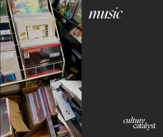
The first image I placed on the music page was a photo of a record stand in the oasis market, but overtime I realised that the focal point of that image and the first thing your eyes move to is the Taylor Swift album cover, which is not representative of the goth subculture at all and so looks completely out of place amongst the other pages. So I swapped it for another image from the same shop that had a focal point of a much darker album cover, what looks like a person screaming. I liked this because gothic rock music is very loud and shouty, so I thought this image already began to communicate what the section was about.
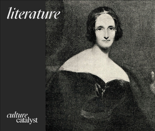
The literature title was what I struggled most with, as the only photo ideas I had were of books. As i had multiple pages about literature, I found that the images of books I had taken began to look a bit cliche, so I needed to minimise how many I was using. I decided to go with an old artwork of Mary Shelley, one of the most famous writers of the gothic literature period. Although it wasnt my own image, it was also not actually a photograph, and with art also being a huge gothic theme I thought it was appropriate to include.

0 notes
Text
Organza Spread
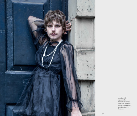
I thought it would be nice to follow the previous page with something similar but not quite the same. The model is posed similarly but I put the image on the other side, and added an actual sentence to slowly introduce the readers into some slightly heftier text.
- As this image bleeds onto the other page, I made it so the midway point was where the brick wall begins, to hopefully minimise loosing anything too important when the pages are bound together in the actual magazine.
- Even though this is a slightly longer piece of text, I developed it in the same way as the previous page; by quickly brainstorming key words to try and put together as a sentence.
- Frustratingly the way the magazine was bound resulted in part of the models arm being lost in the middle, which made him look quite disfigured.
- The small sentence of text was inspired by Dazed, and is a common theme throughout their magazine.
0 notes
Text
Lace Spread
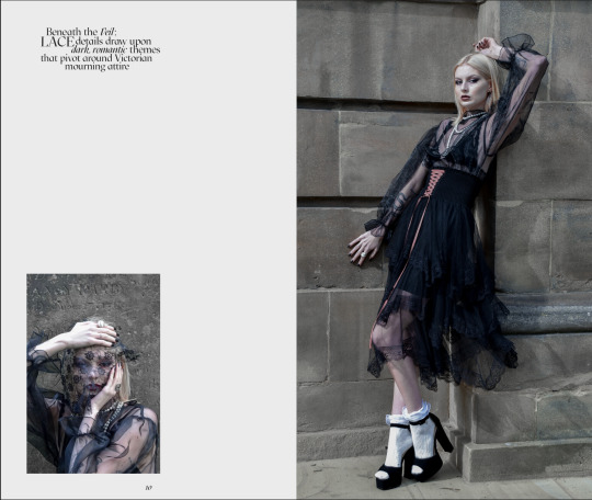
- To avoid the magazine being to wordy, I wanted to create a theme of short snappy phrases that summarise what the page is about, which were initially inspired by fashion magazines such as Vogue and Another. To begin with I wrote these phrases in Indesign to ensure they were the correct font size, and then copied them into illustrator so that I could move each word and try different layouts.
- The way I went about actually writing the phrases was I bullet pointed key words to do with the subject, and then tried to piece them together to build a phrase. I found this tricky to begin with but got the hang of it the further into development I got.
- I placed the larger image on the right side because of the way she is leaning, naturally it looked better that she was leaning towards the edge of the page, rather than it being cut off in the middle looking as if she’s going to lean across onto the other side. I decided to have it as a full bleed image because I thought the exaggered width of the page was completed by Izzys height, which is also exaggerated by the platform heels.
- After trialling different sizes for the smaller photo I eventually decided to have it the same width as the phrase, not only does it create a sense of uniformity but having the image so isolated and small gives it weighted importance. The “beneath the veil” part of the sentence spurred from that image and the way the lace covers Izzy’s face, given that the page is also about lace material that photo is very significant, and I wanted a way to demonstrate that other than just enlarging the photo and over crowding the space.

0 notes