
namitaylor1-blog
4D Foundation 2019
By NAMI TAYLOR
5 posts
Don't wanna be here? Send us removal request.
Last Seen Blogs

hosino-hikaru
Hoshizora

young-royals-confessions
young royals confessions
pigeonneaux
c'est une boule d'amour

decadeschallengeccfinds
Decades Challenge CC Finds
Text
Major self directed Media based artwork.
Before starting my media based artwork I looked to my favourite artists; Wes Anderson and Nadia Lee Cphen, to gain some inspiration. I further looked at various installation artworks, one that stood out to me the most is Tracey Emin ‘My Bed’. With the help of these artists I was able to come to the conclusion of creating my own installation for my overall artwork. I knew I wanted to focus on portraiture and play with the theme surrealism by manipulating the time and situation within my work. Further, I think it would be interesting to incorporate a high fashion theme amongst my images to add individuality and character towards my series of photographs.
INSPIRATION
Wes Anderson is a American filmmaker who is well known for his distinctive visual and narrative styles. ‘Moon Rise Kingdom’ (2012), really stood out to me through the use of colours and composition that was used throughout the whole movie.
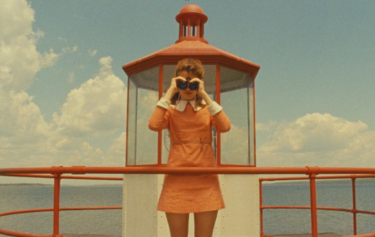
His techniques within filmmaking has always been intriguing to the public, I would liker to adapt such skills and intertwine them into my own images but still maintaining my own style. By indulging myself within the world of Andersons I’m able to gain a rich understanding of composition and the overall style that will help me in my final project.
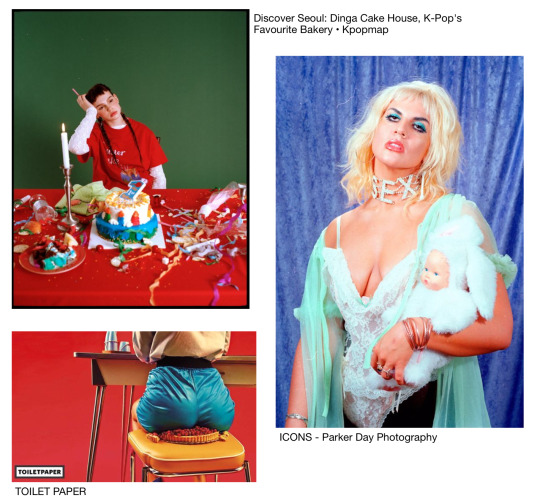
Nadia lee Cohen is a British filmmaker and self-portrait artist. Her style mainly focuses on the 1950-70s American and British cinema that is portrayed specially through her series ‘Hello my name is’.

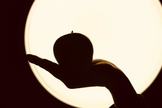
Cohen’s unique style of photographs and films has always been extremely satisfying to the eye. She creates captivating images through her unique skills in what seems like a materialistic world that she creates in studios and settings. In this series especially has inspired me to create my own bizarre portrait photos. Her use of hair, makeup and costumes are all factors that build a somewhat plastic/fake appearances in each image creating a doll like figure. The posture of these subjects is what builds a strong composition and character that I will have to think about very carefully as I will only be using one piece of item with each image. I will have to use that to my own advantage to create a solid composition within the frame.
Tracey Emin is an English artist known for her autobiographical and confessional artwork. I looked closely at one of her most famous installations of all time, ‘My bed’ (1998). She was inspired by the aftermath of her bed following a bad-breakup. Surrounding her bed was crumpled tissues, cigarettes, empty vodka bottles, through this image she believed that this was a work of art.
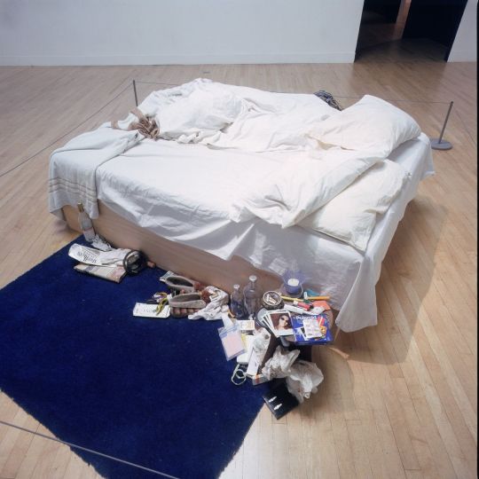
Installation view of Tracey Emin, My Bed, at the Turner Prize Exhibition, Tate Gallery, London, 1999-2000.
I was inspired by her use of various random objects and created it into a one large installation artwork. It makes you wonder all the little things that we own or collect over the years into one little section of your own home. I wanted to use this idea within my own work by incorporating one random object in my house to show our relationship with our belongings towards the audience. The messy and uncleaned bedroom creates a buzzer compositions as it is placed in the middle of a meusume. She expresses a personal response depicting vulnerability, a self-portrait that doesn’t veer from the messiness of depression and heartbreak. Where she comments the views and her own painful experience.
Mario Testino is a Peruvian fashion and portrait photographer whose work is found mainly in international magazines such as Vouge, V Magazine and Vanity Fair. High fahsion photography has always been an interest in mine through the use of set design, preprofessional models and the mood and styling of the overall photo. Testino creates emblematic images that have contributed to the success of high fashion brands while he challenges traditional views on gender by mixing masculinity and femininity and suggests sensuality rather than. sexuality.
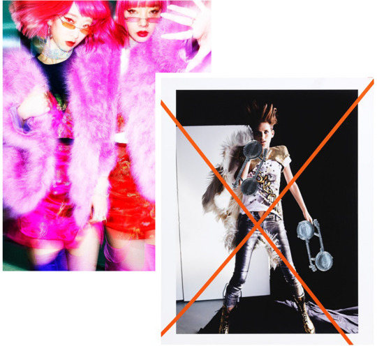
Right: Amiaya, Tokyo, 2018 Left: Mario Testino Document Journal, May , 2014
Above it is clear that Testino captures the moment in time and brings out the humanity of his subjects, creating a connection between the model and the audience. His images are captivating to the eye using bright bold colours, he also draws on his printed work to create a two layer image to exemplify the chaos within the image. Further I chose Testino as one of my artist of inspiration as his works have always stood out to me, especially for this task I want to create a my own inspired high fashion photographs to create an editorial series based on context and situation.
DEVELOPING IDEA
Before capturing any photographs I've decided to to sketch out each image that I will be taking, to gain a better understanding fo what my series will ultimately look like. As you can see each drawing has one coloured object item that will correspond with the outfits. I wanted to keep a colourful rainbow theme throughout each image to indorse a light-hearted mood for the audience.
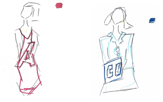
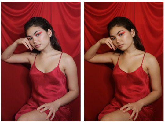
Red: In this image I will mainly focus on the the colour rose red. This strong vibrant colour will be structured by the object; Eiffel tower statue.
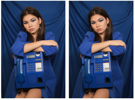
Blue: The image will have a striking electric blue tone throughout the photo. I will be using a phone box as my prop.
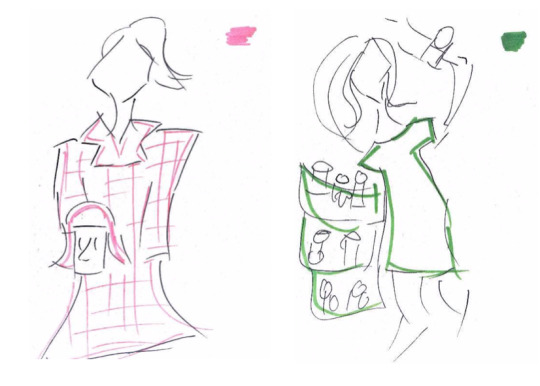
Pink: For this image I will be using a mannequin head wearing a pink bob wig as my prop. My model will be wearing a pink coat that will correspond to the wig.
Green: The green pop wad a little tricky to find as I will also be using toilet paper in the image as my main prop.
PRACTICE SHOOT
Proofsheet
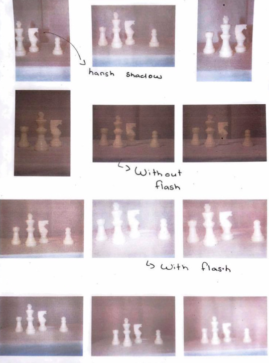
Evaluation: For this shoot I had to create my own little studio within my house. This was very tricky as I had to find multiple lamps and set them up facing towards the subject, however there was not enough lamps to achieve the studio lighting that I wanted. Resulting to using flash on my camera allowed me to get that bright image that I wanted. I worked with small colourful objects just so I can see how myself series will turn out. Overall I’m very pleased with my final mini practice shoot as it helped me know what camera settings I should use and how I should position my c camera for the actual shoots.
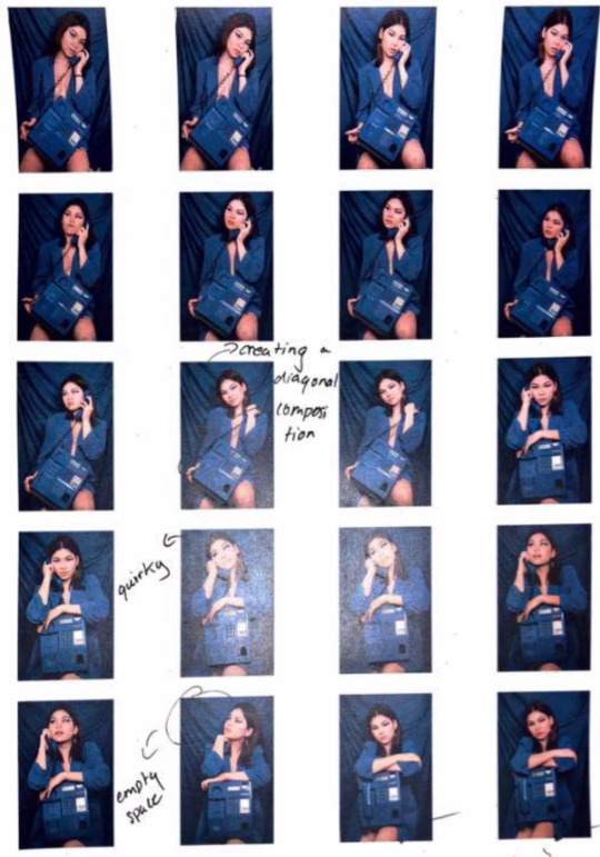
SHOOT ONE: BLUE
Proofsheet
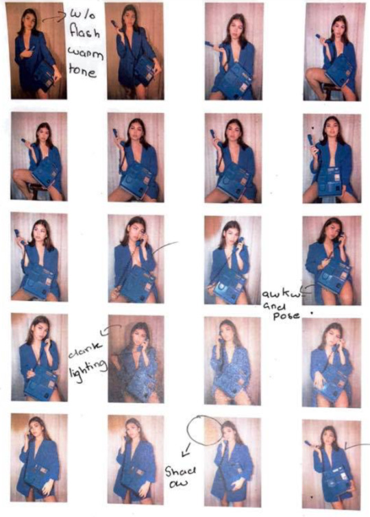
Evaluation: The blue images turned out exactly how I wanted and I’m very pleased knowing that there are potential images that I can use for my final series. I did have problem with the lighting as my flash was turning off and on. I did like the ones without flash but I would have to ensure all my other images have the same tone in colours to keep a theme throughout my images.
SHOOT TWO: GREEN
Proofsheet
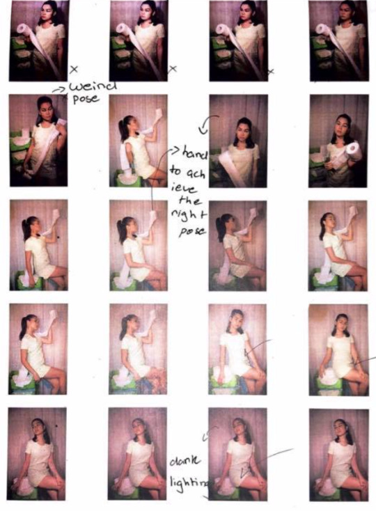
Evaluation: This shoot was very tricky as I couldn’t find anything in my house that was green except this this three layered holder for tissue paper. My whole approach to this series is suppose to express quriky and playfulness however use toilet paper was very hard create a structured composition. Once again the lighting was going all over the play due to the flash turning off and on which made the images seen dark. There are a few images that the subject is holding the toilet paper that covers the entire frame however there is something still very off about these images that don’t quite fit into my series. I will have to see how I go for my next couple photos if I was to incorporate a green image of not.
SHOOT THREE: PINK
Proofsheet
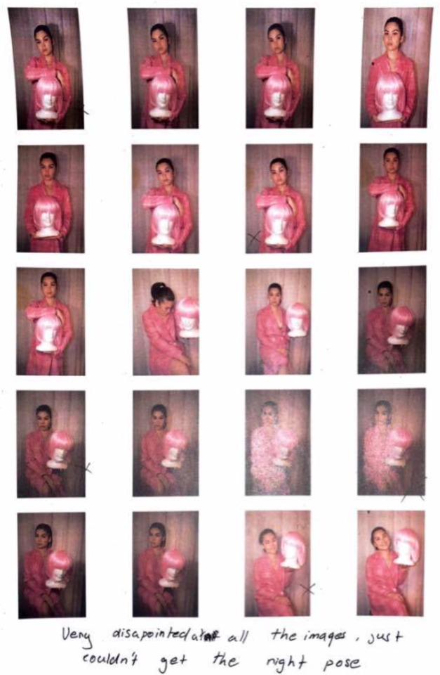
Evaluation: The test shoot did not go as well as I hoped it would due to the prop not suiting the overall image. I felt as if the mannequin head with the pink wig looked somewhat awkward and due to the flash it washed out the white face in an unpleasant way. Further, I used a flask but the i felt as if the small object did not justice and was failure once again. Thus, I’ve decided to not use these pink images in my final work and due to the short amount of time I have im enabled to repeat this pink shoot again.
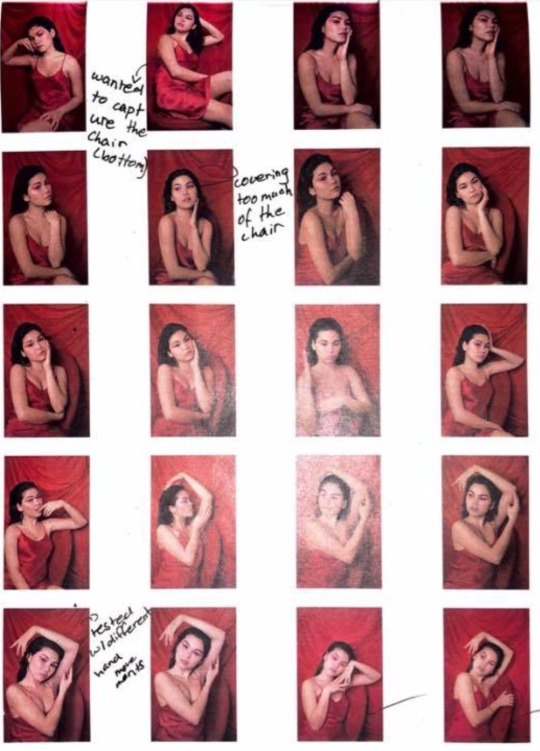
SHOOT FOUR: RED
Proofsheet
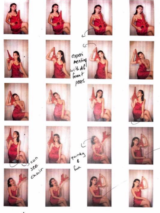
Evaluation: I am very pleased with this shoot as it turned out exactly how I expected. I was able to create new composition within each image by placing the Eiffel tower artefact around the photo. It was also very fun to shoot as it was quirky and random. As of right now the red and blue images are the only ones that turned out great but for the other ones I was very disappointed. I decided to do another photo shoot using the colour yellow that will hopefully stand out just the other primary colours.
WEEK FIVE
FEEDBACK FROM TEACHER
In today’s class I was able to discuss my overall idea to my teacher, Vicky and showed her my images that I have taken. Further, I discussed how I will be doing another shoot today with a yellow theme however we both agreed on just work on the blue and red images to create a more detailed image. She suggested to put a backdrop to add texture and more depth. I also decided to present my work in a large spacious room because it will allow the audience to move amongst the space and interact with the objects.
I further went to the printing room to meet with Josh, where he helped me set up my images on Lightroom, however we discovered the image quality is very low due to my camera setting. This meant my images will not print in a high resolution causing it to look burly and having a lot of noise. Since I will be doing another shoot today I will have ensure that my camera is on the highest pixel where next Tuesday I will be able to print them in a higher resolution photo.
Throughout the day I worked on my blog and edited a few parts. Later in the day I will hopefully be taking my last shoot for this task that will help improve my overall final work.
PINTEREST INSPIRATION
Before my shoot I wanted to look for more inspiration to really develop an idea throughout my images and to see what composition I’m aiming to create. I looked through Pinterest and found a couple of images that have really helped me gain an idea on how to develop my backdrop for my final images.
SHOOT FIVE & SIX
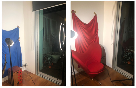
Set up: For todays photo shoot I was able to get a ring light from a friend of mine which allowed me to achieve that bright studio lighting without using flash on my photos. In the early photo shoots my flash kept going off and on due to the auto setting, however this time I kept it off. Below, the images show a set up off my mini studio that I’ve created. You can see I had purchased fabric for my background and had to tape it to my wall creating riffles to add texture.
SHOOT FIVE: RED & BLUE
Evaluation: I was very pleased with this photo shoot as I was able to pick two images for my final work. I made a few annotations on the proof sheet that describe which images I liked my ticking them and others that I found awkward or out fo place.
EDITING & PRINTING
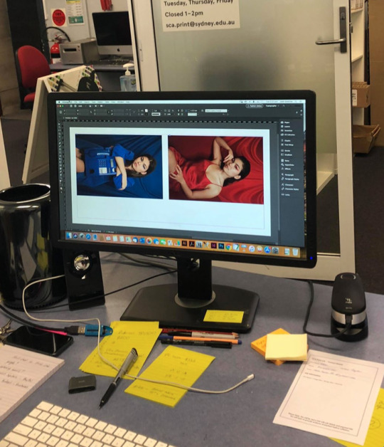
Below is the two chosen images of red and blue photos. I have placed my edits of the red photo as you can see the before and after image. Where skin tone is now warmer and will suit nicely with the blue skin tone. I also had to fill in the left bottom corner of the blue image to get rid of the white background.
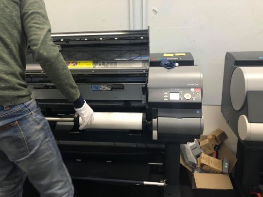
Then Josh helped me print test images on fine art smooth paper. This allowed me to view my printed images and see if the colours and tone on the screen matched with ones on the paper. Below is an image of the set up for printing the mini test prints.
Here is a photo of Josh placing the art smooth paper A3 into the printer.
TEST PRINTS
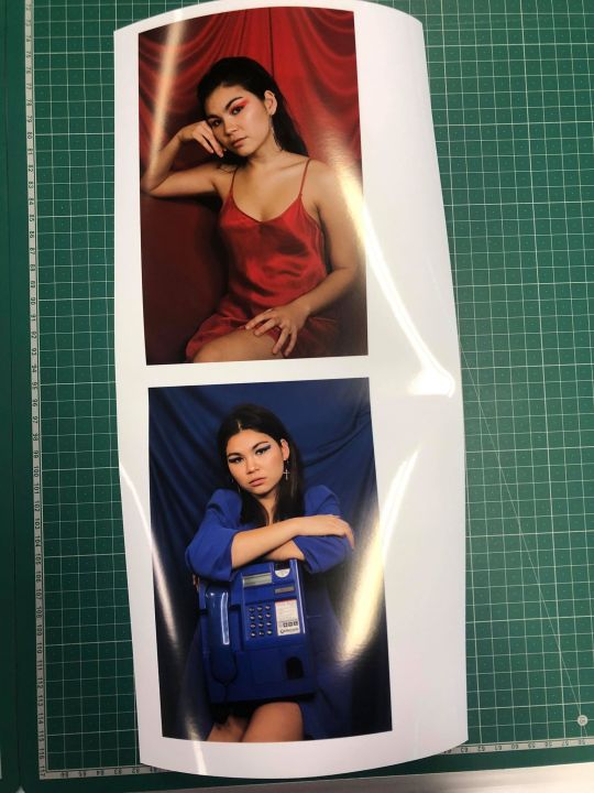
I’m very pleased how my test print turned out as they were both successful. The skin in the red image was really balanced and complimented the other blue image. This ultimately made a nice duo.
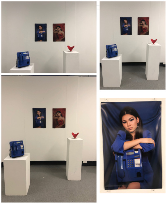
PRESENTATION
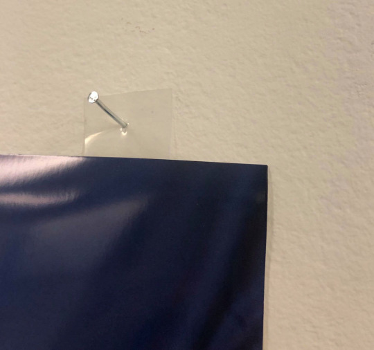
Below is my overall presentation setup. I had to pin up the print using a hammer however during this stage a couple of finger print marked my blue print. I then asked Izzy to help, we decided on taping a clear plastic seal at the edges of my image and hammer those down without touching my prints.
Further, I placed two pillars infant of my photographs and put the objects on it. As you can see I placed a miniature version of the red chair on the pillar because it would of been impossible too bring the actual human size form chair to the University. Hopefully this alternative still manages to bring a high quality installation.
(I tried to upload my final images on a google drive but it wouldn't upload because of the photos resolution being too high. I could email you the images so please let me know.)
FINAL EVALUATION
Overall, I am very pleased with my final media based artwork, as it turned out exactly how I wanted. Throughout the long process I was able to finally achieve my final images. By the last shoot I knew that I have came a long way, and was extremely happy how they turned out. The editing and printing stage ran smoothly with the help of Josh as we were able to achieve it in less than a hour. I learnt how to use Lightroom where he helped me edit the red image skin tone to match the blue one. We printed on shiny gloss paper however when I was hanging it up I accidentally go my finger prints on the image. This made me question if I ever wanna use glossy paper again but the overall look was spectacular. On the presentation day I was able to locate two block stands where I placed my two objects. The outcome was nicely placed however, if I was given more time and resources I would of done a whole large series, to really complete my vision. Thus, despite the lack of photos and time, Im very happy how the overall presentation was put together.
ARTIST STATEMENT
My media based artwork, “What the eye can't see”, focuses on beauty found within the mundane as we look beyond the superficial standards of human perception. The images tells a story, of a young women possessing the objects; a vintage phone box and a love heart chair, that challenge our perception of beauty where these inanimate objects oppose our natural indications of beauty. Furthermore, the model becomes one with the objects where we start to associate beauty to a further extent than our natural standards.
Inspired by situation and creating a time and place, each setting compliments the colour of the object, forming an aesthetic appeal to the series. By brining these objects to life by presenting them directly in front of the audience it creates a layer of realism allowing us to maintain our focus on the bright vivid items. The interactive installation allows us to question our own individual associations of beauty, as we view two perspective; the images and the objects placed in front. Overall, by exploring humanities identities of true beauty and superficial perfection, my work looks beyond these standards viewing mundane items that provide its own natural beauty.
0 notes
Text
Group Presentation
For the group presentation I partnered up with two girls, Anastasia and Bronte. We first started to brainstorm, looking specially at video media. We knew that we wanted to create an installation exploring the theme time, context and situation. In doing so, we came up with a simple video idea of capturing a mundane activity, eating ice cream. To add a more complex appeal to the artwork we decided on printing out the setting of the video on to a clear white sheet of fabric in front of the video (projecting on a wall). We question the criteria of what should be included or excluded from photographic visions: what deserves to be an artwork? The idea of waiting, expecting, anticipating is overridden. Entertainment is replaced with contemplation and the banal, the everyday becomes art.
Inspiration
We have drawn inspiration from Jan Svankmajer’s Lunch. Svankmajer uses the mediums claymation and pixilation to captivate the audience with humour and hyperrealism. The film depicts a business man and a vagabond, unable to get the waiter's attention. They begin eating everything they can lay their hands on (the vase of flowers, the table). This consumption then becomes a greedy competition and one character eats the other. The elevator soundtrack creates a light mood to contradicts the dark horror. For our project we wanted to reflect this sense of humour and playfulness. Instead of dark suspense drawn from cannibalism however, we have created suspense through futility: our film does not have a resolution as such, and the only change that is witnessed is the disappearance of the ice cream.
Slovakian photographer Evelyn Bencicova inspired us through her use of controlled compositions characterised by aesthetic sterility. A bleak mood runs across each of her still life images. We arranged our setting to resemble a still life, but it is not a concrete situation, disturbed and changed in the duration of the film. Our video ends with an empty table setting, a similar situation to the beginning. The only record of change is the empty bowl. Bencicova’s dull and unsettling images create an intriguing appeal that draws in the audience using a simplicity which we attempted to mimic through our minimal setting.

(An)Organic by Evelyn Bencicova
Music
We used the song ‘The Name of Life’ from the film Spirited Away to amplify the antic subject of the video, also creating a light-hearted mood an humorous suspense with the dramatic sections of the track. We could also explore Charlie Chaplin music or other ways to draw attention to film as a medium being explored “for film’s sake” in our artwork.
Filming and Editing
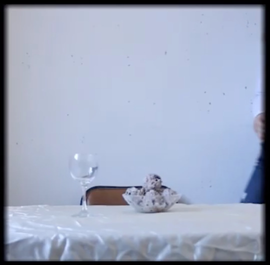
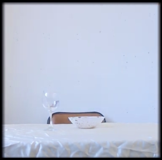
Before we started filming we had to find a somewhat large room within the facility and set up the overall composition of the video. We eventually found a well lit room and placed a white sheet of cloth over the table. We also put the ice cream into a glass bowls with a tiny spoon and an empty wine glass to add a sense of confusion and humour.
Here is a link to the finalised edited video on youtube. As you can tell we wanted to make the video a square for aesthetic purposes and we also added a soft boarder around video to create a vintage atmosphere.
https://www.youtube.com/watch?v=ImPM5IDIYPs
The beginning and the ending of the video.
Overall my group and I are very pleased how the video turned out for it wad exactly how we wanted it to look. Now we had to figure out the hard part of the overall project, printing on to the fabric and how it would look infant of the image.
Printing on the fabric
This part of the process was ultimately a downfall because the image printed backwards on the fabric, causing the image to look jaggard and out of place. We were unable to print out a new one due to the lack of resources and time we had.
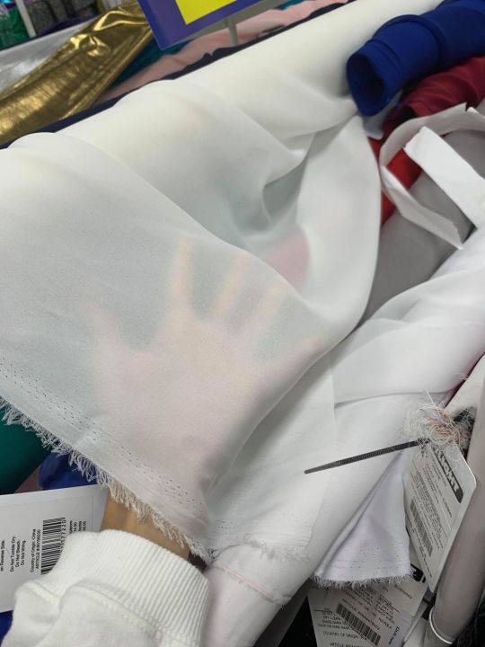
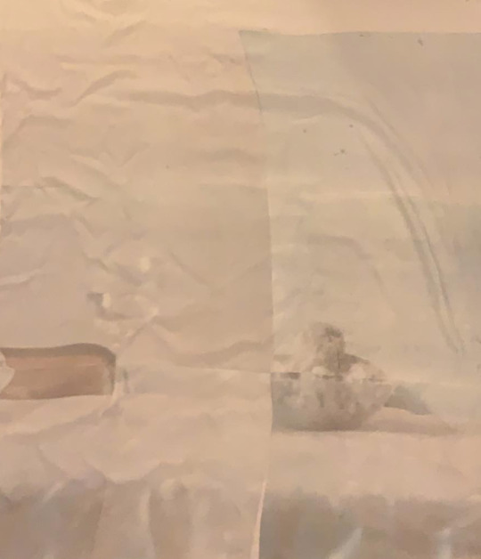
However we came up with the idea of flipping the sheet and outlining the image at the beginning of the video with a black marker. This ultimately helped maintain our conceptual idea of time, it in fact made our overall installation artwork stronger as it was vividly clear of what we had done and aded a light-hearted style with the uneven lines and crooked edges.

WEEK FOUR
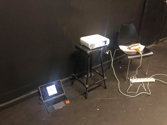
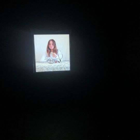
Today, our group presentation was due but before we had to present we needed to find a large black room that would be contrasted by the white sheet of fabric. Once finding one we set up our projector and line it up with the white cloth.
Below are images of the set up of our group presentation.
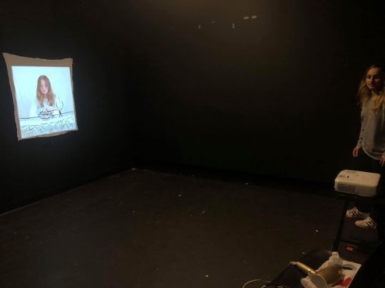
Here is a photograph of what it looked like with the black outlines over the video. As you can see it is not perfectly lined up but that it what we were trying to achieve as it creates a new layer of an imperfect reality / a distorted present.
Overall, my group and I were very pleased on how the project turned out as we came up with solutions with each individual problems and solved them as whole. During the actual presentation everything ran smoothly except we didn't have a speaker to project the two sources of sound but it was loud enough for everybody to hear. It was an enjoyable task and working with friends made it a fun experience as we were able to create a successful installation.
Artist Statement
Our video and still image installation explores time, context and situation, recording the mundane act of consuming a bowl of ice cream. We overlapped a simple, playful outline of the setting done in black marker on fabric, with video footage, to highlight the playful and humorous nature of the work, and create a shift in focus from analogue line art to digital moving image.
We wanted the audience to feel amused, slightly confused at the work and yet we also hope to raise questions through the tension of art and banality. Eating ice cream may seem trivial or cause a search for some deeper hidden message behind the mundane, but we really ask for a close examination of composition, scene and situation. We question the criteria of what should be included in photographic vision. Waiting, expecting and anticipating are overridden. Entertainment is replaced with contemplation. The banal, the everyday becomes art.
This tension between traditionally ‘meaningful and meaningless’ can be related to Jean Baudrillard’s ideas in Simulacra and Simulation:
“We live in a world where there is more and more information, and less and less meaning.”
“The futility of everything that comes to us from the media is inescapable … there is no alternative but to fill the screen”
“At home, surrounded by information, by screens, I am no longer anywhere, but rather everywhere in the world at once, in the midst of a universal banality”
We drew the outline of the tablecloth, glass, bowl and ice cream in simple lines with black marker. In this way, the outline is one trace of the situation, and the video is another. They have been overlapped, slightly misaligned and as the figure enters our video, we are reminded of the different abilities to record time, place and context in still and moving medias.
Our body of work playfully explores the limits of human-constructed time and its measurement against simple habits and rituals. As such, the piece begins with a still arrangement of daily objects (a table, chair and bowl of ice-cream) which is outlined onto a piece of cloth. We intend to question the relationship between human beings and situation. Further, the melting scoops of ice-cream atop the table comment on the idea that time initiates as many changes as humans do. Our decision to construct a multimedia work enables the viewer to experience two situations simultaneously – both past and present. Thus, transience and timelessness conflict with each other prompting us to consider a situation, a context’s durability, and understand the human condition for what it really is – as fragile and fleeting as ice cream.
Here is the link to our group presentation. Enjoy :)
https://www.youtube.com/watch?v=k8bJENqbskA&feature=share&fbclid=IwAR1BFQR8nIhJi9NyADY8uWG1W8eDGgtugif9lgNSyVCwd3sW0ylG96gw1pE
Bibliography
Svankmajer, J (1992). Food Pt. 2 ‘Lunch’. Retrieved from Vimeo https://vimeo.com/12680446
Daluiso, G (2015). Artist of the Week: Evelyn Bencicova. Retrieved from Kaltblut website https://www.kaltblut-magazine.com/artist-of-the-week-evelyn-bencicova/
Cowan, Scott J (2013). STYLE AND INTERPRETATION: THE INEVITABILITY OF BANALITY IN A ‘CONTEMPORARY’ ART. https://thanassuming.wordpress.com/2013/02/18/196/
Maltz, R (2018). Art of the Banal. http://leiaopalma.com/english/art-of-the-banal/
Behrmann, K (2012). William Eggleston: Taking Pictures of the Banal. https://artofcreativephotography.com/famous-photographers/william-eggleston/
Calirman, C (2015). Art and the Banal.
Baudrillard, J (1994). Simulacra and Simulation https://books.google.com.au/books?hl=en&lr=&id=9Z9biHaoLZIC&oi=fnd&pg=PA1&dq=jean+baudrillard+simulacra+and+simulation&ots=3NUcdWbsrV&sig=Ibf6r8oV_JINV5sDTAO0x09DaV4#v=onepage&q=jean%20baudrillard%20simulacra%20and%20simulation&f=false
Music
Hisaishi, J (2001). Spirited Away. Instrumental Piano: Tokyo, Japan: Miyasaki
0 notes
Text
Week Three
In class we were shown a variety of different artist who construct their own environments and scenes. One artist that really stood out to me was Gregory Crewdson who created cinematic scenes of suburbia creating sense of dramatic suspense. It would be interesting to use Crewdson for inspiration for my Media Based artwork, where I could create my own scene of portrait photographs.

*Untitled (Ophelia) 2001 by Gregory Crewdson b. 1962
Digital Camera Task
1. Choose a site around the school and document it in three different ways including sound and video
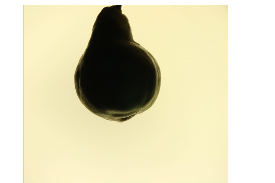
We then were given a task where we were able to experiment the different camera settings. We found a well lit stairwell where we placed fruits into a glass bowl and took abstract and straight on images.

We started challenging the shadows and the overall depth of the image to create a sense of suspense. We were mostly inspired by still life as we capturing a mundane element.
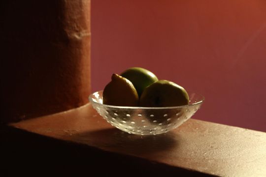
It was really interesting how these silhouette photos came out as the light behind them really dramatised the overall image. I especially like the pear image because even tho most of it is black you can still identify what fruit it is through the shape and texture that is clearly seen in the outline of the pear.
We then decided to capture a video of my friend biting into an apple using a very close lens to her face, in the clip you can hear the sound she made as well.
Video link:
video-1558158162.mp4
. If you are unable to watch the video I can always send it via email.
2. Make three images changing the aperture (f numbers)
We then decided to place the three fruits seperate from each other where we practiced using the aperture to focus on each item.
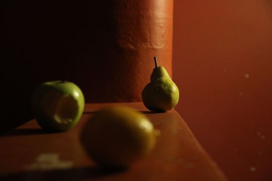
(MORE PHOTOS ARE ON THE CAMERA)
Overall, this whole task was very enjoyable and fun as we were able to create our own set up using minimalistic props to create our own still life images. It also helped us understand how to use different techniques on the camera, aperture. For my media art based artwork I will be taking a portrait photographs so this task specially really helped me gain a better understanding of how to use a camera.
Later that day we started to work on our group presentation, that would be due in the following week after. We wanted to start filming today because we knew that it would take a long time. Further in our last workshop of that day we were taught how to use Premiere pro where we started to edit our film project. I will be posting all the details on my group presentation on a different post that will show the overall progress.
0 notes
Text
Week Two
Task: Making a pinhole camera pinhole experimentation.
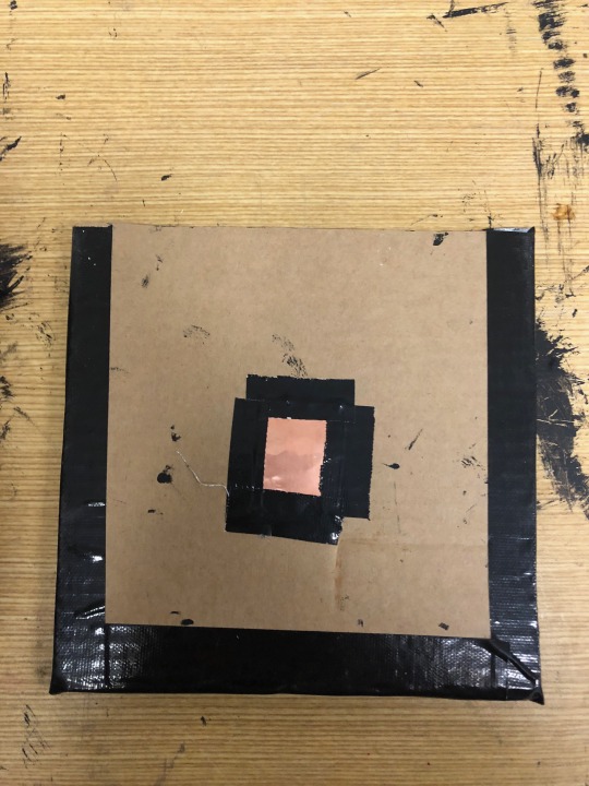
In todays class we all brought in our own resources to create a pinhole camera, this included cardboard, tubes, soda cans, mesh, wire etc. I partnered up with my friend where we created our own pinhole camera using cardboard and created a box. We painted the insides black to ensure that the box dark while also using tape to keep it together.
Below is the five black square cardboards that we will use to create our own pin hole box.
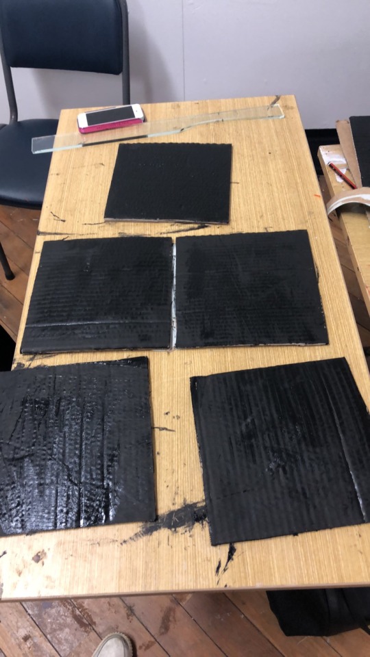
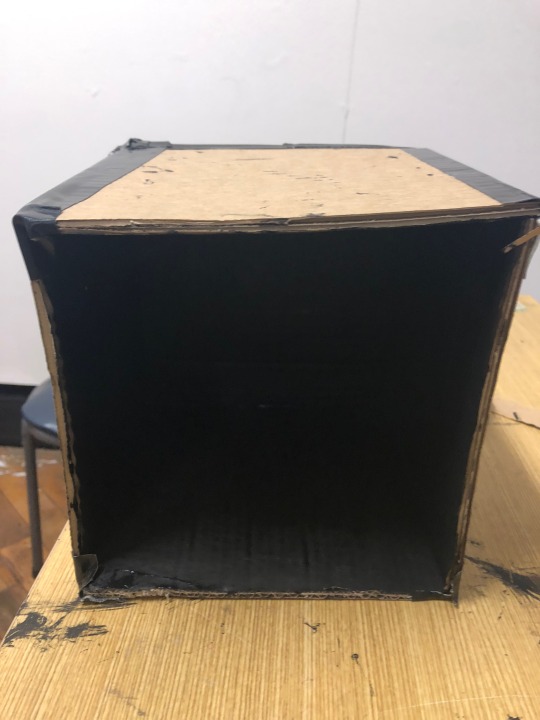
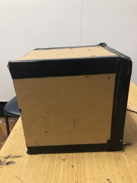
We then started to make it into a box by taking the sides with black tape.Below are some side and front views of the box.
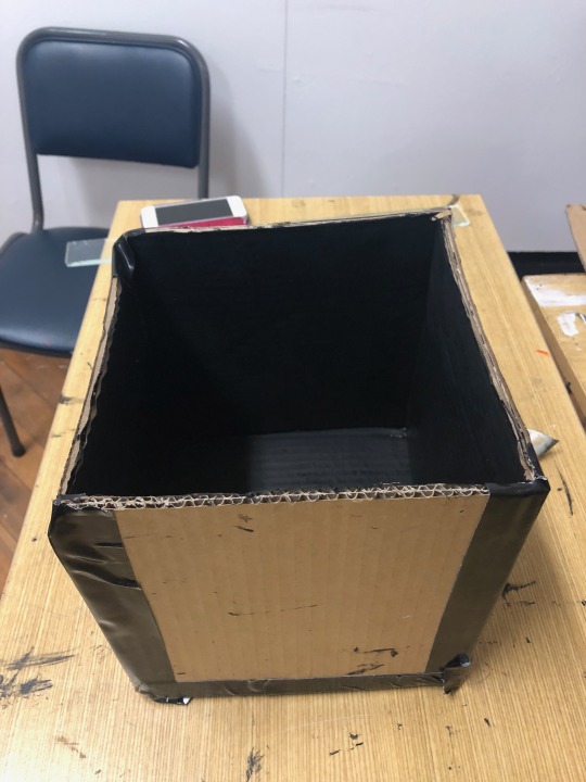
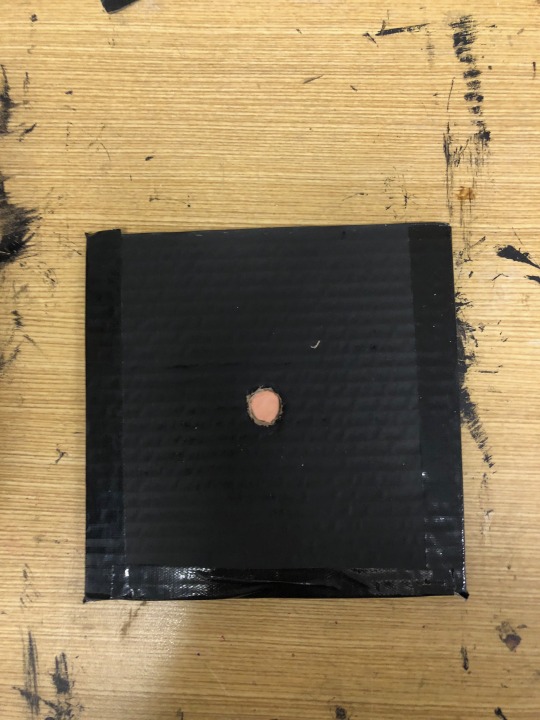
We then had to cut out a small hole in one of the squares, where we placed a small rectangular copper on top of it. We had to create a tiny pin hole where this will allow to camera to take the actual photo of it surroundings.
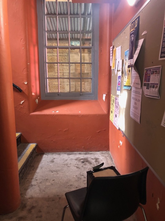
Once our pin hole camera was finished we went into the darkroom where we places the paper inside the box and sealed it with tape. We decided to capture the staircases, we believed it wouldn't take that much time because it was so bright due to the large windows letting light in, so we left the pin hole exposed for 7 mins. After developing the image in the dark room, this was the result of the final photo.
We then decided to turn it into a positive, to see if it would identify the picture a bit more thoroughly.
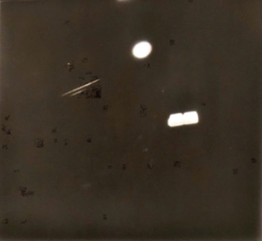
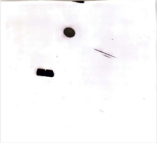
We decided to do another try of taking a photo in the stairways but in a different position and leaving it there for 10 mins hoping it would capture sharp image.
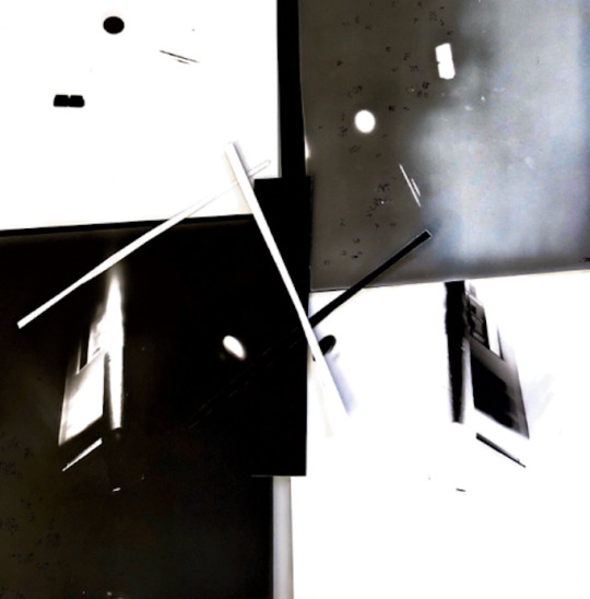
However, the photo turned out completely white. At this point our pinhole camera was falling apart due to the constant taping the lid on and off. But we were determined to capture a stairway image, we used the wooden pin hole camera knowing that it could be more effective than the one we made from scratch. This time we placed it in a new position where there was more light and kept it there for an hour and half. This is what the image turned out and we also made it into a positive (original image on the left and positive on the right)
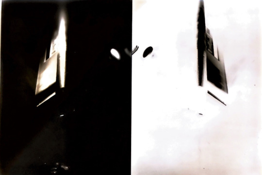
We were very please how the image turned out even though it doesn't show much of the staircases it did capture the window in an a surreal and interesting way. We then placed the four images (positive and negative) together to create one photo.
Thus, we were very pleased on how all the images turned out even though we challenged ourselves by taking indoor photos where sometimes pinhole cameras would need to sit there for hours.
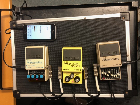
Screen Arts Workshop: Capturing & Manipulating Sound
In this class we were introduced to sound and how artist uses sound to create their own artwork.
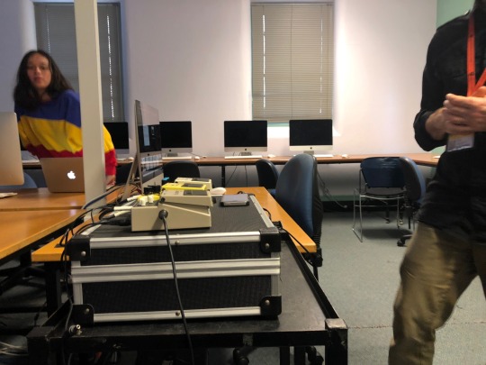
Here are some images of the equipment used to manipulate sound and mix it. It was a very interesting workshop where I was able to learn how to create my own sound. However for my final work I don't think I will be using sound as I will mainly be focusing on creating my own images through portraiture.
Overall, today was very full on as we learn how to create our own pin hole camera and manipulate sound. However I believe I will not be using dark room photography for my final project as I’m more interested in studio lighting. As for sound if I had more time I would love to work with that equipment and area but due to the small time we have it will be difficult for me to integrate sound into my work.
0 notes
Text
Week One
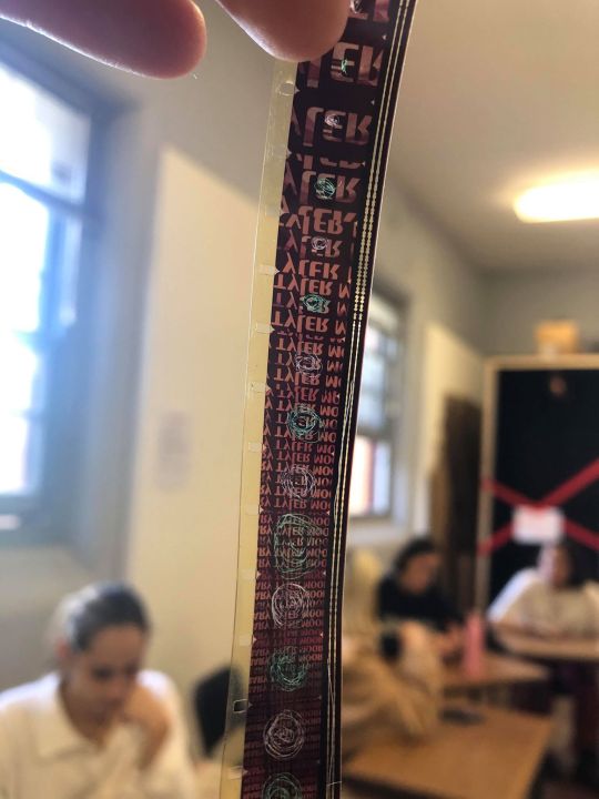
Task: Direct animation: Etching onto 16 mm film.
In todays workshop we were introduced to old film where we were able to scratch on to it and create our own film animation.
The image below is is the machine that will be used to project these film images.
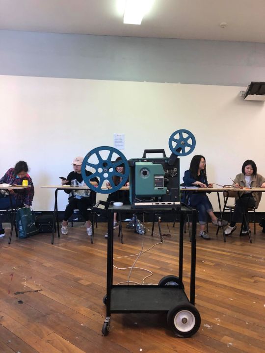
We were able to connect everybody's films using this equipment to tape each end together.

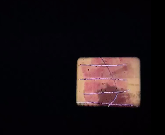
A photo of the when the images were projected on the white board.
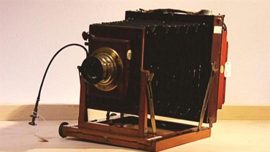
Photomedia Workshop: Printing Pinhole camera
Next we were introduced to early style of photography, pinhole camera. It is a is a simple camera without a lens but with a tiny aperture, a pinhole – effectively a light-proof box with a small hole in one side. Light from a scene passes through the aperture and projects an inverted image on the opposite side of the box, which is known as the camera obscura effect.
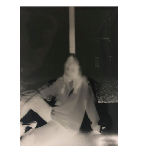
I then partnered up with my friend Stasi to go outside and take our photos. We sat in the shade where my friend would sit very still in front of the camera, leaving the hole exposed for 7 mins. After this we went into the dark room where we developed the image. This is how the image turned out.
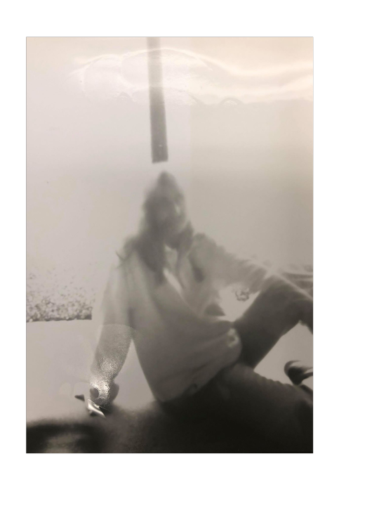
After we turned it into a positive image, allowing the darker places to be lightened up a bit.
Moving away from portraits, I then captured trees however I was still in the shade. This time the camera was exposed for 8 min as I wanted it to the image to be clear and sharp. This was the outcome.
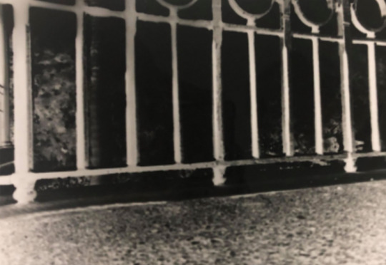
I was very please how this photo turned out as you can clearly see the railings, however in the background it is still very dark mainly due to how bright it was that day, allowing too my light into the photo causing it to be overexposed.
2 notes
·
View notes