
nm3217sarahwong
NM3217 (AY21/22 Sem 2) Blog — Sarah Wong
11 posts
Don't wanna be here? Send us removal request.
Last Seen Blogs
shannon-blake
Scooby Dooby Doo
su-homebroken-au
Steven Universe Homebroken

robbiewilliams11
𝐑𝐨𝐛𝐛𝐢𝐞 𝐰𝐢𝐥𝐥𝐢𝐚𝐦𝐬

cherllyio
Cherlly
paul-newmans-sauce
Canary In A Coalmine 🍉
Text
Final Project
Going with the second prompt, the Design and Brand Guide I have created for this Final Project (FP) will attempt to rebrand our very own Communications and New Media (CNM) department in NUS. My overall goal was to create a new image for CNM that will appeal to youths and incoming undergraduates, convincing them to pursue their education with our department. During the brainstorming phase (coming up with the word cloud), some qualities that I wanted CNM to be associated with included “Fresh”, “Innovative”, “Holistic”, “Vitality'', “Modern”, and “Exciting”. These qualities went on to inform all the sections in this brand guide (and the entire rebrand itself), including the design mockups I conceived when I first started to explore the possibilities for logos (seen below).

During the feedback exchange in Week 11, logo mockups 2 and 3 were received the most positively from my classmates—they liked the second one because they thought the design was rather clever (“innovative”) and professional-looking while they liked the third design because it looked inviting (“vitality”, “exciting”) and it was easy to discern what department the logo is associated with due to the incorporation of the speech bubble. It was fun hearing the opinions of fellow CNM students and what they liked about the designs since they are the target audience in mind for this rebrand, and I received some good suggestions on how to improve my design. As such, the final logo (seen below) is a fusion of both designs, as informed by my peers’ critiques.

Overall, the goal of this final design was to create a simple yet memorable logomark that can cleverly encapsulate the multi-faceted (“holistic”) nature of CNM, as accentuated by the choice of colours (will be elaborated on later). The design is clean and two-dimensional so that it looks modern while also being practical since it can be easily replicated. That the logomark itself integrates the initials of the department into the speech bubble also hopefully invokes appreciation for the use of effective communication (“innovative”).


Aside from the meanings behind each colour detailed in the guide, this particular colour combination (red, yellow, green, blue) was chosen because it is made up of primary colours (RYB and RGB model). Seen in the logos of technology companies (e.g. Google, Microsoft), my goal was to highlight the holistic nature of the field of study that is CNM, from which its students will emerge as all-rounded individuals with a versatile skill set. While yellow, blue, and red are meant to be associated with each word in CNM respectively, green is meant to represent NUS, thus setting the backdrop for CNM’s place in academia both figuratively and literally (in the logo). This is the reason why green is not used in the border and instead incorporated as accents throughout the guide itself, existing to vitally support the other three colours.

The colour palette also received positive feedback from my classmates—they liked the vibrancy and eye-catching nature of it and felt that it encapsulated the qualities I wanted the rebrand to emulate (“fresh”, “exciting”, “holistic”) well. Some classmates gave me some feedback that working with such a colourful palette may come at the risk of looking unprofessional, especially when used in combination with the handwriting fonts I experimented with for the logo mockups. I took their advice into account and I made sure to use strong and clean lines throughout the logo, brand guide, and fonts to ensure that the rebrand maintained a polished and professional feel.
In InDesign, I made sure to have the exact swatches of my four brand colours saved on-hand at all times so that I am able to access them easily when using them for design elements such as text, shapes, and borders.
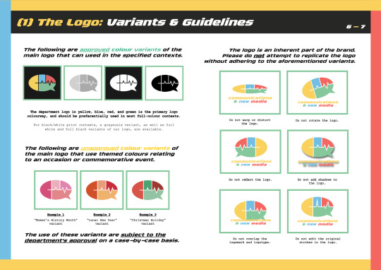
For the logo guidelines, I took the liberty of allowing for more flexibility when it came to logo variants. For example, the possibility of changing of the logo colours in conjunction with the celebration of certain occasions or events is offered (though this is of course still subject to the department’s approval), so that the department can showcase their involvement in current campus and societal happenings.
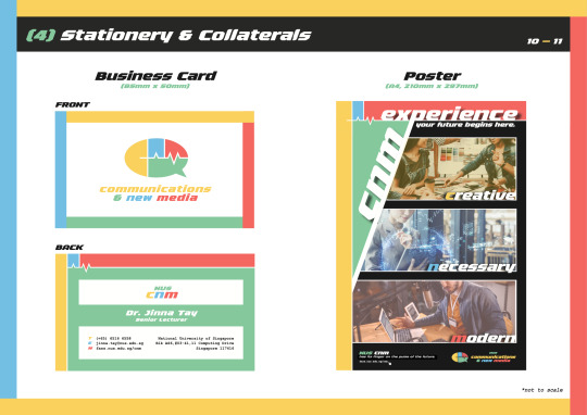
The fourth and final section showcases the designs for the business card (pg 11) and poster (pg 12). The front of the business card simply showcases the main logo against a white background, framed by a border consisting of the four main colours. That the green border at the bottom is overlapped by both the blue and red borders is not a mistake but a deliberate and subtle detail to convey the sentiment elaborated previously, green being a colour that exists to support the other three. Since the logo was already showcased in full on the front, I wanted to experiment with displaying the logo in a different way on the back, integrating it into the background instead. During the final critique, I received a comment from a classmate that the font size of the body text was too small so in the updated name card, I shifted the logo to allow for more space for the text.
The poster design was partially inspired by the current (as of writing this) header on the CNM website, with the slogan “EXPERIENCE. YOUR.FUTURE.BEGINS.HERE.”. While I used the same main slogan and also incorporated the element of the elongated “P” into my design, I chose to highlight my own choice words “Creative”, “Necessary”, and “Modern” because these are qualities I wanted to bring across about CNM that are similar to those I mentioned previously. The photos used for each word are tinted to reflect the respective colours in CNM (yellow, blue, red), which are also highlighted at the start of each word, spelling out CNM. Similarly to the back of the business card, a background variation of the logo is used at the top left, while the full logo is used at the bottom right. The tagline at the bottom “NUS CNM has its finger on the pulse of the future” (mentioned on pg 2) is used to emphasise both the passionate and forward-looking nature of the department.
I received feedback from a classmate on the poster as well—she pointed out how the centre seemed to stand out more from the others and suggested for me to adjust the tones of the picture so that they are more consistent with each other. After some experimenting, I decided to tint all the photos used by varying amounts to achieve a similar lightness so as to make them more cohesive. This allows for more emphasis on the text as well, which is desirable since the photos are meant as visual aids to accentuate the meaning of the text. In experimenting, I also decided to add drop shadow to all the larger text in the poster for consistency and to create a more attention-grabbing look, especially for the words “experience” and “cnm”.
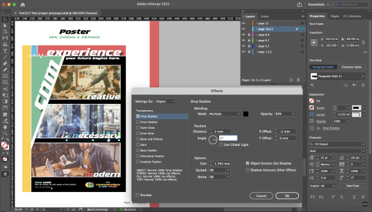
For the drop shadow, I made use of the individual settings to customise the intensity, angle, and offset of the shadows for the different types of text. Specifically, for the words “creative”, “necessary”, and “modern”, I changed it from the default by setting the Y offset at 0 mm and the angle at 0º so that the shadows do not overlap the white border in a striking manner and create a distracting pattern.

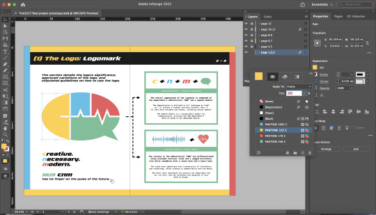
To end off my blog post, here’s an overview of all the pages in my workspace. This was a view I frequently referred back to to ensure that the design of the brand guide itself is consistent across the pages and felt cohesive as a whole. I also made use of different layers to ensure that all the design elements are on their respective pages to prevent any confusion when locating and changing them later on, as well as any unwanted or accidental changes.
The final page exists purely for aesthetic purposes. During the planning stage, I had an extra page left over so I decided to create a page that characteristically looks like the ending cover page of a booklet. Incorporating the background variation of the logo (as mentioned earlier), it serves as an appropriate ending to this brand guide by encapsulating the simplicity, vibrancy, and holistic nature of this CNM rebrand.
0 notes

Text
Week 7 — In-Lecture Exercise F

The first (top) two colours are both blues—they are both more muted and less intense versions of a blue hue which I think helps bring across a sense of calmness and serenity associated with the sky. I chose to include two variants of blue (one lighter tint and one darker shade) so that a sense of transition is conveyed, fitting for an evening sky which is in transition from day to night and is better described as a gradient than any single shade of blue.
The third colour pink, chosen to represent all the colours in the sunset, provides a pleasant pop of colour while still fitting in with the above blues in its muted form. The pink stands out in the middle of this palette because it can only be derived from its own unique hue (the top two colours can be derived from the same hue of blue while the last two colours can be derived from a yellow hue). It also conveys a sentimental and romantic mood, fitting for the romanticism and beauty associated with a sunset.
The fourth colour is a warm yellow that is the most vivid and intense of the palette, fitting because it is meant to represent the glow of the street lamps which are the brightest objects in the photo. It conveys a sense of joy and hope, like the light at the end of a tunnel, and I think it really shines when used in the foreground of a more muted sky.
The last colour is a darker shade of yellow, used to represent everything else on the ground, which are all subject to the yellow tint of the light emitted by the street lamps. Due to its similarity to brown and slight green-ish tint, it evokes a sense of earthiness and naturalness. While it may not work with the first three colours individually, I think it comes together well as a palette because it offers an interesting contrast as darker shade while still maintaining cohesion through the lighter shade of yellow.
0 notes
Text
Week 6 — In-Lecture Exercise E

Comment #1: The typefaces for the title and body text are not complementary.
Ironically, because the font used for the title is the exact same (too similar) as the one used for the body text, discord is still created between the two. Despite the difference in font size and the gap that separates them, the title and body text are equally overwhelming which makes the body text hard to distinguish and read.
A suggestion would be to use a Serif font for the body text instead so it stands in contrast with the title and render both more readable.
Comment #2: Various factors are contributing to body text being hard to read.
These factors include:
The body text is aligned to the centre which creates varying line lengths that makes it harder for the viewer to track and read.
The body text is completely capitalised. As such there are no ascenders, descenders or defining capital letters that can help to indicate the start of new sentences nor the use of proper nouns.
While an outline font is good for a big eye-grabbing title, when used for the body text, it renders the words less readable since it is of a smaller font size and the outlines appear thinner. The outlines also reduce the contrast between the text (which contains white within the black outline) and the white background.
Some suggestions that can be made include:
Aligning the body text to the left so there is a clearer starting point and it becomes easier to track the words in each line.
Use normal capitalisation (i.e. capitalising the start of every sentence and wherever else necessary) instead of capitalising all the words. With the introduction of different heights (ascenders, descenders, capitalised letters), it would be good to consider increasing the leading as well to allow more space between each line.
Use a font that is filled in and not an outline so there is greater contrast between the text and the background.
0 notes
Text
Week 5 — In-Lecture Exercise D
I took the shots separately without a narrative in mind but if you’d like, the following six images can be viewed in order (L-R, U-D) to form a very short storyline created from only using different shots of the same object. This will assist in how I explain each shot as well.


The first image uses the very long shot (VLS) size and achieves a similar purpose to an establishing shot. While the form of an individual can be seen, the figure himself is unknown and what he is holding up remains indiscernible at a distance, creating an aura of mystery and intrigue. The subject is centred so that it is obvious to the audience that he is the main focus, decreasing the likelihood of them being distracted by other elements in the frame.
The second image is a close-up (CU) of the figure’s face, revealing him to be Geralt of Rivia from The Witcher series. This image follows the rule of thirds whereby his face is positioned on the left two line intersections so that his face and identity becomes the main focus of this shot. However, his fist is also in frame on the right and is shown to be holding something. The positioning of his fist is not centred on any line intersections and is slightly to the right because the fist is a secondary focus to his face—a viewer will only be directed to look towards his fist after first seeing his face. That only a portion of his fist is in frame and the fist itself is out of focus piques the viewer’s curiosity about what he holds in his hand while also foreshadowing the reveal in the next shot.
The third image is shot from a worm’s eye angle which makes the subject seem imposing and intimidating. In this shot, the thing he is holding up is revealed as well, that is a several severed monster heads held together using rope. Now with more context on what he is holding, the worm’s eye view also conveys a sense of menace and danger since it can be implied that these heads were obtained via violent means.
The fourth image is a midshot (MS) shot at eye-level. This image serves to show both of the elements revealed in earlier shots in one image (Geralt and the tied up severed heads). While it appears to be a pretty standard shot since it is taken from eye level, it was deliberately taken such that the subject’s eyes do not directly meet the camera and is looking beyond it, letting the viewer into the fact that someone or something else of importance is likely present out of the frame.
The fifth image is a big close-up (BCU) which also follows the rule of thirds with the subject’s face taking up two-thirds of the shot. The focus of this shot is solely the facial expression of the subject so that the viewer can be cued into his emotions and mood, which in this case looks to be rather tense and wary. Again, that he is directing his gaze off-screen piques viewers’ curiosity of what thing or person is present that deserves such a reaction, effectively engaging them and holding their attention.
0 notes
Text
Week 4 — In-Lecture Exercise C
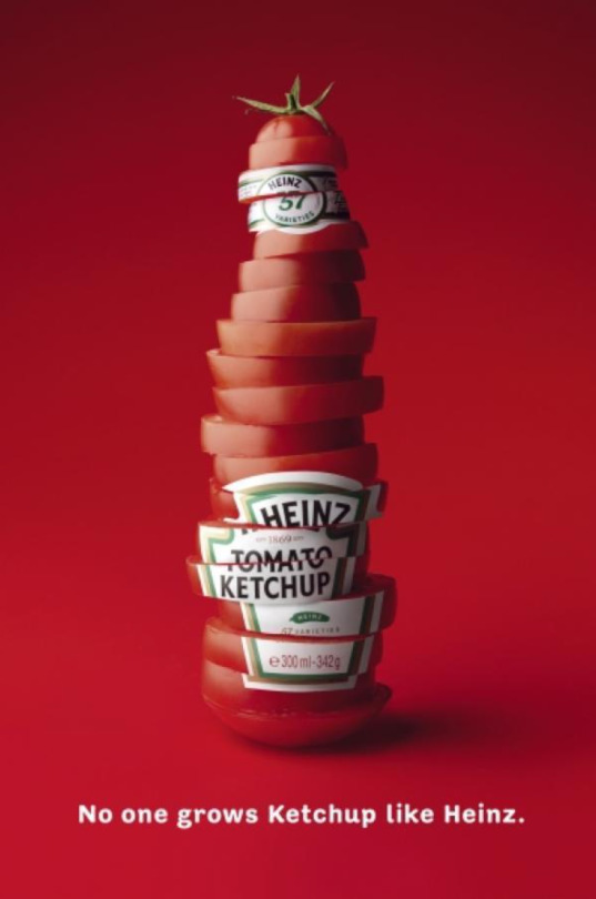
With regard to the content within the print advertisement, the signifier refers to the slices of tomatoes that are stacked atop one another to form a towering pile, one that does not look like the typical round shape of a tomato but instead an upright and oblong shape. Accompanied by the recognisable Heinz labels, it becomes clear that the oblong shape of the stacked tomato slices is meant to resemble a bottle, coming together to signify a Heinz brand ketchup bottle.
However, the entire print advertisement itself can also be seen as a signifier, made up of both the aforementioned tomato slices and the caption “No one grows ketchup like Heinz.”. The use of tomato slices to represent a ketchup bottle and the intentional use of the word “grows” (over a more typical word like “makes”) has the intended effect of having audiences associate Heinz’s ketchup with the real tomatoes grown in a field. By equating Heinz ketchup to tomato slices, it implies to audiences that their ketchup tastes authentic and ‘like the real thing’, almost as if they were eating the actual tomato itself. The word “grows'' amplifies this sentiment by making it seem as though the ketchup is farm-to-table and has been created with minimal processing needed.
Overall, the signifiers in this print advertisement are meant to signify qualities like authenticity, good taste, freshness and naturalness, which the Heinz brand wants audiences to associate with their ketchup.
0 notes
Text
Week 2 — In-Lecture Exercise B
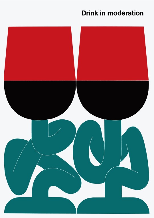
Ikki Kobayashi: Forget me nots. (Copyright © Ikki Kobayashi, 2020)
Description:
This piece of artwork features two glasses side-by-side. The bowls of the glasses are red and contain a black liquid while the stems are green. What stands out most are the stems of the glasses. Instead of being thin and vertically straight, the stems are rather thick and are heavily distorted, intertwining with and winding in and around itself, creating shapes similar to those of silly straws. The caption is on the top right which reads “Drink in moderation”.
Analysis:
From both the caption “Drink in moderation” (which is in reference to alcohol) and the black and red used in the bowl of the glass, it can be inferred that two glasses of wine are depicted. The placement of the two glasses in relation to each other and within the artwork itself creates a feeling of unease—the glasses are placed very close to each other, separated by a hairline of white space between various parts of the glass, and they are located very near to the edges of the artwork. The stems stand out because it does not make sense realistically—that they are misshapen makes the glasses hard to hold within a person’s hand. The caption “Drink in moderation” seems deliberately placed on the right such that it hovers over only one glass of wine instead of simply being centred in the available space above the glasses.
Interpretation:
That the stem makes the wine glass hard to hold ties in directly to the caption “Drink in moderation.”, because it is a physical depiction of not being able to handle one’s liquor. The artwork evokes a visual of using a misshapen wine glass which then creates a sense of discomfort and frustration, prompting viewers to ponder whether having another glass to drink is literally and thus metaphorically worth it. That the wine glasses are separated by such a small space is a visual representation of the ease at which one can cross the boundary into having too much to drink, and as such caution should be exercised. That the caption is placed over only one glass ties into the sentiment of setting boundaries for oneself and moderating one’s drinking.
Judgement:
I think that this artwork is successful in delivering its message because it is able to do so with a minimal number of simple design elements. I think it is also innovative in the way it visually depicts its message—by distorting the form of an object familiar to everyone, it creates a feeling of discomfort everyone can imagine and relate to, and it probes people to ponder why the object has been misshapen in this way, allowing them to find their way to the artwork’s message. One thing I would consider is whether this artwork can be changed to express the same sentiment in a more minimalistic way. One example would be only using the word “Moderation” as the caption since the colours used and the connotations of the word can lead people to infer that the artwork is about drinking.
0 notes
Text
Assignment 3 — Information Design
Pre-critique work:

Post-critique work:
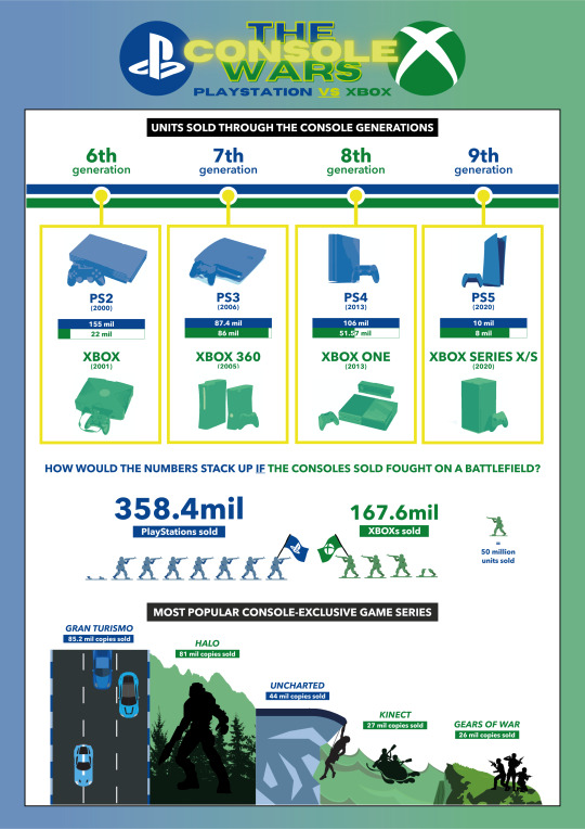
The title of my infographic is “The Console Wars: PlayStation VS XBOX” where I attempt to visually represent the popularity of the consoles against each other.
The background of the infographic is a gradient going seamlessly from blue to green (the brand colours of PlayStation and XBOX respectively) from left to right, in line with the placement of the respective brand logos, with PlayStation on the left and XBOX on the right. The fonts chosen are all Sans Serif for a cleaner and more modern look, which is in line with the topic of technology and technological development. This also explains the choice to have a ‘glow’ or ‘neon’ effect for the word “console” because of the association with electronic products that emit light as well as the overall futuristic aesthetic.
In the first section titled “Units Sold Through the Console Generations”, I aimed to show how each console fared against the other in terms of the number of console units sold throughout the different generations of consoles. I used a timeline consisting of four dots that extended down into their own box to compare consoles of four different generations, specifically the sixth, seventh, eighth, and ninth generations. In each box, I name the respective PlayStation and XBOX consoles and the year in which they were released in that specific generation. For example, in the third box (8th generation), I showed that the PS4 and XBOX ONE were both released in 2013. I also made sure to visually differentiate the two consoles using their respective brand colours (blue for PlayStation and green for XBOX) for the depiction of the physical console as well as the labels used for their names and year of release. For the depictions of the physical console, I also used Image Tracing to vectorise and simplify the original photo such that it resembles the art and visual elements used in the rest of the infographic. I used bar charts to illustrate the difference in the number of units sold between the two consoles, each bar in its respective brand colour so they are easily distinguishable.
The second section is titled “How would the number stack up if the consoles fought on a battlefield?” as a play on the infographic’s title “Console Wars”. It is in a less prominent heading compared to the first section (and third section) because I consider it a subsection of the first section—it visually represents the sum total of consoles bought throughout all the generations. I used toy soldiers to represent console units, where 1 toy soldier represented 50 million units and used them to support the numerical figures (358 mil vs 167.6 mil) to visually show how many more units of PlayStation consoles were sold as compared to XBOX consoles, more than twice as much. The fonts of the numerical figures were sized proportionally in relation to each others’s values so as to visually represent how the number of PlayStations sold is larger than the number of XBOXs sold. These toy soldiers were similarly in their respective brand colours or blue for PlayStation and green for XBOX. Other insignias of war such as the flags with each console’s logos were added to the toy soldiers to further flesh out the visual concept of a battlefield.
The third section is titled “Most Popular Console-Exclusive Game Series”. This section aims to measure the popularity of the consoles against each other, using the popularity of console-exclusive games (which will aid the sale of the consoles) instead of the popularity of the console units themselves. As such, the heading for this section uses the same prominent heading as the first section since it represents the second significant metric by which the popularity of consoles is being measured. In this section, I used graphics representing be of the in-game content to represent each game. For example, Gran Turismo is a racing game series so it is represented by a race track with cars, Uncharted is an adventure game series in which scaling tall structures is a main game mechanic, and Kinect (consisting of Kinect Adventures and Kinect Sports) is represented by water rafting since its an activity featured in the former and as a sport, it simultaneously ties in thematically to the latter. The graphics are designed such that a downwards slope is created, visually representing the decreasing popularity of each game, in terms of the number of game units sold, similar to that in a line graph. The graphics as well as the labels are also in the respective brand colours to show which console the specific game is specific to—for example, the graphic elements in Halo, Kinect, and Gears of War are in different shades of green because they are XBOX-exclusive games.
The following are the changes I made to the original design after receiving critique from my tutor and my peers on my work:
(1) I changed how the physical likenesses of the consoles were depicted in the infographic.
Initially, I depicted the consoles as pixelated graphics because I wanted it to look more abstract and simpler than the initial photographs I was referencing. I chose to pixelate it specifically because I felt that pixels were reminiscent of certain video games and thought they were a relevant and visually interesting detail I could incorporate into the graphics for the physical consoles.
However, after receiving feedback from my tutor, I decided to use vector art for this depiction instead so that it is more consistent with the other graphics I used in my infographic, such as the toy soldiers and those used in the third section.
(2) I changed the colour of the background of the headings.
Initially I had the different headings in blue and green because I wanted to use a limited number of colours for this infographic, mainly the different shades of blue and green (brand colours), yellow (the accent colour) and white (background colour for content). I thought about using black but decided against it in the end because I thought that it created a big contrast with the white background and felt rather out of place since no other elements in the infographics utilised white.
However, after completing the third section as well as receiving feedback from my classmates, I realised that the headings being in green and blue become a source of confusion. Since I had repeatedly made sure to associate each colour with their respective consoles prior to this, the colour of the headings was confusing as it led people to think that the content under the headings were only associated with one particular console. After having this made known to me, I decided that I could go back to my initial idea of having the headings in black after also releasing that I used black in the graphic elements in the third section, as such the use of black elsewhere would not feel out of place. However, to slightly mitigate the issue of too high a contrast being caused by the black against the white (since in the third section the black was mostly set against blue or green), I turned down the transparency of the black boxes to 95% from 100% so that the contrast stands out less.
(3) I lowered the number of toy soldiers used in the infographic.
In the original work, I used a large number of toy soldiers to represent the number of console units sold with the intention of creating an image that resembled soldiers fighting on a battlefield, in line with the concept of the title. However, I received feedback from my classmates that the large number of soldiers made it difficult to ascertain how many console units were in fact sold from each brand. As such, I scaled down the number of toy soldiers used such that it can be easily counted, having one soldier represent more units instead, and included numerical figures to show exactly how many consoles from each brand were sold.
(4) I abstracted the graphic elements used in the third section of the infographic.
I simplified the black silhouettes used in visuals in the third section. Specifically, I abstracted the figures from the Halo graphic and the Kinect graphic by removing the shading and the most of the negative space within it so it is visually consistent with all the other visuals which were solid black with minimal detail.
Depicted below is my Adobe workspace:


For this assignment, two features which I made use of were the ‘Colour Swatch’ feature and the ‘Image Tracing’ feature. I utilised colour swatches in particular for this assignment because as mentioned previously, the two brand colours were used repeatedly throughout the infographic due to their relevance to the content. To ensure the colours I used for the words and backgrounds were consistent with the brand colours, I used the eyedropper tool to extract the colours from the original photos from the brand logos at the start and made sure to save it to my colour palette so I could refer back to it when working on the rest of the infographic. I also used the Image Tracing feature for this assignment to create the vector art from photos, for the physical depiction of the consoles as elaborated on earlier.
0 notes
Text
Assignment 2 — Storytime!
Pre-critique work:

Post-critique work:

(Top left to bottom right: Frames 1–9)
When attempting this assignment on visual storytelling, my goal was to create a series of images that look like they could have been frames taken straight from an action movie (the reason why I used the 16:9 aspect ratio consistently for all frames). Since the action figures available to me were all characters from films in the Marvel Cinematic Universe, I decided to create a scene depicting a plausible scenario between the three specific characters (Thor, Loki, Captain America) by including using in-universe lore and rules as well (e.g. the rules which govern the use of Thor’s hammer).
The following is my thought process for how I staged each frame such that it furthered the storyline appropriately:
Frame 1
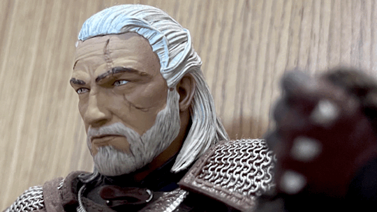
I wanted to begin with a shot that introduced the main conflict of the story by depicting the hero (Thor) and the main villain (Loki) facing off against each other dramatically. I used a long shot because (a) I wanted the establishing shot to get across who the characters were so a viewer would have the necessary context and (b) because I wanted the shot to depict them in an imposing manner to bring across the grandiosity of a fight between powerful individuals, which is also why I shot it from a lower angle looking up at the characters. Lighting-wise, I wanted to have different colours symbolise different qualities within the characters, orange (a warm tone) representing good versus blue (a cool tone) representing evil, which I attempted to use consistently throughout the story.
Frame 2
I wanted this frame to show how our hero is prepared for the fight—it is shot from his back to draw focus to the weapon (hammer) in his hand being primed for attack. In this shot, I used Loki’s shadow to represent his presence because I wanted to minimise any elements which could be distracting and draw attention away from the hammer, which also explains the heavy shadow on Thor’s back.
Frame 3
This frame is a close-up of Thor’s hammer on its side and slipping out of a hand to show that it has been thrown, with an implication that Thor is throwing it at Loki. Here I used lighting to create an effect reminiscent of the flames surrounding a flying meteor to imply that the hammer is being thrown into motion at a very high speed, highlighting Thor’s physical strength.
Frame 4
This frame aims to show Loki’s reaction to Thor’s attack, and it is a close-up because I wanted to highlight the proximity between the hammer and Loki’s face, showing how he dodged it only very narrowly, thus raising the tension of this moment.
Frame 5
This frame exists to show what happened to the hammer, since it was seen being thrown and missing Loki, going behind him. The close-up is deliberate so as to not reveal who is currently holding the hammer, increasing the suspense of this twist where a third mystery character comes into play in the story.
Frame 6
This frame then dramatically reveals the identity of the mystery character, Captain America (Cap). This is a long shot that is slightly tilted to the right (dutch angle) for two reasons. One, because I wanted to give the impression that Cap is coming quickly towards Loki, using the slope to imply faster motion. Two, I wanted to show this to be the turning point where things literally turn awry for Loki and someone gains the upper hand on him, thus throwing his world “off-kilter”.
Frame 7
This frame depicts what happens when Cap eventually reaches Loki, where he is in a slightly higher (jumping) aggressive stance, bringing the hammer down onto Loki. This is a close-up to highlight the intimacy and intensity of the fight between the two characters, where the focus is on the hammer finally being used on Loki, aiming to satisfy the build-up of anticipation after the earlier misfire by Thor. The blue from Loki completely disappears from this frame to show how Loki is being thoroughly overpowered by the hammer, especially since he is in full contact with it.
Frame 8
This frame reveals what exactly Cap does with the hammer—instead of using it to strike Loki, he defies audience expectation by placing it down onto Loki’s body instead, subduing him completely by using the hammer to weigh him down onto the floor.
Frame 9
The story ends with this frame zooming out from the previous close-up into a wide shot which puts the previous frame into context. The positioning of both the characters (Cap and Thor) and the camera is mean to simulate the taking of a self-photo.This highlights the humour of the situation since Loki is subdued in an unexpected way, and Cap and Thor are shown to be making light of his defeat, bringing the story to a conclusion whereby good overpowers evil yet again.
—
During the critique, I received helpful and comprehensive advice from my tutor on how to improve my work. The following details the critiques given and the changes made to the original work:
(Frames below refer to that of the pre-critique work)
Frame 4
One comment pointed out the lack of continuity with regards to the direction of movement of the hammer from Frame 3 to 4. I anticipated this because, during the shoot, I struggled with getting the hammer orientated correctly while simultaneously making sure my hand could not be seen in the frame. However, it was suggested that I could have the hammer pass by behind Loki instead to help with this issue, which was what I changed for the final product. Though Cap was partially included in the background to foreshadow his entrance, it was suggested that I remove him because his presence made the frame busier such that it was harder to tell what to focus on. As such, Cap is not as prominent in the background of the final product.
Frame 5
It was suggested that the reveal of Cap’s identity could be delayed so as to build up the mystery and suspense. As such, I acted upon my tutor’s advice to use a frame with a close-up of his hand holding the hammer instead, only revealing him in the next frame.
Frame 7
Upon receiving advice that Frame 7 was an additional but unnecessary action between Cap and Loki, in the sense that its presence does not affect the storyline much, I decided to remove it in favour of having another adding a different frame at the moment Cap’s identity is revealed, so I could capitalise on the suspense that had been built up prior to that.
—
Depicted below is my Adobe workspace:

As usual, I made use of the 'Layers' function to organise and simplify my workspace. Because this assignment required the submission of additional materials such as the storyboard and the shortlisted photographs, I used the ‘Artboard’ feature to create additional artboards for each of these components. This was used in conjunction with the layers function whereby each layer corresponds to the contents on one artboard.
Other tools which I made use of were the ‘Artboard rulers’ and ‘Arrange’ feature, which I utilised to centre and space out my frames evenly for clearer formatting.
0 notes
Text
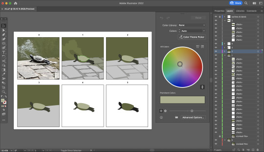
Assignment 1 — Stripping Down!
Pre-critique work:
Post-critique work:

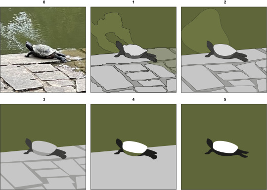
When attempting this assignment on abstraction, an internal goal I set for myself was to successfully distil a photograph into a visually distinct and simple form, almost akin to a logo. To challenge myself, I deliberately chose a photograph in which the subject is situated in an environment relevant to itself so that I could try to incorporate the essence of the background into the final abstracted piece as well.
The following is my thought process at each stage of the abstraction process:
Stage 1
I outlined the picture in a detailed manner, making sure to capture all the curved jagged shapes of both the subject and background. I also included additional details such as the reflection in the water and the water overlapping the land.
Stage 2
I abstracted it by rounding the irregular edges and reducing the thickness of the outlines to reduce the number of details that may be distracting or overwhelming. I removed the overlapping water for the same reason.
Stage 3
I abstracted it further by removing the outlines completely so that the picture appeared cleaner and simpler. I removed the reflection of the water to further serve this purpose.
Stage 4
I removed the tiles on the land because I felt that even without this detail, the singular grey block is sufficiently representative of land. I also changed the light and dark grey of the terrapin to white and black respectively to create greater contrast and make the subject more identifiable. I utilised the green of the background in the terrapin so as to avoid the use of different shades of grey.
Stage 5
I removed the green from the terrapin to challenge myself to depict it in only two less conventional colours. I made the entire background green and removed the grey land because I felt that the colour green is relevant and significant to the subject (terrapin).
During the critique, I received valuable perspective and feedback on my work from my peers. The main criticism of my work is stated below and following that are the takeaways that factored into the revisions I made in my final work:
Criticism: The final depiction of the subject (terrapin) was by itself, not easily identifiable as a terrapin.
(1) Reason: The simplification (smoothness, roundness) of the legs led to important characteristics of the terrapin, such as its webbed feet and claws, being lost.
My original intention: I was trying to abstract the shape of the terrapin to its simplest form and my thought was that with the recognisable shell, the shape of the legs would not be an important factor in helping to identify the terrapin.
Revision made: I paused the abstraction of the shape of the terrapin at a stage that allowed the above characteristics to still be recognisable, and proceeded to abstract other aspects, such as the colours and background, instead.
(2) Reason: The use of black and white in the terrapin (instead of green) caused some of the iconicity of the terrapin to be lost.
My original intention: I wanted to challenge myself by using less conventional colours to depict the terrapin and my thought was that by retaining the green of the water in the background, a viewer would be able to form an association between the colour green and the terrapin and be able to easily identify the subject.
Revision made: I changed the colours of the terrapin at every stage to make sure that they were all different shades of green so that the iconic green of the terrapin is retained.
Another revision I made was removing Stage 2 of abstraction from the original work in post-critique work. This was so that I had more room to abstract the subject itself (the terrapin) and focus less on the background. This eventually led to the removal of the background altogether in Stages 4 and 5 since the green background seemed to confuse some of my classmates — while it was a deliberate artistic choice on my part to incorporate the green in a less conventional way (as mentioned above), some seemed to interpret it as a literal depiction of the terrapin in the water and found the lack of congruence with the initial picture (in which the terrapin sits at the border of land and water) to be confusing.
I think that my final work has improved in the sense that it has become more recognisable and conventionally iconic. With the feedback from my peers, I was able to abstract my photograph to a final form that can be perceived with more clarity and thus more easily accessible to everyone.
Depicted below is my Adobe workspace:
I mainly made use of two features to aid my work:
(1) The “Layers” feature was very helpful in helping me organise my assets.
For example, I was easily able to toggle the visibility of the photograph in Stage 1, allowing me to compare my abstracted work with the original reference
Another example would be using different layers for each stage, including one layer solely for the outlines and labels of the boxes which I kept locked throughout to prevent any accidental changes
(2) The “Recolour” feature helped me ensure that the shades of green used did not stray too far from each other.
By adjusting the brightness and saturation of one particular green in the “Recolour” panel, it ensured that the different greens used were indeed varying tints of the same colour and that I am following the assignment requirements strictly.
0 notes
Photo
Week 1 — In-Lecture Exercise A
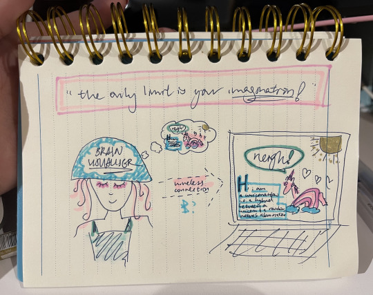
Invention of choice: Brain Visualiser!
How it works: Visualise anything inside your brain and the helmet will recreate it on a digital screen
Works for any digital medium:
Text — Imagine a story and the words are automatically typed as you go
Art — Instantly draw a picture by imagining it (though it depends on how detailed your mind’s picture is)
3D — Pair your helmet to a 3D printer and watch your ideas materialise tangible before your eyes
Web — Bring up sources of inspiration immediately by thinking words/phrases of interest (e.g. Google image search, play a song
Benefits: Lowers the barriers of entry of doing creative work
No time = no problem — Saves time by skipping the steps of navigating software and your computer to achieve the result you want
No inspiration = no problem — Pull up an entire internet’s worth of inspiration with just a single thought to get your creative juices flowing
No skill = less problem — While being trained in your craft still has value (e.g. story writing is more than just typing fast), it allows you to have a better jumping off point when creating (+ the time saved can be used to hone your craft!)
Result: Churn out as many pieces of creative work as you’d like, truly “the only limit is your imagination”!
0 notes