
Last Seen Blogs

atleast3olives
lil bby rat

margotauxusa
Mon voyage aux USA

victorlovesyousc
Victor Likes Art
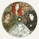
robertarryn
Magic and Mystery

perhaps-him
Untitled
Text
Task2 :
Practice
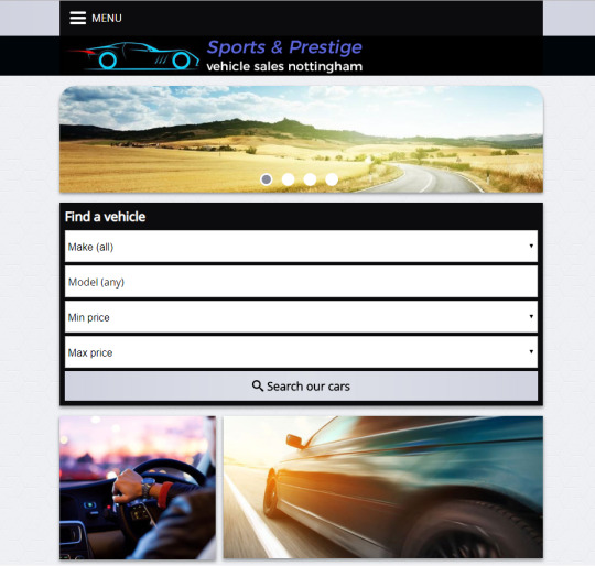
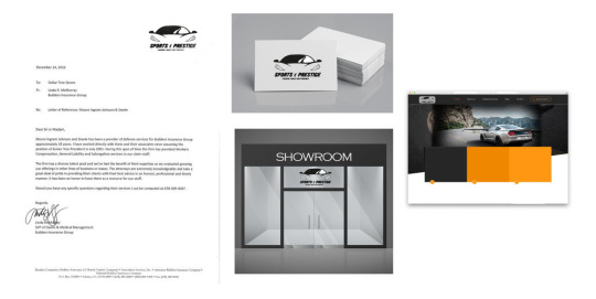
1) I decided to rebrand this local business in Nottingham as they look awful, in my opinion, I will show you the steps on how I would rebrand a logo and their website. as you can see, the website is outdated and does not attract viewers.
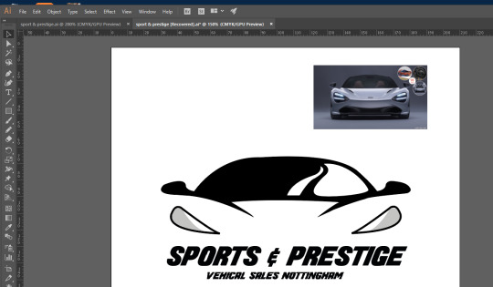
I first researched their business on what kind of cars they have for sale, the reason because I can remake the logo on the style of the cars they have. from looking at the vehicles, they do have a high-quality car for sale. I first opened up adobe illustrator made a new document and then I went on google image and looked some designs on how other designers rebrand there logo. then I searched up some prestige cars and then I embedded the image on illustrator and then the used the pen tool. used the basic black and white theme on it because to shows professionalism and it looks, class. here is my final outcome on my first rebranding. ere you can see a front view of a McLaren and I used a sporty font on the front which looks simple.on the glass of the car I used a swarved shade to show it a car.
as you can see, represented the logo with using business cards and showroom and the website to show how it looks. overall I think it is an improvement on the logo that they have right now. even better if I added a few background details related to cars.
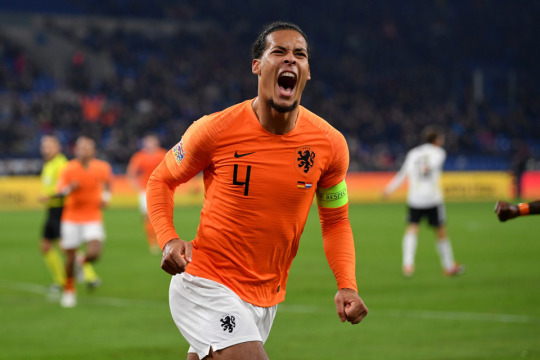
2) Another rebrand that I will be designing is the Netherlands logo. the logo is the Royal Dutch Football Association's lion logo into a roaring lioness, to represents the national men and women's, national team.here is there logo. as you can see from this image the logo does stand out and looks very neat on the football kit.
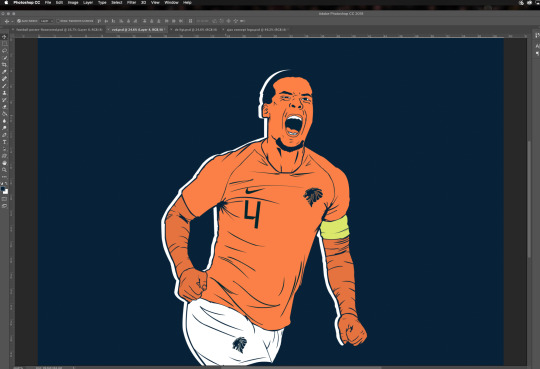
I will open adobe illustrator and then make a new document, then I will look at lions faced sideways to make my design. I first completed my illustration of VVD ( Virgil Van Dijk ). As you can see, I used the Netherlands colour theme to create this illustration orange and dark blue navy. on the right-hand side, is where I will embed my own logo.
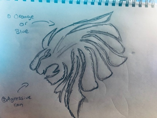
Now I will remake the Netherlands logo. I first sketched out a rough idea of how the logo would look, I then scanned it into my computer, I then opened up Adobe Photoshop and made a new document.i then used the pen tool to go over my drawing of the logo.
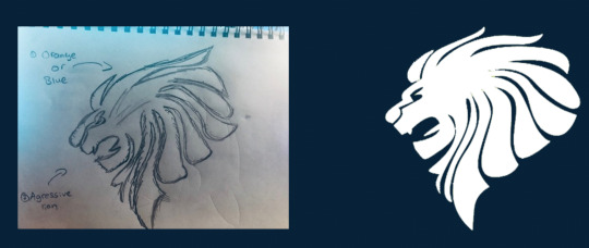
Here is my final outcome. overall, I have accomplished the task.i have rebranded the logo and I have completed the illustration of Virgil Van Dijk. I used orange and a dark navy blue as the main theme colour as it represents the Netherlands. I illustrated it using the pen tool and the Wacom board. I added the smoke effect using the image from google and I decreased the opacity to 80% to blend together. one way I could improve on this is by adding more detail on the background, as it kind of looks bland.but overall I am happy with it.

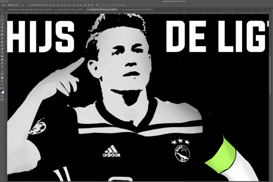
3) I will be making another illustration and a remake on the logo of De Ligt .he is another football player from Netherland, and I will remake the logo for them.
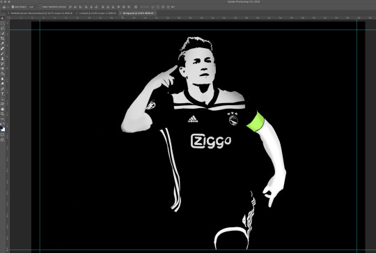
I first got an image from Pinterest of De Ligt, and embedded it into Adobe Photoshop. as you can see I went for a black and white theme for the kit De ligt is wearing. I like this style as it looks unique, and this was my first time to try a new style to illustration.
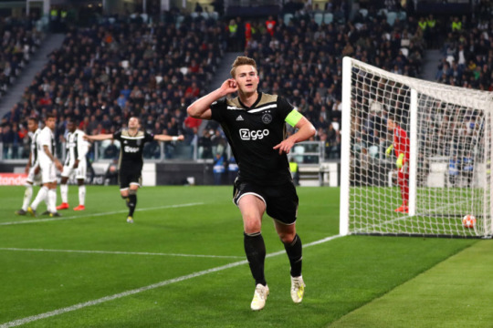
I first used the filter gallery and used the posterize the image to show the different skin tones shades. I then locked the posterized image and made a new layer. then I used a black background and used white colour on de ligt.
next step was to remake the logo. I first played around on photoshop to see anything workes out for the logo and I came up with this.i have used a greek hero-warrior that represents Ajax in general and I added the three stars on top.
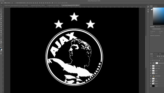
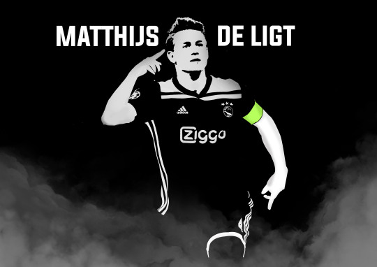
here is my final outcome, overall I am very happy with the outcome of this illustration and the remake of the ajax logo.as you can see I have embedded the logo on the kit itself which looks neat and stylish on the Football kit.and the black and white of De Ligt looks amazing. and I am very happy with it. one way I could improve this is by adding more detail to the background so it doesn't look bland, but I did add a smoke effect on the bottom.
0 notes
Text
Task1 :
My Specialist field
What is a Graphics Designers Job?
A graphic designer’s job is to produce visual ideas that communicate solutions and ideas that inspire, inform and captivate consumers. Furthermore, goals can be different upon the type of graphic design, but a graphic designer primarily focused on making whatever direction they are producing for recognizable. A graphic designer is there to help build a brand identity and boost that company’s brand as well as communicate their messages.
What is Illustration & Rebranding?
An illustration is a decoration, interpretation or visual explanation of a text, concept or process, designed for integration in published media, such as posters, flyers, magazines, books, teaching materials, animations, video games and films. And Rebranding is a marketing strategy in which a new name, term, symbol, design, concept or combination thereof is created for an established brand with the intention of developing a new, differentiated identity in the minds of consumers, investors, competitors, and other stakeholders.
The rise of the remote graphic designer
The career of a graphic designer has also evolved along with the development of the field itself. Companies no longer hire in-house designers; they hire freelancers. This is a huge advantage for both the employer and the employee. Companies get to save on office space and do not have to provide all the tools and devices needed. Freelance graphic designers too can work from anywhere at all. All they need is an Internet connection, a laptop, and design software.
As of now, it is clear that the field of graphic design will only develop further with the advance of technology. It will always remain an essential tool for brands to drive their profits, as well as a medium of artistic and creative expression.
My specialism in this industry is Illustrations and Graphics Design. I love to learn about new things and be constantly taking in new information, illustration has shown itself to be the ideal field. I get to develop and be inspired by interesting concepts and then think to myself, and I also learn from failures in my work. I find that many lessons/skills in the art world are learned by simply doing something and seeing what works and what doesn’t.
And of course, I learn from other artists. Having other artists have proved to be crucial. Experienced artists and teachers constantly remind me of areas to improve in my work and help keep me updated on the ever-changing technology of the art world.
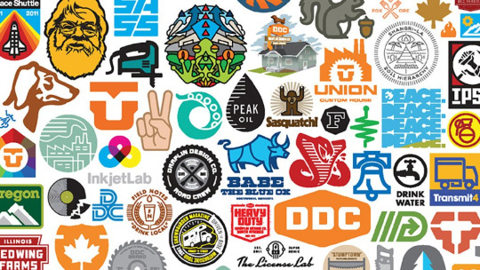
One of the artist that inspired me into designing is Aaron Draplin, he is a graphic designer, author and founder of Draplin Design Co. His clients include Nike, Burton Snowboards, Esquire, Red Wing, Field Notes, Ford Motor Company and the Obama Administration. His illustrations are very professional and simple.
Aaron Draplin is a popular contemporary graphic designer known for his logo designs and poster art. He is also the founder of Draplin Design Co. He was born on October 15th, 1973 in Detroit, Michigan and was also raised there. He attended St Francis High School until 10th grade and then moved to Traverse City Senior High to finish the rest of his education, graduating in 1991. He started his associate degree at Northwestern Michigan College at the age of 17 and learned the basics of Visual Art. When he was 19, he moved to Bend, Oregon to chase his dream of becoming a professional graphic designer. He started working on Snowboard designs and progressed onto bigger things from there.
Frank Shepard Fairey is an American contemporary street artist, graphic designer, activist, illustrator, and founder of OBEY Clothing who emerged from the skateboarding scene. He first became known for his "Andre the Giant Has a Posse" sticker campaign while attending the Rhode Island School of Design.

The Process of Illustration Today:
STEP 1: BRAINSTORMING & IDEAS
When beginning an illustration project, I start by creating a sketch dump. This is an industry term for the action of a stream of consciousness sketching, which is usually done in a quick and haphazard manner. This action helps me clear my mind and gets the ball rolling on pinpointing that great idea, which may manifest on the first sheet of paper or reveal itself many sheets in. During the brainstorming round, there is no limit to how much or how little you should sketch. The primary function of this exercise is to build momentum.
STEP 2: SKETCHING
I get a little more detailed in the next step, where I gradually build up loose and fluid lines from the initial sketches until something more concrete takes shape with heavier strokes and defined lines. Like Step 1 before, there are no hard and fast rules on how much time and detail should be dedicated here. Sometimes first round sketches are almost ready-made for Step 3 other times exhaustive renditions are required.
STEP 3: COLOR EXPLORATION
I usually start by scanning the image or photographing it with my phone. There are instances where I need to tweak it slightly so that the lines are more defined, but I��m quickly on to the next process colour exploration.
STEP 4: BUILDING THE SHAPES
Once I have the basic colour scheme negotiated, I import my sketch into Illustrator to begin creating basic shapes and adding initial detail. Here, many alterations are made to improve the illustration and make it more visually appealing, so this is usually the most time-consuming of all steps.
STEP 5: DETAILS & TWEAKING
This is where I begin adding more details to bring life to the illustration, taking care to decide how much tweaking is still needed. Much is determined by trial and error. Sometimes there are too many small details, or maybe this colour is too bright or overused; you get the idea. If something doesn’t quite look right, it is either deleted or re-tweaked.
FINAL STEP: PRESENTATION
Sometimes the illustration will fill the entire page, other times it is dominated by white space, or includes text. I’m a fan of either surrounding my illustrations in white space or bleeding them over the entire artboard. And I only add text when necessary. When in doubt, go back to the beginning, as presentation is ultimately determined by an illustration’s original intent.
https://collegegrad.com/careers/graphic-designers
https://focuslabllc.com/digest/illustration-process
0 notes